Embed Size (px)
Citation preview
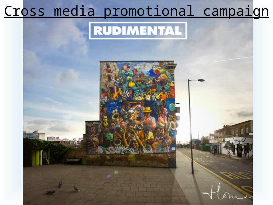
Cross media promotional campaign
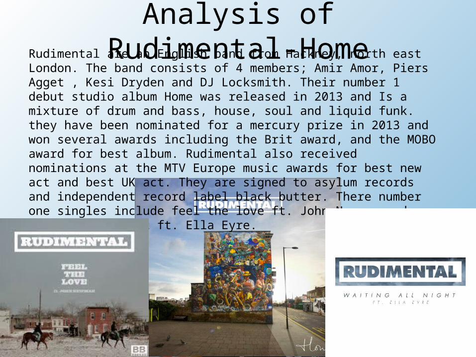
Analysis of Rudimental-HomeRudimental are an English band from Hackney, north east London. The band
consists of 4 members; Amir Amor, Piers Agget , Kesi Dryden and DJ Locksmith. Their number 1 debut studio album Home was released in 2013 and Is a mixture of drum and bass, house, soul and liquid funk. they have been nominated for a mercury prize in 2013 and won several awards including the Brit award, and the MOBO award for best album. Rudimental also received nominations at the MTV Europe music awards for best new act and best UK act. They are signed to asylum records and independent record label black butter. There number one singles include feel the love ft. John Newman and waiting all night ft. Ella Eyre.
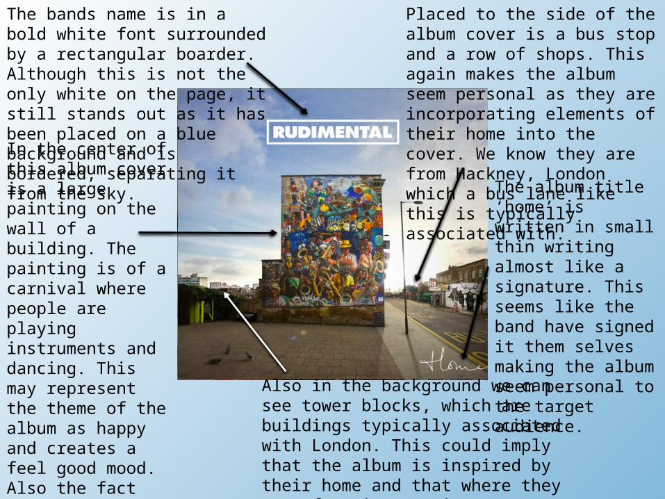
The bands name is in a bold white font surrounded by a rectangular boarder. Although this is not the only white on the page, it still stands out as it has been placed on a blue background and is bordered, separating it from the sky.
The album title ‘home’ is written in small thin writing almost like a signature. This seems like the band have signed it them selves making the album seem personal to the target audience.
Placed to the side of the album cover is a bus stop and a row of shops. This again makes the album seem personal as they are incorporating elements of their home into the cover. We know they are from Hackney, London which a bus lane like this is typically associated with.
Also in the background we can see tower blocks, which are buildings typically associated with London. This could imply that the album is inspired by their home and that where they come from is very important to them. This also implies quite an urban theme.
In the center of this album cover is a large painting on the wall of a building. The painting is of a carnival where people are playing instruments and dancing. This may represent the theme of the album as happy and creates a feel good mood. Also the fact that it is on the side of a building makes it street art, which again suggests they maybe inspired by their urban London roots.
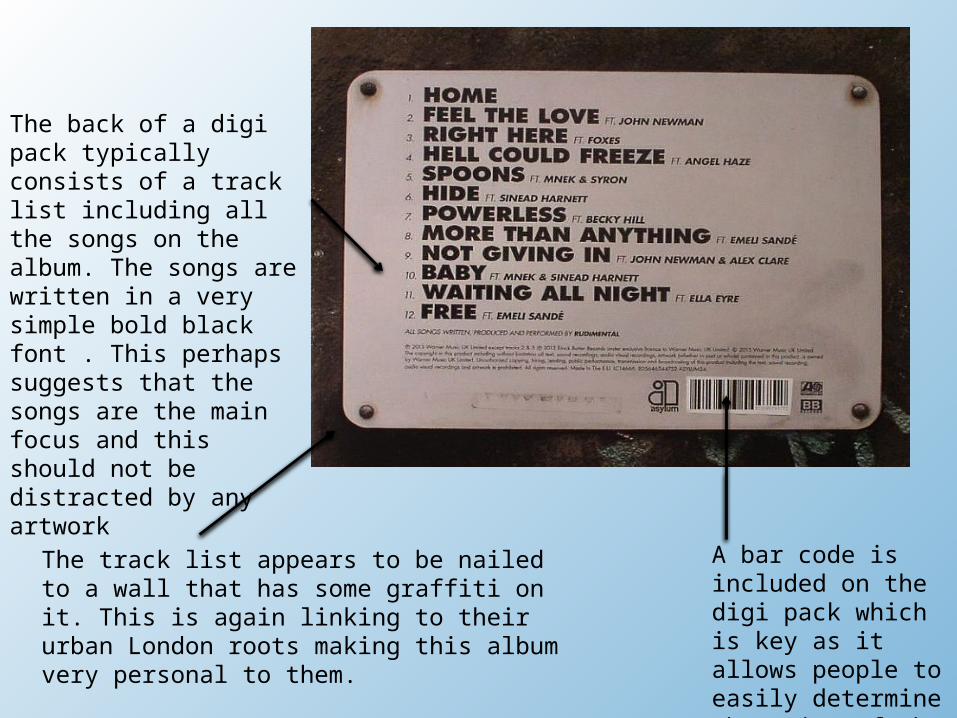
A bar code is included on the digi pack which is key as it allows people to easily determine the price of the album
The back of a digi pack typically consists of a track list including all the songs on the album. The songs are written in a very simple bold black font . This perhaps suggests that the songs are the main focus and this should not be distracted by any artwork
The track list appears to be nailed to a wall that has some graffiti on it. This is again linking to their urban London roots making this album very personal to them.
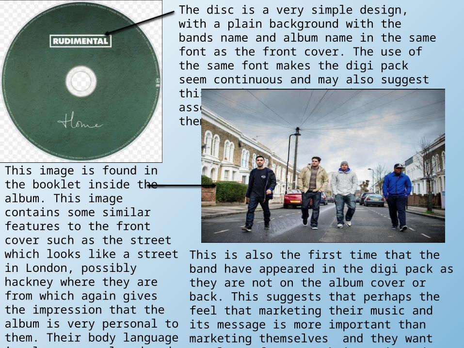
The disc is a very simple design, with a plain background with the bands name and album name in the same font as the front cover. The use of the same font makes the digi pack seem continuous and may also suggest this is the font the band want to be associated with, almost giving themselves a logo.
This image is found in the booklet inside the album. This image contains some similar features to the front cover such as the street which looks like a street in London, possibly hackney where they are from which again gives the impression that the album is very personal to them. Their body language is also very relaxed and they are not posing which may suggest they are relaxed in this environment which further implies this could be their home.
This is also the first time that the band have appeared in the digi pack as they are not on the album cover or back. This suggests that perhaps the feel that marketing their music and its message is more important than marketing themselves and they want people to focus on their music and not their image which implies that they are very passionate about this album.