Embed Size (px)
Citation preview
Magazine Front Cover Evaluation
By Olivia Lewis Brown
Magazine Front Cover
1
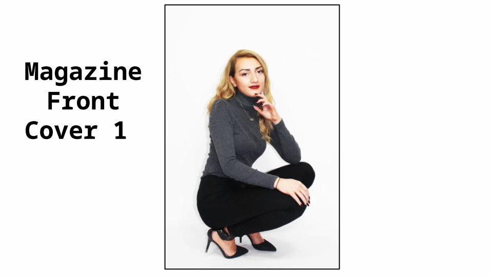
Evaluation Of Cover Photo 1My intentions when taking this medium long shot photograph was to be able to get the full body shot of the model in frame as I wanted to mimic, through the models pose and outfit ,the stylistics of other inspirational magazine spreads such as Look magazine, Teen Vogue and Elle as this pose is a conventional full body shot used in most fashion magazines. My final image fulfils all my intentions for an effective cover image as all features conform to the conventional stylistics of a fashion magazine cover as the models outfit against the white juxtaposing background helps define the model and her clothing as the main focal image combined with the central reservation using rule of thirds to signify the models importance on the page. The image I feel is appropriate for a teenage lifestyle magazine as it is bold in its simplicity and the use of block colours I feel is received well by my target audience as it signifies the viewer not needing too many expensive patterns or fabrics to make an impression. The Meaning created through this image I wanted to convey as a simple fashion statement can be effective as the model does not wear a bright or expensive looking outfit to make an impression, the block colours also help draw attention to the model as the showcase element of the clothes highlighting a key meaning I wanted to create being that it should be the wearer of the clothes that should stand out, to wear the clothes and not let the clothes take any attention from you.
Completed Front
Cover 1
Completed Magazine Front Cover 1 Evaluation
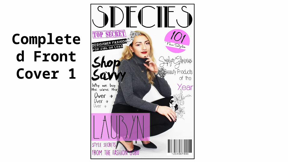
Throughout the process of creating this front cover I feel the combination of image and text complemented each other well as through the use of block colours on the outfit of the model as well in the text coincided with the stylistics and themes established. The use of a pink, grey and black colour scheme I utilized to signify my target consumer to be a female audience and appeal to my target audience as the stereotypical inclusion of pink as a feminine symbol I feel worked to my advantage as it is used on other fashion magazines such as Elle or Teen Vogue to appeal to their female target audience. The meaning created through the use of colour font and text is promoting high street shopping and affordable fashion as this appeals to my target consumer being a younger teen audience which will have a low spending profile and little spare income. I feel this cover has fulfilled all my intentions I wanted to create for my fashion magazine as it is simple yet effective, bold but not over the top, and gives an impression through colour symbolism and easy to read text with a retro font incorporated to convey a classic theme.
Magazine Front Cover
2
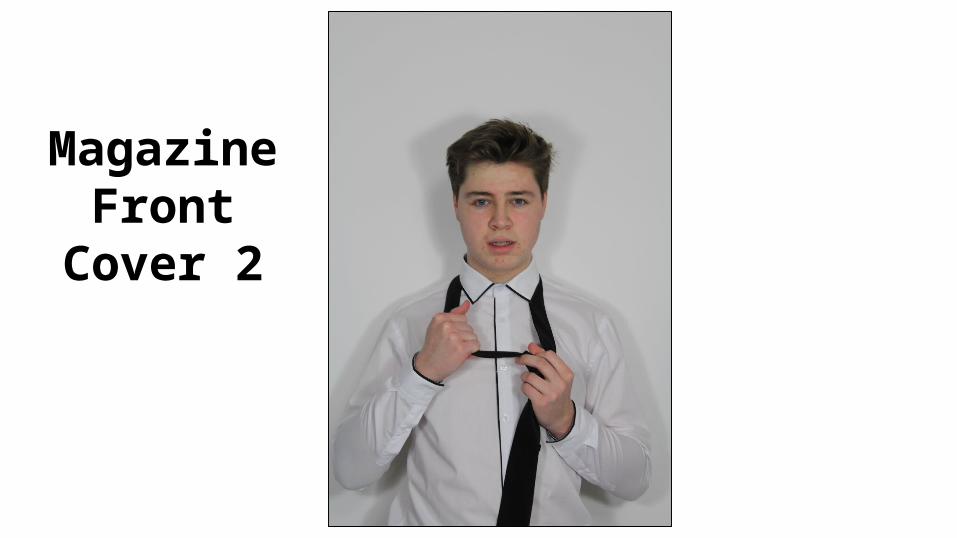
Evaluation of Front Cover 2 my intention when taking this image was to establish a powerful direct mode of address which automatically connects with my target audience. The central positioning of the model also helps define him as the main focal point and his pose with his hands directing attention to his facial expression almost frames his face as being the main focal image on the page. When fulfilling my intentions for this cover image the photos use of conventional magazine stylistics such as direct address and central positioning as well as a bold outfit choice and conventional pose was a prime candidate for my front cover image. The image I believe this image is appropriate for a teenage lifestyle magazine as its featured star is of the same age as my selected target consumers being a teenage audience. The meaning created in this image is through the use of black and white costume not taking any attention away from the star conveying to the audience he is the most important focal point on the page.
Completed Magazine
Front Cover 2
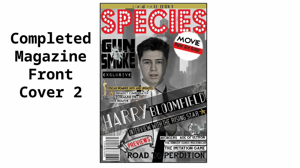
Completed Magazine Front Cover 2 Evaluation The combination of image and text works well within this cover as the use of black and white to fit with this issues classic black and white film theme works well to suit the stylistics and genre of my magazine.
The image is meant to coincide with my magazines main cover line for the film “Gun Smoke” which is signified to be a classic 20’s gangster action film as the special effects of the bullet hole through the font combined with the retro fonts and black and white high key lighting could convey and the mise en scene dress of the actor in black and white smart attire fits with the overall black and white theme.
This image is appropriate for my target audience as it appeals to classic film fans of the magazine through the use of lighting, retro font and classic model pose and central positioning being a conventional layout of a traditional magazine.
This magazine fulfils my intentions for the layout and overall presentation of the cover as the retro syle is a prominent focal point, the actor uses direct address to engage with the audience and the masthead and most important information has been made bold and bright, conveying information effectively.
Magazine Front Cover
3
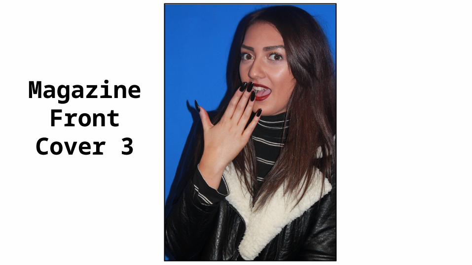
Evaluation of Front Cover 3My intention when taking this photograph was to capture the conventions of my genre of gossip magazine signifying kept secrets and suspicion. I feel this image achieve what I intended through the use of pose, having the model with her hand covering her mouth suggesting she has told a secret which will draw in my audience attention through the advertising use of hollywood secrets and scandals. The use of a blue background also highlights the form of the model as the juxtaposing dark colour of her outfit against the blue conveys her to be the main focal point of the image.
The image I feel is appropriate for my target audience as it uses traditional gossip magazine conventions to appeal to my consumers expectations of this genre through the use of pose, direct address and vivid colour to capture my audience attention.
Completed Magazine
Front Cover 3
Evaluation Of Completed Front Cover
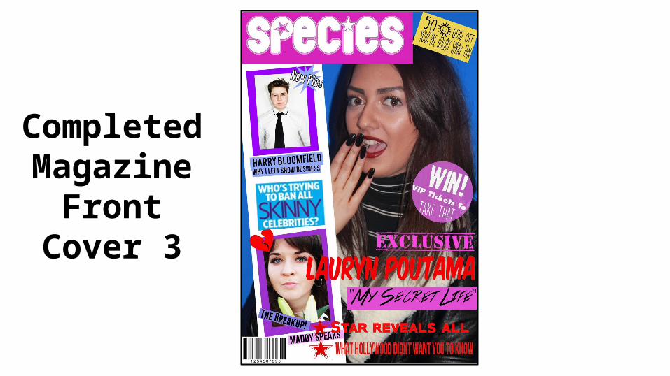
When creating this front cover I felt the combination of images to text worked extremely well im conveying valuable information and drawing in my target audience as I have used a selection of Buzz words such as “ Exclusive” and “The Breakup!” to inspire interest and advertise key featurettes in my article. The use of an incentive within my puff and “ Win!” also creates a second medium of advertisement as the competition provides an extra element of interest for my audience. The images included of my two main models Harry and Maddy uses Direct address to connect with viewers and draw attention to all parts of the page. The meaning created through the use of images and text is the meaning of openness within society. The cover lines describing the relevance of the photo conveys individuals stories and provides a sense of realism making it appropriate for my target audience as they as normal people can identify with the featured stars life problems therefore making them want to read more.
This final cover fulfils all my desired intentions as it conveys information and stars point of views effectively and unbiasedly. The cover also relates to my target audience well and I feel will be received well by fans of this particular genre of magazine.
Magazine Front
Cover 4
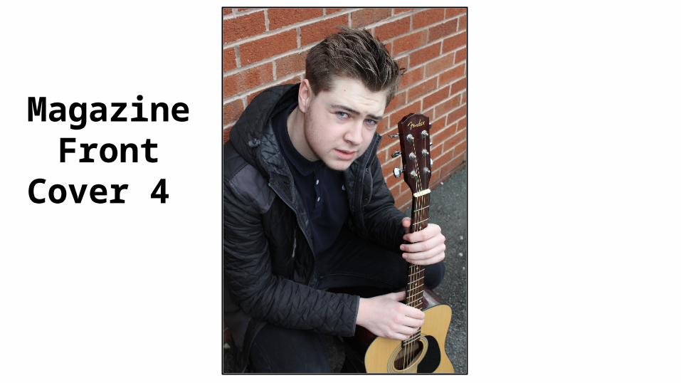
Evaluation of Front Cover 4When creating this cover my main intentions when taking the primary photograph was to have both the artist and his instrument included with equal focal importance to clearly signify the music genre of my magazine cover. I included a plan in bricked background to connote the grunge themes included in my magazine stylistics and take no attention away from my main focal image being the artist and his guitar. I also used the models direct mode of address to capture the attention of my target audience. I feel my final selected image fulfils all my expectations as it is simple yet effective in conveying information about the artist, and the high angle gives the audience a certain amount of power when receiving the image and the artist.
I believe the image is suitable for a teenage lifestyle magazine as it focuses on a relatable teen artist and the simplicity of the image with the artist dressed in his everyday clothes with only his guitar as a mise en scene prop provides a relatable character which will appeal to my target audience lifestyle and
normality, the image signifying the music industry at its most raw and basic.
Completed Magazine
Front Cover 4
Evaluation of Completed Front Cover 4
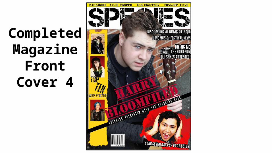
When crafting this front cover in photoshop I combined the rough and gritty stylistics of the text with equally relatable photos to create an overall theme of grunge and rock as my main inspiration for the design of this magazine is such music magazines as Kerrang and GQ. The meaning created through the font style and rough textures conveys the stereotypical rock conventions of disorder, anarchy and grunge music as the magazines rough design does not conform to any other music magazines neat and uniform layout which could be seen as defying against industry house styles established for magazines. I feel the look and tone of my magazine is appropriate for my chosen teen target audience as it reaches them on a more realistic level as the shot mise en scene is not the expensive product of the music industry conventional style and the artist is also relatable, seen as normal due to his dress and plan mise en scene. This final cover image fulfils all my intentions for a music magazine as it conveys themes and personality aspects of the model well and related to my target audience through an undertone of realism.