Embed Size (px)
Citation preview
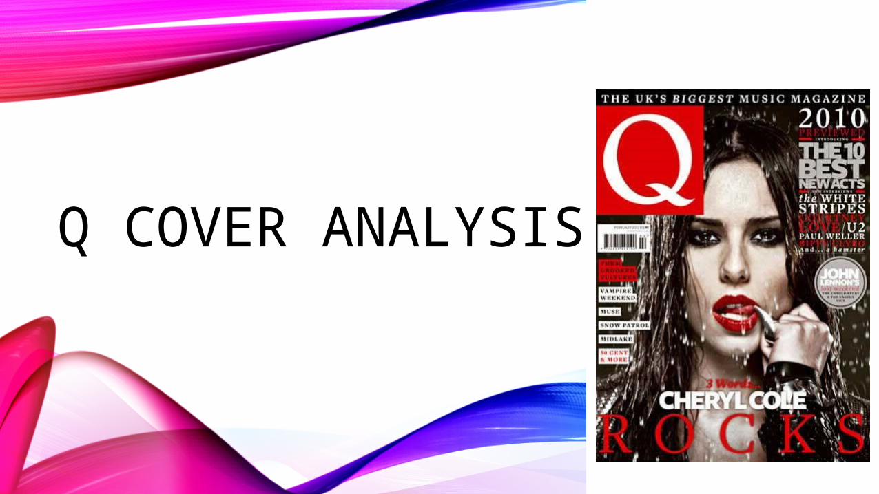
Q COVER ANALYSIS
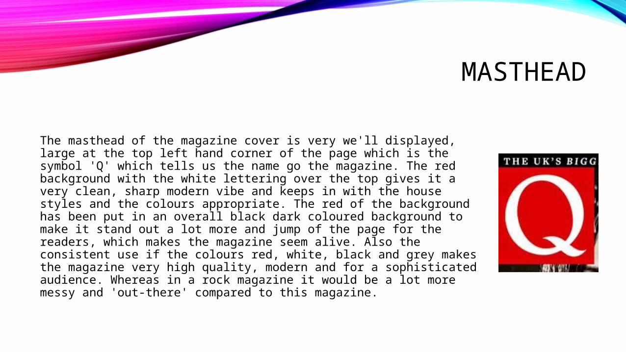
MASTHEAD
The masthead of the magazine cover is very we'll displayed, large at the top left hand corner of the page which is the symbol 'Q' which tells us the name go the magazine. The red background with the white lettering over the top gives it a very clean, sharp modern vibe and keeps in with the house styles and the colours appropriate. The red of the background has been put in an overall black dark coloured background to make it stand out a lot more and jump of the page for the readers, which makes the magazine seem alive. Also the consistent use if the colours red, white, black and grey makes the magazine very high quality, modern and for a sophisticated audience. Whereas in a rock magazine it would be a lot more messy and 'out-there' compared to this magazine.
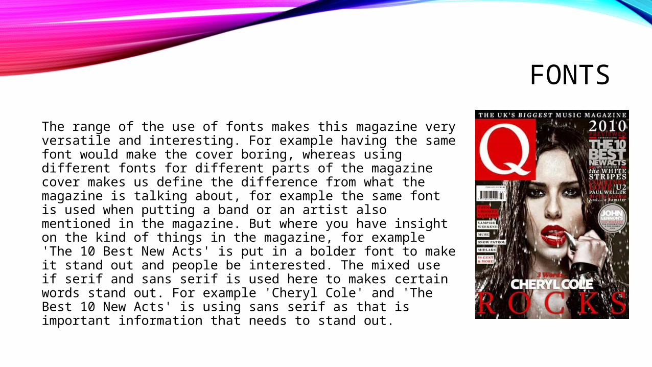
FONTS
The range of the use of fonts makes this magazine very versatile and interesting. For example having the same font would make the cover boring, whereas using different fonts for different parts of the magazine cover makes us define the difference from what the magazine is talking about, for example the same font is used when putting a band or an artist also mentioned in the magazine. But where you have insight on the kind of things in the magazine, for example 'The 10 Best New Acts' is put in a bolder font to make it stand out and people be interested. The mixed use if serif and sans serif is used here to makes certain words stand out. For example 'Cheryl Cole' and 'The Best 10 New Acts' is using sans serif as that is important information that needs to stand out.
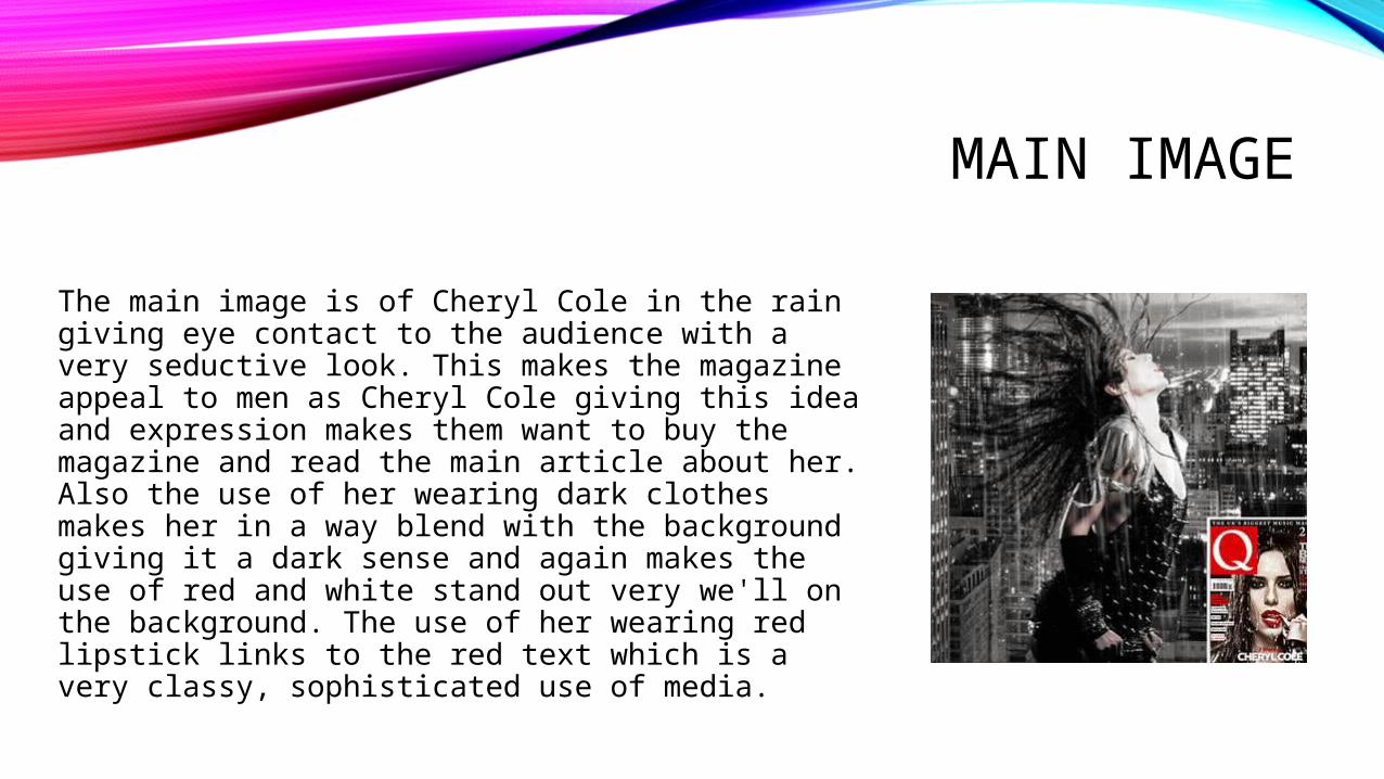
MAIN IMAGE
The main image is of Cheryl Cole in the rain giving eye contact to the audience with a very seductive look. This makes the magazine appeal to men as Cheryl Cole giving this idea and expression makes them want to buy the magazine and read the main article about her. Also the use of her wearing dark clothes makes her in a way blend with the background giving it a dark sense and again makes the use of red and white stand out very we'll on the background. The use of her wearing red lipstick links to the red text which is a very classy, sophisticated use of media.
HEADLINE, COVERLINES
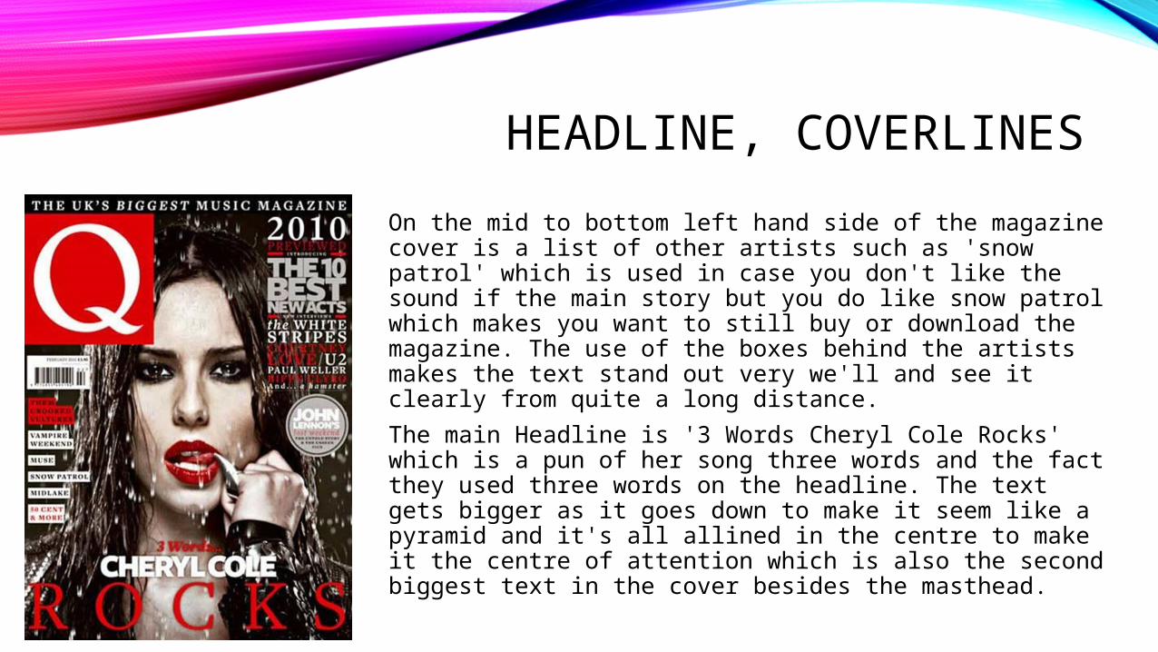
On the mid to bottom left hand side of the magazine cover is a list of other artists such as 'snow patrol' which is used in case you don't like the sound if the main story but you do like snow patrol which makes you want to still buy or download the magazine. The use of the boxes behind the artists makes the text stand out very we'll and see it clearly from quite a long distance.
The main Headline is '3 Words Cheryl Cole Rocks' which is a pun of her song three words and the fact they used three words on the headline. The text gets bigger as it goes down to make it seem like a pyramid and it's all allined in the centre to make it the centre of attention which is also the second biggest text in the cover besides the masthead.