Embed Size (px)
Citation preview
Step by Stop construction
Front Page
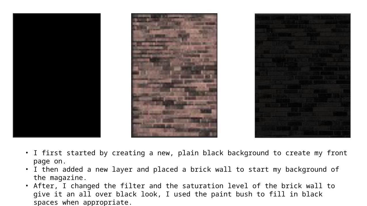
• I first started by creating a new, plain black background to create my front page on.• I then added a new layer and placed a brick wall to start my background of the magazine.• After, I changed the filter and the saturation level of the brick wall to give it an all over black look, I used the
paint bush to fill in black spaces when appropriate.
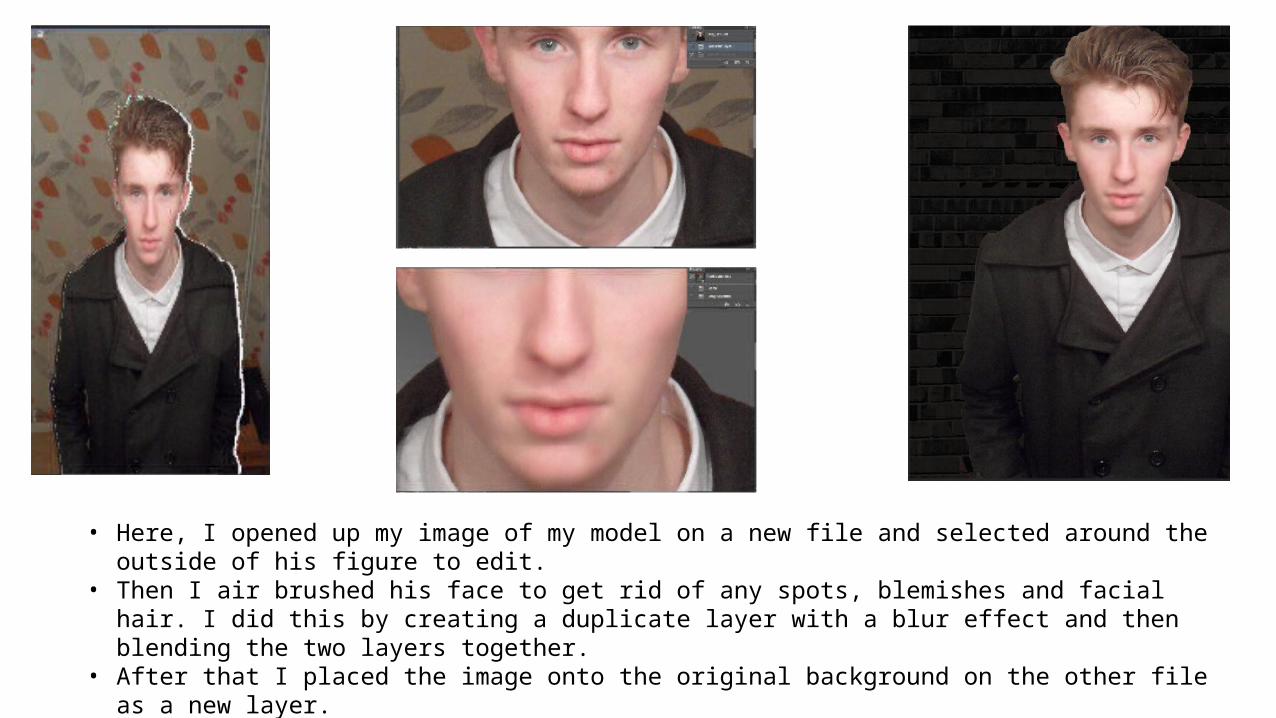
• Here, I opened up my image of my model on a new file and selected around the outside of his figure to edit.• Then I air brushed his face to get rid of any spots, blemishes and facial hair. I did this by creating a duplicate layer
with a blur effect and then blending the two layers together.• After that I placed the image onto the original background on the other file as a new layer.
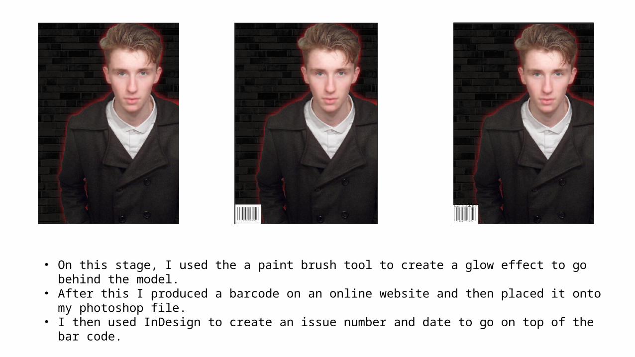
• On this stage, I used the a paint brush tool to create a glow effect to go behind the model.• After this I produced a barcode on an online website and then placed it onto my photoshop file.• I then used InDesign to create an issue number and date to go on top of the bar code.
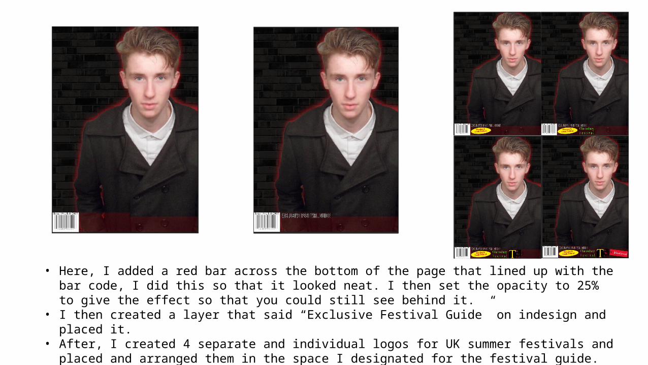
• Here, I added a red bar across the bottom of the page that lined up with the bar code, I did this so that it looked neat. I then set the opacity to 25% to give the effect so that you could still see behind it.
• I then created a layer that said “Exclusive Festival Guide” on indesign and placed it.• After, I created 4 separate and individual logos for UK summer festivals and placed and arranged them in the
space I designated for the festival guide.
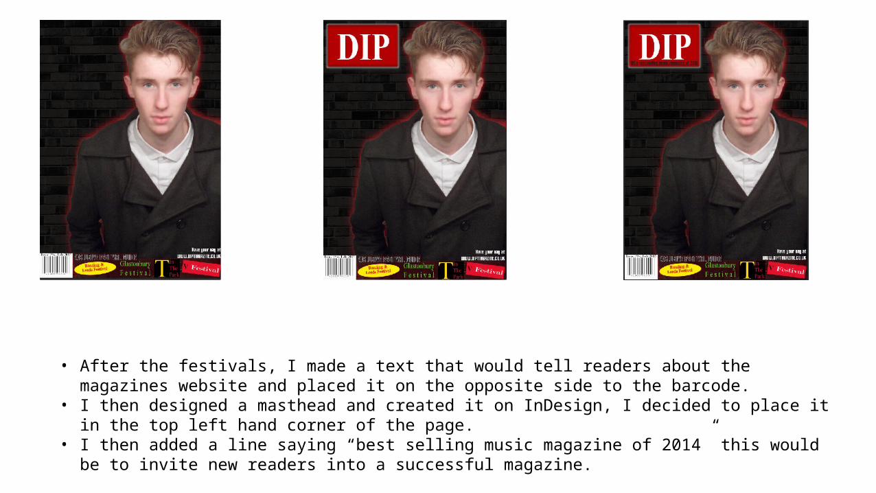
• After the festivals, I made a text that would tell readers about the magazines website and placed it on the opposite side to the barcode.
• I then designed a masthead and created it on InDesign, I decided to place it in the top left hand corner of the page.
• I then added a line saying “best selling music magazine of 2014” this would be to invite new readers into a successful magazine.
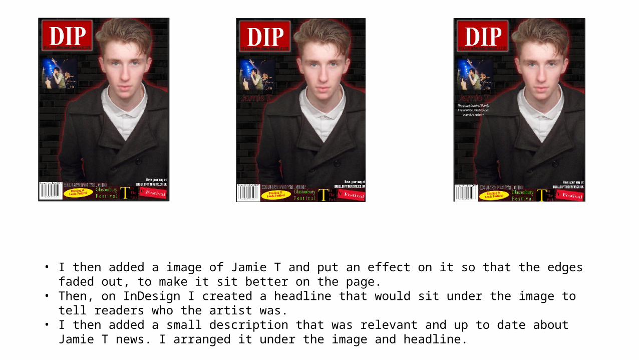
• I then added a image of Jamie T and put an effect on it so that the edges faded out, to make it sit better on the page.
• Then, on InDesign I created a headline that would sit under the image to tell readers who the artist was.• I then added a small description that was relevant and up to date about Jamie T news. I arranged it under the
image and headline.
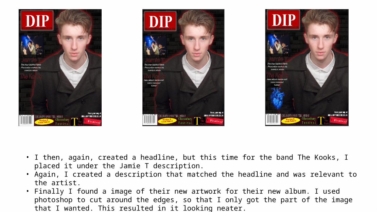
• I then, again, created a headline, but this time for the band The Kooks, I placed it under the Jamie T description.• Again, I created a description that matched the headline and was relevant to the artist.• Finally I found a image of their new artwork for their new album. I used photoshop to cut around the edges, so
that I only got the part of the image that I wanted. This resulted in it looking neater.
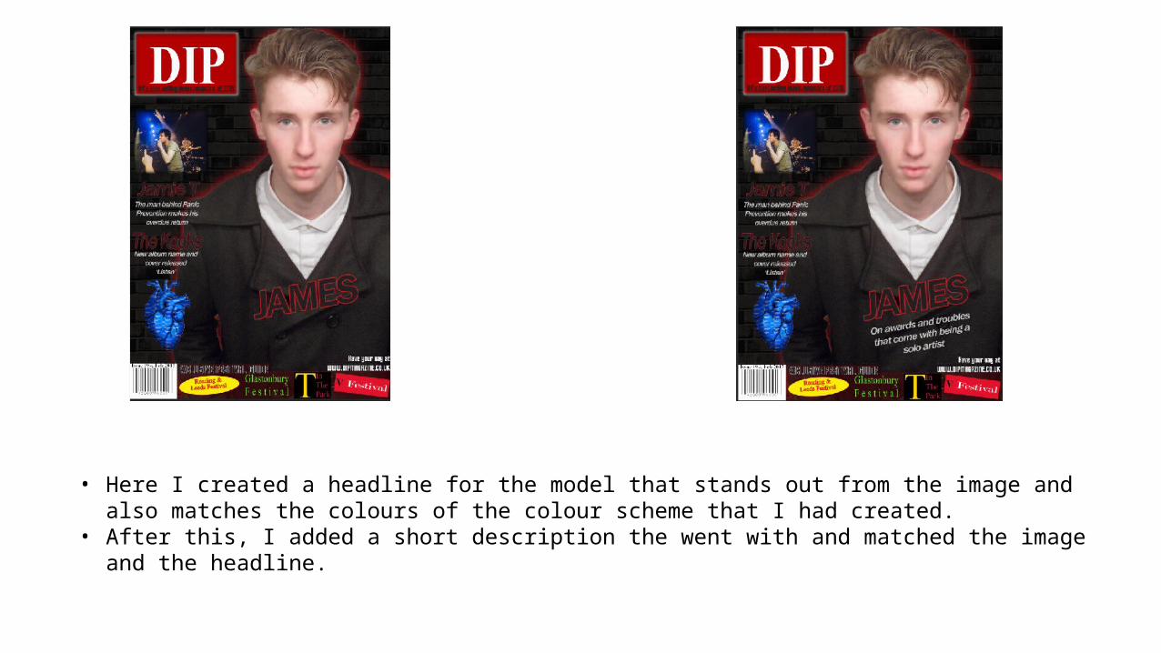
• Here I created a headline for the model that stands out from the image and also matches the colours of the colour scheme that I had created.
• After this, I added a short description the went with and matched the image and the headline.
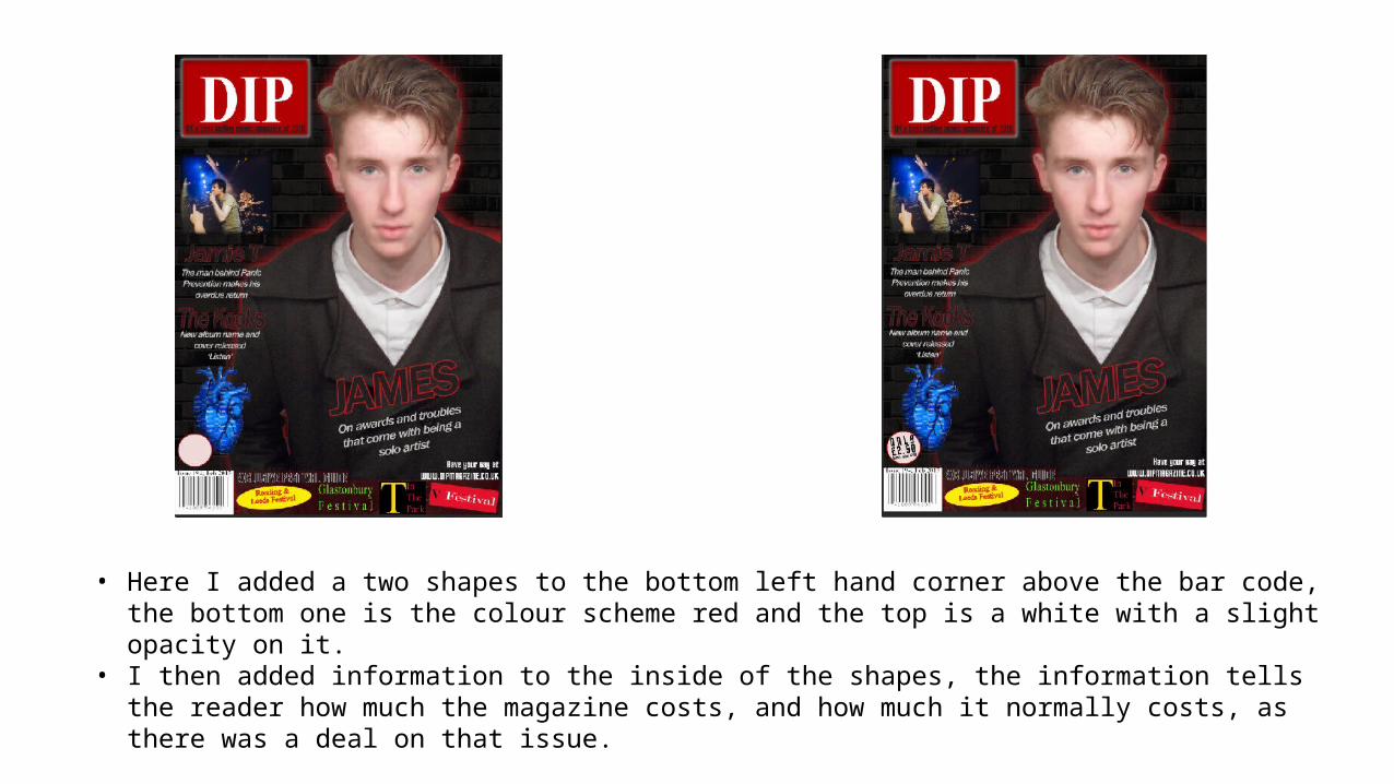
• Here I added a two shapes to the bottom left hand corner above the bar code, the bottom one is the colour scheme red and the top is a white with a slight opacity on it.
• I then added information to the inside of the shapes, the information tells the reader how much the magazine costs, and how much it normally costs, as there was a deal on that issue.
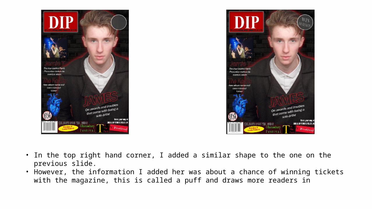
• In the top right hand corner, I added a similar shape to the one on the previous slide.• However, the information I added her was about a chance of winning tickets with the magazine, this is called a
puff and draws more readers in
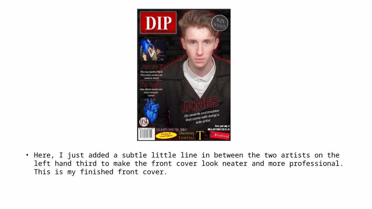
• Here, I just added a subtle little line in between the two artists on the left hand third to make the front cover look neater and more professional. This is my finished front cover.