Embed Size (px)
Citation preview
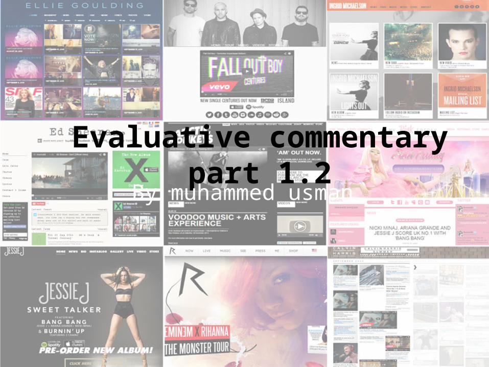
Evaluative commentary part 1.2By muhammed usman
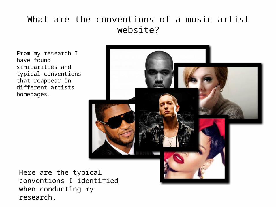
What are the conventions of a music artist website?
From my research I have found similarities and typical conventions that reappear in different artists homepages.
Here are the typical conventions I identified when conducting my research.
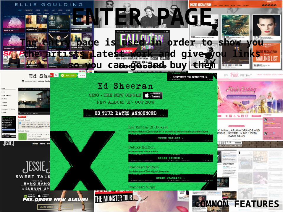
ENTER PAGEThe entry page is used in order to show you the artists
latest work and give you links so you can go and buy them
COMMON FEATURES
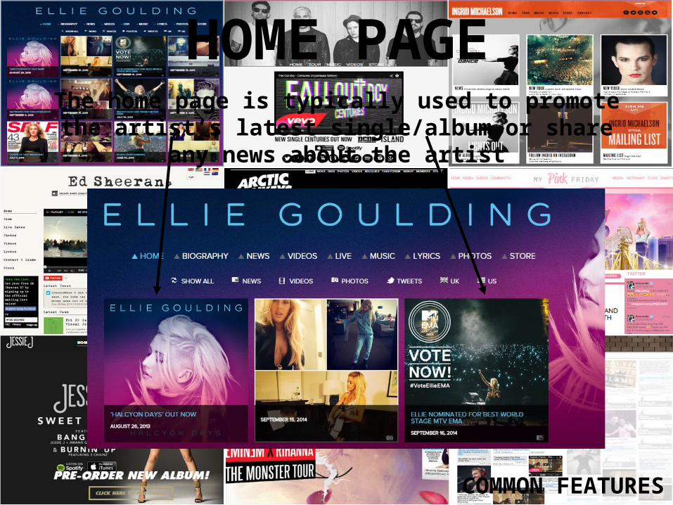
HOME PAGEThe home page is typically used to promote the artist’s latest single/album or share any news about the artist
COMMON FEATURES
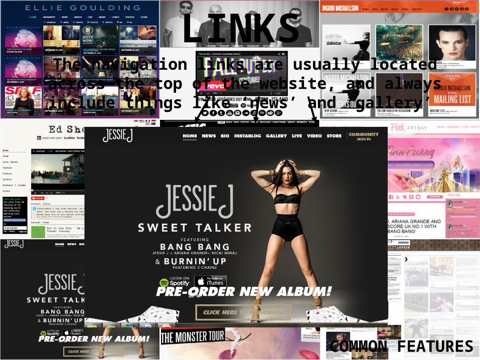
LINKSThe navigation links are usually located across the top of the website, and always include things like ‘news’ and ‘gallery’
COMMON FEATURES
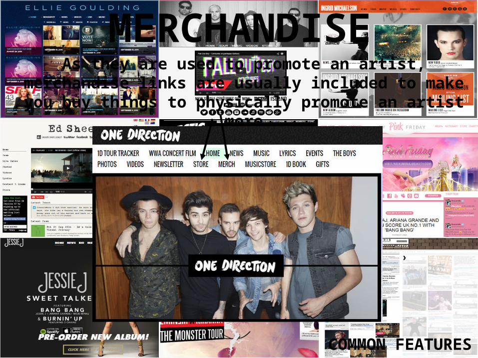
MERCHANDISEAs they are used to promote an artist, merchandise links are
usually included to make you buy things to physically promote an artist more
COMMON FEATURES
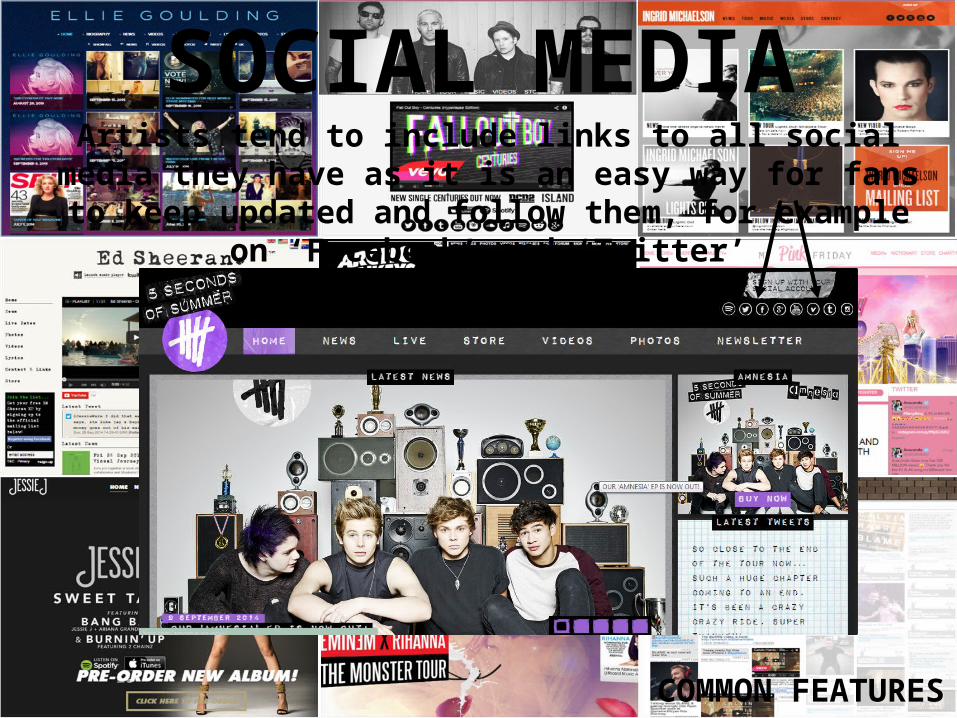
SOCIAL MEDIAArtists tend to include links to all social media they have as it is an easy way for fans to keep updated and follow them, for
example on ‘Facebook’ and ‘Twitter’
COMMON FEATURES
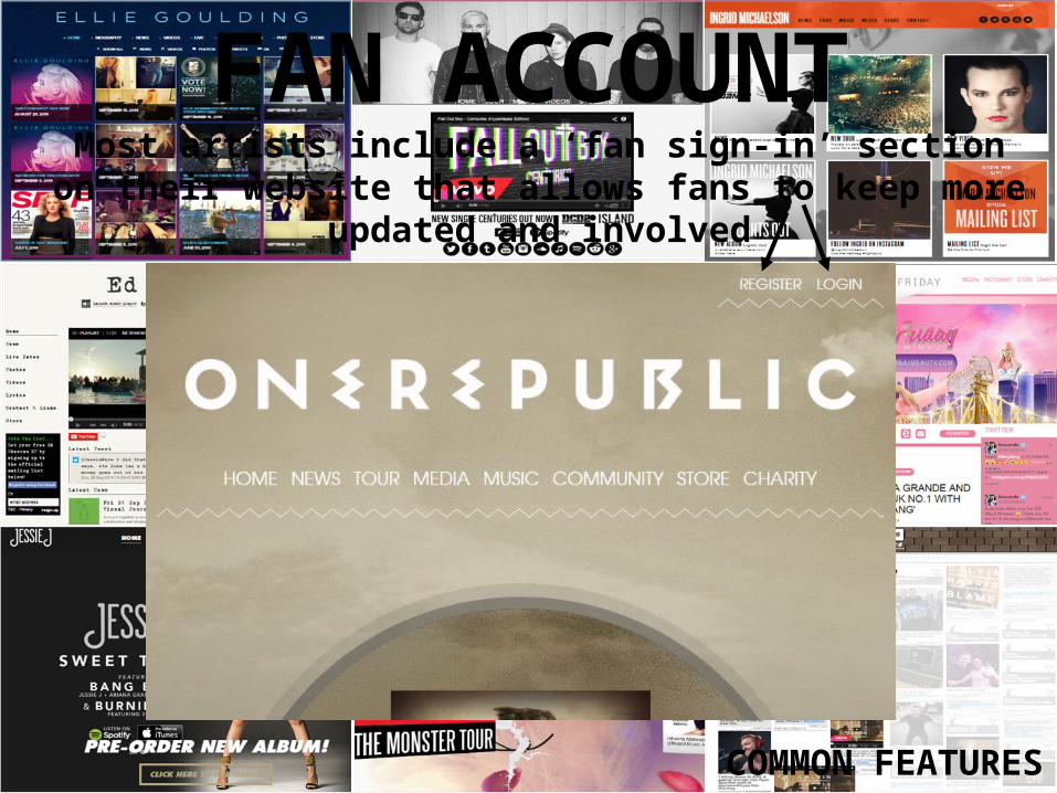
FAN ACCOUNTMost artists include a ‘fan sign-in’ section on their website
that allows fans to keep more updated and involved
COMMON FEATURES
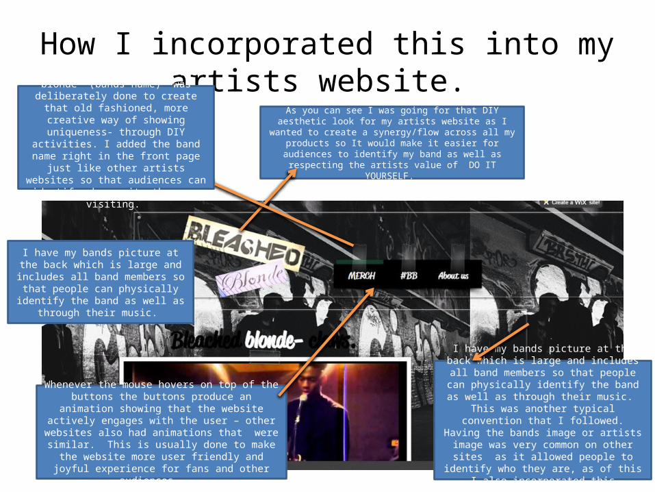
How I incorporated this into my artists website. As you can see I was going for that DIY aesthetic look for my artists website as I wanted to create a synergy/flow across all my products so It would make it easier for audiences to identify my band as well
as respecting the artists value of DO IT YOURSELF.
The paper cut title “bleached blonde” (bands name) was deliberately done to
create that old fashioned, more creative way of showing uniqueness- through DIY
activities. I added the band name right in the front page just like other artists websites so that audiences can identify whose site they
are visiting.
I have my bands picture at the back which is large and includes all band members so that people
can physically identify the band as well as through their music. This was another typical convention that I followed. Having the bands image or artists
image was very common on other sites as it allowed people to identify who they are, as of this I also incorporated this convention into my
website.
I have my bands picture at the back which is large and includes all band members so
that people can physically identify the band as well as through their music.
Whenever the mouse hovers on top of the buttons the buttons produce an animation showing that the website actively engages with the user – other websites also had
animations that were similar. This is usually done to make the website more user friendly and joyful
experience for fans and other audiences.
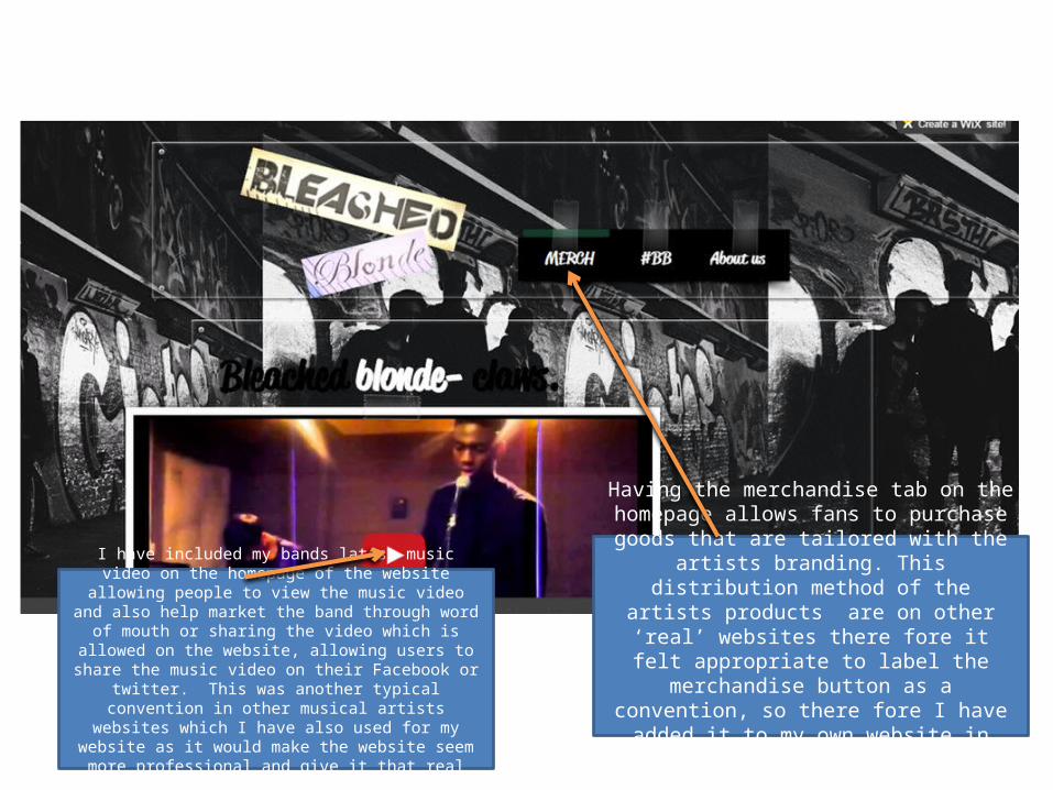
I have included my bands latest music video on the homepage of the website allowing people to view the music video and
also help market the band through word of mouth or sharing the video which is allowed on the website, allowing users to share the music video on their Facebook or twitter. This was another typical convention in other musical artists websites which I have also used for my website as it would make the
website seem more professional and give it that real feeling.
Having the merchandise tab on the homepage allows fans to purchase goods that are tailored
with the artists branding. This distribution method of the artists products are on other ‘real’ websites there fore it felt appropriate to label the
merchandise button as a convention, so there fore I have added it to my own website in hopes
of making it a more typical website.
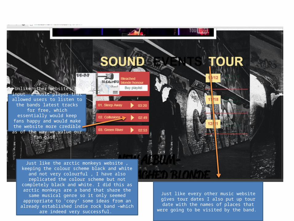
Just like the arctic monkeys website , keeping the colour scheme black and white and not very colourful , I have also replicated the colour scheme but not completely black and white. I did this as arctic monkeys are a band that share the same musical genre so it only seemed appropriate to ‘copy’ some ideas from an already established indie rock band –
which are indeed very successful.
Just like every other music website gives tour dates I also put up tour date with the names of places that
were going to be visited by the band.
Unlike other websites I input a music player that allowed users to listen to
the bands latest tracks for free, which essentially would keep fans happy and would make the website more credible as of the way we value our fan base.
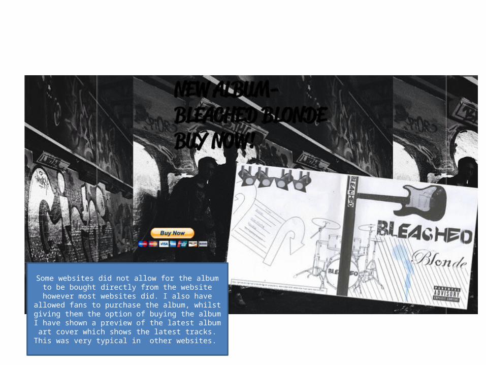
Some websites did not allow for the album to be bought directly from the website however most websites did. I also have allowed fans to purchase the album, whilst giving them
the option of buying the album I have shown a preview of the latest album art cover which shows the latest tracks. This was
very typical in other websites.
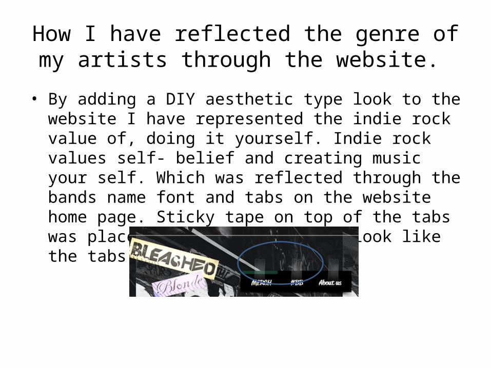
How I have reflected the genre of my artists through the website.
• By adding a DIY aesthetic type look to the website I have represented the indie rock value of, doing it yourself. Indie rock values self- belief and creating music your self. Which was reflected through the bands name font and tabs on the website home page. Sticky tape on top of the tabs was placed to make the website look like the tabs had been stuck on.

By keeping the artists image in the background and their music video and products in front I have reflected the genre of indie rock and their value of
“music is more unique than the artists image”. By not focusing on the artists image and having them not on the centre of the screen (but having
products in the centre) attracts the audiences attention away from the artist and on to the products, this helps reinforcing the indie rock value of
music is should be the artists recognition and not their image.