Embed Size (px)
Citation preview
Music magazine analysis
Headline/ Splash:The position of the headline is centred and just below the faces of the people on the cover. This draws attention to both the cover photo and the headline. Furthermore, the lip colour of the female is the same as the colour of the title of their band name in the headline further linking them and creating some fluency. The choice of all the people in the cover wearing black contrasts with the females hair and lips making her stand out and become more eye-catching.
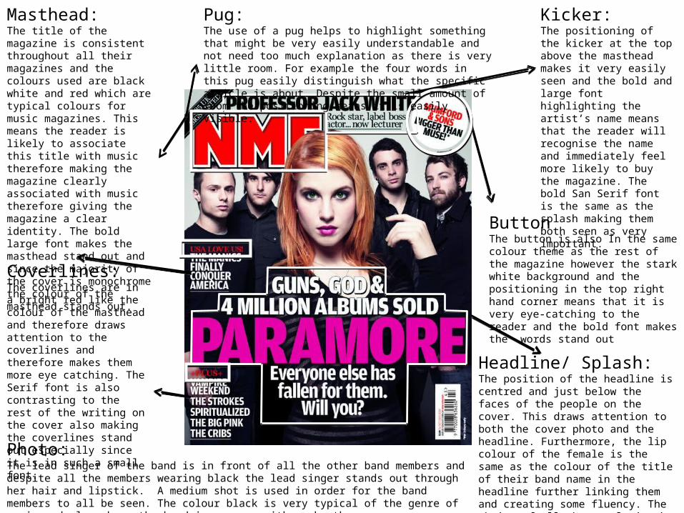
Masthead:The title of the magazine is consistent throughout all their magazines and the colours used are black white and red which are typical colours for music magazines. This means the reader is likely to associate this title with music therefore making the magazine clearly associated with music therefore giving the magazine a clear identity. The bold large font makes the masthead stand out and since the majority of the cover is monochrome the colour of the masthead stands out.
Coverlines:The coverlines are in a bright red like the colour of the masthead and therefore draws attention to the coverlines and therefore makes them more eye catching. The Serif font is also contrasting to the rest of the writing on the cover also making the coverlines stand out especially since it is in such a small font.
Kicker:The positioning of the kicker at the top above the masthead makes it very easily seen and the bold and large font highlighting the artist’s name means that the reader will recognise the name and immediately feel more likely to buy the magazine. The bold San Serif font is the same as the splash making them both seen as very important.
ButtonThe button is also In the same colour theme as the rest of the magazine however the stark white background and the positioning in the top right hand corner means that it is very eye-catching to the reader and the bold font makes the words stand out
Pug:The use of a pug helps to highlight something that might be very easily understandable and not need too much explanation as there is very little room. For example the four words in this pug easily distinguish what the specific article is about. Despite the small amount of room the positioning means it is easily visible.
Photo:The lead singer of the band is in front of all the other band members and despite all the members wearing black the lead singer stands out through her hair and lipstick. A medium shot is used in order for the band members to all be seen. The colour black is very typical of the genre of music and also shows the band in synergy with each other.
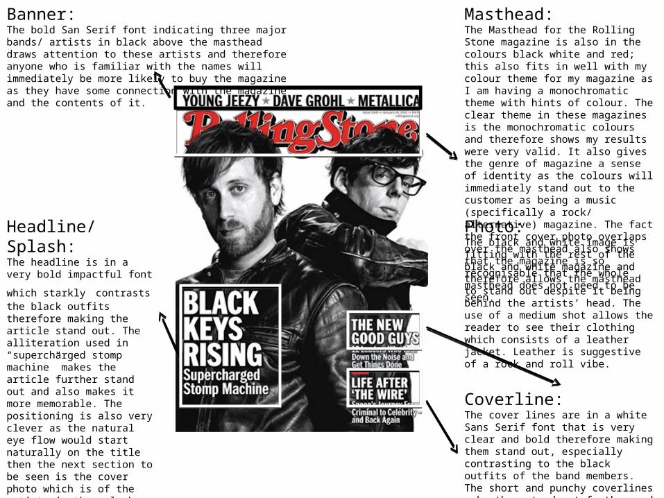
Banner:The bold San Serif font indicating three major bands/ artists in black above the masthead draws attention to these artists and therefore anyone who is familiar with the names will immediately be more likely to buy the magazine as they have some connection with the magazine and the contents of it.
Coverline:The cover lines are in a white Sans Serif font that is very clear and bold therefore making them stand out, especially contrasting to the black outfits of the band members. The short and punchy coverlines make them stand out further and also makes them more memorable.
Masthead:The Masthead for the Rolling Stone magazine is also in the colours black white and red; this also fits in well with my colour theme for my magazine as I am having a monochromatic theme with hints of colour. The clear theme in these magazines is the monochromatic colours and therefore shows my results were very valid. It also gives the genre of magazine a sense of identity as the colours will immediately stand out to the customer as being a music (specifically a rock/ alternative) magazine. The fact the front cover photo overlaps over the masthead also shows that the magazine is so recognisable that the whole masthead does not need to be seen.
Headline/ Splash:The headline is in a very bold
impactful font which starkly contrasts the black outfits therefore making the article stand out. The alliteration used in “supercharged stomp machine” makes the article further stand out and also makes it more memorable. The positioning is also very clever as the natural eye flow would start naturally on the title then the next section to be seen is the cover photo which is of the artists in the splash then the words “Black Keys Rising” would be seen, therefore meaning this is the first headline the reader will see and fans of this band will be enticed to read and buy the magazine.
Photo:The black and white image is fitting with the rest of the black and white magazine and therefore allows the masthead to stand out despite it being behind the artists’ head. The use of a medium shot allows the reader to see their clothing which consists of a leather jacket. Leather is suggestive of a rock and roll vibe.
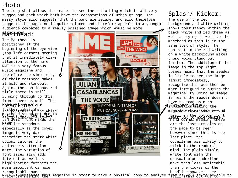
Masthead:The Masthead is positioned at the beginning of the eye view (top left corner) meaning that it immediately draws attention to the name. NME is a very famous music magazine and therefore the simplicity of their masthead makes it bold and standout. Again, the continuous red title theme is still running through to this front cover as well. The bold pop of colour further makes the masthead stand out due to the monochrome front page.
Splash/ Kicker: The use of the red background and white writing shows consistency within the black white and red theme as well as tying it well to the masthead as this is in the same sort of style. The contrast to the red writing on a white background makes these words stand out further. The addition of the image in the top right corner means that the reader is likely to see the image almost immediately, recognise the face then be more intrigued in buying the magazine. By using an image is means the reader doesn’t have to read as much information making the magazine cover simpler and reach out
to more people.
Headline:The contrast of the white outline with the simple san Serif font makes the headline standout especially as the cover image is very dark therefore the stark white colour catches the audience’s attention more. The variation of font sizes also adds interest as well as highlighting furthers the more important or more recognisable names therefore meaning the reader will be able to establish the artists and be more likely to buy the magazine.
Coverline:The coverlines are very small in the bottom right hand corner meaning these are the last articles on the page to be seen however since this is the last place, the coverlines are likely to stick in the readers mind. The plain simple white font with the unusual blue underline make them less noticeable than the kicker or the headline however they still stand out due to the additional blue underline which is not typical of the magazine.
NOTE: I purchased this magazine in order to have a physical copy to analyse from as well as to be able to analyse the contents of the magazine.
Photo:The long shot allows the reader to see their clothing which is all very rugged and dark which both have the connotations of urban grunge. The messy style also suggests that the band are relaxed and also therefore suggests the magazine is quite relaxed and therefore appeals to a younger audience compared to a really polished image which would be more structured.


