Embed Size (px)
Citation preview
The 8 most common mistakes in graph visualizations.
SAS founded in 2013 in Paris | http://linkurio.us | @linkurious
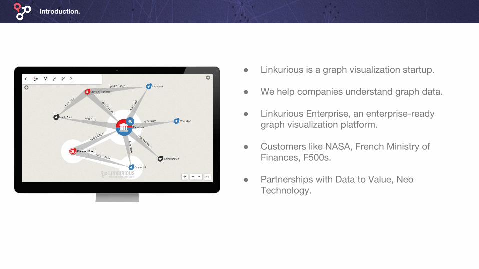
Introduction.
● Linkurious is a graph visualization startup.
● We help companies understand graph data.
● Linkurious Enterprise, an enterprise-ready graph visualization platform.
● Customers like NASA, French Ministry of Finances, F500s.
● Partnerships with Data to Value, Neo Technology.
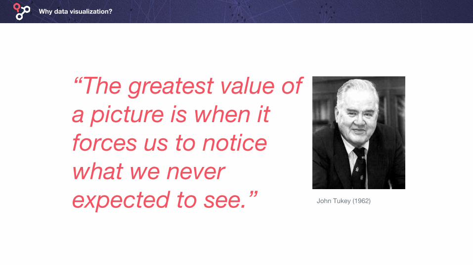
Why data visualization?
“The greatest value of a picture is when it forces us to notice what we never expected to see.” John Tukey (1962)
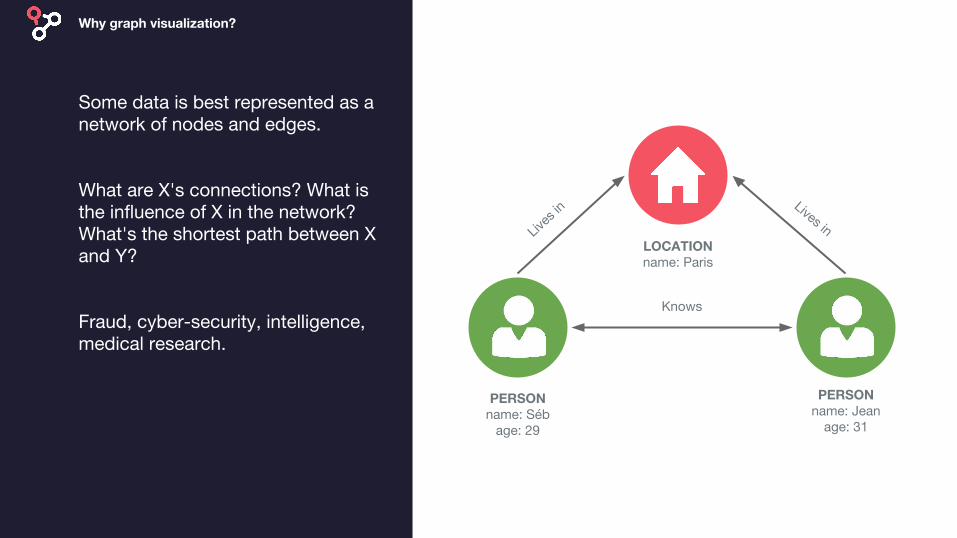
Some data is best represented as a network of nodes and edges.
What are X's connections? What is the influence of X in the network? What's the shortest path between X and Y?
Fraud, cyber-security, intelligence, medical research.
Why graph visualization?
PERSONname: Séb
age: 29
PERSONname: Jean
age: 31
LOCATIONname: Paris
Lives
inLives in
Knows
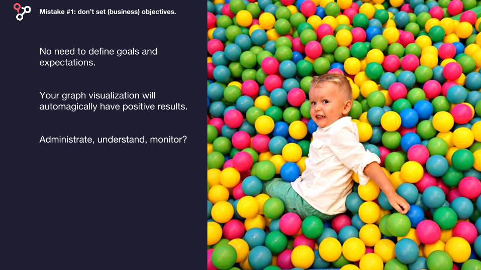
No need to define goals and expectations.
Your graph visualization will automagically have positive results.
Administrate, understand, monitor?
Mistake #1: don’t set (business) objectives.

Why understand your users, their challenges, their habits.
You know what is right, why ask other people?
Developers, data scientists, analysts, public?
Mistake #2: don’t consider your users.

You’re an artist and your graph visualizations need to entertain.
3D, colored backgrounds, fancy interactions.
Colors, sizes, glyphs, icons for nodes & colors and sizes for edges.
Mistake #3: treat it as an art project.
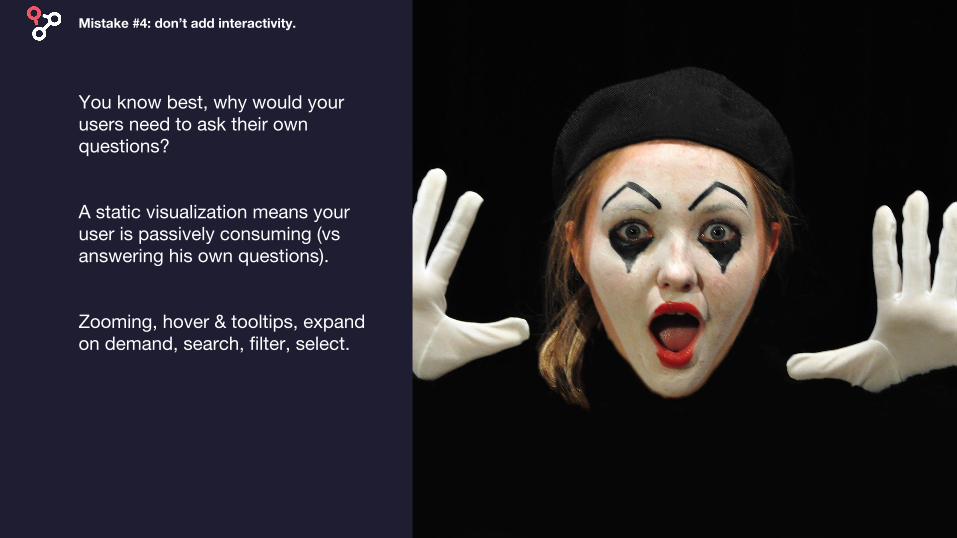
You know best, why would your users need to ask their own questions?
A static visualization means your user is passively consuming (vs answering his own questions).
Zooming, hover & tooltips, expand on demand, search, filter, select.
Mistake #4: don’t add interactivity.
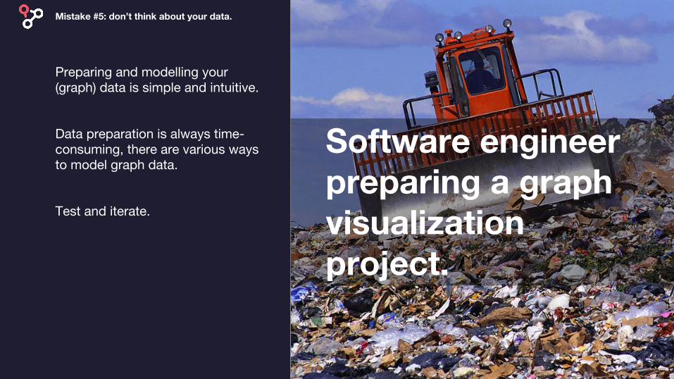
Preparing and modelling your (graph) data is simple and intuitive.
Data preparation is always time-consuming, there are various ways to model graph data.
Test and iterate.
Mistake #5: don’t think about your data.
Software engineer preparing a graph visualization project.

No need to provide guidance to interpret your graph visualization.
Help your users correctly interpret the information you provide.
Legend, labels, tooltips.
Mistake #6: let the user figure it out.
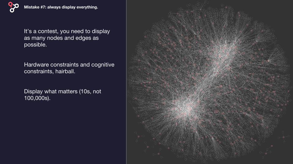
It’s a contest, you need to display as many nodes and edges as possible.
Hardware constraints and cognitive constraints, hairball.
Display what matters (10s, not 100,000s).
Mistake #7: always display everything.
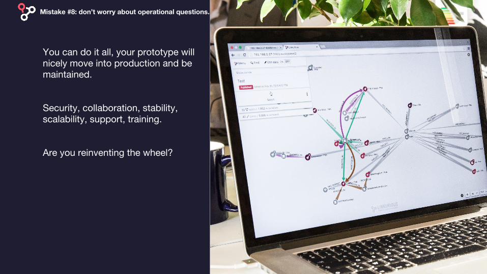
You can do it all, your prototype will nicely move into production and be maintained.
Security, collaboration, stability, scalability, support, training.
Are you reinventing the wheel?
Mistake #8: don’t worry about operational questions.
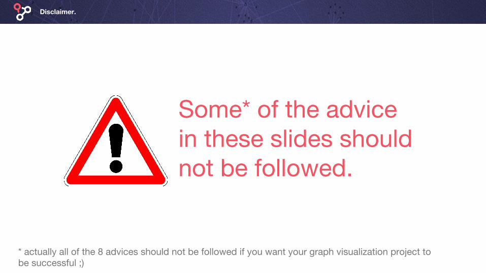
Disclaimer.
Some* of the advice in these slides should not be followed.
* actually all of the 8 advices should not be followed if you want your graph visualization project to be successful ;)
![Graph-assisted Visualization of Microvascular …2.2 Graph Visualization Previous surveys on graph visualization identify the key issues of clarity and viewability [16], which are](https://img.pdfslide.net/doc/110x75/5ec9ea9775dc0534da69c2d9/graph-assisted-visualization-of-microvascular-22-graph-visualization-previous-surveys.jpg)