Tools & Techniques for Practical Collection Assessment
Sarah TudescoAssessment Librarian
Presenter
Presentation Notes
Hello. Welcome to Visualizing Collections. Data Visualization is a big topic. My goal at this session is to establish a foundation. I will demonstrate chart basics – selecting the right visual for the data you’re trying to present. Then I will do a quick walk through of 2 great tools for exploring data – Excel and Tableau.
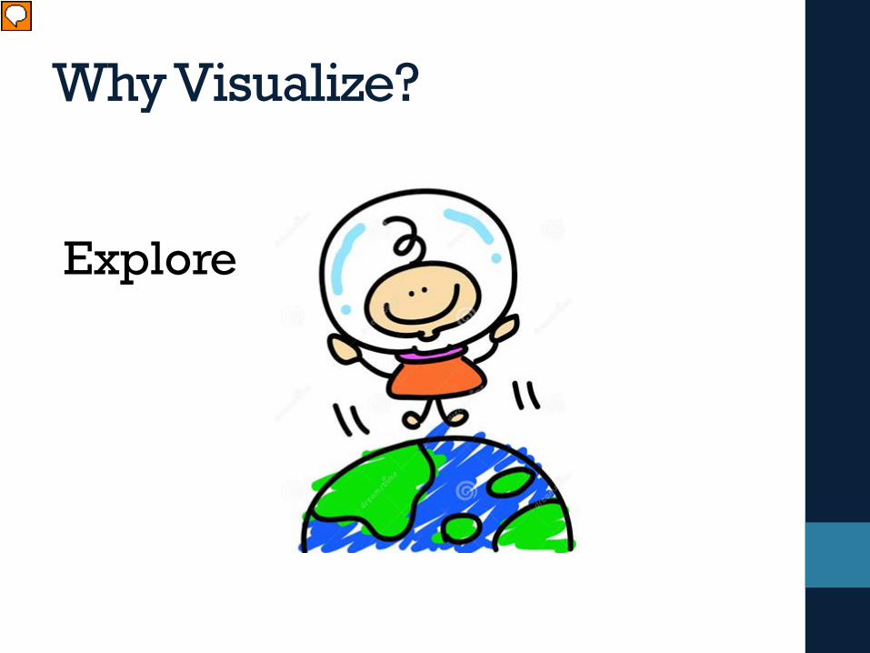
Why Visualize?
Explore
Presenter
Presentation Notes
There are two reasons to visualize data. To explore – find a story the data is telling you and….
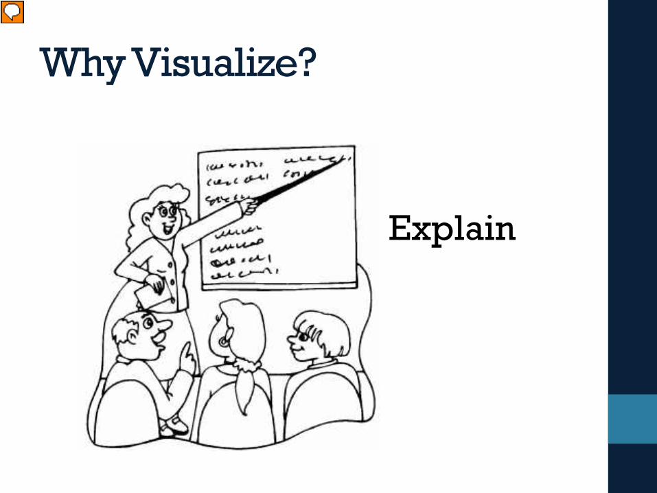
Why Visualize?
Explain
Presenter
Presentation Notes
Explain – tell a story to a specific audience What are you trying to say? The single most important step you can take to make a great visualization is to know what you’re trying to say. With the amount of data available today, anyone can get lost in a world of scatter plots and geocoding. It is vital that your visualization has a purpose and you are selective about what you include in your visualization to fulfill that purpose.
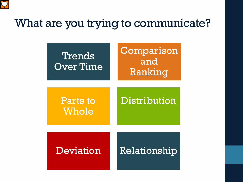
What are you trying to communicate?
Trends Over Time
Comparison and
Ranking
Parts to Whole
Distribution
Deviation Relationship
Presenter
Presentation Notes
To explain the trend over time To compare and rank To understand how parts relate to the whole To show the distribution To find out if there are deviations To understand the relationships I’m going to show you some charts to represent these concepts
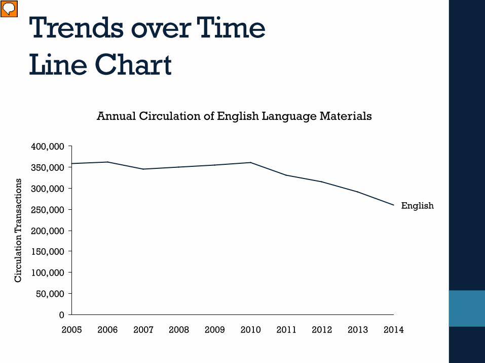
Trends over TimeLine Chart
0
50,000
100,000
150,000
200,000
250,000
300,000
350,000
400,000
2007 2008 2009 201020062005 20122011 2013
English
Cir
cula
tion
Tran
sact
ions
2014
Annual Circulation of English Language Materials
Presenter
Presentation Notes
Trend over time You want to understand what happens over time to a variable. In this example, the line shows you the total circulation of English language materials for the past ten years. Line charts are a good choice for visualizing time series
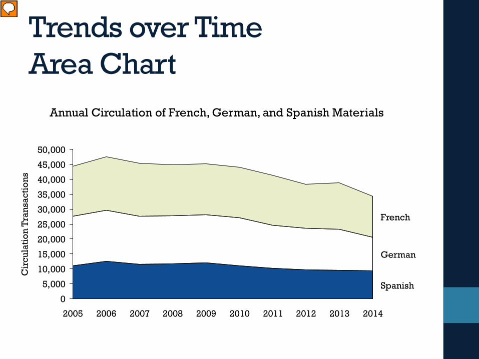
Trends over TimeArea Chart
Annual Circulation of French, German, and Spanish Materials
0
5,000
10,000
15,000
20,000
25,000
30,000
35,000
40,000
45,000
50,000
Cir
cula
tion
Tran
sact
ions
2005 2006 2007 2008
German
French
2009 2010 20122011 20142013
Spanish
Presenter
Presentation Notes
Area charts can also show time series. This type of chart is good for comparing values over time.
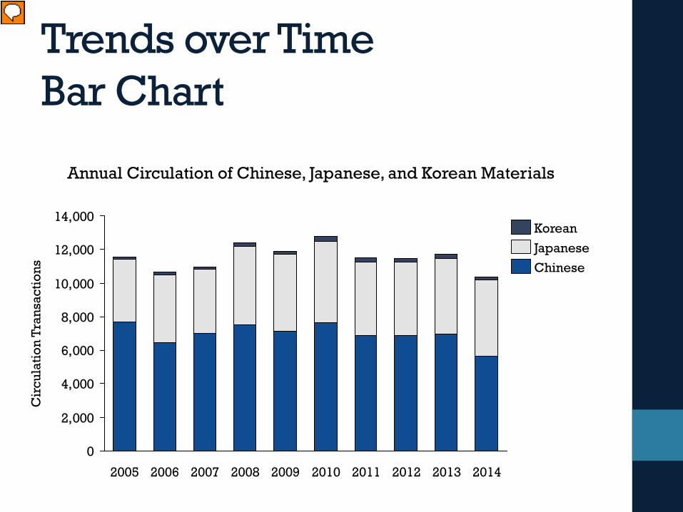
Trends over TimeBar Chart
Annual Circulation of Chinese, Japanese, and Korean Materials
0
2,000
4,000
6,000
8,000
10,000
12,000
14,000
200820062005 2007 20112010 20142009
Cir
cula
tion
Tran
sact
ions
20132012
Korean
ChineseJapanese
Presenter
Presentation Notes
Bar charts are another good format for communicating time series data. Whatever you choose, you should you should try to put time on the X-axis and the measure on the Y-axis; that will help your view cater to our cultural conventions on trending.
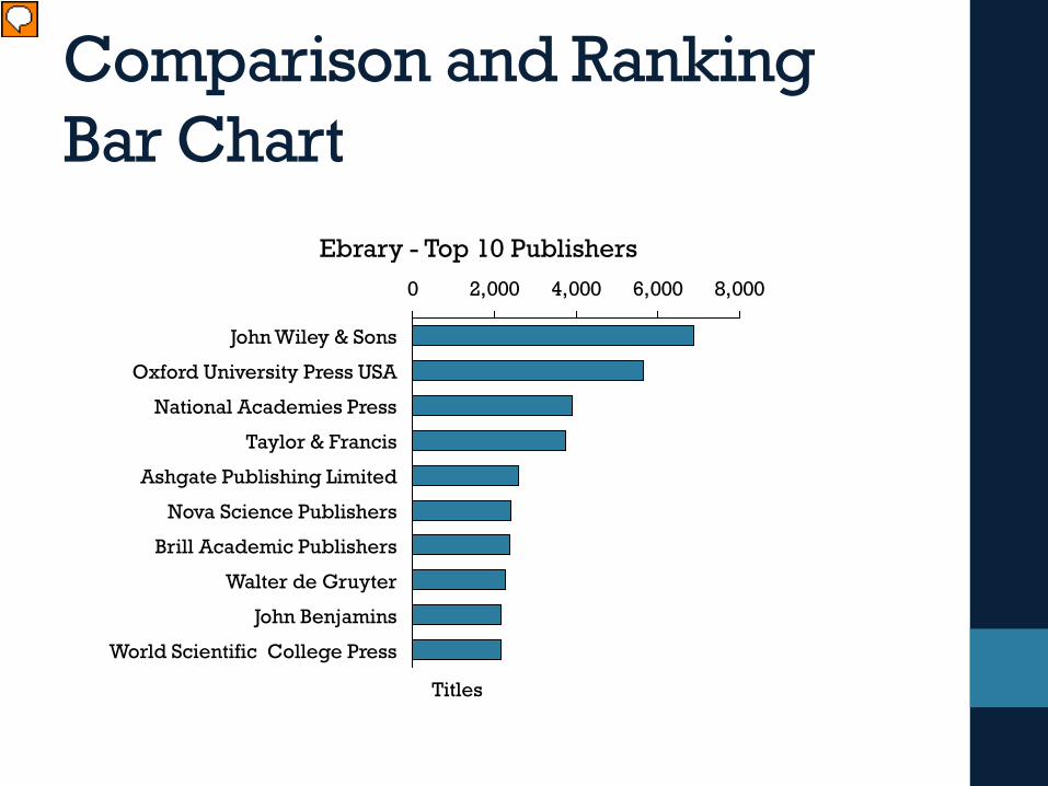
Comparison and RankingBar Chart
0 2,000 4,000 6,000 8,000
John Wiley & Sons
Walter de Gruyter
John Benjamins
World Scientific College Press
Oxford University Press USA
National Academies Press
Titles
Taylor & Francis
Ashgate Publishing Limited
Nova Science Publishers
Brill Academic Publishers
Ebrary - Top 10 Publishers
Presenter
Presentation Notes
Another method for analyzing data is comparison and ranking. This helps shows us where we are and how we are doing. A bar chart is great for comparison and ranking because it encodes quantitative values as length on the same baseline, making it extremely easy to compare values. This example shows the total top publishers represented in Ebrary. You get a sense of the number of titles held by the publisher and it’s ranking compared to the one above and below.
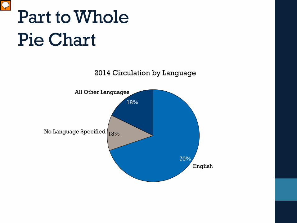
Part to WholePie Chart
English70%
No Language Specified 13%
18%
All Other Languages
2014 Circulation by Language
Presenter
Presentation Notes
There are occasions when you want to do a part-to-whole analysis. Although pie charts are commonly used in this type of situation, many visualization experts recommend staying away from pie charts. The human visual system is not very good at estimating area, You can only compare slices that are right next to each other. This chart – with only 3 values – isn’t so bad. But if you have more than 3 – the slices can become more difficult to discern.
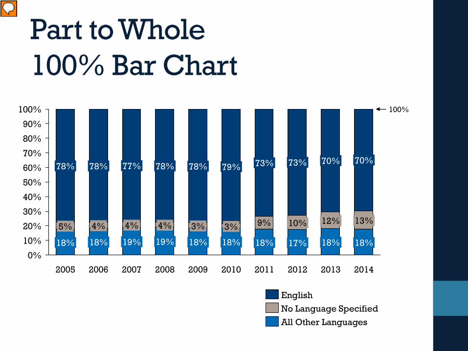
Part to Whole100% Bar Chart
9%
0%
10%
20%
30%
40%
50%
60%
70%
80%
90%
100%
77%
2006
78%
2007
4%
19%18%
73%
2010
18%
2011
18%
3%
17%
10% 12%
70%
2012
70%73%
18%
2014
18%
13%
2013
100%
78% 78%
18%
5%
2005
4%
19%
2009
4% 3%
18%
79%78%
2008
All Other LanguagesNo Language SpecifiedEnglish
Presenter
Presentation Notes
A better way to show parts to whole comparisons is a 100% bar chart. In this chart – There are 3 values we’re comparing. My goal is to show that most of the material that circulates from our library is English language material. And I wanted to see if that percentage changed over time. With a 100% bar chart – you’re eye is drawn to the percentage. It draws your eye to that comparison – I don’t care how many items circulated in 2006 vs 2010. I care about the English percentage of that total.
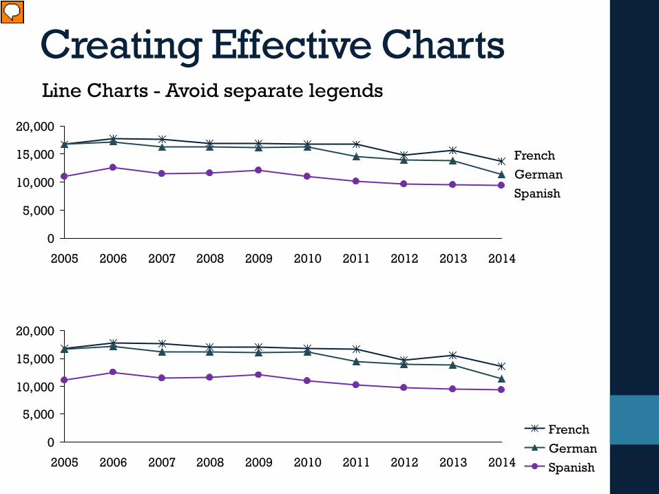
Creating Effective ChartsLine Charts - Avoid separate legends
Line Charts – Avoid separate legends. I’m sure we’ve all seen line charts with lots of values and colors. Experts recommend keeping the legends with the lines.
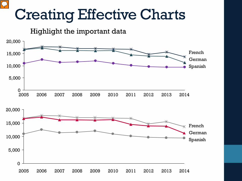
Creating Effective ChartsHighlight the important data
0
5,000
10,000
15,000
20,000
2012 2014
French
20112006
Spanish
20132005 2007 2008 2009 2010
German
0
5,000
10,000
15,000
20,000
2012 2014
French
20112006
Spanish
20132005 2007 2008 2009 2010
German
Presenter
Presentation Notes
Highlight important data. In this example – I want to talk about circulation of German materials compared to other romance languages.
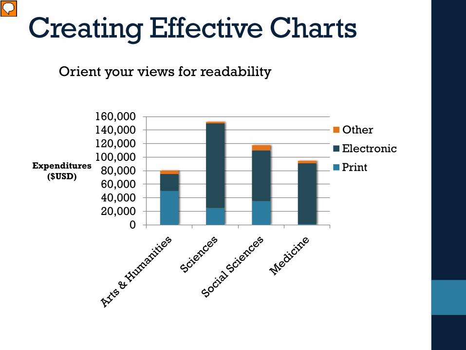
Creating Effective ChartsOrient your views for readability
020,00040,00060,00080,000
100,000120,000140,000160,000
Expenditures ($USD)
Other
Electronic
Print
Presenter
Presentation Notes
Orient your views for readability Sometimes, simple changes can go a very long way toward making your visualizations easy to interact with. Did you find it difficult to read? If so, that’s probably because all of the labels are vertically oriented. This makes them difficult to read. If you find yourself with a view that has long labels that only fit vertically, try rotating the view.
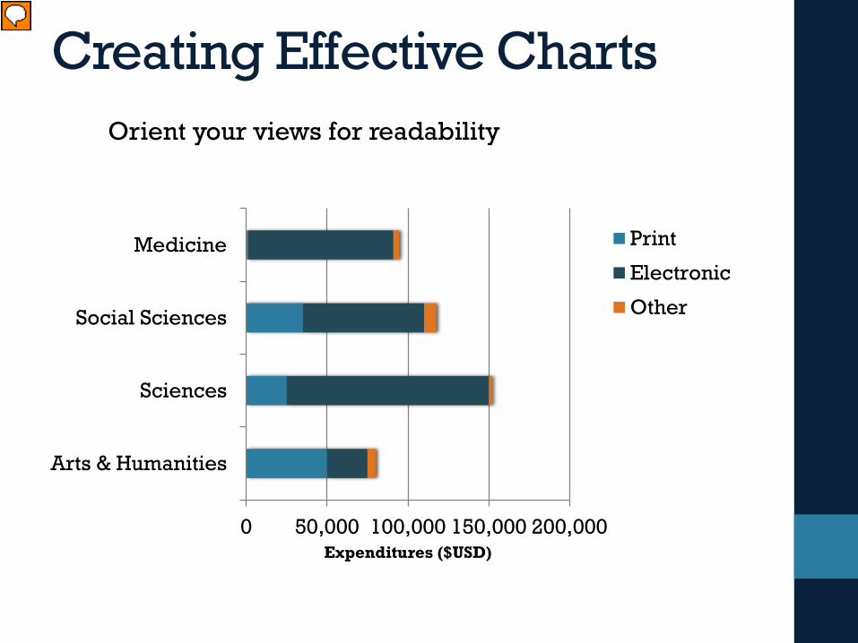
Creating Effective ChartsOrient your views for readability
0 50,000 100,000 150,000 200,000
Arts & Humanities
Sciences
Social Sciences
Medicine
Expenditures ($USD)
Print
Electronic
Other
Presenter
Presentation Notes
Simply moving to a horizontal bar chart makes this particular chart much easier to read.
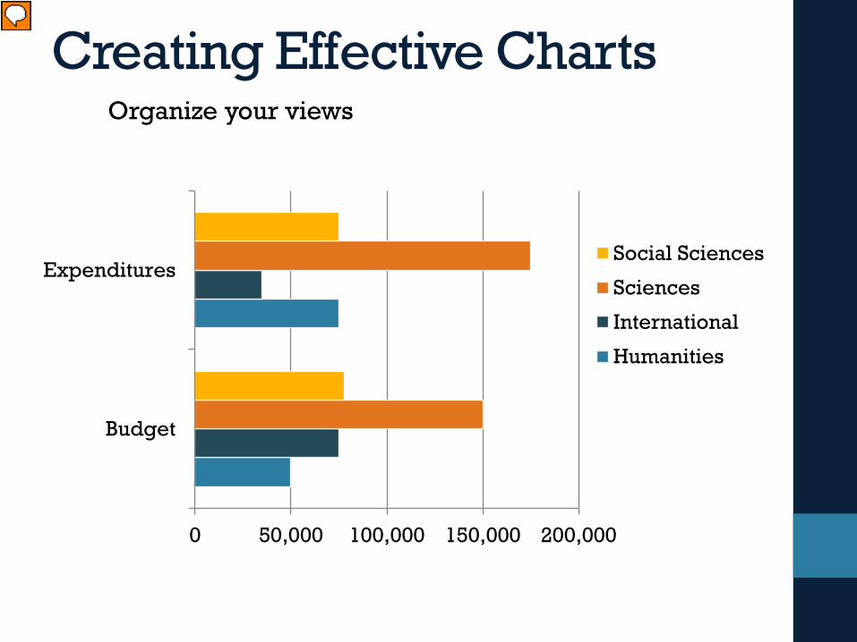
Creating Effective ChartsOrganize your views
0 50,000 100,000 150,000 200,000
Budget
ExpendituresSocial Sciences
Sciences
International
Humanities
Presenter
Presentation Notes
The organization of your data can impact your visualization. Sometimes the first version of the chart shows that the data may not be organized for comparison. In this example I want to compare the budget and the actual expenditures of different groups.
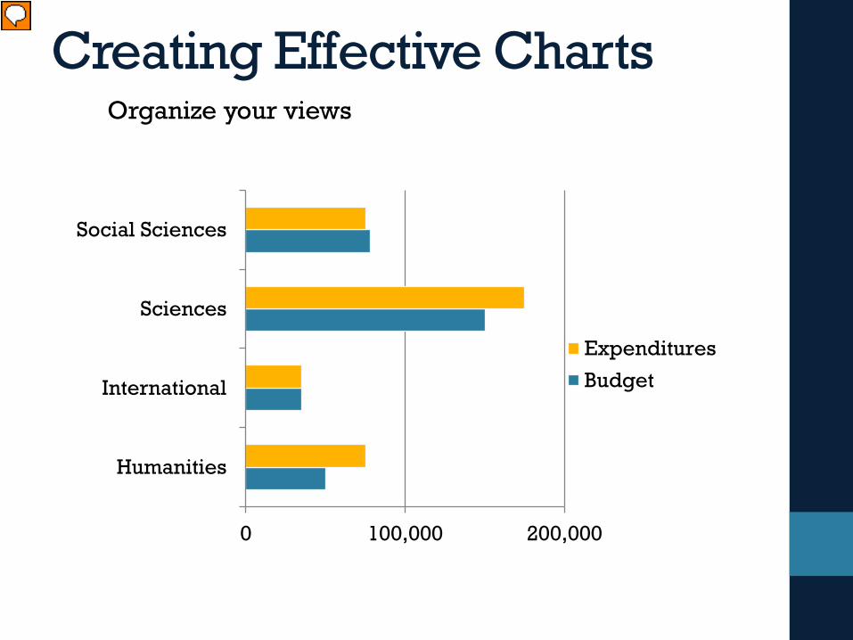
Creating Effective ChartsOrganize your views
0 100,000 200,000
Humanities
International
Sciences
Social Sciences
Expenditures
Budget
Presenter
Presentation Notes
In this view – you see the budget and expenditure bars right next to each other. It’s much easier to evaluate the different groups.
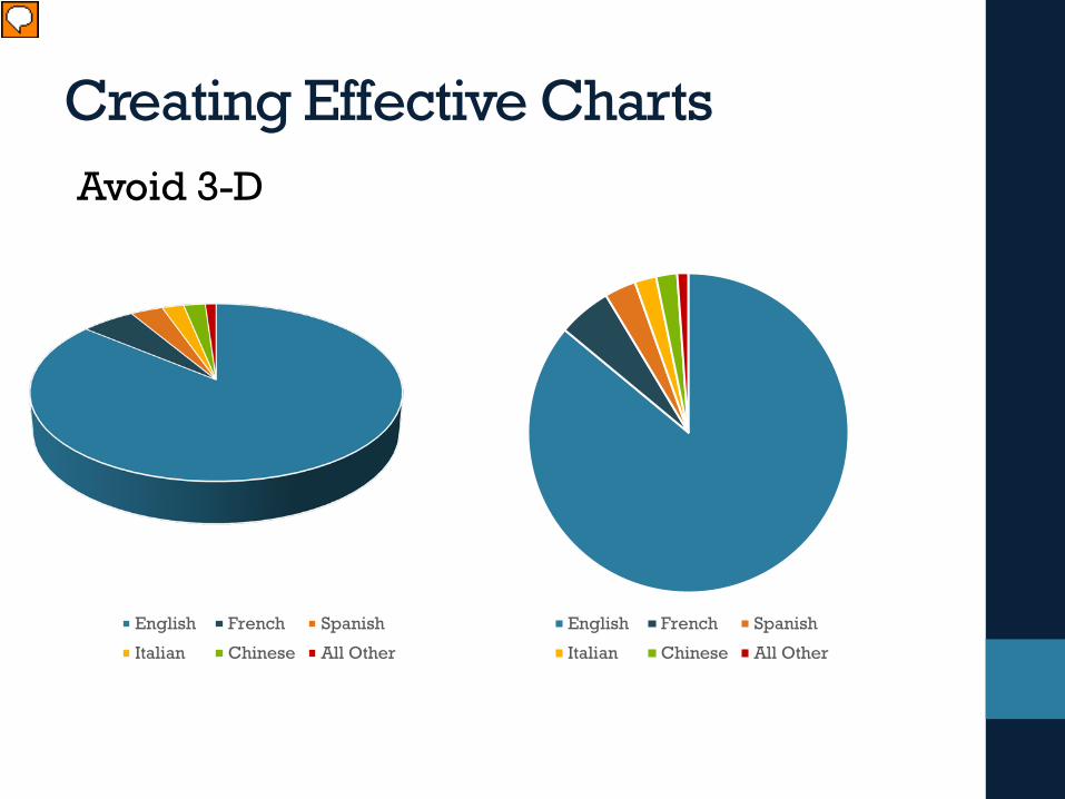
Creating Effective ChartsAvoid 3-D
English French Spanish
Italian Chinese All Other
English French Spanish
Italian Chinese All Other
Presenter
Presentation Notes
3-D views of charts and graphs make it more difficult to judge the size of the slices. Many visualization tools offer 3-D versions of charts – but just because something is available doesn’t mean it’s good.
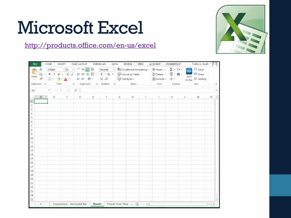
Microsoft Excelhttp://products.office.com/en-us/excel
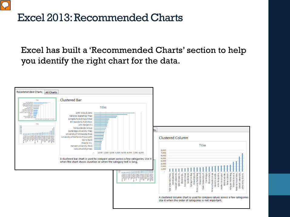
Excel has built a ‘Recommended Charts’ section to help you identify the right chart for the data.
Presenter
Presentation Notes
Recommended Charts – Excel tries to help you identify the right chart for your data
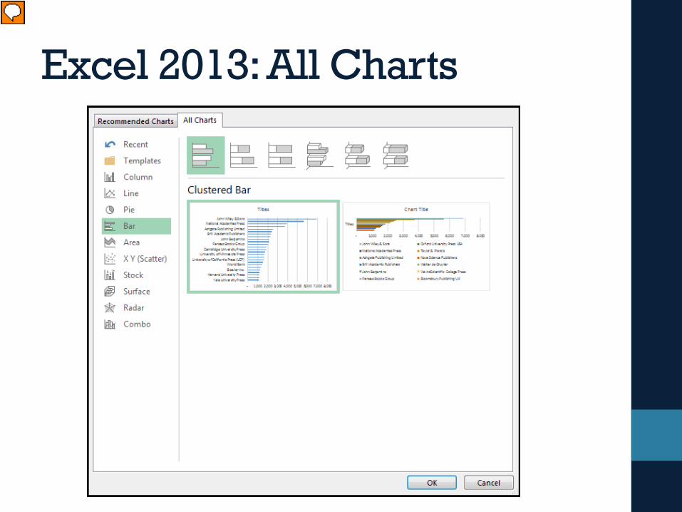
Excel 2013: All Charts
Presenter
Presentation Notes
All charts allows you to explore other chart options – the new version shows you the selected data in preview mode
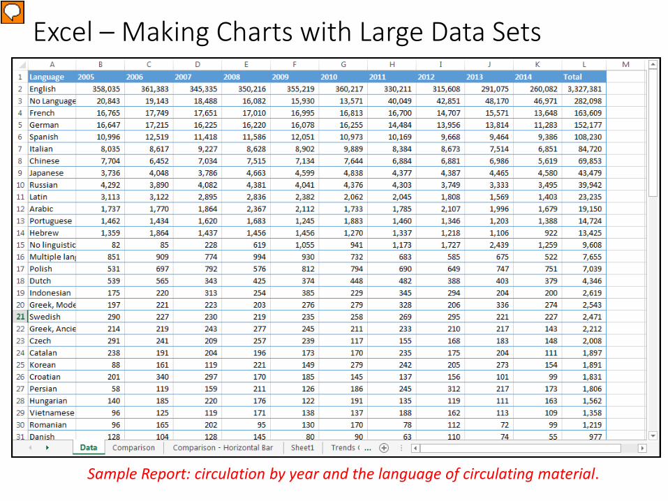
Excel – Making Charts with Large Data Sets
Sample Report: circulation by year and the language of circulating material.
Presenter
Presentation Notes
Sometimes you have big data sets – before making a chart you need to consider how to summarize the data.
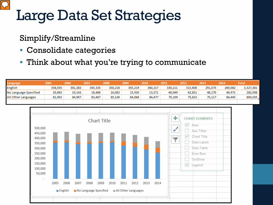
Large Data Set StrategiesSimplify/Streamline• Consolidate categories• Think about what you’re trying to communicate
Presenter
Presentation Notes
Sometimes you need to consolidate categories before exploring the data in a chart. Excel offers you many options for summarizing data – I recommend you explore pivot tables – these techniques can make this process much easier.
Tableau Softwarehttp://www.tableausoftware.com/
Tableau software offers a suite of Business Intelligence products that make it easy to query, organize, and visualize data.
• Tableau Desktop• Tableau Server• Tableau Online • Tableau Public
Presenter
Presentation Notes
Tableau Walk-Through Tableau is one of the newer players in the Business Intelligence world. More and more universities are starting to deploy this in Institutional Research and IT. It’s a really powerful tool that makes it really easy to get started. There are lots of different iterations of Tableau – but most versions are not free. However, they do offer access to ‘Tableau Public’ which is free with the caveat that you need to publish your data on their public server.
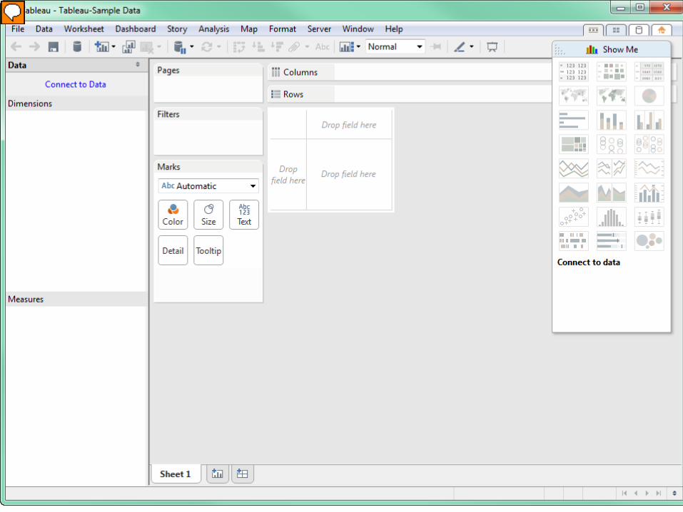
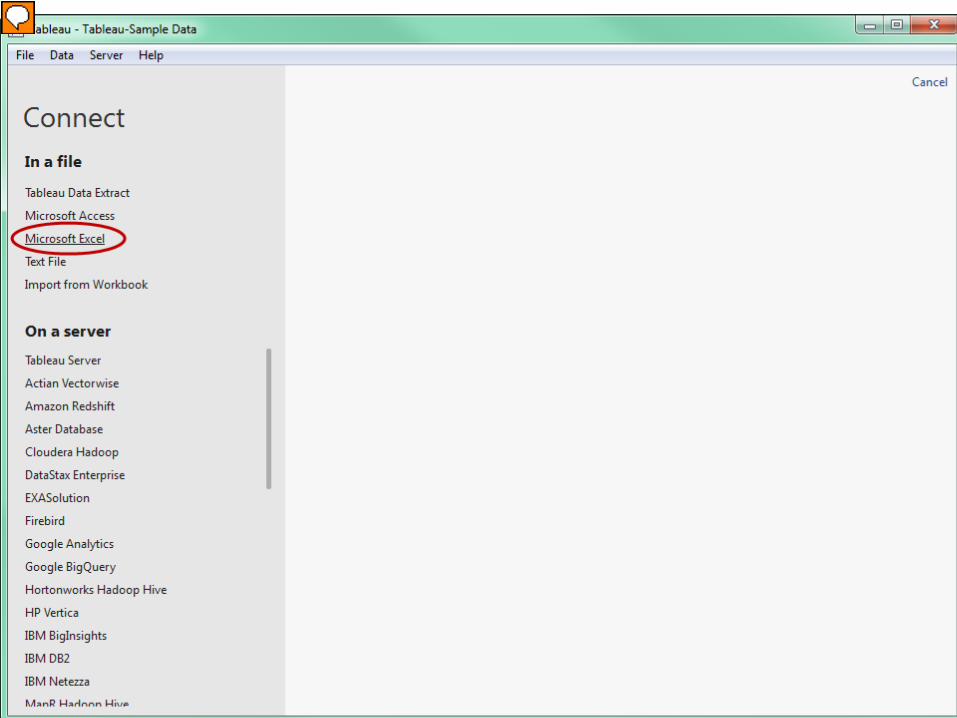
Tableau Desktop – this is where you do your data exploration. There isn’t much here until you connect to a data source.
Presenter
Presentation Notes
Tableau providers connectors to many different systems. You can connect to simple text and excel files as well as databases.
Presenter
Presentation Notes
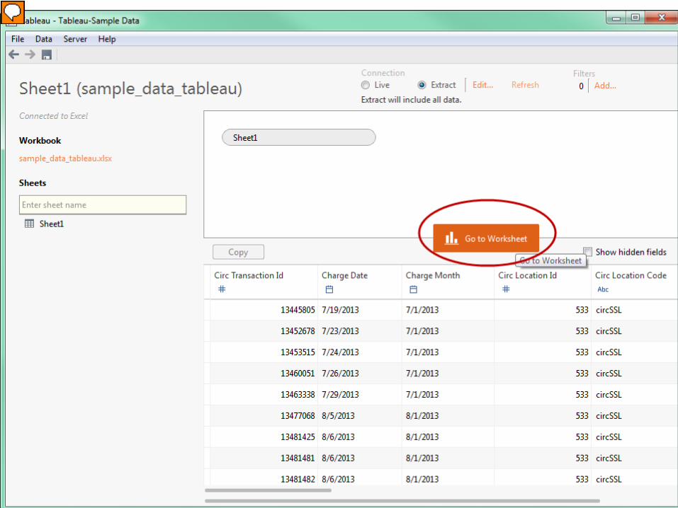
In this walk-through, I setup a connection to an excel workbook. Once you select the file, you see a preview of the data and some other options. You can connect to live data or create an extract. Extracts are static data sets. If you keep it as a live view, as the data in the source file is updated, so are the visualizations that you build in Tableau.
Presenter
Presentation Notes
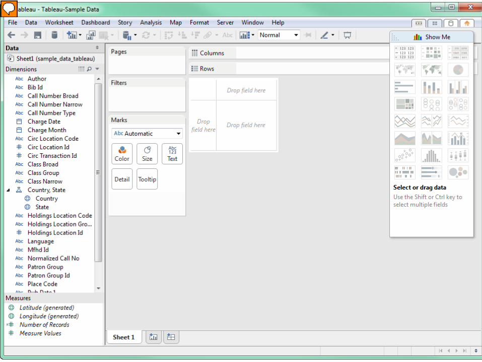
Now you see a lot of data elements in the work area. Tableau tries to figure out data types based on the source data. It’s pretty easy to pick out text, dates, and numeric fields. It’s also important to note that there are separate sections for ‘Dimensions’ and ‘Measures’. The measures are the numbers you use to summarize data.
Presenter
Presentation Notes
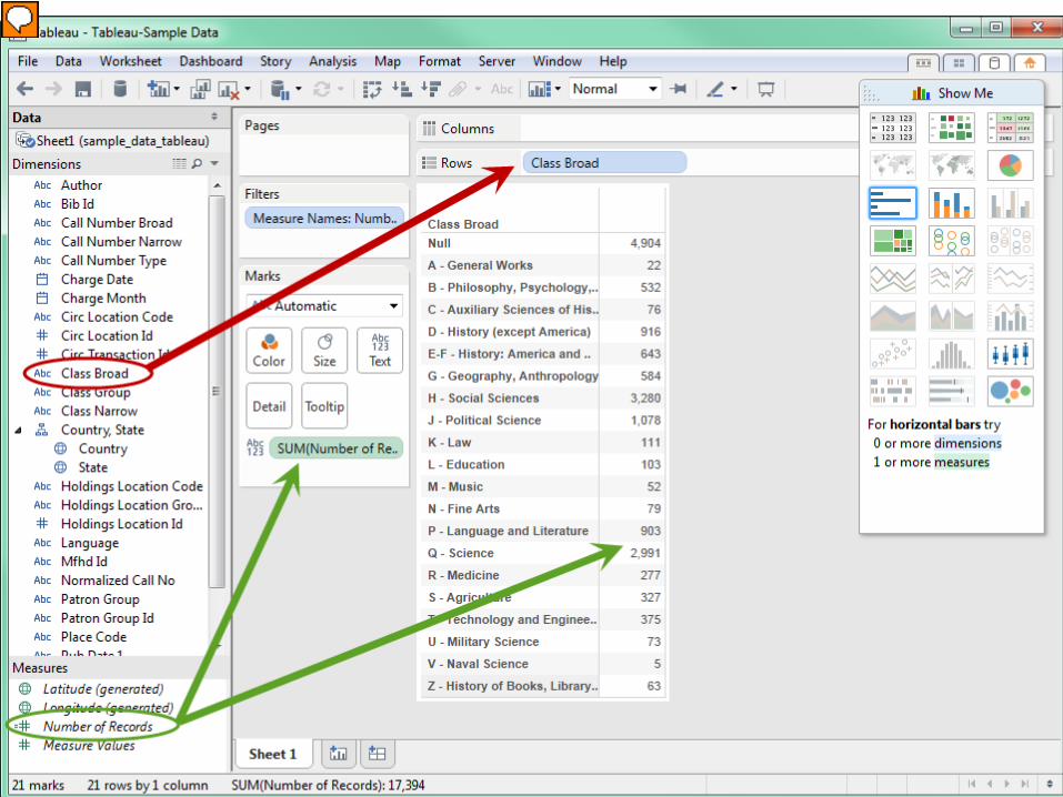
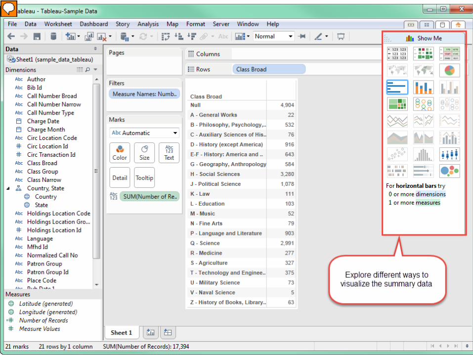
Building a dataset is easy. In this example, I want to see the number of items in various LC classes. I move the ‘CLASS BROAD’ field to the rows area and the ‘NUMBER OF RECORDS’ to the summary area. And a table appears. This is the equivalent to an excel pivot table.
Presenter
Presentation Notes
Once you add data to the workspace – tableau shows you visualization options in the ‘Show Me’ menu. Charts that work with the data elements appear in color.
Presenter
Presentation Notes
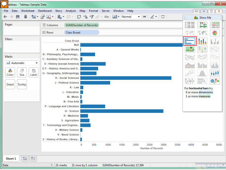
As you select options in the show me menu– the data automatically changes to chart form.
Presenter
Presentation Notes
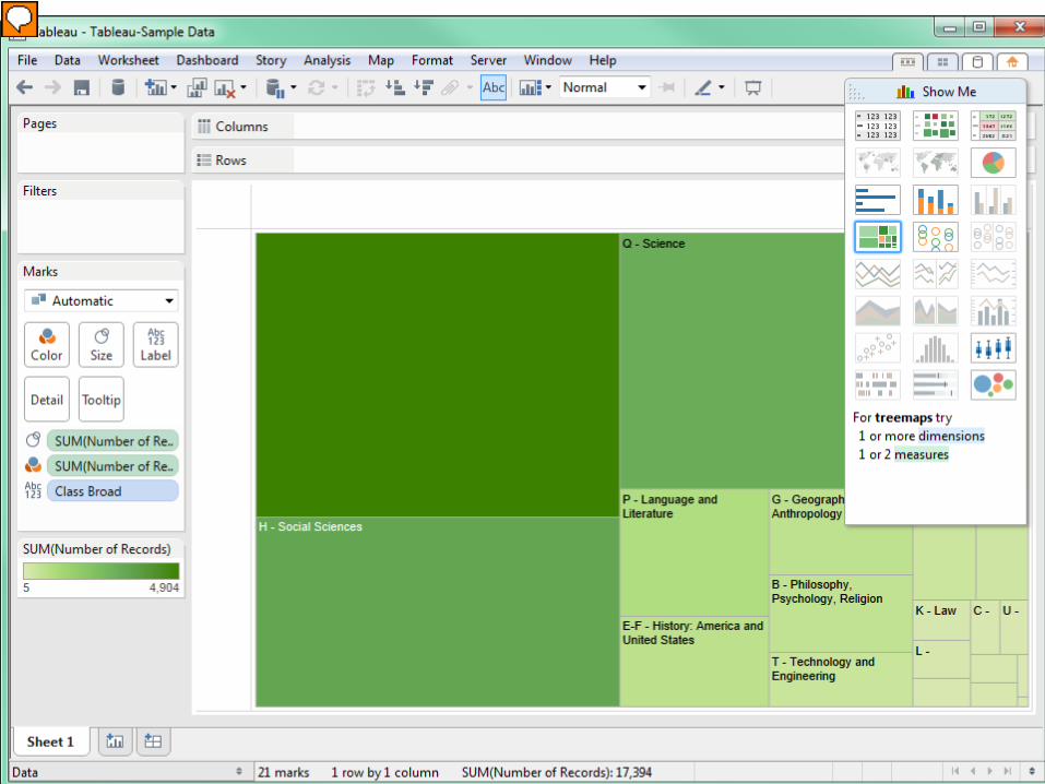
Here is the tree map view of the data. In this case, the size of the boxes are associated with the LC Class – the biggest box is for the blanks – items without LC numbers.
Presenter
Presentation Notes
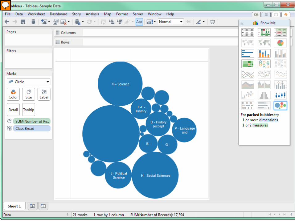
And here’s the bubble chart view. You may have seen these types of visualizations in publications. I’ve noticed a lot of articles in the Chronicle of Higher Education using tableau visualizations.
Presenter
Presentation Notes
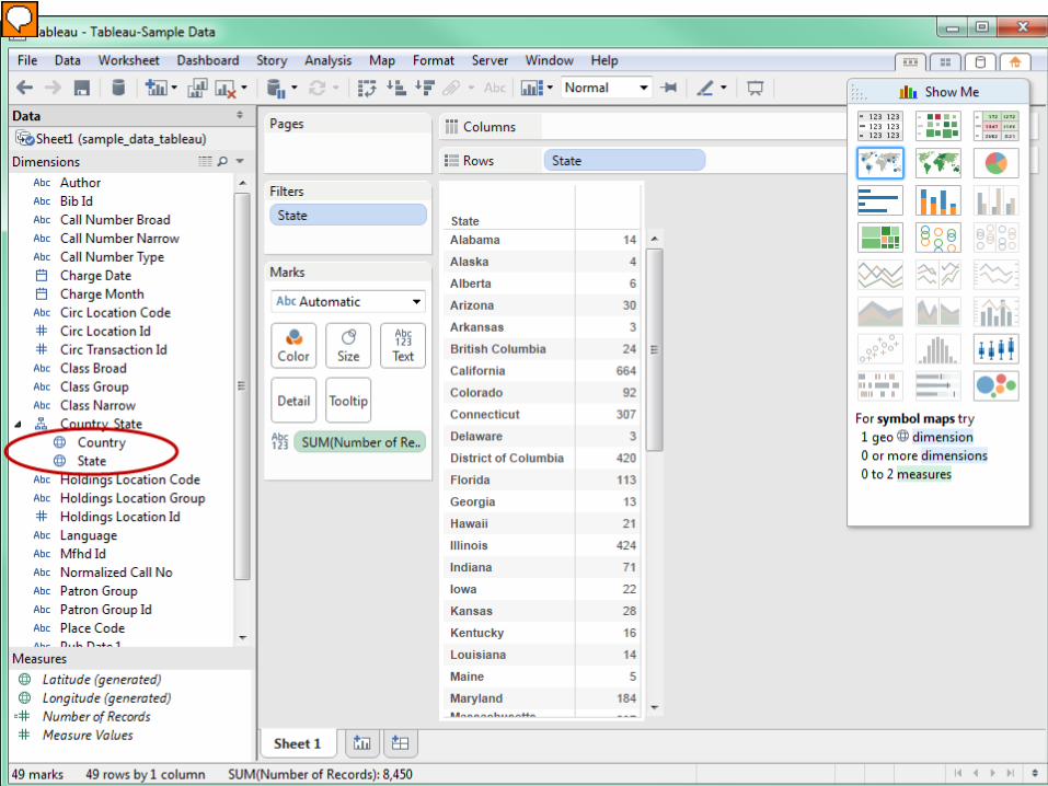
Tableau also includes maps – making it easy to make map visualizations. If your data includes geographic data elements – tableau will detect them and make the maps function available. In this example – the data includes the place of publication code from the bibliographic record. In my data – I added a lookup table that associated the code with the place name. In this summary – you can see the number of items that circulated based on the place of publication (here I limited it to states).
Presenter
Presentation Notes
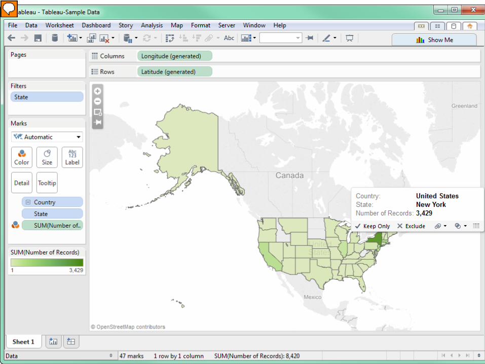
When I click the map in the ‘Show Me’ menu – this is what you see. The more items published in that state, the more intense the green color. When you hover over the state – it will tell you how many items were published there. There is just a quick overview. There are tons of options for customizing and organizing views. Tableau offers video tutorials and frequent webinars. If you’re interested in exploring this further – this is a great place to start.
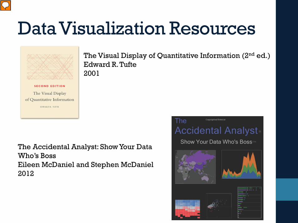
Data Visualization ResourcesThe Visual Display of Quantitative Information (2nd ed.)Edward R. Tufte2001
The Accidental Analyst: Show Your Data Who’s BossEileen McDaniel and Stephen McDaniel2012
Presenter
Presentation Notes
There is a plethora of resources available to help you learn more. Edward Tufte is a guru in this area. This is considered a core text in this field.
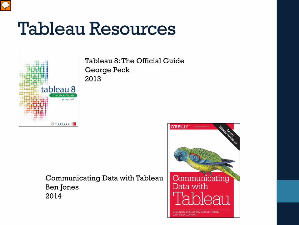
Tableau Resources
Tableau 8: The Official GuideGeorge Peck2013
Communicating Data with TableauBen Jones2014
Presenter
Presentation Notes
Tableau is a newer tool, but here are some good introductory texts. Both of these are available on the Safari ebook platform – if you have access to that subscription.
Excel ResourcesCharts and Graphs: Microsoft Excel 2013Bill Jelen2013
Meaningful Graphs: Converting Data into Informative Excel ChartsJames M. Smith2014
Presenter
Presentation Notes
There is no lack of excel resources out there. Here are two newer titles that focus on charts on graphs.