Embed Size (px)
Citation preview
An User Guide of
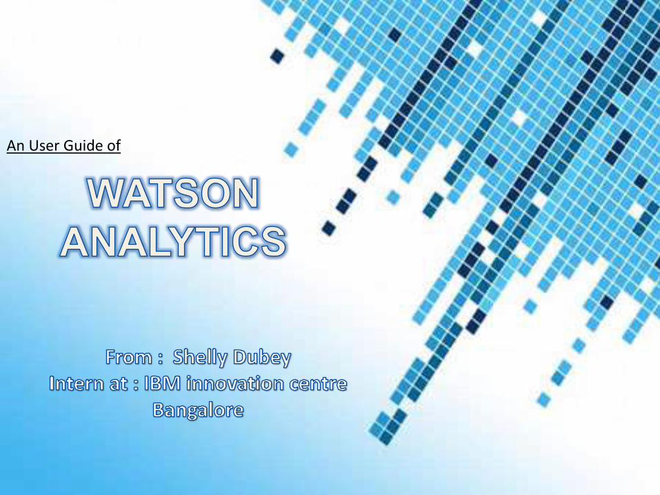
A Self service, Cloud based analytics solution.
Automates data preparation, predictive analysis and visual story
telling for professionals.
Enable to navigate through data and understand the patterns to
make better decisions.
Powered by IBM’s Watson cognitive computing technology.
• Compared to Watson, Other tools are -(i) too complex,
(ii) hard to access, and (iii) require the skill set of a data
scientist. Reason is clear because these analytical tools
are not developed keeping business users in mind but
technical people to develop customized solutions for end
users.• Watson Analytics also removes a lot of the barriers for
business professionals around usability, getting and cleansing
data, learning different analytical techniques and the cost..
Watson is more portable.
• WA uses natural language to make interaction with
powerful, predictive analytics easier with the ability to
understand key questions, such as: What are the key
drivers of my product sales? Which benefits drive
employee retention the most?
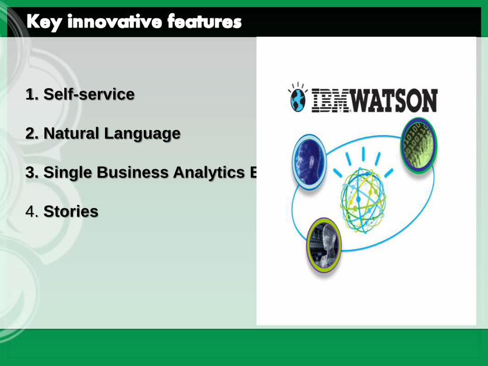
1. Self-service
2. Natural Language
3. Single Business Analytics Experience
4. Stories
1. Self-service: As a business user you can be completely
self-enabled to conceive a need, to get the data, to analyze it,
and to communicate the results all by yourself. Watson
Analytics features the use of predictive analytics to surface
key relevant facts and uncover unforeseen patterns and
relationships. This process sparks new questions and better
insight, directing users to parts of their business that matter
most.
2. Natural Language – Watson Analytics speaks the
language of business and people by enabling someone to
simply type in what they would like to see. WA produces
results that explain why things happened and what's likely to
happen, all in familiar business terms. And as business
professionals interact with the results,
3. Single Business Analytics Experience – Unlike today’s
separate analytics tools designed for different kinds of
analysis and data tasks, Watson Analytics is a seamless,
unified experience that brings together a set of self-service
enterprise data and analytics capabilities on the cloud.
4. Stories: The stories are like templates to start you off on
your analytics process. It could be things like campaign
management for a marketing person; win-loss analysis for
sales; employer retention for HR. These are pre-created
examples that you can use just to learn what you might do, or
use as a template for your own analysis if your business
problem is similar.
IBM Watson Analytics sets powerful analytics capabilities free so
practically anyone can use them. Automated data preparation,
predictive analytics, reporting, dashboards, visualization and
collaboration capabilities, enable you to take control of your own
analysis. You can then take the appropriate action to address a
problem or seize an opportunity, all without asking IT or a data expert
for help.
1. Get better data. Data access, refinement, management and analysis
are automated and available from the cloud.
2. Get answers. Ask questions in the terms of your business, whether
you're in marketing, sales, HR, finance or operations.
3. Understand your business. Automated intelligence enables you to
draw conclusions based on what has happened and why.
4. Tell a story. Visualizations help you create clear and compelling
infographics to prove your point confidently.
5. Think ahead. Statistical analysis, correlations and predictions help
you see what is likely to happen and what you can do about it.
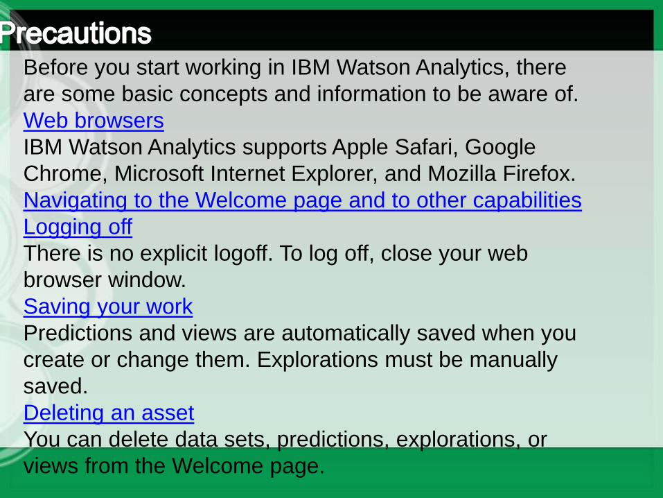
Before you start working in IBM Watson Analytics, there
are some basic concepts and information to be aware of.
Web browsers
IBM Watson Analytics supports Apple Safari, Google
Chrome, Microsoft Internet Explorer, and Mozilla Firefox.
Navigating to the Welcome page and to other capabilities
Logging off
There is no explicit logoff. To log off, close your web
browser window.
Saving your work
Predictions and views are automatically saved when you
create or change them. Explorations must be manually
saved.
Deleting an asset
You can delete data sets, predictions, explorations, or
views from the Welcome page.

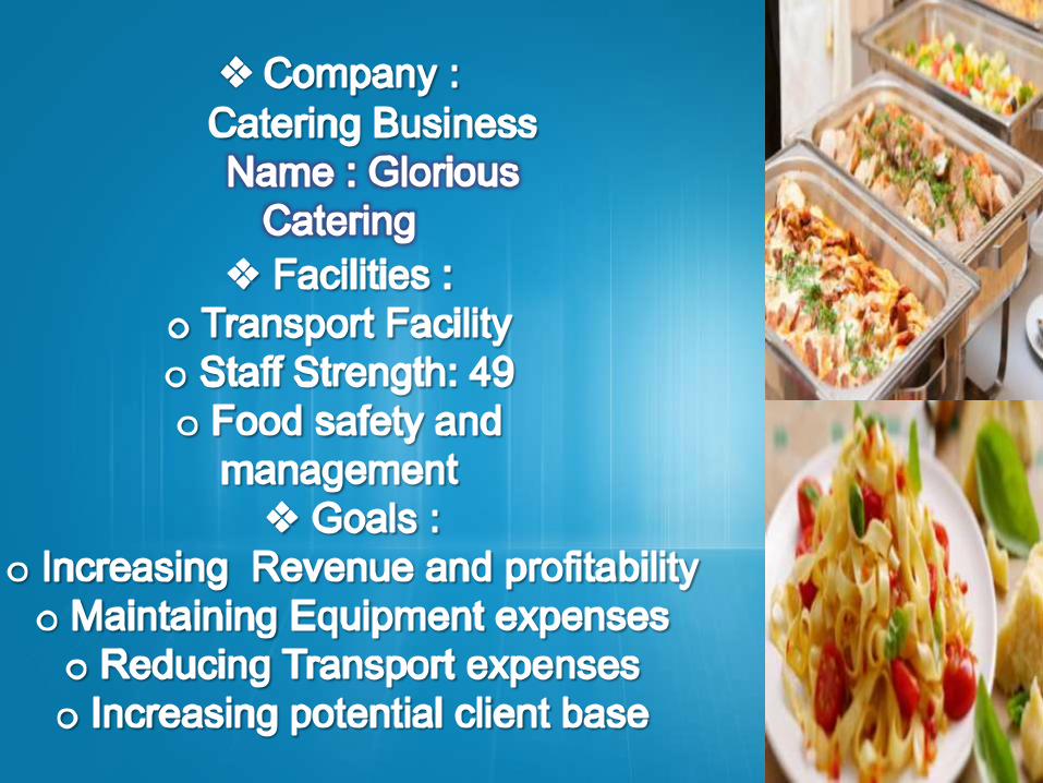
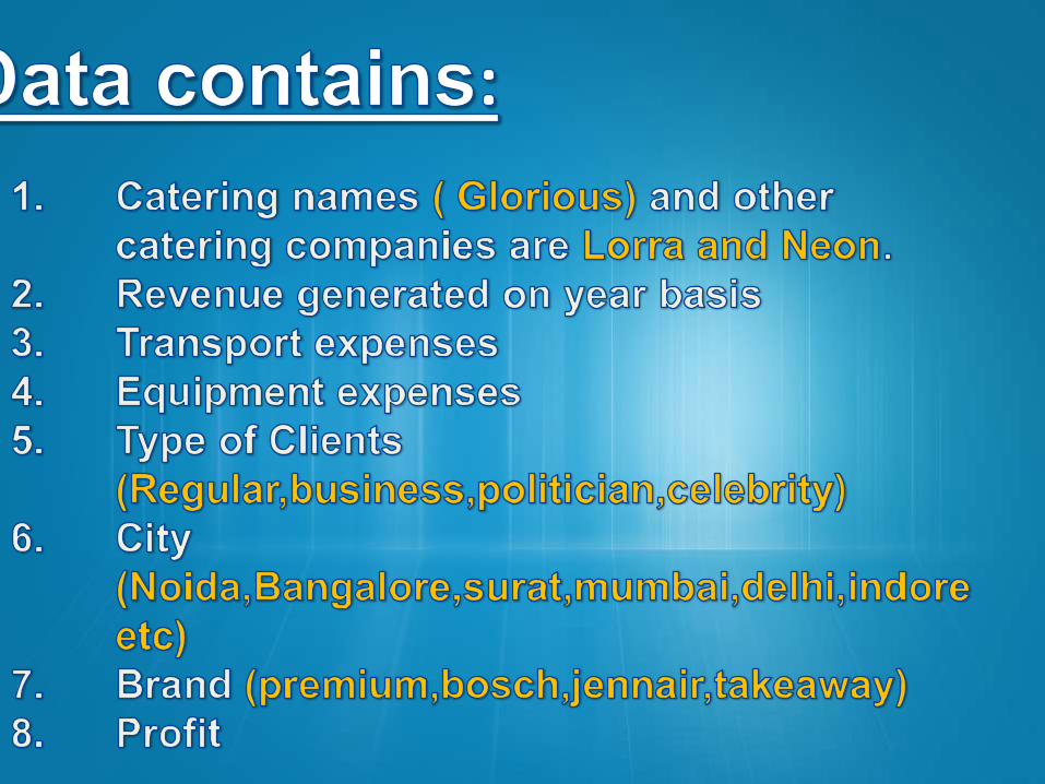
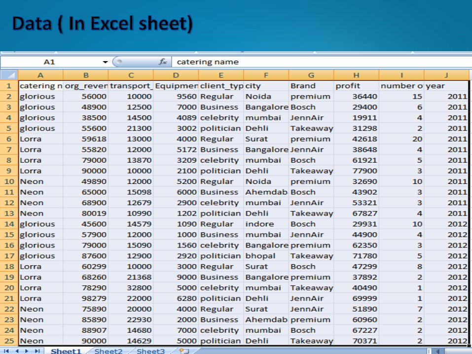
Business ScenarioTell your story with : Watson Analytics
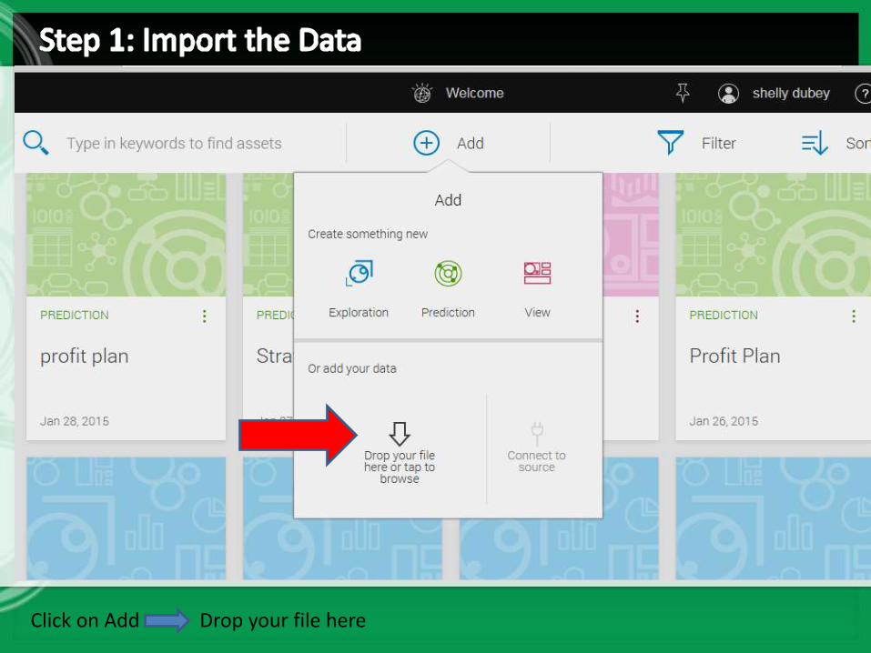
Click on Add Drop your file here
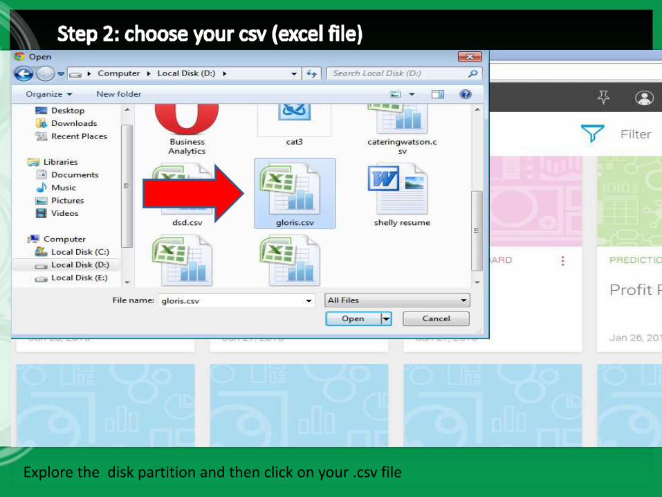
Explore the disk partition and then click on your .csv file
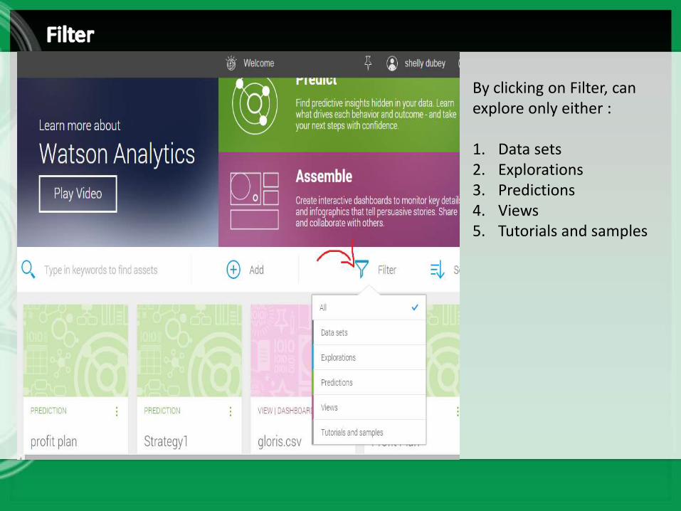
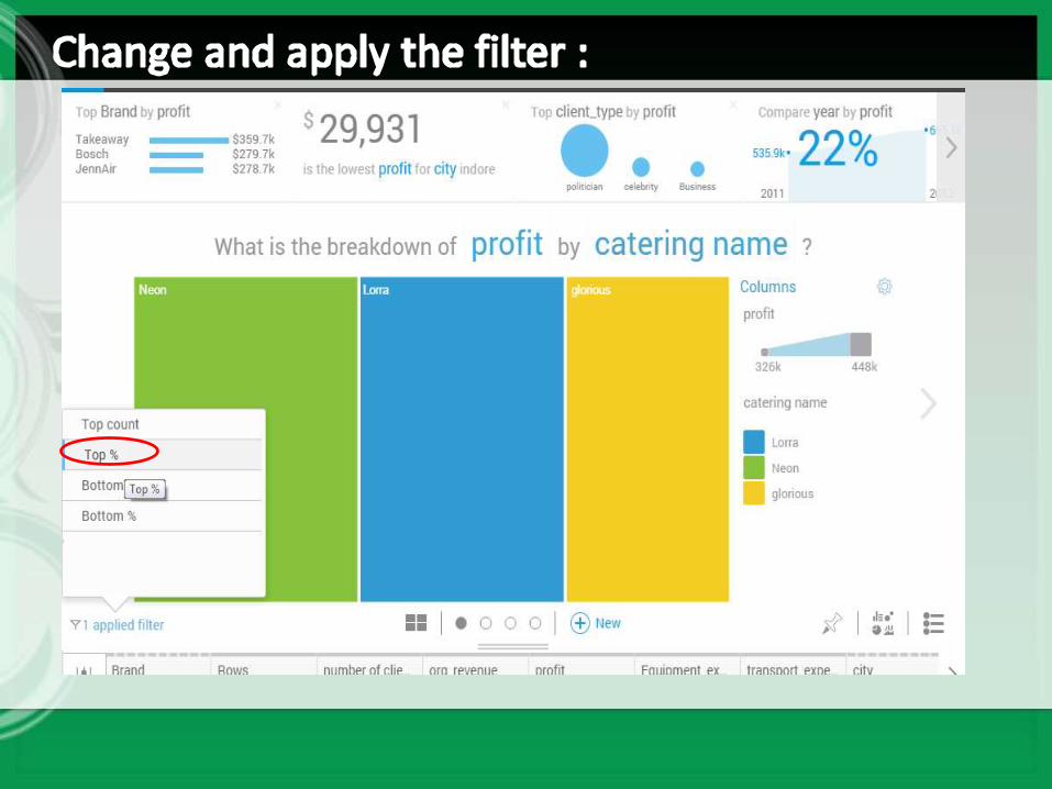
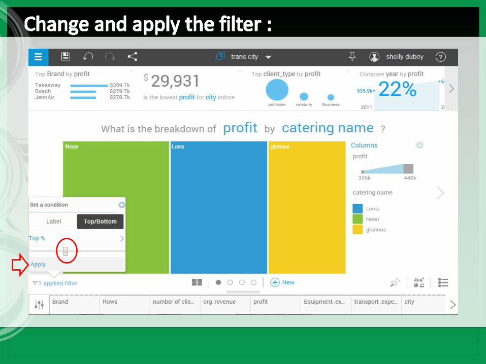
By clicking on Filter, can explore only either :
1. Data sets2. Explorations3. Predictions4. Views5. Tutorials and samples
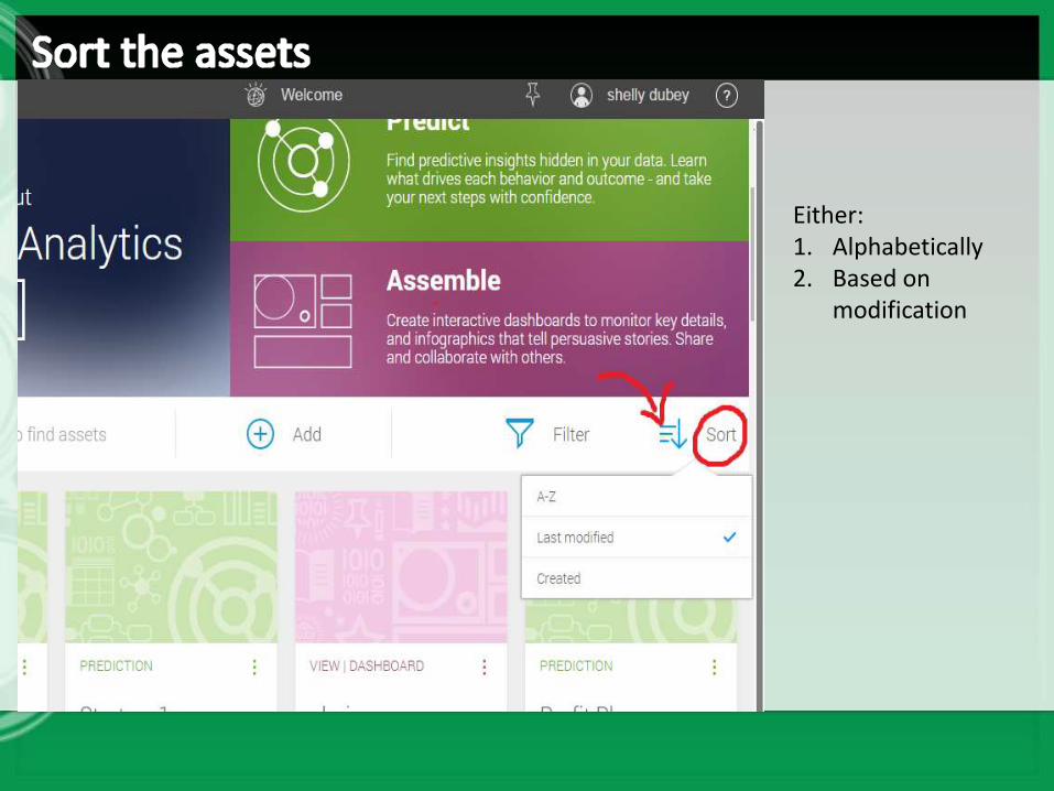
Either:1. Alphabetically2. Based on
modification

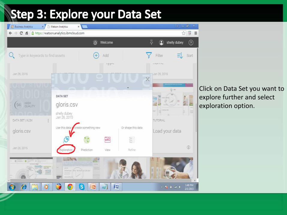
Click on Data Set you want to explore further and select exploration option.
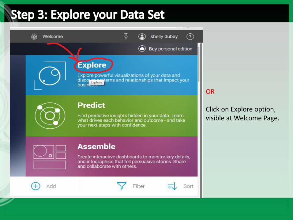
OR
Click on Explore option, visible at Welcome Page.
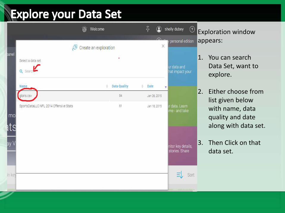
Exploration window appears:
1. You can search Data Set, want to explore.
2. Either choose from list given below with name, data quality and date along with data set.
3. Then Click on that data set.
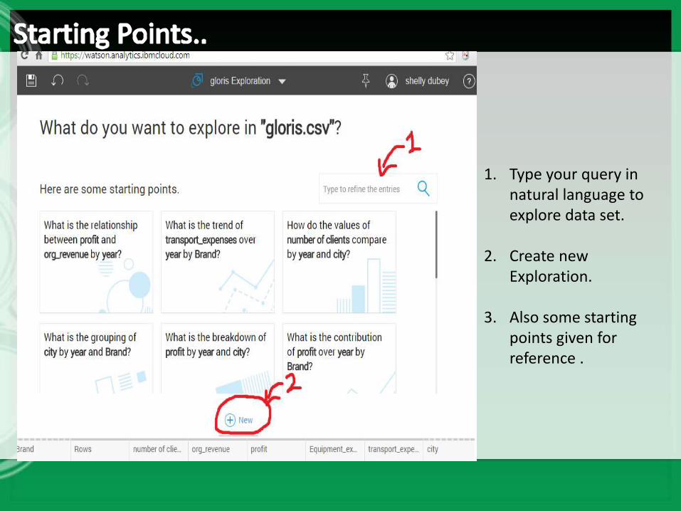
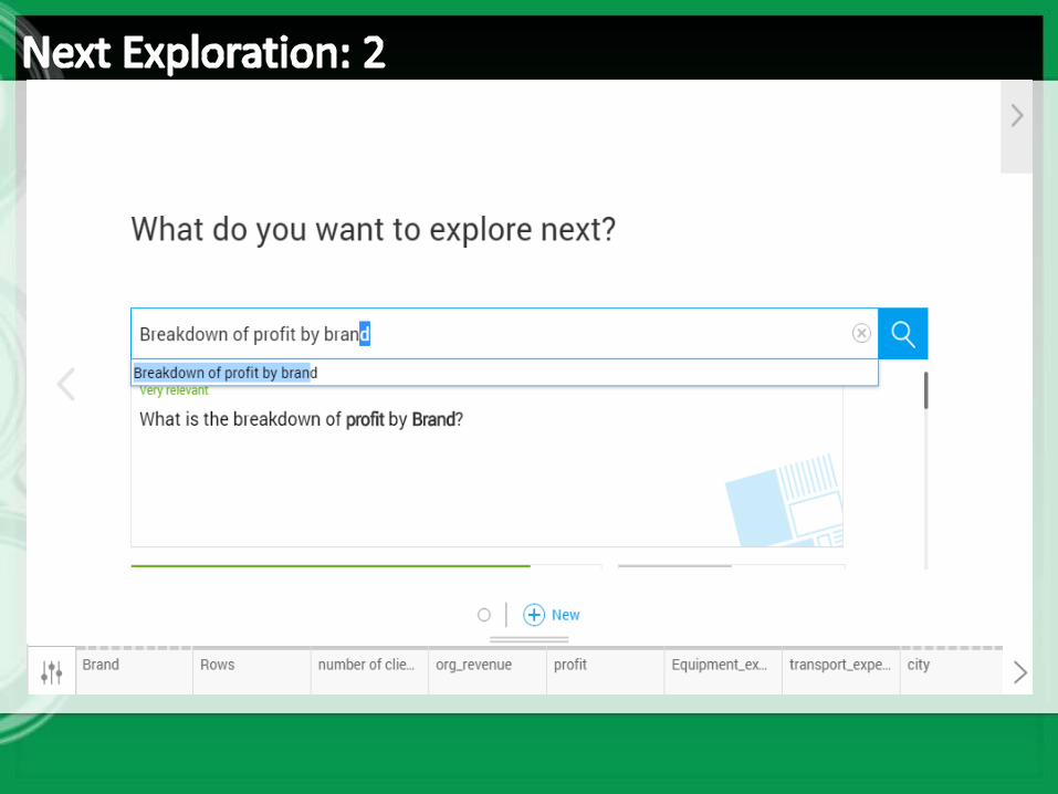
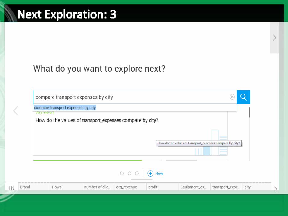
1. Type your query in natural language to explore data set.
2. Create new Exploration.
3. Also some starting points given for reference .
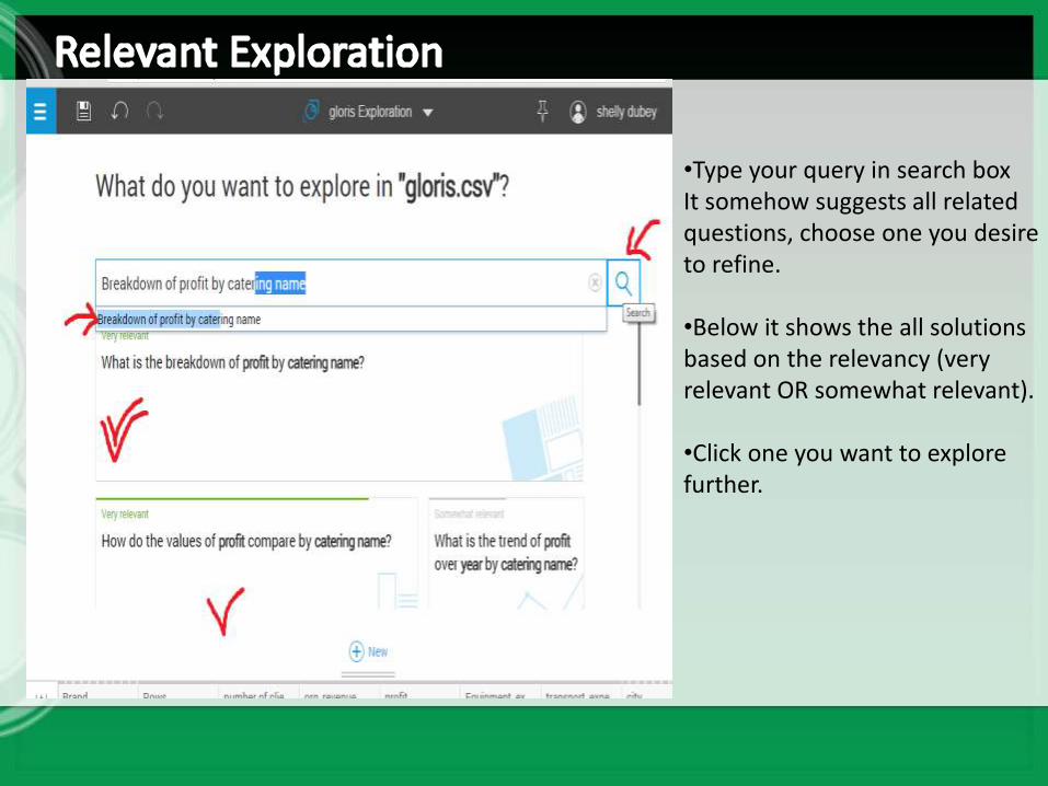
•Type your query in search box It somehow suggests all related questions, choose one you desire to refine.
•Below it shows the all solutions based on the relevancy (very relevant OR somewhat relevant).
•Click one you want to explore further.
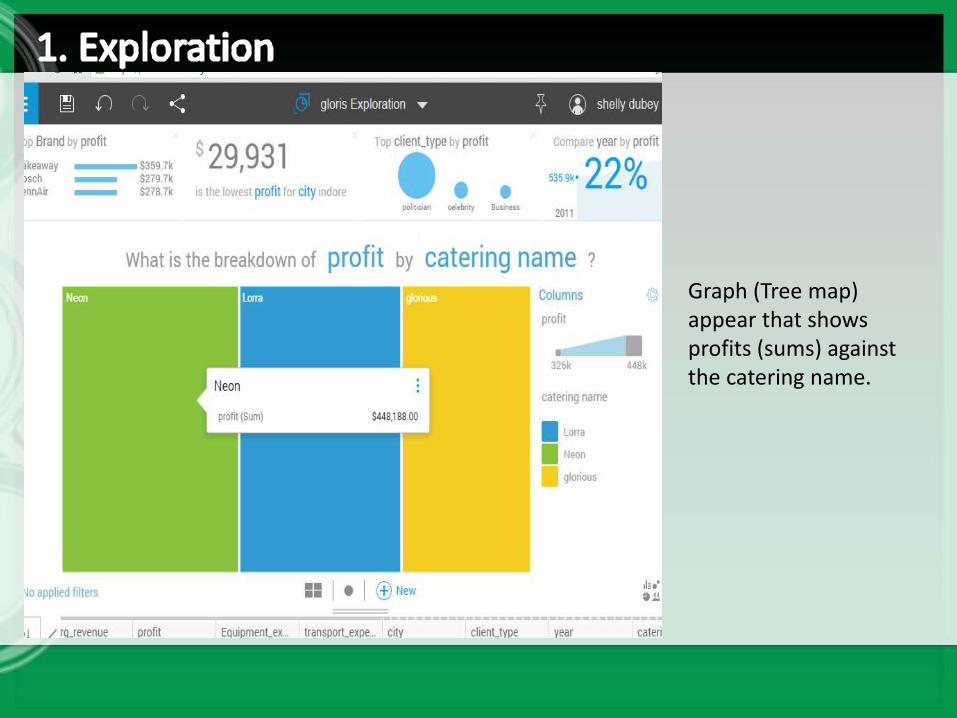
Graph (Tree map) appear that shows profits (sums) against the catering name.
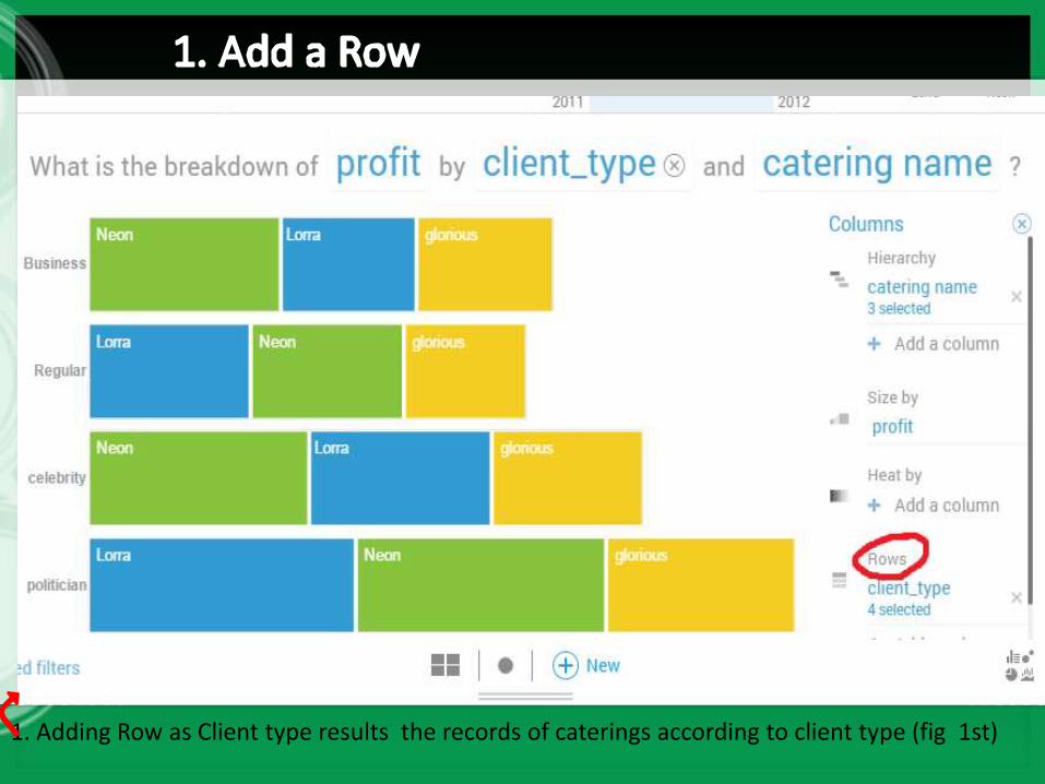
1. Adding Row as Client type results the records of caterings according to client type (fig 1st)
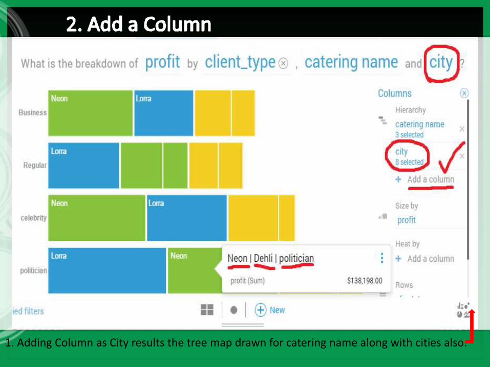
1. Adding Column as City results the tree map drawn for catering name along with cities also.
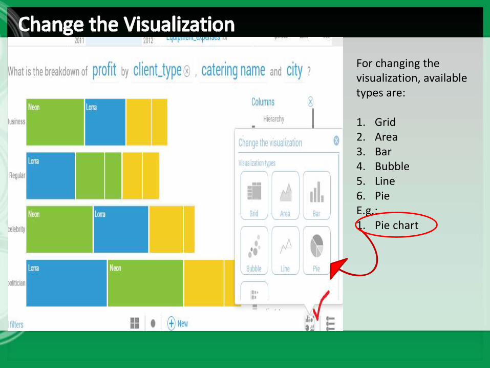
For changing the visualization, available types are:
1. Grid2. Area3. Bar4. Bubble5. Line6. Pie E.g.:1. Pie chart
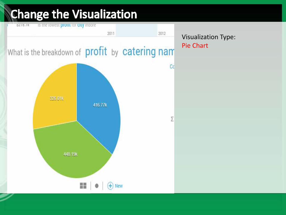
Visualization Type:Pie Chart
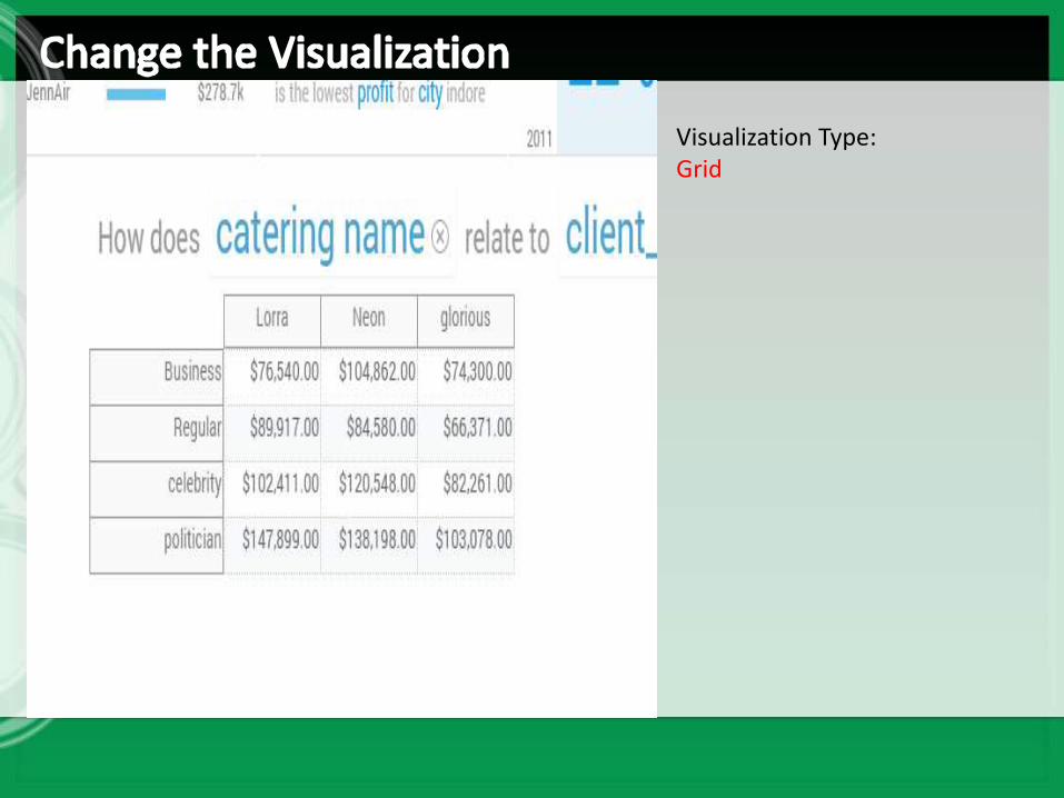
Visualization Type:Grid
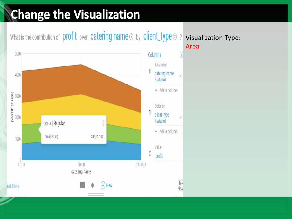
Visualization Type:Area
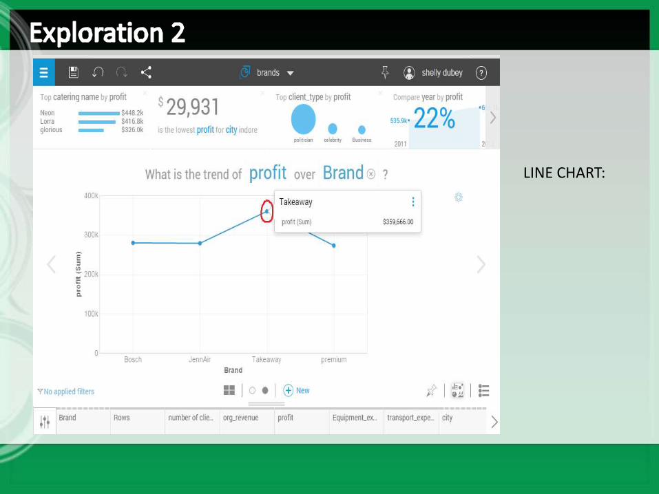
LINE CHART:
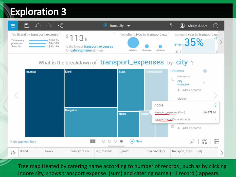
Tree map Heated by catering name according to number of records , such as by clicking Indore city, shows transport expense (sum) and catering name (=1 record ) appears.
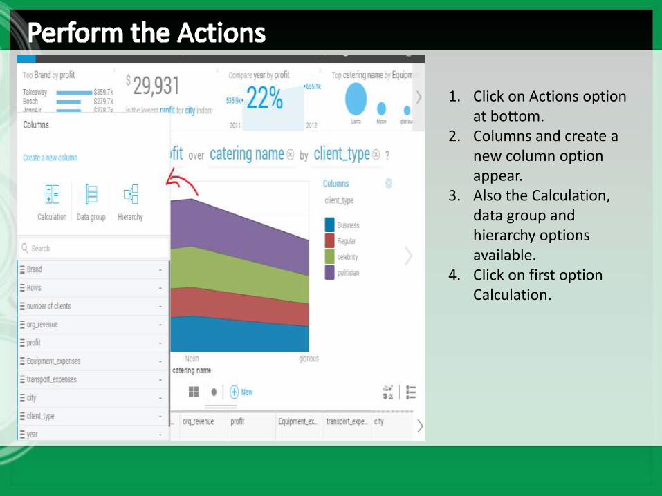
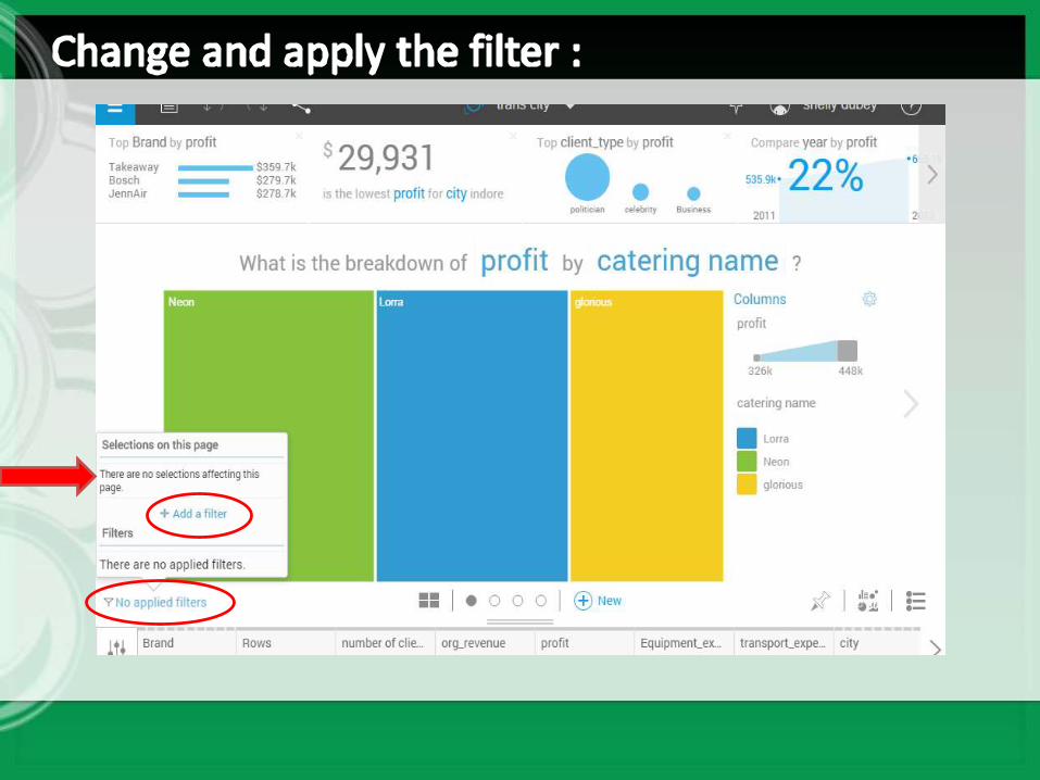
1. Click on Actions option at bottom.
2. Columns and create a new column option appear.
3. Also the Calculation, data group and hierarchy options available.
4. Click on first option Calculation.
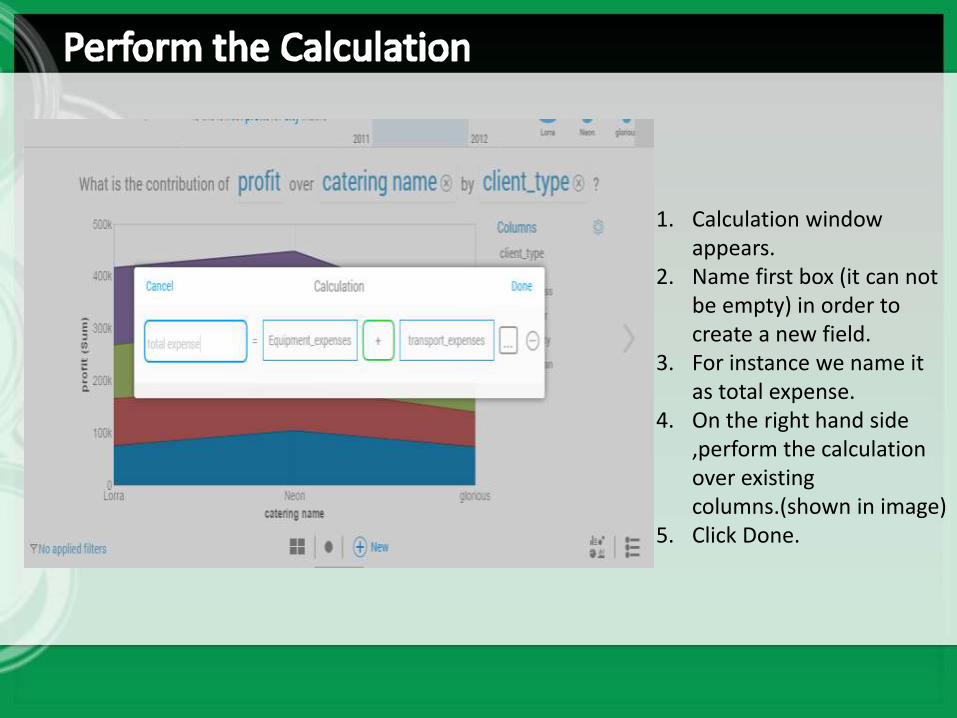
1. Calculation window appears.
2. Name first box (it can not be empty) in order to create a new field.
3. For instance we name it as total expense.
4. On the right hand side ,perform the calculation over existing columns.(shown in image)
5. Click Done.
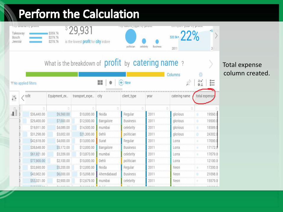
Total expense column created.
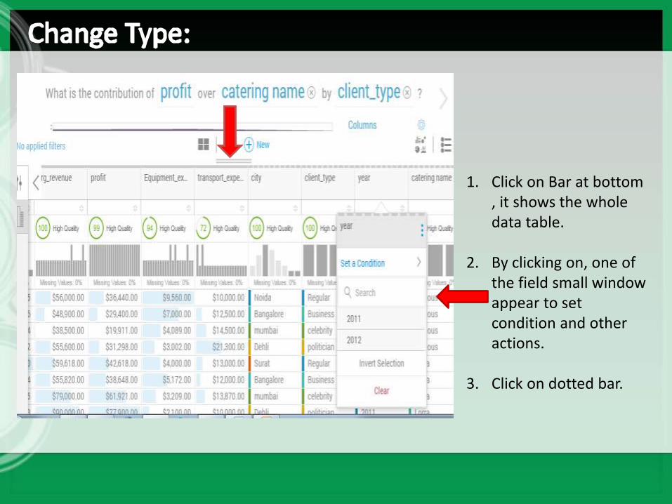
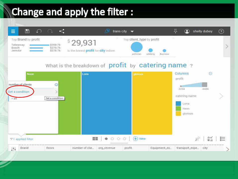
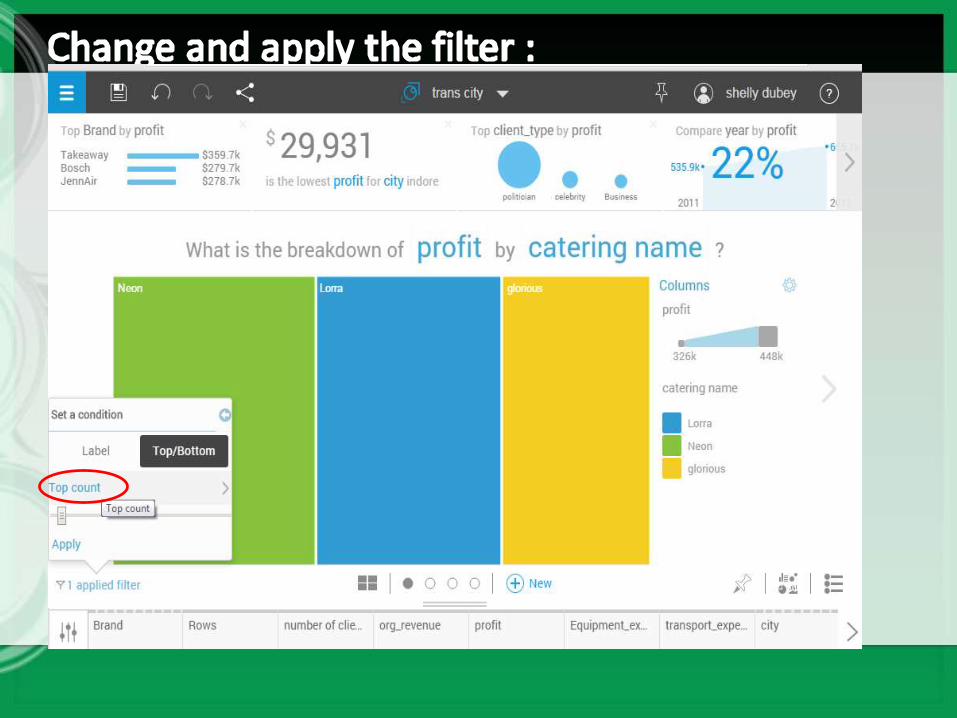
1. Click on Bar at bottom , it shows the whole data table.
2. By clicking on, one of the field small window appear to set condition and other actions.
3. Click on dotted bar.
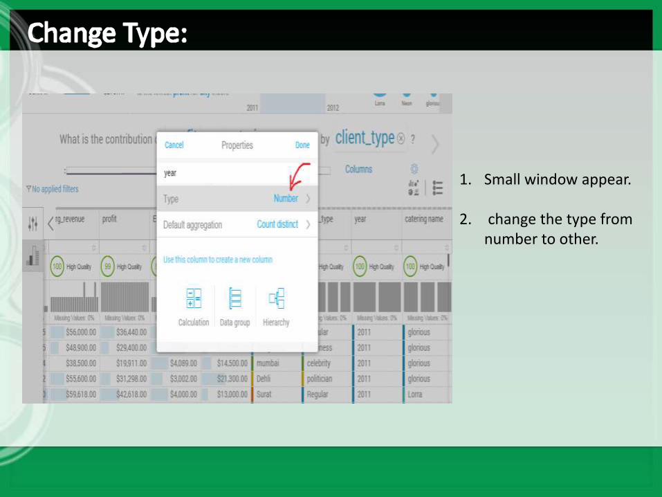
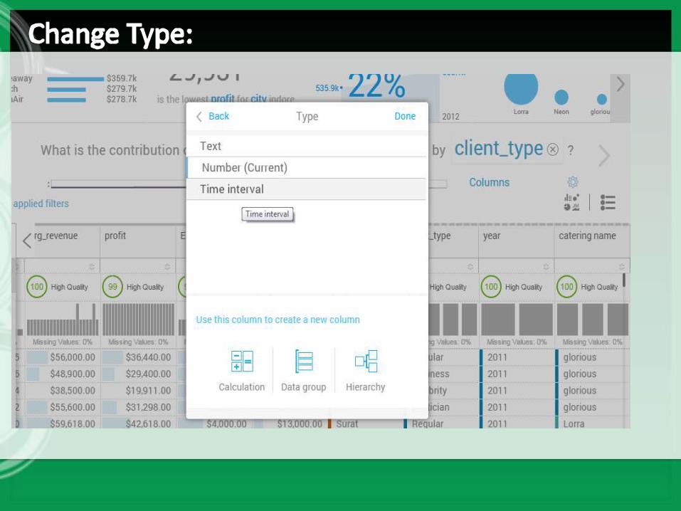
1. Small window appear.
2. change the type from number to other.
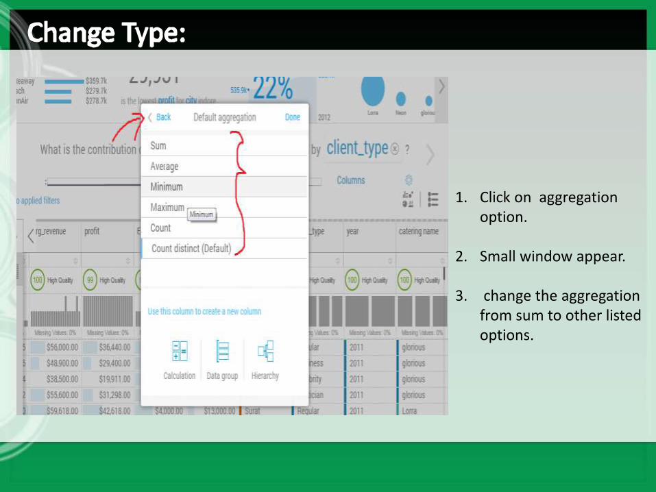
1. Click on aggregation option.
2. Small window appear.
3. change the aggregation from sum to other listed options.
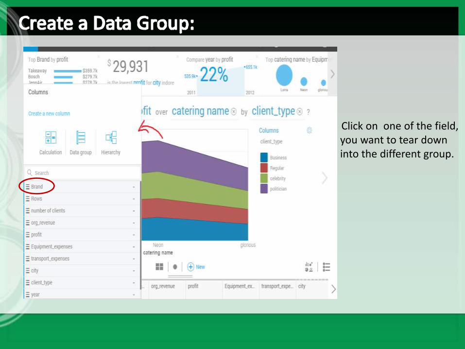
Click on one of the field, you want to tear down into the different group.
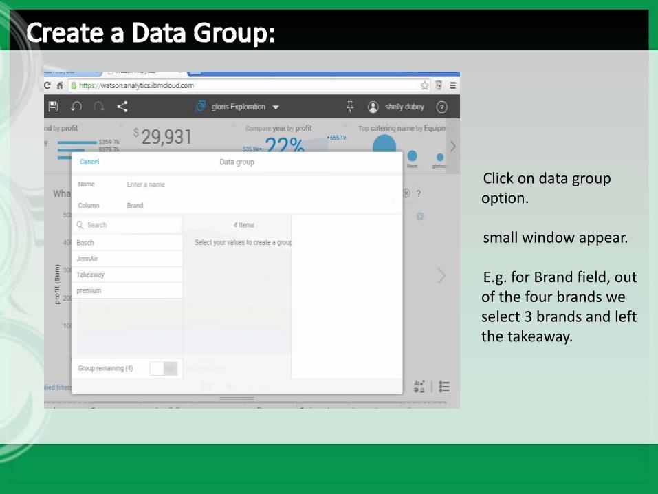
Click on data group option.
small window appear.
E.g. for Brand field, out of the four brands we select 3 brands and left the takeaway.
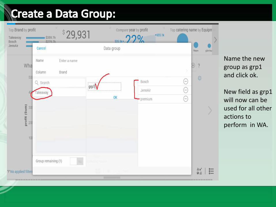
Name the new group as grp1 and click ok.
New field as grp1 will now can be used for all other actions to perform in WA.
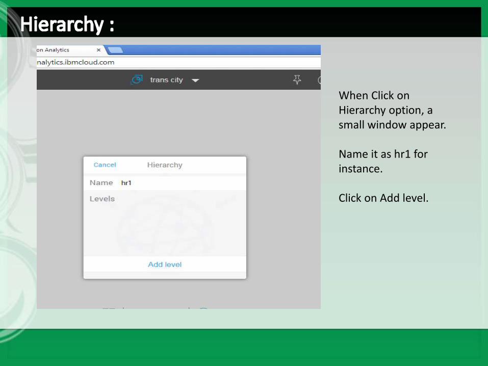
When Click on Hierarchy option, a small window appear.
Name it as hr1 for instance.
Click on Add level.
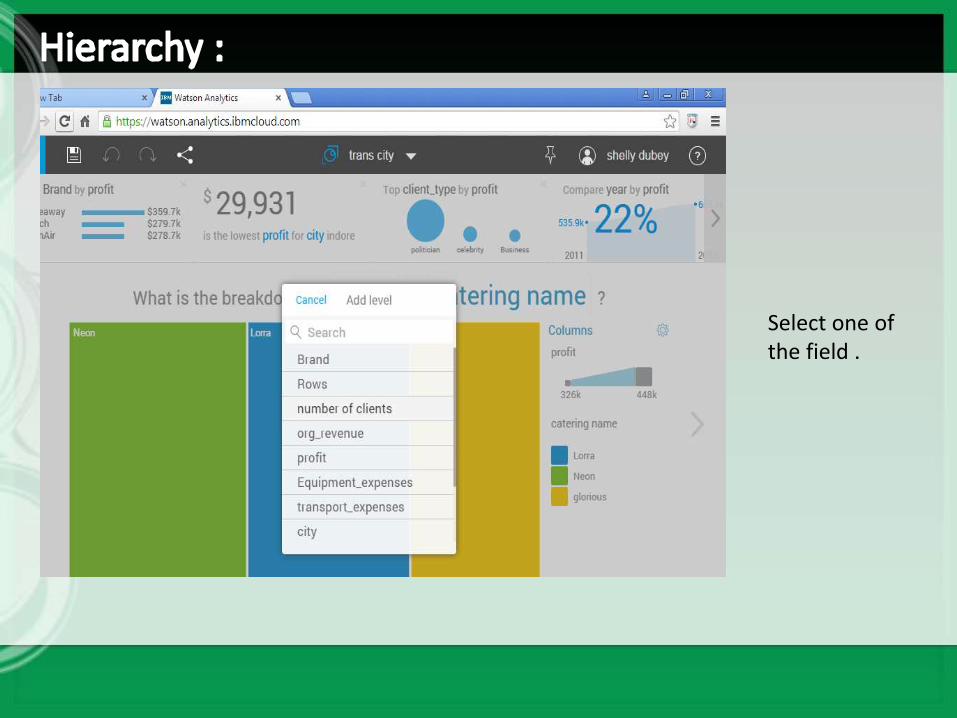
Select one of the field .
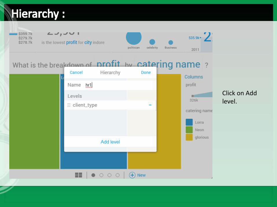
Click on Add level.
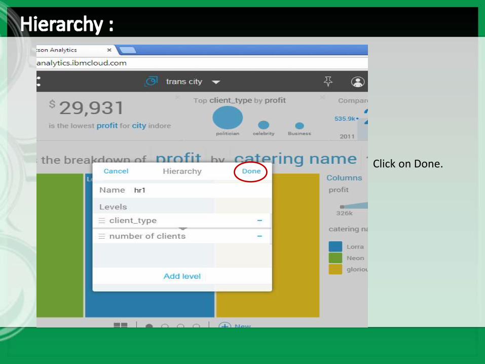
Click on Done.
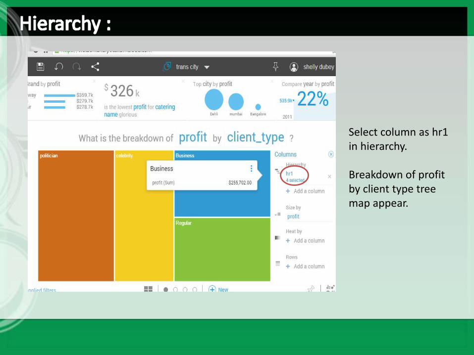
Select column as hr1 in hierarchy.
Breakdown of profit by client type tree map appear.

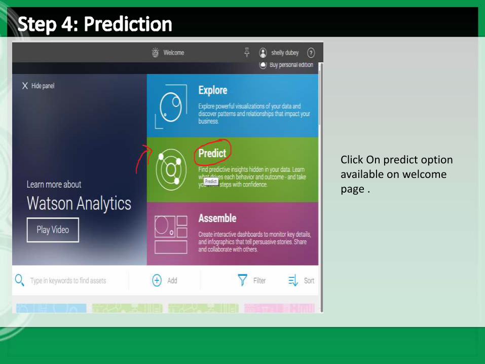
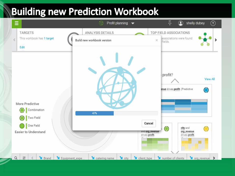
Click On predict option available on welcome page .
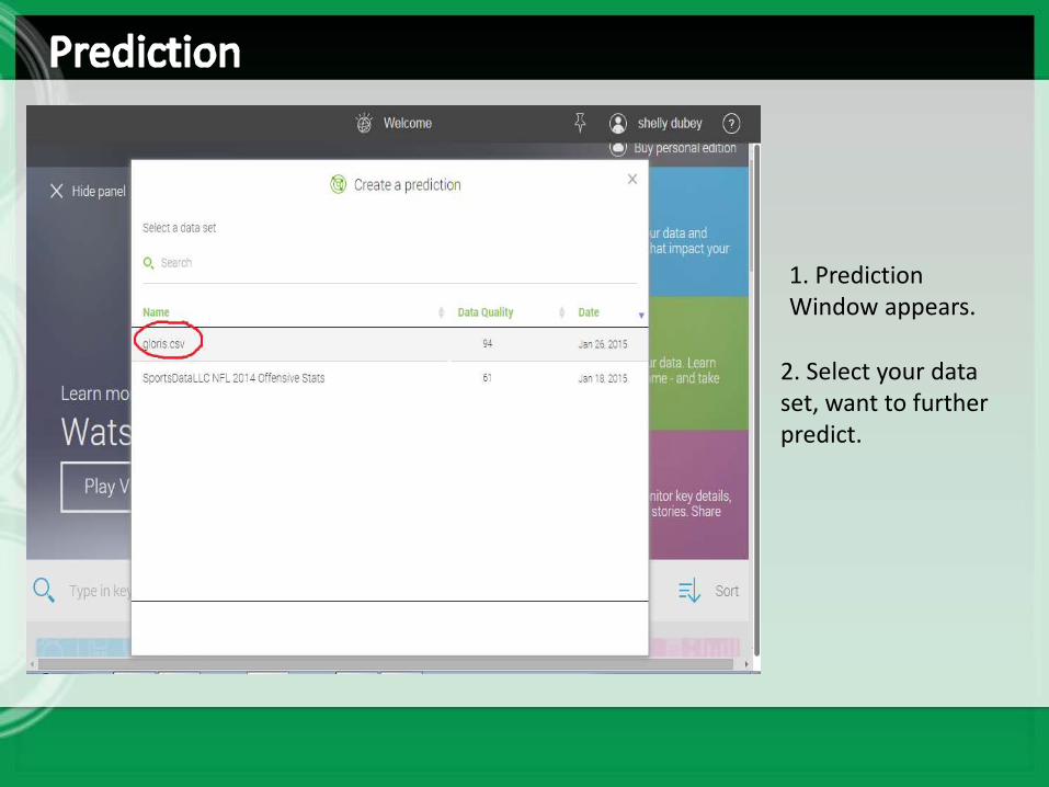
2. Select your data set, want to further predict.
1. PredictionWindow appears.
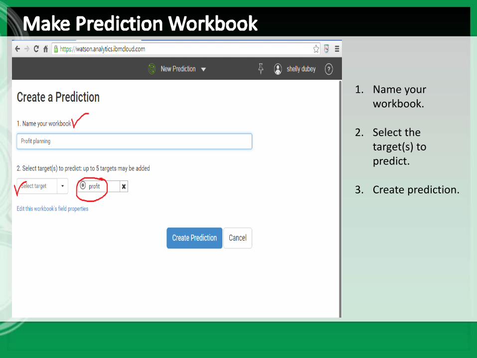
1. Name your workbook.
2. Select the target(s) to predict.
3. Create prediction.
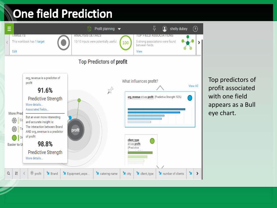
Top predictors of profit associated with one field appears as a Bull eye chart.
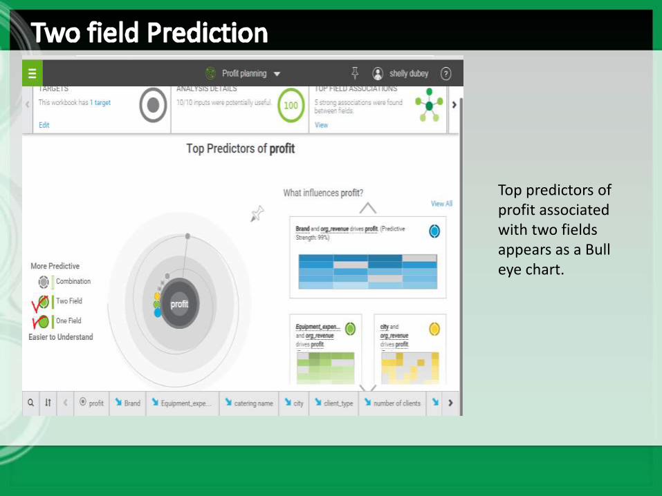
Top predictors of profit associated with two fields appears as a Bull eye chart.
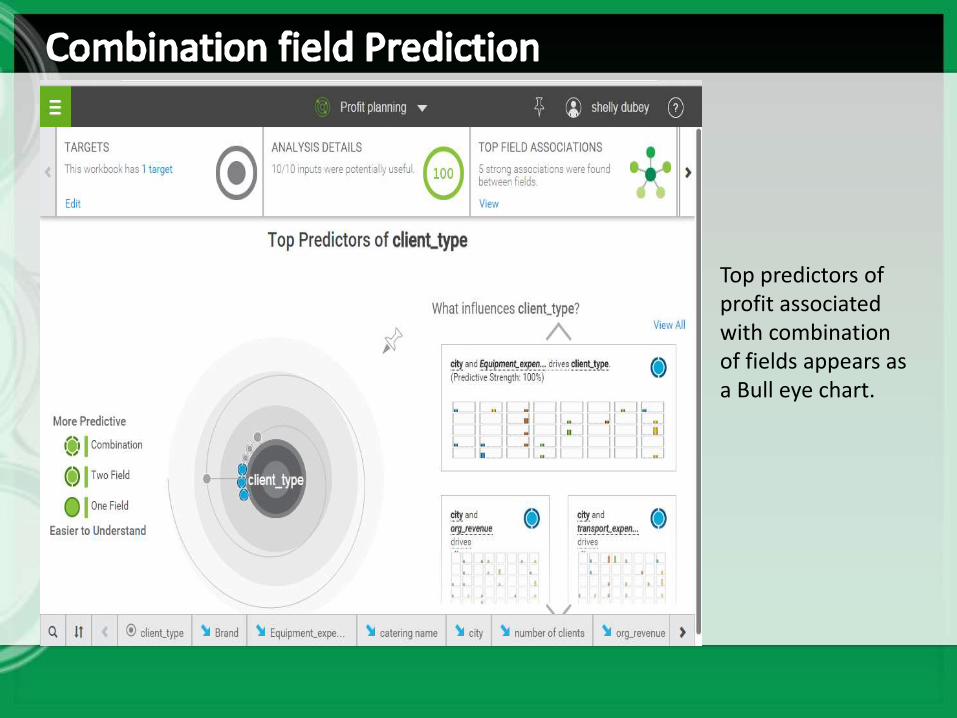
Top predictors of profit associated with combination of fields appears as a Bull eye chart.
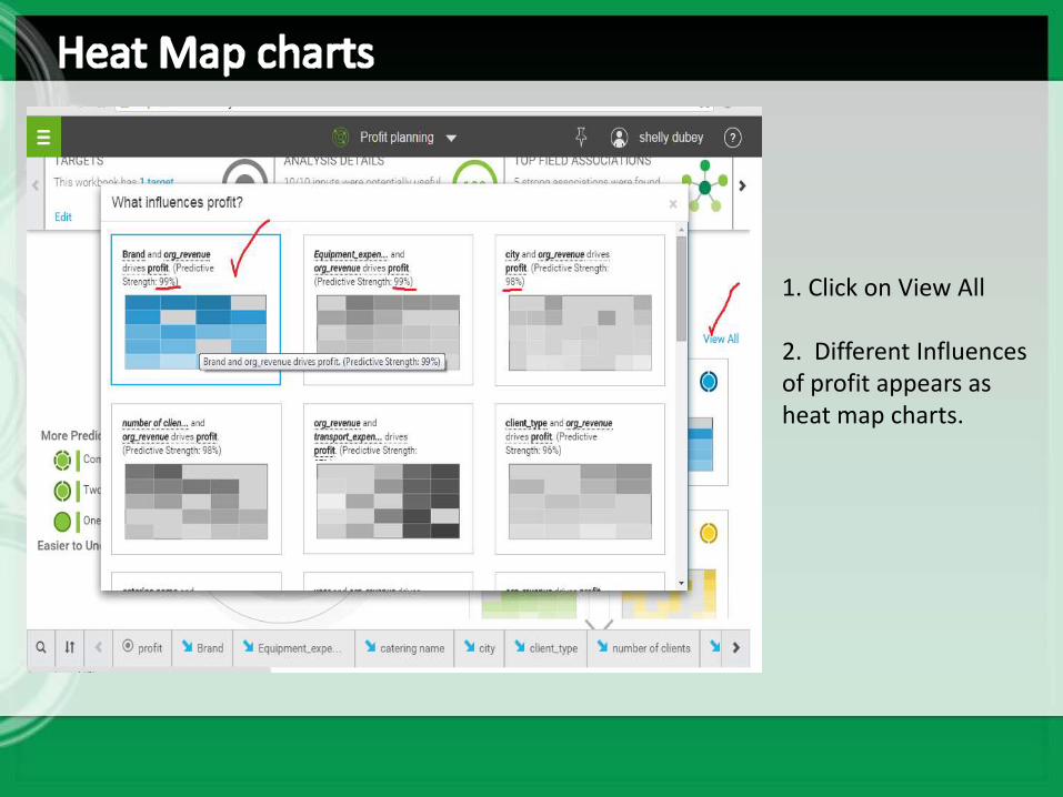
1. Click on View All
2. Different Influences of profit appears as heat map charts.
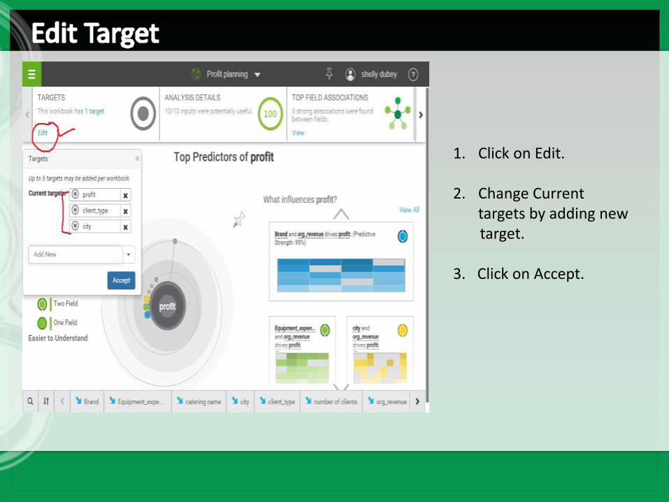
1. Click on Edit.
2. Change Current targets by adding newtarget.
3. Click on Accept.
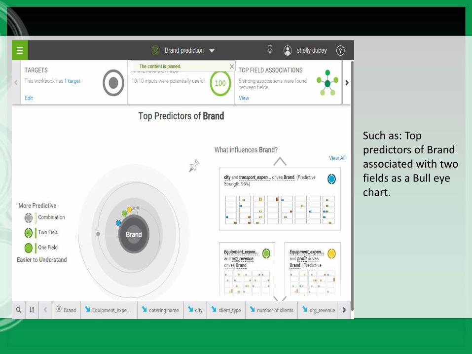
Such as: Top predictors of Brand associated with two fields as a Bull eye chart.
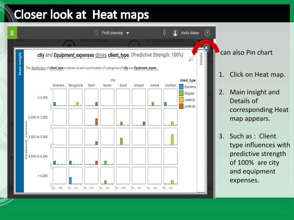
1. Click on Heat map.
2. Main insight and Details of corresponding Heat map appears.
3. Such as : Client type influences with predictive strength of 100% are city and equipment expenses.
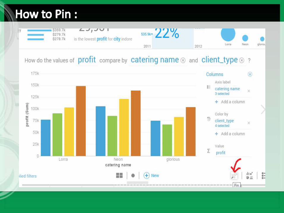
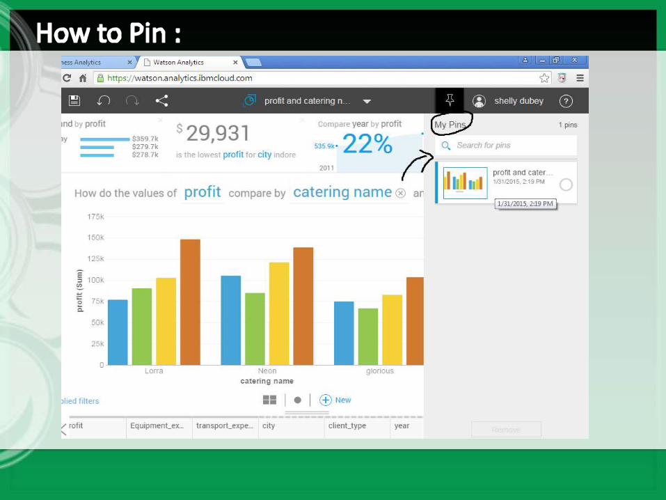
can also Pin chart
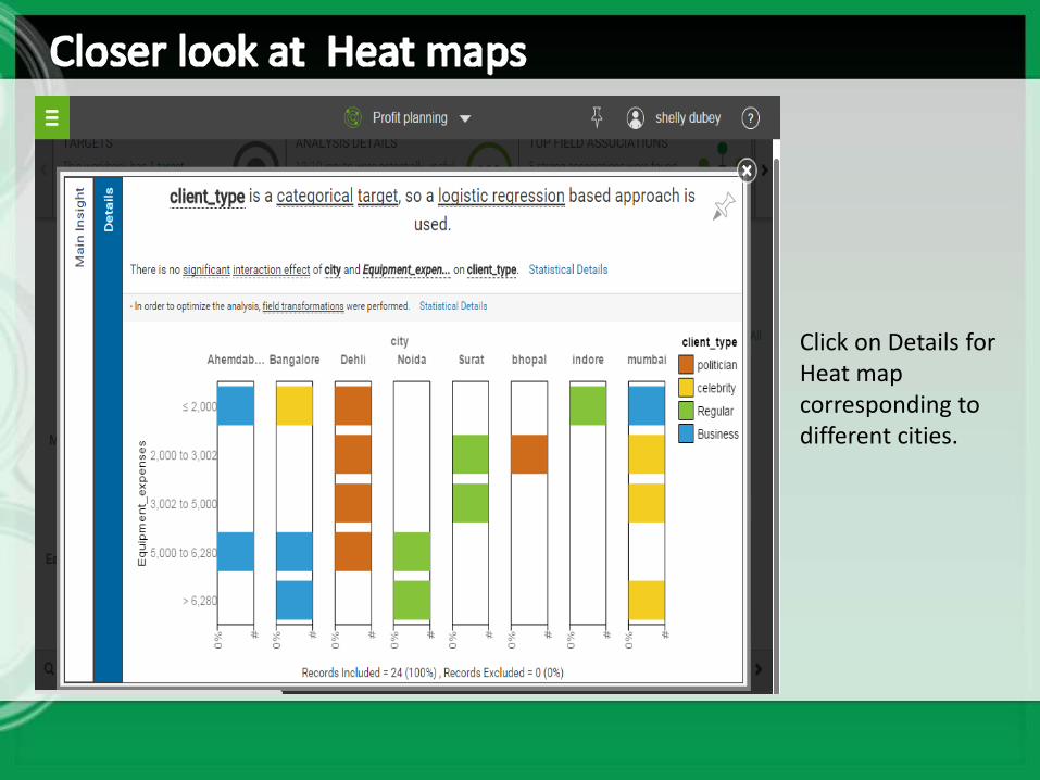
Click on Details for Heat map corresponding to different cities.
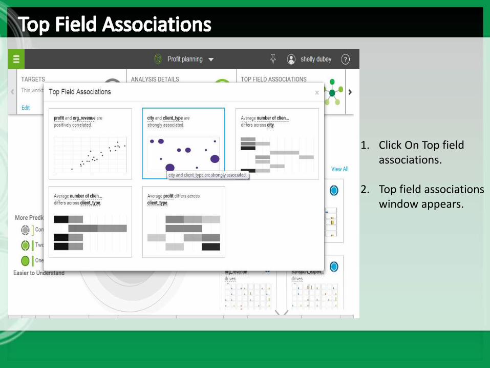
1. Click On Top field associations.
2. Top field associations window appears.
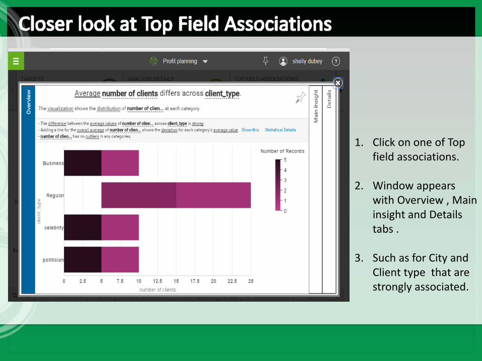
1. Click on one of Top field associations.
2. Window appears with Overview , Main insight and Details tabs .
3. Such as for City and Client type that are strongly associated.
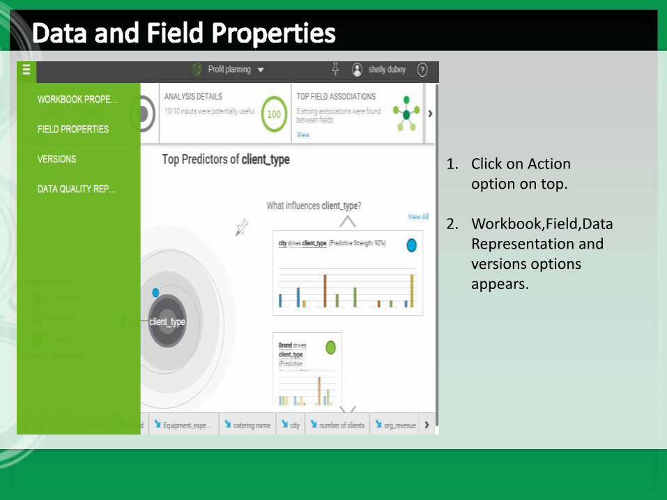
1. Click on Action option on top.
2. Workbook,Field,Data Representation and versions options appears.
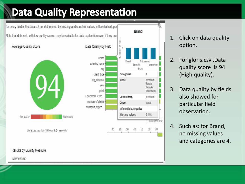
1. Click on data quality option.
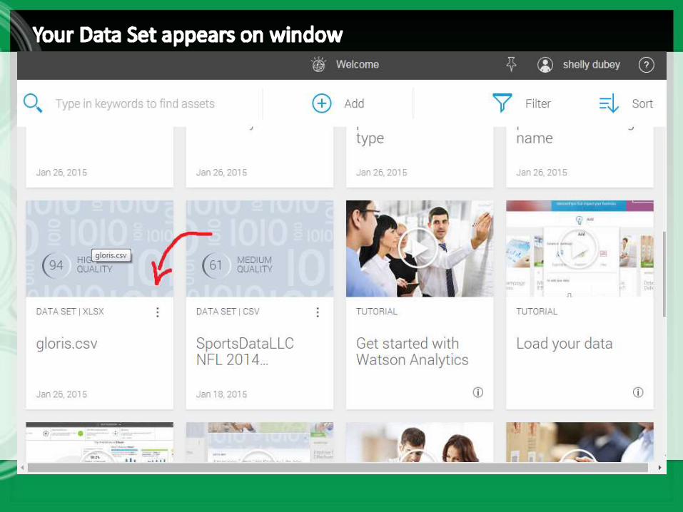
2. For gloris.csv ,Data quality score is 94 (High quality).
3. Data quality by fields also showed for particular field observation.
4. Such as: for Brand, no missing values and categories are 4.
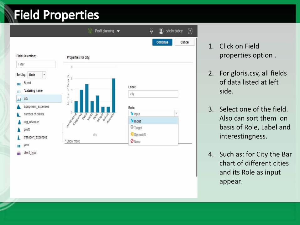
1. Click on Field properties option .
2. For gloris.csv, all fields of data listed at left side.
3. Select one of the field. Also can sort them on basis of Role, Label and interestingness.
4. Such as: for City the Bar chart of different cities and its Role as input appear.
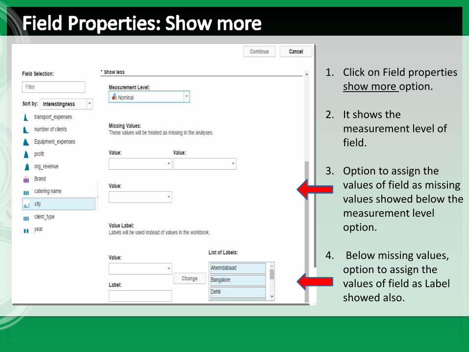
1. Click on Field properties show more option.
2. It shows the measurement level of field.
3. Option to assign the values of field as missing values showed below the measurement level option.
4. Below missing values, option to assign the values of field as Label showed also.
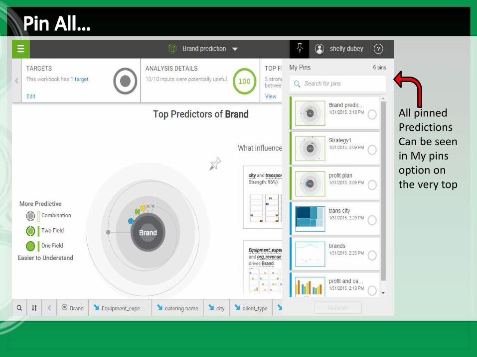
All pinned PredictionsCan be seen in My pins option on the very top

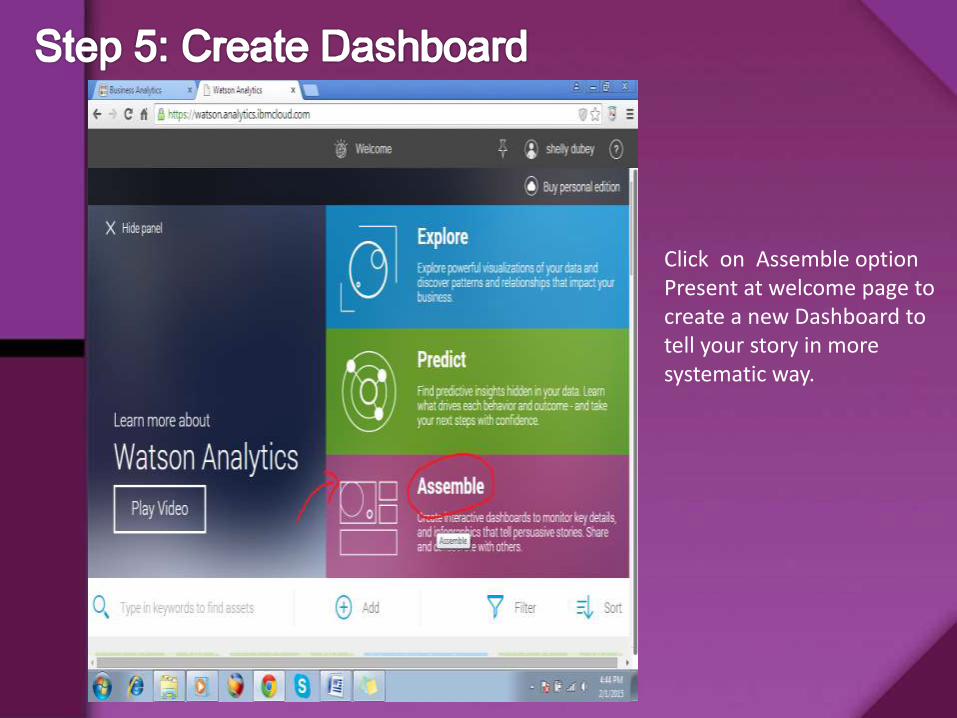
Click on Assemble option Present at welcome page to create a new Dashboard to tell your story in more systematic way.
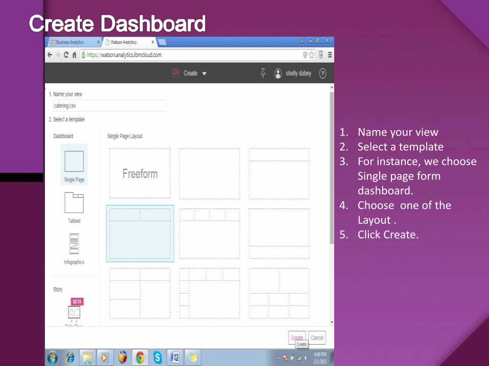
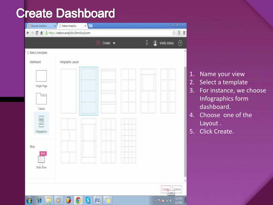
1. Name your view 2. Select a template3. For instance, we choose
Single page form dashboard.
4. Choose one of the Layout .
5. Click Create.
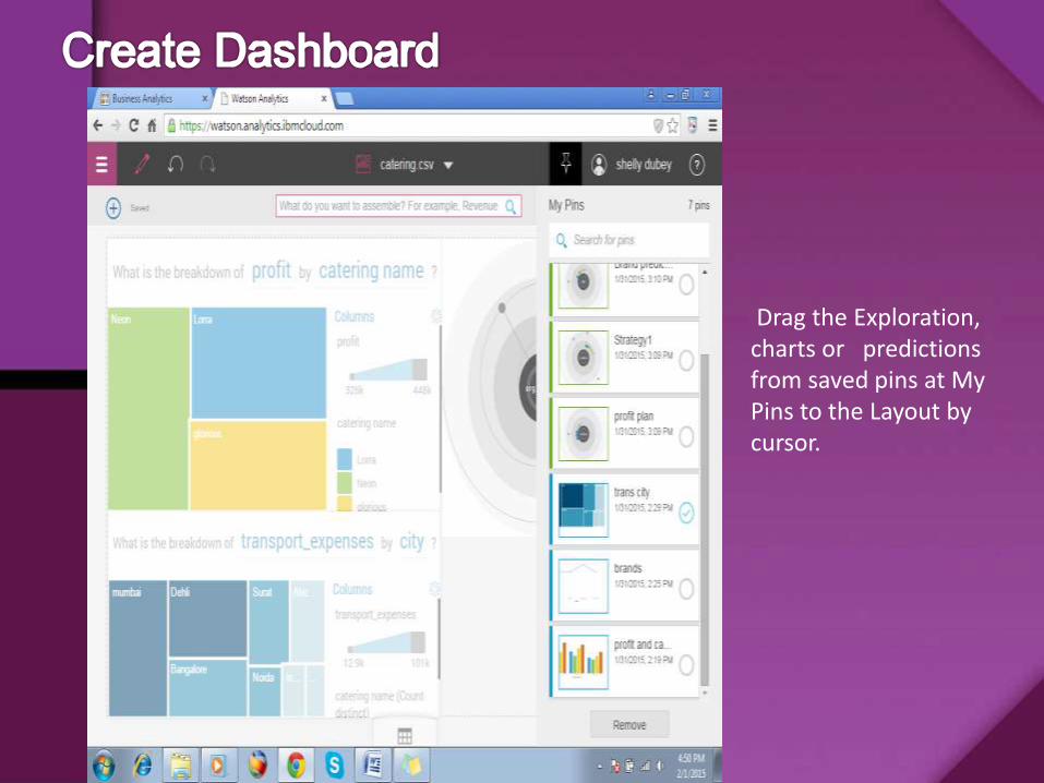
Drag the Exploration, charts or predictions from saved pins at My Pins to the Layout by cursor.
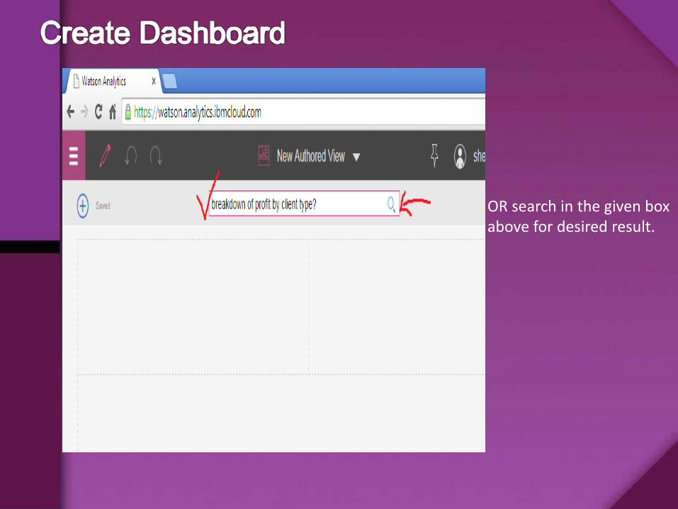
OR search in the given box above for desired result.
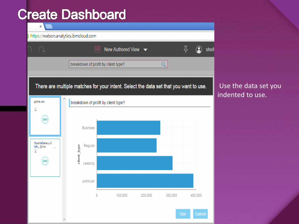
Use the data set you indented to use.
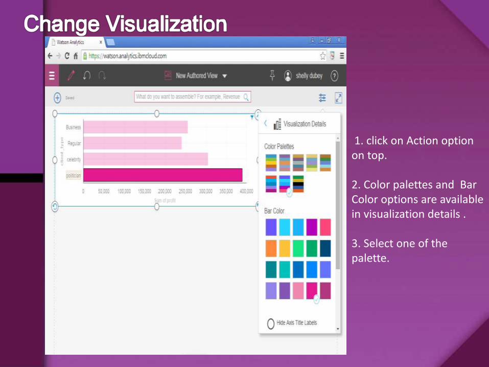
1. click on Action option on top.
2. Color palettes and Bar Color options are available in visualization details .
3. Select one of the palette.
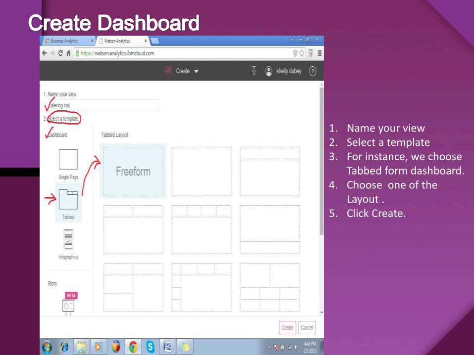
1. Name your view 2. Select a template3. For instance, we choose
Tabbed form dashboard.4. Choose one of the
Layout .5. Click Create.
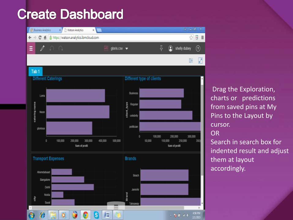
Drag the Exploration, charts or predictions from saved pins at My Pins to the Layout by cursor.ORSearch in search box for indented result and adjust them at layout accordingly.
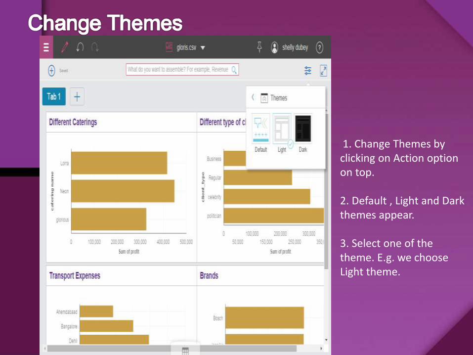
1. Change Themes by clicking on Action option on top.
2. Default , Light and Dark themes appear.
3. Select one of the theme. E.g. we choose Light theme.
1. Name your view 2. Select a template3. For instance, we choose
Infographics form dashboard.
4. Choose one of the Layout .
5. Click Create.
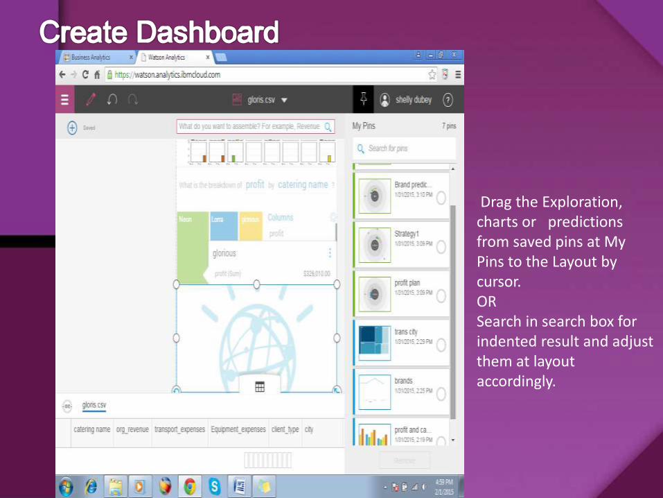
Drag the Exploration, charts or predictions from saved pins at My Pins to the Layout by cursor.ORSearch in search box for indented result and adjust them at layout accordingly.
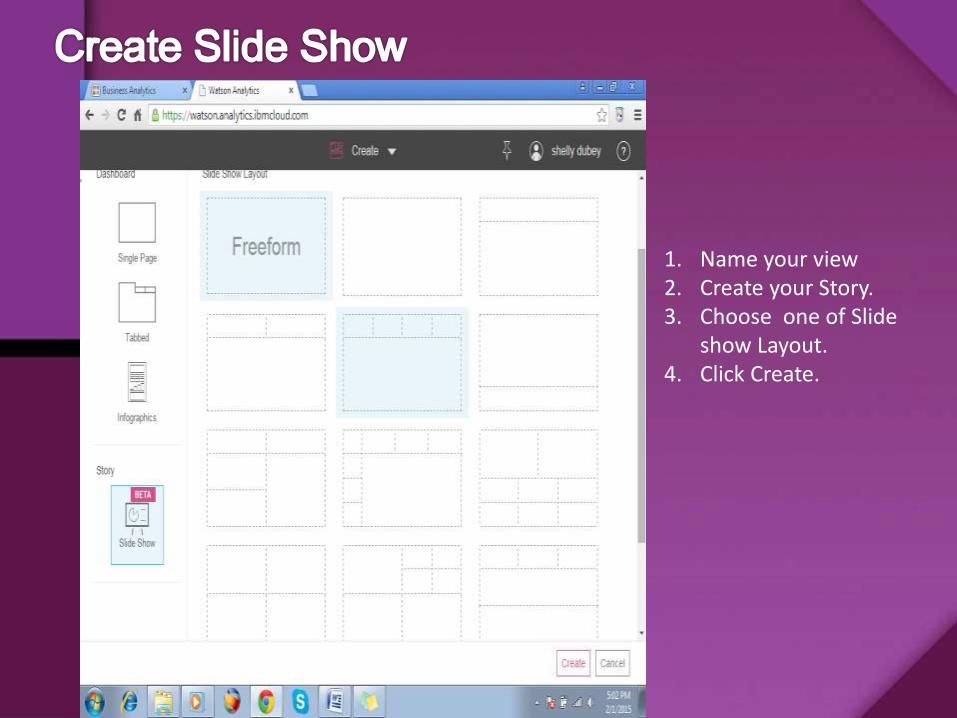
1. Name your view 2. Create your Story.3. Choose one of Slide
show Layout.4. Click Create.
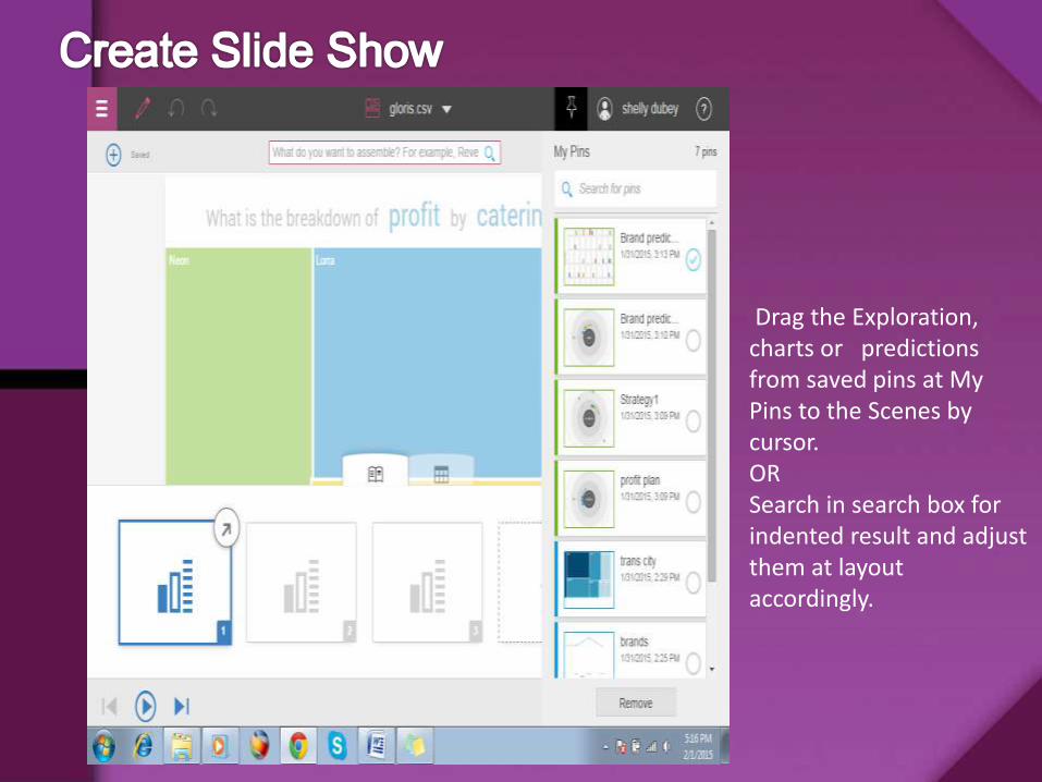
Drag the Exploration, charts or predictions from saved pins at My Pins to the Scenes by cursor.ORSearch in search box for indented result and adjust them at layout accordingly.
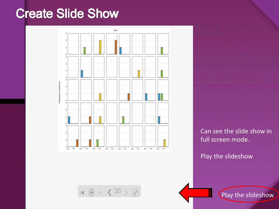
Can see the slide show in full screen mode.
Play the slideshow
Play the slideshow
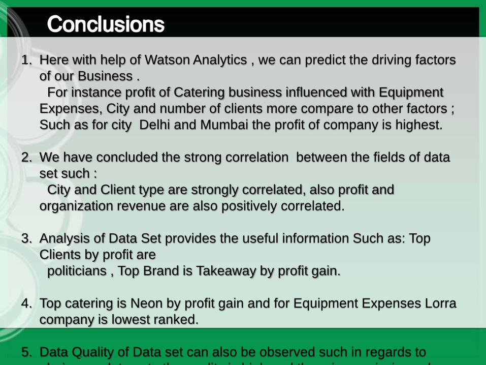
1. Here with help of Watson Analytics , we can predict the driving factors
of our Business .
For instance profit of Catering business influenced with Equipment
Expenses, City and number of clients more compare to other factors ;
Such as for city Delhi and Mumbai the profit of company is highest.
2. We have concluded the strong correlation between the fields of data
set such :
City and Client type are strongly correlated, also profit and
organization revenue are also positively correlated.
3. Analysis of Data Set provides the useful information Such as: Top
Clients by profit are
politicians , Top Brand is Takeaway by profit gain.
4. Top catering is Neon by profit gain and for Equipment Expenses Lorra
company is lowest ranked.
5. Data Quality of Data set can also be observed such in regards to
gloris.csv data set, the quality is high and there is no missing values
1. AnalyticsZone from IBM : http://www.ibm.com/analytics/watson-analytics/
2. Business Analytics Blog by Vikas Manoria
3. Forbes.com for Watson Analytics Beta


![PEP Web - The Analytic Third: Working with Intersubjective ... … · analytic third'. This third subjectivity, the intersubjective analytic third Green's [1975] 'analytic object'),](https://img.pdfslide.net/doc/110x75/6099619e2d4b51336024f694/pep-web-the-analytic-third-working-with-intersubjective-analytic-third.jpg)