Embed Size (px)
Citation preview
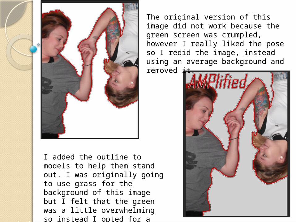
The original version of this image did not work because the green screen was crumpled, however I really liked the pose so I redid the image, instead using an average background and removed it.
I added the outline to models to help them stand out. I was originally going to use grass for the background of this image but I felt that the green was a little overwhelming so instead I opted for a blank grey background.
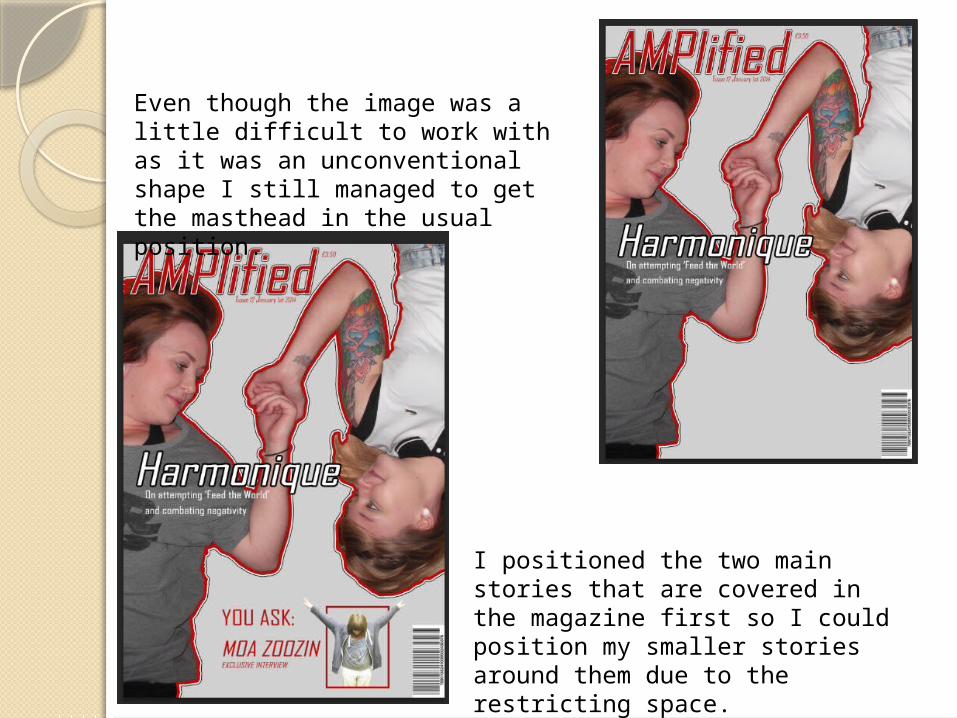
Even though the image was a little difficult to work with as it was an unconventional shape I still managed to get the masthead in the usual position.
I positioned the two main stories that are covered in the magazine first so I could position my smaller stories around them due to the restricting space.
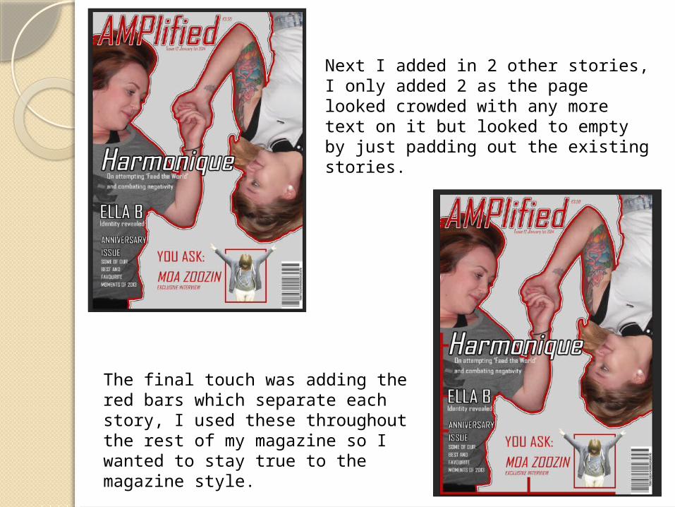
Next I added in 2 other stories, I only added 2 as the page looked crowded with any more text on it but looked to empty by just padding out the existing stories.
The final touch was adding the red bars which separate each story, I used these throughout the rest of my magazine so I wanted to stay true to the magazine style.