Embed Size (px)
Citation preview
Creation of my magazine cover and contents page.
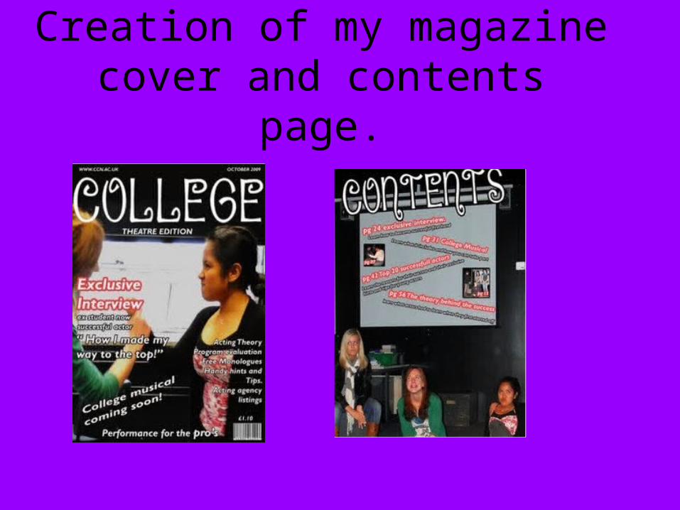
Font coverTo begin with I edited my photos colours to make them more bold and stand out.
I then added a big bold white title, I used white so it would stand out on the black background boldly.
I then added the more important titles in the left hand side. I put bold colours as an out line of the text so they would stand out on the dark background.
I then added the less important text on the right hand side in a smaller font but still added an out line so they stand out from the background. I also added a bar code and price to give it an more professional look. Lastly I added a slogan at the bottom of the page.
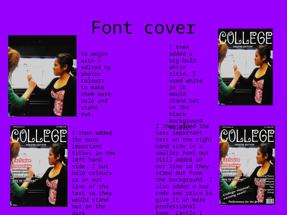
contentsTo begin with I edited my photos colours to make them more bold and stand out. I then added the bold title with
a dark out line to make it stand out. I added the page numbers with their contents and gave the text bright out lines so they matched the writing on the front cover of the magazine
I then added s couple of small pictures to show some of the contents of the pages, I out lined the photos in black so they stand out clearly on the white back ground.
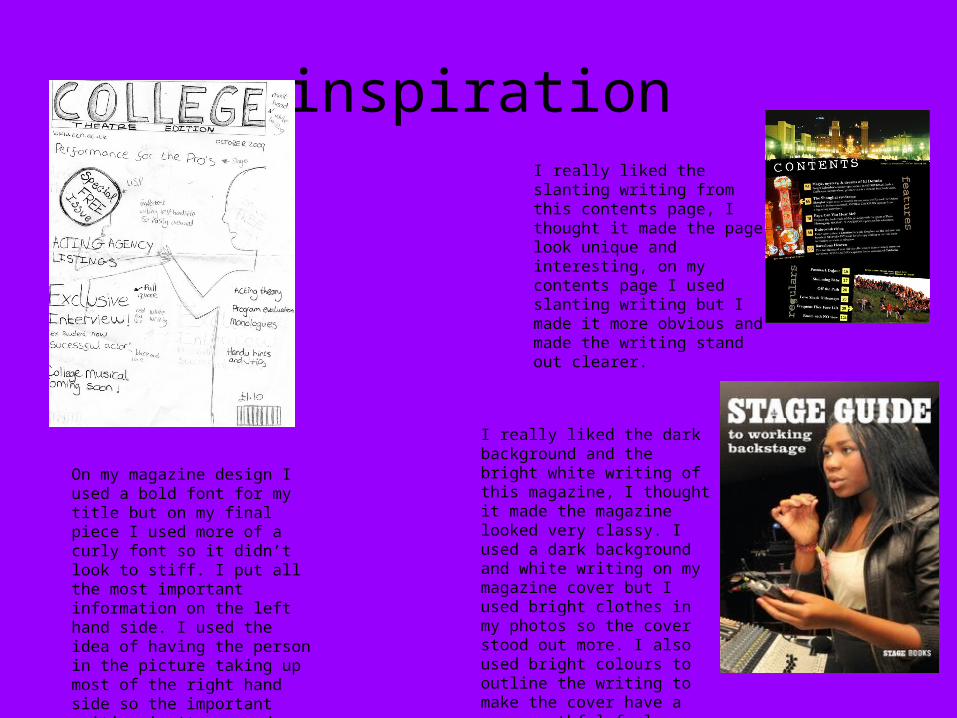
inspirationI really liked the slanting writing from this contents page, I thought it made the page look unique and interesting, on my contents page I used slanting writing but I made it more obvious and made the writing stand out clearer.
I really liked the dark background and the bright white writing of this magazine, I thought it made the magazine looked very classy. I used a dark background and white writing on my magazine cover but I used bright clothes in my photos so the cover stood out more. I also used bright colours to outline the writing to make the cover have a more youthful feel.
On my magazine design I used a bold font for my title but on my final piece I used more of a curly font so it didn’t look to stiff. I put all the most important information on the left hand side. I used the idea of having the person in the picture taking up most of the right hand side so the important writing isn't covered.
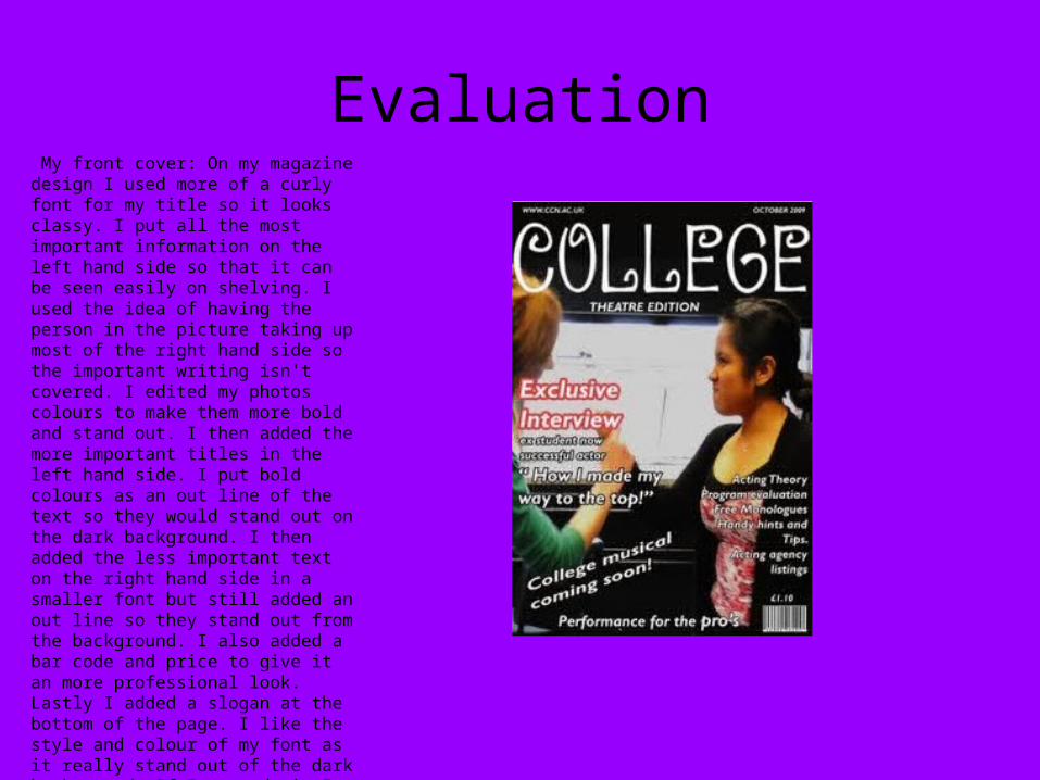
Evaluation My front cover: On my magazine design I used more of a curly font for my title so it looks classy. I put all the most important information on the left hand side so that it can be seen easily on shelving. I used the idea of having the person in the picture taking up most of the right hand side so the important writing isn't covered. I edited my photos colours to make them more bold and stand out. I then added the more important titles in the left hand side. I put bold colours as an out line of the text so they would stand out on the dark background. I then added the less important text on the right hand side in a smaller font but still added an out line so they stand out from the background. I also added a bar code and price to give it an more professional look. Lastly I added a slogan at the bottom of the page. I like the style and colour of my font as it really stand out of the dark background. If I re made it I would make the photos capture the facial expression better and not have so much daylight in the background as it draws attention away from the writing,
Evaluation
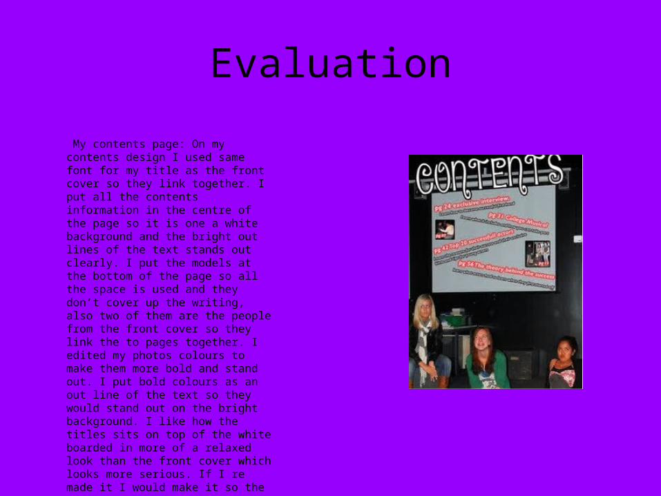
My contents page: On my contents design I used same font for my title as the front cover so they link together. I put all the contents information in the centre of the page so it is one a white background and the bright out lines of the text stands out clearly. I put the models at the bottom of the page so all the space is used and they don’t cover up the writing, also two of them are the people from the front cover so they link the to pages together. I edited my photos colours to make them more bold and stand out. I put bold colours as an out line of the text so they would stand out on the bright background. I like how the titles sits on top of the white boarded in more of a relaxed look than the front cover which looks more serious. If I re made it I would make it so the pictures that show the contents were bigger and stood out more.