Embed Size (px)
Citation preview
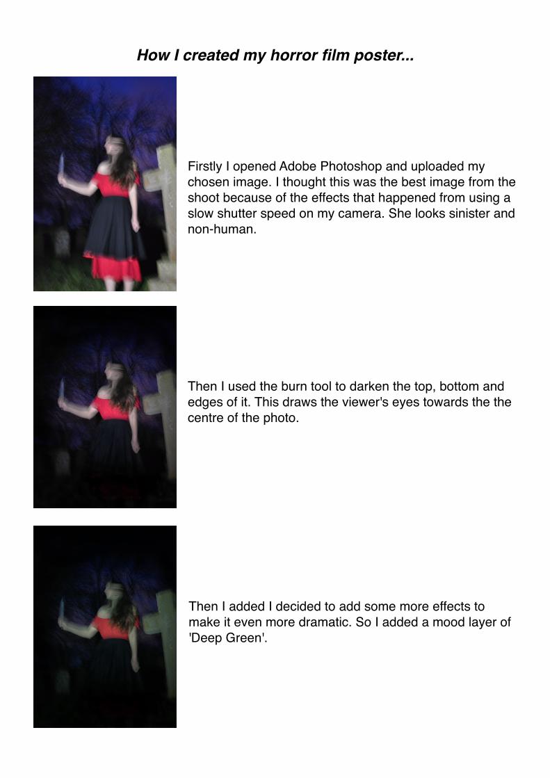
How I created my horror film poster...
Firstly I opened Adobe Photoshop and uploaded my chosen image. I thought this was the best image from the shoot because of the effects that happened from using a slow shutter speed on my camera. She looks sinister and non-human.
Then I used the burn tool to darken the top, bottom and edges of it. This draws the viewer's eyes towards the the centre of the photo.
Then I added I decided to add some more effects to make it even more dramatic. So I added a mood layer of 'Deep Green'.
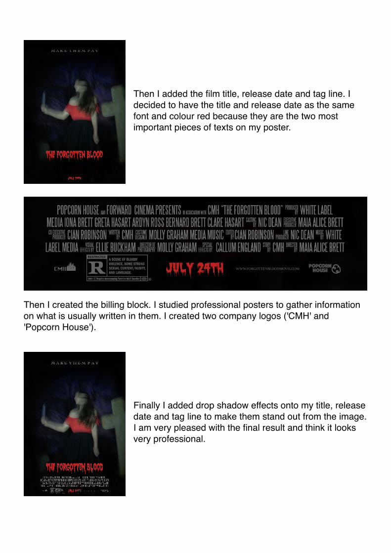
Then I added the film title, release date and tag line. I decided to have the title and release date as the same font and colour red because they are the two most important pieces of texts on my poster.
Then I created the billing block. I studied professional posters to gather information on what is usually written in them. I created two company logos ('CMH' and 'Popcorn House').
Finally I added drop shadow effects onto my title, release date and tag line to make them stand out from the image. I am very pleased with the final result and think it looks very professional.
How I created my horror film magazine cover...
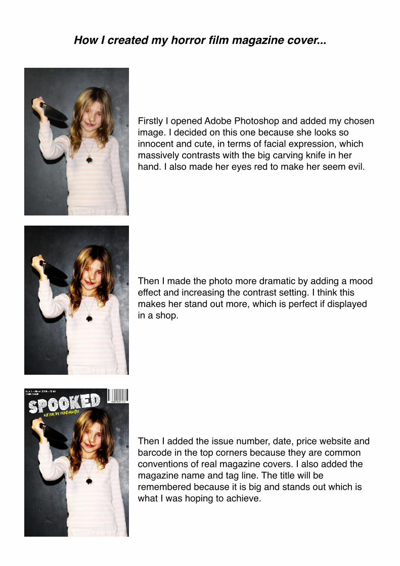
Firstly I opened Adobe Photoshop and added my chosen image. I decided on this one because she looks so innocent and cute, in terms of facial expression, which massively contrasts with the big carving knife in her hand. I also made her eyes red to make her seem evil.
Then I made the photo more dramatic by adding a mood effect and increasing the contrast setting. I think this makes her stand out more, which is perfect if displayed in a shop.
Then I added the issue number, date, price website and barcode in the top corners because they are common conventions of real magazine covers. I also added the magazine name and tag line. The title will be remembered because it is big and stands out which is what I was hoping to achieve.
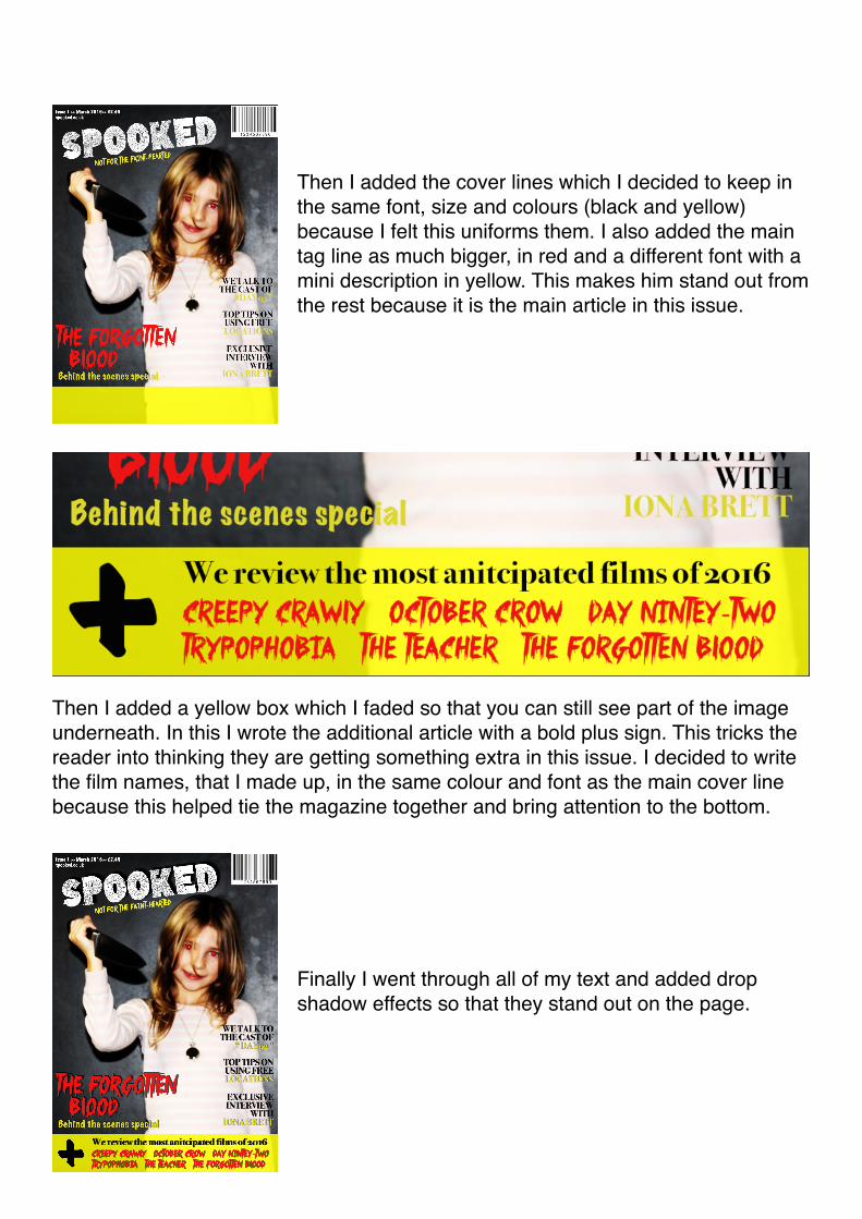
Then I added the cover lines which I decided to keep in the same font, size and colours (black and yellow) because I felt this uniforms them. I also added the main tag line as much bigger, in red and a different font with a mini description in yellow. This makes him stand out from the rest because it is the main article in this issue.
Then I added a yellow box which I faded so that you can still see part of the image underneath. In this I wrote the additional article with a bold plus sign. This tricks the reader into thinking they are getting something extra in this issue. I decided to write the film names, that I made up, in the same colour and font as the main cover line because this helped tie the magazine together and bring attention to the bottom.
Finally I went through all of my text and added drop shadow effects so that they stand out on the page.