Embed Size (px)
Citation preview
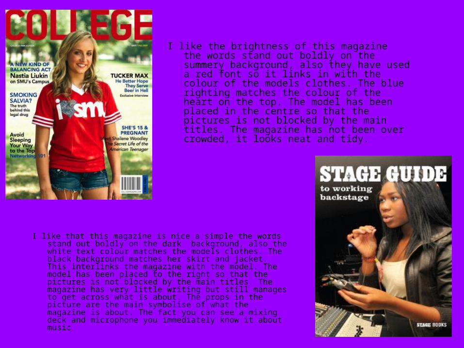
I like the brightness of this magazine the words stand out boldly on the summery background, also they have used a red font so it links in with the colour of the models clothes. The blue righting matches the colour of the heart on the top. The model has been placed in the centre so that the pictures is not blocked by the main titles. The magazine has not been over crowded, it looks neat and tidy.
I like that this magazine is nice a simple the words stand out boldly on the dark background, also the white text colour matches the models clothes. The black background matches her skirt and jacket. This interlinks the magazine with the model. The model has been placed to the right so that the pictures is not blocked by the main titles. The magazine has very little writing but still manages to get across what is about. The props in the picture are the main symbolise of what the magazine is about. The fact you can see a mixing deck and microphone you immediately know it about music
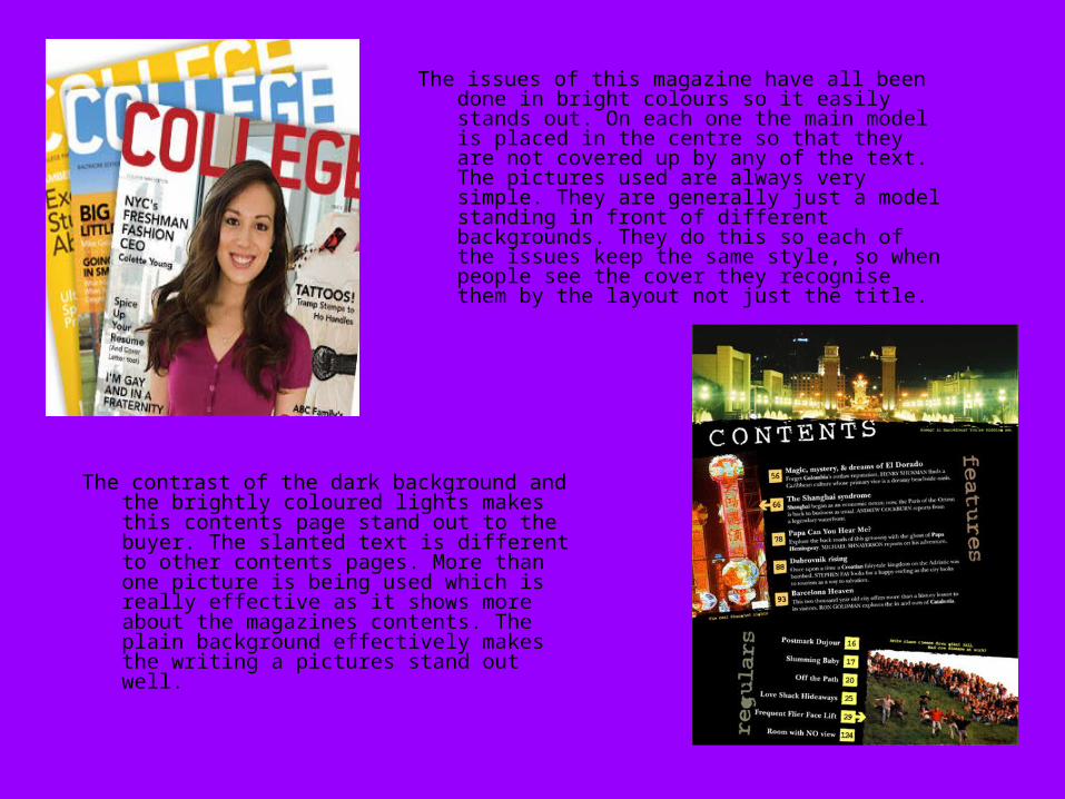
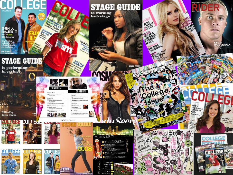
The issues of this magazine have all been done in bright colours so it easily stands out. On each one the main model is placed in the centre so that they are not covered up by any of the text. The pictures used are always very simple. They are generally just a model standing in front of different backgrounds. They do this so each of the issues keep the same style, so when people see the cover they recognise them by the layout not just the title.
The contrast of the dark background and the brightly coloured lights makes this contents page stand out to the buyer. The slanted text is different to other contents pages. More than one picture is being used which is really effective as it shows more about the magazines contents. The plain background effectively makes the writing a pictures stand out well.
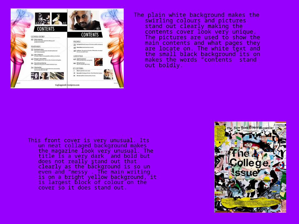
The plain white background makes the swirling colours and pictures stand out clearly making the contents cover look very unique. The pictures are used to show the main contents and what pages they are locate on. The white text and the small black background its on makes the words “contents” stand out boldly.
This front cover is very unusual. Its un neat collaged background makes the magazine look very unusual. The title is a very dark and bold but does not really stand out that clearly as the background is so un even and “messy”. The main writing is on a bright yellow background, it is largest block of colour on the cover so it does stand out.