Embed Size (px)
Citation preview
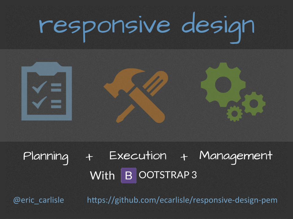
responsive design
Planning Execution + + Management With OOTSTRAP 3
h#ps://github.com/ecarlisle/responsive-‐design-‐pem @eric_carlisle
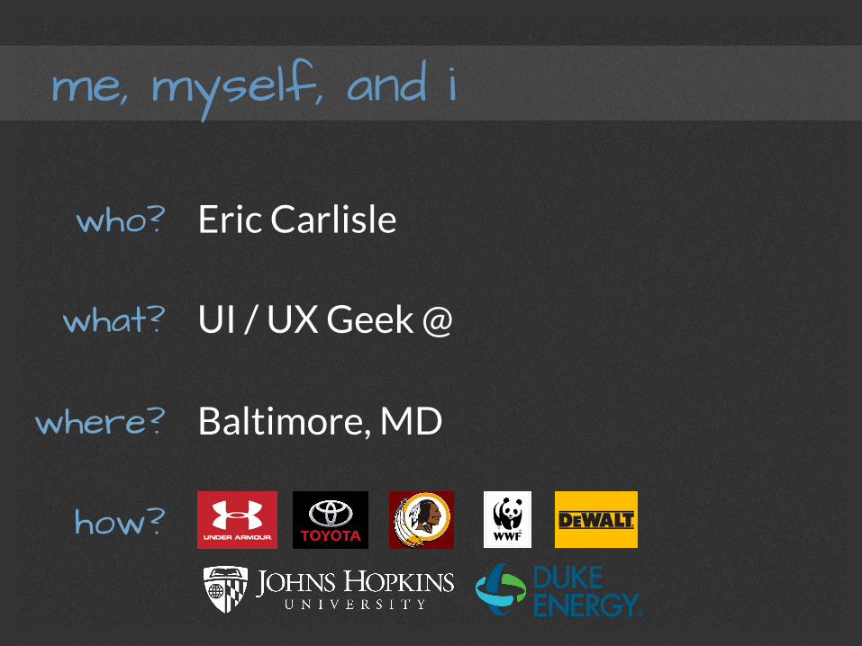
me, myself, and i
Eric Carlisle
UI / UX Geek @
Baltimore, MD
who?
what?
where?
how?
Agenda
Planning : The Mobile-First Approach
Execution : Introduction to Bootstrap
Management : Workflow, Tooling, Caveats
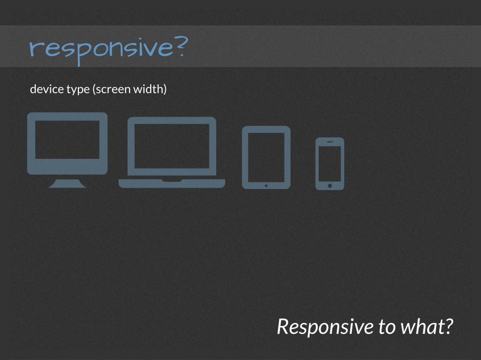
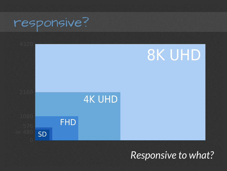
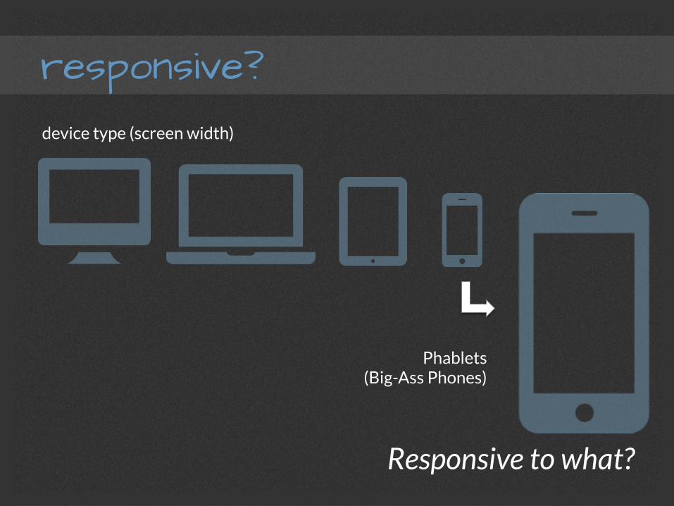
responsive?
Responsive to what?
device type (screen width)
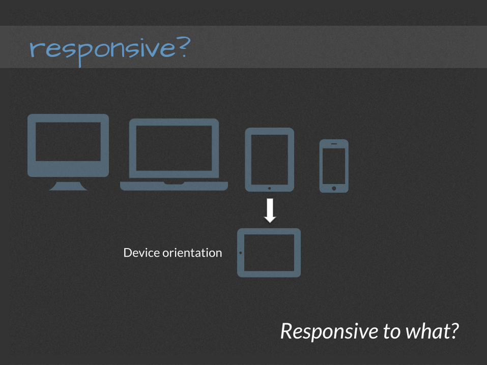
responsive?
Responsive to what?
Device orientation
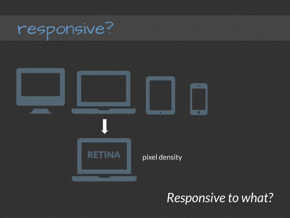
responsive?
Responsive to what?
pixel density
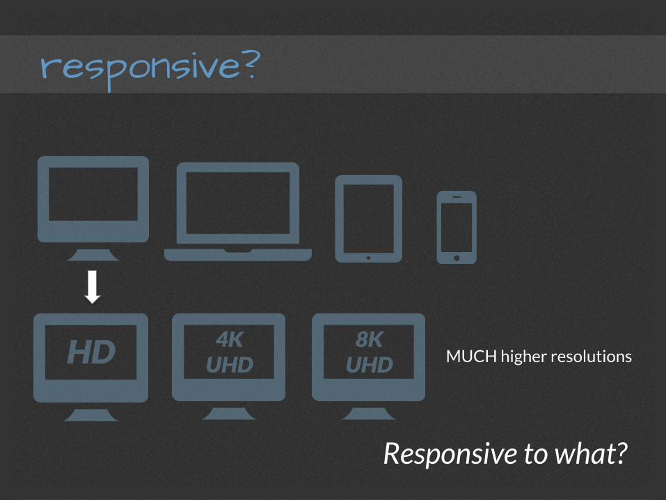
responsive?
Responsive to what?
MUCH higher resolutions
responsive?
Responsive to what?
responsive?
Responsive to what?
device type (screen width)
Phablets (Big-Ass Phones)
responsive?

responsive?
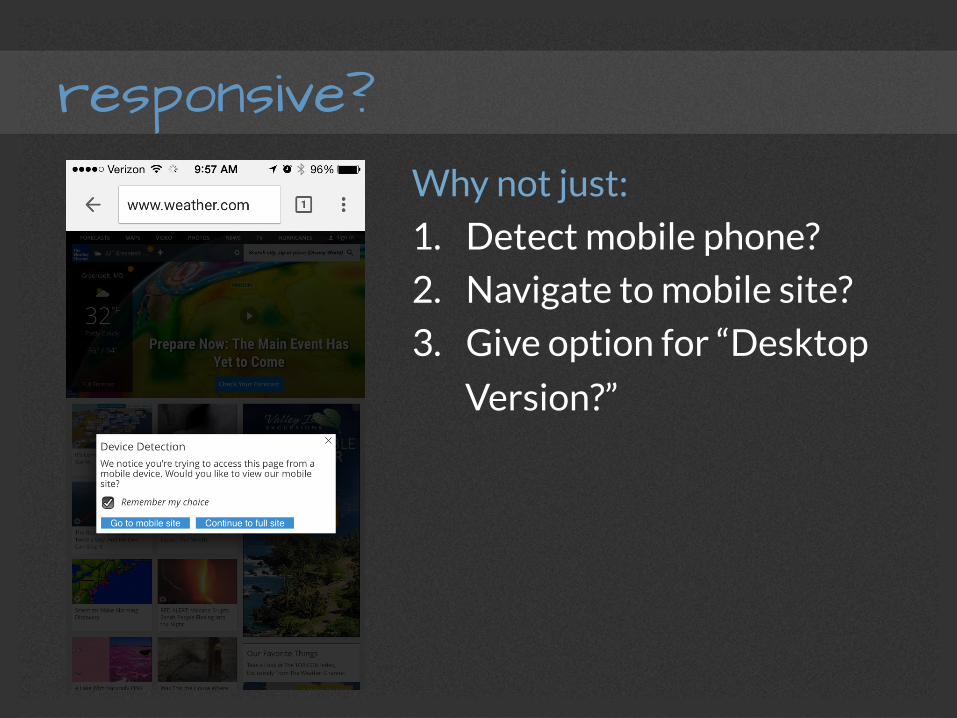
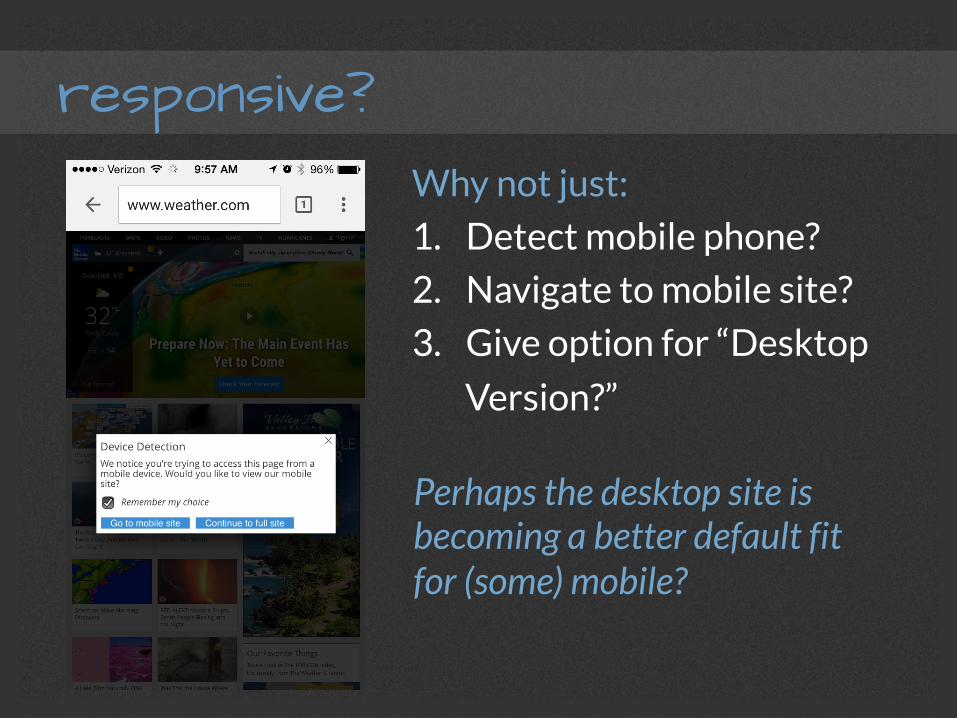
responsive? Why not just:
1. Detect mobile phone?
2. Navigate to mobile site?
3. Give option for “Desktop
Version?”
responsive? Why not just:
1. Detect mobile phone?
2. Navigate to mobile site?
3. Give option for “Desktop
Version?”
Perhaps the desktop site is becoming a better default fit for (some) mobile?
responsive?
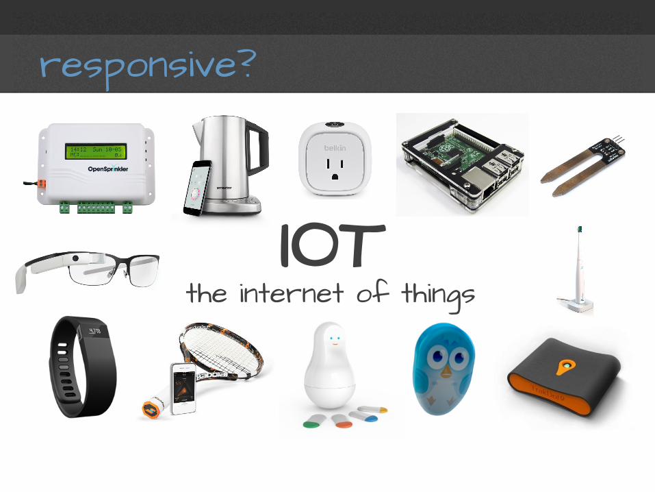
IOT the internet of things
responsive?
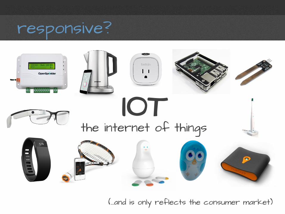
(...and is only reflects the consumer market)
IOT the internet of things
responsive?
Responsive to WHAT NOT?

planning
mobile first
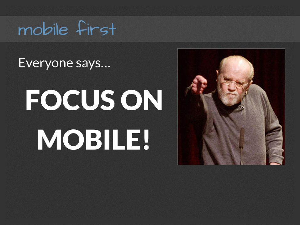
Everyone says…
FOCUS ON
MOBILE!
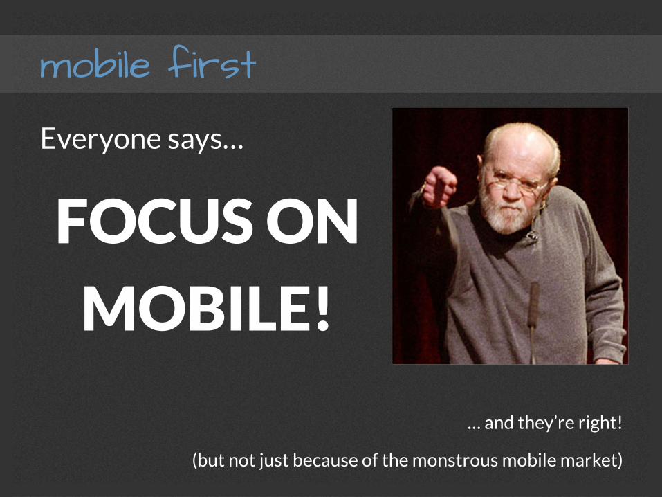
mobile first
Everyone says…
FOCUS ON
MOBILE!
… and they’re right!
(but not just because of the monstrous mobile market)
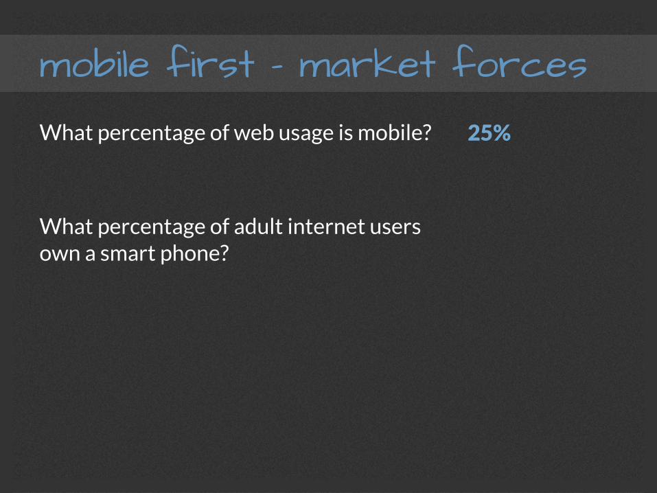
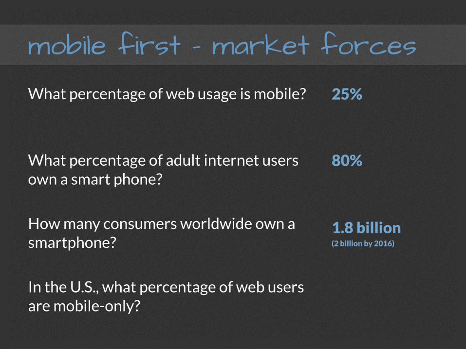
mobile first – market forces What percentage of web usage is mobile?
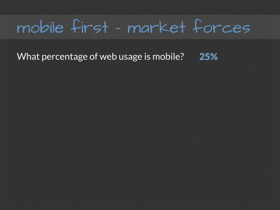
mobile first – market forces What percentage of web usage is mobile? 25%
mobile first – market forces What percentage of web usage is mobile?
What percentage of adult internet users own a smart phone?
25%
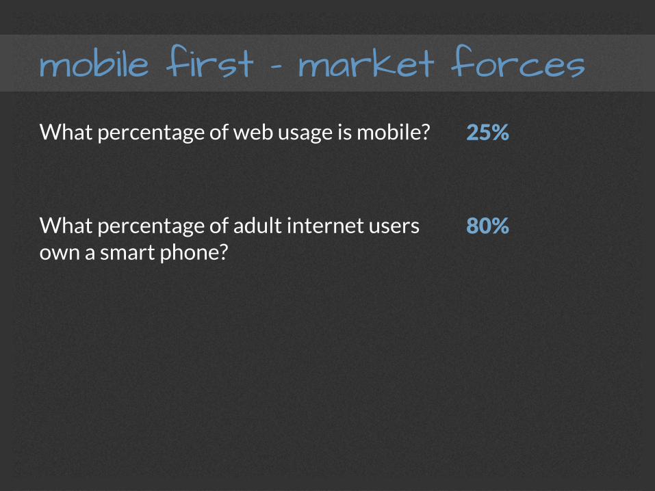
mobile first – market forces What percentage of web usage is mobile?
What percentage of adult internet users own a smart phone?
25%
80%
mobile first – market forces What percentage of web usage is mobile?
What percentage of adult internet users own a smart phone?
How many consumers worldwide own a smartphone?
25%
80%
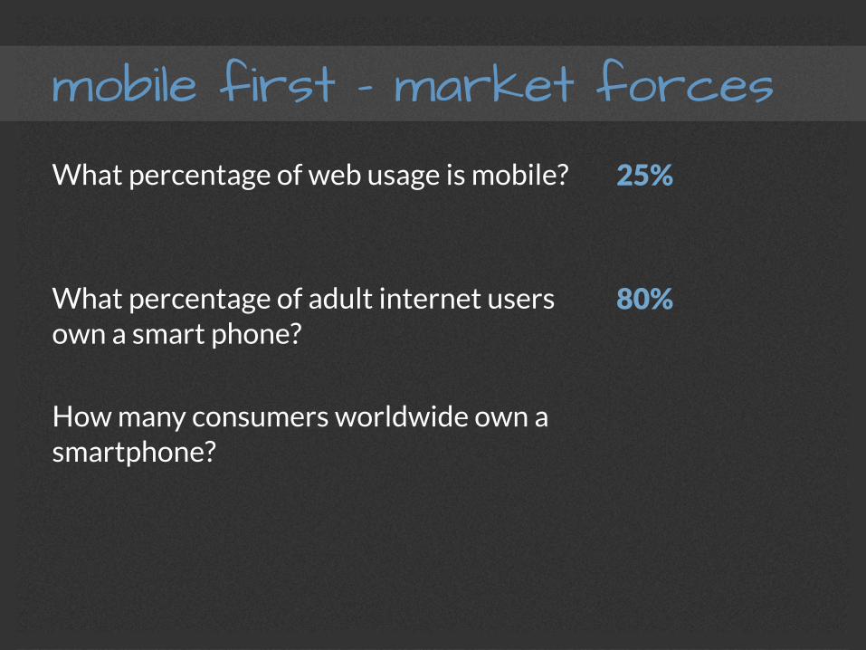
mobile first – market forces What percentage of web usage is mobile?
What percentage of adult internet users own a smart phone?
How many consumers worldwide own a smartphone?
25%
80%
1.8 billion (2 billion by 2016)
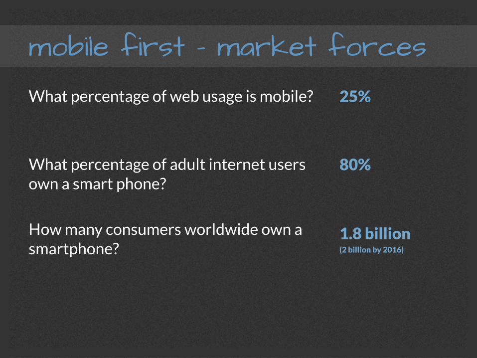
mobile first – market forces What percentage of web usage is mobile?
What percentage of adult internet users own a smart phone?
How many consumers worldwide own a smartphone?
In the U.S., what percentage of web users are mobile-only?
25%
80%
1.8 billion (2 billion by 2016)
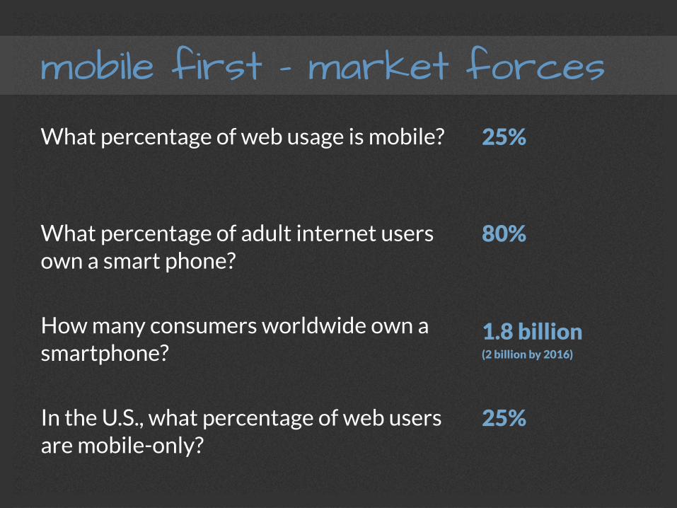
mobile first – market forces What percentage of web usage is mobile?
What percentage of adult internet users own a smart phone?
How many consumers worldwide own a smartphone?
In the U.S., what percentage of web users are mobile-only?
25%
80%
1.8 billion (2 billion by 2016)
25%
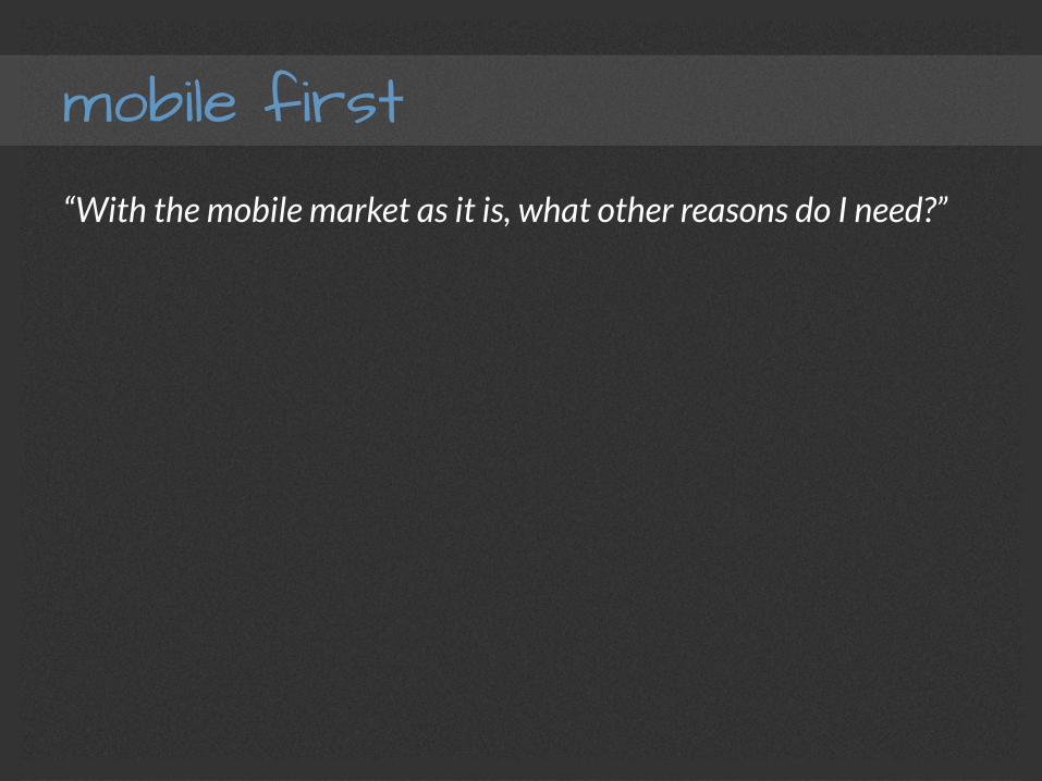
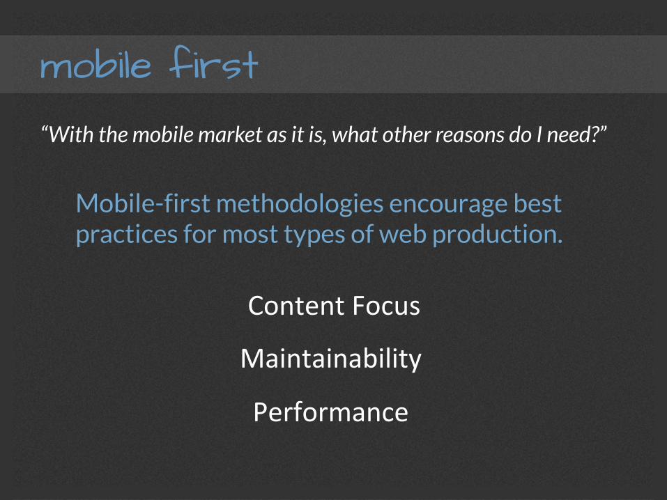
mobile first “With the mobile market as it is, what other reasons do I need?”
mobile first “With the mobile market as it is, what other reasons do I need?”
Mobile-first methodologies encourage best practices for most types of web production.
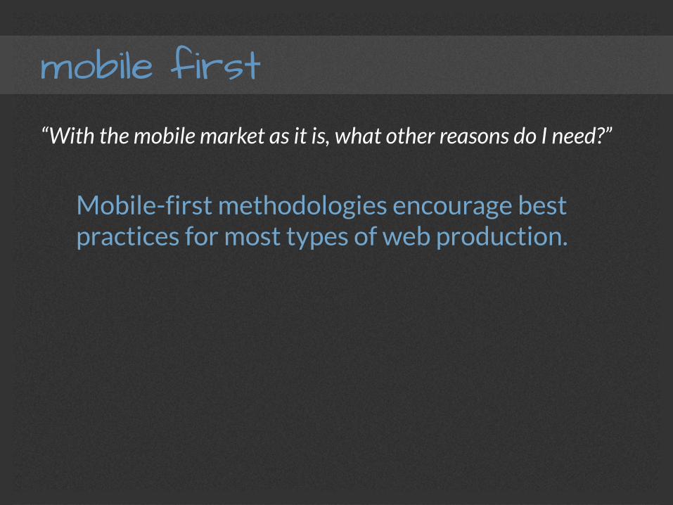
mobile first “With the mobile market as it is, what other reasons do I need?”
Mobile-first methodologies encourage best practices for most types of web production.
Content Focus
Maintainability
Performance
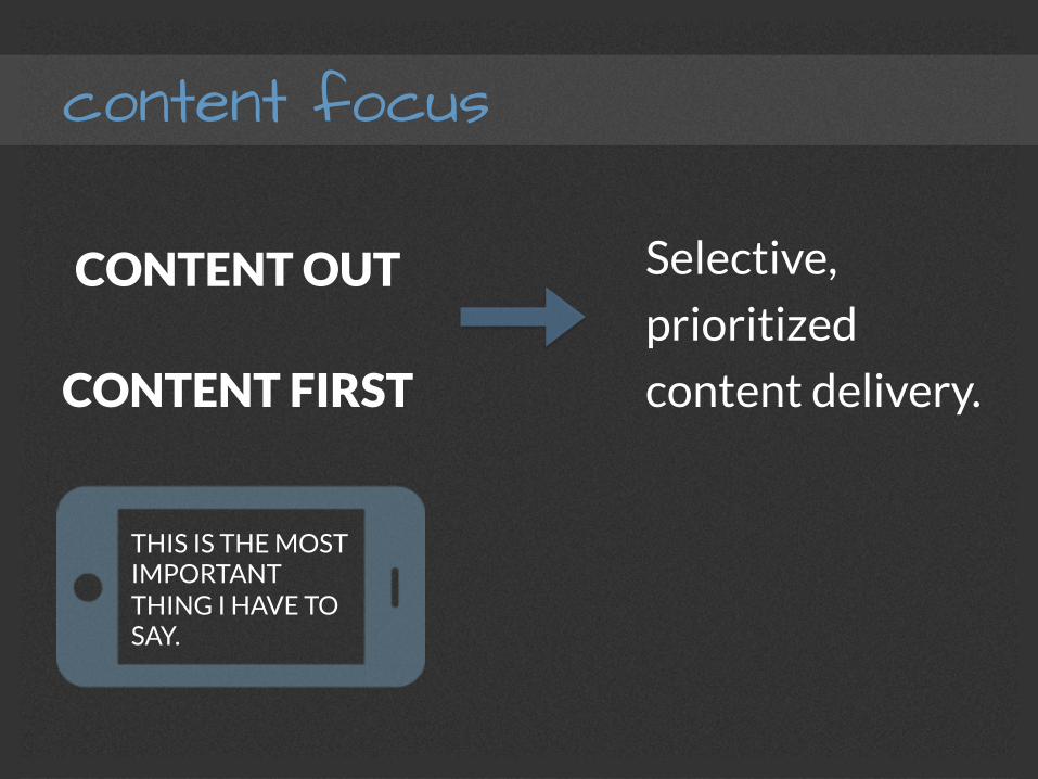
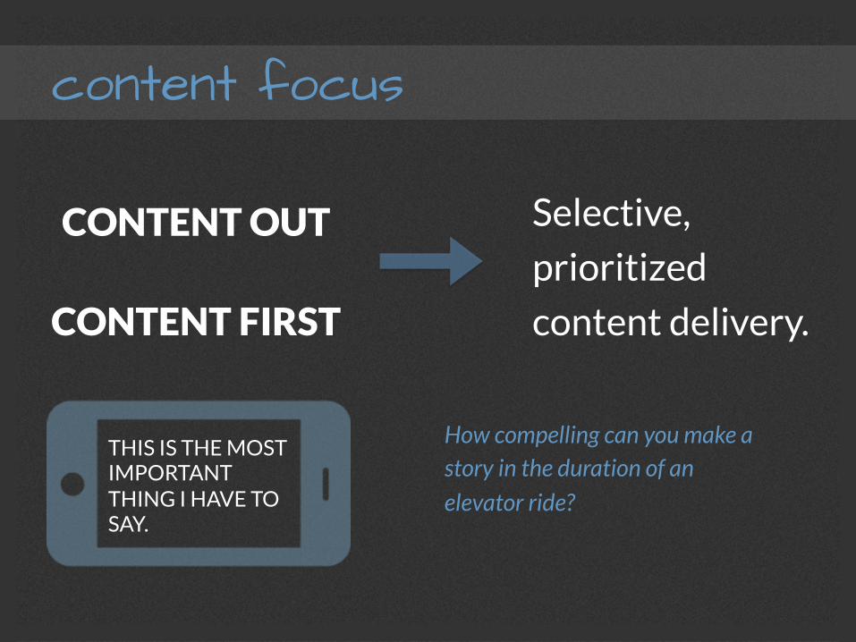
content focus
CONTENT OUT
CONTENT FIRST
Selective,
prioritized
content delivery.
THIS IS THE MOST IMPORTANT THING I HAVE TO SAY.
content focus
CONTENT OUT
CONTENT FIRST
Selective,
prioritized
content delivery.
THIS IS THE MOST IMPORTANT THING I HAVE TO SAY.
How compelling can you make a story in the duration of an elevator ride?
content focus Though there’s no competing with…
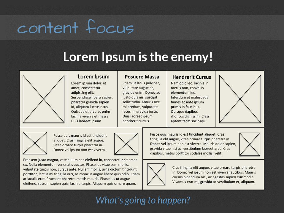
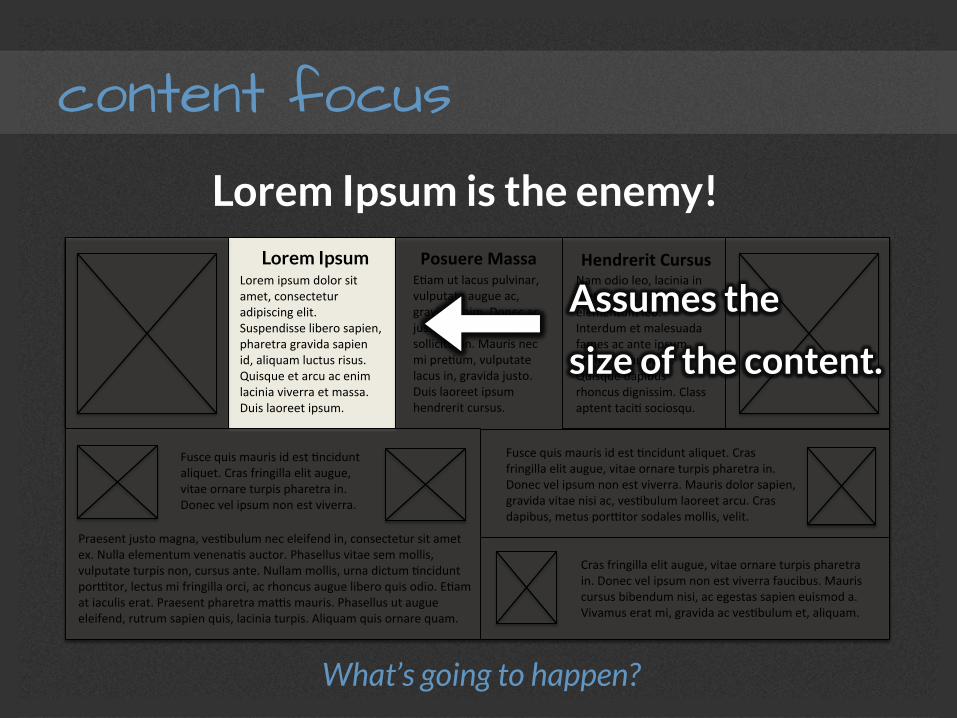
content focus Lorem Ipsum is the enemy!
content focus Lorem Ipsum is the enemy!
Nam odio leo, lacinia in metus non, convallis elementum leo. Interdum et malesuada fames ac ante ipsum primis in faucibus. Quisque dapibus rhoncus dignissim. Class aptent taciF sociosqu.
EFam ut lacus pulvinar, vulputate augue ac, gravida enim. Donec ac justo quis nisi suscipit sollicitudin. Mauris nec mi preFum, vulputate lacus in, gravida justo. Duis laoreet ipsum hendrerit cursus.
Lorem ipsum dolor sit amet, consectetur adipiscing elit. Suspendisse libero sapien, pharetra gravida sapien id, aliquam luctus risus. Quisque et arcu ac enim lacinia viverra et massa. Duis laoreet ipsum.
Lorem Ipsum Posuere Massa Hendrerit Cursus
Fusce quis mauris id est Fncidunt aliquet. Cras fringilla elit augue, vitae ornare turpis pharetra in. Donec vel ipsum non est viverra.
Praesent justo magna, vesFbulum nec eleifend in, consectetur sit amet ex. Nulla elementum venenaFs auctor. Phasellus vitae sem mollis, vulputate turpis non, cursus ante. Nullam mollis, urna dictum Fncidunt porMtor, lectus mi fringilla orci, ac rhoncus augue libero quis odio. EFam at iaculis erat. Praesent pharetra maMs mauris. Phasellus ut augue eleifend, rutrum sapien quis, lacinia turpis. Aliquam quis ornare quam.
Fusce quis mauris id est Fncidunt aliquet. Cras fringilla elit augue, vitae ornare turpis pharetra in. Donec vel ipsum non est viverra. Mauris dolor sapien, gravida vitae nisi ac, vesFbulum laoreet arcu. Cras dapibus, metus porMtor sodales mollis, velit.
Cras fringilla elit augue, vitae ornare turpis pharetra in. Donec vel ipsum non est viverra faucibus. Mauris cursus bibendum nisi, ac egestas sapien euismod a. Vivamus erat mi, gravida ac vesFbulum et, aliquam.
What’s going to happen?
Assumes the
size of the content.

content focus
What’s going to happen?
maintainability
Progressive Enhancement
instead of
Graceful Degradation
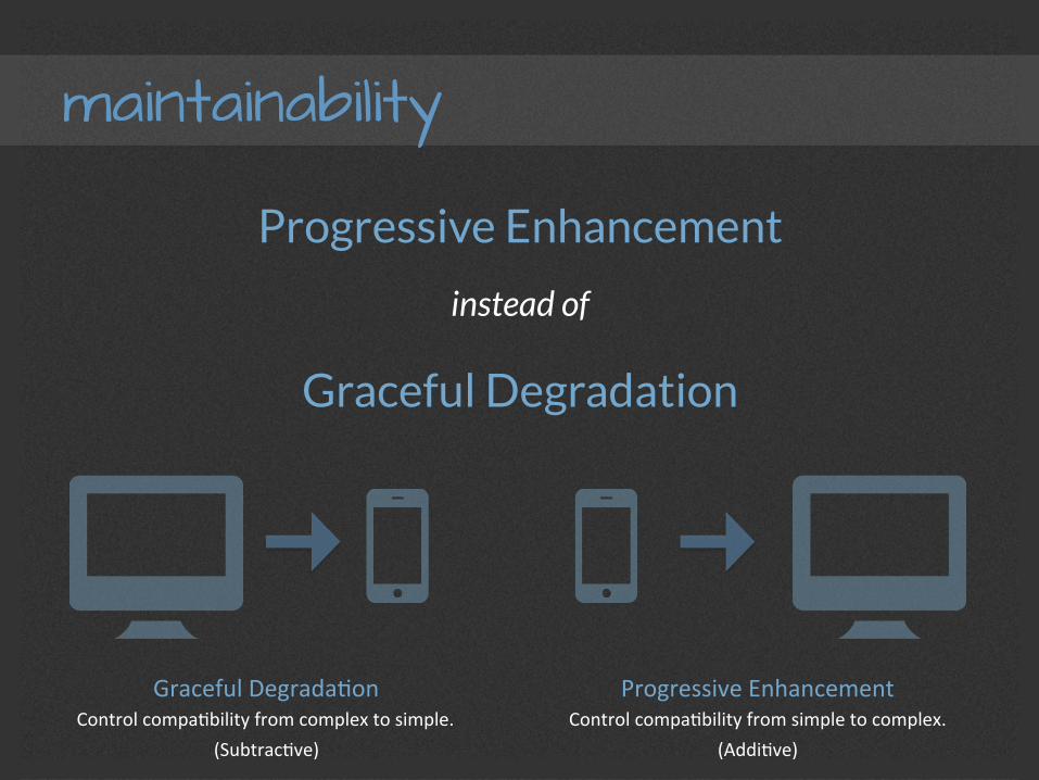
maintainability
Progressive Enhancement
instead of
Graceful Degradation
Graceful DegradaFon Control compaFbility from complex to simple.
(SubtracFve)
Progressive Enhancement Control compaFbility from simple to complex.
(AddiFve)
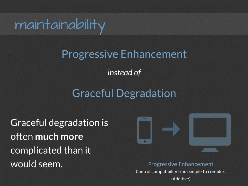
maintainability
Progressive Enhancement
instead of
Graceful Degradation
Progressive Enhancement Control compaFbility from simple to complex.
(AddiFve)
Graceful degradation is
often much more
complicated than it
would seem.
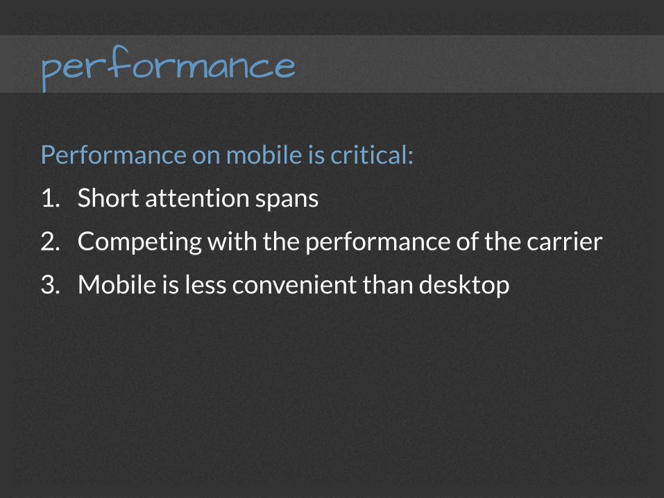
performance
Performance on mobile is critical:
1. Short attention spans
2. Competing with the performance of the carrier
3. Mobile is less convenient than desktop
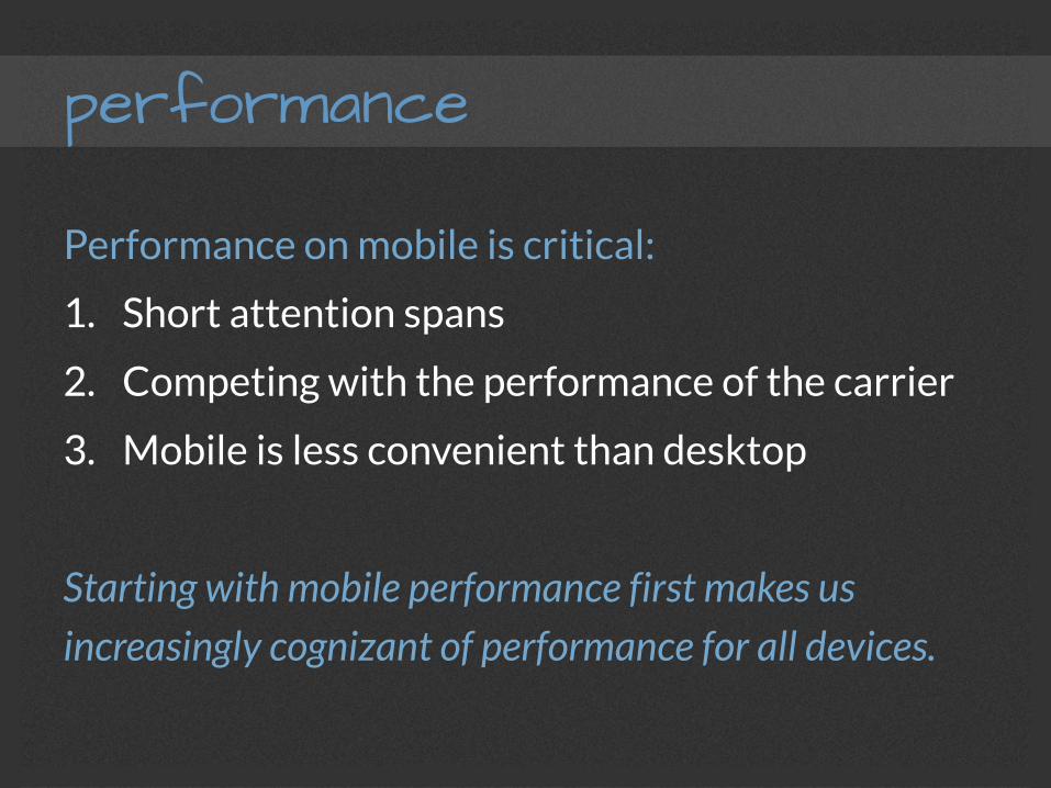
performance
Performance on mobile is critical:
1. Short attention spans
2. Competing with the performance of the carrier
3. Mobile is less convenient than desktop
Starting with mobile performance first makes us increasingly cognizant of performance for all devices.
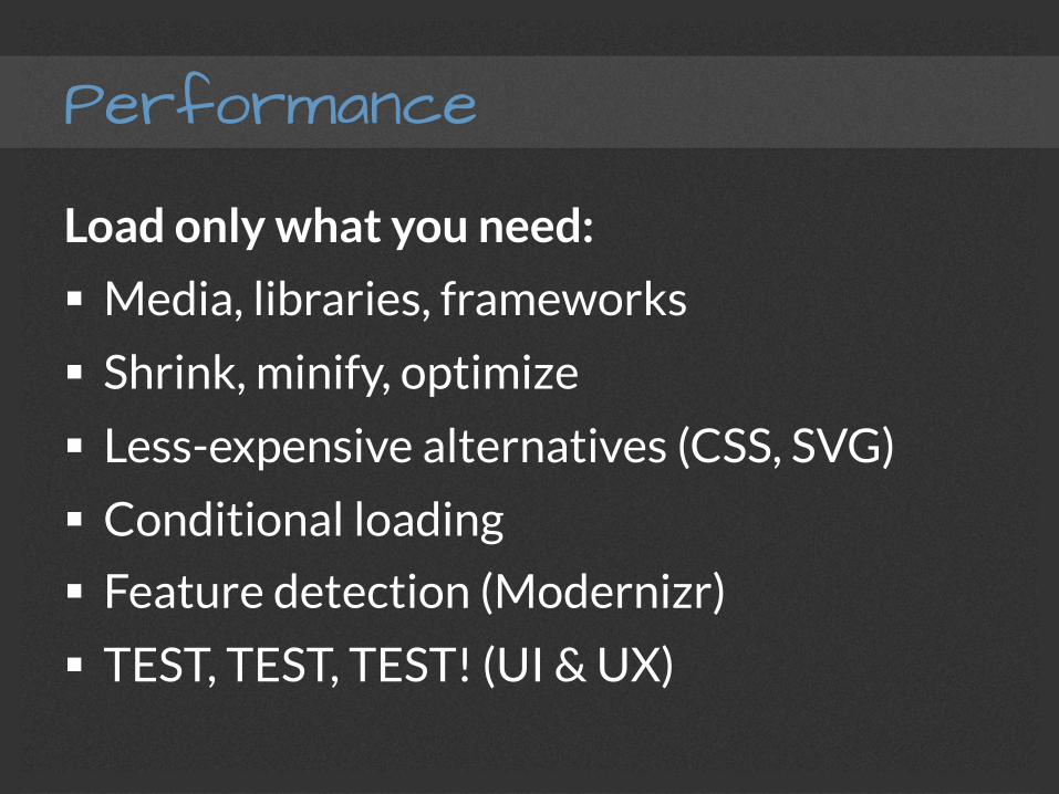
Performance
Load only what you need:
§ Media, libraries, frameworks
§ Shrink, minify, optimize
§ Less-expensive alternatives (CSS, SVG)
§ Conditional loading
§ Feature detection (Modernizr)
§ TEST, TEST, TEST! (UI & UX)

execution
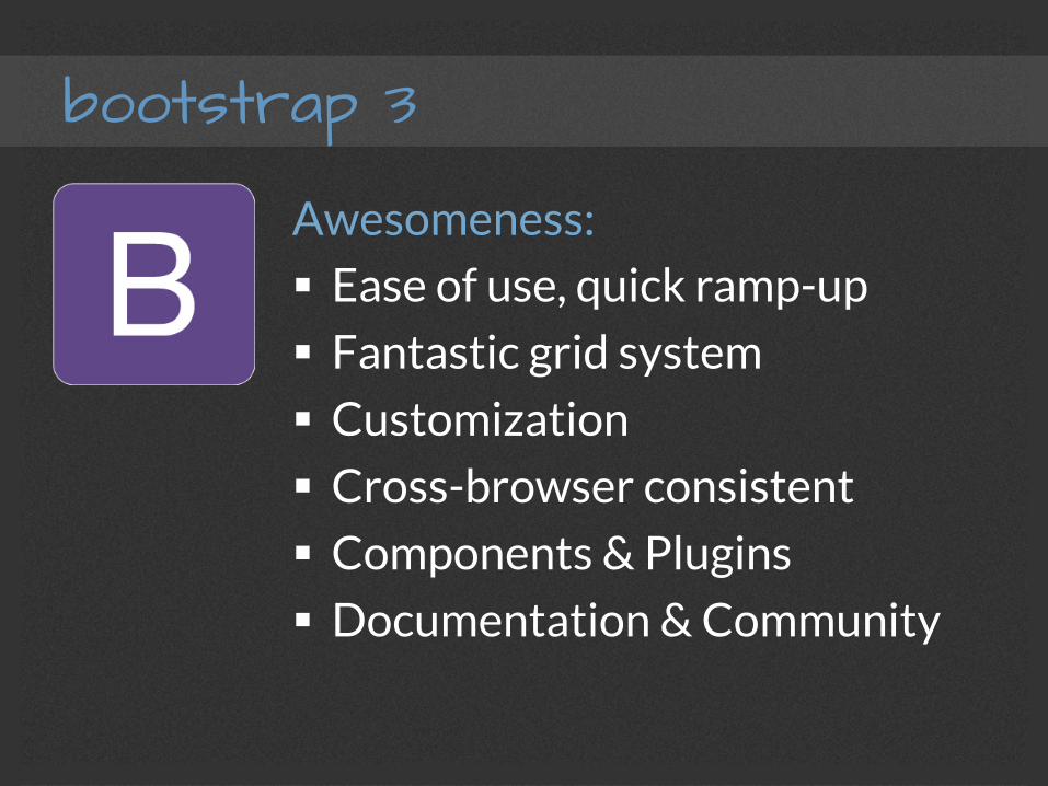
bootstrap 3
Awesomeness:
§ Ease of use, quick ramp-up
§ Fantastic grid system
§ Customization
§ Cross-browser consistent
§ Components & Plugins
§ Documentation & Community
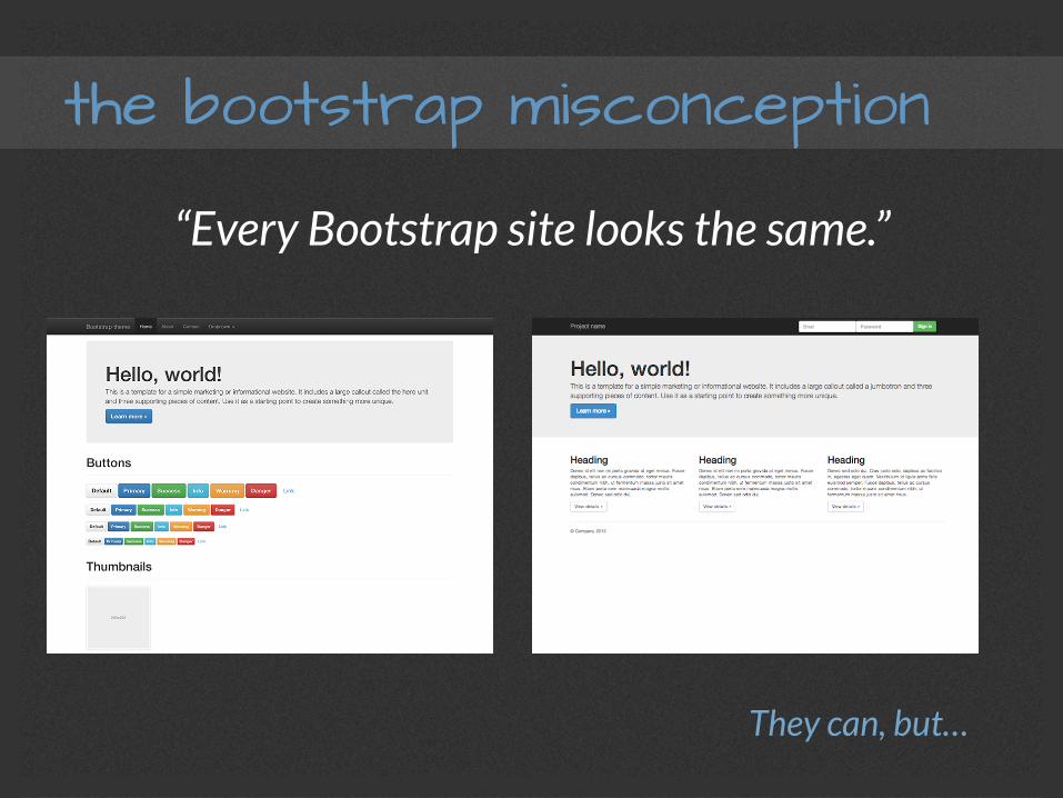
the bootstrap misconception
“Every Bootstrap site looks the same.”
They can, but…
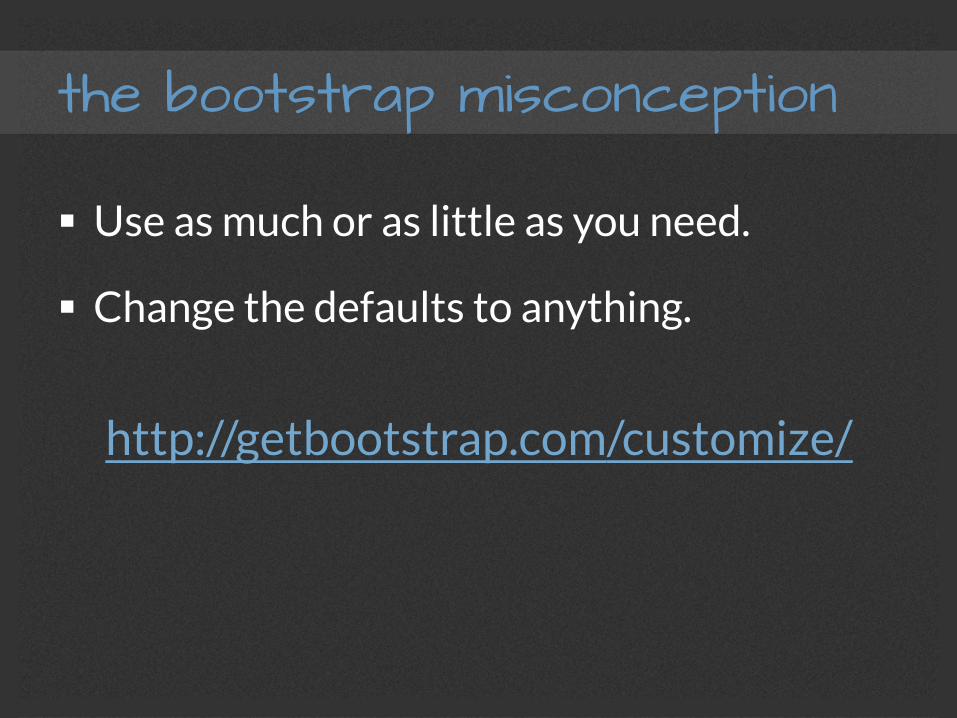
the bootstrap misconception
§ Use as much or as little as you need.
§ Change the defaults to anything.
http://getbootstrap.com/customize/
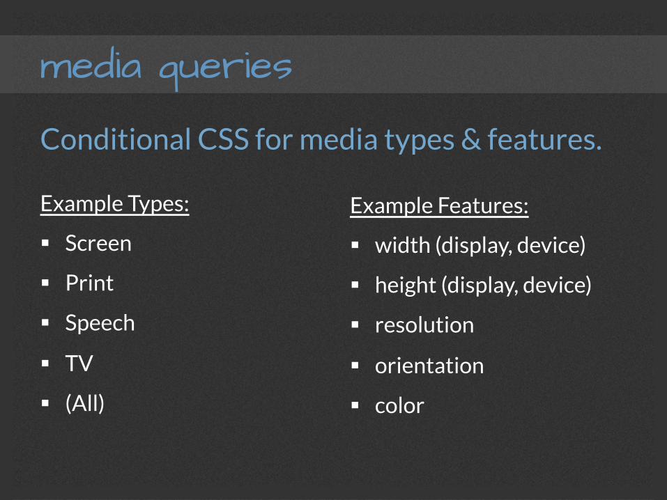
media queries
Conditional CSS for media types & features.
Example Types:
§ Screen
§ Speech
§ TV
§ (All)
Example Features:
§ width (display, device)
§ height (display, device)
§ resolution
§ orientation
§ color
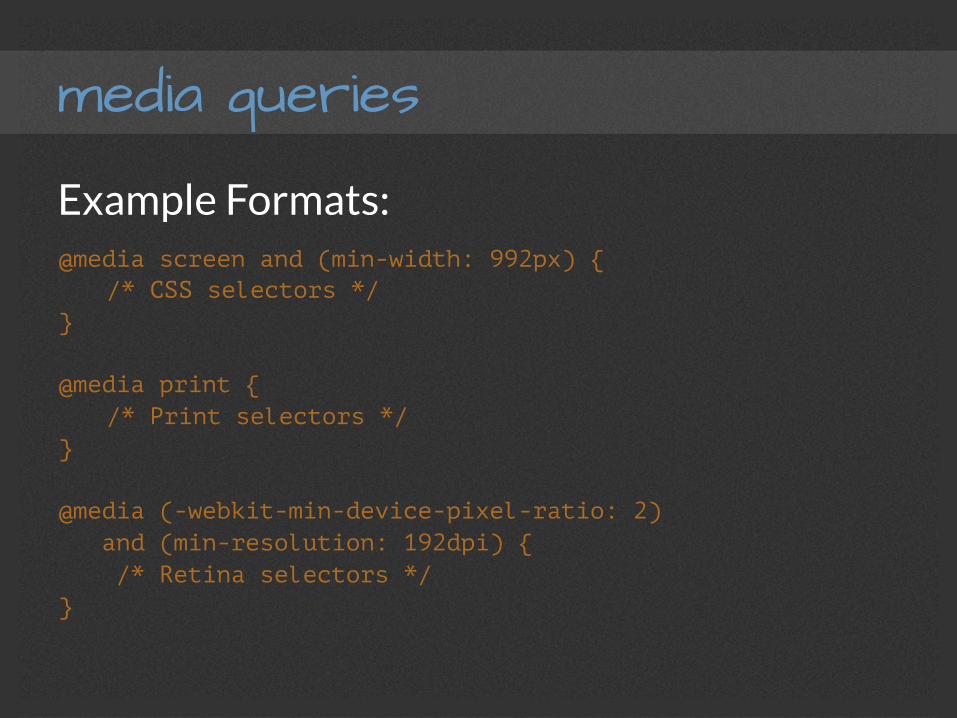
media queries
Example Formats: @media screen and (min-width: 992px) {
/* CSS selectors */ } @media print {
/* Print selectors */ } @media (-webkit-min-device-pixel-ratio: 2) and (min-resolution: 192dpi) { /* Retina selectors */ }
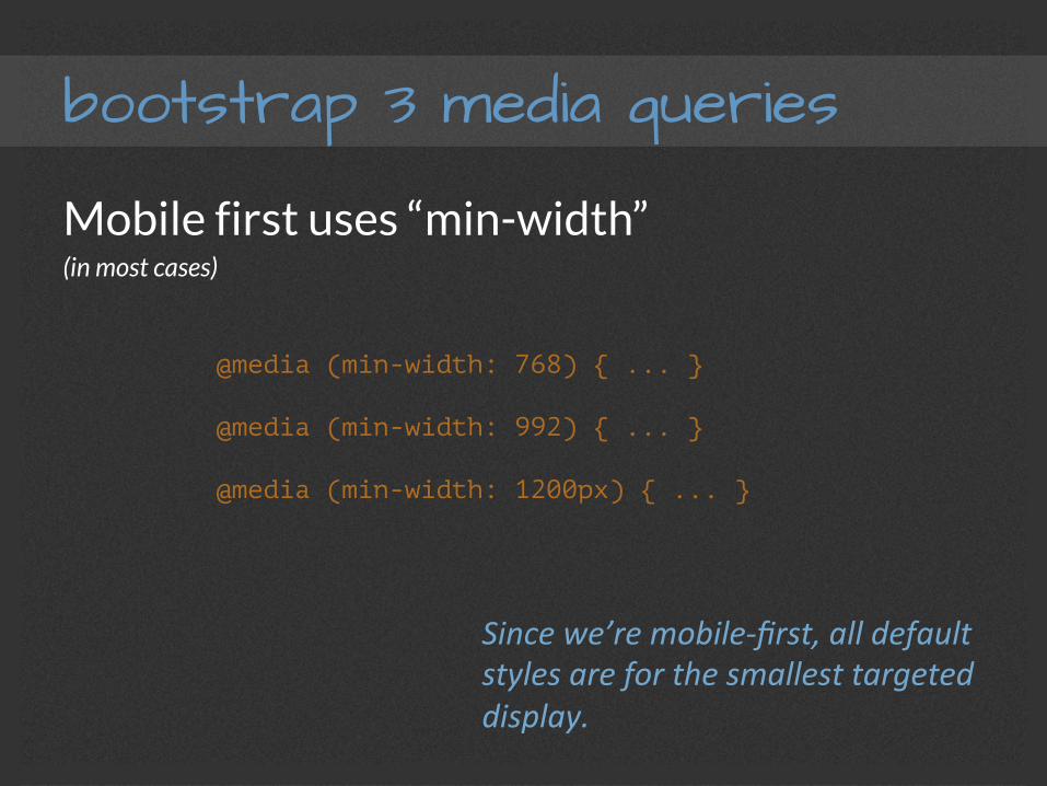
bootstrap 3 media queries
Mobile first uses “min-width” (in most cases)
@media (min-width: 768) { ... }
@media (min-width: 992) { ... }
@media (min-width: 1200px) { ... }
Since we’re mobile-‐first, all default styles are for the smallest targeted display.
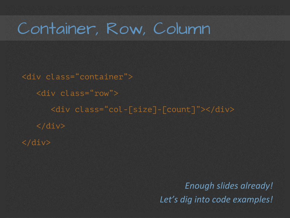
Container, Row, Column
<div class=“container”>
<div class=“row”>
<div class=“col-[size]-[count]”></div>
</div>
</div>
Enough slides already! Let’s dig into code examples!
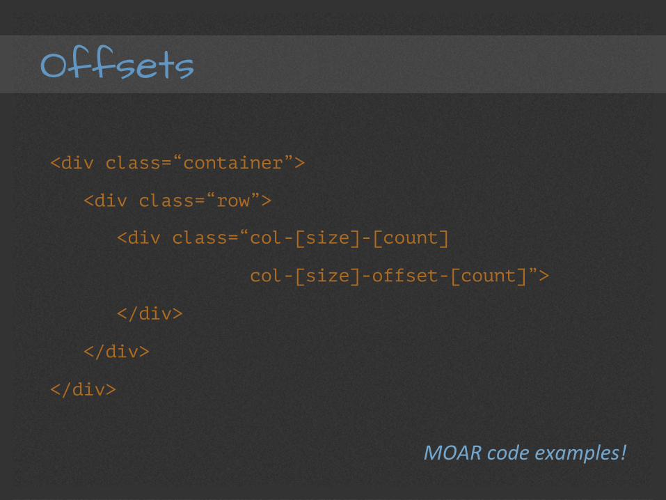
Offsets
<div class=“container”>
<div class=“row”>
<div class=“col-[size]-[count]
col-[size]-offset-[count]”>
</div>
</div>
</div>
MOAR code examples!
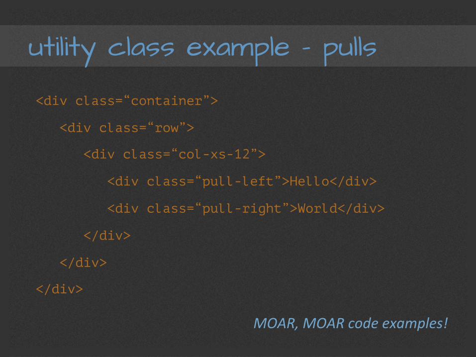
utility class example – pulls
<div class=“container”>
<div class=“row”>
<div class=“col-xs-12”>
<div class=“pull-left”>Hello</div>
<div class=“pull-right”>World</div>
</div>
</div>
</div>
MOAR, MOAR code examples!
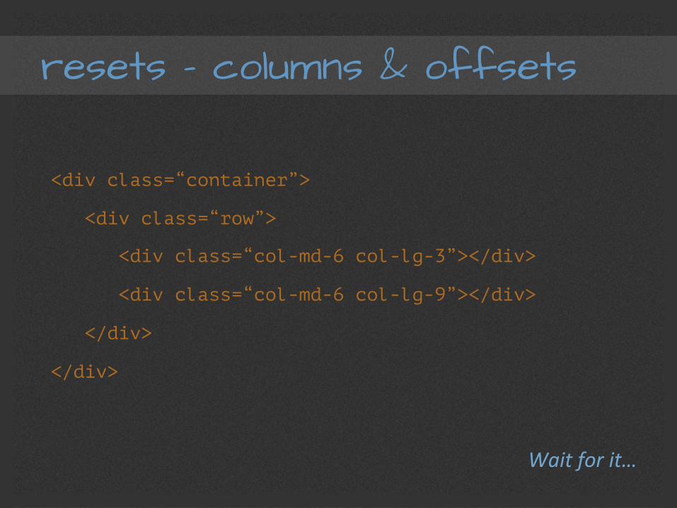
resets – columns & offsets
<div class=“container”>
<div class=“row”>
<div class=“col-md-6 col-lg-3”></div>
<div class=“col-md-6 col-lg-9”></div>
</div>
</div>
Wait for it…
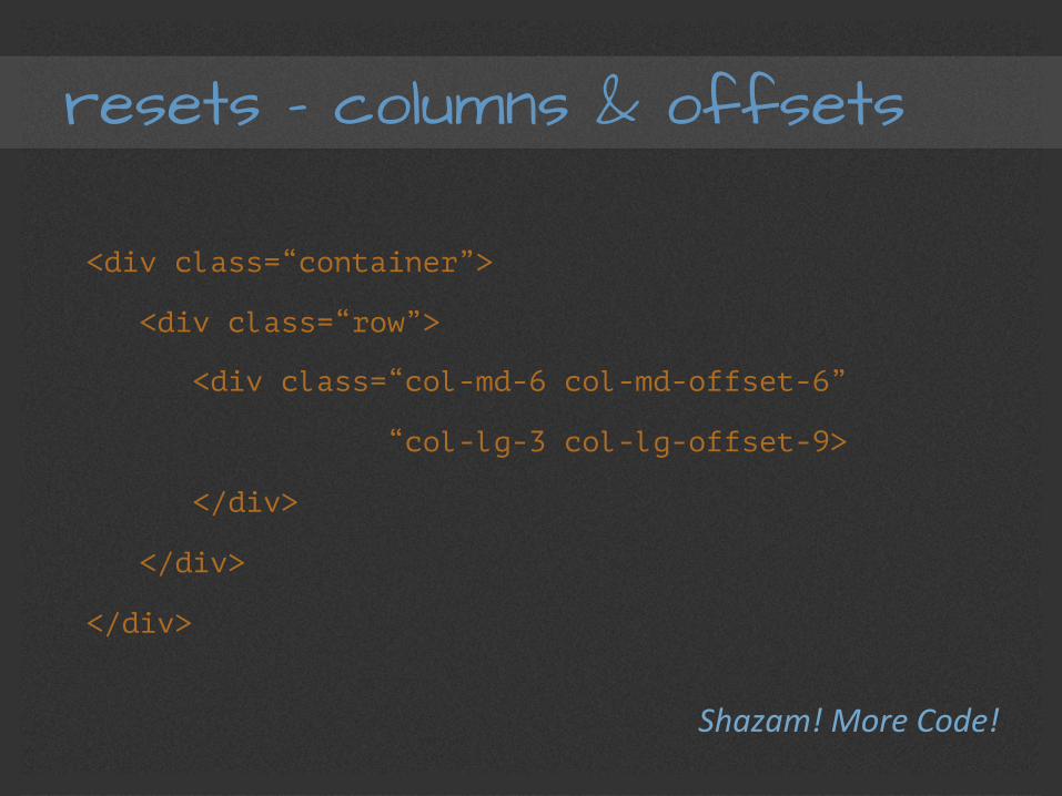
resets – columns & offsets
<div class=“container”>
<div class=“row”>
<div class=“col-md-6 col-md-offset-6”
“col-lg-3 col-lg-offset-9>
</div>
</div>
</div>
Shazam! More Code!

management
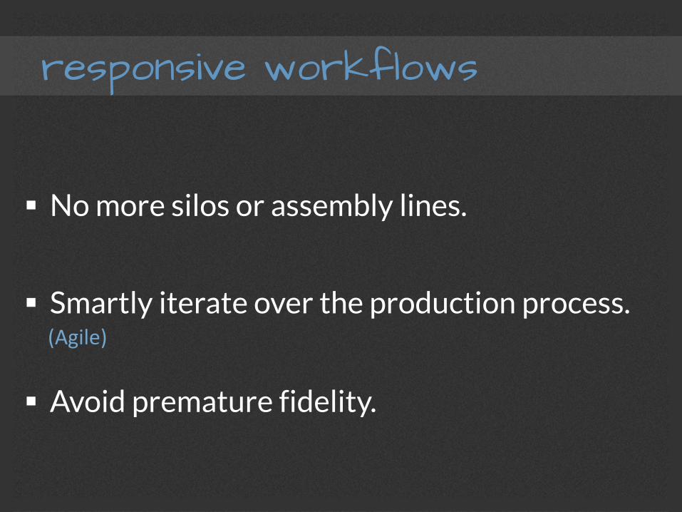
responsive workflows
§ No more silos or assembly lines.
§ Smartly iterate over the production process.
§ Avoid premature fidelity.
(Agile)
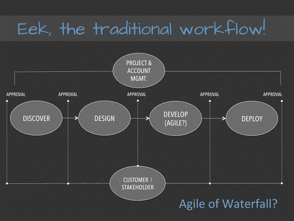
Eek, the traditional workflow!
DISCOVER DESIGN DEVELOP (AGILE?) DEPLOY
PROJECT & ACCOUNT
MGMT.
CUSTOMER / STAKEHOLDER
APPROVAL APPROVAL APPROVAL APPROVAL APPROVAL
Agile of Waterfall?
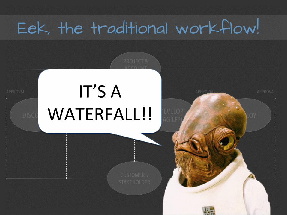
Eek, the traditional workflow!
DISCOVER DESIGN DEVELOP (AGILE?) DEPLOY
PROJECT & ACCOUNT
MGMT.
CUSTOMER / STAKEHOLDER
APPROVAL APPROVAL APPROVAL APPROVAL APPROVAL IT’S A WATERFALL!!
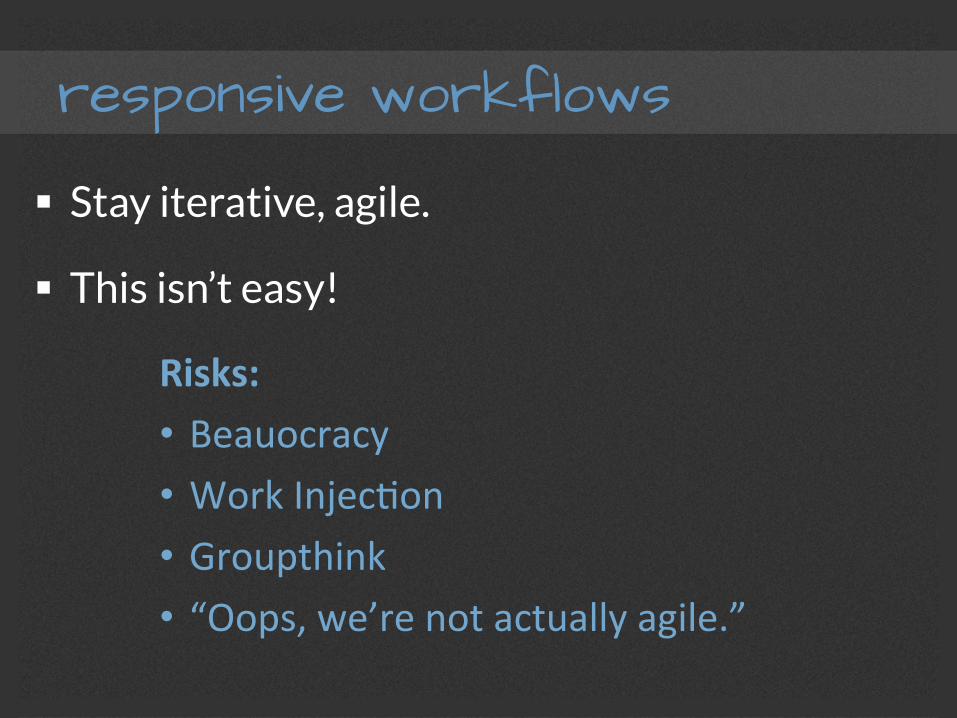
responsive workflows
§ Stay iterative, agile.
§ This isn’t easy!
Risks: • Beauocracy • Work InjecFon • Groupthink • “Oops, we’re not actually agile.”

responsive workflows
§ Stay iterative, agile.
§ This isn’t easy!
Risks: • Beauocracy • Work InjecFon • Groupthink • “Oops, we’re not actually agile.”
tools – CSS preprocessors
CSS can get big fast!
Keep it modular & manageable.
tools – automation
Bower NPM Yeoman
Grunt Gulp
Testing!
And many, many others!
responsive caveats
§ Sometimes not the easiest sell to a client
§ Contrary to the way we typically visualize
§ Works better when starting from scratch
§ Matching user expectation is trickier!
§ Higher cost