Embed Size (px)
Citation preview
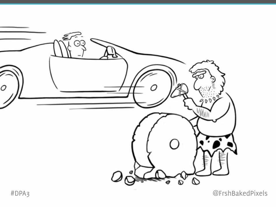
Stop Reinventing the WheelBuild Responsive Websites Using Bootstrap Framework
Gaurav Gupta HighEdWeb Conference, October 5, 2015
#DPA3 @FrshBakedPixels
#DPA3
@FrshBakedPixels
about meIT Analyst
Division of Learning Innovation and Student Success
Virginia Commonwealth University
#DPA3 @FrshBakedPixels
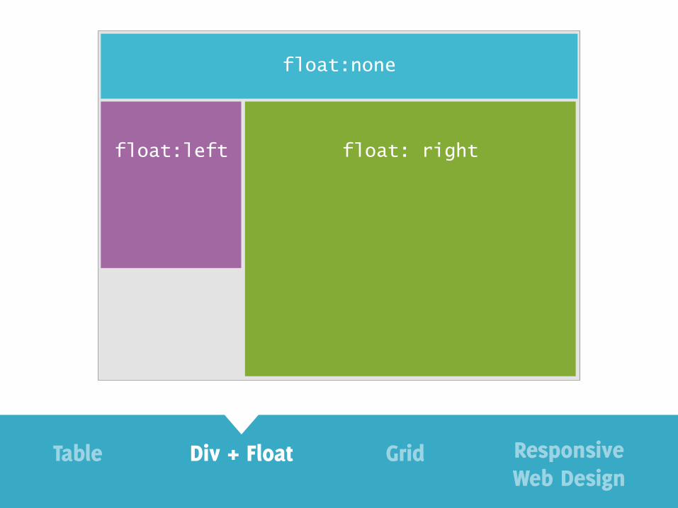
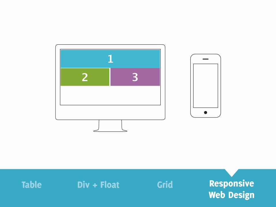
evolution of web design
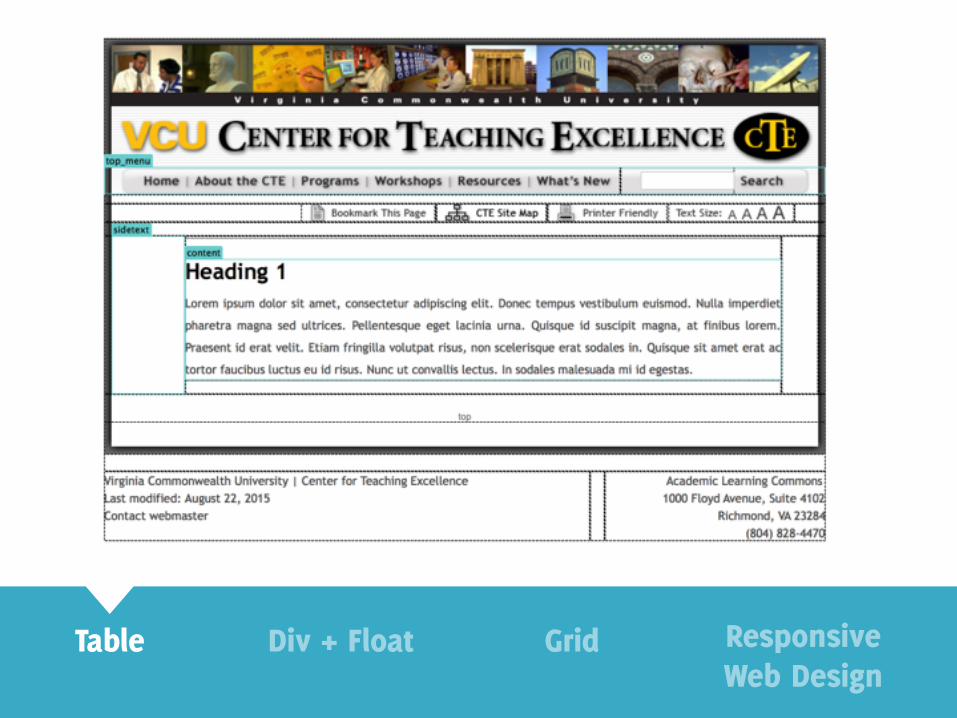
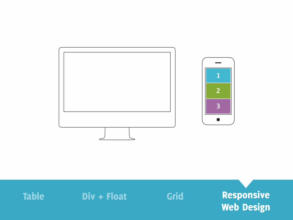
Table Div + Float Grid ResponsiveWeb Design
float:none
float:left float: right
Table Div + Float Grid ResponsiveWeb Design
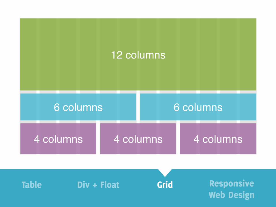
12 columns
4 columns
6 columns 6 columns
4 columns 4 columns
Table Div + Float Grid ResponsiveWeb Design
12 3
Table Div + Float Grid ResponsiveWeb Design
1
2
3
Table Div + Float Grid ResponsiveWeb Design
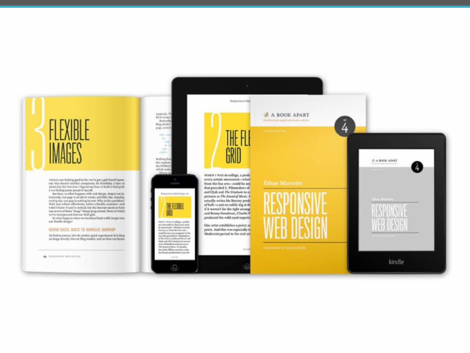

Media queries
Responsive grid
Responsive images
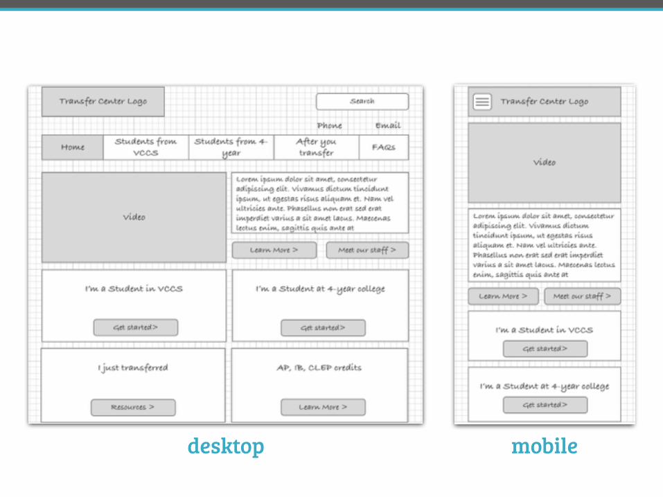
desktop mobile
Media queries
Responsive grid
Responsive images
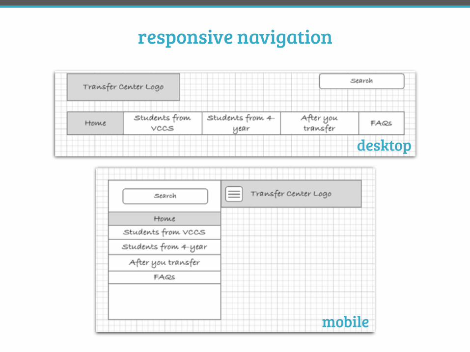
responsive navigation
desktop
mobile
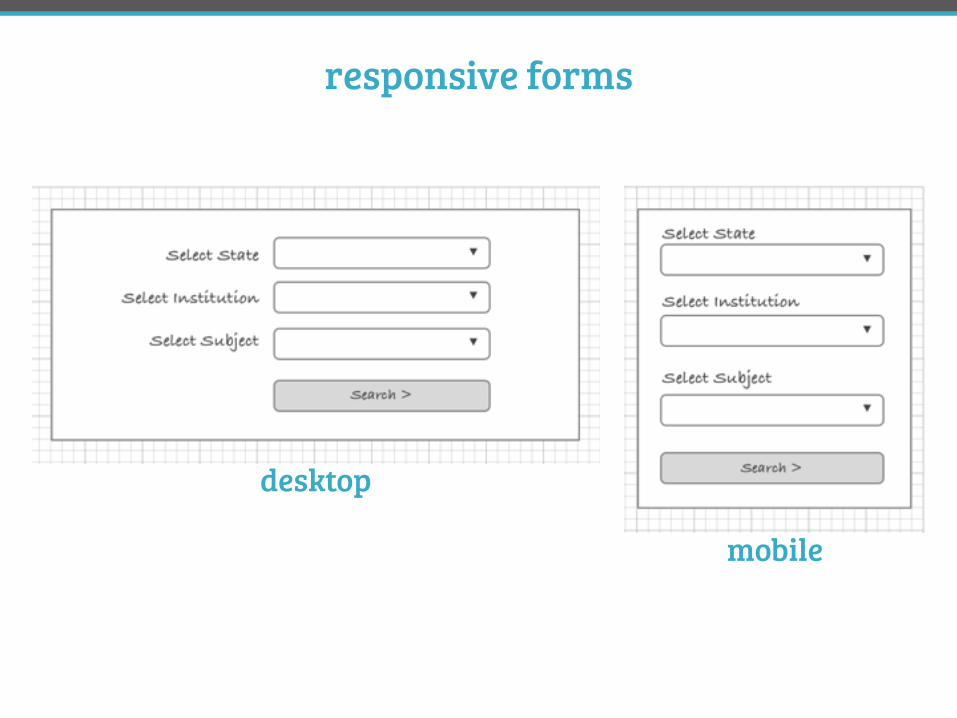
responsive forms
desktop
mobile
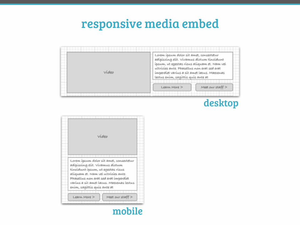
responsive media embed
desktop
mobile
#DPA3 @FrshBakedPixels
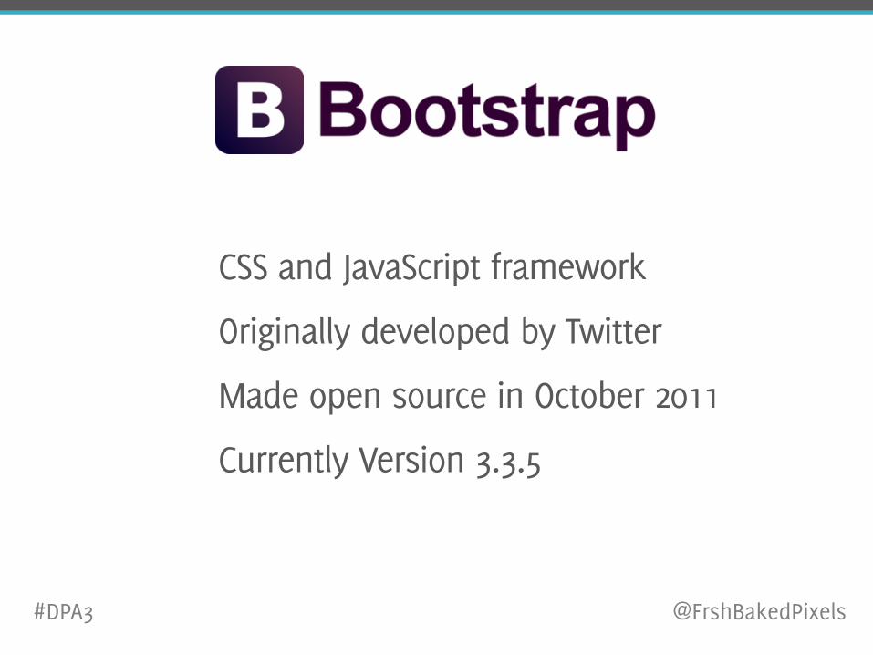
CSS and JavaScript framework
Originally developed by Twitter
Made open source in October 2011
Currently Version 3.3.5
#DPA3 @FrshBakedPixels
why Bootstrap
#DPA3 @FrshBakedPixels
wide browser anddevice support
re-usable components
standardized code
open-source andcustomizable
thoroughly tested and debugged
#DPA3 @FrshBakedPixels
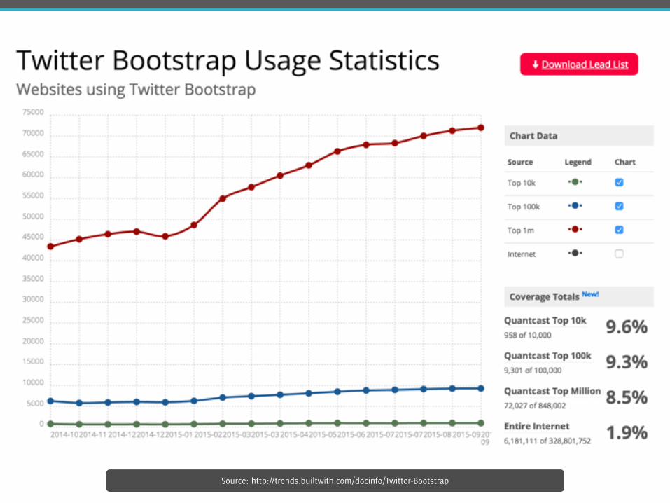
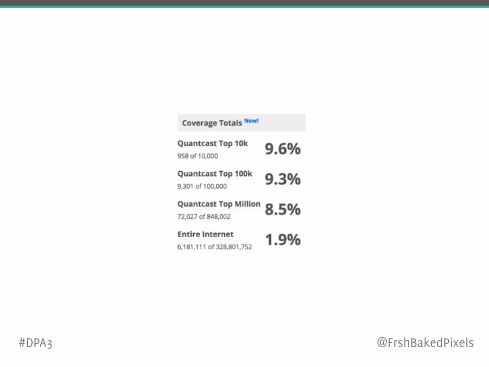
Source: http://trends.builtwith.com/docinfo/Twitter-Bootstrap
#DPA3 @FrshBakedPixels

Source: http://us.pg.com

Source: http://statefarm.com
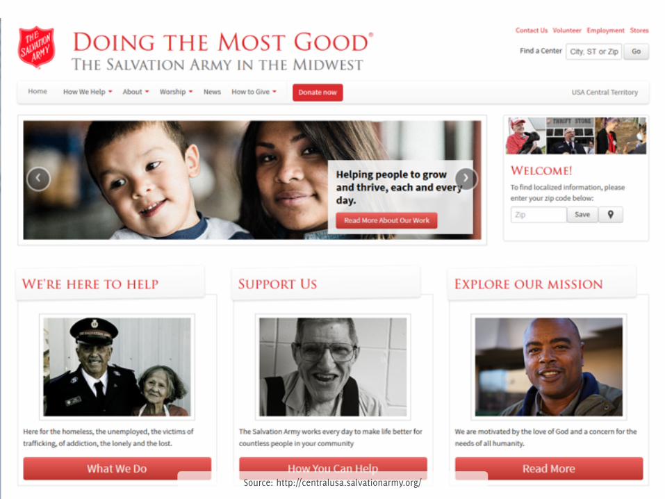
Source: http://centralusa.salvationarmy.org/
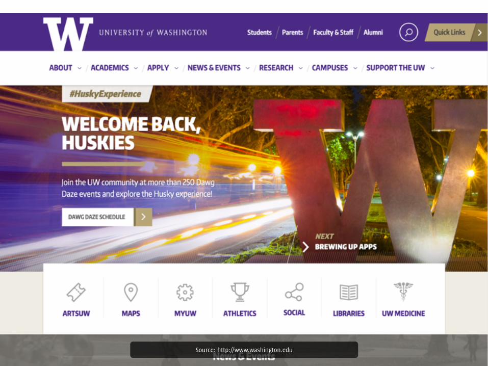
Source: http://www.washington.edu
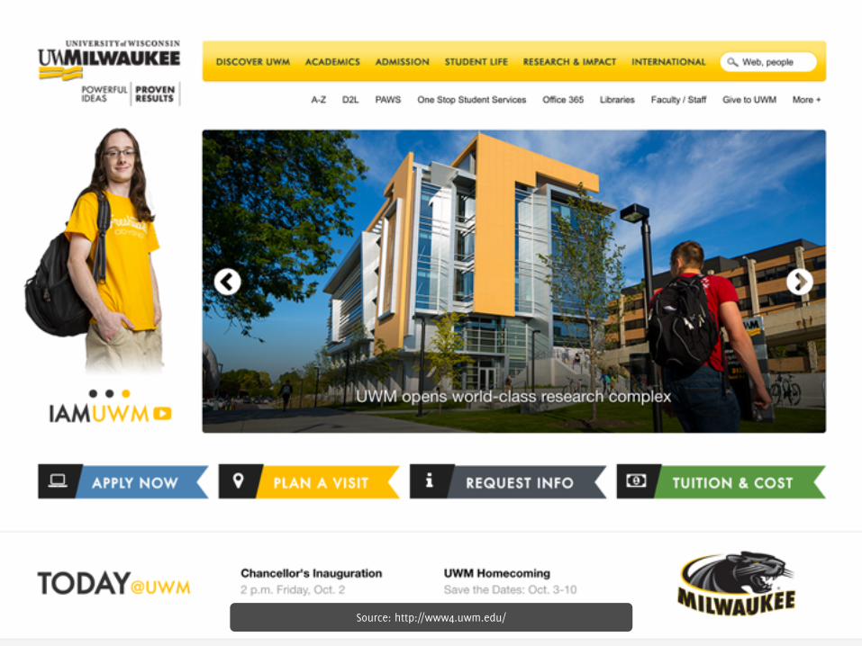
Source: http://www4.uwm.edu/
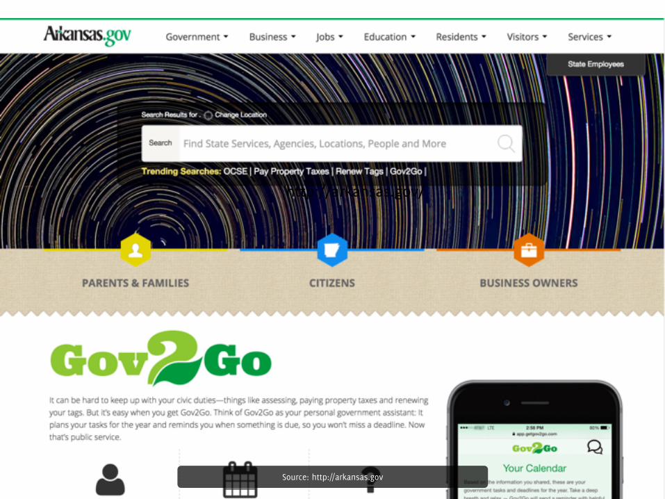
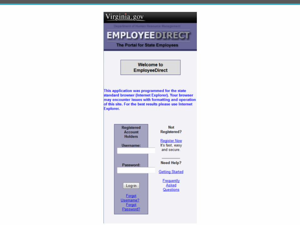
Source: http://arkansas.gov
http://arkansas.gov/
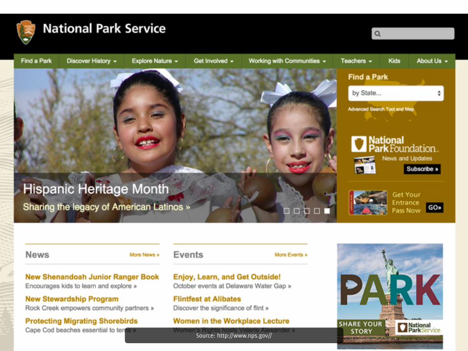
Source: http://www.nps.gov//
Repeal Bootstrap
what’s included in Bootstrap
#DPA3 @FrshBakedPixels
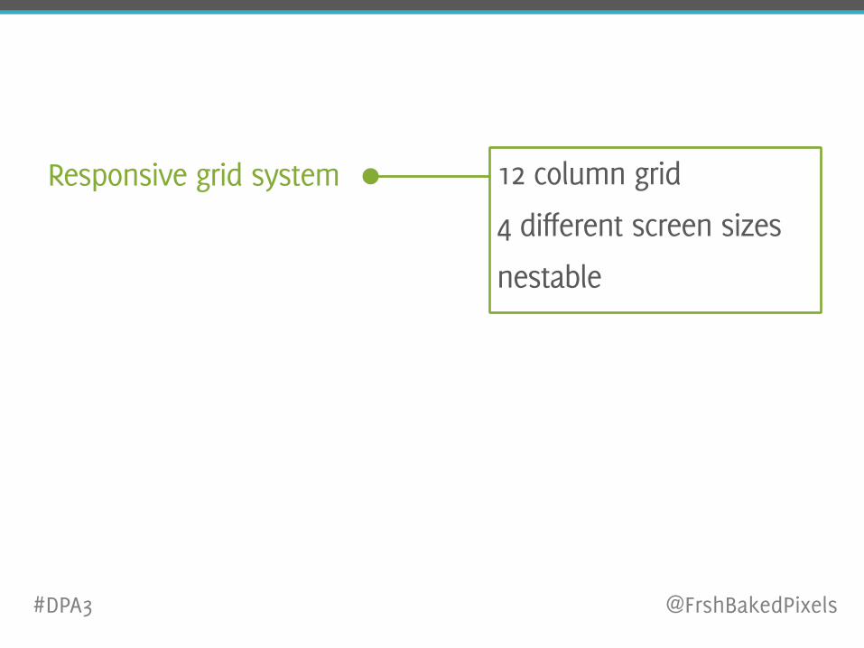
Responsive grid system 12 column grid
4 different screen sizes
nestable
#DPA3 @FrshBakedPixels
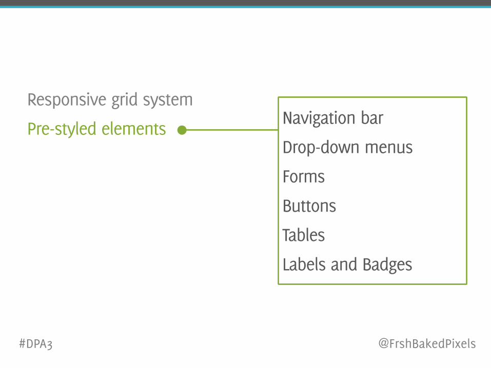
Responsive grid system
Pre-styled elements Navigation bar
Drop-down menus
Forms
Buttons
Tables
Labels and Badges
#DPA3 @FrshBakedPixels
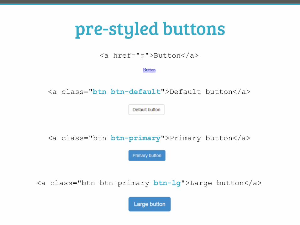
pre-styled buttons
<a class="btn btn-default">Default button</a>
<a class="btn btn-primary btn-lg">Large button</a>
<a class="btn btn-primary">Primary button</a>
<a href="#">Button</a>
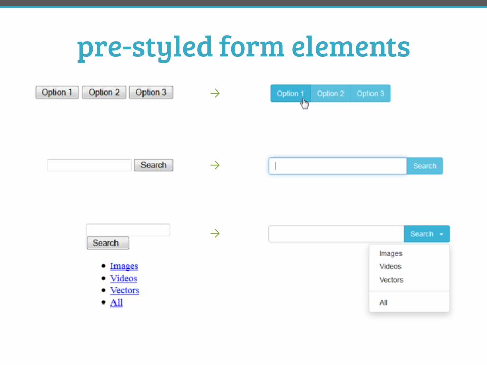
pre-styled form elements
→
→
→
Responsive grid system
Pre-styled elements
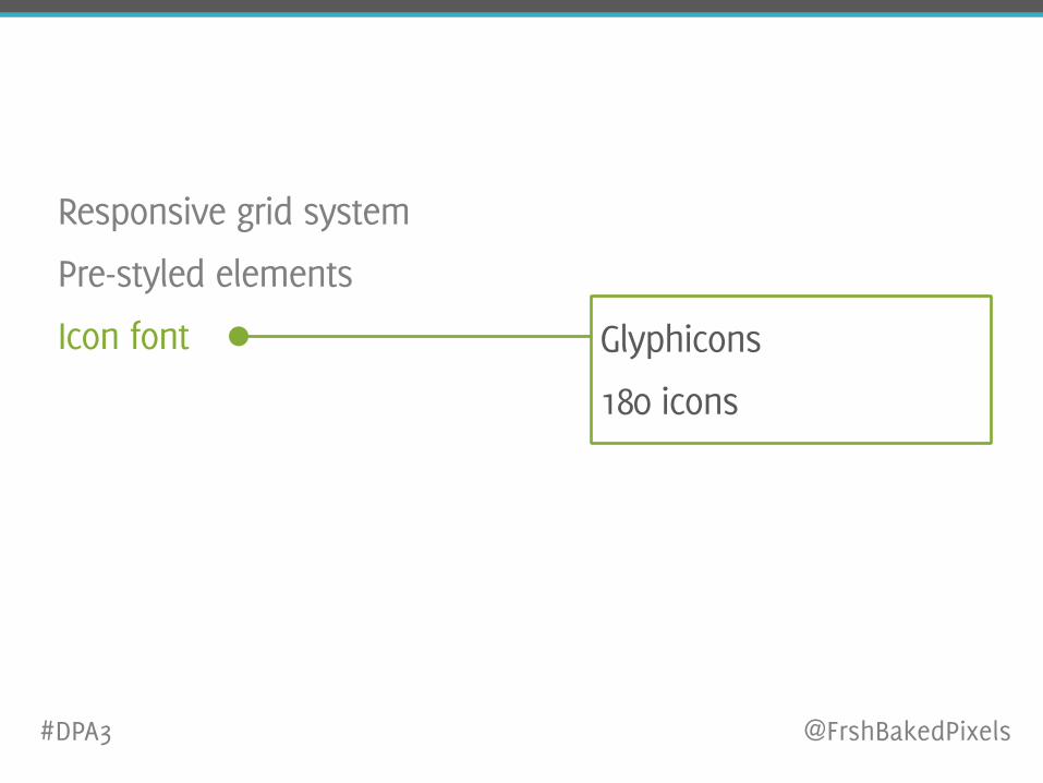
Icon font Glyphicons
180 icons
#DPA3 @FrshBakedPixels
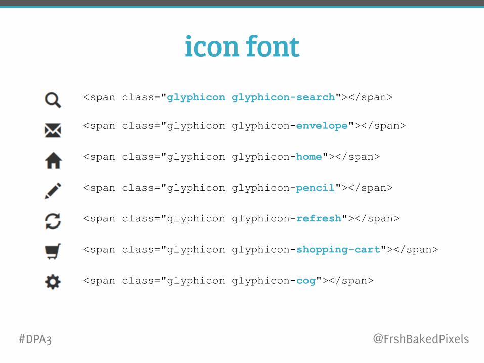
icon font<span class="glyphicon glyphicon-search"></span>
<span class="glyphicon glyphicon-envelope"></span>
<span class="glyphicon glyphicon-home"></span>
<span class="glyphicon glyphicon-pencil"></span>
<span class="glyphicon glyphicon-refresh"></span>
<span class="glyphicon glyphicon-shopping-cart"></span>
<span class="glyphicon glyphicon-cog"></span>
#DPA3 @FrshBakedPixels
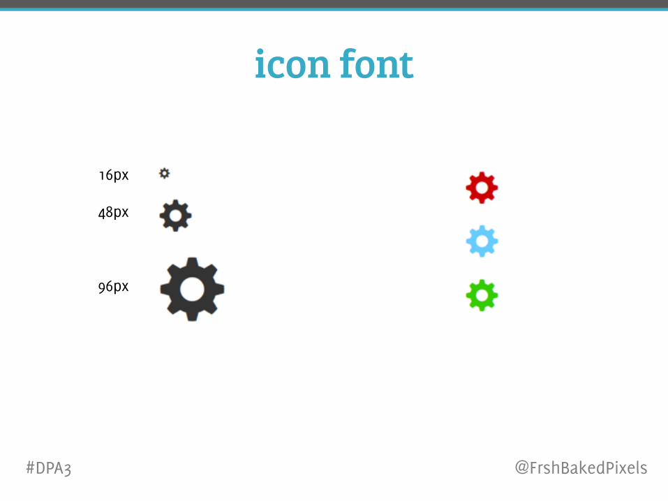
icon font
16px
48px
96px
#DPA3 @FrshBakedPixels
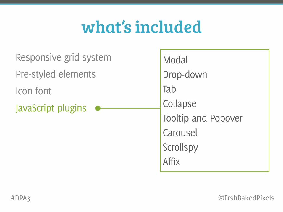
what’s includedResponsive grid system
Pre-styled elements
Icon font
JavaScript plugins
Modal Drop-down Tab Collapse Tooltip and Popover Carousel Scrollspy Affix
#DPA3 @FrshBakedPixels
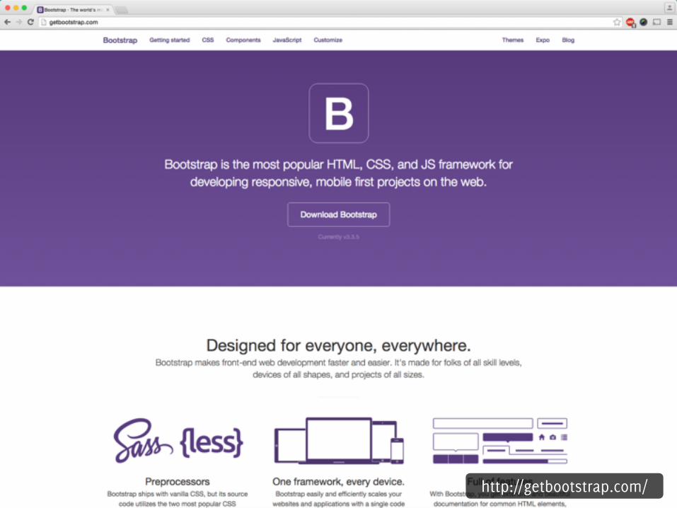
http://getbootstrap.com/
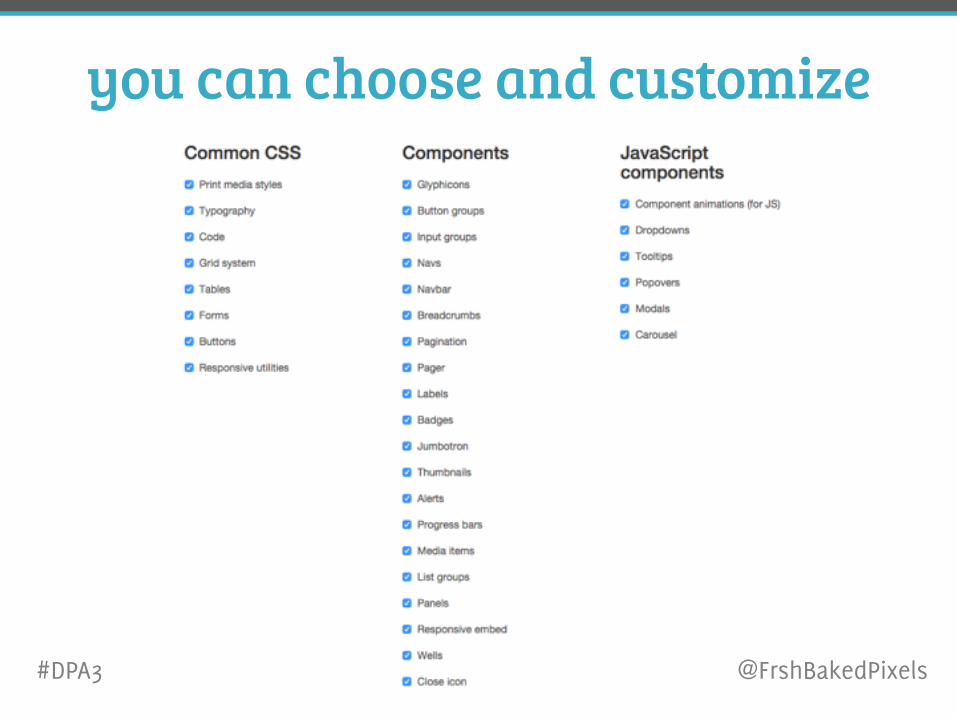
you can choose and customize
#DPA3 @FrshBakedPixels
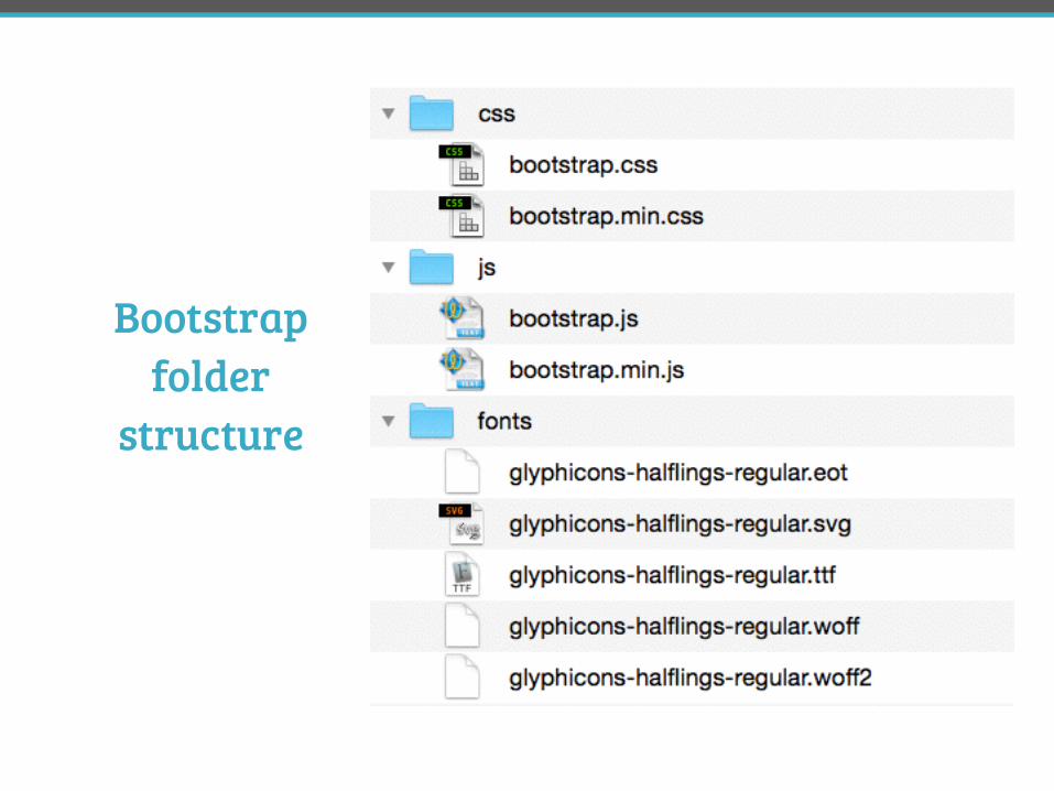
Bootstrap folder
structure
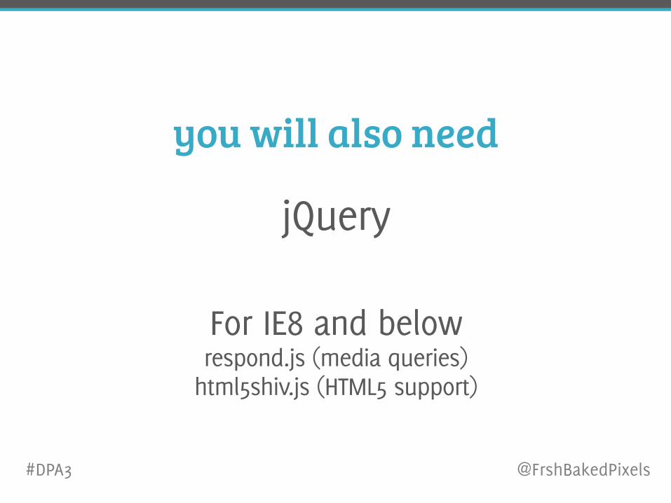
you will also need
jQuery
For IE8 and below respond.js (media queries)
html5shiv.js (HTML5 support)
#DPA3 @FrshBakedPixels
let’s build something
#DPA3 @FrshBakedPixels
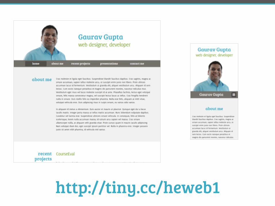
http://tiny.cc/heweb1
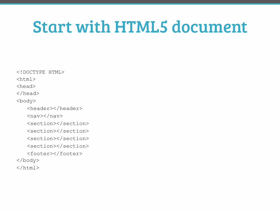
Start with HTML5 document
<!DOCTYPE HTML> <html> <head></head> <body> <header></header> <nav></nav> <section></section> <section></section> <section></section> <section></section> <footer></footer> </body> </html>
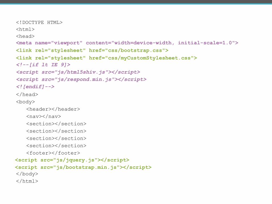
<!DOCTYPE HTML> <html> <head>
</head> <body> <header></header> <nav></nav> <section></section> <section></section> <section></section> <section></section> <footer></footer>
</body> </html>
<link rel="stylesheet" href="css/bootstrap.css"><meta name="viewport" content="width=device-width, initial-scale=1.0">
<!--[if lt IE 9]> <script src="js/html5shiv.js"></script> <script src="js/respond.min.js"></script> <![endif]-->
<script src="js/jquery.js"></script> <script src="js/bootstrap.min.js"></script>
<link rel="stylesheet" href="css/myCustomStylesheet.css">
responsive grid 101
#DPA3 @FrshBakedPixels
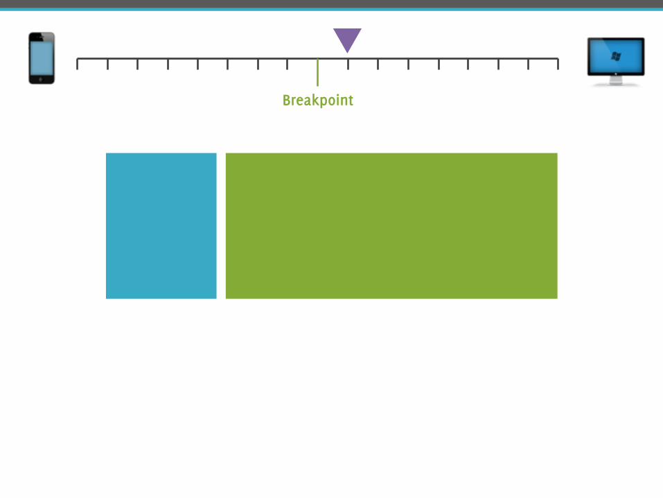
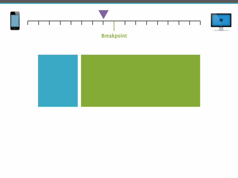
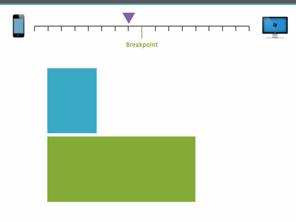
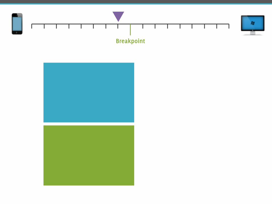
Breakpoint
Breakpoint
Breakpoint
Breakpoint
Breakpoint
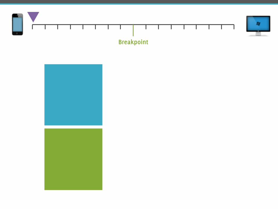
Breakpoint
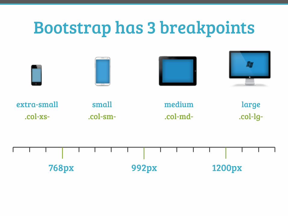
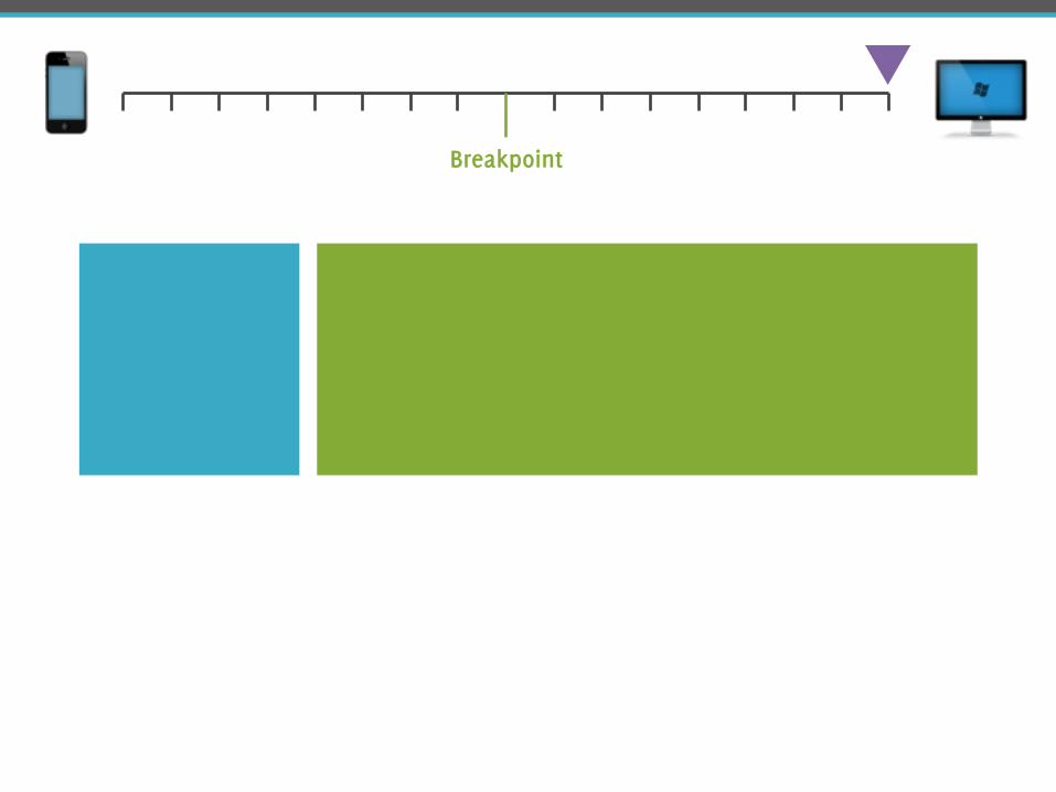
Bootstrap has 3 breakpoints
992px 1200px768px
extra-small small medium large.col-xs- .col-lg-.col-md-.col-sm-
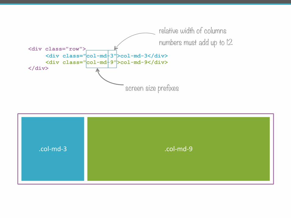
<div class="col-md-3">col-md-3</div> <div class="col-md-9">col-md-9</div>
screen size prefixes
relative width of columns numbers must add up to 12
.col-‐md-‐3 .col-‐md-‐9
<div class="row">
</div>
<section class="row"> <div class="col-md-3">
</div> <div class="col-md-9">
</div> </section>
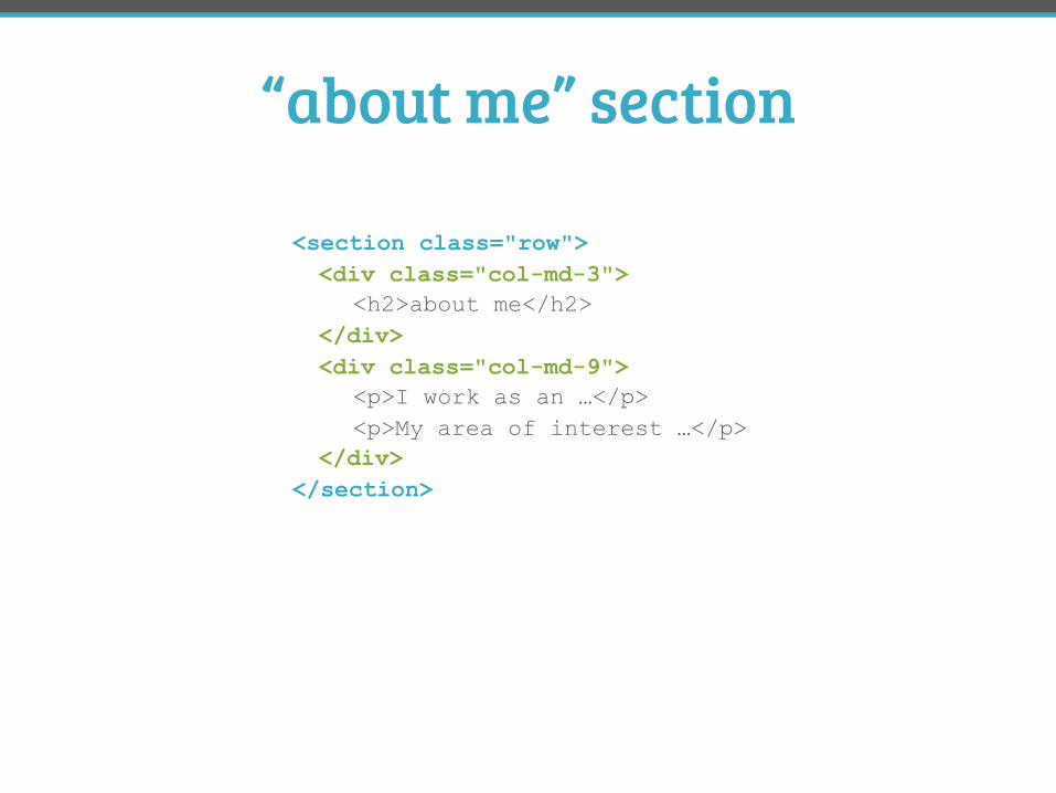
“about me” section
<h2>about me</h2>
<p>I work as an …</p> <p>My area of interest …</p>
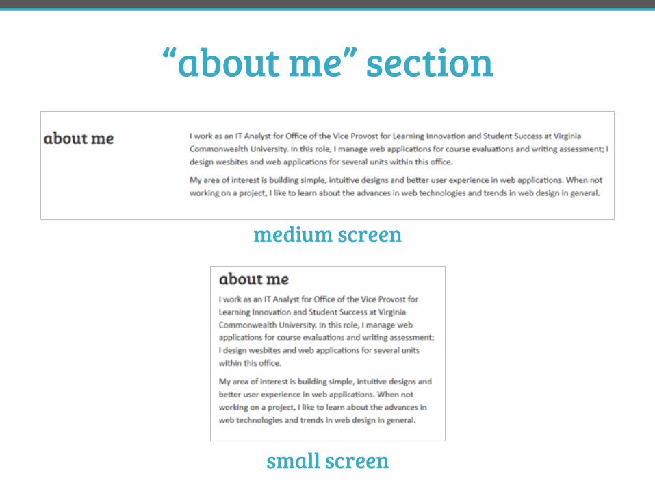
small screen
medium screen
“about me” section
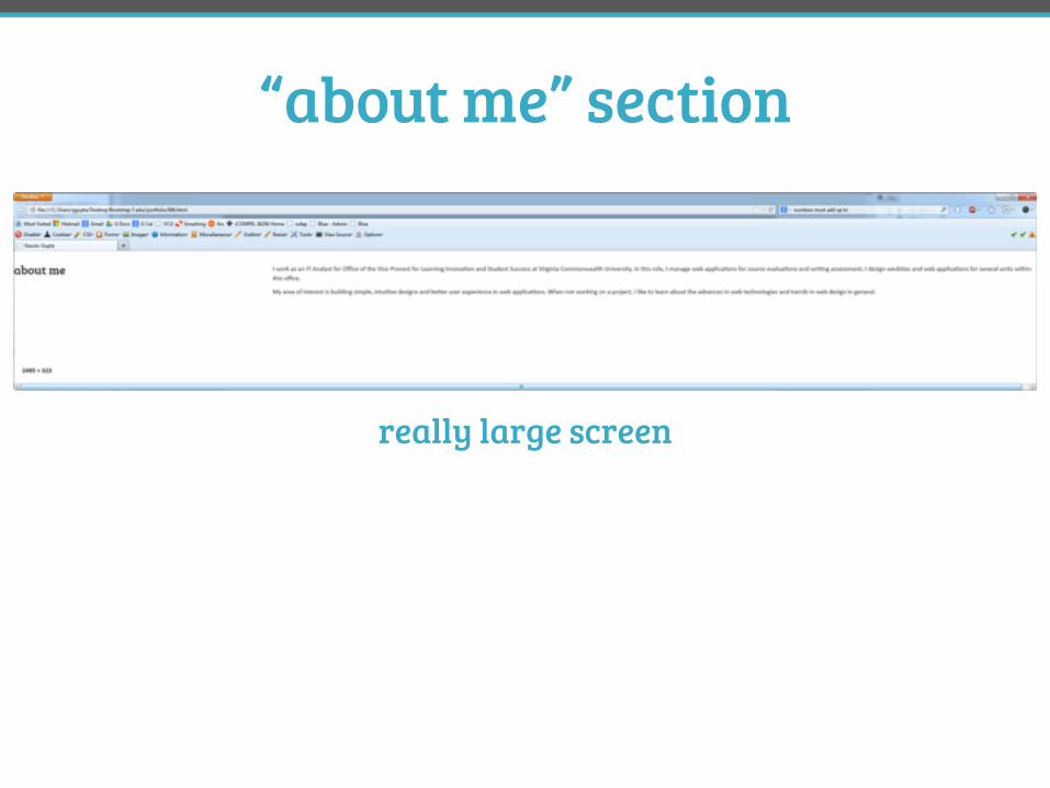
really large screen
“about me” section
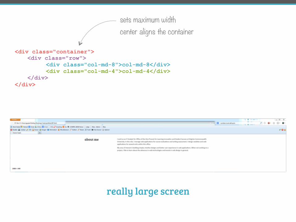
<div class="row"> <div class="col-md-8">col-md-8</div> <div class="col-md-4">col-md-4</div> </div>
sets maximum width center aligns the container
really large screen
<div class="container">
</div>
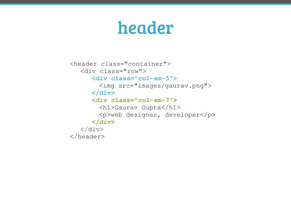
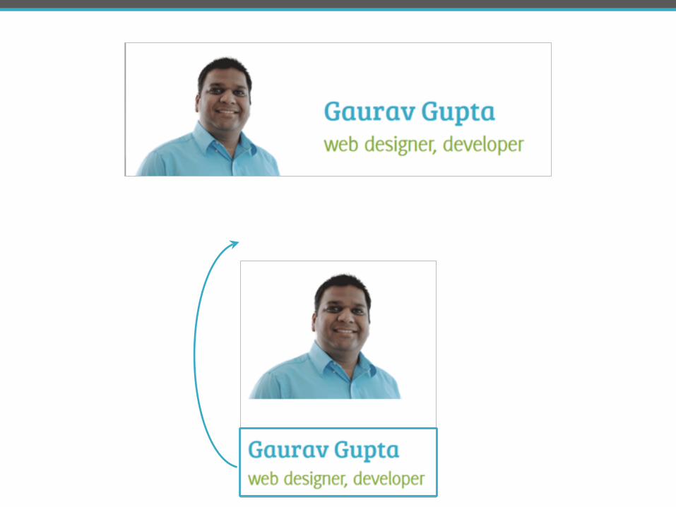
header
<header class="container"> <div class="row"> <div class="col-sm-5"> <img src="images/gaurav.png"> </div> <div class="col-sm-7"> <h1>Gaurav Gupta</h1> <p>web designer, developer</p> </div> </div> </header>
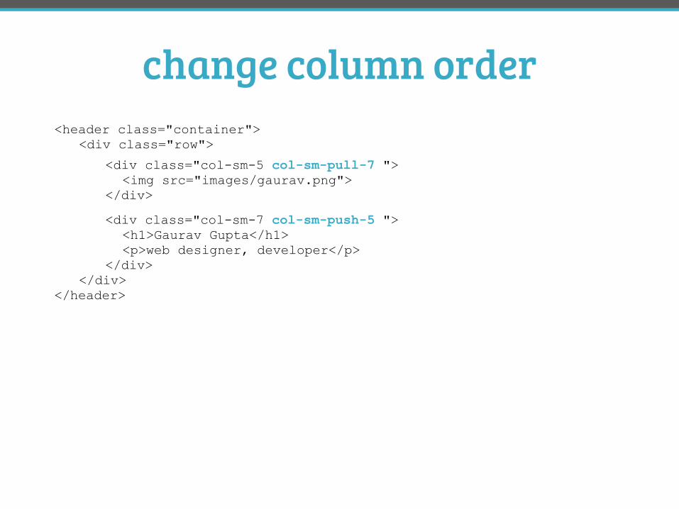
change column order<header class="container"> <div class="row">
</div> </header>
<div class="col-sm-5 col-sm-pull-7 "> <img src="images/gaurav.png"> </div>
<div class="col-sm-7 col-sm-push-5 "> <h1>Gaurav Gupta</h1> <p>web designer, developer</p> </div>
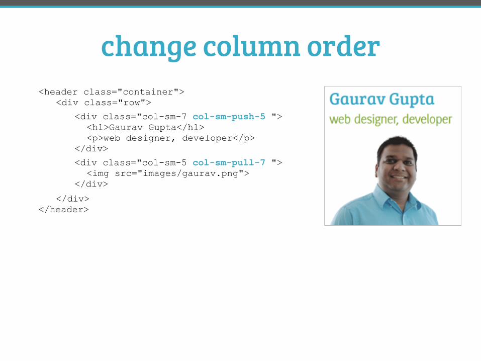
change column order<header class="container"> <div class="row">
</div> </header>
<div class="col-sm-5 col-sm-pull-7 "> <img src="images/gaurav.png"> </div>
<div class="col-sm-7 col-sm-push-5 "> <h1>Gaurav Gupta</h1> <p>web designer, developer</p> </div>
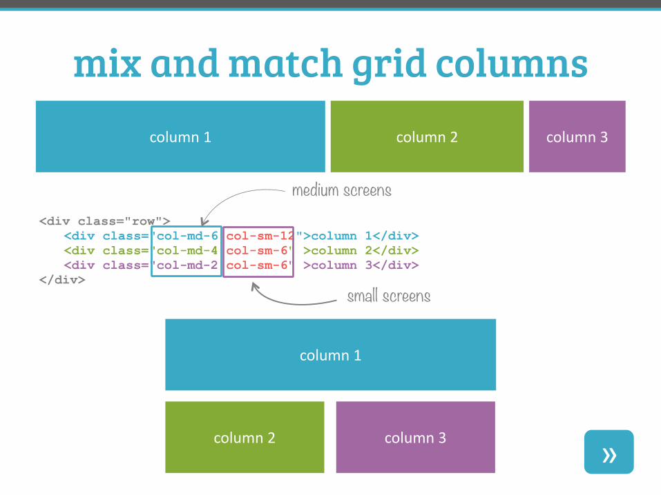
mix and match grid columnscolumn 1 column 2 column 3
<div class="row"> <div class="col-md-6 col-sm-12">column 1</div> <div class="col-md-4 col-sm-6" >column 2</div> <div class="col-md-2 col-sm-6" >column 3</div> </div>
column 1
column 2 column 3 »
medium screens
small screens
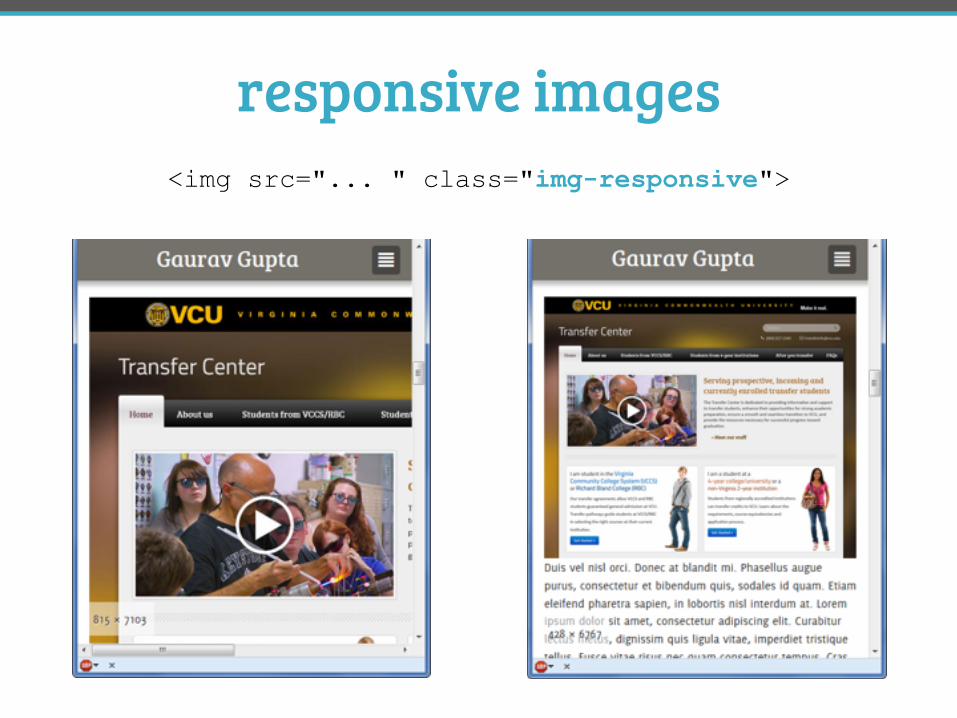
responsive images<img src="... " class="img-responsive">
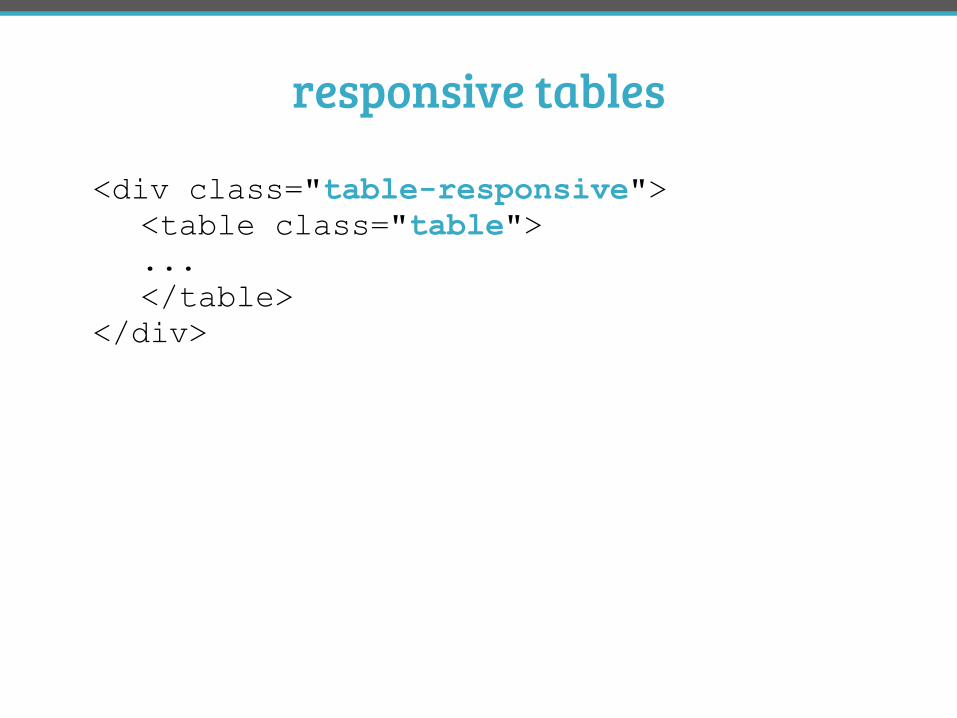
responsive tables
<div class="table-responsive"> <table class="table"> ... </table> </div>
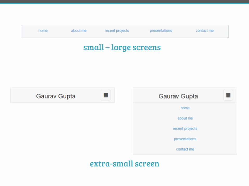
responsive navigation
#DPA3 @FrshBakedPixels
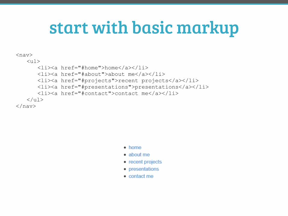
start with basic markup<nav> <ul> <li><a href="#home">home</a></li> <li><a href="#about">about me</a></li> <li><a href="#projects">recent projects</a></li> <li><a href="#presentations">presentations</a></li> <li><a href="#contact">contact me</a></li> </ul> </nav>
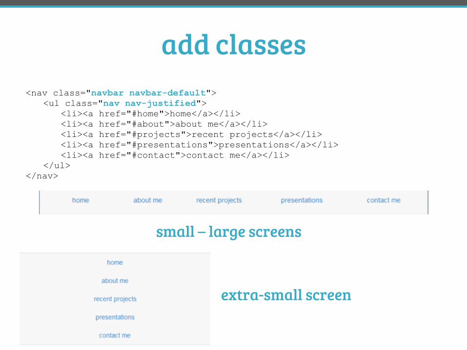
add classes<nav class="navbar navbar-default"> <ul class="nav nav-justified"> <li><a href="#home">home</a></li> <li><a href="#about">about me</a></li> <li><a href="#projects">recent projects</a></li> <li><a href="#presentations">presentations</a></li> <li><a href="#contact">contact me</a></li> </ul> </nav>
small – large screens
extra-small screen
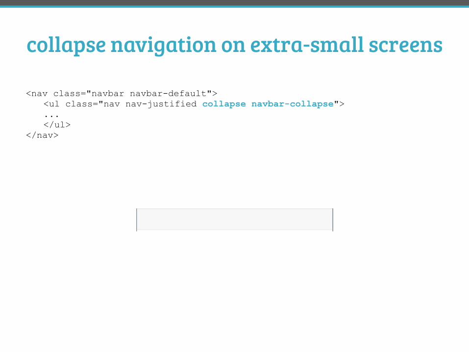
collapse navigation on extra-small screens
<nav class="navbar navbar-default"> <ul class="nav nav-justified collapse navbar-collapse"> ... </ul> </nav>
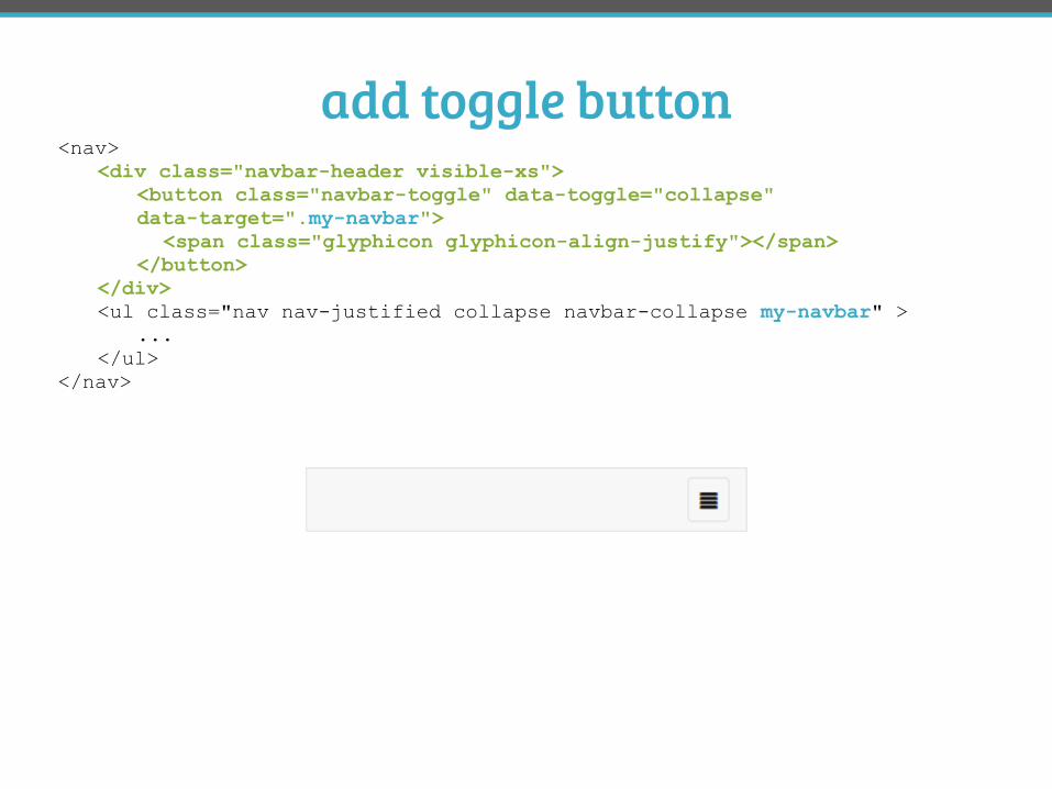
add toggle button<nav> <div class="navbar-header visible-xs"> <button class="navbar-toggle" data-toggle="collapse" data-target=".my-navbar"> <span class="glyphicon glyphicon-align-justify"></span> </button> </div> <ul class="nav nav-justified collapse navbar-collapse my-navbar" > ... </ul> </nav>
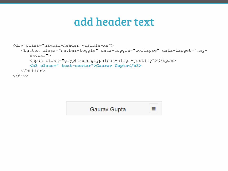
add header text
<div class="navbar-header visible-xs"> <button class="navbar-toggle" data-toggle="collapse" data-target=".my- navbar"> <span class="glyphicon glyphicon-align-justify"></span> <h3 class=" text-center">Gaurav Gupta</h3> </button> </div>
small – large screens
extra-small screen
adding your own styles
#DPA3 @FrshBakedPixels
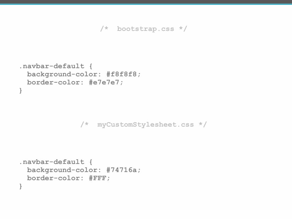
/* myCustomStylesheet.css */
.navbar-default { background-color: #74716a; border-color: #FFF; }
/* bootstrap.css */
.navbar-default { background-color: #f8f8f8; border-color: #e7e7e7; }
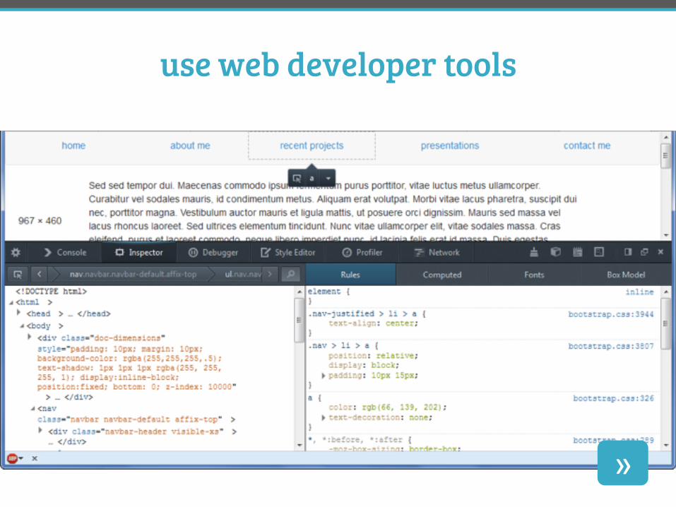
use web developer tools
»
JavaScript components
#DPA3 @FrshBakedPixels
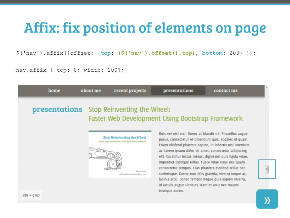
Affix: fix position of elements on page $('nav').affix({offset: {top: ($('nav').offset().top), bottom: 200} });
nav.affix { top: 0; width: 100%;}
»
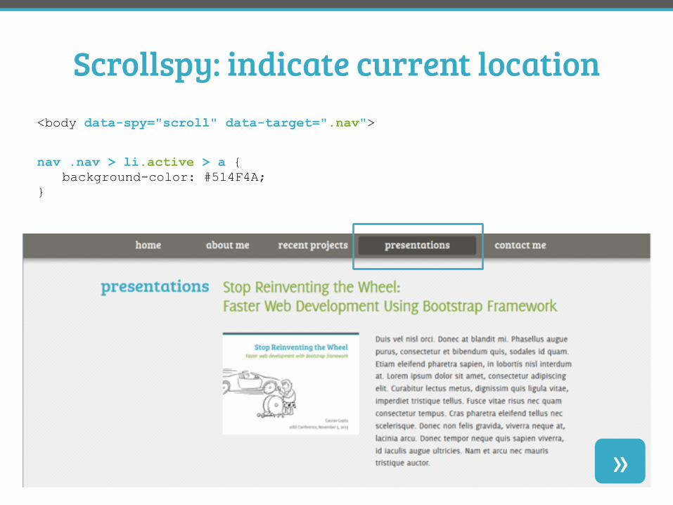
Scrollspy: indicate current location <body data-spy="scroll" data-target=".nav">
nav .nav > li.active > a { background-color: #514F4A; }
»
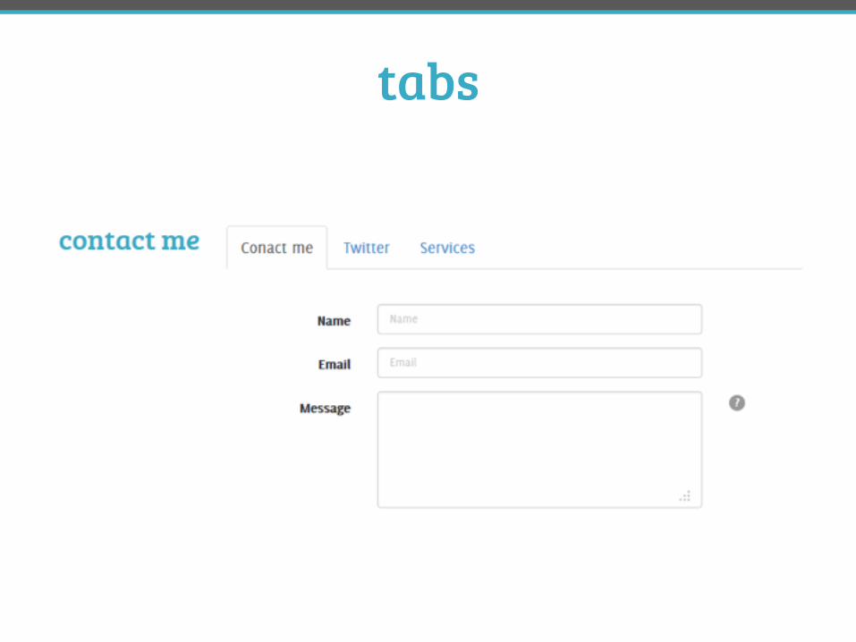
tabs
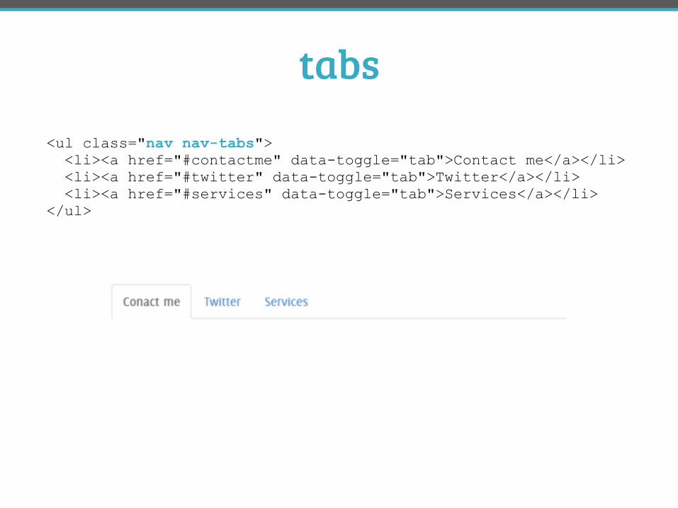
tabs<ul class="nav nav-tabs"> <li><a href="#contactme" data-toggle="tab">Contact me</a></li> <li><a href="#twitter" data-toggle="tab">Twitter</a></li> <li><a href="#services" data-toggle="tab">Services</a></li> </ul>
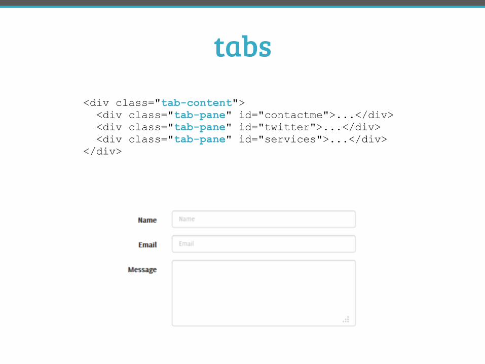
tabs<div class="tab-content"> <div class="tab-pane" id="contactme">...</div> <div class="tab-pane" id="twitter">...</div> <div class="tab-pane" id="services">...</div> </div>
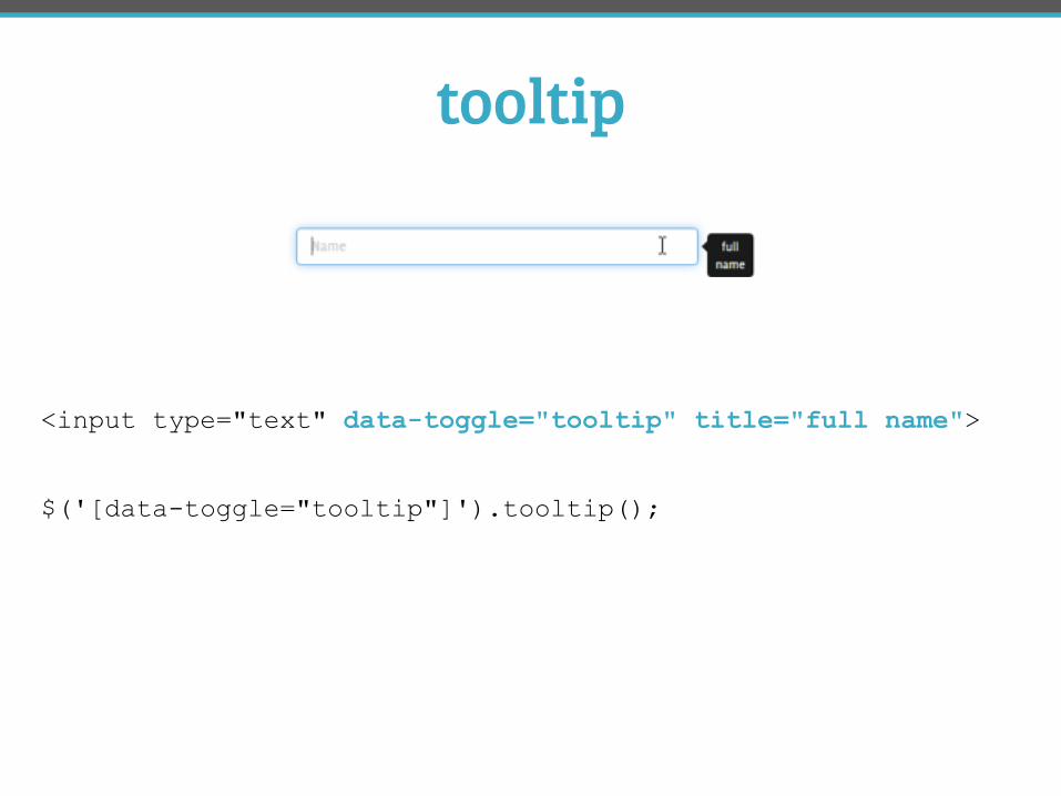
tooltip
<input type="text" data-toggle="tooltip" title="full name">
$('[data-toggle="tooltip"]').tooltip();
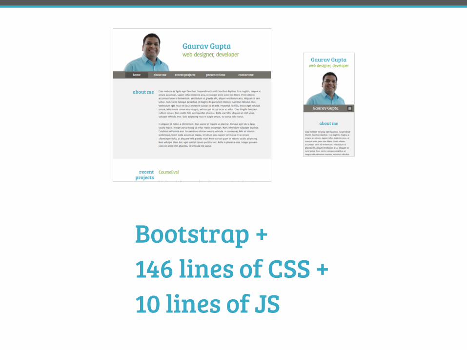
Bootstrap + 146 lines of CSS + 10 lines of JS
#DPA3 @FrshBakedPixels

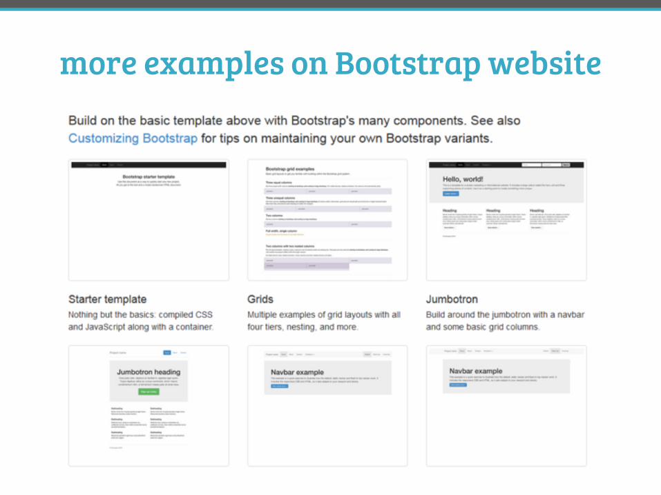
more examples on Bootstrap website
retrofitting an existing website
#DPA3 @FrshBakedPixels
Apple page built with Bootstrap
http://tiny.cc/heweb2
8-10 hours
other ways to use Bootstrap
#DPA3 @FrshBakedPixels
prototyping
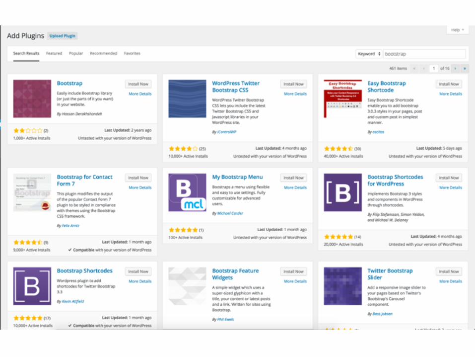
Wordpress plugins
third party add-ons
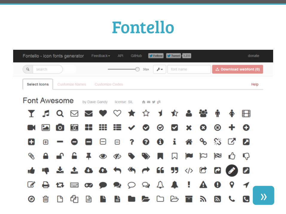
Fontello
»
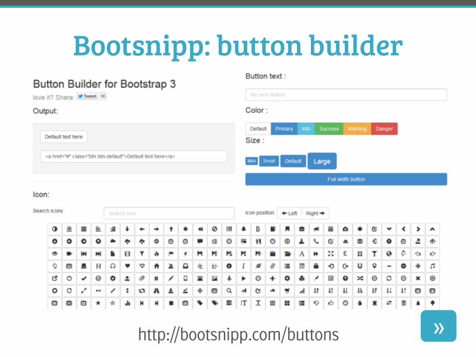
Bootsnipp: button builder
http://bootsnipp.com/buttons »
pros and cons of Bootstrap
#DPA3 @FrshBakedPixels
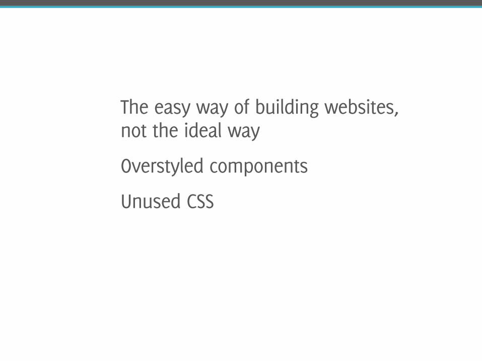
The easy way of building websites, not the ideal way
Overstyled components
Unused CSS
version 4.0
#DPA3 @FrshBakedPixels
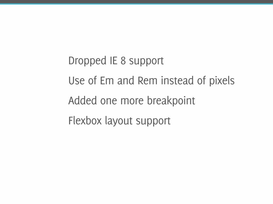
Dropped IE 8 support
Use of Em and Rem instead of pixels
Added one more breakpoint
Flexbox layout support
other frameworks
#DPA3 @FrshBakedPixels
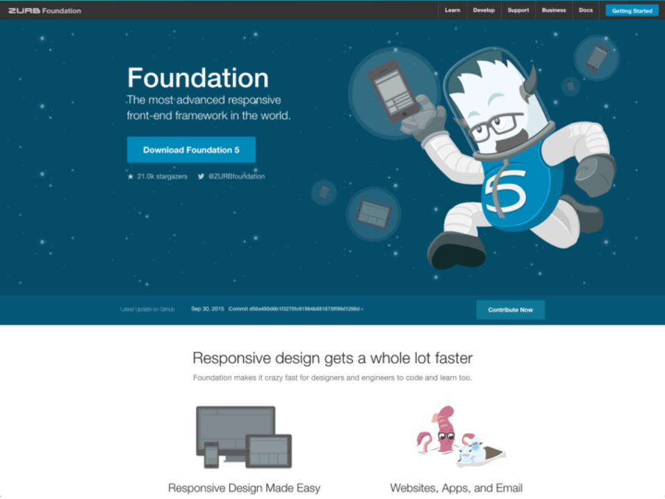
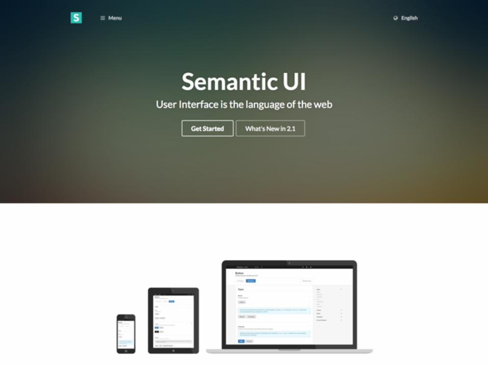
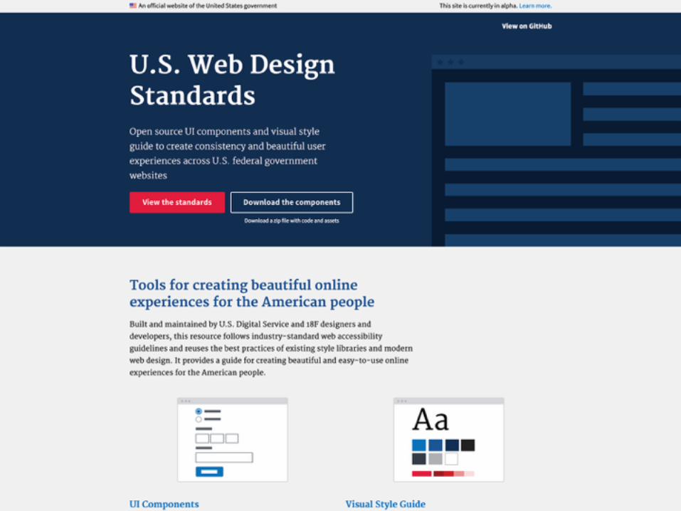
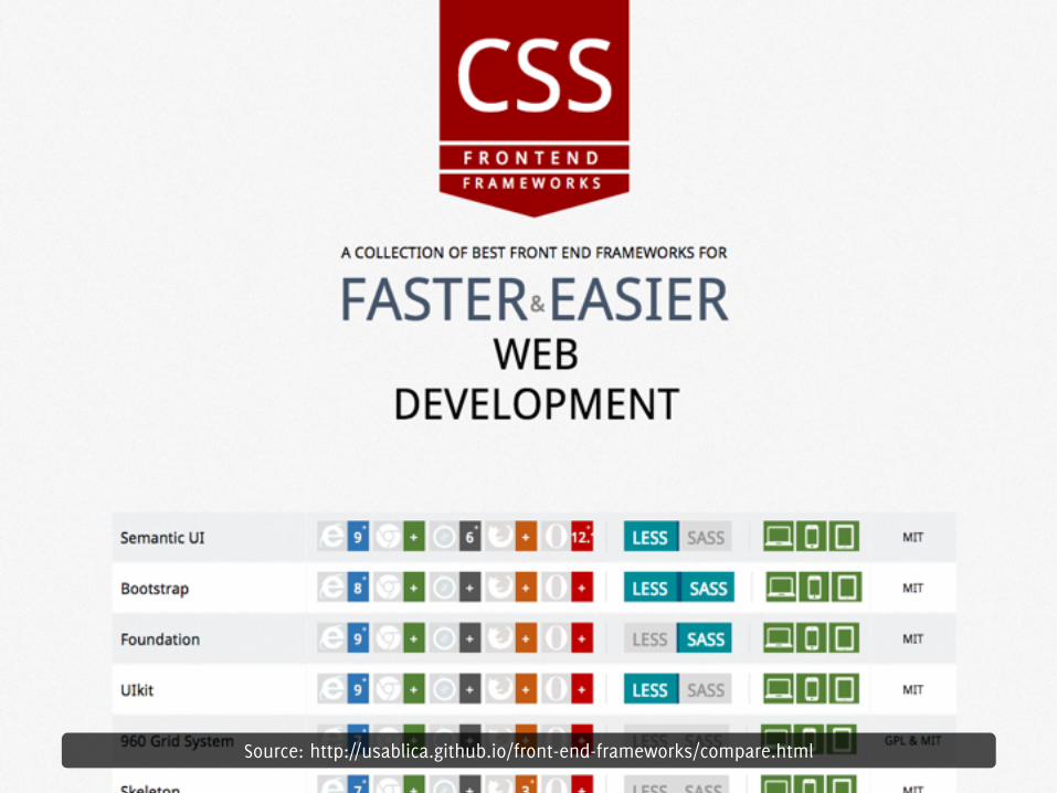
Source: http://usablica.github.io/front-end-frameworks/compare.html
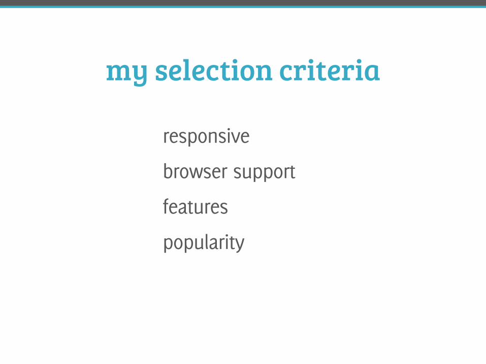
my selection criteria
responsive
browser support
features
popularity
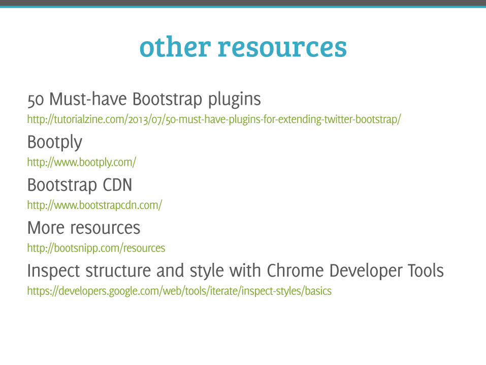
other resources50 Must-have Bootstrap plugins http://tutorialzine.com/2013/07/50-must-have-plugins-for-extending-twitter-bootstrap/
Bootply http://www.bootply.com/
Bootstrap CDN http://www.bootstrapcdn.com/
More resources http://bootsnipp.com/resources
Inspect structure and style with Chrome Developer Tools
https://developers.google.com/web/tools/iterate/inspect-styles/basics
questions?
#DPA3
@frshbakedpixels