Embed Size (px)
Citation preview
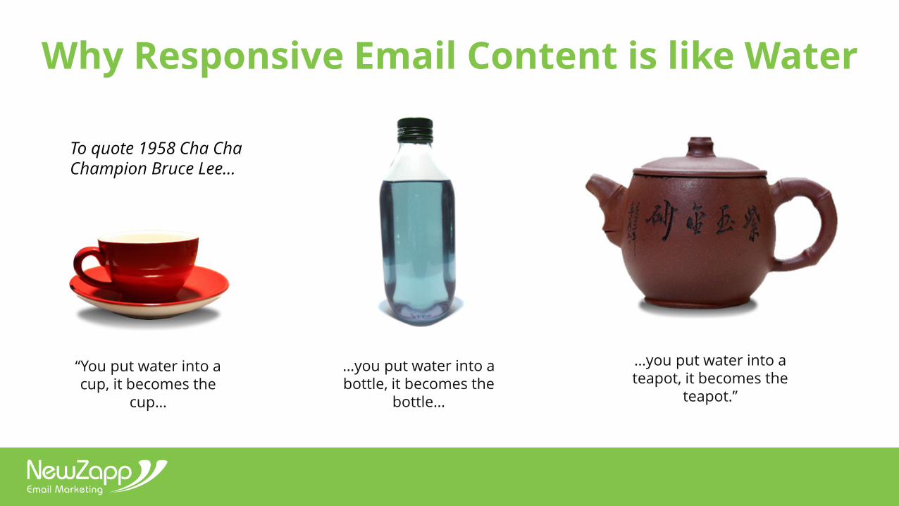
Why Responsive Email Content is like Water
“You put water into a cup, it becomes the
cup…
…you put water into a teapot, it becomes the
teapot.”
…you put water into a bottle, it becomes the
bottle…
To quote 1958 Cha ChaChampion Bruce Lee…
www.newzapp.com
Why Build Responsively?
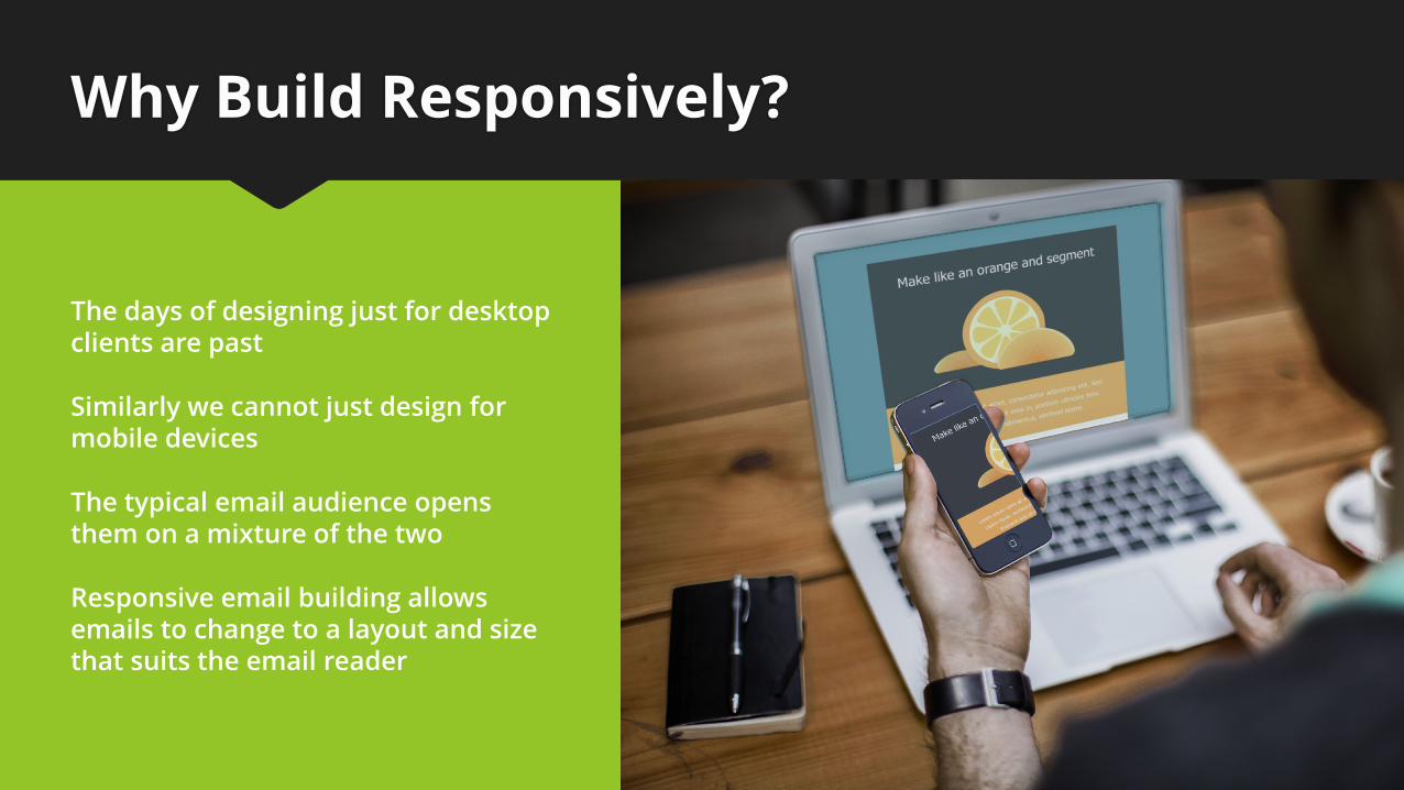
The days of designing just for desktop clients are past
Similarly we cannot just design for mobile devices
The typical email audience opens them on a mixture of the two
Responsive email building allows emails to change to a layout and size that suits the email reader
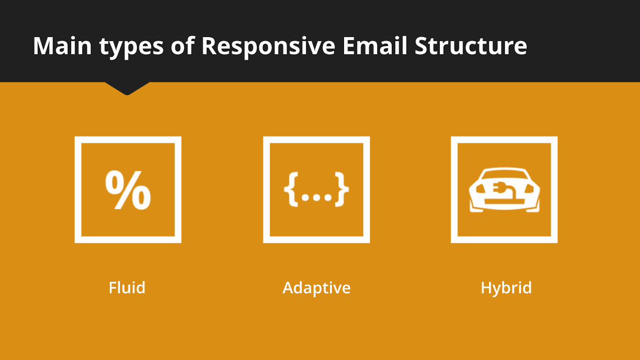
Main types of Responsive Email Structure
Fluid Adaptive Hybrid
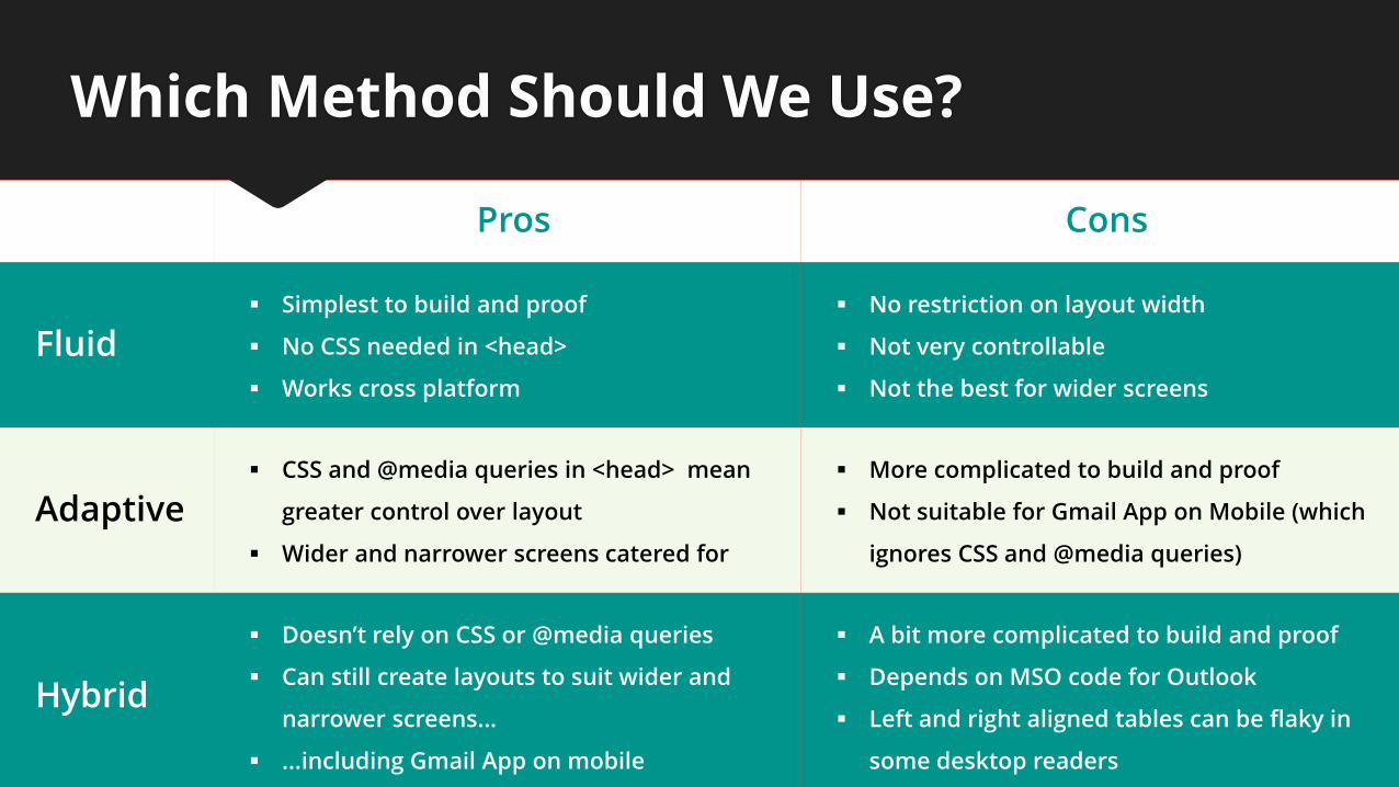
Pros Cons
Fluid Simplest to build and proof
No CSS needed in <head>
Works cross platform
No restriction on layout width
Not very controllable
Not the best for wider screens
Adaptive CSS and @media queries in <head> mean
greater control over layout
Wider and narrower screens catered for
More complicated to build and proof
Not suitable for Gmail App on Mobile (which
ignores CSS and @media queries)
Hybrid
Doesn’t rely on CSS or @media queries
Can still create layouts to suit wider and
narrower screens…
...including Gmail App on mobile
A bit more complicated to build and proof
Depends on MSO code for Outlook
Left and right aligned tables can be flaky in
some desktop readers
Which Method Should We Use?
Fluid
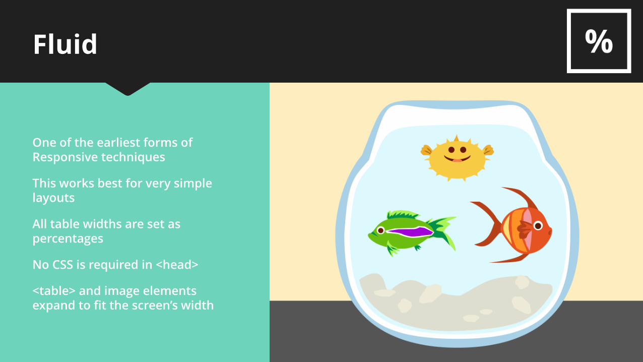
One of the earliest forms of Responsive techniques
All table widths are set as percentages
This works best for very simple layouts
No CSS is required in <head>
<table> and image elements expand to fit the screen’s width
Fluid
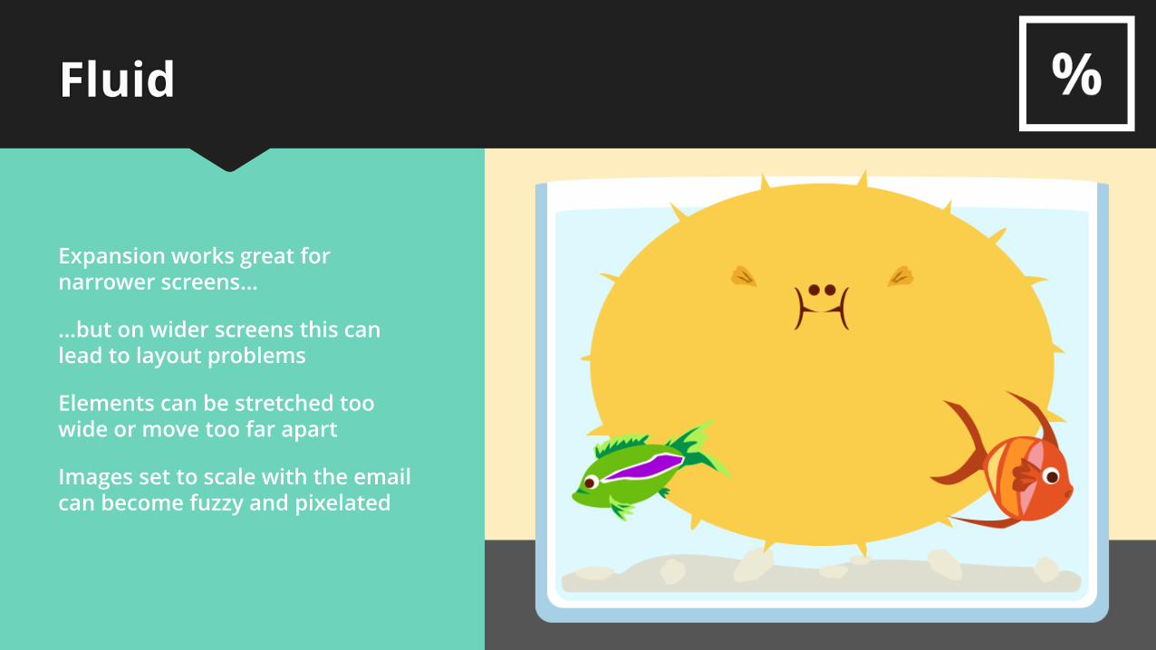
Expansion works great for narrower screens…
Images set to scale with the email can become fuzzy and pixelated
…but on wider screens this can lead to layout problems
Elements can be stretched too wide or move too far apart
Adaptive
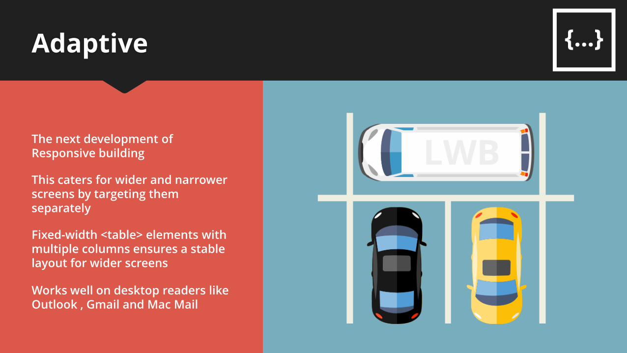
The next development of Responsive building
Fixed-width <table> elements with multiple columns ensures a stable layout for wider screens
Works well on desktop readers like Outlook , Gmail and Mac Mail
This caters for wider and narrower screens by targeting them separately
Adaptive
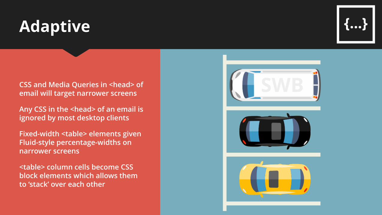
Fixed-width <table> elements given Fluid-style percentage-widths on narrower screens
CSS and Media Queries in <head> of email will target narrower screens
<table> column cells become CSS block elements which allows them to ‘stack’ over each other
Any CSS in the <head> of an email is ignored by most desktop clients
Adaptive
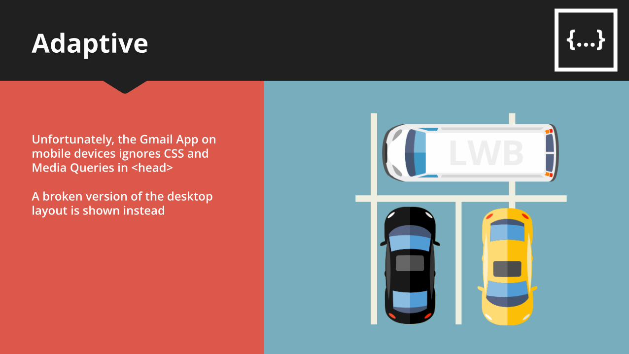
Unfortunately, the Gmail App on mobile devices ignores CSS and Media Queries in <head>
A broken version of the desktop layout is shown instead
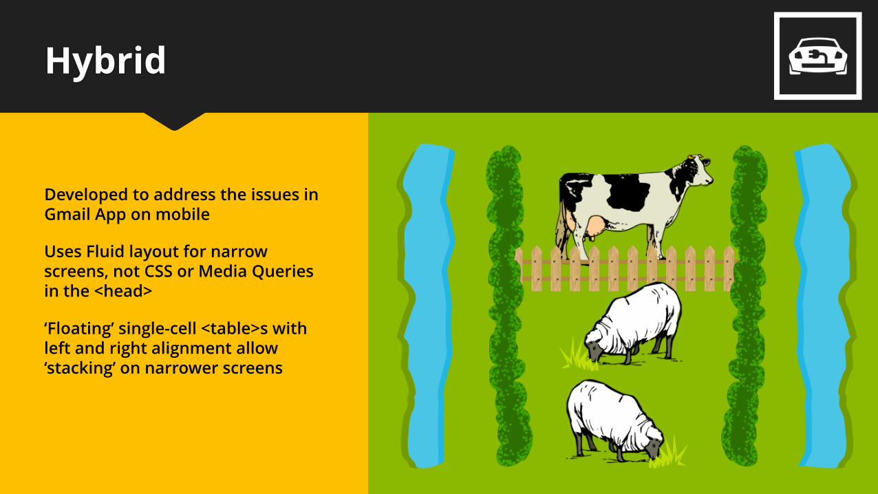
Hybrid
Uses Fluid layout for narrow screens, not CSS or Media Queries in the <head>
Developed to address the issues in Gmail App on mobile
‘Floating’ single-cell <table>s with left and right alignment allow ‘stacking’ on narrower screens
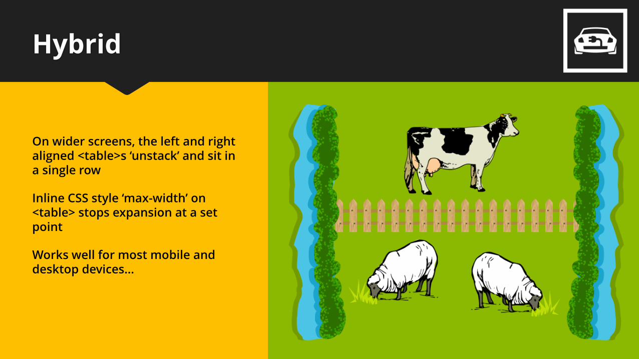
Hybrid
On wider screens, the left and right aligned <table>s ‘unstack’ and sit in a single row
Inline CSS style ‘max-width’ on <table> stops expansion at a set point
Works well for most mobile and desktop devices…
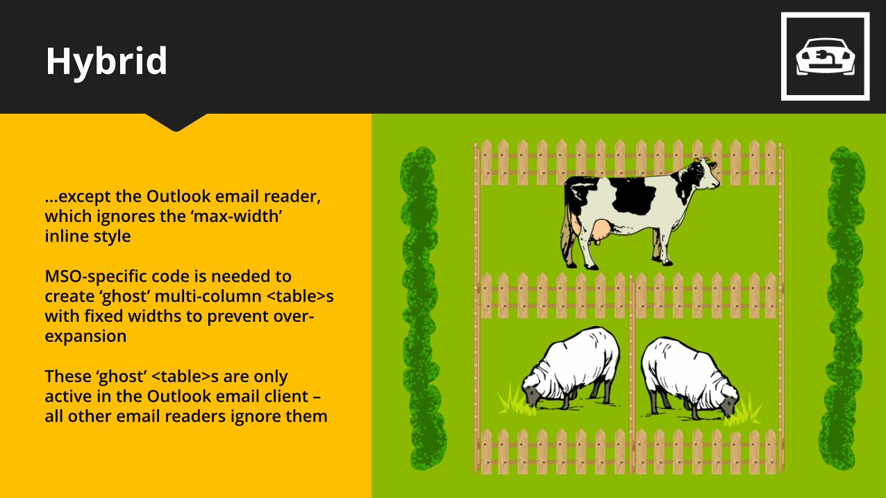
Hybrid
…except the Outlook email reader, which ignores the ‘max-width’ inline style
MSO-specific code is needed to create ‘ghost’ multi-column <table>s with fixed widths to prevent over-expansion
These ‘ghost’ <table>s are only active in the Outlook email client –all other email readers ignore them
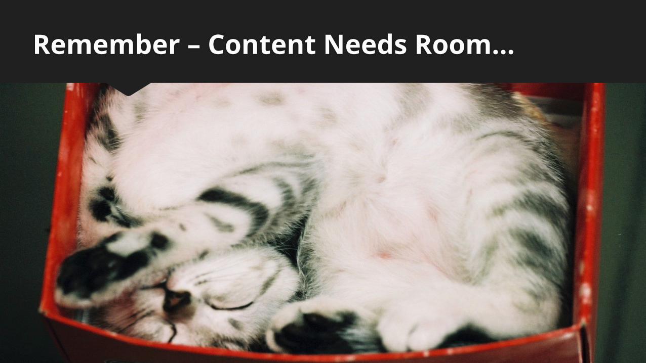
Remember – Content Needs Room…

www.newzapp.com