Embed Size (px)
Citation preview

EARTH HOUR BRAND GUIDELINES 2015
1
03 08 15 29 1. ABOUT EARTH HOUR & WWF
5. EARTH HOUR 2015 NAMING RIGHTS
9. EARTH HOUR COLOUR PALETTE
13. EARTH HOUR PARTICIPANTS & OTHER SUPPORTERS
05 2. THE BRAND EVOLUTION
06 3. EARTH HOUR 2015 THEME
07 4. EARTH HOUR BLUE
6. EARTH HOUR 2015 BRAND INDENTITY
10
09
7. EARTH HOUR LOOK AND FEEL
12 8. EARTH HOUR IMAGES
16 10. EARTH HOUR FONTS
17 11. EARTH HOUR LOGO USAGE
19 11.1 EARTH HOUR LOGO USAGE:—Background and Colour
20 11.2 EARTH HOUR LOGO USAGE:—Clear Space
21 11.3 EARTH HOUR LOGO USAGE:—Positioning
23 11.4 EARTH HOUR LOGO USAGE:—Text and Font
24 12. PLACEMENT OF WWF LOGO
14. ADMIN COLLATERAL
32
33
34
15. ABOUT THE BRAND GUIDELINES
16. SIGN OFF PROCEDUREAND CONTACTS
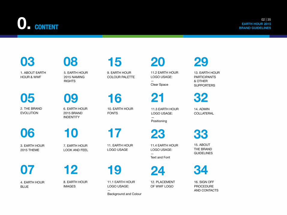
0. 02 | 35 EARTH HOUR 2015
BRAND GUIDELINES
CONTENT
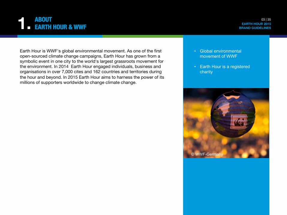
Earth Hour is WWF's global environmental movement. As one of the first open-sourced climate change campaigns, Earth Hour has grown from a symbolic event in one city to the world's largest grassroots movement for the environment. In 2014 Earth Hour engaged individuals, business and organisations in over 7,000 cites and 162 countries and territories during the hour and beyond. In 2015 Earth Hour aims to harness the power of its millions of supporters worldwide to change climate change.
1. 03 | 35 EARTH HOUR 2015
BRAND GUIDELINES
ABOUT "EARTH HOUR & WWF
• Global environmental movement of WWF
• Earth Hour is a registered
charity
© WWF-Germany
1. 04 | 35 EARTH HOUR 2015
BRAND GUIDELINES
ABOUT "EARTH HOUR & WWF
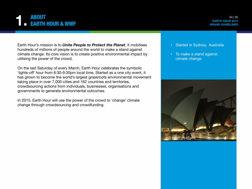
Earth Hour’s mission is to Unite People to Protect the Planet. It mobilises hundreds of millions of people around the world to make a stand against climate change. Its core vision is to create positive environmental impact by utilising the power of the crowd. On the last Saturday of every March, Earth Hour celebrates the symbolic ‘lights-off’ hour from 8:30-9:30pm local time. Started as a one city event, it has grown to become the world’s largest grassroots environmental movement taking place in over 7,000 cities and 162 countries and territories, crowdsourcing actions from individuals, businesses, organisations and governments to generate environmental outcomes. In 2015, Earth Hour will use the power of the crowd to ‘change’ climate change through crowdsourcing and crowdfunding.
• Started in Sydney, Australia • To make a stand against
climate change
© WWF-Australia

5
© WWF-Indonesia
2. 05 | 35 EARTH HOUR 2015
BRAND GUIDELINES
THE BRAND"EVOLUTION
Bring people together through a symbolic hour-long event
Galvanise people into taking action beyond the hour
STAGE 3
STAGE 1
STAGE 2
Harness the power of the crowd through crowdsourcing and crowdfunding to drive tangible environmental outcomes
3. 06 | 35 EARTH HOUR 2015
BRAND GUIDELINES
EARTH HOUR 2015"THEME
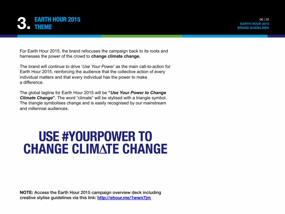
For Earth Hour 2015, the brand refocuses the campaign back to its roots and harnesses the power of the crowd to change climate change.
The brand will continue to drive ‘Use Your Power’ as the main call-to-action for Earth Hour 2015, reinforcing the audience that the collective action of every individual matters and that every individual has the power to make a difference.
The global tagline for Earth Hour 2015 will be “Use Your Power to Change Climate Change”. The word “climate” will be stylised with a triangle symbol. The triangle symbolises change and is easily recognised by our mainstream and millennial audiences.
!
NOTE: Access the Earth Hour 2015 campaign overview deck including creative stylise guidelines via this link: http://ehour.me/1wwn7jm
4. 07 | 35 EARTH HOUR 2015
BRAND GUIDELINES
EARTH HOUR "BLUE
Last year in 2014, Earth Hour launched Earth Hour Blue, the first world’s first crowdfunding and crowdsourcing platform for the planet, hosted on earthhour.org.
Earth Hour Blue is an all-encompassing global platform that empowers people to contribute to tangible environmental outcomes by donating to crowdfunding projects or adding their voices by signing up for petitions and actions on the platform.
The objective is to raise funds and collective actions and voices to make tangible environmental changes a reality for our living planet.
For 2015, the platform will still be available on earthhour.org with a strong emphasis on harnessing the power of the crowd to change climate change (refer to section 3 for more information on the global theme for 2015).
For external communication, ‘Earth Hour Blue’ can be used in copy and content, accompanied by compelling design, photography and other artwork materials. The powerful and uplifting usage of the colour blue represents an evolved and refreshed look and feel for the brand.
NOTE: Access the Earth Hour 2015 campaign overview deck including creative stylise guidelines via this link: http://ehour.me/1wwn7jm
USING THE TRADEMARK™ SYMBOL The Earth Hour™ brand is a registered trademark. On the first mention of the Earth Hour’s name in text format, the trademark ™ symbol should appear after the word Hour. Example: Earth Hour™ All subsequent mentions within the same document/article do not have to show the ™ symbol. NOTE: In some large size fonts, the ™ symbol may sit incorrectly. For this reason, the first use/mention of Earth Hour™ should be in body text only, as opposed to headings or cover pages. WWF’S EARTH HOUR In order to emphasize the importance of the relationship between WWF and Earth Hour, WWF organiser teams should use the following words when describing the Earth Hour movement: “WWF’s Earth Hour” WWF’s Earth Hour should be used on the first mention only. All subsequent mentions within the same document/article should be: Earth Hour. !
5. 08 | 35 EARTH HOUR 2015
BRAND GUIDELINES
EARTH HOUR"NAMING RIGHTS
6. 09 | 35 EARTH HOUR 2015
BRAND GUIDELINES
BRAND VALUES &"DEFINING CHARACTERISTIC
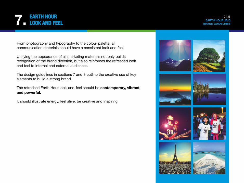
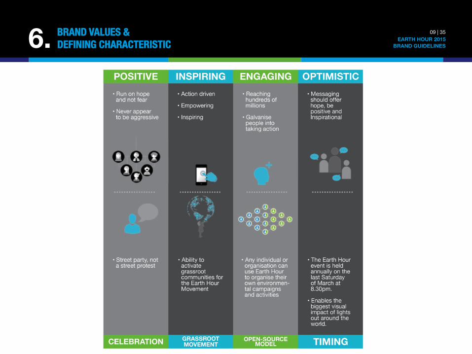
From photography and typography to the colour palette, all communication materials should have a consistent look and feel. Unifying the appearance of all marketing materials not only builds recognition of the brand direction, but also reinforces the refreshed look and feel to internal and external audiences. The design guidelines in sections 7 and 8 outline the creative use of key elements to build a strong brand. The refreshed Earth Hour look-and-feel should be contemporary, vibrant, and powerful. It should illustrate energy, feel alive, be creative and inspiring.
7. 10 | 35 EARTH HOUR 2015
BRAND GUIDELINES
EARTH HOUR"LOOK AND FEEL
7. 11 | 35 EARTH HOUR 2015
BRAND GUIDELINES
EARTH HOUR"LOOK AND FEEL
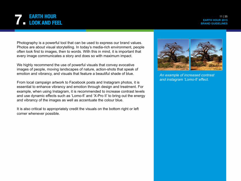
Photography is a powerful tool that can be used to express our brand values. Photos are about visual storytelling. In today’s media-rich environment, people often look first to images, then to words. With this in mind, it is important that every image communicates a story and does so with maximum impact. We highly recommend the use of powerful visuals that convey evocative images of people, moving landscapes of nature, action-shots that speak of emotion and vibrancy, and visuals that feature a beautiful shade of blue. From local campaign artwork to Facebook posts and Instagram photos, it is essential to enhance vibrancy and emotion through design and treatment. For example, when using Instagram, it is recommended to increase contrast levels and use dynamic effects such as ‘Lomo-fi’ and ‘X-Pro II’ to bring out the energy and vibrancy of the images as well as accentuate the colour blue. It is also critical to appropriately credit the visuals on the bottom right or left corner whenever possible.
An example of increased contrast and instagram ‘Lomo-fi’ effect.
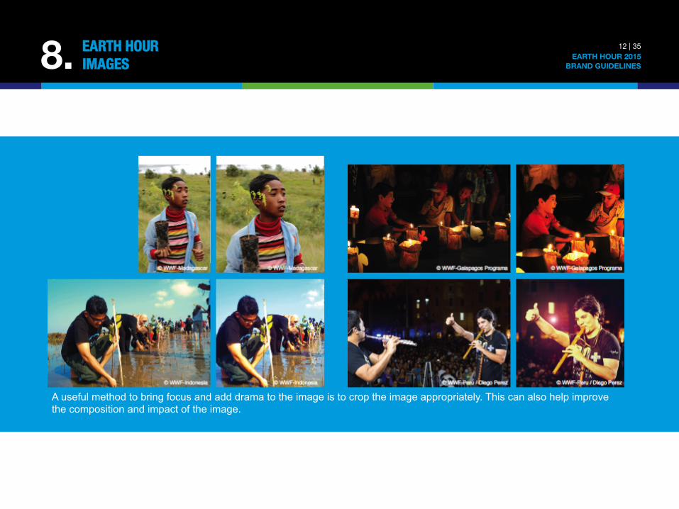
A useful method to bring focus and add drama to the image is to crop the image appropriately. This can also help improve the composition and impact of the image.
8. 12 | 35 EARTH HOUR 2015
BRAND GUIDELINES
EARTH HOUR"IMAGES
= = =
=
=
= =
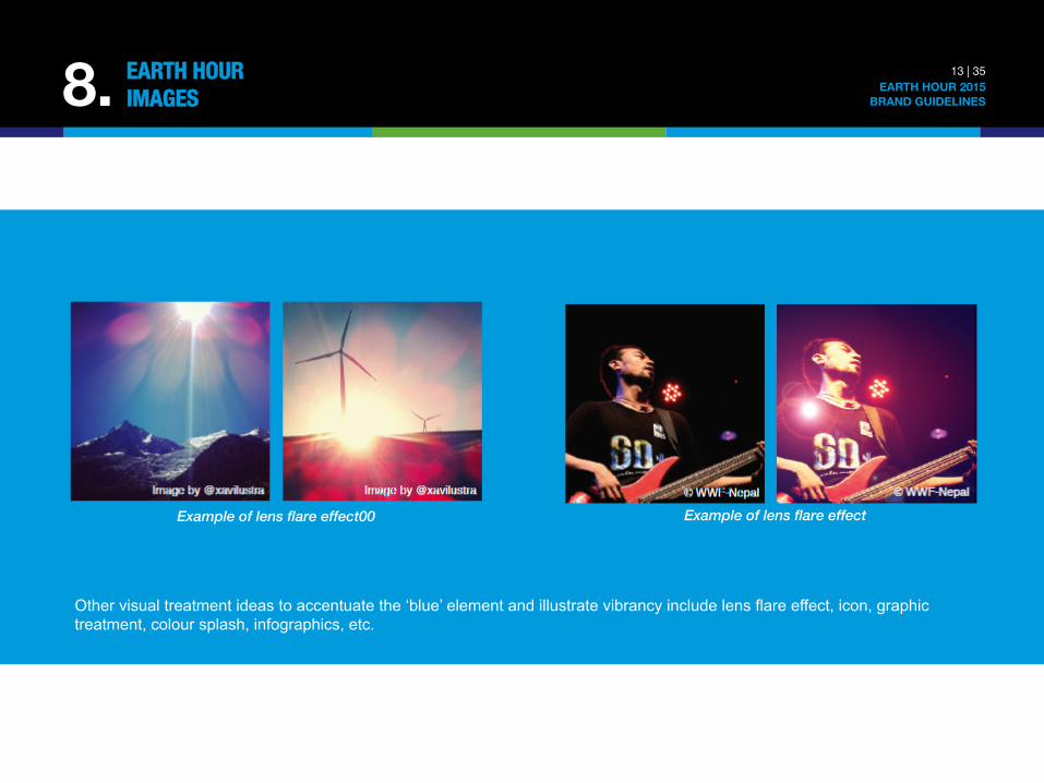
Other visual treatment ideas to accentuate the ‘blue’ element and illustrate vibrancy include lens flare effect, icon, graphic treatment, colour splash, infographics, etc.
Example of lens flare effect Example of lens flare effect00
8. 13 | 35 EARTH HOUR 2015
BRAND GUIDELINES
EARTH HOUR"IMAGES
8. 14 | 35 EARTH HOUR 2015
BRAND GUIDELINES
EARTH HOUR"IMAGES
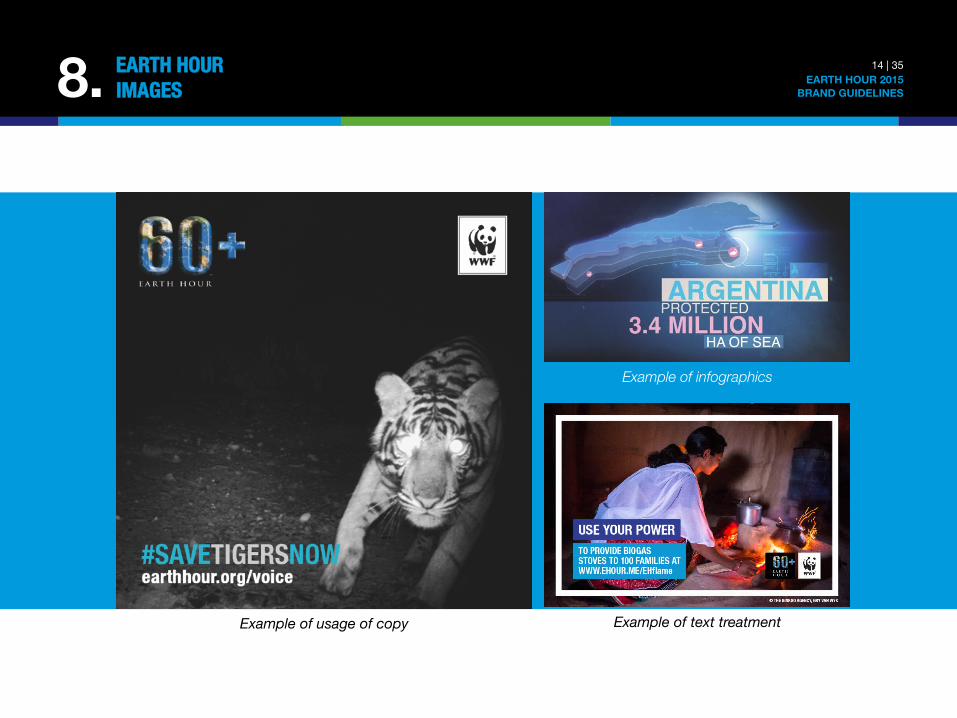
Example of usage of copy Example of text treatment
Example of infographics
9. 15 | 35 EARTH HOUR 2015
BRAND GUIDELINES
EARTH HOUR"COLOUR PALETTE
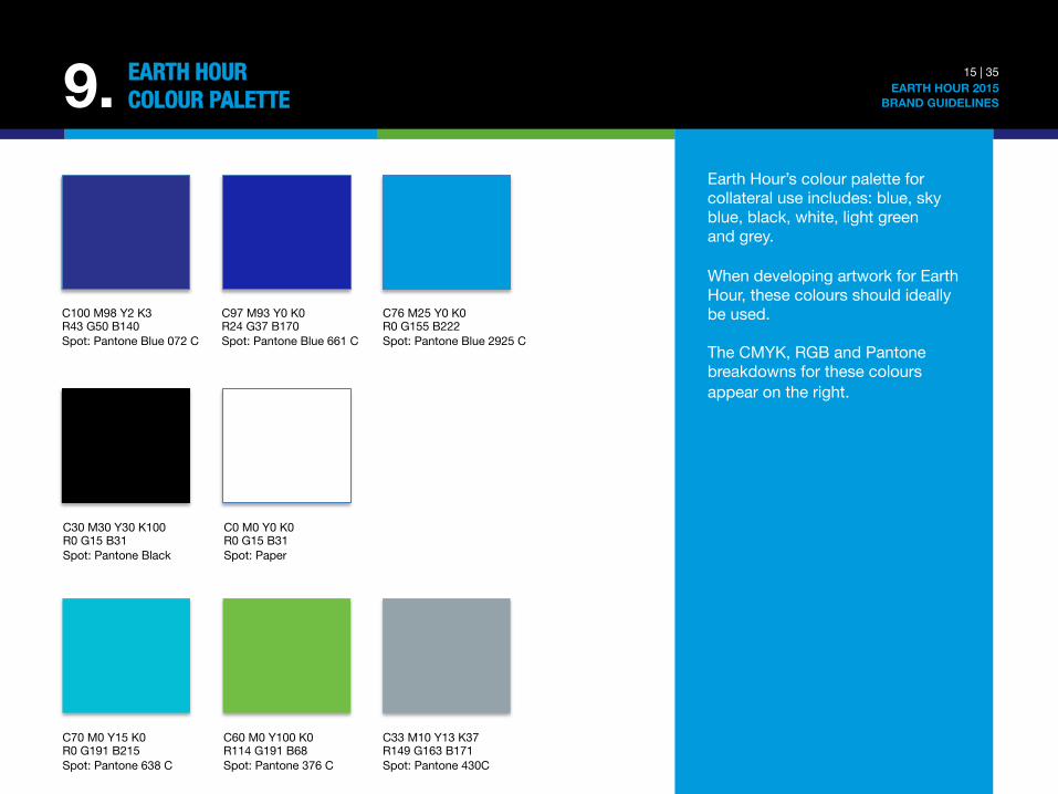
Earth Hour’s colour palette for collateral use includes: blue, sky blue, black, white, light green and grey. When developing artwork for Earth Hour, these colours should ideally be used. The CMYK, RGB and Pantone breakdowns for these colours appear on the right.
C100 M98 Y2 K3 R43 G50 B140 Spot: Pantone Blue 072 C
C97 M93 Y0 K0 R24 G37 B170 Spot: Pantone Blue 661 C
C76 M25 Y0 K0 R0 G155 B222 Spot: Pantone Blue 2925 C
C30 M30 Y30 K100 R0 G15 B31 Spot: Pantone Black
C0 M0 Y0 K0 R0 G15 B31 Spot: Paper
C70 M0 Y15 K0 R0 G191 B215 Spot: Pantone 638 C
C60 M0 Y100 K0 R114 G191 B68 Spot: Pantone 376 C
C33 M10 Y13 K37 R149 G163 B171 Spot: Pantone 430C
10. 16 | 35 EARTH HOUR 2015
BRAND GUIDELINES
EARTH HOUR"FONTS
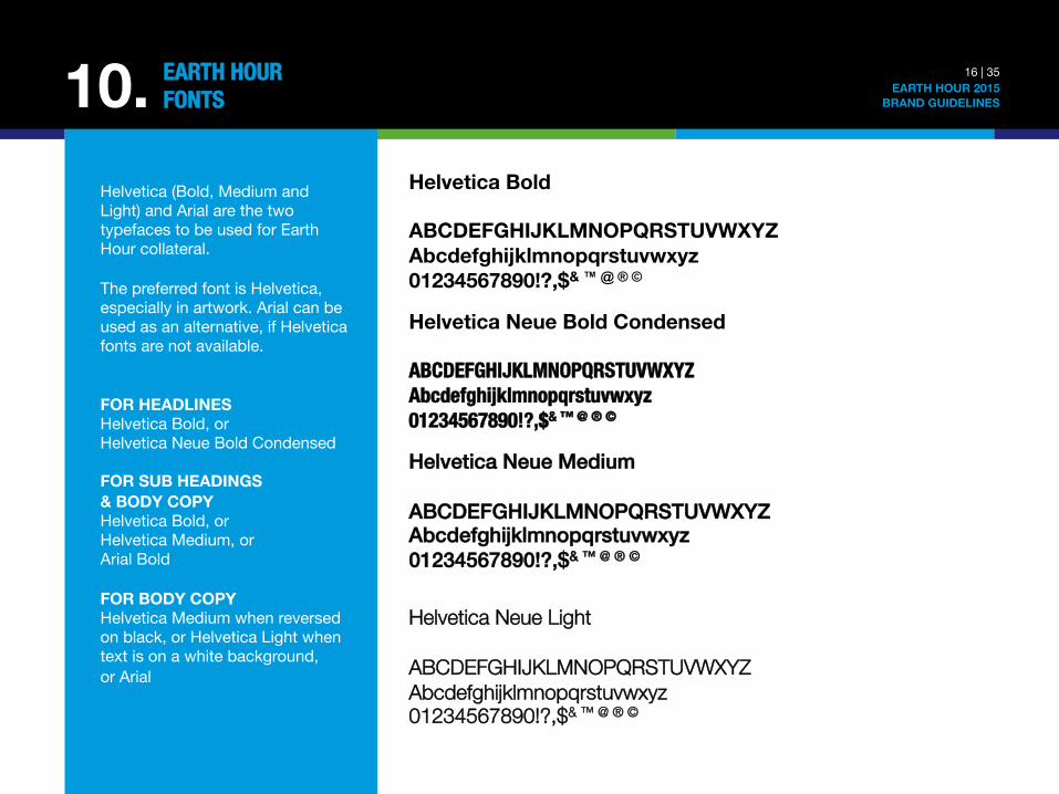
Helvetica (Bold, Medium and Light) and Arial are the two typefaces to be used for Earth Hour collateral. The preferred font is Helvetica, especially in artwork. Arial can be used as an alternative, if Helvetica fonts are not available. FOR HEADLINES Helvetica Bold, or Helvetica Neue Bold Condensed FOR SUB HEADINGS & BODY COPY Helvetica Bold, or Helvetica Medium, or Arial Bold FOR BODY COPY Helvetica Medium when reversed on black, or Helvetica Light when text is on a white background, or Arial
Helvetica Bold ABCDEFGHIJKLMNOPQRSTUVWXYZ Abcdefghijklmnopqrstuvwxyz 01234567890!?,$& ™ @ ® ©
Helvetica Neue Bold Condensed ABCDEFGHIJKLMNOPQRSTUVWXYZ Abcdefghijklmnopqrstuvwxyz 01234567890!?,$& ™ @ ® © !
Helvetica Neue Medium!!ABCDEFGHIJKLMNOPQRSTUVWXYZ!Abcdefghijklmnopqrstuvwxyz!01234567890!?,$& ™ @ ® ©!!
Helvetica Neue Light ABCDEFGHIJKLMNOPQRSTUVWXYZ Abcdefghijklmnopqrstuvwxyz 01234567890!?,$& ™ @ ® ©
11. 17 | 35 EARTH HOUR 2015
BRAND GUIDELINES
EARTH HOUR"LOGO USAGE
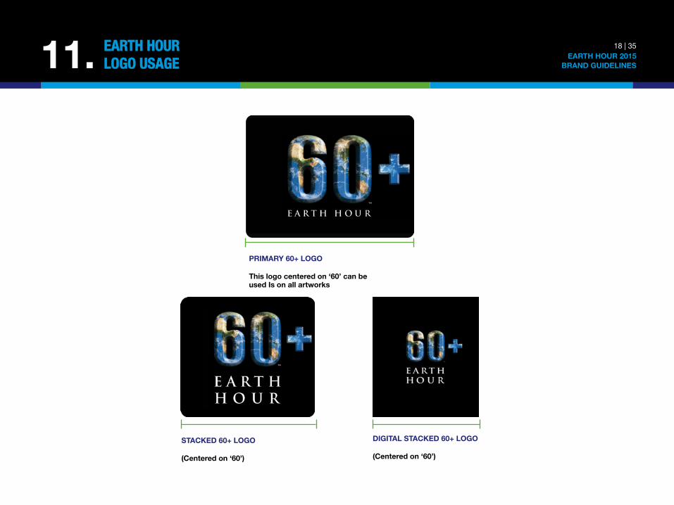
Using the Earth Hour logo correctly (i.e. in the correct format, size and in the correct location) helps to protect its integrity. The logo is an important element of the brand that must never be distorted or changed. The correct logo must be used at all times. 60+ LOGO In 2011, Earth Hour introduced the 60+ logo as a way of inspiring and empowering people to take Earth Hour beyond the hour. The idea of 60+ was to create a symbol that would unite the world in a global commitment to action that would last all year long, not just for one hour. COMPULSORY USE From 2012 onwards, the 60+ logo officially replaced the original Earth Hour logo and should now be used across ALL Earth Hour communication materials. FORMATS The 60+ logo is available in high-resolution EPS format and JPEG format: Primary Logo: Use on all artwork Stacked Logo: Use when logo is smaller than 50mm in height Digital Stacked Logo: Use on social media and as avatar Access the logo files via link below: http://ehour.me/brand2015
18 | 35 EARTH HOUR 2015
BRAND GUIDELINES 11. EARTH HOUR"LOGO USAGE
PRIMARY 60+ LOGO This logo centered on ‘60’ can beused Is on all artworks
STACKED 60+ LOGO (Centered on ‘60’)
DIGITAL STACKED 60+ LOGO (Centered on ‘60’)
19 | 35 EARTH HOUR 2015
BRAND GUIDELINES 11.1 EARTH HOUR"LOGO USAGE: BACKGROUND AND COLOUR
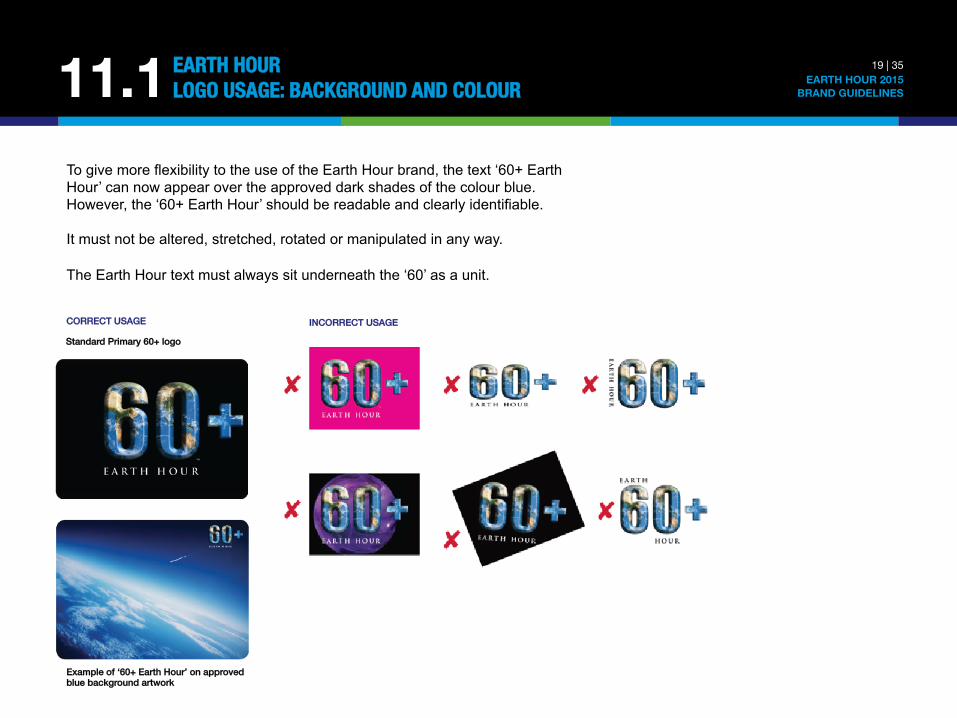
To give more flexibility to the use of the Earth Hour brand, the text ‘60+ Earth Hour’ can now appear over the approved dark shades of the colour blue. However, the ‘60+ Earth Hour’ should be readable and clearly identifiable. It must not be altered, stretched, rotated or manipulated in any way. The Earth Hour text must always sit underneath the ‘60’ as a unit.
CORRECT USAGE! Standard Primary 60+ logo
Example of ‘60+ Earth Hour’ on approved blue background artwork
INCORRECT USAGE!
20 | 35 EARTH HOUR 2015
BRAND GUIDELINES
EARTH HOUR"LOGO USAGE: CLEARSPACE
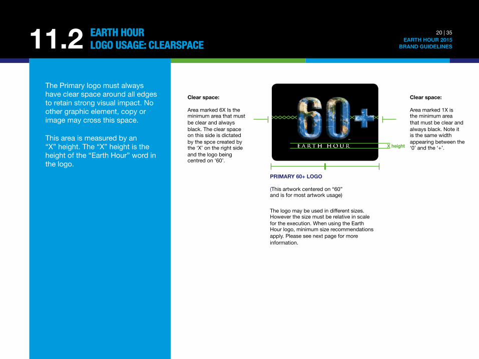
The Primary logo must always have clear space around all edges to retain strong visual impact. No other graphic element, copy or image may cross this space. This area is measured by an “X” height. The “X” height is the height of the “Earth Hour” word in the logo.
11.2
PRIMARY 60+ LOGO (This artwork centered on “60” and is for most artwork usage)
The logo may be used in different sizes. However the size must be relative in scale for the execution. When using the Earth Hour logo, minimum size recommendations apply. Please see next page for more information.
X height
Clear space: Area marked 1X is the minimum area that must be clear and always black. Note it is the same width appearing between the ‘0’ and the ‘+’.
Clear space: Area marked 6X Is the minimum area that must be clear and always black. The clear space on this side is dictated by the spce created by the ‘X’ on the right side and the logo being centred on ‘60’.
21 | 35 EARTH HOUR 2015
BRAND GUIDELINES
EARTH HOUR"LOGO USAGE: POSITIONING 11.3
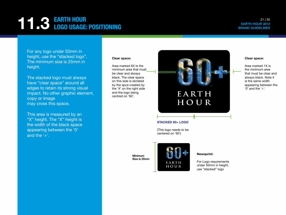
For any logo under 50mm in height, use the “stacked logo”. The minimum size is 25mm in height. The stacked logo must always have “clear space” around all edges to retain its strong visual impact. No other graphic element, copy or image may cross this space. This area is measured by an “X” height. The “X” height is the width of the black space appearing between the ‘0’ and the ‘+’.
Clear space: Area marked 6X Is the minimum area that must be clear and always black. The clear space on this side is dictated by the spce created by the ‘X’ on the right side and the logo being centred on ‘60’.
STACKED 60+ LOGO (This logo needs to be centered on ’60’)
Minimum !Size is 25mm
Newsprint: For Logo requirements under 50mm in height,use “stacked” logo
Clear space: Area marked 1X is the minimum area that must be clear and always black. Note it is the same width appearing between the ‘0’ and the ‘+’.
22 | 35 EARTH HOUR 2015
BRAND GUIDELINES
EARTH HOUR"LOGO USAGE: POSITIONING 11.3
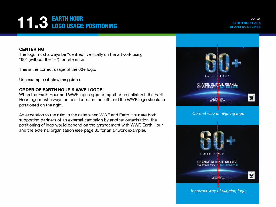
CENTERING The logo must always be “centred” vertically on the artwork using “60” (without the “+”) for reference. This is the correct usage of the 60+ logo. Use examples (below) as guides. ORDER OF EARTH HOUR & WWF LOGOS When the Earth Hour and WWF logos appear together on collateral, the Earth Hour logo must always be positioned on the left, and the WWF logo should be positioned on the right. An exception to the rule: In the case when WWF and Earth Hour are both supporting partners of an external campaign by another organisation, the positioning of logo would depend on the arrangement with WWF, Earth Hour, and the external organisation (see page 30 for an artwork example).
Correct way of aligning logo
Incorrect way of aligning logo
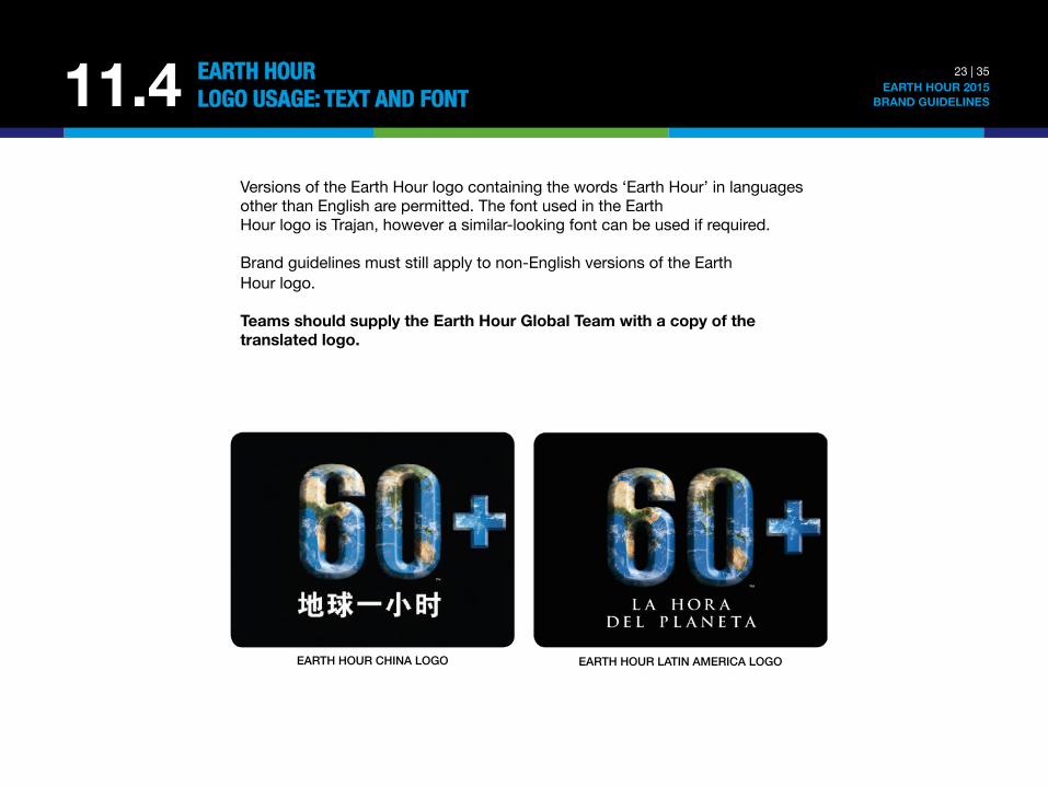
Versions of the Earth Hour logo containing the words ‘Earth Hour’ in languages other than English are permitted. The font used in the Earth Hour logo is Trajan, however a similar-looking font can be used if required. Brand guidelines must still apply to non-English versions of the Earth Hour logo. Teams should supply the Earth Hour Global Team with a copy of the translated logo.
23 | 35 EARTH HOUR 2015
BRAND GUIDELINES 11.4 EARTH HOUR"LOGO USAGE: TEXT AND FONT
EARTH HOUR CHINA LOGO! EARTH HOUR LATIN AMERICA LOGO!
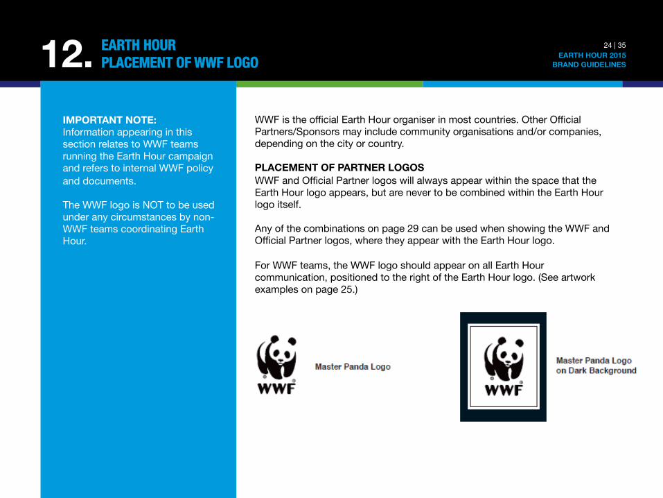
WWF is the official Earth Hour organiser in most countries. Other Official Partners/Sponsors may include community organisations and/or companies, depending on the city or country. PLACEMENT OF PARTNER LOGOS WWF and Official Partner logos will always appear within the space that the Earth Hour logo appears, but are never to be combined within the Earth Hour logo itself. Any of the combinations on page 29 can be used when showing the WWF and Official Partner logos, where they appear with the Earth Hour logo. For WWF teams, the WWF logo should appear on all Earth Hour communication, positioned to the right of the Earth Hour logo. (See artwork examples on page 25.)
24 | 35 EARTH HOUR 2015
BRAND GUIDELINES 12. EARTH HOUR"PLACEMENT OF WWF LOGO
IMPORTANT NOTE: Information appearing in this section relates to WWF teams running the Earth Hour campaign and refers to internal WWF policy and documents. The WWF logo is NOT to be used under any circumstances by non-WWF teams coordinating Earth Hour.
When WWF is branded as the lead organisation, it is important to follow the WWF brand guidelines (see OneWWF at https://sites.google.com/a/wwf.panda.org/brand-development/) including the brand values and key message framework approved at the Assembly of the 2009 WWF Annual Conference. Following these guidelines will help to ensure that WWF’s special and different characteristics are communicated around Earth Hour. Placement of WWF logo: exception and special treatments WWF should endeavour to build its brand through Earth Hour while maintaining the open-source nature that ensures a wide dissemination of the message. In some cases, it may not be appropriate for the WWF logo to appear in Earth Hour communication products and in other cases, special care should be taken to ensure the WWF logo is placed appropriately. WWF should not be seen to endorse, support, or co-brand with companies that WWF has not already explicitly given the rights to use the WWF trademarks to. It is still possible, however, for companies and organisations to sponsor/support Earth Hour.
25 | 35 EARTH HOUR 2015
BRAND GUIDELINES 12. EARTH HOUR"PLACEMENT OF WWF LOGO
26 | 35 EARTH HOUR 2015
BRAND GUIDELINES 12. EARTH HOUR"PLACEMENT OF WWF LOGO
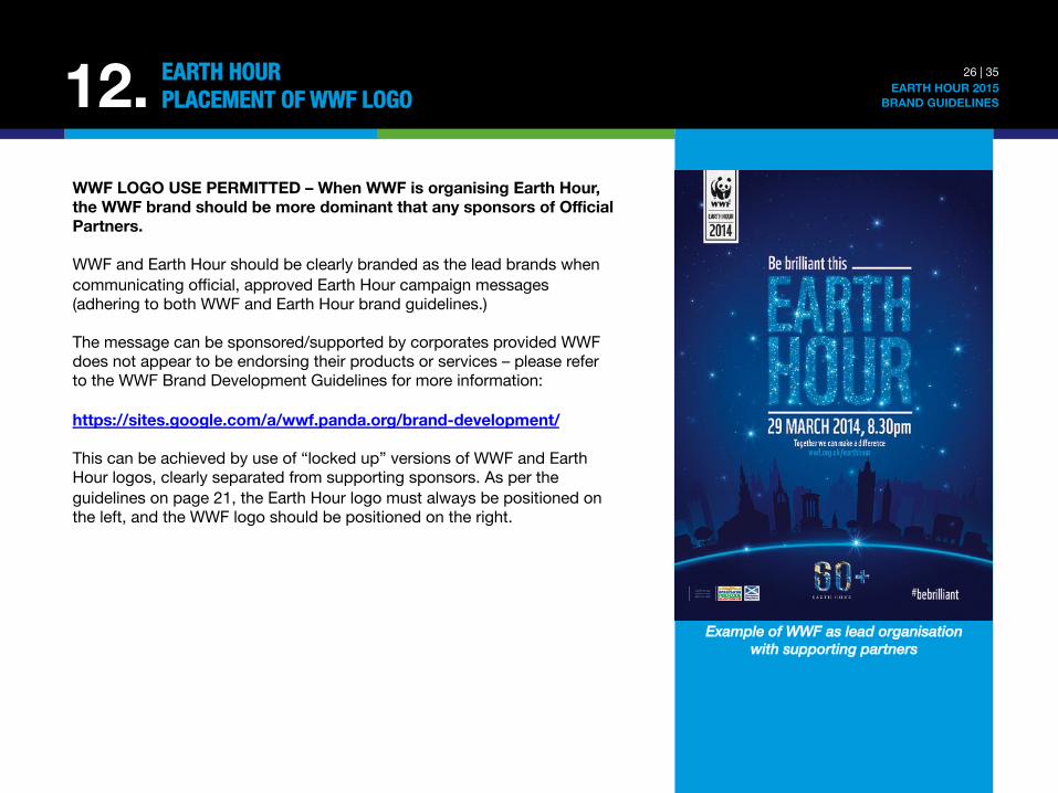
WWF LOGO USE PERMITTED – When WWF is organising Earth Hour, the WWF brand should be more dominant that any sponsors of Official Partners. WWF and Earth Hour should be clearly branded as the lead brands when communicating official, approved Earth Hour campaign messages (adhering to both WWF and Earth Hour brand guidelines.) The message can be sponsored/supported by corporates provided WWF does not appear to be endorsing their products or services – please refer to the WWF Brand Development Guidelines for more information: https://sites.google.com/a/wwf.panda.org/brand-development/ This can be achieved by use of “locked up” versions of WWF and Earth Hour logos, clearly separated from supporting sponsors. As per the guidelines on page 21, the Earth Hour logo must always be positioned on the left, and the WWF logo should be positioned on the right.
Example of WWF as lead organisation with supporting partners
27 | 35 EARTH HOUR 2015
BRAND GUIDELINES 12. EARTH HOUR"PLACEMENT OF WWF LOGO
A WWF-INSPIRED MOVEMENT Wherever possible, WWF should still be named as parent organisation of Earth Hour. The following text, used as “boilerplate” information appearing on standard Earth Hour media releases, is a useful way of describing WWF’s involvement in Earth Hour. “Earth Hour is WWF's global environmental movement. As one of the first open-sourced climate change campaigns, Earth Hour has grown from a symbolic event in one city to the world's largest grassroots movement for the environment. In 2014 Earth Hour engaged individuals, business and organisations in over 7,000 cites and 162 countries and territories during the hour and beyond. In 2015 Earth Hour aims to harness the power of its millions of supporters worldwide to change climate change.” ADDITIONAL GUIDANCE AND RESOURCES Earth Hour Project Managers should work with WWF Brand Managers and Corporate Relations Managers in their office, who can in turn work with the Brand Unit and Corporate Relations Unit at WWF International, to develop a system that works for their WWF office sponsors and local audience. CORPORATE RELATIONS: • WWF International Corporate Relations guidelines can be found on OneWWF at:
http://ehour.me/1DHG76d • Information on our multi-national partners can be found on One WWF at:
http://ehour.me/1y0LcmG
28 | 35 EARTH HOUR 2015
BRAND GUIDELINES 12. EARTH HOUR"PLACEMENT OF WWF LOGO
THE WWF BRAND GUIDELINES: Google site: https://sites.google.com/a/wwf.panda.org/brand-development/ Basecamp site: https://wwf.basecamphq.com/projects/4788393-brand/files For our WWF Network colleagues, we have posted all the chapters, the asset bank folders and a logo application appendix on our Google site. Please access these files via the link below: https://sites.google.com/a/wwf.panda.org/brand-development/ For all external partners we have posted all the chapters, the asset bank folders and a logo application appendix on our Basecamp project space – see link below. You will need to register with us to access the files. Please send us the individual’s name, company name and email address to register for access. http://wwf.basecamphq.com/projects/4788393/files If you have problems accessing these links, please contact Wee Ping Tan, Brand Manager of WWF-International, at [email protected]
Business groups, NGOs, community groups or any other organisations which are NOT Official Earth Hour Partners/Sponsors – but that wish to develop their own advertising or promotional material in support of Earth Hour – are permitted to use the Earth Hour brand as per the following conditions: 1) Consultation & Sign-off Procedure Non-partner/sponsor companies or groups developing support material must consult the Earth Hour Project Manager in their respective country/city and/or Earth Hour Global team and obtain official sign-off prior to production. The brand must not be used for commercial purposes. (See page 35 for Earth Hour Global team contact information) 2) Use of Time / Date & URL Non-partner/sponsor communication must always include the Earth Hour time and date and Earth Hour URL. 3) Use of the Earth Hour Logo & Official Partner Logos The suitability of use of the Earth Hour logo and partner logos on non-partner communication is up to the discretion of the Earth Hour Project Manager in the respective country/city and/or Earth Hour Global team. 4) Positioning of Non-partner / Sponsor Logos Non-partner/sponsor logos must never appear next to Official Partner logos in communication. 5) Use of the Non-partner / Sponsor Statement Non-partner/sponsor logos must be accompanied by the following words defining their support in all communications: “[Business/NGO/community group name] is committed to Earth Hour.”
29 | 47 EARTH HOUR 2015
BRAND GUIDELINES 13. EARTH HOUR"PARTICIPANTS AND OTHER SUPPORTERS
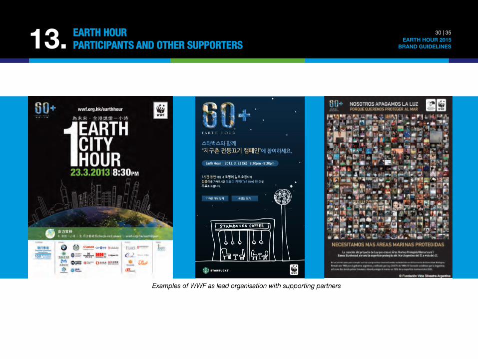
Examples of WWF as lead organisation with supporting partners
30 | 35 EARTH HOUR 2015
BRAND GUIDELINES 13. EARTH HOUR"PARTICIPANTS AND OTHER SUPPORTERS

Example where an organisation or company promotes Earth Hour
(hence no use of WWF logo)
Examples of non-WWF Earth Hour team and supporting partners (hence no use of WWF logo)
31 | 35 EARTH HOUR 2015
BRAND GUIDELINES 13. EARTH HOUR"PARTICIPANTS AND OTHER SUPPORTERS
32 | 35 EARTH HOUR 2015
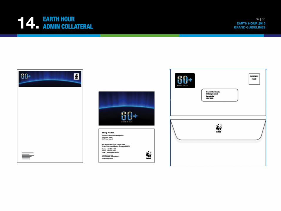
BRAND GUIDELINES 14. EARTH HOUR"ADMIN COLLATERAL
33 | 35 EARTH HOUR 2015
BRAND GUIDELINES 15. ABOUT THE"BRAND GUIDELINES
This set of Earth Hour Brand Guidelines outline how the Earth Hour name and logo must be used across all mediums. The guidelines are to be adhered to in all forms of internal and external communication as part of the Earth Hour brand licensing arrangement. Direct any questions and concern to internal Yammer network, or contact Earth Hour Global team at [email protected] or [email protected]
34 | 35 EARTH HOUR 2015
BRAND GUIDELINES 16. THE SIGN-OFF PROCEDURE The Earth Hour brand has been built to allow for creative flexibility. However, these rules and guidelines have been developed to ensure the longevity and integrity of the Earth Hour brand, by providing a professional, standardised look and feel for the movement. They are intended to help Earth Hour Teams communicate consistently and effectively about the movement in written and spoken communication. Earth Hour Project Managers need to manage sign-off procedures to ensure the correct usage of the Earth Hour brand in their respective countries. EARTH HOUR GLOBAL TEAM CONTACT Director of Brand and Marketing: Bonnie Chia [email protected] General Enquiry: [email protected] REFERENCE LINKS Visit http://ehour.me/brand2015 to download the Earth Hour Brand Guidelines 2015, Earth Hour logo assets and Helvetica Neue Condensed Bold font file Yammer for EH Network: http://yammer.com/earthhour.org Official EH Global Website: www.earthhour.org YouTube Platform Website: www.youtube.com/earthhour WWF Brand Guidelines on Google and Basecamp: https://sites.google.com/a/wwf.panda.org/brand-development/home https://wwf.basecamphq.com/projects/4788393-brand/log
EARTH HOUR"SIGN-OFF PROCEDURE AND CONTACTS
© 1986 Panda Symbol WWF – World Wide Fund For Nature (Formerly World Wildlife Fund) ® “WWF” is a WWF Registered Trademark. © 2015 Earth Hour – All rights reserved.