Embed Size (px)
Citation preview
I like this magazine front cover because it’s simple, but effective, the main colour scheme
is black, white and pink. The model on the cover is Nicki Minaj, she is in the middle of the
cover and has a powerful gaze, this is symbolising that she is luring you in with her eyes like she is in control. One of the things I don’t like about this magazine cover is that
the picture is black and white; nicki Minaj is a colourful character and she could be in
colour/dressed more colourful to portray her personality.
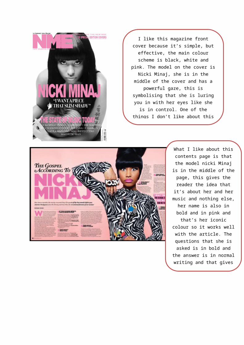
What I like about this contents page is that the model nicki Minaj is in the middle of the page, this gives the reader the idea that it’s
about her and her music and nothing else, her name is also in bold and in pink and that’s her
iconic colour so it works well with the article. The questions that she is asked is in bold and the answer is in normal writing and that gives
a good visual image. The background also works well
because it’s a different shade of pink and blends well. There is nothing I don’t like about this
contents page.
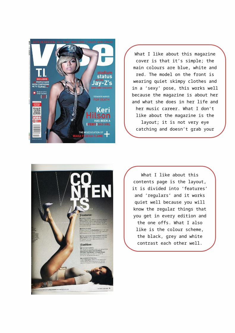
What I like about this magazine cover is that it’s simple; the main colours are blue, white and red. The model on the front is wearing quiet
skimpy clothes and in a ‘sexy’ pose, this works well because the magazine is about her and
what she does in her life and her music career. What I don’t like about the magazine is the
layout; it is not very eye catching and doesn’t grab your attention. The cover story doesn’t
stand out because all the other writing is quiet large so you cannot tell.
What I like about this contents page is the layout, it is divided into ‘features’ and
‘regulars’ and it works quiet well because you will know the regular things that you
get in every edition and the one offs. What I also like is the colour scheme, the black, grey and white contrast each other well. The model is in an interesting shape and
that makes you pay attention and to read more.
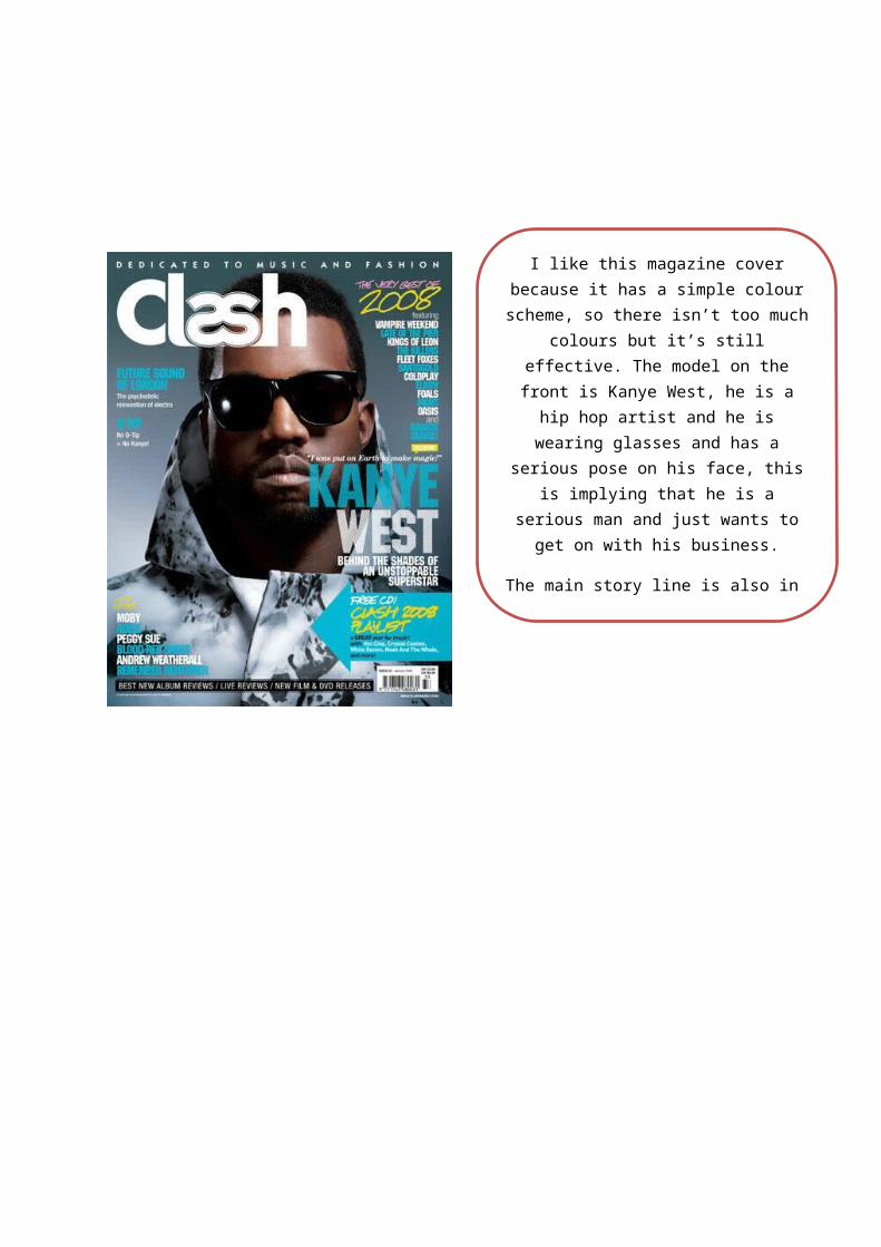
I like this magazine cover because it has a simple colour scheme, so there isn’t too much colours but it’s still effective. The
model on the front is Kanye West, he is a hip hop artist and he is wearing glasses and has a serious pose on his face, this is implying that he is a serious man and just wants to get on
with his business.
The main story line is also in bold so it stands out so as soon as you see this cover you know it is about Kanye west. What I dislike about this front cover is that the other stories are in bold and are small so it is hard to read and it is too close together.
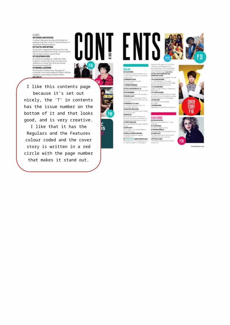
I like this contents page because it’s set out nicely, the ‘T’ in contents has the issue number on the bottom of it and that looks good, and is very creative. I
like that it has the Regulars and the Features colour coded and the cover
story is written in a red circle with the page number that makes it stand out.
What I don’t like about the contents page is that there are too many things
happening; there is too much information that could be put on the
other pages and not the contents one.