Embed Size (px)
Citation preview
No part of this document may be reproduced or distributed in any form or by any means, or stored in a data base or retrieval system, without the prior written permission of the Centre for Learning Technologies, Stellenbosch University.
POWERPOINT SLIDESAvoiding the Pitfalls of Bad Slides
No part of this document may be reproduced or distributed in any form or by any means, or stored in a data base or retrieval system, without the prior written permission of the Centre for Learning Technologies, Stellenbosch University.
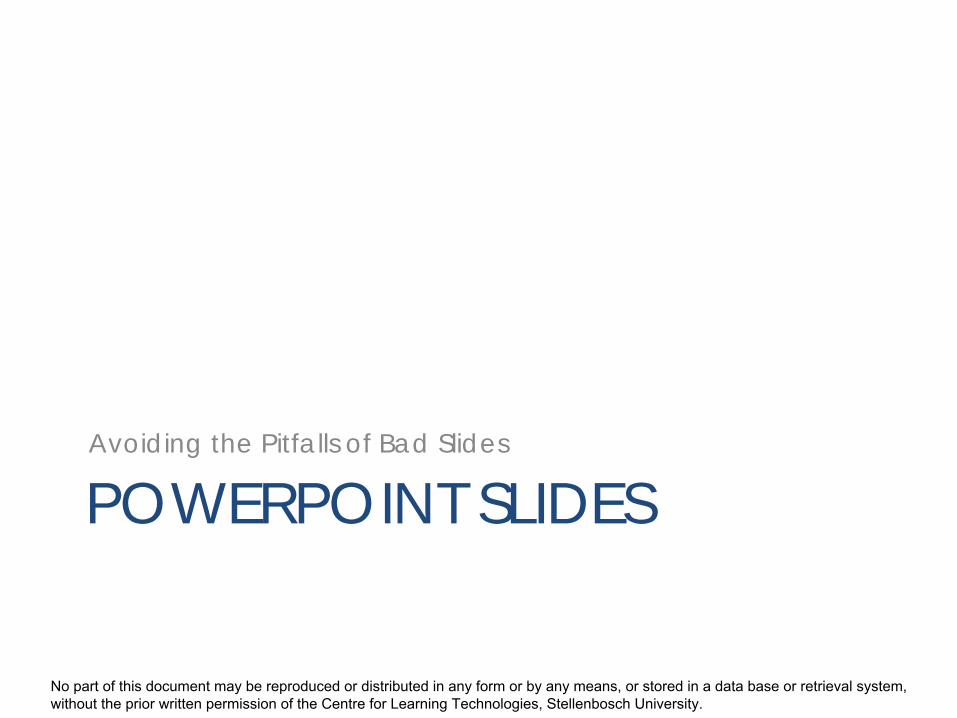
Slide structure – Good
• Use 1-2 slides per minute of yourpresentation
• Point form– Not complete sentences
• Include 4-5 points per slide• Avoid wordiness
– Use key words– Phrases only

No part of this document may be reproduced or distributed in any form or by any means, or stored in a data base or retrieval system, without the prior written permission of the Centre for Learning Technologies, Stellenbosch University.
Slide Structure - BadThis page contains too many words fora presentation slide. It is not written inpoint form, making it difficult both foryour audience to read and for you topresent each point. Although there areexactly the same number of points onthis slide as the previous slide, it looksmuch more complicated. In short, youraudience will spend too much timetrying to read this paragraph instead oflistening to you.
No part of this document may be reproduced or distributed in any form or by any means, or stored in a data base or retrieval system, without the prior written permission of the Centre for Learning Technologies, Stellenbosch University.
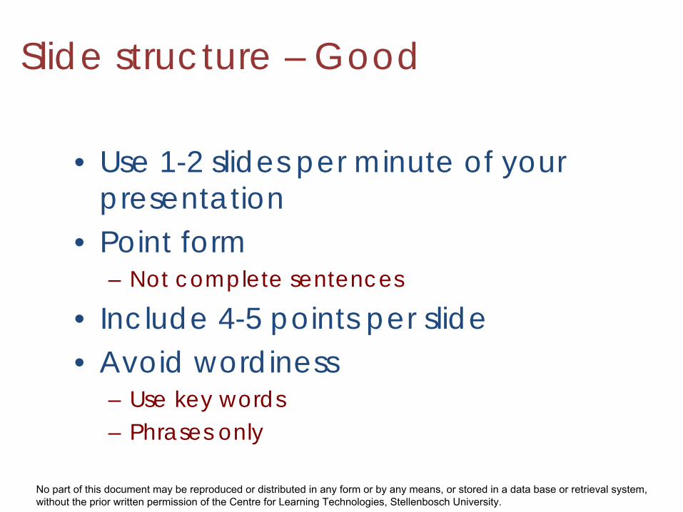
Slide structure - Bad
• Should not be distracting• Should not go overboard• Be consistent
Animate only if it makes sense to animate!
No part of this document may be reproduced or distributed in any form or by any means, or stored in a data base or retrieval system, without the prior written permission of the Centre for Learning Technologies, Stellenbosch University.
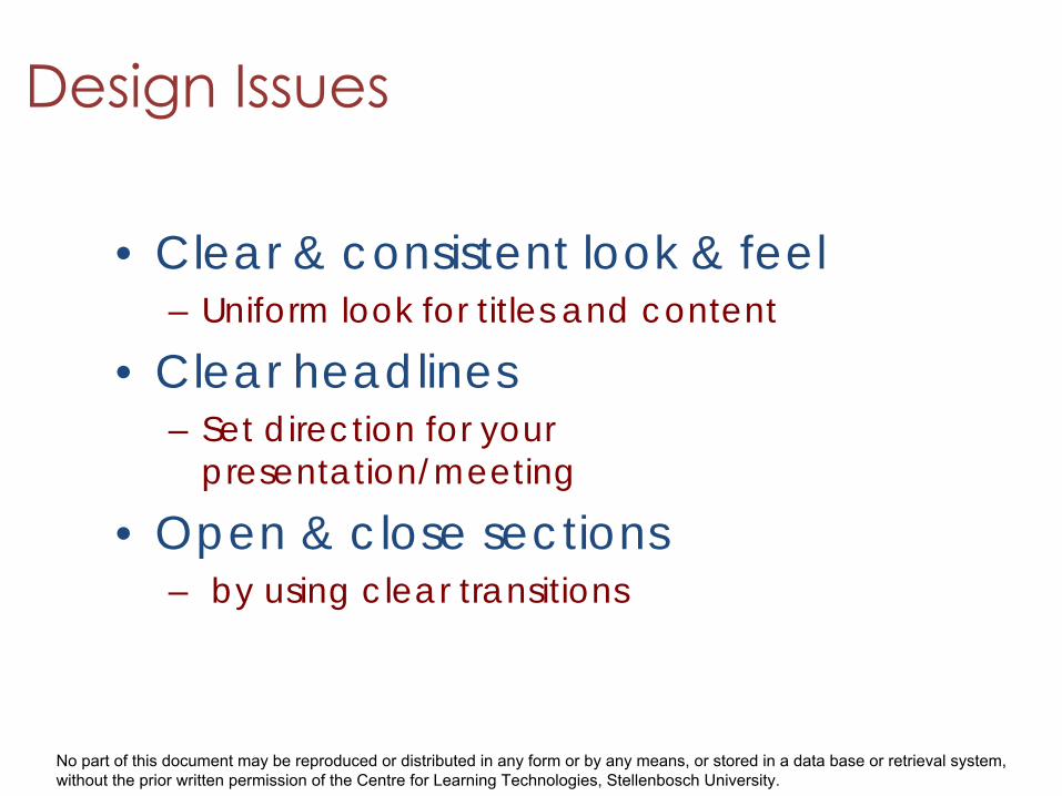
• Clear & consistent look & feel– Uniform look for titles and content
• Clear headlines– Set direction for your
presentation/meeting
• Open & close sections– by using clear transitions
No part of this document may be reproduced or distributed in any form or by any means, or stored in a data base or retrieval system, without the prior written permission of the Centre for Learning Technologies, Stellenbosch University.
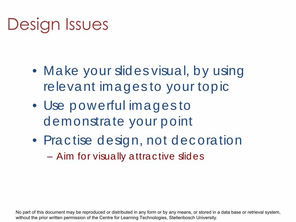
• Make your slides visual, by using relevant images to your topic
• Use powerful images to demonstrate your point
• Practise design, not decoration– Aim for visually attractive slides
No part of this document may be reproduced or distributed in any form or by any means, or stored in a data base or retrieval system, without the prior written permission of the Centre for Learning Technologies, Stellenbosch University.
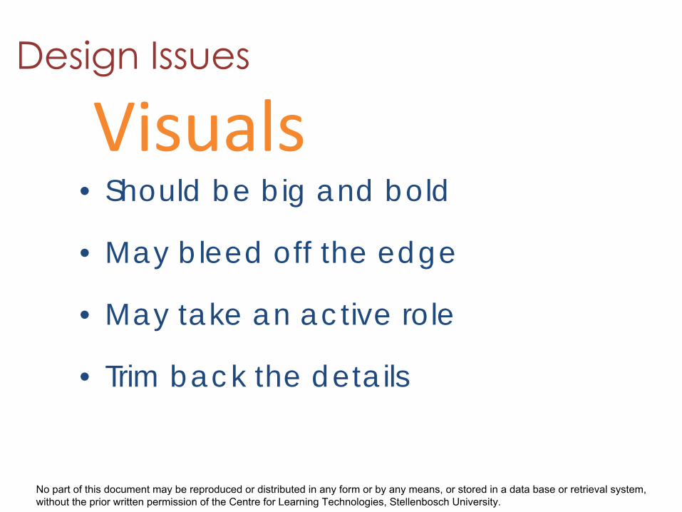
• Should be big and bold
• May bleed off the edge
• May take an active role
• Trim back the details
Visuals
No part of this document may be reproduced or distributed in any form or by any means, or stored in a data base or retrieval system, without the prior written permission of the Centre for Learning Technologies, Stellenbosch University.
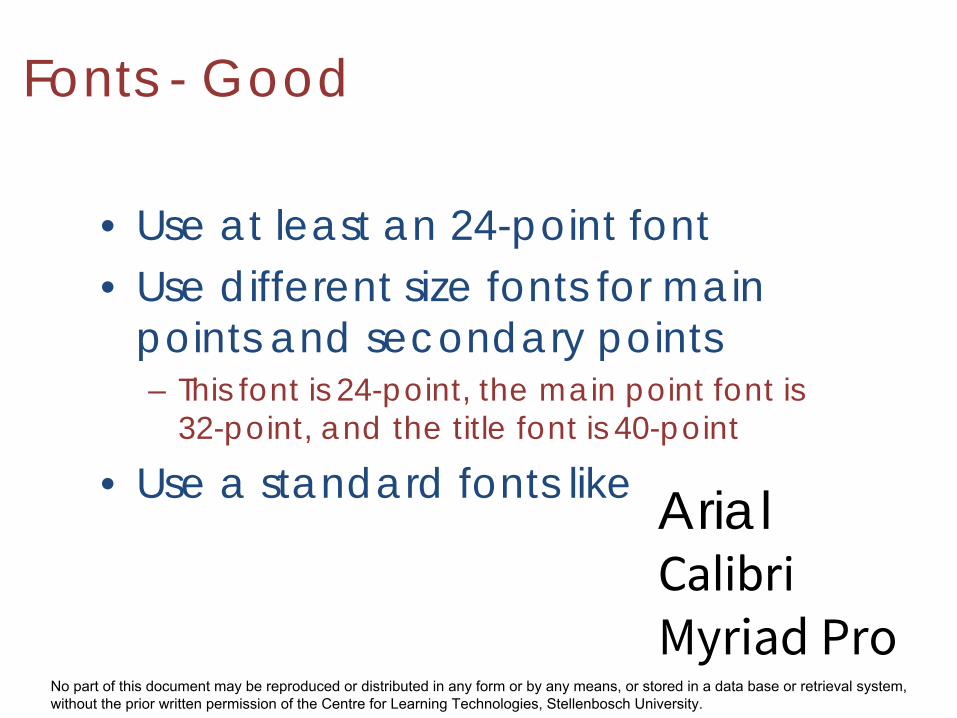
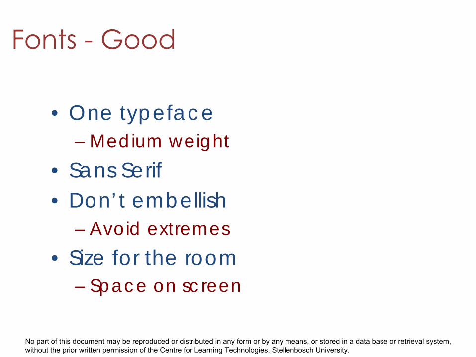
Fonts - Good
• Use at least an 24-point font• Use different size fonts for main
points and secondary points– This font is 24-point, the main point font is
32-point, and the title font is 40-point
• Use a standard fonts like ArialCalibriMyriad Pro
No part of this document may be reproduced or distributed in any form or by any means, or stored in a data base or retrieval system, without the prior written permission of the Centre for Learning Technologies, Stellenbosch University.
• One typeface– Medium weight
• Sans Serif• Don’t embellish
– Avoid extremes• Size for the room
– Space on screen
No part of this document may be reproduced or distributed in any form or by any means, or stored in a data base or retrieval system, without the prior written permission of the Centre for Learning Technologies, Stellenbosch University.
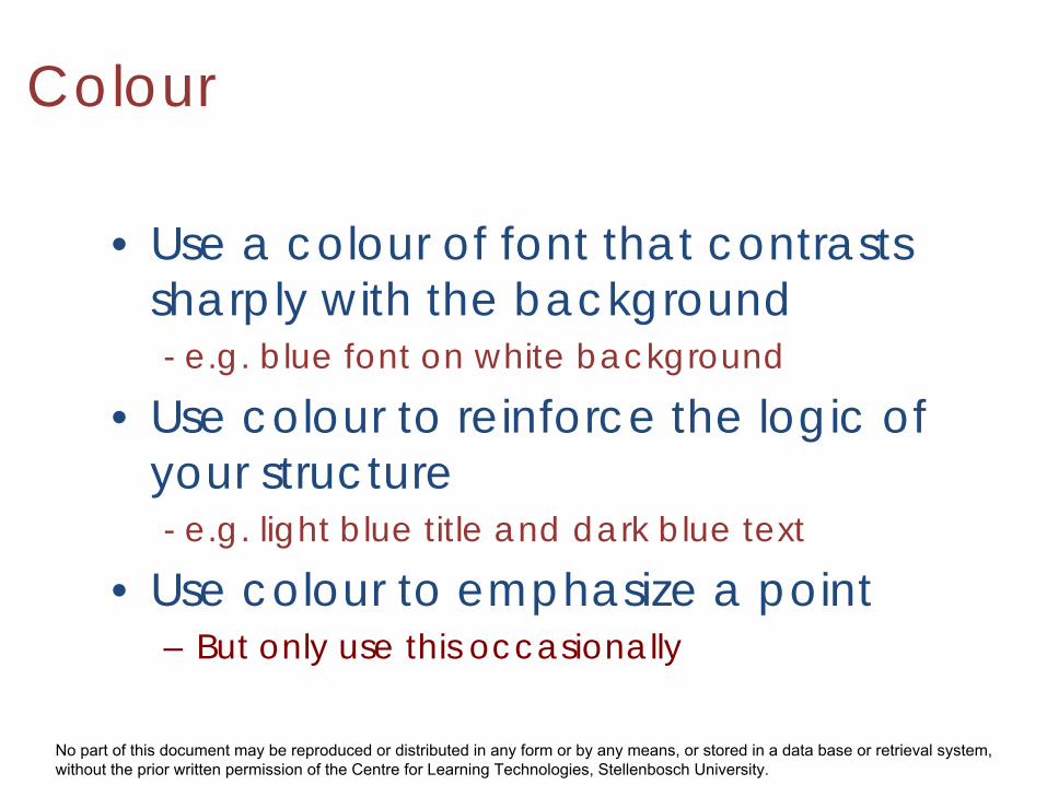
Colour
• Use a colour of font that contrasts sharply with the background- e.g. blue font on white background
• Use colour to reinforce the logic of your structure- e.g. light blue title and dark blue text
• Use colour to emphasize a point– But only use this occasionally
No part of this document may be reproduced or distributed in any form or by any means, or stored in a data base or retrieval system, without the prior written permission of the Centre for Learning Technologies, Stellenbosch University.
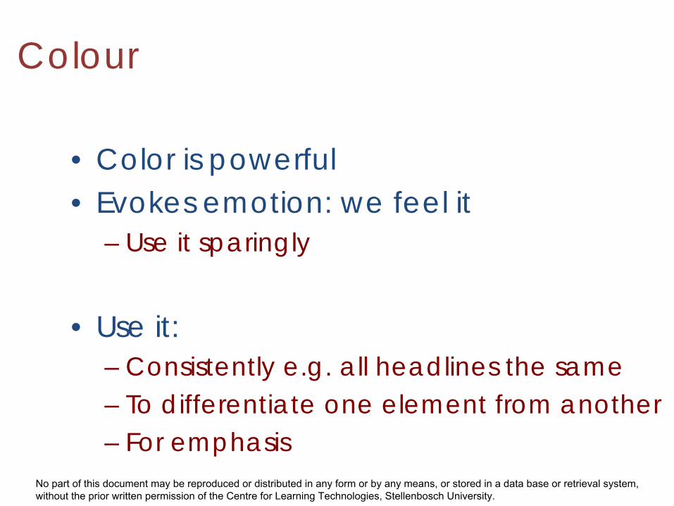
• Color is powerful• Evokes emotion: we feel it
– Use it sparingly
• Use it:– Consistently e.g. all headlines the same – To differentiate one element from another– For emphasis
Colour
No part of this document may be reproduced or distributed in any form or by any means, or stored in a data base or retrieval system, without the prior written permission of the Centre for Learning Technologies, Stellenbosch University.
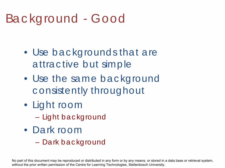
Background - Good
• Use backgrounds that areattractive but simple
• Use the same backgroundconsistently throughout
• Light room– Light background
• Dark room– Dark background
No part of this document may be reproduced or distributed in any form or by any means, or stored in a data base or retrieval system, without the prior written permission of the Centre for Learning Technologies, Stellenbosch University.
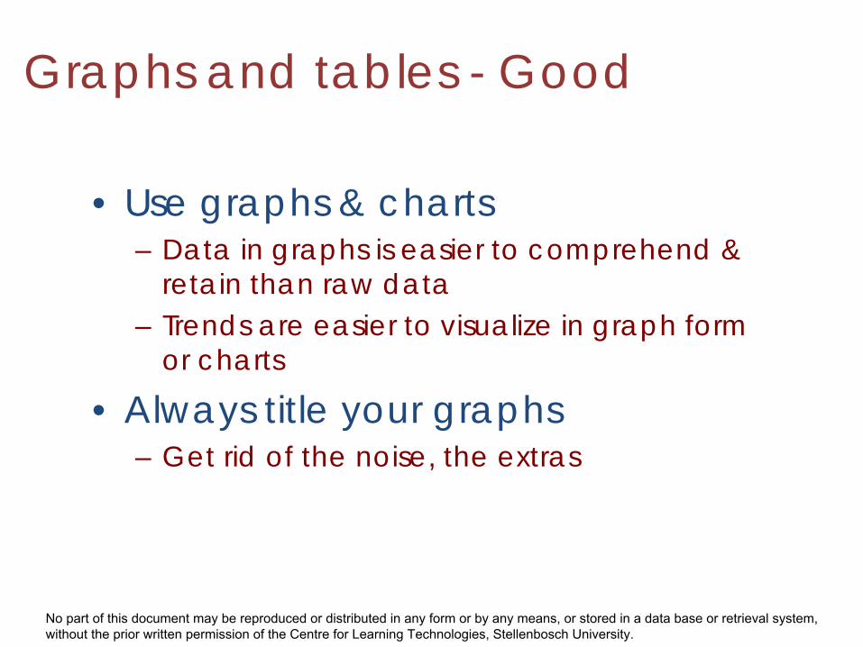
Graphs and tables - Good
• Use graphs & charts– Data in graphs is easier to comprehend &
retain than raw data– Trends are easier to visualize in graph form
or charts
• Always title your graphs– Get rid of the noise, the extras
No part of this document may be reproduced or distributed in any form or by any means, or stored in a data base or retrieval system, without the prior written permission of the Centre for Learning Technologies, Stellenbosch University.
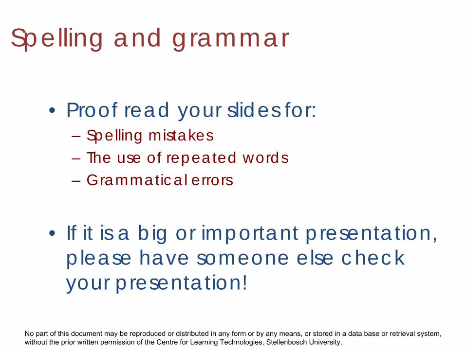
Spelling and grammar
• Proof read your slides for:– Spelling mistakes– The use of repeated words– Grammatical errors
• If it is a big or important presentation,please have someone else checkyour presentation!
No part of this document may be reproduced or distributed in any form or by any means, or stored in a data base or retrieval system, without the prior written permission of the Centre for Learning Technologies, Stellenbosch University.
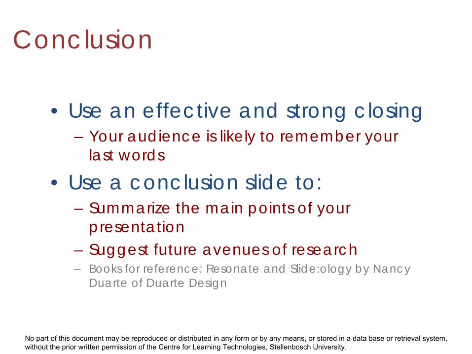
Conclusion
• Use an effective and strong closing– Your audience is likely to remember your
last words
• Use a conclusion slide to:– Summarize the main points of your
presentation– Suggest future avenues of research– Books for reference: Resonate and Slide:ology by Nancy
Duarte of Duarte Design
No part of this document may be reproduced or distributed in any form or by any means, or stored in a data base or retrieval system, without the prior written permission of the Centre for Learning Technologies, Stellenbosch University.
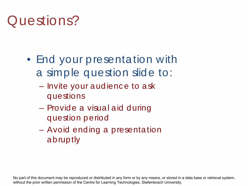
Questions?
• End your presentation witha simple question slide to:– Invite your audience to ask
questions– Provide a visual aid during
question period– Avoid ending a presentation
abruptly