Embed Size (px)
Citation preview
brand identity guides
version 1
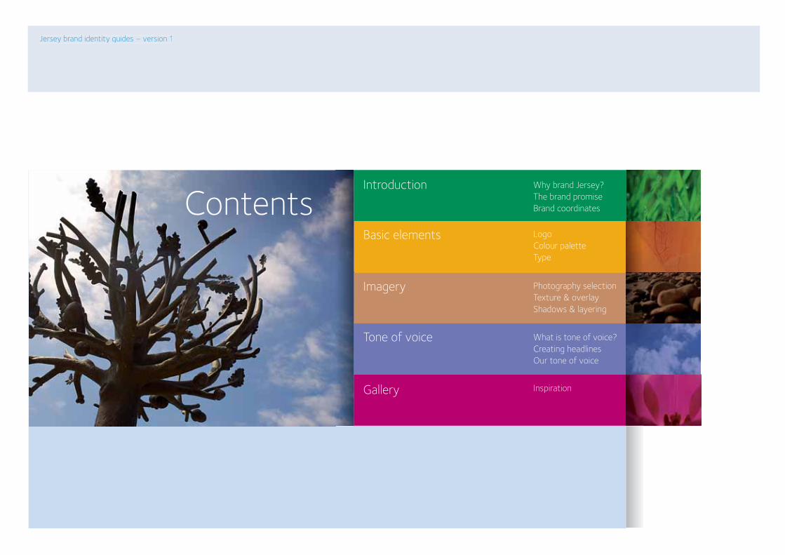
Why brand Jersey? The brand promise Brand coordinates
Logo Colour palette Type
Photography selection Texture & overlay Shadows & layering
What is tone of voice?Creating headlinesOur tone of voice
Inspiration
Basic elements
Imagery
Tone of voice
Gallery
Jersey brand identity guides – version 1
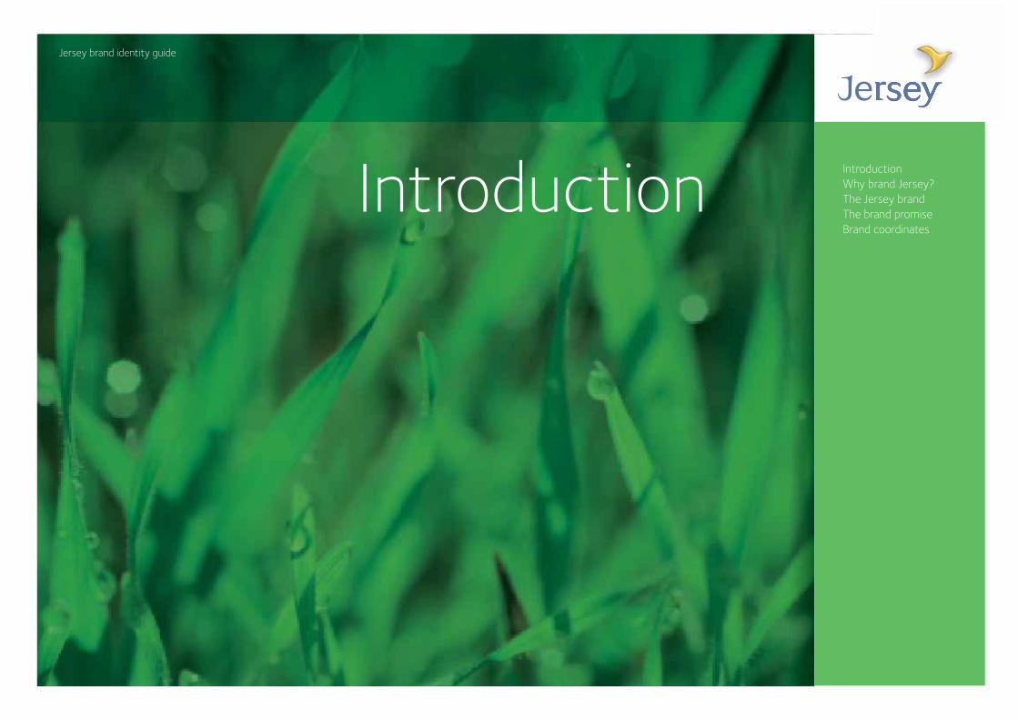
Introduction
Contents
Jersey brand identity guideJersey brand identity guide
IntroductionWhy brand Jersey?The Jersey brandThe brand promiseBrand coordinates
Introduction
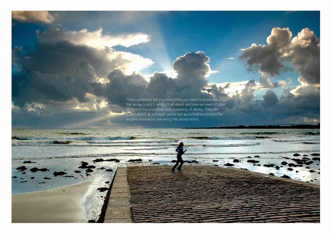
These guidelines tell you everything you need to know about the Jersey brand – what it’s all about and how we want to start using it in the promotion and marketing of Jersey. They are intended not as a straight jacket but as a creative stimulus for anyone involved in delivering the Jersey brand.
Why brandJersey?
The project to brand Jersey started with a very thorough look at existing perceptions of everything that is Jersey. It concentrated on four areas that are key to Jersey’s future – tourism, finance, agriculture and the community and it sought to understand what it is like to live, work, visit or invest in Jersey. This work highlighted some big challenges for the brand to overcome:
And key to this was finding a brand promise for Jersey that would be both completely true of Jersey and also challenging in terms of the expectations it would set for the different sectors. Because creating a brand is only ever the start of a journey. The really hard bit is delivering on the promise.
Jersey has always been a very beautiful, very desirable place to live and work. And it already has a ‘brand’ – a set of perceptions that many people share about what Jersey is like. Safe, secure, beautiful, great beaches, a little old fashioned, off shore, Jersey Royals, wealthy, a bit inward looking. A whole mix of the good and bad, the fair and the unfair.
How can we position Jersey as a sophisticated and contemporary place to visit?
How can we reinforce perceptions of strength, solidity and integrity within the financial market?
How can we help grow the agriculture sector recognising (and marketing) the unique qualities that make Jersey produce worth trying and buying?
How can we reawaken a sense of pride amongst the whole community in Jersey?
The Jersey brand
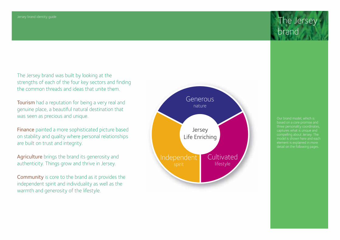
The Jersey brand was built by looking at the strengths of each of the four key sectors and finding the common threads and ideas that unite them.
Tourism had a reputation for being a very real and genuine place, a beautiful natural destination that was seen as precious and unique.
Finance painted a more sophisticated picture based on stability and quality where personal relationships are built on trust and integrity.
Agriculture brings the brand its generosity and authenticity. Things grow and thrive in Jersey.
Community is core to the brand as it provides the independent spirit and individuality as well as the warmth and generosity of the lifestyle.
Our brand model, which is based on a core promise and three personality coordinates, captures what is unique and compelling about Jersey. The model is shown here and each element is explained in more detail on the following pages.
Generousnature
Independentspirit
Cultivatedlifestyle
JerseyLife Enriching
Jersey brand identity guide
Jersey brand identity guide
Lifeenriching
Generousnature
Independentspirit
Cultivatedlifestyle
JerseyLife Enriching
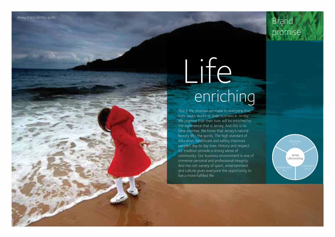
This is the promise we make to everyone that lives, visits, works or does business in Jersey. We promise that their lives will be enriched by the experience that is Jersey. And this is no false promise. We know that Jersey’s natural beauty lifts the spirits. The high standard of education, healthcare and safety improves people’s day to day lives. History and respect for tradition provide a strong sense of community. Our business environment is one of immense personal and professional integrity. And the rich variety of sport, entertainment and culture gives everyone the opportunity to live a more fulfilled life
Brand promise
Jersey brand identity guide Brand coordinates
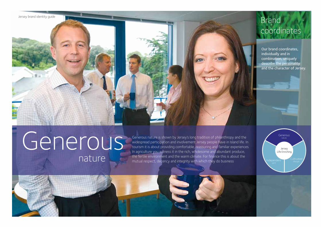
Generous nature is shown by Jersey’s long tradition of philanthropy and the widespread participation and involvement Jersey people have in Island life. In tourism it is about providing comfortable, reassuring and familiar experiences. In agriculture you witness it in the rich, wholesome and abundant produce, the fertile environment and the warm climate. For finance this is about the mutual respect, decency and integrity with which they do business
Our brand coordinates, individually and in combination, uniquely describe the personality and the character of Jersey.
Generousnature
Independentspirit
Cultivatedlifestyle
JerseyLife Enriching
Generousnature
Jersey brand identity guide
Jersey brand identity guide
Our brand coordinates, individually and in combination, uniquely describe the personality and the character of Jersey.
Brand coordinates
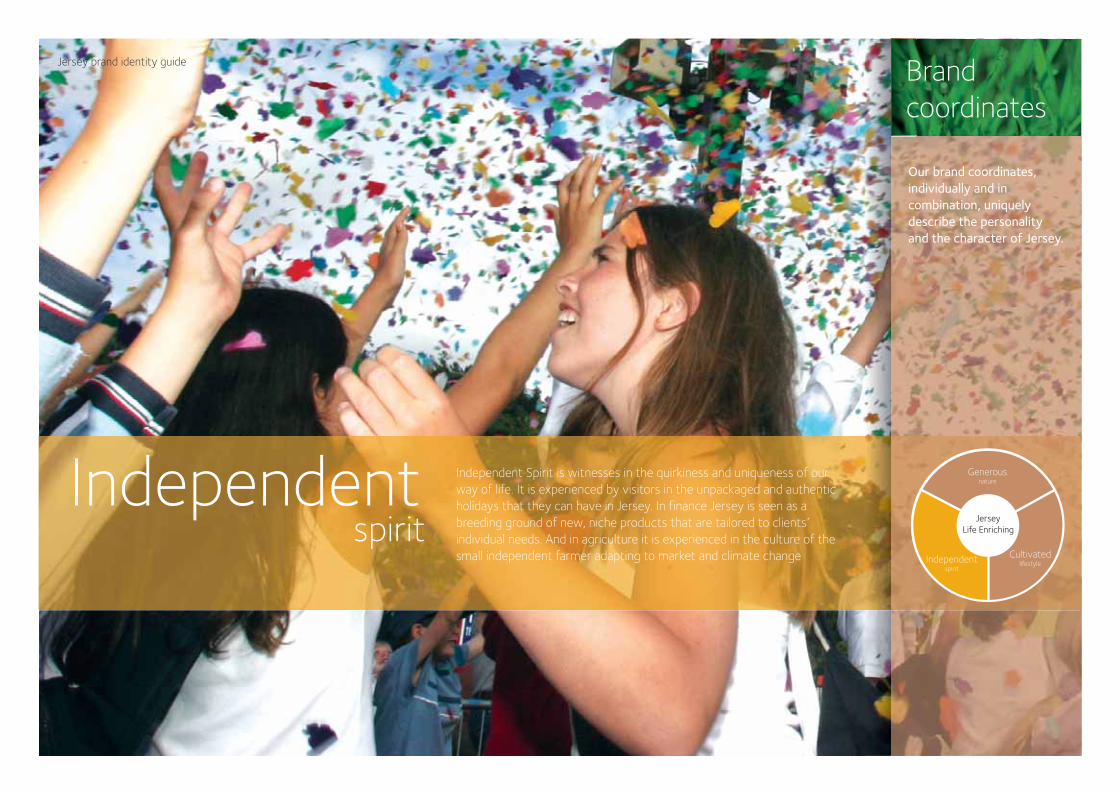
Independent Spirit is witnesses in the quirkiness and uniqueness of our way of life. It is experienced by visitors in the unpackaged and authentic holidays that they can have in Jersey. In finance Jersey is seen as a breeding ground of new, niche products that are tailored to clients’ individual needs. And in agriculture it is experienced in the culture of the small independent farmer adapting to market and climate change
Independentspirit
Generousnature
Independentspirit
Cultivatedlifestyle
JerseyLife Enriching
Jersey brand identity guide
lifestyle
Our brand coordinates, individually and in combination, uniquely describe the personality and the character of Jersey.
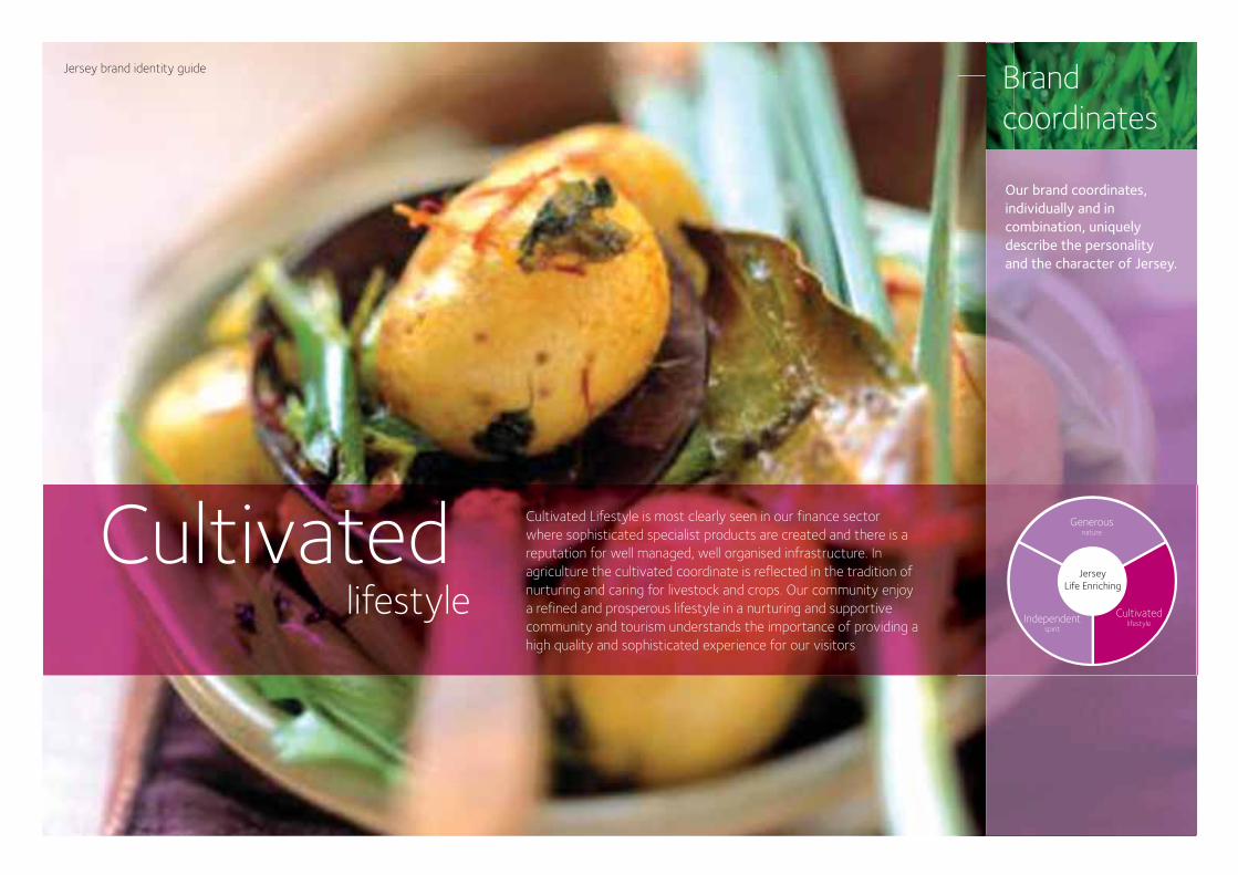
Cultivated Lifestyle is most clearly seen in our finance sector where sophisticated specialist products are created and there is a reputation for well managed, well organised infrastructure. In agriculture the cultivated coordinate is reflected in the tradition of nurturing and caring for livestock and crops. Our community enjoy a refined and prosperous lifestyle in a nurturing and supportive community and tourism understands the importance of providing a high quality and sophisticated experience for our visitors
Generousnature
Independentspirit
Cultivatedlifestyle
JerseyLife Enriching
Brand coordinates
Cultivated
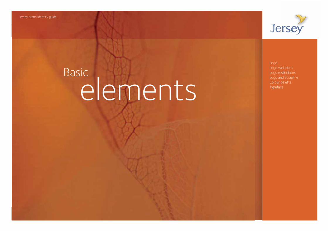
Basic
Jersey brand identity guide
LogoLogo variationsLogo restrictionsLogo and StraplineColour paletteTypefaceelements
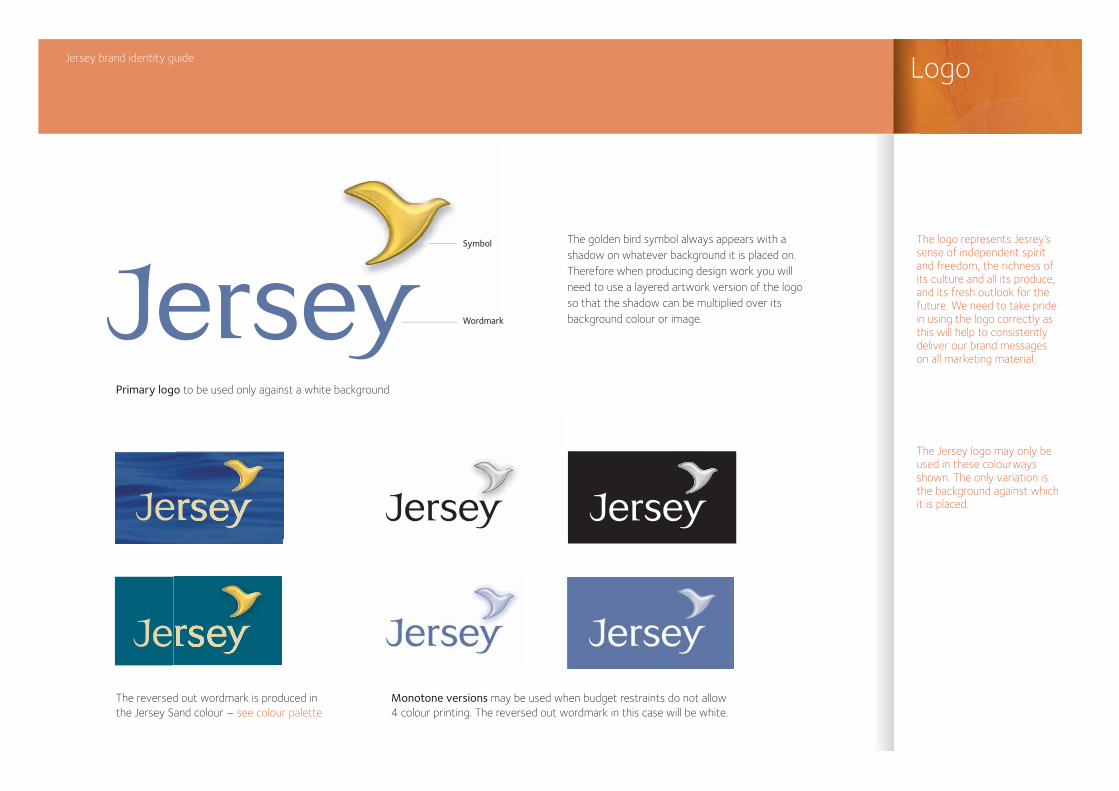
Jersey brand identity guide Logo
Primary logo to be used only against a white background
Wordmark
Symbol The golden bird symbol always appears with a shadow on whatever background it is placed on. Therefore when producing design work you will need to use a layered artwork version of the logo so that the shadow can be multiplied over its background colour or image.
The reversed out wordmark is produced in the Jersey Sand colour – see colour palette
Monotone versions may be used when budget restraints do not allow 4 colour printing. The reversed out wordmark in this case will be white.
The logo represents Jesrey’s sense of independent spirit and freedom, the richness of its culture and all its produce, and its fresh outlook for the future. We need to take pride in using the logo correctly as this will help to consistently deliver our brand messages on all marketing material.
The Jersey logo may only be used in these colourways shown. The only variation is the background against which it is placed.
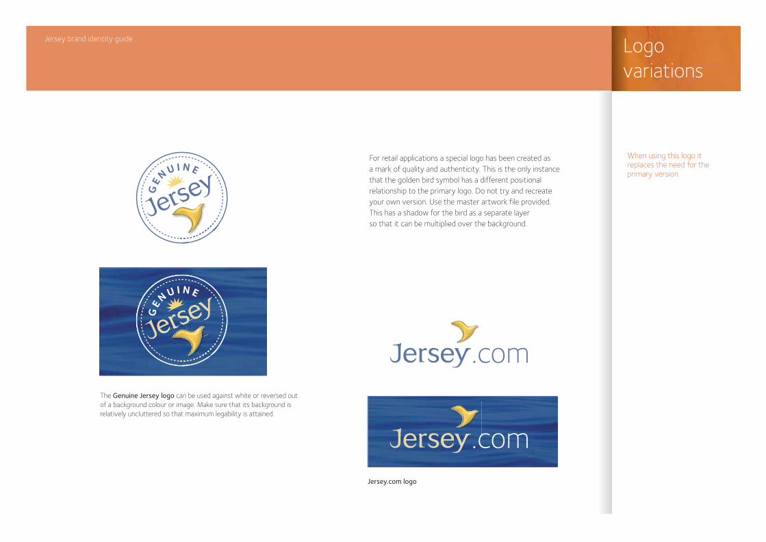
For retail applications a special logo has been created as a mark of quality and authenticity. This is the only instance that the golden bird symbol has a different positional relationship to the primary logo. Do not try and recreate your own version. Use the master artwork file provided. This has a shadow for the bird as a separate layer so that it can be multiplied over the background.
The Genuine Jersey logo can be used against white or reversed out of a background colour or image. Make sure that its background is relatively uncluttered so that maximum legability is attained.
Jersey.com logo
Jersey brand identity guide Logovariations
When using this logo it replaces the need for the primary version.
GEN U I N E
GEN U I N E
.com
.com
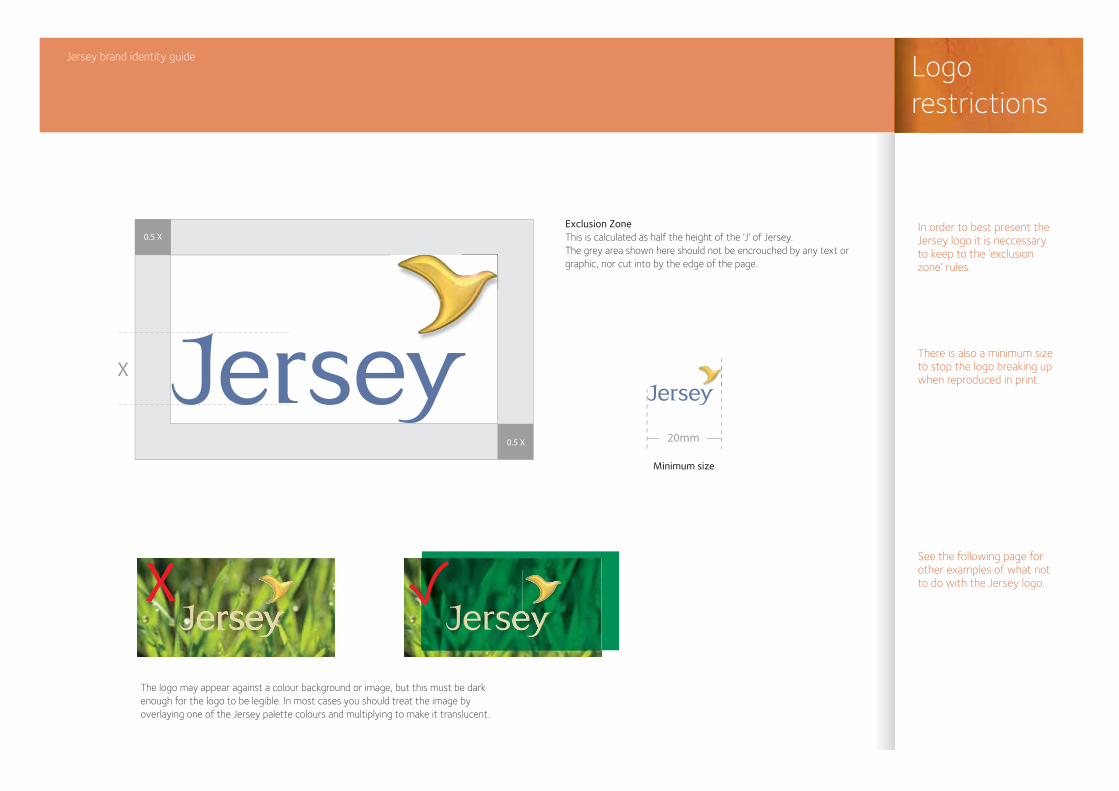
Exclusion ZoneThis is calculated as half the height of the ‘J’ of Jersey.The grey area shown here should not be encrouched by any text or graphic, nor cut into by the edge of the page.
Minimum size
The logo may appear against a colour background or image, but this must be dark enough for the logo to be legible. In most cases you should treat the image by overlaying one of the Jersey palette colours and multiplying to make it translucent.
Jersey brand identity guide Logorestrictions
In order to best present the Jersey logo it is neccessary to keep to the ‘exclusion zone’ rules.
There is also a minimum size to stop the logo breaking up when reproduced in print.
See the following page for other examples of what not to do with the Jersey logo.
X
20mm
0.5 X
0.5 X
X
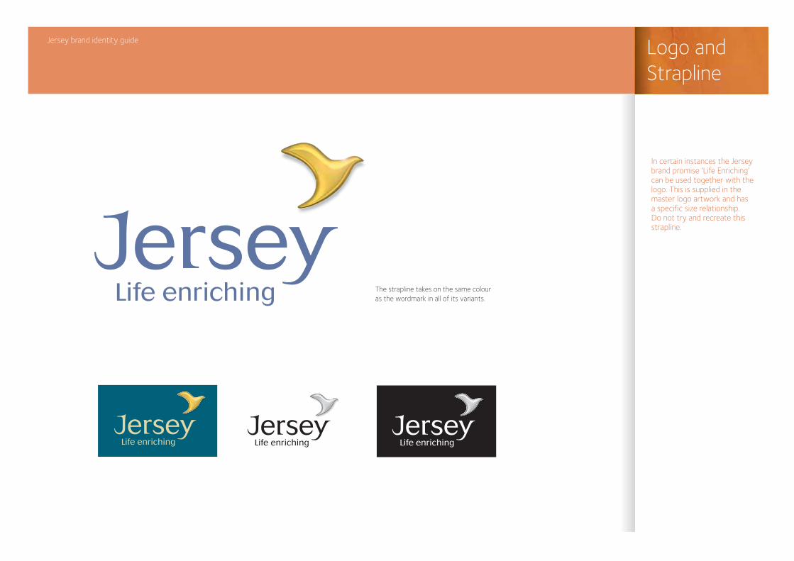
The strapline takes on the same colour as the wordmark in all of its variants.
Jersey brand identity guide Logo and Strapline
In certain instances the Jersey brand promise ‘Life Enriching’ can be used together with the logo. This is supplied in the master logo artwork and has a specific size relationship. Do not try and recreate this strapline.
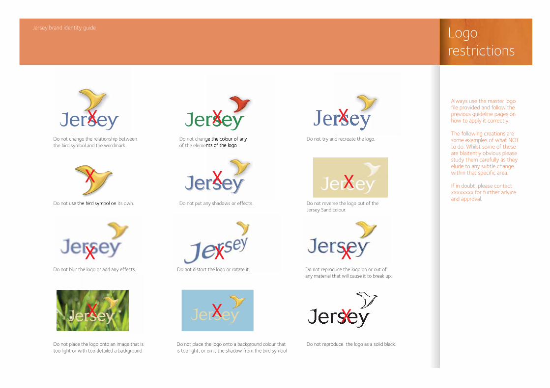
JerseyDo not change the relationship between the bird symbol and the wordmark.
Do not use the bird symbol on its own.
Do not blur the logo or add any effects.
Do not place the logo onto an image that is too light or with too detailed a background
Do not place the logo onto a background colour that is too light, or omit the shadow from the bird symbol
Do not reproduce the logo as a solid black.
Do not put any shadows or effects.
Do not change the colour of any of the elements of the logo
Do not try and recreate the logo.
Jersey brand identity guide Logorestrictions
Always use the master logo file provided and follow the previous guideline pages on how to apply it correctly.
The following creations are some examples of what NOT to do. Whilst some of these are blaitently obvious please study them carefully as they elude to any subtle change within that specific area.
If in doubt, please contact xxxxxxxx for further advice and approval.
X
X
X
X
X
X
X X X
XXX
Do not reverse the logo out of the Jersey Sand colour.
Do not distort the logo or rotate it. Do not reproduce the logo on or out of any material that will cause it to break up.
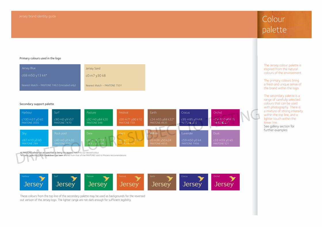
These colours from the top line of the secondary palette may be used as backgrounds for the reversed out version of the Jersey logo. The lighter range are not dark enough for sufficient legibility.
Jersey brand identity guide Colourpalette
The Jersey colour palette is inspired from the natural colours of the environment.
The primary colours bring a fresh and unique sense of the brand within the logo.
The secondary palette is a range of carefully selected colours that can be used with photography. There is a mixture of strong intensity within the top line, and a lighter touch within the lower line. See gallery section for further examples
All PANTONE references are specified as being the nearest match to our desired colour. *In some cases the CMYK breakdown has been altered from that of the PANTONE Solid to Process reccomendations.
Pebble
c0 m36 y50 k24PANTONE 4655
Gold
c0 m33 y100 k4PANTONE 124
Lavender
c59 m50 y0 k4PANTONE 7456
Dusk
c33 m59 y0 k0PANTONE 521
Dew
c64 m0 y83 k0PANTONE 7489
Rock pool
c40 m0 y0 k20PANTONE 550
Sky
c82 m10 y0 k0PANTONE 299
Earth
c24 m55 y68 k32*PANTONE 4635
Orchid
c0 m100 y0 k25PANTONE 227
Crocus
c95 m95 y0 k15PANTONE 273
Festival
c00 m71 y90 k10PANTONE 159
Pasture
c92 m0 y84 k20PANTONE 348
Harbour
c100 m37 y0 k0PANTONE 3005
Surf
c90 m0 y9 k57PANTONE 7470
Earth OrchidCrocusFestivalPastureHarbour Surf
Jersey Blue
c68 m50 y13 k4*
Nearest Match – PANTONE 7462 (Uncoated only)
Jersey Sand
c0 m7 y30 k8
Nearest Match – PANTONE 7501
Primary colours used in the logo
Secondary support palette
DRAFT COLOURS SUBJECT TO TESTING
All PANTONE references are specified as being the nearest match to ouAll PANTONE references are specified as being the nearest match to o*In some cases the CMYK breakdown has been alteredn some cases the CMYK breakdown has been altered
ECTT TO TTESTI
T COLOUR BJECTRS SU T TO
PebbleGo
c0 m33 y100 k4PANTONE 12
64 m0 y83 k0ANTONE 74 550
c0 m100 y0 k25PANTONE 227
95 y0 k15PANTONE 27
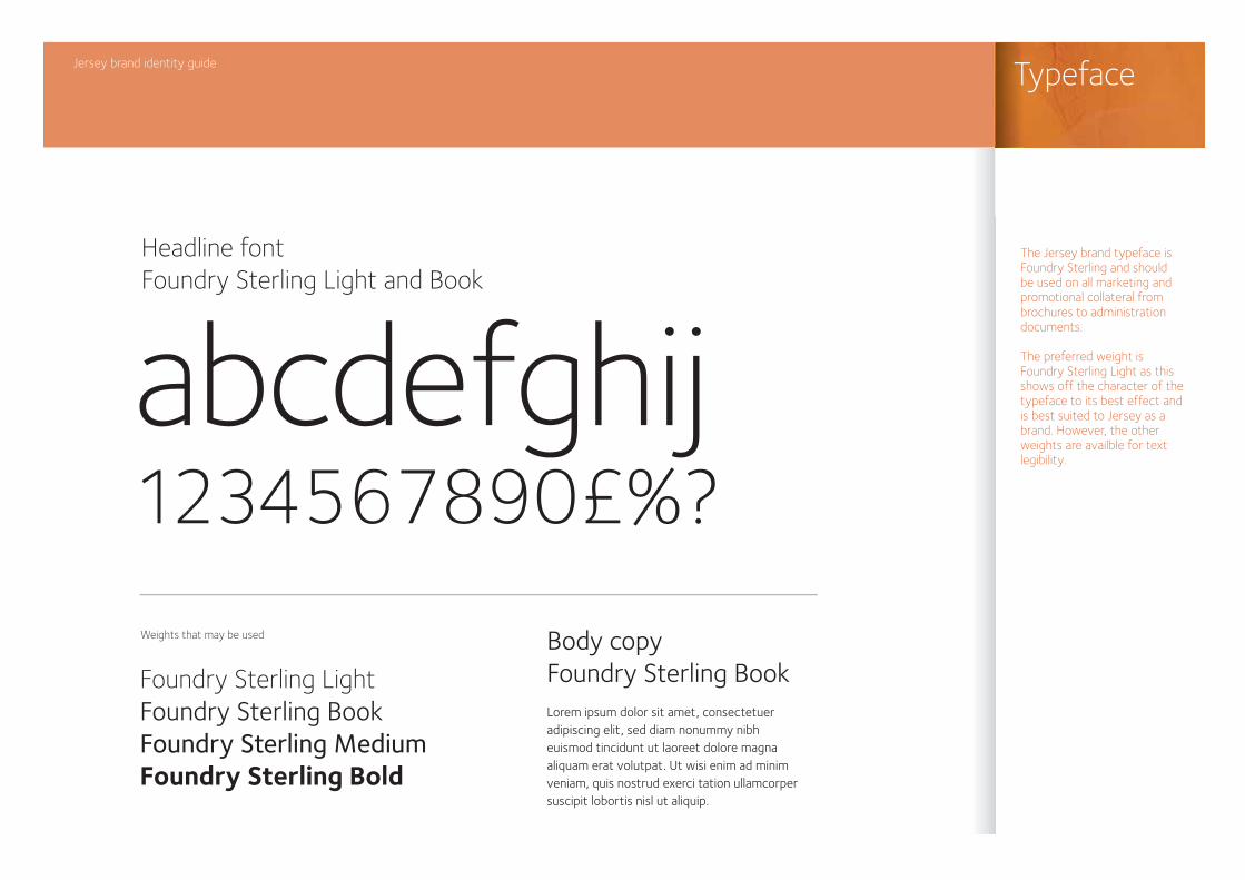
Weights that may be used
abcdefghij1234567890£%?
Headline fontFoundry Sterling Light and Book
Body copyFoundry Sterling BookFoundry Sterling Light
Foundry Sterling BookFoundry Sterling MediumFoundry Sterling Bold
Lorem ipsum dolor sit amet, consectetueradipiscing elit, sed diam nonummy nibh euismod tincidunt ut laoreet dolore magna aliquam erat volutpat. Ut wisi enim ad minim veniam, quis nostrud exerci tation ullamcorpersuscipit lobortis nisl ut aliquip.
Jersey brand identity guide Typeface
The Jersey brand typeface is Foundry Sterling and should be used on all marketing and promotional collateral from brochures to administration documents.
The preferred weight is Foundry Sterling Light as this shows off the character of the typeface to its best effect and is best suited to Jersey as a brand. However, the other weights are availble for text legibility.
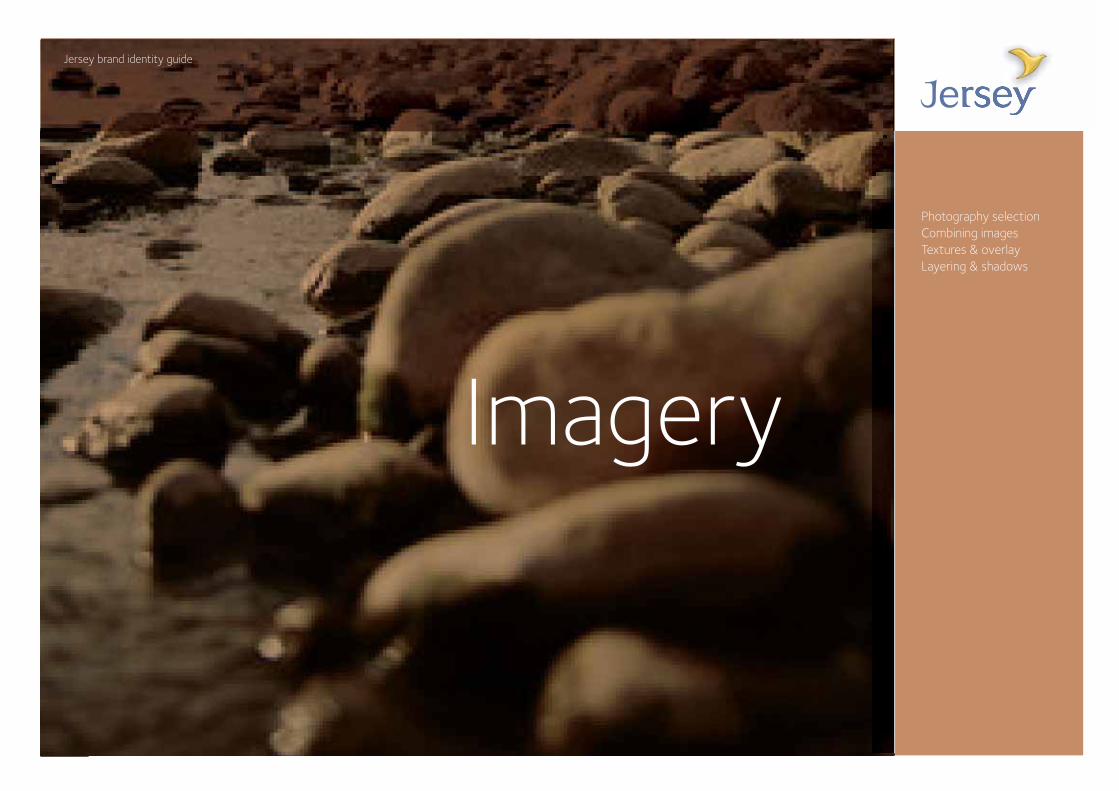
Photography selectionCombining imagesTextures & overlayLayering & shadows
Jersey brand identity guide
Imagery
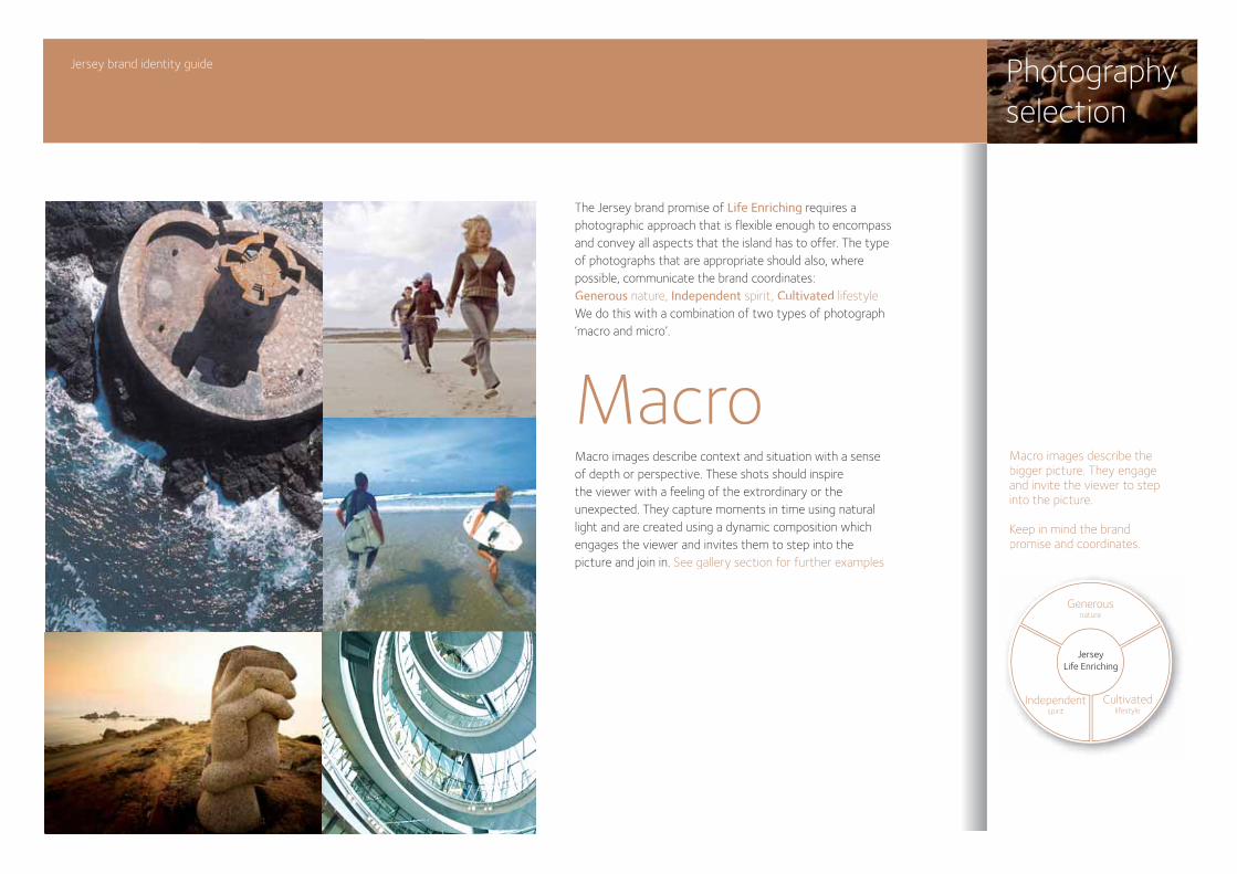
The Jersey brand promise of Life Enriching requires a photographic approach that is flexible enough to encompass and convey all aspects that the island has to offer. The type of photographs that are appropriate should also, where possible, communicate the brand coordinates: Generous nature, Independent spirit, Cultivated lifestyleWe do this with a combination of two types of photograph ‘macro and micro’.
Macro images describe context and situation with a sense of depth or perspective. These shots should inspire the viewer with a feeling of the extrordinary or the unexpected. They capture moments in time using natural light and are created using a dynamic composition which engages the viewer and invites them to step into the picture and join in. See gallery section for further examples
Jersey brand identity guide Photographyselection
MacroMacro images describe the bigger picture. They engage and invite the viewer to stepinto the picture.
Keep in mind the brand promise and coordinates.
Generousnature
Independentspirit
Cultivatedlifestyle
JerseyLife Enriching
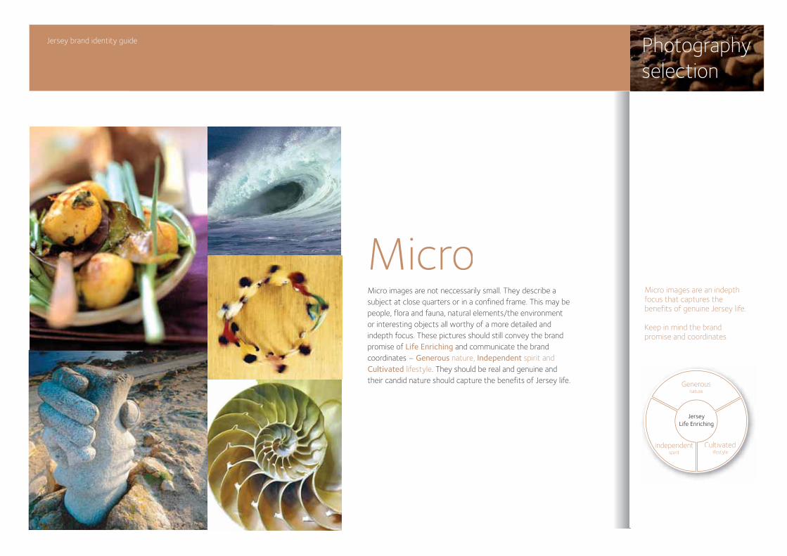
Micro images are not neccessarily small. They describe a subject at close quarters or in a confined frame. This may be people, flora and fauna, natural elements/the environment or interesting objects all worthy of a more detailed and indepth focus. These pictures should still convey the brand promise of Life Enriching and communicate the brand coordinates – Generous nature, Independent spirit and Cultivated lifestyle. They should be real and genuine and their candid nature should capture the benefits of Jersey life.
Jersey brand identity guide Photographyselection
MicroMicro images are an indepthfocus that captures thebenefits of genuine Jersey life.
Keep in mind the brandpromise and coordinates.
Generousnature
Independentspirit
Cultivatedlifestyle
JerseyLife Enriching
MacroMicro
MicroMacro
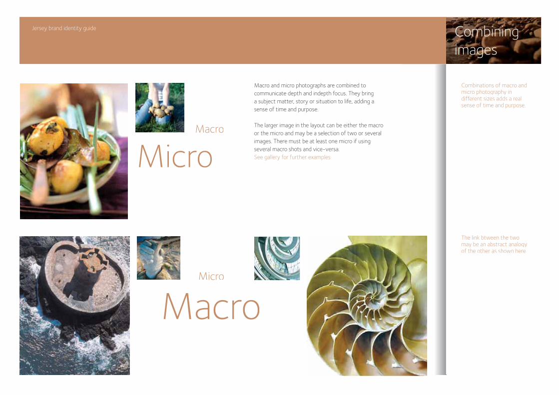
Macro and micro photographs are combined to communicate depth and indepth focus. They bring a subject matter, story or situation to life, adding a sense of time and purpose.
The larger image in the layout can be either the macro or the micro and may be a selection of two or several images. There must be at least one micro if using several macro shots and vice-versa. See gallery for further examples
Jersey brand identity guide Combiningimages
Combinations of macro and micro photography in different sizes adds a realsense of time and purpose.
The link btween the twomay be an abstract analogyof the other as shown here.
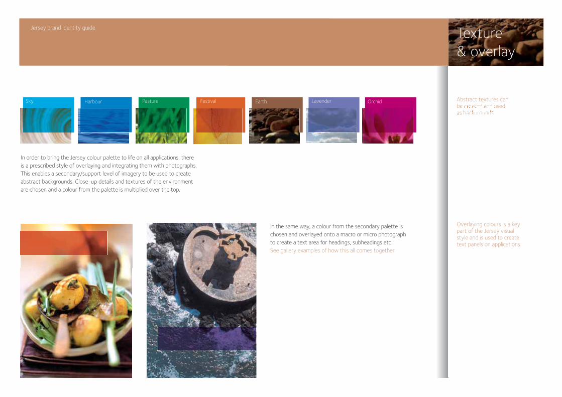
In the same way, a colour from the secondary palette is chosen and overlayed onto a macro or micro photograph to create a text area for headings, subheadings etc.See gallery examples of how this all comes together
PhotographyPatterns & texturesHow to combine images
Texture & overlay
Jersey brand identity guide
Abstract textures can be created and usedPhotographyas backgrounds.
PhotographyPatterns & te
Overlaying colours is a key part of the Jersey visualstyle and is used to create text panels on applications.
LavenderSky Earth OrchidFestivalPastureHarbour
In order to bring the Jersey colour palette to life on all applications, there is a prescribed style of overlaying and integrating them with photographs. This enables a secondary/support level of imagery to be used to create abstract backgrounds. Close-up details and textures of the environment are chosen and a colour from the palette is multiplied over the top.
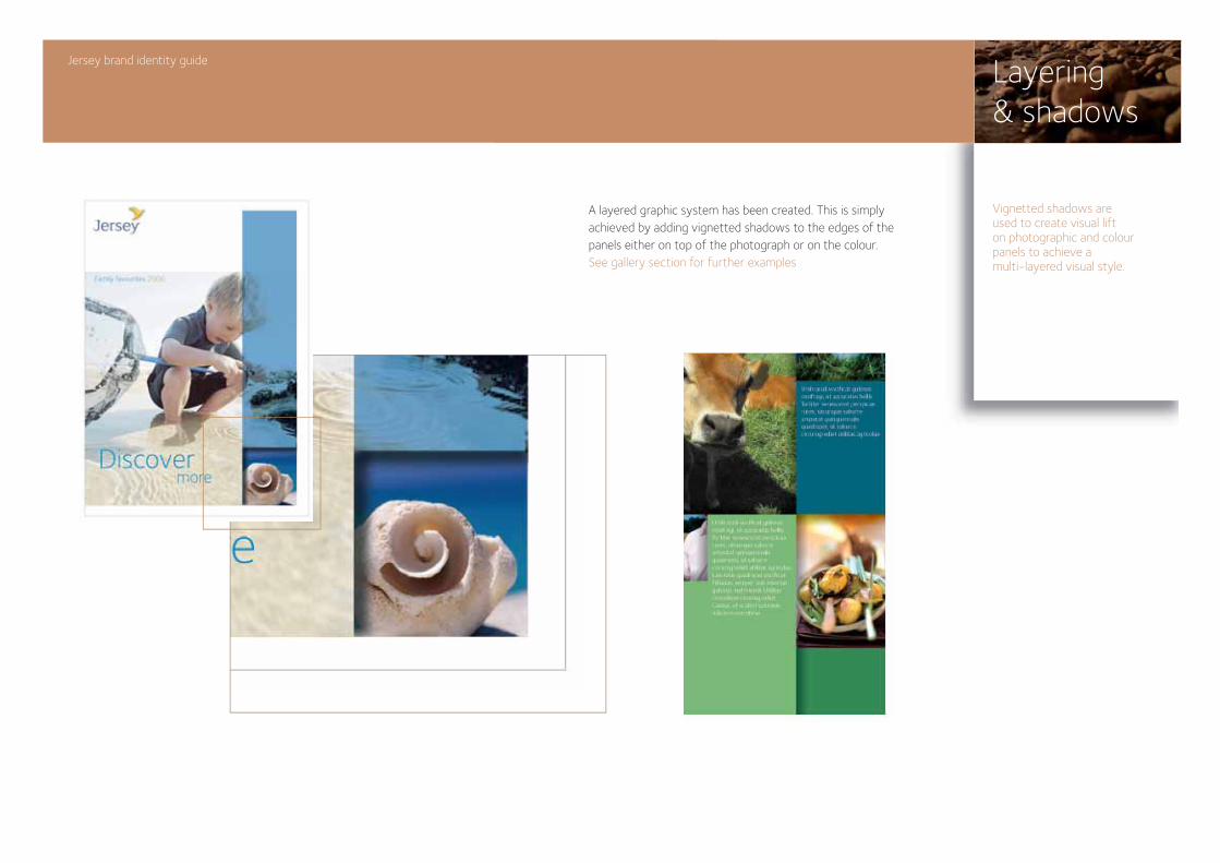
A layered graphic system has been created. This is simply achieved by adding vignetted shadows to the edges of the panels either on top of the photograph or on the colour.See gallery section for further examples
Layering & shadows
Jersey brand identity guide
Vignetted shadows are used to create visual lift on photographic and colour panels to achieve a multi-layered visual style.
What is tone of voice?Creating headlinesOur tone of voice
Jersey brand identity guide
Toneof voice
The new Jersey identity will bring a whole new look and feel to our communication material, but delivering a brand is just as much about what we say and how we say it – we call this tone of voice. Our tone of voice helps bring the Jersey experience to life. A good piece of writing about the Island is more than a description of a place or a set of facts. It has a particular pace, language and style that work together to help the reader really experience Jersey – even if they’ve never been there before. Our style of writing can go a long way to convey what a genuine, stimulating and beautiful place Jersey is to live, work and visit. We want people to be interested, informed and enthusiastic about Jersey – and we want them to want to find out more.
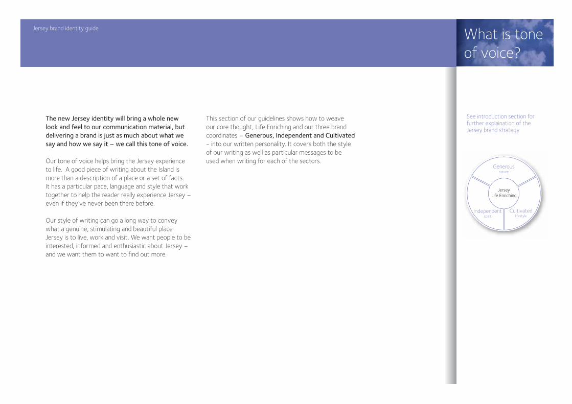
This section of our guidelines shows how to weave our core thought, Life Enriching and our three brand coordinates – Generous, Independent and Cultivated - into our written personality. It covers both the style of our writing as well as particular messages to be used when writing for each of the sectors.
Jersey brand identity guide
What is toneof voice?
See introduction section for further explaination of the Jersey brand strategy
Generousnature
Independentspirit
Cultivatedlifestyle
JerseyLife Enriching
Life styleLife storyWork life balanceLife sizedGood lifeLife supportLive the life
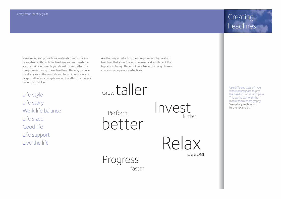
In marketing and promotional materials tone of voice will be established through the headlines and sub heads that are used. Where possible you should try and reflect the core promise through these headlines. This may be done literally by using the word life and linking it with a whole range of different concepts around the affect that Jersey has on people’s life.
Another way of reflecting the core promise is by creating headlines that show the improvement and enrichment that happens in Jersey. This might be achieved by using phrases containing comparative adjectives.
Jersey brand identity guide
Creating headlines
Use different sizes of type where appropriate to give the headings a sense of pace. This works well with the macro/micro photography.See gallery section for further examples
GrowtallerInvest
further
betterPerform
Progressfaster
Relaxdeeper
Our brand coordinates are the brief for our tone of voice. We want people to get a real sense that we are generous, cultivated and independent through the combination of style and content in our writing. The following are some principles of how to get this tone across.
GenerousBeing generous is all about giving people more than they anticipate. In writing this may mean painting stories for people and being more descriptive about issues or qualities. This doesn’t mean it needs to always be very long copy, but it should be inviting and inclusive and help the reader to understand a number of different aspects. So, for example, you might use sentences rather than bullet points in a finance piece; or you may want to describe the climate as part of a piece about our agriculture.
IndependentBeing independent can mean many different things in terms of writing. For Jersey we are looking to create a distinctive and unique tone of voice. It’s important that people appreciate how distinctive the Jersey experience is. It’s already part of your language -
in the mix of French and English and the unusual names you have for Jersey traditions. Try and bring this sense of the distinctive through into the way you write and the things you write about. Being independent may also be about sticking to your principles and having an opinion that comes through the way in which you write. You need to be careful that this doesn’t make jersey appear a little difficult to get to know, but the honesty and authenticity are important parts of your character.
CultivatedJersey has a unique and attractive combination of sophistication and authenticity. By bringing in a sense of cultivation we are trying to get this mix across to people. So we aren’t looking for the copy to be very upmarket or snooty, but instead to give a real sense that Jersey has, and upholds, traditional values. In practice this will probably be as much to do with the content that you choose, but it will also be important to write well – and to care about grammar and punctuation.
Jersey brand identity guide
Our toneof voice
See introduction section for further explaination of the Jersey brand strategy
Jersey brand identity guide
Our toneof voice
Brand messages
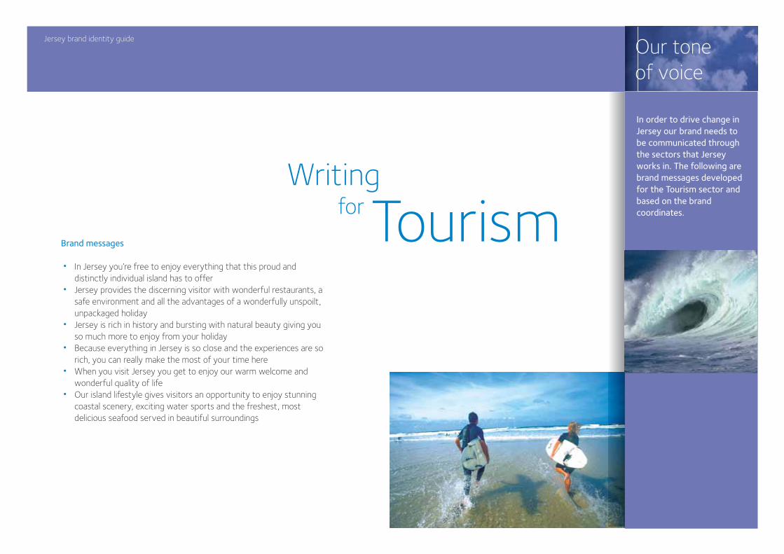
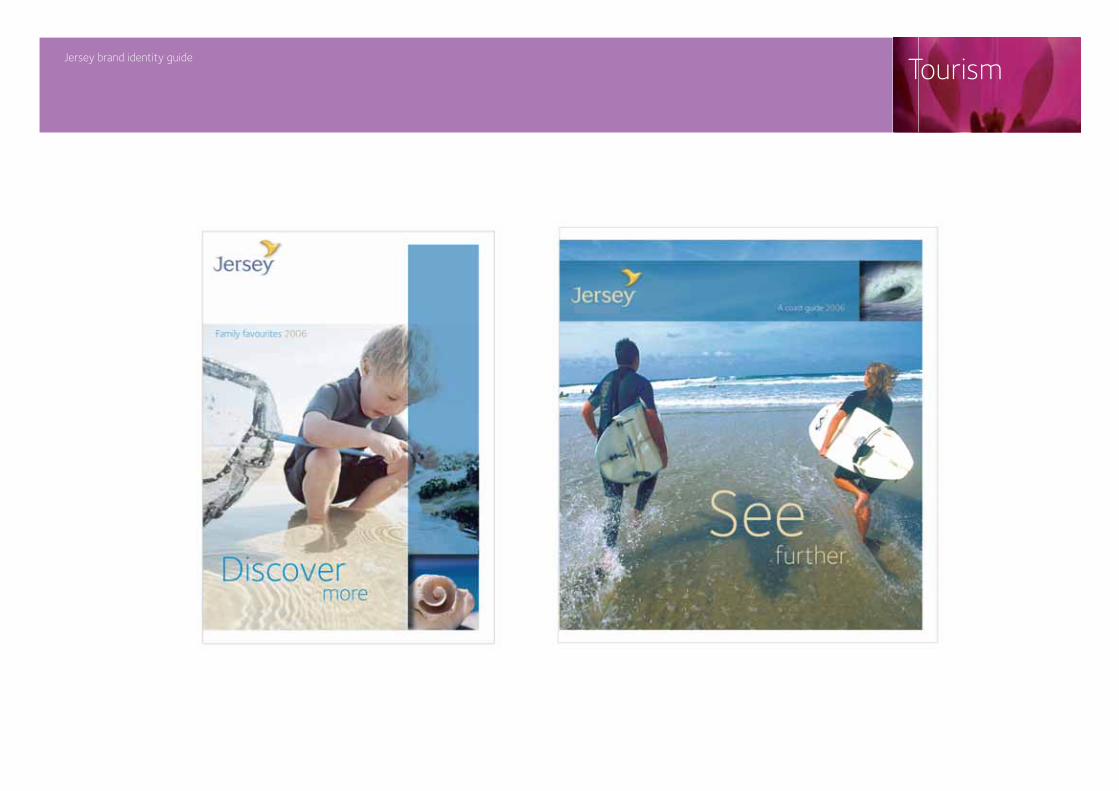
• In Jersey you’re free to enjoy everything that this proud and distinctly individual island has to offer• Jersey provides the discerning visitor with wonderful restaurants, a safe environment and all the advantages of a wonderfully unspoilt, unpackaged holiday• Jersey is rich in history and bursting with natural beauty giving you so much more to enjoy from your holiday• Because everything in Jersey is so close and the experiences are so rich, you can really make the most of your time here• When you visit Jersey you get to enjoy our warm welcome and wonderful quality of life• Our island lifestyle gives visitors an opportunity to enjoy stunning coastal scenery, exciting water sports and the freshest, most delicious seafood served in beautiful surroundings
Writingfor Tourism
In order to drive change in Jersey our brand needs to be communicated through the sectors that Jersey works in. The following are brand messages developed for the Tourism sector and based on the brand coordinates.
Jersey brand identity guide
Our toneof voice
Brand messages
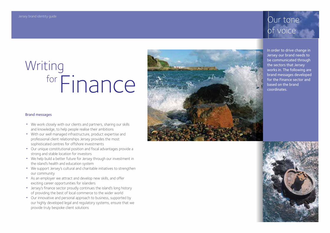
• We work closely with our clients and partners, sharing our skills and knowledge, to help people realise their ambitions• With our well managed infrastructure, product expertise and professional client relationships Jersey provides the most sophisticated centres for offshore investments• Our unique constitutional position and fiscal advantages provide a strong and stable location for investors• We help build a better future for Jersey through our investment in the island’s health and education system• We support Jersey’s cultural and charitable initiatives to strengthen our community• As an employer we attract and develop new skills, and offer exciting career opportunities for islanders• Jersey’s finance sector proudly continues the island’s long history of providing the best of local commerce to the wider world• Our innovative and personal approach to business, supported by our highly developed legal and regulatory systems, ensure that we provide truly bespoke client solutions
WritingforFinance
In order to drive change in Jersey our brand needs to be communicated through the sectors that Jersey works in. The following are brand messages developed for the Finance sector and based on the brand coordinates.
Jersey brand identity guide
Our toneof voice
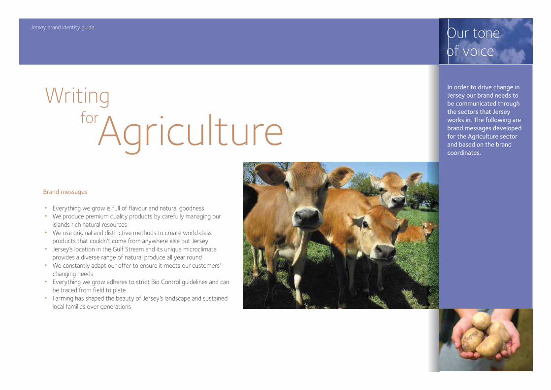
Writingfor
Brand messages
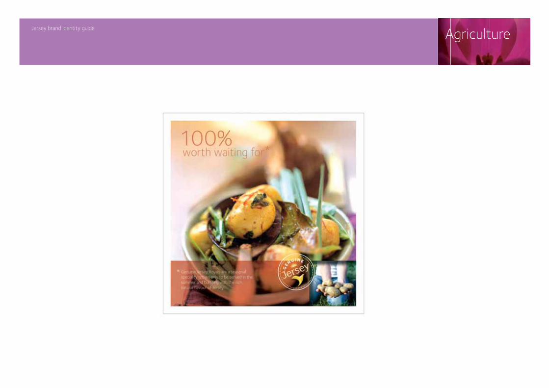
• Everything we grow is full of flavour and natural goodness• We produce premium quality products by carefully managing our islands rich natural resources• We use original and distinctive methods to create world class products that couldn’t come from anywhere else but Jersey• Jersey’s location in the Gulf Stream and its unique microclimate provides a diverse range of natural produce all year round• We constantly adapt our offer to ensure it meets our customers’ changing needs• Everything we grow adheres to strict Bio Control guidelines and can be traced from field to plate• Farming has shaped the beauty of Jersey’s landscape and sustained local families over generations
AgricultureIn order to drive change in Jersey our brand needs to be communicated through the sectors that Jersey works in. The following are brand messages developed for the Agriculture sector and based on the brand coordinates.
Jersey brand identity guide
Our toneof voice
Writingfor
Brand messages
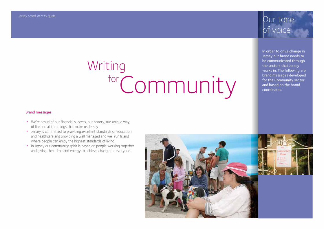
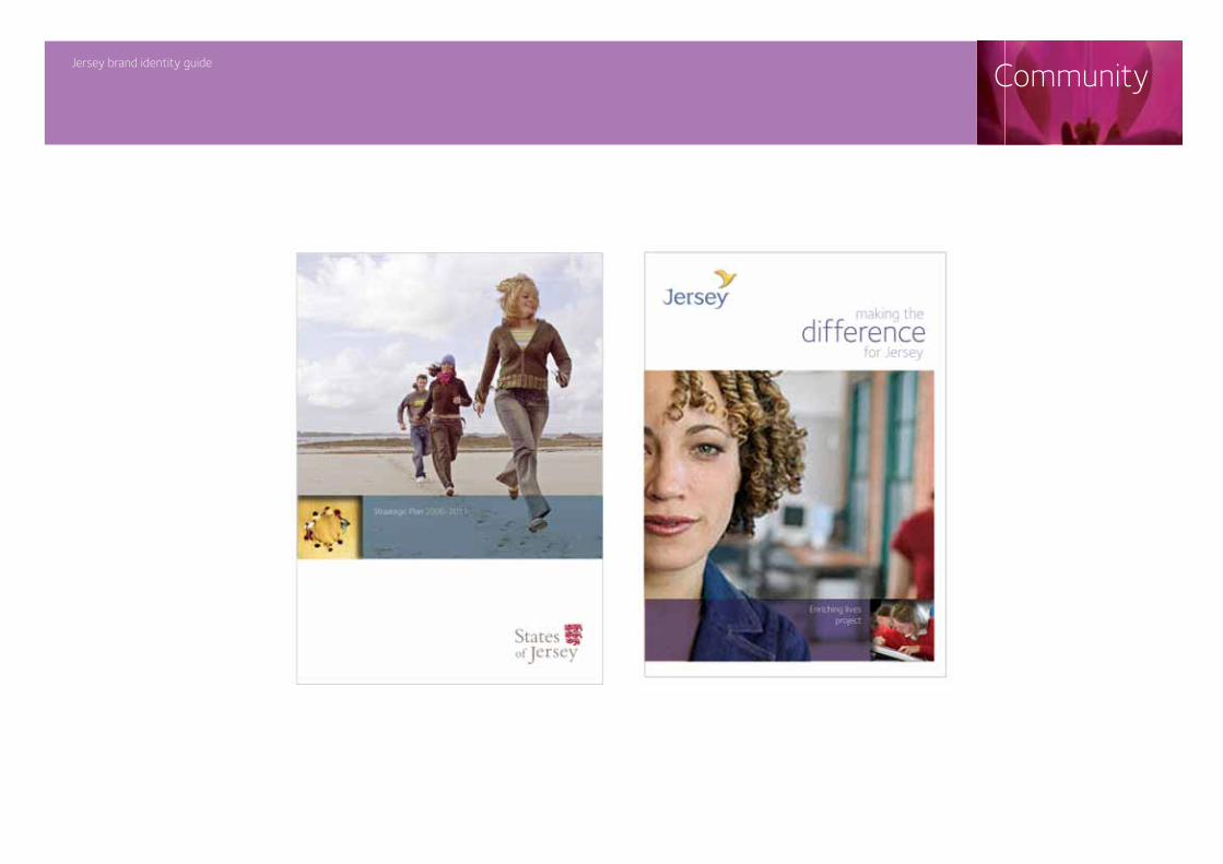
• We’re proud of our financial success, our history, our unique way of life and all the things that make us Jersey• Jersey is committed to providing excellent standards of education and healthcare and providing a well managed and well run Island where people can enjoy the highest standards of living• In Jersey our community spirit is based on people working together and giving their time and energy to achieve change for everyone
Community
In order to drive change in Jersey our brand needs to be communicated through the sectors that Jersey works in. The following are brand messages developed for the Community sector and based on the brand coordinates.
Inspiration and examples
Gallery
Jersey brand identity guide
Jersey brand identity guide
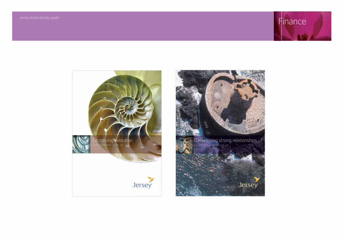
Finance
Jersey brand identity guide
Agriculture
Jersey brand identity guide
Tourism
Jersey brand identity guide
Community
Jersey brand identity guide
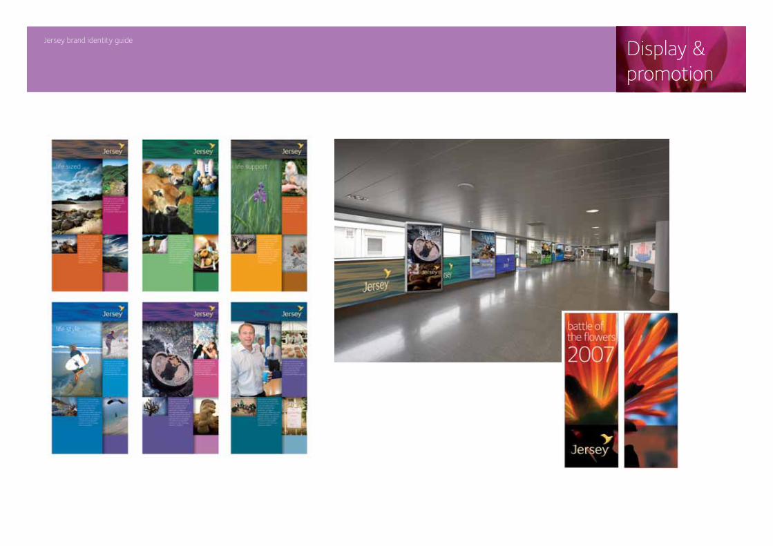
Display &promotion
Jersey brand identity guide
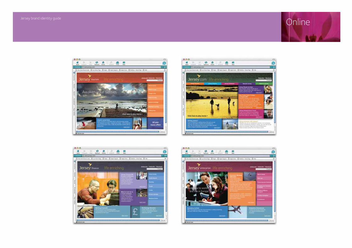
Online
Name XXXXXXXXXAddress XXXXXXXXXXXXXAddress XXXXXXXXXXXXXXTelephone XXXX XXX XXXXFax XXXXX XXXX XXXX Email xxxxxx@xxxxxxxxxxxxxxxx
Contacts
Lorem ipsum dolor sit amet, consectetuer adipiscing elit, sed diam nonummy nibh euismod tincidunt ut laoreet dolore magna aliquam erat volutpat. Ut wisi enim ad minim veniam, quis nostrud exerci tation ullamcorper suscipit lobortis nisl ut aliquip ex ea commodo consequat.