Embed Size (px)
Citation preview
Meal cardBy Ava Mason

Research resources for meal card
This is the website I used for my meal card bean soup.http://www.waitrose.com/home/recipes/recipe_directory/h/hearty_ham_and_broad_bean_soup.html
I also researched some nutritional information on broad beans, to add into my meal card. This is the website I used for the information.
http://www.purepackage.com/2011/08/broad-beans-nutrition-facts-recipes/
I researched information from apricots, but most of the information I put in my meal card was mine and my peers general knowledge.
I created the step by step method to making the fruit salad, because it is very easily made, due to only the washing and chopping of fruits being involved.
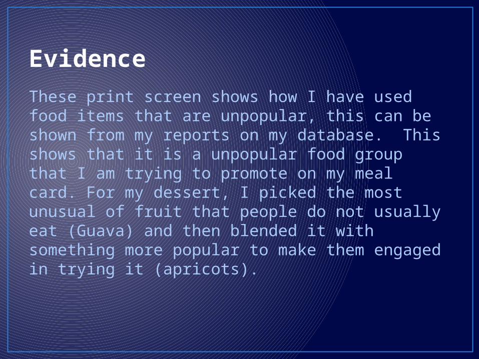
Evidence
These print screen shows how I have used food items that are unpopular, this can be shown from my reports on my database. This shows that it is a unpopular food group that I am trying to promote on my meal card. For my dessert, I picked the most unusual of fruit that people do not usually eat (Guava) and then blended it with something more popular to make them engaged in trying it (apricots).
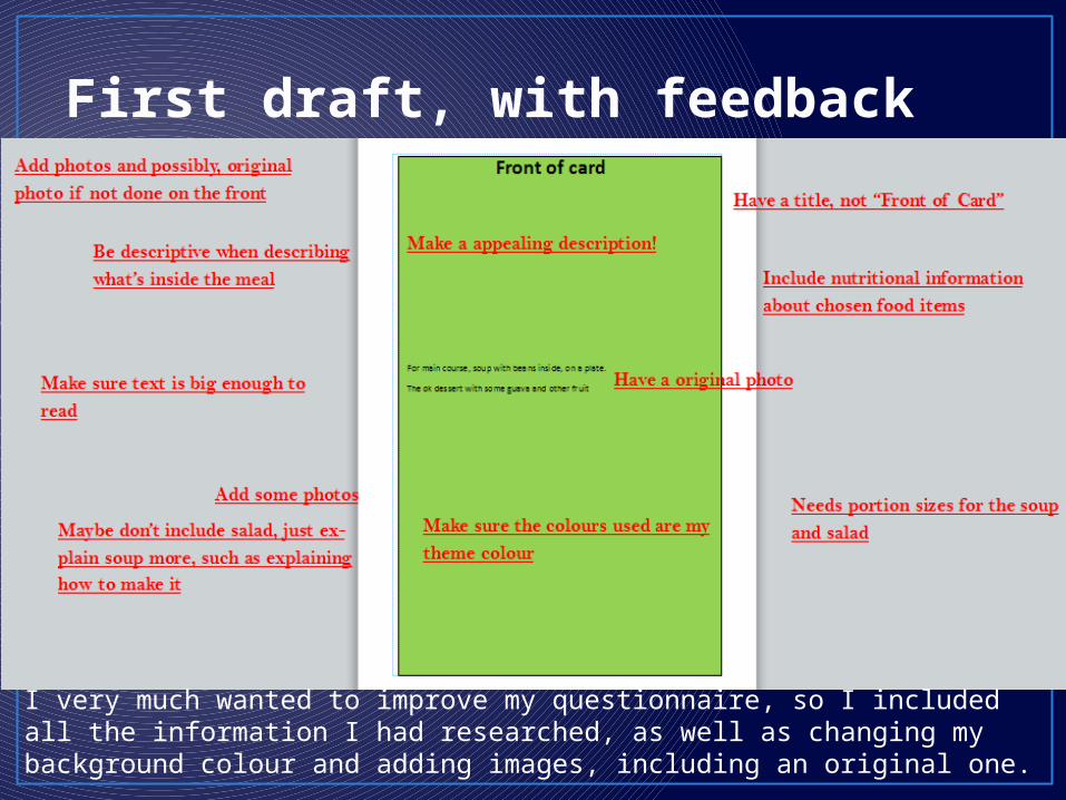
First draft, with feedback
I very much wanted to improve my questionnaire, so I included all the information I had researched, as well as changing my background colour and adding images, including an original one.
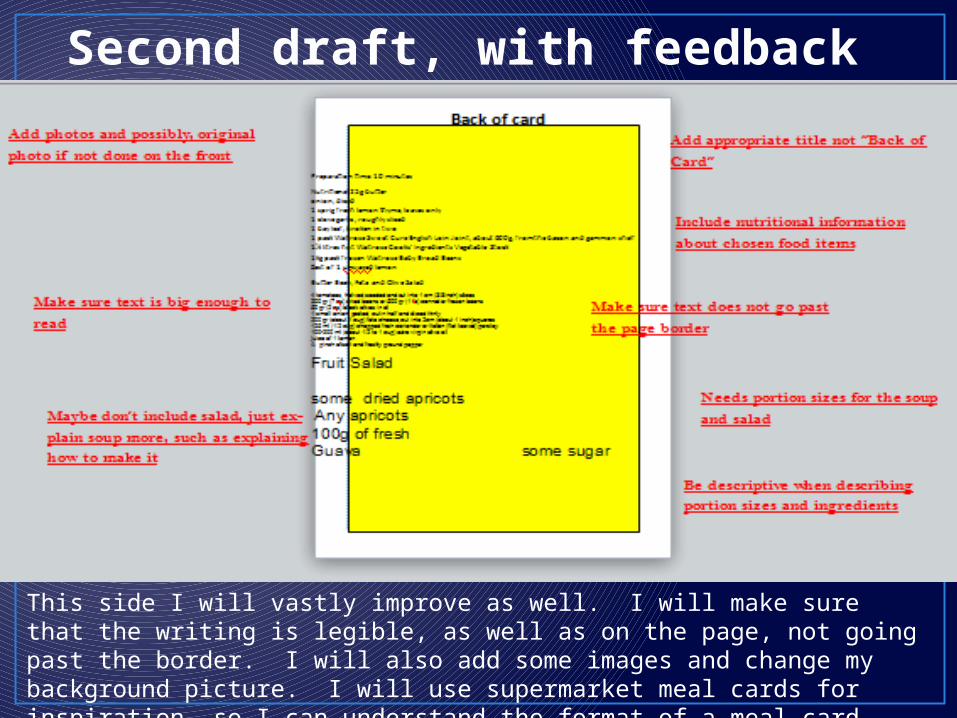
Second draft, with feedback
This side I will vastly improve as well. I will make sure that the writing is legible, as well as on the page, not going past the border. I will also add some images and change my background picture. I will use supermarket meal cards for inspiration, so I can understand the format of a meal card more.
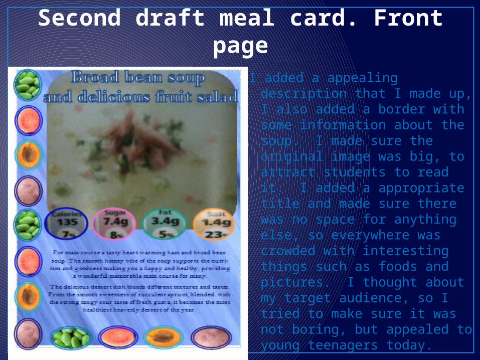
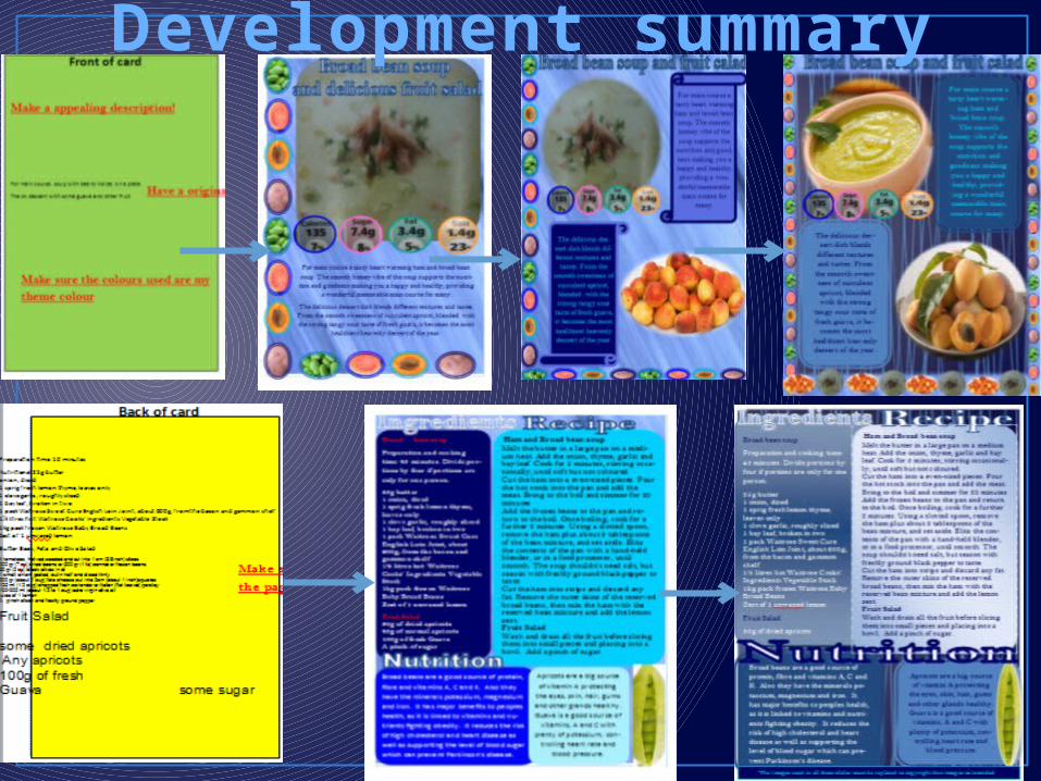
Second draft meal card. Front page
I added a appealing description that I made up, I also added a border with some information about the soup. I made sure the original image was big, to attract students to read it. I added a appropriate title and made sure there was no space for anything else, so everywhere was crowded with interesting things such as foods and pictures. I thought about my target audience, so I tried to make sure it was not boring, but appealed to young teenagers today.
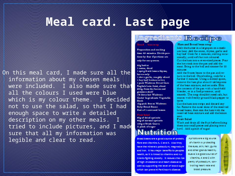
Meal card. Last page
On this meal card, I made sure all the information about my chosen meals were included. I also made sure that all the colours I used were blue which is my colour theme. I decided not to use the salad, so that I had enough space to write a detailed description on my other meals. I tried to include pictures, and I made sure that all my information was legible and clear to read.
Third draft first page of meal card
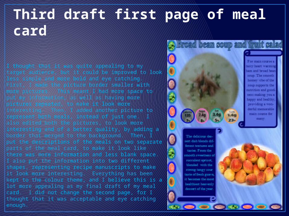
I thought that it was quite appealing to my target audience, but it could be improved to look less simple and more bold and eye catching. First, I made the picture border smaller with more pictures. This meant I had more space to put my information, as well as having more pictures repeated, to make it look more interesting. Then, I added another picture to represent both meals, instead of just one. I also edited both the pictures, to look more interesting and of a better quality, by adding a border that merged to the background. Then, I put the descriptions of the meals on two separate parts of the meal card, to make it look like there was more information and less blank space. I also put the information into two different shapes, representing recipe manuscripts to make it look more interesting. Everything has been kept to the colour theme, and I believe this is a lot more appealing as my final draft of my meal card. I did not change the second page, for I thought that it was acceptable and eye catching enough.
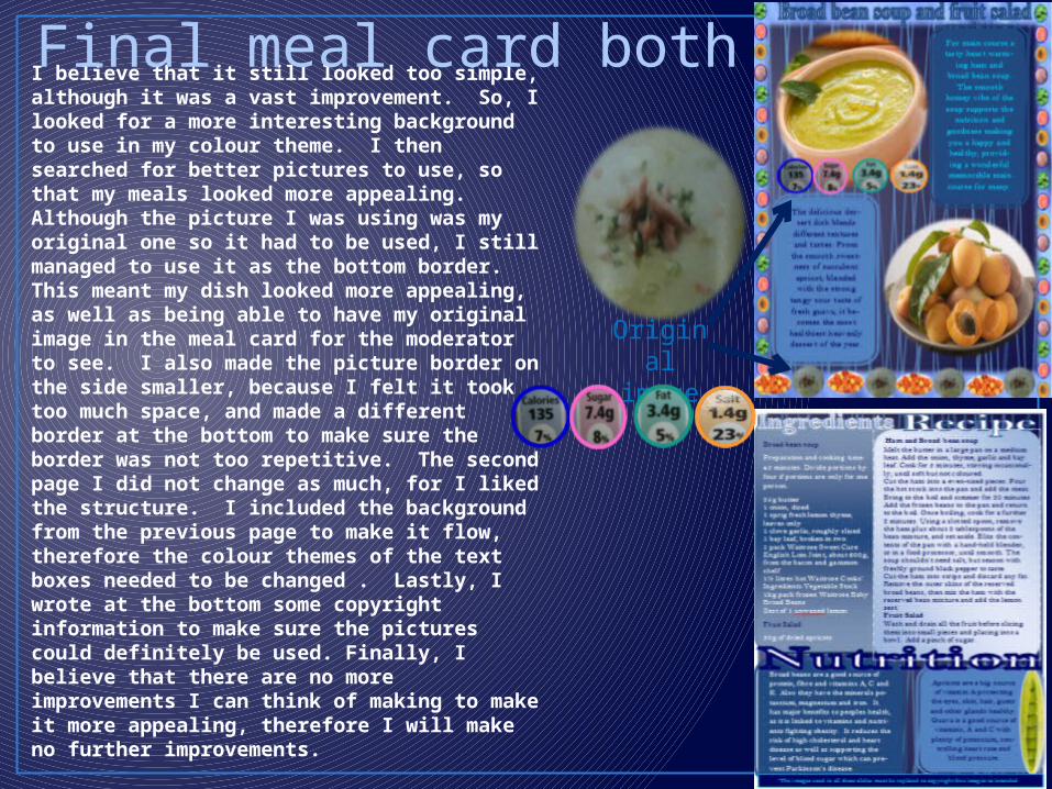
I believe that it still looked too simple, although it was a vast improvement. So, I looked for a more interesting background to use in my colour theme. I then searched for better pictures to use, so that my meals looked more appealing. Although the picture I was using was my original one so it had to be used, I still managed to use it as the bottom border. This meant my dish looked more appealing, as well as being able to have my original image in the meal card for the moderator to see. I also made the picture border on the side smaller, because I felt it took too much space, and made a different border at the bottom to make sure the border was not too repetitive. The second page I did not change as much, for I liked the structure. I included the background from the previous page to make it flow, therefore the colour themes of the text boxes needed to be changed . Lastly, I wrote at the bottom some copyright information to make sure the pictures could definitely be used. Finally, I believe that there are no more improvements I can think of making to make it more appealing, therefore I will make no further improvements.
Final meal card both pages
Original
image
Development summary