Embed Size (px)
Citation preview
Computer Supported Collaborative Rocketry: Teaching students todistinguish good and bad data like expert physicistsMatthew d'Alessio and Loraine Lundquist Citation: Phys. Teach. 51, 424 (2013); doi: 10.1119/1.4820858 View online: http://dx.doi.org/10.1119/1.4820858 View Table of Contents: http://tpt.aapt.org/resource/1/PHTEAH/v51/i7 Published by the American Association of Physics Teachers Related ArticlesLittle Green Man Physics Phys. Teach. 51, 427 (2013) A Progression of Static Equilibrium Laboratory Exercises Phys. Teach. 51, 430 (2013) Color reproduction with a smartphone Phys. Teach. 51, 440 (2013) Big Pile or Small Pile? Phys. Teach. 51, 406 (2013) Quadrant to Measure the Sun's Altitude Phys. Teach. 51, 420 (2013) Additional information on Phys. Teach.Journal Homepage: http://tpt.aapt.org/ Journal Information: http://tpt.aapt.org/about/about_the_journal Top downloads: http://tpt.aapt.org/most_downloaded Information for Authors: http://www.aapt.org/publications/tptauthors.cfm
424 The Physics Teacher ◆ Vol. 51, OctOber 2013 DOI: 10.1119/1.4820858
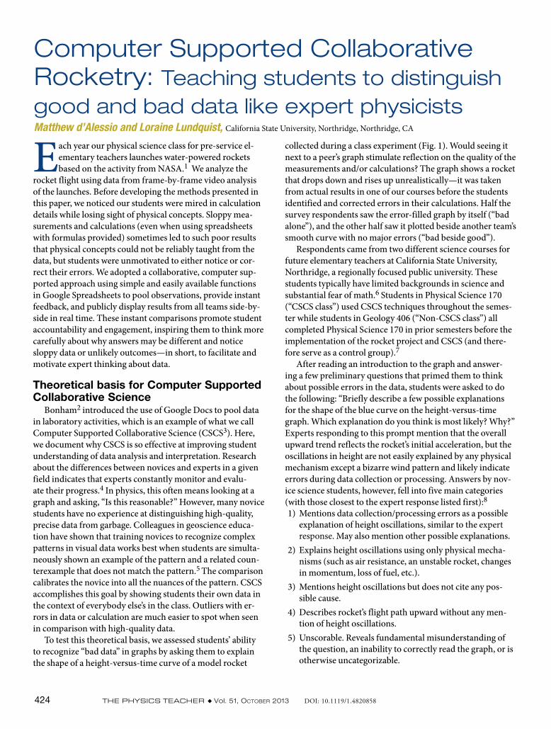
collected during a class experiment (Fig. 1). Would seeing it next to a peer’s graph stimulate reflection on the quality of the measurements and/or calculations? The graph shows a rocket that drops down and rises up unrealistically—it was taken from actual results in one of our courses before the students identified and corrected errors in their calculations. Half the survey respondents saw the error-filled graph by itself (“bad alone”), and the other half saw it plotted beside another team’s smooth curve with no major errors (“bad beside good”).
Respondents came from two different science courses for future elementary teachers at California State University, Northridge, a regionally focused public university. These students typically have limited backgrounds in science and substantial fear of math.6 Students in Physical Science 170 (“CSCS class”) used CSCS techniques throughout the semes-ter while students in Geology 406 (“Non-CSCS class”) all completed Physical Science 170 in prior semesters before the implementation of the rocket project and CSCS (and there-fore serve as a control group).7
After reading an introduction to the graph and answer-ing a few preliminary questions that primed them to think about possible errors in the data, students were asked to do the following: “Briefly describe a few possible explanations for the shape of the blue curve on the height-versus-time graph. Which explanation do you think is most likely? Why?” Experts responding to this prompt mention that the overall upward trend reflects the rocket’s initial acceleration, but the oscillations in height are not easily explained by any physical mechanism except a bizarre wind pattern and likely indicate errors during data collection or processing. Answers by nov-ice science students, however, fell into five main categories (with those closest to the expert response listed first):81) Mentions data collection/processing errors as a possible
explanation of height oscillations, similar to the expert response. May also mention other possible explanations.
2) Explains height oscillations using only physical mecha-nisms (such as air resistance, an unstable rocket, changes in momentum, loss of fuel, etc.).
3) Mentions height oscillations but does not cite any pos-sible cause.
4) Describes rocket’s flight path upward without any men-tion of height oscillations.
5) Unscorable. Reveals fundamental misunderstanding of the question, an inability to correctly read the graph, or is otherwise uncategorizable.
Computer Supported Collaborative Rocketry: Teaching students to distinguish good and bad data like expert physicists Matthew d’Alessio and Loraine Lundquist, California State University, Northridge, Northridge, CA
Each year our physical science class for pre-service el-ementary teachers launches water-powered rockets based on the activity from NASA.1 We analyze the
rocket flight using data from frame-by-frame video analysis of the launches. Before developing the methods presented in this paper, we noticed our students were mired in calculation details while losing sight of physical concepts. Sloppy mea-surements and calculations (even when using spreadsheets with formulas provided) sometimes led to such poor results that physical concepts could not be reliably taught from the data, but students were unmotivated to either notice or cor-rect their errors. We adopted a collaborative, computer sup-ported approach using simple and easily available functions in Google Spreadsheets to pool observations, provide instant feedback, and publicly display results from all teams side-by-side in real time. These instant comparisons promote student accountability and engagement, inspiring them to think more carefully about why answers may be different and notice sloppy data or unlikely outcomes —in short, to facilitate and motivate expert thinking about data.
Theoretical basis for Computer Supported Collaborative Science
Bonham2 introduced the use of Google Docs to pool data in laboratory activities, which is an example of what we call Computer Supported Collaborative Science (CSCS3). Here, we document why CSCS is so effective at improving student understanding of data analysis and interpretation. Research about the differences between novices and experts in a given field indicates that experts constantly monitor and evalu-ate their progress.4 In physics, this often means looking at a graph and asking, “Is this reasonable?” However, many novice students have no experience at distinguishing high-quality, precise data from garbage. Colleagues in geoscience educa-tion have shown that training novices to recognize complex patterns in visual data works best when students are simulta-neously shown an example of the pattern and a related coun-terexample that does not match the pattern.5 The comparison calibrates the novice into all the nuances of the pattern. CSCS accomplishes this goal by showing students their own data in the context of everybody else’s in the class. Outliers with er-rors in data or calculation are much easier to spot when seen in comparison with high-quality data.
To test this theoretical basis, we assessed students’ ability to recognize “bad data” in graphs by asking them to explain the shape of a height-versus-time curve of a model rocket
The Physics Teacher ◆ Vol. 51, OctOber 2013 425
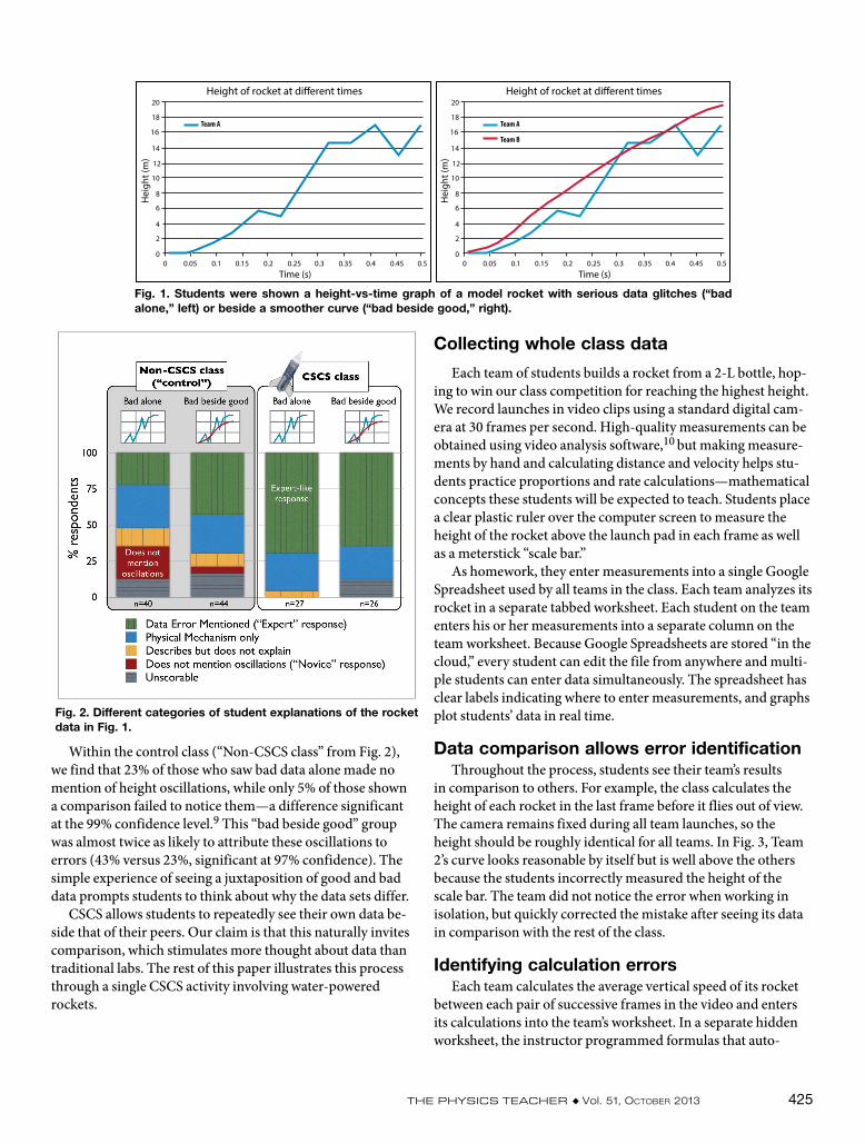
Within the control class (“Non-CSCS class” from Fig. 2), we find that 23% of those who saw bad data alone made no mention of height oscillations, while only 5% of those shown a comparison failed to notice them—a difference significant at the 99% confidence level.9 This “bad beside good” group was almost twice as likely to attribute these oscillations to errors (43% versus 23%, significant at 97% confidence). The simple experience of seeing a juxtaposition of good and bad data prompts students to think about why the data sets differ.
CSCS allows students to repeatedly see their own data be-side that of their peers. Our claim is that this naturally invites comparison, which stimulates more thought about data than traditional labs. The rest of this paper illustrates this process through a single CSCS activity involving water-powered rockets.
Height of rocket at di�erent times
Time (s)
Hei
ght (
m)
00
0.05 0.1 0.15 0.2 0.25 0.3 0.35 0.4 0.45 0.5
2
4
6
8
10
12
14
16
18
20
Team A
Height of rocket at di�erent times
Time (s)
Hei
ght (
m)
00
0.05 0.1 0.15 0.2 0.25 0.3 0.35 0.4 0.45 0.5
2
4
6
8
10
12
14
16
18
20
Team A
Team B
Fig. 1. Students were shown a height-vs-time graph of a model rocket with serious data glitches (“bad alone,” left) or beside a smoother curve (“bad beside good,” right).
Fig. 2. Different categories of student explanations of the rocket data in Fig. 1.
Collecting whole class data
Each team of students builds a rocket from a 2-L bottle, hop-ing to win our class competition for reaching the highest height. We record launches in video clips using a standard digital cam-era at 30 frames per second. High-quality measurements can be obtained using video analysis software,10 but making measure-ments by hand and calculating distance and velocity helps stu-dents practice proportions and rate calculations—mathematical concepts these students will be expected to teach. Students place a clear plastic ruler over the computer screen to measure the height of the rocket above the launch pad in each frame as well as a meterstick “scale bar.”
As homework, they enter measurements into a single Google Spreadsheet used by all teams in the class. Each team analyzes its rocket in a separate tabbed worksheet. Each student on the team enters his or her measurements into a separate column on the team worksheet. Because Google Spreadsheets are stored “in the cloud,” every student can edit the file from anywhere and multi-ple students can enter data simultaneously. The spreadsheet has clear labels indicating where to enter measurements, and graphs plot students’ data in real time.
Data comparison allows error identificationThroughout the process, students see their team’s results
in comparison to others. For example, the class calculates the height of each rocket in the last frame before it flies out of view. The camera remains fixed during all team launches, so the height should be roughly identical for all teams. In Fig. 3, Team 2’s curve looks reasonable by itself but is well above the others because the students incorrectly measured the height of the scale bar. The team did not notice the error when working in isolation, but quickly corrected the mistake after seeing its data in comparison with the rest of the class.
Identifying calculation errorsEach team calculates the average vertical speed of its rocket
between each pair of successive frames in the video and enters its calculations into the team’s worksheet. In a separate hidden worksheet, the instructor programmed formulas that auto-

426 The Physics Teacher ◆ Vol. 51, OctOber 2013
teams, and 2) the ability to see improvement instantly when errors are corrected. Profes-sors can track this kind of self-correction (in addition to inappropriate “correction” such as cheating or unethical changes to data) because Google Spreadsheets record every change by every student in a time-stamped revision his-tory.
In one example, we have a minute-by-min-ute narrative12 illustrating how a team thought it completed its calculations but reconsidered its results once other teams’ results were posted [Fig. 4(a)]. Since the team’s result was created
using an average of each teammate’s individual measurements [a process also facilitated via CSCS techniques, see Fig. 4(b)], they began examining each individual’s work and testing what happened when one individual’s “outlying” data were excluded. This prompted the individual to redo his or her measurements and discover the mistake—voluntarily [Figs. 4(c)-(d)].
The clear data ownership and public accountability to peers makes students want to seek out errors and correct them. This is a major improvement over the first time we used the rocket activity with calculations by hand when stu-dents simply said, “I guess I did things wrong. It won’t hurt my score much, will it?”
Using high-quality data to discover physi-cal processes
Eventually, all teams refine their data and calculations enough to allow meaningful comparisons between teams
—and thereby discover interesting physical pro-cesses. For example, all the rockets experience roughly the same upward force (since they are pumped to the same pressure at launch using a bicycle pump with a pressure gauge), but they have different masses due to differences in design and initial fuel volume. We plot initial acceleration versus mass to find that lighter rockets accelerate faster—a trend only apparent when multiple teams compare high-quality data. But stu-dents also discover a trade-off with stability—rockets with extra mass in the nose cone typically travel higher. (The stability benefits of moving the rocket’s center
matically calculate the velocity for each team from their raw data. Using the “Conditional Formatting” option of Google Spreadsheets, each cell turns green when the team’s calcula-tion matches the hidden calculations or yellow if the team makes one of a series of common minor mistakes. While students perform their calculations, we display a summary worksheet of all teams’ progress on the computer projector. The instructor can glance at the screen to quickly determine which teams need assistance or which teams are finished and can be given more advanced challenges. This instant feedback encourages teams to locate errors themselves, which they of-ten do before the instructor reaches their table.11
Creating a forum where mistakes can be identified and corrected
While automated color-coding helps students fix errors, we ideally want students to identify their own mistakes. CSCS enables this process by allowing: 1) comparison between
Fig. 3. Rocket height vs time reveals that Team 2 is an outlier.
Fig. 4. (a) Speed-vs-time graph for all six teams that inspired Team 4 to look at their raw data in (b); (c) Revised speed-vs-time graph reflecting the corrected input data in (d).
The Physics Teacher ◆ Vol. 51, OctOber 2013 427
and analyze whole class data,” Proceedings of the 9th Annual Hawaii International Conference on Education (Jan. 2011), pp. 2498–2503.
4. “How Experts Differ from Novices,” in How People Learn: Brain, Mind, Experience, and School: Expanded Edition, edited by J. D. Bransford, A. L. Brown, and R. R. Cocking (National Academies Press, Washington, D.C., 2000), pp. 29-50.
5. C. J. Ormand, D. Gentner, B. Jee, T. F. Shipley, B. Tikoff, D. Ut-tal, and C. Manduca, “Finding fault: Laboratory experiments and classroom studies on identifying faults in images,” Geol. Soc. Am. Abstr. Programs 41, 196 (Oct. 2009).
6. In a typical introductory physics class in the nation, 85% of the students have taken some form of high school physics (P. M. Sadler and R. H. Tai, “Success in introductory college physics: The role of high school preparation,” J. Res. Sci. Teach. 42, 111–136). In PHSC 170, only 35% have, and most of those took a physical science course targeted towards non-science students. In terms of math, 20% report that math “terrifies” them.
7. For further information on the experimental design, see Ap-pendix A at TPT Online at http://dx.doi.org/10.1119/1.4820858.
8. See Appendix A for details about inter-rater reliability.9. See Appendix A for technique to calculate statistical signifi-
cance.10. Douglas Brown and Anne Cox, “Innovative uses of video anal-
ysis,” Phys. Teach. 47, 145–150 (March 2009).10. See Appendix B at TPT Online at http://dx.doi.org/
10.1119/1.4820858 for further discussion of the appropriate use of conditional formatting.
11. See Appendix C at TPT Online at http://dx.doi.org/ 10.1119/1.4820858.
Matthew d'Alessio is an assistant professor at California State University, Northridge (CSUN), where he teaches science content courses to future teachers. He is a former high school teacher and Google Faculty Fellow. Loraine Lundquist is an adjunct professor and education researcher at CSUN. California State University, Northridge, 18111 Nordhoff St., Northridge, CA 91343-8266; [email protected]
of mass in front of its center of pressure are emphasized in the design phase, using language appropriate for the students’ backgrounds, but are not fully appreciated until this analysis.) This engineering-style optimization helps support new Next Generation Science Standards, which embed engineering practices within the science curriculum.
ConclusionTo assess the data interpretation skills of students that
completed the CSCS rocket project, we presented them with the graphs in Fig. 1 and coded student descriptions of the data as we did for the non-CSCS class (Fig. 2). CSCS-class students provided expert-like responses two-thirds of the time, nearly twice as often as the control non-CSCS case. Un-like the control case, the “bad alone” and “bad beside good” groups in the CSCS class performed about the same (70% ver-sus 65%, difference not statistically significant), implying that these students no longer needed the comparison because they had developed an internal sense of what good and bad rocket data can look like, much like an expert in this domain might have. In future studies, we will investigate how well students are able to transfer this skill to assessing data in new domains. After completing a semester of instruction using frequent CSCS activities, even students with limited science back-grounds can begin to see data like experts see it—subject to error. The rocket project we describe here is just one example of how cloud computing tools can transform hands-on activi-ties into authentic, collaborative science experiences.
References1. NASA, “Rockets Educator Guide,” EG-2011-11-223-KSC
(NASA, Washington, D.C., 2011).2. Scott Bonham, “Whole class laboratories with Google Docs,”
Phys. Teach. 49, 22–23 (Jan. 2011).3. N. Herr, M. Rivas, B. Foley, V. Vandergon, and G. Simila, “Us-
ing collaborative web-based documents to instantly collect
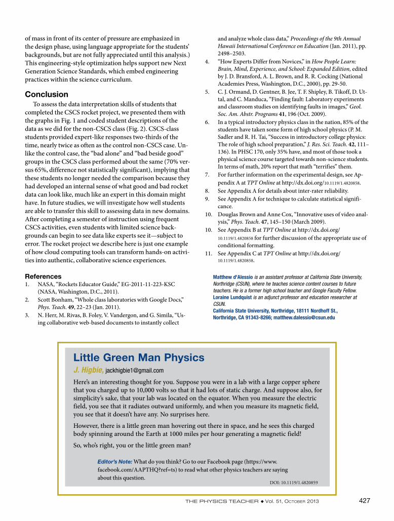
Little Green Man PhysicsJ. Higbie, [email protected]
Here’s an interesting thought for you. Suppose you were in a lab with a large copper sphere that you charged up to 10,000 volts so that it had lots of static charge. And suppose also, for simplicity’s sake, that your lab was located on the equator. When you measure the electric field, you see that it radiates outward uniformly, and when you measure its magnetic field, you see that it doesn’t have any. No surprises here.
However, there is a little green man hovering out there in space, and he sees this charged body spinning around the Earth at 1000 miles per hour generating a magnetic field!
So, who’s right, you or the little green man?
Editor’s Note: What do you think? Go to our Facebook page (https://www. facebook.com/AAPTHQ?ref=ts) to read what other physics teachers are saying about this question.
DOI: 10.1119/1.4820859