Embed Size (px)
Citation preview
CREATE THE FRONT COVER..Using Photoshop to
OR
IGIN
AL I
MA
GE
ED
ITED
IM
AG
E
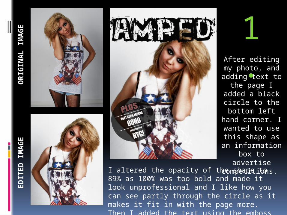
After editing my photo, and
adding text to the page I
added a black circle to the
bottom left hand corner. I wanted
to use this shape as an
information box to advertise
competitions. I altered the opacity of the shape to 89% as 100% was too bold and made it look unprofessional and I like how you can see partly through the circle as it makes it fit in with the page more. Then I added the text using the emboss effect for the word ‘Plus’ to make it stand out more.
1.
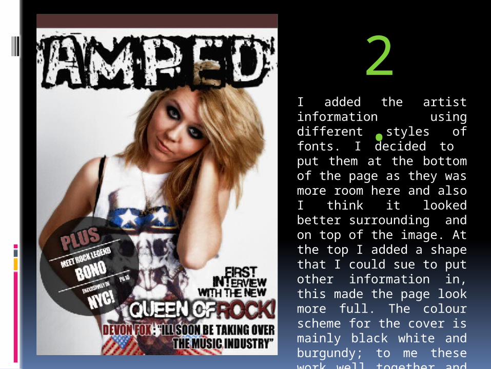
I added the artist information using different styles of fonts. I decided to put them at the bottom of the page as they was more room here and also I think it looked better surrounding and on top of the image. At the top I added a shape that I could sue to put other information in, this made the page look more full. The colour scheme for the cover is mainly black white and burgundy; to me these work well together and are a different take on the red, white and black combination.
2.
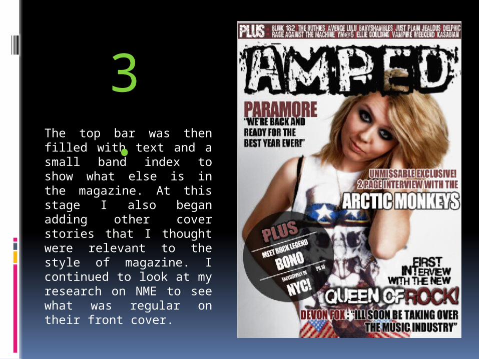
The top bar was then filled with text and a small band index to show what else is in the magazine. At this stage I also began adding other cover stories that I thought were relevant to the style of magazine. I continued to look at my research on NME to see what was regular on their front cover.
3.
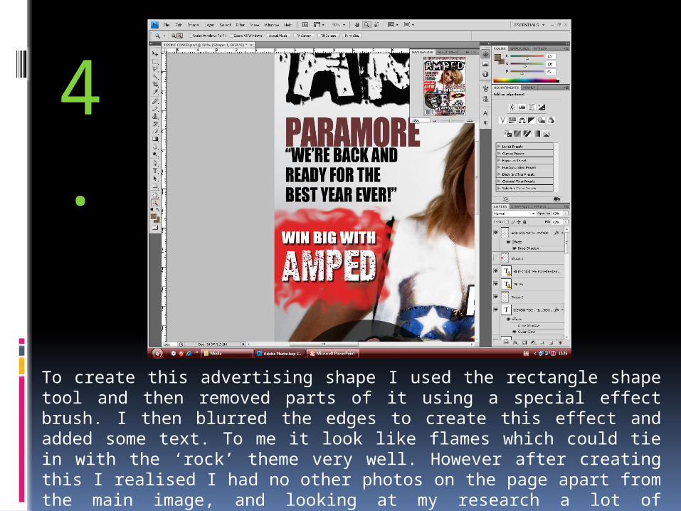
To create this advertising shape I used the rectangle shape tool and then removed parts of it using a special effect brush. I then blurred the edges to create this effect and added some text. To me it look like flames which could tie in with the ‘rock’ theme very well. However after creating this I realised I had no other photos on the page apart from the main image, and looking at my research a lot of magazines have more than one image on the cover, so I decided to remove this shape to leave room for a photo.
4.
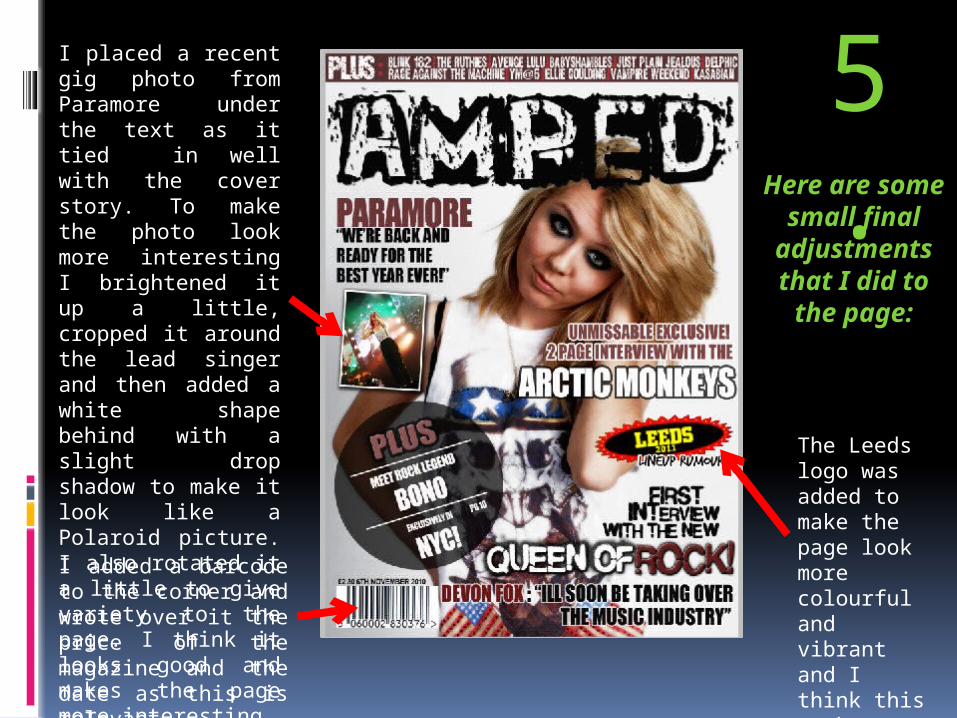
I added a barcode to the corner and wrote over it the price of the magazine and the date as this is relevant information.
I placed a recent gig photo from Paramore under the text as it tied in well with the cover story. To make the photo look more interesting I brightened it up a little, cropped it around the lead singer and then added a white shape behind with a slight drop shadow to make it look like a Polaroid picture. I also rotated it a little to give variety to the page. I think it looks good and makes the page more interesting.
Here are some small
final adjustments that I did to the page:
The Leeds logo was added to make the page look more colourful and vibrant and I think this works well.
5.