Embed Size (px)
Citation preview
JUNE 28, 2016
CUSUM Anomaly Detection
By Kinga Farkas
CUSUM Anomaly Detection | Farkas 1
Abstract Introduction Background
Anomaly Detection in Network Traffic Flows CUSUM Charts
CUSUM Anomaly Detection (CAD) Applying CUSUM Charts to Internet Performance Variables CAD’s Design
Overview Sliding Windows Finding the Training Set Applying the CUSUM Chart Interpreting the CUSUM Chart Results
Tuning Parameters Examples and Results
Example 1: CAD Applied to the Time Series from the ISP Interconnection and its Impact on Consumer Internet Performance Study Example 2: CAD Applied to Data collected from Iran before, during and after the 2013 Iranian Presidential Elections
Evaluation of CAD’s Performance Conclusion © 2016 Measurement Lab Consortium
CUSUM Anomaly Detection | Farkas 2
Abstract
Today, researchers can collect data on a wide range of indicators related to Internet access, speed, and latency. What can we learn from all this data? There is an increasing need for analysis that uses automated methods to sift through the data and uncover unusual patterns, outliers, and anomalous sequences. The CUSUM anomaly detection (CAD) method is based on CUSUM statistical process control charts. CAD is used to detect anomalous subsequences of a time series that show a subtle shift in the mean relative to the context of the sequence itself. CAD was applied in order to look for anomalies in MLab’s database of Network Diagnostic Test (NDT) results. CAD’s success is based on the observation that the NDT time series can be viewed as being comprised of varying length subsequences of real valued random variates, where each of these subsequences correspond to a normal distribution with a specific mean and standard deviation. We describe the basic design of CAD, illustrate how it functions by applying it to time series from MLab’s NDT database that contain known anomalies, and demonstrate its effectiveness by showing that CAD successfully and automatically detected each of the Internet performance degradation incidents with very few false negatives or false positives.
Introduction
MLab’s mission is “to advance network research and empower the public with useful information about their broadband and mobile connections. By enhancing Internet transparency, MLab helps sustain a healthy, innovative Internet.” 1
The CUSUM anomaly detection algorithm explores the need for an automatized method of searching MLab’s vast database of Network Diagnostic Test (NDT) results not for single outlier points, but for a series of unusually high or low measurements. This project was developed during the course of a three month long “Outreachy” internship at Measurement Lab in the 2
summer of 2015. One of the most important features of the algorithm is finding and defining the “normal” pattern for the time series, relative to which deviations could be classified as anomalies. Using a sliding window technique the statistically significant shifts in the mean are detected relative to the “normal pattern” (the training set). The output of the algorithm is the potential list of anomalies along with the corresponding plot of the time series and its anomalies.
1 Measurement Lab, About, http://www.measurementlab.net/about. 2 GNOME Foundation, OUTREACHY, https://www.gnome.org/outreachy/.
CUSUM Anomaly Detection | Farkas 3
Background
Anomaly Detection in Network Traffic Flows There have been several attempts to characterize time series of network traffic flows to detect anomalies, which include outages, abuse, or Internet filtering. Anomaly detection is becoming an increasingly studied field, given the central role that the Internet plays in global communications. These methodologies vary from a symbolic representation of time series to an automated detection of Internet filtering . 3
In their paper, A symbolic representation of Time series, with implications for streaming algorithms, J. Lin E. Keogh, S. Lonardi, B. Chiu make an attempt to create a representation of 4
time series “that allows dimensionality/numerosity reduction, and it also allows distance measures to be defined on the symbolic approach that lower bound corresponding distance measures defined on the original series”. In Visualizing and discovering nontrivial patterns in large time series databases, the same 5
authors describe a time series pattern discovery and visualization system, VizTree, based on augmenting suffix trees. VizTree visually summarizes both the global and local structures of time series data at the same time. This provides solutions to motif discovery, anomaly detection and query content. P. Bartford and D. Plonka describe their work of collecting and analyzing network flow data by 6
using FlowScan open source software. The goal of their work is to identify the statistical properties of anomalies and, if they exist, their invariant properties. The most comprehensive and elaborated work in detecting Internet filtering from geographic time series is presented by J. Wright, A. Darer and O. Farnan in their paper, Detecting Internet filtering from geographic time series . The goal of their work is to identify global patterns of 7
Internet filtering through technical network measurements and to link these events to their social context. Their approach to detect anomalies is based on principal component analysis. It should be pointed out, that the goal CAD is very similar to theirs, but the approach is very different and based on statistical process control.
3 J. Wright, A. Darer, O. Farnan, Detecting Internet filtering from geographic time series, Oxford Internet Institute, July 21, 2015. http://arxiv.org/abs/1507.05819. 4 J. Lin , E. Keogh, S. Lonardi, B. Chiu, A symbolic representation of Time series, with implications for streaming algorithms, DMKD, June 13, 2003 San Diego, CA, USA. 5 J. Lin, E. Keogh, S. Lonardi, Visualizing and discovering nontrivial patterns in large time series databases, Information Visualization (2005), 4, 6182. 6 P. Barford and D. Plonka, Characteristics of network traffic flow anomalies, C.S. Department at the University of Wisconsin, Madison (2001). 7 J. Wright, A. Darer, O. Farnan. Detecting Internet filtering from geographic time series.
CUSUM Anomaly Detection | Farkas 4

CUSUM Charts Statistical control charts are graphs that are used to show how a process changes over time. All statistical control charts have a center line for the average and an upper control and a lower control line. These lines are based on historical values of the process mean and standard deviation. An out of control process will have points on the chart that land above the upper control line or below the lower control line. 8
The CUSUM (cumulative sum) control chart is a statistical control chart used to track the variation of a process . It is a method that is able to detect small shifts in the process’ mean. 9
The CUSUM chart uses four parameters: 1. the expected mean of the process, μ 2. the expected standard deviation of the process, σ 3. the size of the shift that is to be detected,k 4. the control limit, H
The expected mean and standard deviation are defined to be the historical mean and standard deviation of the process when the process is normal and in statistical control . The parameter 10
determines the slack that is allowed in the process; its usual value is about . The parameterk σ is the threshold for the process; its value is usually set to H σ.5
The CUSUM chart works by tracking the individual cumulative sums of the negative and positive deviations from the mean, the high and low sums respectively. The high sum is given by the recursive sequence
for S ax Si+ = M 0, S+i−1 + x i − μ − k , +
0 = 0 , , .. , Ni = 1 2 .
whereas, the low sum is defined by for S in Si
− = M 0, S−i−1 + x i − μ + k , −0 = 0
, , .. , N.i = 1 2 . Note that the parameter does indeed provide for slack in the procedure, since onlyk S i
+ > S+i−1
if ᵻ and only if ᵻ . If either of the cumulative sums, or , reach thexi > + k S i− < S−i−1
xi < − k Si− Si
+ 11
threshold the process is considered outofcontrol.,±H As an example, consider the sequence , where the are randomly selected from a V = v i i=1240 vi normal distribution with a mean and standard deviation . This sequence then0,μ = 5 σ = 3 represents a process that is statistically stable; its departures from the target value, the mean,
are the expected variations due to chance. Next, suppose that the middle elements,0,μ = 5 04
, are replaced by , where the are randomly selected from a normal v i 140i=101 w i 40i=1 wi
distribution with mean and standard deviation The resulting sequence4μ = 5 .σ = 3
8 “Control Chart,” ASQ, http://asq.org/learnaboutquality/datacollectionanalysistools/overview/controlchart.html. 9 “Keeping the Process on Target: CUSUM Charts,” BPI Consulting, LLC, 2014, http://www.spcforexcel.com/knowledge/variablecontrolcharts/keepingprocesstargetcusumcharts. 10 D.C. Mongtomery, Introduction to Statistical Quality Control (John Wiley & Sons, 199)1, 103 11“Keeping the Process on Target: CUSUM Charts,” BPI Consulting, LLC, 2014, http://www.spcforexcel.com/knowledge/variablecontrolcharts/keepingprocesstargetcusumcharts.
CUSUM Anomaly Detection | Farkas 5
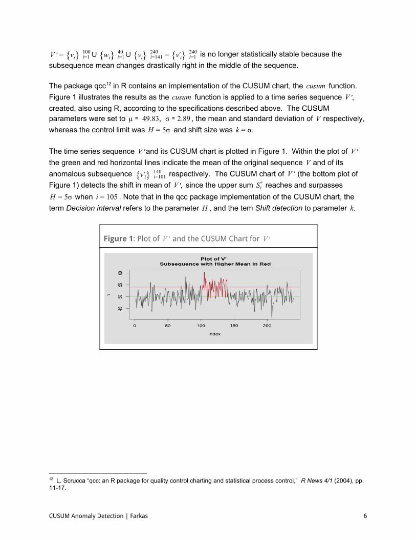
is no longer statistically stable because the∪ ∪ V ′ = v i i=1100 w i 40i=1 v i 240i=141 = v ′i i=1240 subsequence mean changes drastically right in the middle of the sequence. The package qcc in R contains an implementation of the CUSUM chart, the function.usumc 12
Figure 1 illustrates the results as the function is applied to a time series sequence usumc ,V ′ created, also using R, according to the specifications described above. The CUSUM parameters were set to , the mean and standard deviation of respectively,49.83,μ ≃ .89σ ≃2 V whereas the control limit was and shift size was σH = 5 .k = σ The time series sequence and its CUSUM chart is plotted in Figure 1. Within the plot of V ′ V ′the green and red horizontal lines indicate the mean of the original sequence and of itsV anomalous subsequence respectively. The CUSUM chart of (the bottom plot of v ′i 140i=101 V ′ Figure 1) detects the shift in mean of since the upper sum reaches and surpasses,V ′ Si
+ when . Note that in the qcc package implementation of the CUSUM chart, theσ H = 5 05i = 1
term Decision interval refers to the parameter , and the tem Shift detection to parameter H .k
Figure 1: Plot of and the CUSUM Chart for V ′ V ′
12 L. Scrucca “qcc: an R package for quality control charting and statistical process control,” R News 4/1 (2004), pp. 1117.
CUSUM Anomaly Detection | Farkas 6
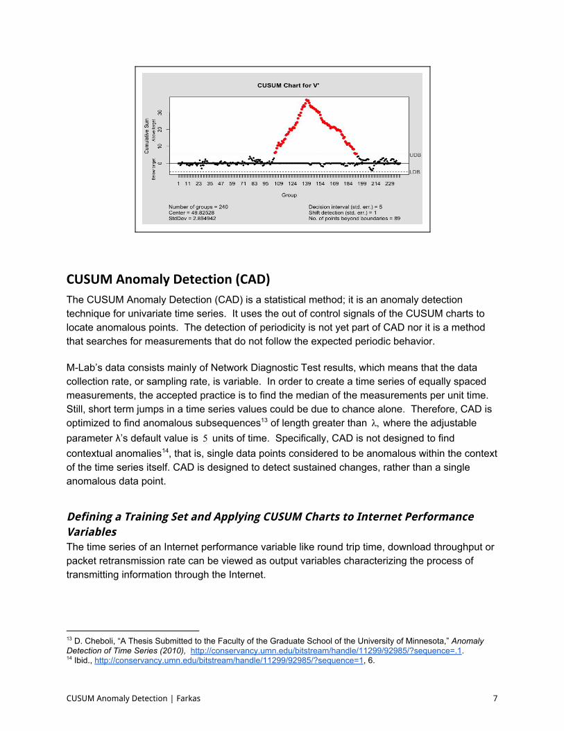
CUSUM Anomaly Detection (CAD)
The CUSUM Anomaly Detection (CAD) is a statistical method; it is an anomaly detection technique for univariate time series. It uses the out of control signals of the CUSUM charts to locate anomalous points. The detection of periodicity is not yet part of CAD nor it is a method that searches for measurements that do not follow the expected periodic behavior. MLab’s data consists mainly of Network Diagnostic Test results, which means that the data collection rate, or sampling rate, is variable. In order to create a time series of equally spaced measurements, the accepted practice is to find the median of the measurements per unit time. Still, short term jumps in a time series values could be due to chance alone. Therefore, CAD is optimized to find anomalous subsequences of length greater than where the adjustable,λ 13
parameter λ’s default value is units of time. Specifically, CAD is not designed to find5 contextual anomalies , that is, single data points considered to be anomalous within the context 14
of the time series itself. CAD is designed to detect sustained changes, rather than a single anomalous data point.
Defining a Training Set and Applying CUSUM Charts to Internet Performance Variables The time series of an Internet performance variable like round trip time, download throughput or packet retransmission rate can be viewed as output variables characterizing the process of transmitting information through the Internet.
13 D. Cheboli, “A Thesis Submitted to the Faculty of the Graduate School of the University of Minnesota,” Anomaly Detection of Time Series (2010), http://conservancy.umn.edu/bitstream/handle/11299/92985/?sequence=.1. 14 Ibid., http://conservancy.umn.edu/bitstream/handle/11299/92985/?sequence=1, 6.
CUSUM Anomaly Detection | Farkas 7
By applying the CUSUM chart to one of these time series we implicitly create a local model for the time series in question. This model defines the local “normal” for the time series, and it is defined by the following:
1. it is normally distributed 2. it has a welldefined mean and standard deviation 3. it is in statistical control
An anomaly signaled by the CUSUM chart implies a shift in the mean with respect to this local model of the Internet performance variable.
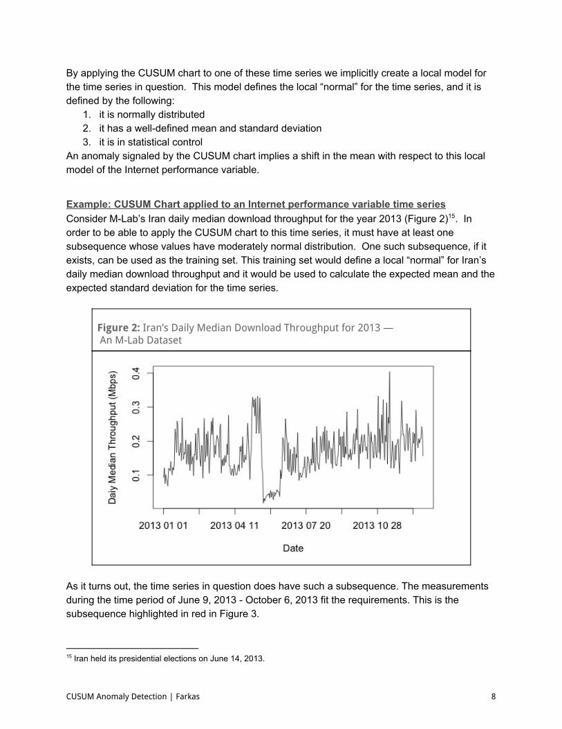
Example: CUSUM Chart applied to an Internet performance variable time series Consider MLab’s Iran daily median download throughput for the year 2013 (Figure 2) . In 15
order to be able to apply the CUSUM chart to this time series, it must have at least one subsequence whose values have moderately normal distribution. One such subsequence, if it exists, can be used as the training set. This training set would define a local “normal” for Iran’s daily median download throughput and it would be used to calculate the expected mean and the expected standard deviation for the time series.
Figure 2: Iran’s Daily Median Download Throughput for 2013 — An M-Lab Dataset
As it turns out, the time series in question does have such a subsequence. The measurements during the time period of June 9, 2013 October 6, 2013 fit the requirements. This is the subsequence highlighted in red in Figure 3.
15 Iran held its presidential elections on June 14, 2013.
CUSUM Anomaly Detection | Farkas 8
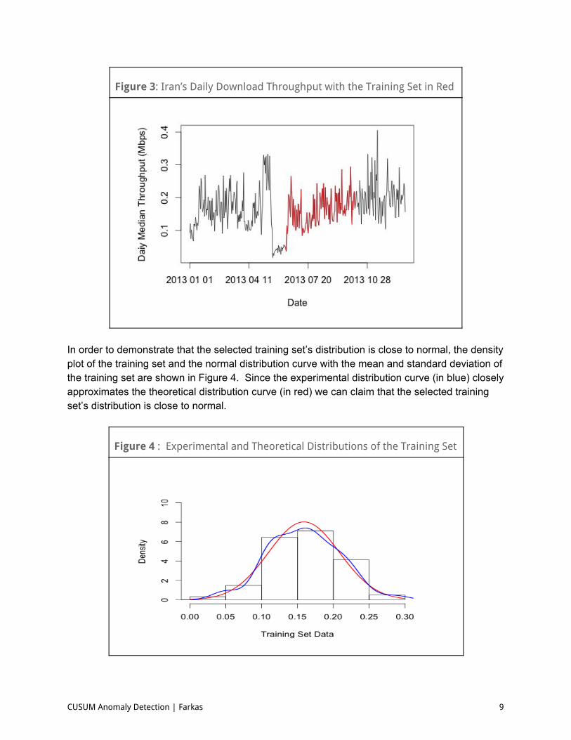
Figure 3: Iran’s Daily Download Throughput with the Training Set in Red
In order to demonstrate that the selected training set’s distribution is close to normal, the density plot of the training set and the normal distribution curve with the mean and standard deviation of the training set are shown in Figure 4. Since the experimental distribution curve (in blue) closely approximates the theoretical distribution curve (in red) we can claim that the selected training set’s distribution is close to normal.
Figure 4 : Experimental and Theoretical Distributions of the Training Set
CUSUM Anomaly Detection | Farkas 9
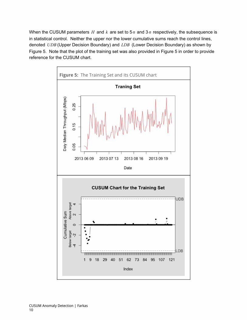
When the CUSUM parameters and are set to 5 and 3 respectively, the subsequence isH k σ σ in statistical control. Neither the upper nor the lower cumulative sums reach the control lines, denoted (Upper Decision Boundary) and (Lower Decision Boundary) as shown byDBU DBL Figure 5. Note that the plot of the training set was also provided in Figure 5 in order to provide reference for the CUSUM chart.
Figure 5: The Training Set and its CUSUM chart
CUSUM Anomaly Detection | Farkas 10
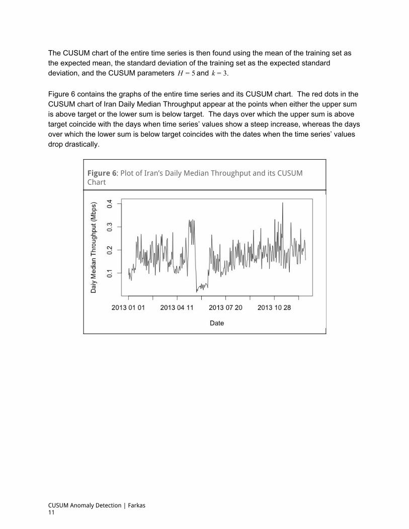
The CUSUM chart of the entire time series is then found using the mean of the training set as the expected mean, the standard deviation of the training set as the expected standard deviation, and the CUSUM parameters and H = 5 .k = 3 Figure 6 contains the graphs of the entire time series and its CUSUM chart. The red dots in the CUSUM chart of Iran Daily Median Throughput appear at the points when either the upper sum is above target or the lower sum is below target. The days over which the upper sum is above target coincide with the days when time series’ values show a steep increase, whereas the days over which the lower sum is below target coincides with the dates when the time series’ values drop drastically.
Figure 6: Plot of Iran’s Daily Median Throughput and its CUSUM Chart
CUSUM Anomaly Detection | Farkas 11
CAD’s Design
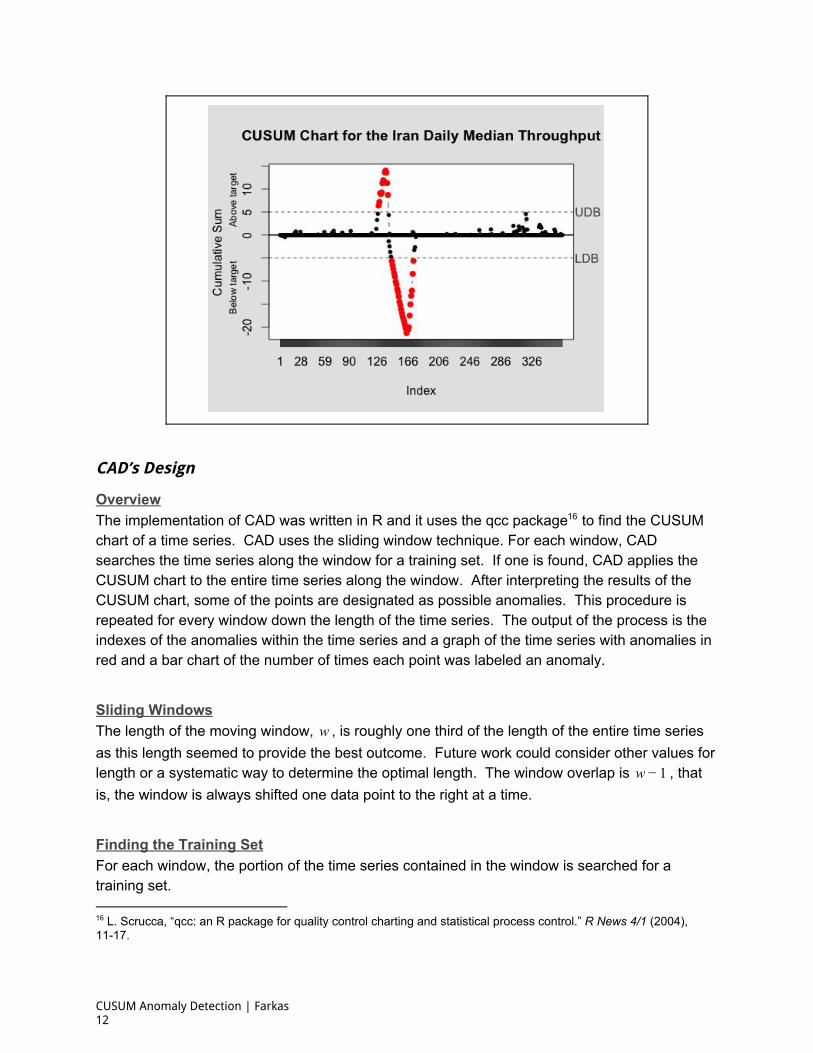
Overview The implementation of CAD was written in R and it uses the qcc package to find the CUSUM 16
chart of a time series. CAD uses the sliding window technique. For each window, CAD searches the time series along the window for a training set. If one is found, CAD applies the CUSUM chart to the entire time series along the window. After interpreting the results of the CUSUM chart, some of the points are designated as possible anomalies. This procedure is repeated for every window down the length of the time series. The output of the process is the indexes of the anomalies within the time series and a graph of the time series with anomalies in red and a bar chart of the number of times each point was labeled an anomaly.
Sliding Windows The length of the moving window, , is roughly one third of the length of the entire time seriesw as this length seemed to provide the best outcome. Future work could consider other values for length or a systematic way to determine the optimal length. The window overlap is , thatw − 1 is, the window is always shifted one data point to the right at a time.
Finding the Training Set For each window, the portion of the time series contained in the window is searched for a training set.
16 L. Scrucca, “qcc: an R package for quality control charting and statistical process control.” R News 4/1 (2004), 1117.
CUSUM Anomaly Detection | Farkas 12

The search starts with looking at all the subsequences with length . If a training set isloor f (3w) not found the length of the subsequence is decreased by one and the process repeats until either a subsequence is found that has the right properties or the subsequence length has reached .42 17
The examination of each subsequence entails calculating the pvalue of the ShapiroWilk test, that checks whether a random sample, , ,…, comes from a normal distribution. The twoy 1 y2 yN hypotheses of the ShapiroWilk test are the null hypothesis (H0)—the distribution is normal and the alternative hypothesis (Ha)—the distribution is not normal. When the p value is greater than or equal to 0.05, H0 cannot be rejected. When the p value is less than 0.05, H0 is rejected and the distribution is considered nonnormal. In this last case, the subsequence is discarded since the points of the subsequence were proven to have a nonnormal distribution. For each subsequence for which the p value is greater than or equal to the kurtosis and skewness.05,0 values are calculated, and the smallest values of the CUSUM parameters and for whichH k the subsequence is in statistical control are identified. If the set of subsequences with a given length and with a p value greater or equal than is.05 0 nonempty, the subsequence that minimizes the quantities , ,1 kewness| − s | kurtosis| − 3|
, and is chosen to be the training set.p value 1| − | ,H k If the subsequence length decreases all the way to and no suitable training set was found,42 the entire process of anomaly detection halts with the conclusion that CAD cannot be applied to the time series in question.
Applying the CUSUM Chart Once a training set, is found along with its CUSUM parameters and , the CUSUM chart,τ Hτ kτ is applied to the entire time series. The parameters for the CUSUM chart are set to the following values: , , The output of theH = Hτ k = kτ ean(τ),μ = m tandard deviation(τ).σ = s CUSUM chart is the indices of the upper sum violations (if there are any) and of the lower sum violations (if there are any) and the values of the upper and lower sums.
Interpreting the CUSUM Chart Results Given that the CUSUM chart results of the time series sequence, the potential anomalies are identified by finding the increasing subsequences of the upper sum violations of length and,λ the decreasing subsequences of the lower sum violations of length , if there are any. Theλ indices of these subsequence elements pinpoint the potential anomalies in the time series for the window in question.
17 By a statistical process control rule of thumb, 12 to 24 values are sufficient to calculate the Cusum parameters. See http://asq.org/qualityprogress/2012/07/backtobasics/smartcharting.html.
CUSUM Anomaly Detection | Farkas 13
Tuning Parameters CAD is mostly automated, however, there are still a few parameters that, although they have default values, can nonetheless be adjusted by the user. These are:
: the minimum length of the anomalous subsequences that CAD should detect; itsλ default value is Decreasing allows CAD to search for short duration sharp.5 λ increases or decreases in the time series. The minimum value of is and at thisλ 1 setting CAD will allow for the detection of single point anomalies, but with an increased risk of false positives.
: adjusts the value of the CUSUM chart applied to the main time series. It is anδ k offset, a value that is added to the CUSUM parameter . Its default value is .kτ 3 Adjusting adjusts the sensitivity of CAD, the higher the value the less sensitive CADδ gets. There is no maximal value for .δ
: the choices for this parameter are or . It determines the type ofypet pperu owerl anomaly CAD should search for. When CAD looks for subsequences ofype pper,t = u the time series with mean larger than the local mean for the time series. On the other hand, when subsequences will be labeled anomalous if their mean value isype ower,t = l below the local mean of the time series. The default setting for is ypet ower.l
CUSUM Anomaly Detection | Farkas 14
Examples and Results CAD was tested on Internet performance time series that contained known anomalous subsequences. There are two different sets of examples considered here and the data for both examples comes from MLab’s Network Diagnostic Test dataset. The first set of examples shows the results of CAD being applied to some of the time series from MLab’s ISP Interconnection and its Impact on Consumer Internet Performance study. 18
The events described within the interconnection study were identified by inspection or prior questions about where potential degradation had occurred. The data for Internet performance variables that form these time series were used by the study to show sustained degradation of broadband performance for end users. These events show up as anomalous subsequences of the Internet performance variable time series. The results will show that CAD uncovers these very same anomalies when applied to these time series. The second example uses CAD to find the anomalies resulting from a prominent case of confirmed Internet censorship that occurred in Iran, just before the presidential elections on June 14, 2013. The dataset used in the second example is also comprised of Internet performance data that is known to contain anomalies, since Iran’s government has admitted to slowing down the Internet in order to ‘preserve calm’ during the election period. 19
Example 1: CAD Applied to the Time Series from the ISP Interconnection and its Impact on Consumer Internet Performance Study The MLab Consortium Technical Report, ISP Interconnection and its Impact on Consumer Internet Performance, uncovered instances of performance degradation in the US using MLab’s NDT datasets. The decline in Internet performance can be observed as a steep drop in median download throughput and a sharp increase in the packet retransmit rate of access ISPs across some of the transit ISPs. The subsequence of the time series of the median download throughput of an ISP, corresponding to the time period over which the median download throughput values have drastically dropped is considered to be an anomalous subsequence. Similarly, the subsequence with drastically large values of the packet retransmit rate time series is an anomalous subsequence. In this example, we focused on the download throughput and packet retransmit rate data from the New York City area, concerning the customers of Time Warner Cable, Comcast, and Verizon connecting across the transit ISP Cogent. These NDT time series spanned the time period from January 1, 2012 September 30, 2014. MLab’s report demonstrated the
18 “ISP Interconnection and its Impact on Consumer Internet Performance,” Measurement Lab (2014), http://www.measurementlab.net/publications/ispinterconnectionimpact.pdf. 19 Golnaz Esfandiari, “Iran Admits Throttling Internet To ‘Preserve Calm’ During Election.” Radio Free Europe Radio Liberty. June 26, 2013. http://www.rferl.org/content/iranInternetdisruptionselection/25028696.html.
CUSUM Anomaly Detection | Farkas 15
degradation of Internet performance between April June 2013 and late February 2014. 20
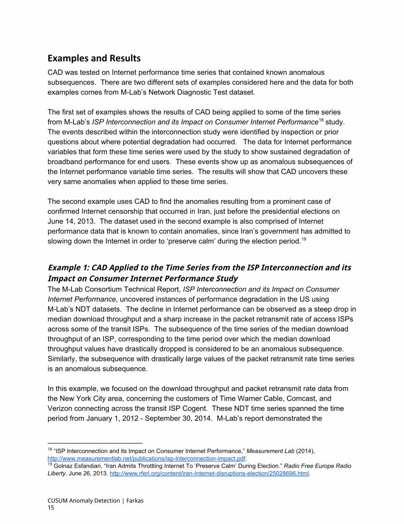
Therefore, we expected that the anomalies detected by CAD would fall into this time range as well. To start, CAD was applied to the median download throughput for Time Warner Cable across Cogent in New York. For this time series the settings were the default settings:
The detected anomalies, plotted in red in Figure 7, range over the timetype ower, , λ . = l δ = 3 = 5 periods of May 7, 2013 June 11, 2013 and July 15, 2013 February 25, 2014. These time periods are mostly in agreement with the time periods of slow Internet service demonstrated by the ISP Interconnection Study. We will not consider the June 11, 2013 July 15, 2013 gap in the list of anomalies as an error. By visual inspection of the time series, it is clear that the download throughput values of this time period are much higher than the neighboring values, both on the left and right. So, it is reasonable that the measurements in the of this time period are not labeled as lower anomalies by CAD.
Figure 7: TWC Download Throughput Using the Transit ISP Cogent in the New York City Area with Anomalies Detected by CAD in Red.
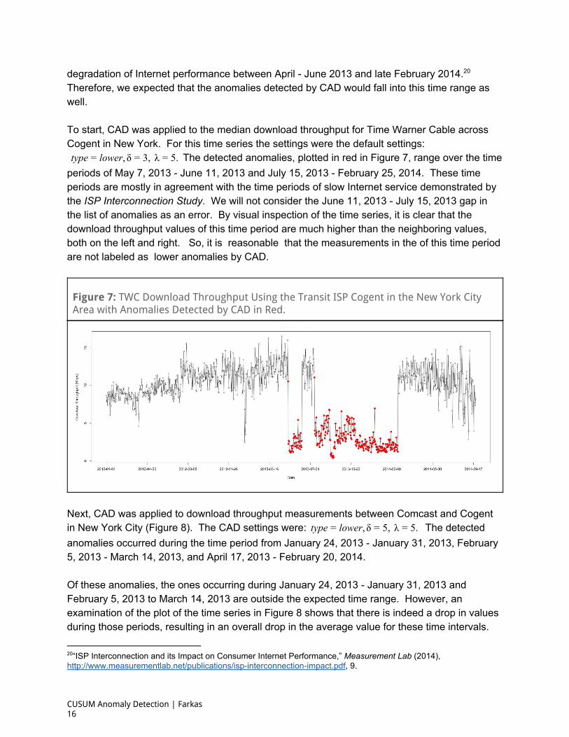
Next, CAD was applied to download throughput measurements between Comcast and Cogent in New York City (Figure 8). The CAD settings were: The detectedype ower, , λ .t = l δ = 5 = 5 anomalies occurred during the time period from January 24, 2013 January 31, 2013, February 5, 2013 March 14, 2013, and April 17, 2013 February 20, 2014. Of these anomalies, the ones occurring during January 24, 2013 January 31, 2013 and February 5, 2013 to March 14, 2013 are outside the expected time range. However, an examination of the plot of the time series in Figure 8 shows that there is indeed a drop in values during those periods, resulting in an overall drop in the average value for these time intervals.
20“ISP Interconnection and its Impact on Consumer Internet Performance,” Measurement Lab (2014), http://www.measurementlab.net/publications/ispinterconnectionimpact.pdf, 9.
CUSUM Anomaly Detection | Farkas 16
These drops in the value of the mean were significant enough that the most points in this date range retained the anomalous label for all values of the parameter ᵬ for which the points for the date range April 17, 2013 February 20, 2014 were still deemed anomalous.
Figure 8: Comcast Download Throughput Using the Transit ISP Cogent in the New York City Area with Anomalies Detected by CAD in Red.
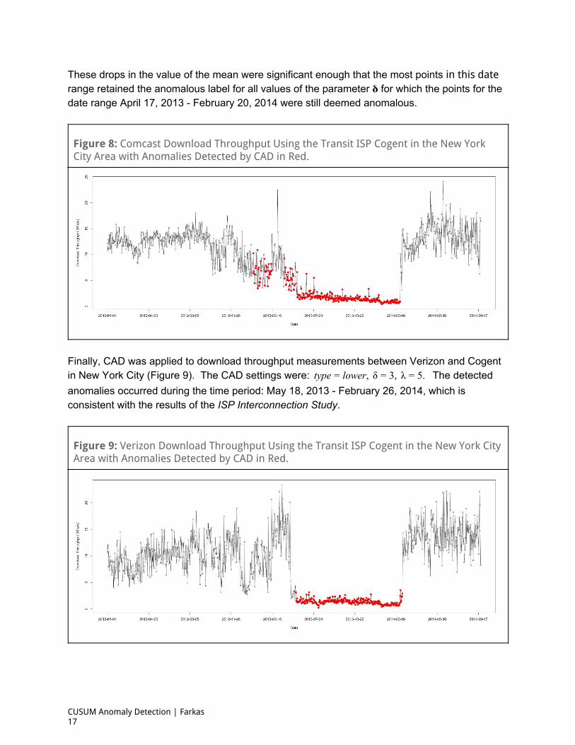
Finally, CAD was applied to download throughput measurements between Verizon and Cogent in New York City (Figure 9). The CAD settings were: The detectedype ower, δ , λ .t = l = 3 = 5 anomalies occurred during the time period: May 18, 2013 February 26, 2014, which is consistent with the results of the ISP Interconnection Study.
Figure 9: Verizon Download Throughput Using the Transit ISP Cogent in the New York City Area with Anomalies Detected by CAD in Red.
CUSUM Anomaly Detection | Farkas 17
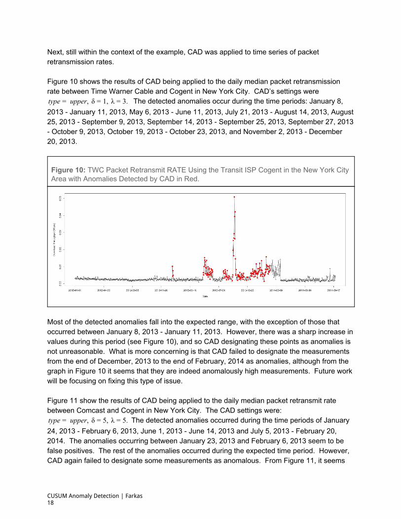
Next, still within the context of the example, CAD was applied to time series of packet retransmission rates. Figure 10 shows the results of CAD being applied to the daily median packet retransmission rate between Time Warner Cable and Cogent in New York City. CAD’s settings were
The detected anomalies occur during the time periods: January 8,ype upper, δ , λ .t = = 1 = 3 2013 January 11, 2013, May 6, 2013 June 11, 2013, July 21, 2013 August 14, 2013, August 25, 2013 September 9, 2013, September 14, 2013 September 25, 2013, September 27, 2013 October 9, 2013, October 19, 2013 October 23, 2013, and November 2, 2013 December 20, 2013.
Figure 10: TWC Packet Retransmit RATE Using the Transit ISP Cogent in the New York City Area with Anomalies Detected by CAD in Red.
Most of the detected anomalies fall into the expected range, with the exception of those that occurred between January 8, 2013 January 11, 2013. However, there was a sharp increase in values during this period (see Figure 10), and so CAD designating these points as anomalies is not unreasonable. What is more concerning is that CAD failed to designate the measurements from the end of December, 2013 to the end of February, 2014 as anomalies, although from the graph in Figure 10 it seems that they are indeed anomalously high measurements. Future work will be focusing on fixing this type of issue. Figure 11 show the results of CAD being applied to the daily median packet retransmit rate between Comcast and Cogent in New York City. The CAD settings were:
The detected anomalies occurred during the time periods of Januaryype upper, δ , λ .t = = 5 = 5 24, 2013 February 6, 2013, June 1, 2013 June 14, 2013 and July 5, 2013 February 20, 2014. The anomalies occurring between January 23, 2013 and February 6, 2013 seem to be false positives. The rest of the anomalies occurred during the expected time period. However, CAD again failed to designate some measurements as anomalous. From Figure 11, it seems
CUSUM Anomaly Detection | Farkas 18
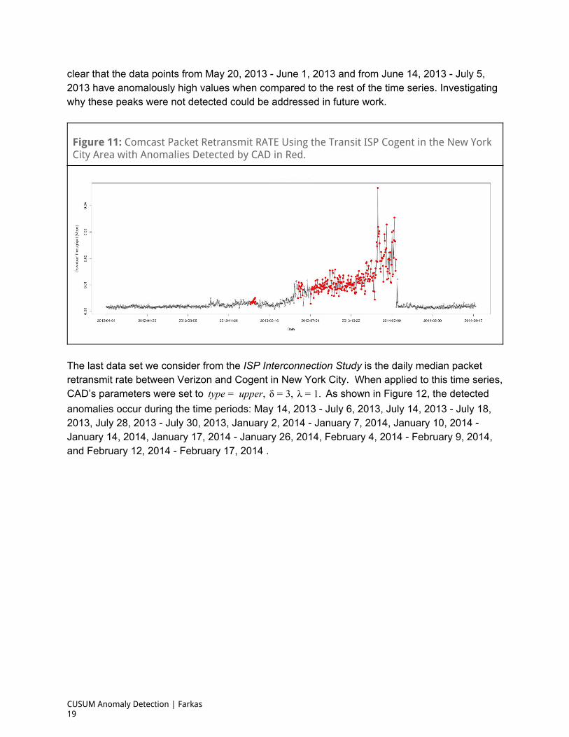
clear that the data points from May 20, 2013 June 1, 2013 and from June 14, 2013 July 5, 2013 have anomalously high values when compared to the rest of the time series. Investigating why these peaks were not detected could be addressed in future work.
Figure 11: Comcast Packet Retransmit RATE Using the Transit ISP Cogent in the New York City Area with Anomalies Detected by CAD in Red.
The last data set we consider from the ISP Interconnection Study is the daily median packet retransmit rate between Verizon and Cogent in New York City. When applied to this time series, CAD’s parameters were set to As shown in Figure 12, the detectedype upper, δ , λ .t = = 3 = 1 anomalies occur during the time periods: May 14, 2013 July 6, 2013, July 14, 2013 July 18, 2013, July 28, 2013 July 30, 2013, January 2, 2014 January 7, 2014, January 10, 2014 January 14, 2014, January 17, 2014 January 26, 2014, February 4, 2014 February 9, 2014, and February 12, 2014 February 17, 2014 .
CUSUM Anomaly Detection | Farkas 19
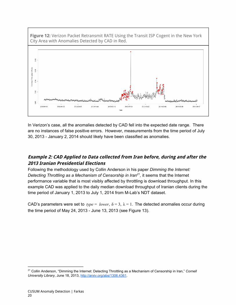
Figure 12: Verizon Packet Retransmit RATE Using the Transit ISP Cogent in the New York City Area with Anomalies Detected by CAD in Red.
In Verizon’s case, all the anomalies detected by CAD fell into the expected date range. There are no instances of false positive errors. However, measurements from the time period of July 30, 2013 January 2, 2014 should likely have been classified as anomalies.
Example 2: CAD Applied to Data collected from Iran before, during and after the 2013 Iranian Presidential Elections Following the methodology used by Collin Anderson in his paper Dimming the Internet: Detecting Throttling as a Mechanism of Censorship in Iran , it seems that the Internet 21
performance variable that is most visibly affected by throttling is download throughput. In this example CAD was applied to the daily median download throughput of Iranian clients during the time period of January 1, 2013 to July 1, 2014 from MLab’s NDT dataset. CAD’s parameters were set to The detected anomalies occur duringype lower, δ , λ .t = = 3 = 1 the time period of May 24, 2013 June 13, 2013 (see Figure 13).
21 Collin Anderson, “Dimming the Internet: Detecting Throttling as a Mechanism of Censorship in Iran,” Cornell University Library, June 18, 2013, http://arxiv.org/abs/1306.4361.
CUSUM Anomaly Detection | Farkas 20
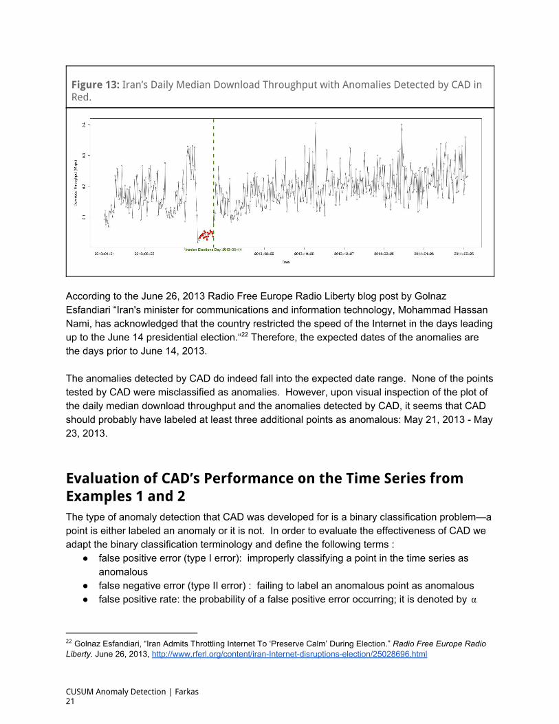
Figure 13: Iran’s Daily Median Download Throughput with Anomalies Detected by CAD in Red.
According to the June 26, 2013 Radio Free Europe Radio Liberty blog post by Golnaz Esfandiari “Iran's minister for communications and information technology, Mohammad Hassan Nami, has acknowledged that the country restricted the speed of the Internet in the days leading up to the June 14 presidential election.“ Therefore, the expected dates of the anomalies are 22
the days prior to June 14, 2013. The anomalies detected by CAD do indeed fall into the expected date range. None of the points tested by CAD were misclassified as anomalies. However, upon visual inspection of the plot of the daily median download throughput and the anomalies detected by CAD, it seems that CAD should probably have labeled at least three additional points as anomalous: May 21, 2013 May 23, 2013.
Evaluation of CAD’s Performance on the Time Series from Examples 1 and 2 The type of anomaly detection that CAD was developed for is a binary classification problem—a point is either labeled an anomaly or it is not. In order to evaluate the effectiveness of CAD we adapt the binary classification terminology and define the following terms :
false positive error (type I error): improperly classifying a point in the time series as anomalous
false negative error (type II error) : failing to label an anomalous point as anomalous false positive rate: the probability of a false positive error occurring; it is denoted by α
22 Golnaz Esfandiari, “Iran Admits Throttling Internet To ‘Preserve Calm’ During Election.” Radio Free Europe Radio Liberty. June 26, 2013, http://www.rferl.org/content/iranInternetdisruptionselection/25028696.html
CUSUM Anomaly Detection | Farkas 21
false negative rate: the probability of a false negative error occurring (the proportion of the number of points tested that result in a false negative error); it is denoted by β
specificity of the method: the quantity 1 − α sensitivity of the method: the quantity 1 − β 23
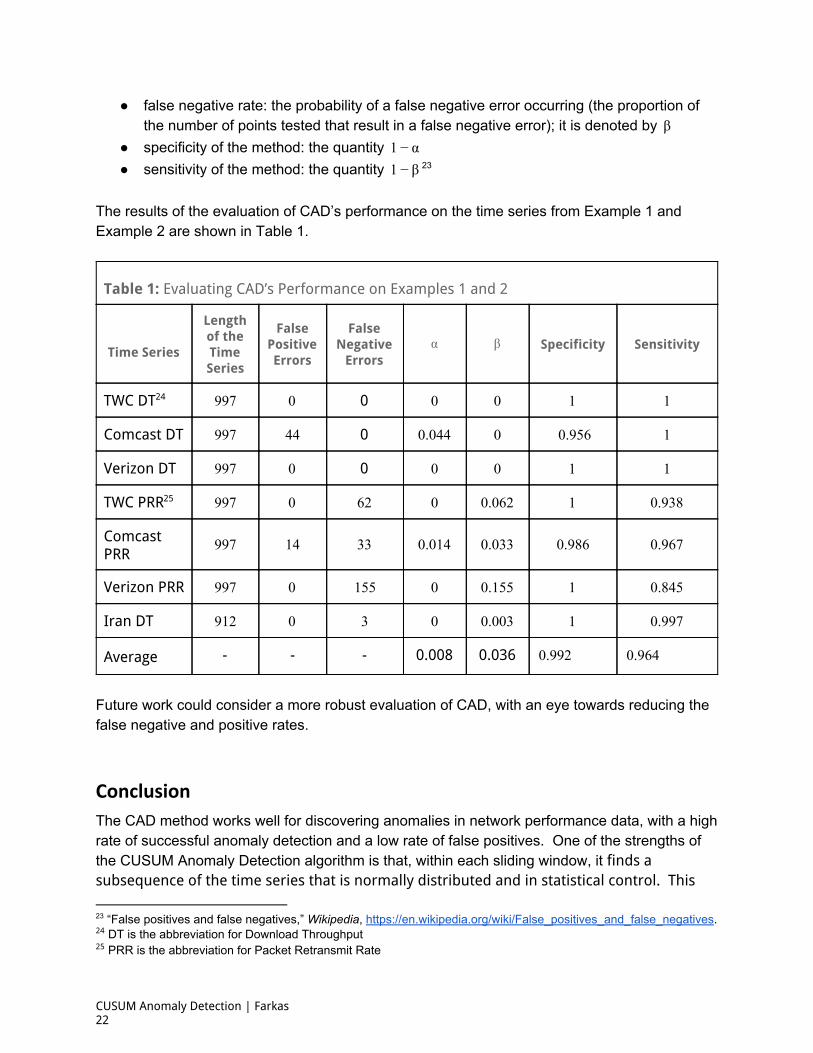
The results of the evaluation of CAD’s performance on the time series from Example 1 and Example 2 are shown in Table 1.
Table 1: Evaluating CAD’s Performance on Examples 1 and 2
Time Series
Length of the Time Series
False Positive Errors
False Negative
Errors α β Specificity Sensitivity
TWC DT 24 979 0 0 0 0 1 1
Comcast DT 979 44 0 .0440 0 0.956 1
Verizon DT 979 0 0 0 0 1 1
TWC PRR 25 979 0 26 0 .0620 1 .9380
Comcast PRR
979 41 33 .0140 .0330 .9860 .9670
Verizon PRR 979 0 551 0 .1550 1 .8450
Iran DT 129 0 3 0 .0030 1 .9970
Average - - - 0.008 0.036 .9920 .9640
Future work could consider a more robust evaluation of CAD, with an eye towards reducing the false negative and positive rates.
Conclusion
The CAD method works well for discovering anomalies in network performance data, with a high rate of successful anomaly detection and a low rate of false positives. One of the strengths of the CUSUM Anomaly Detection algorithm is that, within each sliding window, it finds a subsequence of the time series that is normally distributed and in statistical control. This
23 “False positives and false negatives,” Wikipedia, https://en.wikipedia.org/wiki/False_positives_and_false_negatives. 24 DT is the abbreviation for Download Throughput 25 PRR is the abbreviation for Packet Retransmit Rate
CUSUM Anomaly Detection | Farkas 22

subsequence then represents the normal behavior of the time series within the window and it is used as its training set. Based on this training set a CUSUM chart is created. This chart is used in identifying the statistically significant anomalies, if there are any. One of the tunable parameters of CAD, fine tunes the behavior of the CUSUM chart. The output of the algorithm,δ is a list of possible anomalies and a plot of the time series and the anomalies. Although CAD is successful when applied to the type of time series it was developed for, there are several potential limitations. CAD has not been tested outside this narrow scope, and, as an automatic process, it does not provide a list of points that can be labeled as anomalous with absolute certainty. However, it seeds the research process by producing a list of possible anomalies that the user must assess. Thereafter, the user may adjust parameters as necessary to produce more reliable results. Future work could potentially focus on reducing the need for tunable parameters and extending its application domain to a more general category of univariate time series.
CUSUM Anomaly Detection | Farkas 23
Appendix
CAD was tested on additional examples.
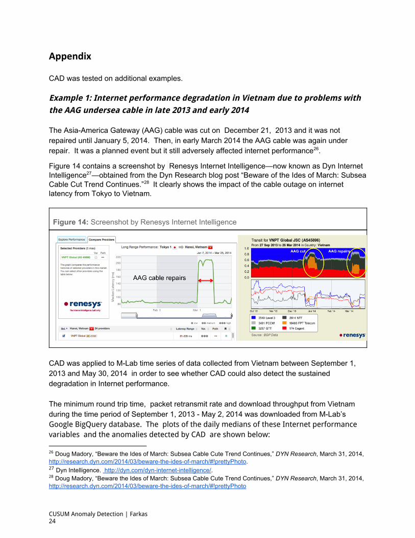
Example 1: Internet performance degradation in Vietnam due to problems with the AAG undersea cable in late 2013 and early 2014
The AsiaAmerica Gateway (AAG) cable was cut on December 21, 2013 and it was not repaired until January 5, 2014. Then, in early March 2014 the AAG cable was again under repair. It was a planned event but it still adversely affected internet performance . 26
Figure 14 contains a screenshot by Renesys Internet Intelligence—now known as Dyn Internet Intelligence —obtained from the Dyn Research blog post “Beware of the Ides of March: Subsea 27
Cable Cut Trend Continues.” It clearly shows the impact of the cable outage on internet 28
latency from Tokyo to Vietnam.
Figure 14: Screenshot by Renesys Internet Intelligence
CAD was applied to MLab time series of data collected from Vietnam between September 1, 2013 and May 30, 2014 in order to see whether CAD could also detect the sustained degradation in Internet performance. The minimum round trip time, packet retransmit rate and download throughput from Vietnam during the time period of September 1, 2013 May 2, 2014 was downloaded from MLab’s Google BigQuery database. The plots of the daily medians of these Internet performance variables and the anomalies detected by CAD are shown below:
26 Doug Madory, “Beware the Ides of March: Subsea Cable Cute Trend Continues,” DYN Research, March 31, 2014, http://research.dyn.com/2014/03/bewaretheidesofmarch/#!prettyPhoto. 27 Dyn Intelligence. http://dyn.com/dyninternetintelligence/. 28 Doug Madory, “Beware the Ides of March: Subsea Cable Cute Trend Continues,” DYN Research, March 31, 2014, http://research.dyn.com/2014/03/bewaretheidesofmarch/#!prettyPhoto
CUSUM Anomaly Detection | Farkas 24
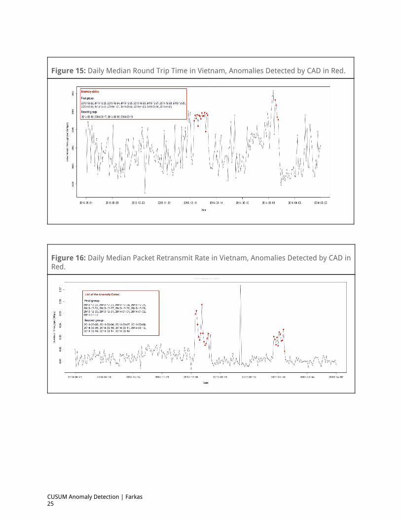
Figure 15: Daily Median Round Trip Time in Vietnam, Anomalies Detected by CAD in Red.
Figure 16: Daily Median Packet Retransmit Rate in Vietnam, Anomalies Detected by CAD in Red.
CUSUM Anomaly Detection | Farkas 25
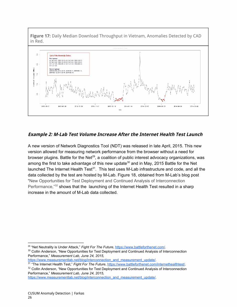
Figure 17: Daily Median Download Throughput in Vietnam, Anomalies Detected by CAD in Red.
Example 2: M-Lab Test Volume Increase After the Internet Health Test Launch
A new version of Network Diagnostics Tool (NDT) was released in late April, 2015. This new version allowed for measuring network performance from the browser without a need for browser plugins. Battle for the Net , a coalition of public interest advocacy organizations, was 29
among the first to take advantage of this new update and in May, 2015 Battle for the Net 30
launched The Internet Health Test . This test uses MLab infrastructure and code, and all the 31
data collected by the test are hosted by MLab. Figure 18, obtained from MLab’s blog post “New Opportunities for Test Deployment and Continued Analysis of Interconnection Performance,” shows that the launching of the Internet Health Test resulted in a sharp 32
increase in the amount of MLab data collected.
29 “Net Neutrality is Under Attack,” Fight For The Future, https://www.battleforthenet.com/. 30 Collin Anderson, “New Opportunities for Test Deployment and Continued Analysis of Interconnection Performance,” Measurement Lab, June 24, 2015, https://www.measurementlab.net/blog/interconnection_and_measurement_update/. 31 “The Internet Health Test,” Fight For The Future, https://www.battleforthenet.com/internethealthtest/. 32 Collin Anderson, “New Opportunities for Test Deployment and Continued Analysis of Interconnection Performance,” Measurement Lab, June 24, 2015, https://www.measurementlab.net/blog/interconnection_and_measurement_update/.
CUSUM Anomaly Detection | Farkas 26
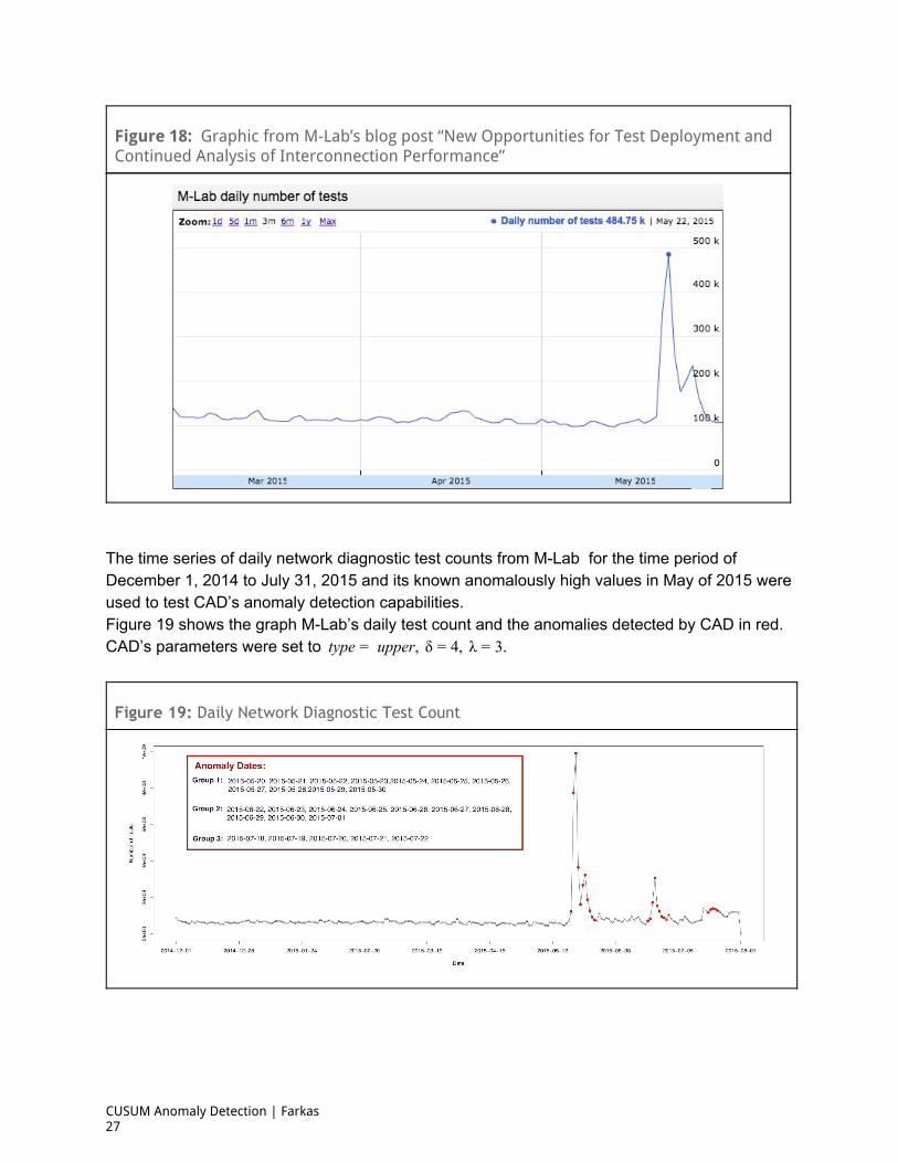
Figure 18: Graphic from M-Lab’s blog post “New Opportunities for Test Deployment and Continued Analysis of Interconnection Performance”
The time series of daily network diagnostic test counts from MLab for the time period of December 1, 2014 to July 31, 2015 and its known anomalously high values in May of 2015 were used to test CAD’s anomaly detection capabilities. Figure 19 shows the graph MLab’s daily test count and the anomalies detected by CAD in red. CAD’s parameters were set to ype upper, δ , λ .t = = 4 = 3
Figure 19: Daily Network Diagnostic Test Count
CUSUM Anomaly Detection | Farkas 27

About the Author Kinga Farkas is a data science consultant for Fast Forward, Inc. and Sperling’s Best Places. In her current job, Kinga uses various machine learning techniques for the predictive analysis of a diverse set of demographic and socioeconomic data. She was an Outreachy data science intern at MLab during MayAugust 2015. It was during this period that she created CAD, the CUSUM Anomaly Detection method. A mathematician by training, Kinga holds an MS in mathematics , a BS and mathematics and a BS in physics from Oregon State University. She has done further graduate level work in algebraic number theory, algebraic geometry and elliptic curve cryptography at the same institution. Kinga writes about her data science escapades in her blog at : http://nthturn.com/. The R code for CAD can be found here: https://github.com/kingakfarkas/CAD.
© 2016 Measurement Lab
CUSUM Anomaly Detection | Farkas 28
![Comparison of Unsupervised Anomaly Detection Techniques · a RapidMiner [10] Extension Anomaly Detection was developed that contains several unsupervised anomaly detection techniques](https://img.pdfslide.net/doc/110x75/5b014b8c7f8b9a952f8e25e8/comparison-of-unsupervised-anomaly-detection-rapidminer-10-extension-anomaly-detection.jpg)


![Troubleshooting web sessions with CUSUM · Change point detection; CUSUM; Anomaly Detection. I. INTRODUCTION The 2014 Akamai State of the Internet report [1] shows more than 788 million](https://img.pdfslide.net/doc/110x75/5fb2bb7a5e2eba621c4aacdc/troubleshooting-web-sessions-with-change-point-detection-cusum-anomaly-detection.jpg)


![Anomaly Detection: Principles, Benchmarking, Explanation ...web.engr.oregonstate.edu/~tgd/...anomaly-detection... · Towards a Theory of Anomaly Detection [Siddiqui, et al.; UAI 2016]](https://img.pdfslide.net/doc/110x75/5fd8992320a65f059c333c6d/anomaly-detection-principles-benchmarking-explanation-webengr-tgdanomaly-detection.jpg)