Embed Size (px)
Citation preview
TURNING ICEBERGS INTO ICE CUBES Stephanie Slobodian Mobile UX Director Marriott Int.
Over 17 years designing experiences for Google, IBM, NPR, Critical Mass and Marriott.

Kaytee NesmithMichael Mooney
Design Partners in Crime
Today 1. Solve the right problem
2. Hypothesis creation
3. Recommendations and managing work
4. Illustrate vision & inspire
5. Celebrate unconventional success
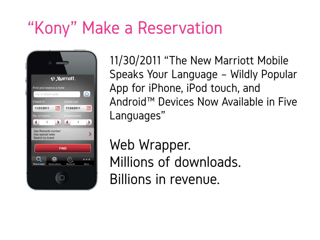
11/30/2011 “The New Marriott Mobile Speaks Your Language – Wildly Popular App for iPhone, iPod touch, and Android™ Devices Now Available in Five Languages”
Web Wrapper. Millions of downloads. Billions in revenue.
“Kony” Make a Reservation
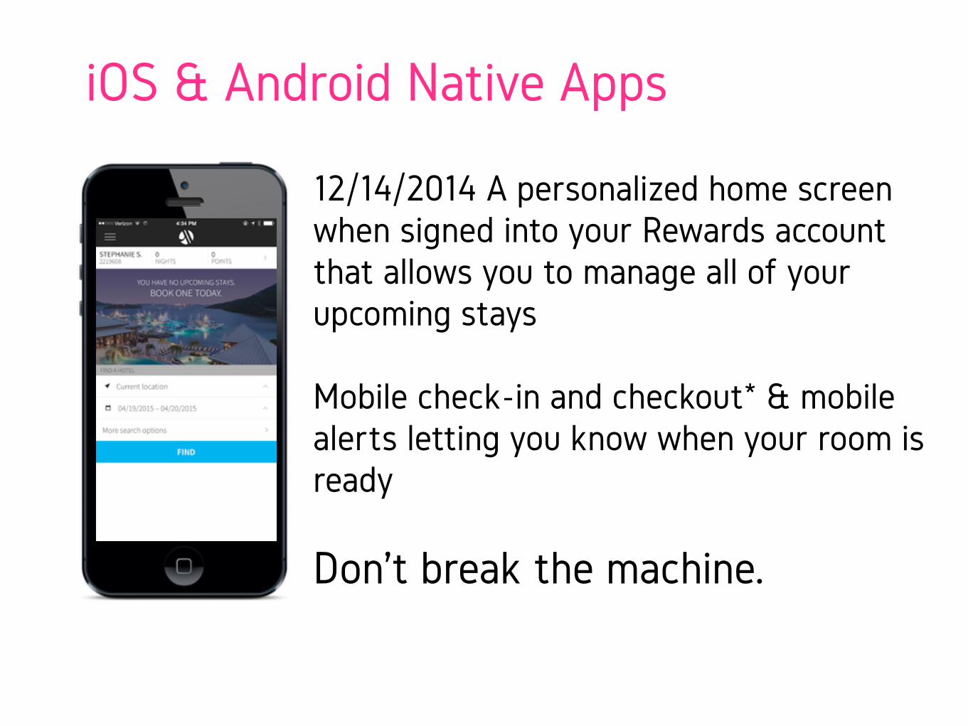
iOS & Android Native Apps
12/14/2014 A personalized home screen when signed into your Rewards account that allows you to manage all of your upcoming stays
Mobile check-in and checkout* & mobile alerts letting you know when your room is ready
Don’t break the machine.
Launch. Cross fingers. Wait for data.
We seem to have a problem…
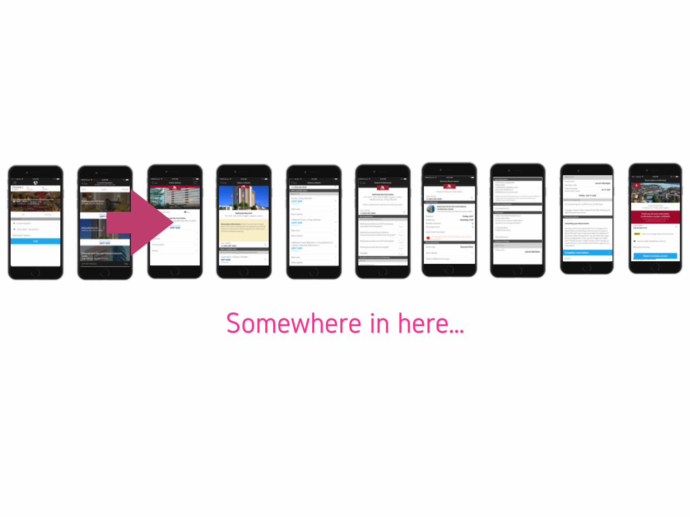
Somewhere in here…
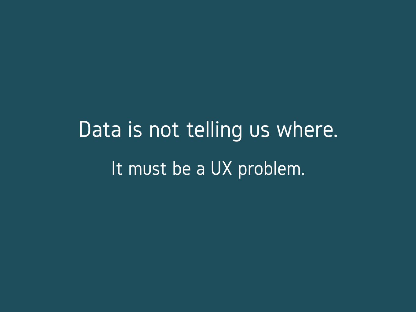
Data is not telling us where.
It must be a UX problem.
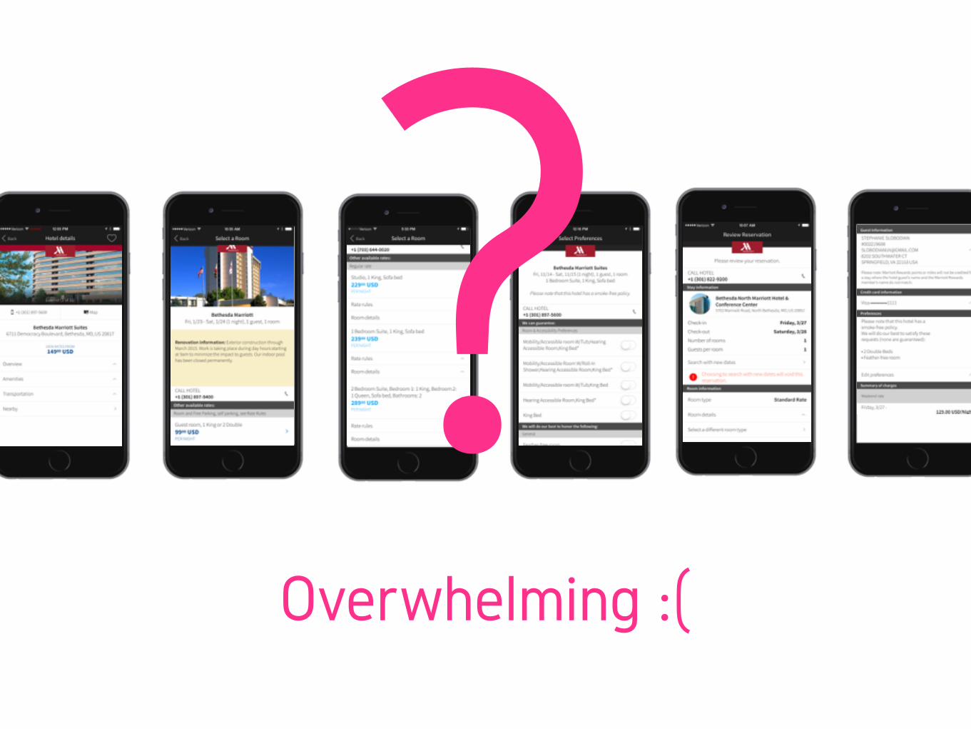
Overwhelming :(
?

Winnipeg, Canada -30 F
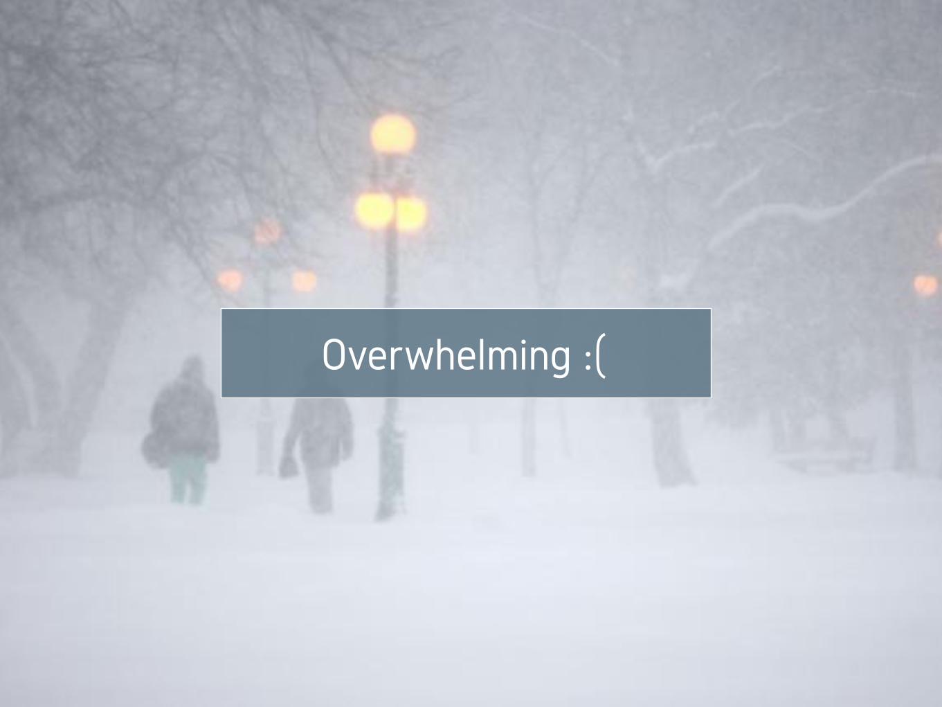
Overwhelming :(

What would a Winnipeg’er do?
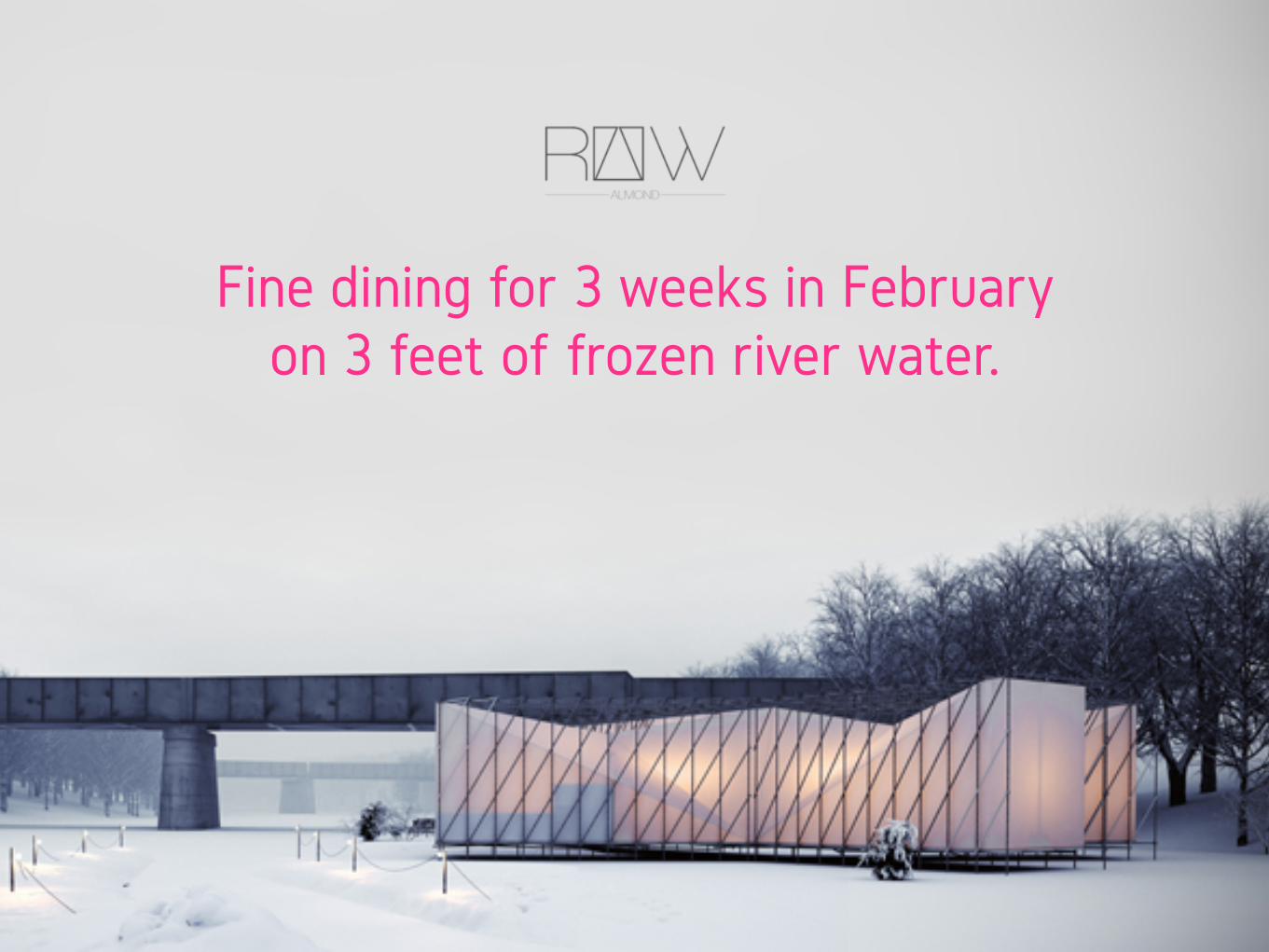
Fine dining for 3 weeks in February on 3 feet of frozen river water.
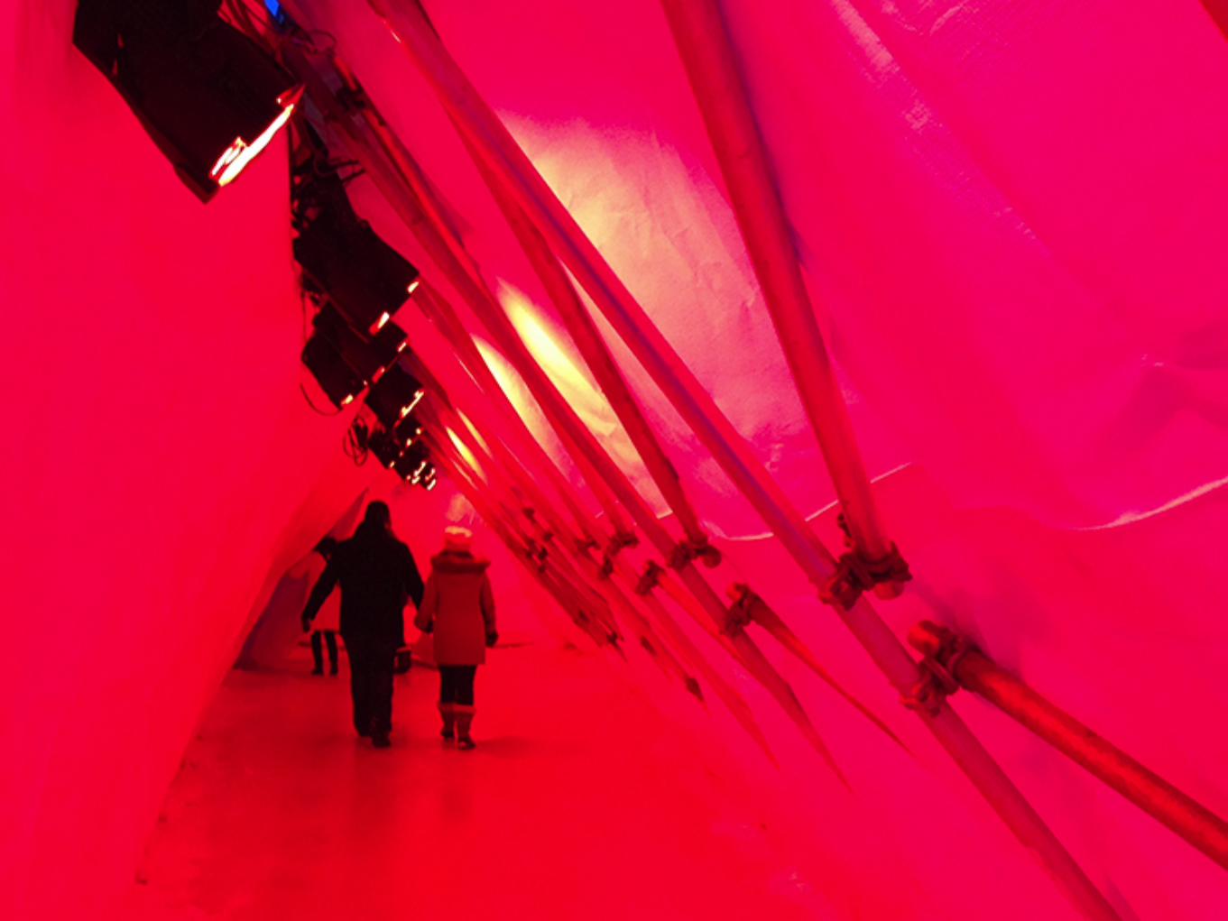


Winnipeg Warming Huts
Art + Architecture Competition on Ice
What would a Winnipeg’er do?
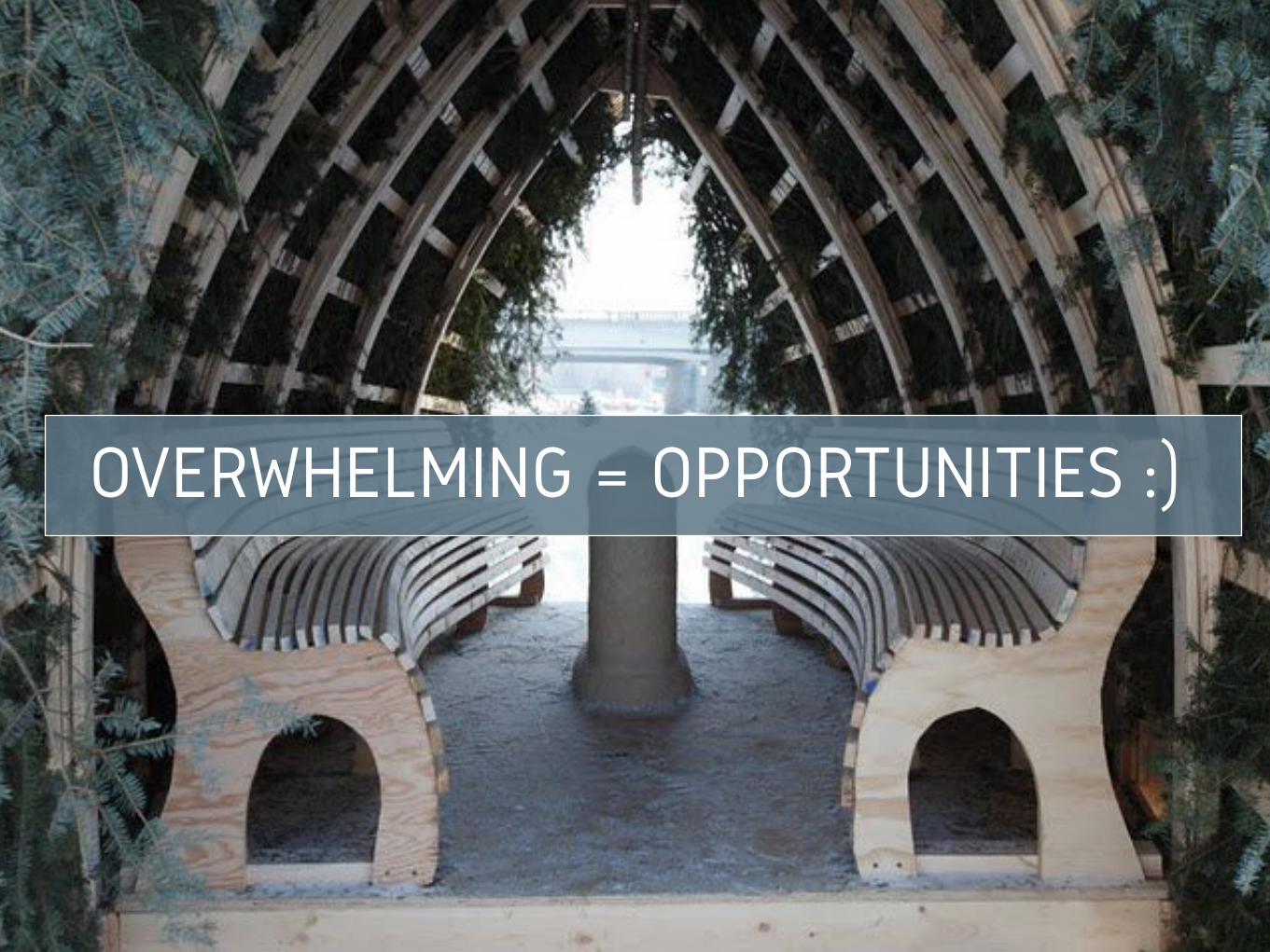
OVERWHELMING = OPPORTUNITIES :)
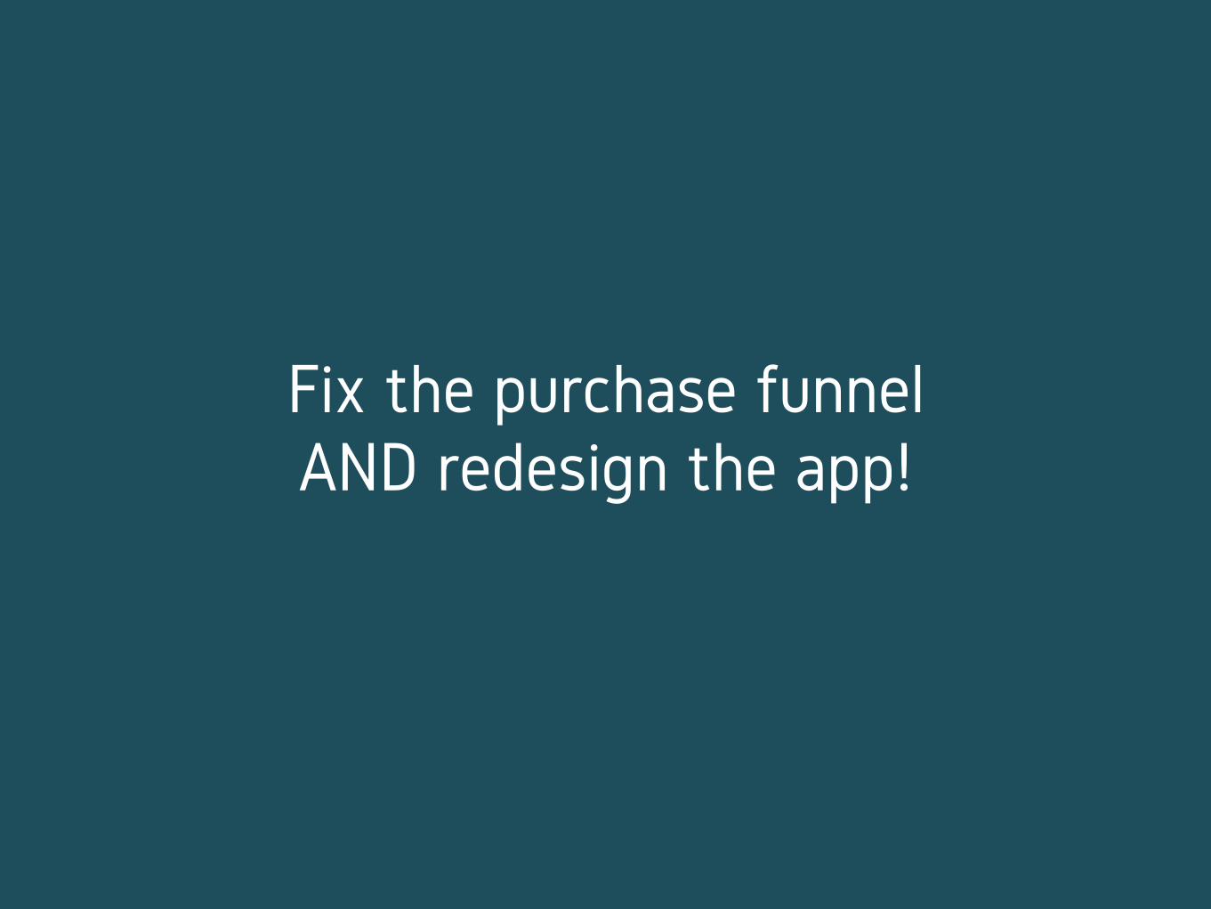
Fix the purchase funnel AND redesign the app!
Shushhhh. Don’t tell anyone ;)

#1 SOLVE THE RIGHT PROBLEM(S)
Where do YOU think the problem is?
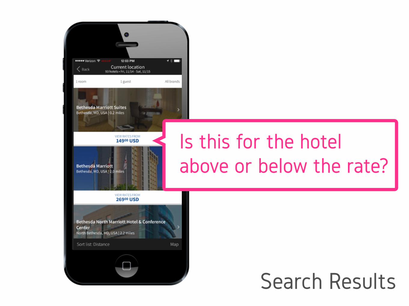
Is this for the hotel above or below the rate?
Search Results
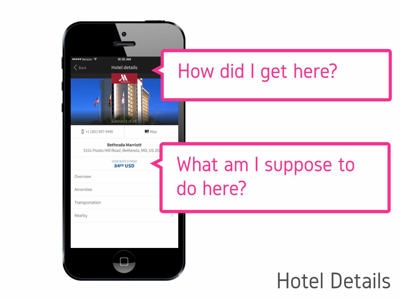
How did I get here?
What am I suppose to do here?
Hotel Details
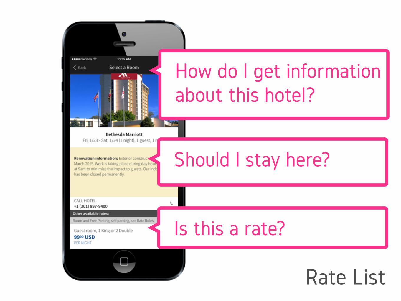
How do I get information about this hotel?
Should I stay here?
Is this a rate?
Rate List
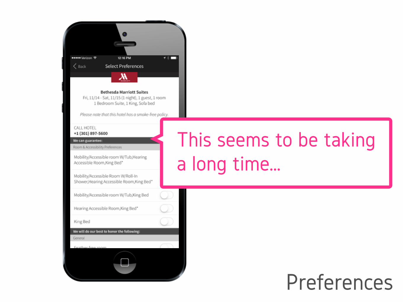
This seems to be taking a long time…
Preferences
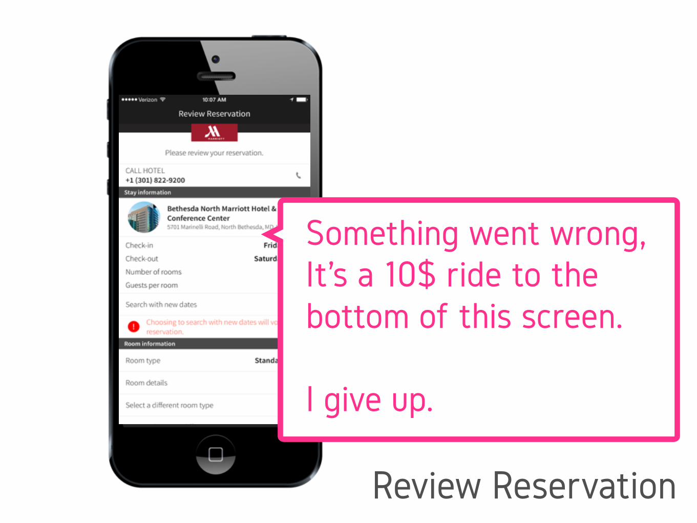
Something went wrong, It’s a 10$ ride to the bottom of this screen.
I give up.
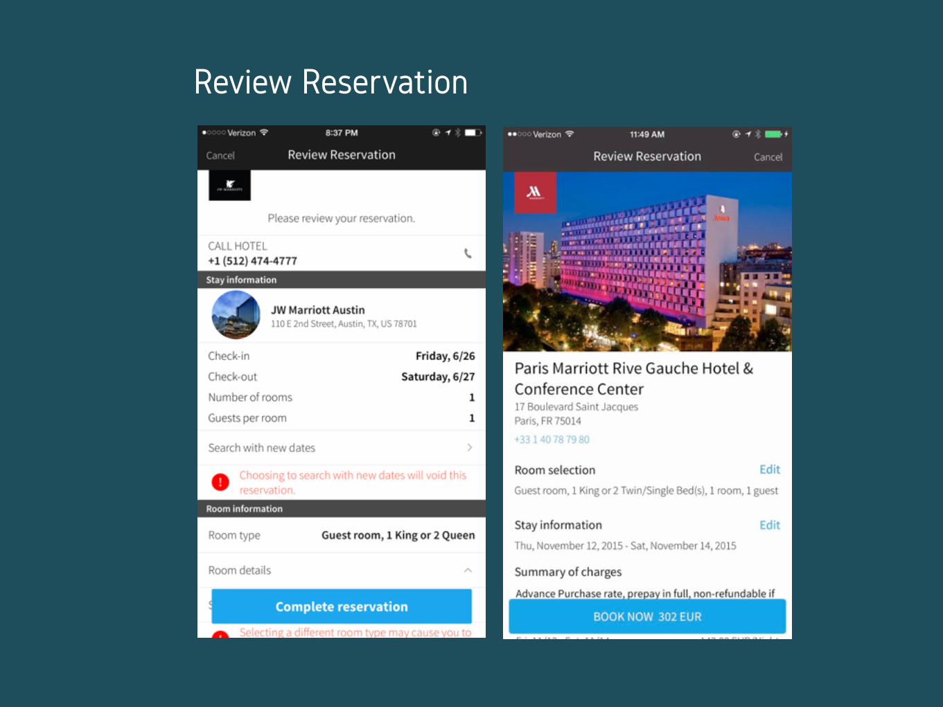
Review Reservation

#2 HYPOTHESIS CREATION
HYPOTHOSIS CREATION
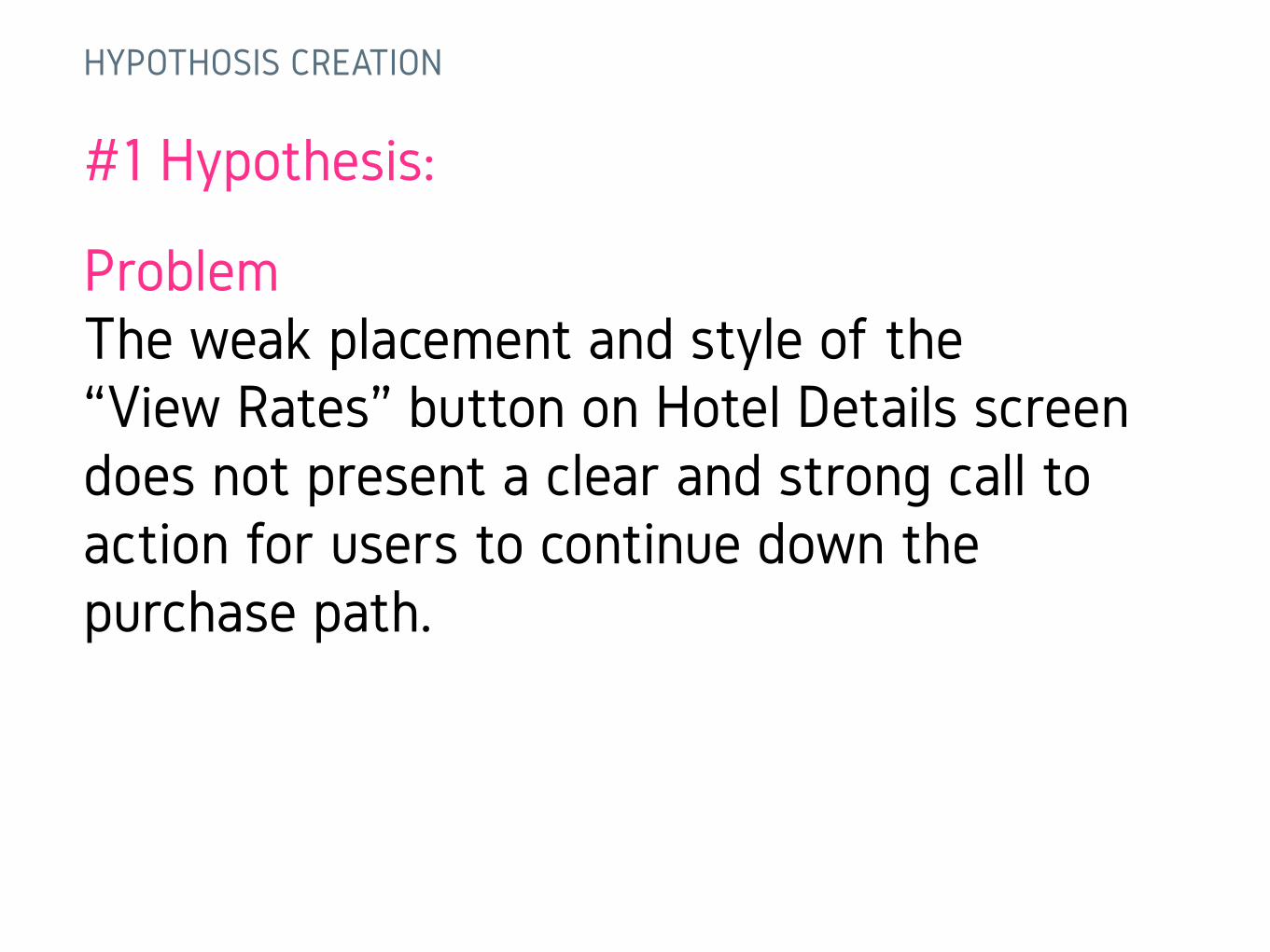
#1 Hypothesis:
Problem The weak placement and style of the “View Rates” button on Hotel Details screen does not present a clear and strong call to action for users to continue down the purchase path.
HYPOTHOSIS CREATION
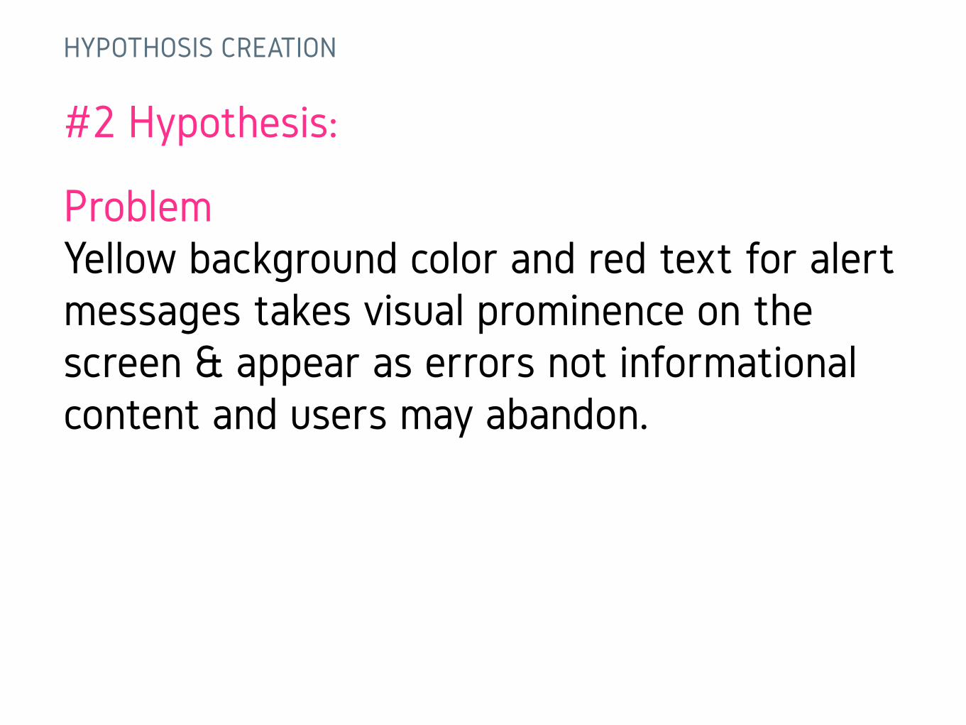
#2 Hypothesis:
Problem Yellow background color and red text for alert messages takes visual prominence on the screen & appear as errors not informational content and users may abandon.
HYPOTHOSIS CREATION
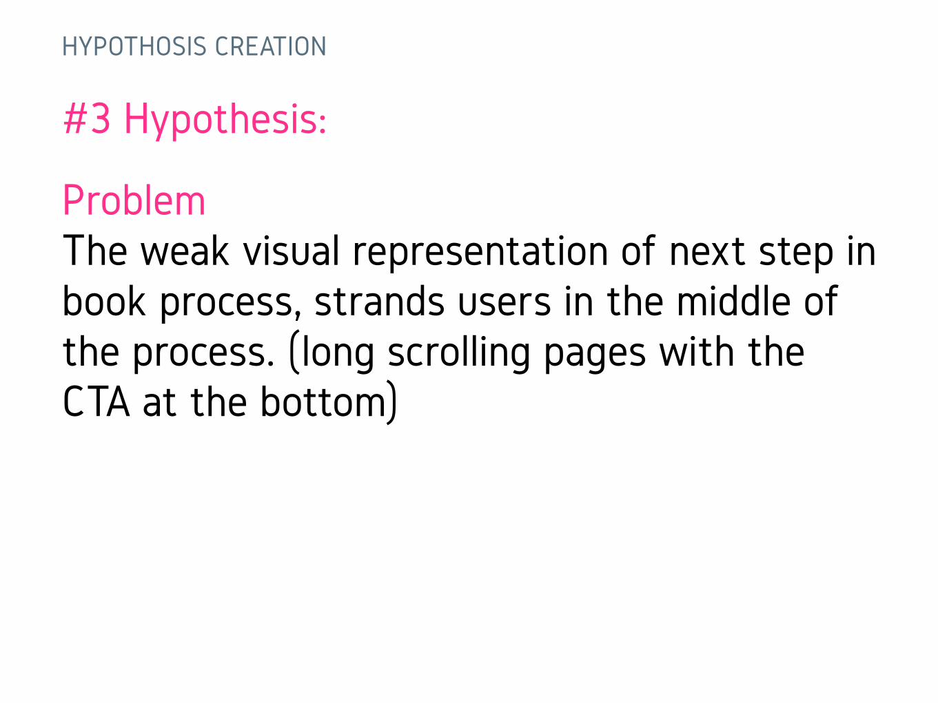
#3 Hypothesis:
Problem The weak visual representation of next step in book process, strands users in the middle of the process. (long scrolling pages with the CTA at the bottom)
HYPOTHOSIS CREATION
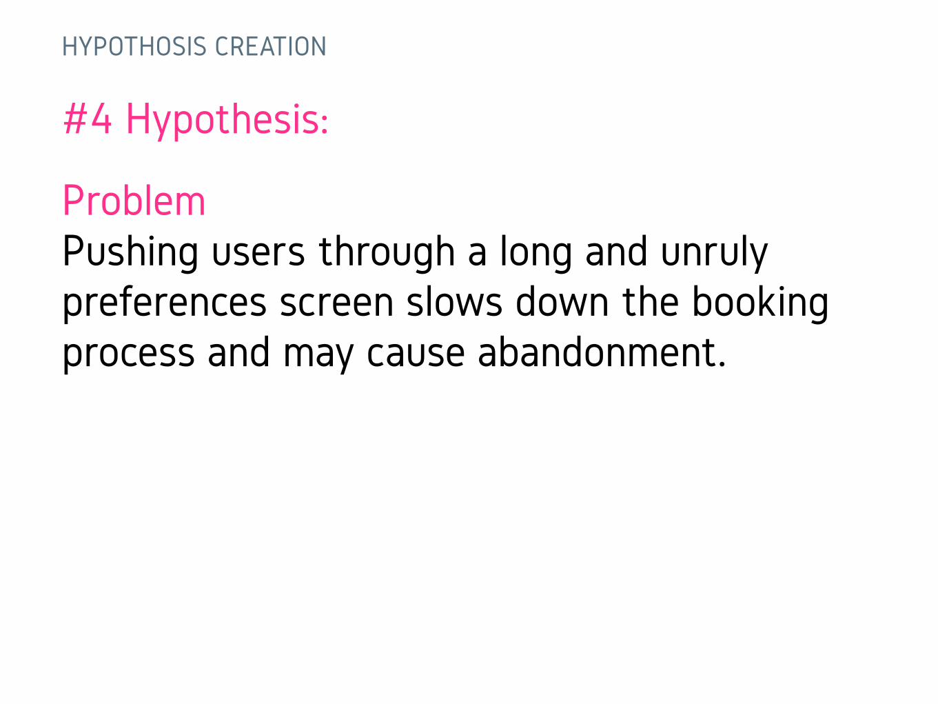
#4 Hypothesis:
Problem Pushing users through a long and unruly preferences screen slows down the booking process and may cause abandonment.
Now go test your hypothesis…
User Testing Rounds 1, 2 & 3
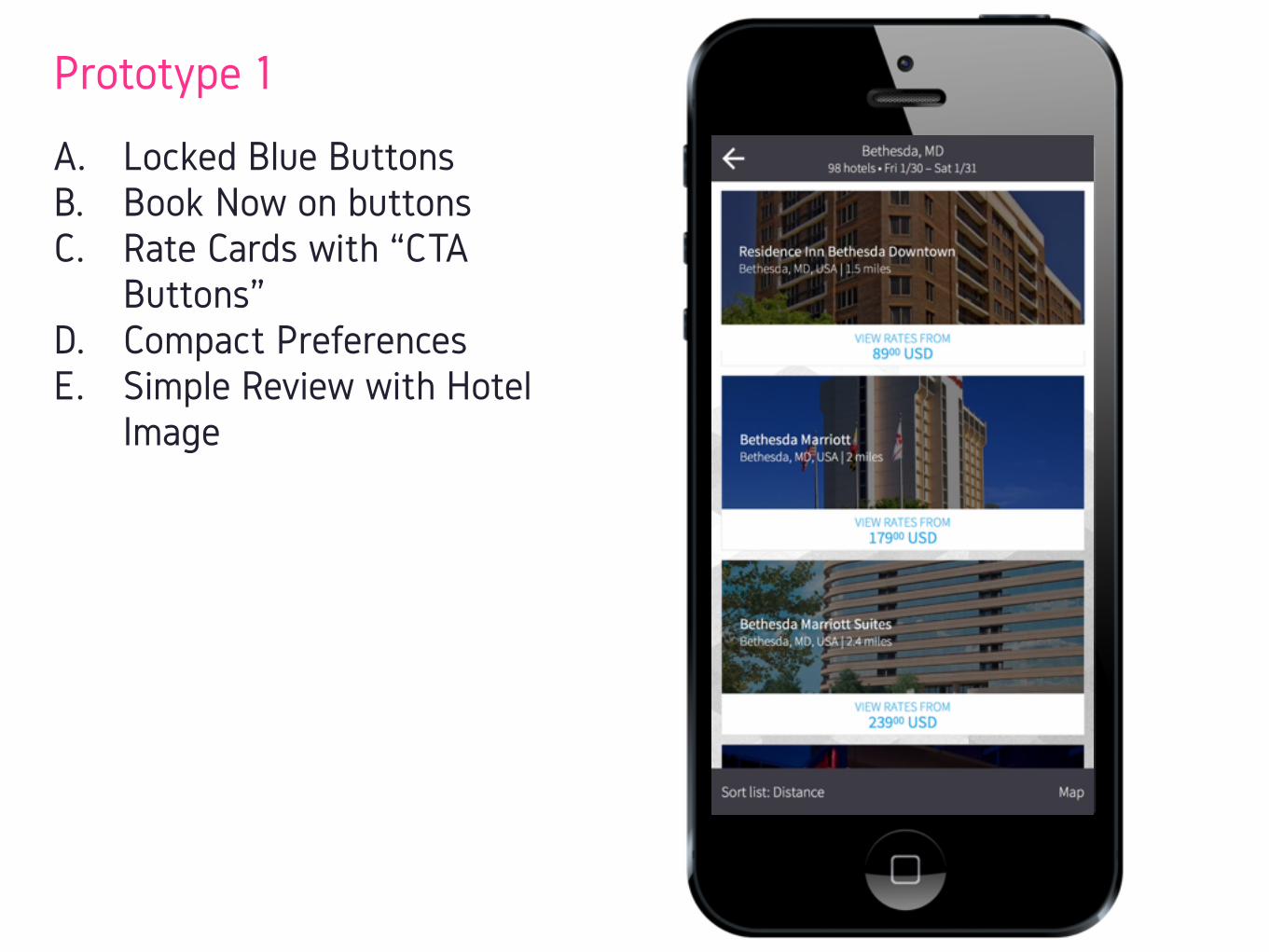
Prototype 1
A. Locked Blue Buttons B. Book Now on buttons C. Rate Cards with “CTA
Buttons” D. Compact Preferences E. Simple Review with Hotel
Image
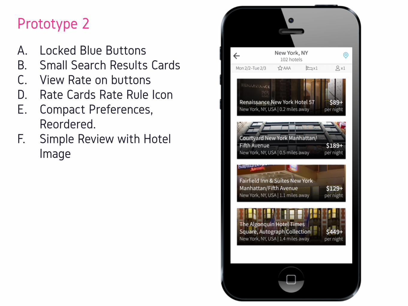
Prototype 2
A. Locked Blue Buttons B. Small Search Results Cards C. View Rate on buttons D. Rate Cards Rate Rule Icon E. Compact Preferences,
Reordered. F. Simple Review with Hotel
Image
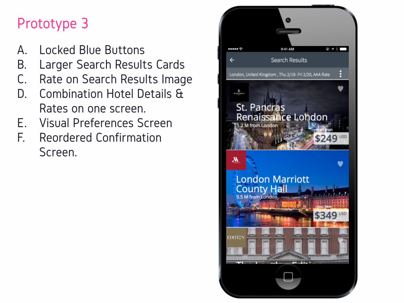
Prototype 3
A. Locked Blue Buttons B. Larger Search Results Cards C. Rate on Search Results Image D. Combination Hotel Details &
Rates on one screen. E. Visual Preferences Screen F. Reordered Confirmation
Screen.
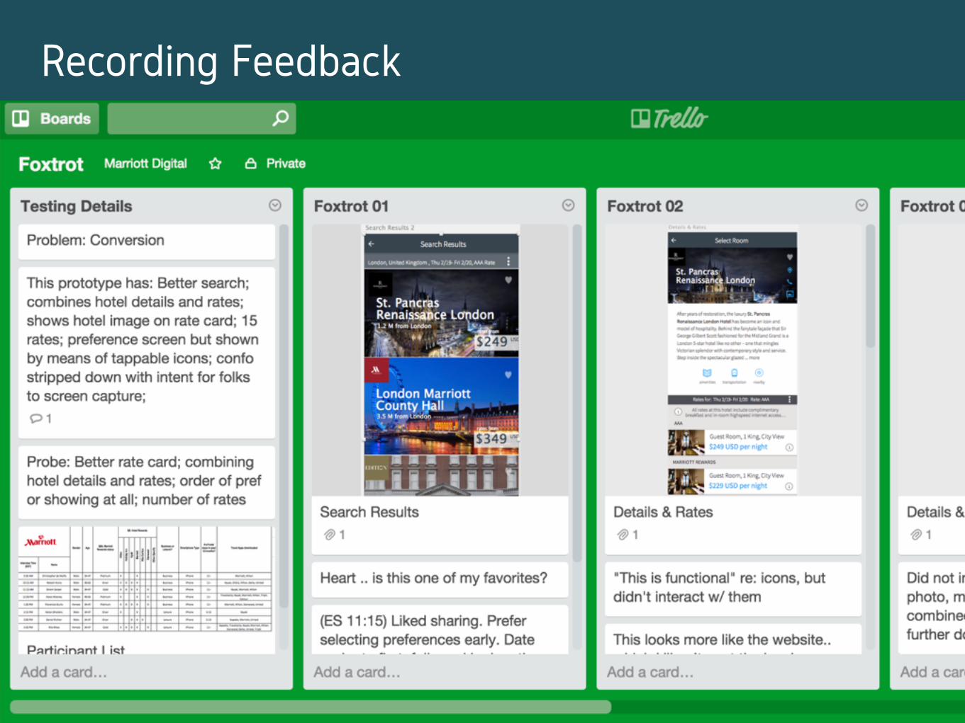
Trello
Recording Feedback
#3 RECOMMENDATIONS & MANAGING WORK
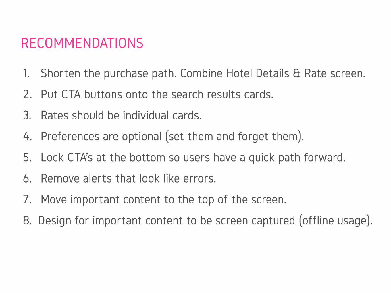
1. Shorten the purchase path. Combine Hotel Details & Rate screen.
2. Put CTA buttons onto the search results cards.
3. Rates should be individual cards.
4. Preferences are optional (set them and forget them).
5. Lock CTA’s at the bottom so users have a quick path forward.
6. Remove alerts that look like errors.
7. Move important content to the top of the screen.
8. Design for important content to be screen captured (offline usage).
RECOMMENDATIONS
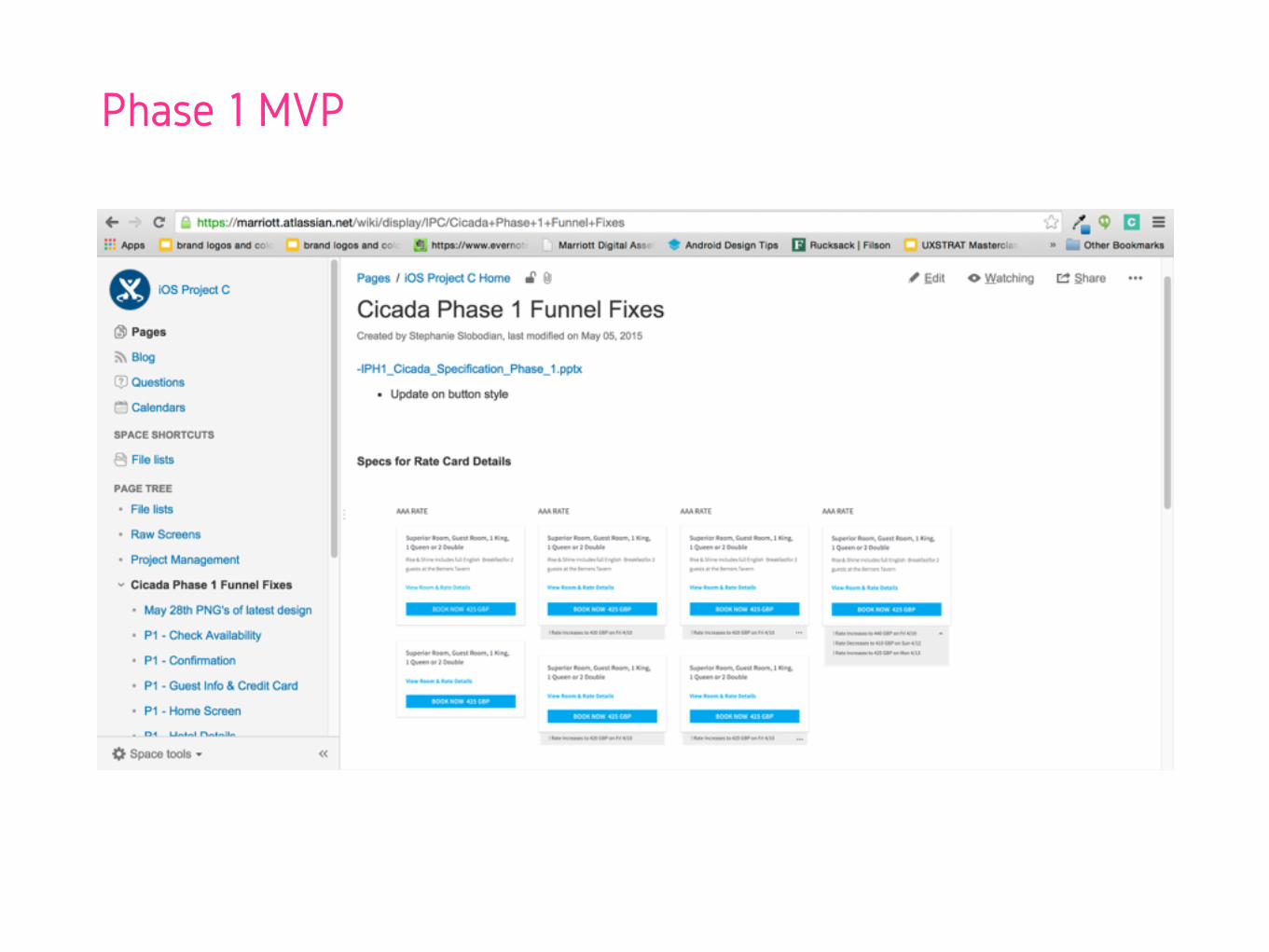
Phase 1 MVP
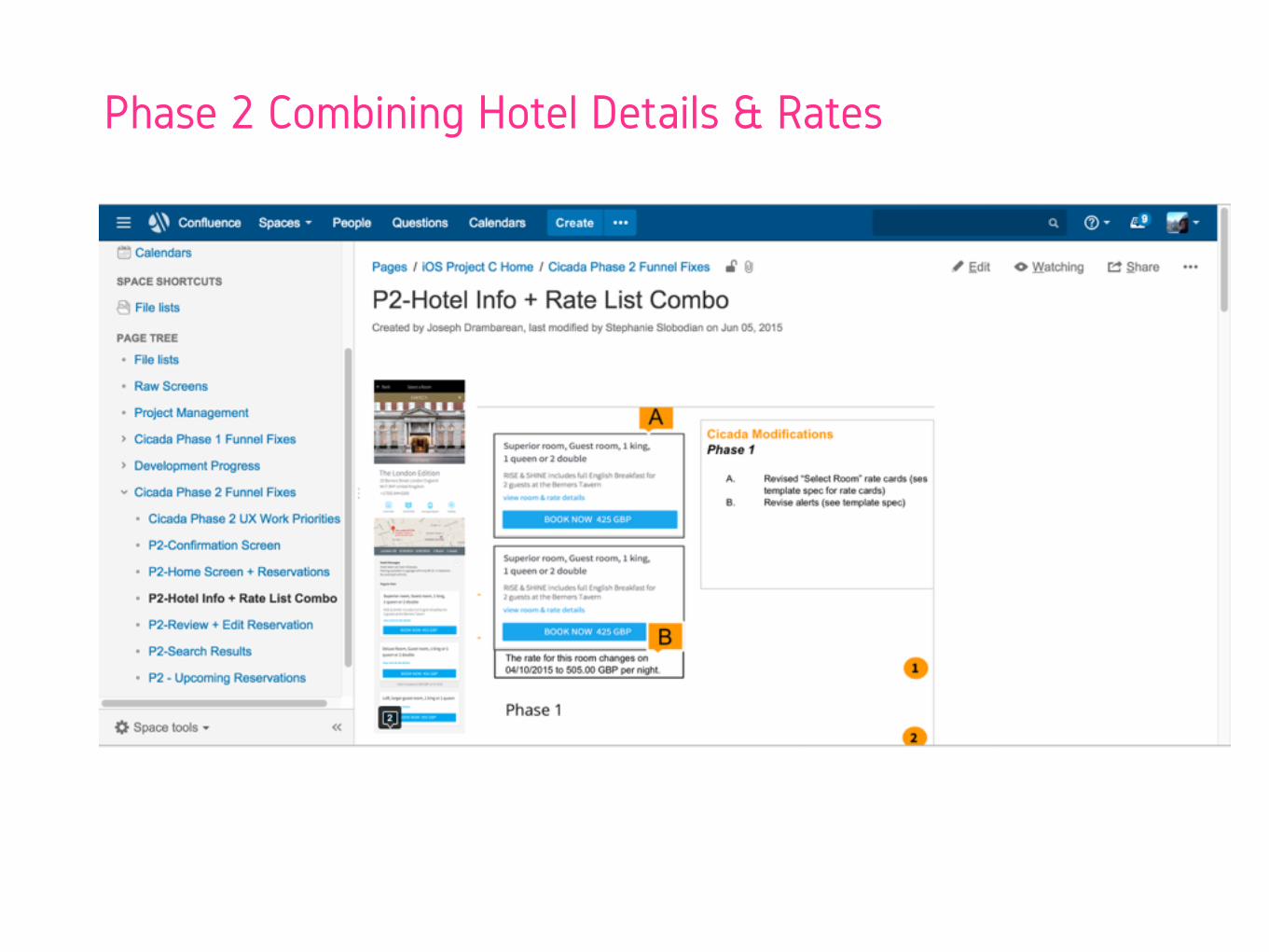
Phase 2 Combining Hotel Details & Rates
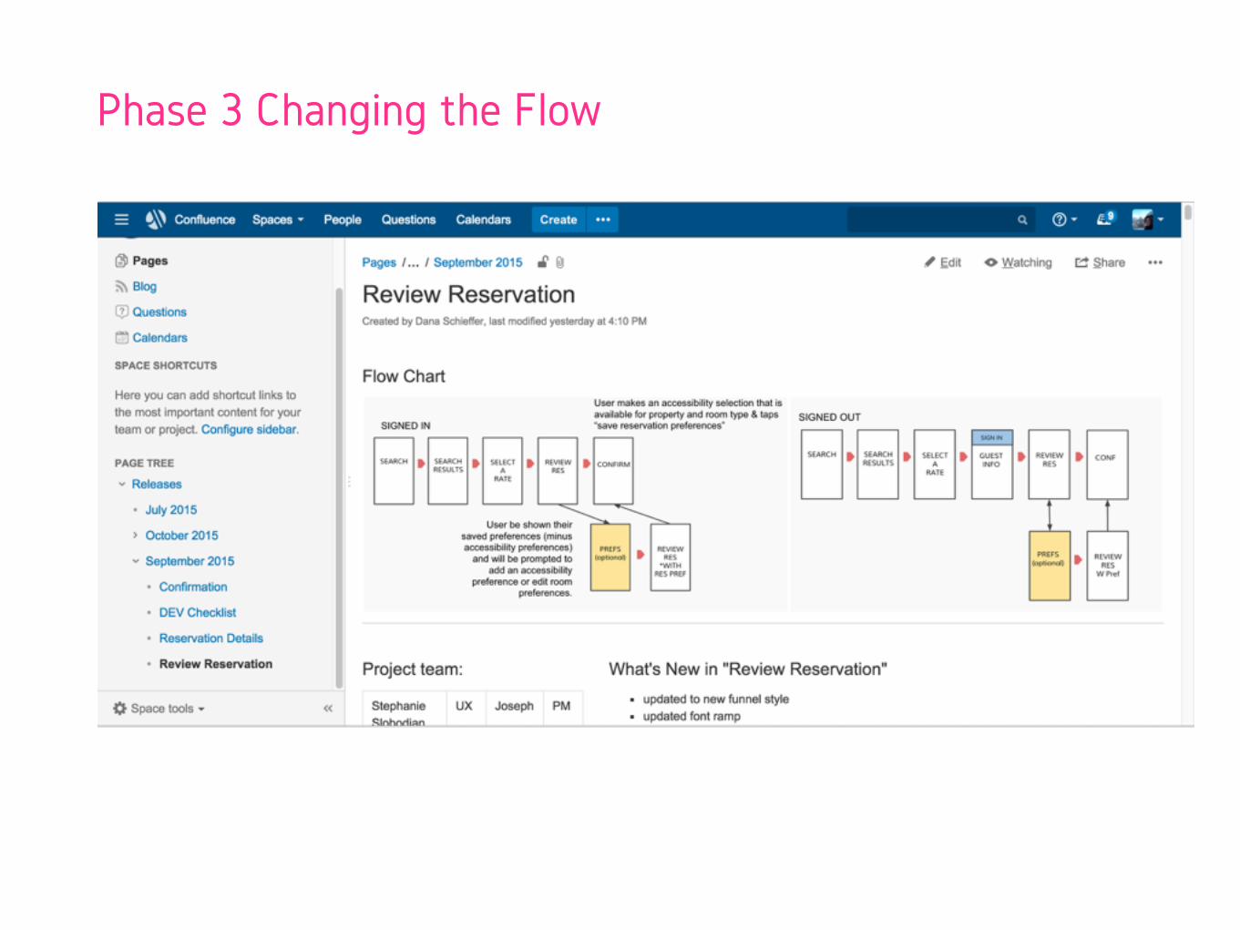
Phase 3 Changing the Flow
Work closely with your team to evaluate your process often.
Negotiate.

#4 ILLUSTRATE VISION & INSPIRE
Before & After.
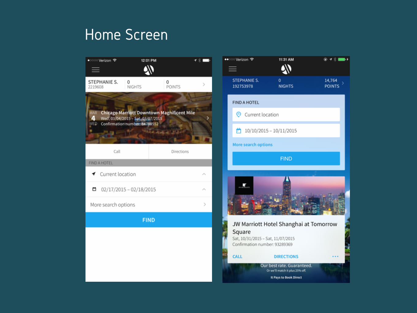
Home Screen
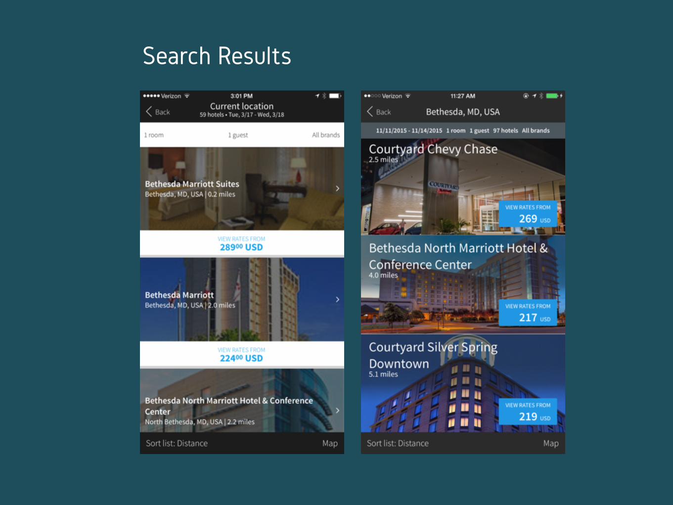
Search Results
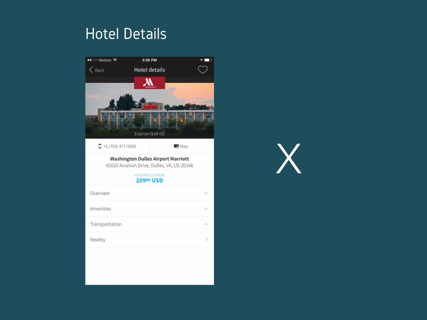
X
Hotel Details
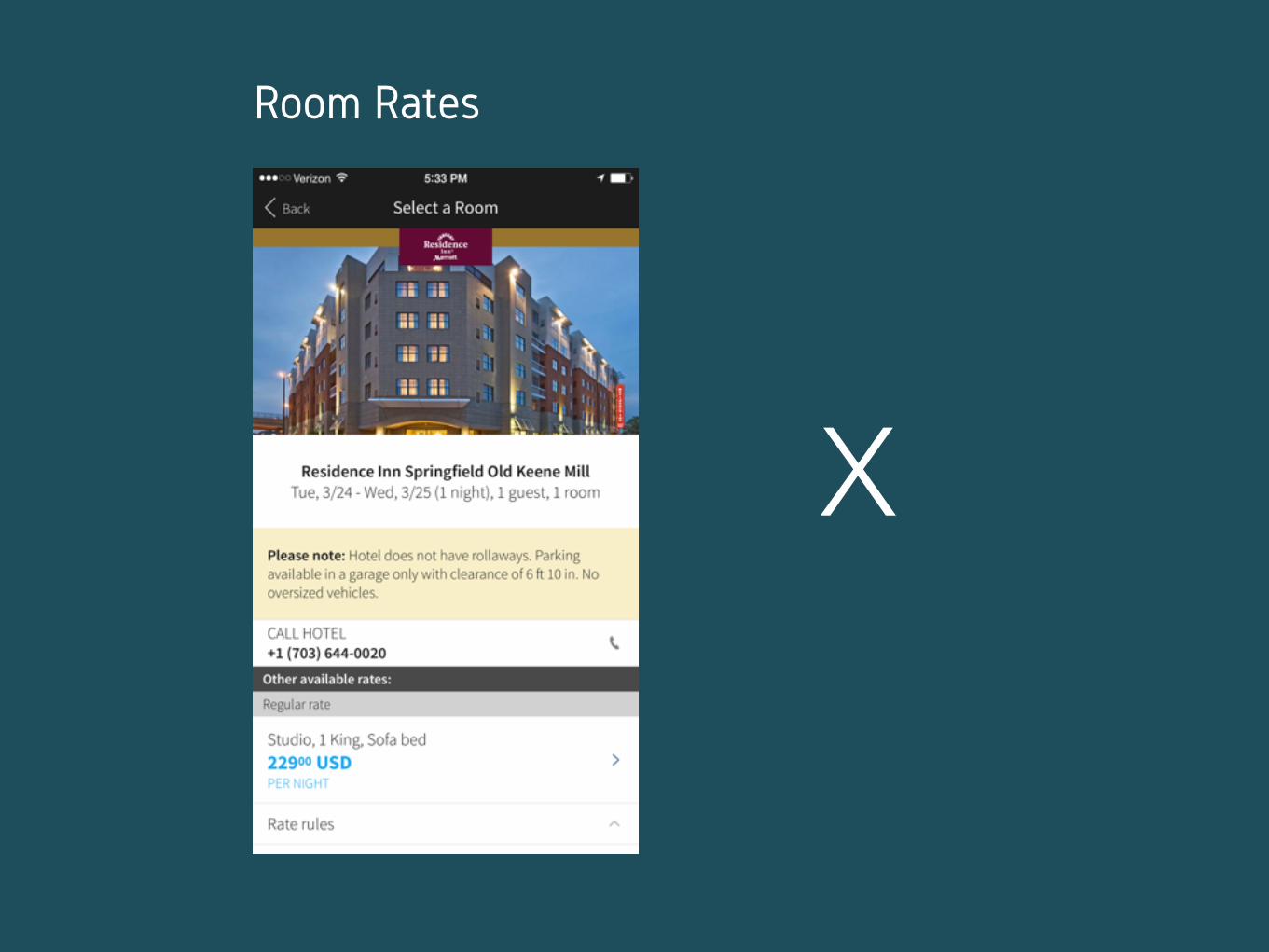
X
Room Rates
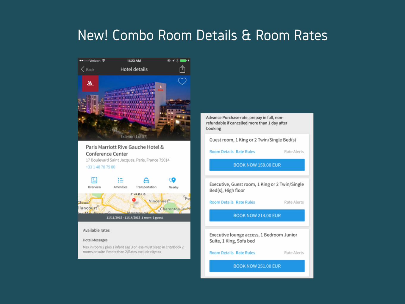
New! Combo Room Details & Room Rates
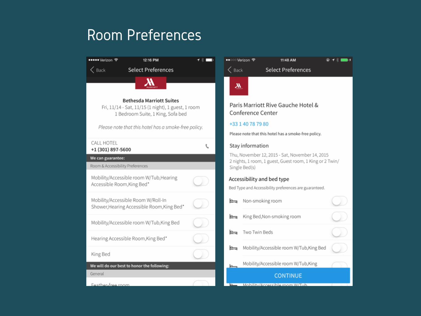
Room Preferences
Review Reservation
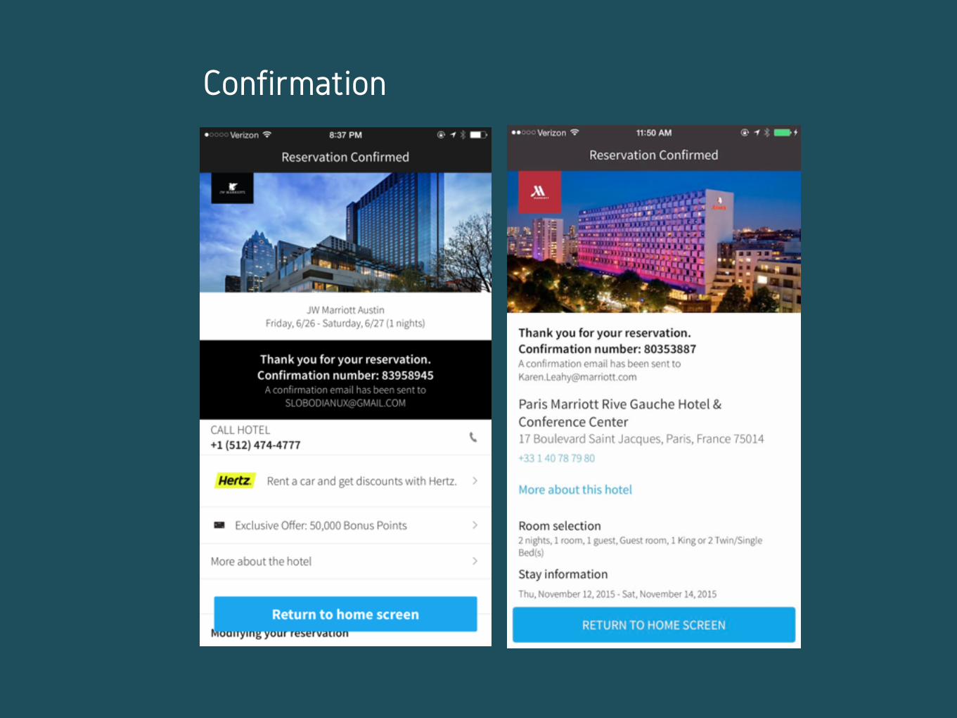
Confirmation

#5 CELEBRATE UNCONVENTIONAL SUCCESS
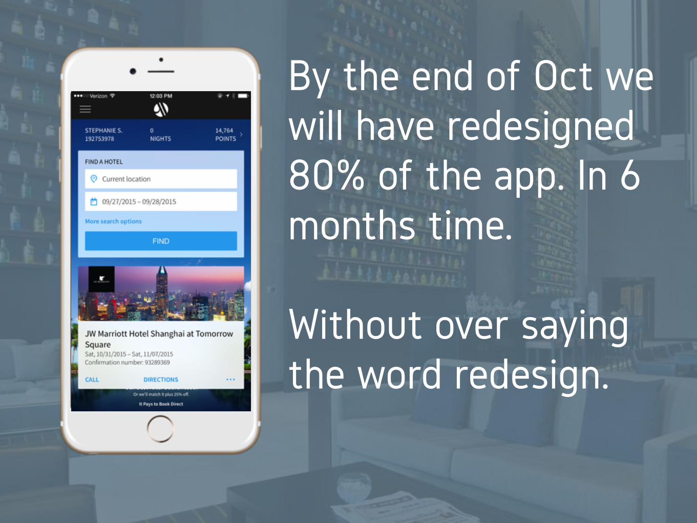
Native IOS App
By the end of Oct we will have redesigned 80% of the app. In 6 months time.
Without over saying the word redesign.
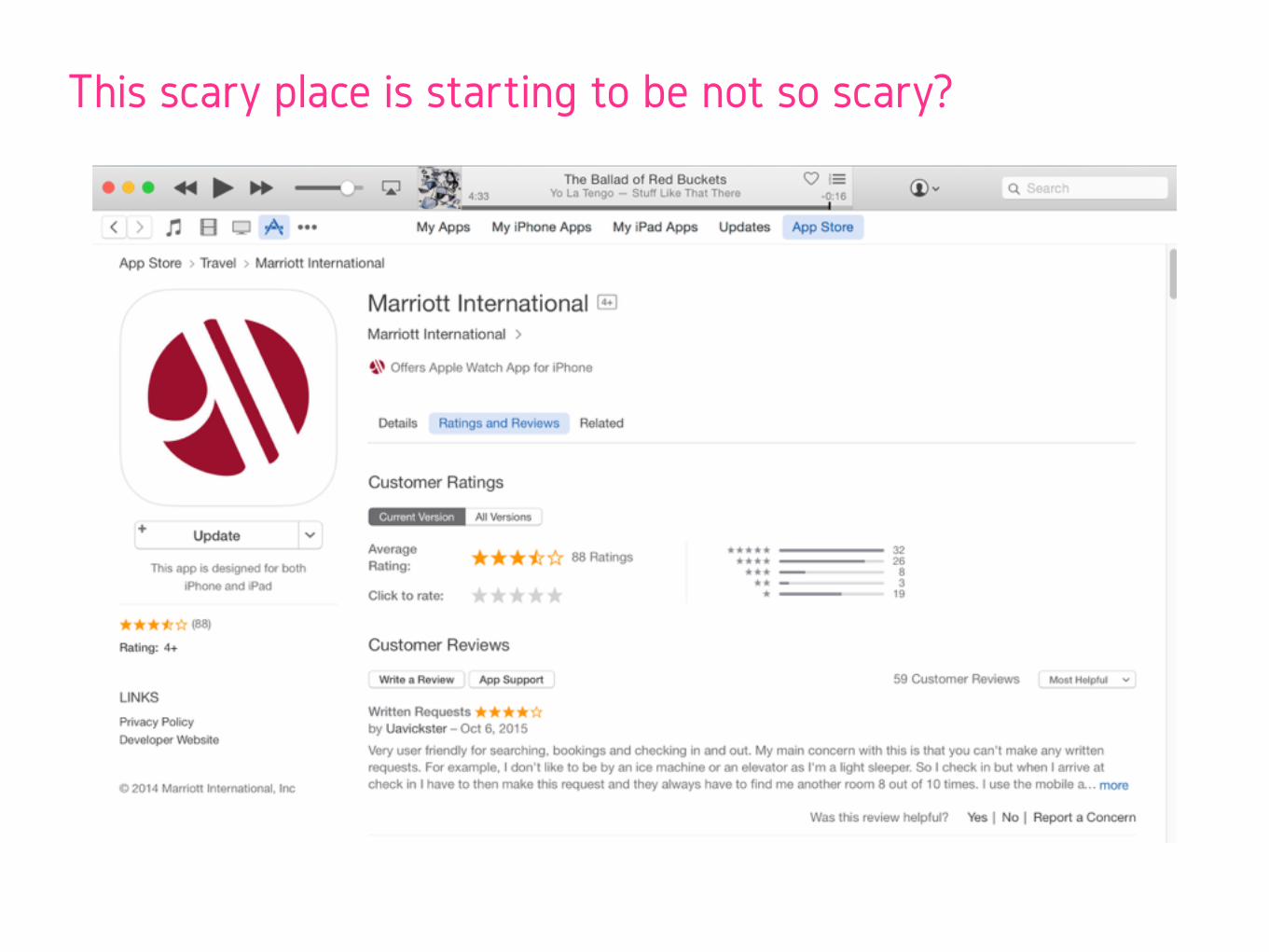
This scary place is starting to be not so scary?
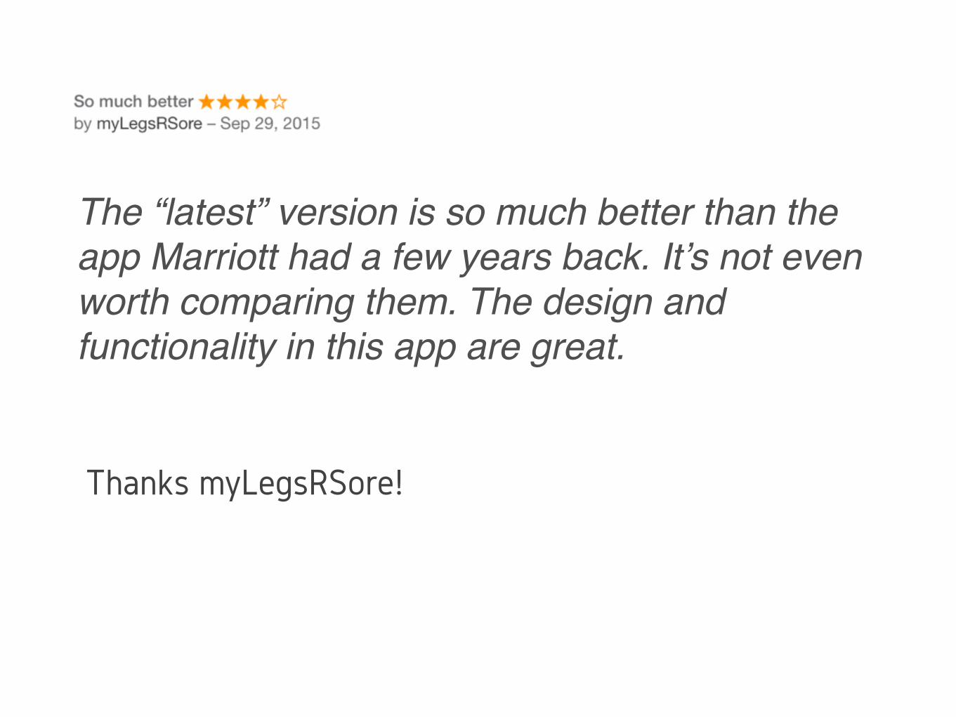
The “latest” version is so much better than the app Marriott had a few years back. It’s not even worth comparing them. The design and functionality in this app are great.
Thanks myLegsRSore!
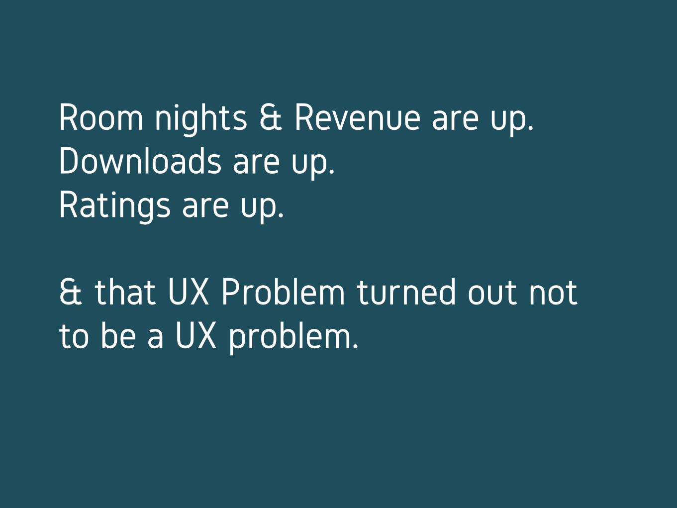
Room nights & Revenue are up. Downloads are up. Ratings are up.
& that UX Problem turned out not to be a UX problem.
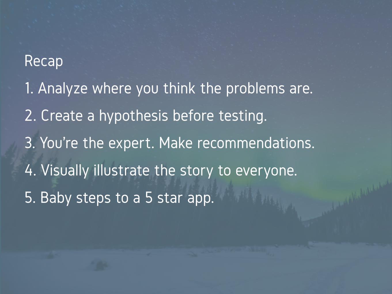
Recap
1. Analyze where you think the problems are.
2. Create a hypothesis before testing.
3. You’re the expert. Make recommendations.
4. Visually illustrate the story to everyone.
5. Baby steps to a 5 star app.
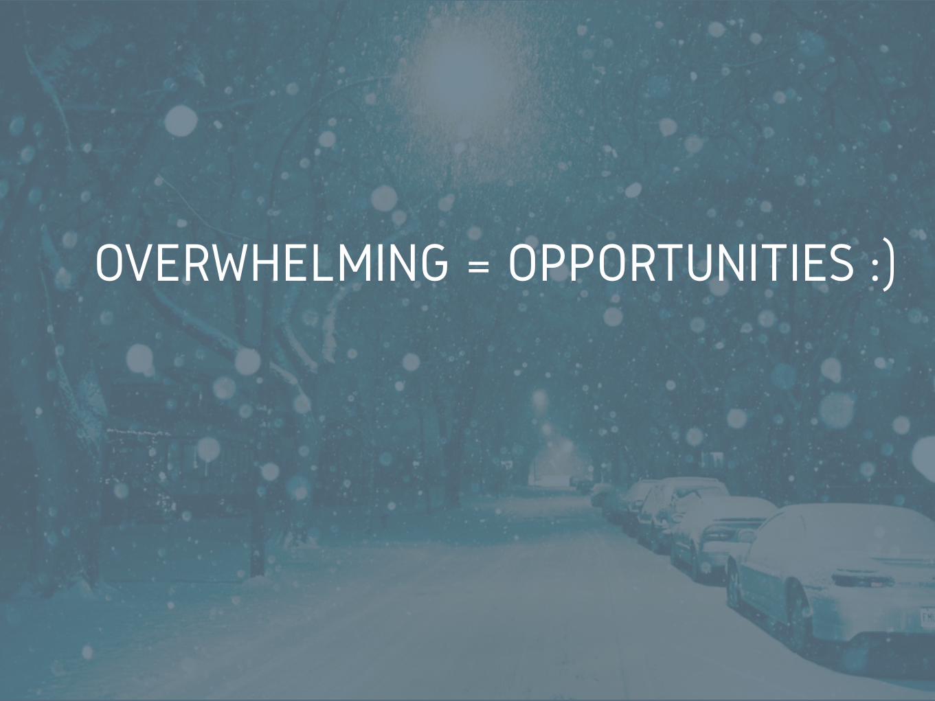
OVERWHELMING = OPPORTUNITIES :)