Embed Size (px)
Citation preview
Displaying Data9-6
Warm UpWarm Up
Lesson PresentationLesson Presentation
Problem of the DayProblem of the Day
Lesson QuizzesLesson Quizzes
Displaying Data9-6
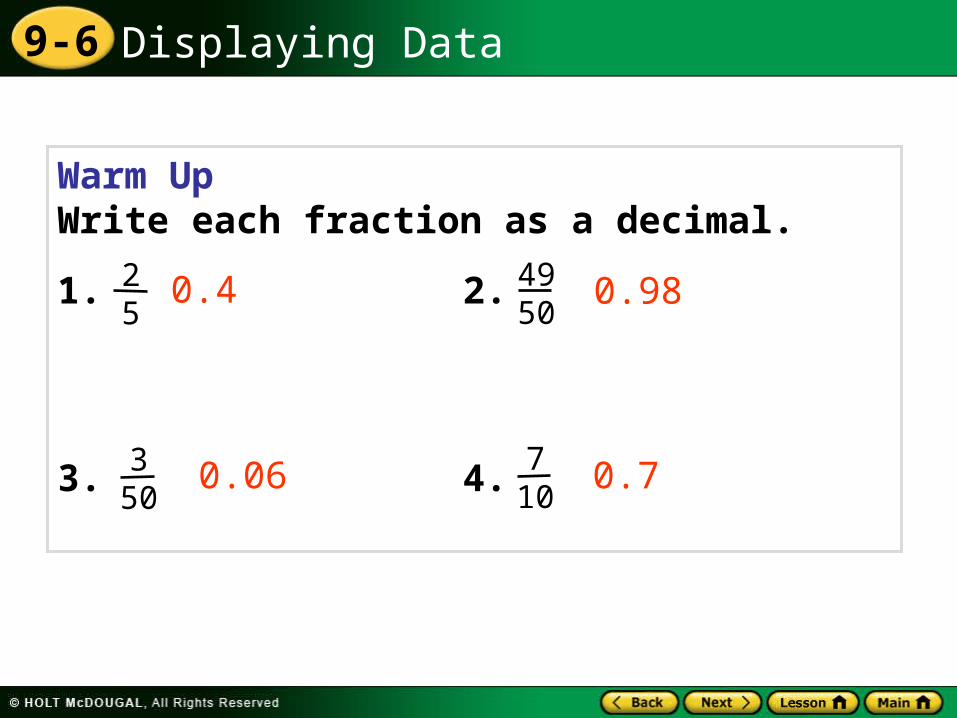
Warm UpWrite each fraction as a decimal.
1. 2.
3. 4.
0.4
0.06 0.7
0.9825
4950
350
710
Displaying Data9-6
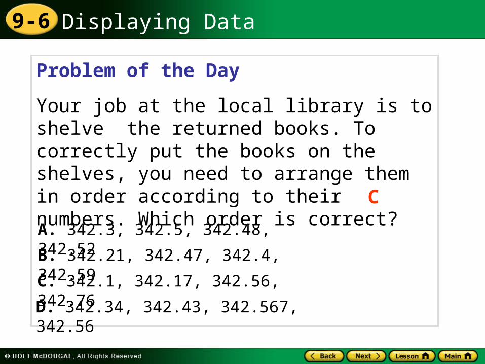
Problem of the Day
Your job at the local library is to shelve the returned books. To correctly put the books on the shelves, you need to arrange them in order according to their numbers. Which order is correct? C
A. 342.3, 342.5, 342.48, 342.52
B. 342.21, 342.47, 342.4, 342.59
C. 342.1, 342.17, 342.56, 342.76
D. 342.34, 342.43, 342.567, 342.56
Displaying Data9-6
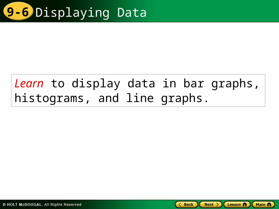
Learn to display data in bar graphs, histograms, and line graphs.
Displaying Data9-6
Vocabulary
double-bar graph
frequency table
histogram
double-line graph
Displaying Data9-6
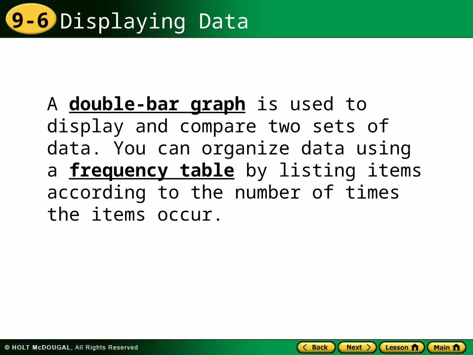
A double-bar graph is used to display and compare two sets of data. You can organize data using a frequency table by listing items according to the number of times the items occur.
Displaying Data9-6
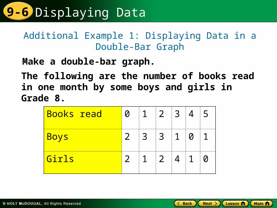
Additional Example 1: Displaying Data in a Double-Bar Graph
Make a double-bar graph.
The following are the number of books read in one month by some boys and girls in Grade 8.
Books read 0 1 2 3 4 5
Boys 2 3 3 1 0 1
Girls 2 1 2 4 1 0
Displaying Data9-6
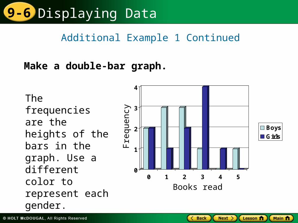
Additional Example 1 Continued
Make a double-bar graph.
0
1
2
3
4
0 1 2 3 4 5
Boys
Girls
Freq
uen
cy
Books read
The frequencies are the heights of the bars in the graph. Use a different color to represent each gender.
Displaying Data9-6
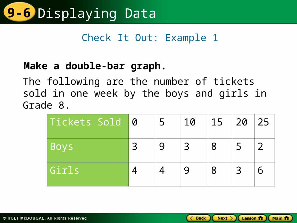
Check It Out: Example 1
Make a double-bar graph.
The following are the number of tickets sold in one week by the boys and girls in Grade 8.
Tickets Sold 0 5 10 15 20 25
Boys 3 9 3 8 5 2
Girls 4 4 9 8 3 6
Displaying Data9-6
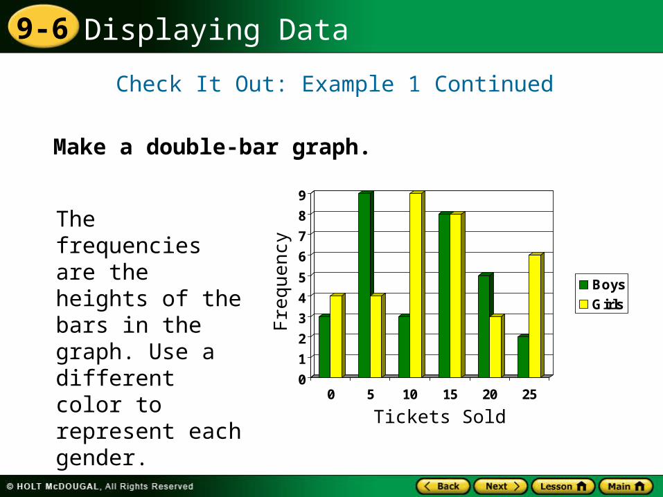
Check It Out: Example 1 Continued
Make a double-bar graph.
0
1
2
3
4
5
6
7
8
9
0 5 10 15 20 25
Boys
Girls
Freq
uen
cy
Tickets Sold
The frequencies are the heights of the bars in the graph. Use a different color to represent each gender.
Displaying Data9-6
A histogram is a bar graph that shows the frequency of data within equal intervals.
Displaying Data9-6
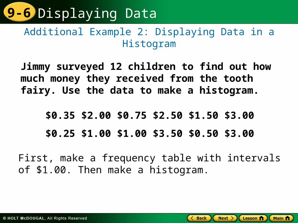
Additional Example 2: Displaying Data in a Histogram
Jimmy surveyed 12 children to find out how much money they received from the tooth fairy. Use the data to make a histogram.
$0.35 $2.00 $0.75 $2.50 $1.50 $3.00
$0.25 $1.00 $1.00 $3.50 $0.50 $3.00
First, make a frequency table with intervals of $1.00. Then make a histogram.
Displaying Data9-6
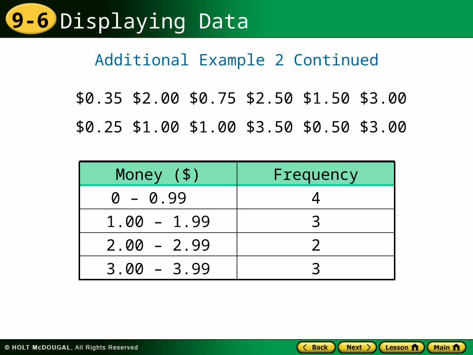
Additional Example 2 Continued
$0.35 $2.00 $0.75 $2.50 $1.50 $3.00
$0.25 $1.00 $1.00 $3.50 $0.50 $3.00
33.00 – 3.99
22.00 – 2.99
31.00 – 1.99
40 – 0.99
FrequencyMoney ($)
Displaying Data9-6
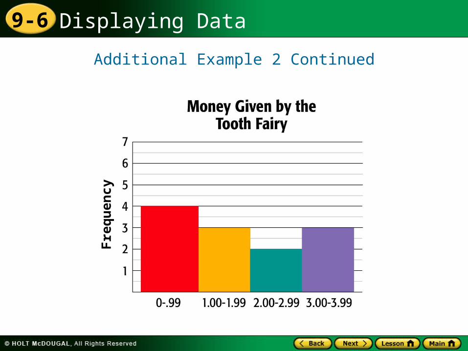
Additional Example 2 Continued
Histograms do not have spaces between the bars.
Helpful Hint
Fre
qu
en
cy
Displaying Data9-6
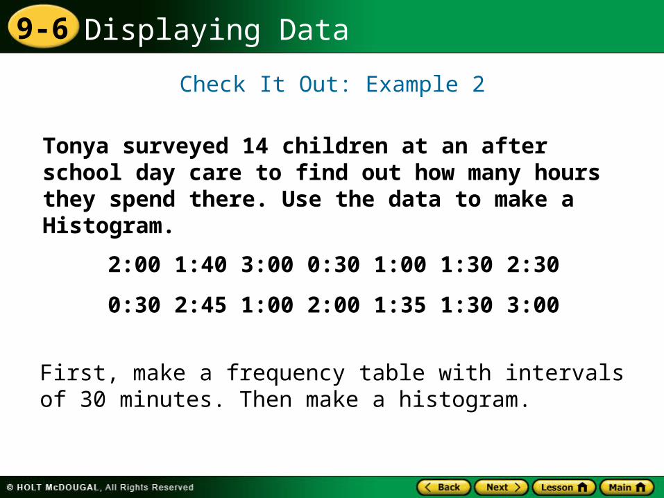
Check It Out: Example 2
Tonya surveyed 14 children at an after school day care to find out how many hours they spend there. Use the data to make a Histogram.
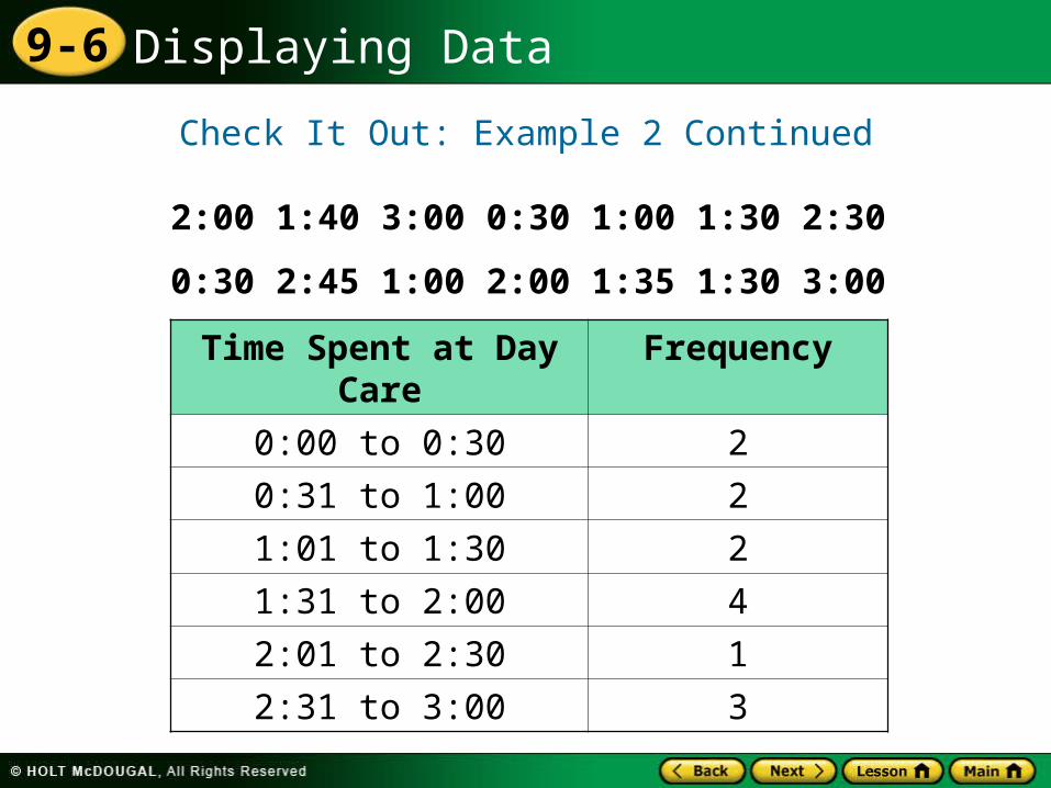
2:00 1:40 3:00 0:30 1:00 1:30 2:30
0:30 2:45 1:00 2:00 1:35 1:30 3:00
First, make a frequency table with intervals of 30 minutes. Then make a histogram.
Displaying Data9-6
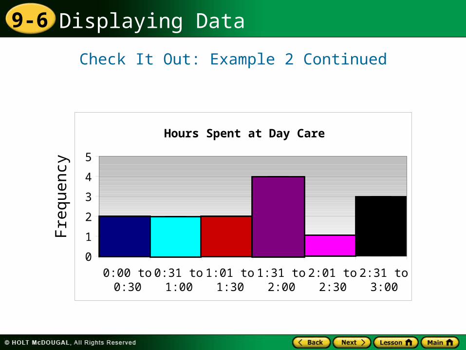
Time Spent at Day Care
Frequency
0:00 to 0:30 2
0:31 to 1:00 2
1:01 to 1:30 2
1:31 to 2:00 4
2:01 to 2:30 1
2:31 to 3:00 3
2:00 1:40 3:00 0:30 1:00 1:30 2:30
0:30 2:45 1:00 2:00 1:35 1:30 3:00
Check It Out: Example 2 Continued
Displaying Data9-6
Check It Out: Example 2 ContinuedFr
equ
ency
Hours Spent at Day Care
0
1
2
3
4
5
0:00 to0:30
0:31 to1:00
1:01 to1:30
1:31 to2:00
2:01 to2:30
2:31 to3:00
Displaying Data9-6
A double-line graph is used to show how two related sets of data change over time.
Displaying Data9-6
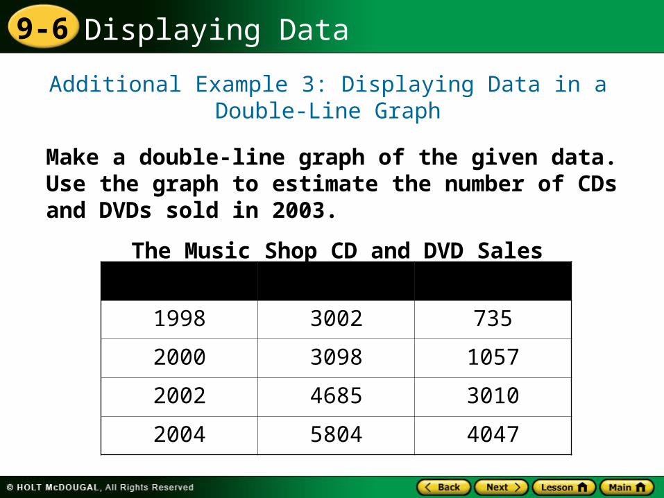
Additional Example 3: Displaying Data in a Double-Line Graph
Make a double-line graph of the given data. Use the graph to estimate the number of CDs and DVDs sold in 2003.
The Music Shop CD and DVD SalesYear CD’s Sold DVDs Sold
1998 3002 735
2000 3098 1057
2002 4685 3010
2004 5804 4047
Displaying Data9-6
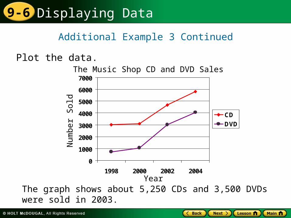
Additional Example 3 Continued
Plot the data.
The graph shows about 5,250 CDs and 3,500 DVDs were sold in 2003.
0
1000
2000
3000
4000
5000
6000
7000
1998 2000 2002 2004
CD
DVD
The Music Shop CD and DVD SalesN
um
ber
Sold
Year
Displaying Data9-6
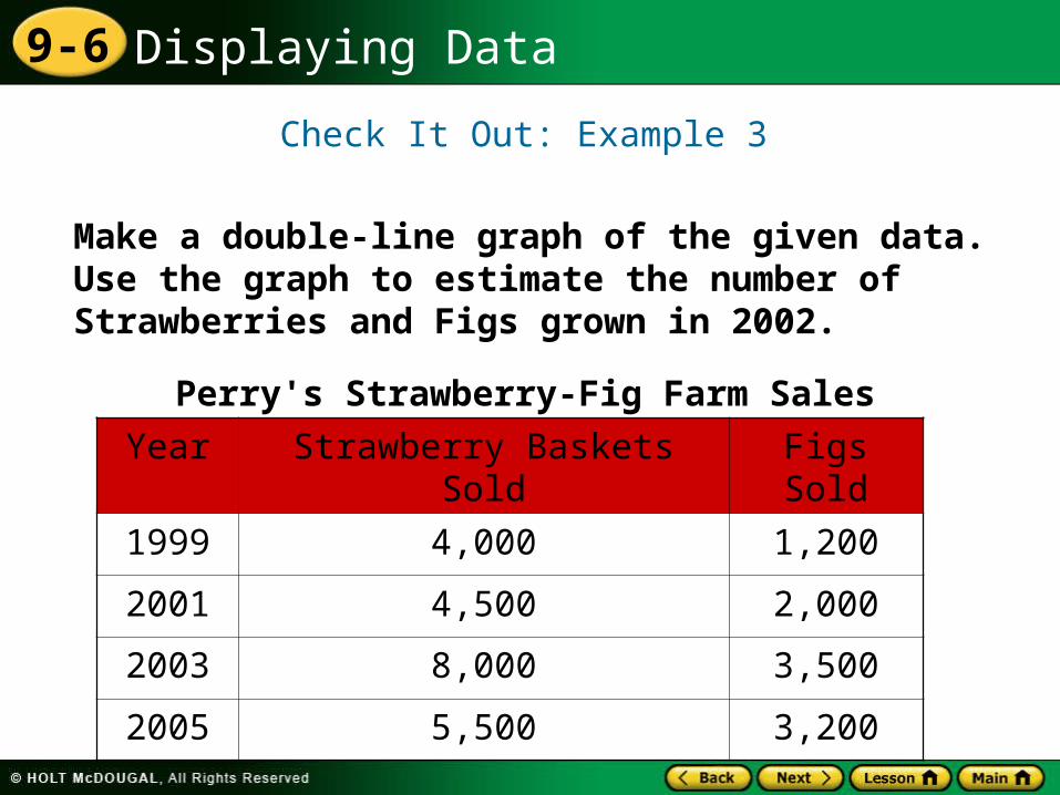
Check It Out: Example 3
Make a double-line graph of the given data. Use the graph to estimate the number of Strawberries and Figs grown in 2002.
Perry's Strawberry-Fig Farm Sales
Year Strawberry Baskets Sold Figs Sold
1999 4,000 1,200
2001 4,500 2,000
2003 8,000 3,500
2005 5,500 3,200
Displaying Data9-6
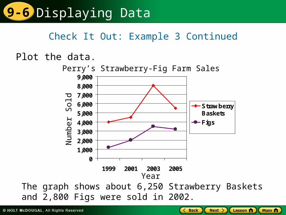
Check It Out: Example 3 Continued
Plot the data.
The graph shows about 6,250 Strawberry Baskets and 2,800 Figs were sold in 2002.
0
1,000
2,000
3,000
4,000
5,000
6,000
7,000
8,000
9,000
1999 2001 2003 2005
StrawberryBaskets
Figs
Perry’s Strawberry-Fig Farm Sales N
um
ber
Sold
Year
Displaying Data9-6
Standard Lesson Quiz
Lesson Quizzes
Lesson Quiz for Student Response Systems
Displaying Data9-6
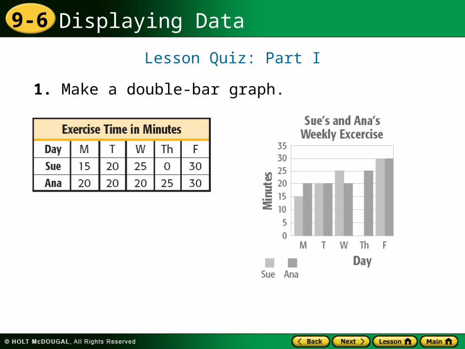
Lesson Quiz: Part I
1. Make a double-bar graph.
Displaying Data9-6
Lesson Quiz: Part II
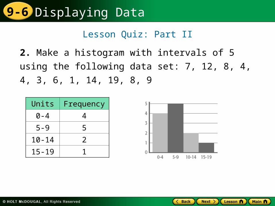
2. Make a histogram with intervals of 5 using the
following data set: 7, 12, 8, 4, 4, 3, 6, 1, 14, 19, 8,
9
Units Frequency
0-4 4
5-9 5
10-14 2
15-19 1
Displaying Data9-6
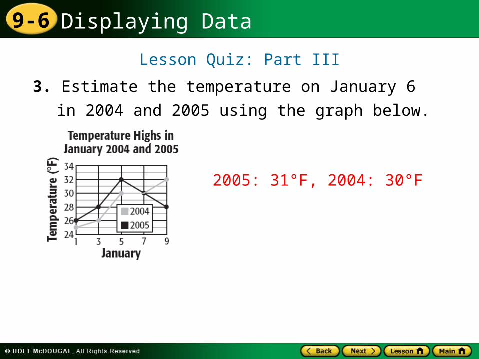
Lesson Quiz: Part III
3. Estimate the temperature on January 6 in 2004
and 2005 using the graph below.
2005: 31°F, 2004: 30°F
Displaying Data9-6
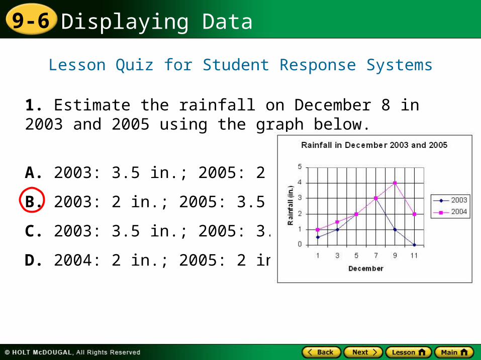
1. Estimate the rainfall on December 8 in 2003 and 2005 using the graph below.
A. 2003: 3.5 in.; 2005: 2 in.
B. 2003: 2 in.; 2005: 3.5 in.
C. 2003: 3.5 in.; 2005: 3.5 in.
D. 2004: 2 in.; 2005: 2 in.
Lesson Quiz for Student Response Systems
Displaying Data9-6
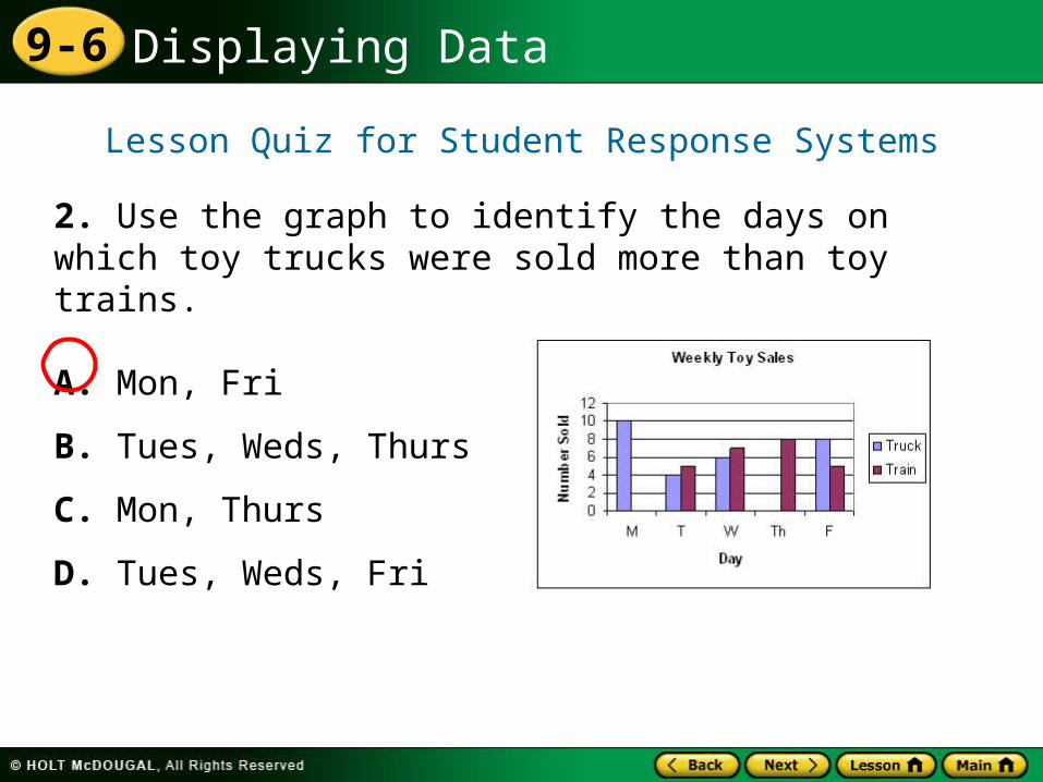
2. Use the graph to identify the days on which toy trucks were sold more than toy trains.
A. Mon, Fri
B. Tues, Weds, Thurs
C. Mon, Thurs
D. Tues, Weds, Fri
Lesson Quiz for Student Response Systems