Embed Size (px)
DESCRIPTION
...
Citation preview
Stocks & Commodities V. 20:1 (22-25): Detecting Trend Direction And Strength by Barbara Star, Ph.D.
Copyright (c) Technical Analysis Inc.
PETE
R N
EUM
ANN
T
TRADING BASICS
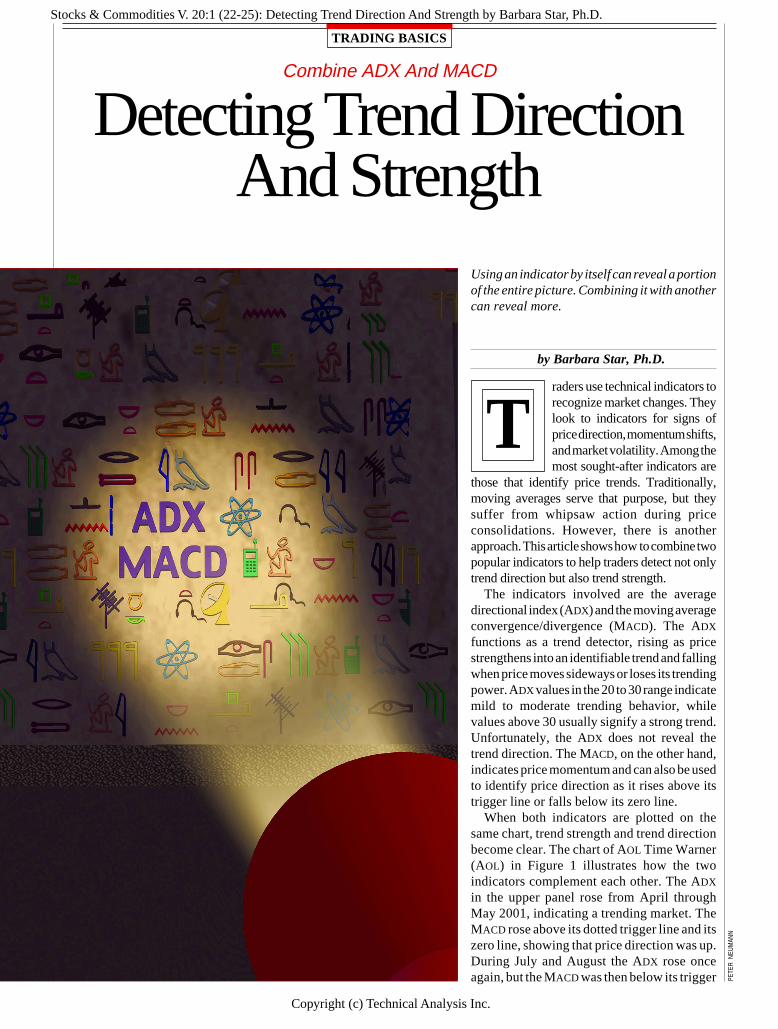
Combine ADX And MACD
Detecting Trend DirectionAnd Strength
Using an indicator by itself can reveal a portionof the entire picture. Combining it with anothercan reveal more.
by Barbara Star, Ph.D.
raders use technical indicators torecognize market changes. Theylook to indicators for signs ofprice direction, momentum shifts,and market volatility. Among themost sought-after indicators are
those that identify price trends. Traditionally,moving averages serve that purpose, but theysuffer from whipsaw action during priceconsolidations. However, there is anotherapproach. This article shows how to combine twopopular indicators to help traders detect not onlytrend direction but also trend strength.
The indicators involved are the averagedirectional index (ADX) and the moving averageconvergence/divergence (MACD). The ADX
functions as a trend detector, rising as pricestrengthens into an identifiable trend and fallingwhen price moves sideways or loses its trendingpower. ADX values in the 20 to 30 range indicatemild to moderate trending behavior, whilevalues above 30 usually signify a strong trend.Unfortunately, the ADX does not reveal thetrend direction. The MACD, on the other hand,indicates price momentum and can also be usedto identify price direction as it rises above itstrigger line or falls below its zero line.
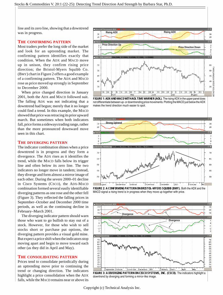
When both indicators are plotted on thesame chart, trend strength and trend directionbecome clear. The chart of AOL Time Warner(AOL) in Figure 1 illustrates how the twoindicators complement each other. The ADX
in the upper panel rose from April throughMay 2001, indicating a trending market. TheMACD rose above its dotted trigger line and itszero line, showing that price direction was up.During July and August the ADX rose onceagain, but the MACD was then below its trigger
Stocks & Commodities V. 20:1 (22-25): Detecting Trend Direction And Strength by Barbara Star, Ph.D.
Copyright (c) Technical Analysis Inc.
line and its zero line, showing that a downtrendwas in progress.
THE CONFIRMING PATTERNMost traders prefer the long side of the marketand look for an uptrending market. Theconfirming pattern identifies exactly thatcondition. When the ADX and MACD moveup in unison, they confirm rising pricedirection; the Bristol-Myers Squibb Co.(BMY) chart in Figure 2 offers a good exampleof a confirming pattern. The ADX and MACD
rose as price moved up strongly in Septemberto December 2000.
When price changed direction in January2001, both the ADX and MACD followed suit.The falling ADX was not indicating that adowntrend had begun; merely that it no longercould find a trend. In this example, the MACD
showed that price was retracing its prior upwardmarch. But sometimes when both indicatorsfall, price forms a sideways trading range, ratherthan the more pronounced downward moveseen in this chart.
THE DIVERGING PATTERNThe indicator combination shines when a pricedowntrend is in progress and they form adivergence. The ADX rises as it identifies thetrend, while the MACD falls below its triggerline and often below its zero line. The twoindicators no longer move in tandem; instead,they diverge and form almost a mirror image ofeach other. During the severe 2000–01 declinein Cisco Systems (CSCO), the ADX-MACD
combination formed several easily identifiablediverging patterns as one rose and the other fell(Figure 3). They reflected the falling prices inSeptember–October and December 2000 timeperiods, as well as the continuing decline inFebruary–March 2001.
The diverging indicator pattern should warnthose who want to go bullish to stay out of astock. However, for those who wish to sellstocks short or purchase put options, thediverging pattern provides a visual gold mine.But expect a price shift when the indicators stopmoving apart and begin to move toward eachother (as they did in April and May).
THE CONSOLIDATING PATTERNPrices tend to consolidate periodically duringan uptrending move prior to continuing thetrend or changing direction. The indicatorshighlight a price consolidation when the ADX
falls, while the MACD remains near or above its
FIGURE 1: ADX AND MACD WITH AOL TIME WARNER (AOL). The rising ADX in the upper panel doesnot differentiate between up- or downtrending price movements. Plotting the MACD just below the ADXmakes the trend direction much easier to spot.
FIGURE 2: A CONFIRMING PATTERN ON BRISTOL-MYERS SQUIBB (BMY). Both the ADX and theMACD signal a rising trend is in progress when they move up together with price.
FIGURE 3: A DIVERGING PATTERN ON CISCO SYSTEMS, INC. (CSCO). The indicators highlight adowntrend by diverging and forming a mirror-like image.
Rising ADX
Price Direction UpPrice Direction Down
Rising ADX
Divergence
Divergence
Strong Uptrend
MET
ASTO
CK
(EQ
UIS
INTE
RN
ATIO
NAL
)
Stocks & Commodities V. 20:1 (22-25): Detecting Trend Direction And Strength by Barbara Star, Ph.D.
Copyright (c) Technical Analysis Inc.
The combination can helptraders stay on the rightside of the market andincrease the probability ofsuccessful trading results.
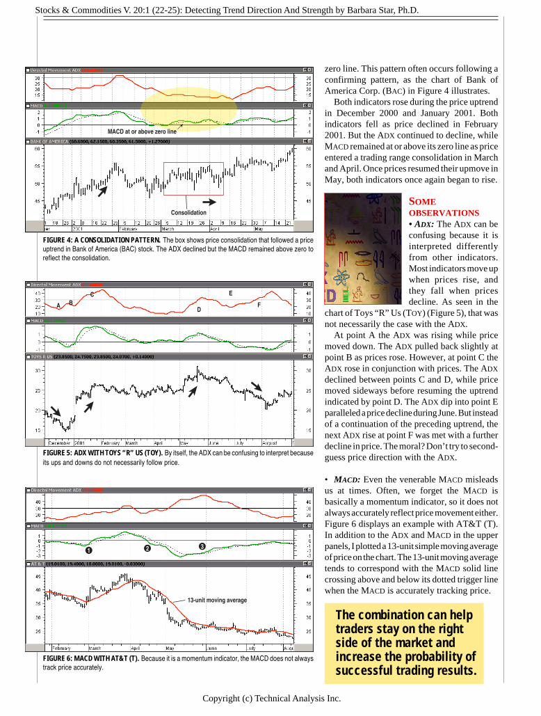
zero line. This pattern often occurs following aconfirming pattern, as the chart of Bank ofAmerica Corp. (BAC) in Figure 4 illustrates.
Both indicators rose during the price uptrendin December 2000 and January 2001. Bothindicators fell as price declined in February2001. But the ADX continued to decline, whileMACD remained at or above its zero line as priceentered a trading range consolidation in Marchand April. Once prices resumed their upmove inMay, both indicators once again began to rise.
SOMEOBSERVATIONS• ADX: The ADX can beconfusing because it isinterpreted differentlyfrom other indicators.Most indicators move upwhen prices rise, andthey fall when pricesdecline. As seen in the
chart of Toys “R” Us (TOY) (Figure 5), that wasnot necessarily the case with the ADX.
At point A the ADX was rising while pricemoved down. The ADX pulled back slightly atpoint B as prices rose. However, at point C theADX rose in conjunction with prices. The ADX
declined between points C and D, while pricemoved sideways before resuming the uptrendindicated by point D. The ADX dip into point Eparalleled a price decline during June. But insteadof a continuation of the preceding uptrend, thenext ADX rise at point F was met with a furtherdecline in price. The moral? Don’t try to second-guess price direction with the ADX.
• MACD: Even the venerable MACD misleadsus at times. Often, we forget the MACD isbasically a momentum indicator, so it does notalways accurately reflect price movement either.Figure 6 displays an example with AT&T (T).In addition to the ADX and MACD in the upperpanels, I plotted a 13-unit simple moving averageof price on the chart. The 13-unit moving averagetends to correspond with the MACD solid linecrossing above and below its dotted trigger linewhen the MACD is accurately tracking price.
FIGURE 4: A CONSOLIDATION PATTERN. The box shows price consolidation that followed a priceuptrend in Bank of America (BAC) stock. The ADX declined but the MACD remained above zero toreflect the consolidation.
FIGURE 5: ADX WITH TOYS “R” US (TOY). By itself, the ADX can be confusing to interpret becauseits ups and downs do not necessarily follow price.
FIGURE 6: MACD WITH AT&T (T). Because it is a momentum indicator, the MACD does not alwaystrack price accurately.
MACD at or above zero line
Consolidation
A BC
D
E
F
13-unit moving average
2 31
Stocks & Commodities V. 20:1 (22-25): Detecting Trend Direction And Strength by Barbara Star, Ph.D.
Copyright (c) Technical Analysis Inc.
At point 1, the MACD solid line rose above its trigger line,which reflected the upmove in price. At point 2 the MACD
crossed below its dotted line, following price to the downside.However, the MACD rise above its trigger line at point 3 wasnot joined by rising prices or an upsloping moving average.The MACD rose because downward momentum pressure haddiminished as prices slowed their downward descent.
• Indicator combo: As the charts show, both the MACD andthe ADX register their signals after the start of a price move,with the ADX slower to respond than the MACD. That meansthe indicator combination will not pinpoint tops and bottoms.
However, traders can expect the ADX–MACD combination toidentify and capture part of a trending move. More important,it can help traders stay on the right side of the market andincrease the probability of successful trading results.
Barbara Star is a part-time trader and former universityprofessor. She is a past vice president of the Market Analystsof Southern California and led a MetaStock users group formany years. She is a frequent contributor to TechnicalAnalysis of STOCKS & COMMODITIES. Currently, she providesindividual instruction and consultation to those interested intechnical analysis. S&C
Stocks & Commodities V. 18:4 (62-68): Picking Out Your Trading Trend by Martin J. Pring
Copyright (c) Technical Analysis Inc.
CLASSIC TECHNIQUES
T
Pick Out YourTrading TrendThere are three kinds of trends: short, intermediate, and longterm. This veteran trader and analyst explains how you canspot them and use them.
by Martin J. Pring
echnical analysis assumes that allthe knowledge, hopes, and fears ofboth active and inactive marketparticipants are reflected in onething: the price. Even if I am in acash position, I am still influenc-ing the price because it would behigher if my cash were invested.Thus, prices are determined by
Bull market9-months -2 years
PRIMARY TREND
Approximately 4-years
Bear market9-months -2 years
psychology. This would just be an interesting observation,except that psychology moves in trends, and so do prices.
Most of the technical tools we use are aimed at identifyingtrend reversals at an early stage. We ride on trends until theweight of the evidence shows or proves that the trend hasreversed — in this case, the number of reliable technicalindicators all pointing inthe same direction.Hence, the greater thenumber of indicators sig-naling a reversal, thegreater the probabilitythat a reversal will takeplace. It is important toremember that technicalanalysis only deals inprobabilities, never cer-tainties. Unfortunately,there is no known methodof forecasting the dura-tion and magnitude of atrend with any degree ofconsistency. Identifyingreversals is hard enough.
What is a trend? Howlong do they last? Beforethe advent of intradaycharts, there were threegenerally accepted dura-tions — primary, inter-mediate, and short-term.
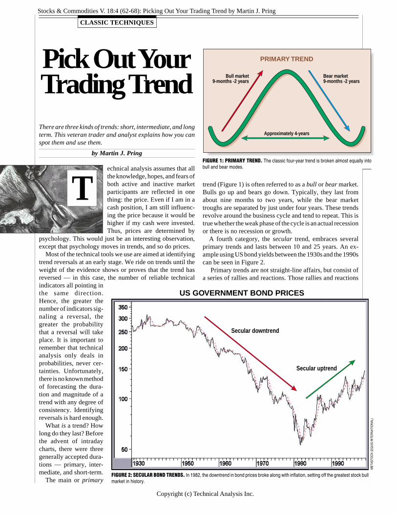
The main or primary
trend (Figure 1) is often referred to as a bull or bear market.Bulls go up and bears go down. Typically, they last fromabout nine months to two years, while the bear markettroughs are separated by just under four years. These trendsrevolve around the business cycle and tend to repeat. This istrue whether the weak phase of the cycle is an actual recessionor there is no recession or growth.
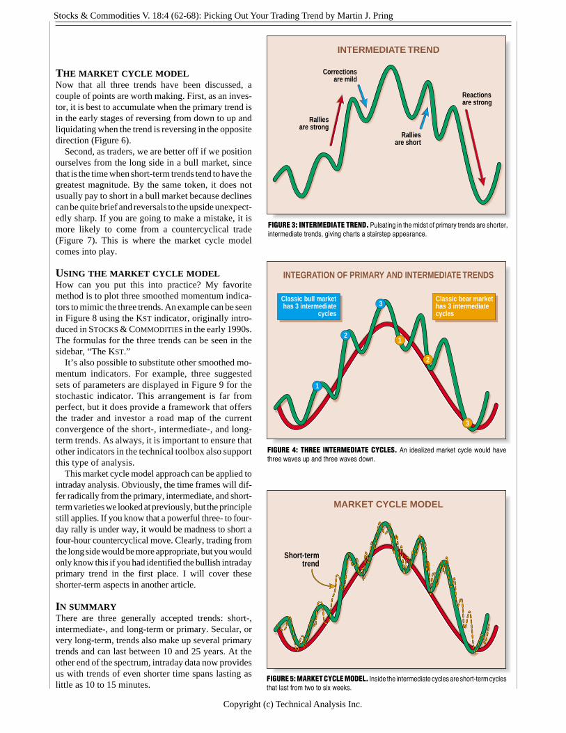
A fourth category, the secular trend, embraces severalprimary trends and lasts between 10 and 25 years. An ex-ample using US bond yields between the 1930s and the 1990scan be seen in Figure 2.
Primary trends are not straight-line affairs, but consist ofa series of rallies and reactions. Those rallies and reactions
FIGURE 1: PRIMARY TREND. The classic four-year trend is broken almost equally intobull and bear modes.
FIGURE 2: SECULAR BOND TRENDS. In 1982, the downtrend in bond prices broke along with inflation, setting off the greatest stock bullmarket in history.
MET
ASTO
CK
(EQ
UIS
INTE
RN
ATIO
NAL
)
Secular downtrend
Secular uptrend
US GOVERNMENT BOND PRICES

Stocks & Commodities V. 18:4 (62-68): Picking Out Your Trading Trend by Martin J. Pring
Copyright (c) Technical Analysis Inc.
MAR
CI
RAS
MU
SSEN are known as intermediate trends and are represented in
Figure 3 by the solid blue line. They can vary in length fromas little as six weeks to as much as nine months — the lengthof a very short primary trend. Intermediate trends typicallydevelop as a result of changing perceptions concerning eco-nomic, financial, or political events.
It is important to have some understanding about thedirection of the main or primary trend. This is because ralliesin bull markets are strong and reactions weak, as shown inFigure 3. On the other hand, bear market reactions are strongwhile rallies are short, sharp, and generally unpredictable. Ifyou have a fix on the underlying primary trend, then you will
be better prepared for the nature of the intermediate ralliesand reactions that will unfold.
Classic technical theory holds that each bull market con-tains three intermediate cycles, as does each primary bearmarket (Figure 4). I would use this only as a guide, sincemany primary trends are not easily classified this way. Thus,if you are waiting for that third intermediate cycle in a bullmarket, it may never materialize.
In turn, intermediate trends can be broken down into short-term trends that last from as little as two weeks to as much asfive or six weeks. They can be seen in Figure 5, representedby the dashed red lines.

Stocks & Commodities V. 18:4 (62-68): Picking Out Your Trading Trend by Martin J. Pring
Copyright (c) Technical Analysis Inc.
CALCULATING THE KSTThe suggested parameters for short,intermediate and long term can befound in sidebar Figure 1. Thereare three steps to calculating theKST indicator. First, calculate thefour different rates of change. Re-calling the formula for rate ofchange (ROC) is today’s closingprice divided by the closing price ndays ago. This result is then multi-plied by 100. Then subtract 100 toobtain a rate of change index thatuses zero as the center point. Sec-ond, smooth each ROC with either asimple or exponential moving av-
Short-term (D) 10 10 1 15 10 2 20 10 3 30 15 4Short-term (W) 3 3E 1 4 4E 2 6 6E 3 10 8E 4Intermediate-term (W) 10 10 1 13 13 2 15 15 3 20 20 4
Intermediate-term (W) 10 10E 1 13 13E 2 15 15E 3 20 20E 4Long-term (M) 9 6 1 12 6 2 18 6 3 24 9 4Long-term (W) 39 26E 1 52 26E 2 78 26E 3 104 39E 4
It is possible to program all KST formulas into MetaStock and the CompuTrac SNAP module.(D) Based on daily data. (W) Based on weekly data. (M) Based on monthly data. (E) EMA.
where:E2 = New exponential averageE1 = Prior exponential averageP2 = Current price
Please note the first day’s calculation does not have a priorexponential average. Consequently, you just use the firstday’s price and begin the smoothing process the next day.Figure 2 is a spreadsheet example of the short-term weeklyKST using exponential moving averages for the smoothing.Column C is the three-week rate of change. The formula forcell C20 is:
erage (EMA). Third, multiply each smoothed ROC by itsprospective weight and sum the weighted smoothed ROCs.
The formula for an exponential moving average (EMA)requires the use of a smoothing constant (α) alpha. Theconstant used to smooth the data is found using the formula2/(n+1). For example, for n=3, then α = 2/(3+1)=0.50. Theformula for the EMA is:
E2 = E1 + α (P2 - E1)
Cell G20 is a six-week ROC:=((B20/B15)*100)-100
Cell H20 is a six-week EMA:=H19+0.29*(G20-H19)
Cell I20 is a 10-week ROC:=((B20/B11)*100)-100
Cell J20 is an eight-week EMA:=J19+0.22*(I20-J19)
Finally, cell K20 is the summed weighted smoothed ROCs.Each smoothed ROC is weighted according to sidebarFigure 1 and summed:
=D20+(2*F20)+(3*H20)+(4*J20)
—Editor
SIDEBAR FIGURE 1: The ROC column is the rate of change. The MA column is the moving average value,and E after the moving average value indicates that the moving average is an exponential moving average.Multiply each smoothed ROC by its weight prior to summing the four smoothed ROCs.
=((B20/B18)*100)-100
The three-week rate of change is smoothed with athree-week EMA. The constant used to smooth thedata is found using the formula 2/(n+1). For n=3,then, the constant equals 2/(3+1)=0.50, and thus, theformula for cell D20 is:
=D19+0.5*(C20-D19)
Cell E20 is a four-week ROC:=((B20/B17)*100)-100
Cell F20 is a four-week EMA:=F19+0.4*(E20-F19)
123456789
1 01 11 21 31 41 51 61 71 81 92 0
A B C D E F G H I J KDate S&P 500 3 week 3 Week 4 Week 4 week 6 Week 6 week10 Week 8 week Summed
920103 419.34 ROC EMA ROC EMA ROC EMA ROC EMA Weighted920110 415.10 ROC920117 418.86 -0.11920124 415.48 0.09 -0.92920131 408.78 -2.41 -2.41 -1.52920207 411.09 -1.06 -1.73 -1.86 -1.97920214 412.48 0.91 -0.41 -0.72 -0.72 -0.63920221 411.46 0.09 -0.16 0.66 -0.17 -1.77920228 412.70 0.05 -0.05 0.39 0.05 -0.67920306 404.44 -1.71 -0.88 -1.95 -0.75 -1.06 -3.55920313 405.84 -1.66 -1.27 -1.37 -0.99 -1.28 -1.28 -2.23920320 411.30 1.70 0.21 -0.34 -0.73 -0.29 -0.99 -1.80920327 403.50 -0.58 -0.18 -0.23 -0.53 -1.93 -1.26 -2.88920403 401.55 -2.37 -1.28 -1.06 -0.74 -2.70 -1.68 -1.77920410 404.29 0.20 -0.54 -1.70 -1.13 -0.04 -1.20 -1.65920416 416.05 3.61 1.54 3.11 0.57 2.52 -0.13 0.87 0.87920424 409.02 1.17 1.35 1.86 1.08 -0.55 -0.25 -0.59 0.54920501 412.53 -0.85 0.25 2.04 1.47 2.24 0.47 -0.04 0.42 6.26920508 416.05 1.72 0.99 0.00 0.88 3.61 1.38 2.87 0.96 10.71
SIDEBAR FIGURE 2: SPREADSHEET FOR SHORT-TERM WEEKLY KST.Here, the KST is calculated using exponential moving averages.
Cou
rtesy
Mic
roso
ft Ex
cel
Stocks & Commodities V. 18:4 (62-68): Picking Out Your Trading Trend by Martin J. Pring
Copyright (c) Technical Analysis Inc.
INTERMEDIATE TREND
Reactionsare strong
Ralliesare short
Correctionsare mild
Ralliesare strong
INTEGRATION OF PRIMARY AND INTERMEDIATE TRENDS
1
12
2
3
3
Classic bull markethas 3 intermediate
cycles
Classic bear markethas 3 intermediatecycles
FIGURE 3: INTERMEDIATE TREND. Pulsating in the midst of primary trends are shorter,intermediate trends, giving charts a stairstep appearance.
FIGURE 4: THREE INTERMEDIATE CYCLES. An idealized market cycle would havethree waves up and three waves down.
MARKET CYCLE MODEL
Short-termtrend
FIGURE 5: MARKET CYCLE MODEL. Inside the intermediate cycles are short-term cyclesthat last from two to six weeks.
THE MARKET CYCLE MODELNow that all three trends have been discussed, acouple of points are worth making. First, as an inves-tor, it is best to accumulate when the primary trend isin the early stages of reversing from down to up andliquidating when the trend is reversing in the oppositedirection (Figure 6).
Second, as traders, we are better off if we positionourselves from the long side in a bull market, sincethat is the time when short-term trends tend to have thegreatest magnitude. By the same token, it does notusually pay to short in a bull market because declinescan be quite brief and reversals to the upside unexpect-edly sharp. If you are going to make a mistake, it ismore likely to come from a countercyclical trade(Figure 7). This is where the market cycle modelcomes into play.
USING THE MARKET CYCLE MODELHow can you put this into practice? My favoritemethod is to plot three smoothed momentum indica-tors to mimic the three trends. An example can be seenin Figure 8 using the KST indicator, originally intro-duced in STOCKS & COMMODITIES in the early 1990s.The formulas for the three trends can be seen in thesidebar, “The KST.”
It’s also possible to substitute other smoothed mo-mentum indicators. For example, three suggestedsets of parameters are displayed in Figure 9 for thestochastic indicator. This arrangement is far fromperfect, but it does provide a framework that offersthe trader and investor a road map of the currentconvergence of the short-, intermediate-, and long-term trends. As always, it is important to ensure thatother indicators in the technical toolbox also supportthis type of analysis.
This market cycle model approach can be applied tointraday analysis. Obviously, the time frames will dif-fer radically from the primary, intermediate, and short-term varieties we looked at previously, but the principlestill applies. If you know that a powerful three- to four-day rally is under way, it would be madness to short afour-hour countercyclical move. Clearly, trading fromthe long side would be more appropriate, but you wouldonly know this if you had identified the bullish intradayprimary trend in the first place. I will cover theseshorter-term aspects in another article.
IN SUMMARYThere are three generally accepted trends: short-,intermediate-, and long-term or primary. Secular, orvery long-term, trends also make up several primarytrends and can last between 10 and 25 years. At theother end of the spectrum, intraday data now providesus with trends of even shorter time spans lasting aslittle as 10 to 15 minutes.
Stocks & Commodities V. 18:4 (62-68): Picking Out Your Trading Trend by Martin J. Pring
Copyright (c) Technical Analysis Inc.
FIGURE 8: KST. This indicator, developed by Pring in the early 1990s, is generally reliable in picking out trends.
Moody’s AAA bond yield
Short-termKST
IntermediateKST
Long-term KSTPRIMARY TRENDS
MOODY’S AAA BOND YIELDS AND THREE KSTs
It is important for investors to have some idea of thedirection and maturity of the main trend. Working on theassumption that a rising tide lifts all boats, traders should alsotry to understand the direction of the main trend even thoughthey themselves are only concerned with a short time horizon.A convenient way to chart longer-term trends is to use a
smoothed momentum indicator such as the stochastics or KST.
Veteran trader and technician Martin J. Pring founded theInternational Institute for Economic Research in 1981. Pringis the author of several books, including the classic Techni-cal Analysis Explained.
FIGURE 7: DON’T FIGHT THE TREND. When trading in and out during a primary trend,go in the direction of the primary trend, not against it.
MARKET CYCLE MODEL
Go long ralliesbut do not
short reactions
Short reactionsbut do notgo long rallies
MARKET CYCLE MODEL
Time toaccumulate
Time toliquidate
FIGURE 6: ACCUMULATE/DISTRIBUTE. Naturally, the best time to load up on stocksis when a cycle bottom is at hand. Approaching the top, it’s time to distribute your holdings.

Stocks & Commodities V. 18:4 (62-68): Picking Out Your Trading Trend by Martin J. Pring
Copyright (c) Technical Analysis Inc.
FIGURE 9: STOCHASTIC SMOOTHING. Stochastics of differing-length parameters also pick up trends. You can smooth with any of a variety ofmomentum indicators.
AAA yield
Stochastic (3x3x3)
Stochastic (10x10x6)
Stochastic (39x26x23) PRIMARY TRENDS
MOODY’S AAA BOND YIELDS AND THREE STOCHASTICS
S&C†See Traders’ Glossary for definition
RELATED READINGInternational Institute for Economic Research. Internet: http:
// www.pring.com/.Pring, Martin J. [1992]. The All-Season Investor, John Wiley
& Sons._____ [1993]. Martin Pring On Market Momentum, Interna-
tional Institute for Economic Research.
_____ [1985]. Technical Analysis Explained, McGraw-HillBook Co.
_____ [1992]. “Rate Of Change,” Technical Analysis ofSTOCKS & COMMODITIES, Volume 10: August.
_____ [2000]. “Trendline Basics,” Technical Analysis ofSTOCKS & COMMODITIES, Volume 18: March.
Stocks & Commodities V16:9 (425-427): Trading the Trend by Andrew Abraham
Copyright (c) Technical Analysis Inc. 1
NEW TECHNIQUES
N
TradingThe Trend
Here’s a volatility indicator, presented here with simpletrend rules for trading various markets.
by Andrew Abraham
ew traders quickly becomefamilar with two adages: “Thetrend is your friend,” and “Letyour profits run and cut yourlosses.” Many of us, however,have learned the hard way thatthese things are easier said thandone. Why is that? One reasonis lack of recognition, since thetrend itself is rarely clarifiedand defined, let alone where it
starts and ends. So we need a clear explication of what a trendis as well as where its beginning and its end are.
SIMPLE ENOUGHSimply, if the trend is considered up, then the trend of pricesare composed of upwaves and the downwaves are countertrendmovements. Downward trends are the opposite, seen asdownwaves with countertrend upwaves. Using several toolsand functions, we can design a quantifiable approach todefining these waves. My favorite is the volatility indicator,which is a formula that measures the market volatility byplotting a smoothed average of the true range. The true range
indicator originates from the work of J. Welles Wilder Jr. fromhis New Concepts in Technical Trading Systems. The definitionof the true range is defined as the largest of the following:
• The difference between today’s high and today’s low• The difference between today’s high and yesterday’s close,
or• The difference between today’s low and yesterday’s close.
The calculation uses a 21-period weighted average of the truerange, giving higher weight to the true range of the mostrecent bar. The final value is then multiplied by 3.
The volatility indicator is used as a stop-and-reverse method.Let’s say the market has been rising, then the volatilityindicator is calculated each day and subtracted from thehighest close during the rising market. The highest close isalways used, even if there has been a series of lower closessince the highest close. If the market closes below thevolatility indicator, then for the next day, the current readingof the volatility indicator is added to the lowest close. Thisstep is followed each day until the market closes above thetrailing volatility indicator.
We now have a definition of the trend. An upward trendexists as long as the volatility indicator is below the marketand a downtrend is in force if the volatility indicator is abovethe market. To visualize these waves, we color-code theuptrends blue and the downtrends red (Figures 1 and 2).
In addition, we can add a basic description of trends fortrading. We will say that uptrends are made up of waves ofhigher highs, with prior lows not being surpassed. Con-versely, downtrends are composed of waves of lower lowsand prior highs not being surpassed. For sustained moves, theupwaves during uptrends will be larger than the countertrenddownwaves, and in downtrends, the downwaves will belarger than the countertrend upwaves. Therefore, we want toonly trade with the trend and buy upwaves in an uptrend andsell short during a downtrend.
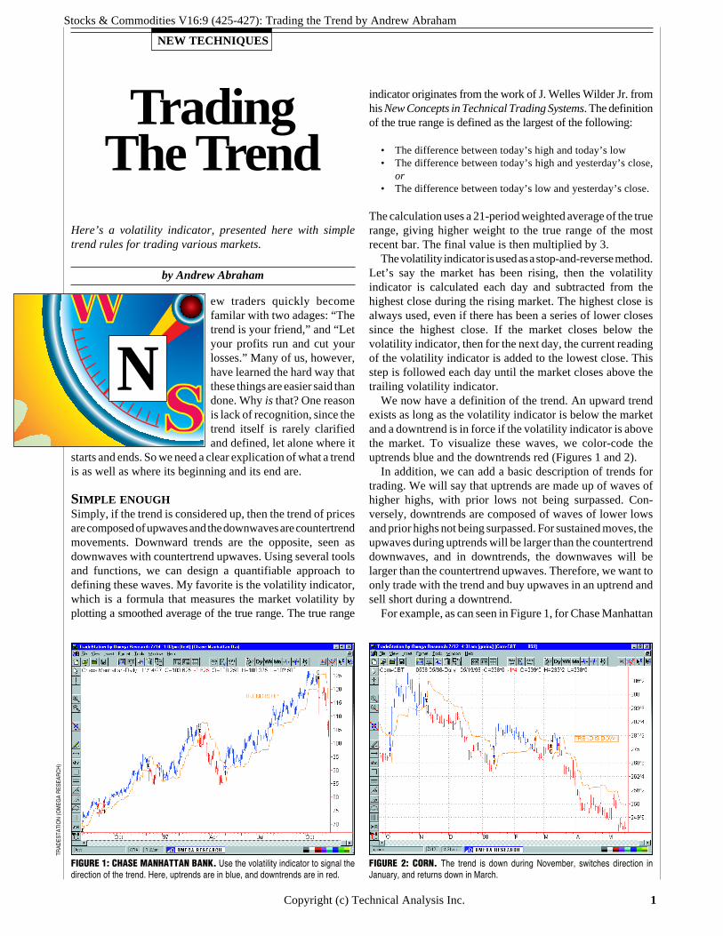
For example, as can seen in Figure 1, for Chase Manhattan
FIGURE 1: CHASE MANHATTAN BANK. Use the volatility indicator to signal thedirection of the trend. Here, uptrends are in blue, and downtrends are in red.
FIGURE 2: CORN. The trend is down during November, switches direction inJanuary, and returns down in March.
TRAD
ESTA
TIO
N (O
MEG
A R
ESEA
RC
H)

Stocks & Commodities V16:9 (425-427): Trading the Trend by Andrew Abraham
Copyright (c) Technical Analysis Inc. 2
JOSÉ
CR
UZ
Bank, the upwave has higher highsand the prior downwave was not sur-passed, so the market is in an uptrend;look to buy only the upwaves. InFigure 2, in the corn market, the op-posite situation exists and the sameconcept is applied, except in this case,the concept is in reverse because it isa downtrend. During November, thevolatility indicator reversed trend, andthe prior low was broken. This wasour signal to go short. Our exit signalwill be the volatility indicator turningpositive.
The position was closed in January1998, and since the rally’s high begin-ning in January did not surpass thehighs of October, our second definitionof an uptrend was not met. As a result,we went short again when the volatilityindicator went negative. In March, theposition was closed with a small loss,and again, the highs of this upwave didnot surpass the highs of January, so wehad a signal to go short again when thevolatility indicator went negative andthe lows of February were broken.
THE TENETS OFGOOD TRADINGNow we are developing the tenets ofgood trading. We are trading with thetrend and locking in profits. But inthat case, how do we know the trendmight be ending?
As stated, an uptrend is intact untilthe previous downwave in the uptrendis surpassed. A downtrend is intact untilthe previous upwave is surpassed. Wewill use the lowest low while the vola-tility indicator signals an uptrend forour low point. This is just an alert thatpossibly the trend might change. Wewould still take the next trade in thedirection of trend (in a confirmeduptrend, we take all upwaves, and in adowntrend, all downwaves).
Our next step is to confirm whetherthe trend has ended. This is confirmedon our next wave. If we are in anuptrend, and if our last downwavewent below the prior downwave, weare on alert. If the next upwave sur-passes the prior upwave, our trend isintact and our alert turned off.
In Figure 3, which shows a chart of
Stocks & Commodities V16:9 (425-427): Trading the Trend by Andrew Abraham
Copyright (c) Technical Analysis Inc. 3
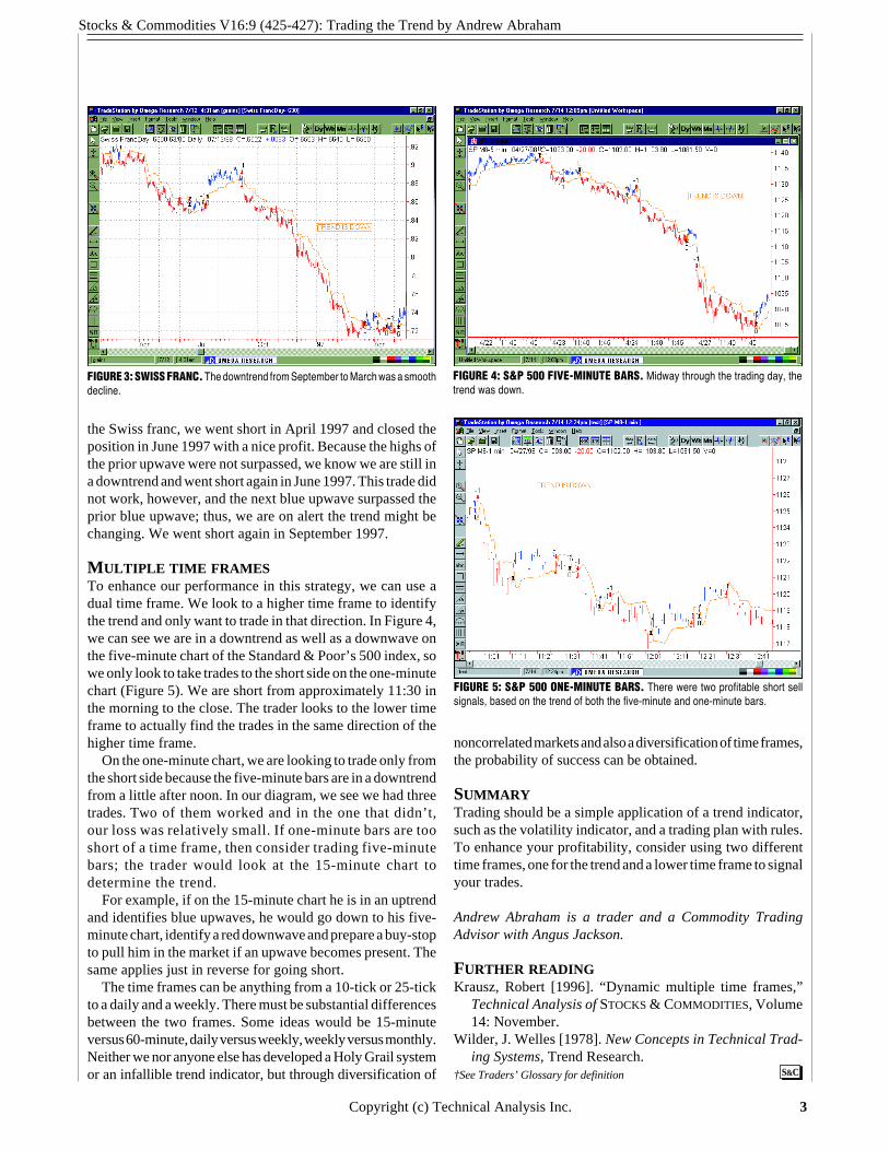
the Swiss franc, we went short in April 1997 and closed theposition in June 1997 with a nice profit. Because the highs ofthe prior upwave were not surpassed, we know we are still ina downtrend and went short again in June 1997. This trade didnot work, however, and the next blue upwave surpassed theprior blue upwave; thus, we are on alert the trend might bechanging. We went short again in September 1997.
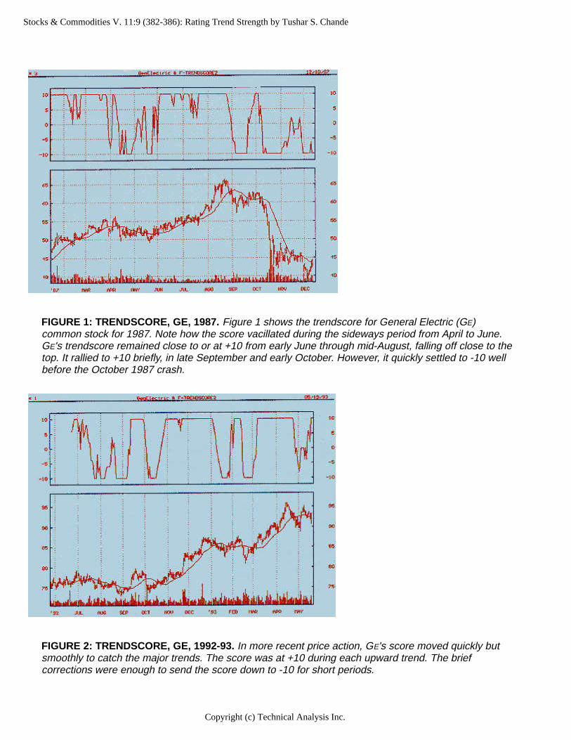
MULTIPLE TIME FRAMESTo enhance our performance in this strategy, we can use adual time frame. We look to a higher time frame to identifythe trend and only want to trade in that direction. In Figure 4,we can see we are in a downtrend as well as a downwave onthe five-minute chart of the Standard & Poor’s 500 index, sowe only look to take trades to the short side on the one-minutechart (Figure 5). We are short from approximately 11:30 inthe morning to the close. The trader looks to the lower timeframe to actually find the trades in the same direction of thehigher time frame.
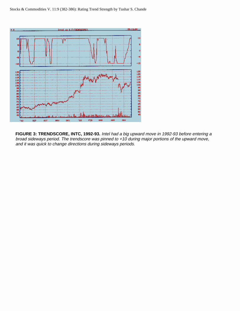
On the one-minute chart, we are looking to trade only fromthe short side because the five-minute bars are in a downtrendfrom a little after noon. In our diagram, we see we had threetrades. Two of them worked and in the one that didn’t,our loss was relatively small. If one-minute bars are tooshort of a time frame, then consider trading five-minutebars; the trader would look at the 15-minute chart todetermine the trend.
For example, if on the 15-minute chart he is in an uptrendand identifies blue upwaves, he would go down to his five-minute chart, identify a red downwave and prepare a buy-stopto pull him in the market if an upwave becomes present. Thesame applies just in reverse for going short.
The time frames can be anything from a 10-tick or 25-tickto a daily and a weekly. There must be substantial differencesbetween the two frames. Some ideas would be 15-minuteversus 60-minute, daily versus weekly, weekly versus monthly.Neither we nor anyone else has developed a Holy Grail systemor an infallible trend indicator, but through diversification of
FIGURE 3: SWISS FRANC. The downtrend from September to March was a smoothdecline.
FIGURE 4: S&P 500 FIVE-MINUTE BARS. Midway through the trading day, thetrend was down.
FIGURE 5: S&P 500 ONE-MINUTE BARS. There were two profitable short sellsignals, based on the trend of both the five-minute and one-minute bars.
noncorrelated markets and also a diversification of time frames,the probability of success can be obtained.
SUMMARYTrading should be a simple application of a trend indicator,such as the volatility indicator, and a trading plan with rules.To enhance your profitability, consider using two differenttime frames, one for the trend and a lower time frame to signalyour trades.
Andrew Abraham is a trader and a Commodity TradingAdvisor with Angus Jackson.
FURTHER READINGKrausz, Robert [1996]. “Dynamic multiple time frames,”
Technical Analysis of STOCKS & COMMODITIES, Volume14: November.
Wilder, J. Welles [1978]. New Concepts in Technical Trad-ing Systems, Trend Research.
S&C†See Traders’ Glossary for definition

Stocks & Commodities V. 11:9 (382-386): Rating Trend Strength by Tushar S. Chande
Rating Trend Strength by Tushar S. Chande
Here's a simple indicator of trend strength. It goes like this: A value of +10 signals an uptrend; a value of -10 signals a downtrend. STOCKS & COMMODITIES Contributing Editor Tushar Chande uses this simple rating system to help answer the eternal traders' question: Is the market trending?
As you may have noticed, a number of rather complicated indicators are available to measure trend
strength. None of these indicators, unfortunately, is perfect. You could use J. Welles Wilder's average directional index (ADX) as an indicator of trend strength, or perhaps the r² value from linear regression analysis. Or you could even use the vertical horizontal filter (VHF) to help determine whether the market is trending.
Each of these indicators requires the user to determine how many days' data should be used in the calculations. As you vary the indicator length or number of days used in the calculation, however, the result of the calculation changes also. Thus, there is no unambiguous answer. If the market were about to enter or leave a trading range, you could get a different indication of trend strength every day — a frustrating set of circumstances.
RATING THE TREND
Here is my way of rating a trend, a method I call trendscore. If today's close is greater than or equal to the close x days ago, score one point. If today's close is less than the close x days ago, the trend's rating loses one point.
Next, compare today's close to the close x+1 days ago. If today's close is greater than or equal to that close, score another point. Deduct one point if the close is lower than the prior close.
Article Text 1Copyright (c) Technical Analysis Inc.

Stocks & Commodities V. 11:9 (382-386): Rating Trend Strength by Tushar S. Chande
If (today's close >= close x days ago) then score = 1
If (today's close < close x days ago) then score = -1
Add up the score for 10 comparisons; the score varies from + 10 to -10. If today's close is greater than all the previous closes, then the trend's score is +10; if today's close is less than all the previous closes, the score is -10. You could smooth? the data by adding fewer than 10 days or more than 10 days.
Trendscore = 10-day sum of scores from days 11 to 20
I begin my calculations at 11 days back from the present and go back another 10 days. Thus, I compare today's close to the closes from 11 to 20 days ago. If today's close is greater than all 10 closes, then the trend's score is +10. If today's close is less than the closes from 11 to 20 days ago, then the trend's score is -10. In sideways markets, the score ranges from +10 to -10. A positive score shows an upward trend bias. Similarly, a negative score shows a downward bias.
I prefer the 11- to 20-day period because it fits my trading horizon. A shorter time of comparison may be too volatile, producing frequent trend change signals, while a longer comparison time is slow to respond. During long trends, the trendscore remains at the outer limits, +10 or -10, for the duration of the trend. In sideways markets, the score doesn't remain at +10 or -10 for long, oscillating between these limits.
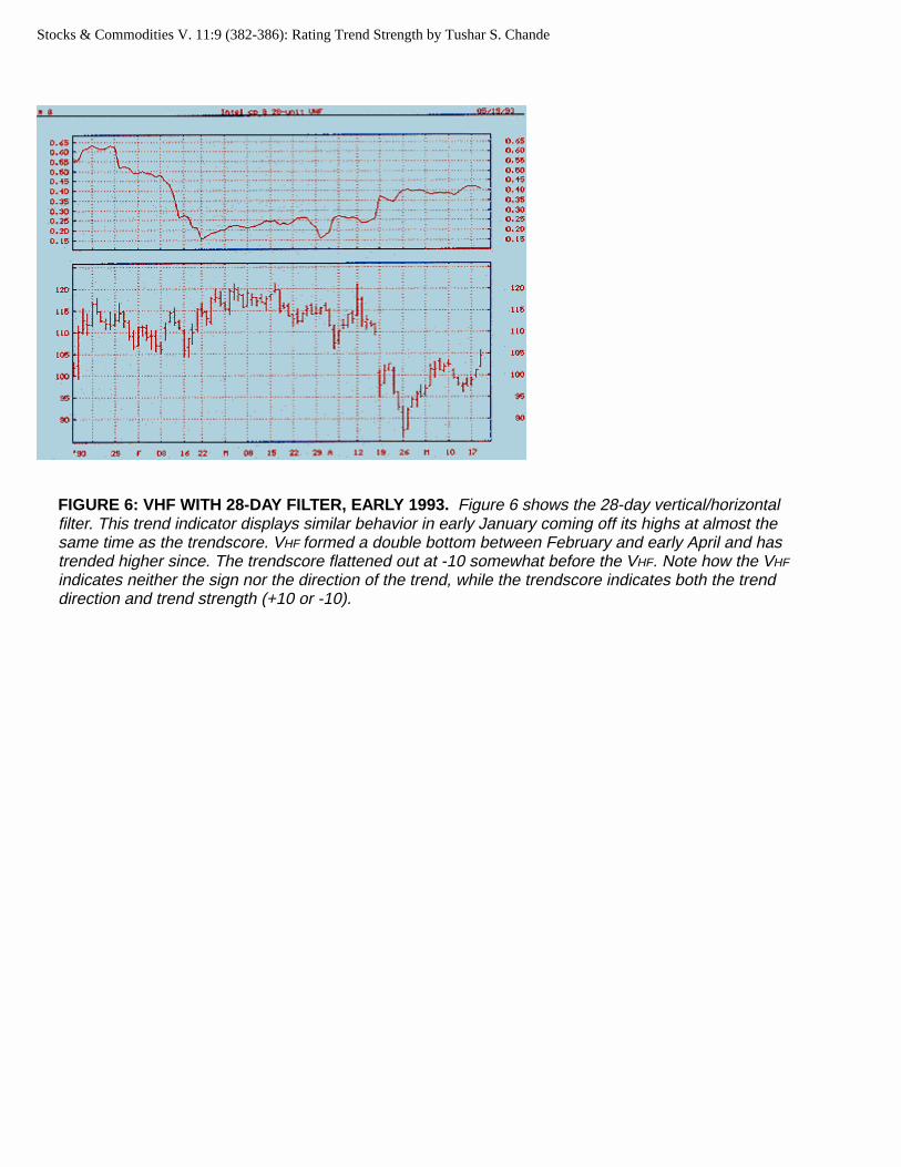
Note how the V HF indicates neither the sign nor the direction of the trend, while the trendscore indicates both the trend direction and trend strength.
METASTOCK FORMULAS
We can use MetaStock to rate trends using the trendscore method . In MetaStock's formula builder, we use the ref function to refer to past data:
TrendScore = if(c,>=,ref(c,-11),1,-1)+if(c,>=,ref(c,-12),1,-1)+if(c,>=,ref(c,-13),1,-1)+if(c,>=,ref(c,-14),1,-1)+if(c,>=,ref(c,-15),1,-1)+if(c,>=,ref(c,-16),1,-1)+if(c,>=,ref(c,-17),1,-1)+if(c,>=,ref(c,-18),1,-1)+if(c,>=,ref(c,-19),1,-1)+if(c,>=,ref(c,-20),1,-1)
Figure 1 shows the trendscore for General Electric (GE) common stock for 1987. Note how the score vacillated during the sideways period from April to June. GE's trendscore remained close to or at +10 from early June through mid-August, falling off close to the top. It rallied to +10 briefly in late September and early October. However, it quickly settled to -10 well before the October 1987 crash. In more recent price action, GE'S score moved quickly but smoothly to catch the major trends (Figure 2). The score was at +10 during each upward trend. The brief corrections were enough to send the score
Article Text 2Copyright (c) Technical Analysis Inc.
Stocks & Commodities V. 11:9 (382-386): Rating Trend Strength by Tushar S. Chande
FIGURE 2: TRENDSCORE, GE, 1992-93. In more recent price action, GE's score moved quickly but smoothly to catch the major trends. The score was at +10 during each upward trend. The brief corrections were enough to send the score down to -10 for short periods.
Copyright (c) Technical Analysis Inc.
FIGURE 1: TRENDSCORE, GE, 1987. Figure 1 shows the trendscore for General Electric (GE) common stock for 1987. Note how the score vacillated during the sideways period from April to June. GE's trendscore remained close to or at +10 from early June through mid-August, falling off close to the top. It rallied to +10 briefly, in late September and early October. However, it quickly settled to -10 well before the October 1987 crash.

Stocks & Commodities V. 11:9 (382-386): Rating Trend Strength by Tushar S. Chande
down to -10 for short periods.
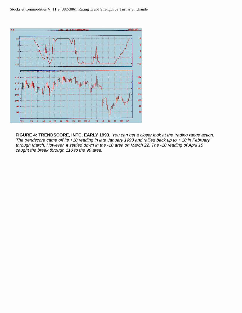
Intel (INTC) had a big upward move in 1992-93 before entering a broad sideways period (Figure 3). The trendscore was pinned to +10 during major portions of the upward move, and it was quick to change directions during sideways periods. You can get a closer look at the trading range action in Figure 4. The trendscore came off its +10 reading in late January 1993 and rallied back up to +10 in February through March. However, it settled down in the -10 area on March 22. The -10 reading of April 15 caught the break through 110 to the 90 area.
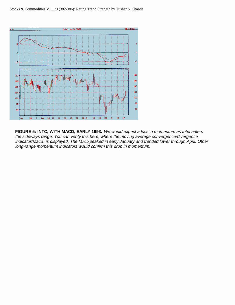
We would expect a loss in momentum as Intel enters the sideways range. You can verify this in Figure 5, which displays the moving average convergence/divergence indicator (MACD). The MACD peaked in early January and trended lower through April. Other long-range momentum indicators would confirm this drop in momentum.
Figure 6 shows the 28-day vertical/horizontal filter. This trend indicator displays similar behavior in early January, coming off its highs at almost the same time as the trendscore. V HF formed a double bottom between February and early April and has trended higher since. The trendscore flattened out at -10 somewhat before the VHF. Note how the VHF indicates neither the sign nor the direction of the trend, while the trendscore indicates both the trend direction and trend strength (+ 10 or -10).
A MATTER OF STYLE
You could trade the trendscore many ways. You could use the zero crossing as an early signal. You would then buy when the trendscore becomes positive and sell when it becomes negative. Or you could wait one to three days after the trendscore reaches +10 or -10 before buying (+ 10) or selling (-10) . Or you could combine the trendscore with a moving average, trading an upward or downward cross over. Another variation would be to go long after the trendscore crosses from -10 to above +5 and go short after the trendscore falls from +10 to below 5. The approach you choose depends on your trading style.
You could also smooth the trendscore with more or fewer days than I used in my calculations. You could, for example, use fewer than 10 days for short-term and 20 to 30 days for intermediate-term trading. You could also combine trendscore with other indicators of trend strength. For example, if you combined it with the VHF indicator, trendscore would provide an indication of direction, while the V HF could provide additional information about the trend's strength.
You could also substitute intraday data in the trendscore method for short-term trading, using hourly data to calculate a trend's score instead of daily data.
Trendscore is a simple way to rate trend strength. It indicates both the direction and strength of the trend and can be easily combined with various trend-following strategies.
Tushar Chande, CTA, holds a doctorate in engineering from the University of Illinois and a master's degree in business administration from the University of Pittsburgh. He is a principal of Kroll, Chande, & Co.
ADDITIONAL READING
Appel, Gerald [1985]. The Moving Average Convergence-Divergence Trading Method , Advanced
References 3Copyright (c) Technical Analysis Inc.
Stocks & Commodities V. 11:9 (382-386): Rating Trend Strength by Tushar S. Chande
FIGURE 3: TRENDSCORE, INTC, 1992-93. Intel had a big upward move in 1992-93 before entering a broad sideways period. The trendscore was pinned to +10 during major portions of the upward move, and it was quick to change directions during sideways periods.
Stocks & Commodities V. 11:9 (382-386): Rating Trend Strength by Tushar S. Chande
FIGURE 4: TRENDSCORE, INTC, EARLY 1993. You can get a closer look at the trading range action. The trendscore came off its +10 reading in late January 1993 and rallied back up to + 10 in February through March. However, it settled down in the -10 area on March 22. The -10 reading of April 15 caught the break through 110 to the 90 area.
Stocks & Commodities V. 11:9 (382-386): Rating Trend Strength by Tushar S. Chande
FIGURE 5: INTC, WITH MACD, EARLY 1993. We would expect a loss in momentum as Intel enters the sideways range. You can verify this here, where the moving average convergence/divergence indicator(Macd) is displayed. The MACD peaked in early January and trended lower through April. Other long-range momentum indicators would confirm this drop in momentum.
Stocks & Commodities V. 11:9 (382-386): Rating Trend Strength by Tushar S. Chande
FIGURE 6: VHF WITH 28-DAY FILTER, EARLY 1993. Figure 6 shows the 28-day vertical/horizontal filter. This trend indicator displays similar behavior in early January coming off its highs at almost the same time as the trendscore. VHF formed a double bottom between February and early April and has trended higher since. The trendscore flattened out at -10 somewhat before the VHF. Note how the VHF
indicates neither the sign nor the direction of the trend, while the trendscore indicates both the trend direction and trend strength (+10 or -10).

Stocks & Commodities V. 11:9 (382-386): Rating Trend Strength by Tushar S. Chande
Version, Scientific Investment Systems.Colby, R.W., and T.A. Meyers [1988]. The Encyclopedia of Technical Market Indicators , Dow
Jones-Irwin.Pring, Martin J. [ 1985]. Technical Analysis Explained, McGraw-Hill Book Co.Wilder, J. Welles [1978]. New Concepts in Technical Trading Systems , Trend Research.
4Copyright (c) Technical Analysis Inc.
Stocks & Commodities V. 10:7 (313-315): Stocks According To Trend Tendency by Stuart Meibuhr
Stocks According To Trend Tendency by Stuart Meibuhr
Many times, a question asked of STOCKS & COMMODITIES readers will more than likely find an answer — and more than an answer, further questions. Such was the article that E. Michael Poulos presented early in 1991, when he showed how assumed trend tendencies ain't necessarily so. Here, Stuart Meibuhr answers one of those corollary questions. If certain futures contracts show decided trend tendencies, can the same be said about certain stocks or indices?
The question that E. Michael Poulos asked in the January 1992 STOCKS & COMMODITIES was "Which
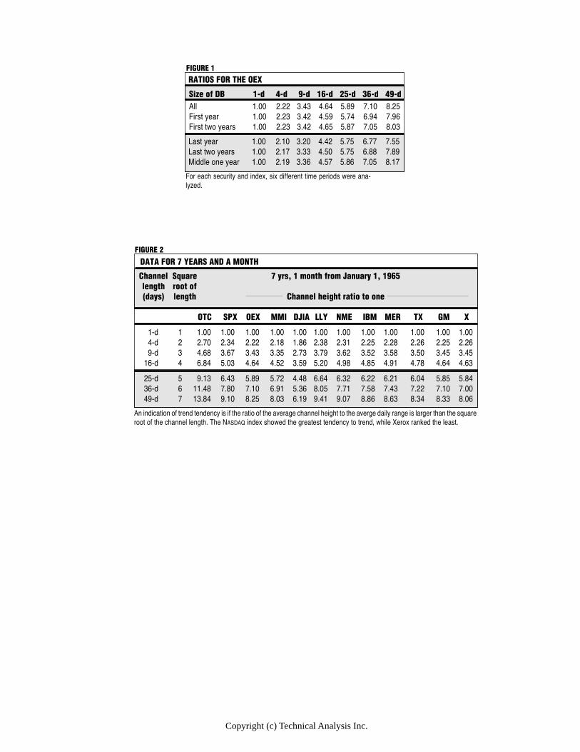
futures trend the most?" In turn, that question triggered a corollary question, "Which stocks or stock indices trend the most?" Poulos's methodology involved measuring the difference between the highest high and the lowest low for seven channel lengths (days) from 1 to 49. The range was averaged to arrive at an average channel height for one-, two-, four-,nine-, 16-,25-, 36- and 49-day channels. Each average was divided by the average for the one-day channel to arrive at a ratio.
Applying the same methodology to several market indices and seven stocks provided some enlightening information. A spreadsheet program was used for the calculations on data transferred from a charting program. Only those securities with histories dating to back before 1985 were used. Data for any holidays were eliminated before the trend calculations. All calculations were performed on data dating from January 2, 1985, to January 31, 1992, a period of seven years and one month.
SIX SELECT
Article Text 1Copyright (c) Technical Analysis Inc.
Copyright (c) Technical Analysis Inc.
Size of DB 1-d 4-d 9-d 16-d 25-d 36-d 49-d
Last year 1.00 2.10 3.20 4.42 5.75 6.77 7.55Last two years 1.00 2.17 3.33 4.50 5.75 6.88 7.89Middle one year 1.00 2.19 3.36 4.57 5.86 7.05 8.17
All 1.00 2.22 3.43 4.64 5.89 7.10 8.25First year 1.00 2.23 3.42 4.59 5.74 6.94 7.96First two years 1.00 2.23 3.42 4.65 5.87 7.05 8.03
RATIOS FOR THE OEX
For each security and index, six different time periods were ana-lyzed.
FIGURE 1
Channel Square 7 yrs, 1 month from January 1, 1965length root of(days) length Channel height ratio to one
OTC SPX OEX MMI DJIA LLY NME IBM MER TX GM X
25-d 5 9.13 6.43 5.89 5.72 4.48 6.64 6.32 6.22 6.21 6.04 5.85 5.8436-d 6 11.48 7.80 7.10 6.91 5.36 8.05 7.71 7.58 7.43 7.22 7.10 7.0049-d 7 13.84 9.10 8.25 8.03 6.19 9.41 9.07 8.86 8.63 8.34 8.33 8.06
DATA FOR 7 YEARS AND A MONTH
An indication of trend tendency is if the ratio of the average channel height to the averge daily range is larger than the squareroot of the channel length. The NASDAQ index showed the greatest tendency to trend, while Xerox ranked the least.
1-d 1 1.00 1.00 1.00 1.00 1.00 1.00 1.00 1.00 1.00 1.00 1.00 1.004-d 2 2.70 2.34 2.22 2.18 1.86 2.38 2.31 2.25 2.28 2.26 2.25 2.269-d 3 4.68 3.67 3.43 3.35 2.73 3.79 3.62 3.52 3.58 3.50 3.45 3.45
16-d 4 6.84 5.03 4.64 4.52 3.59 5.20 4.98 4.85 4.91 4.78 4.64 4.63
FIGURE 2
Stocks & Commodities V. 10:7 (313-315): Stocks According To Trend Tendency by Stuart Meibuhr
For each security, I analyzed six different time periods, which consisted of the entire data set; the first year, the first two years; the last year; the last two years; and one year selected from the middle. This ensured that the ratios were independent of the selected time periods. This turned out not to be completely true. For example, the data in Figure 1 for the OEX are shown for these six different time periods.
Although some variations amounted to almost 10% between the smallest and the largest ratio for any given time period, the trends from the shortest to the longest time period remained the same. Consequently, the ratios for only the entire seven years and one month of data are reported here for the other studied securities. These results for five stock market indices and seven stocks can be seen in Figure 2.
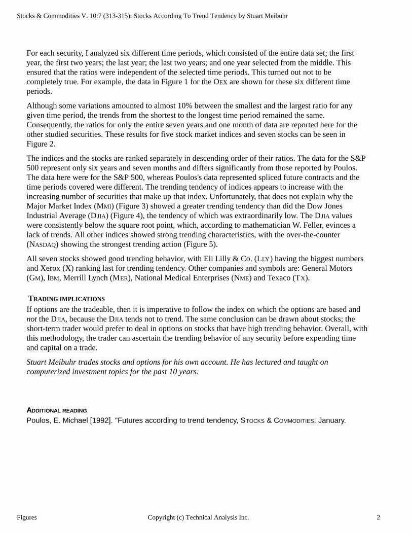
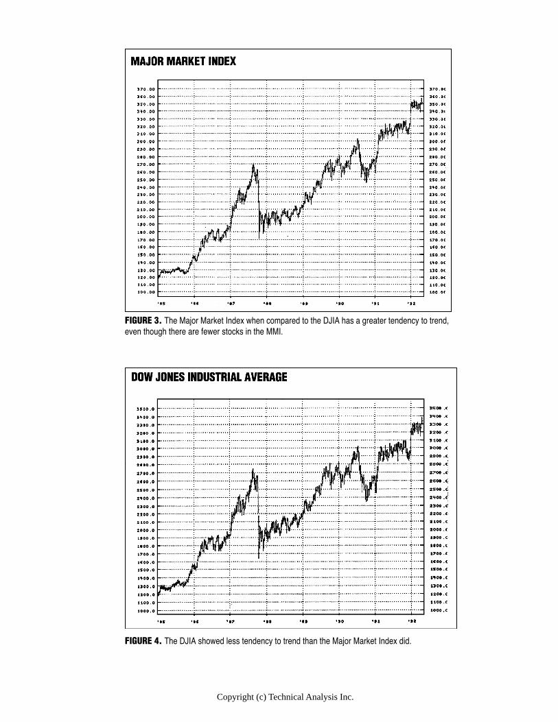
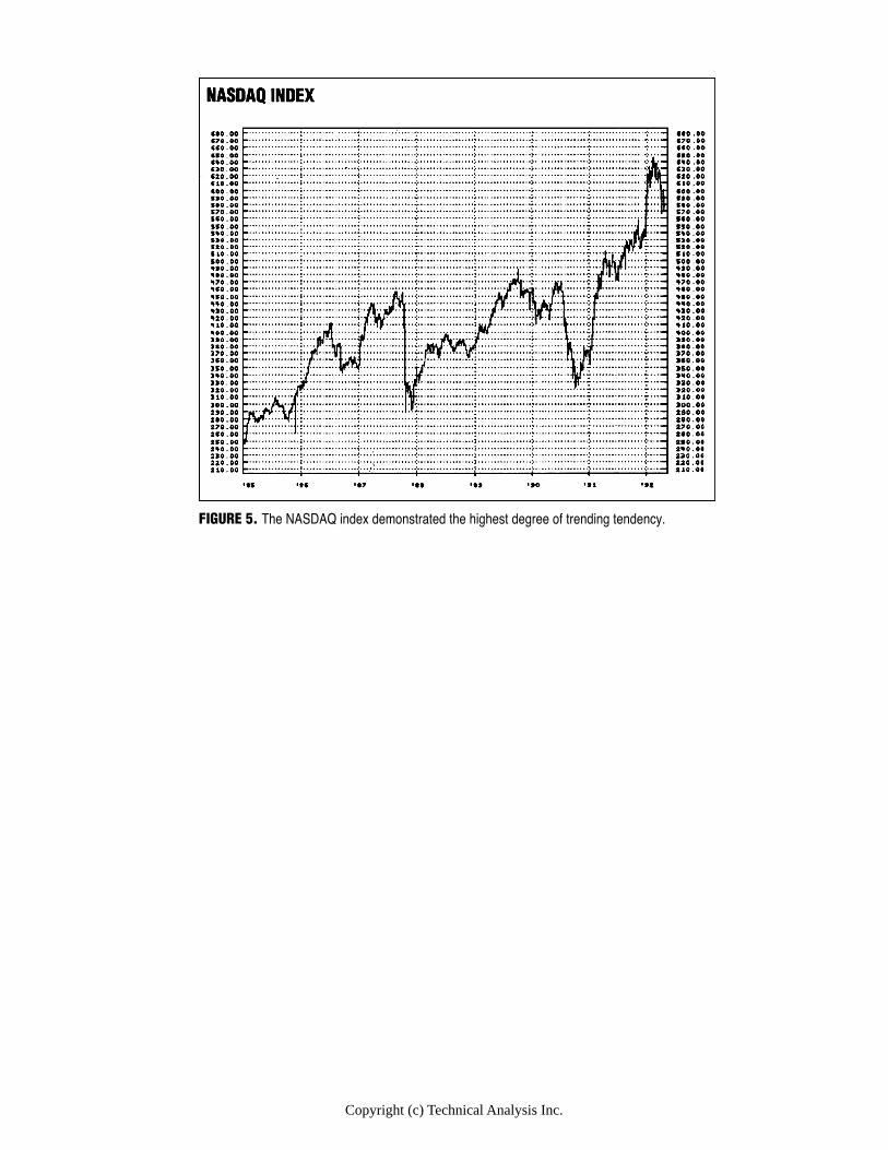
The indices and the stocks are ranked separately in descending order of their ratios. The data for the S&P 500 represent only six years and seven months and differs significantly from those reported by Poulos. The data here were for the S&P 500, whereas Poulos's data represented spliced future contracts and the time periods covered were different. The trending tendency of indices appears to increase with the increasing number of securities that make up that index. Unfortunately, that does not explain why the Major Market Index (MMI) (Figure 3) showed a greater trending tendency than did the Dow Jones Industrial Average (DJIA) (Figure 4), the tendency of which was extraordinarily low. The DJIA values were consistently below the square root point, which, according to mathematician W. Feller, evinces a lack of trends. All other indices showed strong trending characteristics, with the over-the-counter (NASDAQ) showing the strongest trending action (Figure 5).
All seven stocks showed good trending behavior, with Eli Lill y & Co. (LLY ) having the biggest numbers and Xerox (X) ranking last for trending tendency. Other companies and symbols are: General Motors (GM), IBM, Merrill Lynch (MER), National Medical Enterprises (NME) and Texaco (TX).
TRADING I MPLIC ATIONS
If options are the tradeable, then it is imperative to follow the index on which the options are based and not the DJIA, because the DJIA tends not to trend. The same conclusion can be drawn about stocks; the short-term trader would prefer to deal in options on stocks that have high trending behavior. Overall, with this methodology, the trader can ascertain the trending behavior of any security before expending time and capital on a trade.
Stuart Meibuhr trades stocks and options for his own account. He has lectured and taught on computerized investment topics for the past 10 years.
ADDITIONAL READING Poulos, E. Michael [1992]. "Futures according to trend tendency, STOCKS & COMMODITIES, January.
Figures 2Copyright (c) Technical Analysis Inc.
Copyright (c) Technical Analysis Inc.
FIGURE 3. The Major Market Index when compared to the DJIA has a greater tendency to trend,even though there are fewer stocks in the MMI.
FIGURE 4. The DJIA showed less tendency to trend than the Major Market Index did.
Copyright (c) Technical Analysis Inc.
FIGURE 5. The NASDAQ index demonstrated the highest degree of trending tendency.
Stocks & Commodities V. 10:1 (38-42): Futures According To Trend Tendency by E. Michael Poulos
Futures According To Trend Tendency by E. Michael Poulos
Not all markets have the same tendency to trend. E. Michael Poulos uses his February 1991 STOCK & COMMODITIES article, "Of trends and random walks," on the random walk index, which separates trends from random drifts by allowing for trend, as the basis of this article. He explains that the commodity futures you may for one reason or another assume trend strongly may not in fact. By using similar methods as previously, he produces a table of 28 commodities futures and debunks some futures assumptions — for instance, there is a school of thought that assumes that crude oil, gasoline and heating oil all show similar trending tendencies, whereas in truth crude oil and gasoline are near the top of the list, and heating oil, the poor country cousin, comes out only near the middle. Poulos goes into why.
Which futures trend strongest? My February 1991 article, "Of trends and random walks," explained
how the random walk index, which separates trends from random drifts by al- lowing for the direct measurement of trend, could be used toward this end. (See sidebar, "The random walk index.") By using a view of price-time history similar to the one used previously, we can determine how to rank various futures according to their inclination of trend. We attempted to maintain objectivity by not requiring the arbitrary choice of a predetermined fixed lookback interval (for example, the length of a moving average). Other attempted rankings of this kind are often questionable in result because they do not specially distinguish between random drifts and trends.
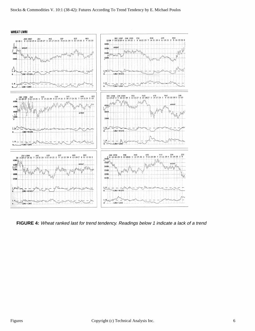
Some results may surprise you. For example, do you believe wheat trends stronger than corn? Or cattle trends stronger than hogs? Wrong. Cattle and wheat are the weakest of the 28 futures covered here. Corn, on the other hand, ranks near the top, sixth out of 28. Do you figure crude oil, gasoline and heating oil all show the same tendency to trend? Wrongo! Crude oil and gasoline are near the top of the list, while
Article Text 1Copyright (c) Technical Analysis Inc.
Stocks & Commodities V. 10:1 (38-42): Futures According To Trend Tendency by E. Michael Poulos
heating oil is well down toward the middle.
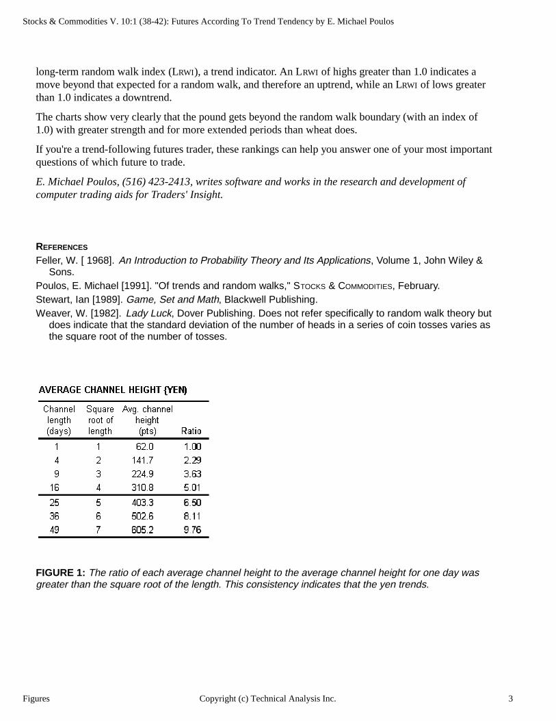
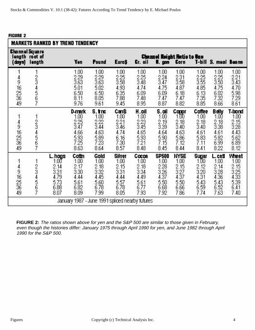
Some explanations are in order. The average channel height for yen (Figure 1) provides some. For the four-day channel length, for example, we start at Day 4 and look back for the highest high and the lowest low from Day 1 through Day 4. We record that high to low difference. We then repeat the above for Day 2 through Day 5, 3 through 6 and so on. We then average all these heights to get the average channel height figure for four day channels. This process is then repeated for each of the a various channel length (that is, lookback intervals). The 2.29 ratio on the four-day row for yen is obtained by dividing the average four-day channel height by the average one-day channel height (141.7 divided by 62.0). For the sake of brevity, we show the average channel height only for yen, but the same procedure was used for all 28 futures (Figure 2).
As we indicated in "Of trends and random walks," these ratios follow, but tend to consistently exceed, the square root of the number of days. Notice that wheat, the weakest trender, barely manages to get beyond the square root figures (recall that 3 is the square root of 9, 4 is the square root of 16, and so forth).
Mathematician W. Feller showed that a "random walk" generated by tossing a coin (one step forward if heads, one step backward if tails) would show a displacement from the starting point, depending on the square root of the number of tosses.
The consistent move beyond the square root point seen in all markets is evidence of trends. The yen clearly shows the strongest trending action, with its ratios well beyond the square roots, while wheat shows much less evidence of trends.
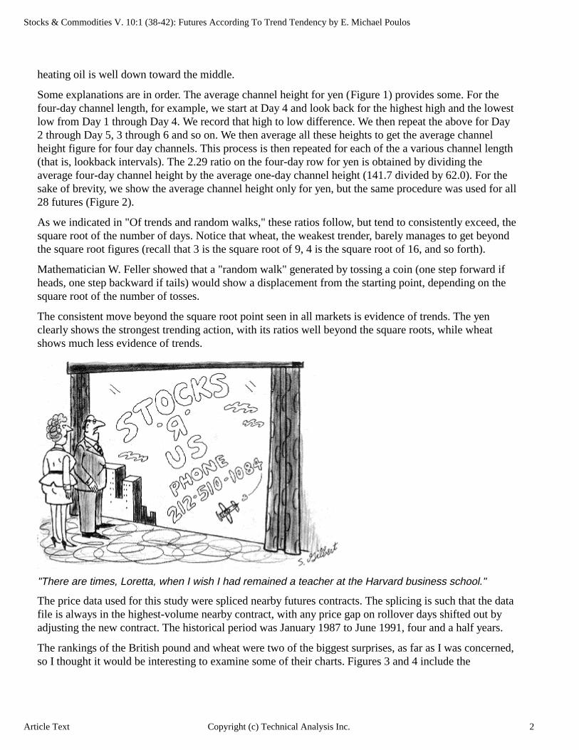
"There are times, Loretta, when I wish I had remained a teacher at the Harvard business school."
The price data used for this study were spliced nearby futures contracts. The splicing is such that the data file is always in the highest-volume nearby contract, with any price gap on rollover days shifted out by adjusting the new contract. The historical period was January 1987 to June 1991, four and a half years.
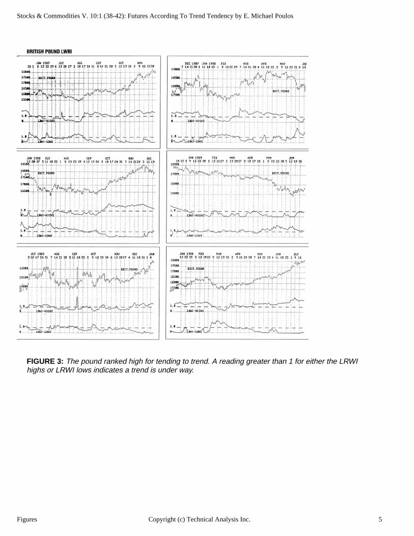
The rankings of the British pound and wheat were two of the biggest surprises, as far as I was concerned, so I thought it would be interesting to examine some of their charts. Figures 3 and 4 include the
Article Text 2Copyright (c) Technical Analysis Inc.
Stocks & Commodities V. 10:1 (38-42): Futures According To Trend Tendency by E. Michael Poulos
long-term random walk index (LRWI), a trend indicator. An LRWI of highs greater than 1.0 indicates a move beyond that expected for a random walk, and therefore an uptrend, while an LRWI of lows greater than 1.0 indicates a downtrend.
The charts show very clearly that the pound gets beyond the random walk boundary (with an index of 1.0) with greater strength and for more extended periods than wheat does.
If you're a trend-following futures trader, these rankings can help you answer one of your most important questions of which future to trade.
E. Michael Poulos, (516) 423-2413, writes software and works in the research and development of computer trading aids for Traders' Insight.
REFERENCES
Feller, W. [ 1968]. An Introduction to Probability Theory and Its Applications, Volume 1, John Wiley & Sons.
Poulos, E. Michael [1991]. "Of trends and random walks," STOCKS & COMMODITIES, February.Stewart, Ian [1989]. Game, Set and Math, Blackwell Publishing.Weaver, W. [1982]. Lady Luck, Dover Publishing. Does not refer specifically to random walk theory but
does indicate that the standard deviation of the number of heads in a series of coin tosses varies as the square root of the number of tosses.
FIGURE 1: The ratio of each average channel height to the average channel height for one day was greater than the square root of the length. This consistency indicates that the yen trends.
Figures 3Copyright (c) Technical Analysis Inc.
Stocks & Commodities V. 10:1 (38-42): Futures According To Trend Tendency by E. Michael Poulos
FIGURE 2: The ratios shown above for yen and the S&P 500 are similar to those given in February, even though the histories differ: January 1975 through April 1990 for yen, and June 1982 through April 1990 for the S&P 500.
Figures 4Copyright (c) Technical Analysis Inc.
Stocks & Commodities V. 10:1 (38-42): Futures According To Trend Tendency by E. Michael Poulos
FIGURE 3: The pound ranked high for tending to trend. A reading greater than 1 for either the LRWI highs or LRWI lows indicates a trend is under way.
Figures 5Copyright (c) Technical Analysis Inc.
Stocks & Commodities V. 10:1 (38-42): Futures According To Trend Tendency by E. Michael Poulos
FIGURE 4: Wheat ranked last for trend tendency. Readings below 1 indicate a lack of a trend
Figures 6Copyright (c) Technical Analysis Inc.
Stocks & Commodities V. 10:1 (38-42): SIDEBAR: THE RANDOM WALK INDEX
THE RANDOM WALK INDEXThe channel height ratio to one day figures given show a consistent excess beyond the square root column. This excess indicates the presence of trends and hints how to create a trend "yardstick." If no trends were present, the ratios would be expected to all fall exactly on the square roots, and thus an "expected random walk" over n days would be the square root of n multiplied by the average daily range (same as average one-day channel height).
We define the random walk index (RWI) as the ratio of an actual price move to the expected random walk. If the move is larger than a random walk (and therefore a trend), its index would be larger than 1.0.
To keep track of where today's high is relative to previous lows and where today's low is relative to previous highs, we need two indices:
RWI of high=(H-Ln)/(Avg.mg.x n )
RWI of low=(Hn-L)/(Avg.mg.x n )
where "Hn" and "Ln" are the high and lows of n days ago and "avg rng" is the average daily range over the n days preceding today. In day-to-day use, these indices are calculated over a range of lookback lengths. Use the largest value returned for today's indicator. Thus, we let the market determine the lookback interval,rather than use a fixed arbitrary one as many current indicators do.
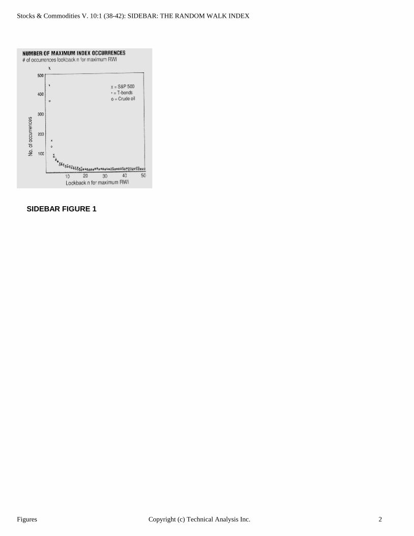
In addition, Figure 1 gives us a very important insight, showing the distribution of lookback lengths for the largest RWI (how many times did the largest RWI occur looking back two days, three days, four, five, six...?). Since the curve of Figure 1 bends at a fairly sharp corner, the entire curve can be approximated by only two straight lines. This means that the markets, to a very good approximation, can be thought of as displaying two distinct personalities. The corner of Figure 1 is showing us where the dividing line between short- and longterm behavior is, between seven and eight days. We therefore calculate two RWIS, one for short term (two to seven days' lookback), and one for longer-term (eight days and up). The short-term one is a good overbought/oversold indicator and the long-term one is a very good trend indicator.
Figures 1Copyright (c) Technical Analysis Inc.
Stocks & Commodities V. 10:1 (38-42): SIDEBAR: THE RANDOM WALK INDEX
SIDEBAR FIGURE 1
Figures 2Copyright (c) Technical Analysis Inc.
Stocks & Commodities V. 9:7 (298-300): What Is A Trend, Anyway? by John Sweeney
What Is A Trend, Anyway? by John Sweeney
A reader reacting to the Settlement article in January on trading basics (Settlement, "Trading simply:
Minimizing losses," Stocks & COMMODITIES, January 1991) asked a key question: What is a trend? How do I identify it when I'm trading? (Personally, I use dual moving averages.) Most of us could think of a number of ways of defining trends, but it fascinates me what our analytical methods tell us about our own thinking. Typically, our thought of "trend" amounts to no more than drawing lines upward or downward. I think it should also encompass drawing them horizontally.
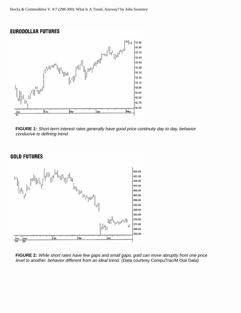
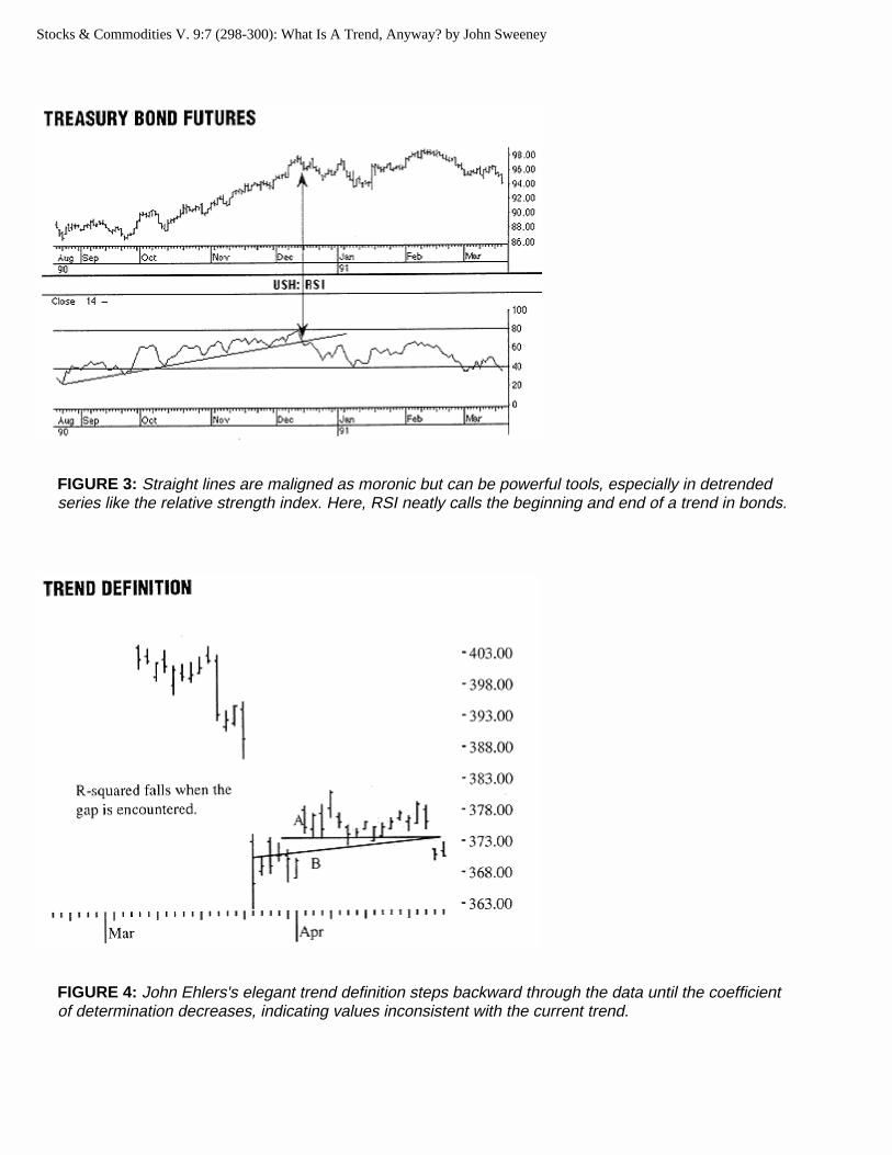
The trend is our friend, we think, because that's when price changes occur in some unidentified, regular progression upon which event we make money. Questioning the key elements — persistent movement over time — by looking at charts, it's evident that tradeables can move smoothly, like the Eurodollars in Figure 1 or Treasury bills (Fed managed), or abruptly, like, say, gold, which is notorious for opening $20 away from where it's been for the last six weeks (Figure 2).
My conclusion? Trending behavior varies by tradeable and is more apparent in "managed" prices (such as specialist supported stocks and short-term interest rates) or markets of mammoth size where the sheer number of participants precludes truly abrupt change — say, debt and currencies. Despite this, we look for (hope for?) a straight line progression of prices from one level to another, hence the urge to draw straight lines on all charts of fluctuating prices.
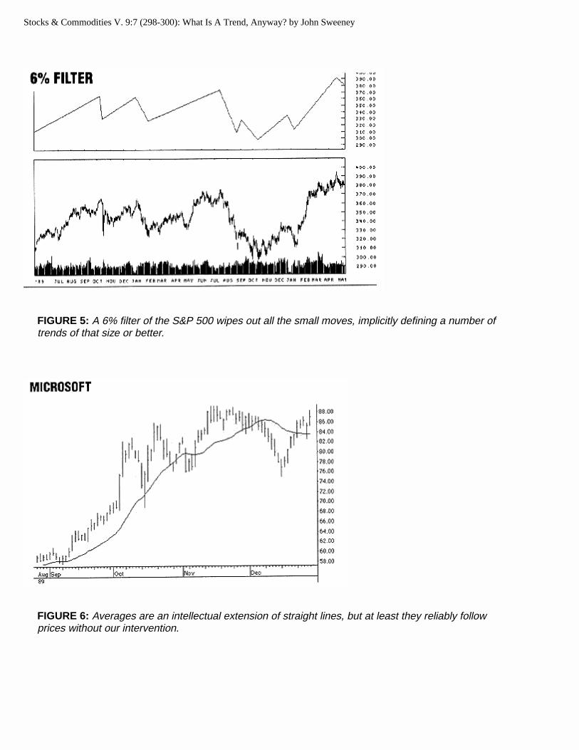
By drawing straight lines, are we really trying to model this variegated behavior or just expressing our own preconceptions and, thus, limitations of thought? Prices do exhibit persistence (that is, statistical dependence): they usually open "around" where they closed and the next price is "around" where the last price was. However, even if that phenomenon justifies describing that behavior with a single line, I can't think of a reason for it to be straight. Though straight lines can be powerful analytical tools (Figure 3), our strong preference for them is foremost our own wishful thinking.
STRAIGHT LINE ELEGANCE
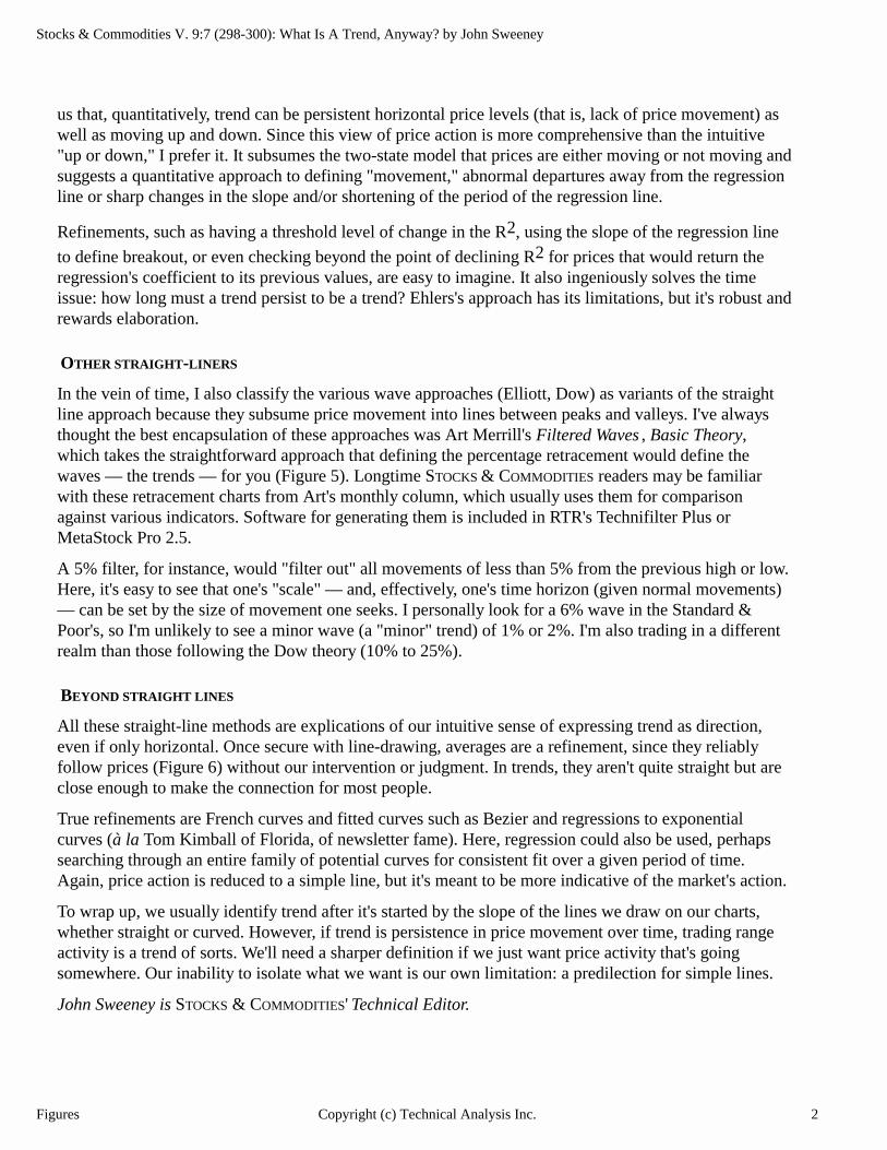
A nifty refinement of the straight line approach was developed by John Ehlers for his cyclic analysis
work. He'd run a regression line (line A in Figure 4) through the last 20 days of data and record the R2.
Then he would extend the line one day further back in time and recalculate the R2. If it stayed the same or increased, then the added day was consistent with the previous 20-day trend and he would go back another day to repeat the calculation. Stepping backward in this fashion (line B in Figure 4), he'd
eventually find a point where the R2 decreased (the gap in Figure 4), an indication that the latest added price was inconsistent with the most recent trend.
All these straight-line methods are explications of our intuiti ve sense of expressing trend as direction, e ven if onl y horizontal.
The beauty of this approach is that it is indifferent to prices rising, falling or staying level. It points out to
Article Text 1Copyright (c) Technical Analysis Inc.
Stocks & Commodities V. 9:7 (298-300): What Is A Trend, Anyway? by John Sweeney
FIGURE 1: Short-term interest rates generally have good price continuity day to day, behavior conducive to defining trend.
FIGURE 2: While short rates have few gaps and small gaps, gold can move abruptly from one price level to another, behavior different from an ideal trend. (Data courtesy CompuTrac/M Dial Data)
Stocks & Commodities V. 9:7 (298-300): What Is A Trend, Anyway? by John Sweeney
FIGURE 3: Straight lines are maligned as moronic but can be powerful tools, especially in detrended series like the relative strength index. Here, RSI neatly calls the beginning and end of a trend in bonds.
FIGURE 4: John Ehlers's elegant trend definition steps backward through the data until the coefficient of determination decreases, indicating values inconsistent with the current trend.
Stocks & Commodities V. 9:7 (298-300): What Is A Trend, Anyway? by John Sweeney
FIGURE 5: A 6% filter of the S&P 500 wipes out all the small moves, implicitly defining a number of trends of that size or better.
FIGURE 6: Averages are an intellectual extension of straight lines, but at least they reliably follow prices without our intervention.
Stocks & Commodities V. 9:7 (298-300): What Is A Trend, Anyway? by John Sweeney
us that, quantitatively, trend can be persistent horizontal price levels (that is, lack of price movement) as well as moving up and down. Since this view of price action is more comprehensive than the intuitive "up or down," I prefer it. It subsumes the two-state model that prices are either moving or not moving and suggests a quantitative approach to defining "movement," abnormal departures away from the regression line or sharp changes in the slope and/or shortening of the period of the regression line.
Refinements, such as having a threshold level of change in the R2, using the slope of the regression line
to define breakout, or even checking beyond the point of declining R2 for prices that would return the regression's coefficient to its previous values, are easy to imagine. It also ingeniously solves the time issue: how long must a trend persist to be a trend? Ehlers's approach has its limitations, but it's robust and rewards elaboration.
OTHER STRAIGHT -LINERS
In the vein of time, I also classify the various wave approaches (Elliott, Dow) as variants of the straight line approach because they subsume price movement into lines between peaks and valleys. I've always thought the best encapsulation of these approaches was Art Merrill's Filtered Waves, Basic Theory, which takes the straightforward approach that defining the percentage retracement would define the waves — the trends — for you (Figure 5). Longtime STOCKS & COMMODITIES readers may be familiar with these retracement charts from Art's monthly column, which usually uses them for comparison against various indicators. Software for generating them is included in RTR's Technifilter Plus or MetaStock Pro 2.5.
A 5% filter, for instance, would "filter out" all movements of less than 5% from the previous high or low. Here, it's easy to see that one's "scale" — and, effectively, one's time horizon (given normal movements) — can be set by the size of movement one seeks. I personally look for a 6% wave in the Standard & Poor's, so I'm unlikely to see a minor wave (a "minor" trend) of 1% or 2%. I'm also trading in a different realm than those following the Dow theory (10% to 25%).
BEYOND STRAIGHT LINES
All these straight-line methods are explications of our intuitive sense of expressing trend as direction, even if only horizontal. Once secure with line-drawing, averages are a refinement, since they reliably follow prices (Figure 6) without our intervention or judgment. In trends, they aren't quite straight but are close enough to make the connection for most people.
True refinements are French curves and fitted curves such as Bezier and regressions to exponential curves (à la Tom Kimball of Florida, of newsletter fame). Here, regression could also be used, perhaps searching through an entire family of potential curves for consistent fit over a given period of time. Again, price action is reduced to a simple line, but it's meant to be more indicative of the market's action.
To wrap up, we usually identify trend after it's started by the slope of the lines we draw on our charts, whether straight or curved. However, if trend is persistence in price movement over time, trading range activity is a trend of sorts. We'll need a sharper definition if we just want price activity that's going somewhere. Our inability to isolate what we want is our own limitation: a predilection for simple lines.
John Sweeney is STOCKS & COMMODITIES' Technical Editor.
Figures 2Copyright (c) Technical Analysis Inc.

Stocks & Commodities V. 8:10 (377-381): Early Trend Identification by John F. Ehlers
Early Trend Identification by John F. Ehlers
Impressive profits can be accumulated just by staying with a position during a trend. We would all be
millionaires if only we could identify the trend early in its onset. While the trends are obvious in retrospect, it's another matter altogether to identify the trend in the heat of battle. Not only that, there may not be a trend at all at the time we expect one.
If we make a reasonable mathematical model of the market we can examine it parametrically. The conclusions we draw from this model can help us establish our entry points and strategies for trading the trends. We will view the market as a random walk problem to create our model.
Random walk for the marketIn the same way that water can only flow downstream, time cannot be reversed in trading. In addition, prices can only be higher or lower in the same way that the river can only bend to the right or left. These elements constrain the random walk problem to a special form that mathematicians call "drunkard's walk." In the simplest form of this walk, the "drunk" steps only into a square diagonally to the right or into a square diagonally to the left as he steps forward. He must make a new decision with each step. To make the decision random, he flips a coin to determine the direction he will take. Repeated many times, the overlay of paths that he follows will look like a smoke plume. The question of the drunkard's destination can be answered through a well-known partial differential equation called the Diffusion Equation. The density of the smoke particles in the plume is analogous to the probability of the drunkard's location. A multiple-exposure photograph of the drunkard's walk repeated over and over would show its randomness. This photograph would show the composite paths to have a uniform density,
Article Text 1Copyright (c) Technical Analysis Inc.
Stocks & Commodities V. 8:10 (377-381): Early Trend Identification by John F. Ehlers
widening from the initial position. The uniform density would make the sum of the paths look like smoke plume.
Further, random walk does not necessarily mean chaos. A minor variation of the drunkard's walk problem is to allow the random coin-flip decision to control the change of direction rather than the direction itself— that is, the random variable becomes momentum instead of direction. The partial differential equation describing this condition is known as the Telegrapher's Equation. The equation describes electric waves along telegraph wires, among other subjects. You can picture the result as the drunk reeling back and forth. He overcorrects around a general direction trying to reach an objective. This formulation of the problem, expressed in terms of physics, accurately portrays the river and explains why the river meanders. In a multiple-exposure photograph the paths are still randomly distributed. Nevertheless, the cycles are apparent in the shorter case of a single path. By analogy, the market has short-term cycles when the appropriate conditions prevail.
If enough traders ask themselves whether the market will go up today, the random variable is direction. Thus, conditions are established for the solution of the Diffusion Equation. On the other hand, if enough traders ask themselves whether the trend will continue, the random variable now becomes momentum. You could then expect the conditions to be established for the solution of the Telegrapher's Equation. The market is ripe for short-term cycle activity.
Identifying t rends with reverse logicAs formed by the random walk, our market model is either cyclic or trending. A moving average is about the only means we have to measure the trend directly. Moving averages are not very helpful because they are always lagging functions. However, we can measure the cycles and know when the market is cyclic. By reverse logic, if the market is not short-term cyclic, it must be trending. We can identify whether the market is cyclic in a period as short as a half cycle. Cycle analysis, therefore, can be used to spot a trend early in its formulation.
The early identification of a trend then depends on a valid measurement of short-term cyclic activity. There are two ways to do so, either by cycle elimination or by spectrum analysis. Of the two, cycle elimination is by far the easier.
Let's approach the question of cycle elimination using synthesis and then reverse the procedure to establish what we must do to perform the analysis. We can synthesize a theoretical price curve by adding a pure sinewave to a straight trendline. We then examine these two components independently. The average over the period of a theoretical sinewave is always zero, regardless of where we started the average. If we used a moving average with a length the period of the sinewave, then the sinewave is completely removed and we are left with only the straight line trend.
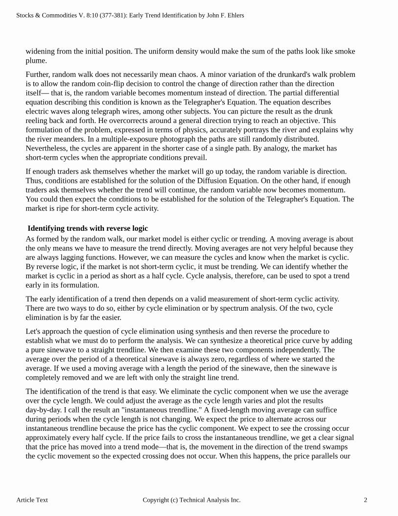
The identification of the trend is that easy. We eliminate the cyclic component when we use the average over the cycle length. We could adjust the average as the cycle length varies and plot the results day-by-day. I call the result an "instantaneous trendline." A fixed-length moving average can suffice during periods when the cycle length is not changing. We expect the price to alternate across our instantaneous trendline because the price has the cyclic component. We expect to see the crossing occur approximately every half cycle. If the price fails to cross the instantaneous trendline, we get a clear signal that the price has moved into a trend mode—that is, the movement in the direction of the trend swamps the cyclic movement so the expected crossing does not occur. When this happens, the price parallels our
Article Text 2Copyright (c) Technical Analysis Inc.
Copyright (c) Technical Analysis Inc.
FIGURE 1. We can identify a trend in the first five days of its move on March 2, 1990. At this pointwe have a 10-day cycle, and the price has not crossed the instantaneous trendline within thelast five days.
FIGURE 2. This spectrum shows an excellent 12-day cycle in February 22, 1990, just after weentered our short position.
Copyright (c) Technical Analysis Inc.
FIGURE 3. Here, the spectrum is taken on February 27, 1990. Note the subtle change. Thevery long cycle is starting to appear.
FIGURE 4. Figures 4, 5 and 6 show the progression of the spectrum for the next three tradingdays.

Copyright (c) Technical Analysis Inc.
FIGURE 5. The progression of the spectrum continues.
FIGURE 6. March 2, 1990, was the day previously declared that the trend was to be established.

Stocks & Commodities V. 8:10 (377-381): Early Trend Identification by John F. Ehlers
instantaneous trendline without crossing it. The instantaneous trendline is a lagging function like a normal moving average. Using the instantaneous trendline method, a trend is identified when the price does not cross or even appear likely to cross the trendline within a half cycle.
Figure 1 is an example of where we identify a trend in the first five days of its move on March 2, 1990 (900302, the cursor location). At this point we have a 10-day cycle, and the price has not crossed the instantaneous trendline within the last five days. The price shows no tendency of trying to cross the instantaneous trendline. Early identification allows us to capture about a 30-point profit, the majority of the move.
We can use this technique to simply trade the trends. However, the profits are even better if we use the trend identification to shift from a cyclic trading strategy to a trend trading strategy. Suppose in our example we had been trading on the basis of cycles. Trading every five days (each half cycle), we would have gone long on 900131, a short-term low. From there we would go short on 900207 (short-term high), long on 900214 (a little early for a short-term low), and short on 900221. Our last short entry would be at about 431, substantially above the 415 price where we first identified the downtrend. We would already have been in a short position on the basis of cycle trading and therefore would exploit the full extent of the trend movement. Shifting between cycle trading strategy and trend trading strategy therefore enhances overall profitability.
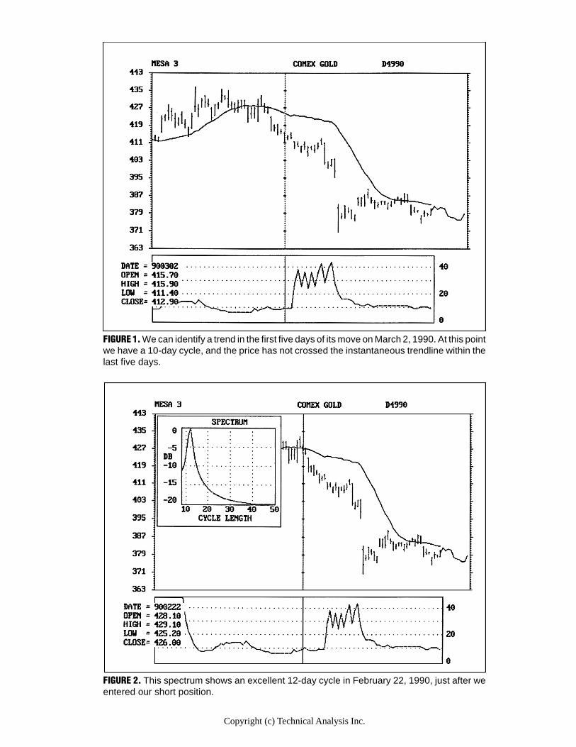
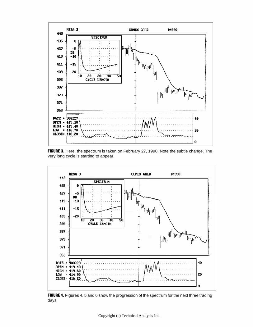
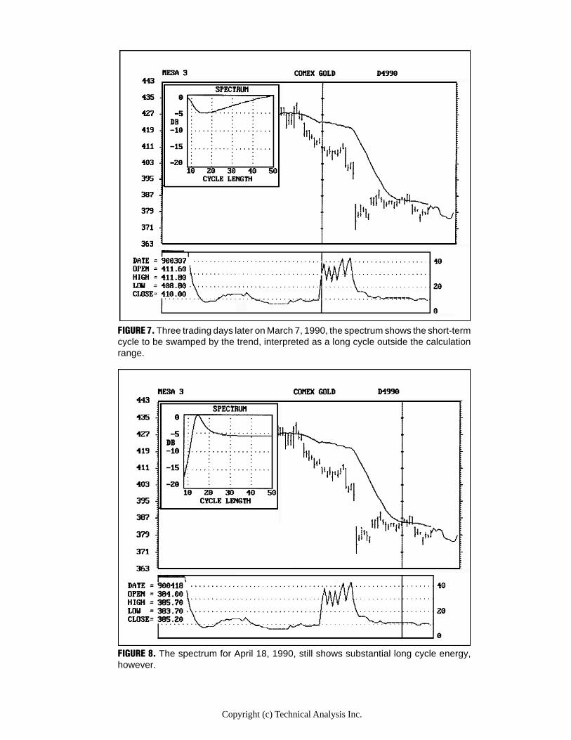
Verifying t rend identificationA spectrum display shows amplitude on the Y axis vs. cycle length on the X axis. This display allows you to see the relative strength of several cycles, a benefit beyond merely picking out the dominant cycle. The spectrum display also allows you to identify the quality, or resolution of the cycle measurement. Ideally, a cycle measurement is a single spike on the display. This ideal picture tells you that there is only one well-defined spectrum component — the dominant cycle. But what if the spectrum display is a broad bell-shaped curve? In this case, the energy is spread over a range of possible dominant cycles, with no cycle length being clearly dominant. The spectrum display indicates that the lack of resolution is reason enough not to trade the market on the basis of cycles. For trend identification we are most interested in the capability of the spectrum display to show the formation of two or more cycles.
Figures 4, 5 and 6 show the progression of the spectrum for the next three trading da ys. Figure 6 is the spectrum for 900302, the day we previousl y declared the trend to be established.
J.M. Hurst, in The Profit Magic of Stock Transaction Timing, advances the principle of proportionality. Simplified, the principle states that longer cycles have larger amplitudes. This principle is obvious to the most casual chart reader.
We can use this principle to identify trends with the spectrum display of short-term cycles. From our example for gold, Figure 2 shows an excellent 12-day cycle on 900222, just after we entered our short position. Figure 3 shows the spectrum taken on 900227. The very long cycle, longer than 50 days, is starting to appear. Figures 4,5 and 6 show the progression of the spectrum for the next three trading days. Figure 6 is the spectrum for 900302, the day we previously declared the trend to be established. Figure 7 shows the spectrum three trading days later on 900307. Figure 7 shows that the short-term cycle has been
Article Text 3Copyright (c) Technical Analysis Inc.
Copyright (c) Technical Analysis Inc.
FIGURE 7. Three trading days later on March 7, 1990, the spectrum shows the short-termcycle to be swamped by the trend, interpreted as a long cycle outside the calculationrange.
FIGURE 8. The spectrum for April 18, 1990, still shows substantial long cycle energy,however.
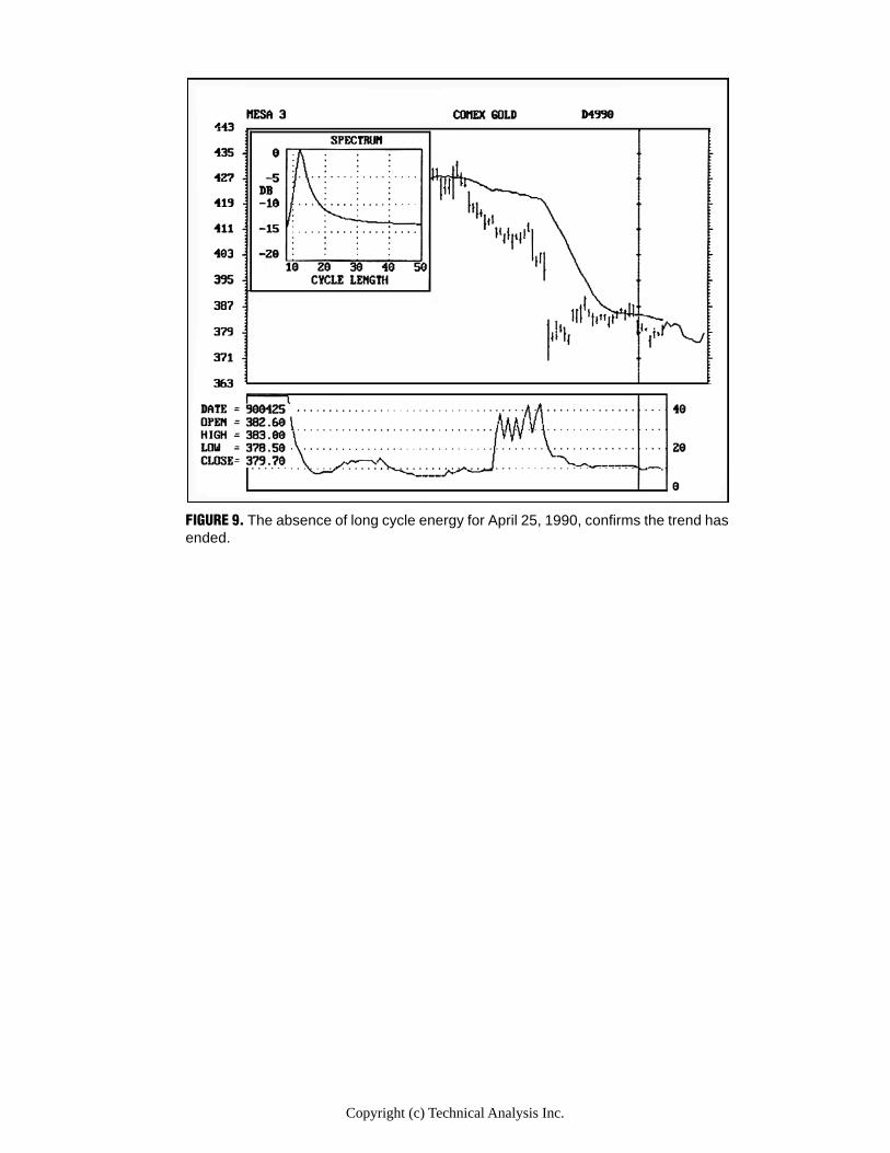
Copyright (c) Technical Analysis Inc.
FIGURE 9. The absence of long cycle energy for April 25, 1990, confirms the trend hasended.
Stocks & Commodities V. 8:10 (377-381): Early Trend Identification by John F. Ehlers
swamped by the trend, which is interpreted as a long cycle outside the calculation range. Used this way, the spectrum confirms that the trend has been established.
The spectrum can also confirm that the trend movement has ended. The price first crosses the instantaneous trendline from the bottom on 900418. (We could have exited then at about 385 for a total profit of $4,600 on a single contract.) Figure 8 is the spectrum for 900418, and shows long cycle energy. Figure 9 is the spectrum for 900425, five trading days later. Absence of long cycle energy confirms the trend has ended.
I'm tr ying to automate the entire trading strateg y. One of the earl y dreams for computers, you ma y recall, was to create robots to serve mankind.
Helpful cycles and trading strategyOur example is not an uncommon event. This approach can be used to repeatedly alter your trading strategy as the market shifts from the cycle mode to the trend mode. All you need to do is estimate or measure the current short-term cycle and then take a simple average over the period of the cycle length and plot it as a point on your bar chart. Repeat this daily. Connecting the averages with a line creates your "instantaneous trendline." Then watch the price action relative to this trendline to identify the onset of the trend when the price has not crossed within the last half cycle.
I'm trying to automate the entire trading strategy. One of the early dreams for computers, you may recall, was to create robots to serve mankind. By recognizing when we are in a trend mode (Diffusion Equation) or cycle mode (Telegrapher's Equation), our computers should know when to apply the proper trading strategy. I guess that would make our computer a "know-bot"!
John Ehlers, Box 1801, Goleta, CA 93116, (805) 969-6478, is an electrical engineer working in electronic research and development and has been a private trader since 1978. He is a pioneer in introducing maximum entropy spectrum analysis to technical trading through his MESA computer program.
ReferencesHurst, J.M. [1970]. The Profit Magic of Stock Transaction Timing, Prentice-Hall.Ehlers, John [1990]. "1989 cycles," Technical Analysis of Stocks & Commodities, June.
Figures 4Copyright (c) Technical Analysis Inc.
Stocks & Commodities V. 5:2 (64-66): Trend of the trend by Gregory L. Morris
Trend of the trend by Gregory L. Morris
Most indicators of trend are taken for granted even though many times they are used successfully by
stock and commodity traders. It has been my experience that blindly following canned indicators can lead you into a false sense of security, especially if you begin using the indicator when it is correctly calling the market. If you begin using a trend-following indicator during its inevitable whipsaw period, you will lose faith and look for another indicator. Therefore, if you develop an indicator using some basic logic and reason which is related to known market action, you can have a little more faith in a particular indicator. There is also the argument of using a basket of indicators and/or using them in a tree structured approach. No doubt that is a safer approach, but it is not the purpose of this article.
It is accepted that the successful trader must identify and follow the trend of the market to be a consistent winner. There are, of course, many indicators available to help identify the termination of a trend and prepare you to reverse your positions. Adding even more confusion to the arena, you have to determine which type of trend is being identified: short, medium, or long. Again, this is not the purpose here.
I would like to share with you a simple trend-following technique that seems to work very well. It works because you must adapt it to the market you want to analyze. In other words, the parameters are going to be different for each market, whether it be stocks, commodities, mutual funds, or whatever. A complete explanation of the system will be discussed while being applied to the Dow Jones Industrial Average. I know what you're thinking--no one can trade the DJIA, so why use it? That's the very reason I have used it. I did not want it to look like I had culled hundreds of charts to find one that best supported this technique.
First of all, you must determine your trading objectives: short, medium, or long-term. Short-term (a few days to a few weeks) would rely on daily data for the trend information. Long-term (greater than six months) would use almost exclusively weekly data. Medium-term would use a combination of both. Then, of course, there are combinations of daily and weekly that you can use to put conditional restraints into your trading system. The technique of using longer-term indicators to determine which side of a shorter-term indicator to make your trade is usually a profitable trading strategy. However, for the purposes of this article, I will stick to the short- to medium-term.
Determining the dominant short-term cycle is necessary to obtain the smoothing parameters for this indicator. There are many good books available on cycles. One that I have found to be the most useful is The Profit Magic of Stock Transaction Timing, by J.M. Hurst (Copyright 1970). Despite the horrendous title, the book is exceptionally logical in its explanation of market cycles and how to identify them.
One method of determining cycles is to detrend the data. This is a simple concept involving the price data and a moving average. The moving average length is based upon the trend you want to follow. For short-term, a moving average of 25-35 days works quite well. Basically, you subtract the moving average from the price and plot the results. This is as if you had grasped the moving average line at both ends and pulled it tight so it looked like a straight line with the price data remaining in its same relative position to the moving average.
Article Text 1Copyright (c) Technical Analysis Inc.
Stocks & Commodities V. 5:2 (64-66): Trend of the trend by Gregory L. Morris
Most indicators of trend are taken for granted even though many times they are used successfully
Of course you can always just count the days between lows from any daily chart or use sophisticated maximum entropy or Fourier analysis. Detrending just makes those lows stand out a little better.
Before I go any further, a look at moving averages might be a good idea. A moving average smooths a sequence of numbers such that the result is a reduction in magnitude of the short-term fluctuations, while leaving the longer-term fluctuations little changed. Obviously, the time span of the moving average used will alter its characteristics.
J.M. Hurst explains these alterations with three general rules:
1. A moving average of any given time span exactly reduces the magnitude of the fluctuations of duration equal to that time span to zero.
2. The same moving average also greatly reduces (but does not eliminate) the magnitude of all fluctuations of duration less than the time span of the moving average.
3. All fluctuations of greater than the time span of the average "come through," or are also present in the resulting moving average line. Those with durations just a little greater than the span of the average are greatly reduced in magnitude, but the effect lessens as periodicity duration increases. Very long duration periodicities come through nearly unscathed.
For this indicator you need to identify the short-term cycle for the market you are analyzing. Detrending the data as mentioned earlier will assist you in identifying market lows and finding the dominant short-term cycle. Once the cycle has been identified, select an exponential average equal to one half of the short-term cycle. For the Dow Jones Industrial Average, the short-term cycle is 14 to 15 days. Therefore, you should use seven days for your exponential average. Most software programs allow you to work with periods instead of smoothing constants when dealing with F exponential averages. Periods are somewhat easier to grasp than smoothing constants. The reason behind using an average equal to one half of the short-term cycle is to maximize the price movement without smoothing the dominant cycle.
Only through years of use and experimentation have I been able to determine the second part of the equation: That is, the length (or period) of the second exponential average used with this trend-following indicator. Simply stated, use a period six times the value of what you used for the short-term average. If you used seven days for the short one, then use 42 days for this one. I suppose, for credibility, I should have told you that by using six times the short average you were applying the principle of "half-dozening" which, of course, everyone knows about. But, in case you don't, half-dozening refers to the completely arbitrary rule c of using a longer term average equal to six times the short average. This was found after many years of experimentation.
The relationship between these two is similar to the Moving Average Convergence Divergence (MACD) first written about by Gerald Appel. Merely subtract the longer period average from the short period average and you are left with an oscillator that will give quicker and more timely signals than your standard two-moving-average crossover system. Buy and sell signals are generated by using an arithmetic moving average on this oscillator. Again, by much testing, I have found that the period for this average should be three times the value of the short-term exponential average. In this example, that would be 21 days.
Article Text 2Copyright (c) Technical Analysis Inc.
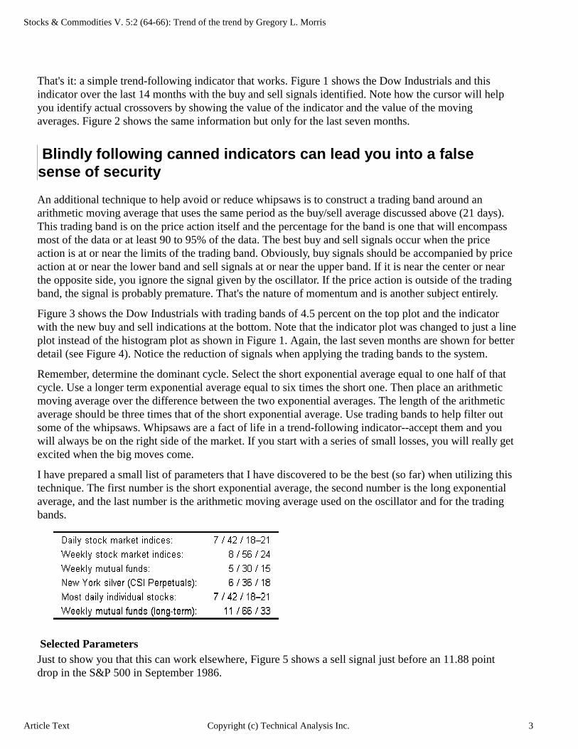
Stocks & Commodities V. 5:2 (64-66): Trend of the trend by Gregory L. Morris
That's it: a simple trend-following indicator that works. Figure 1 shows the Dow Industrials and this indicator over the last 14 months with the buy and sell signals identified. Note how the cursor will help you identify actual crossovers by showing the value of the indicator and the value of the moving averages. Figure 2 shows the same information but only for the last seven months.
Blindl y follo wing canned indicators can lead you into a false sense of security
An additional technique to help avoid or reduce whipsaws is to construct a trading band around an arithmetic moving average that uses the same period as the buy/sell average discussed above (21 days). This trading band is on the price action itself and the percentage for the band is one that will encompass most of the data or at least 90 to 95% of the data. The best buy and sell signals occur when the price action is at or near the limits of the trading band. Obviously, buy signals should be accompanied by price action at or near the lower band and sell signals at or near the upper band. If it is near the center or near the opposite side, you ignore the signal given by the oscillator. If the price action is outside of the trading band, the signal is probably premature. That's the nature of momentum and is another subject entirely.
Figure 3 shows the Dow Industrials with trading bands of 4.5 percent on the top plot and the indicator with the new buy and sell indications at the bottom. Note that the indicator plot was changed to just a line plot instead of the histogram plot as shown in Figure 1. Again, the last seven months are shown for better detail (see Figure 4). Notice the reduction of signals when applying the trading bands to the system.
Remember, determine the dominant cycle. Select the short exponential average equal to one half of that cycle. Use a longer term exponential average equal to six times the short one. Then place an arithmetic moving average over the difference between the two exponential averages. The length of the arithmetic average should be three times that of the short exponential average. Use trading bands to help filter out some of the whipsaws. Whipsaws are a fact of life in a trend-following indicator--accept them and you will always be on the right side of the market. If you start with a series of small losses, you will really get excited when the big moves come.
I have prepared a small list of parameters that I have discovered to be the best (so far) when utilizing this technique. The first number is the short exponential average, the second number is the long exponential average, and the last number is the arithmetic moving average used on the oscillator and for the trading bands.
Selected ParametersJust to show you that this can work elsewhere, Figure 5 shows a sell signal just before an 11.88 point drop in the S&P 500 in September 1986.
Article Text 3Copyright (c) Technical Analysis Inc.
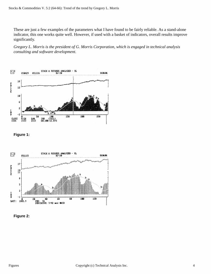
Stocks & Commodities V. 5:2 (64-66): Trend of the trend by Gregory L. Morris
These are just a few examples of the parameters what I have found to be fairly reliable. As a stand-alone indicator, this one works quite well. However, if used with a basket of indicators, overall results improve significantly.
Gregory L. Morris is the president of G. Morris Corporation, which is engaged in technical analysis consulting and software development.
Figure 1:
Figure 2:
Figures 4Copyright (c) Technical Analysis Inc.

Stocks & Commodities V. 5:2 (64-66): Trend of the trend by Gregory L. Morris
Figure 3:
Figure 4:
Figures 5Copyright (c) Technical Analysis Inc.
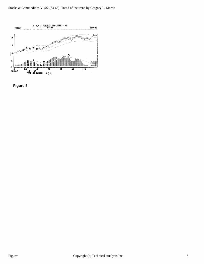
Stocks & Commodities V. 5:2 (64-66): Trend of the trend by Gregory L. Morris
Figure 5:
Figures 6Copyright (c) Technical Analysis Inc.


![[Trading] Stocks & Commodities Toby Crabel ORB Articles](https://img.pdfslide.net/doc/110x75/55cf9a49550346d033a119d8/trading-stocks-commodities-toby-crabel-orb-articles.jpg)