Embed Size (px)
Citation preview

SOME PERSPECTIVES ON THE NATIONAL ECONOMY:
Enjoy the Party While it Lasts
Uwe E. Reinhardt
Woodrow Wilson School of Public and International Affairs
and
Department of Economics
Princeton University
CLASS OF 2000
2008 MILLENIAL LECTURE
May 31, 2008

This is an expanded and slightly updated version of a
presentation made to Princeton Alumni on May 31, 2008.
Slides containing text have been added to substitute for the
oral commentary made during the presentation. They were
not in the original presentation.
OUTLINE OF THE PRESENTATION:
I. A BRIEF REVIEW OF FRESHMAN ECON 101
II. SOME MACRO-ECONOMIC NUMBERS
A. Year-to-year growth in GDP
B. Inflation over time
C. Private investment in the U.S.
D. Taxes and economic growth
E. How was U.S. Investment financed?
1. Private savings by U.S. business and households
2. Savings (Dis-Savings) by government (esp. federal fiscal policy)
3. Importing the savings of foreigners (the Current Account)
I. A BRIEF REVIEW OF ECON 101

The first sketch economics professors put on the board in the
first lecture in introductory macro-economics courses is the
famous Circular Flow of Economic Activity, also known as the
Circular Money Flow, because economic activity is measured in
monetary terms.
In this circular flow the nation’s Gross Domestic Product (GDP)
is measured by the total revenues received by U.S. producers.
GDP thus measures all valuable output produced in a nation, but
only as long as that output was traded in the commercial market
place.
Thus, the highly valuable output produced by volunteer workers
and by parents – especially mothers – is not counted in GDP. It is
a major measurement error, leaving out much productive activity.
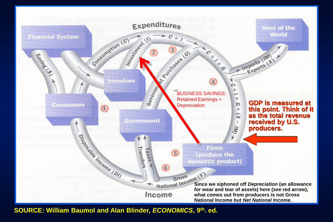
SOURCE: William Baumol and Alan Blinder, ECONOMICS, 9th. ed.
GDP is measured at this point. Think of it as the total revenue received by U.S. producers.
BUSINESS SAVINGS:
Retained Earnings +
Depreciation
Since we siphoned off Depreciation (an allowance for wear and tear of assets) here (see red arrow), what comes out from producers is not Gross National Income but Net National Income.
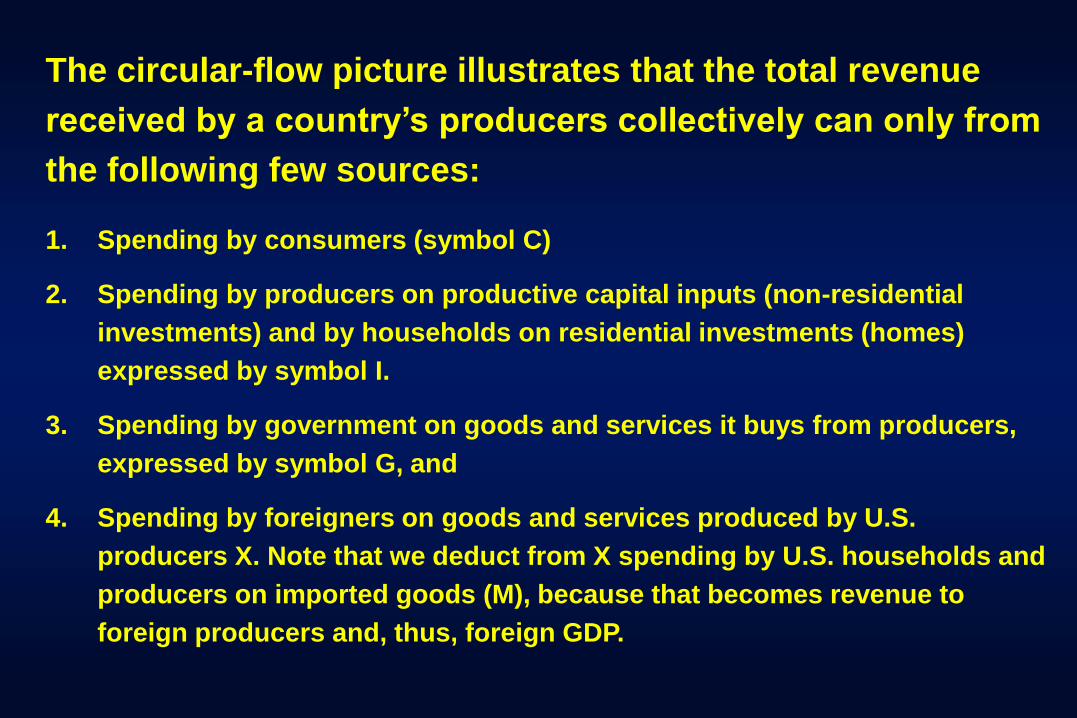
The circular-flow picture illustrates that the total revenue
received by a country’s producers collectively can only from
the following few sources:
1. Spending by consumers (symbol C)
2. Spending by producers on productive capital inputs (non-residential
investments) and by households on residential investments (homes)
expressed by symbol I.
3. Spending by government on goods and services it buys from producers,
expressed by symbol G, and
4. Spending by foreigners on goods and services produced by U.S.
producers X. Note that we deduct from X spending by U.S. households and
producers on imported goods (M), because that becomes revenue to
foreign producers and, thus, foreign GDP.
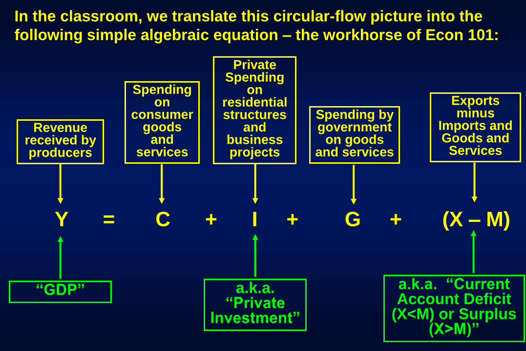
Y = C + I + G + (X – M)
Revenue received by producers
“GDP”
Spending on
consumer goods
and services
Private Spending
on residential structures
and business projects
Spending by government
on goods and services
Exports minus
Imports and Goods and
Services
a.k.a. “Current Account Deficit
(X<M) or Surplus (X>M)”
In the classroom, we translate this circular-flow picture into the
following simple algebraic equation – the workhorse of Econ 101:
a.k.a. “Private
Investment”

Now, before jumping from here into data from the real world,
let me first offer some gentle criticism of macro-economics,
as we professors teach it to our students.

Y = C + I + G + (X – M)
Spending on
residential structures
and business projects
Spending by government
on goods and services
To their shame, macro economists rarely ever
distinguish explicitly between government
spending on current operations and on long-
lived capital investments.
CONSIDER AGAIN THE MACRO EQUATION:
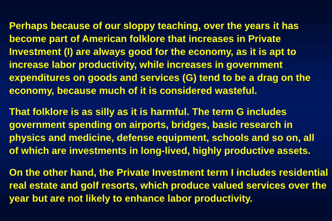
Perhaps because of our sloppy teaching, over the years it has
become part of American folklore that increases in Private
Investment (I) are always good for the economy, as it is apt to
increase labor productivity, while increases in government
expenditures on goods and services (G) tend to be a drag on the
economy, because much of it is considered wasteful.
That folklore is as silly as it is harmful. The term G includes
government spending on airports, bridges, basic research in
physics and medicine, defense equipment, schools and so on, all
of which are investments in long-lived, highly productive assets.
On the other hand, the Private Investment term I includes residential
real estate and golf resorts, which produce valued services over the
year but are not likely to enhance labor productivity.
Not splitting G into current government operations and government
investments can easily seduce people into thinking that cutting
taxes and reducing government spending on schools or research
(i.e., cutting G) and using those tax savings to build more private
golf resorts (i.e., increasing I) somehow makes America’s economy
stronger. Many people seem to believe it. It is pure bull shine.
Future generations of Americans are likely to pay a price for this
sloppy work in the form of a deteriorating infrastructure, in an
inadequate supply and composition of human capital and in a
reduced number of valuable patents.
Where is John Kenneth Galbraith when we need him? He famously
drew attention in his early writings to the bias whereof I speak.

II. SOME MACRO-ECONOMIC NUMBERS
All taken from the “Statistical Tables” section of the Economic
Report of the President to the Congress, February, 2008, found
at the website
http://www.gpoaccess.gov/eop/download.html

A. Data on the growth of Gross Domestic Product (GDP)
In the next few slides, I present data on the year-to-year growth in
“real” GDP, where “real” means “adjusted for inflation” or, in other
words, “expressed in US dollars with a constant purchasing power.”
Broadly speaking, we can think of these “constant dollars” as
dollars that buy the same amount of GDP over time.
Although, in fact, U.S. Presidents have at best a minor
influence on the growth of GDP (which is driven my numerous
variables often outside the President’s control) I superimpose
on most of the data to follow the regimes of Presidents,
because that is so often done in punditry on TV and in the
press.
For example, there now are almost mythical references to President
Reagan’s allegedly miraculous, economic prowess. The late Robert
Bartley, Editor of the Wall Street Journal, celebrated it in his book
The Seven Fat Years: And How to do it again (1995).
However, with all respect due to President Reagan, I have trouble
seeing the miracle in the data found in the Economic Report to the
President to Congress cited here.
There was only one spectacular year (1984), but it followed an
earlier decline of GDP – that is, climbing out of a hole.
The rest of the Reagan years strike me as rather ordinary, if we
compare it to the Carter years and especially the Clinton years.
Indeed, I have long been bothered by the disrespect so many
Americans—especially on the right of center– show toward
President Carter.
The high oil prices and general inflation rates of the late 1970s eand
early 1980s can hardly be blamed on his economic policies.
Specifically, what policies would they have been?
It was at President Carter’s initiative – not President Reagan’s -- that
the airline and trucking industries were deregulated—now generally
viewed as sound policy.
It was President Carter—not President Reagan—who boldly
appointed Paul Volker to head the Federal Reserve, full well
knowing that Volker’s approach would entail some harsh but
needed medicine.
Finally, as you will see in the data, the Reagan years passed onto
the years of President George H. Bush (the Elder) a rather weak
economy.
At the beginning of the Reagan presidency, the supply-side
economists then in the saddle heralded an increase in savings and
investment in the US, in response to sharp cuts in income tax rates.
Judge for yourself in the slides (further on) plotting investment and
savings as a percentage of GDP over time. Investment and savings
as percent of GDP tended to decline during the Reagan years and
increase during the Clinton years.
Again, we should not overestimate the impact President’s have on
GDP – nor, however, should we create myths on fictional data.
ANNUAL GROWTH IN INFLATION-ADJUSTED (REAL)
GDP 1975-2007
-4%
-2%
0%
2%
4%
6%
8%
75 76 77 78 79 80 81 82 83 84 85 86 87 88 89 90 91 92 93 94 95 96 97 98 99 00 1 2 3 4 5 6 7
Perc
en
t In
cre
ase f
rom
Pre
vio
us Y
ear
Carter Reagan Bush I Clinton Bush II
SOURCE: Economic Report of the President 2008, Table B-2.
AVERAGE ANNUAL COMPOUND GROWTH RATES IN REAL
GDP BY PRESIDENTIAL TERM, 1976-2007
2.1%
3.4%
2.1%
3.7%
2.4%
0.0%
1.0%
2.0%
3.0%
4.0%
5.0%
1976-1980 1980-1988 1988-1992 1992-2000 2000-2007
Carter Reagan Bush I Clinton Bush II
SOURCE: Economic Report of the President 2008, Table B-2.
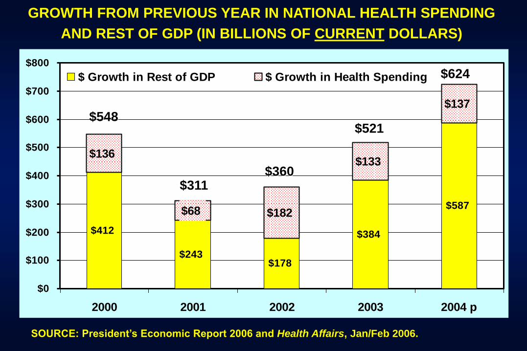
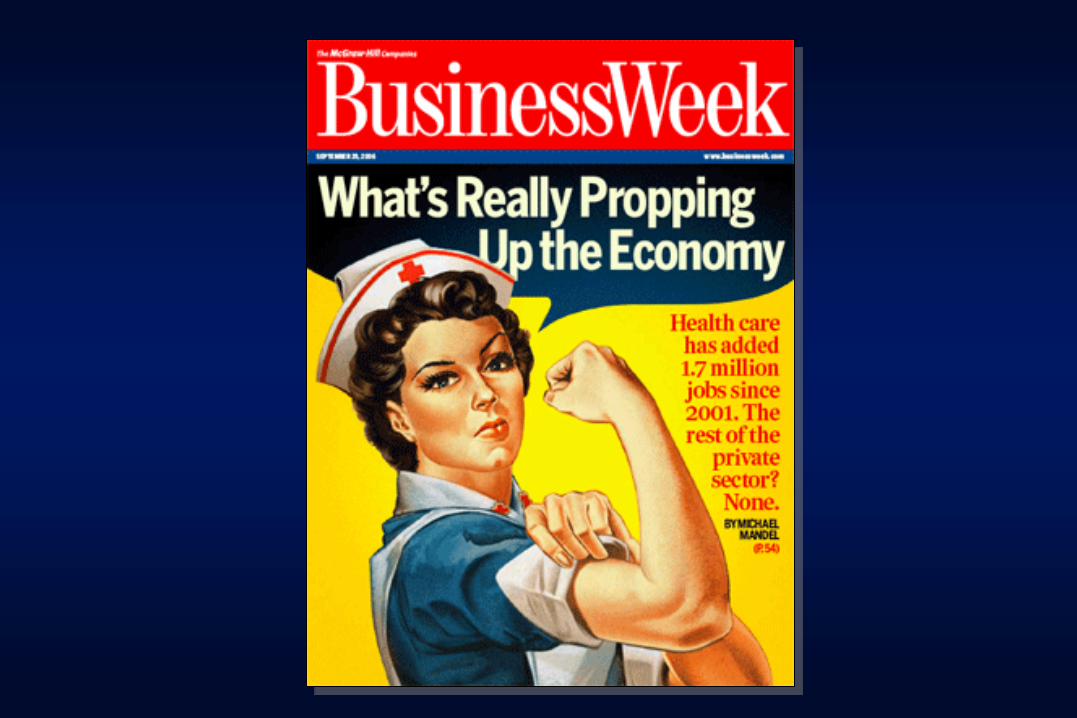
The much maligned U.S. health-care sector – so often decried by
economists and pundits alike decried as a drag on the economy
– actually became the economy’s most powerful economic
locomotive during the recessionary first term of President Bush,
as the next two slides illustrates, creating more new jobs than
any other sector of the economy.
As far as growth on GDP is concerned, the health-care sector
left both the housing boom and business investment in the dust.
On the next, the bold numbers atop the columns represent the
dollar growth in GDP over the previous year. The red portion of
the bar represents health spending.
AN INTERESTING ASIDE:
HEALTH CARE AS OUR ECONOMY’S ECONOMIC LOCOMOTIVE
$412
$243$178
$384
$587
$136
$68 $182
$133
$137
$0
$100
$200
$300
$400
$500
$600
$700
$800
2000 2001 2002 2003 2004 p
$ Growth in Rest of GDP $ Growth in Health Spending
GROWTH FROM PREVIOUS YEAR IN NATIONAL HEALTH SPENDING
AND REST OF GDP (IN BILLIONS OF CURRENT DOLLARS)
$548
$311 $360
$521
$624
SOURCE: President’s Economic Report 2006 and Health Affairs, Jan/Feb 2006.
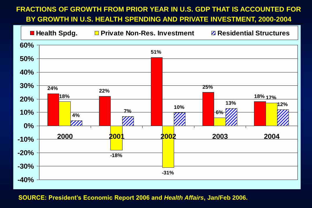
24%22%
51%
25%
18%18%
-18%
-31%
6%
17%
4%7%
10%13% 12%
-40%
-30%
-20%
-10%
0%
10%
20%
30%
40%
50%
60%
2000 2001 2002 2003 2004
Health Spdg. Private Non-Res. Investment Residential Structures
FRACTIONS OF GROWTH FROM PRIOR YEAR IN U.S. GDP THAT IS ACCOUNTED FOR
BY GROWTH IN U.S. HEALTH SPENDING AND PRIVATE INVESTMENT, 2000-2004
SOURCE: President’s Economic Report 2006 and Health Affairs, Jan/Feb 2006.

While on the topic of jobs, here are some data on unemployment,
also taken from the President’s Economic Report to Congress
2008.
B. Unemployment
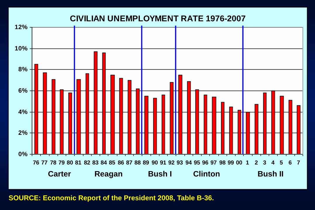
CIVILIAN UNEMPLOYMENT RATE 1976-2007
0%
2%
4%
6%
8%
10%
12%
76 77 78 79 80 81 82 83 84 85 86 87 88 89 90 91 92 93 94 95 96 97 98 99 00 1 2 3 4 5 6 7
Carter Reagan Bush I Clinton Bush II
SOURCE: Economic Report of the President 2008, Table B-36.
C. Data on Inflation
The previous sides showed changes in “real” GDP, by which is
meant inflation-adjusted growth in GDP. In other words, real GDP
is measured in U.S. dollars that buy roughly the same “basket”
of the goods and services included in the GDP year after year.
The next slide shows the time path of annual changes in the
GDP Implicit Price Index used to convert GDP data in current
(not inflation-adjusted) GDP into real GDP in constant-
purchasing-power dollars.
It is one of several measures of general price inflation in the
economy.
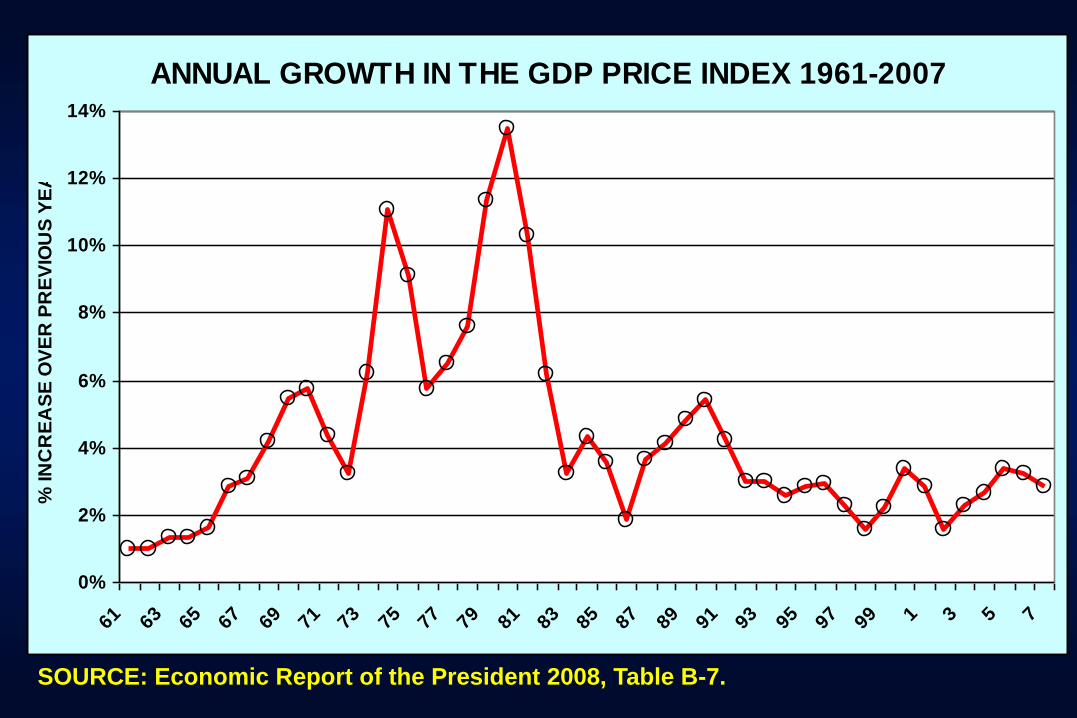
ANNUAL GROWTH IN THE GDP PRICE INDEX 1961-2007
0%
2%
4%
6%
8%
10%
12%
14%
61 63 65 67 69 71 73 75 77 79 81 83 85 87 89 91 93 95 97 99 1 3 5 7
% IN
CR
EA
SE
OV
ER
PR
EV
IOU
S Y
EA
R
SOURCE: Economic Report of the President 2008, Table B-7.
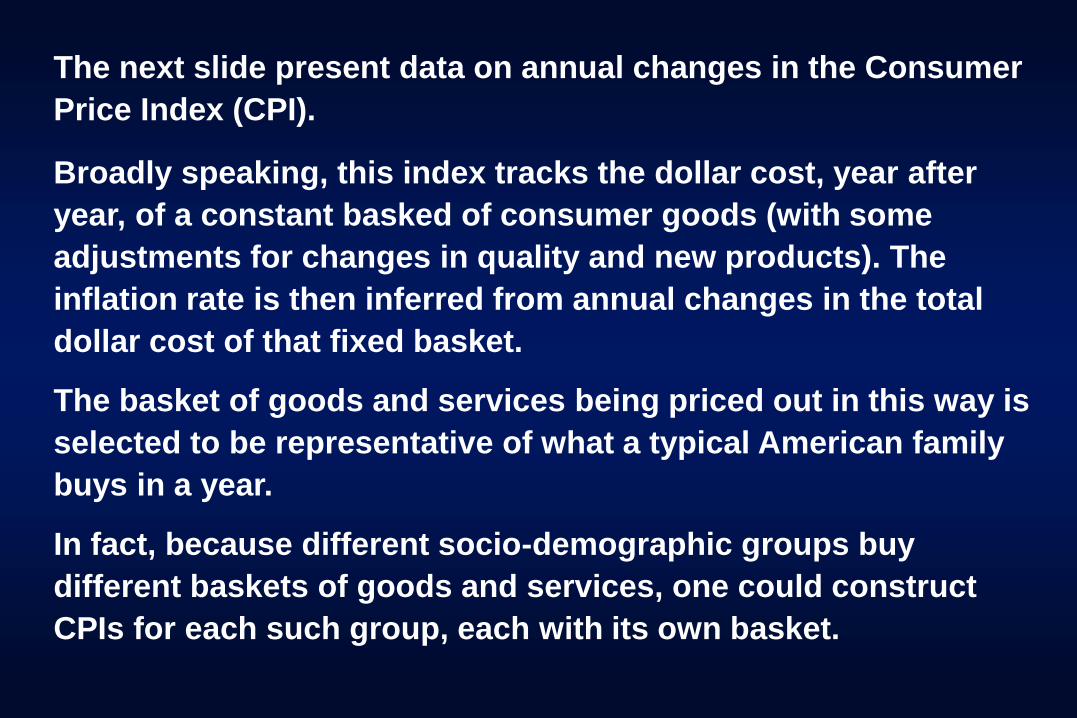
The next slide present data on annual changes in the Consumer
Price Index (CPI).
Broadly speaking, this index tracks the dollar cost, year after
year, of a constant basked of consumer goods (with some
adjustments for changes in quality and new products). The
inflation rate is then inferred from annual changes in the total
dollar cost of that fixed basket.
The basket of goods and services being priced out in this way is
selected to be representative of what a typical American family
buys in a year.
In fact, because different socio-demographic groups buy
different baskets of goods and services, one could construct
CPIs for each such group, each with its own basket.

SOURCE: Economic Report of the President 2008, Table B-60.
ANNUAL GROWTH IN CONSUMER PRICE INDEX (CPI) 1961-2007
0%
2%
4%
6%
8%
10%
61 63 65 67 69 71 73 75 77 79 81 83 85 87 89 91 93 95 97 99 1 3 5 7
% IN
CR
EA
SE
OV
ER
PR
EV
IOU
S Y
EA
R
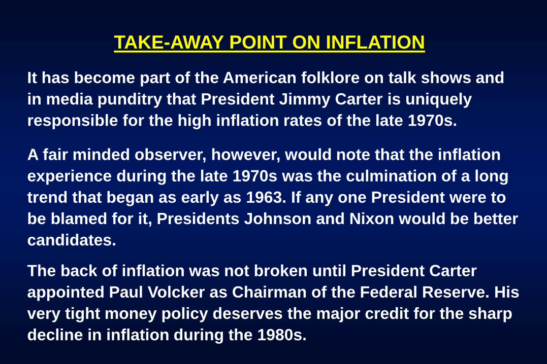
TAKE-AWAY POINT ON INFLATION
It has become part of the American folklore on talk shows and
in media punditry that President Jimmy Carter is uniquely
responsible for the high inflation rates of the late 1970s.
A fair minded observer, however, would note that the inflation
experience during the late 1970s was the culmination of a long
trend that began as early as 1963. If any one President were to
be blamed for it, Presidents Johnson and Nixon would be better
candidates.
The back of inflation was not broken until President Carter
appointed Paul Volcker as Chairman of the Federal Reserve. His
very tight money policy deserves the major credit for the sharp
decline in inflation during the 1980s.
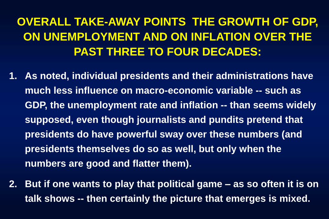
OVERALL TAKE-AWAY POINTS THE GROWTH OF GDP,
ON UNEMPLOYMENT AND ON INFLATION OVER THE
PAST THREE TO FOUR DECADES:
1. As noted, individual presidents and their administrations have
much less influence on macro-economic variable -- such as
GDP, the unemployment rate and inflation -- than seems widely
supposed, even though journalists and pundits pretend that
presidents do have powerful sway over these numbers (and
presidents themselves do so as well, but only when the
numbers are good and flatter them).
2. But if one wants to play that political game – as so often it is on
talk shows -- then certainly the picture that emerges is mixed.

D. Data on the Investment (I) in business capital and homes

Let us, next, look at private investment (I) in the U.S.
economy and the sources of funds (savings in the U.S.
and abroad) that have financed that investment.
We begin with another famous equation from Econ 101.
By “private investments” economists mean investments
by business firms in their capacity plus investments by
households in residential structures.
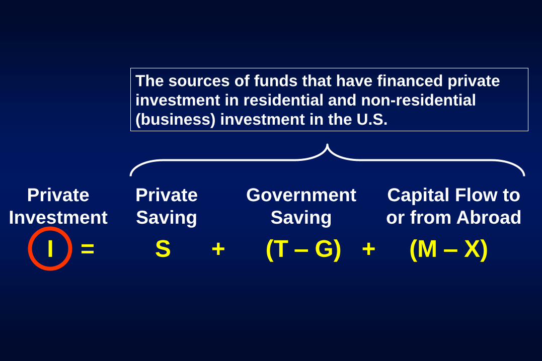
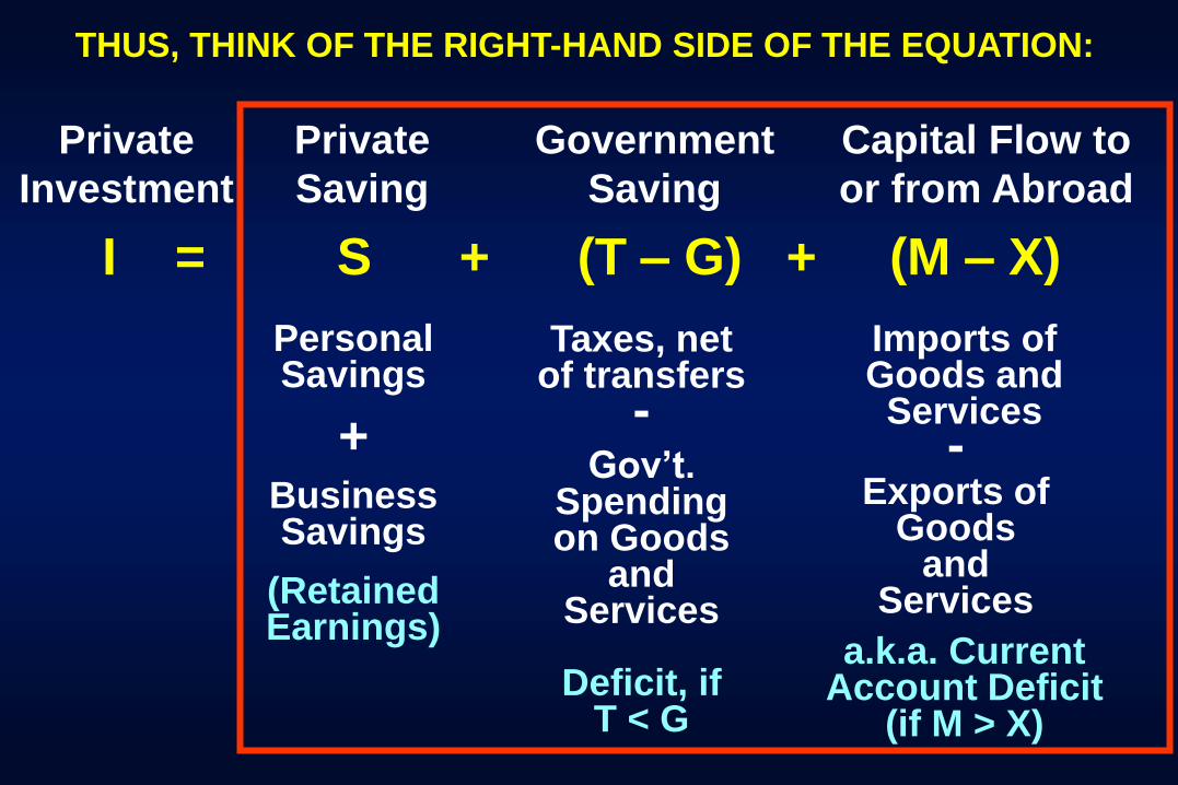
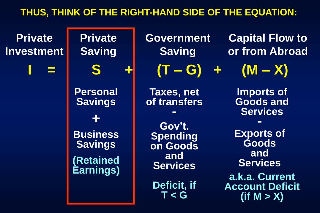
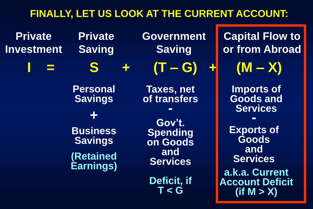
I = S + (T – G) + (M – X)
Private
Saving
Government
Saving
Capital Flow to
or from Abroad
Private
Investment
The sources of funds that have financed private
investment in residential and non-residential
(business) investment in the U.S.
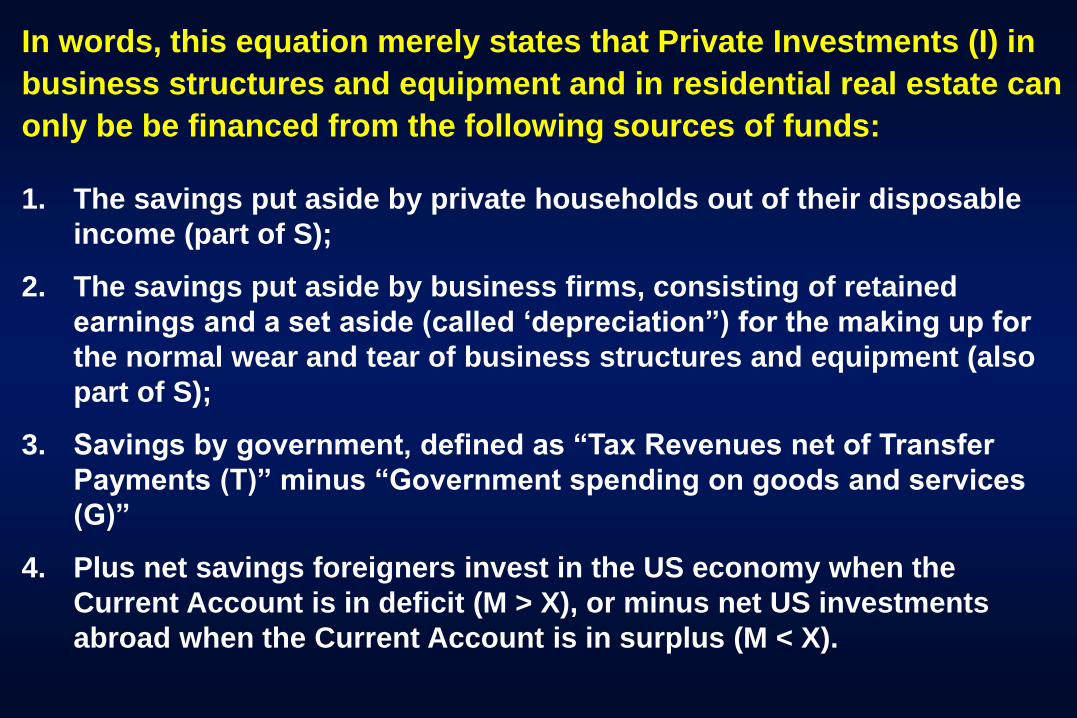
In words, this equation merely states that Private Investments (I) in
business structures and equipment and in residential real estate can
only be be financed from the following sources of funds:
1. The savings put aside by private households out of their disposable
income (part of S);
2. The savings put aside by business firms, consisting of retained
earnings and a set aside (called ‘depreciation”) for the making up for
the normal wear and tear of business structures and equipment (also
part of S);
3. Savings by government, defined as “Tax Revenues net of Transfer
Payments (T)” minus “Government spending on goods and services
(G)”
4. Plus net savings foreigners invest in the US economy when the
Current Account is in deficit (M > X), or minus net US investments
abroad when the Current Account is in surplus (M < X).
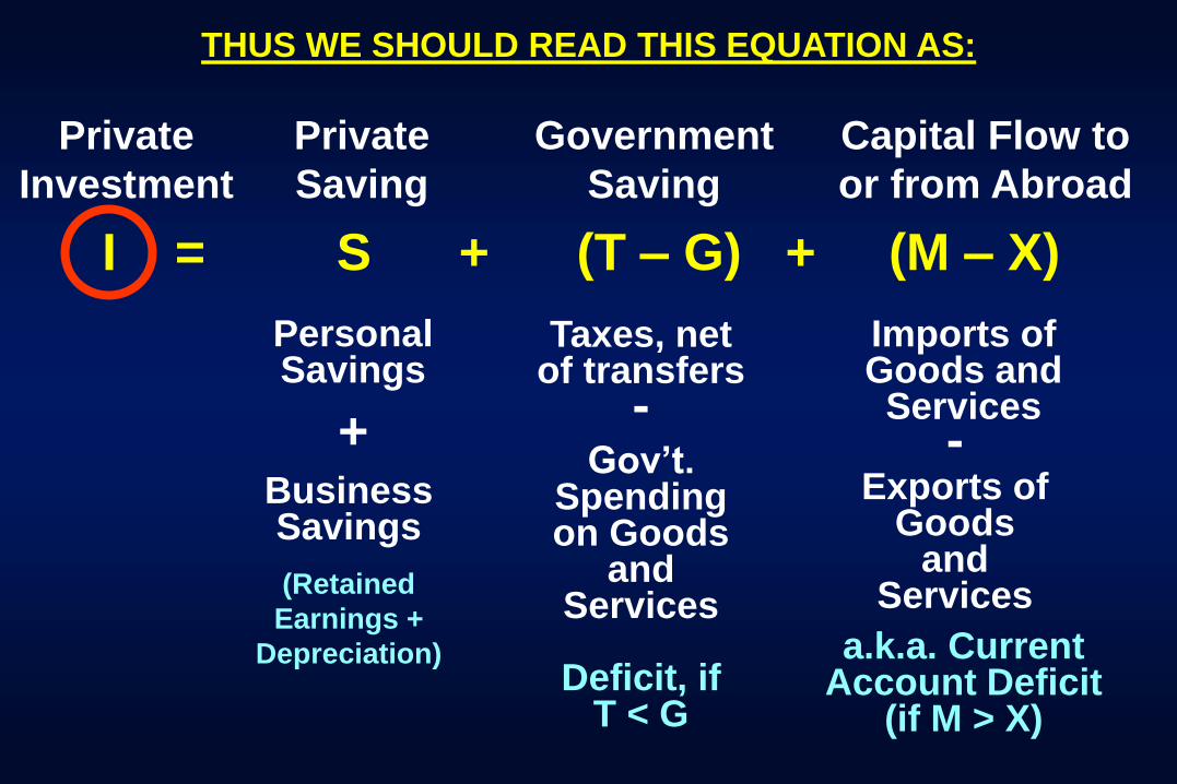
I = S + (T – G) + (M – X)
Private
Saving
Government
Saving
Capital Flow to
or from Abroad
Private
Investment
Personal Savings
+ Business Savings
(Retained
Earnings +
Depreciation)
Taxes, net of transfers
- Gov’t.
Spending on Goods
and Services
Imports of Goods and Services
- Exports of
Goods and
Services
a.k.a. Current Account Deficit
(if M > X) Deficit, if
T < G
THUS WE SHOULD READ THIS EQUATION AS:

Let us first look at the time-path of private investment in the U.S.,
broken down as follows:
The picture that emerges is fascinating, given the widely held
supply-side theory that cuts in personal income-tax rates will
drive up private business investment and thus economic growth,
while tax increases will reduce such investments.
1. total private investment in the US economy and its
components (the black line in the next slide),
2. business investments, i.e. non-residential investments (the
red line) and
3. investment in residential structures (the blue line).
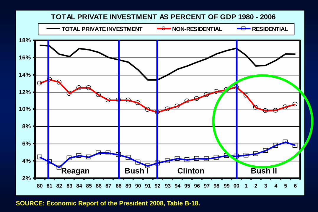
TOTAL PRIVATE INVESTMENT AS PERCENT OF GDP 1980 - 2006
2%
4%
6%
8%
10%
12%
14%
16%
18%
80 81 82 83 84 85 86 87 88 89 90 91 92 93 94 95 96 97 98 99 00 1 2 3 4 5 6
TOTAL PRIVATE INVESTMENT NON-RESIDENTIAL RESIDENTIAL
SOURCE: Economic Report of the President 2008, Table B-18.
Reagan Bush I Clinton Bush II
SOURCE: Economic Report of the President 2008, Table B-18.
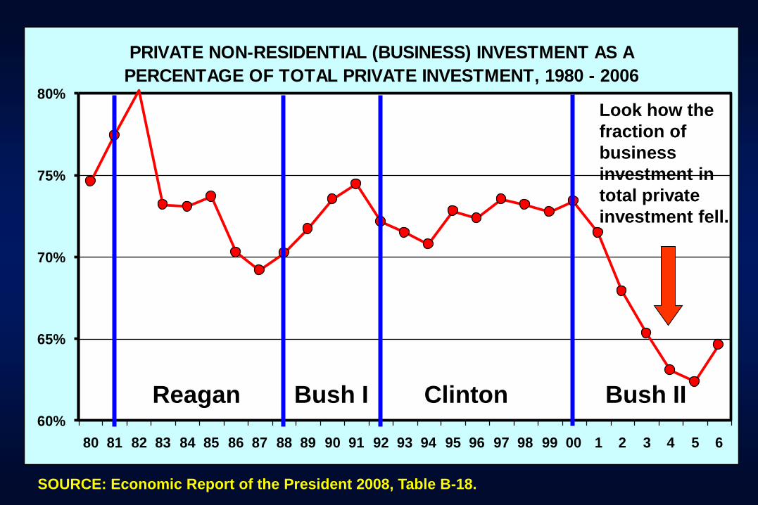
PRIVATE NON-RESIDENTIAL (BUSINESS) INVESTMENT AS A
PERCENTAGE OF TOTAL PRIVATE INVESTMENT, 1980 - 2006
60%
65%
70%
75%
80%
80 81 82 83 84 85 86 87 88 89 90 91 92 93 94 95 96 97 98 99 00 1 2 3 4 5 6
Reagan Bush I Clinton Bush II
Look how the
fraction of
business
investment in
total private
investment fell.
TAKE-AWAY POINTS:
1. Cuts in the personal income-tax rates are routinely defended
as sources of added investments in the economy and, thus, of
economic growth.
2. But look at what happened to nonresidential (business)
investment as a percentage of GDP, after the massive tax cuts
in 2001 and 2003.
3. Capital formation in business (non-residential investment)
actually fell since 2001, while spending on residential
construction absorbed an increasing fraction of total private
investment and of GDP.
4. Clearly, the relationship between tax cuts and economic
growth is not a straightforward as seems widely supposed.
E. Taxes and Economic Growth
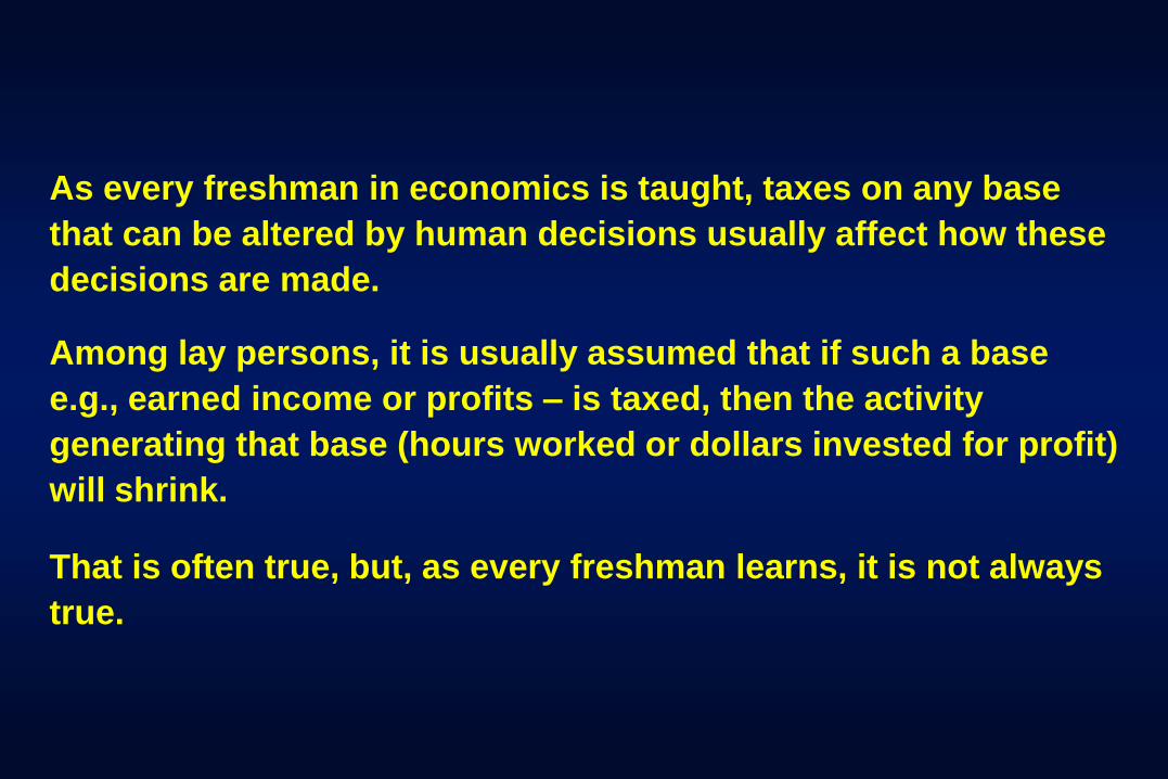
As every freshman in economics is taught, taxes on any base
that can be altered by human decisions usually affect how these
decisions are made.
Among lay persons, it is usually assumed that if such a base
e.g., earned income or profits – is taxed, then the activity
generating that base (hours worked or dollars invested for profit)
will shrink.
That is often true, but, as every freshman learns, it is not always
true.
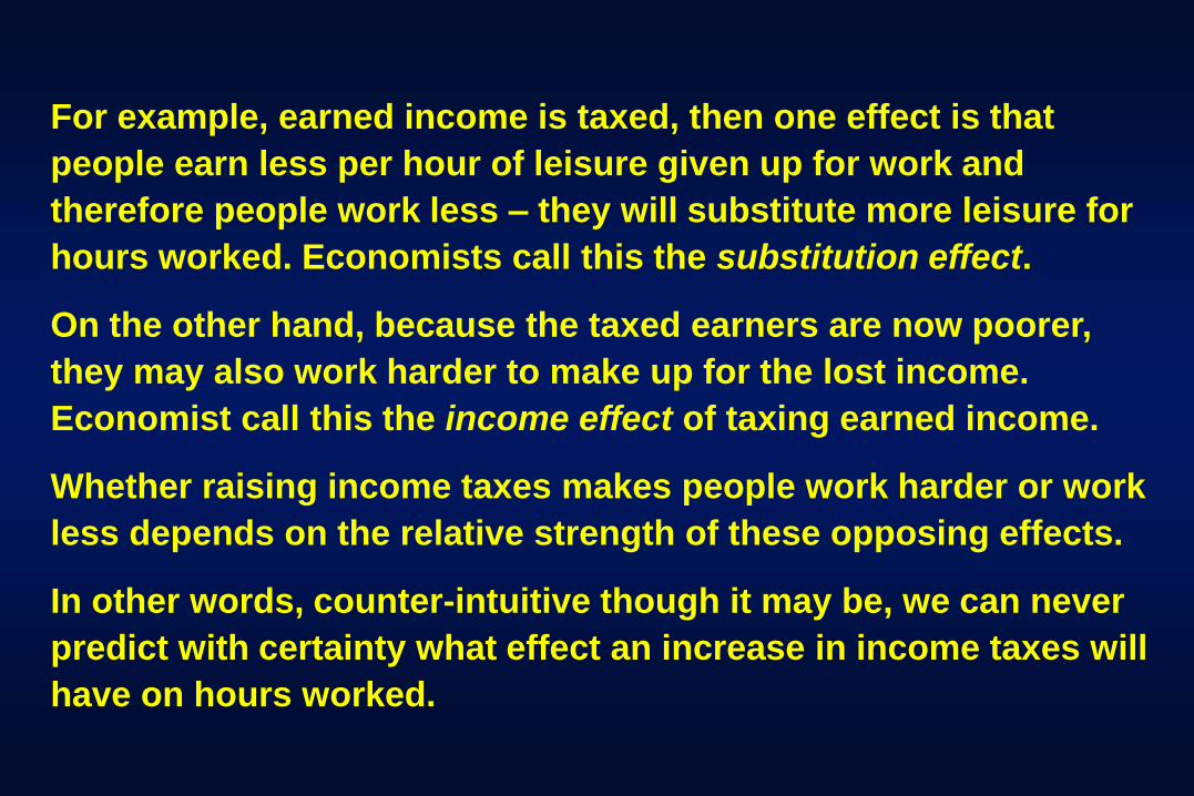
For example, earned income is taxed, then one effect is that
people earn less per hour of leisure given up for work and
therefore people work less – they will substitute more leisure for
hours worked. Economists call this the substitution effect.
On the other hand, because the taxed earners are now poorer,
they may also work harder to make up for the lost income.
Economist call this the income effect of taxing earned income.
Whether raising income taxes makes people work harder or work
less depends on the relative strength of these opposing effects.
In other words, counter-intuitive though it may be, we can never
predict with certainty what effect an increase in income taxes will
have on hours worked.
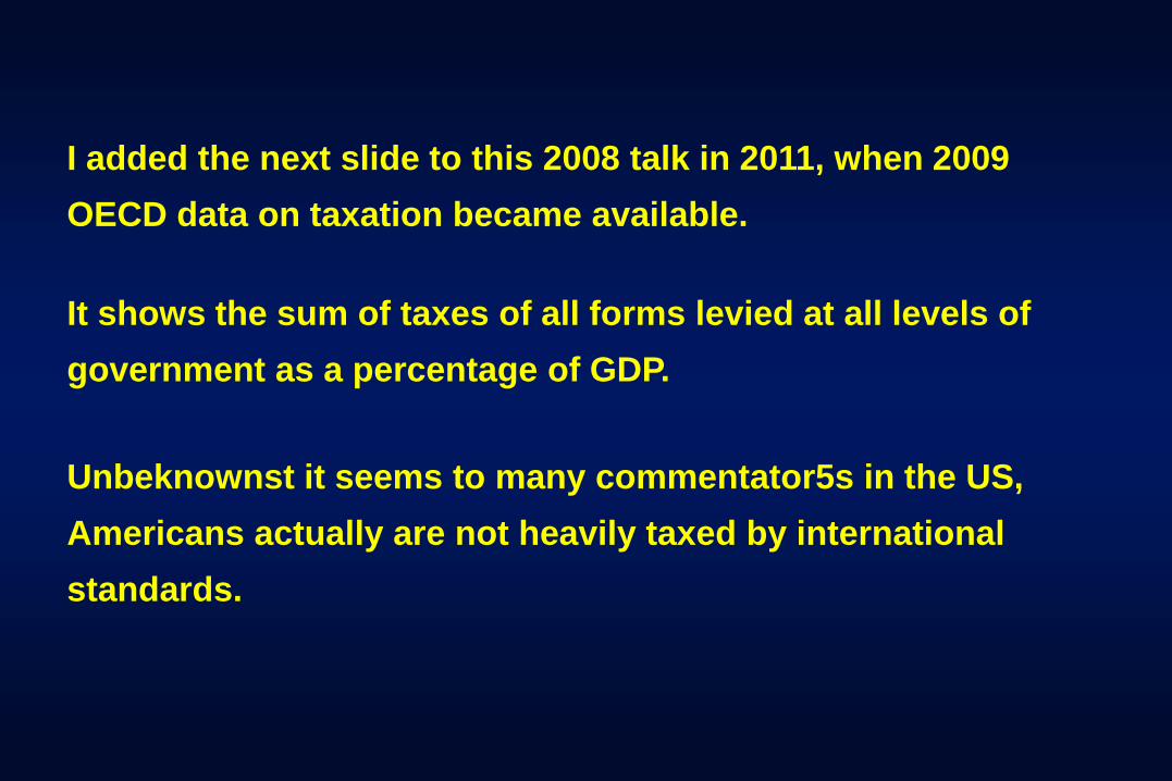
I added the next slide to this 2008 talk in 2011, when 2009
OECD data on taxation became available.
It shows the sum of taxes of all forms levied at all levels of
government as a percentage of GDP.
Unbeknownst it seems to many commentator5s in the US,
Americans actually are not heavily taxed by international
standards.
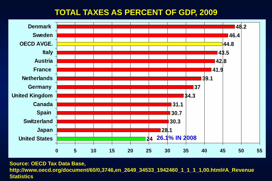
24
28.1
30.3
30.7
31.1
34.3
37
39.1
41.9
42.8
43.5
44.8
46.4
48.2
0 5 10 15 20 25 30 35 40 45 50 55
United States
Japan
Switzerland
Spain
Canada
United Kingdom
Germany
Netherlands
France
Austria
Italy
OECD AVGE.
Sweden
Denmark
Source: OECD Tax Data Base,
http://www.oecd.org/document/60/0,3746,en_2649_34533_1942460_1_1_1_1,00.html#A_Revenue
Statistics
TOTAL TAXES AS PERCENT OF GDP, 2009
26.1% IN 2008

If one looks at the relationship between tax rates and economic
growth across entire economies in the OECD countries, that
relationship is not nearly as apparent as economist Mundell
would have us believe.
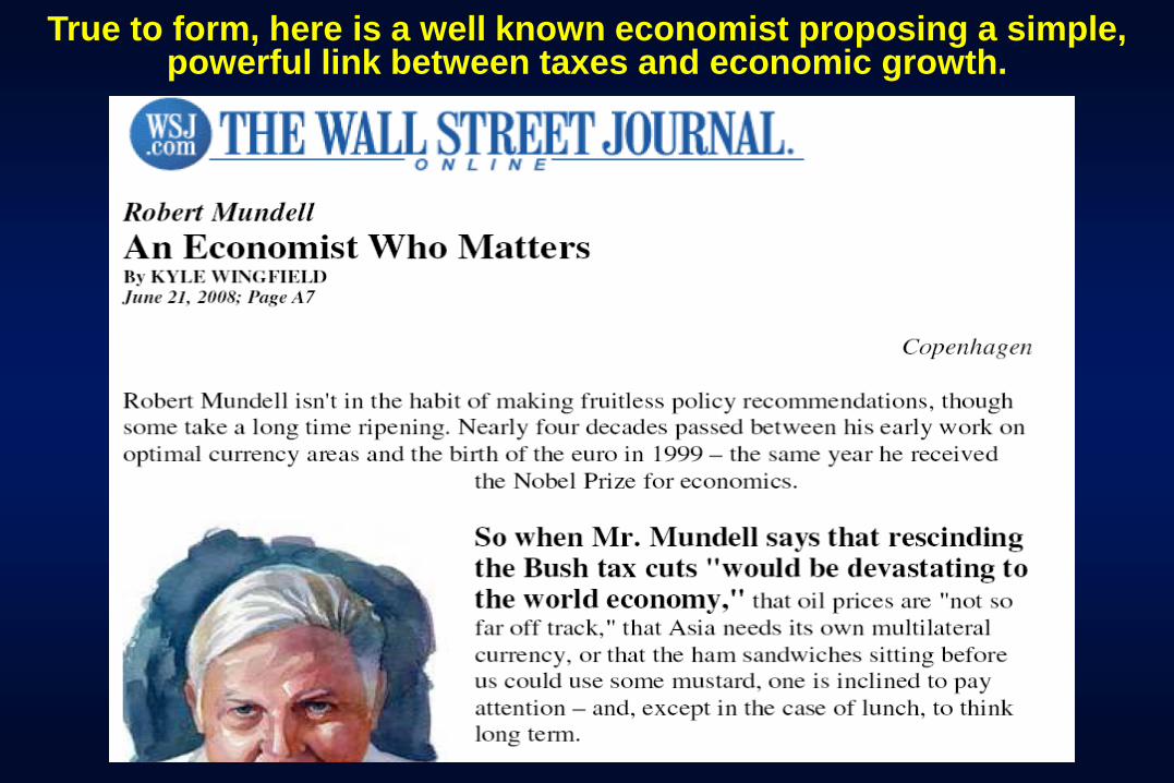
True to form, here is a well known economist proposing a simple, powerful link between taxes and economic growth.
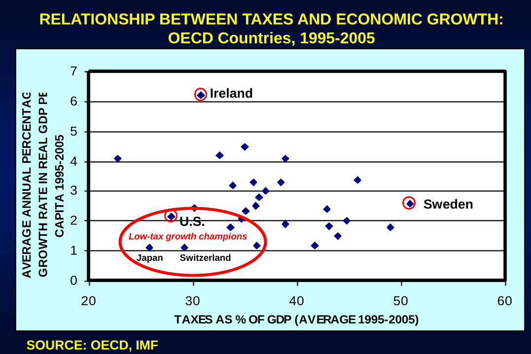
0
1
2
3
4
5
6
7
20 30 40 50 60
TAXES AS % OF GDP (AVERAGE 1995-2005)
AV
ER
AG
E A
NN
UA
L P
ER
CE
NT
AG
E
GR
OW
TH
RA
TE
IN
RE
AL
GD
P P
ER
CA
PIT
A 1
995-2
005
Ireland
U.S.
Sweden
SOURCE: OECD, IMF
RELATIONSHIP BETWEEN TAXES AND ECONOMIC GROWTH:
OECD Countries, 1995-2005
Switzerland Japan
Low-tax growth champions
SOURCE: OECD, Statistics Brief No. 7, December 2003, http://www.oecd.org/dataoecd/5/11/22413472.pdf
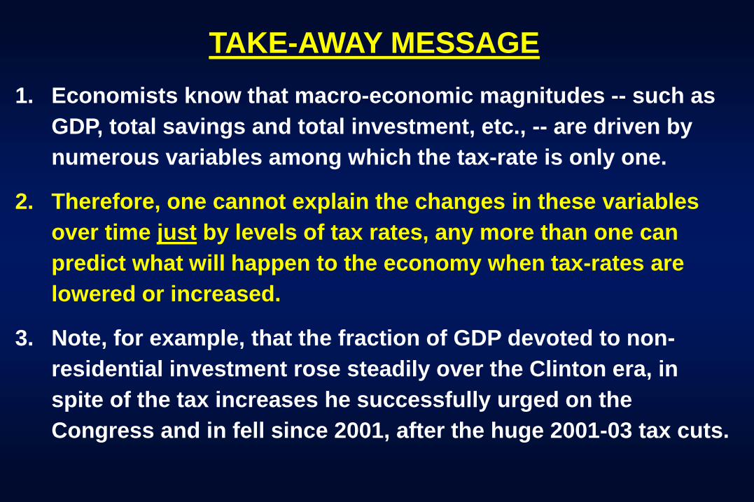
TAKE-AWAY MESSAGE
1. Economists know that macro-economic magnitudes -- such as
GDP, total savings and total investment, etc., -- are driven by
numerous variables among which the tax-rate is only one.
2. Therefore, one cannot explain the changes in these variables
over time just by levels of tax rates, any more than one can
predict what will happen to the economy when tax-rates are
lowered or increased.
3. Note, for example, that the fraction of GDP devoted to non-
residential investment rose steadily over the Clinton era, in
spite of the tax increases he successfully urged on the
Congress and in fell since 2001, after the huge 2001-03 tax cuts.
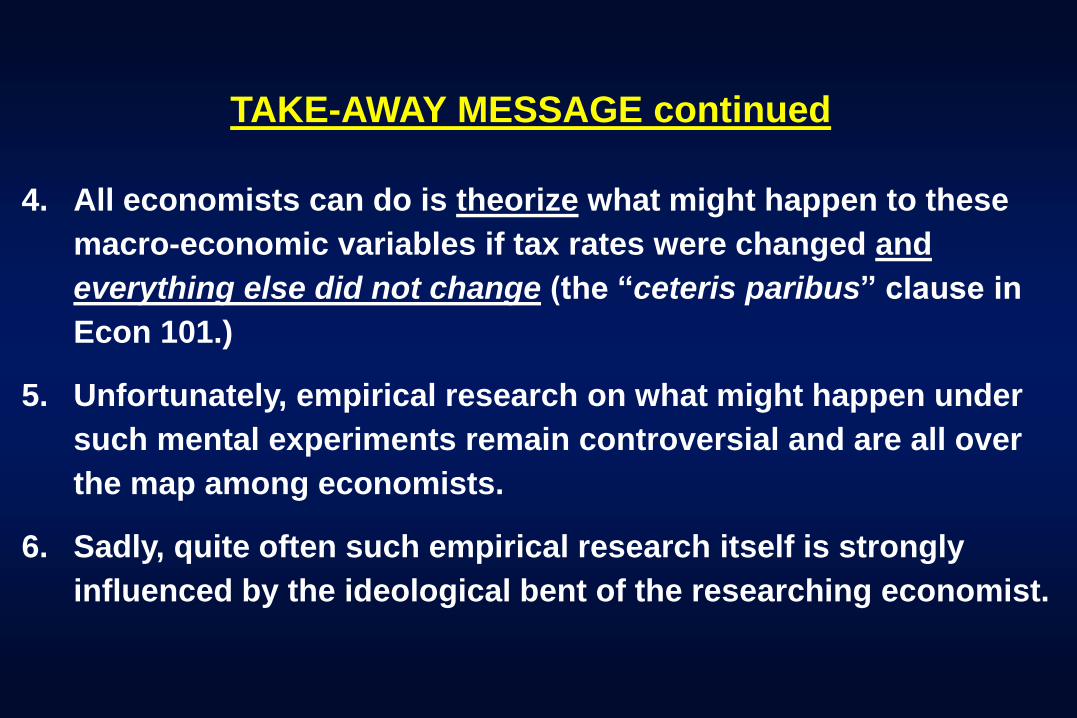
TAKE-AWAY MESSAGE continued
4. All economists can do is theorize what might happen to these
macro-economic variables if tax rates were changed and
everything else did not change (the “ceteris paribus” clause in
Econ 101.)
5. Unfortunately, empirical research on what might happen under
such mental experiments remain controversial and are all over
the map among economists.
6. Sadly, quite often such empirical research itself is strongly
influenced by the ideological bent of the researching economist.

F. How was investment (I) in the U.S. financed?
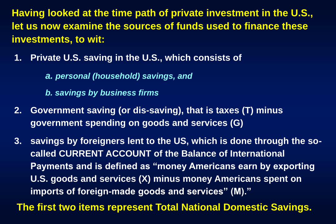
Having looked at the time path of private investment in the U.S.,
let us now examine the sources of funds used to finance these
investments, to wit:
1. Private U.S. saving in the U.S., which consists of
a. personal (household) savings, and
b. savings by business firms
2. Government saving (or dis-saving), that is taxes (T) minus
government spending on goods and services (G)
3. savings by foreigners lent to the US, which is done through the so-
called CURRENT ACCOUNT of the Balance of International
Payments and is defined as “money Americans earn by exporting
U.S. goods and services (X) minus money Americans spent on
imports of foreign-made goods and services” (M).”
The first two items represent Total National Domestic Savings.
I = S + (T – G) + (M – X)
Private
Saving
Government
Saving
Capital Flow to
or from Abroad
Private
Investment
Personal Savings
+ Business Savings
(RetainedEarnings)
Taxes, net of transfers
- Gov’t.
Spending on Goods
and Services
Imports of Goods and Services
- Exports of
Goods and
Services
a.k.a. Current Account Deficit
(if M > X) Deficit, if
T < G
THUS, THINK OF THE RIGHT-HAND SIDE OF THE EQUATION:
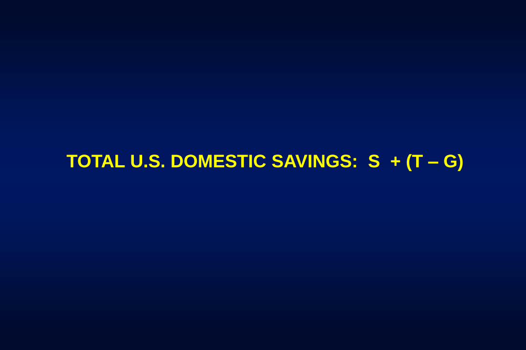
TOTAL U.S. DOMESTIC SAVINGS: S + (T – G)
I = S + (T – G) + (M – X)
Private
Saving
Government
Saving
Capital Flow to
or from Abroad
Private
Investment
Personal Savings
+ Business Savings
(RetainedEarnings)
Taxes, net of transfers
- Gov’t.
Spending on Goods
and Services
Imports of Goods and Services
- Exports of
Goods and
Services
a.k.a. Current Account Deficit
(if M > X) Deficit, if
T < G
THUS, THINK OF THE RIGHT-HAND SIDE OF THE EQUATION:

In looking at total domestic (National) U.S. savings, the national
accounts distinguish between
1. Gross National Savings, prior to deducting an allowance for the
wear and tear of capital equipment and structures (also known
as ‘depreciation”), and
2. Net National Savings, which is net of that allowance for the
wear and tear of structures and equipment.
We can think of Net National Savings the nation set aside to put in
place new structures and equipment.
The next slide shows the difference between these two savings
concepts.
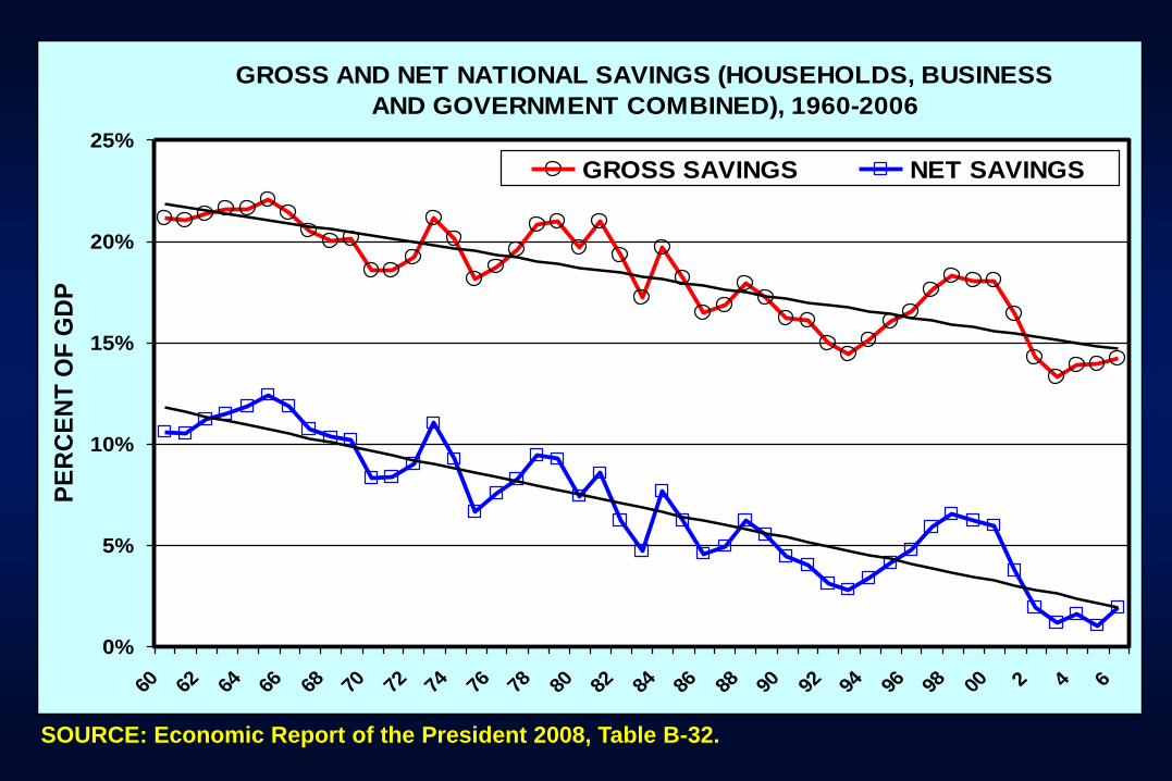
GROSS AND NET NATIONAL SAVINGS (HOUSEHOLDS, BUSINESS
AND GOVERNMENT COMBINED), 1960-2006
0%
5%
10%
15%
20%
25%
60 62 64 66 68 70 72 74 76 78 80 82 84 86 88 90 92 94 96 98 00 2 4 6
PE
RC
EN
T O
F G
DP
GROSS SAVINGS NET SAVINGS
SOURCE: Economic Report of the President 2008, Table B-32.
Notice on the preceding slide how, over the long hall, both the
gross- and the net U.S. national savings rate has declined,
although not steadily.
Notice also that, after 1994, both savings rates increased (in
good part because the federal deficit then shrank and turned
into a surplus) and how it fell again after 2000 (in large part
because the federal deficit then began rising again.)

Private Saving (Business and Household) in the U.S. : S
Let us now turn to private savings, S, the first term on the right-
hand side of the equation. We recall that it is the sum of
business savings in the U.S. and of personal (household)
savings.
In the graphs that follows, business savings is on a “net” basis,
that is, excluding a set aside for depreciation. In other words,
business savings in these graphs represent retained profits
that have been reinvested in the business sector on behalf of
owners..
I = S + (T – G) + (M – X)
Private
Saving
Government
Saving
Capital Flow to
or from Abroad
Private
Investment
Personal Savings
+ Business Savings
(RetainedEarnings)
Taxes, net of transfers
- Gov’t.
Spending on Goods
and Services
Imports of Goods and Services
- Exports of
Goods and
Services
a.k.a. Current Account Deficit
(if M > X) Deficit, if
T < G
THUS, THINK OF THE RIGHT-HAND SIDE OF THE EQUATION:
SOURCE: Economic Report of the President 2008, Table B-1 AND B-32.
TOTAL HOUSEHOLD AND BUSINESS SAVINGS) AS PERCENTAGE OF
GDP, NET OF DEPRECIATION ALLOWANCE
0%
2%
4%
6%
8%
10%
12%
80 81 82 83 84 85 86 87 88 89 90 91 92 93 94 95 96 97 98 99 00 1 2 3 4 5 6
PERSONAL SAVINGS BUSINESS SAVINGS TOTAL NET PRIVATE SAVINGS
SOURCE: Economic Report of the President 2008, Table B-1 AND B-32.
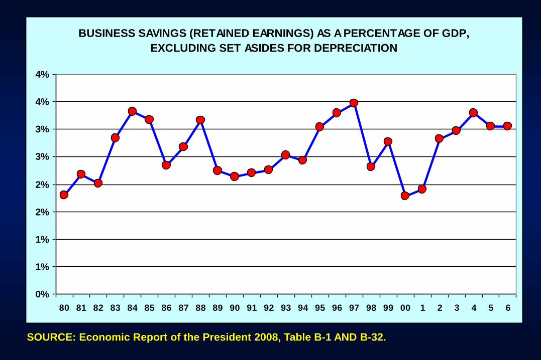
BUSINESS SAVINGS (RETAINED EARNINGS) AS A PERCENTAGE OF GDP,
EXCLUDING SET ASIDES FOR DEPRECIATION
0%
1%
1%
2%
2%
3%
3%
4%
4%
80 81 82 83 84 85 86 87 88 89 90 91 92 93 94 95 96 97 98 99 00 1 2 3 4 5 6
SOURCE: Economic Report of the President 2008, Table B-1 AND B-32.
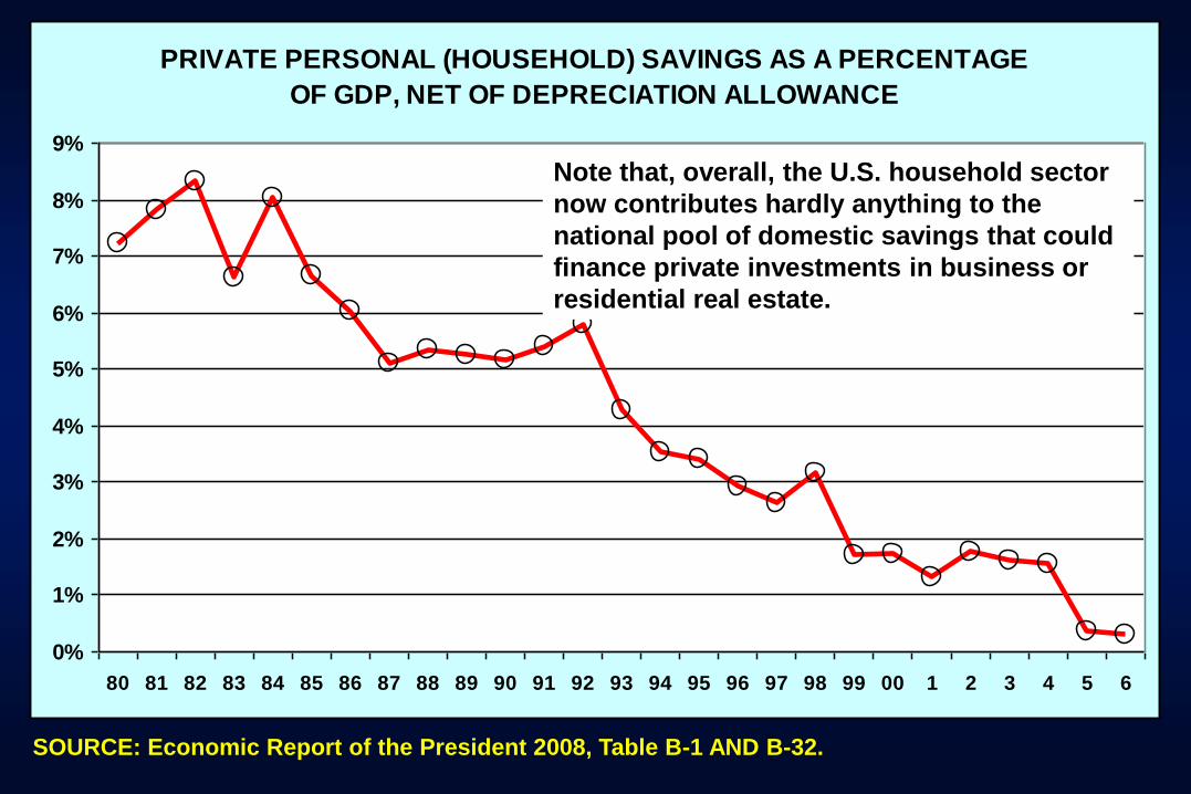
PRIVATE PERSONAL (HOUSEHOLD) SAVINGS AS A PERCENTAGE
OF GDP, NET OF DEPRECIATION ALLOWANCE
0%
1%
2%
3%
4%
5%
6%
7%
8%
9%
80 81 82 83 84 85 86 87 88 89 90 91 92 93 94 95 96 97 98 99 00 1 2 3 4 5 6
Note that, overall, the U.S. household sector
now contributes hardly anything to the
national pool of domestic savings that could
finance private investments in business or
residential real estate.
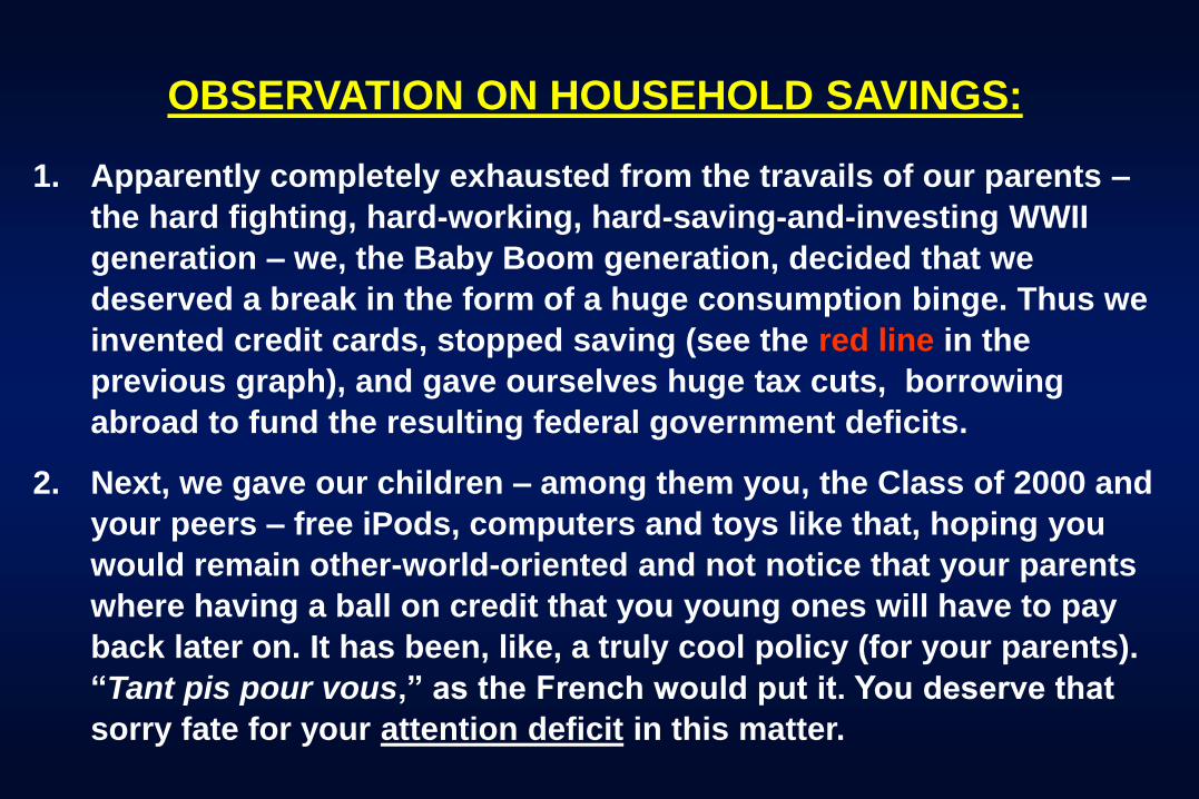
OBSERVATION ON HOUSEHOLD SAVINGS:
1. Apparently completely exhausted from the travails of our parents –
the hard fighting, hard-working, hard-saving-and-investing WWII
generation – we, the Baby Boom generation, decided that we
deserved a break in the form of a huge consumption binge. Thus we
invented credit cards, stopped saving (see the red line in the
previous graph), and gave ourselves huge tax cuts, borrowing
abroad to fund the resulting federal government deficits.
2. Next, we gave our children – among them you, the Class of 2000 and
your peers – free iPods, computers and toys like that, hoping you
would remain other-world-oriented and not notice that your parents
where having a ball on credit that you young ones will have to pay
back later on. It has been, like, a truly cool policy (for your parents).
“Tant pis pour vous,” as the French would put it. You deserve that
sorry fate for your attention deficit in this matter.
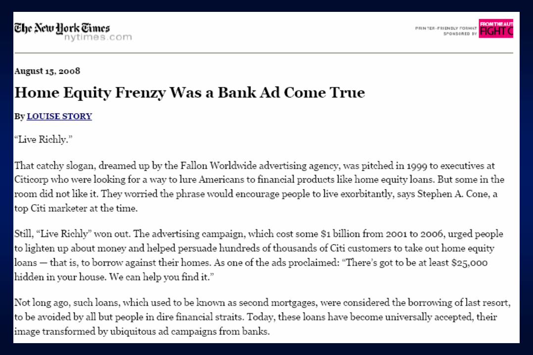
July 20, 2008: I add ex post two additional and revealing slides
on the financial position of U.S. households, taken from a
report in The New York Times, July 20, 2008
Apparently, much of the savings Americans traditionally had in
their homes was tapped through second mortgages to finance
additional consumption.
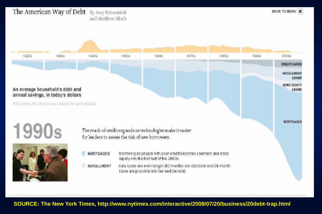
SOURCE: The New York Times, http://www.nytimes.com/interactive/2008/07/20/business/20debt-trap.html
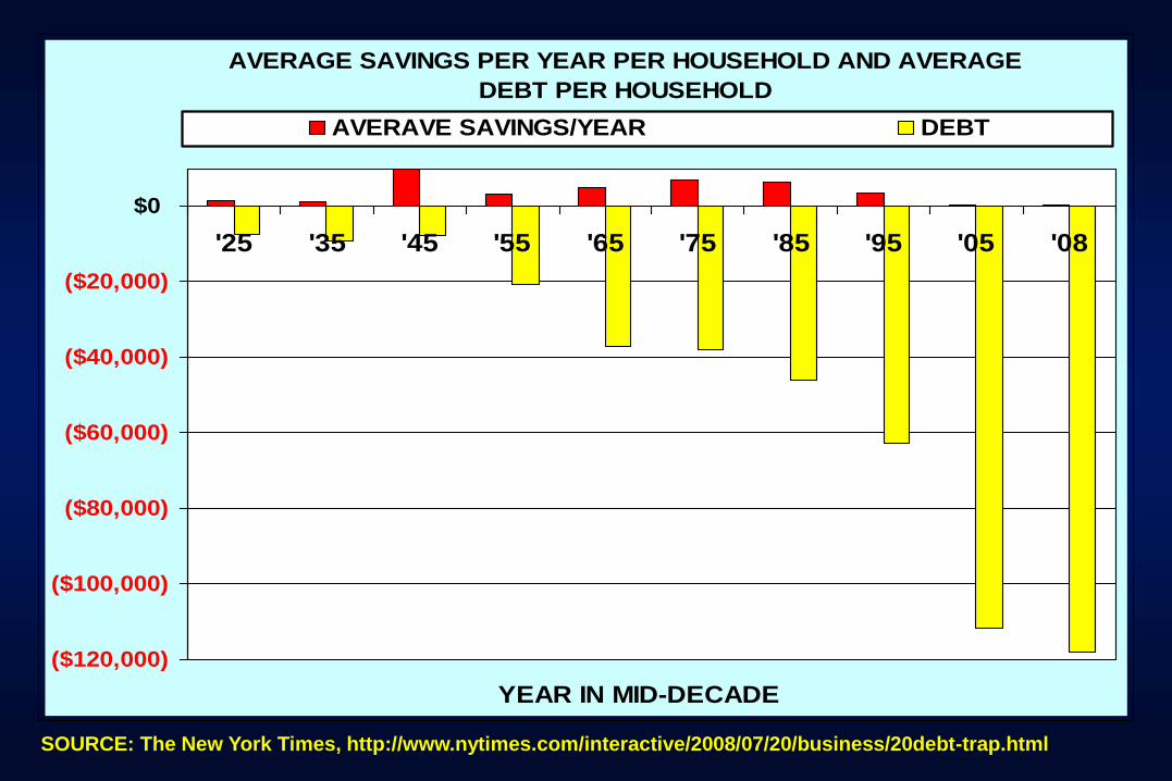
SOURCE: The New York Times, http://www.nytimes.com/interactive/2008/07/20/business/20debt-trap.html
AVERAGE SAVINGS PER YEAR PER HOUSEHOLD AND AVERAGE
DEBT PER HOUSEHOLD
($120,000)
($100,000)
($80,000)
($60,000)
($40,000)
($20,000)
$0
'25 '35 '45 '55 '65 '75 '85 '95 '05 '08
YEAR IN MID-DECADE
AVERAVE SAVINGS/YEAR DEBT
Next, let us look a government savings -- Tax Revenue (T) minus
Government Expenditures on Goods and Services (G) in the
equation. Together, the management of T and G is known as
“fiscal policy.”
Because the federal government since 2001 has consistently
spent more than the tax revenue it took in – it consistently ran
deficits – we must think here not of “savings” but of “dis-
savings.”
We shall first look at fiscal policy over the long span 1980 to 2008
and then at fiscal policy since 2001.
Government Savings (mainly Dis-savings) in the U.S. : T - G
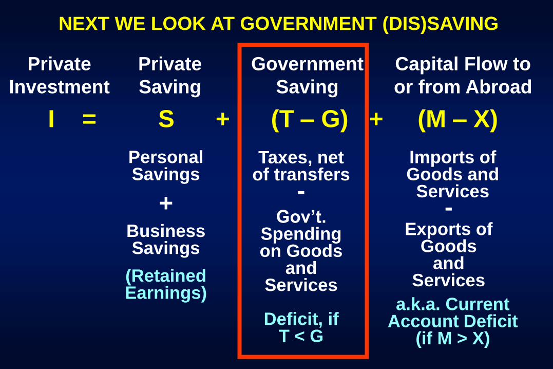
NEXT WE LOOK AT GOVERNMENT (DIS)SAVING
I = S + (T – G) + (M – X)
Private
Saving
Government
Saving
Capital Flow to
or from Abroad
Private
Investment
Personal Savings
+ Business Savings
(RetainedEarnings)
Taxes, net of transfers
- Gov’t.
Spending on Goods
and Services
Imports of Goods and Services
- Exports of
Goods and
Services
a.k.a. Current Account Deficit
(if M > X) Deficit, if
T < G
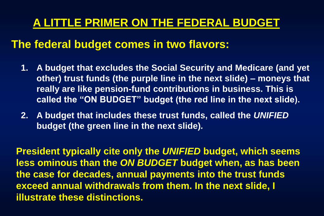
A LITTLE PRIMER ON THE FEDERAL BUDGET
The federal budget comes in two flavors:
1. A budget that excludes the Social Security and Medicare (and yet
other) trust funds (the purple line in the next slide) – moneys that
really are like pension-fund contributions in business. This is
called the “ON BUDGET” budget (the red line in the next slide).
2. A budget that includes these trust funds, called the UNIFIED
budget (the green line in the next slide).
President typically cite only the UNIFIED budget, which seems
less ominous than the ON BUDGET budget when, as has been
the case for decades, annual payments into the trust funds
exceed annual withdrawals from them. In the next slide, I
illustrate these distinctions.
Let us begin by looking at the time path, from 1968 to 2008, of
federal ON-BUDGET receipts and outlays, adjusted for inflation by
the GDP Price Deflator set to 100 for the year 2000 (next slide).
We see that the Reagan-Bush I era does not stand out as one
under which real federal ON-BUDGET spending was under tight
control. It rose apace.
There is, however, a slight downward kink in the real spending line
under the earlier Clinton years.
Note also the large ON-BUDGET federal annual deficits started
under the Reagan years, shrank noticeably under the Clinton years
(and even turned into a surplus), but grew again under the Bush II
years.
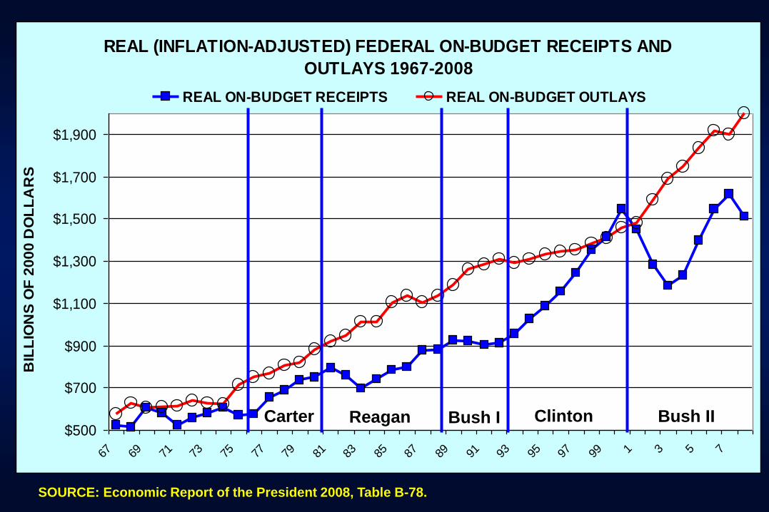
SOURCE: Economic Report of the President 2008, Table B-78.
REAL (INFLATION-ADJUSTED) FEDERAL ON-BUDGET RECEIPTS AND
OUTLAYS 1967-2008
$500
$700
$900
$1,100
$1,300
$1,500
$1,700
$1,900
67 69 71 73 75 77 79 81 83 85 87 89 91 93 95 97 99 1 3 5 7
BIL
LIO
NS
OF
20
00
DO
LL
AR
S
REAL ON-BUDGET RECEIPTS REAL ON-BUDGET OUTLAYS
Carter Reagan Bush I Clinton Bush II
An alternative way of beholding federal fiscal policy is to
express both receipts and outlays as a percentage of GDP,
which is done in the next slide.
We see that federal ON-BUGDET receipts (i.e., excluding Social
Security and Medicare Trust Fund contributions) fell below 13%
of GDP in the Reagan-Bush I years but rose again sharply in the
Clinton years.
By contrast, federal ON-BUDGET spending was high in the
Reagan-Bush I era, certainly relative to the Carter and Clinton
years.
SOURCE: Economic Report of the President 2008, Table B-78.
ON-BUDGET FEDERAL RECEIPTS AND OUTLAYS AS
PERCENT OF GDP, 1980-2008
11%
12%
13%
14%
15%
16%
17%
18%
19%
20%
68 69 70 71 72 73 74 75 76 77 78 79 80 81 82 83 84 85 86 87 88 89 90 91 92 93 94 95 96 97 98 99 00 1 2 3 4 5 6 7 8
PE
RC
EN
T O
F G
DP
ON-BUDGET RECEIPTS ON-BUDGET OUTLAYS
NIXON CARTER
FO
RD
REAGAN BUSH I
BUSH II
CLINTON

10%
12%
14%
16%
18%
20%
22%
24%
68 69 70 71 72 73 74 75 76 77 78 79 80 81 82 83 84 85 86 87 88 89 90 91 92 93 94 95 96 97 98 99 0 1 2 3 4 5 6 7 8 9 10
ON-BUDGET RECEIPTS ON-BUDGET OUTLAYS
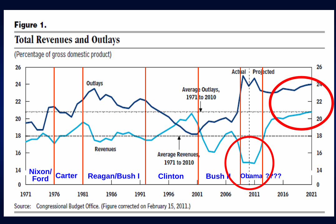
FEDERAL RECEIPTS AND OUTLAYS AS A PERCENT OF GDP, 1968 – 2010
(Excludes the Social Security and Medicare Trust Fund Operations)
Nixon Fo
rd
Carter Reagan Bush I Clinton Bush II Ob
am
a
SOURCE: Economic Report of the President 2010, Table B-78.
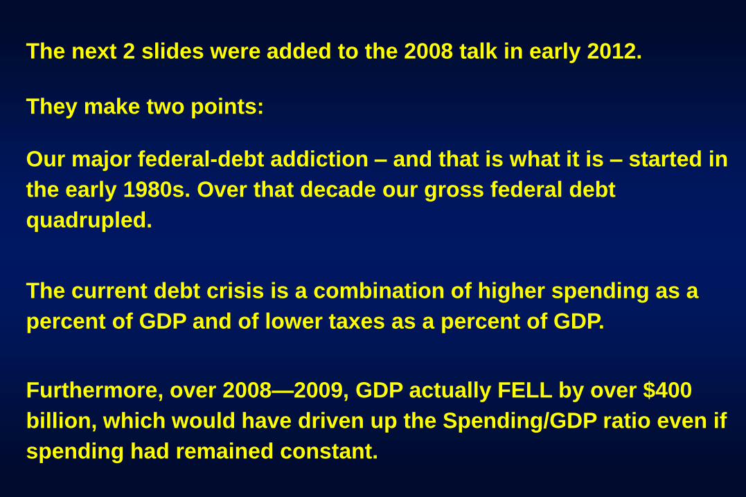
The next 2 slides were added to the 2008 talk in early 2012.
They make two points:
Our major federal-debt addiction – and that is what it is – started in
the early 1980s. Over that decade our gross federal debt
quadrupled.
The current debt crisis is a combination of higher spending as a
percent of GDP and of lower taxes as a percent of GDP.
Furthermore, over 2008—2009, GDP actually FELL by over $400
billion, which would have driven up the Spending/GDP ratio even if
spending had remained constant.
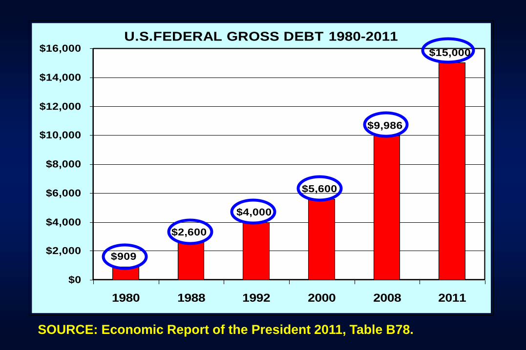
U.S.FEDERAL GROSS DEBT 1980-2011
$909
$2,600
$4,000
$5,600
$9,986
$15,000
$0
$2,000
$4,000
$6,000
$8,000
$10,000
$12,000
$14,000
$16,000
1980 1988 1992 2000 2008 2011
SOURCE: Economic Report of the President 2011, Table B78.
Reagan/Bush I Clinton Bush II Obama Carter Nixon/Ford ????

Finally, for good measure I show the time path of contributions to
and withdrawals from the Social Security-, Medicare- and other
trust funds.
We see that these trust funds developed large surpluses, starting
in the Reagan era (in response to the Greenspan report on Social
Security).
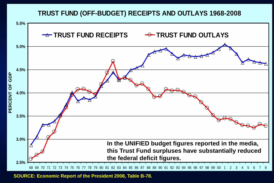
SOURCE: Economic Report of the President 2008, Table B-78.
TRUST FUND (OFF-BUDGET) RECEIPTS AND OUTLAYS 1968-2008
2.5%
3.0%
3.5%
4.0%
4.5%
5.0%
5.5%
68 69 70 71 72 73 74 75 76 77 78 79 80 81 82 83 84 85 86 87 88 89 90 91 92 93 94 95 96 97 98 99 00 1 2 3 4 5 6 7 8
PE
RC
EN
T O
F G
DP
TRUST FUND RECEIPTS TRUST FUND OUTLAYS
In the UNIFIED budget figures reported in the media,
this Trust Fund surpluses have substantially reduced
the federal deficit figures.
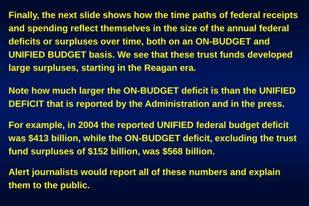
Finally, the next slide shows how the time paths of federal receipts
and spending reflect themselves in the size of the annual federal
deficits or surpluses over time, both on an ON-BUDGET and
UNIFIED BUDGET basis. We see that these trust funds developed
large surpluses, starting in the Reagan era.
Note how much larger the ON-BUDGET deficit is than the UNIFIED
DEFICIT that is reported by the Administration and in the press.
For example, in 2004 the reported UNIFIED federal budget deficit
was $413 billion, while the ON-BUDGET deficit, excluding the trust
fund surpluses of $152 billion, was $568 billion.
Alert journalists would report all of these numbers and explain
them to the public.
THE FEDERAL SURPLUS (DEFICIT) 1980 - 2009
$(650)
$(550)
$(450)
$(350)
$(250)
$(150)
$(50)
$50
$150
$250
80 81 82 83 84 85 86 87 88 89 90 91 92 93 94 95 96 97 98 99 00 1 2 3 4 5 6 7 8 9
ON-BUDGET TRUST FUNDS UNIFIED BUDGET
SOURCE: Economic Report of the President 2008, Table B-78.
Bush I Bush II Reagan Clinton
As the previous slide shows, the ON BUDGET deficit is much
larger than the UNIFIED budget deficit.
Imagine if had had routinely invested the Social Security and
Medicare Trust Fund surpluses in a diversified portfolio of foreign
assets. Then, in the future, instead of paying people in Japan,
China and Dubai interest on the US Treasury bonds we sold them
and paying back those bonds, our children would face lower
taxes because these foreign citizens would pay our children
interest and profits and repaid debt. Alas, for our children, we
spend the Trust Fund surpluses on routine government
operations (G) and borrowed billions on top of it from abroad.
For fiscal year 2004, for example, the White House and the press
would have been talking about a deficit of roughly $400 billion,
when the true federal budget deficit was in excess of $550 billion.
Federal fiscal policy in recent years

At the beginning of 2001, the Congressional Budget Office (CBO)
projected a sizeable cumulative federal budget surplus for the
decade 2001-2010, based on tax- and revenue-trends and the
budget surpluses that had been achieved in the latter half of the
1990s.
The media spoke and wrote about a cumulative projected surplus
of $5.6 trillion for 2001-10; but $2.5 trillion of that surplus
represented cumulative projected surpluses in the Social
Security and Medicare trust funds, so that the cumulative federal
operating surplus (the so-called “on-budget” surplus) was only
$3.1 trillion (see next slide).
As noted, in principle, the Social Security surplus should have
been invested and not been spent as if it were spendable annual
operating revenue.

SOURCE: Congressional Budget Office (www.CBO.gov), various dates.
2.5
3.1
0.9
2.5
$0
$1
$2
$3
$4
$5
$6
JAN. 2001 AUG. 2001
TR
ILL
ION
S O
F D
OL
LA
RS
ON-BUDGET SOCIAL SECURITY
CUMULATIVE, PROSPECTIVE 10-YEAR FEDERAL BUDGET
SURPLUS/DEFICIT 2001-2011
Before 9/11 !
$5.6 tr
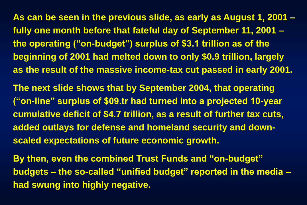
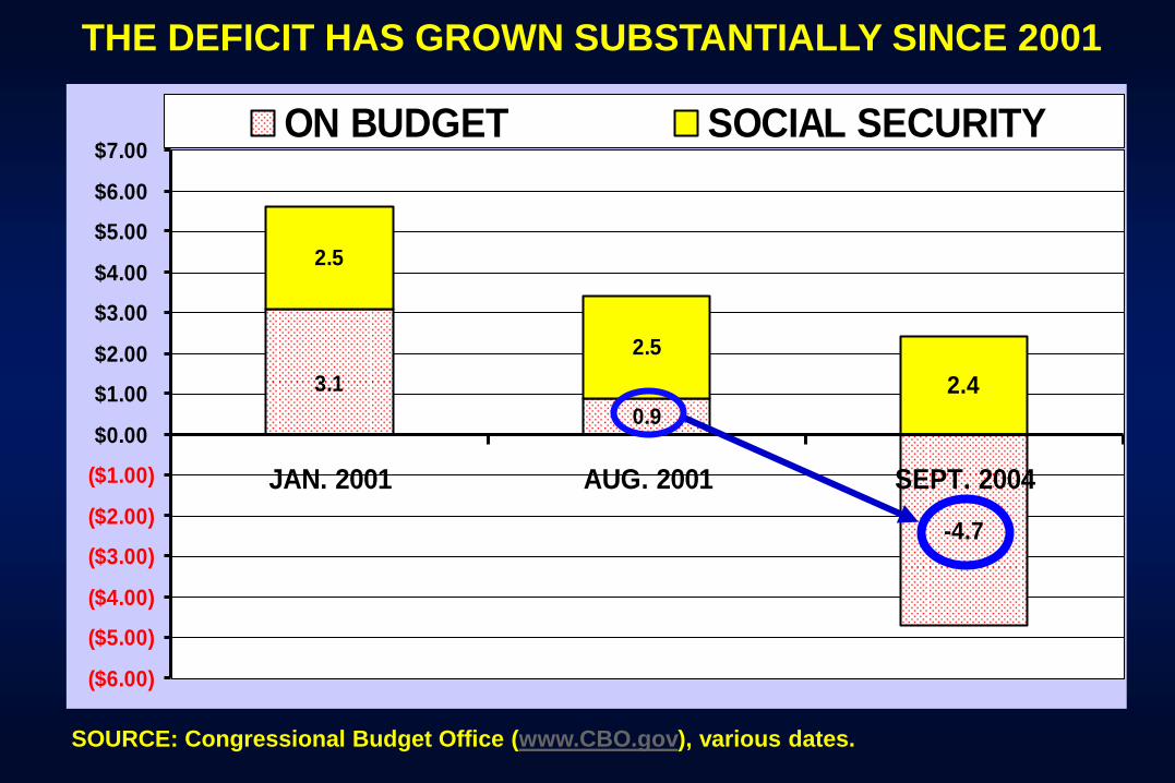
As can be seen in the previous slide, as early as August 1, 2001 –
fully one month before that fateful day of September 11, 2001 –
the operating (“on-budget”) surplus of $3.1 trillion as of the
beginning of 2001 had melted down to only $0.9 trillion, largely
as the result of the massive income-tax cut passed in early 2001.
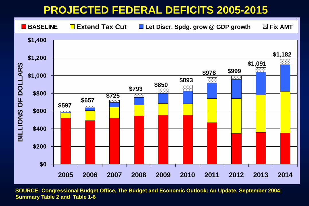
The next slide shows that by September 2004, that operating
(“on-line” surplus of $09.tr had turned into a projected 10-year
cumulative deficit of $4.7 trillion, as a result of further tax cuts,
added outlays for defense and homeland security and down-
scaled expectations of future economic growth.
By then, even the combined Trust Funds and “on-budget”
budgets – the so-called “unified budget” reported in the media –
had swung into highly negative.
SOURCE: Congressional Budget Office (www.CBO.gov), various dates.
2.5
3.1
-4.7
0.9
2.5
2.4
($6.00)
($5.00)
($4.00)
($3.00)
($2.00)
($1.00)
$0.00
$1.00
$2.00
$3.00
$4.00
$5.00
$6.00
$7.00
JAN. 2001 AUG. 2001 SEPT. 2004
ON BUDGET SOCIAL SECURITY
THE DEFICIT HAS GROWN SUBSTANTIALLY SINCE 2001
The next two slides show the projected cumulative federal
budget deficits under various assumed scenarios, including an
extension of the Bush tax cuts of 2001 and 2003 beyond 2010,
when the original tax cuts would expire unless they were formally
extended beyond 2010 by legislation.
The next slide shows that by September 2004, that operating
(“on-line” surplus of $09.tr had turned into a projected 10-year
cumulative deficit of $4.7 trillion, as a result of further tax cuts,
added outlays for defense and homeland security and down-
scaled expectations of future economic growth.
By then, even the combined Trust Funds and “on-budget”
budgets – the so-called “unified budget” reported in the media –
had swung into highly negative.
$0
$200
$400
$600
$800
$1,000
$1,200
$1,400
2005 2006 2007 2008 2009 2010 2011 2012 2013 2014
BIL
LIO
NS
OF
DO
LL
AR
SBASELINE Extend Tax Cut Let Discr. Spdg. grow @ GDP growth Fix AMT
$597 $657
$725 $793
$850 $893
$978 $999
$1,091
$1,182
SOURCE: Congressional Budget Office, The Budget and Economic Outlook: An Update, September 2004;
Summary Table 2 and Table 1-6
PROJECTED FEDERAL DEFICITS 2005-2015
-$7,832
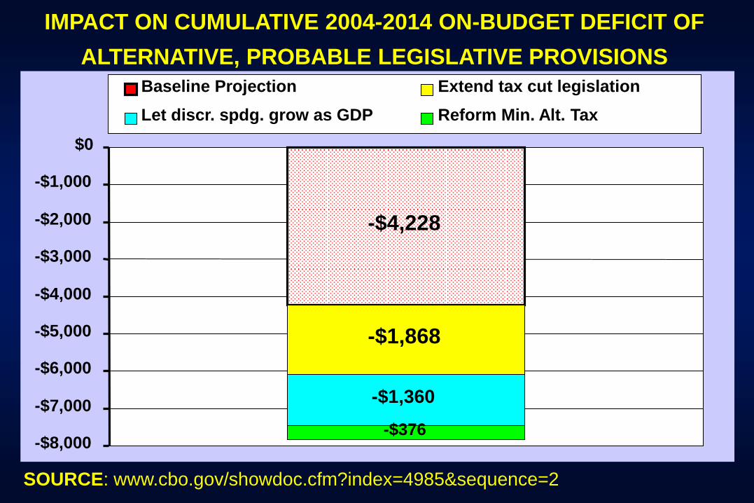
IMPACT ON CUMULATIVE 2004-2014 ON-BUDGET DEFICIT OF
ALTERNATIVE, PROBABLE LEGISLATIVE PROVISIONS
SOURCE: www.cbo.gov/showdoc.cfm?index=4985&sequence=2
-$4,228
-$1,868
-$1,360
-$376 -$8,000
-$7,000
-$6,000
-$5,000
-$4,000
-$3,000
-$2,000
-$1,000
$0
Baseline Projection Extend tax cut legislation
Let discr. spdg. grow as GDP Reform Min. Alt. Tax
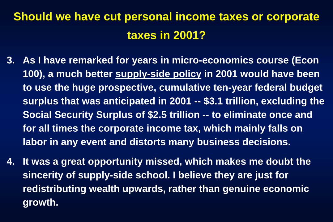
Should we have cut personal income taxes or corporate
taxes in 2001?
3. As I have remarked for years in micro-economics course (Econ
100), a much better supply-side policy in 2001 would have been
to use the huge prospective, cumulative ten-year federal budget
surplus that was anticipated in 2001 -- $3.1 trillion, excluding the
Social Security Surplus of $2.5 trillion -- to eliminate once and
for all times the corporate income tax, which mainly falls on
labor in any event and distorts many business decisions.
4. It was a great opportunity missed, which makes me doubt the
sincerity of supply-side school. I believe they are just for
redistributing wealth upwards, rather than genuine economic
growth.
For the sake of completeness, the next slide shows the
time path of the annual state budgets during the longer
period 1980 to 2008.
GOVERNMENT BUDGET SURPLUSES OR DEFICITS
(SAVINGS) AS PERCENT OF GDP 1980 - 2006
-0.4%
-0.2%
0.0%
0.2%
0.4%
0.6%
0.8%
80 81 82 83 84 85 86 87 88 89 90 91 92 93 94 95 96 97 98 99 00 1 2 3 4 5 6
SOURCE: Economic Report of the President 2008, Table B-1 AND B-32.
Reagan Bush I Clinton Bush II
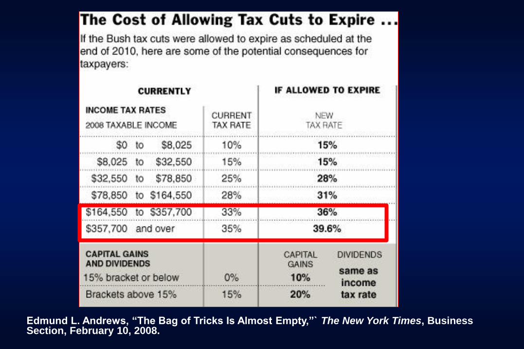
A major question in the upcoming election is whether
the tax cuts enacted in 2001 and 2003 – most of which
were set to expire in 2010-2011 – should be made
permanent.
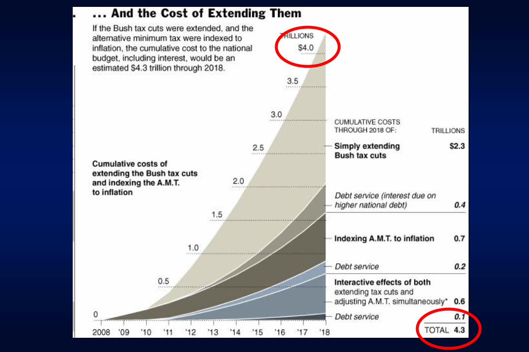
As the next slide, based on Congressional Budget Office
data, shows, extending the tax cuts would add an estimated
$4 trillion to our federal debt.
Edmund L. Andrews, “The Bag of Tricks Is Almost Empty,”` The New York Times, Business Section, February 10, 2008.
EFFECT ON FEDERAL BUDGET OF EXTENDING 2001-2003 TAX
CUTS PAST 2010
Edmund L. Andrews, “The Bag of Tricks Is Almost Empty,”` The New York Times, Business Section, February 10, 2008.

INTRIGUING QUESTION:
1. It can be asked whether the Chinese, the Japanese and sundry
potentates of the Middle East who have hitherto financed much
of our federal deficits will be willing to give us yet another
mortgage on this $4 trillion through ever more rising Current
Account deficits – a mortgage that you, now still other-world-
oriented GenXers, will have to pay off.
2. Let’s hope so, lest interest rates go through the roof, as the U.S.
Treasury must compete for domestic (not Chinese) savings to
fund the federal deficit. And when interest rates rise, asset values
– of stocks, bonds, real estate – plummet.
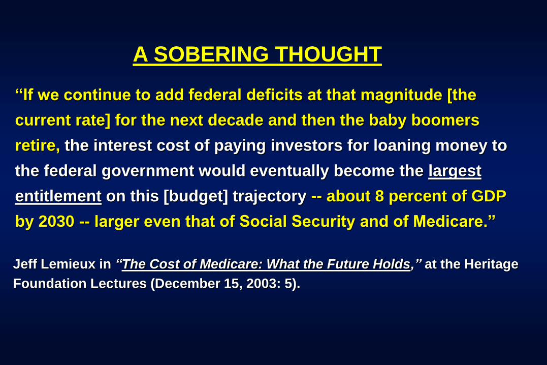
“If we continue to add federal deficits at that magnitude [the
current rate] for the next decade and then the baby boomers
retire, the interest cost of paying investors for loaning money to
the federal government would eventually become the largest
entitlement on this [budget] trajectory -- about 8 percent of GDP
by 2030 -- larger even that of Social Security and of Medicare.”
Jeff Lemieux in “The Cost of Medicare: What the Future Holds,” at the Heritage
Foundation Lectures (December 15, 2003: 5).
A SOBERING THOUGHT
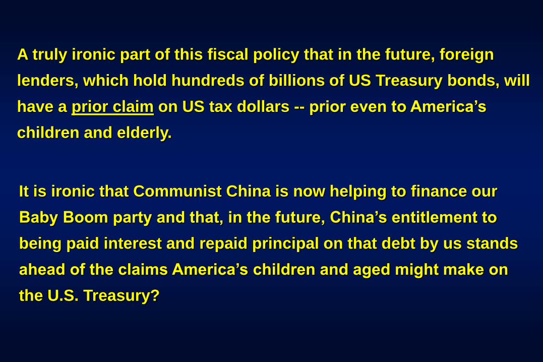
A truly ironic part of this fiscal policy that in the future, foreign
lenders, which hold hundreds of billions of US Treasury bonds, will
have a prior claim on US tax dollars -- prior even to America’s
children and elderly.
It is ironic that Communist China is now helping to finance our
Baby Boom party and that, in the future, China’s entitlement to
being paid interest and repaid principal on that debt by us stands
ahead of the claims America’s children and aged might make on
the U.S. Treasury?

Cool! They hooked us on opium; we’ll hook them on credit.
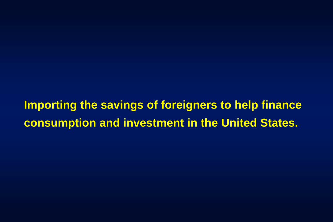
Importing the savings of foreigners to help finance
consumption and investment in the United States.
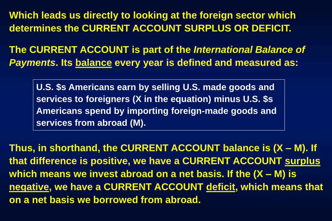
Which leads us directly to looking at the foreign sector which
determines the CURRENT ACCOUNT SURPLUS OR DEFICIT.
Thus, in shorthand, the CURRENT ACCOUNT balance is (X – M). If
that difference is positive, we have a CURRENT ACCOUNT surplus
which means we invest abroad on a net basis. If the (X – M) is
negative, we have a CURRENT ACCOUNT deficit, which means that
on a net basis we borrowed from abroad.
The CURRENT ACCOUNT is part of the International Balance of
Payments. Its balance every year is defined and measured as:
U.S. $s Americans earn by selling U.S. made goods and
services to foreigners (X in the equation) minus U.S. $s
Americans spend by importing foreign-made goods and
services from abroad (M).
FINALLY, LET US LOOK AT THE CURRENT ACCOUNT:
I = S + (T – G) + (M – X)
Private
Saving
Government
Saving
Capital Flow to
or from Abroad
Private
Investment
Personal Savings
+ Business Savings
(RetainedEarnings)
Taxes, net of transfers
- Gov’t.
Spending on Goods
and Services
Imports of Goods and Services
- Exports of
Goods and
Services
a.k.a. Current Account Deficit
(if M > X) Deficit, if
T < G
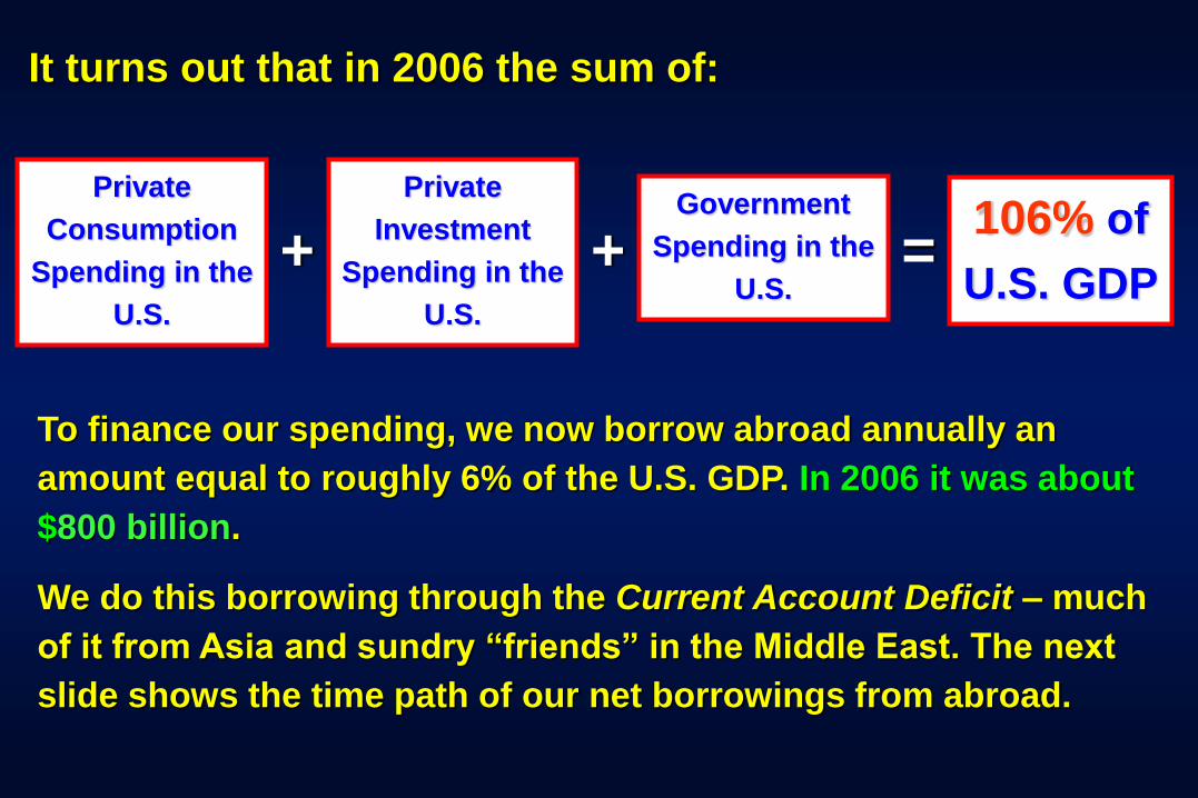
It turns out that in 2006 the sum of:
Private
Consumption
Spending in the
U.S.
Private
Investment
Spending in the
U.S.
+ Government
Spending in the
U.S. + =
106% of
U.S. GDP
To finance our spending, we now borrow abroad annually an
amount equal to roughly 6% of the U.S. GDP. In 2006 it was about
$800 billion.
We do this borrowing through the Current Account Deficit – much
of it from Asia and sundry “friends” in the Middle East. The next
slide shows the time path of our net borrowings from abroad.
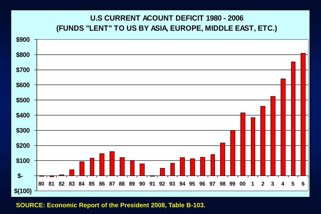
U.S CURRENT ACOUNT DEFICIT 1980 - 2006
(FUNDS "LENT" TO US BY ASIA, EUROPE, MIDDLE EAST, ETC.)
$(100)
$-
$100
$200
$300
$400
$500
$600
$700
$800
$900
80 81 82 83 84 85 86 87 88 89 90 91 92 93 94 95 96 97 98 99 00 1 2 3 4 5 6
SOURCE: Economic Report of the President 2008, Table B-103.
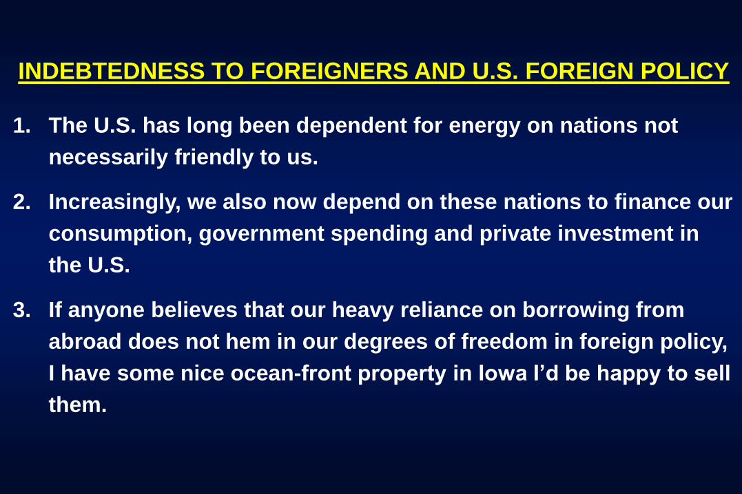
INDEBTEDNESS TO FOREIGNERS AND U.S. FOREIGN POLICY
1. The U.S. has long been dependent for energy on nations not
necessarily friendly to us.
2. Increasingly, we also now depend on these nations to finance our
consumption, government spending and private investment in
the U.S.
3. If anyone believes that our heavy reliance on borrowing from
abroad does not hem in our degrees of freedom in foreign policy,
I have some nice ocean-front property in Iowa I’d be happy to sell
them.

INDEBTEDNESS TO FOREIGNERS AND U.S. FOREIGN POLICY
4. For example, we claim to hate dictators who brutally violate
human rights. With our sophisticated drones and laser guided
missiles, we certainly could have persuaded the oppressive junta
ruling Myanmar to free its people from its current oppression. Yet
we did not even attempt to do so.
5. For a clue why it might be so, study the map on the next slide.
6. Chances are that a subtle hint from Beijing discouraged the U.S.
from even thinking about that option, lest China absent itself
from the next auction at which U.S. Treasuries are auctioned off
or shift its portfolio from $s to Euros.
7. We shall never know, but we can guess.

Myanmar is China’s
coveted window to
the Bay of Bengal

THE END