Embed Size (px)
Citation preview
1. In what ways does your media product use, develop or challenge forms1. In what ways does your media product use, develop or challenge forms and conventions of real media products? and conventions of real media products?
2. What have you learnt about the technologies from the 2. What have you learnt about the technologies from the process of constructing this productprocess of constructing this product
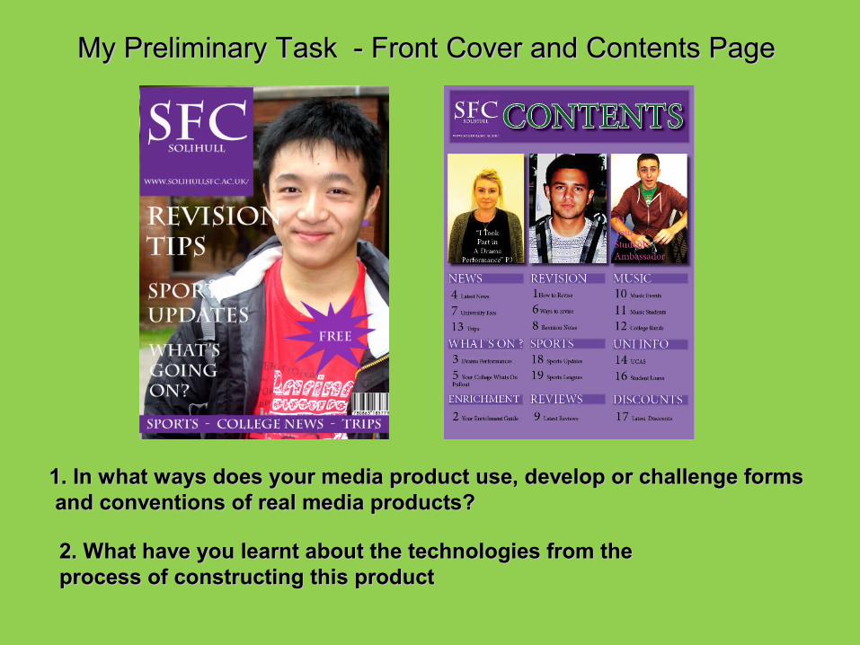
My Preliminary Task - Front Cover and Contents PageMy Preliminary Task - Front Cover and Contents Page
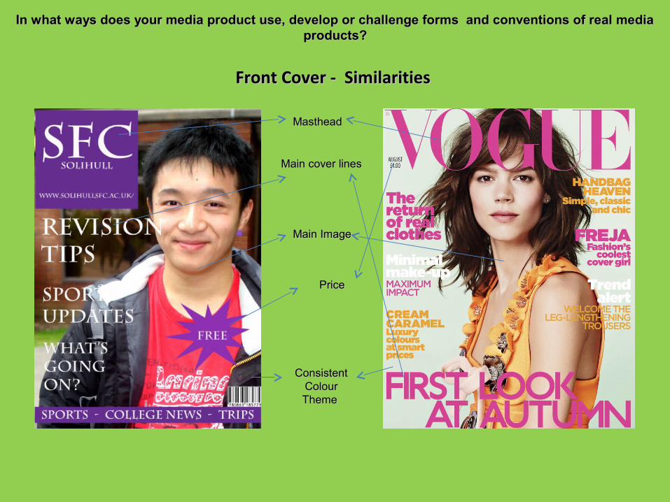
In what ways does your media product use, develop or challenge forms and conventions of real media In what ways does your media product use, develop or challenge forms and conventions of real media products?products?
Front Cover - Similarities Front Cover - Similarities
MastheadMasthead
Main cover lines Main cover lines
Main Image Main Image
PricePrice
Consistent Consistent Colour Colour Theme Theme
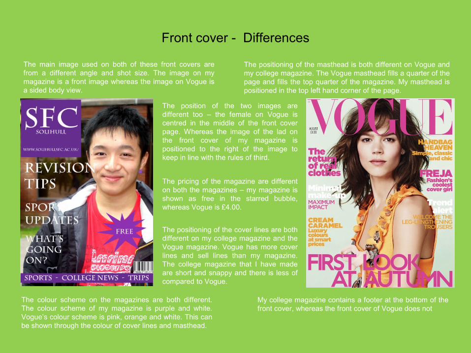
Front cover - Differences
The main image used on both of these front covers are from a different angle and shot size. The image on my magazine is a front image whereas the image on Vogue is a sided body view.
The position of the two images are different too – the female on Vogue is centred in the middle of the front cover page. Whereas the image of the lad on the front cover of my magazine is positioned to the right of the image to keep in line with the rules of third.
The positioning of the masthead is both different on Vogue and my college magazine. The Vogue masthead fills a quarter of the page and fills the top quarter of the magazine. My masthead is positioned in the top left hand corner of the page.
The positioning of the cover lines are both different on my college magazine and the Vogue magazine. Vogue has more cover lines and sell lines than my magazine. The college magazine that I have made are short and snappy and there is less of compared to Vogue.
The pricing of the magazine are different on both the magazines – my magazine is shown as free in the starred bubble, whereas Vogue is £4.00.
The colour scheme on the magazines are both different. The colour scheme of my magazine is purple and white. Vogue’s colour scheme is pink, orange and white. This can be shown through the colour of cover lines and masthead.
My college magazine contains a footer at the bottom of the front cover, whereas the front cover of Vogue does not
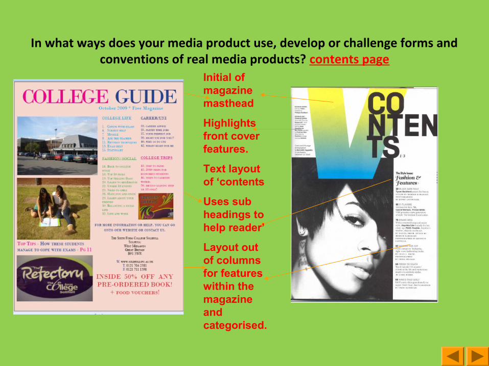
In what ways does your media product use, develop or challenge forms and conventions of real media products? contents page
Initial of magazine masthead
Highlights front cover features.
Text layout of ‘contents
Uses sub headings to help reader’
Layout out of columns for features within the magazine and categorised.
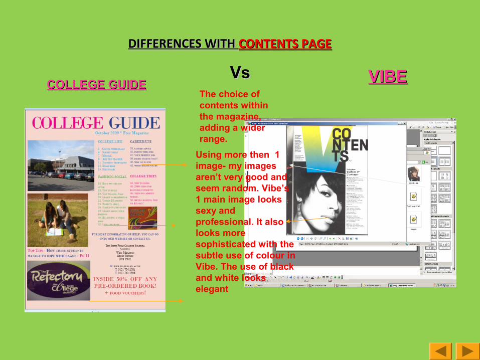
DIFFERENCES WITH DIFFERENCES WITH CONTENTS PAGECONTENTS PAGE VsVs VIBEVIBE
The choice of contents within the magazine, adding a wider range.
Using more then 1 image- my images aren’t very good and seem random. Vibe’s 1 main image looks sexy and professional. It also looks more sophisticated with the subtle use of colour in Vibe. The use of black and white looks elegant
COLLEGE GUIDECOLLEGE GUIDE
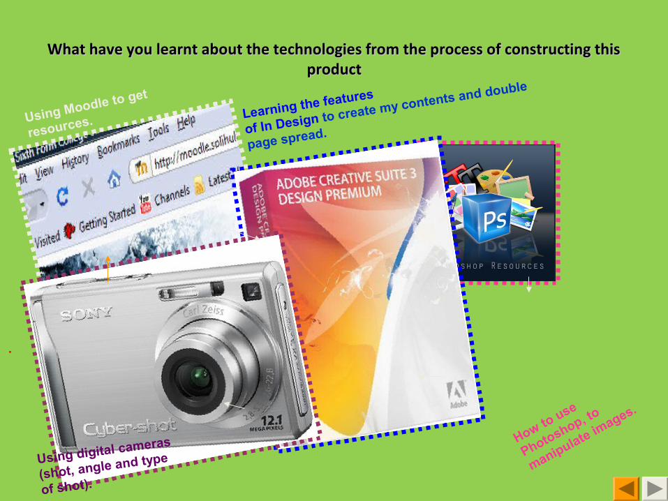
What have you learnt about the technologies from the process of constructing this What have you learnt about the technologies from the process of constructing this productproduct
Using Moodle to get
resources. Learning the features
of In Design to create my contents and double
page spread.
.
Using digital cameras
(shot, angle and type
of shot).
How to use
Photoshop, to
manipulate images.
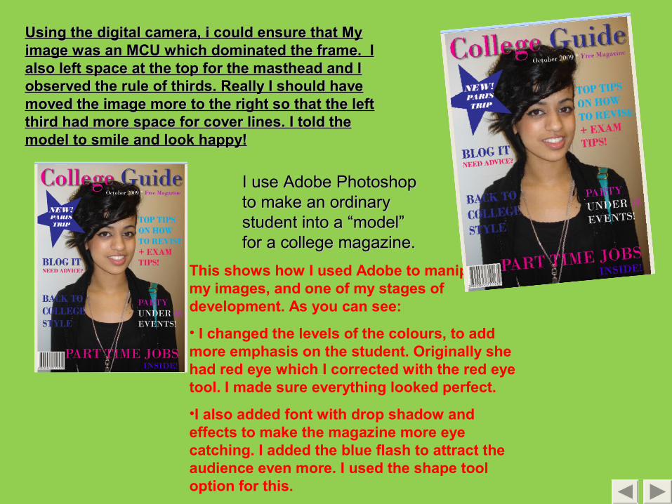
This shows how I used Adobe to manipulate my images, and one of my stages of development. As you can see:
• I changed the levels of the colours, to add more emphasis on the student. Originally she had red eye which I corrected with the red eye tool. I made sure everything looked perfect.
•I also added font with drop shadow and effects to make the magazine more eye catching. I added the blue flash to attract the audience even more. I used the shape tool option for this.
Using the digital camera, i could ensure that My Using the digital camera, i could ensure that My image was an MCU which dominated the frame. I image was an MCU which dominated the frame. I also left space at the top for the masthead and I also left space at the top for the masthead and I observed the rule of thirds. Really I should have observed the rule of thirds. Really I should have moved the image more to the right so that the left moved the image more to the right so that the left third had more space for cover lines. I told the third had more space for cover lines. I told the model to smile and look happy!model to smile and look happy!
I use Adobe Photoshop I use Adobe Photoshop to make an ordinary to make an ordinary student into a “model” student into a “model” for a college magazine.for a college magazine.
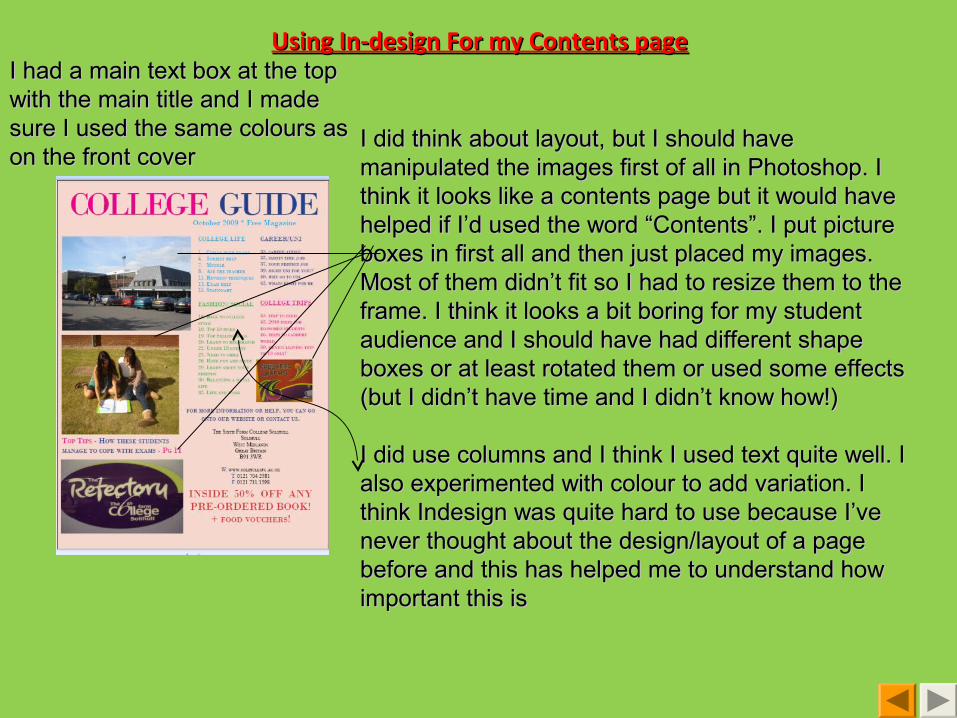
Using In-design For my Contents pageUsing In-design For my Contents page
I did think about layout, but I should have I did think about layout, but I should have manipulated the images first of all in Photoshop. I manipulated the images first of all in Photoshop. I think it looks like a contents page but it would have think it looks like a contents page but it would have helped if I’d used the word “Contents”. I put picture helped if I’d used the word “Contents”. I put picture boxes in first all and then just placed my images. boxes in first all and then just placed my images. Most of them didn’t fit so I had to resize them to the Most of them didn’t fit so I had to resize them to the frame. I think it looks a bit boring for my student frame. I think it looks a bit boring for my student audience and I should have had different shape audience and I should have had different shape boxes or at least rotated them or used some effects boxes or at least rotated them or used some effects (but I didn’t have time and I didn’t know how!)(but I didn’t have time and I didn’t know how!)
I did use columns and I think I used text quite well. I I did use columns and I think I used text quite well. I also experimented with colour to add variation. I also experimented with colour to add variation. I think Indesign was quite hard to use because I’ve think Indesign was quite hard to use because I’ve never thought about the design/layout of a page never thought about the design/layout of a page before and this has helped me to understand how before and this has helped me to understand how important this isimportant this is
I had a main text box at the top I had a main text box at the top with the main title and I made with the main title and I made sure I used the same colours as sure I used the same colours as on the front coveron the front cover