Embed Size (px)
Citation preview
GIMP Tutorial
Welcome to the Team 1073 GIMP tutorial. You might not have heard of GIMP, but it’s an
extremely powerful program that is very similar to Adobe Photoshop and it’s free. So if your
team can’t get Photoshop, or even if you would be interested in playing with it, GIMP is great
thing to download. GIMP stands for: GNU Image Manipulation Program, and is available for
download from its website at: www.gimp.com.
GIMP, or Photoshop if you have it, is a great tool for any FIRST Robotics team. It allows you to
edit photos of your team, and create graphics as advertising for your team. So you can edit the
color balance and take things out pictures of your team to make them look better. You can do
lots of cool things when making graphics for your team such as: website backgrounds, web-
banners, and logos. Most of the time in our tutorial will be spent on how to graphics. Some of
the things to be covered are: making new images in GIMP, brushes, layers, paths, and filters.
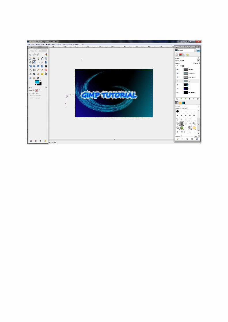
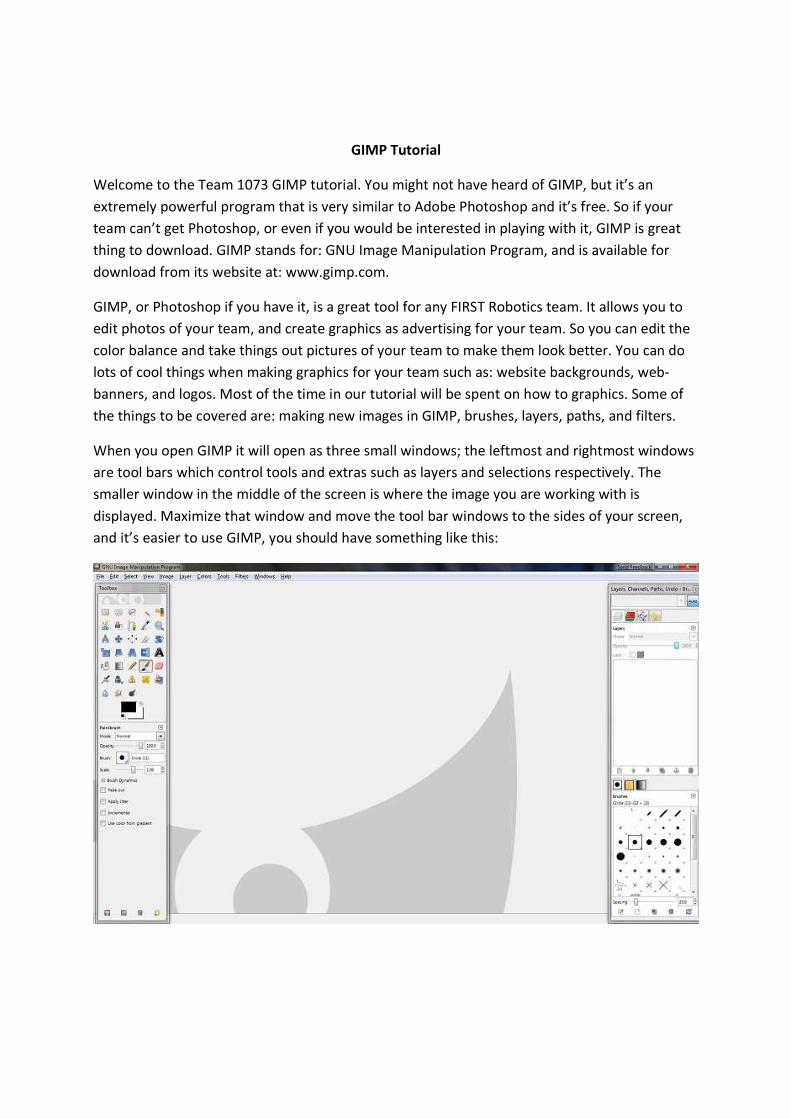
When you open GIMP it will open as three small windows; the leftmost and rightmost windows
are tool bars which control tools and extras such as layers and selections respectively. The
smaller window in the middle of the screen is where the image you are working with is
displayed. Maximize that window and move the tool bar windows to the sides of your screen,
and it’s easier to use GIMP, you should have something like this:
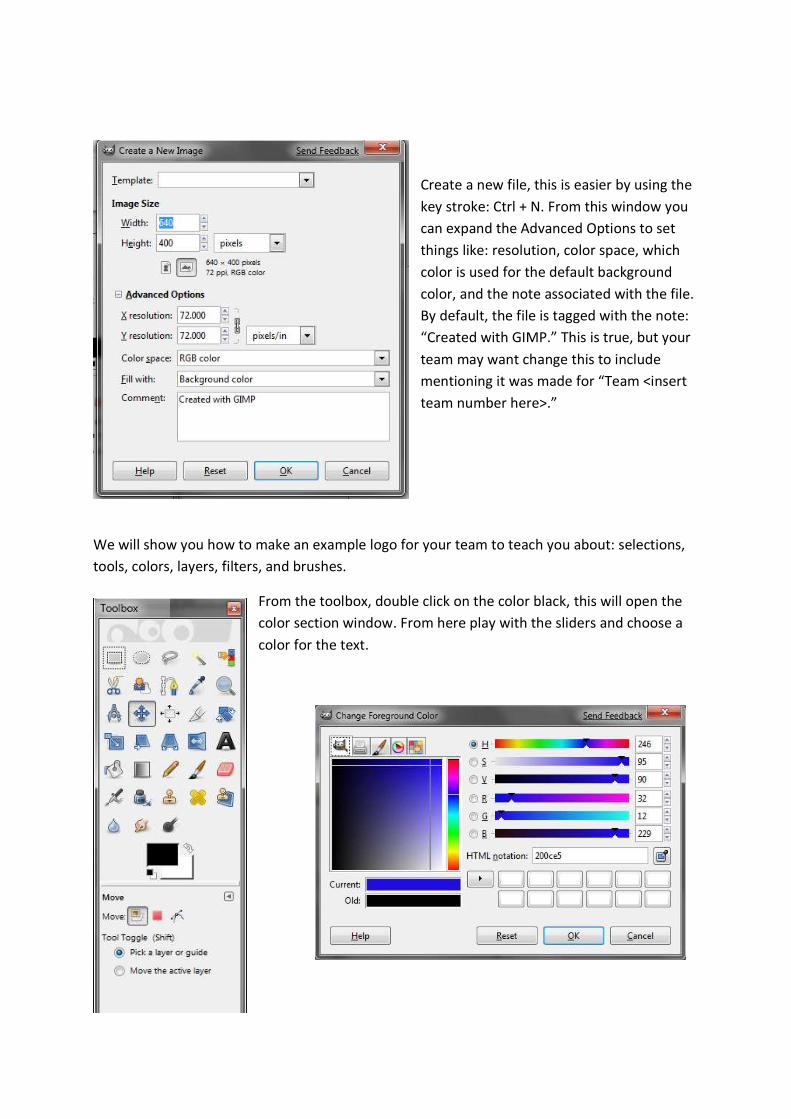
Create a new file, this is easier by using the
key stroke: Ctrl + N. From this window you
can expand the Advanced Options to set
things like: resolution, color space, which
color is used for the default background
color, and the note associated with the file.
By default, the file is tagged with the note:
“Created with GIMP.” This is true, but your
team may want change this to include
mentioning it was made for “Team <insert
team number here>.”
We will show you how to make an example logo for your team to teach you about: selections,
tools, colors, layers, filters, and brushes.
From the toolbox, double click on the color black, this will open the
color section window. From here play with the sliders and choose a
color for the text.
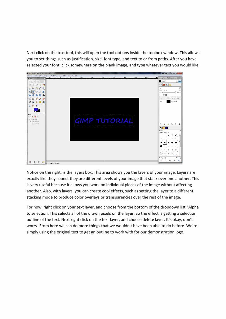
Next click on the text tool, this will open the tool options inside the toolbox window. This allows
you to set things such as justification, size, font type, and text to or from paths. After you have
selected your font, click somewhere on the blank image, and type whatever text you would like.
Notice on the right, is the layers box. This area shows you the layers of your image. Layers are
exactly like they sound, they are different levels of your image that stack over one another. This
is very useful because it allows you work on individual pieces of the image without affecting
another. Also, with layers, you can create cool effects, such as setting the layer to a different
stacking mode to produce color overlays or transparencies over the rest of the image.
For now, right click on your text layer, and choose from the bottom of the dropdown list “Alpha
to selection. This selects all of the drawn pixels on the layer. So the effect is getting a selection
outline of the text. Next right click on the text layer, and choose delete layer. It’s okay, don’t
worry. From here we can do more things that we wouldn’t have been able to do before. We’re
simply using the original text to get an outline to work with for our demonstration logo.
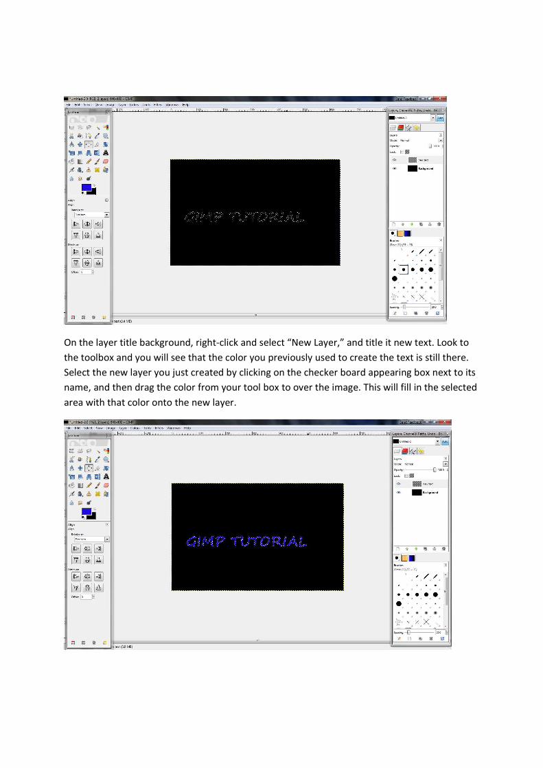
On the layer title background, right-click and select “New Layer,” and title it new text. Look to
the toolbox and you will see that the color you previously used to create the text is still there.
Select the new layer you just created by clicking on the checker board appearing box next to its
name, and then drag the color from your tool box to over the image. This will fill in the selected
area with that color onto the new layer.
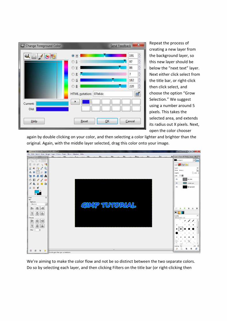
Repeat the process of
creating a new layer from
the background layer, so
this new layer should be
below the “next text” layer.
Next either click select from
the title bar, or right-click
then click select, and
choose the option “Grow
Selection.” We suggest
using a number around 5
pixels. This takes the
selected area, and extends
its radius out X pixels. Next,
open the color chooser
again by double clicking on your color, and then selecting a color lighter and brighter than the
original. Again, with the middle layer selected, drag this color onto your image.
We’re aiming to make the color flow and not be so distinct between the two separate colors.
Do so by selecting each layer, and then clicking Filters on the title bar (or right-clicking then
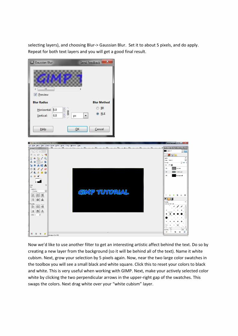
selecting layers), and choosing Blur-> Gaussian Blur. Set it to about 5 pixels, and do apply.
Repeat for both text layers and you will get a good final result.
Now we’d like to use another filter to get an interesting artistic affect behind the text. Do so by
creating a new layer from the background (so it will be behind all of the text). Name it white
cubism. Next, grow your selection by 5 pixels again. Now, near the two large color swatches in
the toolbox you will see a small black and white square. Click this to reset your colors to black
and white. This is very useful when working with GIMP. Next, make your actively selected color
white by clicking the two perpendicular arrows in the upper-right gap of the swatches. This
swaps the colors. Next drag white over your “white cubism” layer.
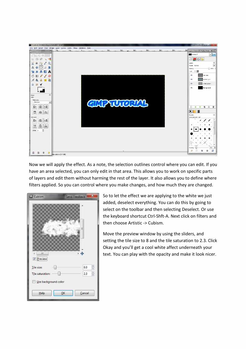
Now we will apply the effect. As a note, the selection outlines control where you can edit. If you
have an area selected, you can only edit in that area. This allows you to work on specific parts
of layers and edit them without harming the rest of the layer. It also allows you to define where
filters applied. So you can control where you make changes, and how much they are changed.
So to let the effect we are applying to the white we just
added, deselect everything. You can do this by going to
select on the toolbar and then selecting Deselect. Or use
the keyboard shortcut Ctrl-Shft-A. Next click on filters and
then choose Artistic -> Cubism.
Move the preview window by using the sliders, and
setting the tile size to 8 and the tile saturation to 2.3. Click
Okay and you’ll get a cool white affect underneath your
text. You can play with the opacity and make it look nicer.
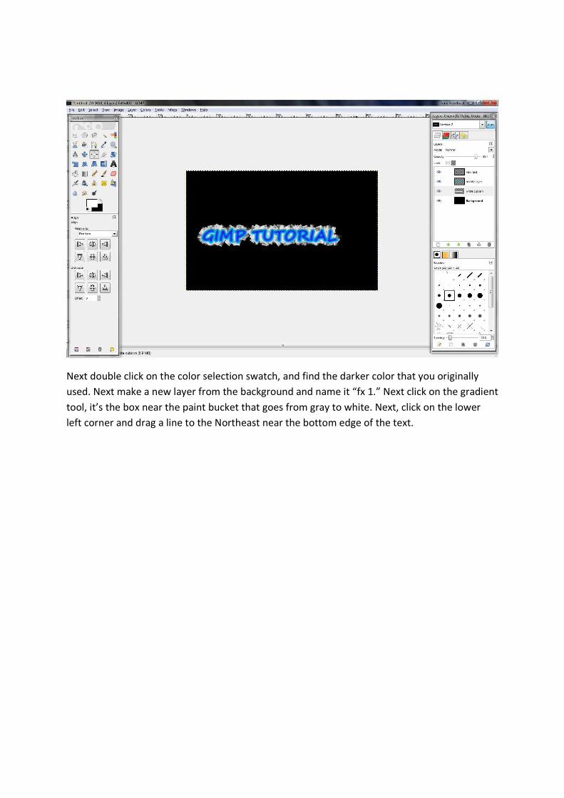
Next double click on the color selection swatch, and find the darker color that you originally
used. Next make a new layer from the background and name it “fx 1.” Next click on the gradient
tool, it’s the box near the paint bucket that goes from gray to white. Next, click on the lower
left corner and drag a line to the Northeast near the bottom edge of the text.
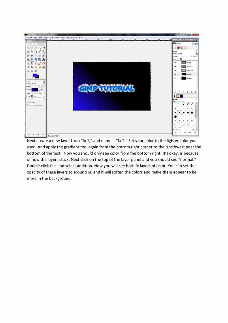
Next create a new layer from “fx 1,” and name it “fx 2.” Set your color to the lighter color you
used. And apply the gradient tool again from the bottom right corner to the Northwest near the
bottom of the text. Now you should only see color from the bottom right. It’s okay, is because
of how the layers stack. Next click on the top of the layer panel and you should see “normal.”
Double click this and select addition. Now you will see both fx layers of color. You can set the
opacity of these layers to around 60 and it will soften the colors and make them appear to be
more in the background.
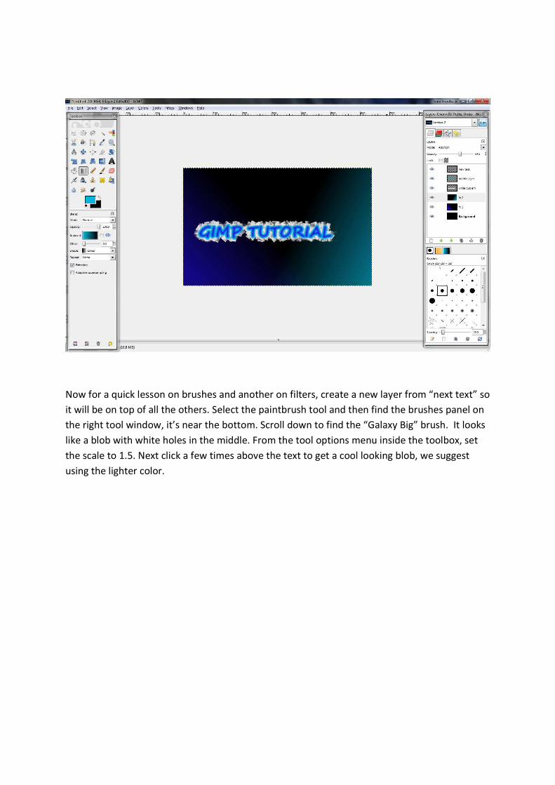
Now for a quick lesson on brushes and another on filters, create a new layer from “next text” so
it will be on top of all the others. Select the paintbrush tool and then find the brushes panel on
the right tool window, it’s near the bottom. Scroll down to find the “Galaxy Big” brush. It looks
like a blob with white holes in the middle. From the tool options menu inside the toolbox, set
the scale to 1.5. Next click a few times above the text to get a cool looking blob, we suggest
using the lighter color.
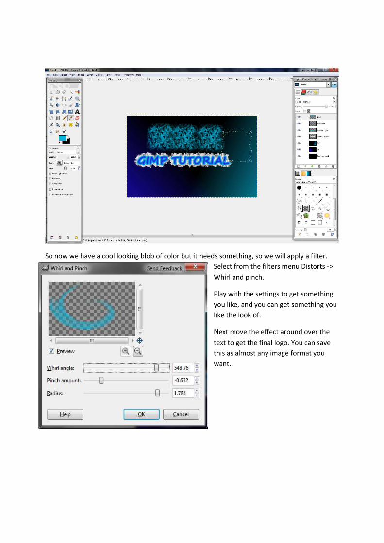
So now we have a cool looking blob of color but it needs something, so we will apply a filter.
Select from the filters menu Distorts ->
Whirl and pinch.
Play with the settings to get something
you like, and you can get something you
like the look of.
Next move the effect around over the
text to get the final logo. You can save
this as almost any image format you
want.