Embed Size (px)
Citation preview
9/9/2014
University of York
Heuristics for developing and evaluating smartphone mobile websites Author: Vasileios Xanthopoulos
Supervisor: Helen Petrie
Word Count: 22859 As calculated by Microsoft Word 2013. This includes all the body of the report and the Appendix
1 | P a g e
STATEMENT OF ETHICS
User testing was conducted with the user’s data security and ethical treatment in mind. All users were adequately informed on the purpose of the study they were taking part in and they were given informed consent forms for all the data they provided, visual, audio and written. Users were not forced into participating in this study and they were treated professionally, with respect.
2 | P a g e
ABSTRACT Websites for smartphone use require different design and development approaches to desktop websites, taking into account the different physical designs, functionalities, and contexts of use, as well as the mental load of working with each platform. This study investigated usability problems with 7 smartphone websites via both iPhone and Android smartphones. 24 participants undertook tasks using a retrospective think aloud protocol. The usability problems identified were analyzed using a grounded theory approach where they were iteratively categorized with similar problems and factoring for frequency of occurrences and mean severity resulting in a final list of 4 categories and 16 problem subcategories. This categorization of problems was transformed into a set of 16 heuristics for the development and evaluation of websites for smartphone use. Comparing the mobile heuristics with well-established web heuristics showed high overlap but with a specialized view concerning the mobile web. The use of the new heuristics increase the usability and user experience of smartphone websites and help create a more trustworthy, profitable and hospitable mobile web.
3 | P a g e
CONTENTS statement of ethics ........................................................................................................................................................ 1
Abstract ......................................................................................................................................................................... 2
table of figures ............................................................................................................................................................... 4
List of tables ................................................................................................................................................................... 4
1. Introduction .......................................................................................................................................................... 5
2. Review of relevant literature ................................................................................................................................ 6
2.1 Mobile phones and the Web .............................................................................................................................. 6
2.2 Small screen size ................................................................................................................................................. 8
2.3 Search functions on the mobile web ................................................................................................................ 11
2.4 Context of use of mobile web ........................................................................................................................... 11
2.5 Cognitive aspects of mobile use in different contexts ...................................................................................... 13
2.6 Visual information density and navigation ....................................................................................................... 14
2.7 Conventional vs mobile web access ........................................................................................................... 15
2.8 User testing ....................................................................................................................................................... 16
3. Problem analysis ................................................................................................................................................. 18
4. Method ............................................................................................................................................................... 19
4.1 Design ......................................................................................................................................................... 19
4.2 Websites ........................................................................................................................................................... 20
4.3 Participants ....................................................................................................................................................... 22
4.4 Equipment ......................................................................................................................................................... 25
4.5 Materials ........................................................................................................................................................... 26
4.6 Procedure .......................................................................................................................................................... 26
4.7 Data analysis ..................................................................................................................................................... 27
5. Results ................................................................................................................................................................. 29
6. Discussion ................................................................................................................................................................ 42
6.1 Overview and rationale ..................................................................................................................................... 42
6.2 Interpretation and analysis ............................................................................................................................... 43
6.3 Comparison of study’s heuristics to conventional web heuristics .................................................................... 45
6.4 Limitations ........................................................................................................................................................ 50
6.5 Benefits and implications of VX heuristics ........................................................................................................ 50
6.6 Future work ....................................................................................................................................................... 51
7. Conclusions ......................................................................................................................................................... 52
References ................................................................................................................................................................... 53
Appendix ...................................................................................................................................................................... 56
4 | P a g e
TABLE OF FIGURES
Figure 1: Graph depicting daily distribution of screen minutes across countries .......................... 7
Figure 2: graph depicting mobile use as a percentage of web usage by region ............................ 9
Figure 3: visualization of the design of this study ........................................................................ 19
Figure 4: User answer on frequency of mobile web access on a 5 point scale ............................ 22
Figure 5: User answers on how experienced they are with the mobile web ............................... 23
Figure 6: Questionnaire data on what are the most important things about the mobile web ... 24
Figure 7: The hand-made mobile usability mounted webcamera ............................................... 25
Figure 8: Webcam opened to adjust focus ................................................................................... 25
Figure 9: usability problem pieces spread on a table to be categorized ...................................... 27
Figure 10: usability problems and their rating ............................................................................. 28
Figure 11: graph depicting the frequency of occurrence of usability problems identified .......... 33
Figure 12: graph depicting the highest frequency of subcategory occurrences per category ..... 34
Figure 13: graph depicting the mean severity rating of each category ........................................ 35
Figure 14: graph depicting the mean severity rate for each subcategory ................................... 36
Figure 15: Graph depicting frequency of occurrence per subcategory highlighting those of 8 occurrences and more .................................................................................................................. 37
LIST OF TABLES
Table 1: interactive websites and the tasks to be performed during user testing ...................... 21
Table 2: Problems after omitting/merging subcategories with less than 3 frequency of occurrences ................................................................................................................................... 32
Table 3: Omitted subcategories due to frequency of occurrences .............................................. 32
Table 4: Categories suitable for merge and the new category produced .................................... 32
Table 5: Subcategories with more than 8 occurrended AND higher than mean = 3 severity rating....................................................................................................................................................... 38
Table 6: New heuristics for the design and development of mobile websites ............................ 40
Table 7: Positive user feedback on website features ................................................................... 40
Table 8: Nielsen’s, petrie and power’s heuristics lines up to be compared with heuristics proposed by this study .................................................................................................................................. 46
Table 9: heuristic overlap between vx and nielsen’s heuristics ................................................... 47
Table 10: table presenting overlap between vx heuristics and petrie and power’s heuristics .... 48
Table 11: General heuristics overlapping between vx heuristics and petrie & power’s heuristics....................................................................................................................................................... 48
Table 12: Problems after 3 iterations of emergent categorization .............................................. 64
5 | P a g e
1. INTRODUCTION The mobile web has been an everyday commodity for the past few years with 25% and rising, of global web access being mobile [1]. Usability has surprisingly fallen behind, causing user frustration and confusion. The purpose of this study is to develop heuristics for the design and development of websites viewed on mobile phones. Mobile phones and mobile web access have transformed every aspect of human life. It was not always like this, I am fortunate enough to remember the phones with the round dial and the feedback sound they made when the dial returned to its initial position. I hated having to call my father from that phone because, back then, mobile phone numbers in Greece started with 0. 0 made the round dial go all the way around which took more time because I had to wait for the dial to return back to its initial position to dial the next number and it made more of this ‘noise’ which made you think, ‘how badly do I want to talk to this person to have to endure this?’. Another issue with land line phones was the fact that they were stationary. If you happened to live in a big house you had to run to answer that phone before the caller got bored and just hang up rendering your sprint effort moot. Nowadays mobile phones have reached 7billion subscribers worldwide and 30% of those being smartphones. 30% of 7 billion people have the ability to access the web from their mobile phone [1]. Viewing websites on our mobile phones has been a much different experience than accessing the web on desktops/laptops, with this experience often being a tedious one because designers and developers, without taking into account the differences of mobile phones such as the smaller screen size, input and output functions and context of use, they adopted the same guidelines for designing and developing websites meant for conventional web to the mobile web. Why do they do that? One reason could be that there are no mobile web heuristics to help them achieve in building a usable website for mobile use. The results of adopting heuristics for conventional web access can be found in everyday interaction with the mobile web. Websites look different, they are difficult to use and navigate resulting in poor user experience and task performance. The approach followed to resolving these problems was, firstly, understanding the need for developing new heuristics by examining the differences between conventional and mobile web access that would provide the foundation for conducting a usability study to discover usability problems that would eventually contribute to the development of heuristics that would provide ‘rules of thumb’ that would help mobile web access a usable and seamless experience.
Sections to follow are review of the relevant literature, problem analysis which outlines the problems and sets the scope of this study, method section where the process and the equipment and materials used to conduct this study, results section and discussion and where the results, limitation and implications of this study are discussed and conclusions sections where the final take-away message is outlined.
6 | P a g e
2. REVIEW OF RELEVANT LITERATURE
The advances in technology and the need people have to be able to communicate with one another for various reasons led to the development of the cellular or mobile phone.
The literature review is structured to examine the literature for mobile phones, the web and finally the mobile web, the difference in conventional and mobile phones in a technology chronological manner. During the search for relevant literature it became apparent that there is no literature for mobile web heuristics thus, investigation of mobile phones and the mobile web was performed by widening the ‘circle’ and focusing on the differences between accessing the web from conventional devices and mobile phones such as small screen size, context and cognitive aspects. Peer reviewed journals such as ACM and Interact were examined for literature to create a pool from which this review was created.
2.1 MOBILE PHONES AND THE WEB
Mobile phones were created to be used on the move with no geographical restrictions. The first mobile phone was demonstrated by John F. Mitchell and Dr Martin Cooper of Motorola in 1973 [2]. These mobile phones had a very small one line display where the number dialed was displayed, which was a major step up in terms of mental load of the dialer who, before that, had to remember the number he dialed. 1973 is a long way back and mobile phones have been in our lives for more than three decades now, transforming the way we communicate and socialize with other people as well as how we do business by allowing for 24/7 access to people no matter where they are. Since mobile devices are inherently created to be used while on the move and not in a specific place or context, new mechanisms needed to be defined for developing and maintaining relationships [3],[4],[5]. There is no doubt that mobile phones changed our lives and the way we do things, although personal accessibility has its downsides. [6] reported that personal accessibility has led to increased mobile phone use which in turn resulted in a greater stress burden and dependency on the device by those individuals. In 1990, Tim Berners-Lee, a British computer scientist proposed the use of hypertext to “link and access information of various kinds as a web of nodes in which the user can browse at will.”[7] leading to what eventually became the World Wide Web in 1991. 2 years later, the world’s first pocket size phone was introduced by Motorola and in 1993 and perhaps the first smartphone was introduced by IBM with the IBM Simon [8]. The development and advances of the Web and mobile phones went toe to toe and in 2004, when Google went public, started a new era on the Web, offering search functionality that is fast and of high relevance, to anyone who had an internet connection, transforming the Web into what it is today [9]. In 2007, Apple introduced its trademark product and a milestone in the mobile phone industry, the Apple iPhone. The iPhone was not the first smartphone but it was the first one to utilize a revolutionary touchscreen and the one to finally adopt the 3G technology that had been available for the past 6 years [8]. The smartphone touchscreen introduced new ways of interaction with the mobile phone, allowing the user to use his fingers to navigate multiple pages of content with interactions that seemed more natural and direct, offering greater user experience then the
7 | P a g e
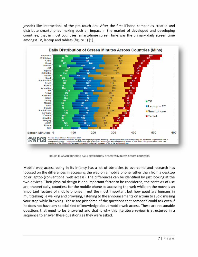
joystick-like interactions of the pre-touch era. After the first iPhone companies created and distribute smartphones making such an impact in the market of developed and developing countries, that in most countries, smartphone screen time was the primary daily screen time amongst TV, laptop and tablets (figure 1) [1].
FIGURE 1: GRAPH DEPICTING DAILY DISTRIBUTION OF SCREEN MINUTES ACROSS COUNTRIES
Mobile web access being in its infancy has a lot of obstacles to overcome and research has focused on the differences in accessing the web on a mobile phone rather than from a desktop pc or laptop (conventional web access). The differences can be identified by just looking at the two devices. Their physical design is one important factor to be considered, the contexts of use are, theoretically, countless for the mobile phone so accessing the web while on the move is an important feature of mobile phones if not the most important but how good are humans in multitasking i.e walking and browsing, listening to the announcements on a train to avoid missing your stop while browsing. Those are just some of the questions that someone could ask even if he does not have any special kind of knowledge about mobile web access. These are reasonable questions that need to be answered and that is why this literature review is structured in a sequence to answer these questions as they were asked.
8 | P a g e
2.2 SMALL SCREEN SIZE
Screen size is the most obvious difference between accessing the web from a mobile phone and accessing the web using conventional methods. [10] examined the effects of screen size in the pre-touch screen era by conducting a study to investigate the perceptions of narrow web pages on mobile phones. Using one of the first commercial web browsers, WebViewer, they carried out experiments to test for how users perceived familiar web pages on small screens. Results showed that
the notion of squeezing a page to fit a small device seemed to be easy enough for users to understand
After task-completion questions such as ‘How hard it was to spot a link on the page compared to the PC’, users answered that
it was harder than the PC because they could not get a picture of the whole site when on the small display,
information were not in the order of “normal perceiving”
Normal HTML elements looked and felt different than on the desktop.
3 out of the 11 users complained about having to scroll too much
Another 2 about the irrelevant information they had to go through at the beginning of the page.
Finally users commented on the fact that they would use a small screen system when looking for specific information because the small screen and low bandwidths made browsing experience limited.
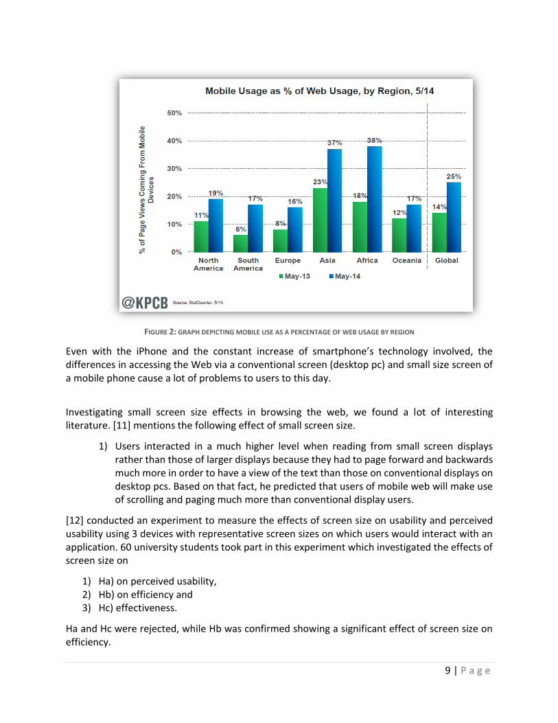
The introduction of the iPhone and other mobiles with multi-touch displays signaled the rise of the mobile web which in 2013 reached 25% of total global web access (figure 2).
9 | P a g e
FIGURE 2: GRAPH DEPICTING MOBILE USE AS A PERCENTAGE OF WEB USAGE BY REGION
Even with the iPhone and the constant increase of smartphone’s technology involved, the differences in accessing the Web via a conventional screen (desktop pc) and small size screen of a mobile phone cause a lot of problems to users to this day.
Investigating small screen size effects in browsing the web, we found a lot of interesting literature. [11] mentions the following effect of small screen size.
1) Users interacted in a much higher level when reading from small screen displays rather than those of larger displays because they had to page forward and backwards much more in order to have a view of the text than those on conventional displays on desktop pcs. Based on that fact, he predicted that users of mobile web will make use of scrolling and paging much more than conventional display users.
[12] conducted an experiment to measure the effects of screen size on usability and perceived usability using 3 devices with representative screen sizes on which users would interact with an application. 60 university students took part in this experiment which investigated the effects of screen size on
1) Ha) on perceived usability, 2) Hb) on efficiency and 3) Hc) effectiveness.
Ha and Hc were rejected, while Hb was confirmed showing a significant effect of screen size on efficiency.
10 | P a g e
Another study investigated the screen size effect of conventional web access and mobile web access. [13] conducted a study to examine the impact of screen size on users while they try to achieve certain goals on mobile devices by conducting task based evaluations and user impressions on how they think they were affected by the small size of the screen on information retrieval. 20 staff members and students participated in the experiment divided into 2 groups. One group used a browser with 1074x768 display resolution and the other group a browser with 640x480 pixels. 2 tasks with 2 parts each was asked to be completed by the users while their actions were automatically logged on the server which in turn produced performance measures. At the end of the session users completed an extensive questionnaire on how they perceived the system. Results showed that
1) Group one, with the large display, answered twice as many questions than the one with the small size display.
Data analysis of the questionnaire supported this result, that the small screen
2) Decreases task performance with 80% of small screen users reporting an impact on their ability to complete the tasks compared to 40% of large display users.
3) Regarding how many times users moved forward or backwards using links, no significant difference between the two screen sizes.
4) Completion of the log analysis showed that 80% of small screen users used the search function to start the process and used the search facilities twice as many times than large screen users and a tendency to return to search facilities more frequently.
5) Finally, small screen users performed a lot more navigation actions such as scrolling or paging than their conventional counterparts, although, results showed that most of the scrolling was down and right.
Participants showed not only the severe effects of screen size but also, promoted the importance of search functions on a webpage especially when accessing the web through a mobile phone.
11 | P a g e
2.3 SEARCH FUNCTIONS ON THE MOBILE WEB
Realizing how important search function is for the mobile web user, [14] conducted another study on ways to improve search on mobile devices with results showing that
When users succeed in their search they do so quickly (2-3) minutes and in a small number of interactions or prolonged failures.
On average, users took twice as long to successfully complete a search and were 60% less successful than when using the conventional large screen interface
The number of result pages views on both small and conventional sized screens were 2-3 which makes the number of possible results 20 for conventional display screens and around 10-15 possible results for mobile screen sizes.
[10-14] clearly demonstrate that screen size plays a very important role in the efficiency, satisfaction and information access, although these studies conducted, investigating display size are not specific to browsing the web but they are concerned with general tasks being performed on the mobile phone.
2.4 CONTEXT OF USE OF MOBILE WEB
With accessing the web from our mobile phones being so common nowadays, the need for deeper understanding of this phenomenon was required for this study to move forward. More specifically where, when and how users access the Web using their phones. Usage and its context are very important pieces of understanding the needs users have since the mobile phone was built to be used in a wide variety of contexts. [15] conducted an important study to identify the contexts under which mobile internet is used most frequently and what is the impact of context on the ease of use. They applied the Information Architecture framework to classify usability problems into 4 categories (representation, structure, Navigation and content) caused by various contexts classified in terms of eight elements (Goal, Emotion, Hand, Leg, Visual, auditory, co-location and interaction). 40 people were selected based on two criteria, mobile internet experience which needed to be high and the ability to use the stationary internet during the entire study period. The data was analyzed in two parts: context of use and usability problems. Each of the eight context factors were coded in a bipolar manner and produced 256 unique contexts of use. Results showed that
participants used the internet 61 minutes on average
1505 usability problems were reported, 1552 sessions were classified to the 256 contexts identified
The most frequent context of use being when the participants had a hedonic goal, their emotional state was joyful, they were stationary, visual and auditory distractions were low, few people were around and the interaction was reported as low.
The second most frequent context of use was the same as the first one except the goal was utilitarian instead of hedonic.
Participants used mobile internet at least once in 85,9% of contexts when they were stationary while 36,7% of the 256 contexts while they were moving
12 | P a g e
Mobile internet was used more often for hedonic (69,5%) rather than utilitarian goals (53,1%)
One hand was used 76.6% rather than both hands (41.1%).
Usability problems identified during different contexts suggest that problems with
The content of mobile internet occurred most frequently (37.2%)
Navigation (28.7%)
Representation (19.7%)
Structure (14.6%)
And all of those problems were significantly affected by three context factors: one of both hands, stationary or while co-located. So even though mobile phones were created to be used in various contexts, mobile web access is accomplished while the users are stationary, using one hand and when not many people are around. [16] shares the same results on how users access the mobile web, they conducted a qualitative study to test the Web activity taxonomy by looking at actual mobile web usage data. They chose their frameworks to emerge from the user data itself via user data inspection, affinity diagrams and brainstorming sessions, complemented by a quantitative log analysis with a larger group of users. 47 active web users took part in this study from different countries, 38 of them were male and 9 female. The method followed was based on contextual inquiry, a user familiar location was chosen where the user was asked to describe and replay his recent mobile web usage as accurately as possible, asking the user what, when, with whom and why the participant used the web, what kind of problems he faces and how he overcome those problems. Usage patterns were identified by means of critical incident collection technique. Results suggest that users access the mobile web
From a stationary position and in very short sessions.
Qualitative results showed four contextual factors emerged from the qualitative analysis, spatial, temporal, social and access factors.
Affinity diagrams on field exploration data emerge 4 mobile web activities, Information seeking, Communication, Content object handling and transactions.
[15],[16] agreed on the fact that users access the web from a stationary position. Additionally, [16] shows very short sessions of usage. Why is this the case?
13 | P a g e
2.5 COGNITIVE ASPECTS OF MOBILE USE IN DIFFERENT CONTEXTS
[17] provided an explanation by conducting a semi-naturalistic field study to investigate how cognitive resources are affected by different contexts by utilizing minicams to record attention properties and attributes on the move while a page was loading.
1894 page loadings occurred and the results of the analysis showed that:
participant’s attention shifted away in only 35% of those loadings o 46% for mobile situations such as the Railway station o 70% for Metro platform and o 80% in long quiet street
A one-way ANOVA showed a “significant effect of context on the duration of continuous attention to the mobile device”. A further analysis of those percentages showed that
In the lab and the café, continuous attention was estimated between 8-16s,
The escalator and the busy street conditions were both below 6s.
Also, the number of ‘switches of attention’ from the device to the environment was approximately 8 for the busy street condition but less than 1 in the lab condition with the general phenomenon documented being that attention stayed in the environment more while outdoors than indoors with the “difference between the lab and the busy street being almost ten-fold”. Finally, resource depletion resulted in users having to compromise secondary tasks that competed for attentional resources, thus, participants walked slower when paying attention to the device to reduce the need to sample the environment in short increments. [16],[17] showed consistency in their results that usage sessions are very short because the second showed that attentional resources are limited so accessing the web while walking divides our attention between the mobile screen and the user’s surroundings where he often has to sample the environment.
14 | P a g e
2.6 VISUAL INFORMATION DENSITY AND NAVIGATION
How information is presented in small screen devices is of grave importance because displaying information suitable for a conventional screen would be inappropriate and unusable because it is widely known that the legibility and also the readability is hampered by increased density of text on the screen [18],[19]. How do users navigate through webpage after webpage of, admittedly, visually dense pages, what kind of problems they face and what causes these problems?
[20] investigated whether the influence from cognitive preview or visual density, affects the usability of small screen devices and observe the effects on navigational performance by manipulating text size, information density and cognitive preview in simulated mobile phones screens. 40 elderly users, aged between 55 and 73, took part in the experiment. Prescreening questionnaires used to make sure variation were due to experimental variable and not personal differences and their age-related characteristics were psychometrically assessed prior to main testing which included the completion of 9 tasks in a two factorial (font size, preview) design study. The 2 factorial design produced 4 conditions.
1) small font/ small preview
2) large font/ small preview
3) small font/ large preview
4) large font / large preview
Results shows that font size did not significantly affect performance but there was a meaningful interaction between font size and size of preview showing that the combination of the two contribute to performance with a stronger impact on the preview size. Also, font size did not affect navigation performance either but the size of the preview affected disorientation measures. Best performance was observed in the 4th condition of large text/large preview and poorest performance was observed in large font/small preview. While condition 4 is the most advantageous, conducting the second trial with the same conditions and users, no learnability differences were observed in any of the font/preview conditions proving the learnability effect was a generic effect which was not tied to any particular display/font format. The pre- session psychometrics were combined with performance and ease of use variables and showed that navigation performance was not affected by the user’s verbal memory abilities but negative statements from users were less frequent in users with higher memory abilities. Navigation performance was tightly correlated with higher spatial and field dependency abilities leading to faster task completion.
15 | P a g e
2.7 CONVENTIONAL VS MOBILE WEB ACCESS
After examining the effects of context of use and cognition in mobile web, we need to get to the chase by examining the differences between conventional and mobile methods of accessing the web. In [10] participants stated that the notion of squeezing a website to fit the small screen of mobile phones was something they easily understood but how easy it is for users to browse full websites on their mobile phone compared to the conventional web? [21] evaluated mobile web browsing compared to desktop web browsing. 12 participants had to complete 4 typical tasks. The results suggest that
user’s performance was poor on mobile phones o Only one in twelve participants, being able to complete all 4 tasks on a mobile
phone.
Average completion time on mobile was 5.7 minutes while on desktop was 1.41
Total average task completion time for all tasks on desktop browsers for all participants was under 6 minutes while the same average was 23 minutes for mobile phones.
On rating the clarity of information organization, participants rated on a 5-point scale with an average of mean = 3.6 which shows that they did not find information organization clear. These results show that viewing full websites on a mobile display is very unusable, inefficient and inappropriate. [22] reached the same conclusion with results again showing that on mobile optimized versions, participants were 30-40% faster but they were annoyed by the limited features of the optimized version. Setting aside the limited features issue, mobile optimized pages, although far from perfect, are clearly more usable and efficient so why not every company designs a mobile optimized version of its full website? A few companies decided to create mobile tailored websites suitable for mobile viewing. These tailored websites were designed to have fewer functions than the full website and their design was fit for viewing on small screen displays but far from perfect, with usability problems persisting. [23, 24] have shown that big, international companies who consider the web very important for marketing and advertising their products and services do not have optimized websites for mobile access even with recent reports showing that the mobile subscribers have reached 7 billion and mobile use for accessing the web has gone up tremendously in 6 years from 268 million in 2007 to 2.1 billion in 2013 [25]. Another staggering report comes from Google Inc. reporting that in 2011, only 21% of its largest advertisers have mobile friendly websites [23].
16 | P a g e
2.8 USER TESTING
A wide range of literature was researched to provide a deep understanding on what goes around the mobile web and its conventional counter-part. It is time to move on to choosing what kind of think aloud protocol would be used. There are two kinds of think aloud, namely, the concurrent and the retrospective think aloud. Which one provides higher quality of problems identified and how?
To answer this question literature on the differences between the two needed to be researched. RTA and CTA protocols both have merits and drawbacks and research shows that the differences in usability problems identified are not of significant importance. RTA was chosen for this study because of its benefits compared to CTA. Those benefits involve decreased reactivity with participants having their own manner and pace to complete tasks while CTA users may perform worse because of the added workload of them having to simultaneously talk and perform tasks (Russo et al. 1989).
Another benefit of RTA over CTA, which may not be applicable to this study since no performance measurements are recorded, is the fact that RTA allows recording of working times per task compared to CTA during which workload can slow down the user’s performance. Another benefit of RTA is the possibility of identifying higher-level causes for individual usability problems because users have the chance to watch themselves perform and reflect on this process.
RTA has important drawbacks that need to be taken into account before deciding which protocol to use. One of those drawbacks is the significant increase in duration of the sessions with participants because users need to watch a video clip of their actions and comment on their actions and the fact that they have to comment on those after their completion had given them more time to reflect and think on their comments. Another important drawback with immediate consequences in the data is the fact that giving the participant adequate time to think about his actions also gives the chance to change, invent new or intentionally not mention thoughts they had while performing the tasks [26]. [26] performed a study, 40 participants took part in order to compare the two think aloud variation, results showed no significant difference in the number of problems detected between the two variations although, they differed in how these problems were reported with RTA problems being revealed by verbalizations and the time they had between task performing and retrospective think aloud gave them the chance to not only verbalize problems but also comment on additional problems. CTA participants did not have this chance because the added workload resulted from having to perform and think at the same time did not offer them this chance. Additionally, results show there was no significant differences were found in the type of problems identified by the two variations with 89% overlap of all problems detected. The important finding though came from the completion of tasks. While task performing was not affected by the concurrent think aloud, task completion was significantly affected by CTA think aloud compared to RTA (p < 0.05). Another important drawback of RTA is the possibility important information may be forgotten by the users when it is time for them to verbalize them [27],[28],[29].
The review of the literature demonstrated the problems of mobile web access, their cause and effects. This study attempts to provide valuable ‘rules of thumb’ on how to design, develop and
17 | P a g e
evaluate website for mobile use. The conclusions of this literature analysis are presented in the next section, Problem analysis, to be used as a foundation for the analysis of the problem as a foundation for the benefits of this study in the literature.
18 | P a g e
3. PROBLEM ANALYSIS
Mobile web access is a necessity of everyday life nowadays with how fast things are moving around us. All the more people require access to the web while on the move. Our society is always on the move. Mobile phones have different physical design and that introduces restrictions in comparison to conventional methods that need to be addressed before we jump into assumptions and design for mobile web as if we were designing for desktop or laptop web access. Screen size, context of use and different needs make for a mobile web that does not fully subscribe to the way conventional web is seen as or used for. The review of relevant literature attempted to give an answer to how these restrictions and different device purpose affect interaction. From the above presented literature we can draw conclusions and answers to those questions. Mobile phones changed the way we think about communication and redefined communication and personal relationship constructs. Mobile phones, while created to be used in a variety of contexts, they are mostly used
Indoors, for hedonic purposes, while the user is stationary, using one hand and when there are not a lot of people around.
The small screen size of the mobile phone clearly affects efficiency, task completion, cognitive workload and the amount of interactions needed.
Interaction while on the move is done in short bursts of 4-6 seconds because attentional resources are limited and interaction with the mobile and sampling the environment challenge the brain’s attentional capacity.
Users expect the interaction to be as easy and straight forward as the interaction with conventional desktop web but the interaction is different and users prefer the conventional ways than the mobile web.
Designers and developers have to consider the limitations and extenuating circumstances presented when accessing and interacting with a mobile phone and design the websites meant for mobile use taking those limitations and circumstances into account, with different or alternated guidelines because the literature proves that the existing guidelines and heuristics are not suitable for the mobile web. This study is not concern with providing practical, specific methods for designing and developing websites, rather provide ‘rules of thumb’ for designing and evaluating mobile websites. Also, it is not concerned with comparing different mobile phone devices such as evaluations and reviews of specific mobile devices.
This study was conducted to help close the gap presented in the literature that mobile web access and interaction is different from the conventional web access and there are no heuristics to be used to help design and develop mobile usable websites or evaluate the existing ones. This study presents a unique and easy to follow and understand heuristics and help designers and developers to finally, build and evaluate websites for mobile phones.
19 | P a g e
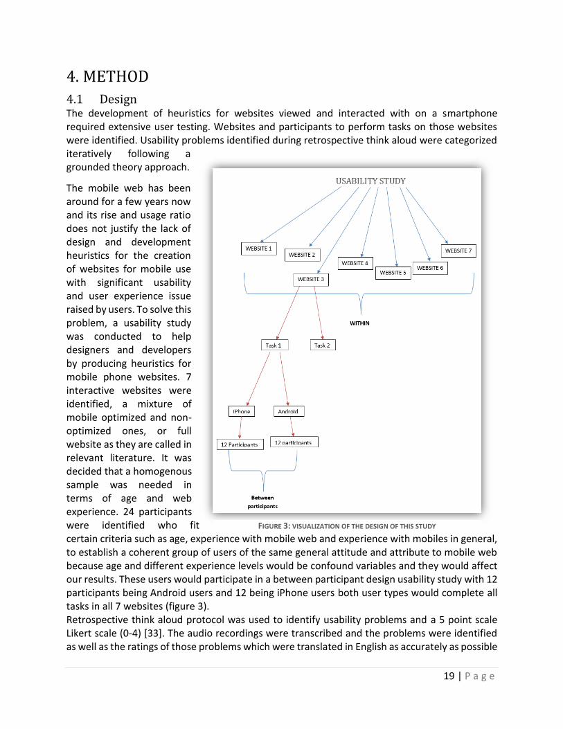
4. METHOD
4.1 Design The development of heuristics for websites viewed and interacted with on a smartphone required extensive user testing. Websites and participants to perform tasks on those websites were identified. Usability problems identified during retrospective think aloud were categorized iteratively following a grounded theory approach.
The mobile web has been around for a few years now and its rise and usage ratio does not justify the lack of design and development heuristics for the creation of websites for mobile use with significant usability and user experience issue raised by users. To solve this problem, a usability study was conducted to help designers and developers by producing heuristics for mobile phone websites. 7 interactive websites were identified, a mixture of mobile optimized and non-optimized ones, or full website as they are called in relevant literature. It was decided that a homogenous sample was needed in terms of age and web experience. 24 participants were identified who fit certain criteria such as age, experience with mobile web and experience with mobiles in general, to establish a coherent group of users of the same general attitude and attribute to mobile web because age and different experience levels would be confound variables and they would affect our results. These users would participate in a between participant design usability study with 12 participants being Android users and 12 being iPhone users both user types would complete all tasks in all 7 websites (figure 3). Retrospective think aloud protocol was used to identify usability problems and a 5 point scale Likert scale (0-4) [33]. The audio recordings were transcribed and the problems were identified as well as the ratings of those problems which were translated in English as accurately as possible
FIGURE 3: VISUALIZATION OF THE DESIGN OF THIS STUDY
20 | P a g e
and a grounded theory approach was followed to identify categories and subcategories that emerged from the data itself using open coding.
4.2 WEBSITES The websites identified for user testing were the product of a focus group assembled for identifying regularly visited websites by these users during that particular time. 5 people participated in this focus group, recruited using the same criteria as the ones set for the user testing participants, this way the users themselves would elect their most visited websites improving the validity of the user testing results. 11 websites were identified from which 3 social media websites, 3 tourism websites, one commercial airline company website and 2 mobile phone and internet providers, one cinema entertainment website and Apple’s Greek website. It was apparent that those choices were influenced by the context of this meeting and its timing. Greeks planned their vacations, it was in the middle of the summer and that is where the airline and tourism websites can be attributed.
Those 15 websites were then carefully processed to identify those who fit the criteria set for this particular study. Most of them did not have the option to change language, even the tourism websites. We ended up with 1 tourism website (www.tourism.gr), the 2 biggest mobile providers in the country (www.vodafone.gr, www.cosmote.gr), one entertainment website (www.villagecinemas.gr), a commercial airline company (www.aegeanair.gr), Apple’s Greek website (www.apple.com/gr) and last but not least, Facebook’s webpage (www.facebook.com).
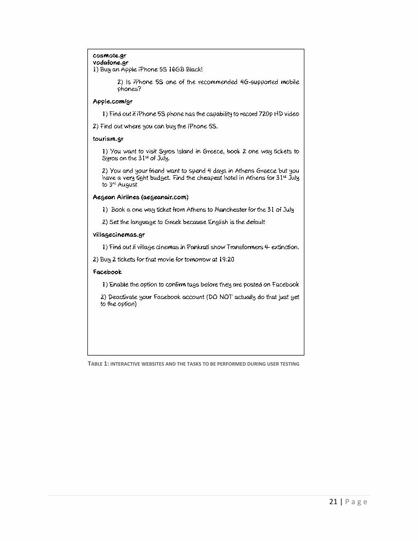
The group’s work did not stop there. The most common tasks were to be identified by the group based on their visits to these websites. If enough tasks could not be identified, group participants were asked to identify tasks they would expect to be able to perform in these website, with a maximum of tasks to be identified for each websites set at 5. After those tasks were identified, the group was instructed to evaluate those tasks and come up with the 3 most common tasks for each website. The deliverable of this focus group process was a list of 7 websites with 3 tasks to be completed in each of them. During the first pilot test, it became apparent that 3 tasks for each website would supersede the 1 and a half hour mark and we were afraid that it would tire and bore the user so we decided to use 2 tasks for each website. A second pilot test was conducted or a time estimation and overall quality of recording that lasted 58 minutes. The finalized list of websites and their tasks is the following:
21 | P a g e
TABLE 1: INTERACTIVE WEBSITES AND THE TASKS TO BE PERFORMED DURING USER TESTING
22 | P a g e
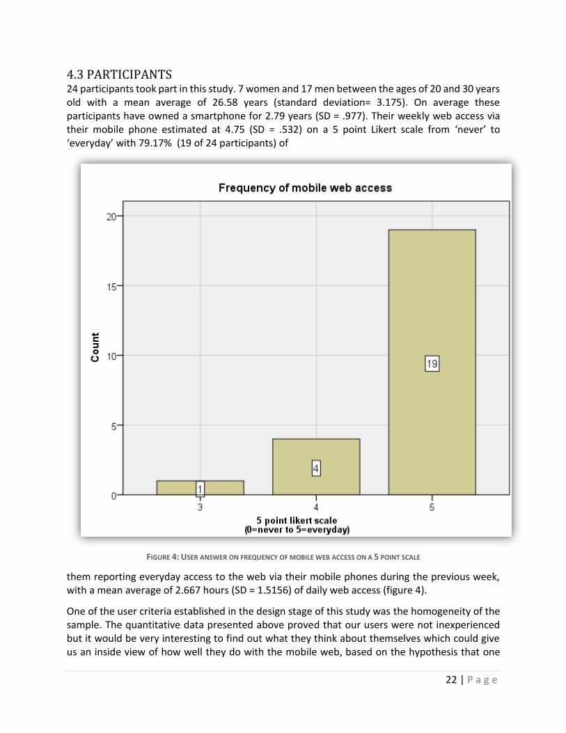
4.3 PARTICIPANTS 24 participants took part in this study. 7 women and 17 men between the ages of 20 and 30 years old with a mean average of 26.58 years (standard deviation= 3.175). On average these participants have owned a smartphone for 2.79 years (SD = .977). Their weekly web access via their mobile phone estimated at 4.75 (SD = .532) on a 5 point Likert scale from ‘never’ to ‘everyday’ with 79.17% (19 of 24 participants) of
FIGURE 4: USER ANSWER ON FREQUENCY OF MOBILE WEB ACCESS ON A 5 POINT SCALE
them reporting everyday access to the web via their mobile phones during the previous week, with a mean average of 2.667 hours (SD = 1.5156) of daily web access (figure 4).
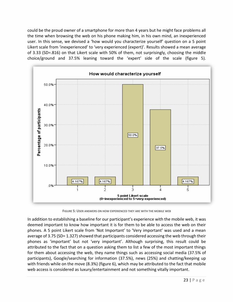
One of the user criteria established in the design stage of this study was the homogeneity of the sample. The quantitative data presented above proved that our users were not inexperienced but it would be very interesting to find out what they think about themselves which could give us an inside view of how well they do with the mobile web, based on the hypothesis that one
23 | P a g e
could be the proud owner of a smartphone for more than 4 years but he might face problems all the time when browsing the web on his phone making him, in his own mind, an inexperienced user. In this sense, we devised a ‘how would you characterize yourself’ question on a 5 point Likert scale from ‘inexperienced’ to ‘very experienced (expert)’. Results showed a mean average of 3.33 (SD=.816) on that Likert scale with 50% of them, not surprisingly, choosing the middle choice/ground and 37.5% leaning toward the ‘expert’ side of the scale (figure 5).
FIGURE 5: USER ANSWERS ON HOW EXPERIENCED THEY ARE WITH THE MOBILE WEB
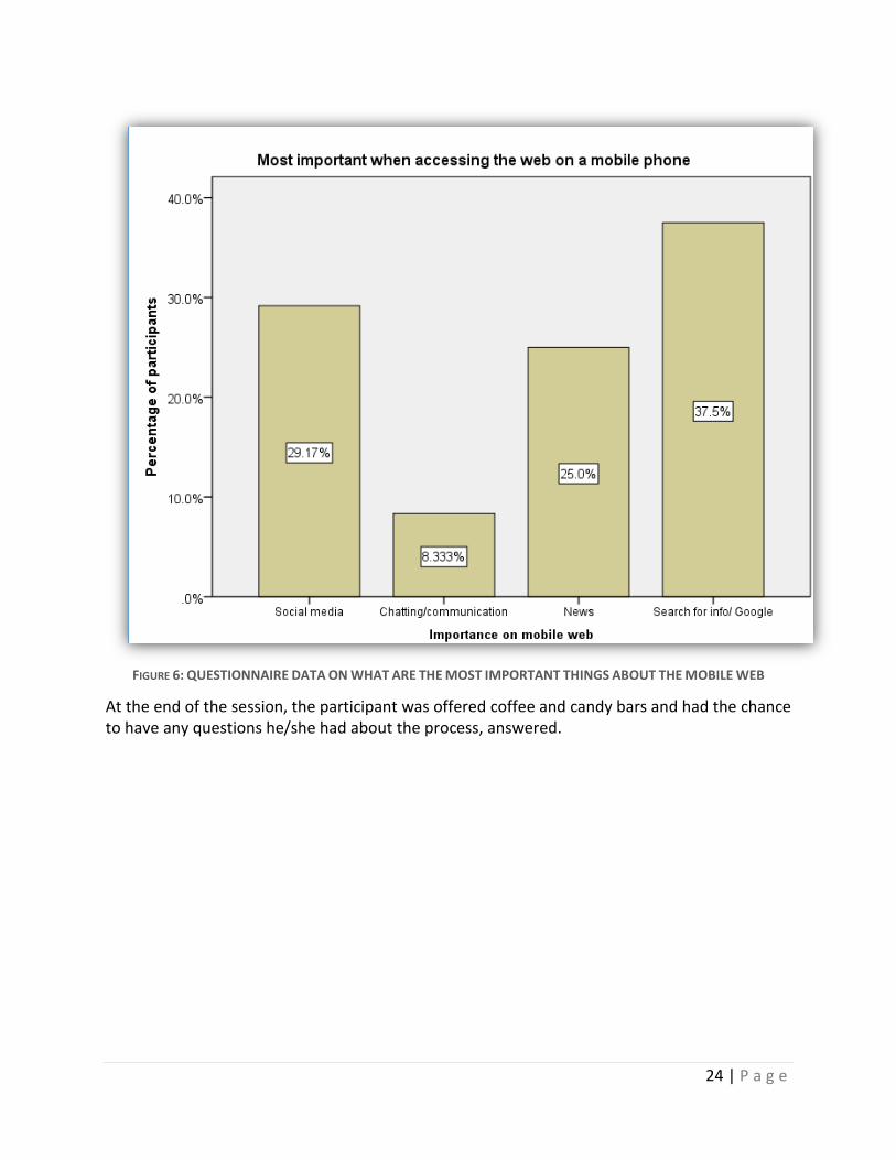
In addition to establishing a baseline for our participant’s experience with the mobile web, it was deemed important to know how important it is for them to be able to access the web on their phones. A 5 point Likert scale from ‘Not Important’ to ‘Very important’ was used and a mean average of 3.75 (SD= 1.327) showed that participants considered accessing the web through their phones as ‘important’ but not ‘very important’. Although surprising, this result could be attributed to the fact that on a question asking them to list a few of the most important things for them about accessing the web, they name things such as accessing social media (37.5% of participants), Google/searching for information (37.5%), news (25%) and chatting/keeping up with friends while on the move (8.3%) (figure 6), which may be attributed to the fact that mobile web access is considered as luxury/entertainment and not something vitally important.
24 | P a g e
FIGURE 6: QUESTIONNAIRE DATA ON WHAT ARE THE MOST IMPORTANT THINGS ABOUT THE MOBILE WEB
At the end of the session, the participant was offered coffee and candy bars and had the chance to have any questions he/she had about the process, answered.
25 | P a g e
4.4 EQUIPMENT
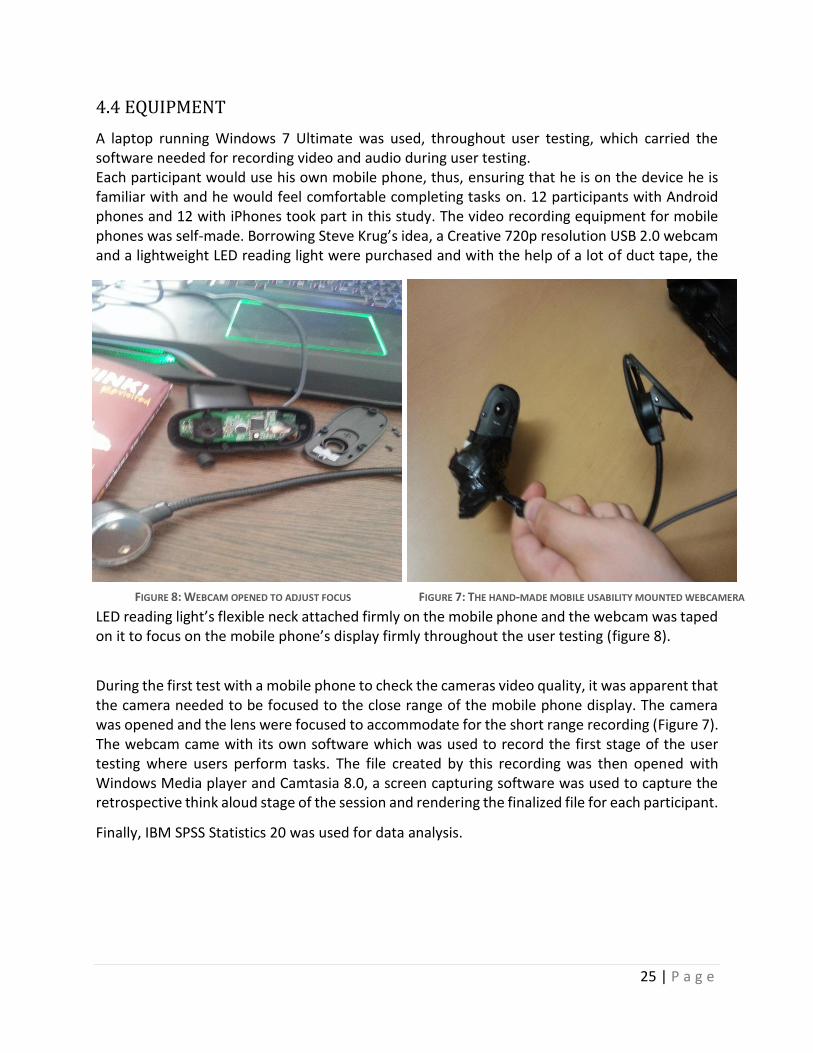
A laptop running Windows 7 Ultimate was used, throughout user testing, which carried the software needed for recording video and audio during user testing. Each participant would use his own mobile phone, thus, ensuring that he is on the device he is familiar with and he would feel comfortable completing tasks on. 12 participants with Android phones and 12 with iPhones took part in this study. The video recording equipment for mobile phones was self-made. Borrowing Steve Krug’s idea, a Creative 720p resolution USB 2.0 webcam and a lightweight LED reading light were purchased and with the help of a lot of duct tape, the
LED reading light’s flexible neck attached firmly on the mobile phone and the webcam was taped on it to focus on the mobile phone’s display firmly throughout the user testing (figure 8).
During the first test with a mobile phone to check the cameras video quality, it was apparent that the camera needed to be focused to the close range of the mobile phone display. The camera was opened and the lens were focused to accommodate for the short range recording (Figure 7). The webcam came with its own software which was used to record the first stage of the user testing where users perform tasks. The file created by this recording was then opened with Windows Media player and Camtasia 8.0, a screen capturing software was used to capture the retrospective think aloud stage of the session and rendering the finalized file for each participant.
Finally, IBM SPSS Statistics 20 was used for data analysis.
FIGURE 8: WEBCAM OPENED TO ADJUST FOCUS FIGURE 7: THE HAND-MADE MOBILE USABILITY MOUNTED WEBCAMERA
26 | P a g e
4.5 MATERIALS
A pre-screening questionnaire divided in two sections was given to the participant. The first section was for demographic information and the second section consisted of Likert scales, open-ended questions, and closed check box questions with the purpose of checking for the participant’s suitability based on the age, mobile and mobile web experience (see page 69 in the Appendix). The age range of the participants should be quite homogenous and their experience with mobiles and the mobile web needed to be above average (more than mean= 3 on a 5 point scale). The questionnaire was given to the participant prior to the main testing session after he read and signed 2 consent forms devised for both audio voice recording and mobile display recording (see pages 65, 66 of the appendix). During the test session, pieces of paper with the website URL and tasks to be performed on each website and a sheet with the severity rating definitions, were given to the participant.
4.6 PROCEDURE
Each session lasted around 60 minutes depending on how much the user had to say during the retrospective think aloud portion of the session. Participants were briefed on arrival about the purpose of the experiment and it was made clear to them that they are not under evaluation but the websites and the overall interaction are.
The users were offered coffee and biscuits and were given the consent forms for video and audio recording to read and sign them. After signing the consent forms, the researcher explained to them the procedure that would follow.
The mobile testing webcam was equipped on the participant’s mobile phone and a brief test on the audio and video recording quality followed. The user was handed a piece of paper with the website he needed to visit and the tasks to be completed on that website so he would not have to ask the facilitator again and again if he had forgotten the task or he did not know how to type the URL of the website, which might make him feel uncomfortable or not smart. After the completion of the two tasks of that particular website, the second website task paper was handed to them and so on until the 3rd website-task paper was handed to them. At that point the task session was paused and the retrospective think aloud portion followed for the 3 first websites. The reason why testing was divided into 2 portions is that tasks were short and if the process was paused for the retrospective session for each website, the user might have felt tired or bored. If the retrospective was performed after all 7 websites were completed the users might have forgotten what and why he did what he did or any thoughts he had that wanted to communicate to the facilitator, thus, the sessions was paused for the retrospective think aloud to take place after the tasks on the 3rd website were completed.
For each participant who took part in this study the order of websites was reversed to accommodate for the participants becoming tired and bored close to the end of the process. This way if we had lower quality comments during the last 10 minutes of the testing session, we could counterbalance that by reverting the order the websites were presented to the user.
During the retrospective think aloud potion, participants would go through the replay of their interaction, fast-forwarding in IDLE periods for example when pages were loading, with the first
27 | P a g e
3 websites and talk about problems they encountered as well as any good features they encountered for each website separately. The reason we asked participants to mention good features was to gather information on what users deem as good design on a mobile website that might help in the production of design guidelines and/or design examples for the heuristics to be produced. If participants proved reluctant to talk they were kindly prompted by the researcher on particular parts of the replay video where the researcher detected uncertainty in their (inter)actions, such as repeated scrolling left and right on the same section of the website indicating that the user is looking for something, or any prolonged pauses during the task that could mean that the user is lost or cannot find something important to continue with the task. Also, few participants were reluctant to talk because they were shy and/or because of their character. Those participants were prompted on the homepage of each website to answer questions such as ‘what do you see here’, ‘do you detect any problems or something good you would like to mention’ and ‘what are your thoughts of what you see on your display?’ If the user identified a problem, the process was paused and the participant was asked to rate the problem for its severity on a 4 point scale where 1 = cosmetic, 2=minor, 3= major and 4 = catastrophic. After the retrospective portion of testing was completed, the user resumed the task portion with the 4 remaining websites. That transition from the retrospective portion of the first 3 websites to the task portion and then the retrospective portion of the last 4 websites helped put introvert users’ mind at easy by helping them understand what the facilitator expected from them and what kind of questions he is interested in which made them more talkative and more ‘to the point’. At the end, the researcher thanked the users for their participation in the experiment.
4.7 DATA ANALYSIS
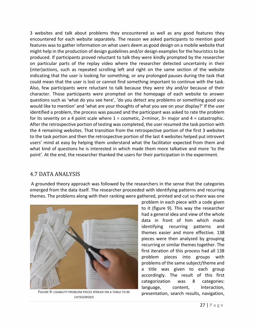
A grounded theory approach was followed by the researchers in the sense that the categories emerged from the data itself. The researcher proceeded with identifying patterns and recurring themes. The problems along with their ranking were gathered, printed and cut so there was one
problem in each piece with a code given to it (figure 9). This way the researcher had a general idea and view of the whole data in front of him which made identifying recurring patterns and themes easier and more effective. 138 pieces were then analyzed by grouping recurring or similar themes together. The first iteration of this process had all 138 problem pieces into groups with problems of the same subject/theme and a title was given to each group accordingly. The result of this first categorization was 8 categories: language, content, Interaction, presentation, search results, navigation, FIGURE 9: USABILITY PROBLEM PIECES SPREAD ON A TABLE TO BE
CATEGORIZED
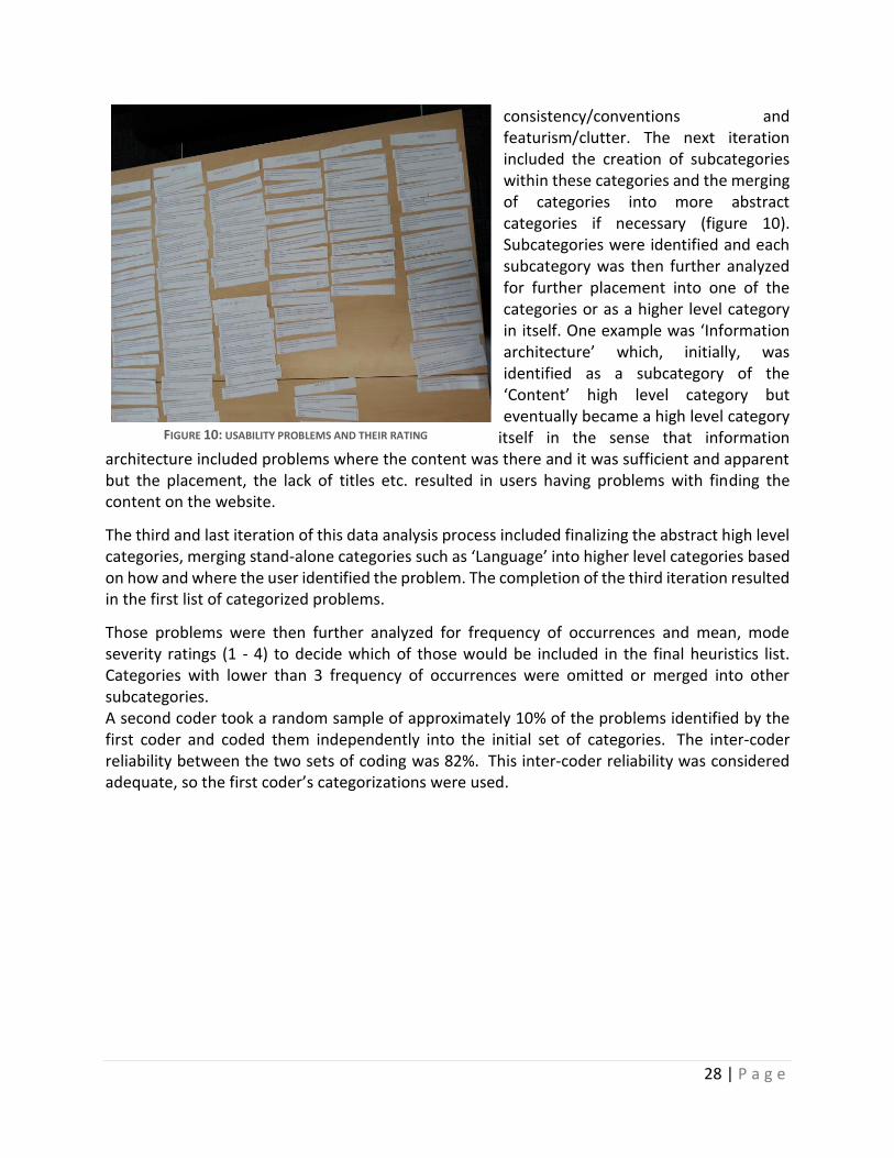
28 | P a g e
consistency/conventions and featurism/clutter. The next iteration included the creation of subcategories within these categories and the merging of categories into more abstract categories if necessary (figure 10). Subcategories were identified and each subcategory was then further analyzed for further placement into one of the categories or as a higher level category in itself. One example was ‘Information architecture’ which, initially, was identified as a subcategory of the ‘Content’ high level category but eventually became a high level category
itself in the sense that information architecture included problems where the content was there and it was sufficient and apparent but the placement, the lack of titles etc. resulted in users having problems with finding the content on the website.
The third and last iteration of this data analysis process included finalizing the abstract high level categories, merging stand-alone categories such as ‘Language’ into higher level categories based on how and where the user identified the problem. The completion of the third iteration resulted in the first list of categorized problems.
Those problems were then further analyzed for frequency of occurrences and mean, mode severity ratings (1 - 4) to decide which of those would be included in the final heuristics list. Categories with lower than 3 frequency of occurrences were omitted or merged into other subcategories. A second coder took a random sample of approximately 10% of the problems identified by the first coder and coded them independently into the initial set of categories. The inter-coder reliability between the two sets of coding was 82%. This inter-coder reliability was considered adequate, so the first coder’s categorizations were used.
FIGURE 10: USABILITY PROBLEMS AND THEIR RATING
29 | P a g e
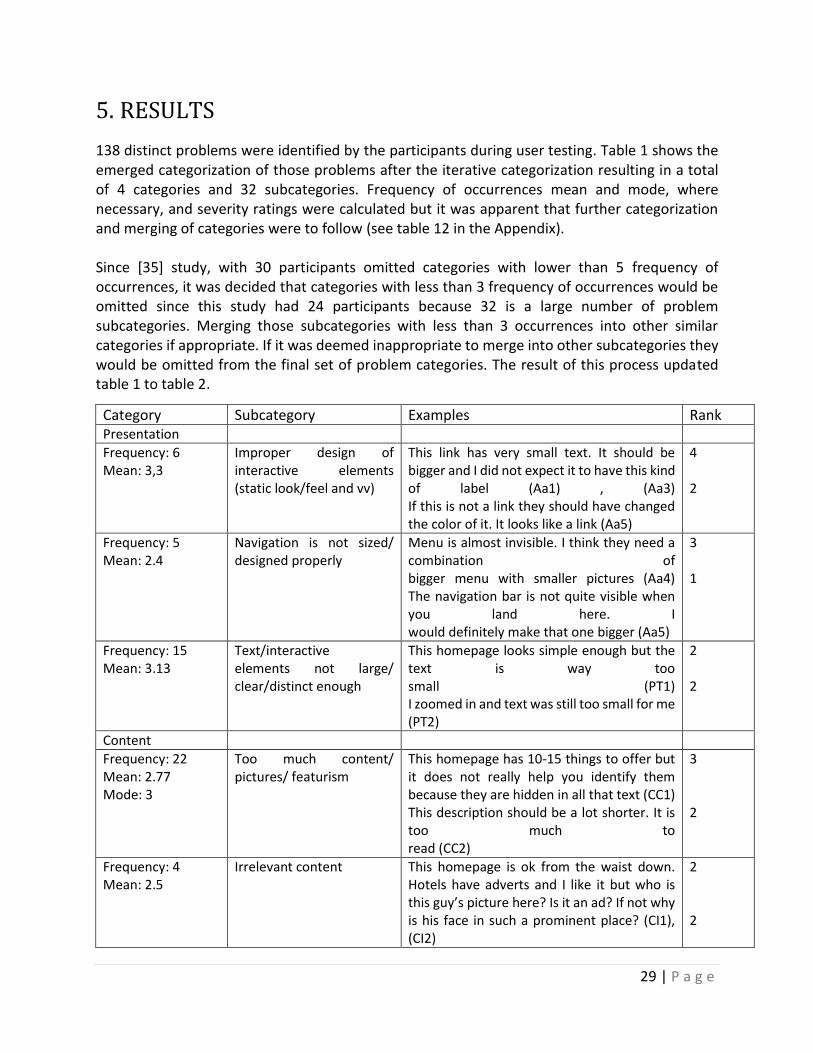
5. RESULTS
138 distinct problems were identified by the participants during user testing. Table 1 shows the emerged categorization of those problems after the iterative categorization resulting in a total of 4 categories and 32 subcategories. Frequency of occurrences mean and mode, where necessary, and severity ratings were calculated but it was apparent that further categorization and merging of categories were to follow (see table 12 in the Appendix). Since [35] study, with 30 participants omitted categories with lower than 5 frequency of occurrences, it was decided that categories with less than 3 frequency of occurrences would be omitted since this study had 24 participants because 32 is a large number of problem subcategories. Merging those subcategories with less than 3 occurrences into other similar categories if appropriate. If it was deemed inappropriate to merge into other subcategories they would be omitted from the final set of problem categories. The result of this process updated table 1 to table 2.
Category Subcategory Examples Rank Presentation
Frequency: 6 Mean: 3,3
Improper design of interactive elements (static look/feel and vv)
This link has very small text. It should be bigger and I did not expect it to have this kind of label (Aa1) , (Aa3) If this is not a link they should have changed the color of it. It looks like a link (Aa5)
4 2
Frequency: 5 Mean: 2.4
Navigation is not sized/ designed properly
Menu is almost invisible. I think they need a combination of bigger menu with smaller pictures (Aa4) The navigation bar is not quite visible when you land here. I would definitely make that one bigger (Aa5)
3 1
Frequency: 15 Mean: 3.13
Text/interactive elements not large/ clear/distinct enough
This homepage looks simple enough but the text is way too small (PT1) I zoomed in and text was still too small for me (PT2)
2 2
Content
Frequency: 22 Mean: 2.77 Mode: 3
Too much content/ pictures/ featurism
This homepage has 10-15 things to offer but it does not really help you identify them because they are hidden in all that text (CC1) This description should be a lot shorter. It is too much to read (CC2)
3 2
Frequency: 4 Mean: 2.5
Irrelevant content This homepage is ok from the waist down. Hotels have adverts and I like it but who is this guy’s picture here? Is it an ad? If not why is his face in such a prominent place? (CI1), (CI2)
2 2
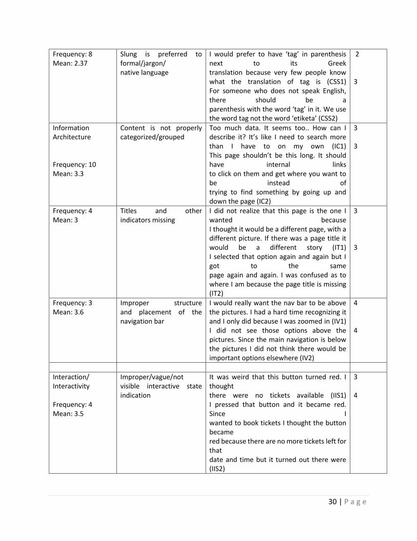
30 | P a g e
Frequency: 8 Mean: 2.37
Slung is preferred to formal/jargon/ native language
I would prefer to have ‘tag’ in parenthesis next to its Greek translation because very few people know what the translation of tag is (CSS1) For someone who does not speak English, there should be a parenthesis with the word ‘tag’ in it. We use the word tag not the word ‘etiketa’ (CSS2)
2 3
Information Architecture Frequency: 10 Mean: 3.3
Content is not properly categorized/grouped
Too much data. It seems too.. How can I describe it? It’s like I need to search more than I have to on my own (IC1) This page shouldn’t be this long. It should have internal links to click on them and get where you want to be instead of trying to find something by going up and down the page (IC2)
3 3
Frequency: 4 Mean: 3
Titles and other indicators missing
I did not realize that this page is the one I wanted because I thought it would be a different page, with a different picture. If there was a page title it would be a different story (IT1) I selected that option again and again but I got to the same page again and again. I was confused as to where I am because the page title is missing (IT2)
3 3
Frequency: 3 Mean: 3.6
Improper structure and placement of the navigation bar
I would really want the nav bar to be above the pictures. I had a hard time recognizing it and I only did because I was zoomed in (IV1) I did not see those options above the pictures. Since the main navigation is below the pictures I did not think there would be important options elsewhere (IV2)
4 4
Interaction/ Interactivity Frequency: 4 Mean: 3.5
Improper/vague/not visible interactive state indication
It was weird that this button turned red. I thought there were no tickets available (IIS1) I pressed that button and it became red. Since I wanted to book tickets I thought the button became red because there are no more tickets left for that date and time but it turned out there were (IIS2)
3 4
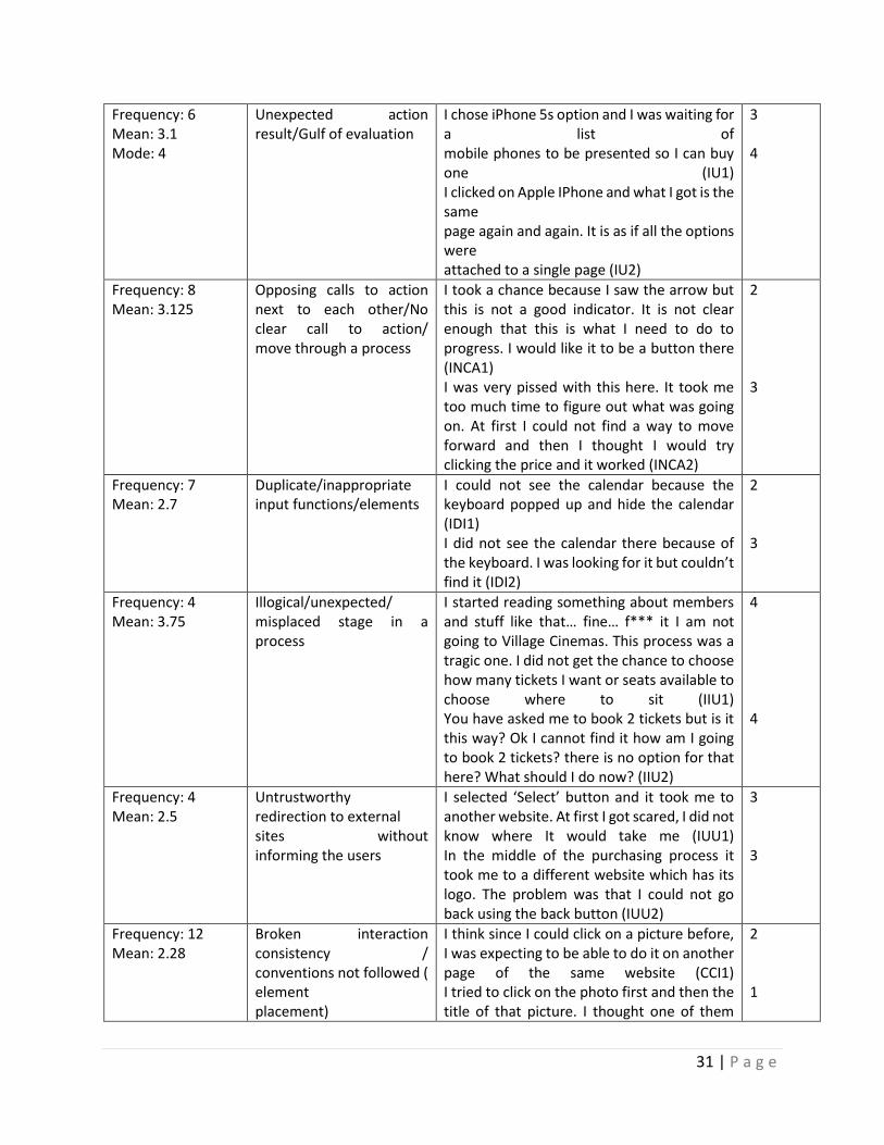
31 | P a g e
Frequency: 6 Mean: 3.1 Mode: 4
Unexpected action result/Gulf of evaluation
I chose iPhone 5s option and I was waiting for a list of mobile phones to be presented so I can buy one (IU1) I clicked on Apple IPhone and what I got is the same page again and again. It is as if all the options were attached to a single page (IU2)
3 4
Frequency: 8 Mean: 3.125
Opposing calls to action next to each other/No clear call to action/ move through a process
I took a chance because I saw the arrow but this is not a good indicator. It is not clear enough that this is what I need to do to progress. I would like it to be a button there (INCA1) I was very pissed with this here. It took me too much time to figure out what was going on. At first I could not find a way to move forward and then I thought I would try clicking the price and it worked (INCA2)
2 3
Frequency: 7 Mean: 2.7
Duplicate/inappropriate input functions/elements
I could not see the calendar because the keyboard popped up and hide the calendar (IDI1) I did not see the calendar there because of the keyboard. I was looking for it but couldn’t find it (IDI2)
2 3
Frequency: 4 Mean: 3.75
Illogical/unexpected/ misplaced stage in a process
I started reading something about members and stuff like that… fine… f*** it I am not going to Village Cinemas. This process was a tragic one. I did not get the chance to choose how many tickets I want or seats available to choose where to sit (IIU1) You have asked me to book 2 tickets but is it this way? Ok I cannot find it how am I going to book 2 tickets? there is no option for that here? What should I do now? (IIU2)
4 4
Frequency: 4 Mean: 2.5
Untrustworthy redirection to external sites without informing the users
I selected ‘Select’ button and it took me to another website. At first I got scared, I did not know where It would take me (IUU1) In the middle of the purchasing process it took me to a different website which has its logo. The problem was that I could not go back using the back button (IUU2)
3 3
Frequency: 12 Mean: 2.28
Broken interaction consistency / conventions not followed ( element placement)
I think since I could click on a picture before, I was expecting to be able to do it on another page of the same website (CCI1) I tried to click on the photo first and then the title of that picture. I thought one of them
2 1
32 | P a g e
would take me to where I wanted to go as previously in this website (CCI2)
TABLE 2: PROBLEMS AFTER OMITTING/MERGING SUBCATEGORIES WITH LESS THAN 3 FREQUENCY OF OCCURRENCES
Table 2 shows the emergent categorization of usability problems identified by the participants with subcategories with less than 3 occurrences being omitted or merged with other categories. The following table (table 3) presents the omitted subcategories from table 1 to table 2:
Category Subcategory Frequency of occurrences
Presentation Inadequate search results visual grouping/divide 2
Content Irrelevant/inadequate/confusing/unexpected search results 2
Content Improper content placement 1
Information architecture
Key functions are hidden/grouped with other functions 1
Interaction Illogical interactive element placement 2
Interaction Inconsistent OS specific interaction 2
Interaction Lack of interactive flexibility 1
Interaction Faulty interaction 2
Interaction Non visible interactive elements 1
Interaction Long loading time during an interaction 1
Interaction OS specific interaction consistency 1 TABLE 3: OMITTED SUBCATEGORIES DUE TO FREQUENCY OF OCCURRENCES
The following table (table 4) presents subcategories merged into one category:
Origin category Subcategories New subcategory
Interaction ‘Widely used interaction conventions are not followed’ + ‘Inconsistent interface between the full website and the mobile app’ + ‘Inconsistent interaction throughout the same website’ + ‘Conventions on interactive element’s placement not followed’
Broken interaction consistency/ conventions not followed
Interaction ‘Opposing calls to action next to each other’ + ‘No calls to action’
Opposing calls to action next to each other/No clear call to action/ move through a process
Presentation ‘Improper size/label/color of links’ + ‘Interactive elements look/feel static and vice versa’
Improper design of interactive elements
TABLE 4: CATEGORIES SUITABLE FOR MERGE AND THE NEW CATEGORY PRODUCED
This process resulted in 16 problems being omitted along with their subcategories, resulting in a new total of 122 problems, 4 categories and 16 subcategories reduced from 32 subcategories in table 1.
33 | P a g e
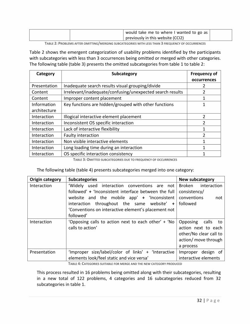
Interaction category was the category with the highest frequency of occurrences with 45 occurrences, followed by ‘Content’ with 34 occurrences, ‘Presentation’ with 26 occurrences and ‘Information Architecture’ with 17 occurrences (figure 11).
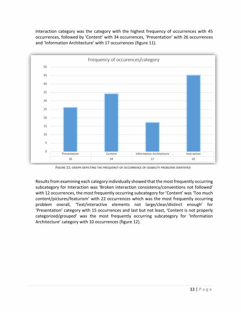
Results from examining each category individually showed that the most frequently occurring subcategory for Interaction was ‘Broken interaction consistency/conventions not followed’ with 12 occurrences, the most frequently occurring subcategory for ‘Content’ was ‘Too much content/pictures/featurism’ with 22 occurrences which was the most frequently occurring problem overall, ‘Text/interactive elements not large/clear/distinct enough’ for ‘Presentation’ category with 15 occurrences and last but not least, ‘Content is not properly categorized/grouped’ was the most frequently occurring subcategory for ‘Information Architecture’ category with 10 occurrences (figure 12).
FIGURE 11: GRAPH DEPICTING THE FREQUENCY OF OCCURRENCE OF USABILITY PROBLEMS IDENTIFIED
34 | P a g e
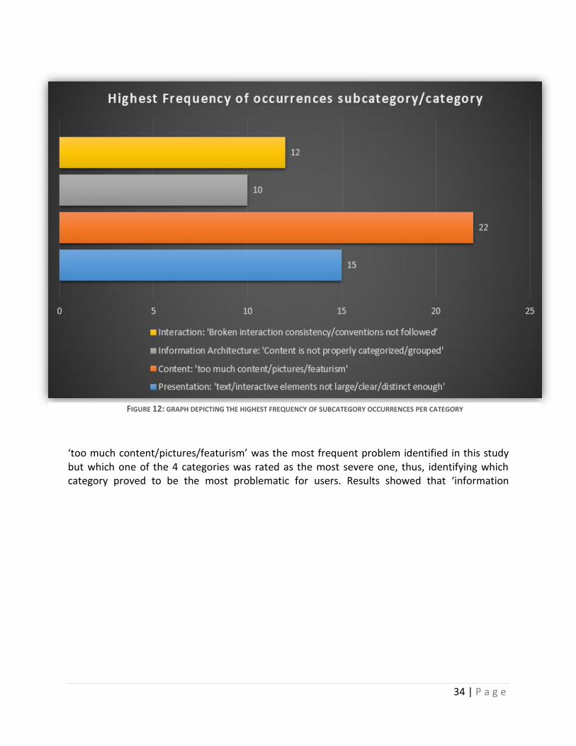
‘too much content/pictures/featurism’ was the most frequent problem identified in this study but which one of the 4 categories was rated as the most severe one, thus, identifying which category proved to be the most problematic for users. Results showed that ‘information
FIGURE 12: GRAPH DEPICTING THE HIGHEST FREQUENCY OF SUBCATEGORY OCCURRENCES PER CATEGORY
35 | P a g e
architecture’ was the most problematic with a mean average of 3.3 followed by ‘Interaction’ with 2.99, ‘Presentation’ with 2.94 and ‘Content’ with 2.54 mean severity (figure 13).
Finally, the merging and omission of subcategories served the purpose of deriving heuristics for the design and development of mobile websites by transforming the negative problem subcategory names into positive heuristics. The analysis led to the identification of the most severe as well as the most frequent categories and subcategories. Problems with high severity should be addressed but also problems appearing frequently cannot be ignored because the cumulative difficulty and frustration they cause could still severely hinder user performance and experience. One example could be the problem subcategory ‘Too much content/pictures/featurism’ of the ‘Content’ category which has the highest frequency of occurrences of all the subcategories as demonstrated on figure 12. In this spirit, the following table presents usability subcategories based on their severity mean of over 3 in the 0-4 scale.
FIGURE 13: GRAPH DEPICTING THE MEAN SEVERITY RATING OF EACH CATEGORY
36 | P a g e
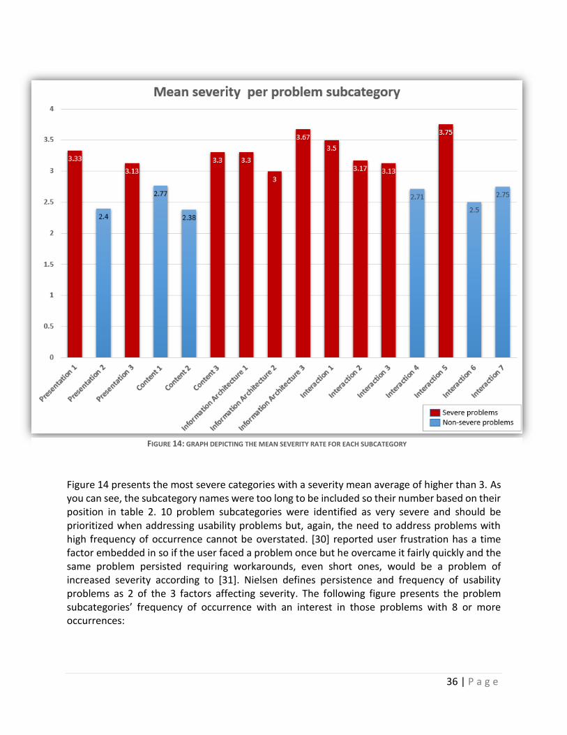
Figure 14 presents the most severe categories with a severity mean average of higher than 3. As you can see, the subcategory names were too long to be included so their number based on their position in table 2. 10 problem subcategories were identified as very severe and should be prioritized when addressing usability problems but, again, the need to address problems with high frequency of occurrence cannot be overstated. [30] reported user frustration has a time factor embedded in so if the user faced a problem once but he overcame it fairly quickly and the same problem persisted requiring workarounds, even short ones, would be a problem of increased severity according to [31]. Nielsen defines persistence and frequency of usability problems as 2 of the 3 factors affecting severity. The following figure presents the problem subcategories’ frequency of occurrence with an interest in those problems with 8 or more occurrences:
FIGURE 14: GRAPH DEPICTING THE MEAN SEVERITY RATE FOR EACH SUBCATEGORY
37 | P a g e
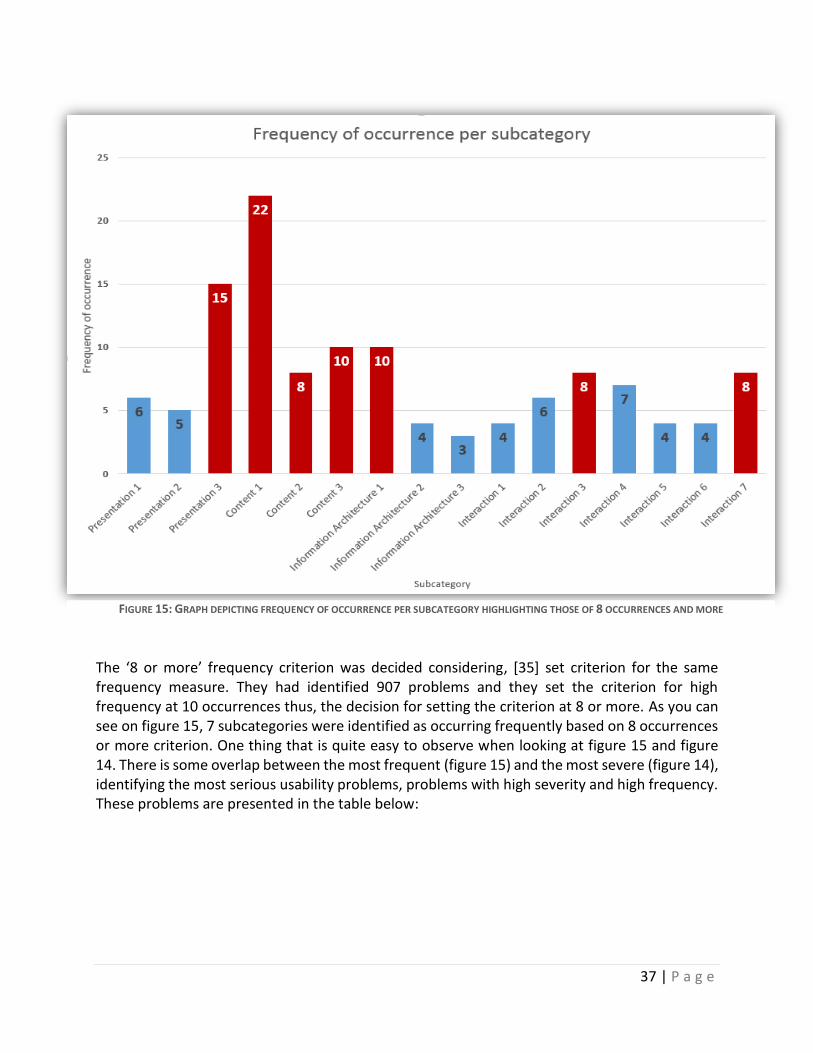
The ‘8 or more’ frequency criterion was decided considering, [35] set criterion for the same frequency measure. They had identified 907 problems and they set the criterion for high frequency at 10 occurrences thus, the decision for setting the criterion at 8 or more. As you can see on figure 15, 7 subcategories were identified as occurring frequently based on 8 occurrences or more criterion. One thing that is quite easy to observe when looking at figure 15 and figure 14. There is some overlap between the most frequent (figure 15) and the most severe (figure 14), identifying the most serious usability problems, problems with high severity and high frequency. These problems are presented in the table below:
FIGURE 15: GRAPH DEPICTING FREQUENCY OF OCCURRENCE PER SUBCATEGORY HIGHLIGHTING THOSE OF 8 OCCURRENCES AND MORE
38 | P a g e
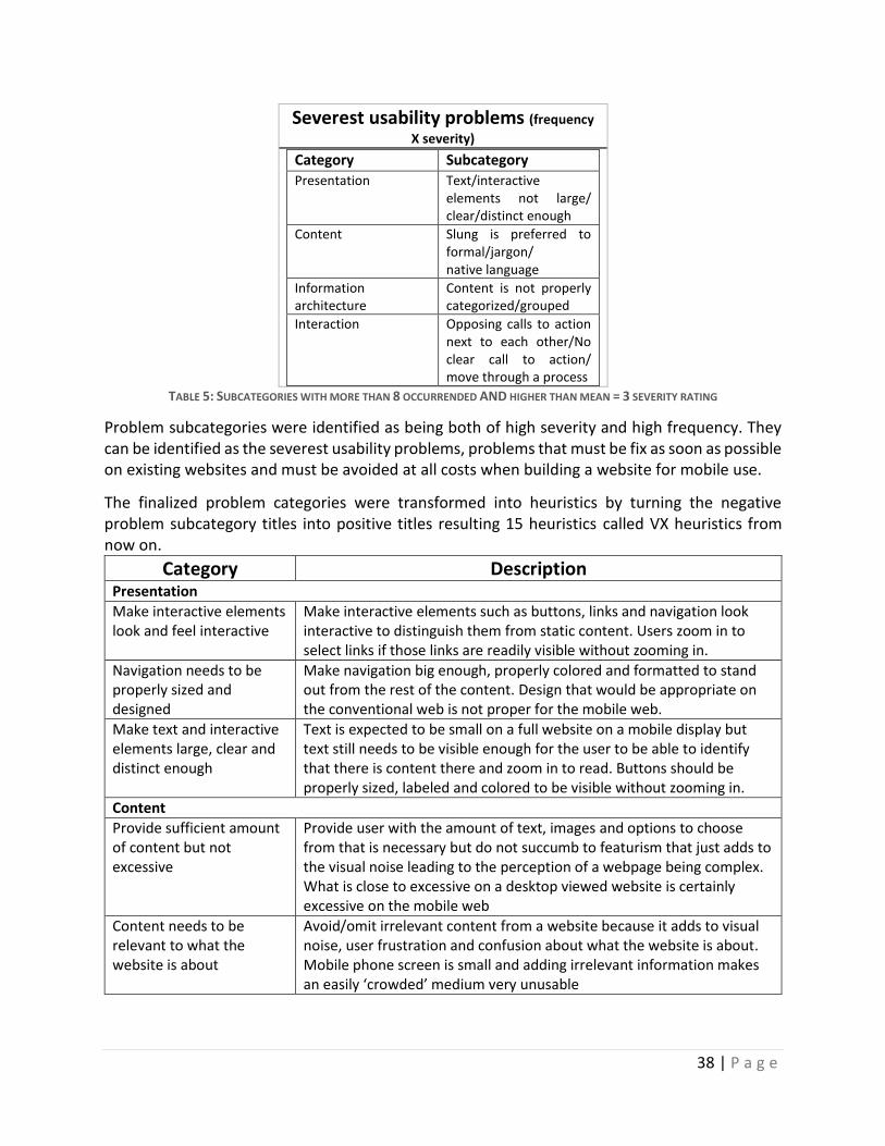
Severest usability problems (frequency
X severity) Category Subcategory
Presentation Text/interactive elements not large/ clear/distinct enough
Content Slung is preferred to formal/jargon/ native language
Information architecture
Content is not properly categorized/grouped
Interaction Opposing calls to action next to each other/No clear call to action/ move through a process
TABLE 5: SUBCATEGORIES WITH MORE THAN 8 OCCURRENDED AND HIGHER THAN MEAN = 3 SEVERITY RATING
Problem subcategories were identified as being both of high severity and high frequency. They can be identified as the severest usability problems, problems that must be fix as soon as possible on existing websites and must be avoided at all costs when building a website for mobile use.
The finalized problem categories were transformed into heuristics by turning the negative problem subcategory titles into positive titles resulting 15 heuristics called VX heuristics from now on.
Category Description Presentation
Make interactive elements look and feel interactive
Make interactive elements such as buttons, links and navigation look interactive to distinguish them from static content. Users zoom in to select links if those links are readily visible without zooming in.
Navigation needs to be properly sized and designed
Make navigation big enough, properly colored and formatted to stand out from the rest of the content. Design that would be appropriate on the conventional web is not proper for the mobile web.
Make text and interactive elements large, clear and distinct enough
Text is expected to be small on a full website on a mobile display but text still needs to be visible enough for the user to be able to identify that there is content there and zoom in to read. Buttons should be properly sized, labeled and colored to be visible without zooming in.
Content
Provide sufficient amount of content but not excessive
Provide user with the amount of text, images and options to choose from that is necessary but do not succumb to featurism that just adds to the visual noise leading to the perception of a webpage being complex. What is close to excessive on a desktop viewed website is certainly excessive on the mobile web
Content needs to be relevant to what the website is about
Avoid/omit irrelevant content from a website because it adds to visual noise, user frustration and confusion about what the website is about. Mobile phone screen is small and adding irrelevant information makes an easily ‘crowded’ medium very unusable
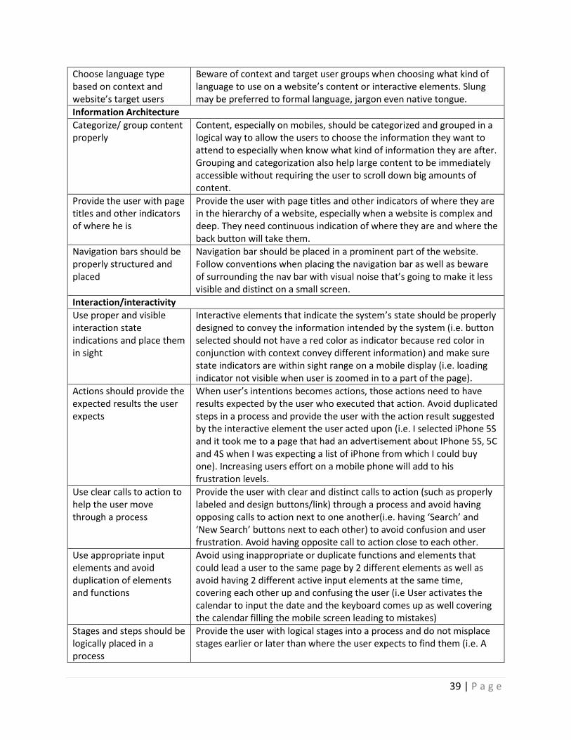
39 | P a g e
Choose language type based on context and website’s target users
Beware of context and target user groups when choosing what kind of language to use on a website’s content or interactive elements. Slung may be preferred to formal language, jargon even native tongue.
Information Architecture
Categorize/ group content properly
Content, especially on mobiles, should be categorized and grouped in a logical way to allow the users to choose the information they want to attend to especially when know what kind of information they are after. Grouping and categorization also help large content to be immediately accessible without requiring the user to scroll down big amounts of content.
Provide the user with page titles and other indicators of where he is
Provide the user with page titles and other indicators of where they are in the hierarchy of a website, especially when a website is complex and deep. They need continuous indication of where they are and where the back button will take them.
Navigation bars should be properly structured and placed
Navigation bar should be placed in a prominent part of the website. Follow conventions when placing the navigation bar as well as beware of surrounding the nav bar with visual noise that’s going to make it less visible and distinct on a small screen.
Interaction/interactivity
Use proper and visible interaction state indications and place them in sight
Interactive elements that indicate the system’s state should be properly designed to convey the information intended by the system (i.e. button selected should not have a red color as indicator because red color in conjunction with context convey different information) and make sure state indicators are within sight range on a mobile display (i.e. loading indicator not visible when user is zoomed in to a part of the page).
Actions should provide the expected results the user expects
When user’s intentions becomes actions, those actions need to have results expected by the user who executed that action. Avoid duplicated steps in a process and provide the user with the action result suggested by the interactive element the user acted upon (i.e. I selected iPhone 5S and it took me to a page that had an advertisement about IPhone 5S, 5C and 4S when I was expecting a list of iPhone from which I could buy one). Increasing users effort on a mobile phone will add to his frustration levels.
Use clear calls to action to help the user move through a process
Provide the user with clear and distinct calls to action (such as properly labeled and design buttons/link) through a process and avoid having opposing calls to action next to one another(i.e. having ‘Search’ and ‘New Search’ buttons next to each other) to avoid confusion and user frustration. Avoid having opposite call to action close to each other.
Use appropriate input elements and avoid duplication of elements and functions
Avoid using inappropriate or duplicate functions and elements that could lead a user to the same page by 2 different elements as well as avoid having 2 different active input elements at the same time, covering each other up and confusing the user (i.e User activates the calendar to input the date and the keyboard comes up as well covering the calendar filling the mobile screen leading to mistakes)
Stages and steps should be logically placed in a process
Provide the user with logical stages into a process and do not misplace stages earlier or later than where the user expects to find them (i.e. A
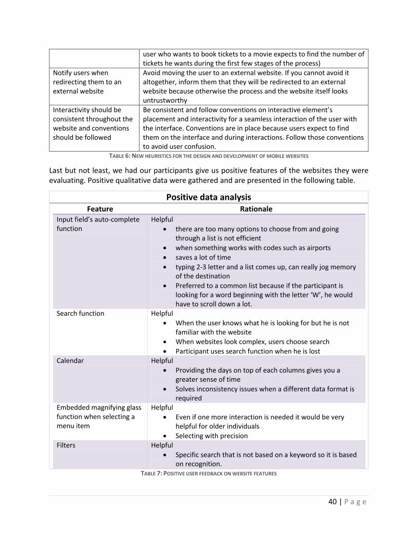
40 | P a g e
user who wants to book tickets to a movie expects to find the number of tickets he wants during the first few stages of the process)
Notify users when redirecting them to an external website
Avoid moving the user to an external website. If you cannot avoid it altogether, inform them that they will be redirected to an external website because otherwise the process and the website itself looks untrustworthy
Interactivity should be consistent throughout the website and conventions should be followed
Be consistent and follow conventions on interactive element’s placement and interactivity for a seamless interaction of the user with the interface. Conventions are in place because users expect to find them on the interface and during interactions. Follow those conventions to avoid user confusion.
TABLE 6: NEW HEURISTICS FOR THE DESIGN AND DEVELOPMENT OF MOBILE WEBSITES
Last but not least, we had our participants give us positive features of the websites they were evaluating. Positive qualitative data were gathered and are presented in the following table.
Positive data analysis Feature Rationale
Input field’s auto-complete function
Helpful
there are too many options to choose from and going through a list is not efficient
when something works with codes such as airports
saves a lot of time
typing 2-3 letter and a list comes up, can really jog memory of the destination
Preferred to a common list because if the participant is looking for a word beginning with the letter ‘W’, he would have to scroll down a lot.
Search function Helpful
When the user knows what he is looking for but he is not familiar with the website
When websites look complex, users choose search
Participant uses search function when he is lost Calendar Helpful
Providing the days on top of each columns gives you a greater sense of time
Solves inconsistency issues when a different data format is required
Embedded magnifying glass function when selecting a menu item
Helpful
Even if one more interaction is needed it would be very helpful for older individuals
Selecting with precision Filters Helpful
Specific search that is not based on a keyword so it is based on recognition.
TABLE 7: POSITIVE USER FEEDBACK ON WEBSITE FEATURES
41 | P a g e
These positive comments on specific websites features are important not only because they highlight good things about websites, things that should be implemented on mobile websites but also provide the rationale behind these comments on how these features are helpful to users.
42 | P a g e
6. DISCUSSION
6.1 OVERVIEW AND RATIONALE
The mobile web, even today, offers a mediocre user experience with the majority of websites having low usability, making users prefer the conventional way of accessing the web for what they deem as ‘serious’ tasks. Using the same design guidelines for the design and development of mobile websites proves unsuitable for mobile web access because they do not consider the purpose, physical design and context of use of mobile phones as seen in the literature review. Mobile phones’ screen size, context of use and cognitive requirements are very different from those of a desktop or a laptop computer. Although, users may be expecting the interaction to be as easy and straight forward as the interaction with conventional desktop/laptop web, the interaction is different and users prefer the conventional ways than the mobile web. The smaller screen size affects efficiency, task completion, the cognitive workload required for interaction in different contexts and the amount of interactions needed by the user. Mobile phones are most often used indoors, for hedonic purposes, when the user is stationary and there are not a lot of people around. When mobile phones are used on the move, the interaction is done in short bursts of less than 6 seconds because attentional resources are limited and interaction with the mobile and sampling the environment challenge the brain’s attentional capacity.
Retrospective think aloud protocol was used to evaluate 7 interactive websites. There was some thought on choosing retrospective or concurrent protocols. Retrospective think aloud (RTA) was chosen for this study because of its benefits compared to concurrent think aloud (CTA). Those benefits involve decreased reactivity with participants having their own manner and pace to complete tasks while in CTA leading in increased session duration, users may perform worse because of the added workload of them having to simultaneously talk and perform tasks. Also, identifying higher-level causes for individual usability problems because users have the chance to watch themselves perform and reflect on this process [28]. The major finding that tipped the scale towards the RTA was the fact that, while task performing was not affected by the concurrent think aloud, task completion was significantly affected by CTA think aloud compared to RTA (p < 0.05) [26].
Moving on, the fact that usability problems found in mobile-optimized websites is a testament of the way they are designed. Designers try to solve the screen display differentiation, often poorly, leaving all the rest mobile aspects unaddressed, highlighting the need for specialized heuristics for websites meant to be viewed and interacted with on a mobile phone, offering the user a usable and enjoyable interactive experience. 138 usability problems, for both full and mobile-optimized websites, were identified by this usability study which focused on producing usability heuristics for the mobile web. First, the identified usability problems went through an iterative grounded categorization process with 3 iterations to be categorized into problem categories and subcategories resulting in 4 major categories namely, Presentation, Content, Information Architecture and Interaction and each category had its own problem subcategories labeled appropriately to represent the emerged problem. These categories went through another iteration of categorization where frequency and severity were measured and
43 | P a g e
the subcategories with lower than 3 frequency of occurrence were omitted from the final problem table if they could not be merged with other subcategories to form a new subcategory with more than 3 occurrences while others were merged into one category. The results of this last iteration produced a finalized table of 16 evidence-based problem subcategories grouped into 4 major categories. Presentation had 3 heuristics, Content had 3, Information architecture had 3 and finally, Interaction had 7. One explanation for the majority of usability problems being grouped in the Interaction category is that websites being interactive is a given or at least they try to make them interactive, leading to increased interaction problems identified. These 16 problem subcategories were turned into heuristics by transforming the negative problem subcategory titles to 16 positive heuristic titles.
6.2 INTERPRETATION AND ANALYSIS
Taking a closer look at those 16 heuristics, one can easily identify similarities between the last two heuristics of the ‘Presentation’ category. ‘Navigation needs to be properly sized and designed’ and ‘Make text and interactive elements large, clear and distinct enough’ could easily be merged into one considering that navigation is an interactive element and the usability problems identified about it are the same as the other heuristics’. This is a case of one heuristic, in this case the second of the two, being the more general one and the other being a more specific one. The reason they were not merged is the fact that navigation is extremely important for the mobile web, as seen in the literature, and having a heuristic dedicated specifically for the design of the navigation was deemed worth having.
Results showed that the most frequent usability problem was identified as being ‘Too much content/pictures and featurism’ which was also researched by [20], presented during the literature review and it is not surprising. The advances in e-marketing requiring an ever rising portion of a page and the ever increasing features and functions fighting for their own portion of the website can be compared to a high value real estate where everyone wants a piece of. If that was true for the conventional web, it is especially true and important for the mobile web where that real estate is a hut in terms of size.
Results also showed that Information Architecture is the category with the highest mean severity of the four categories with all of its 3 subcategories being rated as of high severity. Structure, placement and grouping of information are very important for the user to find his way towards the completion of a task. If information is not grouped or placed appropriately, user has to search more than he wants to and should have to, prolonging the task duration and increasing the interactions he has to perform on that device. That device being a mobile phone which, as seen in literature, inherently requires a lot more interactions than the conventional web, leading to an increase in effort needed, workload, cumulative frustration and time. That is why it is not surprising that users rated problems related to ‘Information Architecture’ so highly. The highest severity subcategory from ‘Interaction’ category is none other than ‘Broken consistency and convention not followed.’ Anyone who has performed usability evaluations knows that this problem comes up a lot and there is very good reason why. Conventions are practices concerning structure, placement, design and behavior of elements of the website that have been in place for so long, they became norms. The majority of websites try to keep conventions in the design
44 | P a g e
because users expect those conventions to be in place. Inability to follow conventions leads to a phenomenon that can be compared to ‘change blindness’, the inability of human beings to identify changes in their visual periphery, in the sense that if the user expects something to be placed on the right side of the website and with a particular label, it will take a lot of time for him/her to identify if he/ she ever does, the same element if it is on the left side no matter how big it is. This phenomenon happened numerous times during user testing providing this study with a subcategory of high frequency of occurrence and severity.
An interesting and unexpected problem came up during user testing which led to a problem subcategory, based on its frequency and eventually made it to the final list of heuristics. The ‘Choose language type based on the context and website’s target users’ heuristic and how it came to be a problem subcategory is worth discussing. During user testing users were asked to enable Facebook’s option to ‘review tags before they are posted on their timeline’. Most users had a big problem with finding that option because Facebook’s website was in Greek and the majority of users did not know what the Greek translation of ‘tag’ was. This problem led to the realization that even if they were Greeks and they prefered the website in Greek, they had never used the Greek word for it because ‘tag’ is a universal word when it comes to Facebook. The interesting thing about this particular usability problem they identified is that, firstly, that usability problem would not have come up in an expert evaluation if it was performed by the researcher of this study because it had never occurred that something like that would happen. Secondly, this problem illustrates how context relevant language use surpasses the need of merely using native language.
Attempting to analyze and present the results of the data analysis, 2 graphs were created (figure 14 and figure 15). The relationship between them, one being a frequency graph and the other a severity graph of all the problem subcategories with the purpose of illustrating which of those subcategories passed the threshold established for making it to the final problem table and become heuristics. Having those two graph side by side until they were arranged in between text, led to the idea of identifying which subcategories overlap as being of high frequency and of high severity in these 2 graphs. There was a four problem subcategory overlap between the 2 graphs. Those problems having both high frequency and high severity were identified as the 4 most severe problems of this usability study and should be addressed as quickly as possible on an existing website or avoided at all costs when designing and developing a new website for mobile use.
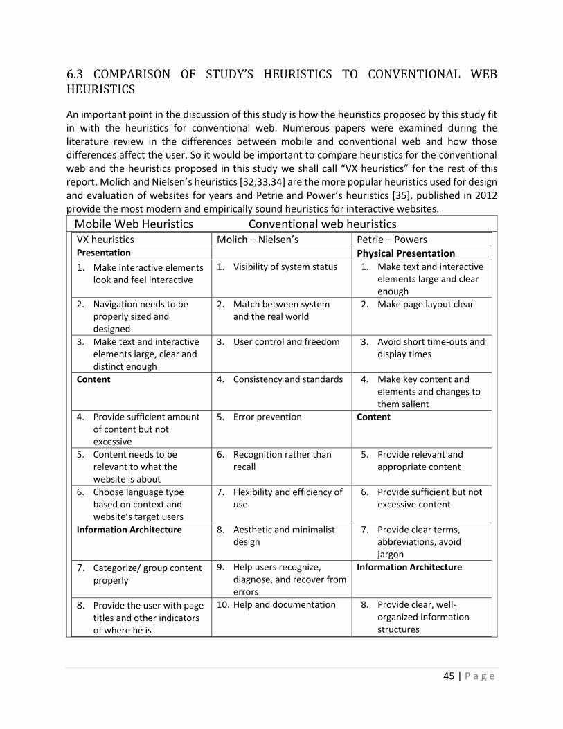
45 | P a g e
6.3 COMPARISON OF STUDY’S HEURISTICS TO CONVENTIONAL WEB HEURISTICS
An important point in the discussion of this study is how the heuristics proposed by this study fit in with the heuristics for conventional web. Numerous papers were examined during the literature review in the differences between mobile and conventional web and how those differences affect the user. So it would be important to compare heuristics for the conventional web and the heuristics proposed in this study we shall call “VX heuristics” for the rest of this report. Molich and Nielsen’s heuristics [32,33,34] are the more popular heuristics used for design and evaluation of websites for years and Petrie and Power’s heuristics [35], published in 2012 provide the most modern and empirically sound heuristics for interactive websites.
Mobile Web Heuristics Conventional web heuristics
VX heuristics Molich – Nielsen’s Petrie – Powers Presentation Physical Presentation
1. Make interactive elements look and feel interactive
1. Visibility of system status 1. Make text and interactive elements large and clear enough
2. Navigation needs to be properly sized and designed
2. Match between system and the real world
2. Make page layout clear
3. Make text and interactive elements large, clear and distinct enough
3. User control and freedom 3. Avoid short time-outs and display times
Content 4. Consistency and standards 4. Make key content and elements and changes to them salient
4. Provide sufficient amount of content but not excessive
5. Error prevention Content
5. Content needs to be relevant to what the website is about
6. Recognition rather than recall
5. Provide relevant and appropriate content
6. Choose language type based on context and website’s target users
7. Flexibility and efficiency of use
6. Provide sufficient but not excessive content
Information Architecture 8. Aesthetic and minimalist design
7. Provide clear terms, abbreviations, avoid jargon
7. Categorize/ group content properly
9. Help users recognize, diagnose, and recover from errors
Information Architecture
8. Provide the user with page titles and other indicators of where he is
10. Help and documentation 8. Provide clear, well-organized information structures
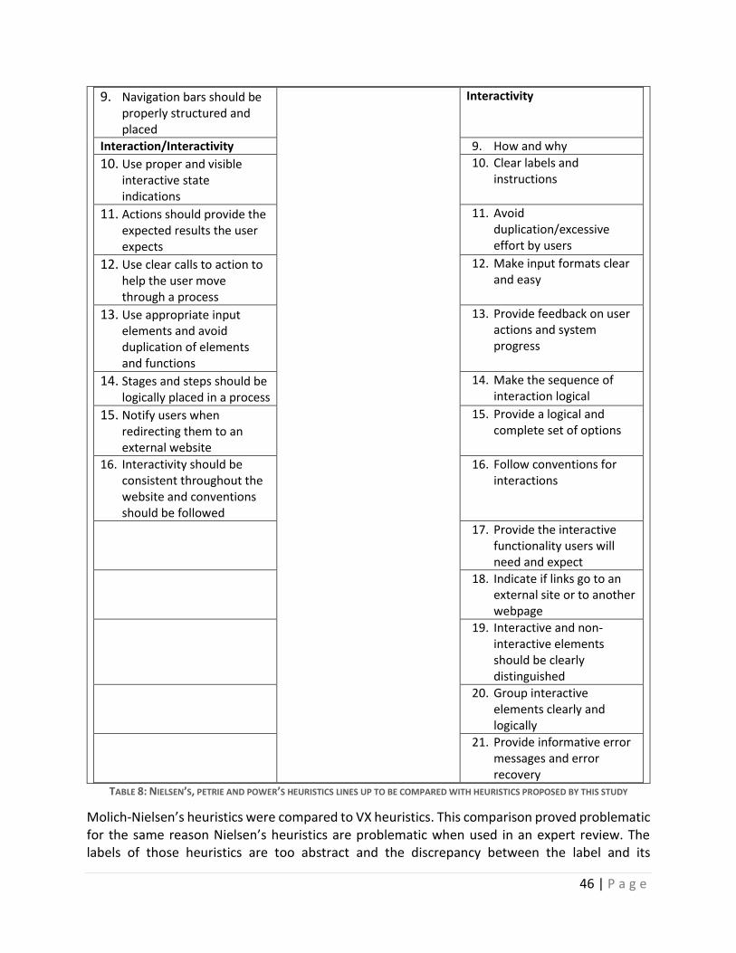
46 | P a g e
9. Navigation bars should be properly structured and placed
Interactivity
Interaction/Interactivity 9. How and why
10. Use proper and visible interactive state indications
10. Clear labels and instructions
11. Actions should provide the expected results the user expects
11. Avoid duplication/excessive effort by users
12. Use clear calls to action to help the user move through a process
12. Make input formats clear and easy
13. Use appropriate input elements and avoid duplication of elements and functions
13. Provide feedback on user actions and system progress
14. Stages and steps should be logically placed in a process
14. Make the sequence of interaction logical
15. Notify users when redirecting them to an external website
15. Provide a logical and complete set of options
16. Interactivity should be consistent throughout the website and conventions should be followed
16. Follow conventions for interactions
17. Provide the interactive functionality users will need and expect
18. Indicate if links go to an external site or to another webpage
19. Interactive and non-interactive elements should be clearly distinguished
20. Group interactive elements clearly and logically
21. Provide informative error messages and error recovery
TABLE 8: NIELSEN’S, PETRIE AND POWER’S HEURISTICS LINES UP TO BE COMPARED WITH HEURISTICS PROPOSED BY THIS STUDY
Molich-Nielsen’s heuristics were compared to VX heuristics. This comparison proved problematic for the same reason Nielsen’s heuristics are problematic when used in an expert review. The labels of those heuristics are too abstract and the discrepancy between the label and its
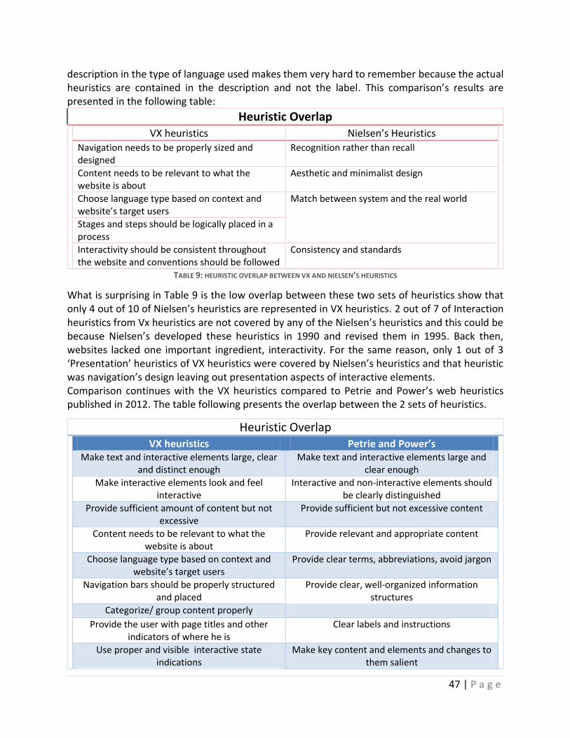
47 | P a g e
description in the type of language used makes them very hard to remember because the actual heuristics are contained in the description and not the label. This comparison’s results are presented in the following table:
Heuristic Overlap VX heuristics Nielsen’s Heuristics
Navigation needs to be properly sized and designed
Recognition rather than recall
Content needs to be relevant to what the website is about
Aesthetic and minimalist design
Choose language type based on context and website’s target users
Match between system and the real world
Stages and steps should be logically placed in a process
Interactivity should be consistent throughout the website and conventions should be followed
Consistency and standards
TABLE 9: HEURISTIC OVERLAP BETWEEN VX AND NIELSEN’S HEURISTICS
What is surprising in Table 9 is the low overlap between these two sets of heuristics show that only 4 out of 10 of Nielsen’s heuristics are represented in VX heuristics. 2 out of 7 of Interaction heuristics from Vx heuristics are not covered by any of the Nielsen’s heuristics and this could be because Nielsen’s developed these heuristics in 1990 and revised them in 1995. Back then, websites lacked one important ingredient, interactivity. For the same reason, only 1 out of 3 ‘Presentation’ heuristics of VX heuristics were covered by Nielsen’s heuristics and that heuristic was navigation’s design leaving out presentation aspects of interactive elements. Comparison continues with the VX heuristics compared to Petrie and Power’s web heuristics published in 2012. The table following presents the overlap between the 2 sets of heuristics.
Heuristic Overlap VX heuristics Petrie and Power’s
Make text and interactive elements large, clear and distinct enough
Make text and interactive elements large and clear enough
Make interactive elements look and feel interactive
Interactive and non-interactive elements should be clearly distinguished
Provide sufficient amount of content but not excessive
Provide sufficient but not excessive content
Content needs to be relevant to what the website is about
Provide relevant and appropriate content
Choose language type based on context and website’s target users
Provide clear terms, abbreviations, avoid jargon
Navigation bars should be properly structured and placed
Provide clear, well-organized information structures
Categorize/ group content properly Provide the user with page titles and other
indicators of where he is Clear labels and instructions
Use proper and visible interactive state indications
Make key content and elements and changes to them salient
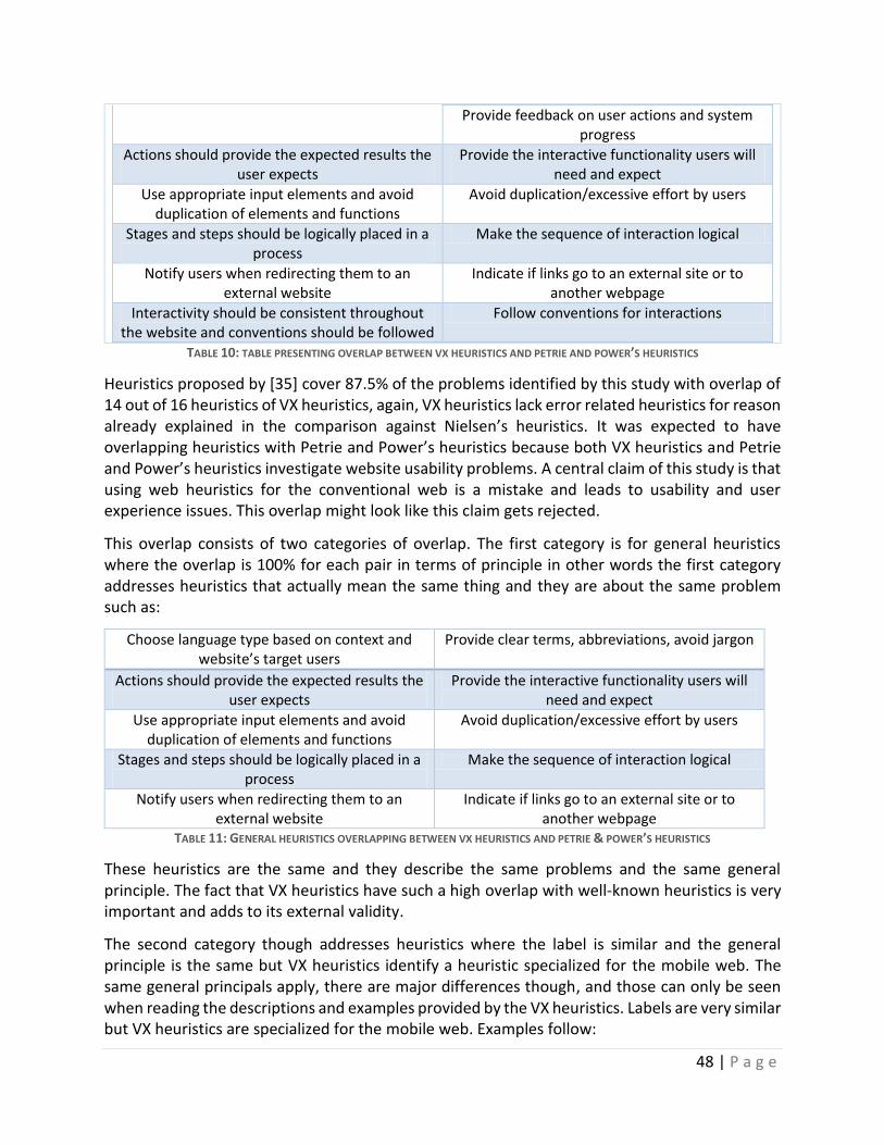
48 | P a g e
Provide feedback on user actions and system progress
Actions should provide the expected results the user expects
Provide the interactive functionality users will need and expect
Use appropriate input elements and avoid duplication of elements and functions
Avoid duplication/excessive effort by users
Stages and steps should be logically placed in a process
Make the sequence of interaction logical
Notify users when redirecting them to an external website
Indicate if links go to an external site or to another webpage
Interactivity should be consistent throughout the website and conventions should be followed
Follow conventions for interactions
TABLE 10: TABLE PRESENTING OVERLAP BETWEEN VX HEURISTICS AND PETRIE AND POWER’S HEURISTICS
Heuristics proposed by [35] cover 87.5% of the problems identified by this study with overlap of 14 out of 16 heuristics of VX heuristics, again, VX heuristics lack error related heuristics for reason already explained in the comparison against Nielsen’s heuristics. It was expected to have overlapping heuristics with Petrie and Power’s heuristics because both VX heuristics and Petrie and Power’s heuristics investigate website usability problems. A central claim of this study is that using web heuristics for the conventional web is a mistake and leads to usability and user experience issues. This overlap might look like this claim gets rejected.
This overlap consists of two categories of overlap. The first category is for general heuristics where the overlap is 100% for each pair in terms of principle in other words the first category addresses heuristics that actually mean the same thing and they are about the same problem such as:
Choose language type based on context and website’s target users
Provide clear terms, abbreviations, avoid jargon
Actions should provide the expected results the user expects
Provide the interactive functionality users will need and expect
Use appropriate input elements and avoid duplication of elements and functions
Avoid duplication/excessive effort by users
Stages and steps should be logically placed in a process
Make the sequence of interaction logical
Notify users when redirecting them to an external website
Indicate if links go to an external site or to another webpage
TABLE 11: GENERAL HEURISTICS OVERLAPPING BETWEEN VX HEURISTICS AND PETRIE & POWER’S HEURISTICS
These heuristics are the same and they describe the same problems and the same general principle. The fact that VX heuristics have such a high overlap with well-known heuristics is very important and adds to its external validity.
The second category though addresses heuristics where the label is similar and the general principle is the same but VX heuristics identify a heuristic specialized for the mobile web. The same general principals apply, there are major differences though, and those can only be seen when reading the descriptions and examples provided by the VX heuristics. Labels are very similar but VX heuristics are specialized for the mobile web. Examples follow:
49 | P a g e
# 3 VX heuristic and #1 Petrie and Powers heuristic were presented to overlap but the description of the first paints a specialized picture about the mobile web based on user data. It describes the fact that text and interactive elements are expected to be small on a full website viewed on a mobile phone but users need to be able to recognize the text before they zoom in because they, first, look for content and then they zoom in to read/select.
# 4 VX heuristic and #6 Petrie and Powers heuristic overlapped based on the general principle of avoiding having too much content on a page. That is true for both mobile and conventional web but the issue for the mobile web is much more intense because of the screen size and the inability users have anyway to not be able to perceive the whole page that makes them using scrolling, zooming and paging functions a lot more, as seen in the review of literature. The same goes for #5 VX heuristic
Another overlapping heuristic is #7 VX heuristic which overlaps with #8 Petrie and Powers heuristic where content on mobile phones must be categorized and grouped properly because large amounts of content make for a lot of interactions required by the users to go through it all.
Content must be organized in a way that users can find what they want without having to read irrelevant to them information or having to scroll large amounts of content to get to where they want. Especially if they know what they are after.
An important overlapping heuristic is #9 VX heuristic with #4, #13 Petrie and Powers heuristics. Interaction indicators must be proper and salient enough, in others words the user needs to be informed whenever something changes. The problem with the mobile web that came from the user data collected during user testing is that when users used the left side bar where the search filters were, when they selected a filter, they were automatically zoomed in close to that filter they selected. The problem was that the rest of the page was not visible so they did not know if selecting this filter actually changed the results on the screen because that part of the page was out of sight on the mobile screen. Another reason why this usability came up frequently is that the loading indicator was out of sight too because the designers had placed it in the middle of the results page because they designed a webpage for the conventional web.
The above stated, demonstrate the fact that heuristics are similar in their general principles but the differences between the mobile web and the conventional web makes them specialized to the mobile web’s restrictions and that is what the heuristic descriptions are explaining including examples from user data collected during user testing.
Table 7 presents user comments on good features on the websites they evaluated. Those positive comments, while being slightly out of scope of this study, can be a guide for developers about what kind of features users really want and need on mobile websites that make their life easier and the mobile web a more efficient and effective web medium. The rationale provided by the
50 | P a g e
participants for the reason why those features could be imperative for the developers by giving them an insight on how and then those features are used.
6.4 LIMITATIONS
The comparison between VX heuristics and Nielsen’s heuristics helped identify weaknesses of the VX heuristics. 3 of Nielsen’s heuristics are concern with errors and documentation which none of VX heuristics covers due to the lack of errors appearing during user testing. That can be attributed to the fact that the tasks to be performed by the users were error free but not mistake/slip free. In other words users made mistakes but those mistakes did not result in any kind of errors. The forms, an error causing feature of the web, had auto-complete embedded, calendars and lists for date input and radio buttons. In fact, calendars and the auto-complete function of input fields were identified as some of the good features that made their interaction much easier and efficient (table 7).
Another limitation some could identify about this study is the fact that the usability study took place in a laboratory environment, isolated by any kind of visual or audio distractions which is the opposite of how the mobile phones are supposed to be used. Instead a field study would increase result validity. Those comments are considered perfectly reasonable and might be correct but the review of relevant literature and especially literature on context of use discovered that mobile phones are primarily used indoors and when not too many people are around and more specifically, mobile web use is most common when sitting on the couch of one’s own home because the couch is a comfortable place for users to access the mobile web but there is no computer in that room. The above stated facts could suggest that conducting studies for the mobile web in a lab might not be invalid.
Other limitations could be the amount and quality of tasks to be performed by the user. Tasks were simple and short, albeit very common for users visiting these kinds of websites which were identified by the users themselves. Or the fact the homogeneity of participant sample and especially all users being of Greek nationality and the role culture plays in usability evaluation.
6.5 BENEFITS AND IMPLICATIONS OF VX HEURISTICS
This study will greatly improve the mobile web because this study and its products are based on solid research foundations, deep understanding of the literature surrounding mobile phones and the web as individual entities and together, forming the mobile web. The improvements directly resulting from adopting these heuristics will not only be usable websites but also seamless interaction with the web leading to improved user experience. This improved user experience could lead to a greater mobile web market penetration and the percentage of web access through mobile could increase because users would enjoy going online and browsing for goods, information and services. The percentage of utilitarian mobile web access could be increased, thus allowing more users to trust the mobile web for their utilitarian tasks and they would be less dependent on stationary means such as desktop/laptop computers thus, making mobile web access, really mobile. Speaking about trust, some of the participants of this study mentioned that they would perform account setting changed and pay online from their PC rather than their mobile phone. Improved usability and user experience could lead to user trusting their mobile
51 | P a g e
phone to perform tasks they would not perform otherwise because they did not trust the mobile web mainly because of its design and the increased number of usability problems they identified and had to deal with. Also these heuristics, being reasonable in number makes them fairly easy to remember. Being able to remember the heuristics when evaluating a website greatly increases efficiency and performance because evaluators and designers would not have to go back and forth reading revisiting the table of heuristics and their descriptions.
Additionally, following these heuristics could solve another issue discussed in the literature review, information density. Information density has proven to be a major problem, especially for the mobile web. Those heuristics cover this problem by mean of a ‘Content’ category heuristic ‘Provide the user with sufficient content but not excessive’ which was derived by the most frequent usability problem occurring during this study’s evaluation sessions. Avoiding high information density allows for clarity, making the important, for the user and the client, functions clearer and in conjunction with heuristics on structure (Information architecture) and design (presentation) make these functions more visible and readily distinguishable. Adoption of these heuristics for the design and development of mobile websites could lead to websites of higher usability and user experience, finally, making the mobile web a place where the user would be able to perform most of the tasks he used to perform on the web via conventional means.
6.6 FUTURE WORK
Further work is needed to focus on examining whether these heuristics are more effective in designing and developing of mobile websites. Also, future work should focus on the limitations mentioned in the previous section and examine how effective and efficient field usability studies are compared to laboratory studies when testing for mobile web usability. Evaluations must be conducted using these new heuristics and the results must be compared to results from other heuristics. The limitation of those heuristics to identify and evaluate error resulting interactions and feature is something that needs to be addressed.
52 | P a g e
7. CONCLUSIONS
This study showed mobile phone’s differences to the conventional web access must be taken into consideration when designing, developing and evaluating websites on a mobile phone. Screen size, mental load, I/O functions and context of use make for a mobile web in need of specialized heuristics that adhere to the attributes and restrictions of the mobile web. While heuristics for conventional web access and mobile web adhere to the same basic design and interaction principles, the mobile web heuristics proposed by this study suggest a specialized approach. These heuristics take consider the same basic design and interaction principles of the conventional web and factoring the attributes of mobile phones and their differences from conventional web access, would help design and develop mobile website with increased usability and user experience that could turn mobile web into a more hospitable ‘place’. Users would be able to perform both utilitarian and hedonic tasks and decrease dependency to the conventional web to those who previously used it for what they deem as ‘serious’ tasks due to mobile web’s usability problems and low trustworthiness.
53 | P a g e
REFERENCES [1]M. Meeker.(2014, May). "Internet Trends 2014" [Online]. Available: http://www.kpcb.com/internet-trends.
[2] R. Heeks. (2008). "Meet Marty Cooper – the inventor of the mobile phone". BBC 41 (6): 26–33.
[3] K. Aoki and E. J. Downes, "An analysis of young people's use of and attitudes toward cell phones," Telematics and Informatics, vol. 20, pp. 349-364, 2003. [4] N. Green. “On the move: technology, mobility, and the mediation of social time and space”. The Information Society, 18, 281–292, 2002. [5] A.S.Taylor, R. Harper. “The gift of the gab? A design-oriented sociology of young people’s use of mobiles”. Computer Supported Cooperative Work 12, 267–296, 2003. [6] D. Sheffield, K.Bolton. “Mobile phone use and perceptions of stress”. In: Proceedings of British Psychological Society, Division of Health Psychology Annual Conference, University of Essex, UK, 13–15 September 2006. [7]T. Berners-Lee , R. Cailliau. "WorldWideWeb: Proposal for a hypertexts Project". 1990. [8]J. Meyers. "Watch The Incredible 70-Year Evolution Of The Cell Phone"[Online]. Available: http://www.businessinsider.com/complete-visual-history-of-cell-phones-2011-5?op=1 [9] D. Rowinski.(2003) . "A Visual History Of The Web Told Through Webby Winners" [Online]. Available: http://readwrite.com/2013/04/02/a-visual-history-of-the-web [10] V. Roto, A. Kaikkonen .(2003). “Perception of narrow web pages on a mobile Phone”. In: Proceedings of the 19th International Symposium on Human Factors in Telecommunication (HFT 2003). Berlin, Germany, pages 205-212, 2003. [11] A. Dillon et al. “The effect of display size and text splitting on reading lengthy text from the screen”. Behaviour and Information Technology 9 (3) 215–227, 1990. [12] D. Raptis, et al. "Does size matter? Investigating the impact of mobile phone screen size on users’ perceived usability, effectiveness and efficiency.," Proc. 15th Int. Conf. Human-Comput. Interaction With Mobile Devices Services. 2003. [13] M. Jones et al. "Improving Web interaction on small displays," Comput. Networks: Int. J. Computer Telecommunications Networking, vol. 31, pp. 1129–1137, 1999. [14] M. Jones et al. "Improving web search on small screen devices," Interacting With Computers, vol. 15, p. 479–495,2013.
54 | P a g e
[15] H. Kim et al. "An Empirical Study of the Use Contexts and Usability Problems in Mobile Internet," Proc. 35th Hawaii Int. Conf. Syst. Sciences, 2002. [16] Y. Cui & V. Roto, "How People Use the Web on Mobile Devices," Www 2008 / Alternate Track: Industrial Practice and Experience, 2008. [17] A. Oulasvirta. et al. “Interaction in 4-second bursts: The fragmented nature of attentional resources in mobile HCI”. In Proceedings of SIGCHI Conference on Human Factors in Computing Systems, ACM Press, New York, pp. 919-928, 2005. [18] Norman, K.L., 1991. “The Psychology of Menu Selection”. Ablex, Norwood, NJ. [19] M. Ziefle. “Instruction format and navigation aids in mobile devices”. In: Holzinger, A. (Ed.), Usability and Human Computer Interaction for Education and Work. LNCS 5298. Springer, , Berlin, Heidelberg, pp. 339-358, 2008. [20] M. Ziefle, "Information presentation in small screen devices: The trade-off between visual density and menu foresight," Applied Ergonomics, vol. 41, pp. 719–730, 2010. [21] S. Shrestha, "Mobile Web Browsing: Usability Study," Mobility '07 Proc. 4th Int. Conf. Mobile Technology, Applications, Syst., pp. 187–194, 2007. [22] G. Schmiedl et al. "Mobile Phone Web Browsing – A Study on Usage and Usability Of The Mobile Web," Proc. 11th Int. Conf. Human-Comput. Interaction With Mobile Devices Services, no. 70, 2009. [23] A. Ha: Google Pushing Advertisers to Build for Mobile Search. Adweek (2011)
[24] Cookson, R. “UK companies not ready for mobile internet”[Online]. Available: http://www.ft.com/cms/s/0/bd059e26-4cf2-11e2-a99b-00144 feab49a.html-axzz2QrGnu9Db
[25] International Telecommunication Union, Key Global Telecom Indicators for the World Telecommunication Service Sector (2012)[Online]. Available: http://www.itu.int/ITU-d/ict/statistics/at_glance/keytelecom.html
[26] M.J. Haak et al. "Retrospective vs. concurrent think-aloud protocols: testing the usability of an online library catalogue," Behaviour & Inform. Technology, vol. 22, no. 5, p. 339–351, 2003.
[27] K. A. Ericcson, H. A. Simon. “Protocol Analysis: Verbal Reports as Data”. Cambridge, MA. MIT Press. 1993.
55 | P a g e
[28] J. E. Russo et al. “The validity of verbal protocols”. Memory & Cognition, 17, 759 – 769, 1989. [29] R. Teague et al. “Concurrent vs. post-task usability test ratings”. Conference on Human
Factors and Computing Systems. (Seattle, WA: ACM SIGCHI), pp. 289 – 290, 2001. [30] J. Lazar. "Severity and Impact of Computer User Frustration: A Comparison of Student and Workplace Users," Interacting With Computers, vol. 18, pp. 187–207, 2006. [31] J. Nielsen. “Severity Ratings” [Online]. Available: http://people.cs.uct.ac.za/~gaz/teach/hons/papers/Severity%20Ratings%20for%20Usability%20Problems.html [32] R. Molich and J. Nielsen. Improving a human computer dialogue. Communications of the
ACM, 33(3), 338 – 348, 1990. [33]J. Nielsen. “Usability engineering”. San Diego, CA: Morgan Kaufmann, 1993. [34]J. Nielsen. and R. Molich. Heuristic evaluation of user interfaces. Proc. CHI 1990, ACM Press (1990), 249-256, 1990. [35] H. Petrie and C. Power, "What do users really care about?: a comparison of usability problems found by users and experts on highly interactive websites," CHI '12 Proceedings of the SIGCHI Conference on Human Factors in Computing Systems, pp. 2107-2116, 2012.

56 | P a g e
APPENDIX
57 | P a g e
Category Subcategory Data Rank
Presentation
Frequency: 3 Mean: 3,3
Improper size/label/ color of links
This link has very small text. It should be bigger and I did not expect it to have this kind of label (Aa1) , (Aa3) If this is not a link they should have changed the color of it. It looks like a link (Aa5)
4 2
Frequency: 3 Mean: 3,3
Interactive elements look/feel static and vice versa
At first I did not think those are buttons. I thought the whole homepage was a single picture (Aa2) I cannot click on the highlighted iPhone 5S text who look like links (Ab1) The yellow highlighted terms made me think they are clickable so I start clicking them (Ab2)
3 4 3
Frequency: 5 Mean: 2.4
Navigation is not sized/ designed properly
Menu is almost invisible. I think they need a combination of bigger menu with smaller pictures (Aa4) The navigation bar is not quite visible when you land here. I would definitely make that one bigger (Aa5) The bar is the same color as the rest of the elements which makes it very hard to recognize (Aa6) I did not see the nav menu. It is too small and I would want a different color with bold text (Aa7) I saw the nav bar but it did not look like a nav bar. Too small! (Aa8)
3 1 4 2 2
Frequency: 2 Mean: 3
Inadequate search results visual grouping /divide
I don’t like the way the results are presented here. No visible borders between them to distinguish each line (Ab3) I was expecting the results to be formatted in a different way (Ab4)
3 3
Frequency: 15 Mean: 3.13 Mode: 4
Text/interactive elements not large/ clear/distinct enough
This homepage looks simple enough but the text is way too small (PT1) I zoomed in and text was still too small for me (PT2) I did not see that small navigation up there. If text was larger I would be able to see it. I didn’t and that is why I chose to scroll down and go the other way (PT3) I did not notice those options otherwise I would have zoomed in from the beginning (PT4) I did not see the nav bar when I got on this website. I thought it was list or something (PT5) This button is placed in between 2 strong brands. Our eyes are trained to see these brands and since they placed that button in between they should have designed it different so it stands out (PT6) I had a major problem with this button. I did not see it at all, it should have a different design, more visible (PT7) I did not see the ‘Buy it’ button because it’s not green, it is not big enough (PT8) I did not see this button. I would prefer it to have a huge square button there (PT9) I did not see the button there. It is very hard to see. Text is not clear enough (PT10) I did not see the button it is very small. I did see there was something there but I did not stay to see what it was that is why
2 2 2 4 4 3 4 4 2 4 3
58 | P a g e
I moved down the page (PT11) If the button’s label was with bold black letters I would see it from the start and I would select it and I would be done (PT12) REL 2 I did not see the button because of its coloring, design and size. It should have some kind of contrast or the text should have a different color (PT13) I did not see that button it is so faded (PT14) I am looking for the button to buy it. I do not see it because the letters are small and the contrast is bad. It does not stand out enough with all these pictures around (PT15) REL 1
3 3 4 3
Content
Frequency: 2 Mean: 3
Irrelevant/inadequate/ confusing/ unexpected search results
I need to search each one of these links to find what I was looking for because it did not give me exact enough results to get to where I want (CS1) It didn’t give me the results I was expecting. It gave me something irrelevant which I had to leave it to chance whether it was what I wanted or not (CS2)
2 4
Frequency: 22 Mean: 2.77 Mode: 3
Too much content/ pictures/ featurism
This homepage has 10-15 things to offer but it does not really help you identify them because they are hidden in all that text (CC1) This description should be a lot shorter. It is too much to read (CC2) This sentence is so long that I was trying to understand what they mean. I think it was deliberate to be this hard and time-consuming to make you give up on it assuming you would ever find it (CC3) It is a lot of text to read for something that simple (CC4) It looks like it has a lot of information but the display is very small making me move through a big website in a small space. It looks hard because I have to read and scroll up and down right and left (CC5) I do not like this homepage. It is not usable, too many pictures it is so obvious this is for a desktop size screen. Huge volume of data for such a small screen (CC6) This homepage is good for a desktop pc but too much for a mobile one. Too many pictures, huge menu with too many options (CC7) I know this is a picture and that I would have to search around it to find some text and I get scared. Too many pictures I need to select (x) to close them? This is a problem for me (CC8) Homepage is very cluttered. Too many pictures and text and it is not good on a mobile phone (CC9) Too much information and too many pictures on this homepage it is a bit chaotic (CC10) The negative thing about this homepage is how many things there are on this page. Some of them are up some at the bottom it does not look like there is any kind of organization or uniformity. I did not know where to start from (CC11) This page looks so complicated. All these colors, pictures and nothing to catch your eye. Nothing specific I would want to look at (CC12)
3 2 4 1 3 3 2 3 2 3 2 4
59 | P a g e
It is very hard for me because there is so much stuff on this homepage that makes it very hard to see it all like when you are on a desktop computer (CC13) First impression is not that bad but there is so much information in one screen… (CC14) I do not like this page. I am lost with all these pictures around. I do not know where I am going (CC15) It is very tiresome for me, too much information next to each other. I do not know where to focus. If its name was not tourism, I would not know what it is about from the start (CC16) There is so much text here, it is not helpful at all. Maybe if there were pictures with links it would be better (CC17) Too many pictures when we are connecting to it through a mobile phone (CC18) The size of the pictures is a problem. They are very big (CC19) It was very hard for me on this homepage. I was looking for something specific and all I could look at was the pictures, I thought this is a website for advertisements. It took a while until I noticed the products list (CC20) Tough page. I don’t like it. It does not impress me in any way, it’s not fast to load and it provides a lot of unnecessary things (CC21) Very difficult website. Too many pictures and the text is too small (CC22)
3 2 3 3 3 2 3 3 3 4
Frequency: 1 Mean: 3
Improper content placement
This should be up top because the user who will get to this page would want to book tickets. I do not care about pictures(CP1)
3
Frequency: 4 Mean: 2.5
Irrelevant content This homepage is ok from the waist down. Hotels have adverts and I like it but who is this guy’s picture here? Is it an ad? If not why is his face in such a prominent place? (CI1), (CI2) I do not know what’s this. This homepage has a few irrelevant information which I do not care for (CI3) It looks like a news website. If it didn’t have the logo I would have thought I was on a newspapers website or yahoo news. Unacceptable, this is a tourism website I want to see hotels and tickets (CI4)
2 2 4
Frequency: 8 Mean: 2.37
Slung is preferred to formal/jargon/ native language
I would prefer to have ‘tag’ in parenthesis next to its Greek translation because very few people know what the translation of tag is (CSS1) For someone who does not speak English, there should be a parenthesis with the word ‘tag’ in it. We use the word tag not the word ‘etiketa’ (CSS2) I thought it would be placed here. It should have a parenthesis with the ’tag’ label next to it (CSS3) The word makes you think it refers to the cheapest because they sound the same but it is wrong. I think they should be called cheapest – most expensive not ascending and descending (CJS1) Characteristics and technical specs are the same for me. What is the difference? That is why I chose technical specs. This is confusing tome (CJS2) I think it should say lower or higher or from lower price to show a starting point t. Ascending and descending is not wrong but we
2 3 4 1 3 1
60 | P a g e
do not speak that kind of Greek. We do not know how to. I think it is our fault. IT is very easy to get back on course even if you make a mistake here but do not expect a website to teach you the Greek language (CJS3) Once you said pick the cheapest is like telling me to look for the descending order of prices (CJS4) I made a mistake there, I think it would be better if it was lower, higher price. I think it would be more precise (CJS5)
1 4
Information Architecture Frequency: 10 Mean: 3.3
Content is not properly categorized/grouped
Too much data. It seems too.. How can I describe it? It’s like I need to search more than I have to on my own (IC1) This page shouldn’t be this long. It should have internal links to click on them and get where you want to be instead of trying to find something by going up and down the page (IC2) I do not like information to be hidden in text and images. I prefer it to be divided into sections and placed u top (IC3) I think it is much harder to find the information iam looking for because there is no categorization here (IC4) I hate this homepage. Too much information, everything looks so random and not categorized or grouped in any way I can recognize (IC5) This was really hard for me. I wanted this content categorized so I can find the information I wanted without having to read all these information to find what I want (IC6) I am scrolling all the time. There should be categories to help me find the information I want (IC7) If you know what you r looking for, having to scroll so much is not the best way to do it. It would be much better if there were filters or a search function (IC8) Pages should be segmented in a better way so I won’t have to scroll down 3-4 times to see one page especially since I have an iPhone 4 which has a small display (IC9) I think it should be bigger and closer to the picture to look like they are together (Aa3)
3 3 4 4 4 4 3 3 3 2
Frequency: 4 Mean: 3
Titles and other indicators missing
I did not realize that this page is the one I wanted because I thought it would be a different page, with a different picture. If there was a page title it would be a different story (IT1) I selected that option again and again but I got to the same page again and again. I was confused as to where I am because the page title is missing (IT2) I do not know where I am. Did the website change? Is it still Cosmote’s website? (IT3) It took me to a page I did not recognize and there was no title there to help me understand where I am. It is important to have a title(IT4)
3 3 3 3
Frequency: 1 Mean: 3
Key functions are hidden/ grouped with other functions
I do not think this is the right way to deactivate the account, having it in the general tab. It is as if the company does not want you to find it. I want a separate category for this (IK1)
3
Frequency: 3 Mean: 3.6
Improper structure and placement of the navigation bar
I would really want the nav bar to be above the pictures. I had a hard time recognizing it and I only did because I was zoomed in (IV1) I did not see those options above the pictures. Since the main navigation is below the pictures I did not think there would be
4 4
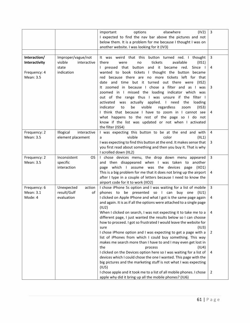
61 | P a g e
important options elsewhere (IV2) I expected to find the nav bar above the pictures and not below them. It is a problem for me because I thought I was on another website. I was looking for it (IV3)
3
Interaction/ Interactivity Frequency: 4 Mean: 3.5
Improper/vague/not visible interactive state indication
It was weird that this button turned red. I thought there were no tickets available (IIS1) I pressed that button and it became red. Since I wanted to book tickets I thought the button became red because there are no more tickets left for that date and time but it turned out there were (IIS2) It zoomed in because I chose a filter and as I was zoomed in I missed the loading indicator which was out of the range thus I was unsure if the filter I activated was actually applied. I need the loading indicator to be visible regardless zoom (IIS3) I think that because I have to zoom in I cannot see what happens to the rest of the page so I do not know if the list was updated or not when I activated the filter (ISS4)
3 4 3 4
Frequency: 2 Mean: 3.5
Illogical interactive element placement
I was expecting this button to be at the end and with a visible color (IIL1) I was expecting to find this button at the end. It makes sense that you first read about something and then you buy it. That is why I scrolled down (IIL2)
4 3
Frequency: 2 Mean: 3.5
Inconsistent OS specific interaction
I chose devices menu, the drop down menu appeared and then disappeared when I was taken to another page which I assume was the devices page (IIO1) This is a big problem for me that it does not bring up the airport after I type in a couple of letters because I need to know the airport code for it to work (IIO2)
3 4
Frequency: 6 Mean: 3.1 Mode: 4
Unexpected action result/Gulf of evaluation
I chose iPhone 5s option and I was waiting for a list of mobile phones to be presented so I can buy one (IU1) I clicked on Apple IPhone and what I got is the same page again and again. It is as if all the options were attached to a single page (IU2) When I clicked on search, I was not expecting it to take me to a different page, I just wanted the results below so I can choose how to proceed. I got so frustrated I would leave the website for sure (IU3) I chose iPhone option and I was expecting to get a page with a list of iPhones from which I could buy something. This way makes me search more than I have to and I may even get lost in the process (IU4) I clicked on the Devices option here so I was waiting for a list of devices which I could chose the one I wanted. This page with the big pictures and the marketing stuff is not what I was expecting (IU5) I chose apple and it took me to a list of all mobile phones. I chose apple why did it bring up all the mobile phones? (IU6)
3 4 4 2 4 2
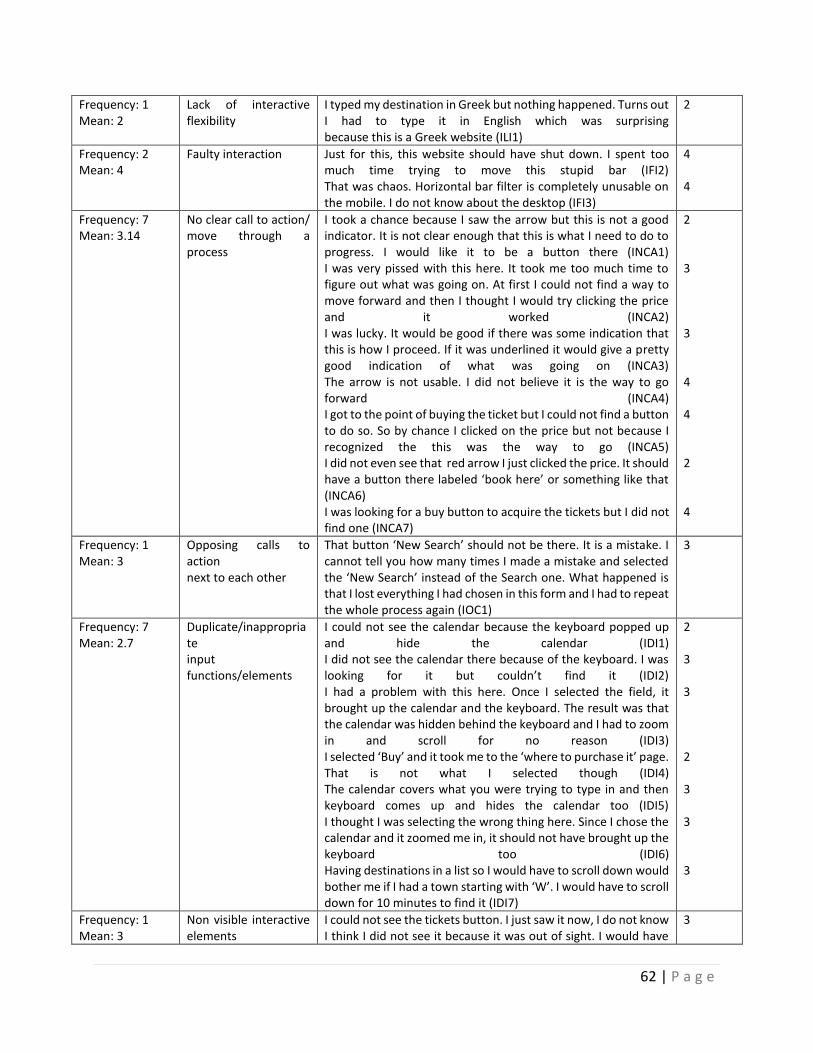
62 | P a g e
Frequency: 1 Mean: 2
Lack of interactive flexibility
I typed my destination in Greek but nothing happened. Turns out I had to type it in English which was surprising because this is a Greek website (ILI1)
2
Frequency: 2 Mean: 4
Faulty interaction Just for this, this website should have shut down. I spent too much time trying to move this stupid bar (IFI2) That was chaos. Horizontal bar filter is completely unusable on the mobile. I do not know about the desktop (IFI3)
4 4
Frequency: 7 Mean: 3.14
No clear call to action/ move through a process
I took a chance because I saw the arrow but this is not a good indicator. It is not clear enough that this is what I need to do to progress. I would like it to be a button there (INCA1) I was very pissed with this here. It took me too much time to figure out what was going on. At first I could not find a way to move forward and then I thought I would try clicking the price and it worked (INCA2) I was lucky. It would be good if there was some indication that this is how I proceed. If it was underlined it would give a pretty good indication of what was going on (INCA3) The arrow is not usable. I did not believe it is the way to go forward (INCA4) I got to the point of buying the ticket but I could not find a button to do so. So by chance I clicked on the price but not because I recognized the this was the way to go (INCA5) I did not even see that red arrow I just clicked the price. It should have a button there labeled ‘book here’ or something like that (INCA6) I was looking for a buy button to acquire the tickets but I did not find one (INCA7)
2 3 3 4 4 2 4
Frequency: 1 Mean: 3
Opposing calls to action next to each other
That button ‘New Search’ should not be there. It is a mistake. I cannot tell you how many times I made a mistake and selected the ‘New Search’ instead of the Search one. What happened is that I lost everything I had chosen in this form and I had to repeat the whole process again (IOC1)
3
Frequency: 7 Mean: 2.7
Duplicate/inappropriate input functions/elements
I could not see the calendar because the keyboard popped up and hide the calendar (IDI1) I did not see the calendar there because of the keyboard. I was looking for it but couldn’t find it (IDI2) I had a problem with this here. Once I selected the field, it brought up the calendar and the keyboard. The result was that the calendar was hidden behind the keyboard and I had to zoom in and scroll for no reason (IDI3) I selected ‘Buy’ and it took me to the ‘where to purchase it’ page. That is not what I selected though (IDI4) The calendar covers what you were trying to type in and then keyboard comes up and hides the calendar too (IDI5) I thought I was selecting the wrong thing here. Since I chose the calendar and it zoomed me in, it should not have brought up the keyboard too (IDI6) Having destinations in a list so I would have to scroll down would bother me if I had a town starting with ‘W’. I would have to scroll down for 10 minutes to find it (IDI7)
2 3 3 2 3 3 3
Frequency: 1 Mean: 3
Non visible interactive elements
I could not see the tickets button. I just saw it now, I do not know I think I did not see it because it was out of sight. I would have
3
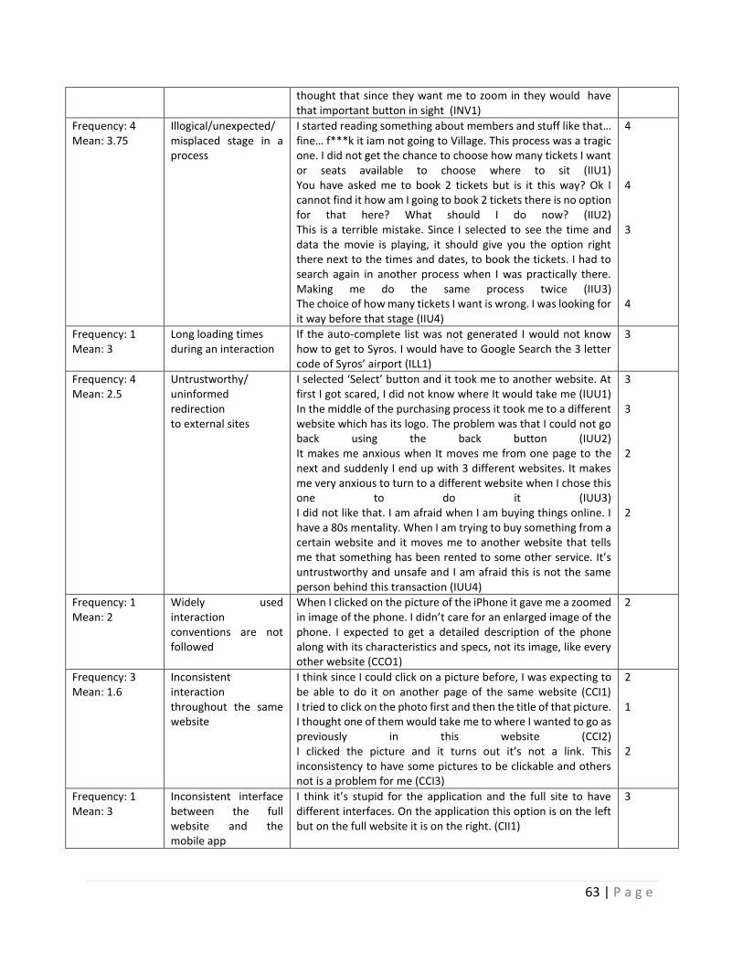
63 | P a g e
thought that since they want me to zoom in they would have that important button in sight (INV1)
Frequency: 4 Mean: 3.75
Illogical/unexpected/ misplaced stage in a process
I started reading something about members and stuff like that… fine… f***k it iam not going to Village. This process was a tragic one. I did not get the chance to choose how many tickets I want or seats available to choose where to sit (IIU1) You have asked me to book 2 tickets but is it this way? Ok I cannot find it how am I going to book 2 tickets there is no option for that here? What should I do now? (IIU2) This is a terrible mistake. Since I selected to see the time and data the movie is playing, it should give you the option right there next to the times and dates, to book the tickets. I had to search again in another process when I was practically there. Making me do the same process twice (IIU3) The choice of how many tickets I want is wrong. I was looking for it way before that stage (IIU4)
4 4 3 4
Frequency: 1 Mean: 3
Long loading times during an interaction
If the auto-complete list was not generated I would not know how to get to Syros. I would have to Google Search the 3 letter code of Syros’ airport (ILL1)
3
Frequency: 4 Mean: 2.5
Untrustworthy/ uninformed redirection to external sites
I selected ‘Select’ button and it took me to another website. At first I got scared, I did not know where It would take me (IUU1) In the middle of the purchasing process it took me to a different website which has its logo. The problem was that I could not go back using the back button (IUU2) It makes me anxious when It moves me from one page to the next and suddenly I end up with 3 different websites. It makes me very anxious to turn to a different website when I chose this one to do it (IUU3) I did not like that. I am afraid when I am buying things online. I have a 80s mentality. When I am trying to buy something from a certain website and it moves me to another website that tells me that something has been rented to some other service. It’s untrustworthy and unsafe and I am afraid this is not the same person behind this transaction (IUU4)
3 3 2 2
Frequency: 1 Mean: 2
Widely used interaction conventions are not followed
When I clicked on the picture of the iPhone it gave me a zoomed in image of the phone. I didn’t care for an enlarged image of the phone. I expected to get a detailed description of the phone along with its characteristics and specs, not its image, like every other website (CCO1)
2
Frequency: 3 Mean: 1.6
Inconsistent interaction throughout the same website
I think since I could click on a picture before, I was expecting to be able to do it on another page of the same website (CCI1) I tried to click on the photo first and then the title of that picture. I thought one of them would take me to where I wanted to go as previously in this website (CCI2) I clicked the picture and it turns out it’s not a link. This inconsistency to have some pictures to be clickable and others not is a problem for me (CCI3)
2 1 2
Frequency: 1 Mean: 3
Inconsistent interface between the full website and the mobile app
I think it’s stupid for the application and the full site to have different interfaces. On the application this option is on the left but on the full website it is on the right. (CII1)
3
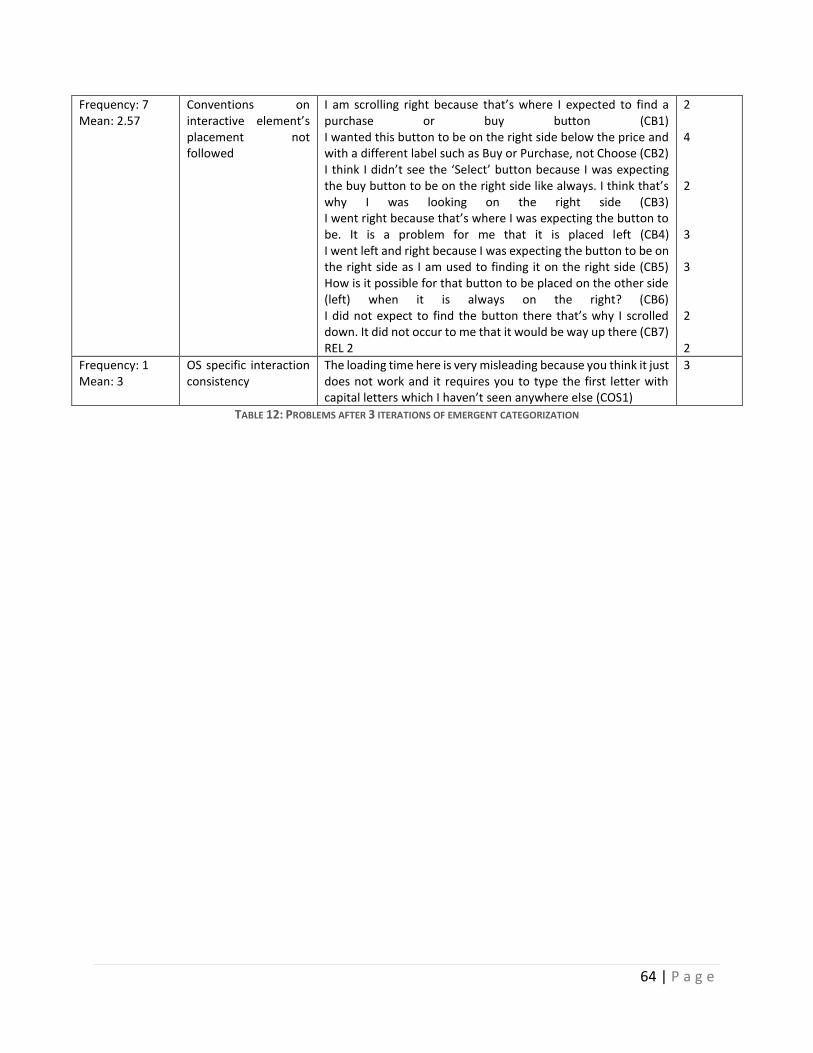
64 | P a g e
Frequency: 7 Mean: 2.57
Conventions on interactive element’s placement not followed
I am scrolling right because that’s where I expected to find a purchase or buy button (CB1) I wanted this button to be on the right side below the price and with a different label such as Buy or Purchase, not Choose (CB2) I think I didn’t see the ‘Select’ button because I was expecting the buy button to be on the right side like always. I think that’s why I was looking on the right side (CB3) I went right because that’s where I was expecting the button to be. It is a problem for me that it is placed left (CB4) I went left and right because I was expecting the button to be on the right side as I am used to finding it on the right side (CB5) How is it possible for that button to be placed on the other side (left) when it is always on the right? (CB6) I did not expect to find the button there that’s why I scrolled down. It did not occur to me that it would be way up there (CB7) REL 2
2 4 2 3 3 2 2
Frequency: 1 Mean: 3
OS specific interaction consistency
The loading time here is very misleading because you think it just does not work and it requires you to type the first letter with capital letters which I haven’t seen anywhere else (COS1)
3
TABLE 12: PROBLEMS AFTER 3 ITERATIONS OF EMERGENT CATEGORIZATION
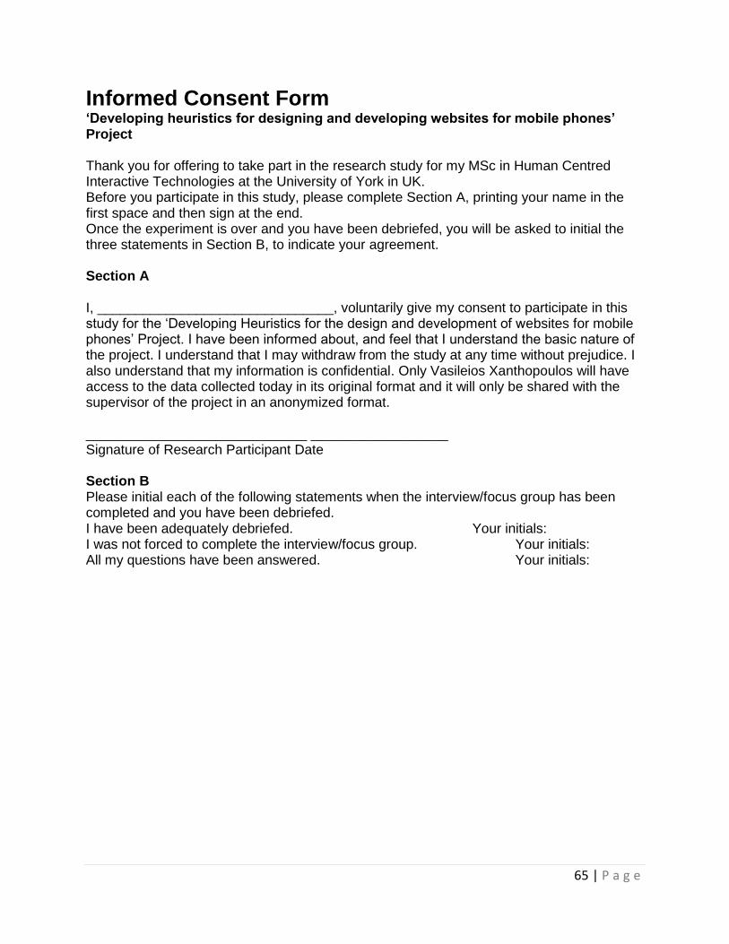
65 | P a g e
Informed Consent Form ‘Developing heuristics for designing and developing websites for mobile phones’ Project Thank you for offering to take part in the research study for my MSc in Human Centred Interactive Technologies at the University of York in UK. Before you participate in this study, please complete Section A, printing your name in the first space and then sign at the end. Once the experiment is over and you have been debriefed, you will be asked to initial the three statements in Section B, to indicate your agreement. Section A I, _______________________________, voluntarily give my consent to participate in this study for the ‘Developing Heuristics for the design and development of websites for mobile phones’ Project. I have been informed about, and feel that I understand the basic nature of the project. I understand that I may withdraw from the study at any time without prejudice. I also understand that my information is confidential. Only Vasileios Xanthopoulos will have access to the data collected today in its original format and it will only be shared with the supervisor of the project in an anonymized format. _____________________________ __________________ Signature of Research Participant Date Section B Please initial each of the following statements when the interview/focus group has been completed and you have been debriefed. I have been adequately debriefed. Your initials: I was not forced to complete the interview/focus group. Your initials: All my questions have been answered. Your initials:
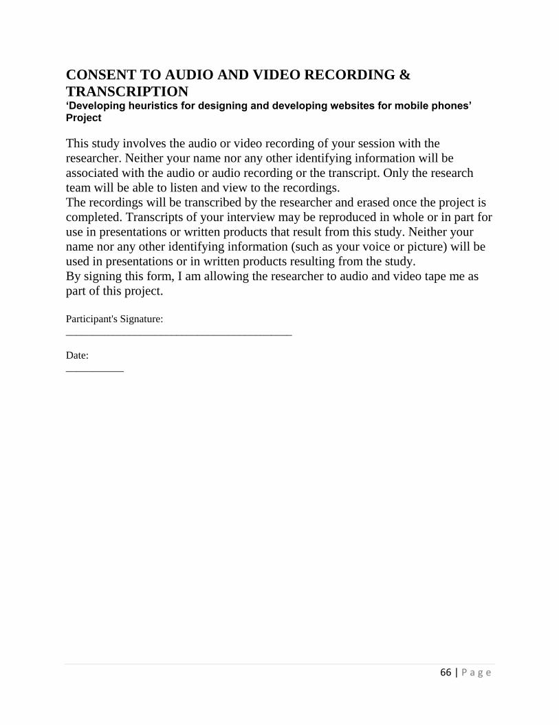
66 | P a g e
CONSENT TO AUDIO AND VIDEO RECORDING &
TRANSCRIPTION ‘Developing heuristics for designing and developing websites for mobile phones’ Project
This study involves the audio or video recording of your session with the
researcher. Neither your name nor any other identifying information will be
associated with the audio or audio recording or the transcript. Only the research
team will be able to listen and view to the recordings.
The recordings will be transcribed by the researcher and erased once the project is
completed. Transcripts of your interview may be reproduced in whole or in part for
use in presentations or written products that result from this study. Neither your
name nor any other identifying information (such as your voice or picture) will be
used in presentations or in written products resulting from the study.
By signing this form, I am allowing the researcher to audio and video tape me as
part of this project.
Participant's Signature:
___________________________________________
Date: ___________
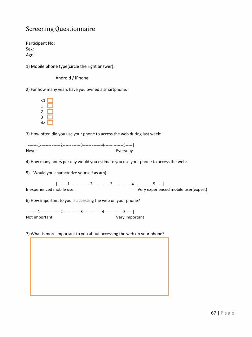
67 | P a g e
Screening Questionnaire Participant No: Sex: Age: 1) Mobile phone type(circle the right answer):
Android / iPhone 2) For how many years have you owned a smartphone:
<1 1 2 3 4>
3) How often did you use your phone to access the web during last week: |-------1-------- ------2------ ------3------ -------4------ -------5-----| Never Everyday 4) How many hours per day would you estimate you use your phone to access the web: 5) Would you characterize yourself as a(n):
|-------1-------- ------2------ ------3------ -------4------ -------5-----| Inexperienced mobile user Very experienced mobile user(expert) 6) How important to you is accessing the web on your phone? |-------1-------- ------2------ ------3------ -------4------ -------5-----| Not important Very important 7) What is more important to you about accessing the web on your phone?


