Embed Size (px)
Citation preview
IBM Cognos AnalyticsVersion 11.0.0
Dashboards and Stories User Guide
IBM

ii IBM Cognos Analytics Version 11.0.0: Dashboards and Stories User Guide
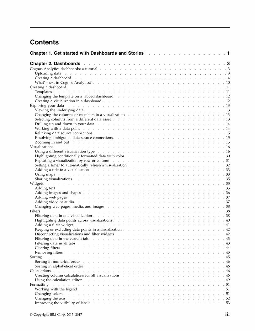
Contents
Chapter 1. Get started with Dashboards and Stories . . . . . . . . . . . . . . . . 1
Chapter 2. Dashboards . . . . . . . . . . . . . . . . . . . . . . . . . . . . . 3Cognos Analytics dashboards: a tutorial . . . . . . . . . . . . . . . . . . . . . . . . . . 3
Uploading data . . . . . . . . . . . . . . . . . . . . . . . . . . . . . . . . . 3Creating a dashboard . . . . . . . . . . . . . . . . . . . . . . . . . . . . . . . 4What's next in Cognos Analytics? . . . . . . . . . . . . . . . . . . . . . . . . . . . 10
Creating a dashboard . . . . . . . . . . . . . . . . . . . . . . . . . . . . . . . . 11Templates . . . . . . . . . . . . . . . . . . . . . . . . . . . . . . . . . . . 11Changing the template on a tabbed dashboard . . . . . . . . . . . . . . . . . . . . . . 12Creating a visualization in a dashboard . . . . . . . . . . . . . . . . . . . . . . . . . 12
Exploring your data . . . . . . . . . . . . . . . . . . . . . . . . . . . . . . . . 13Viewing the underlying data . . . . . . . . . . . . . . . . . . . . . . . . . . . . 13Changing the columns or members in a visualization . . . . . . . . . . . . . . . . . . . . 13Selecting columns from a different data asset . . . . . . . . . . . . . . . . . . . . . . . 13Drilling up and down in your data . . . . . . . . . . . . . . . . . . . . . . . . . . 14Working with a data point . . . . . . . . . . . . . . . . . . . . . . . . . . . . . 14Relinking data source connections . . . . . . . . . . . . . . . . . . . . . . . . . . . 15Resolving ambiguous data source connections . . . . . . . . . . . . . . . . . . . . . . . 15Zooming in and out . . . . . . . . . . . . . . . . . . . . . . . . . . . . . . . 15
Visualizations. . . . . . . . . . . . . . . . . . . . . . . . . . . . . . . . . . . 16Using a different visualization type . . . . . . . . . . . . . . . . . . . . . . . . . . 16Highlighting conditionally formatted data with color . . . . . . . . . . . . . . . . . . . . 30Repeating a visualization by row or column . . . . . . . . . . . . . . . . . . . . . . . 31Setting a timer to automatically refresh a visualization . . . . . . . . . . . . . . . . . . . . 32Adding a title to a visualization . . . . . . . . . . . . . . . . . . . . . . . . . . . 33Using maps . . . . . . . . . . . . . . . . . . . . . . . . . . . . . . . . . . 33Sharing visualizations . . . . . . . . . . . . . . . . . . . . . . . . . . . . . . . 35
Widgets . . . . . . . . . . . . . . . . . . . . . . . . . . . . . . . . . . . . 35Adding text . . . . . . . . . . . . . . . . . . . . . . . . . . . . . . . . . . 35Adding images and shapes . . . . . . . . . . . . . . . . . . . . . . . . . . . . . 36Adding web pages . . . . . . . . . . . . . . . . . . . . . . . . . . . . . . . . 37Adding video or audio . . . . . . . . . . . . . . . . . . . . . . . . . . . . . . 37Changing web pages, media, and images . . . . . . . . . . . . . . . . . . . . . . . . 38
Filters . . . . . . . . . . . . . . . . . . . . . . . . . . . . . . . . . . . . . 38Filtering data in one visualization . . . . . . . . . . . . . . . . . . . . . . . . . . . 38Highlighting data points across visualizations . . . . . . . . . . . . . . . . . . . . . . . 40Adding a filter widget . . . . . . . . . . . . . . . . . . . . . . . . . . . . . . . 41Keeping or excluding data points in a visualization . . . . . . . . . . . . . . . . . . . . . 42Disconnecting visualizations and filter widgets . . . . . . . . . . . . . . . . . . . . . . 42Filtering data in the current tab. . . . . . . . . . . . . . . . . . . . . . . . . . . . 43Filtering data in all tabs . . . . . . . . . . . . . . . . . . . . . . . . . . . . . . 43Clearing filters . . . . . . . . . . . . . . . . . . . . . . . . . . . . . . . . . 44Removing filters . . . . . . . . . . . . . . . . . . . . . . . . . . . . . . . . . 45
Sorting . . . . . . . . . . . . . . . . . . . . . . . . . . . . . . . . . . . . . 45Sorting in numerical order . . . . . . . . . . . . . . . . . . . . . . . . . . . . . 46Sorting in alphabetical order. . . . . . . . . . . . . . . . . . . . . . . . . . . . . 46
Calculations . . . . . . . . . . . . . . . . . . . . . . . . . . . . . . . . . . . 46Creating column calculations for all visualizations . . . . . . . . . . . . . . . . . . . . . 46Using the calculation editor . . . . . . . . . . . . . . . . . . . . . . . . . . . . . 49
Formatting . . . . . . . . . . . . . . . . . . . . . . . . . . . . . . . . . . . 51Working with the legend . . . . . . . . . . . . . . . . . . . . . . . . . . . . . . 51Changing colors . . . . . . . . . . . . . . . . . . . . . . . . . . . . . . . . . 51Changing the axis . . . . . . . . . . . . . . . . . . . . . . . . . . . . . . . . 52Improving the visibility of labels . . . . . . . . . . . . . . . . . . . . . . . . . . . 53
© Copyright IBM Corp. 2015, 2017 iii
Adding labels in the visualization . . . . . . . . . . . . . . . . . . . . . . . . . . . 53Changing the label orientation . . . . . . . . . . . . . . . . . . . . . . . . . . . . 54Connecting data points with smooth lines . . . . . . . . . . . . . . . . . . . . . . . . 54Using a different symbol . . . . . . . . . . . . . . . . . . . . . . . . . . . . . . 55Changing the size or color of bubbles . . . . . . . . . . . . . . . . . . . . . . . . . 55Changing the orientation of a word cloud . . . . . . . . . . . . . . . . . . . . . . . . 55Showing or hiding grid lines . . . . . . . . . . . . . . . . . . . . . . . . . . . . 55Working with objects . . . . . . . . . . . . . . . . . . . . . . . . . . . . . . . 56
Data properties . . . . . . . . . . . . . . . . . . . . . . . . . . . . . . . . . . 57Changing how data is aggregated . . . . . . . . . . . . . . . . . . . . . . . . . . . 57Editing column headings . . . . . . . . . . . . . . . . . . . . . . . . . . . . . . 58
Chapter 3. Stories . . . . . . . . . . . . . . . . . . . . . . . . . . . . . . . 59Assembling a story . . . . . . . . . . . . . . . . . . . . . . . . . . . . . . . . . 59Changing the timeline of a scene . . . . . . . . . . . . . . . . . . . . . . . . . . . . 61
Changing a timeline title for media, web pages, and images . . . . . . . . . . . . . . . . . . 62Adding extra animation effects . . . . . . . . . . . . . . . . . . . . . . . . . . . . . 62Highlighting data . . . . . . . . . . . . . . . . . . . . . . . . . . . . . . . . . 63Playing all scenes to the end and/or in a continuous loop . . . . . . . . . . . . . . . . . . . . 63Testing a story or a scene . . . . . . . . . . . . . . . . . . . . . . . . . . . . . . . 64
Index . . . . . . . . . . . . . . . . . . . . . . . . . . . . . . . . . . . . 65
iv IBM Cognos Analytics Version 11.0.0: Dashboards and Stories User Guide
Chapter 1. Get started with Dashboards and Stories
IBM® Cognos® Analytics provides dashboards and stories to communicate yourinsights and analysis. You can assemble a view that contains visualizations such asa graph, chart, plot, table, map, or any other visual representation of data.
Creating a dashboard or story
If you're new to dashboards and stories, review the following steps to understandthe general workflow to create a view.
1. Tap , and tap Dashboard, or tap Story.2. Select a template. Cognos Analytics provides templates that contain predefined
layouts and grid lines for easy arrangement and alignment of the visualizationsin a view.
3. Add visualizations to your view in one or more of the following ways:v If you know the type of visualization you want to use, select the
visualization type and then add columns to it.v If you know the data that you want to see, but are not sure about how to
present it, tap and add a source to the Selected sources panel. Then,drag columns onto the canvas. Cognos Analytics displays them in theappropriate visualization.
v Tap , and type a question or a statement. Cognos Analytics creates anappropriate visualization by analyzing the data in the data set to answer thequestion or intent of the statement.
v Drag your collected visualizations from the My pins panel to quickly build astory.
4. Limit the data that is displayed by filtering in one or more of the followingways:v You can filter individual visualizations or on all visualizations in the view.v You can even filter on a column that is not displayed in the visualization by
using a context filter.v You can select a specific value or a range of values.
5. Enhance your view and draw attention to visualizations by adding media, webpages, images, shapes, and text.
6. Personalize your view by changing the theme. You can choose from default,light, or dark themes. You can also customize specific visualization propertiessuch as fill and border color, and opacity.
7. Create more meaningful or complex visualizations by adding columns to anexisting visualization. Drag another column onto a visualization and it changesto match the new data added.
8. You can undo and redo your last actions in succession. The ability to undo andredo previous actions is available until you close the view.
9. Test the view.
© Copyright IBM Corp. 2015, 2017 1

2 IBM Cognos Analytics Version 11.0.0: Dashboards and Stories User Guide
Chapter 2. Dashboards
Explore powerful visualizations of your data in IBM Cognos Analytics anddiscover patterns and relationships that impact your business. Then communicatethe insights that you've discovered in a dashboard and share it with others.
Cognos Analytics dashboards: a tutorialIBM Cognos Analytics integrates reporting, modeling, analysis, dashboards, stories,and event management so you can understand your organization's data, and makeeffective business decisions.
This tutorial shows you the basics of creating a dashboard.
Scenario for the tutorial
In this tutorial, you're a Human Resources manager who has been given a bigproject – you'll be leading a new training initiative for your entire global company.You want to better understand where the training budget is currently invested inall areas of the company because at this moment, you just know how it's spent inyour area of the company.
Uploading dataLet's start by getting data for the tutorial. There are lots of sample data assets onthe IBM Cognos Analytics Community that you can use in IBM Cognos Analytics,including the one that's used in this tutorial.
Procedure1. Go to Human Resources Training on the Watson Analytics™ Resources page.
(https://www.ibm.com/communities/analytics/watson-analytics-blog/human-resources-training/)
2. Select “IBM_HR_Training 2014-17.csv”. Depending on your browser, you maybe asked what you want to do with it. Tap Save.
3. In Cognos Analytics, tap Browse.You can also tap the New icon and then tap Upload files.
© Copyright IBM Corp. 2015, 2017 3
4. Go to where you saved “IBM_HR_Training 2014-17.csv” and select it.The data asset appears in the My content folder.
Note: You can refine the data by filtering it or adding calculations or changingthe properties. However, we won't refine it in this tutorial.
5. Tap OK.
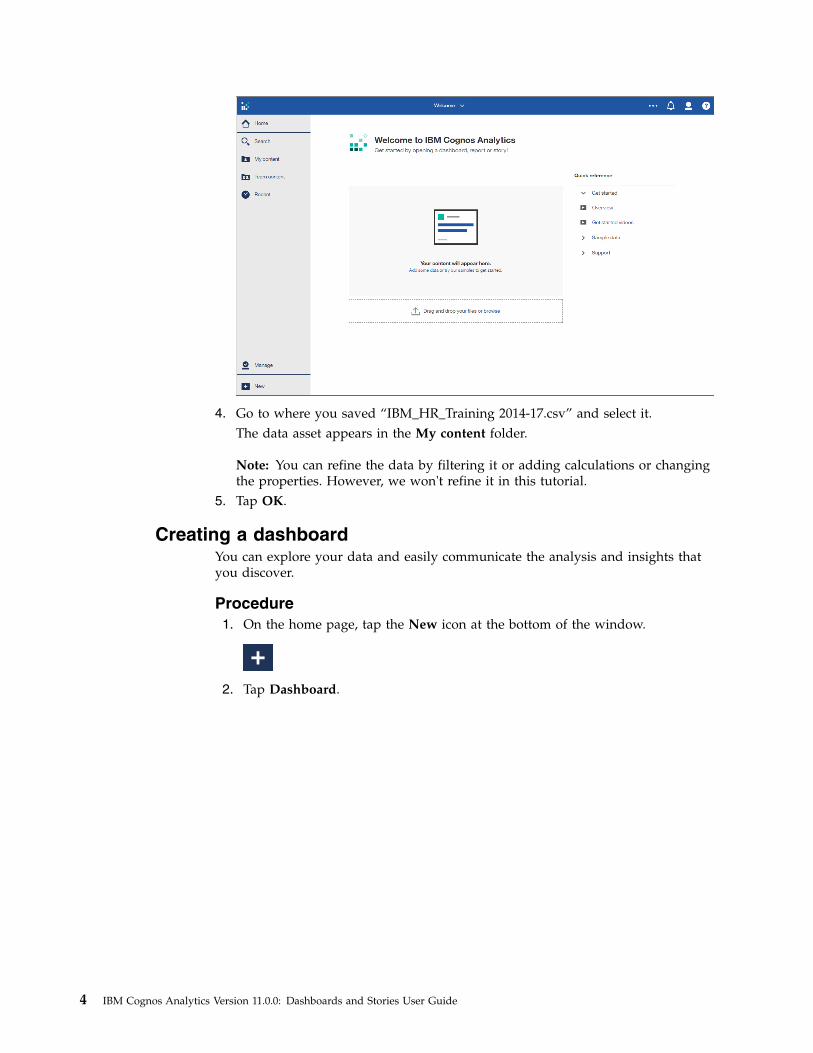
Creating a dashboardYou can explore your data and easily communicate the analysis and insights thatyou discover.
Procedure1. On the home page, tap the New icon at the bottom of the window.
2. Tap Dashboard.
4 IBM Cognos Analytics Version 11.0.0: Dashboards and Stories User Guide
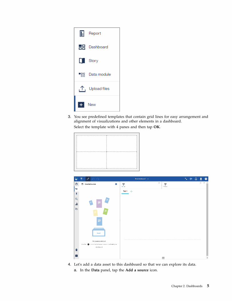
3. You see predefined templates that contain grid lines for easy arrangement andalignment of visualizations and other elements in a dashboard.Select the template with 4 panes and then tap OK.
4. Let's add a data asset to this dashboard so that we can explore its data.a. In the Data panel, tap the Add a source icon.
Chapter 2. Dashboards 5
b. Go to the My content folder and select “IBM_HR_Training_2014-17.csv”.Tap Add.
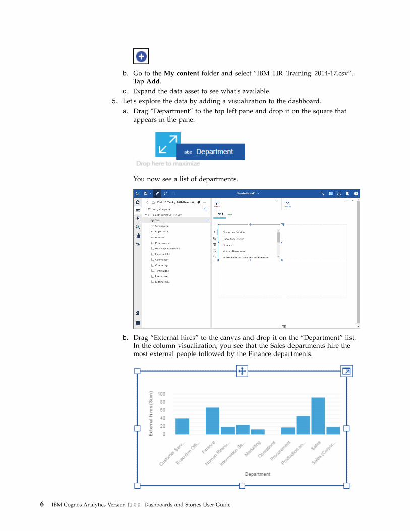
c. Expand the data asset to see what's available.5. Let's explore the data by adding a visualization to the dashboard.
a. Drag “Department” to the top left pane and drop it on the square thatappears in the pane.
You now see a list of departments.
b. Drag “External hires” to the canvas and drop it on the “Department” list.In the column visualization, you see that the Sales departments hire themost external people followed by the Finance departments.
6 IBM Cognos Analytics Version 11.0.0: Dashboards and Stories User Guide
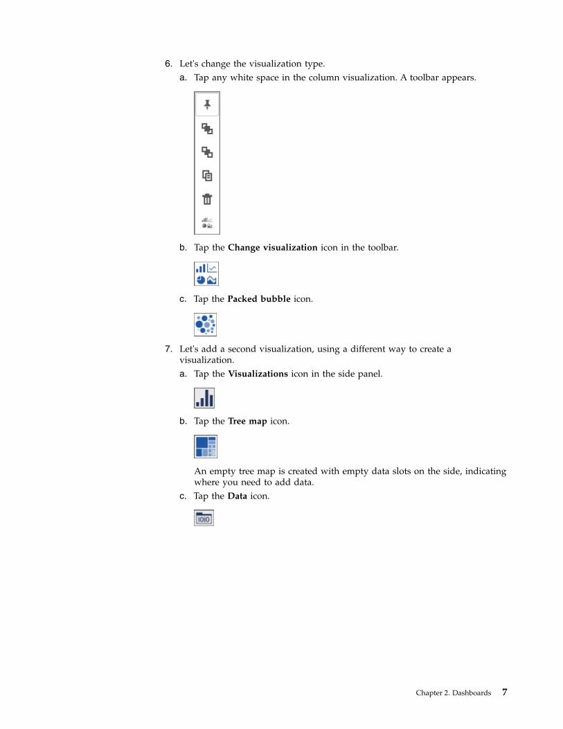
6. Let's change the visualization type.a. Tap any white space in the column visualization. A toolbar appears.
b. Tap the Change visualization icon in the toolbar.
c. Tap the Packed bubble icon.
7. Let's add a second visualization, using a different way to create avisualization.a. Tap the Visualizations icon in the side panel.
b. Tap the Tree map icon.
An empty tree map is created with empty data slots on the side, indicatingwhere you need to add data.
c. Tap the Data icon.
Chapter 2. Dashboards 7
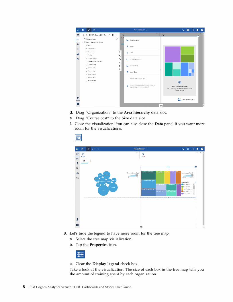
d. Drag “Organization” to the Area hierarchy data slot.e. Drag “Course cost” to the Size data slot.f. Close the visualization. You can also close the Data panel if you want more
room for the visualizations.
8. Let's hide the legend to have more room for the tree map.a. Select the tree map visualization.b. Tap the Properties icon.
c. Clear the Display legend check box.Take a look at the visualization. The size of each box in the tree map tells youthe amount of training spent by each organization.
8 IBM Cognos Analytics Version 11.0.0: Dashboards and Stories User Guide
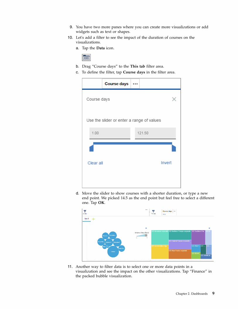
9. You have two more panes where you can create more visualizations or addwidgets such as text or shapes.
10. Let's add a filter to see the impact of the duration of courses on thevisualizations.a. Tap the Data icon.
b. Drag “Course days” to the This tab filter area.c. To define the filter, tap Course days in the filter area.
d. Move the slider to show courses with a shorter duration, or type a newend point. We picked 14.5 as the end point but feel free to select a differentone. Tap OK.
11. Another way to filter data is to select one or more data points in avisualization and see the impact on the other visualizations. Tap “Finance” inthe packed bubble visualization.
Chapter 2. Dashboards 9
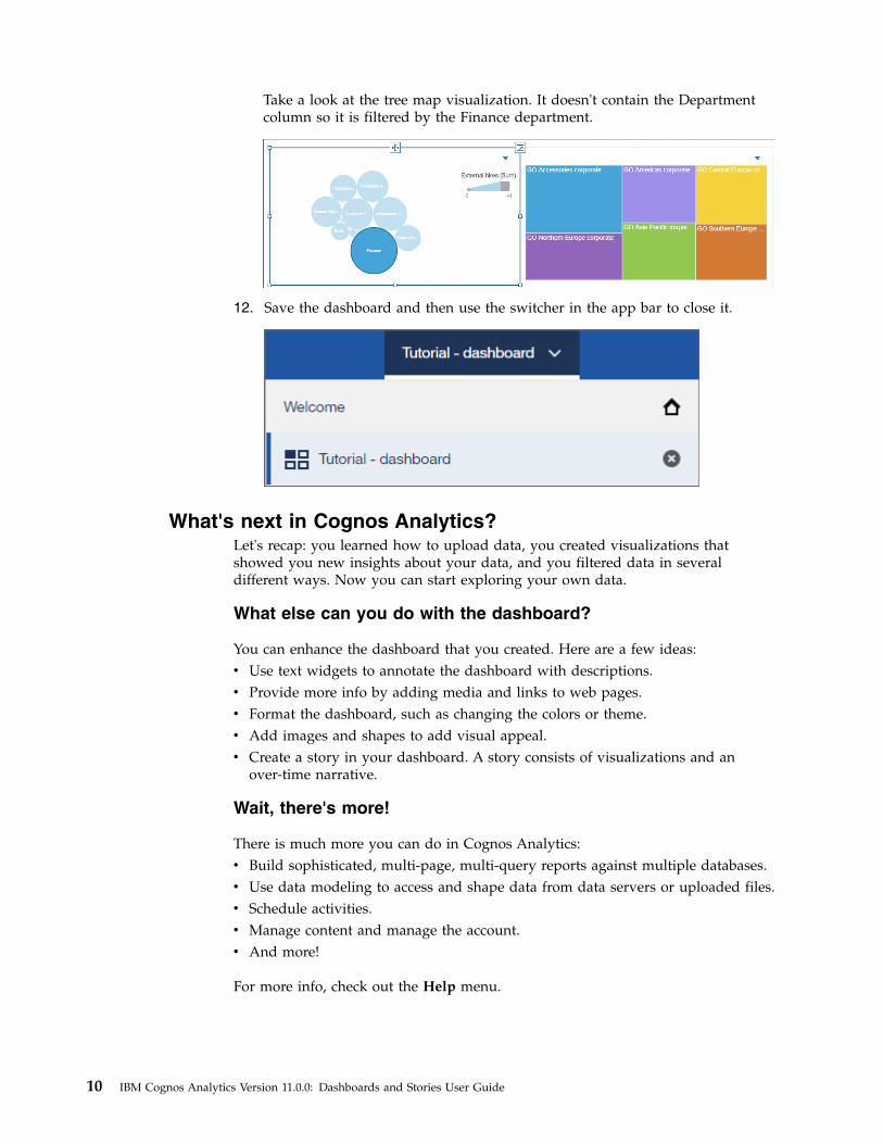
Take a look at the tree map visualization. It doesn't contain the Departmentcolumn so it is filtered by the Finance department.
12. Save the dashboard and then use the switcher in the app bar to close it.
What's next in Cognos Analytics?Let's recap: you learned how to upload data, you created visualizations thatshowed you new insights about your data, and you filtered data in severaldifferent ways. Now you can start exploring your own data.
What else can you do with the dashboard?
You can enhance the dashboard that you created. Here are a few ideas:v Use text widgets to annotate the dashboard with descriptions.v Provide more info by adding media and links to web pages.v Format the dashboard, such as changing the colors or theme.v Add images and shapes to add visual appeal.v Create a story in your dashboard. A story consists of visualizations and an
over-time narrative.
Wait, there's more!
There is much more you can do in Cognos Analytics:v Build sophisticated, multi-page, multi-query reports against multiple databases.v Use data modeling to access and shape data from data servers or uploaded files.v Schedule activities.v Manage content and manage the account.v And more!
For more info, check out the Help menu.
10 IBM Cognos Analytics Version 11.0.0: Dashboards and Stories User Guide
Have fun!
Creating a dashboardA dashboard helps you to monitor events or activities at a glance by providing keyinsights and analysis about your data on one or more pages or screens.
Procedure1. Tap the New icon and then tap Dashboard.
2. Select a template to use and tap OK.Predefined templates contain grid lines for easy arrangement and alignment ofvisualizations and other elements. For example, you can create an infographicto convey information with pictures on one page that you scroll through.
TemplatesIBM Cognos Analytics provides templates that contain predefined designs and gridlines for easy arrangement and alignment of the visualizations.
When you choose a template, consider the look that you want and the screen sizeof the device that will be used.
Freeform
A freeform template uses absolute positioning. The objects retain their size andposition, regardless of the screen size of the device that they are being viewed in.For small screen sizes, absolute positioning can increase the need for scrollingbecause objects are larger than the screen.
Freeform is one large area that is not divided into sections.
Choose freeform if you want visualizations to appear exactly as you size and placethem, regardless of the screen size of the device that they are viewed in.
Chapter 2. Dashboards 11
Other templates
The other templates use relative positioning. The objects adjust their size andposition, relative to each other, the data they show, and the screen size of thedevice that they are viewed in.
You can choose from several templates with various designs that divide the canvasinto separate sections. When you drag a column to the middle of a section, theresulting visualization maximizes to fill the entire section. When you drag anobject around on the canvas, grid lines appear to help you precisely align it.
Choose one of these templates if you want the size and position of visualizationsto adjust to fit into the screen size of the device that they are viewed in. Theappearance of the dashboard can change depending on the size of the screen that itis viewed in.
Changing the template on a tabbed dashboardYou can change the template while you’re assembling a tabbed dashboard. Afteryou change the template, move the objects around to fit.
Before you begin
You cannot change the template if you originally selected the Freeform template.
Procedure1. On a dashboard, double-click a tab.2. Tap the Change template icon.
3. Select a template.
Creating a visualization in a dashboardWhile assembling a dashboard, you may realize that you need anothervisualization. You can create one in the dashboard.
Procedure1. Tap the Data icon.
If you don't see the Data icon, tap the Edit or preview icon.
2. In the Data panel, expand the data asset that you want to use.If a different data asset is open, tap the Go back icon next to the name of thedata asset that is open.
3. To create the new visualization, complete one of the following actions:v Drag a column onto the canvas.
12 IBM Cognos Analytics Version 11.0.0: Dashboards and Stories User Guide
IBM Cognos Analytics creates a visualization to match the column. Forexample, when you add Year or Department, a table is created. Drag in ameasure, such as Revenue, and a bar visualization is created.
v Tap the Visualizations icon and select a type. Then add a column to eachdata slot.
Exploring your dataYou can explore the data that is shown in a visualization by using the interactivetitle, drilling up or down columns, and viewing the details of a data point.
Viewing the underlying dataThe data tray shows you all the rows and columns that are available for you toanalyze.
Procedure1. Tap the Data icon.
If you don't see the Data icon, tap the Edit or preview icon.
2. Review and explore the columns that are available for you to use.
Changing the columns or members in a visualizationYou can focus on points that are of interest to you by changing the data thatappears in the visualization.
Procedure1. Select the visualization that you want to work with.2. In the Selected sources panel, expand the data asset that you want to use.
If a different data asset is open, tap the Go back icon next to the name of thedata asset that is open.
3. To replace the column, drag a new column to the axis. For example, if you haveyears in one axis and you drop months on top of it, you now see data formonths.
4. To remove a column, tap the Menu icon and then tap Remove column.
Selecting columns from a different data assetYou can use data from more than one data asset in your dashboard. Eachvisualization must use data from a single data asset. You cannot use data frommultiple data assets in the same visualization.
Chapter 2. Dashboards 13
Procedure1. In the Selected sources panel, tap the Add a source icon.
If you don't see the Add a source icon, tap the Go back icon next to the nameof the data asset that is open.
2. Find and select the data asset that you want to use.3. Now you can drag items from the new data asset to the canvas of your
dashboard.
Drilling up and down in your dataExplore your data at different levels to gain a broader perspective or a moredetailed view.
Note: When you drill back up after drilling down, you may lose filters that areapplied. For example, you create a filter to include the data for sales regions of theUSA and Canada. You drill down on Florida. When you drill up again, theanalysis no longer includes Canada in its scope.
Procedure1. Right-click a label in the visualization.2. To see more details, tap the Drill down icon.
3. To gain a different or broader perspective, tap the Navigate icon and selectanother column to explore.
Working with a data pointYou can view details, select, or perform actions on a data point.
About this task
You can work with an individual data point in different ways:v You can view its details. Sometimes you want to see the data for one specific
part of a visualization. For example, a bar visualization shows you the monthlysales revenue for each country that you sell in. The bar for the UK in Januaryshows you the proportional share for the UK but not the revenue number.
v You can select it. This allows you to see the data point highlighted in all relatedvisualizations in the current tab of the dashboard.
v You can perform actions on it. For example, you can keep or exclude it in thevisualization, drill down into it, sort it, or filter it.
Procedure1. To view the details of a data point, such as a bar, slice, or bubble, hover over it.
A tooltip appears, showing information about the data point.
14 IBM Cognos Analytics Version 11.0.0: Dashboards and Stories User Guide
2. To select the data point, click it.3. To perform actions on the data point, right-click on it.
A tooltip appears with details about the data point. At the bottom of thetooltip, action buttons appear.
Relinking data source connectionsYou can relink a dashboard to the same source or to a different source directlyfrom the dashboard.
About this task
For example, your visualizations are linked to a source called "Sales Data". You canrelink your visualizations to an updated "Sales Data" source or to a different sourcecalled "Regional Sales Data". If the same column appears in both sources, thevisualization is updated automatically. If the columns don't match, thevisualization will indicate that a field is missing. To fix this, expand thevisualization and manually update the columns.
Note: When you relink a data source and there are multiple data sourceconnections and data source signons associated with your credentials, a promptasks you to resolve the ambiguous connections.
To switch the data source connection while you are authoring a dashboard or story,use Relink in the Selected sources panel.
Procedure1. Open the Selected sources panel.2. Tap the More icon beside a data source.
3. Tap Relink and browse to the data source that you want to use.
Resolving ambiguous data source connectionsWhen you open a dashboard or story and there are multiple data sourceconnections and data source sign-ons associated with your credentials, a promptasks you to resolve the ambiguous connections.
Procedure
When prompted, select a connection to use for your data source, and click OK.If your connection also has an ambiguous sign-on, you will get prompted twice;one prompt for the connection and then a second prompt for the sign-on.
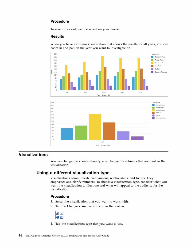
Zooming in and outSometimes you want to zoom in on a visualization to see the details, such as in alarge bar visualization. For the visualizations that support zoom, use the scrollbutton on your mouse or the icons in the visualization to zoom in and out.
Chapter 2. Dashboards 15
Procedure
To zoom in or out, use the wheel on your mouse.
Results
When you have a column visualization that shows the results for all years, you canzoom in and pan on the year you want to investigate on.
VisualizationsYou can change the visualization type or change the columns that are used in thevisualization.
Using a different visualization typeVisualizations communicate comparisons, relationships, and trends. Theyemphasize and clarify numbers. To choose a visualization type, consider what youwant the visualization to illustrate and what will appeal to the audience for thevisualization.
Procedure1. Select the visualization that you want to work with.2. Tap the Change visualization icon in the toolbar.
3. Tap the visualization type that you want to use.
16 IBM Cognos Analytics Version 11.0.0: Dashboards and Stories User Guide
Take a look at how each visualization type communicates data differently. Forexample, use a bar, column, or line visualization to compare a set of values.Use a line or area visualization to track relationships. Use a tree map or pievisualization to see the parts of a whole.
4. If you select a visualization type that requires different data slots to be used,add a column to each empty data slot that has an asterisk (*) in it.
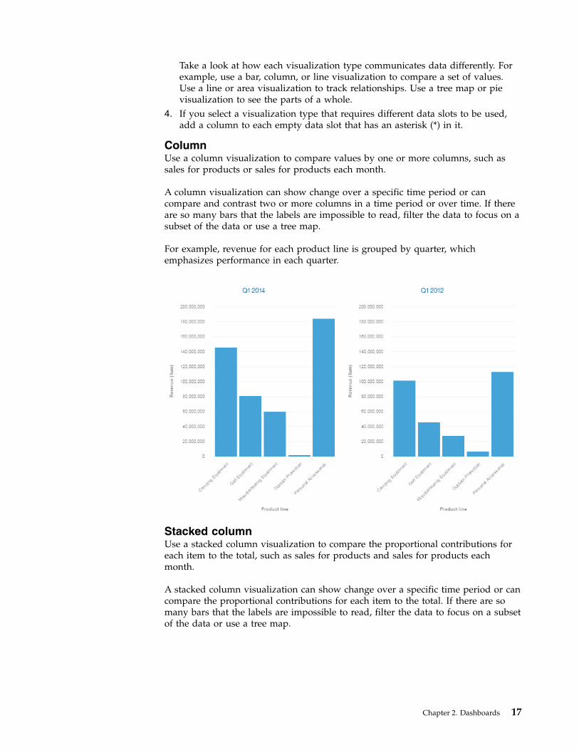
ColumnUse a column visualization to compare values by one or more columns, such assales for products or sales for products each month.
A column visualization can show change over a specific time period or cancompare and contrast two or more columns in a time period or over time. If thereare so many bars that the labels are impossible to read, filter the data to focus on asubset of the data or use a tree map.
For example, revenue for each product line is grouped by quarter, whichemphasizes performance in each quarter.
Stacked columnUse a stacked column visualization to compare the proportional contributions foreach item to the total, such as sales for products and sales for products eachmonth.
A stacked column visualization can show change over a specific time period or cancompare the proportional contributions for each item to the total. If there are somany bars that the labels are impossible to read, filter the data to focus on a subsetof the data or use a tree map.
Chapter 2. Dashboards 17
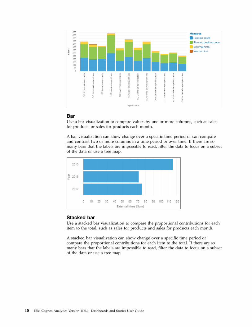
BarUse a bar visualization to compare values by one or more columns, such as salesfor products or sales for products each month.
A bar visualization can show change over a specific time period or can compareand contrast two or more columns in a time period or over time. If there are somany bars that the labels are impossible to read, filter the data to focus on a subsetof the data or use a tree map.
Stacked barUse a stacked bar visualization to compare the proportional contributions for eachitem to the total, such as sales for products and sales for products each month.
A stacked bar visualization can show change over a specific time period orcompare the proportional contributions for each item to the total. If there are somany bars that the labels are impossible to read, filter the data to focus on a subsetof the data or use a tree map.
18 IBM Cognos Analytics Version 11.0.0: Dashboards and Stories User Guide
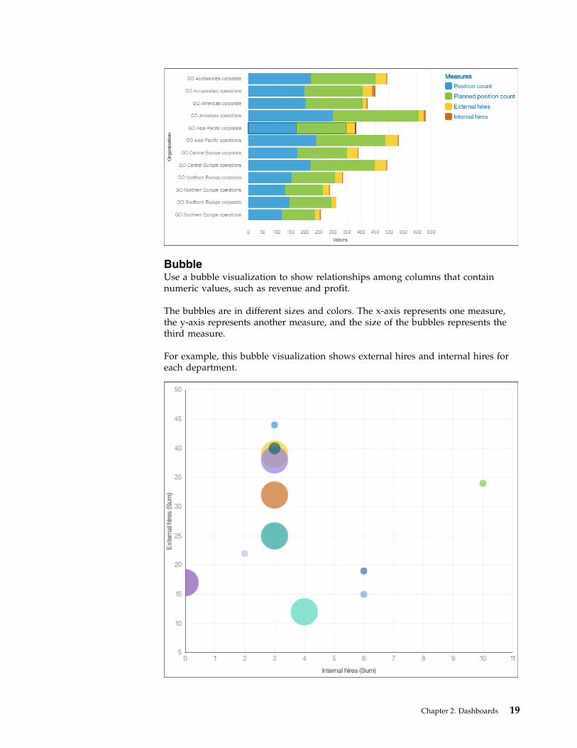
BubbleUse a bubble visualization to show relationships among columns that containnumeric values, such as revenue and profit.
The bubbles are in different sizes and colors. The x-axis represents one measure,the y-axis represents another measure, and the size of the bubbles represents thethird measure.
For example, this bubble visualization shows external hires and internal hires foreach department.
Chapter 2. Dashboards 19
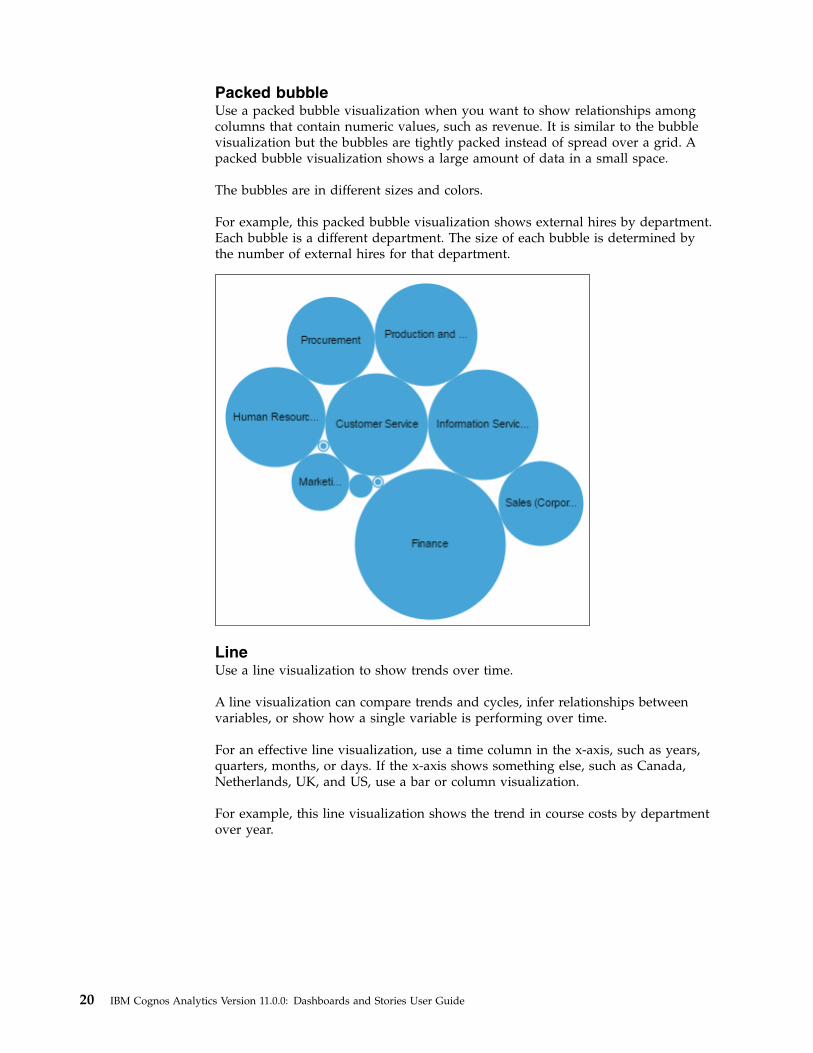
Packed bubbleUse a packed bubble visualization when you want to show relationships amongcolumns that contain numeric values, such as revenue. It is similar to the bubblevisualization but the bubbles are tightly packed instead of spread over a grid. Apacked bubble visualization shows a large amount of data in a small space.
The bubbles are in different sizes and colors.
For example, this packed bubble visualization shows external hires by department.Each bubble is a different department. The size of each bubble is determined bythe number of external hires for that department.
LineUse a line visualization to show trends over time.
A line visualization can compare trends and cycles, infer relationships betweenvariables, or show how a single variable is performing over time.
For an effective line visualization, use a time column in the x-axis, such as years,quarters, months, or days. If the x-axis shows something else, such as Canada,Netherlands, UK, and US, use a bar or column visualization.
For example, this line visualization shows the trend in course costs by departmentover year.
20 IBM Cognos Analytics Version 11.0.0: Dashboards and Stories User Guide
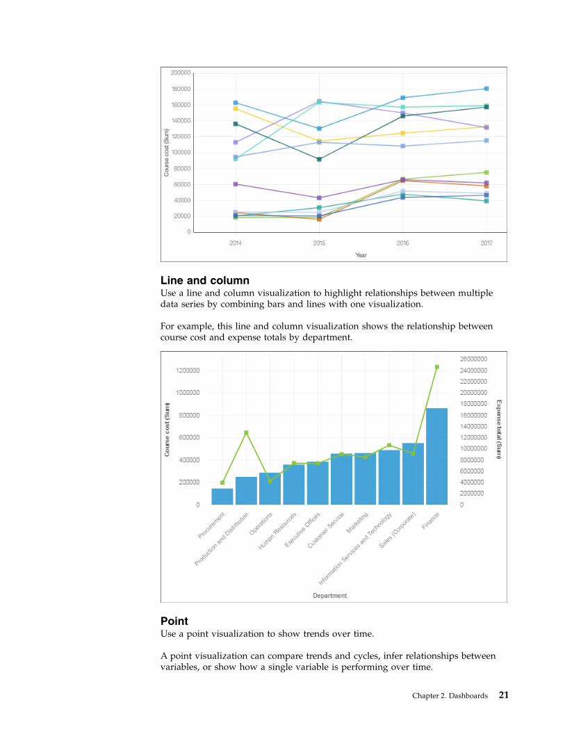
Line and columnUse a line and column visualization to highlight relationships between multipledata series by combining bars and lines with one visualization.
For example, this line and column visualization shows the relationship betweencourse cost and expense totals by department.
PointUse a point visualization to show trends over time.
A point visualization can compare trends and cycles, infer relationships betweenvariables, or show how a single variable is performing over time.
Chapter 2. Dashboards 21
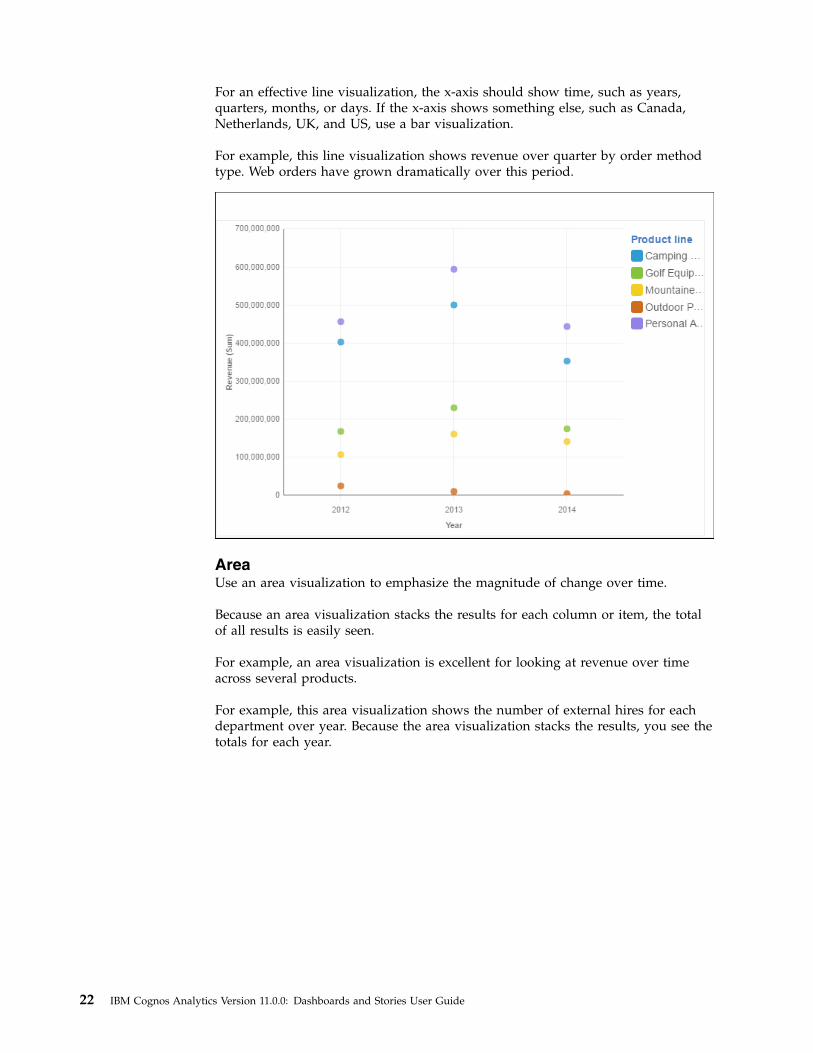
For an effective line visualization, the x-axis should show time, such as years,quarters, months, or days. If the x-axis shows something else, such as Canada,Netherlands, UK, and US, use a bar visualization.
For example, this line visualization shows revenue over quarter by order methodtype. Web orders have grown dramatically over this period.
AreaUse an area visualization to emphasize the magnitude of change over time.
Because an area visualization stacks the results for each column or item, the totalof all results is easily seen.
For example, an area visualization is excellent for looking at revenue over timeacross several products.
For example, this area visualization shows the number of external hires for eachdepartment over year. Because the area visualization stacks the results, you see thetotals for each year.
22 IBM Cognos Analytics Version 11.0.0: Dashboards and Stories User Guide
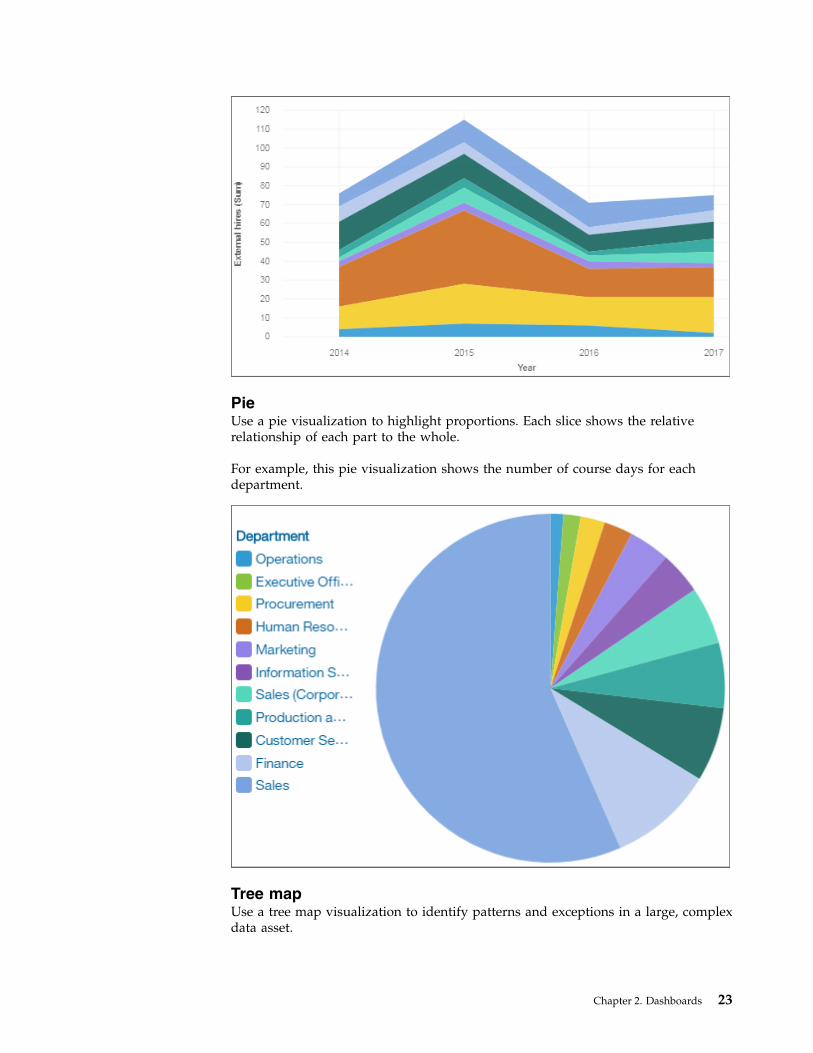
PieUse a pie visualization to highlight proportions. Each slice shows the relativerelationship of each part to the whole.
For example, this pie visualization shows the number of course days for eachdepartment.
Tree mapUse a tree map visualization to identify patterns and exceptions in a large, complexdata asset.
Chapter 2. Dashboards 23
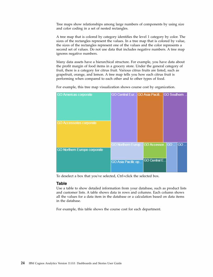
Tree maps show relationships among large numbers of components by using sizeand color coding in a set of nested rectangles.
A tree map that is colored by category identifies the level 1 category by color. Thesizes of the rectangles represent the values. In a tree map that is colored by value,the sizes of the rectangles represent one of the values and the color represents asecond set of values. Do not use data that includes negative numbers. A tree mapignores negative numbers.
Many data assets have a hierarchical structure. For example, you have data aboutthe profit margin of food items in a grocery store. Under the general category offruit, there is a category for citrus fruit. Various citrus fruits are listed, such asgrapefruit, orange, and lemon. A tree map tells you how each citrus fruit isperforming when compared to each other and to other types of food.
For example, this tree map visualization shows course cost by organization.
To deselect a box that you've selected, Ctrl+click the selected box.
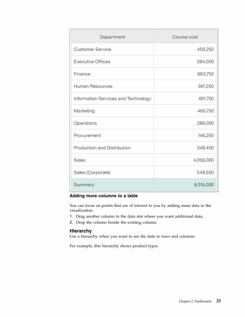
TableUse a table to show detailed information from your database, such as product listsand customer lists. A table shows data in rows and columns. Each column showsall the values for a data item in the database or a calculation based on data itemsin the database.
For example, this table shows the course cost for each department.
24 IBM Cognos Analytics Version 11.0.0: Dashboards and Stories User Guide
Adding more columns to a table
You can focus on points that are of interest to you by adding more data to thevisualization.1. Drag another column to the data slot where you want additional data.2. Drop the column beside the existing column.
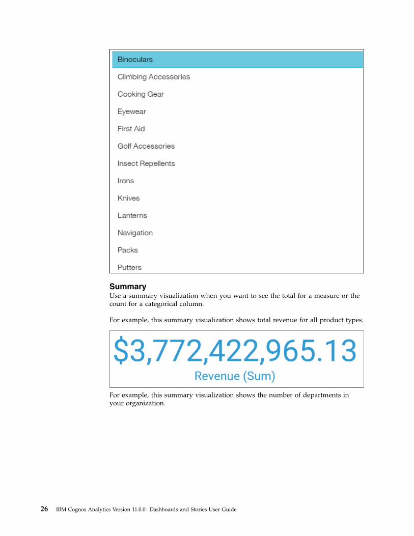
HierarchyUse a hierarchy when you want to see the data in rows and columns.
For example, this hierarchy shows product types.
Chapter 2. Dashboards 25
SummaryUse a summary visualization when you want to see the total for a measure or thecount for a categorical column.
For example, this summary visualization shows total revenue for all product types.
For example, this summary visualization shows the number of departments inyour organization.
26 IBM Cognos Analytics Version 11.0.0: Dashboards and Stories User Guide
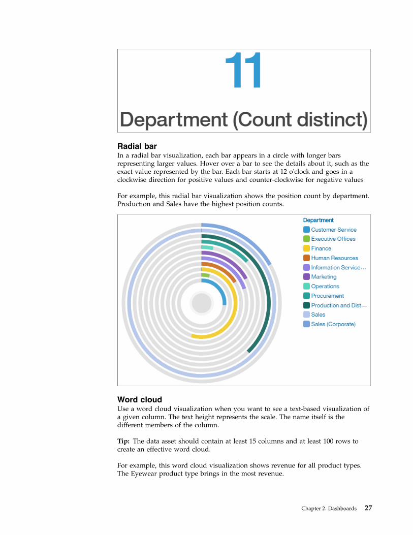
Radial barIn a radial bar visualization, each bar appears in a circle with longer barsrepresenting larger values. Hover over a bar to see the details about it, such as theexact value represented by the bar. Each bar starts at 12 o'clock and goes in aclockwise direction for positive values and counter-clockwise for negative values
For example, this radial bar visualization shows the position count by department.Production and Sales have the highest position counts.
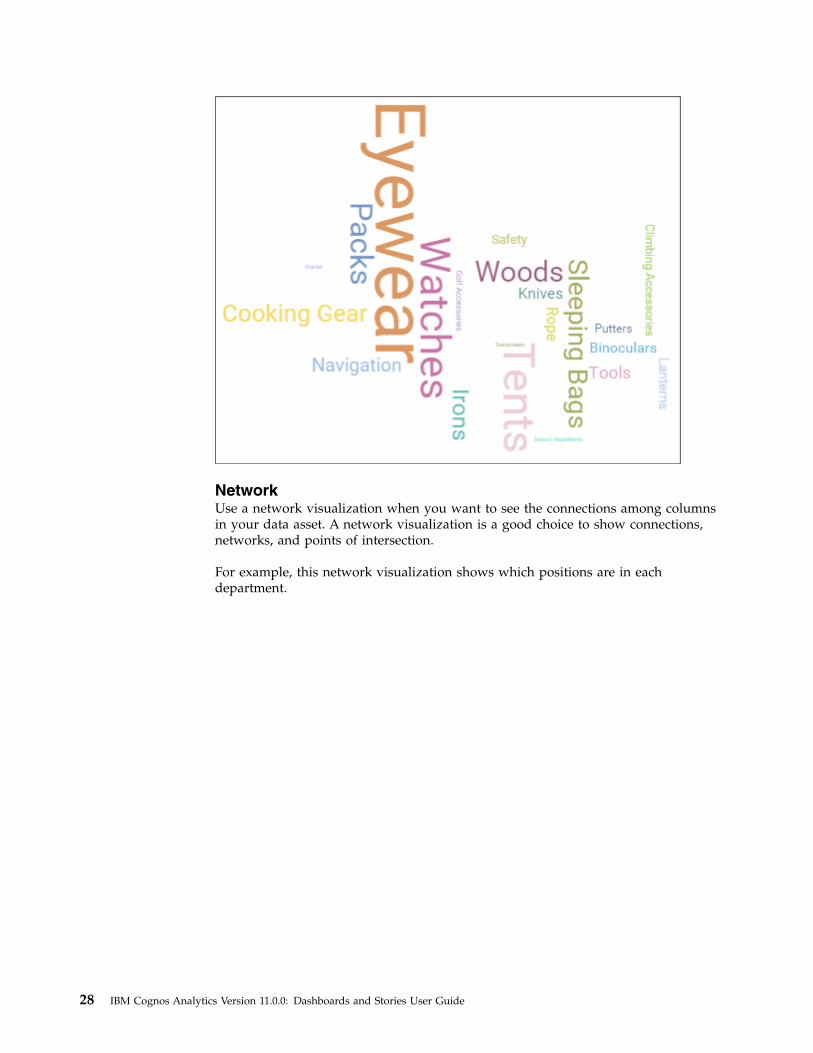
Word cloudUse a word cloud visualization when you want to see a text-based visualization ofa given column. The text height represents the scale. The name itself is thedifferent members of the column.
Tip: The data asset should contain at least 15 columns and at least 100 rows tocreate an effective word cloud.
For example, this word cloud visualization shows revenue for all product types.The Eyewear product type brings in the most revenue.
Chapter 2. Dashboards 27
NetworkUse a network visualization when you want to see the connections among columnsin your data asset. A network visualization is a good choice to show connections,networks, and points of intersection.
For example, this network visualization shows which positions are in eachdepartment.
28 IBM Cognos Analytics Version 11.0.0: Dashboards and Stories User Guide
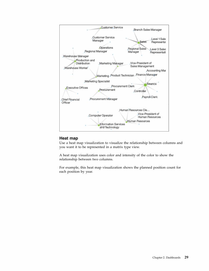
Heat mapUse a heat map visualization to visualize the relationship between columns andyou want it to be represented in a matrix type view.
A heat map visualization uses color and intensity of the color to show therelationship between two columns.
For example, this heat map visualization shows the planned position count foreach position by year.
Chapter 2. Dashboards 29
Data playerUse a data player to see an animation of the impact of a column on the othervisualizations.
Highlighting conditionally formatted data with colorConditional formatting allows you to see the distribution of your data andhighlight exceptional data points by using color in your table or crosstabvisualizations. For example, you might want to highlight low sales numbers in red,or use green to highlight sales numbers over a certain threshold.
Procedure1. Open a table or crosstab visualization.
2. Drag the measure that you want to highlight to the Color data slot.3. Close the visualization.
4. To edit the conditional formatting, tap the visualization, then tap .Use the sliders at the bottom of the visualization.v You can add a handle to add another color category. You can display up to
five color categories on your slider. To add a handle, tap the canvas underthe slider close to where you want the new handle to appear.
v You can manually expand the range of values on the slider. Tap the first or
last handle on the slider and drag it outside the current range. Thevalues on the slider will increase.
30 IBM Cognos Analytics Version 11.0.0: Dashboards and Stories User Guide
v You can remove a handle from the slider. To do so, right-click thehandle and tap the Delete icon.
5. To use a different color palette, or to change the order of the colors on thepalette, select the visualization, tap the Properties icon and then tap the Detailstab.
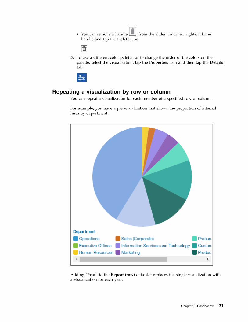
Repeating a visualization by row or columnYou can repeat a visualization for each member of a specified row or column.
For example, you have a pie visualization that shows the proportion of internalhires by department.
Adding “Year” to the Repeat (row) data slot replaces the single visualization witha visualization for each year.
Chapter 2. Dashboards 31
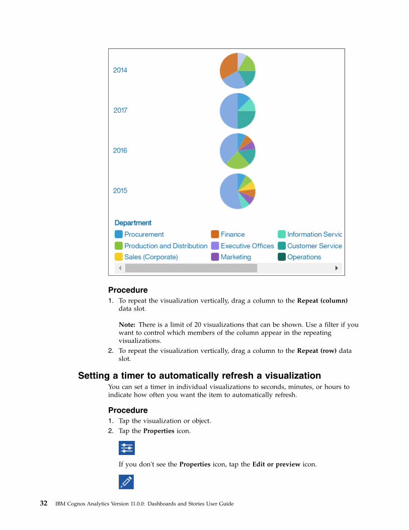
Procedure1. To repeat the visualization vertically, drag a column to the Repeat (column)
data slot.
Note: There is a limit of 20 visualizations that can be shown. Use a filter if youwant to control which members of the column appear in the repeatingvisualizations.
2. To repeat the visualization vertically, drag a column to the Repeat (row) dataslot.
Setting a timer to automatically refresh a visualizationYou can set a timer in individual visualizations to seconds, minutes, or hours toindicate how often you want the item to automatically refresh.
Procedure1. Tap the visualization or object.2. Tap the Properties icon.
If you don't see the Properties icon, tap the Edit or preview icon.
32 IBM Cognos Analytics Version 11.0.0: Dashboards and Stories User Guide
3. In the Details tab, select the Refresh automatically check box and set therefresh frequency to seconds, minutes, or hours.
Adding a title to a visualizationAdd clarity by adding a title to any visualization.
Procedure1. Tap the visualization or object.2. Tap the Properties icon.
If you don't see the Properties icon, tap the Edit or preview icon.
3. In the General tab, select the Show title check box and enter the title in thevisualization.
Tip: By default, the Show title check box is not selected.
Using mapsMaps help you to do geographic analysis of data by using locations such as states,regions, and postal codes.
Over 235,000 administrative boundaries and over 220,000 zip and postal codes inover 245 countries are supported.
Note: For a complete list of supported locations, follow these steps:1. Go to the Box folder at https://ibm.box.com/s/
rvqticfej2fadqybittgg484hbfe81q4.2. Click the Mapping folder.3. Download and extract the file IBM Cognos Analytics Mapping.zip.4. View the archive, for example:v IBM Cognos Analytics Mapping Admin Boundary Types and Post
Regions.xlsx
This spreadsheet contains the types of administrative and postal boundariesby country.
v IBM Cognos Analytics Mapping Named Administrative Boundaries.xlsx
This spreadsheet contains the names of the administrative boundaries bycountry.
Data is mapped by matching the location name on the map with a location in yourdata.
Dashboards have a limit of plotting or mapping a maximum of 3000 data points onany visualization.
Adding a map to a dashboardWhen you use a map in a dashboard, you can show data for one location measure,either as a filled region, a point, or both.
Chapter 2. Dashboards 33
Before you begin
You must have access to the IBM Cognos samples. This procedure uses the IBMCognos GO Sales sample data. If your administrator installed these samples, theyare in Team content > Samples > Models > GO Sales (query).
About this task
This procedure shows you how to create a map that shows revenue by region andgross profit as points.
Note: Other names for a map are polygon, filled region, and choropleth.
Procedure
Create the map and add revenue by region.1. Click New and then click Dashboard.2. Leave the default values in the Select a template window and click OK.
3. In the left pane, click the Visualizations icon , and then click the Mapicon.
4. In the left pane, click Sources, and then click Add a Source.5. Click Team content > Samples > Models > GO Sales (query) and click Add.6. Expand GO Sales (query) > go_sales > Sales (query) > Sales, and drag
Revenue to the Location color data slot.7. Expand Branch and drag City to the Locations data slot. The map is
populated and a yellow triangle displays in the upper right corner of the map.
Tip: Zoom in and zoom out of the map to see more or less detail. Click anddrag to move around the map.
8. Click the yellow triangle. A window displays the unresolved locationsinformation. There are two types of unresolved locations: ambiguous regionand unrecognized location. To resolve the first problem, add categories torefine the locations. For example, add Province or state and Country to theLocation data slot. To resolve the second problem, cleanse your data byrenaming the locations.
9. To add points to the map, drag measures to the Point size and Point colordata slots.
10. Save the dashboard when you're done.
Using latitude and longitude locations in a mapWhen you use a map in a dashboard, you can show data for multiple layers:regions, points, and latitude/longitude locations.
Before you begin
To use latitude/longitude locations in your map, use a data source that containslatitude and longitude data. For example:
Table 1. Example table with latitude and longitude data
City Longitude Latitude Rating Surveys
Antwerp 4.402771 51.260197 7 30.000
34 IBM Cognos Analytics Version 11.0.0: Dashboards and Stories User Guide
Table 1. Example table with latitude and longitude data (continued)
City Longitude Latitude Rating Surveys
Brussels 4.355607 50.878899 9 76.000
At the top of the data slot pane, click the down arrow and selectLatitude/Longitude.
Note: The format of the longitude and latitude data must be as follows: Lat51.260197 , Long 4.402771. The format 51° 26’ 01.97’’ N , 4° 40’ 2.771’’ E isnot supported.
Procedure1. Click New and then click Dashboard.2. Leave the default values in the Select a template window and click OK.
3. In the left pane, click the Visualizations icon , and then click the Mapicon.
4. In the left pane, click Sources, and then click Add a Source. Select a datasource that contains longitude and latitude data.
5. In the visualization, expand and select Longitude/Longitude.6. In the left pane, expand your data items and drag latitude and longitude to the
Latitude and Longitude data slots.7. Drag City to the Label data slot. The latitude, longitude, name of the city
appears when you hover over the data points.8. Drag rating to the Size data slot and drag Surveys to the Color data slot.
Sharing visualizationsYou can communicate your results with anyone outside of IBM Cognos Analytics.
Sharing visualizations through a linkYou can share direct access to a dashboard or story by using a URL link. Therecipient of the link must be a valid IBM Cognos Analytics user in the sameaccount and have permission to access the related data.
Procedure1. Go to the My content folder.2. Tap More beside the dashboard or story that you want a link for.
3. Tap the Share icon .4. Copy the link and paste it into another application.
For example, send the link by email to another user.
WidgetsYou can add widgets such as text, media, web pages, images, and shapes.
Adding textReinforce your analysis by adding text to your dashboards and stories. Forexample, you can highlight key points shown in a visualization and providebackground info.
Chapter 2. Dashboards 35
Procedure1. Tap the Widgets icon.
If you don't see the Widgets icon, tap the Edit or preview icon first.
2. If you want to position the widget yourself, drag the Text icon to the canvas. Ifyou want the widget to fill the next available pane in the template, tap the Texticon.
3. Type in the text box and then tap away from it.4. To format the text, double-click the text and change one or more of the
following properties:v Fontv Font sizev Colorv Alignmentv Style, such as bold, underline, or italic
Adding images and shapesImprove the look and feel of your dashboards and stories by adding images andshapes.
Procedure1. Tap the Widgets icon.
If you don't see the Widgets icon, tap the Edit or preview icon.
2. To add an image from the Widgets tab, complete the following actions:a. If you want to position the image widget yourself, drag the Image icon to
the canvas. If you want the widget to fill the next available pane in thetemplate, tap the Image icon.
b. Enter the URL, and press Enter to save it.Note these requirements for images:v Use one of the following formats for images: JPEG, JPG, GIF, PNGv Use HTTP or HTTPS (secure HTTP) format. URLs are validated for
format only; you must ensure that the link is valid.
36 IBM Cognos Analytics Version 11.0.0: Dashboards and Stories User Guide
3. If your administrator has customized the Widgets panel with additionalimages:a. Select the Image library tab.b. Click an image to add it to your dashboard.
4. To add a shape, complete one of the following actions:v If you want to position the shape yourself, drag the shape that you want to
the canvas.v If you want the shape to fill the next available pane in the template, tap the
icon for the shape.
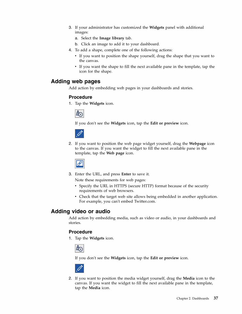
Adding web pagesAdd action by embedding web pages in your dashboards and stories.
Procedure1. Tap the Widgets icon.
If you don't see the Widgets icon, tap the Edit or preview icon.
2. If you want to position the web page widget yourself, drag the Webpage iconto the canvas. If you want the widget to fill the next available pane in thetemplate, tap the Web page icon.
3. Enter the URL, and press Enter to save it.Note these requirements for web pages:v Specify the URL in HTTPS (secure HTTP) format because of the security
requirements of web browsers.v Check that the target web site allows being embedded in another application.
For example, you can't embed Twitter.com.
Adding video or audioAdd action by embedding media, such as video or audio, in your dashboards andstories.
Procedure1. Tap the Widgets icon.
If you don't see the Widgets icon, tap the Edit or preview icon.
2. If you want to position the media widget yourself, drag the Media icon to thecanvas. If you want the widget to fill the next available pane in the template,tap the Media icon.
Chapter 2. Dashboards 37
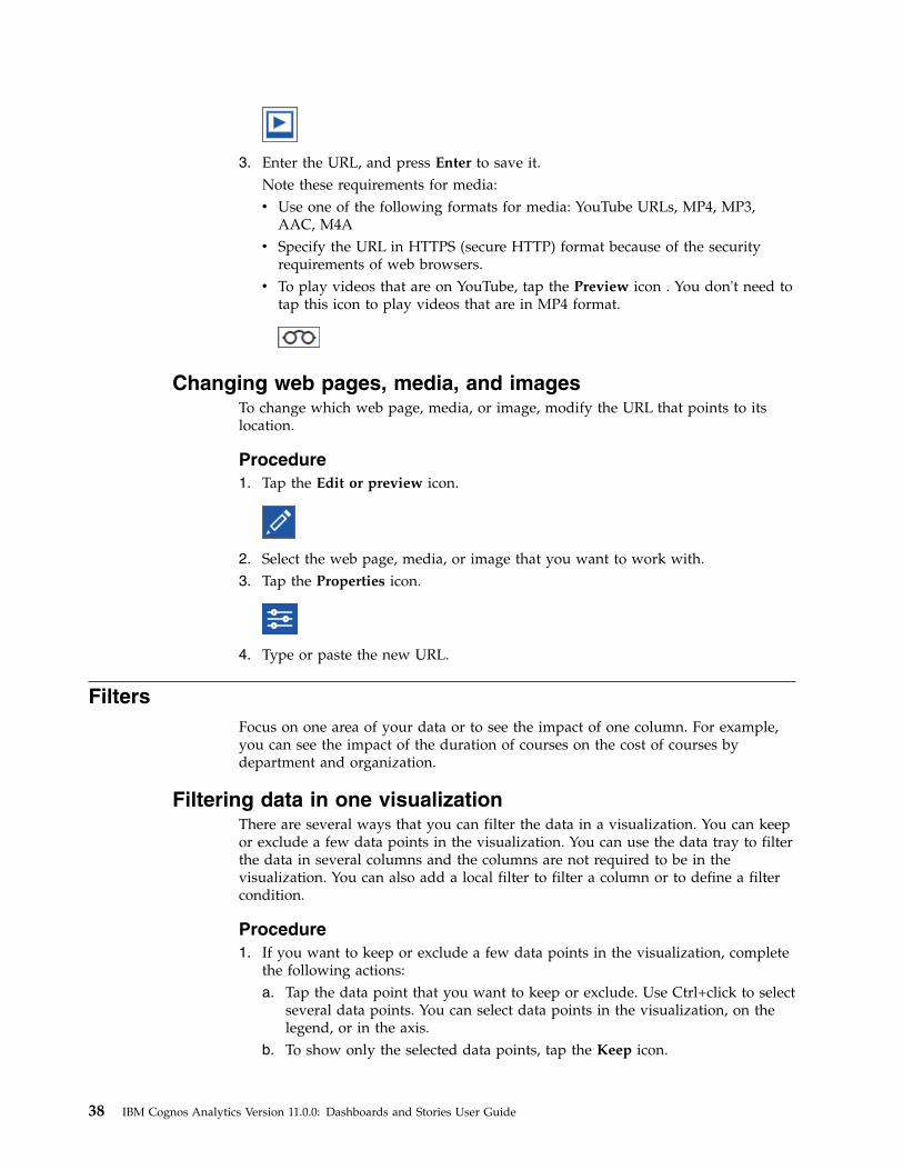
3. Enter the URL, and press Enter to save it.Note these requirements for media:v Use one of the following formats for media: YouTube URLs, MP4, MP3,
AAC, M4Av Specify the URL in HTTPS (secure HTTP) format because of the security
requirements of web browsers.v To play videos that are on YouTube, tap the Preview icon . You don't need to
tap this icon to play videos that are in MP4 format.
Changing web pages, media, and imagesTo change which web page, media, or image, modify the URL that points to itslocation.
Procedure1. Tap the Edit or preview icon.
2. Select the web page, media, or image that you want to work with.3. Tap the Properties icon.
4. Type or paste the new URL.
FiltersFocus on one area of your data or to see the impact of one column. For example,you can see the impact of the duration of courses on the cost of courses bydepartment and organization.
Filtering data in one visualizationThere are several ways that you can filter the data in a visualization. You can keepor exclude a few data points in the visualization. You can use the data tray to filterthe data in several columns and the columns are not required to be in thevisualization. You can also add a local filter to filter a column or to define a filtercondition.
Procedure1. If you want to keep or exclude a few data points in the visualization, complete
the following actions:a. Tap the data point that you want to keep or exclude. Use Ctrl+click to select
several data points. You can select data points in the visualization, on thelegend, or in the axis.
b. To show only the selected data points, tap the Keep icon.
38 IBM Cognos Analytics Version 11.0.0: Dashboards and Stories User Guide
All other data points are excluded from the visualization.c. To hide the selected data points, tap the Exclude icon.
2. If you want to filter the data in one or more columns, complete the followingactions:a. Tap the Open data tray icon at the bottom of the canvas.
If you don't see the Open data tray icon, tap the Edit or preview icon.
b. Tap a column heading in the data tray.c. Tap Filter.d. Specify what will be filtered on.v If the column contains numeric data, use the sliders or enter a range of
values to filter on.v If the column is a hierarchy, expand the levels in the hierarchy and select
the members or levels that you want. For example, select 2017 and eachquarter in 2016.
v If the column has the data type of date, time, or timestamp (also knownas datetime), select before, after, or between for the dates to include in thefilter.
v If the column contains text, tap one or more members to filter on. Or youcan add a filter condition. With a filter condition, you have the followingoptions: Equals, Contains, Begins with, Ends with, Does not equal,Does not contain, Does not begin with, and Does not end with.
e. If you want to select many values, select the ones that you don't want andtap Invert.
f. To apply the filter, tap OK.3. If you want to define a filter condition or filter a column in a visualization,
complete the following actions:a. Open a visualization.
If you don't see this icon, tap the Edit or preview icon.
b. Tap the Data icon and expand the data asset that you want to use.
c. Drag a column into the Local filters box.d. Select the members that you want to use in the filter or add a filter
condition.
Chapter 2. Dashboards 39
If you decide to add a filter conditions, you have the following options:Equals, Contains, Begins with, Ends with, Does not equal, Does notcontain, Does not begin with, and Does not end with.
e. If you want to select many values, select the ones that you don't want andtap Invert.
f. To apply the filter, tap OK.4. Close the visualization.
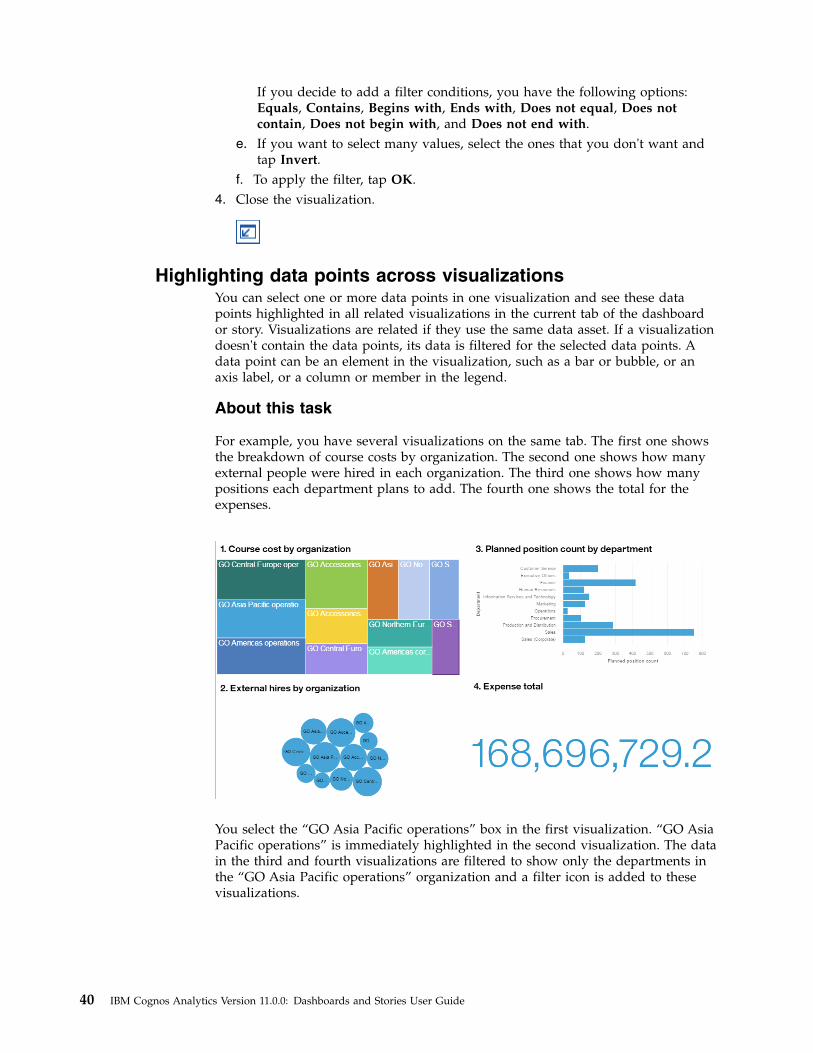
Highlighting data points across visualizationsYou can select one or more data points in one visualization and see these datapoints highlighted in all related visualizations in the current tab of the dashboardor story. Visualizations are related if they use the same data asset. If a visualizationdoesn't contain the data points, its data is filtered for the selected data points. Adata point can be an element in the visualization, such as a bar or bubble, or anaxis label, or a column or member in the legend.
About this task
For example, you have several visualizations on the same tab. The first one showsthe breakdown of course costs by organization. The second one shows how manyexternal people were hired in each organization. The third one shows how manypositions each department plans to add. The fourth one shows the total for theexpenses.
You select the “GO Asia Pacific operations” box in the first visualization. “GO AsiaPacific operations” is immediately highlighted in the second visualization. The datain the third and fourth visualizations are filtered to show only the departments inthe “GO Asia Pacific operations” organization and a filter icon is added to thesevisualizations.
40 IBM Cognos Analytics Version 11.0.0: Dashboards and Stories User Guide
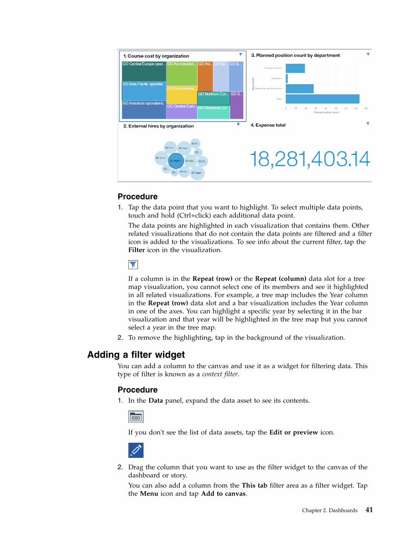
Procedure1. Tap the data point that you want to highlight. To select multiple data points,
touch and hold (Ctrl+click) each additional data point.The data points are highlighted in each visualization that contains them. Otherrelated visualizations that do not contain the data points are filtered and a filtericon is added to the visualizations. To see info about the current filter, tap theFilter icon in the visualization.
If a column is in the Repeat (row) or the Repeat (column) data slot for a treemap visualization, you cannot select one of its members and see it highlightedin all related visualizations. For example, a tree map includes the Year columnin the Repeat (row) data slot and a bar visualization includes the Year columnin one of the axes. You can highlight a specific year by selecting it in the barvisualization and that year will be highlighted in the tree map but you cannotselect a year in the tree map.
2. To remove the highlighting, tap in the background of the visualization.
Adding a filter widgetYou can add a column to the canvas and use it as a widget for filtering data. Thistype of filter is known as a context filter.
Procedure1. In the Data panel, expand the data asset to see its contents.
If you don't see the list of data assets, tap the Edit or preview icon.
2. Drag the column that you want to use as the filter widget to the canvas of thedashboard or story.You can also add a column from the This tab filter area as a filter widget. Tapthe Menu icon and tap Add to canvas.
Chapter 2. Dashboards 41
3. Filter the data in the visualizations.v If the column contains distinct values, select the values that you want to use
in the filter widget.v If the column is a hierarchy, expand the levels in the hierarchy and select the
members or levels that you want. For example, select 2017 and each quarterin 2016.
v If the column has the data type of date, time, or timestamp (also known asdatetime), select before, after, or between for the dates to include in the filter.
Keeping or excluding data points in a visualizationYou can keep or exclude specific data points in a visualization. For example, anoutlier makes it hard to see the other data points in the visualization.
Procedure1. Select the discovery that you want to work with.2. Right-click a data point in the visualization or in the legend. Use Ctrl+click to
select several data points.3. To display only the selected data points, tap Keep. The filter is applied to that
visualization only. All other data points are excluded from the visualization.4. To hide the selected data points, tap Exclude. The filter is applied to that
visualization only.5. To remove the Keep or Exclude filter, right-click the column on the axis and
tap Select items. For example, if you excluded one year, you right-click theYear column on the axis.
Disconnecting visualizations and filter widgetsBy default, visualizations and filter widgets communicate with each other. Whenyou highlight a data point in one visualization or filter widget, you filter the datain all other visualizations or filter widgets that use the same data. Sometimes youwant to keep one or more visualizations not change when you highlight a datapoint elsewhere.
You can see what's connected, create new connections, disable connections, andcreate new groups of connections. To view and modify widget connections, theremust be at least two visualizations or filter widgets on the canvas.
Procedure1. On the app bar, tap the View widget connection icon.
Matching numbers on the visualizations and filter widgets mean that they areconnected to each other. The visualizations and filter widget must come fromthe same source to be connected.
2. Tap a visualization or filter widget with a number shown in the middle.3. To disconnect a visualization or filter widget from all others on the canvas, tap
the Break all links icon.
42 IBM Cognos Analytics Version 11.0.0: Dashboards and Stories User Guide
4. To create a new connection, tap the Create new connection icon.
5. To add a visualization or filter widget to an existing group of connections, tapthe Add to an existing connection icon and select the connection.
6. To stop working with the widget connections, tap the View widget connectionsicon again.
Filtering data in the current tabYou can filter the data that appears in all visualizations that use the selected dataasset in the current tab of the dashboard or story.
If you add the same column to the All tabs filter and to the This tab filter, themembers that you pick in the All tabs filter are applied to the This tab filter. Forexample, you add the Year column to both filters. You filter All tabs to show 2015,2016, and 2017. The This tab filter will show only these years and you can filterthe years further.
You cannot drag a column between the All tabs and This tab filter areas.
Procedure1. In the Data panel, expand the data asset to see its contents.
If you don't see the list of data assets, tap the Edit or preview icon.
2. Drag one or more columns to the This tab filter area. You can change the orderof columns that have been added to the filter.
Tip: Any selections made in the current tab are cleared when applying anyfilter in the This Tab filter area by selecting a subset of values.
3. To define the filter, tap the column in the This tab filter area.v If the column contains distinct values, select the member or members that
you want to filter on.v If the column contains continuous values, use the slider to select a range of
values to filter on. You can also tap the start or end points of the range andenter a number.
v If the column is a hierarchy, expand the levels in the hierarchy and select themembers or levels that you want. For example, select 2017 and each quarterin 2016.
v If the column has the data type of date, time, or timestamp (also known asdatetime), select before, after, or between for the dates to include in the filter.
4. Tap OK.
Filtering data in all tabsYou can add a filter to apply to all visualizations that use the selected data asset inall tabs of your dashboard. Infographics don't have multiple tabs.
Chapter 2. Dashboards 43
If you add the same column to the All tabs filter and to the This tab filter, themembers that you pick in the All tabs filter are applied to the This tab filter. Forexample, you add the Year column to both filters. You filter All tabs to show 2015,2016, and 2017. The This tab filter will show only these years and you can filterthe years further.
You cannot drag a column between the All tabs and This tab filter areas.
Note: Filters are not supported for decision tree visualizations or spiralvisualizations.
Procedure1. In the Data panel, expand the data asset to see its contents.
If you don't see the list of data assets, tap the Edit or preview icon.
2. Drag one or more columns to the All tabs filter area. You can change the orderof columns that have been added to the filter.
Tip: Any selections made in all tabs are cleared when applying any filter in theAll Tabs filter area by selecting a subset of values.
3. To define the filter, tap the column in the All tabs filter area.v If the column contains distinct values, select the member or members that
you want to filter on.v If the column contains continuous values, use the slider to select a range of
values to filter on. You can also tap the start or end points of the range andenter a number.
v If the column is a hierarchy, expand the levels in the hierarchy and select themembers or levels that you want. For example, select 2017 and each quarterin 2016.
v If the column has the data type of date, time, or timestamp (also known asdatetime), select before, after, or between for the dates to include in the filter.
4. Tap OK.
Clearing filtersYou can quickly clear the values that you've filtered on and select new values for adashboard or story.
Procedure1. To clear the values that you filtered on in the This tab filter area, tap the Menu
icon in the This tab filter area and tap Clear all columns.
If you don't see the Menu icon, tap the Edit or preview icon.
2. To clear the values that you filtered on in the All tabs filter area, tap the Menuicon in the All tabs filter area and tap Clear all columns.
44 IBM Cognos Analytics Version 11.0.0: Dashboards and Stories User Guide
3. To clear the values that you selected in a filter widget, tap the Menu icon in thefilter widget and tap Clear all. Then tap Apply.
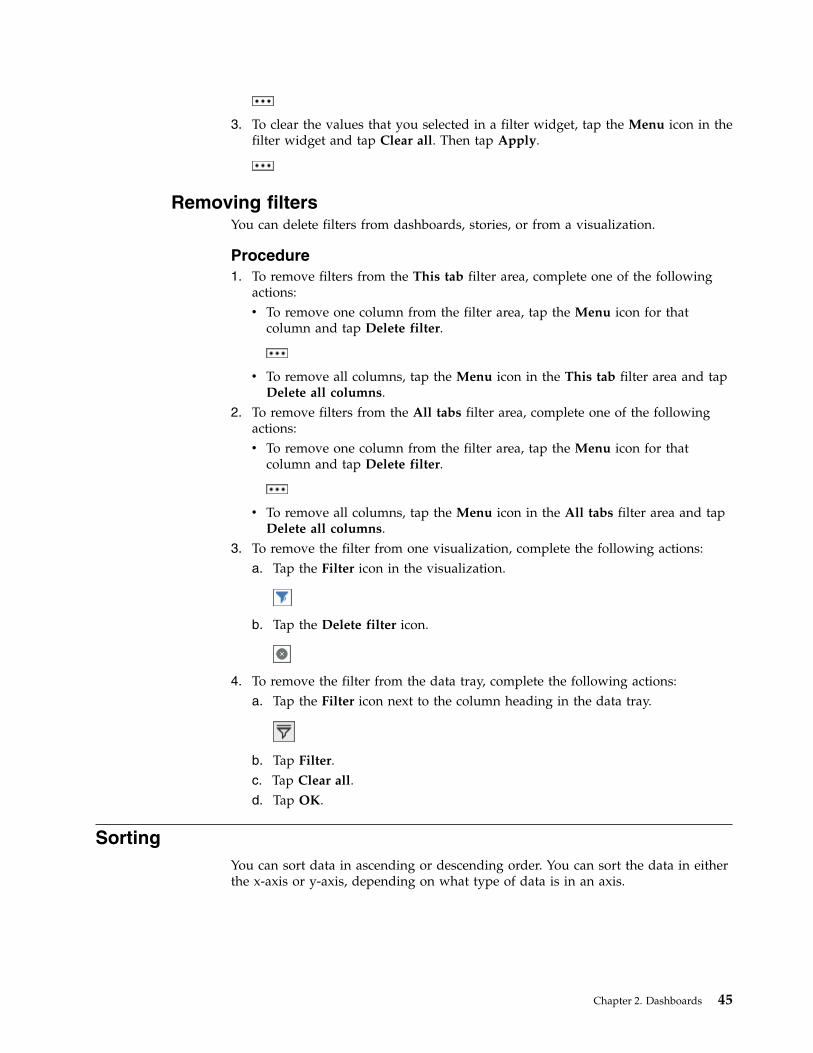
Removing filtersYou can delete filters from dashboards, stories, or from a visualization.
Procedure1. To remove filters from the This tab filter area, complete one of the following
actions:v To remove one column from the filter area, tap the Menu icon for that
column and tap Delete filter.
v To remove all columns, tap the Menu icon in the This tab filter area and tapDelete all columns.
2. To remove filters from the All tabs filter area, complete one of the followingactions:v To remove one column from the filter area, tap the Menu icon for that
column and tap Delete filter.
v To remove all columns, tap the Menu icon in the All tabs filter area and tapDelete all columns.
3. To remove the filter from one visualization, complete the following actions:a. Tap the Filter icon in the visualization.
b. Tap the Delete filter icon.
4. To remove the filter from the data tray, complete the following actions:a. Tap the Filter icon next to the column heading in the data tray.
b. Tap Filter.c. Tap Clear all.d. Tap OK.
SortingYou can sort data in ascending or descending order. You can sort the data in eitherthe x-axis or y-axis, depending on what type of data is in an axis.
Chapter 2. Dashboards 45
Sorting in numerical orderUnderstand how different items are ranked by sorting the data from the lowestnumber to the highest or from the highest number to the lowest. For example, youwant to see the profit margin for each product line from the least profitable to themost profitable.
Procedure1. Touch and hold, or right-click, the axis label of the column that you want to
sort. You can sort the data in either the x-axis or y-axis, depending on whattype of data is in an axis.
2. Tap the Sort icon.
3. Select how you want to sort the data:v Sort ascending
v Sort descending
4. To return to the default sort order, select Auto (none).
Sorting in alphabetical orderOrganize the data by sorting it into alphabetical order. For example, you want tosee employees in alphabetical order. Only columns that are categorical can besorted by label. Numeric columns, such as revenue, are sorted by value.
Procedure1. Touch and hold, or right-click, the axis label of the column that you want to
sort. You can sort the data in either the x-axis or y-axis, depending on whattype of data is in an axis.
2. Tap the Sort icon.
3. Select how you want to sort the data:v Sort ascending
v Sort descending
4. To return to the default sort order, select Auto (none).
CalculationsCalculations are important to help you solve problems and make decisions.
Creating column calculations for all visualizationsCalculations that are based on columns can help you define the relationshipsbetween items of interest. For example, create calculations such as variance andvariance percentage in a cost-benefit analysis to help you compare costs torevenues and actual sales to projected sales. When you create a calculation, it isadded as a column in the data tray. You can add the calculation to allvisualizations.
46 IBM Cognos Analytics Version 11.0.0: Dashboards and Stories User Guide
About this task
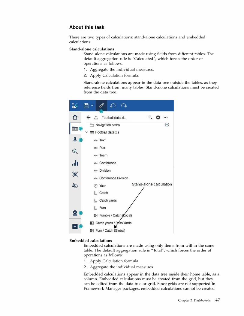
There are two types of calculations: stand-alone calculations and embeddedcalculations.
Stand-alone calculationsStand-alone calculations are made using fields from different tables. Thedefault aggregation rule is “Calculated”, which forces the order ofoperations as follows:1. Aggregate the individual measures.2. Apply Calculation formula.
Stand-alone calculations appear in the data tree outside the tables, as theyreference fields from many tables. Stand-alone calculations must be createdfrom the data tree.
Embedded calculationsEmbedded calculations are made using only items from within the sametable. The default aggregation rule is “Total”, which forces the order ofoperations as follows:1. Apply Calculation formula.2. Aggregate the individual measures.
Embedded calculations appear in the data tree inside their home table, as acolumn. Embedded calculations must be created from the grid, but theycan be edited from the data tree or grid. Since grids are not supported inFramework Manager packages, embedded calculations cannot be created
Chapter 2. Dashboards 47
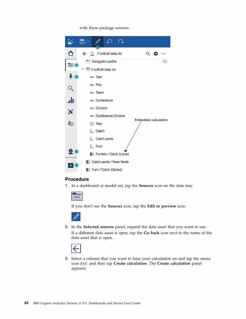
with these package sources.
Procedure1. In a dashboard or model set, tap the Sources icon on the data tray.
If you don't see the Sources icon, tap the Edit or preview icon.
2. In the Selected sources panel, expand the data asset that you want to use.If a different data asset is open, tap the Go back icon next to the name of thedata asset that is open.
3. Select a column that you want to base your calculation on and tap the menuicon
and then tap Create calculation. The Create calculation panel
appears.
48 IBM Cognos Analytics Version 11.0.0: Dashboards and Stories User Guide
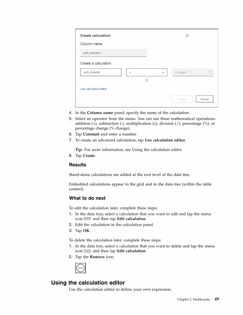
4. In the Column name panel, specify the name of the calculation.5. Select an operator from the menu. You can use these mathematical operations:
addition (+), subtraction (-), multiplication (x), division (/), percentage (%), orpercentage change (% change).
6. Tap Constant and enter a number.7. To create an advanced calculation, tap Use calculation editor.
Tip: For more information, see Using the calculation editor.8. Tap Create.
Results
Stand-alone calculations are added at the root level of the data tree.
Embedded calculations appear in the grid and in the data tree (within the tablecontext).
What to do next
To edit the calculation later, complete these steps:1. In the data tray, select a calculation that you want to edit and tap the menu
icon
and then tap Edit calculation.2. Edit the calculation in the calculation panel.3. Tap OK.
To delete the calculation later, complete these steps:1. In the data tray, select a calculation that you want to delete and tap the menu
icon
and then tap Edit calculation.2. Tap the Remove icon.
Using the calculation editorUse the calculation editor to define your own expression.
Chapter 2. Dashboards 49
About this task
Custom calculations can be created at the data module level or at the table level.The module-level calculations can reference columns from multiple tables.
For information about the functions that you can use to define your expressions,see Using the expression editor.
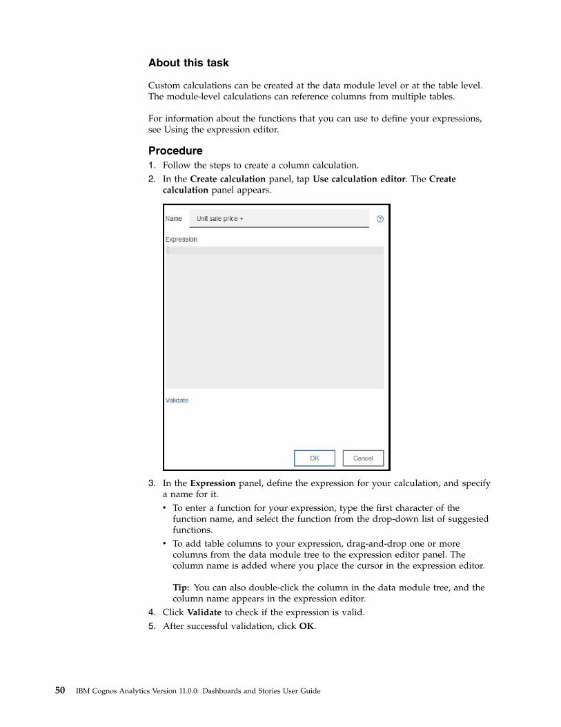
Procedure1. Follow the steps to create a column calculation.2. In the Create calculation panel, tap Use calculation editor. The Create
calculation panel appears.
3. In the Expression panel, define the expression for your calculation, and specifya name for it.v To enter a function for your expression, type the first character of the
function name, and select the function from the drop-down list of suggestedfunctions.
v To add table columns to your expression, drag-and-drop one or morecolumns from the data module tree to the expression editor panel. Thecolumn name is added where you place the cursor in the expression editor.
Tip: You can also double-click the column in the data module tree, and thecolumn name appears in the expression editor.
4. Click Validate to check if the expression is valid.5. After successful validation, click OK.
50 IBM Cognos Analytics Version 11.0.0: Dashboards and Stories User Guide
Results
If you created your calculation at the data module level, the calculation is addedafter the last table in the data module tree. If you created your calculation at thetable level, the calculation is added at the end of the list of columns in the table. Toview the expression for the calculation, open the calculation properties panel, andclick on the expression that is shown for the Expression property.
FormattingYou can customize a dashboard, story, or visualization by changing its visualproperties.
Working with the legendA legend is a key to the items in the visualization. The legend appears if there's acolumn in the Color data slot or Size by data slot.
Procedure1. Tap the Properties icon.
If you don't see the Properties icon, tap the Edit or preview icon.
2. Tap the Details tab.3. To change the location of the legend, select a location from the Legend position
box.4. To hide the legend, clear the Display legend check box.
Changing colorsYou can change colors in the entire dashboard or story, in a visualization, or inwidgets that you added to a dashboard or story.v For the dashboard or story, you can change the visual theme and the
background color.v For visualizations, you can change the color palette, the color used in the
elements (such as bars, bubbles, or lines), the fill color, and the border color. Youcan also make the visualizations more transparent or opaque.
v For shape and text widgets, you can make the widget more transparent oropaque, change the fill color, and change the border color.
Procedure1. Tap the Properties icon.
If you don't see the Properties icon, tap the Edit or preview icon.
Chapter 2. Dashboards 51
2. For the entire dashboard or story, ensure that nothing else has focus by tappingthe background, away from any visualization or object and complete one ormore of the following actions in the General tab:
What to change Actions
The theme of the entire dashboard or story Under Visual themes select a differenttheme.
The background color of the entiredashboard or story
Tap Background color and select a newcolor.
3. For visualizations, tap the visualization that you want to work with andcomplete one or more of the following actions:
What to change Actions
The color palette used in a visualization In the Details tab, tap Color palette andselect a new palette. Optionally, tap Heatpalette to change the heat scale order.
The color of the elements of a visualization(such as bars, bubbles, or lines) if thevisualization does not use the Color dataslot
In the Details tab, tap Element color andselect a new color.
How transparent or opaque a visualizationis
In the General tab, move the Opacity slider.
The fill color for a visualization In the General tab, tap Fill color and selecta new color.
The border color for a visualization In the General tab, tap Border color andselect a new color.
4. For shape and text widgets that you added to the dashboard or story, select thewidget that you want to work with and complete one or more of the followingactions in the General tab:
What to change Actions
How transparent or opaque a shape or textis
Move the Opacity slider.
The fill color for a shape or text Tap Fill color and select a new color.
The border color for a shape or text Tap Border color and select a new color.
Changing the axisYou can change the axis by rotating the axis labels, adjusting the scale of the axesto include or exclude zero, and showing or hiding the names of columns thatappear in the axis titles.
Procedure1. Tap the Properties icon.
If you don't see the Properties icon, tap the Edit or preview icon.
52 IBM Cognos Analytics Version 11.0.0: Dashboards and Stories User Guide
2. Tap the Details tab.3. Complete one or more of the following actions:
Goal Actions
Rotate the axis labels. Select the Show labels vertically check box.
Exclude the zero from the axis scale. Clear the Show zero origin check box.
Hide the column headings in both axes. Clear the Show axis titles check box.
Hide the column heading in the axis thatshows measures, such as revenue, quantitysold, or profit.
Clear the Show value axis title check box.
Hide the column heading in the axis thatshows items, such as years, products, orcustomers.
Clear the Show item axis title check box.
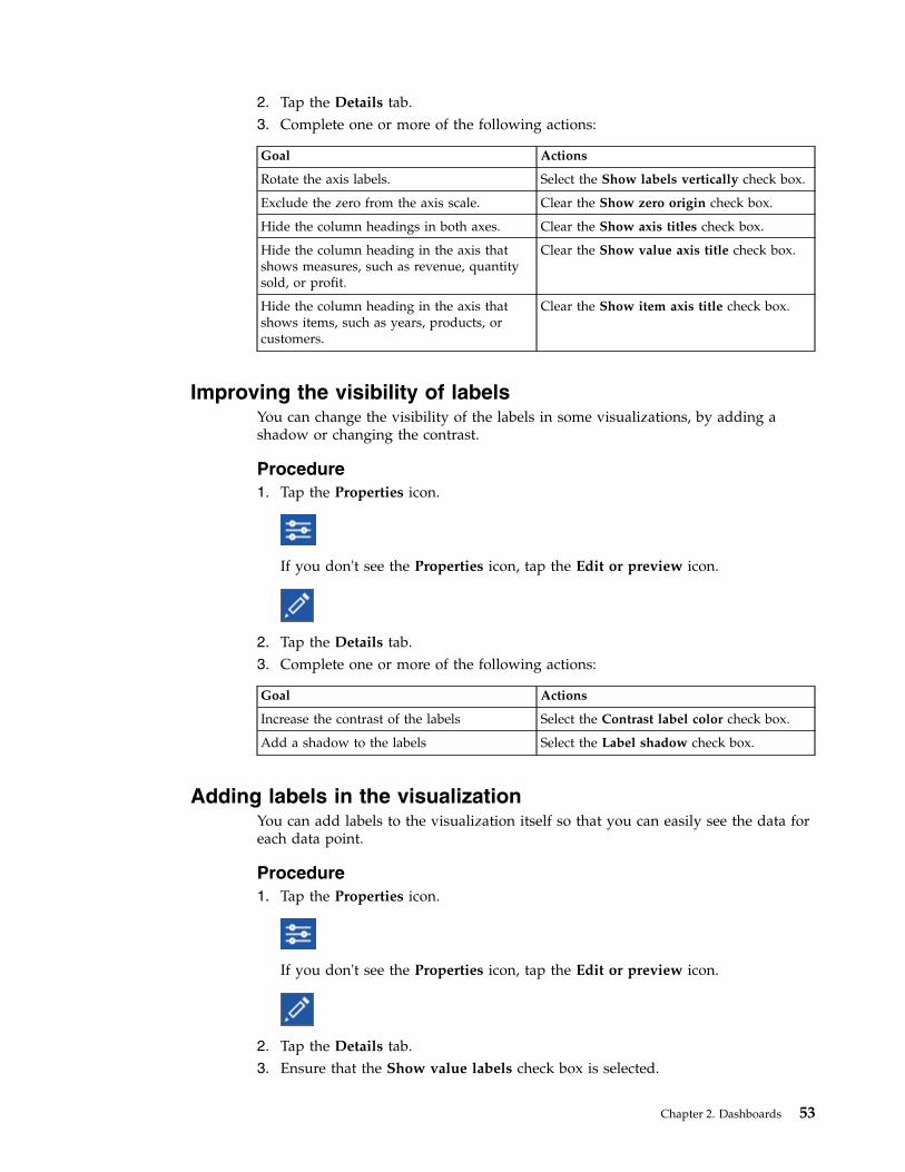
Improving the visibility of labelsYou can change the visibility of the labels in some visualizations, by adding ashadow or changing the contrast.
Procedure1. Tap the Properties icon.
If you don't see the Properties icon, tap the Edit or preview icon.
2. Tap the Details tab.3. Complete one or more of the following actions:
Goal Actions
Increase the contrast of the labels Select the Contrast label color check box.
Add a shadow to the labels Select the Label shadow check box.
Adding labels in the visualizationYou can add labels to the visualization itself so that you can easily see the data foreach data point.
Procedure1. Tap the Properties icon.
If you don't see the Properties icon, tap the Edit or preview icon.
2. Tap the Details tab.3. Ensure that the Show value labels check box is selected.
Chapter 2. Dashboards 53
4. From the Value label format box, select Value, Percentage of category, orPercentage of color.
Changing the label orientationYou can change the orientation of the labels on the horizontal axis in somevisualizations.
Procedure1. Tap the Properties icon.
If you don't see the Properties icon, tap the Edit or preview icon.
2. Tap the Details tab.3. Select an orientation from the Item axis label orientation menu.
Orientation Meaning
Automatic The best label orientation is determined foryou, based on available space.
Horizontal The label orientation is horizontal.
Vertical The label orientation is vertical.
Rotate 45 degrees The label orientation is rotated 45 degreesclock-wise.
Stagger The labels are arranged of two lines in ahorizontal way.
Connecting data points with smooth linesYou can show data points connected by smooth curves in an area, line andcolumn, or line visualization.
Procedure1. Select the area, line and column, or line visualization that you want to work
with.2. Tap the Properties icon.
If you don't see the Properties icon, tap the Edit or preview icon.
3. Tap the Details tab.4. To connect the data points by smooth curves, select the Smooth lines check
box.
54 IBM Cognos Analytics Version 11.0.0: Dashboards and Stories User Guide
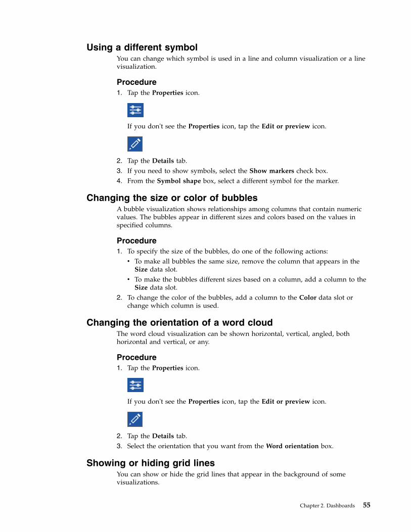
Using a different symbolYou can change which symbol is used in a line and column visualization or a linevisualization.
Procedure1. Tap the Properties icon.
If you don't see the Properties icon, tap the Edit or preview icon.
2. Tap the Details tab.3. If you need to show symbols, select the Show markers check box.4. From the Symbol shape box, select a different symbol for the marker.
Changing the size or color of bubblesA bubble visualization shows relationships among columns that contain numericvalues. The bubbles appear in different sizes and colors based on the values inspecified columns.
Procedure1. To specify the size of the bubbles, do one of the following actions:v To make all bubbles the same size, remove the column that appears in the
Size data slot.v To make the bubbles different sizes based on a column, add a column to the
Size data slot.2. To change the color of the bubbles, add a column to the Color data slot or
change which column is used.
Changing the orientation of a word cloudThe word cloud visualization can be shown horizontal, vertical, angled, bothhorizontal and vertical, or any.
Procedure1. Tap the Properties icon.
If you don't see the Properties icon, tap the Edit or preview icon.
2. Tap the Details tab.3. Select the orientation that you want from the Word orientation box.
Showing or hiding grid linesYou can show or hide the grid lines that appear in the background of somevisualizations.
Chapter 2. Dashboards 55
Procedure1. Tap the Properties icon.
If you don't see the Properties icon, tap the Edit or preview icon.
2. Tap the Details tab.3. To hide the grid lines, clear the Show grid lines check box. To show them,
select the Show grid lines check box.
Working with objectsYou can work with objects, such as visualizations and widgets, that are on thecanvas.
Procedure1. Select the object that you want to work with.
If you don't see icons for the object, tap the Edit or preview icon.
2. Complete one or more of the following actions:
Goal Actions
Group objects Select several objects and tap the Groupicon.
Ungroup objects Select the group and tap the Ungroup icon.
Layer objects To place the object behind other objects, tapthe Send to back icon.
To place the object on top of the otherobjects, tap the Bring to front icon.
Move objects Tap and hold the Move icon and drag theobject to its new location.
Duplicate objects Tap the Duplicate icon and then move theobject to a new location.
Resize objects Drag one of the squares on the border of theobject.
56 IBM Cognos Analytics Version 11.0.0: Dashboards and Stories User Guide
Goal Actions
Delete objects Tap the Delete icon.
Data propertiesYou can adjust the appearance of data in an asset, such as how it is aggregated orwhat the column headings are. If you want these changes to affect all assets, youmust make them in the data asset itself.
Changing how data is aggregatedYou can change how numeric data is summarized or aggregated. IBM CognosAnalytics assigns a default aggregation type to numerical columns when a dataasset is imported. For example, the default aggregation for a column called “Age”is average. The default aggregation for column called “Revenue” is sum. Whenyou use a column in a visualization, the default aggregation is used.
Procedure1. Tap the Data icon.
If you don't see the Data icon, tap the Edit or preview icon.
2. In the Data panel, tap the Menu icon for the column that you want to modify,and tap Properties.
3. Tap Aggregate, and choose another method:
Total The total value for the selected column.
AverageThe average value of the selected column.
MinimumThe lowest value in the column.
MaximumThe highest value in the column.
Count How many rows are in the selected column. Blanks are not included inthe count but duplicates are included. For example, if a city appears in10 rows, it is counted each time that it appears.
Count distinctHow many unique rows are in the selected column. Duplicate rows arecounted once. For example, if a city appears in 10 rows, it is countedonly the first time that it appears.
Chapter 2. Dashboards 57
Editing column headingsYou can make column headings more descriptive and meaningful to you. The newcolumn headings appear only in the current asset. To change the column headingsfor all assets, change them in the data asset.
Procedure1. Tap the Data icon.
If you don't see the Data icon, tap the Edit or preview icon.
2. In the Data panel, tap the Menu icon for the column that you want to modify,and tap Properties.
3. In the Label box, enter a new column heading.
58 IBM Cognos Analytics Version 11.0.0: Dashboards and Stories User Guide
Chapter 3. Stories
A story is a type of view that contains a set of scenes that are displayed insequence over time.
Stories are similar to dashboards because they also use visualizations to share yourinsights. Stories differ from dashboards because they provide an over-timenarrative and can convey a conclusion or recommendation.
For example, each slide in a story contains an analysis, insight, or piece ofinformation that is revealed as the viewer runs a slide show. The slides build uponeach other until the final slide, which provides a conclusion or summary. You canalso create the effect of animation by having visualizations and objects appear anddisappear during a scene in a story.
You can use the following techniques to assemble a story:v Reuse visualizations from your collection of pinsv Create new visualizations from your data by selecting columns from a data setv Change the timeline of a scene to create an animation effectv Add text, media, web pages, images, and shapesv Change how objects enter or exit a scene by setting the following animation
properties:– Slide in and slide out– Fade in and fade out– Scale in and scale out– Shrink in and expand out– Pivot in and pivot out
Assembling a storyYou can quickly assemble a story by reusing analysis, insights, and visualizations,that you set aside in your collection of pins. You can also add new visualizations,media, web pages, images, shapes, and text to your story. Types of stories includeslide show and guided journey.
Procedure
1. Tap New , and tap Story.2. Under Story, select one of the following story types:
Slide showTells a story through a series of slides or scenes.
Guided journeyGuides an audience on a journey that starts out as the full picture ofthe story and then pans and zooms into the details across the canvas.
3. Tap the layout that you want to use.
© Copyright IBM Corp. 2015, 2017 59
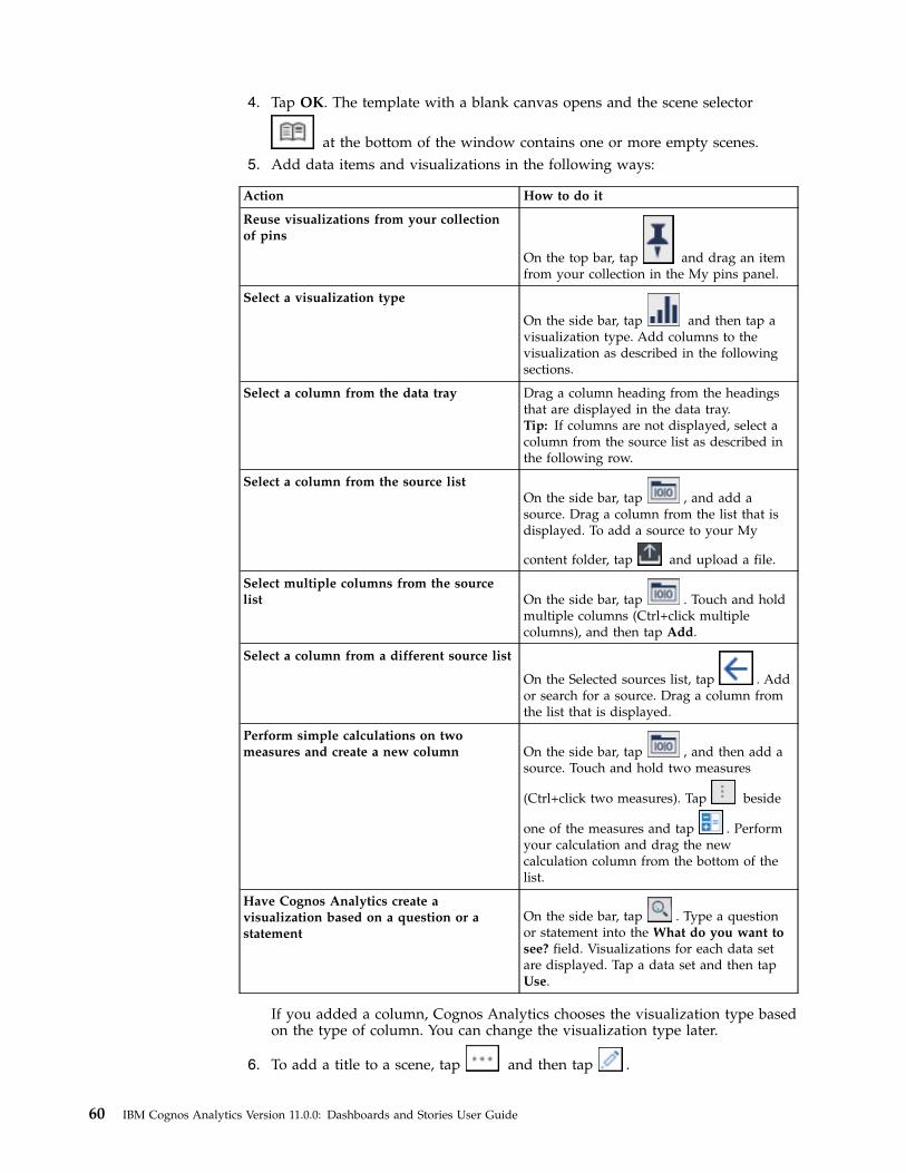
4. Tap OK. The template with a blank canvas opens and the scene selector
at the bottom of the window contains one or more empty scenes.5. Add data items and visualizations in the following ways:
Action How to do it
Reuse visualizations from your collectionof pins
On the top bar, tap and drag an itemfrom your collection in the My pins panel.
Select a visualization type
On the side bar, tap
and then tap avisualization type. Add columns to thevisualization as described in the followingsections.
Select a column from the data tray Drag a column heading from the headingsthat are displayed in the data tray.Tip: If columns are not displayed, select acolumn from the source list as described inthe following row.
Select a column from the source listOn the side bar, tap , and add asource. Drag a column from the list that isdisplayed. To add a source to your My
content folder, tap
and upload a file.
Select multiple columns from the sourcelist On the side bar, tap . Touch and hold
multiple columns (Ctrl+click multiplecolumns), and then tap Add.
Select a column from a different source list
On the Selected sources list, tap . Addor search for a source. Drag a column fromthe list that is displayed.
Perform simple calculations on twomeasures and create a new column On the side bar, tap , and then add a
source. Touch and hold two measures
(Ctrl+click two measures). Tap
beside
one of the measures and tap . Performyour calculation and drag the newcalculation column from the bottom of thelist.
Have Cognos Analytics create avisualization based on a question or astatement
On the side bar, tap . Type a questionor statement into the What do you want tosee? field. Visualizations for each data setare displayed. Tap a data set and then tapUse.
If you added a column, Cognos Analytics chooses the visualization type basedon the type of column. You can change the visualization type later.
6. To add a title to a scene, tap and then tap .
60 IBM Cognos Analytics Version 11.0.0: Dashboards and Stories User Guide
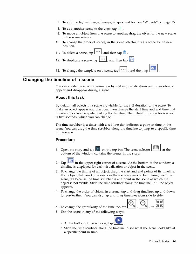
7. To add media, web pages, images, shapes, and text see “Widgets” on page 35.
8. To add another scene to the view, tap .9. To move an object from one scene to another, drag the object to the new scene
in the scene selector.10. To change the order of scenes, in the scene selector, drag a scene to the new
position.
11. To delete a scene, tap and then tap .
12. To duplicate a scene, tap , and then tap .
13. To change the template on a scene, tap , and then tap .
Changing the timeline of a sceneYou can create the effect of animation by making visualizations and other objectsappear and disappear during a scene.
About this task
By default, all objects in a scene are visible for the full duration of the scene. Tomake an object appear and disappear, you change the start time and end time thatthe object is visible anywhere along the timeline. The default duration for a sceneis five seconds, which you can change.
The time scrubber is a timer with a red line that indicates a point in time in thescene. You can drag the time scrubber along the timeline to jump to a specific timein the scene.
Procedure
1. Open the story and tap on the top bar. The scene selector at thebottom of the window contains the scenes in the story.
2. Tap in the upper-right corner of a scene. At the bottom of the window, atimeline is displayed for each visualization or object in the scene.
3. To change the timing of an object, drag the start and end points of its timeline.If an object that you know exists in the scene appears to be missing from thescene, it's because the time scrubber is at a point in the scene at which theobject is not visible. Slide the time scrubber along the timeline until the objectappears.
4. To change the order of objects in a scene, tap and drag timelines up and downto reorder them. You can also tap and drag timelines from side to side.
5. To change the granularity of the timeline, tap , , or .6. Test the scene in any of the following ways:
v At the bottom of the window, tap .v Slide the time scrubber along the timeline to see what the scene looks like at
a specific point in time.
Chapter 3. Stories 61
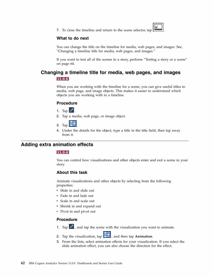
7. To close the timeline and return to the scene selector, tap .
What to do next
You can change the title on the timeline for media, web pages, and images. See,“Changing a timeline title for media, web pages, and images.”
If you want to test all of the scenes in a story, perform “Testing a story or a scene”on page 64.
Changing a timeline title for media, web pages, and images
When you are working with the timeline for a scene, you can give useful titles tomedia, web page, and image objects. This makes it easier to understand whichobjects you are working with in a timeline.
Procedure
1. Tap .2. Tap a media, web page, or image object.
3. Tap .4. Under the details for the object, type a title in the title field, then tap away
from it.
Adding extra animation effects
You can control how visualizations and other objects enter and exit a scene in yourstory.
About this task
Animate visualizations and other objects by selecting from the followingproperties:v Slide in and slide outv Fade in and fade outv Scale in and scale outv Shrink in and expand outv Pivot in and pivot out
Procedure
1. Tap , and tap the scene with the visualization you want to animate.
2. Tap the visualization, tap , and then tap Animation.3. From the lists, select animation effects for your visualization. If you select the
slide animation effect, you can also choose the direction for the effect.
62 IBM Cognos Analytics Version 11.0.0: Dashboards and Stories User Guide
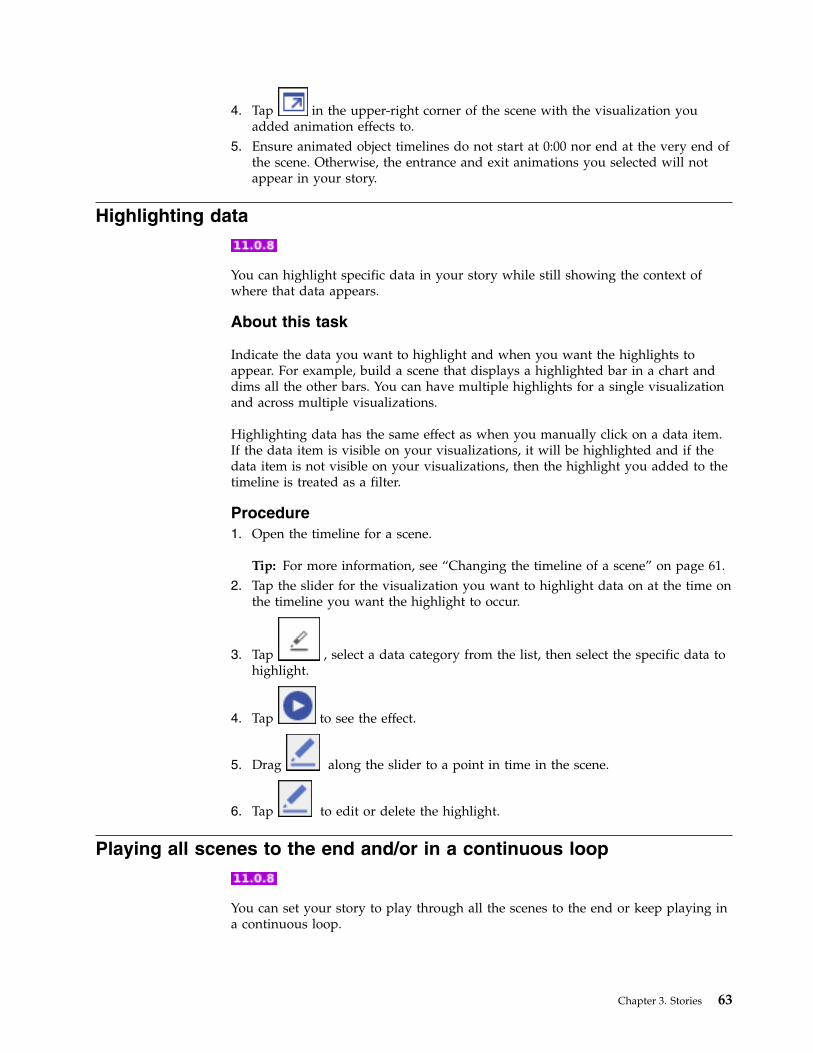
4. Tap in the upper-right corner of the scene with the visualization youadded animation effects to.
5. Ensure animated object timelines do not start at 0:00 nor end at the very end ofthe scene. Otherwise, the entrance and exit animations you selected will notappear in your story.
Highlighting data
You can highlight specific data in your story while still showing the context ofwhere that data appears.
About this task
Indicate the data you want to highlight and when you want the highlights toappear. For example, build a scene that displays a highlighted bar in a chart anddims all the other bars. You can have multiple highlights for a single visualizationand across multiple visualizations.
Highlighting data has the same effect as when you manually click on a data item.If the data item is visible on your visualizations, it will be highlighted and if thedata item is not visible on your visualizations, then the highlight you added to thetimeline is treated as a filter.
Procedure1. Open the timeline for a scene.
Tip: For more information, see “Changing the timeline of a scene” on page 61.2. Tap the slider for the visualization you want to highlight data on at the time on
the timeline you want the highlight to occur.
3. Tap , select a data category from the list, then select the specific data tohighlight.
4. Tap to see the effect.
5. Drag along the slider to a point in time in the scene.
6. Tap to edit or delete the highlight.
Playing all scenes to the end and/or in a continuous loop
You can set your story to play through all the scenes to the end or keep playing ina continuous loop.
Chapter 3. Stories 63
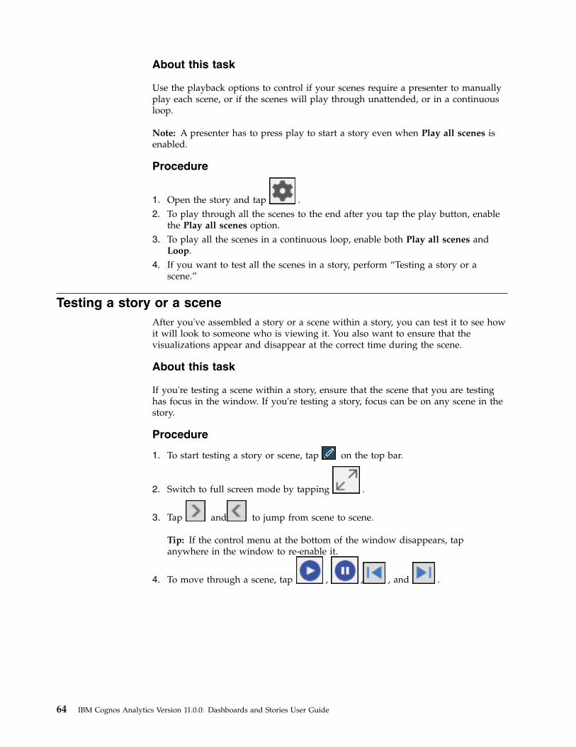
About this task
Use the playback options to control if your scenes require a presenter to manuallyplay each scene, or if the scenes will play through unattended, or in a continuousloop.
Note: A presenter has to press play to start a story even when Play all scenes isenabled.
Procedure
1. Open the story and tap .2. To play through all the scenes to the end after you tap the play button, enable
the Play all scenes option.3. To play all the scenes in a continuous loop, enable both Play all scenes and
Loop.4. If you want to test all the scenes in a story, perform “Testing a story or a
scene.”
Testing a story or a sceneAfter you've assembled a story or a scene within a story, you can test it to see howit will look to someone who is viewing it. You also want to ensure that thevisualizations appear and disappear at the correct time during the scene.
About this task
If you're testing a scene within a story, ensure that the scene that you are testinghas focus in the window. If you're testing a story, focus can be on any scene in thestory.
Procedure
1. To start testing a story or scene, tap on the top bar.
2. Switch to full screen mode by tapping .
3. Tap and to jump from scene to scene.
Tip: If the control menu at the bottom of the window disappears, tapanywhere in the window to re-enable it.
4. To move through a scene, tap , , , and .
64 IBM Cognos Analytics Version 11.0.0: Dashboards and Stories User Guide
Index
Aabsolute positioning 11aggregations
changing 57all tabs filters 44
clearing values 44removing 45
animate)fade, slide, scale, shrink, expand, pivot visualizations 62
animation 62appearance of data 57area visualizations 22
smooth lines 54ascending order 46audio 37average 57axis titles
showing or hiding 52
Bbackground colors 51bar visualizations 18border colors 51brushing 40bubble visualizations 19
size and color 55
Ccalculations 46
aggregation types 57all visualizations 47
categorical heat map visualizations 29changing template 12charts
See visualizationschoropleth
See mapsclearing values from filters 44color palettes 51column filters 38, 43, 44column headings
showing or hiding 52column visualizations 17columns
adding 24changing 13Color 30editing names 58sorting alphabetically 46sorting by value 46
composite visualizations 21conditional formatting 30
adding and removing handles 30connections
visualizations 42context filters 41count 57count distinct 57
Ddashboards
adding text 36assembling 11creating visualizations 12filters 38, 43formatting 51multiple data assets 14overview 3tutorial 4visualizations 16widgets 35
datatutorial 3viewing details 14zooming in and out 16
data player 30data points
filtering 42data properties 57data sets 59data tray
filtering 38viewing 13
deletingfilters 45objects 56
descending order 46details of data points 14discovery sets
calculations 46data properties 57exploring data 13filters 38overview 3visualizations 16
displaysSee dashboards
drillingdown 14up 14
duplicatingobjects 56
Eelement colors 51excluding items 38, 42exploring
data 13
Ffill colors 51filled region
See mapsfilter widgets
creating connections 42disconnecting 42viewing connections 42
© Copyright IBM Corp. 2015, 2017 65
filtering 40all tabs 44clearing values 44data tray 38keeping or excluding 38, 42overview 38removing 45widget 30, 41
fonts 36formatting 51
bubbles 55colors 51
freeform 11
Ggetting started
tutorial 3global filters 44grid
See tablegrid lines 56grouping
objects 56
Hheat map visualizations 29hiding
legend 51hierarchies
navigating 14hierarchy visualizations 25highlighting 40
Iimages
changing 38changing timeline title 62formats 36https requirement 36
including items 38, 42infographics
assembling 11item titles
showing or hiding 52
Kkeeping items 38, 42
Llabels
contrast 53, 54orientation 54quality 53, 54shadow 53
latitude 34layers
objects 56layouts
other 11
legendposition 51showing or hiding 51
line and column visualizations 21smooth lines 54symbols 55
line visualizations 20smooth lines 54symbols 55
local filters 38, 43longitude 34
Mmaps 33
creating 34maximum 57media
changing 38changing timeline title 62formats 37
minimum 57moving
objects 56multiple data assets
in dashboards 14multiple visualizations 32multipliers 32muted colors 51
Nnavigation paths 14network visualizations 28
Oobjects
working with 56opacity 51orientation
word cloud 55
Ppacked bubble visualizations 20pie visualizations 23point visualizations 20, 21polygon
See mapsposition of legend 51publishing 35
Rradial bar visualizations 27redoing 1refresh automatically 32relative positioning 11repeating visualizations 32resizing
objects 56rotating
axis labels 52
66 IBM Cognos Analytics Version 11.0.0: Dashboards and Stories User Guide
Sshapes 36
formatting 51sharing 35
overview 35smooth lines 54sorting
alphabetical order 46by value 46overview 46
stacked bar visualizations 18stacked column visualizations 17stories
assembling 59testing 64timeline 61types 59
sum 57summarizing 57summary visualizations 26symbols
changing 55
Ttable visualizations 24
adding data 24template
changing 12templates
freeform 11other 11
textadding to dashboards 36formatting 36, 51
themes 51this tab filters 43
clearing values 44removing 45
timelinereordering objects 61titles for media, web pages, images 62
timersetting for a visualization 32
title 33total aggregation type 57transparent colors 51tree map visualizations 24tutorial
dashboard 4uploading data 3what's next 10
Uundoing 1ungrouping
objects 56uploading data
tutorial 3URLs 36, 37, 38
Vvalue titles
showing or hiding 52values
showing or hiding in visualizations 53vertex symbols 55view mode 1views
assembling 1saving 1
visual themes 51visualization
title 33visualizations 16
area 22bar 18bubble 19changing columns 13column 17creating connections 42creating in dashboards 12data player 30disconnecting 42formatting 51heat map 29hierarchy 25line 20line and column 21network 28packed bubble 20pie 23point 21positioning 11radial bar 27recommended 1repeating 32sharing 35showing or hiding values 53stacked bar 18stacked column 17summary 26table 24tree map 24types 1, 16viewing connections 42word cloud 27working with 56
Wweb pages 37
changing 38changing timeline title 62
widgetsfilter 41formatting shapes or text 51overview 35working with 56
word cloud visualizations 27orientation 55
Zzeros 52zooming in and out 16
Index 67