Embed Size (px)
DESCRIPTION
Collection of IELTS Report Writing.
Citation preview
IELTS Report Writing You should write at least 150 words. You should spend about 20 minutes on this task.
1. The table below shows the number of medals won by the top ten countries in the London 2012 Olympic Games. Summarize the information by selecting and reporting the main features, and make comparisons where relevant.
The table shows the number of medals won by the top ten countries in the London 2012 Olympic Games. The USA won greatest number of medals overall with the total of 104. They won more gold medals than silver and more medals than any other country in both categories. China had the second number of medals at 88, and like the USA, China won fewer silver medals than gold medals.
While Russia’s silver medal total was better than Great Britain’s, they did not do as well as Great Britain in the gold medals, winning just 24. In fact Great Britain had a lower overall medal total than Russia but, as the table is based on the number of gold medals won, they were placed third. Similarly, Germany was significantly more successful at winning medals than South Korea, with a total of 44 compared to South Korea’s 28, but because South Korea won two more gold medals than Germany they were ranked higher. Australia gave the worst performance in this group, winning only seven gold and sixteen silver medals.
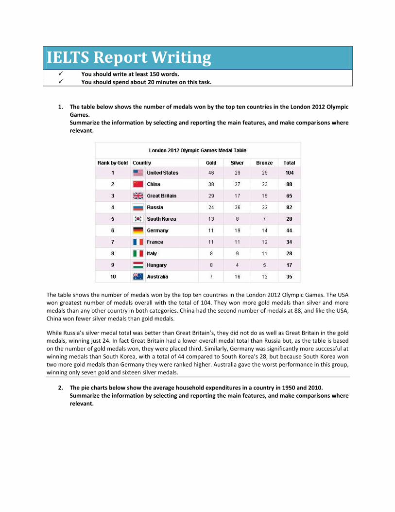
2. The pie charts below show the average household expenditures in a country in 1950 and 2010. Summarize the information by selecting and reporting the main features, and make comparisons where relevant.
The two pie charts give information about household expenditure on goods and services in 1950 and 2010. It is immediately obvious that there are some quite significant differences between the two charts.
In 2010 the largest proportion of expenditure was on food whereas in 1950 it was on housing, with food for just 11.2%. There is a great difference in terms of housing expenditure between the two years. In 1950 72.1% of the total household budget went towards housing, compared to only 22% in 2010.
There has been a notable increase in the amount of money spent on transportation between the two dates. In addition, the charts show a significant rise in the proportion of money spent on health care in 2010 compared to 1950.
There are some similarities, however. For example, in both 1950 and 2010 the proportion of education expenditure was roughly the same.
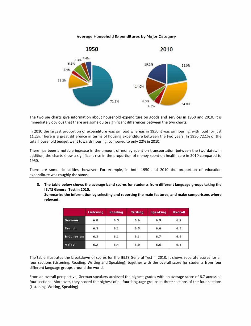
3. The table below shows the average band scores for students from different language groups taking the IELTS General Test in 2010. Summarize the information by selecting and reporting the main features, and make comparisons where relevant.
The table illustrates the breakdown of scores for the IELTS General Test in 2010. It shows separate scores for all four sections (Listening, Reading, Writing and Speaking), together with the overall score for students from four different language groups around the world.
From an overall perspective, German speakers achieved the highest grades with an average score of 6.7 across all four sections. Moreover, they scored the highest of all four language groups in three sections of the four sections (Listening, Writing, Speaking).
French speakers scored the second highest scores overall, closely followed by Malay and Indonesian speakers. Although French speakers did not do so well in the Reading, Speaking and Listening sections compared to Indonesian and Malay speakers, there was a significant difference in their grades for the Writing section. These grades were high relative to Indonesian and Malay candidates. Surprisingly, Malay speakers, who achieved the second lowest results overall, achieved the highest results of all four language groups for the Reading section.
As a final point, it is interesting to note that the scores for each section show that all students on average scored the highest marks for the Speaking section and the lowest marks for the Reading section.
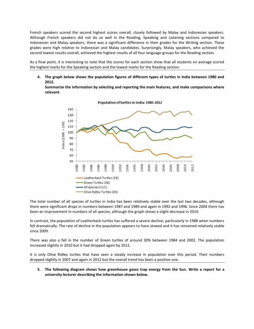
4. The graph below shows the population figures of different types of turtles in India between 1980 and 2012. Summarize the information by selecting and reporting the main features, and make comparisons where relevant.
The total number of all species of turtles in India has been relatively stable over the last two decades, although there were significant drops in numbers between 1987 and 1989 and again in 1992 and 1996. Since 2004 there has been an improvement in numbers of all species, although the graph shows a slight decrease in 2010.
In contrast, the population of Leatherback turtles has suffered a severe decline, particularly in 1988 when numbers fell dramatically. The rate of decline in the population appears to have slowed and it has remained relatively stable since 2009.
There was also a fall in the number of Green turtles of around 30% between 1984 and 2002. The population increased slightly in 2010 but it had dropped again by 2012.
It is only Olive Ridley turtles that have seen a steady increase in population over this period. Their numbers dropped slightly in 2007 and again in 2012 but the overall trend has been a positive one.
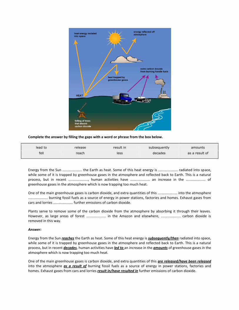
5. The following diagram shows how greenhouse gases trap energy from the Sun. Write a report for a university lecturer describing the information shown below.
Complete the answer by filling the gaps with a word or phrase from the box below.
lead to release result in subsequently amounts
fell reach less decades as a result of
Energy from the Sun .................... the Earth as heat. Some of this heat energy is .................... radiated into space, while some of it is trapped by greenhouse gases in the atmosphere and reflected back to Earth. This is a natural process, but in recent ...................., human activities have .................... an increase in the .................... of greenhouse gases in the atmosphere which is now trapping too much heat.
One of the main greenhouse gases is carbon dioxide, and extra quantities of this .................... into the atmosphere .................... burning fossil fuels as a source of energy in power stations, factories and homes. Exhaust gases from cars and lorries .................... further emissions of carbon dioxide.
Plants serve to remove some of the carbon dioxide from the atmosphere by absorbing it through their leaves. However, as large areas of forest .................... in the Amazon and elsewhere, .................... carbon dioxide is removed in this way.
Answer:
Energy from the Sun reaches the Earth as heat. Some of this heat energy is subsequently/then radiated into space, while some of it is trapped by greenhouse gases in the atmosphere and reflected back to Earth. This is a natural process, but in recent decades, human activities have led to an increase in the amounts of greenhouse gases in the atmosphere which is now trapping too much heat.
One of the main greenhouse gases is carbon dioxide, and extra quantities of this are released/have been released into the atmosphere as a result of burning fossil fuels as a source of energy in power stations, factories and homes. Exhaust gases from cars and lorries result in/have resulted in further emissions of carbon dioxide.
Plants serve to remove some of the carbon dioxide from the atmosphere by absorbing it through their leaves. However, as large areas of forest are (being) felled/have been felled in the Amazon and elsewhere, less carbon dioxide is removed in this way.
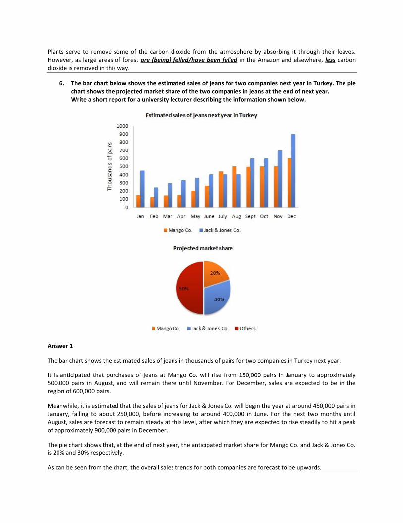
6. The bar chart below shows the estimated sales of jeans for two companies next year in Turkey. The pie chart shows the projected market share of the two companies in jeans at the end of next year. Write a short report for a university lecturer describing the information shown below.
Answer 1
The bar chart shows the estimated sales of jeans in thousands of pairs for two companies in Turkey next year.
It is anticipated that purchases of jeans at Mango Co. will rise from 150,000 pairs in January to approximately 500,000 pairs in August, and will remain there until November. For December, sales are expected to be in the region of 600,000 pairs.
Meanwhile, it is estimated that the sales of jeans for Jack & Jones Co. will begin the year at around 450,000 pairs in January, falling to about 250,000, before increasing to around 400,000 in June. For the next two months until August, sales are forecast to remain steady at this level, after which they are expected to rise steadily to hit a peak of approximately 900,000 pairs in December.
The pie chart shows that, at the end of next year, the anticipated market share for Mango Co. and Jack & Jones Co. is 20% and 30% respectively.
As can be seen from the chart, the overall sales trends for both companies are forecast to be upwards.
Answer 2:
The bar chart shows the predicted sales of jeans in thousands of pairs for two companies in Turkey; Mango Co. and Jack & Jones Co. for next year.
The most striking feature is that sales will increase for both companies, It is anticipated that sales of Jack & Jones Co. will start at 450,000 pairs in January decreasing by 200,000 pairs following month with a gradual recover over the subsequent four months reaching 400,000 pairs in June. Those of Jack & Jones Co. are predicted to be stable until August picking up to 600,000 pairs in September and October.
Sales of Jack & Jones will reach a pick of 900,000 in December, For those of Mango Co. is forecasted a gradual increase with the largest sale of 600,000 pairs in December. In the beginning of the next year those of Mango Co. will stand at 150,000 pairs falling back to 100,000 pairs in February, rising steadily to 250,000 in June, In subsequent months sales will reach 450,000 pairs increasing to 500,000 pairs in August, staying stable until November,
Regarding the pie chart the sales of Jack & Jones Co. will share 30% of market whereas those of Mango Co. 20%. 50% of market is set to be shared by other companies.
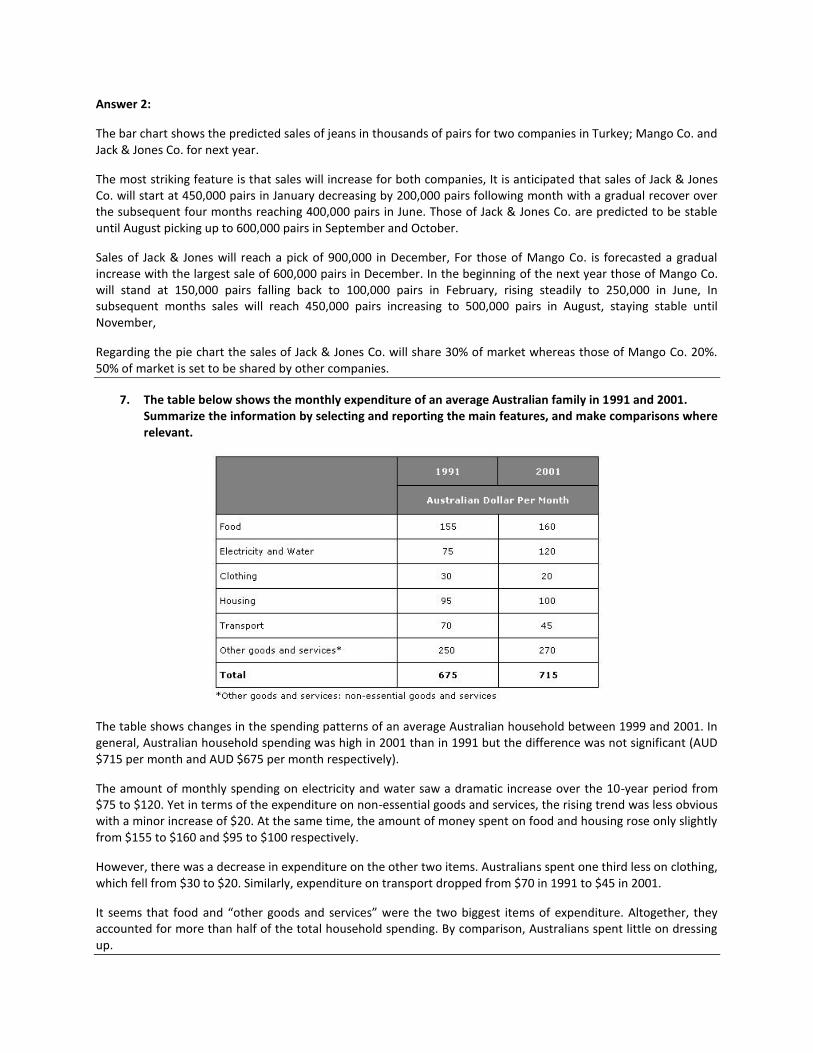
7. The table below shows the monthly expenditure of an average Australian family in 1991 and 2001. Summarize the information by selecting and reporting the main features, and make comparisons where relevant.
The table shows changes in the spending patterns of an average Australian household between 1999 and 2001. In general, Australian household spending was high in 2001 than in 1991 but the difference was not significant (AUD $715 per month and AUD $675 per month respectively).
The amount of monthly spending on electricity and water saw a dramatic increase over the 10-year period from $75 to $120. Yet in terms of the expenditure on non-essential goods and services, the rising trend was less obvious with a minor increase of $20. At the same time, the amount of money spent on food and housing rose only slightly from $155 to $160 and $95 to $100 respectively.
However, there was a decrease in expenditure on the other two items. Australians spent one third less on clothing, which fell from $30 to $20. Similarly, expenditure on transport dropped from $70 in 1991 to $45 in 2001.
It seems that food and “other goods and services” were the two biggest items of expenditure. Altogether, they accounted for more than half of the total household spending. By comparison, Australians spent little on dressing up.
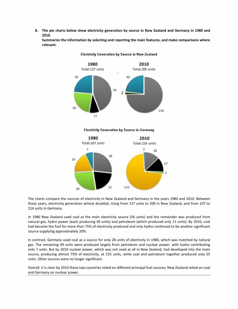
8. The pie charts below show electricity generation by source in New Zealand and Germany in 1980 and 2010. Summarize the information by selecting and reporting the main features, and make comparisons where relevant.
The charts compare the sources of electricity in New Zealand and Germany in the years 1980 and 2010. Between these years, electricity generation almost doubled, rising from 127 units to 200 in New Zealand, and from 107 to 214 units in Germany.
In 1980 New Zealand used coal as the main electricity source (56 units) and the remainder was produced from natural gas, hydro power (each producing 30 units) and petroleum (which produced only 11 units). By 2010, coal had become the fuel for more than 75% of electricity produced and only hydro continued to be another significant source supplying approximately 20%.
In contrast, Germany used coal as a source for only 28 units of electricity in 1980, which was matched by natural gas. The remaining 49 units were produced largely from petroleum and nuclear power, with hydro contributing only 7 units. But by 2010 nuclear power, which was not used at all in New Zealand, had developed into the main source, producing almost 75% of electricity, at 155 units, while coal and petroleum together produced only 55 units. Other sources were no longer significant.
Overall, it is clear by 2010 these two countries relied on different principal fuel sources: New Zealand relied on coal and Germany on nuclear power.
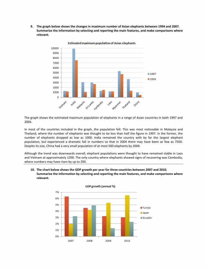
9. The graph below shows the changes in maximum number of Asian elephants between 1994 and 2007. Summarize the information by selecting and reporting the main features, and make comparisons where relevant.
The graph shows the estimated maximum population of elephants in a range of Asian countries in both 1997 and 2004.
In most of the countries included in the graph, the population fell. This was most noticeable in Malaysia and Thailand, where the number of elephants was thought to be less than half the figure in 1997. In the former, the number of elephants dropped as low as 1000. India remained the country with by far the largest elephant population, but experienced a dramatic fall in numbers so that in 2004 there may have been as few as 7500. Despite its size, China had a very small population of at most 500 elephants by 2004.
Although the trend was downwards overall, elephant populations were thought to have remained stable in Laos and Vietnam at approximately 1200. The only country where elephants showed signs of recovering was Cambodia, where numbers may have risen by up to 200.
10. The chart below shows the GDP growth per year for three countries between 2007 and 2010. Summarize the information by selecting and reporting the main features, and make comparisons where relevant.
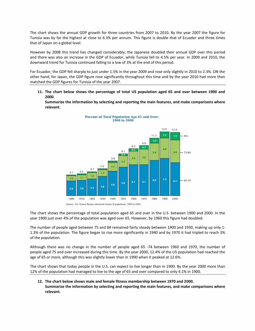
The chart shows the annual GDP growth for three countries from 2007 to 2010. By the year 2007 the figure for Tunisia was by far the highest at close to 6.3% per annum. This figure is double that of Ecuador and three times that of Japan on a global level.
However by 2008 this trend has changed considerably; the Japanese doubled their annual GDP over this period and there was also an increase in the GDP of Ecuador, while Tunisia fell to 4.5% per year. In 2009 and 2010, the downward trend for Tunisia continued falling to a low of 3% at the end of this period.
For Ecuador, the GDP fell sharply to just under 1.5% in the year 2009 and rose only slightly in 2010 to 2.3%. ON the other hand, for Japan, the GDP figure rose significantly throughout this time and by the year 2010 had more than matched the GDP figures for Tunisia of the year 2007.
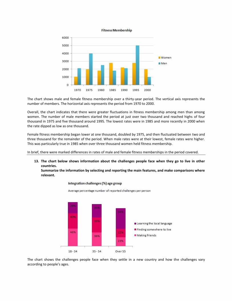
11. The chart below shows the percentage of total US population aged 65 and over between 1900 and 2000. Summarize the information by selecting and reporting the main features, and make comparisons where relevant.
The chart shows the percentage of total population aged 65 and over in the U.S. between 1900 and 2000. In the year 1900 just over 4% of the population was aged over 65. However, by 1960 this figure had doubled.
The number of people aged between 75 and 84 remained fairly steady between 1900 and 1930, making up only 1-1.3% of the population. The figure began to rise more significantly in 1940 and by 1970 it had tripled to reach 3% of the population.
Although there was no change in the number of people aged 65 -74 between 1960 and 1970, the number of people aged 75 and over increased during this time. By the year 2000, 12.4% of the US population had reached the age of 65 or more, although this was slightly lower than in 1990 when it peaked at 12.6%.
The chart shows that today people in the U.S. can expect to live longer than in 1900. By the year 2000 more than 12% of the population had managed to live to the age of 65 and over compared to only 4.1% in 1900.
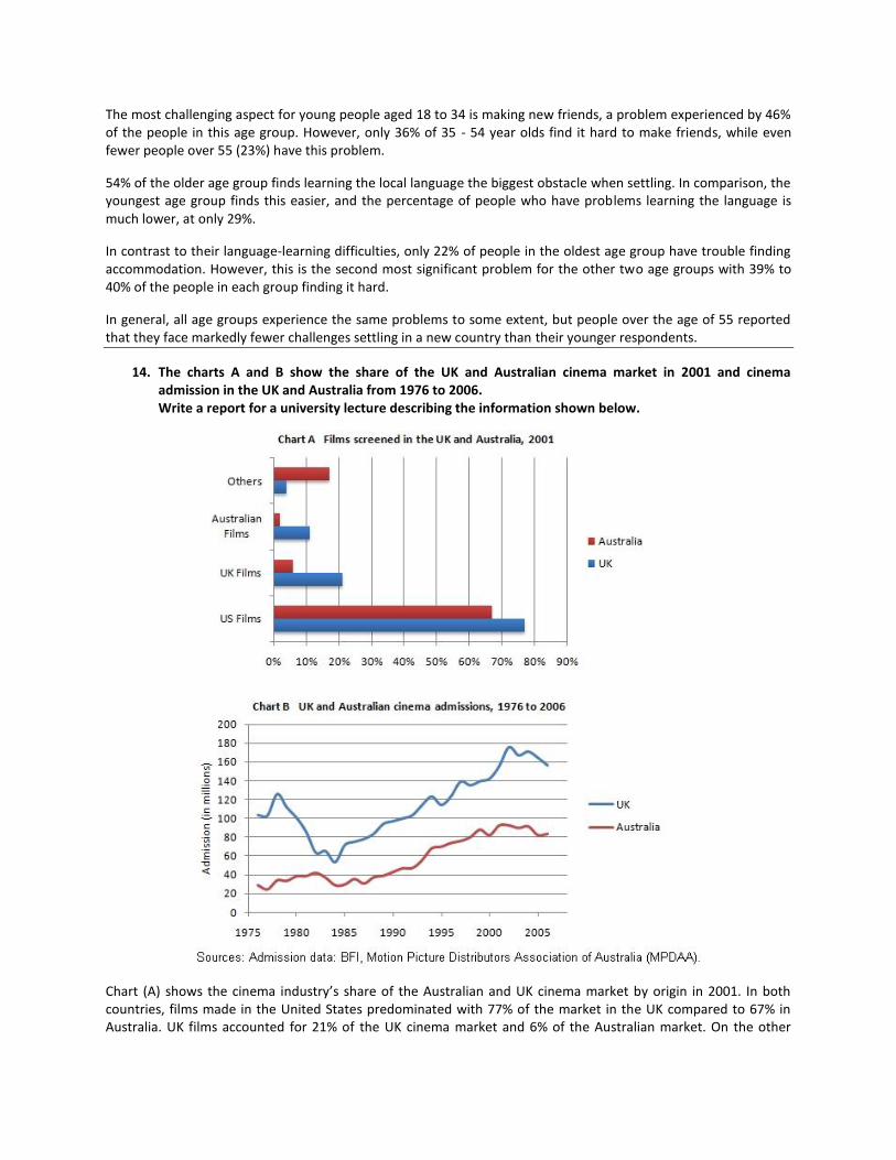
12. The chart below shows male and female fitness membership between 1970 and 2000. Summarize the information by selecting and reporting the main features, and make comparisons where relevant.
The chart shows male and female fitness membership over a thirty-year period. The vertical axis represents the number of members. The horizontal axis represents the period from 1970 to 2000.
Overall, the chart indicates that there were greater fluctuations in fitness membership among men than among women. The number of male members started the period at just over two thousand and reached highs of four thousand in 1975 and five thousand around 1995. The lowest rates were in 1985 and more recently in 2000 when the rate dipped as low as one thousand.
Female fitness membership began lower at one thousand, doubled by 1975, and then fluctuated between two and three thousand for the remainder of the period. When male rates were at their lowest, female rates were higher. This was particularly true in 1985 when over three thousand women held fitness membership.
In brief, there were marked differences in rates of male and female fitness memberships in the period covered.
13. The chart below shows information about the challenges people face when they go to live in other countries. Summarize the information by selecting and reporting the main features, and make comparisons where relevant.
The chart shows the challenges people face when they settle in a new country and how the challenges vary according to people’s ages.
The most challenging aspect for young people aged 18 to 34 is making new friends, a problem experienced by 46% of the people in this age group. However, only 36% of 35 - 54 year olds find it hard to make friends, while even fewer people over 55 (23%) have this problem.
54% of the older age group finds learning the local language the biggest obstacle when settling. In comparison, the youngest age group finds this easier, and the percentage of people who have problems learning the language is much lower, at only 29%.
In contrast to their language-learning difficulties, only 22% of people in the oldest age group have trouble finding accommodation. However, this is the second most significant problem for the other two age groups with 39% to 40% of the people in each group finding it hard.
In general, all age groups experience the same problems to some extent, but people over the age of 55 reported that they face markedly fewer challenges settling in a new country than their younger respondents.
14. The charts A and B show the share of the UK and Australian cinema market in 2001 and cinema admission in the UK and Australia from 1976 to 2006. Write a report for a university lecture describing the information shown below.
Chart (A) shows the cinema industry’s share of the Australian and UK cinema market by origin in 2001. In both countries, films made in the United States predominated with 77% of the market in the UK compared to 67% in Australia. UK films accounted for 21% of the UK cinema market and 6% of the Australian market. On the other
hand, while 11% of the films shown in Australia were Australian, no Australian films were shown in the UK. Films from other countries had 16% of the market share in Australia as opposed/compared to just 2% in the UK.
Chart (B) shows cinema admissions in the UK and Australia since 1976. In both countries cinema admissions dropped/fell in the early 1980s. In Australia admissions fell/dropped from just under 40 million in 1980 to about 30 million in 1984–6 while in the UK the decrease was far more dramatic (from 100 million in 1980 to less than 60 million in 1984). Since then, however, the industry has recovered in both countries. In 2001, cinema admissions in the UK stood at over 150 million, whereas in Australia they reached 90 million.
Overall, the charts show that the cinema has increased in popularity in both countries over the last 15 years, but that the origins of the films projected in Australia are more diverse than in the UK.
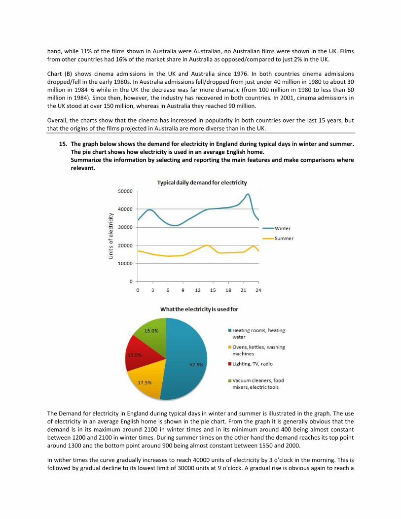
15. The graph below shows the demand for electricity in England during typical days in winter and summer. The pie chart shows how electricity is used in an average English home. Summarize the information by selecting and reporting the main features and make comparisons where relevant.
The Demand for electricity in England during typical days in winter and summer is illustrated in the graph. The use of electricity in an average English home is shown in the pie chart. From the graph it is generally obvious that the demand is in its maximum around 2100 in winter times and in its minimum around 400 being almost constant between 1200 and 2100 in winter times. During summer times on the other hand the demand reaches its top point around 1300 and the bottom point around 900 being almost constant between 1550 and 2000.
In wither times the curve gradually increases to reach 40000 units of electricity by 3 o’clock in the morning. This is followed by gradual decline to its lowest limit of 30000 units at 9 o’clock. A gradual rise is obvious again to reach a
stationary level between 3 o’clock and 9 o’clock of about 40000 units again. Then there is a sharp rise in the next hour to reach its maximum before collapsing again to a lower level by the end of the day.
In summer time the curve gradually decrease to reach its lower limit around 9 o’clock of a bit more that 10000 units. A gradual increase is noticed to reach its top of 20000 after which a stationary phase is obvious between 3 o’clock and 10 o’clock at night of about 15000 units.
The pie chart on the other hand shows that 52.5% of the electricity is used for heating rooms and water. 17.5% is consumed for ovens kettles and washing machines 15% is used in lighting TV and radio and finally 15% is consumed in the sue of vacuum cleaners food mixtures and electric tools.
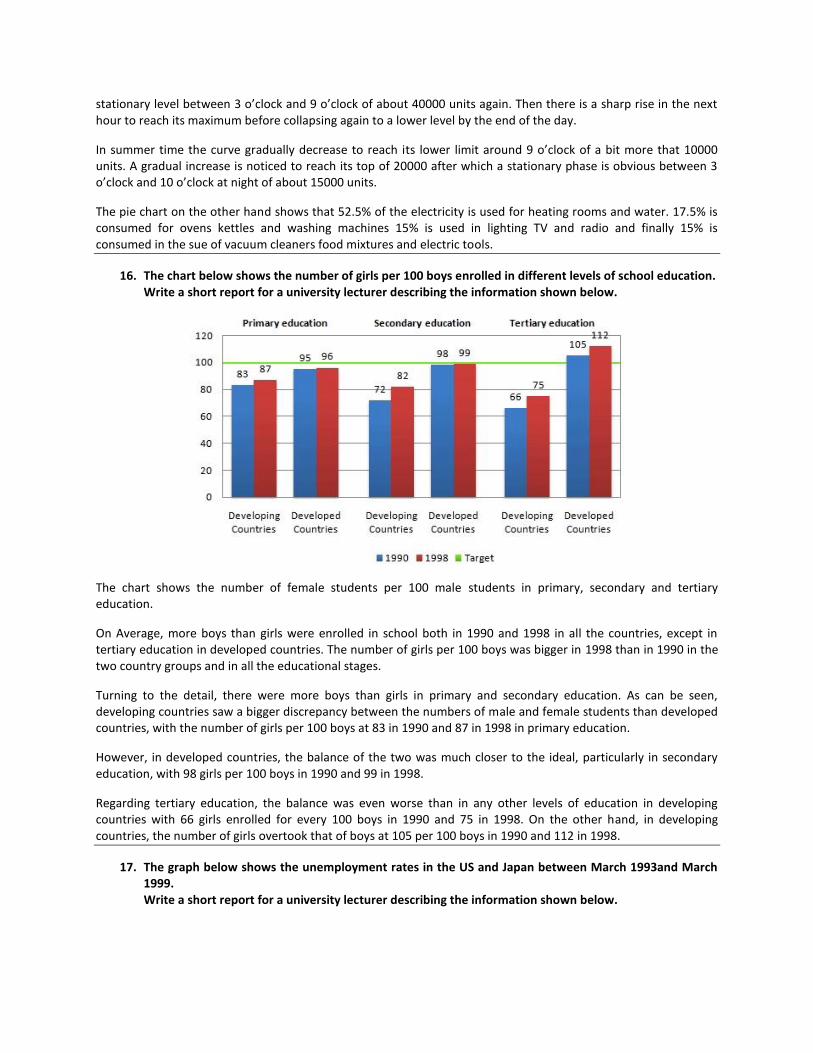
16. The chart below shows the number of girls per 100 boys enrolled in different levels of school education. Write a short report for a university lecturer describing the information shown below.
The chart shows the number of female students per 100 male students in primary, secondary and tertiary education.
On Average, more boys than girls were enrolled in school both in 1990 and 1998 in all the countries, except in tertiary education in developed countries. The number of girls per 100 boys was bigger in 1998 than in 1990 in the two country groups and in all the educational stages.
Turning to the detail, there were more boys than girls in primary and secondary education. As can be seen, developing countries saw a bigger discrepancy between the numbers of male and female students than developed countries, with the number of girls per 100 boys at 83 in 1990 and 87 in 1998 in primary education.
However, in developed countries, the balance of the two was much closer to the ideal, particularly in secondary education, with 98 girls per 100 boys in 1990 and 99 in 1998.
Regarding tertiary education, the balance was even worse than in any other levels of education in developing countries with 66 girls enrolled for every 100 boys in 1990 and 75 in 1998. On the other hand, in developing countries, the number of girls overtook that of boys at 105 per 100 boys in 1990 and 112 in 1998.
17. The graph below shows the unemployment rates in the US and Japan between March 1993and March 1999. Write a short report for a university lecturer describing the information shown below.
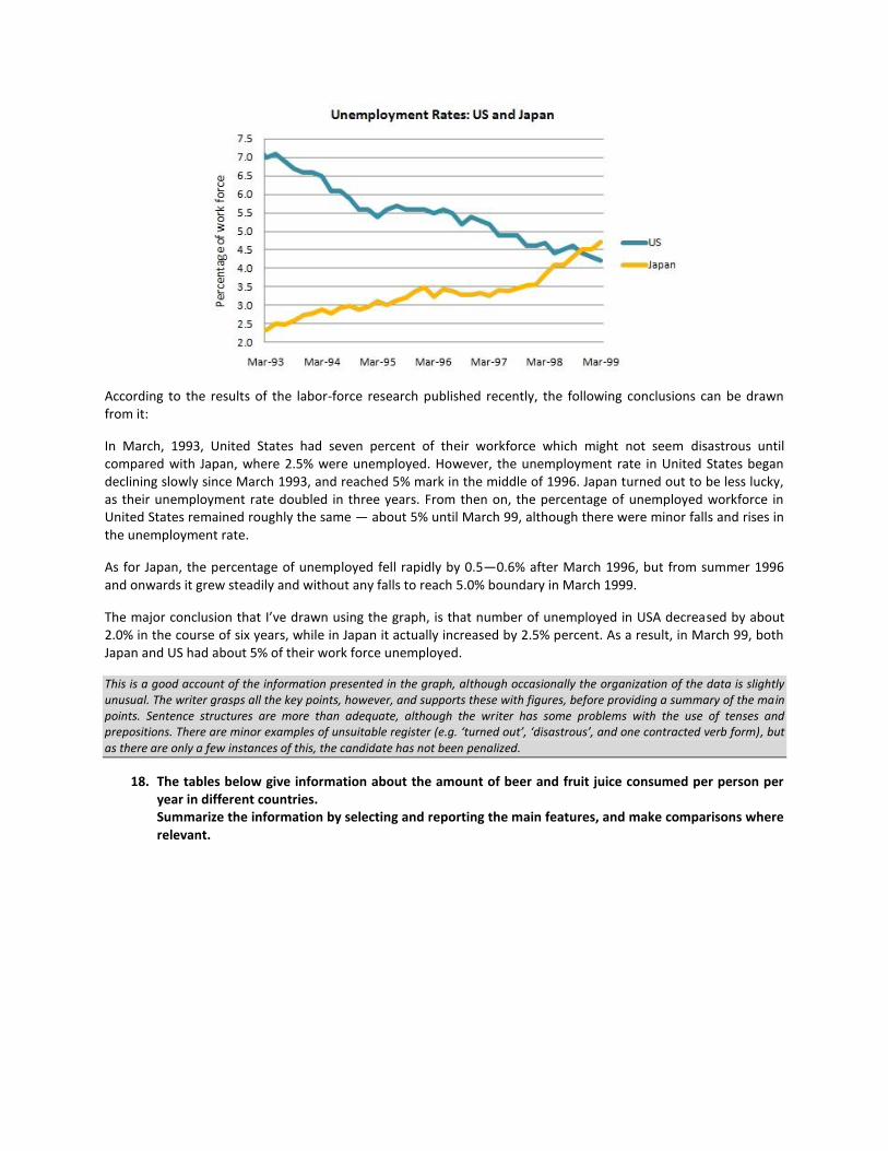
According to the results of the labor-force research published recently, the following conclusions can be drawn from it:
In March, 1993, United States had seven percent of their workforce which might not seem disastrous until compared with Japan, where 2.5% were unemployed. However, the unemployment rate in United States began declining slowly since March 1993, and reached 5% mark in the middle of 1996. Japan turned out to be less lucky, as their unemployment rate doubled in three years. From then on, the percentage of unemployed workforce in United States remained roughly the same — about 5% until March 99, although there were minor falls and rises in the unemployment rate.
As for Japan, the percentage of unemployed fell rapidly by 0.5—0.6% after March 1996, but from summer 1996 and onwards it grew steadily and without any falls to reach 5.0% boundary in March 1999.
The major conclusion that I’ve drawn using the graph, is that number of unemployed in USA decreased by about 2.0% in the course of six years, while in Japan it actually increased by 2.5% percent. As a result, in March 99, both Japan and US had about 5% of their work force unemployed.
This is a good account of the information presented in the graph, although occasionally the organization of the data is slightly unusual. The writer grasps all the key points, however, and supports these with figures, before providing a summary of the main points. Sentence structures are more than adequate, although the writer has some problems with the use of tenses and prepositions. There are minor examples of unsuitable register (e.g. ‘turned out’, ‘disastrous’, and one contracted verb form), but as there are only a few instances of this, the candidate has not been penalized.
18. The tables below give information about the amount of beer and fruit juice consumed per person per year in different countries. Summarize the information by selecting and reporting the main features, and make comparisons where relevant.
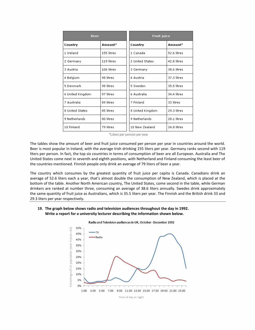
The tables show the amount of beer and fruit juice consumed per person per year in countries around the world. Beer is most popular in Ireland, with the average Irish drinking 155 liters per year. Germany ranks second with 119 liters per person. In fact, the top six countries in terms of consumption of beer are all European. Australia and The United States come next in seventh and eighth positions, with Netherland and Finland consuming the least beer of the countries mentioned. Finnish people only drink an average of 79 liters of beer a year.
The country which consumes by the greatest quantity of fruit juice per capita is Canada. Canadians drink an average of 52.6 liters each a year, that’s almost double the consumption of New Zealand, which is placed at the bottom of the table. Another North American country, The United States, come second in the table, while German drinkers are ranked at number three, consuming an average of 38.6 liters annually. Swedes drink approximately the same quantity of fruit juice as Australians, which is 35.5 liters per year. The Finnish and the British drink 33 and 29.3 liters per year respectively.
19. The graph below shows radio and television audiences throughout the day in 1992. Write a report for a university lecturer describing the information shown below.
Answer 1
The graph shows the percentage of audiences over 4 yes old of UK follows the radio and television throughout the day during the period October-December 1992. It has been observed from the graph that less than 10% audiences follows the radio at 6:00 am and the percentage raised to a pick around 30% at 8'AM and decline gradually to around 10% during the period 2'00 to 4'00 Pm and again raised a bi t to around 12% between 4'00 to 6'00 PM. It then again dropped to below 10% at around 10'PM. The rate again raised to a bit between 10'00 PM to 12'00 PM and then dropped slowly by 4'00 AM. On the other hand, the rate of television audiences raises 0-10% during the period 6'00 to 8'00 am and remain steady up to 1 0'AM and then gradually goes down by 12'00 noon. The percentage raised dramatically to around 15% by 2'00 noon. The percentage raised dramatically goes down by 12'00 noon. The percentage raised dramatically to around 15% by 2'00 PM which again raised to a pick above 40% between 6'00-8'00 PM and then gradually dropped between the period 12'00 PM to 4'00 AM.
The answer has an appropriate introduction which the candidate has attempted to express in his/her own words. There is good coverage of the data and a brief reference to contrasting trends. The answer can be followed although it is rather repetitive and cohesive devices are overused. In order to gain a higher mark for content, the candidate would be expected to select the salient features of the graph and comment primarily on these. Sentences are long but lack complexity. There are some errors in tense, verb form and spelling which interfere slightly with the flow of the answer.
Answer 2
The blue graph shows the television audiences throughout the day. It shows that the percentage of audiences is three percent in early morning but it gradually rises unto ten percent at 8:00 am and maintains the same for the next two hours. There is a slight fall in percentage in next two hours however after that it raises sharp unto twenty percent within the next two hours. After this the graph rises very fast and attains its peak at 10 pm which is about forty five percent. The graph gradually falls down and at 2:00 am it is at five percent. The red graph shows the percentage for radio audiences. Unlike the television one the peak percentage of the radio audiences is at 8:00 am which is about 30 percent. Then it gradually falls and it corresponds with the television one at two pm. After that it gradually falls but with a small increase in percentage at 4:30 to 6:00 pm. The percentage of audience then gradually goes down and at four AM it is the lowest which is near 2 percent. These graphs prove the progressive popularity of television.
The answer deals well with both the individual media trends and the overall comparison of these trends. The opening could be more fully developed with the inclusion of information relating to the groups studied and the period of time during which the study took place. There is a good variety of cohesive devices and the message can be followed quite easily although the expression is sometimes a little clumsy. Structures are complex and vocabulary is varied but there are errors in word forms, tense and voice though these do not impede communication.
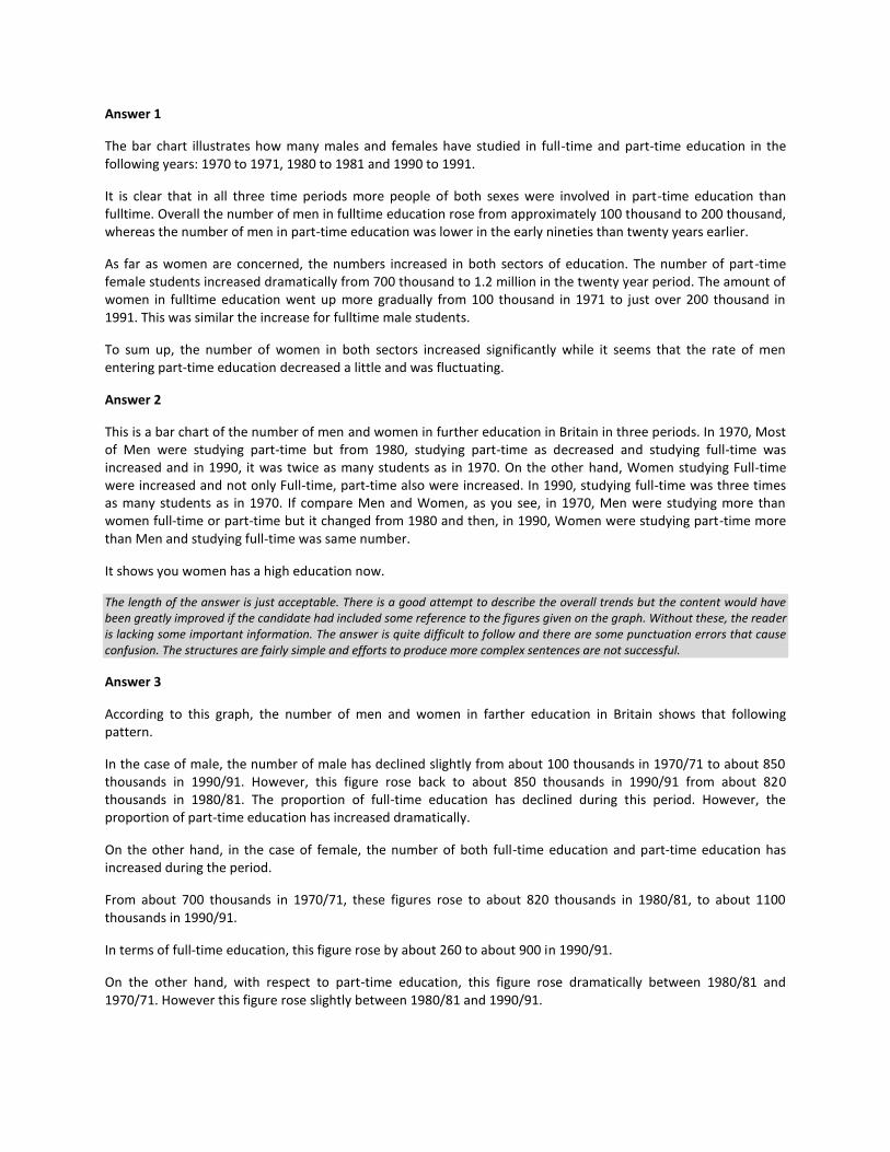
20. The chart below shows the number of men and women in further education in Britain in three periods and whether they were studying fulltime or part-time. Summarize the information by selecting and reporting the main features, and make comparisons where relevant.
Answer 1
The bar chart illustrates how many males and females have studied in full-time and part-time education in the following years: 1970 to 1971, 1980 to 1981 and 1990 to 1991.
It is clear that in all three time periods more people of both sexes were involved in part-time education than fulltime. Overall the number of men in fulltime education rose from approximately 100 thousand to 200 thousand, whereas the number of men in part-time education was lower in the early nineties than twenty years earlier.
As far as women are concerned, the numbers increased in both sectors of education. The number of part-time female students increased dramatically from 700 thousand to 1.2 million in the twenty year period. The amount of women in fulltime education went up more gradually from 100 thousand in 1971 to just over 200 thousand in 1991. This was similar the increase for fulltime male students.
To sum up, the number of women in both sectors increased significantly while it seems that the rate of men entering part-time education decreased a little and was fluctuating.
Answer 2
This is a bar chart of the number of men and women in further education in Britain in three periods. In 1970, Most of Men were studying part-time but from 1980, studying part-time as decreased and studying full-time was increased and in 1990, it was twice as many students as in 1970. On the other hand, Women studying Full-time were increased and not only Full-time, part-time also were increased. In 1990, studying full-time was three times as many students as in 1970. If compare Men and Women, as you see, in 1970, Men were studying more than women full-time or part-time but it changed from 1980 and then, in 1990, Women were studying part-time more than Men and studying full-time was same number.
It shows you women has a high education now.
The length of the answer is just acceptable. There is a good attempt to describe the overall trends but the content would have been greatly improved if the candidate had included some reference to the figures given on the graph. Without these, the reader is lacking some important information. The answer is quite difficult to follow and there are some punctuation errors that cause confusion. The structures are fairly simple and efforts to produce more complex sentences are not successful.
Answer 3
According to this graph, the number of men and women in farther education in Britain shows that following pattern.
In the case of male, the number of male has declined slightly from about 100 thousands in 1970/71 to about 850 thousands in 1990/91. However, this figure rose back to about 850 thousands in 1990/91 from about 820 thousands in 1980/81. The proportion of full-time education has declined during this period. However, the proportion of part-time education has increased dramatically.
On the other hand, in the case of female, the number of both full-time education and part-time education has increased during the period.
From about 700 thousands in 1970/71, these figures rose to about 820 thousands in 1980/81, to about 1100 thousands in 1990/91.
In terms of full-time education, this figure rose by about 260 to about 900 in 1990/91.
On the other hand, with respect to part-time education, this figure rose dramatically between 1980/81 and 1970/71. However this figure rose slightly between 1980/81 and 1990/91.

The candidate has made a good attempt to describe the graphs looking at global trends and more detailed figures. There is, however, some information missing and the information is inaccurate in minor areas. The answer flows quite smoothly although connectives are overused or inappropriate, and some of the points do not link up well. The grammatical accuracy is quite good and the language used to describe the trends is well-handled. However, there are problems with expression and the appropriate choice of words and whilst there is good structural control, the complexity and variation in the sentences are limited.