Embed Size (px)
Citation preview
Innovation and Top Income Inequality∗
Philippe Aghion Ufuk Akcigit Antonin Bergeaud
Richard Blundell David Hemous
June 2015
Abstract
In this paper we use cross-state panel data to show a positive and significant cor-relation between various measures of innovativeness and top income inequality in theUnited States over the past decades. Two distinct instrumentation strategies suggestthat this correlation (partly) reflects a causality from innovativeness to top incomeinequality, and the effect is significant: for example, when measured by the numberof patent per capita, innovativeness accounts on average across US states for around17% of the total increase in the top 1% income share between 1975 and 2010. Yet,innovation does not appear to increase other measures of inequality which do not fo-cus on top incomes. Next, we show that the positive effects of innovation on the top1% income share are dampened in states with higher lobbying intensity. Finally, fromcross-section regressions performed at the commuting zone (CZ) level, we find that:(i) innovativeness is positively correlated with upward social mobility; (ii) the positivecorrelation between innovativeness and social mobility, is driven mainly by entrant in-novators and less so by incumbent innovators, and it is dampened in states with higherlobbying intensity. Overall, our findings vindicate the Schumpeterian view whereby therise in top income shares is partly related to innovation-led growth, where innovationitself fosters social mobility at the top through creative destruction.
JEL classification: O30, O31, O33, O34, O40, O43, O47, D63, J14, J15Keywords: top income, inequality, innovation, patenting, citations, social mobility,
incumbents, entrant
∗Addresses - Aghion: Harvard University, NBER and CIFAR. Akcigit: University of Pennsylvania andNBER. Bergeaud: Banque de France. Blundell: University College London, Institute of Fiscal Studies,NBER and CEPR. Hemous: INSEAD and CEPR. We thank Daron Acemoglu, Pierre Azoulay, GilbertCette, Raj Chetty, Mathias Dewatripont, Thibault Fally, Maria Guadalupe, John Hassler, Elhanan Helpman,Chad Jones, Pete Klenow, Torsten Persson, Thomas Piketty, Andres Rodriguez-Clare, Emmanuel Saez,Stefanie Stantcheva, Francesco Trebbi, Fabrizio Zilibotti and seminar participants at MIT Sloan, INSEAD,the University of Zurich, Harvard University, The Paris School of Economics, Berkeley, the IIES at StockholmUniversity, and the IOG group at the Canadian Institute for Advanced Research for very helpful commentsand suggestions.
1
1 Introduction
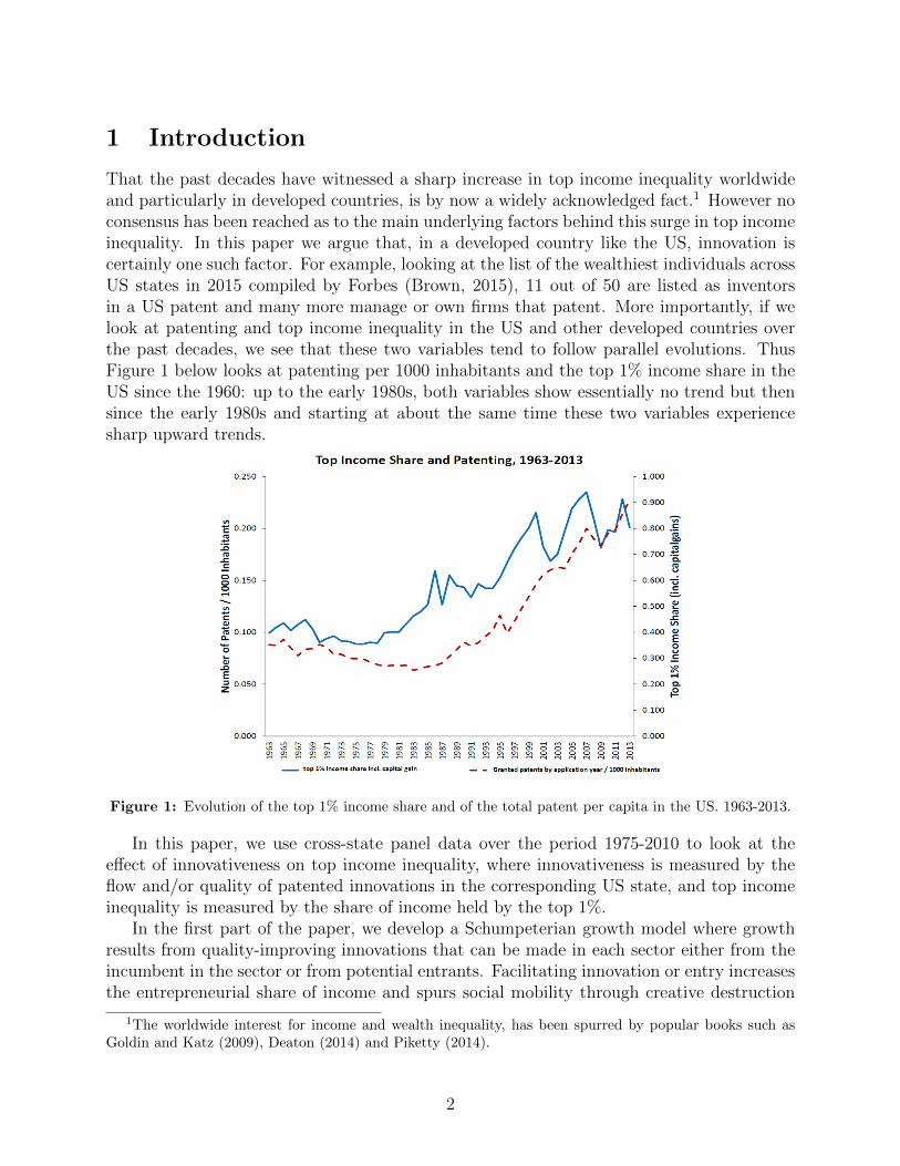
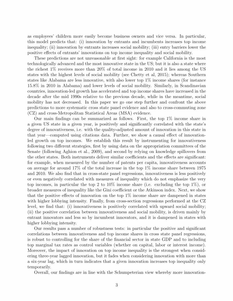
That the past decades have witnessed a sharp increase in top income inequality worldwideand particularly in developed countries, is by now a widely acknowledged fact.1 However noconsensus has been reached as to the main underlying factors behind this surge in top incomeinequality. In this paper we argue that, in a developed country like the US, innovation iscertainly one such factor. For example, looking at the list of the wealthiest individuals acrossUS states in 2015 compiled by Forbes (Brown, 2015), 11 out of 50 are listed as inventorsin a US patent and many more manage or own firms that patent. More importantly, if welook at patenting and top income inequality in the US and other developed countries overthe past decades, we see that these two variables tend to follow parallel evolutions. ThusFigure 1 below looks at patenting per 1000 inhabitants and the top 1% income share in theUS since the 1960: up to the early 1980s, both variables show essentially no trend but thensince the early 1980s and starting at about the same time these two variables experiencesharp upward trends.
Figure 1: Evolution of the top 1% income share and of the total patent per capita in the US. 1963-2013.
In this paper, we use cross-state panel data over the period 1975-2010 to look at theeffect of innovativeness on top income inequality, where innovativeness is measured by theflow and/or quality of patented innovations in the corresponding US state, and top incomeinequality is measured by the share of income held by the top 1%.
In the first part of the paper, we develop a Schumpeterian growth model where growthresults from quality-improving innovations that can be made in each sector either from theincumbent in the sector or from potential entrants. Facilitating innovation or entry increasesthe entrepreneurial share of income and spurs social mobility through creative destruction
1The worldwide interest for income and wealth inequality, has been spurred by popular books such asGoldin and Katz (2009), Deaton (2014) and Piketty (2014).
2
as employees’ children more easily become business owners and vice versa. In particular,this model predicts that: (i) innovation by entrants and incumbents increases top incomeinequality; (ii) innovation by entrants increases social mobility; (iii) entry barriers lower thepositive effects of entrants’ innovations on top income inequality and social mobility.
These predictions are not unreasonable at first sight: for example California is the mosttechnologically advanced and the most innovative state in the US; but it is also a state wherethe richest 1% receives more than 20% of total income in 2010 and it lies among the USstates with the highest levels of social mobility (see Chetty et al, 2015); whereas Southernstates like Alabama are less innovative, with also lower top 1% income shares (for instance15.8% in 2010 in Alabama) and lower levels of social mobility. Similarly, in Scandinaviancountries, innovation-led growth has accelerated and top income shares have increased in thedecade after the mid 1990s relative to the previous decade, while in the meantime, socialmobility has not decreased. In this paper we go one step further and confront the abovepredictions to more systematic cross state panel evidence and also to cross-commuting zone(CZ) and cross-Metropolitan Statistical Areas (MSA) evidence.
Our main findings can be summarized as follows. First, the top 1% income share ina given US state in a given year, is positively and significantly correlated with the state’sdegree of innovativeness, i.e. with the quality-adjusted amount of innovation in this state inthat year—computed using citations data. Further, we show a causal effect of innovation-led growth on top incomes. We establish this result by instrumenting for innovativenessfollowing two different strategies, first by using data on the appropriation committees of theSenate (following Aghion et al., 2009), and second by relying on knowledge spillovers fromthe other states. Both instruments deliver similar coefficients and the effects are significant:for example, when measured by the number of patents per capita, innovativeness accountson average for around 17% of the total increase in the top 1% income share between 1975and 2010. We also find that in cross-state panel regressions, innovativeness is less positivelyor even negatively correlated with measures of inequality which do not emphasize the verytop incomes, in particular the top 2 to 10% income share (i.e. excluding the top 1%), orbroader measures of inequality like the Gini coefficient or the Atkinson index. Next, we showthat the positive effects of innovation on the top 1% income share are dampened in stateswith higher lobbying intensity. Finally, from cross-section regressions performed at the CZlevel, we find that: (i) innovativeness is positively correlated with upward social mobility;(ii) the positive correlation between innovativeness and social mobility, is driven mainly byentrant innovators and less so by incumbent innovators, and it is dampened in states withhigher lobbying intensity.
Our results pass a number of robustness tests: in particular the positive and significantcorrelations between innovativeness and top income shares in cross state panel regressions,is robust to controlling for the share of the financial sector in state GDP and to includingtop marginal tax rates as control variables (whether on capital, labor or interest income).Moreover, the impact of innovation on top income inequality is the strongest when consid-ering three-year lagged innovation, but it fades when considering innovation with more thana six-year lag, which in turn indicates that a given innovation increases top inequality onlytemporarily.
Overall, our findings are in line with the Schumpeterian view whereby more innovation-
3
led growth should both, increase top income shares (which reflect innovation rents) and socialmobility (which results from creative destruction and associated firm and job turnover).
The analysis in this paper relates to several strands of literature. First, to endogenousgrowth models: thus Rebelo (1991) developed an AK model to argue that (over)taxingcapital can be detrimental to growth as capital accumulation amounts to knowledge accu-mulation in AK models. Similarly, a straightforward implication of innovation-based growthmodels (Romer, 1990; Aghion and Howitt, 1992) is that, everything else equal, taxing inno-vation rents is detrimental to growth as it discourages individuals from investing in R&D andthus from innovating. On the other hand, Banerjee and Newman (1993), Galor and Zeira(1993), Benabou (1996) and Aghion and Bolton (1997) argue that once credit constraintsare present, reducing wealth inequality can actually have a stimulating effect on growth, asit allows credit-constrained individuals otherwise subject to credit-rationing to finance inno-vative projects. We contribute to this literature, first by introducing social mobility into thepicture and linking it to creative destruction, and second by looking explicitly at the effectsof innovativeness on top income shares. Hassler and Rodriguez-Mora (2000) analyze therelationship between growth and intergenerational mobility in a model which may featuremultiple equilibria, some with high growth and high social mobility and others with lowgrowth and low social mobility. Multiple equilibria arise because in a high growth environ-ment, inherited knowledge depreciates faster, which reduces the advantage of incumbents. Inthat paper however, growth is driven by externalities instead of resulting from innovations.More recently, Jones and Kim (2014) model an economy where incumbents exert efforts toincrease their market share while entrants can innovate to replace the incumbents. Theinterplay between these two forces ensure a Pareto distribution of income, where top incomeinequality is negatively correlated with innovation and with social mobility, a prediction atodds with our empirical results.2
Second, our paper relates to an empirical literature on inequality and growth. Thus,Banerjee and Duflo (2003) find no robust relationship between income inequality and growthwhen measuring inequality by the Gini coefficient, whereas Forbes (2000) finds a positiverelationship between these two variables. However, these papers do not look at top incomesnor at social mobility, and they do not contrast innovation-led growth with non-frontiergrowth. More closely related to our analysis, Frank (2009) finds a positive relationshipbetween both the top 10% and top 1% income shares and growth across US states; however,Franck does not establish any causal link from growth to top income inequality, nor does heconsider innovation or social mobility.3
Third, a large literature on skill-biased technical change aims at explaining the increasein labor income inequality since the 1970’s. In particular, Katz and Murphy (1992) andGoldin and Katz (2008) have shown that technical change has been skill-biased in the 20th
century. Acemoglu (1998, 2002 and 2007) sees the skill distribution as determining thedirection of technological change, while Hemous and Olsen (2014) argue that the incentive toautomate low-skill tasks naturally increases as an economy develops. Several papers (Aghion
2To be more specific, the negative correlation between top income inequality and innovation hinges onthe fact that Jones and Kim define “innovation” as the result of the innovative efforts by entrants only.
3Parallel work by Acemoglu and Robinson (2015) also reports a positive correlation between top incomeinequality and growth in panel data at the country level (or at least no evidence of a negative correlation).
4

and Howitt, 1997; Caselli, 1999; Galor and Moav, 2000) see General Purpose Technologies(GPT) as lying behind the increase in inequality, as the arrival of a GPT favors workers whoadapt faster to the detriment of the rest of the population. Krusell, Ohanian, Rıos-Rull andViolante (2000) show how with capital-skill complementarity, the increase in the equipmentstock can account for the increase in the skill premium. While this literature focuses onthe direction of innovation and on broad measure of labor income inequality (such as theskill-premium), our paper is more directly concerned with the rise of the top 1% and how itrelates with the rate and quality of innovation (in fact our results suggest that innovativenessdoes not have a strong impact on broad measures of inequality compared to their impact ontop income shares).
Finally, our focus on top incomes links our paper to a large literature documenting asharp increase in top income inequality over the past decades (in particular, see Pikettyand Saez, 2003). We contribute to this line of research by arguing that increases in top 1%income shares, are at least in part caused by increases in innovation-led growth.4
The remaining part of the paper is organized as follows. Section 2 outlays a simpleSchumpeterian model to guide our analysis of the relationship between innovation-led growth,top incomes, and social mobility. Section 3 presents our cross-state panel data and ourmeasures of inequality and innovativeness. Section 4 presents our core regression results.Section 5 discussed three extensions of our analysis: first, it looks at the relationship betweeninnovativeness and social mobility; second, it distinguishes between entrant and incumbentinnovation when looking at the effects on top incomes and on social mobility; third, it looksat how local lobbying impacts on the effects of innovativeness on top income and on socialmobility. Section 6 concludes.
2 Theory
In this section we develop a simple Schumpeterian growth model to explain why increasedR&D productivity or increased openness to entry increases both, the top income share andsocial mobility.
2.1 Baseline model
Consider the following discrete time model. The economy is populated by a continuumof individuals. At any point in time, there is a measure 2 of individuals in the economy,half of them are capital owners who own the firms and the rest of the population worksas production workers.5 Each individual lives only for one period. Every period, a new
4Rosen (1981) emphasizes the link between the rise of superstars and market integration: namely, asmarkets become more integrated, more productive firms can capture a larger income share, which translatesinto higher income for its owners and managers. Similarly, Gabaix and Landier (2008) show that the increasein the size of some firms can account for the increase in their CEO’s pay. Our analysis is consistent with thisline of work, to the extent that successful innovation is a main factor driving differences in productivitiesacross firms, and therefore in firms’ size.
5One can extend the analysis to the more general case where workers’ population differs from businessowners’ population. All our results go through except that we then have to carry around the mass of workers
5

generation of individuals is born and individuals that are born to current firm owners inheritthe firm from their parents. The rest of the population works in production unless theysuccessfully innovate and replace incumbents’ children.
2.1.1 Production
A final good is produced according to the following Cobb-Douglas technology:
lnYt =
∫ 1
0
ln yitdi, (1)
where yit is the amount of intermediate input i used for final production at date t. Eachintermediate is produced with a linear production function
yit = qitlit, (2)
where lit is the amount of labor used to produce intermediate input i at date t and qit is thelabor productivity. Each intermediate i is produced by a monopolist who faces a competitivefringe from the previous technology in that sector.
2.1.2 Innovation
Whenever there is a new innovation in any sector i in period t, quality in that sector improvesby a multiplicative term ηH so that:
qi,t = ηHqi,t−1.
In the meantime, the previous technological vintage qi,t−1 becomes publicly available, so thatthe innovator in sector i obtains a technological lead of ηH over potential competitors.
At the end of period t, other firms can partly imitate the (incumbent) innovator’s tech-nology so that, in the absence of a new innovation in period t + 1, the technological leadenjoyed by the incumbent firm in sector i shrinks to ηL with ηL < ηH .
Assuming away any further imitation before a new innovation occurs, the technologicallead enjoyed by the incumbent producer in any sector i takes two values: ηH in periods withinnovation and ηL < ηH in periods without innovation.6
Finally, we assume that an incumbent producer that has not recently innovated, can stillresort to lobbying in order to prevent entry by an outside innovator. Lobbying is successfulwith exogenous probability z, in which case, the innovation is not implemented, and theincumbent remains the technological leader in the sector (with a lead equal to ηL).
Both potential entrants and incumbents have access to the following innovation technol-ogy. By spending
CK,t (x) = θKx2
2Yt
an incumbent (K = I) or entrant (K = E) can innovate with probability x. A reduction inθK captures an increase in R&D productivity or R&D support, and we allow for it to differbetween entrants and incumbents.
through all the equilibrium equations of the model.6The details of the imitation-innovation sequence do not matter for our results, what matters is that
innovation increases the technological lead of the incumbent producer over its competitive fringe.
6

2.1.3 Timing of events
Each period unfolds as follows:
1. In each line i, a potential entrant spends CE,t (xi) and the offspring of the incumbentin sector i spends CI,t (xi) .
2. With probability (1− z)xi the entrant succeeds, replaces the incumbent and obtainsa technological lead ηH , with probability xi the incumbent succeeds and improves itstechnological lead from ηL to ηH , with probability 1 − (1− z)xi − xi, there is nosuccessful innovation and the incumbent stays the leader with a technological lead ofηL.7
3. Production and consumption take place and the period ends.
2.2 Solving the model
We solve the model in two steps: first, we compute the income shares of entrepreneursand workers and the rate of upward social mobility (from being a worker to becoming anentrepreneur) for given innovation rates by entrants and incumbents; second, we endogeneizethe entrants’ and incumbents’ innovation rates.
2.2.1 Income shares and social mobility for given innovation rates
In this subsection we take as given the fact that in all sectors potential entrants innovate atsome rate xt and incumbents innovate at some rate xt at date t.
Using (2), the marginal cost of production of (the leading) intermediate producer i attime t is
MCit =wtqi,t.
Since the leader and the fringe enter Bertrand competition, the price charged at time t byintermediate producer i is simply a mark-up over the marginal cost equal to the size of thetechnological lead, i.e.
pi,t =wtηitqi,t
, (3)
where ηi,t ∈ {ηH , ηL}. Therefore innovating allows the technological leader to charge tem-porarily a higher mark-up.
Using the fact that the final good sector spends the same amount Yt on all intermediategoods (a consequence of the Cobb-Douglas technology assumption), we have in equilibrium:
Yt = pi,tyit for all i. (4)
7For simplicity, we rule out the possibility that both agents innovate in the same period, so that innova-tions by the incumbent and the entrant in any sector, are not independent events. This can be microfoundedin the following way. Assume that every period there is a mass 1 of ideas, and only one idea is succesful.Research efforts x and x represent the mass of ideas that a firm investigates. Firms can observe each otheractions, therefore in equilibrium they will never choose to look for the same idea provided that x∗ + x∗ < 1,which is satisfied for θK sufficiently large.
7

This, together with (3) and (2), allows us to immediately express the labor demand andthe equilibrium profit in any sector i at date t. Labor demand by producer i at time t isgiven by:
lit =Ytwtηit
.
And equilibrium profits in sector i at time t are equal to:
πit = (pit −MCit)yit =ηit − 1
ηitYt.
Hence profits are higher if the incumbent has recently innovated, namely:
πH,t =ηH − 1
ηH︸ ︷︷ ︸≡πH
Yt > πL,t =ηL − 1
ηL︸ ︷︷ ︸≡πL
Yt.
Now we have everything we need to derive the expressions for the income shares of workersand entrepreneurs and for the rate of upward social mobility. Let µt denote the fraction ofhigh-mark-up sectors (i.e. with ηit = ηH) at date t.
Labor market clearing at date t implies that:
1 =
∫litdi =
∫Ytwtηit
di =Ytwt
[µtηH
+1− µtηL
]We restrict attention to the case where the ηit’s are sufficiently large that
wt < πL,t < πH,t,
so that top incomes are earned by entrepreneurs.Hence the share of income earned by workers (wage share) at time t is equal to:
wages sharet =wtYt
=µtηH
+1− µtηL
. (5)
whereas the share of income earned by entrepreneurs (entrepreneurs share) at time t is equalto:
entrepreneur sharet =µtπH,t + (1− µt) πL,t
Yt= 1− µt
ηH− 1− µt
ηL. (6)
Since mark-ups are larger in sectors with new technologies, aggregate income shifts fromworkers to entrepreneurs in relative terms whenever the equilibrium fraction of product lineswith new technologies µt increases. But by the law of large numbers this fraction is equalto the probability of an innovation by either the incumbent or a potential entrant in anyintermediate good sector.
More formally, we have:µt = xt + (1− z)xt, (7)
which increases with the innovation intensities of both incumbents and entrants, but to alesser extent with respect to entrants’ innovations the higher the entry barriers z are.
8

Finally, we measure upward social mobility by the probability Ψt that the offspring of aworker becomes a business owner. This in turn happens only if this individual manages tofirst innovate and then avoids the entry barrier; therefore
Ψt = xt (1− z) , (8)
which is increasing in entrant’s innovation intensity xt but less so the higher the entry barriersz are. This yields:
Proposition 1 (i) A higher rate of innovation by a potential entrant, xt, is associated witha higher entrepreneur share of income and a higher rate of social mobility, but less so thehigher the entry barriers z are; (ii) A higher rate of innovation by an incumbent, xt, isassociated with a higher entrepreneur share of income but has no impact on social mobility.
Remark 1: That the equilibrium share of wage income in total income decreases withthe fraction of high mark-up sectors µt, and therefore with the innovation intensities ofentrants and incumbents, does not imply that the equilibrium level of wages also declines.In fact the opposite occurs, and to see this more formally, we can compute the equilibriumlevel of wages by plugging (4) and (3) in (1), which yields:
wt =Qt
ηµtH η1−µtL
, (9)
where Qt is the quality index defined as Qt = exp∫ 1
0ln qitdi. The law of motion for the
quality index is computed as
Qt = exp
∫ 1
0
[µt ln ηHqit−1 + (1− µt) ln qit−1] di = Qt−1ηµtH . (10)
Therefore, for given technology level at time t− 1, the equilibrium wage is given by
wt = ηµt−1L Qt−1.
This last equation clearly shows that the overall effect of a current increase in innovationintensities is to increase the equilibrium wage for given technology level at time t− 1, eventhough it also shifts some income share towards entrepreneurs.8
Remark 2: Equation (9) shows that if the equilibrium innovation intensities x∗ and x∗
of the entrant and incumbent are constant over time (which we show below) the growth rateof aggregate variables such as aggregate output and the wage rate is equal to the growth rateof the quality index Qt. Using the law of motion for Qt (10), we get that the equilibriumgrowth rate is a constant given by
g∗ = η(1−z)x∗+x∗H − 1,
which is increasing in the entrant innovation rate x∗ (but less so the higher entry barriers zare) and in the incumbent innovation rate x∗.9
8In addition, note that the entrepreneurial share is independent of innovation intensities in previousperiods. Therefore, a temporary increase in current innovation only leads to a temporary increase in theentrepreneurial share: once imitation occurs, the gains from the current burst in innovation will be equallyshared by workers and entrepreneurs.
9We looked at an extension of the model where only some high-ability incumbents can potentially innovate
9

2.2.2 Endogenous innovation
We now turn to the endogenous determination of the innovation rates of entrants and incum-bents. The offspring of the previous period’s incumbent solves the following maximizationproblem:
maxx
{xπHYt + (1− x− (1− z)x∗) πLYt + (1− z)x∗wt − θI
x2
2Yt
}.
This expression states that the offspring of an incumbent can already collect the profits ofthe firm that she inherited (πL), but also has the chance of making higher profit (πH) byinnovating with probability x.
Clearly the optimal innovation decision is simply
x∗t = x∗ =πH − πL
θI=
(1
ηL− 1
ηH
)1
θI, (11)
which decreases with incumbent R&D cost parameter θI .A potential entrant in sector i solves the following maximization problem:
maxx
{(1− z)xπHYt + (1− x (1− z))wt − θE
x2
2Yt
},
since an entrant chooses its innovation rate with the outside option being a production workerwho receives wage wt.
Using the fact (see above) that
wtYt
=µtηH
+1− µtηL
,
taking first order conditions, and using our assumption that wt < πL,t, we can express theentrant innovation rate as
x∗t ≡ x∗ =
(πH −
[µtηH
+1− µtηL
])(1− z)
θE. (12)
Then, using the fact that in equilibrium
µ∗ = (1− z)x∗ + x∗,
the equilibrium innovation rate for entrants is simply given by
x∗ =
(πH − 1
ηL+(
1ηL− 1
ηH
)x∗)
(1− z)
θE − (1− z)2(
1ηL− 1
ηH
) . (13)
while the other, low-ability, incumbents cannot. In this extension, a high rate of entrant’s innovation and lowentry barriers further increase growth by ensuring a higher share of high-ability incumbents in steady-state.
10

Therefore lower barriers to entry (i.e. a lower z) and less costly R&D for entrants (lowerθE) both increase the entrants’ innovation rate (as 1/ηL− 1/ηH > 0). Less costly incumbentR&D also increases the entrant innovation rate since x∗ is decreasing in θI .
10
Intuitively, high mark-up sectors are those where an innovation just occurred and wasnot blocked, so a reduction in either entrants’ or incumbents’ R&D costs increases the shareof high mark-up sectors in the economy and thereby the entrepreneurs’ share of income.And to the extent that higher entry barriers dampen the positive correlation between theentrants’ innovation rate and the entrepreneurial share of income, they will also dampen thepositive effects of a reduction in entrants’ or incumbents’ R&D costs on the entrepreneurialshare of income.11
Finally, equation (8) immediately implies that a reduction in entrants’ or incumbents’R&D costs increases social mobility but less so the higher the barriers to entry are.
We have thus established:
Proposition 2 An increase in R&D productivity (whether it is associated with a reductionin θI or in θE), leads to an increase in the innovation rates x∗ and x∗ but less so the higherthe entry barriers z are; consequently, it leads to higher growth, higher entrepreneur shareand higher social mobility but less so the higher the entry barriers are.
Proof. The only claim we have not formally proved in the text is that ∂2
∂θK∂z(1− z)x∗ > 0
(which immediately implies that the positive impact of a increase in R&D productivity ongrowth, entrepreneurial share and social mobility is attenuated when barriers to entry arehigh). Differentiating first with respect to θE, we get:
∂ (1− z)x∗
∂θE= − (1− z)x∗
θE − (1− z)2(
1ηL− 1
ηH
) ,which is increasing in z since x∗ and (1− z) both decrease in z and the denominator θ +
(1− z)2[
1ηH− 1
ηL
]increases in z (recall that 1
ηL− 1
ηH> 0). Similarly, differentiating with
respect to θI gives:
∂ (1− z)x∗
∂θI=
(1ηL− 1
ηH
)(1− z)
θE − (1− z)2(
1ηL− 1
ηH
) ∂x∗∂θI
,
which is increasing in z since ∂x∗
∂θI< 0, and 1 − z and the denominator both decrease in z.
This establishes the proposition.
2.2.3 Impact of mark-ups on innovation and inequality
Our discussion so far pointed to a causality from innovation to top income inequality andsocial mobility. However the model also speaks to the reverse causality from top inequality to
10That x∗ increases with x∗ results from the fact that more innovation by incumbents lowers the equilibriumwage which decreases the opportunity cost of innovation for an entrant. This general equilibrium effect restson the assumption that incumbents and entrants cannot both innovate in the same period.
11See the proof of Proposition 2 below.
11

innovation. First, a higher innovation size ηH leads to a higher mark-up for firms which havesuccessfully innovated. As a result, it increases the entrepreneur share for given innovationrate (see (6)). Second, a higher ηH increases incumbents’ (11) and (13) entrants’ innovationrates, which further increases the entrepreneur share of income.
More interestingly perhaps, a higher ηL increases the mark-up of a non-innovator andthereby also the entrepreneur share, while discouraging incumbent’s innovation.12 This inturn may dampen the positive correlation between innovation and the entrepreneur share ofincome.
2.3 Predictions
We can summarize the main predictions from the above theoretical discussion as follows.
• Innovation by both entrants and incumbents, increases top income inequality;
• Innovation by entrants increases social mobility;
• Entry barriers lower the positive effect of entrants’ innovation on top income inequalityand on social mobility.
We now confront these predictions to the data.
3 Data and measurement
Our core empirical analysis is carried out at US state level. Our dataset covers the period1975-2010, a time range imposed upon us by the availability of patent data.
3.1 Inequality
The data on the share of income owned by the top 1% of the income distribution for ourcross-US-state panel analysis, are drawn from the US State-Level Income Inequality Database(Frank, 2009). From the same data source, we also gather information on alternative mea-sures of inequality: namely, the top 10% income share, the Atkinson Index (with a coefficientof 0.5), the Theil Index and the Gini Index. We thus end up with a balanced panel of 51states (we include Alaska and Hawaii and count the District of Columbia as a “state”) and atotal of 1836 observations (51 states over 36 years). In 2010, the three states with the highestshare of total income held by the richest 1% are Connecticut, New York and Wyoming withrespectively 21.7%, 21.1% and 20.1% whereas West Virginia, Iowa and Maine are the stateswith the lowest share held by the top 1% (respectively 11.8%, 12% and 12%). In every USstate, the top 1% income share has increased between 1975 and 2010, the unweighted meanvalue was around 8% in 1975 and reached 21% in 2007 before slowly decreasing to 16.3% in
12In the Appendix, we show that an increase in ηL also decreases total innovation when θI = θE , but yetits impact on the entrepreneur share remains positive for a sufficiently high R&D cost (i.e. for θ sufficientlyhigh).
12
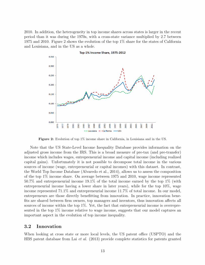
2010. In addition, the heterogeneity in top income shares across states is larger in the recentperiod than it was during the 1970s, with a cross-state variance multiplied by 2.7 between1975 and 2010. Figure 2 shows the evolution of the top 1% share for the states of Californiaand Louisiana, and in the US as a whole.
Figure 2: Evolution of top 1% income share in California, in Louisiana and in the US.
Note that the US State-Level Income Inequality Database provides information on theadjusted gross income from the IRS. This is a broad measure of pre-tax (and pre-transfer)income which includes wages, entrepreneurial income and capital income (including realizedcapital gains). Unfortunately it is not possible to decompose total income in the varioussources of income (wage, entrepreneurial or capital incomes) with this dataset. In contrast,the World Top Income Database (Alvaredo et al., 2014), allows us to assess the compositionof the top 1% income share. On average between 1975 and 2010, wage income represented50.7% and entrepreneurial income 19.1% of the total income earned by the top 1% (withentrepreneurial income having a lower share in later years), while for the top 10%, wageincome represented 71.1% and entrepreneurial income 11.7% of total income. In our model,entrepreneurs are those directly benefitting from innovation. In practice, innovation bene-fits are shared between firm owners, top managers and inventors, thus innovation affects allsources of income within the top 1%. Yet, the fact that entrepreneurial income is overrepre-sented in the top 1% income relative to wage income, suggests that our model captures animportant aspect in the evolution of top income inequality.
3.2 Innovation
When looking at cross state or more local levels, the US patent office (USPTO) and theHBS patent database from Lai et al. (2013) provide complete statistics for patents granted
13
between the years 1975 and 2010. For each patent, it provides information on the state ofresidence of the patent inventor, the date of application of the patent and a link to everyciting patents granted before 2010. This citation network between patents enables us toconstruct several estimates for the quality of innovation as described below. Since a patentcan be associated with more than one inventor and since coauthors of a given patent donot necessarily live in the same state, we assume that patents are split evenly betweeninventors and thus we attribute only a fraction of the patent to each inventor. A patent isalso associated with an “assignee” that owns the right to the patent. Usually, the assignee isthe firm employing the inventor, and for independent inventors the assignee and the inventorare the same person. We chose to locate each patent according to the US state where itsinventor lives and works. Although the inventor’s location might occasionally differ fromthe assignee’s location, most of the time the two locations coincide (the correlation betweenthe two is above 92%).13 Moreover, we checked that all our results are robust to locatingpatents according to the assignee’s address instead of the inventor’s address. And we alsochecked the robustness of our results to removing independent inventors from the patentcount. Finally, in line with the patenting literature, we focus on “utility patents” whichcover 90% of all patents at the USPTO.14
3.2.1 Truncation bias
The so-called truncation bias in patent count stems from the fact that the process of grantinga patent takes about two years on average following patent application. As the individualUSPTO database contains only patents that have been granted before 2010, simply groupingby state for each year will lead to underestimate the intensity of innovation as we approach theend period of the sample (as many patents with application dates close to 2010 are unlikely tobe granted by 2010, and therefore to appear in the database). Since we restrict attention topatents with application dates between 1975 and 2010, the truncation bias is not an issue atthe beginning of the time period (correcting for patents that were granted after 1975 but withapplication dates before 1975). To account for truncation, we use aggregate data on patentgranted by application date at the state level from the USPTO website. These data havebeen updated in 2014 and therefore in principle they should not suffer too much from thetruncation bias problem over the period 1975-2010. However, even before 2010, we observea decrease in the number of granted patents as distributed by their application date.15 Twomain factors seem to account for the decreasing trend in the number of granted patents.First, the information technology bubble has led many inventors to create a company inthe high tech sector during the 90s and to innovate faster than their competitors. This
13For example, Delaware and DC are states for which the inventor’s address is more likely to differ fromthe assignee’s address.
14The USPTO classification considers three types of patents according to the official documentation: utilitypatents that are used to protect a new and useful invention, for example a new machine, or an improvementto an existing process; design patents that are used to protect a new design of a manufactured object; andplant patents that protect some new varieties of plants. Among those three types of patents, the first ispresumably the best proxy for innovation, and it is the only type of patents for which we have completedata.
15This is not the case when looking at the number of patents distributed by their granting year.
14

generated a patent race that stopped after the crisis in 2000. Second, the USPTO has faceda large surge in the number of patent applications since the past decade as evidenced bythe official statistics on the number of applications (regardless of whether these patents willultimately be granted or not). Consequently, a growing share in the number of applicationsfiled are still pending because they have not yet been examined (for more information aboutthis “backlog”, see De Rassenfosse et al. (2013)). To address this problem, we completedthe series after 200616 with the adjusted number of patent applications by the various states(regardless of whether the patents were to be granted or rejected) from the Strumsky GrantedPatent and Patent Application Database17 assuming a constant and homogeneous rate ofacceptance for the years 2007, 2008, 2009 and 2010. This assumption is not unreasonablewhen looking at past data. This method has its shortcomings though: the measure is noisyfor the last three years as it may involve including many insignificant patents. An alternativewould be to assume that the backlog accounts for the same share of patents across all states,which in turn is consistent with the shape of the lag distribution being very similar acrossstates. Then, the backlog would be captured by our fixed effects. Fortunately, these twoapproaches yield very similar results and therefore we shall only present results using thefirst approach.18
Similarly, we correct for truncated citation bias using the quasi-structural approach pro-posed by Hall, Jaffe and Trajtenberg (2001) and extend their HJT corrector until 2010. Thismethod allows us to generate corrected citation data that can be compared over time andtechnologies. Here again, because of the inaccuracy of the correction variable for the lastthree years, corrected citation counts can mainly be used before 2008.
There is a substantial amount of variation in innovativeness both across states and overtime. Between 1975 and 1990, Delaware, Connecticut, New Jersey and Massachusetts werethe most innovating states (with 0.55, 0.4, 0.39 and 0.29 patents per 1000 inhabitants re-spectively), while Arkansas, Mississippi and Hawaii were the least innovative states withless than 0.05 patents per thousands inhabitants. Between 1990 and 2009, however, themost innovative states were Idaho (0.99 patents per 1000 inhabitants), Vermont (0.86), Mas-sachusetts (0.63), Minnesota (0.61) and California (0.61), whereas Arkansas, West Virginiaand Mississippi all had less than 0.06 patents per 1000 inhabitants.19
16According to the USPTO website: “As of 12/31/2012, utility patent data, as distributed by year ofapplication, are approximately 95% complete for utility patent applications filed in 2004, 89% complete forapplications filed in 2005, 80% complete for applications filed in 2006, 67% complete for applications filedin 2007, 49% complete for applications filed in 2008, 36% complete for applications filed in 2009, and 19%complete for applications filed in 2010; data are essentially complete for applications filed prior to 2004.” Bythe same logic, in 2014 nearly all patents from 2006 should be included.
17https://clas-pages.uncc.edu/innovation/18Yet another approach is to delete the time component by considering only the share of total patents
application in each state. We checked the robustness of our results to using this alternative approach.19Idaho’s place at the top of this list may look surprising, but it is home to several tech companies
(particularly in semiconductors). Our results carry through if one excludes Idaho.
15
3.2.2 Quality measures
Simply counting the number of patent granted by their application date is a crude measureof innovation as it does not differentiate between a patent that made a significant contri-bution to science and a more incremental one. The USPTO database, provides sufficientlyexhaustive information on patent citation to compute indicators which better measure thequality of innovation. We consider four measures of innovation quality:
• 3, 4 and 5 year windows citations counter : this variable measures the number ofcitations received within no more than 3, 4 or 5 years after the application date. Thismeasure has the advantage of being immune from the citation truncation bias problemdescribed above as long as we correct for the number of patents and provided we stopour data sample at patents applied in 2006, 2005 and 2004 respectively.
• Is the patent among the 5% most cited in the year by 2010? This is a dummy variableequal to one if the patent applied for in a given year belong to the top 5% most citedpatents. Because most of the patents are not yet cited, or at most once, in 2008, 2009and 2010, we stop computing this measure after the year 2007.
• Total corrected citation counter: This measures the number of times a patent has beencited, once this number has been corrected for the truncation citation bias as explainedabove.
• Has the patent been renewed? This is a dummy variable equal to one if the patenthas been renewed (at least one) before 2014. Indeed, USPTO require inventors topay maintenance fees three times during the lifetime of the patent, the first paymentbeing made three years after the date of issue. Hence this measure is immune fromtruncation bias issues. Unfortunatly, these data are only available from 1982.
These measures have been aggregated at the state level by taking the sum of the qualitymeasures over the total number of patents granted for a given state and a given applicationdate and then divided by the number of inhabitants. Most of our quality measures can thusbe considered as citation weighted patents counts. These different measures of innovativenessdisplay consistent trends: hence the four states with the highest flows of patents between1975 and 1990 are also the four states with the highest total citation counts, and similarlyfor the five most innovative states between 1990 and 2009.
3.3 Control variables
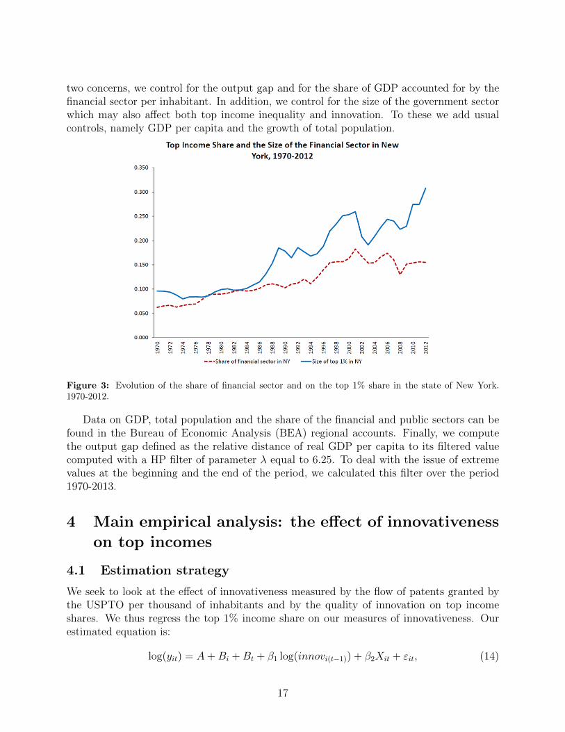
When regressing top income shares on innovativeness, a few concerns may be raised. First,the business cycle is likely to have direct effects on innovation and top income share. Second,top income share groups are likely to involve to a significant extent individuals employed bythe financial sector (see for example Philippon and Reshef, 2012). To evidence this strongcorrelation, Figure 3 shows the evolution of the share of the financial sector and of the sizeof the top 1% income share group in the state of New York. In turn, the financial sectoris sensitive to business cycles and it may also affect innovation directly. To address these
16
two concerns, we control for the output gap and for the share of GDP accounted for by thefinancial sector per inhabitant. In addition, we control for the size of the government sectorwhich may also affect both top income inequality and innovation. To these we add usualcontrols, namely GDP per capita and the growth of total population.
Figure 3: Evolution of the share of financial sector and on the top 1% share in the state of New York.1970-2012.
Data on GDP, total population and the share of the financial and public sectors can befound in the Bureau of Economic Analysis (BEA) regional accounts. Finally, we computethe output gap defined as the relative distance of real GDP per capita to its filtered valuecomputed with a HP filter of parameter λ equal to 6.25. To deal with the issue of extremevalues at the beginning and the end of the period, we calculated this filter over the period1970-2013.
4 Main empirical analysis: the effect of innovativeness
on top incomes
4.1 Estimation strategy
We seek to look at the effect of innovativeness measured by the flow of patents granted bythe USPTO per thousand of inhabitants and by the quality of innovation on top incomeshares. We thus regress the top 1% income share on our measures of innovativeness. Ourestimated equation is:
log(yit) = A+Bi +Bt + β1 log(innovi(t−1)) + β2Xit + εit, (14)
17
where yit is the measure of inequality, Bi is a state fixed effect, Bt is a year fixed effect,innovi(t−1) is innovativeness in year t − 1,20 and X is a vector of control variables.21 Byincluding state and time fixed effects we are eliminating permanent cross state differencesin inequality and also aggregate changes in inequality. We are essentially studying therelationship between the differential growth in innovation across states with the differentialgrowth in inequality.
4.2 Results from OLS regressions
Table 2 presents the results from regressing top income shares and other inequality measureson the flow of patents. The relevant variables are defined in Table 1. As explained in theprevious section, the number of patents granted by the USPTO for a given application datehas been corrected for the truncation bias.
From Table 2 we see that the effect of the flow of patents per capita on the top 1% incomeshare is always positive and significant at the cross state level. The effect is robust to addingthe control variables even when we control for the size of the financial sector and for the sizeof the government.
Table 3 shows the effect of our various measures of innovation quality on the top 1%income share. The first three columns present our results when using the 3, 4 and 5 yearwindow citation number as our innovation quality measure. As argued above, this measurehas the advantage of being immune to the citation truncation bias problem as long as werestrict our observations to before 2007, 2006 and 2005 respectively for these three measures.
The results from Table 3 show that these measures of innovation quality are positivelycorrelated with the top 1% income share. Columns 4, 5 and 6 from the same table considerthe other three measures of innovation quality. Column 4 regresses top income share on thecorrected number of citations per capita, column 5 regresses top income share on the numberof patents among the 5% most cited in the same application year, and column 6 regressesthe top income share on the number of patents per capita but counting only those that havebeen renewed at least once. In all instances, we find a positive and significant coefficient forinnovation on the top 1% income share. Moreover, the coefficients are quite similar acrossthe different measures of innovation.
4.3 Results from IV regressions
To deal with endogeneity issues in the regression of top income inequality on innovativeness,we construct two instruments: the first instrument relies on states’ representation in theAppropriation Committees of the Senate and the House of Representatives. The secondinstrument exploits knowledge spillovers across states.
20We discuss the choice of lagged innovation variable(s) below.21When y is equal to 0, computing log(y) would result in removing the observation from the panel. In such
cases, we proceed as in Blundell et al. (1995) and set the left hand variable to 0 and add a dummy equal toone if y is equal to 0. All the results of this paper are consistent with simply removing the observation andthe magnitudes are only very slightly altered. This dummy is not reported.
18
4.3.1 Instrumentation using the state composition of appropriation committees
Following Aghion et al (2009), we consider the time-varying State composition of the ap-propriation committees of the Senate and the House of Representatives. To construct thisinstrument, we gather data on membership of these committees over the period 1969-2010(corresponding to Congress numbers 91 to 111).22 The rationale for using this instrumentis analyzed at length in Aghion et al. (2009): in a nutshell, the appropriation committeesallocate federal funds to research education across US states.23 A member of Congress whosits in such a Committee often pushes towards subsidizing research education in the state inwhich she has been elected, in order to increase her chances of reelection in that state. Con-sequently, a state with one of its congressmen seating on the committee is likely to receivemore funding and to develop its research education, which should subsequently increase itsinnovativeness in the following years.
For the years 1969-2010, the number of seats in this committee has slowly increasedfrom around 50 to 65 for the House and from around 25 to 30 for the Senate. The Statecomposition of the Appropriation Committees is potentially a good instrument for researcheducation subsidies and thus for innovativeness, because changes in the composition of theappropriation committees have little to do with growth or innovation performance in thosestates. Instead, they are determined by random events such as the death or retirement ofcurrent heads or other members of these committees, followed by a complicated politicalprocess to find suitable candidates (although the committees are renewed every two years,in practice committee members stay for several terms in a row, particularly in the Senate).This process in turn gives large weight to seniority considerations with also a concern formaintaining a fair political and geographical distribution of seats (as described with moredetails in Aghion et al., 2009). In addition, legislators are unable to fully evaluate thepotential of a research project and are more likely to allocate grants on the basis of politicalinterests. Both explain why it is reasonable to see the arrival of a congressman in theappropriation committee in the Senate or the House of Representatives, as an exogenousshock on innovativeness (a decrease in θE and θI in the context of our model).
Based on these Appropriation Committee data, different instruments for innovativenesscan be constructed. We follow the simplest approach which is to take the number of senators(0, 1 or 2) or representatives who seat on the committee for each state and at each date.24
22Data have been collected and compared from various documentspublished by the House of Representative and the Senate, namely:http://democrats.appropriations.house.gov/uploads/House Approps Concise% History.pdf. andhttp://www.gpo.gov/fdsys/pkg/CDOC-110sdoc14/pdf/CDOC-110sdoc14.pdf. The name of each con-gressman has been compared with official biographical informations to determine the appointment date andthe termination date.
23Even though these appropriations committees are not explicitly dedicated to research education, defacto an important fraction of their budget goes to research education. As explained in Aghion et al (2009),“research universities are important channels for pay back because they are geographically specific to alegislator’s constituency. (...) Other potential channels include funding for a particular highway, bridge,or similar infrastructure project located in the constituency”. We control for highway, infrastructure andmilitary expenditures in our regressions, as explained below.
24We checked that our results are consistent with two other measures: one which focuses on the subcom-mittees which are the most active in allocating federal spending: Agriculture, Defense and Energy (following
19
Next, we need to find the appropriate time-lag between a congressman’s accession into theappropriation committee and the effect this may have on innovativeness. According toAghion et al. (2009), many politicians in the United States are on a two year cycle. Whenappointed to the committee, they must do everything in order to show their electors that theyare capable of doing something for them, and will thus allocate funds to universities locatedin his/her states of constituency. For this reason, we decided to set the lag to two years, butone and three year lags are also considered because of the time before the allocation of newfunds and the filling of a patent application.
Although changes in the composition of the Appropriation Committees can be seen asexogenous shocks on innovativeness there is still a concern about potential effects of suchchanges on the top 1% income share that do not relate to innovation. There is not muchdata on appropriation committee earmarks; yet, for the years 2008 to 2010, the Taxpayersfor Common Sense, a nonpartisan budget watchdog, reports data on earmarks in which wecan see that infrastructure, research education and military are the three main recipients forappropriation committees’ funds. In addition, when looking more closely at top recipients,we see that most are either universities or defense related companies.25
One can of course imagine a situation in which the (rich) owner of a construction ormilitary company will capture part of these funds. In that case, the number of senatorsseating in the committee of appropriation would be correlated with the top 1% incomeshare, but for reasons having little to do with innovation. To deal with such possibility,we use data on federal allocation to states by identifying the sources of state revenues (seeAghion et al., 2009). Such data can be found at the Census Bureau on a yearly basis. Usingthis source, we identify a particular type of infrastructure spending, namely highways, forwhich we have consistent data from 1975 onward. We thus control for highways and also forthe share of the federal military funding allocated to the various states.
Our results for the effect of innovativeness on the top 1% income share in the correspond-ing IV regressions are shown in Table 4.26 We chose to present the results only for the top1% and for the instrument using the number of seats at the Senate. Adding the numberof seats occupied at the House of Representative shows consistent results but decreases thefirst stage F stat.27
Columns 1 to 3 show the effect of the number of patents per capita (variable patent pc)on top 1% income share while columns 4 to 6 use the number of citations in a 3 year windowsper capita (variable 3YWindow).28 The effect is positive and significant whether we consider1, 2 or 3 year lags. First stage regression F-statistics are reported at the bottom of Table4.29
Aghion et al., 2009), and another one which only considers the number of members whose seniority is lessthan 8 years (as these members are more likely to direct funds to their states for political reasons).
25Such data can be found on the Opensecrets website : https://www.opensecrets.org/earmarks/index.php26As we have a long time series for each state, we are not concerned about ’short T ’ bias in panel data
IV. We apply instrumental variables estimator directly to equation (14).27Looking at earmarks data, we can see that the Senate Appropriation Committee (although smaller than
the House of Representative’s Committee) send more earmarks. This might be one reason for why using theSenate Appropriation Committee variable yields better first stage results.
28Results for other measures of innovativeness are consistent and available upon request.29It may seem surprising that an appointment on the appropriation committee should already have an
20
In addition, the share of the financial sector is, as expected, positively correlated withthe top 1% income share (but significantly only in the last three columns) while the shareof the public sector affects top income inequality negatively.
As already stressed above, changes in the appropriation committee are hard to predict,as they often result from the death of current committee members. Yet, one might raise thepossibility that some talented and rich inventors learn about a representative from anotherstate having just been elected on the appropriation committee, and subsequently decide tomove to that state so as to benefit from future earmarks. This would enhance the positivecorrelation between top income inequality and innovation although not for the reason tobe captured by our IV strategy.30 However, building on Lai et al. (2013), we were able toidentify the location of successive patents by a same inventor. This in turn allowed us todelete patent observations pertaining to inventors whose previous patent was not registeredin the same state. Our results still hold when we look at the effect of patents per capita onthe top 1%, with a regression coefficient which is essentially the same as before (equal to0.154).31
4.3.2 Instrumentation using the knowledge spillovers
To add further evidence of a causal link from innovativeness to top income shares, we exploita second instrument based on knowledge spillovers. The idea is to instrument innovation ina state by the sum of innovation intensities in other states weighted by the propensity to citepatents from these other states. Citations reflect past knowledge spillovers, hence a citationnetwork reflects channels whereby future knowledge spillovers occur. Knowledge spilloversin turn lower the costs of innovation (in the model this corresponds to a decrease in θI orθE). For example, patents applied from Massachusetts in 2001 have made 56109 citationsto patents outside Massachusetts. Among those citations, 1622 (3%) are made to patentsapplied from Florida before 2001. Thus, the relative influence of Florida on Massachusettsin 2001 in terms of innovation spillover can be set at 3%.
We then compute the matrix of weights by averaging bilateral innovation spillovers be-tween each pair of states over the period from 1970 to 1978.32 With such matrix, we computeour instrument as follows: if m(i, j, t) is the number of citations from a patent in state i,with an application date t, to a patent of state j, and if innov(j, t) denotes our measure of
impact on innovation after only one year. Note that separating between universities patent and non-universitypatents, we did find that the impact after one year was stronger on the former type. In addition, this isconsistent with Toole (2007) who shows that in the pharmaceutical industry, the positive impact of publicR&D on private R&D is the strongest after 1 year.
30Moretti and Wilson (2014) indeed showed that in the biotech industry, the decline in the user cost ofcapital in some US states induced by federal subsidies to those states, generated a migration of star scientistsinto these states.
31The Bayh-Dole Patent and Trademark Amendments Act of 1980 allowed universities to obtain patentson research funded by the federal governments. This could have affected the (first-stage) relationship betweenthe composition of the Appropriation Committees and a state’s innovativeness. However, removing the firstfew years from the estimation does not change our baseline results.
32Indeed we observe patents whose application date is before 1975 as long as they were granted after 1975.
21
innovation in state j at time t, then we posit:
wi,j =m(i, j, T )∑
k 6=i
m(i, k, T )and KSi,t =
1
Pop−i,t
∑j 6=i
wi,j × innov(j, t− 1),
where T is the length of the period (1970-1978) used to compute the weights wi,j, Pop−i,t isthe population of all states except state i and KS is the instrument.33,34
Table 5 presents the results when the logarithm of KS is used to instrument for thelogarithm of our various measures of innovativeness: the number of patents in column 1,the number of citations received within a 3, 4 or 5 year windows in columns 2, 3 and 4respectively, the total number of citations in column 5, and the number of patent within the5% most cited in the year in column 6. The coefficients are always positive and significant.35
Reverse causality from top income inequality to this knowledge spillover IV seems unlikely(the top 1% income share in one state is unlikely to cause innovations in other states).36
One may also worry that this instrument captures regional or industry trends that are notdirectly the result of innovation and yet affect both top income inequality and innovationin that state. However, we do control for state-level per capita GDP and for the outputgap, which both capture such trends.37 In addition, using the same weights as before, wecalculate and then control for a weighted average of other states’ per capita GDP (variableSpill Gdppc). Finally, the weights wi,j are only weakly correlated with the distance betweenstates (the coefficient is a little less than 0.2). Overall, our two instrumentation strategies,based respectively on the appropriation committee composition and on cross-state innovationspillovers, suggest a causal link between innovativeness and the top 1% income share.38
33We normalize our spillover measures for each state by the total population across the other US states.Without this correction, our measure of spillovers would mecanically put at a relative disadvantage a statewhich is growing relatively faster than other states. Nevertheless, our results still hold without it.
34Our results are also robust to adding the 2 year lag innovation as a control, in order to make sure thatour instrument does not only capture lagged innovation, and to removing California from the sample, whichis the most important state in our weighting.
35The negative and significant coefficient on per capita GDP may reflect the effect of some omitted variablelike education which would affect per capita GDP postively and top income inequality negatively. In fact,when we control for the number of students per capita, this negative coefficient is largely reduced and is nolonger significant while all our results remain consistent. In any case, the coefficient of innovation remainsunchanged when we remove per capita GDP from the set of control variables. This in turn suggests thatwhatever causes the coefficient on per capita GDP to be negative, does not interfere in any major way withthe effect of innovativeness on top income inequality.
36Yet, reverse causality might arise from the same firm citing itself across different states. We check thatthis has, if anything, a very marginal effect by removing citations from a firm to itself in two different stateswhen constructing the weights: these results are essentially unaffected by this change.
37Moreover, we show in Section 4.5 that controlling for the size of additional sectors like computer manu-facturing or chemistry does not affect our results.
38When the two instruments are used together, the effect of innovativeness on the top 1% income shareremains positive and significant. The first stage F stat is a little lower than with the Senate Committee ofAppropriation instrument but still acceptable. Finally, there is no evidence of overidentification when theSargan-Hansen test is used. See column (1) of Table 6 to see the regression of innovation on top incomewhen the two instruments are combined.
22

One might question the fact that some of our control variables are endogenous andthat, conditional upon them, our instruments may be correlated with the unobservables inour model. To check that this is not the case, we re-run our IV regressions, both with eachinstrument separately and with both instruments jointly, with state and year fixed effects butremoving the control variables. And in each case we find that the coefficient of innovationis only slightly altered compared to when run the corresponding IV regressions with allthe control variables. For example, when using our two instruments jointly the regressioncoefficient varies from 0.158 when we include the control variables to 0.155 when we excludethem. The same is true when we run our IV regressions with all the control variables butinstrumenting each control variable by its 1 year lag value: the coefficients on innovation arealmost identical to those in the baseline IV regressions.39
It is also remarkable that our two instruments yield very similar estimates for the impactof innovation on top income inequality (e.g. the coefficient is 0.166 in Table 4 versus 0.162in Table 5), all the more since the two estimations rely on very different sources of variation:controlling for year and state fixed effects, the correlation between the two instruments isvery low (-5.8%). Note also that the magnitudes of the coefficients are larger than in the OLScase. This latter finding suggests that the OLS coefficients are biased downward, possibly asthe result of some omitted variables that increase top income inequality but adversely affectinnovation.40
More details on the IV regressions (including the first stage and reduced form results)are available in the Appendix.
4.3.3 Magnitude of the effects
The above results suggest a causal effect of innovativeness on top income shares at the crossstate panel level. At this stage it is worth setting back and looking at the magnitude ofthis effect. From our IV regressions in Tables 4 and 5, we see that an increase in 1% inthe number of patents per capita increases the top 1% income share by 0.17% and thatthe effects of a 1% increase in the citation-based measures are of comparable magnitude.This means for example that in California where the flow of patents per capita has beenmultiplied by 3 and the top 1% income share has been multiplied by 2.3 from 1975 to 2009,the increase in innovativeness can explain 22% of the increase in the top 1% income shareover that period. On average across US states, innovativeness as measured by the number of
39The key assumption is that the unobservables in the model are mean independent of the instrumentsconditional on the included controls.
40Such variables may typically include entry barriers (e.g. associated with lobbying or corruption) thataffect innovation by entrants negatively and yet contribute to increasing top income inequality by enhancingincumbents’ rents. As shown below, lobbying is indeed positively correlated with the top 1% income shareand negatively correlated with the flow of patents. Accordingly, our theoretical model in section 2.2.3 predictsthat higher mark-ups by non-innovator incumbents can have a positive impact on inequality but a negativeone on innovation. Inequality by itself may cause lower innovation, for instance if concentrated wealthnegatively impacts innovation by poor credit-constrained individuals (as argued by Banerjee and Newman,1993, Galor and Zeira, 1993, Benabou, 1996, and Aghion and Bolton, 1997). Finally, measurement errorsprovide an additional explanation for a downward bias of the OLS coefficients, especially to the extent thatthe relationship between our measure of innovation quality and the revenues generated by an innovation maybe quite noisy.
23

patents per capita explains about 17% of the total increase in the top 1% income share overthe period between 1975 and 2010. Looking now at cross state differences in a given year,we can compare the effect of innovativeness with that of other significant variables such asthe importance of the financial sector and the government size. Our IV regressions suggestthat if a state were to move from the first quartile in terms of the number of patents percapita in 200041 to the fourth quartile, its top 1% income share would increase on averageby 1.5 percentage points. Similarly, moving from the first to the fourth quartile in terms ofthe number of citations, increases the top 1% income share by 1.6 percentage points. Bycomparison, moving from the first quartile in terms of the size of the financial sector thefourth quartile, would lead to a 1.0 percentage point increase in the top 1% income share.
Our results are likely to understate the true impact of innovation on top income inequalityat the national level for at least two reasons. First, if successful, an innovator from a relativelypoor state, is likely to move to a richer state, and therefore not contribute to the top 1%share of her own state. Second, an innovating firm may have some of its owners and topemployees located in a state different from that of inventors, in which case the effect ofinnovativeness on top income inequality will not be fully internalized by the state where thepatent is registered.42 Nevertheless, overall we find a sizeable effect of innovativeness on topincome inequality.
4.4 Other measures of inequality
In this section, we perform the same regressions as before but using broader measures ofinequality: the top 10% income share, the Gini coefficient, the Atkinson index, the Theilindex and the Relative Mean Deviation of the distribution of income, which are drawn fromFrank (2009). Moreover, with data on the top 1% income share, we derive an estimate forthe Gini coefficient of the remaining 99% of the income distribution, which we denote byG99 where:
G99 =G− top11− top1
,
where G is the global Gini and top1 is the top 1% income share. In order to check if the effectof innovativeness on inequality is indeed concentrated on the top 1% income, we computethe average share of income received by each percentile of the income distribution from top10% to top 2% and compare the coefficient on the regression of innovation on this variablewith the one obtained with the top 1% income share as left hand side variable. This average
41We chose 2000 as a reference year because it is the last year for which we have non corrected patentsdata. Results remain consistent when the reference year changes.
42Not all innovations are patented. Yet, as long as the share of patented innovation does not vary acrossstates in a given year, this does not bias our estimation results. However, if this share is not constantovertime (for instance, because of regulatory changes), it does affect our measure of the increase in innovation.In particular, if the share of innovations that get patented has increased over time, then the increase ininnovation is less than the measured increase in patents and innovation can only explain a smaller share ofthe rise of top income inequality. Kortum and Lerner (1999), however, do argue that the sharp increase inthe number of patents in the 90’s reflected a genuine increase in innovation and a shift towards more appliedresearch instead of regulatory changes that would have made patenting easier.
24

size is equal to:
Avgtop =top10− top1
9
where top10 represents the size of the top 10% income share. Table 6 shows the resultsobtained when regressing these other measures of inequalities on innovation quality.43 Inthis table we instrument innovativeness using our two types of instruments, namely thetwo year lag in the appropriation committee composition in the Senate and the knowledgespillover instrument, jointly. Column 1 reproduces the results for the top 1% income share.Column 2 uses the Avgtop measure, column 3 uses the top 10% income share, column 4 usesthe overall Gini coefficient and column 5 uses the Gini coefficient for the bottom 99% ofthe income distribution to measure income inequality on the left-hand side of the regressionequation. Columns 6 and 7 use two broader measures of inequality, namely the AtkinsonIndex with parameter 0.5 and the Theil index. The effect of innovativeness is non significantfor the Theil Index neither is it for the Atkinson index.
Looking at column 2 of Table 6, we see that the effect of innovativeness on the share ofincome received by the top 10 to top 2% of the income distribution is significant but thecoefficient is negative. Gini indexes (columns 4 and 5) show negative although not significantcoefficients.
Together, these results strongly suggest that the link between innovativeness and top in-come inequality is mainly driven by what happens at the very top of the income distribution,and specifically at the top 1% income share.44
4.5 Robustness checks
In this subsection we discuss the robustness of our regression results.
4.5.1 Choice of lags
One may question the interpretation of our positive and significant coefficients on the oneyear lagged innovation variable in our regressions. In particular, some may legitimately arguethat one year after the application date is too short to have an impact on the inventor’sincome, especially since it takes on average two years between the application date and thedate at which the patent is granted by the patent office.45 Nevertheless we stick to theview that our positive and significant coefficients on the one year lagged innovation variable,
43We chose to present results for the 3 year window citation variable but results are similar when usingother measures of innovation quality.
44We also explored the data on the share of income held by the top 0.1% at the state level, directlyprovided to us by Mark Frank. These data are not as reliable as other measures of inequality and this iswhy we chose to concentrate on the top 1% in our analysis of the relationship between innovation and topincome inequality. Yet, when running the same regression with the log of the top 0.1% income share as theleft-hand side variable, the coefficient of innovation remains positive and significant, only slightly smallerthan the coefficient of innovation on the log of the top 1% income share.
45For example, using Finnish individual data on patenting and wage income, Toivanen and Vaananen(2012) find an average lag of two years between patent application and patent grant, and they find animmediate jump in inventors’ wages after patent grant.
25

already captures the effect of innovativeness on top income inequality. In particular, patentapplications are often organized and supervised by firms who start paying for the financingand management of the innovation right after (or even before) the application date as theyanticipate the future profits from the patent. Also, firms may sell a product embedding aninnovation before the patent has been granted, thereby already appropriating some of theprofits from the innovation.
Yet as a robustness check, we investigate what happens when longer innovation lags areincluded in the regression. More specifically, in our regression of the log of the top 1% in-come share on the log of the number of patents per capita (jointly instrumented by our twoIVs) we allow the lag in innovativeness to vary from 1 to 5 years, and we lagged the instru-ments correspondingly. As seen in Table 7, the coefficient on innovation is always stronglysignificant and positive, regardless of which lag we are using. Moreover, the magnitude ofthe coefficient increases as we move from 1 to 3 year lag and then decreases before losingsignificance when the lag goes beyond 5 years—suggesting that, in line with the theory, theimpact of a given innovation on top income inequality is temporary. We also checked therobustness of our results to using the granting date instead of the application date.46
Finally, we run an OLS regression to look at the effect on top 1% income share at datet when innovation is averaged over non-overlapping three year windows (that is, we countpatents with application dates between t − 1 and t − 3). As seen in column 6 of Table 7,the coefficient on innovation is still highly significant and its magnitude is higher than whenonly patents filed at t− 1 are included.47
4.5.2 The role of two specific sectors: finance and natural resources
When considering top income shares and other inequality measures on the one hand andinnovativeness on the other hand, we abstracted from industry composition in the variousstates. However, two particular sectors deserve to be considered more closely: Finance andNatural resources.
The financial sector is overrepresented in the top 1% income share (even though mostindividuals in the top 1% do not work in the financial sector). More specifically, Guvenen,Kaplan and Song (2014) find that 18.2% of individuals in the top 1% work in the Finance,Insurance and Real Estate sector (versus 5.3% for the rest of the population), and that theseindividuals’ income is particularly volatile. To make sure that our effects are not mainlydriven by the financial sector, in the above regressions we already controlled for the share ofthe financial sector in state GDP.
Here, we perform additional tests. First, we add the average employee compensation inthe financial sector as a control to capture any direct effect an increase in financial sector’semployee compensation might have on the top 1% income share. Second, we exclude states
46 We find a regression coefficient which is a little higher than before, and closer to the 3 and 4 year lagcoefficients in the regressions on patent application. This is in turn consistent with the time lag betweenpatent application and patent grant being of about two years (not shown here).
47Here, we just show the OLS results, but we performed the IV estimation and found a significant coefficientwhich is also larger than in the 1 year window case (0.228). Note however, that given the short time period(T=10) the IV results are biased in this case.
26
in which financial activities account for a large fraction of GDP. We selected four such states:New York, Connecticut, Delaware and South Dakota, which are the four states where thefinancial sector’ share in GDP is the highest.
Third, financial innovations themselves might directly increase rents and therefore thetop 1% income share. To account for this latter channel, we subtract patents belonging tothe class 705: “Financial, Business Practice” related to financial activities in order to excludeinnovations in the financial sector.
The IV regressions of the top 1% income share on innovativeness (measured by thenumber of citations per capita) corresponding to these three robustness tests are presentedin Table 8, respectively in columns 1, 2 and 3.48 In each case, the effect of innovativeness onthe top 1% income share is significant and positive, showing very stable values when movingfrom one specification to another.
Another potential issue related to finance is that financial development should impactboth innovation (by providing easier access to credit to potential innovators) and incomeinequality at the top (by boosting high wages). Our IV strategy should in principle ad-dress omitted variable issues including this one, yet here we construct a variable specificallydesigned to directly capture this channel. For each US state, we divide patent applicationin that state into 16 NAICS categories and use the external financial dependence indexcomputed by Kneer (2013) and averaged over the period 1980-1989. External financial de-pendence is defined as the ratio of capital expenditure minus cash flow divided by capitalexpenditure (see Rajan and Zingales, 1998). We multiply the number of patents in eachNAICS sector in that state by that index and then divide by the total number of patentsto compute a variable representing the level of financial dependence of innovation. Thisvariable (denoted EFD in Table 8) should capture a variation in innovativeness at state-leveldriven by a sector that is highly dependent on external finance. Results for regressing thetop 1% income share on the number of citations per capita when controlling for EFD arepresented in column 4. We see that the effect of innovativeness remains significant, even ifthe coefficient is slightly lower than the corresponding coefficient when we do not control forEFD in Tables 5 and 6.
Natural resources and oil extraction represent a large share of GDP in certain states(Wyoming, West Virginia and particularly Alaska oil extraction activities account for almost30% of total GDP in 2009), so that in these states the top 1% income share is likely to beaffected by these sectors which are quite volatile (oil extraction is highly sensitive to energyprices fluctuation). To deal with this concern, we control for the share of natural resourcesin GDP. In addition, we first add the share of oil extraction related activities in state GDPas a control variable; and second, we remove patents from class 208 (Mineral oils: processand production) and 196 (Mineral oils: Apparatus). Results are presented in columns 5 and6 of Table 8. Here again, our results remain significant.49
48In this table we jointly instrument by the appropriation committee and knowledge spillover variables.49We obtain similar results when using other measures of innovativeness.
27
4.5.3 Looking at industry composition
In this subsection, we check that our results are robust to controlling for sectors’ size. First,we use the previous decomposition into 16 NAICS categories to remove patents related tothe NAICS numbered 334: “Computer and Electronic Products”, to deal with the concernthat the effect of innovativeness on top income inequality might be concentrated in the fast-growing computer industry. Similarly, we remove patents from the pharmaceutical sector(NAICS 3254) and from the electrical equipment sector (NAICS 335). In each case, weconduct an IV panel regression combining our two instruments.
The baseline results are presented in columns 1 to 3 of Table 9. Then, in our regressionswe add controls for the logarithm of the value-added of these three NAICS. As seen in column4 of Table 9, the coefficient on innovation remains positive and significant throughout.
In addition, we used the COMTRADE database to look at the extent to which our effectof innovation on top income inequality is driven more by more exporting sectors. Over theperiod from 1975 to 2010, we identified three sectors that are particularly export-intensive:Transportation, Machinery and Electrical Machinery. When we regress the top 1% incomeshare on patenting from those three sectors versus on patenting from other sectors, and usingour two instruments jointly, we obtain a higher coefficient when restricting attention to thethree most exporting sectors (column 5 of Table 9): 0.251 versus 0.168 for the other sectors(column 6 of Table 9). This result is in line with the notion that larger markets increase thereward from innovation, thereby increasing the effect of innovation on top income inequality.
4.5.4 Accounting for changes in top tax rates
Taxation is likely to affect both innovation incentives and the 1% income share. In particular,high top marginal income tax rates may reduce efforts by top earners, divert their pay fromwages to perks, and reduce their incentives to bargain for higher wages (see, in particular,Piketty, Saez and Stantcheva, 2014). In this subsection, we address this concern moredirectly, even though our IV strategy is meant to address omitted variable bias issues likethis one.
More specifically, we use data from the NBER TAXSIM website.50 This database providesinformation on marginal tax rates for various levels of incomes ($10000, $25000, $50000,$75000 and $100000 yearly incomes) and for labor, capital and interest incomes from 1977onward. We use the state marginal labor income tax rate for individuals earning $100000per year as an additional control when regressing the top 1% income share on innovativeness.The results are displayed in Column (7) of Table 8: the effect of innovativeness on the top1% income share remains positive and significant.51
4.6 Star inventors and top income shares
Some innovators are more highly talented than others and therefore more likely to moveup to the top 1% income bracket themselves or help the top management in their firms
50http://users.nber.org/ taxsim/state-tax-tables/51Results are similar when other marginal top tax rates are used as controls.
28

enter the top 1% (in terms of our model such innovators would generate innovations withsize greater than ηH , thereby further increasing the share of entrepreneurial income). Toassess the influence of the most talented innovators more directly, we calculate the numberof “star inventors” in each state each year. Following Acemoglu et al. (2014), we define astar inventor by looking at the adjusted number of citations to her patents in a given year52.We then rank inventors according to two criteria: the maximum and the average number ofcitations they received.53 Each inventor is then associated with a score for each year, and astar inventor is defined as one that made it to the top 5% according to that score.
The USPTO database, combined with the work of Lai et al. (2013), allows us to lookat inventors for each patents granted from 1975 to 2010. We aggregate this measure at thestate level by computing the number of star inventors per capita in each state and eachyear. If a star inventor has different patents in different states, each state is attributed itscorresponding fraction of the inventor’s citations. Then we use our instruments to conducta 2SLS IV regression. Results are presented in Table 10. Columns 1 to 3 use the maximumnumber of citations as a criterium to detect star inventors while columns 4 to 6 use the meannumber of citations. In every case, the results show that an increase in the number of starinventors in a given state has a positive and significant effect on the top 1% income share.
5 Discussion and extensions
In this section we extend our core analysis in four directions: first, we show the robustnessof our core results to moving from cross-state to cross-CZ analysis; second, having moved toCZ-level analysis we consider the relationship between innovativeness and social mobility;third, when analyzing the relationship between innovativeness and top incomes or socialmobility, we distinguish between entrant and incumbent innovation; then, we focus on aparticular source of entry barriers, namely lobbying activities across US states, and we lookat how lobbying intensity affects the impact of innovativeness on top incomes and on socialmobility.
5.1 From cross-state to CZ-level analysis
Panel data on social mobility in the United States are not (yet) available. Therefore, to studythe impact of innovativeness on social mobility without reducing the number of observationstoo much, we move from cross-state to cross-commuting zones (CZ) analysis and use themeasures of social mobility from Chetty et al (2014). A commuting zone (CZ) is a groupof neighboring counties that share the same commuting pattern. There are 741 commutingzones which cover the whole territory of the United States. Some CZs are in rural areaswhereas others are in urban areas (large cities and their surroundings). At the CZ level,we do not have data on top income shares for the whole population. However, Chetty et al
52Similar definitions of superstars are also used in Akcigit, Baslandze and Stantcheva (2015) who studythe international mobility of superstar inventors in response to top tax rate changes
53The number of citations has been corrected so as to compare between inventors across various techno-logical fields.
29
(2015) use the 2000 census to provide estimates for the top 1% share as well as for the Giniindex for a sample of adults both at the CZ and the MSA levels. Using that information,we compute cross-sectional measures of inequality as an average between 1996 and 2000. Ifwe look at urban CZs, the three largest top 1% income shares are in New York (23.6%), SanJose (26.4%) and San Francisco (29.1%), all of which are highly innovative areas.
To associate a patent to a CZ location, we rely on Lai et al. (2013) to complete theUSPTO database as we did when looking at star scientists. This enables us to associateeach inventor with her address and her zipcode which can be linked up to a county, andultimately to a commuting zone. Finally, we aggregate county level data on GDP andpopulation from the BEA to compute GDP per capita and population growth. All otherdata are taken from Chetty et al. (2014).
Using all these data, we can first check whether the effects of innovation on the top 1%income share and on the Gini index are consistent with our cross-states findings (we computethe innovativeness measure over the 1992-1996 period). Table 11 displays the results fromthe regression when the logarithm of the number of patents per capita is used as a measureof innovation. We add controls for GDP per capita, for the growth of total population andfor the size of local government proxied by the logarithm of the local government’s totalexpenditure per capita. In addition, we also add a control for the labor force participationrate in 1996-2000, for school expenditures in the same period, for the college graduation rateand for the share of the manufacturing sector. Finally, standard errors are clustered at thestate level to account for potential correlation across neighboring CZs.54
As seen from the first two columns of Table 11, the effect of innovativeness on the top1% income share is positive and significant (column 1) and robust to adding many controls(column 2). When regressing innovativeness on other measures of inequalities, the coeffi-cients are negative for the bottom 99% Gini and positive for the overall Gini although notsignificant. Interestingly, the labor force participation rate and education related variableshave a negative impact on all our measures of inequality. The positive effect on the top1% is consistent with our core results and once again, we observe that the positive effect ofinnovation on inequality is focused on the top of the distribution.
5.2 The effect of innovation on social mobility
Having moved from cross-state to cross-CZ analysis allows us to look at how innovativenessaffects social mobility, using the various measures of social mobility in Chetty et al. (2014)combined with our local measures of innovation and with the various controls mentionedabove. There, absolute upward mobility is defined as the expected percentile or “rank”(from 0 to 100) for a child whose parents belonged to some P percentile of the incomedistribution. Percentiles are computed from the national income distribution. The ranks arecomputed over the period 2011-2012 when the child is aged around 30 whereas the percentileP of parents income is calculated over the period between 1996 and 2000 when the child wasaged around 15. In addition, Chetty et al. (2014) provide transition matrices by CZ andby quintile: in other words, one can estimate the probability for a child to reach quintile
54Here again, when no patent has been granted in a CZ, we set the innovativeness variable to 0 and adda dummy equal to one in that case.
30

i of the national income distribution when the parents belonged to quintile j for all (i, j).Once again, the intensity of innovativeness in each CZ is measured by the average numberof patents per capita, but this time, we take the averages over the period 2006-2010.
If we focus on the 50 largest commuting zones in our sample and sort them by theprobability for a child to reach the highest quintile when the child’s parents belonged tothe lowest quintile, we find that the top 10 CZs in term of upward mobility at the topinclude: San Jose, San Diego, San Francisco, Seattle, New York, Boston, Sacramento andLos Angeles. These cities, most of them located in California, are among the most innovativein the US. At the other end of the spectrum, we find CZs like Charlotte, Memphis or Atlantawith a very small amount of patents per capita. As argued in Chetty et al. (2014), socialmobility in the US exhibits a high degree of geographic heterogeneity, and if mobility is loweron average than in other developed countries, in the regions where mobility is the highest itis comparable to the levels observed in Canada or Sweden.
One potential concern with these data for our purpose, is that social mobility is basedon the location of the parents not the children, and therefore the data do not account forchildren who move to and then innovate in a different location from that of their parents.However, if anything this should bias our results downwards: if many individuals migrateout of a specific CZ to innovate in San Francisco or New York, this CZ will exhibit highsocial mobility but low innovativeness.
We thus conduct the following regression:
log(Mobi) = A+ β1log(innovi) + β2Xi + εi,
where Mob is our measure of upward social mobility, and innov is our Measure of innovation(the number of patents per capita at the CZ level). We cluster standard errors by state.Table 12 presents our results for this cross-section OLS regression. We add our regular set ofcontrols including the share of the manufacturing sector, the labor force participation ratetaken in 1996-2000, the college graduation rate and the local expenditures in public schoolper student during the same period. Columns 1 and 4 look at the effect of innovativeness onupward mobility when parent income belongs to the 25th percentile. The effect of innova-tiveness is positive and significant. Columns 2, 3, 5 and 6 show the effects of innovativenesson the probability for a child to belong to the highest quintile in income distribution at age30 when her parent belonged to a lower quintile. The lower the quintile to which parentsbelonged, the more positive and significant is the correlation between innovativeness andupward mobility.55 Not surprisingly, school expenditures, the college graduation rate andlabor force participation rate also play a positive role in explaining upward social mobility,while the size of the manufacturing sector is negatively correlated. Finally, column 7 showsthe overall effect of innovativeness on upward mobility measured by the probability to reachthe highest quintile when parent belonged to any lower quintile. Here again, the correlationis positive and significant.
One concern is worth mentioning here: in some CZs, the size of the top quintile is verysmall, reflecting the fact that it is almost impossible to reach this quintile while staying in
55If we continue with quintiles 3 and 4, the effect of innovativeness on social mobility is still significant forquintile 3 (but only when college per capita and manufacturing share are not include) and negative and notsignificant for quintile 4.
31
this CZ. This case often occurs in rural areas: for example, in Greenville, a CZ in Mississippi,only 7.5% of children in 2011-2012 (when they are 30) belong to the highest quintile in thenational income distribution. To address this concern, we conduct the same regressions asabove but we remove CZs where the top quintile has a size below 10% and below 15% (thisexcludes respectively 7 and 100 CZs). All our results remain consistent with columns 1 to6 of the previous regressions.56 In fact, the results are even stronger, with the coefficient ofinnovation being now always significant at the 5% level.
All the results presented in this section are consistent with the prediction of our modelthat innovativeness increases mobility at the top. Yet, we should bear in mind that these arejust cross-sectional OLS correlations, and this remark holds for all other CZ level regressionsin this section.
5.3 Entrant versus incumbent innovation
Our empirical results have highlighted the positive effects of innovativeness on top incomeinequality and also on social mobility. Now, our model suggests that the effect of innova-tiveness on social mobility should operate mainly through entrant innovation, meanwhilethe effect on top income inequality operates through both types of innovation. In orderto distinguish between incumbent and entrant innovation in our data, we declare a patentto be an “entrant patent” if the time lag between its application date and the first patentapplication date of the same assignee amounts to less than 3 years.57 We then aggregate thenumber of “entrant patents” as well as the number of “incumbent patents” at the state levelfrom 1979 to 201058 and at the CZ level by averaging between 2006 and 2010.
We first focus on the effect of entrant innovation on social mobility. We thus conductthe same regression as in the previous section at the cross CZ level but considering sepa-rately entrant innovation and incumbent innovation on the right hand side of the regressionequation. Table 13 presents our results. Columns 1 to 3 regress our three measures of socialmobility on the number of “entrant patents” per capita, whereas columns 4 to 6 regress thethree measures of social mobility on the number of “incumbent patents”. The positive andsignificant coefficients in the first three columns, as compared to columns 4 to 6, suggest thatthe positive effect of innovativeness on social mobility is mainly driven by entrants. Thisconjecture is confirmed by the horse race regression in column 7 in which both entrant inno-vation and incumbent innovation are included as right-hand side variables. There, we clearlysee that all the effect of innovation on social mobility is associated with entrant innovation.
56This result is confirmed by performing the same regression on the whole sample of CZs but adding aninteraction term between the number of patents per capita and a dummy equal to one if the CZ has a topquintile of size higher than 15% of total CZ population. The coefficient for this interaction term is positiveand significant.
57We checked the robustness of our results to using a 5-year lag instead of a 3-year lag threshold to defineentrant versus incumbent innovation. Here we only focus on patents issued by firms and we have removedpatents from public research institute or independent inventors.
58We start in 1979 to reduce the risk of wrongly considering a patent to be an “entrant patent” justbecause of the truncation issue at the beginning of the time period. In addition, we consider every patentfrom the USPTO database, including those with application year before 1975 (but which were granted after1975).
32
Next, we look at the effect of entrants’ innovation on top income inequality, making fulluse of our panel data at the cross state level. Following our definition of entrant innovation,17% of patent applications from 1979 to 2010 can be considered “entrant” (this numberincreases up to 23.7% when we use the 5-year lag threshold to define entrant versus incum-bent innovation). These “entrant” patents have more citations than incumbent patents, forexample in 1980, entrant patents have 11.4 citations on average while incumbent only have9.5 citations, confirming the intuitive idea that entrant patents correspond to more radicalinnovations (see Akcigit and Kerr, 2010).
Table 14 presents the results from the OLS panel regression of the top 1% income shareover two measures of innovativeness (number of patents per capita and number of citationsper capita), restricting attention respectively to entrant patents (columns 1 and 4) and toincumbent patents (columns 2 and 5).59 The coefficients on innovativeness are always posi-tive and significant when innovativeness refers to either entrant innovation or to incumbentinnovation, yet with a smaller coefficient for the latter. In addition, columns 3 and 6 regressthe top 1% income share on both incumbent and entrant innovation, confirming that bothtypes of innovations show significant coefficients,60 in line with what the theory predicts.
5.4 Lobbying as a dampening factor
To the extent that lobbying activities help incumbents prevent or delay new entry, our conjec-ture is that places with higher lobbying intensity should also be places where innovativenesshas lower effects on the top income share and on social mobility.
Measuring lobbying expenditures at state or at CZ level is not straightforward. In partic-ular, the OpenSecrets project61 provides sector specific lobbying expenditure only at nationallevel, not at the state and CZ levels. In order to measure lobbying intensity at the statelevel, we construct for each state a Bartik variable, as the weighted average of lobbyingexpenditure in the different sectors (2 digits NAICS sectors), with weights corresponding tosector shares in the state’s total employment from the US Census Bureau.
More precisely, we want to compute Lob(i, .) the lobbying expenditure in state i, knowingonly the national lobbying expenditure Lob(., k) by sector k. We then define the lobbyingintensity by sector k in state i as:
Lob(i, k) =emp(i, k)I∑j=1
emp(j, k)
Lob(., k),
where emp(i, k) denotes industry k’s share of employment in state i (where 1 ≤ k ≤ K and1 ≤ i ≤ I).
59We do not show the IV regressions. What we obtain is that: (i) the IV regression using both instrumentsworks for incumbent innovation; (ii) the IV regression using the senate appropriation committee IV worksfor entrant innovation if we add one year lag to the instrument; (iii) the knowledge spillovers instrumentdoes not work for entrant innovation. Overall, this is not too surprising: knowledge spillovers and federalsubsidies take time to be effective and thus are more likely to affect established firms than entrants.
60The difference between the two coefficients is not statistically significant.61https://www.opensecrets.org/lobby/list indus.php
33
From this we compute the aggregate lobbying intensity in state i as:
Lob(i, .) =
K∑k=1
emp(i, k)Lob(i, k)
K∑k=1
emp(i, k)
At the CZ level, there is no sectoral employment composition, however, such data existat the cross MSA level for the manufacturing sector (we use a 3 digits NAICS level) fromthe Longitudinal Employer Household Dynamics dataset. We therefore move the analysisfrom CZ to MSA at this point and compute similar Bartik measures of lobbying intensity atthat level (in particular the number of patents has been aggregated at the zipcode level).
Our resulting measure of lobbying at state level places Mississippi, Arkansas and Wis-consin as the three states with the highest intensity of lobbying activities, defined as totallobbying expenditures over GDP. This intensity is negatively correlated with the ratio ofnew firms (defined as firm of age 0 from the Census Bureau) and with the number of patentapplication from entrants while it is positively correlated with the top 1% income share.Thus, in states where lobbying intensity is stronger, entrants seem to have more difficultiesto innovate. Looking over time at states with lobbying intensity above the median, we findthat this group remains quite stable. In fact, 23 states are in this group every year from1998 to 2010 (and this is also true in 2011, 2012 and 2013). We define these states as highlobbying intensity states and create a dummy equal to one whenever a state belongs to thatgroup.62 We then interact this dummy with the logarithm of the number of patents percapita. Columns 1 and 3 of Table 15 shows the results respectively for the OLS (column 1)and for the IV (column 3) regressions with both instruments of the top 1% income share onthe total number of citations per capita (in log and lagged) and the interaction term betweenthe dummy variable for high lobbying intensity and the log of the number of citations percapita. The results shows that if the overall effect of innovativeness on the top 1% incomeshare is always significant and positive, the effect is less strong in states with higher lobbyingintensity. In addition, in a horse-race regression (column 2) where we split the innovativenessvariable between entrant and incumbent innovation, we see that lobbying dampens the im-pact of entrant innovations on the top 1% income share while it has no effect on the impactof incumbent innovation on the top 1% income share, as predicted by the model.
We now look at how lobbying intensity impacts on the effect of innovativeness on socialmobility, using cross-MSA data. As explained above, we aggregated patent applicationsby zipcode and then by MSA and used mobility data from Chetty et al. (2014) who onlyprovide absolute mobility data and no transition matrix for MSAs. Our regular controlvariables (GDP per capita, population growth, share of financial sector and governmentsize) have been found in the BEA and averaged over the period 2006-2010. Overall, we areleft with 352 MSAs which can be separated in two groups of equal size, respectively with highand low lobbying activities. Columns 4 and 5 of Table 15 show the effect of innovation as
62These 23 states are: AL, AR, IA, ID, IN, KS, KY, ME, MI, MO, MS, NC, NE, NH, OH, OK, RI, SC,SD, TN, VT, WI and WV.
34
measured by the number of entrant patents per capita (in log) on the logarithm of absoluteupward mobility. Column 4 focuses on MSAs above median in terms of lobbying activitiesand column 5 on other MSAs. Similarly, columns 6 and 7 look at the effect of the number ofincumbent patents per capita on absolute upward mobility. We see that the effect of entrantinnovativeness on social mobility is positive and significant only for MSAs that are belowmedian in terms of lobbying intensity. In addition, incumbent innovation has no effect onsocial mobility, whether we look at MSAs above or below the median in terms of lobbyingintensity. These results confirm the idea that lobbying dampens the impact of innovativenesson social mobility by reducing the effect of entrant innovation. To sum up, in line with ourmodel, lobbying reduces the impact of innovativeness on social mobility and its impact onthe top 1% income share.63
6 Conclusion
In this paper we have analyzed the effect of innovation-led growth on top incomes and onsocial mobility. Our results show positive and significant correlations between innovativenessor frontier growth on the one hand, and top income shares or social mobility on the otherhand. Our instrumentation at cross-state level suggests that these correlations at leastpartly reflect a causality from innovativeness to top income shares. Moreover, the effectof innovativeness on top income inequality is of significant magnitude: for example, whenmeasured by the number of patents per capita, innovativeness accounts on average acrossUS states for around 17% of the total increase in the top 1% income share between 1975 and2010.
These findings suggest interesting avenues for further research on (innovation-led) growth,inequality and social mobility. First, in our IV regressions we are only directly investigatingthe causal impact of innovation on top income inequality, not the reverse. However, thecomparison between our OLS and our IV results suggests that there are key componentsof top 1% inequality that should have a negative impact on innovation. Identifying thesecomponents is certainly an important avenue for future research.
Another related extension would be to explore policy implications. In particular, howdo we factor in innovation in tax policy design, and how should we combine tax policy withother policy instruments (competition and entry policy, patent policy, R&D subsidies,...) toachieve more inclusive growth, i.e. reconcile the goals of enhancing innovation-based growth,enhancing social mobility, and avoiding excessive income inequality?
Another extension would be to look at the effect of innovation on top income inequalityin cross-country panel data. Preliminary OLS regressions show a positive and significantcorrelation between our innovativeness measures and top 1% income share in cross-countrypanel.
63In line with these findings, in another regression which we are not showing here we find that venturecapital -which presumably fosters entrant innovation- enhances the effect of innovativeness on top incomeinequality: using data on the total number of deals by states from the National Venture Capital Yearbook2014, we find that in states where venture capital intensity is higher, innovation has a more positive effecton top income, but only for entrants.
35
A fourth extension is to explore the relationship between innovation, top income inequal-ity and social mobility using individual data on revenues and patenting.64 In particular weare interested in questions such as: (i) are individuals coming from lower income bracketsmore likely to make it to top income brackets when they are inventors rather than non-inventors? (ii) how do factors such as innate ability, family situation, gender, education,parental education or parental income affect the probability for an inventor to make it totop income brackets? In parallel work we are conducting such a study using Finnish indi-vidual data over the period 1990-2000 (Aghion, Akcigit and Toivanen, 2015)). Note howeverthat while such studies based on the matching between individual patenting data and in-dividual fiscal data, allows us to more directly identify the effect of innovation on upwardincome mobility for inventors, unlike our analysis in this paper they do not account for theaggregate effect of innovation on top income inequality: this effect goes well beyond theinventor as it involves all those who benefit from the inventor’s innovation, starting with thefirm that employs the inventor.
A fifth extension would be to look at innovation beyond patenting. As a first step inthat direction, we looked at the relationship between top income inequality and frontierversus non-frontier growth, where frontier growth is defined as growth in states where laborproductivity is closer than the median to the productivity in the most productive US statethat year. Preliminary cross-state panel OLS regressions show a positive and significantcorrelation between top income inequality and frontier growth, but a negative correlationbetween top income inequality and non-frontier growth. Overall, these two findings areconsistent with the view that the positive correlation between top inequality and growth, ifany, is driven by innovation-led growth.
Finally, our results on the impact of lobbying suggests that the relationship betweeninnovativeness and income inequality depends upon institutional factors which vary acrosscountries. Further research should thus look deeper into how institutions affect the rela-tionship between top income inequality and innovation. These and other extensions of theanalysis in this paper are left for future research.
References
[1] Acemoglu, D (1998), “Why Do New Technologies Complement Skills: Directed Techni-cal Change and Wage Inequality”, Quarterly Journal of Economics, 113, 1055-1089
[2] Acemoglu, D (2002), “Technical Change, Inequality, and the Labor Market”, Journalof Economic Literature, 40, 7-72
[3] Acemoglu, D (2007), “Equilibrium Bias of Technology”, Econometrica, 75(5),1371-1409.
[4] Acemoglu, D., Akcigit, U., and Alp Celik, M (2014), “Young, Restless and Creative:Openness to Disruption and Creative Innovations”, NBER Working Papers 19894, Na-tional Bureau of Economic Research, Inc.
64Following work by Toivanen and Vaananen (2012) and Bell et al (2015).
36

[5] Acemoglu, D., and Robinson, J (2015), “The Rise and Decline of General Laws ofCapitalism”, Journal of Economic Perspectives, 29 (1), 3-28.
[6] Aghion, P., Akcigit, U., and Howitt, P (2014), “What Do We Learn from SchumpeterianGrowth Theory?”, in Handbook of Economic Growth, ed. by P. Aghion and S. Durlauf,Vol 2B: 515-563.
[7] Aghion, P., Akcigit, U., and Toivanen, O (2015), “Living the American Dream in Fin-land: The Social Mobility of Innovators”, mimeo Harvard.
[8] Aghion, P., Boustan, L., Hoxby, C., and Vandenbussche, J (2009), “The Causal Impactof Education on Economic Growth: Evidence from US”, mimeo Harvard.
[9] Aghion, P., and Bolton, P (1997), ”A Theory of Trickle-Down Growth and Develop-ment”, Review of Economic Studies, 64, 151-172
[10] Aghion, P., Caroli, E., and Garcia-Penalosa, C (1999), “Inequality and EconomicGrowth: The Perspective of the New Growth Theories”, Journal of Economic Lit-erature, 37, 1615-1660
[11] Aghion, P., and Howitt, P (1992), “A Model of Growth Through Creative Destruction”,Econometrica, 60, 323-351
[12] Aghion, P., and Howitt, P (1997), Endogenous Growth Theory, MIT Press.
[13] Akcigit, U., S. Baslandze, S. Stantcheva (2015) “Taxation and the International Mobilityof Inventors,” NBER Working Paper 21024.
[14] Akcigit, U., and Kerr, W. (2010), “Growth Through Heterogeneous Innovations”, NBERwp 16443
[15] Alvaredo, F., Atkinson, A., Piketty, T. and Saez, E (2014), The World Top IncomesDatabase, http://topincomes.g-mond.parisschoolofeconomics.eu/.
[16] Autor, D., Katz, L., and Krueger, A (1998), “Computing Inequality: Have ComputersChanged the Labor Market?”, Quarterly Journal of Economics, 113, 1169-1213
[17] Banerjee, A., and Newman, A (1993), “Occupational Choice and the Process of Devel-opment”, Journal of Political Economy, 101, 274-298
[18] Banerjee, A., and Duflo, E (2003), “Inequality and Growth: What Can the Data Say?”,Journal of Economic Growth, 8, 267-299.
[19] Bell, A., Chetty, R., Jaravel, X., Petkova, N., and Van Reenen, J (2015), “The Lifecycleof Inventors” , mimeo Harvard.
[20] Benabou, R (1996), “Inequality and Growth”, NBER Macroeconomics Annual, 11, 11-92
37
[21] Berman, E., Bound, J., and Griliches, Z (1994), “Changes in Demand for Skilled La-bor Within US Manufacturing: Evidence from the Annual Survey of Manufactures”,Quarterly Journal of Economics, 109, 367-397
[22] Blundell, R., Griffith, R., and Van Reenen, J (1995), “Dynamic Count Data Models ofTechnological Innovation,” Economic Journal, Royal Economic Society, vol. 105(429),pages 333-44, March.
[23] Brown, A (2015), “The Richest person in every state”, Forbes,http://www.forbes.com/richest-in-each-state/list/#tab:overall.
[24] Caselli, F (1999). “Technological Revolutions”, American Economic Review, 89, 78-102.
[25] Chetty, R., Hendren, N., Kline, P., and Saez, E (2014), “Where Is the Land of Oppor-tunity? The Geography of Intergenerational Mobility in the United States”, QuarterlyJournal of Economics, 129, 1553-1623.
[26] Deaton, A (2013), The Great Escape: Health, Wealth, and the Origins of Inequality,Princeton University Press
[27] Forbes, K (2000), “A Reassessment of the Relationship between Inequality and Growth”,American Economic Review, 90, 869-887
[28] Frank, M (2009), “Inequality and Growth in the United States: Evidence From A NewState-Level Panel of Income Inequality Measures”, Economic Inquiry, 47, 55-68.
[29] Gabaix, X., and Landier, A (2008), “Why Has CEO Pay Increased So Much”, QuarterlyJournal of Economics, 123, 49-100
[30] Galor, O., and Moav, O (2000), “Ability-Biased Technological Transition, Wage In-equality, and Economic Growth”, Quarterly Journal of Economics, 115, 469-497.
[31] Galor, O., and Zeira, J (1993), “Income Distribution and Macroeconomics”, Review ofEconomic Studies, 60, 35-52
[32] Goldin, C., and Katz, L (2008), The Race Between Education and Technology, HarvardUniversity Press
[33] Guvenen, S, Kaplan and Song, J (2014), “How Risky Are Recessions for Top Earners?”The American Economic Review, Papers & Proceedings, 104(5), 148-153.
[34] Hall, B., Jaffe, A., and Trajtenberg, M (2001), “The NBER Patent Citations Data File:Lessons, Insights and Methodological Tools,” CEPR Discussion Papers 3094, C.E.P.R.Discussion Papers.
[35] Hassler, J., and Rodriguez Mora, J (2000), “Intelligence, Social Mobility, and Growth”,American Economic Review, 90, 888-908.
38
[36] Hemous, D., and Olsen, M (2014), “The Rise of the Machines: Automation, HorizontalInnovation and Income Inequality”, CEPR Discussion Paper 10244, C.E.P.R. Discus-sion Papers.
[37] Jones, C., and Kim, J (2014), “A Schumpeterian Model of Top Income Inequality”,mimeo Stanford.
[38] Katz, L., and Murphy, K (1992), “Change in Relative Wages: Supply and DemandFactors”, Quarterly Journal of Economics, 107, 35-78
[39] Kneer, C (2013), “The Absorption of Talent into Finance: Evidence from U.S. BankingDeregulation,” DNB Working Papers 391, Netherlands Central Bank, Research Depart-ment.
[40] Kortum, S., and Lerner, J. (1999), “What is behind the recent surge in patenting?”,Research Policy, 28, 1-22.
[41] Krusell, P., Ohanian, L., Rios Rull, V., and Violante, G (2000), “Capital-Skill Comple-mentarity and Inequality: A Macroeconomic Analysis”, Econometrica, 68, 1029-1053.
[42] Lai, R., D’Amour, A., Yu, A., Sun, Y., and Fleming, L (2013), “Disambiguation andCo-authorship Networks of the U.S. Patent Inventor Database (1975 - 2010)”
[43] Moretti, E., and Wilson, D (2014), “State incentives for innovation, star scientists andjobs: Evidence from biotech,” Journal of Urban Economics, vol. 79(C), pages 20-38.
[44] Philippon, T., and Reshef, A (2012), “Wages and Human Capital in the U.S. FinanceIndustry: 1909-2006”, The Quarterly Journal of Economics, 127 (4): 1551-1609.
[45] Piketty, T (2003), “Income Inequality in France: 1901-1998”, Journal of PoliticalEconomy, 111, 1004-1042
[46] Piketty, T (2014) Capital in the 21 st century, Harvard University Press.
[47] Piketty, T., and Saez, E (2003), “Income Inequality in the United States: 1913-1998”,Quarterly Journal of Economics, 1, 1-39
[48] Piketty, T., Saez, E. and Stantcheva, S (2014), “Optimal Taxation of Top Labor In-comes: A Tale of Three Elasticities”, American Economic Journal: Economic Policy,6, 230-271.
[49] Rajan, R., and Zingales, L (1998), “Financial Dependence and Growth,” AmericanEconomic Review, American Economic Association, vol. 88(3), pages 559-86, June.
[50] de Rassenfosse, G., Dernis, H., Guellec, D., Picci, L., and van Pottelsberghe de laPotterie, B (2013), “The Worldwide Count of Priority Patents: A New Indicator ofInventive Activity”, Research Policy, Elsevier, 38, 779-792.
39
[51] Rebelo, S (1991), “Long-Run Policy Analysis and Long-Run Growth,” Journal of Po-litical Economy, 99 (3), 500-521.
[52] Romer, P (1990), “Endogenous Technical Change”, Journal of Political Economy, 98,71-102.
[53] Rosen, S (1981), “The Economics of Superstars”, American Economic Review, 71, 845-858.
[54] Toivanen, O., and Vaananen, L (2012), “Returns to Inventors”, Review of Economicsand Statistics, 94, 1173-1190.
[55] Toole, A (2007), “Does Public Scientific Research Complement Private Investment inResearch and Development in the Pharmaceutical Industry?”, Journal of Law and Eco-nomics, 50, 81-104.
40
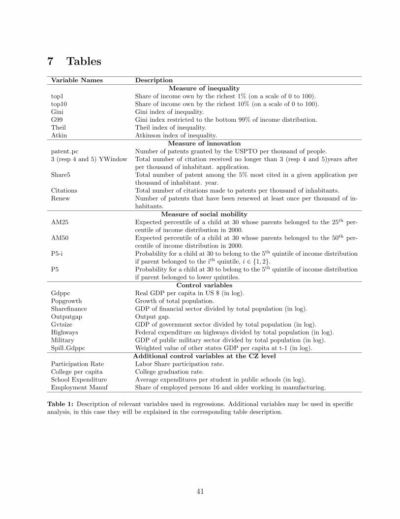
7 Tables
Variable Names DescriptionMeasure of inequality
top1 Share of income own by the richest 1% (on a scale of 0 to 100).top10 Share of income own by the richest 10% (on a scale of 0 to 100).Gini Gini index of inequality.G99 Gini index restricted to the bottom 99% of income distribution.Theil Theil index of inequality.Atkin Atkinson index of inequality.
Measure of innovationpatent pc Number of patents granted by the USPTO per thousand of people.3 (resp 4 and 5) YWindow Total number of citation received no longer than 3 (resp 4 and 5)years after
per thousand of inhabitant. application.Share5 Total number of patent among the 5% most cited in a given application per
thousand of inhabitant. year.Citations Total number of citations made to patents per thousand of inhabitants.Renew Number of patents that have been renewed at least once per thousand of in-
habitants.Measure of social mobility
AM25 Expected percentile of a child at 30 whose parents belonged to the 25th per-centile of income distribution in 2000.
AM50 Expected percentile of a child at 30 whose parents belonged to the 50th per-centile of income distribution in 2000.
P5-i Probability for a child at 30 to belong to the 5th quintile of income distributionif parent belonged to the ith quintile, i ∈ {1, 2}.
P5 Probability for a child at 30 to belong to the 5th quintile of income distributionif parent belonged to lower quintiles.
Control variablesGdppc Real GDP per capita in US $ (in log).Popgrowth Growth of total population.Sharefinance GDP of financial sector divided by total population (in log).Outputgap Output gap.Gvtsize GDP of government sector divided by total population (in log).Highways Federal expenditure on highways divided by total population (in log).Military GDP of public military sector divided by total population (in log).Spill Gdppc Weighted value of other states GDP per capita at t-1 (in log).
Additional control variables at the CZ levelParticipation Rate Labor Share participation rate.College per capita College graduation rate.School Expenditure Average expenditures per student in public schools (in log).Employment Manuf Share of employed persons 16 and older working in manufacturing.
Table 1: Description of relevant variables used in regressions. Additional variables may be used in specificanalysis, in this case they will be explained in the corresponding table description.
41
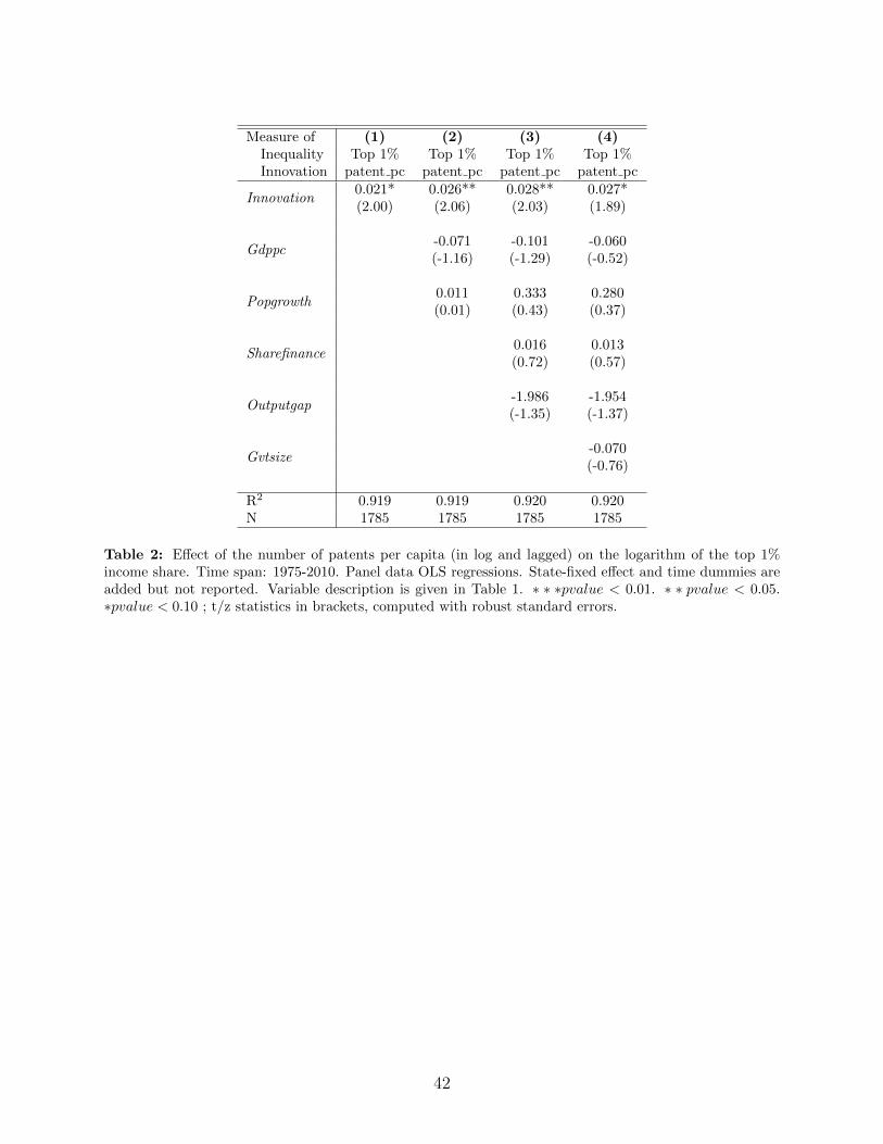
Measure of (1) (2) (3) (4)Inequality Top 1% Top 1% Top 1% Top 1%Innovation patent pc patent pc patent pc patent pc
Innovation0.021* 0.026** 0.028** 0.027*(2.00) (2.06) (2.03) (1.89)
Gdppc-0.071 -0.101 -0.060(-1.16) (-1.29) (-0.52)
Popgrowth0.011 0.333 0.280(0.01) (0.43) (0.37)
Sharefinance0.016 0.013(0.72) (0.57)
Outputgap-1.986 -1.954(-1.35) (-1.37)
Gvtsize-0.070(-0.76)
R2 0.919 0.919 0.920 0.920N 1785 1785 1785 1785
Table 2: Effect of the number of patents per capita (in log and lagged) on the logarithm of the top 1%income share. Time span: 1975-2010. Panel data OLS regressions. State-fixed effect and time dummies areadded but not reported. Variable description is given in Table 1. ∗ ∗ ∗pvalue < 0.01. ∗ ∗ pvalue < 0.05.∗pvalue < 0.10 ; t/z statistics in brackets, computed with robust standard errors.
42
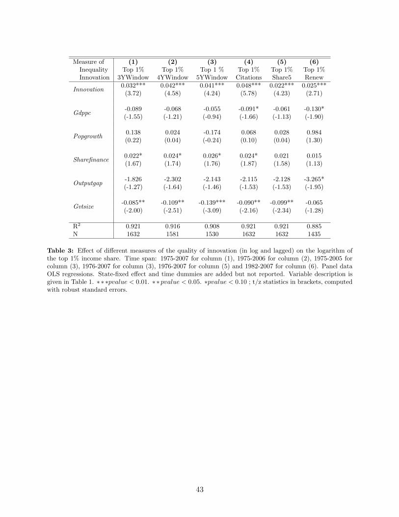
Measure of (1) (2) (3) (4) (5) (6)Inequality Top 1% Top 1% Top 1 % Top 1% Top 1% Top 1%Innovation 3YWindow 4YWindow 5YWindow Citations Share5 Renew
Innovation0.032*** 0.042*** 0.041*** 0.048*** 0.022*** 0.025***
(3.72) (4.58) (4.24) (5.78) (4.23) (2.71)
Gdppc-0.089 -0.068 -0.055 -0.091* -0.061 -0.130*(-1.55) (-1.21) (-0.94) (-1.66) (-1.13) (-1.90)
Popgrowth0.138 0.024 -0.174 0.068 0.028 0.984(0.22) (0.04) (-0.24) (0.10) (0.04) (1.30)
Sharefinance0.022* 0.024* 0.026* 0.024* 0.021 0.015(1.67) (1.74) (1.76) (1.87) (1.58) (1.13)
Outputgap-1.826 -2.302 -2.143 -2.115 -2.128 -3.265*(-1.27) (-1.64) (-1.46) (-1.53) (-1.53) (-1.95)
Gvtsize-0.085** -0.109** -0.139*** -0.090** -0.099** -0.065(-2.00) (-2.51) (-3.09) (-2.16) (-2.34) (-1.28)
R2 0.921 0.916 0.908 0.921 0.921 0.885N 1632 1581 1530 1632 1632 1435
Table 3: Effect of different measures of the quality of innovation (in log and lagged) on the logarithm ofthe top 1% income share. Time span: 1975-2007 for column (1), 1975-2006 for column (2), 1975-2005 forcolumn (3), 1976-2007 for column (3), 1976-2007 for column (5) and 1982-2007 for column (6). Panel dataOLS regressions. State-fixed effect and time dummies are added but not reported. Variable description isgiven in Table 1. ∗ ∗ ∗pvalue < 0.01. ∗ ∗ pvalue < 0.05. ∗pvalue < 0.10 ; t/z statistics in brackets, computedwith robust standard errors.
43
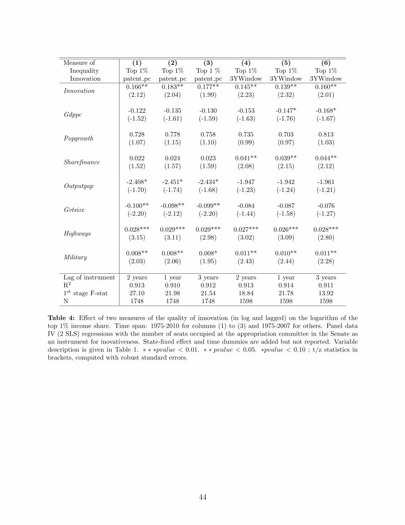
Measure of (1) (2) (3) (4) (5) (6)Inequality Top 1% Top 1% Top 1 % Top 1% Top 1% Top 1%Innovation patent pc patent pc patent pc 3YWindow 3YWindow 3YWindow
Innovation0.166** 0.183** 0.177** 0.145** 0.139** 0.160**(2.12) (2.04) (1.99) (2.23) (2.32) (2.01)
Gdppc-0.122 -0.135 -0.130 -0.153 -0.147* -0.168*(-1.52) (-1.61) (-1.59) (-1.63) (-1.76) (-1.67)
Popgrowth0.728 0.778 0.758 0.735 0.703 0.813(1.07) (1.15) (1.10) (0.99) (0.97) (1.03)
Sharefinance0.022 0.024 0.023 0.041** 0.039** 0.044**(1.52) (1.57) (1.59) (2.08) (2.15) (2.12)
Outputgap-2.408* -2.451* -2.434* -1.947 -1.942 -1.961(-1.70) (-1.74) (-1.68) (-1.23) (-1.24) (-1.21)
Gvtsize-0.100** -0.098** -0.099** -0.084 -0.087 -0.076(-2.20) (-2.12) (-2.20) (-1.44) (-1.58) (-1.27)
Highways0.028*** 0.029*** 0.029*** 0.027*** 0.026*** 0.028***
(3.15) (3.11) (2.98) (3.02) (3.09) (2.80)
Military0.008** 0.008** 0.008* 0.011** 0.010** 0.011**(2.03) (2.06) (1.95) (2.43) (2.44) (2.28)
Lag of instrument 2 years 1 year 3 years 2 years 1 year 3 yearsR2 0.913 0.910 0.912 0.913 0.914 0.9111st stage F-stat 27.10 21.98 21.54 18.84 21.78 13.92N 1748 1748 1748 1598 1598 1598
Table 4: Effect of two measures of the quality of innovation (in log and lagged) on the logarithm of thetop 1% income share. Time span: 1975-2010 for columns (1) to (3) and 1975-2007 for others. Panel dataIV (2 SLS) regressions with the number of seats occupied at the appropriation committee in the Senate asan instrument for inovativeness. State-fixed effect and time dummies are added but not reported. Variabledescription is given in Table 1. ∗ ∗ ∗pvalue < 0.01. ∗ ∗ pvalue < 0.05. ∗pvalue < 0.10 ; t/z statistics inbrackets, computed with robust standard errors.
44
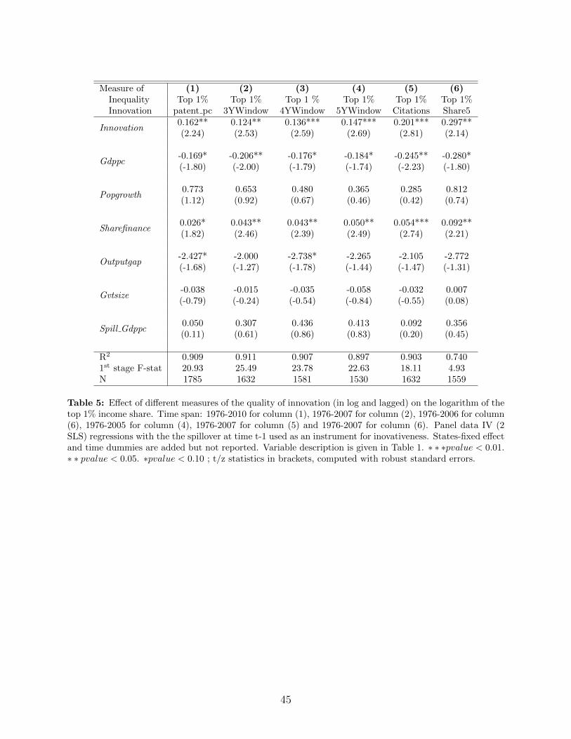
Measure of (1) (2) (3) (4) (5) (6)Inequality Top 1% Top 1% Top 1 % Top 1% Top 1% Top 1%Innovation patent pc 3YWindow 4YWindow 5YWindow Citations Share5
Innovation0.162** 0.124** 0.136*** 0.147*** 0.201*** 0.297**(2.24) (2.53) (2.59) (2.69) (2.81) (2.14)
Gdppc-0.169* -0.206** -0.176* -0.184* -0.245** -0.280*(-1.80) (-2.00) (-1.79) (-1.74) (-2.23) (-1.80)
Popgrowth0.773 0.653 0.480 0.365 0.285 0.812(1.12) (0.92) (0.67) (0.46) (0.42) (0.74)
Sharefinance0.026* 0.043** 0.043** 0.050** 0.054*** 0.092**(1.82) (2.46) (2.39) (2.49) (2.74) (2.21)
Outputgap-2.427* -2.000 -2.738* -2.265 -2.105 -2.772(-1.68) (-1.27) (-1.78) (-1.44) (-1.47) (-1.31)
Gvtsize-0.038 -0.015 -0.035 -0.058 -0.032 0.007(-0.79) (-0.24) (-0.54) (-0.84) (-0.55) (0.08)
Spill Gdppc0.050 0.307 0.436 0.413 0.092 0.356(0.11) (0.61) (0.86) (0.83) (0.20) (0.45)
R2 0.909 0.911 0.907 0.897 0.903 0.7401st stage F-stat 20.93 25.49 23.78 22.63 18.11 4.93N 1785 1632 1581 1530 1632 1559
Table 5: Effect of different measures of the quality of innovation (in log and lagged) on the logarithm of thetop 1% income share. Time span: 1976-2010 for column (1), 1976-2007 for column (2), 1976-2006 for column(6), 1976-2005 for column (4), 1976-2007 for column (5) and 1976-2007 for column (6). Panel data IV (2SLS) regressions with the the spillover at time t-1 used as an instrument for inovativeness. States-fixed effectand time dummies are added but not reported. Variable description is given in Table 1. ∗ ∗ ∗pvalue < 0.01.∗ ∗ pvalue < 0.05. ∗pvalue < 0.10 ; t/z statistics in brackets, computed with robust standard errors.
45
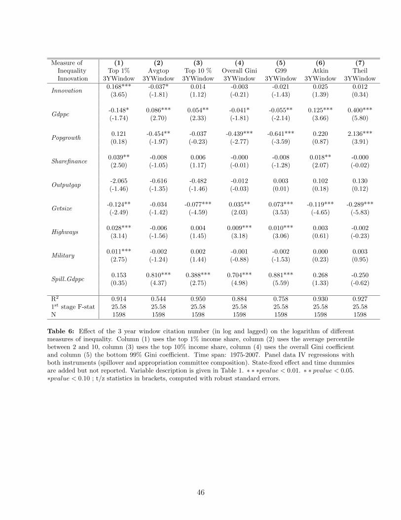
Measure of (1) (2) (3) (4) (5) (6) (7)Inequality Top 1% Avgtop Top 10 % Overall Gini G99 Atkin TheilInnovation 3YWindow 3YWindow 3YWindow 3YWindow 3YWindow 3YWindow 3YWindow
Innovation0.168*** -0.037* 0.014 -0.003 -0.021 0.025 0.012
(3.65) (-1.81) (1.12) (-0.21) (-1.43) (1.39) (0.34)
Gdppc-0.148* 0.086*** 0.054** -0.041* -0.055** 0.125*** 0.400***(-1.74) (2.70) (2.33) (-1.81) (-2.14) (3.66) (5.80)
Popgrowth0.121 -0.454** -0.037 -0.439*** -0.641*** 0.220 2.136***(0.18) (-1.97) (-0.23) (-2.77) (-3.59) (0.87) (3.91)
Sharefinance0.039** -0.008 0.006 -0.000 -0.008 0.018** -0.000(2.50) (-1.05) (1.17) (-0.01) (-1.28) (2.07) (-0.02)
Outputgap-2.065 -0.616 -0.482 -0.012 0.003 0.102 0.130(-1.46) (-1.35) (-1.46) (-0.03) (0.01) (0.18) (0.12)
Gvtsize-0.124** -0.034 -0.077*** 0.035** 0.073*** -0.119*** -0.289***(-2.49) (-1.42) (-4.59) (2.03) (3.53) (-4.65) (-5.83)
Highways0.028*** -0.006 0.004 0.009*** 0.010*** 0.003 -0.002
(3.14) (-1.56) (1.45) (3.18) (3.06) (0.61) (-0.23)
Military0.011*** -0.002 0.002 -0.001 -0.002 0.000 0.003
(2.75) (-1.24) (1.44) (-0.88) (-1.53) (0.23) (0.95)
Spill Gdppc0.153 0.810*** 0.388*** 0.704*** 0.881*** 0.268 -0.250(0.35) (4.37) (2.75) (4.98) (5.59) (1.33) (-0.62)
R2 0.914 0.544 0.950 0.884 0.758 0.930 0.9271st stage F-stat 25.58 25.58 25.58 25.58 25.58 25.58 25.58N 1598 1598 1598 1598 1598 1598 1598
Table 6: Effect of the 3 year window citation number (in log and lagged) on the logarithm of differentmeasures of inequality. Column (1) uses the top 1% income share, column (2) uses the average percentilebetween 2 and 10, column (3) uses the top 10% income share, column (4) uses the overall Gini coefficientand column (5) the bottom 99% Gini coefficient. Time span: 1975-2007. Panel data IV regressions withboth instruments (spillover and appropriation committee composition). State-fixed effect and time dummiesare added but not reported. Variable description is given in Table 1. ∗ ∗ ∗pvalue < 0.01. ∗ ∗ pvalue < 0.05.∗pvalue < 0.10 ; t/z statistics in brackets, computed with robust standard errors.
46
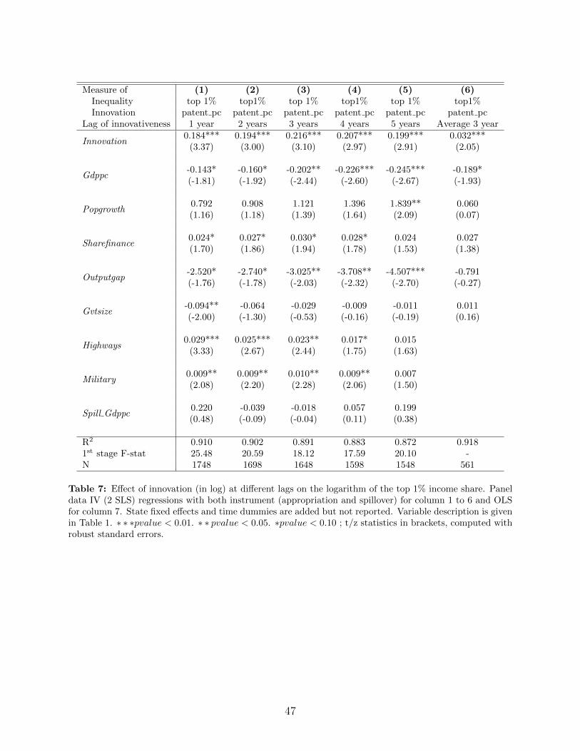
Measure of (1) (2) (3) (4) (5) (6)Inequality top 1% top1% top 1% top1% top 1% top1%Innovation patent pc patent pc patent pc patent pc patent pc patent pc
Lag of innovativeness 1 year 2 years 3 years 4 years 5 years Average 3 year
Innovation0.184*** 0.194*** 0.216*** 0.207*** 0.199*** 0.032***
(3.37) (3.00) (3.10) (2.97) (2.91) (2.05)
Gdppc-0.143* -0.160* -0.202** -0.226*** -0.245*** -0.189*(-1.81) (-1.92) (-2.44) (-2.60) (-2.67) (-1.93)
Popgrowth0.792 0.908 1.121 1.396 1.839** 0.060(1.16) (1.18) (1.39) (1.64) (2.09) (0.07)
Sharefinance0.024* 0.027* 0.030* 0.028* 0.024 0.027(1.70) (1.86) (1.94) (1.78) (1.53) (1.38)
Outputgap-2.520* -2.740* -3.025** -3.708** -4.507*** -0.791(-1.76) (-1.78) (-2.03) (-2.32) (-2.70) (-0.27)
Gvtsize-0.094** -0.064 -0.029 -0.009 -0.011 0.011(-2.00) (-1.30) (-0.53) (-0.16) (-0.19) (0.16)
Highways0.029*** 0.025*** 0.023** 0.017* 0.015
(3.33) (2.67) (2.44) (1.75) (1.63)
Military0.009** 0.009** 0.010** 0.009** 0.007(2.08) (2.20) (2.28) (2.06) (1.50)
Spill Gdppc0.220 -0.039 -0.018 0.057 0.199(0.48) (-0.09) (-0.04) (0.11) (0.38)
R2 0.910 0.902 0.891 0.883 0.872 0.9181st stage F-stat 25.48 20.59 18.12 17.59 20.10 -N 1748 1698 1648 1598 1548 561
Table 7: Effect of innovation (in log) at different lags on the logarithm of the top 1% income share. Paneldata IV (2 SLS) regressions with both instrument (appropriation and spillover) for column 1 to 6 and OLSfor column 7. State fixed effects and time dummies are added but not reported. Variable description is givenin Table 1. ∗ ∗ ∗pvalue < 0.01. ∗ ∗ pvalue < 0.05. ∗pvalue < 0.10 ; t/z statistics in brackets, computed withrobust standard errors.
47
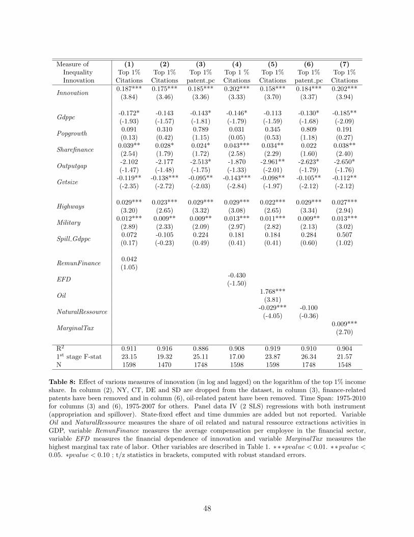
Measure of (1) (2) (3) (4) (5) (6) (7)Inequality Top 1% Top 1% Top 1% Top 1 % Top 1% Top 1% Top 1%Innovation Citations Citations patent pc Citations Citations patent pc Citations
Innovation0.187*** 0.175*** 0.185*** 0.202*** 0.158*** 0.184*** 0.202***
(3.84) (3.46) (3.36) (3.33) (3.70) (3.37) (3.94)
Gdppc-0.172* -0.143 -0.143* -0.146* -0.113 -0.130* -0.185**(-1.93) (-1.57) (-1.81) (-1.79) (-1.59) (-1.68) (-2.09)
Popgrowth0.091 0.310 0.789 0.031 0.345 0.809 0.191(0.13) (0.42) (1.15) (0.05) (0.53) (1.18) (0.27)
Sharefinance0.039** 0.028* 0.024* 0.043*** 0.034** 0.022 0.038**(2.54) (1.79) (1.72) (2.58) (2.29) (1.60) (2.40)
Outputgap-2.102 -2.177 -2.513* -1.870 -2.961** -2.623* -2.650*(-1.47) (-1.48) (-1.75) (-1.33) (-2.01) (-1.79) (-1.76)
Gvtsize-0.119** -0.138*** -0.095** -0.143*** -0.098** -0.105** -0.112**(-2.35) (-2.72) (-2.03) (-2.84) (-1.97) (-2.12) (-2.12)
Highways0.029*** 0.023*** 0.029*** 0.029*** 0.022*** 0.029*** 0.027***
(3.20) (2.65) (3.32) (3.08) (2.65) (3.34) (2.94)
Military0.012*** 0.009** 0.009** 0.013*** 0.011*** 0.009** 0.013***
(2.89) (2.33) (2.09) (2.97) (2.82) (2.13) (3.02)
Spill Gdppc0.072 -0.105 0.224 0.181 0.184 0.284 0.507(0.17) (-0.23) (0.49) (0.41) (0.41) (0.60) (1.02)
RemunFinance0.042(1.05)
EFD-0.430(-1.50)
Oil1.768***
(3.81)
NaturalRessource-0.029*** -0.100
(-4.05) (-0.36)
MarginalTax0.009***
(2.70)
R2 0.911 0.916 0.886 0.908 0.919 0.910 0.9041st stage F-stat 23.15 19.32 25.11 17.00 23.87 26.34 21.57N 1598 1470 1748 1598 1598 1748 1548
Table 8: Effect of various measures of innovation (in log and lagged) on the logarithm of the top 1% incomeshare. In column (2), NY, CT, DE and SD are dropped from the dataset, in column (3), finance-relatedpatents have been removed and in column (6), oil-related patent have been removed. Time Span: 1975-2010for columns (3) and (6), 1975-2007 for others. Panel data IV (2 SLS) regressions with both instrument(appropriation and spillover). State-fixed effect and time dummies are added but not reported. VariableOil and NaturalRessource measures the share of oil related and natural ressource extractions activities inGDP, variable RemunFinance measures the average compensation per employee in the financial sector,variable EFD measures the financial dependence of innovation and variable MarginalTax measures thehighest marginal tax rate of labor. Other variables are described in Table 1. ∗∗∗pvalue < 0.01. ∗∗pvalue <0.05. ∗pvalue < 0.10 ; t/z statistics in brackets, computed with robust standard errors.
48
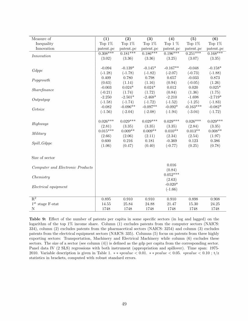
Measure of (1) (2) (3) (4) (5) (6)Inequality Top 1% Top 1% Top 1% Top 1 % Top 1% Top 1%Innovation patent pc patent pc patent pc patent pc patent pc patent pc
Innovation0.308*** 0.181*** 0.186*** 0.196*** 0.251*** 0.168***
(3.02) (3.36) (3.36) (3.25) (3.07) (3.35)
Gdppc-0.094 -0.139* -0.145* -0.167** -0.048 -0.158*(-1.28) (-1.78) (-1.82) (-2.07) (-0.73) (-1.88)
Popgrowth0.409 0.780 0.798 0.657 -0.033 0.873(0.63) (1.14) (1.16) (0.94) (-0.05) (1.26)
Sharefinance-0.003 0.024* 0.024* 0.012 0.020 0.025*(-0.21) (1.74) (1.72) (0.84) (1.36) (1.75)
Outputgap-2.250 -2.501* -2.468* -2.210 -1.698 -2.719*(-1.58) (-1.74) (-1.72) (-1.52) (-1.25) (-1.83)
Gvtsize-0.082 -0.096** -0.097** -0.092* -0.163*** -0.082*(-1.56) (-2.04) (-2.08) (-1.94) (-3.04) (-1.72)
Highways0.026*** 0.029*** 0.029*** 0.029*** 0.026*** 0.029***
(2.81) (3.35) (3.35) (3.35) (2.84) (3.35)
Military0.015*** 0.009** 0.009** 0.010** 0.013** 0.008**
(2.66) (2.06) (2.11) (2.34) (2.54) (1.97)
Spill Gdppc0.600 0.216 0.181 -0.369 0.123 0.386(1.06) (0.47) (0.40) (-0.77) (0.25) (0.78)
Size of sector
Computer and Electronic Products0.016(0.84)
Chemistry0.052***
(2.63)
Electrical equipment-0.020*(-1.66)
R2 0.895 0.910 0.910 0.910 0.898 0.9081st stage F-stat 14.55 25.84 24.88 21.47 15.30 24.25N 1748 1748 1748 1748 1748 1748
Table 9: Effect of the number of patents per capita in some specific sectors (in log and lagged) on thelogarithm of the top 1% income share. Column (1) excludes patents from the computer sectors (NAICS:334), column (2) excludes patents from the pharmacetical sectors (NAICS: 3254) and column (3) excludespatents from the electrical equipment sectors (NAICS: 335). Columns (5) focus on patents from three highlyexporting sectors: Transportation, Machinery and Electrical Machinery while column (6) excludes thesesectors. The size of a sector (see column (4)) is defined as the gdp per capita from the corresponding sector.Panel data IV (2 SLS) regressions with both instrument (appropriation and spillover). Time span: 1975-2010. Variable description is given in Table 1. ∗ ∗ ∗pvalue < 0.01. ∗ ∗ pvalue < 0.05. ∗pvalue < 0.10 ; t/zstatistics in brackets, computed with robust standard errors.
49
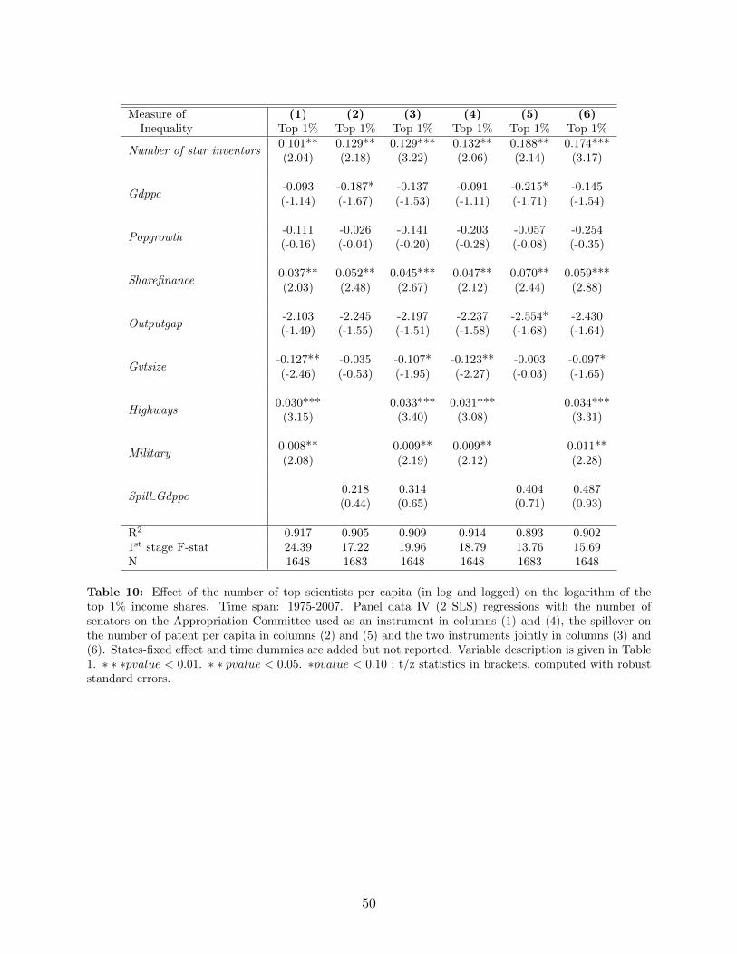
Measure of (1) (2) (3) (4) (5) (6)Inequality Top 1% Top 1% Top 1% Top 1% Top 1% Top 1%
Number of star inventors0.101** 0.129** 0.129*** 0.132** 0.188** 0.174***(2.04) (2.18) (3.22) (2.06) (2.14) (3.17)
Gdppc-0.093 -0.187* -0.137 -0.091 -0.215* -0.145(-1.14) (-1.67) (-1.53) (-1.11) (-1.71) (-1.54)
Popgrowth-0.111 -0.026 -0.141 -0.203 -0.057 -0.254(-0.16) (-0.04) (-0.20) (-0.28) (-0.08) (-0.35)
Sharefinance0.037** 0.052** 0.045*** 0.047** 0.070** 0.059***(2.03) (2.48) (2.67) (2.12) (2.44) (2.88)
Outputgap-2.103 -2.245 -2.197 -2.237 -2.554* -2.430(-1.49) (-1.55) (-1.51) (-1.58) (-1.68) (-1.64)
Gvtsize-0.127** -0.035 -0.107* -0.123** -0.003 -0.097*(-2.46) (-0.53) (-1.95) (-2.27) (-0.03) (-1.65)
Highways0.030*** 0.033*** 0.031*** 0.034***
(3.15) (3.40) (3.08) (3.31)
Military0.008** 0.009** 0.009** 0.011**(2.08) (2.19) (2.12) (2.28)
Spill Gdppc0.218 0.314 0.404 0.487(0.44) (0.65) (0.71) (0.93)
R2 0.917 0.905 0.909 0.914 0.893 0.9021st stage F-stat 24.39 17.22 19.96 18.79 13.76 15.69N 1648 1683 1648 1648 1683 1648
Table 10: Effect of the number of top scientists per capita (in log and lagged) on the logarithm of thetop 1% income shares. Time span: 1975-2007. Panel data IV (2 SLS) regressions with the number ofsenators on the Appropriation Committee used as an instrument in columns (1) and (4), the spillover onthe number of patent per capita in columns (2) and (5) and the two instruments jointly in columns (3) and(6). States-fixed effect and time dummies are added but not reported. Variable description is given in Table1. ∗ ∗ ∗pvalue < 0.01. ∗ ∗ pvalue < 0.05. ∗pvalue < 0.10 ; t/z statistics in brackets, computed with robuststandard errors.
50
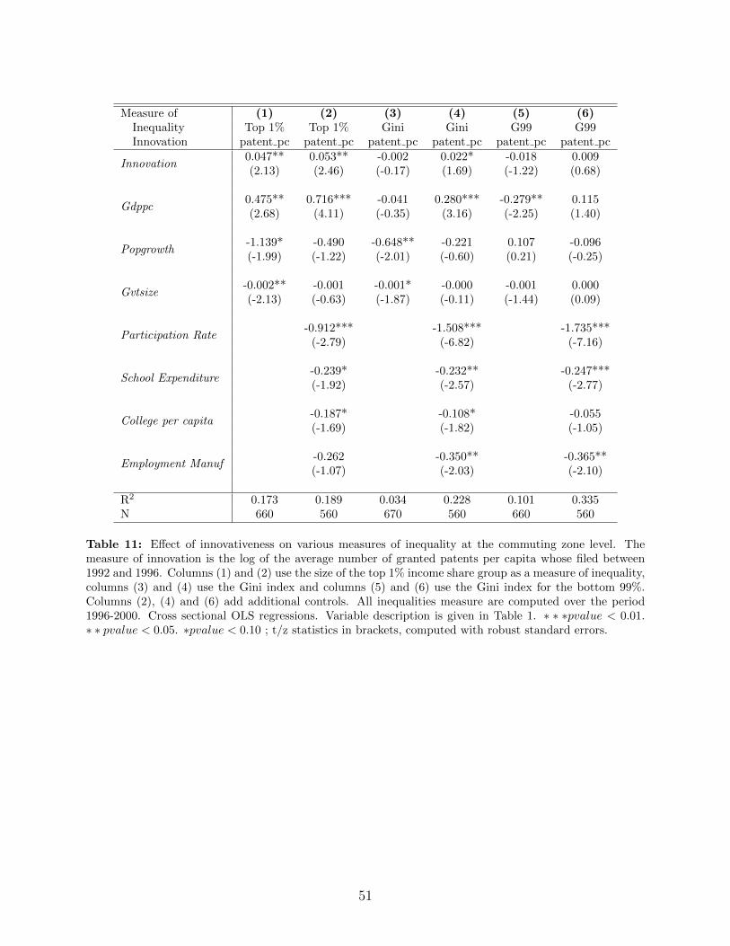
Measure of (1) (2) (3) (4) (5) (6)Inequality Top 1% Top 1% Gini Gini G99 G99Innovation patent pc patent pc patent pc patent pc patent pc patent pc
Innovation0.047** 0.053** -0.002 0.022* -0.018 0.009(2.13) (2.46) (-0.17) (1.69) (-1.22) (0.68)
Gdppc0.475** 0.716*** -0.041 0.280*** -0.279** 0.115(2.68) (4.11) (-0.35) (3.16) (-2.25) (1.40)
Popgrowth-1.139* -0.490 -0.648** -0.221 0.107 -0.096(-1.99) (-1.22) (-2.01) (-0.60) (0.21) (-0.25)
Gvtsize-0.002** -0.001 -0.001* -0.000 -0.001 0.000(-2.13) (-0.63) (-1.87) (-0.11) (-1.44) (0.09)
Participation Rate-0.912*** -1.508*** -1.735***
(-2.79) (-6.82) (-7.16)
School Expenditure-0.239* -0.232** -0.247***(-1.92) (-2.57) (-2.77)
College per capita-0.187* -0.108* -0.055(-1.69) (-1.82) (-1.05)
Employment Manuf-0.262 -0.350** -0.365**(-1.07) (-2.03) (-2.10)
R2 0.173 0.189 0.034 0.228 0.101 0.335N 660 560 670 560 660 560
Table 11: Effect of innovativeness on various measures of inequality at the commuting zone level. Themeasure of innovation is the log of the average number of granted patents per capita whose filed between1992 and 1996. Columns (1) and (2) use the size of the top 1% income share group as a measure of inequality,columns (3) and (4) use the Gini index and columns (5) and (6) use the Gini index for the bottom 99%.Columns (2), (4) and (6) add additional controls. All inequalities measure are computed over the period1996-2000. Cross sectional OLS regressions. Variable description is given in Table 1. ∗ ∗ ∗pvalue < 0.01.∗ ∗ pvalue < 0.05. ∗pvalue < 0.10 ; t/z statistics in brackets, computed with robust standard errors.
51
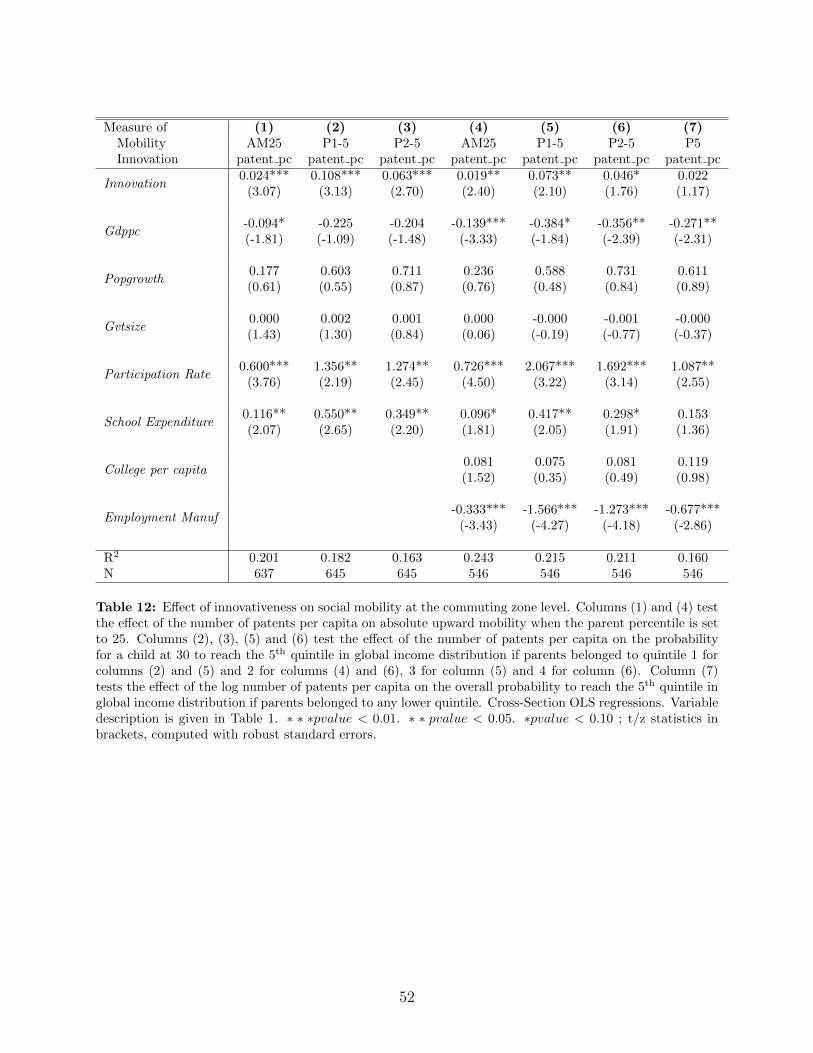
Measure of (1) (2) (3) (4) (5) (6) (7)Mobility AM25 P1-5 P2-5 AM25 P1-5 P2-5 P5Innovation patent pc patent pc patent pc patent pc patent pc patent pc patent pc
Innovation0.024*** 0.108*** 0.063*** 0.019** 0.073** 0.046* 0.022
(3.07) (3.13) (2.70) (2.40) (2.10) (1.76) (1.17)
Gdppc-0.094* -0.225 -0.204 -0.139*** -0.384* -0.356** -0.271**(-1.81) (-1.09) (-1.48) (-3.33) (-1.84) (-2.39) (-2.31)
Popgrowth0.177 0.603 0.711 0.236 0.588 0.731 0.611(0.61) (0.55) (0.87) (0.76) (0.48) (0.84) (0.89)
Gvtsize0.000 0.002 0.001 0.000 -0.000 -0.001 -0.000(1.43) (1.30) (0.84) (0.06) (-0.19) (-0.77) (-0.37)
Participation Rate0.600*** 1.356** 1.274** 0.726*** 2.067*** 1.692*** 1.087**
(3.76) (2.19) (2.45) (4.50) (3.22) (3.14) (2.55)
School Expenditure0.116** 0.550** 0.349** 0.096* 0.417** 0.298* 0.153(2.07) (2.65) (2.20) (1.81) (2.05) (1.91) (1.36)
College per capita0.081 0.075 0.081 0.119(1.52) (0.35) (0.49) (0.98)
Employment Manuf-0.333*** -1.566*** -1.273*** -0.677***
(-3.43) (-4.27) (-4.18) (-2.86)
R2 0.201 0.182 0.163 0.243 0.215 0.211 0.160N 637 645 645 546 546 546 546
Table 12: Effect of innovativeness on social mobility at the commuting zone level. Columns (1) and (4) testthe effect of the number of patents per capita on absolute upward mobility when the parent percentile is setto 25. Columns (2), (3), (5) and (6) test the effect of the number of patents per capita on the probabilityfor a child at 30 to reach the 5th quintile in global income distribution if parents belonged to quintile 1 forcolumns (2) and (5) and 2 for columns (4) and (6), 3 for column (5) and 4 for column (6). Column (7)tests the effect of the log number of patents per capita on the overall probability to reach the 5th quintile inglobal income distribution if parents belonged to any lower quintile. Cross-Section OLS regressions. Variabledescription is given in Table 1. ∗ ∗ ∗pvalue < 0.01. ∗ ∗ pvalue < 0.05. ∗pvalue < 0.10 ; t/z statistics inbrackets, computed with robust standard errors.
52
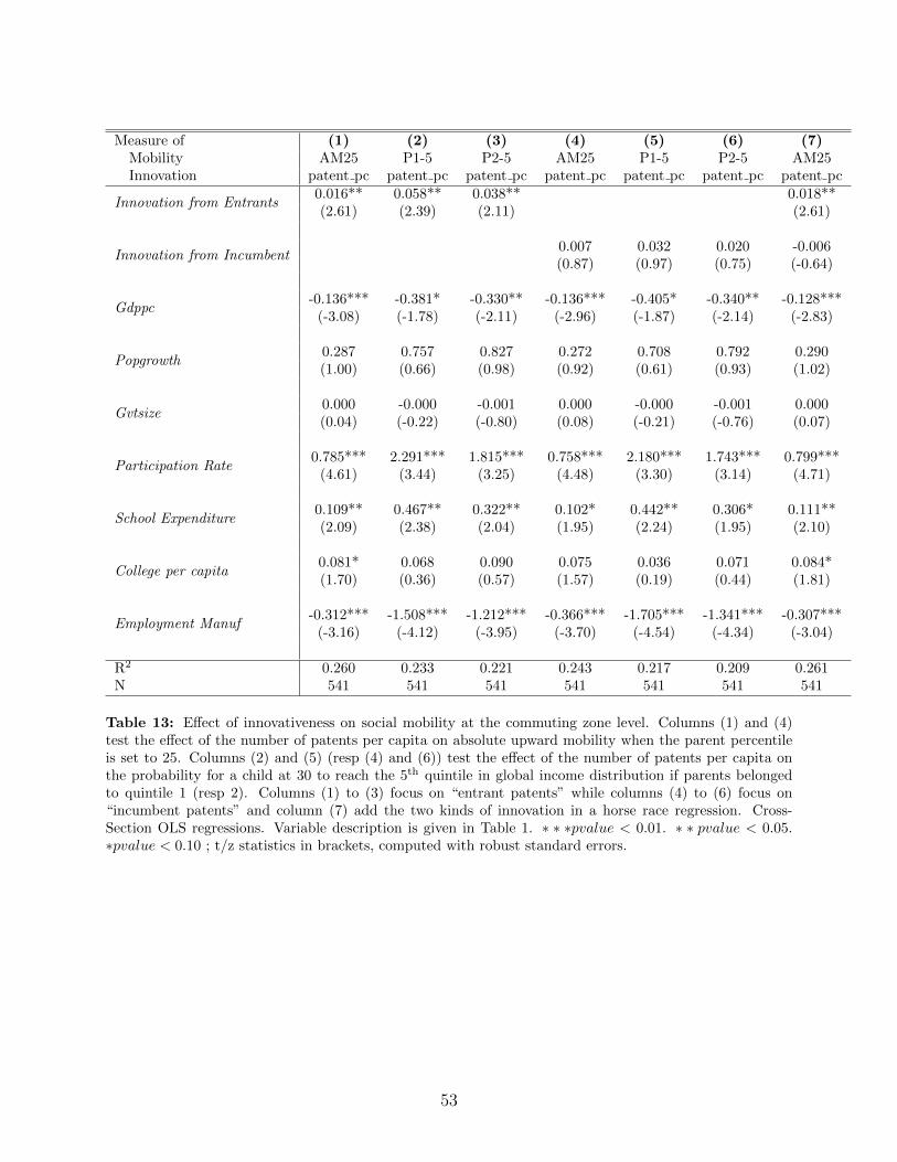
Measure of (1) (2) (3) (4) (5) (6) (7)Mobility AM25 P1-5 P2-5 AM25 P1-5 P2-5 AM25Innovation patent pc patent pc patent pc patent pc patent pc patent pc patent pc
Innovation from Entrants0.016** 0.058** 0.038** 0.018**(2.61) (2.39) (2.11) (2.61)
Innovation from Incumbent0.007 0.032 0.020 -0.006(0.87) (0.97) (0.75) (-0.64)
Gdppc-0.136*** -0.381* -0.330** -0.136*** -0.405* -0.340** -0.128***
(-3.08) (-1.78) (-2.11) (-2.96) (-1.87) (-2.14) (-2.83)
Popgrowth0.287 0.757 0.827 0.272 0.708 0.792 0.290(1.00) (0.66) (0.98) (0.92) (0.61) (0.93) (1.02)
Gvtsize0.000 -0.000 -0.001 0.000 -0.000 -0.001 0.000(0.04) (-0.22) (-0.80) (0.08) (-0.21) (-0.76) (0.07)
Participation Rate0.785*** 2.291*** 1.815*** 0.758*** 2.180*** 1.743*** 0.799***
(4.61) (3.44) (3.25) (4.48) (3.30) (3.14) (4.71)
School Expenditure0.109** 0.467** 0.322** 0.102* 0.442** 0.306* 0.111**(2.09) (2.38) (2.04) (1.95) (2.24) (1.95) (2.10)
College per capita0.081* 0.068 0.090 0.075 0.036 0.071 0.084*(1.70) (0.36) (0.57) (1.57) (0.19) (0.44) (1.81)
Employment Manuf-0.312*** -1.508*** -1.212*** -0.366*** -1.705*** -1.341*** -0.307***
(-3.16) (-4.12) (-3.95) (-3.70) (-4.54) (-4.34) (-3.04)
R2 0.260 0.233 0.221 0.243 0.217 0.209 0.261N 541 541 541 541 541 541 541
Table 13: Effect of innovativeness on social mobility at the commuting zone level. Columns (1) and (4)test the effect of the number of patents per capita on absolute upward mobility when the parent percentileis set to 25. Columns (2) and (5) (resp (4) and (6)) test the effect of the number of patents per capita onthe probability for a child at 30 to reach the 5th quintile in global income distribution if parents belongedto quintile 1 (resp 2). Columns (1) to (3) focus on “entrant patents” while columns (4) to (6) focus on“incumbent patents” and column (7) add the two kinds of innovation in a horse race regression. Cross-Section OLS regressions. Variable description is given in Table 1. ∗ ∗ ∗pvalue < 0.01. ∗ ∗ pvalue < 0.05.∗pvalue < 0.10 ; t/z statistics in brackets, computed with robust standard errors.
53
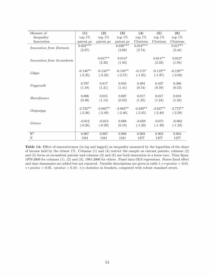
Measure of (1) (2) (3) (4) (5) (6)Inequality top 1% top 1% top 1% top 1% top 1% top 1%Innovation patent pc patent pc patent pc Citations Citations Citations
Innovation from Entrants0.032*** 0.030*** 0.018*** 0.017**
(2.97) (2.69) (2.74) (2.44)
Innovation from Incumbents0.017** 0.014* 0.014** 0.012*(2.32) (1.83) (2.33) (1.94)
Gdppc-0.140** -0.134** -0.158** -0.115* -0.119** -0.128**(-2.35) (-2.32) (-2.57) (-1.85) (-1.97) (-2.03)
Popgrowth0.797 0.817 0.945 0.394 0.437 0.386(1.18) (1.21) (1.41) (0.54) (0.59) (0.53)
Sharefinance0.006 0.015 0.007 0.017 0.017 0.018(0.49) (1.14) (0.53) (1.25) (1.24) (1.34)
Outputgap-3.732** -3.802** -3.863** -3.829** -3.827** -3.772**(-2.36) (-2.49) (-2.46) (-2.45) (-2.40) (-2.38)
Gvtsize-0.012 -0.013 0.008 -0.059 -0.071 -0.062(-0.26) (-0.29) (0.18) (-1.20) (-1.49) (-1.32)
R2 0.907 0.907 0.908 0.903 0.903 0.904N 1581 1581 1581 1377 1377 1377
Table 14: Effect of innovativeness (in log and lagged) on inequality measured by the logarithm of the shareof income held by the richest 1%. Columns (1) and (4) restrict the sample on entrant patents, columns (2)and (5) focus on incumbent patents and columns (3) and (6) use both innovation in a horse race. Time Span:1979-2009 for columns (1), (2) and (3), 1981-2006 for others. Panel data OLS regressions. States fixed effectand time dummmies are added but not reported. Variable descriptions are given in table 1.∗∗∗pvalue < 0.01.∗ ∗ pvalue < 0.05. ∗pvalue < 0.10 ; t/z statistics in brackets, computed with robust standard errors.
54
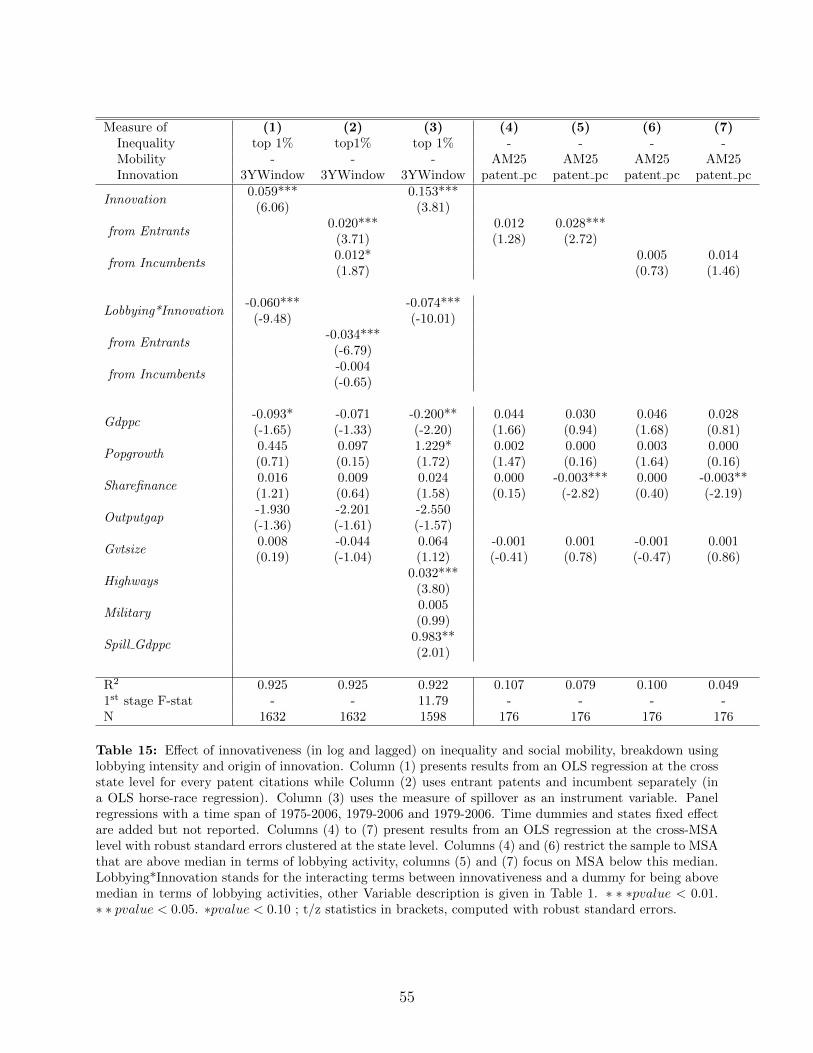
Measure of (1) (2) (3) (4) (5) (6) (7)Inequality top 1% top1% top 1% - - - -Mobility - - - AM25 AM25 AM25 AM25Innovation 3YWindow 3YWindow 3YWindow patent pc patent pc patent pc patent pc
Innovation0.059*** 0.153***
(6.06) (3.81)
from Entrants0.020*** 0.012 0.028***
(3.71) (1.28) (2.72)
from Incumbents0.012* 0.005 0.014(1.87) (0.73) (1.46)
Lobbying*Innovation-0.060*** -0.074***
(-9.48) (-10.01)
from Entrants-0.034***
(-6.79)
from Incumbents-0.004(-0.65)
Gdppc-0.093* -0.071 -0.200** 0.044 0.030 0.046 0.028(-1.65) (-1.33) (-2.20) (1.66) (0.94) (1.68) (0.81)
Popgrowth0.445 0.097 1.229* 0.002 0.000 0.003 0.000(0.71) (0.15) (1.72) (1.47) (0.16) (1.64) (0.16)
Sharefinance0.016 0.009 0.024 0.000 -0.003*** 0.000 -0.003**(1.21) (0.64) (1.58) (0.15) (-2.82) (0.40) (-2.19)
Outputgap-1.930 -2.201 -2.550(-1.36) (-1.61) (-1.57)
Gvtsize0.008 -0.044 0.064 -0.001 0.001 -0.001 0.001(0.19) (-1.04) (1.12) (-0.41) (0.78) (-0.47) (0.86)
Highways0.032***
(3.80)
Military0.005(0.99)
Spill Gdppc0.983**(2.01)
R2 0.925 0.925 0.922 0.107 0.079 0.100 0.0491st stage F-stat - - 11.79 - - - -N 1632 1632 1598 176 176 176 176
Table 15: Effect of innovativeness (in log and lagged) on inequality and social mobility, breakdown usinglobbying intensity and origin of innovation. Column (1) presents results from an OLS regression at the crossstate level for every patent citations while Column (2) uses entrant patents and incumbent separately (ina OLS horse-race regression). Column (3) uses the measure of spillover as an instrument variable. Panelregressions with a time span of 1975-2006, 1979-2006 and 1979-2006. Time dummies and states fixed effectare added but not reported. Columns (4) to (7) present results from an OLS regression at the cross-MSAlevel with robust standard errors clustered at the state level. Columns (4) and (6) restrict the sample to MSAthat are above median in terms of lobbying activity, columns (5) and (7) focus on MSA below this median.Lobbying*Innovation stands for the interacting terms between innovativeness and a dummy for being abovemedian in terms of lobbying activities, other Variable description is given in Table 1. ∗ ∗ ∗pvalue < 0.01.∗ ∗ pvalue < 0.05. ∗pvalue < 0.10 ; t/z statistics in brackets, computed with robust standard errors.
55

8 Appendix
8.1 Proofs for Section 2.2.3
From (11), we have:∂x∗
∂ηL= − 1
η2L
1
θI< 0,
whereas:
∂x∗
∂ηL= (1− z)
[(1− 2x∗)(θE − (1− z)2
(1ηL− 1
ηH
))−(πH − 1
ηL(1− x∗)− 1
ηHx∗)
(1− z)2]
η2L
(θE − (1− z)2
(1ηL− 1
ηH
))2 ,
the sign of which is ambiguous—intuitively a higher ηL decreases incumbent’s rate whichincreases wages but also has a direct negative impact on wages and higher wages in turnlower entrant innovation.
However, when θE = θI , the overall effect of a higher ηL on the aggregate innovation rateis negative; more formally:
∂x∗
∂ηL+∂x∗
∂ηL
= − 1
η2L
1
θ+
(1− z) (1− x∗)
η2L
(θ − (1− z)2
(1ηL− 1
ηH
))− (1− z)
x∗(θ − (1− z)2
(1ηL− 1
ηH
))+(πH − 1
ηL(1− x∗)− 1
ηHx∗)
(1− z)2
η2L
(θ − (1− z)2
(1ηL− 1
ηH
))2= − 1
η2L
(θ − (1− z)2
(1ηL− 1
ηH
)) z
θ
(θ + (1− z)
(1ηL− 1
ηH
))+ (1− z)
x∗(θ−(1−z)2
(1ηL− 1ηH
))+(πH− 1
ηL(1−x∗)− 1
ηHx∗
)(1−z)2(
θ−(1−z)2(
1ηL− 1ηH
))
< 0.
Overall, we therefore have:
∂entrepreneur sharet∂ηL
=1
η2L(1− (1− z)x∗ − x∗) +
(1
ηL− 1
ηH
)∂
∂ηL((1− z)x∗ + x∗) ,
where the second term is dominated by the first term for θ large enough.
56
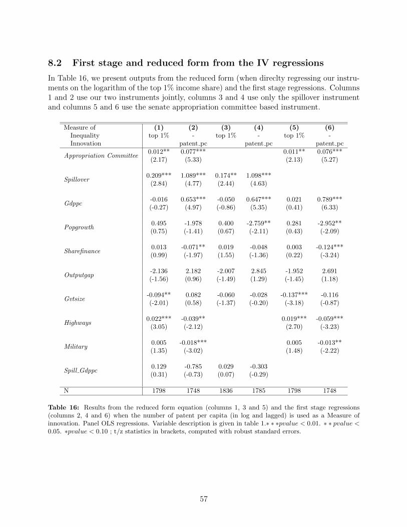
8.2 First stage and reduced form from the IV regressions
In Table 16, we present outputs from the reduced form (when direclty regressing our instru-ments on the logarithm of the top 1% income share) and the first stage regressions. Columns1 and 2 use our two instruments jointly, columns 3 and 4 use only the spillover instrumentand columns 5 and 6 use the senate appropriation committee based instrument.
Measure of (1) (2) (3) (4) (5) (6)Inequality top 1% - top 1% - top 1% -Innovation patent pc patent pc patent pc
Appropriation Committee0.012** 0.077*** 0.011** 0.076***(2.17) (5.33) (2.13) (5.27)
Spillover0.209*** 1.089*** 0.174** 1.098***
(2.84) (4.77) (2.44) (4.63)
Gdppc-0.016 0.653*** -0.050 0.647*** 0.021 0.789***(-0.27) (4.97) (-0.86) (5.35) (0.41) (6.33)
Popgrowth0.495 -1.978 0.400 -2.759** 0.281 -2.952**(0.75) (-1.41) (0.67) (-2.11) (0.43) (-2.09)
Sharefinance0.013 -0.071** 0.019 -0.048 0.003 -0.124***(0.99) (-1.97) (1.55) (-1.36) (0.22) (-3.24)
Outputgap-2.136 2.182 -2.007 2.845 -1.952 2.691(-1.56) (0.96) (-1.49) (1.29) (-1.45) (1.18)
Gvtsize-0.094** 0.082 -0.060 -0.028 -0.137*** -0.116(-2.01) (0.58) (-1.37) (-0.20) (-3.18) (-0.87)
Highways0.022*** -0.039** 0.019*** -0.059***
(3.05) (-2.12) (2.70) (-3.23)
Military0.005 -0.018*** 0.005 -0.013**(1.35) (-3.02) (1.48) (-2.22)
Spill Gdppc0.129 -0.785 0.029 -0.303(0.31) (-0.73) (0.07) (-0.29)
N 1798 1748 1836 1785 1798 1748
Table 16: Results from the reduced form equation (columns 1, 3 and 5) and the first stage regressions(columns 2, 4 and 6) when the number of patent per capita (in log and lagged) is used as a Measure ofinnovation. Panel OLS regressions. Variable description is given in table 1.∗ ∗ ∗pvalue < 0.01. ∗ ∗ pvalue <0.05. ∗pvalue < 0.10 ; t/z statistics in brackets, computed with robust standard errors.
57