Embed Size (px)
DESCRIPTION
Introduction to ArcView. RD 415. Menu Bar. Button Bar. Project Window. Status Bar. Exercise 1. Introduction to an ArcView project and some of the documents it can contain (views, tables, charts, layouts). - PowerPoint PPT Presentation
Citation preview
Introduction to ArcView
RD 415
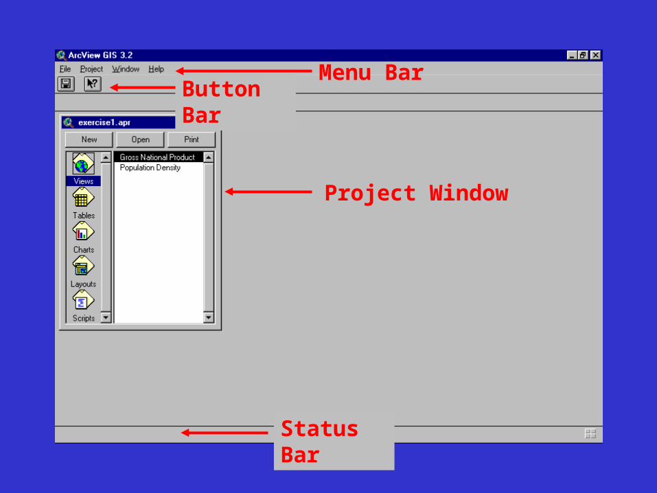
Menu BarButton Bar
Project Window
Status Bar
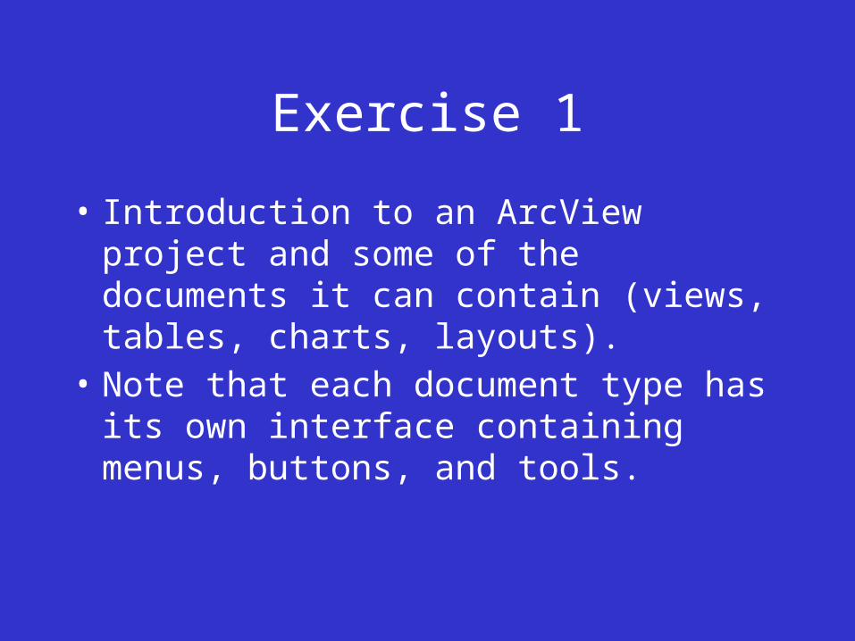
Exercise 1
• Introduction to an ArcView project and some of the documents it can contain (views, tables, charts, layouts).
• Note that each document type has its own interface containing menus, buttons, and tools.
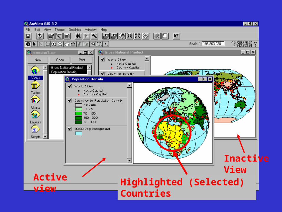
Active view
Inactive View
Highlighted (Selected) Countries
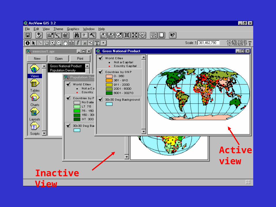
Active view
Inactive View
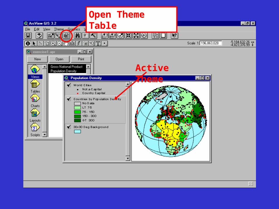
Active Theme
Open Theme Table
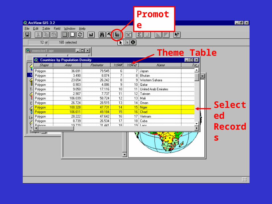
Theme Table
Selected Records
Promote
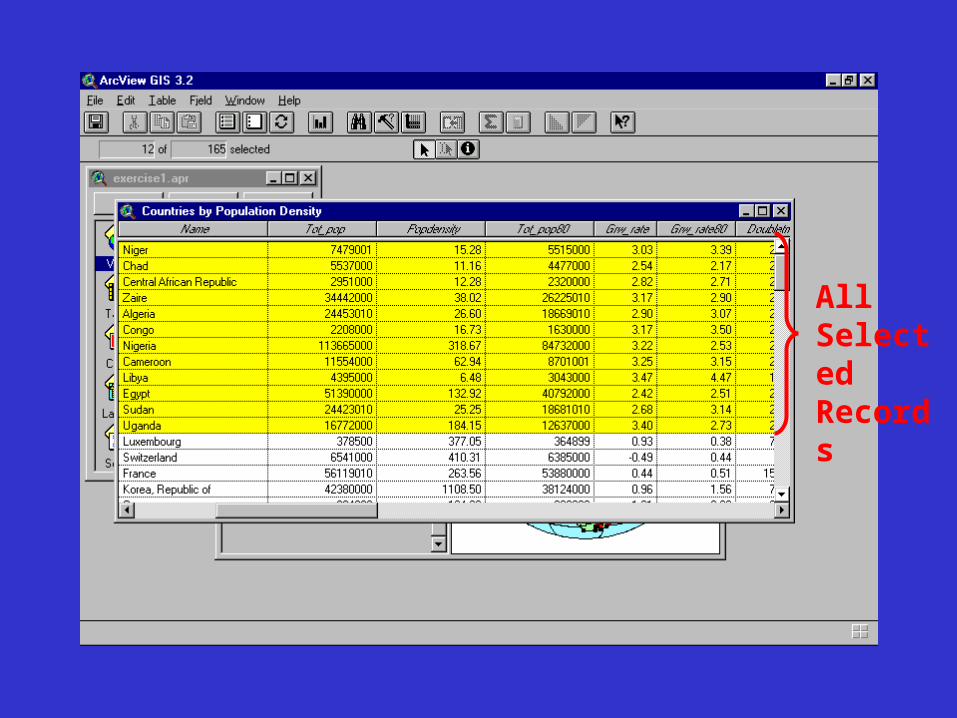
All Selected Records
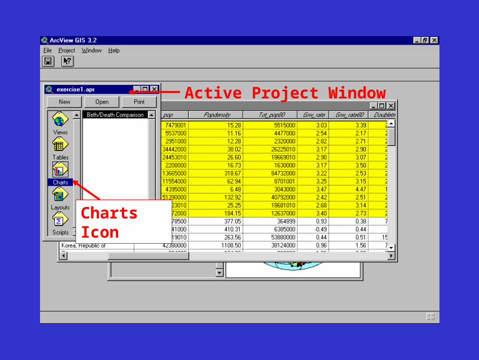
Active Project Window
Charts Icon
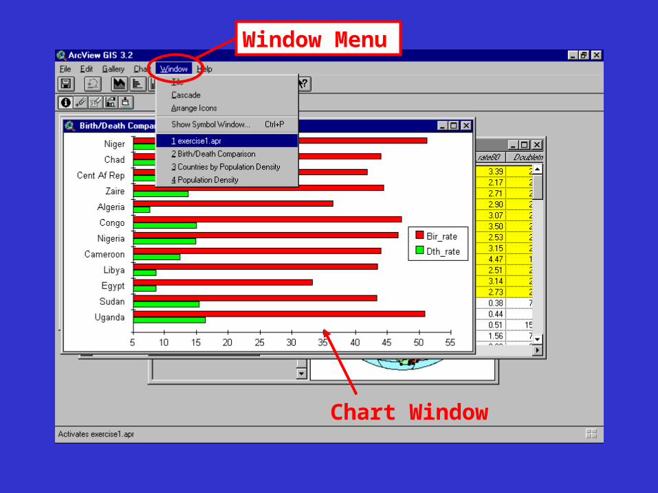
Chart Window
Window Menu
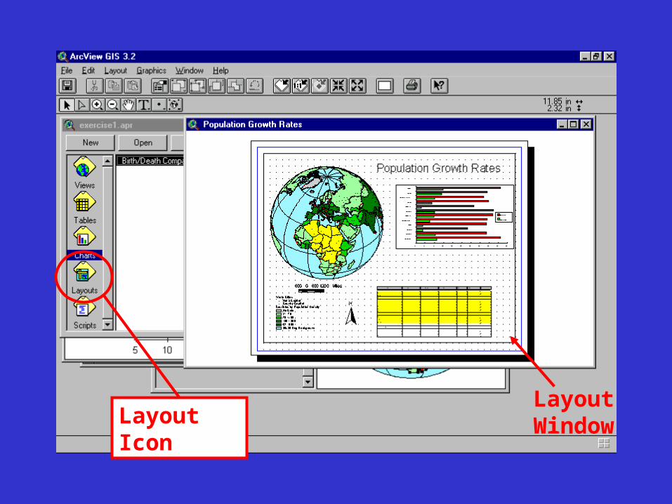
Layout IconLayout Window
Exercise 2You work for the City Maintenance Department,
which plans to add some utilities and upgrade others in a recently renovated part of town. You've been asked to create a map showing the existing utilities to use for planning the additions and upgrades. There is currently no single map that shows all the utilities. Your task is to locate the necessary data sources and add them to a view as themes so you can display them together.
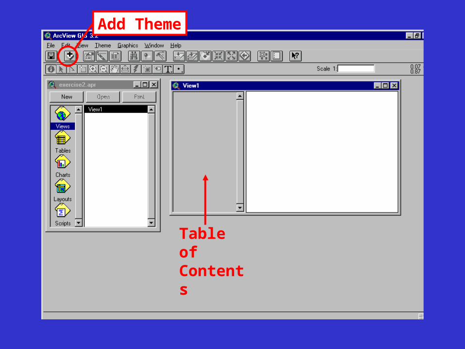
Table of Contents
Add Theme
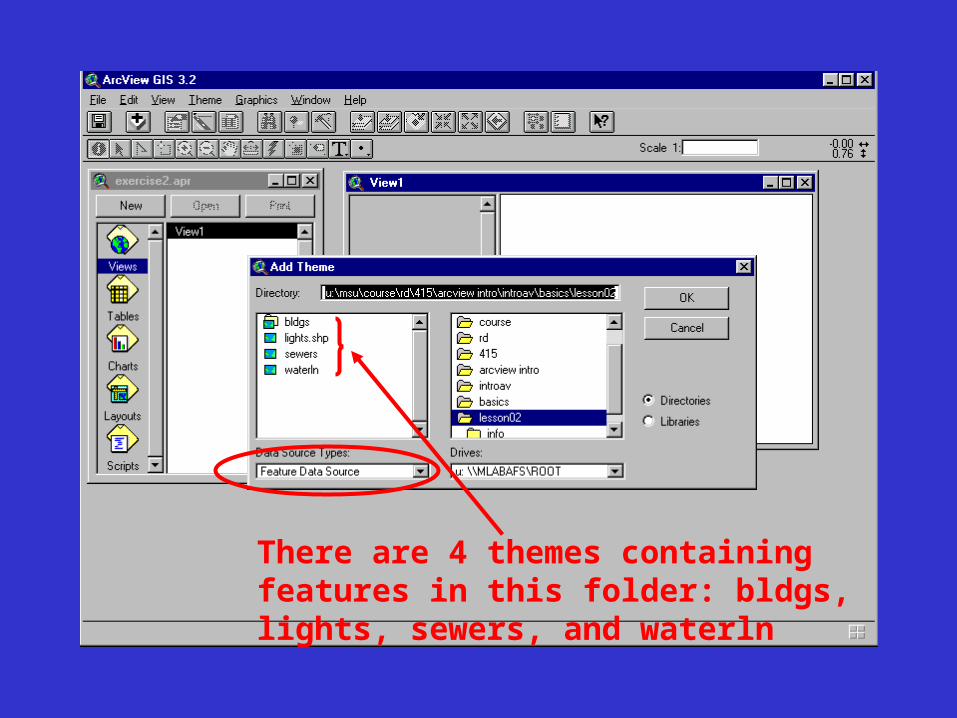
There are 4 themes containing features in this folder: bldgs, lights, sewers, and waterln
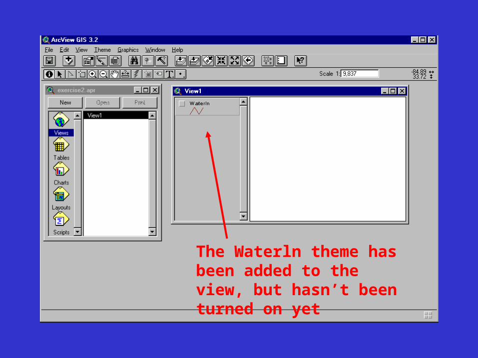
The Waterln theme has been added to the view, but hasn’t been turned on yet
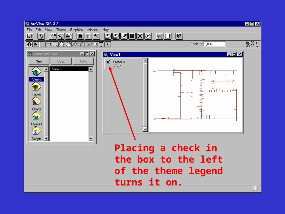
Placing a check in the box to the left of the theme legend turns it on.
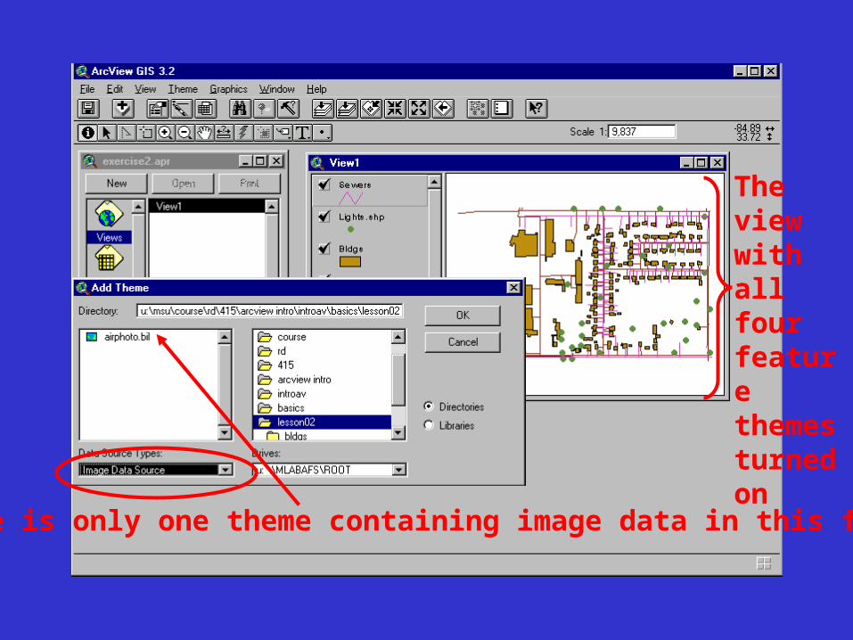
There is only one theme containing image data in this folder.
The view with all four feature themes turned on
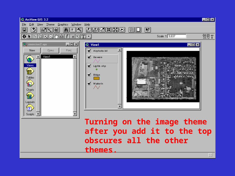
Turning on the image theme after you add it to the top obscures all the other themes.
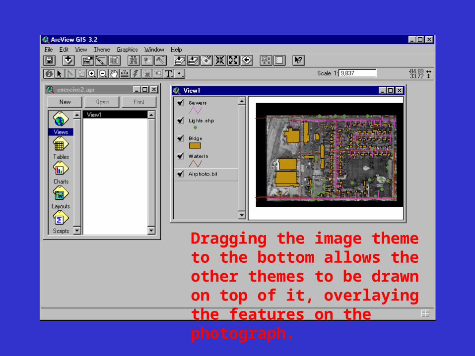
Dragging the image theme to the bottom allows the other themes to be drawn on top of it, overlaying the features on the photograph.
Exercise 3
The City Maintenance Department has decided to dig trenches for sewer lines on some of the properties. Your task is to retrieve the address information for these properties so notification letters can be sent to their owners. The Bldgs theme attribute table contains the address information you need. You'll make this theme active, then open its attribute table.
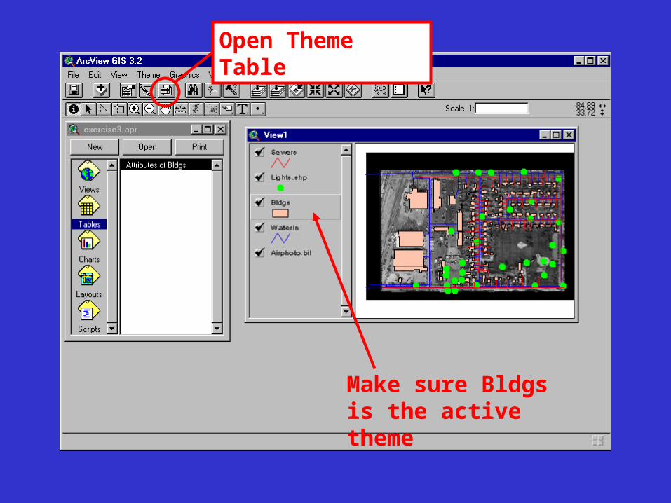
Open Theme Table
Make sure Bldgs is the active theme
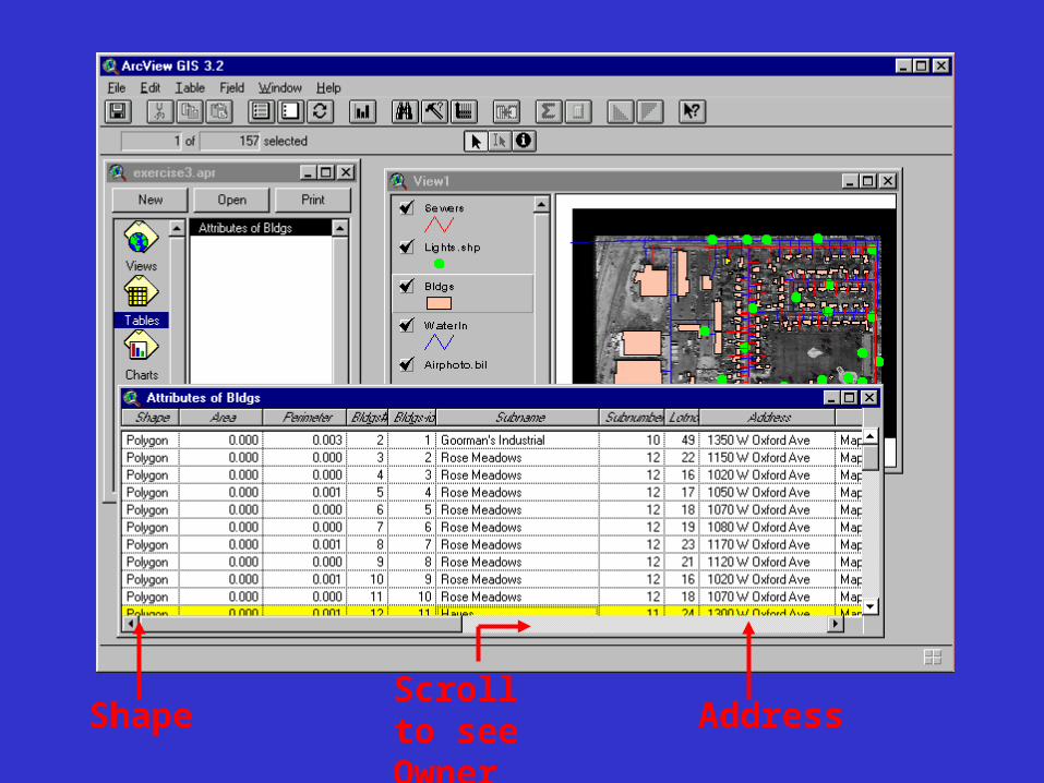
Shape Address
Scroll to see Owner
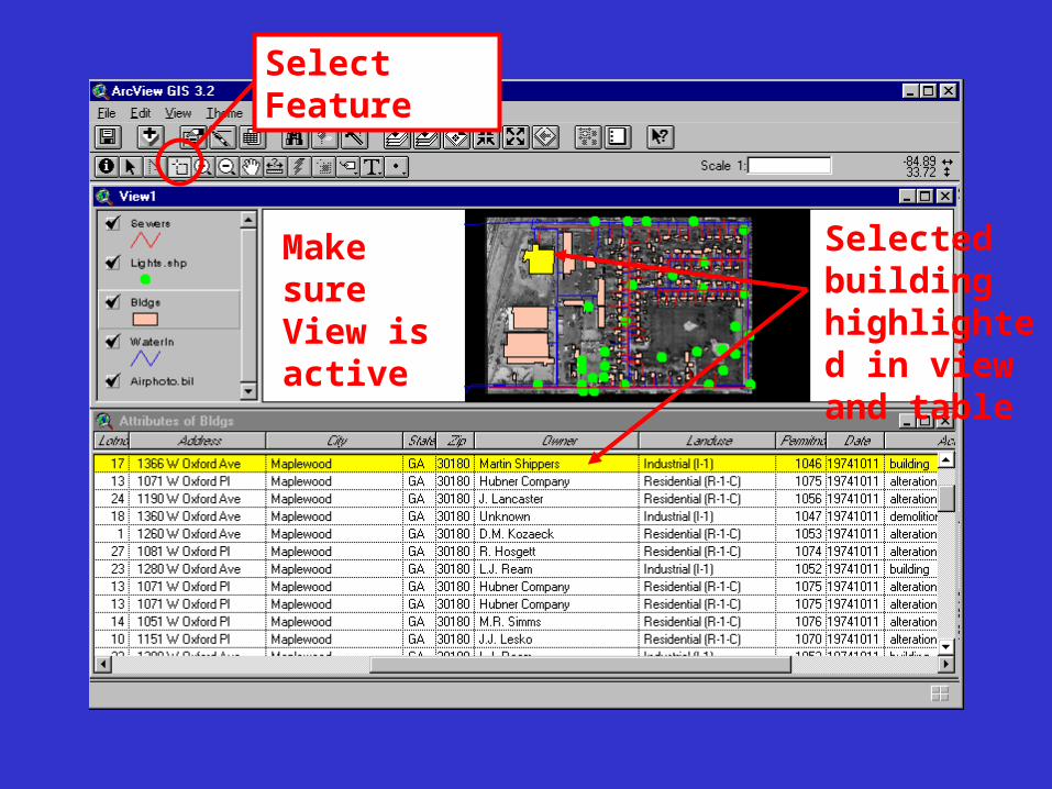
Select Feature
Make sure View is active
Selected building highlighted in view and table
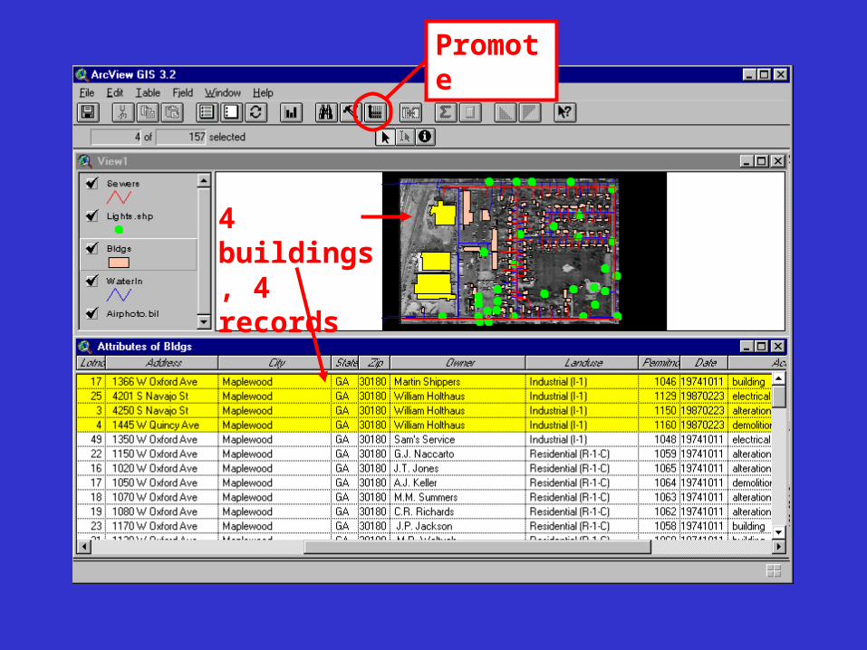
Promote
4 buildings, 4 records
Exercise 4• You work for an ad agency. A prospective
client wants to market a new product in an 18-county area. Your boss wants to show that running a more expensive campaign in the counties with the largest population will get better results than running a cheaper campaign in all the counties. As part of the agency’s presentation, your boss asks you to prepare a map of the 18-county area showing the population distribution.
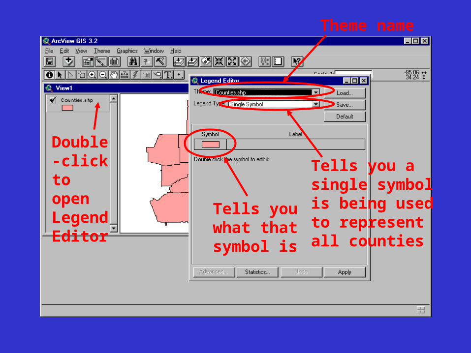
Double-click to open Legend Editor
Theme name
Tells you what that symbol is
Tells you a single symbol is being used to represent all counties
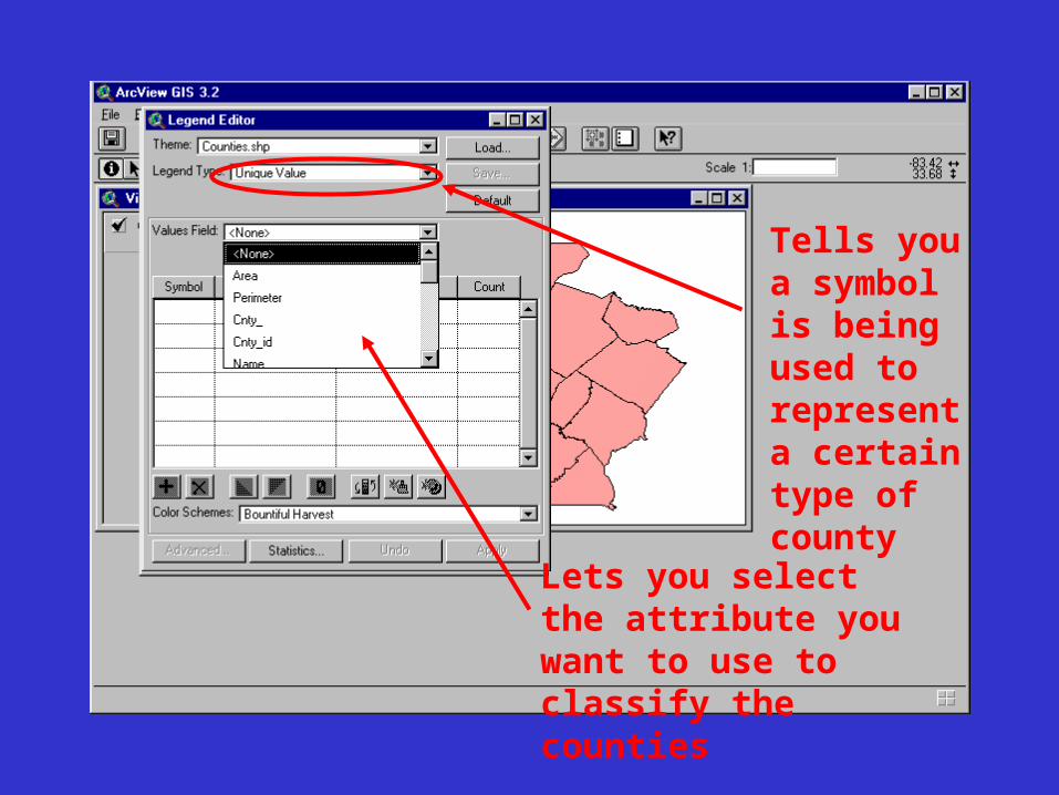
Tells you a symbol is being used to represent a certain type of county
Lets you select the attribute you want to use to classify the counties
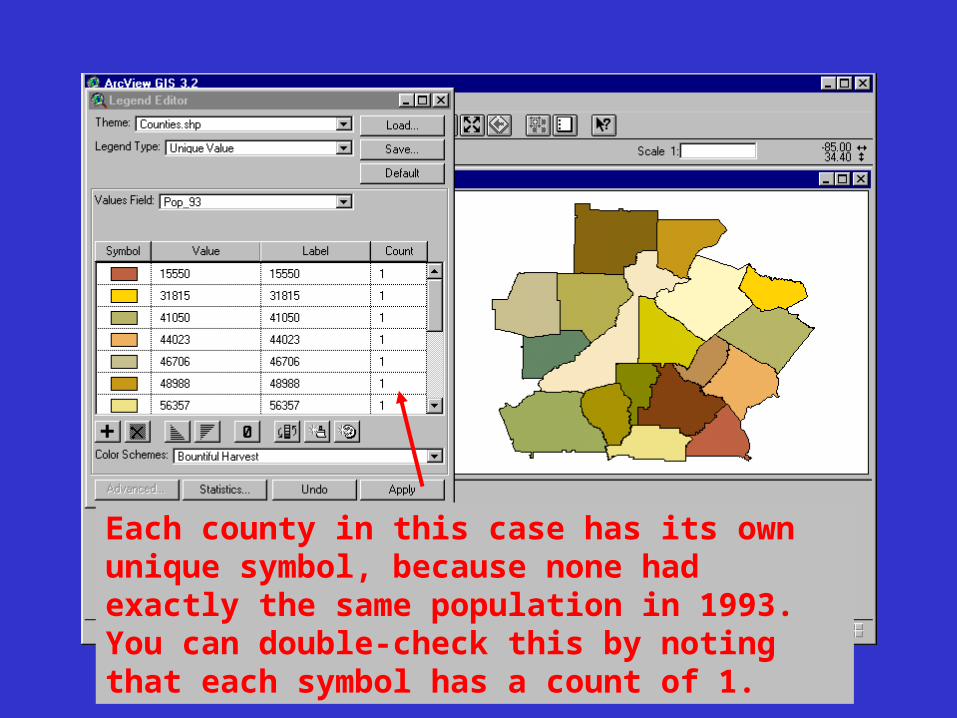
Each county in this case has its own unique symbol, because none had exactly the same population in 1993. You can double-check this by noting that each symbol has a count of 1.
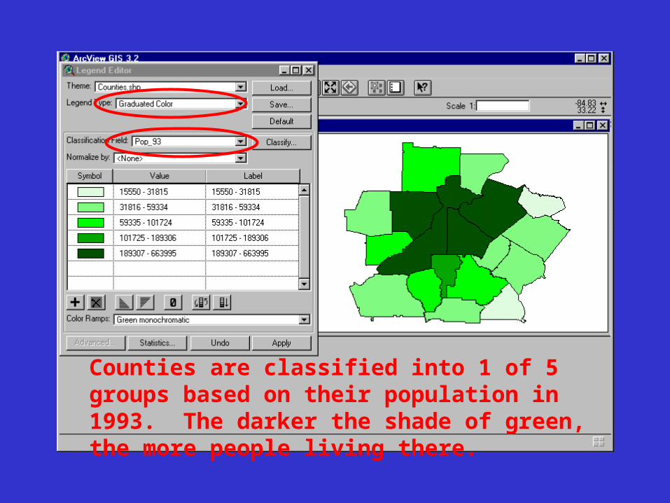
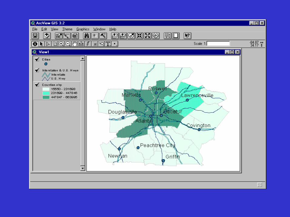
Counties are classified into 1 of 5 groups based on their population in 1993. The darker the shade of green, the more people living there.
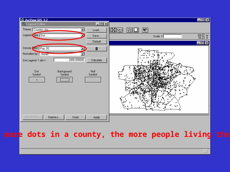
The more dots in a county, the more people living there.
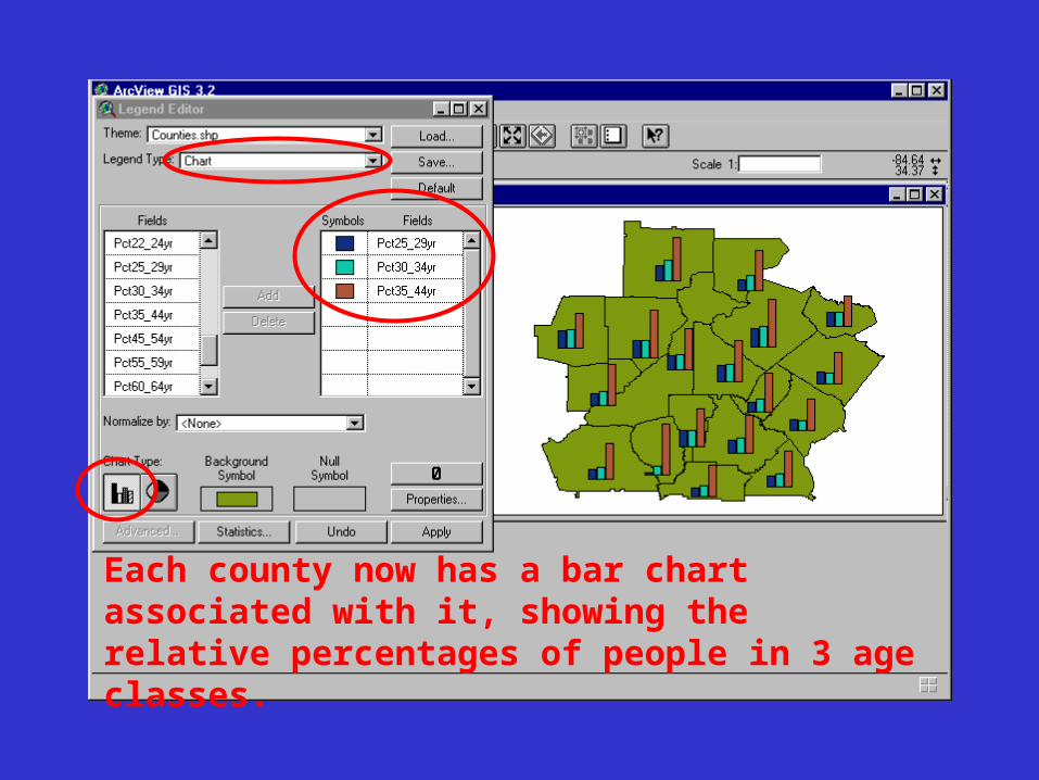
Each county now has a bar chart associated with it, showing the relative percentages of people in 3 age classes.
Exercise 5Now you'll learn how to change the
symbols that represent features. The Legend Editor and Symbol Window allow you to change the color, size, pattern, and other properties of map symbols.
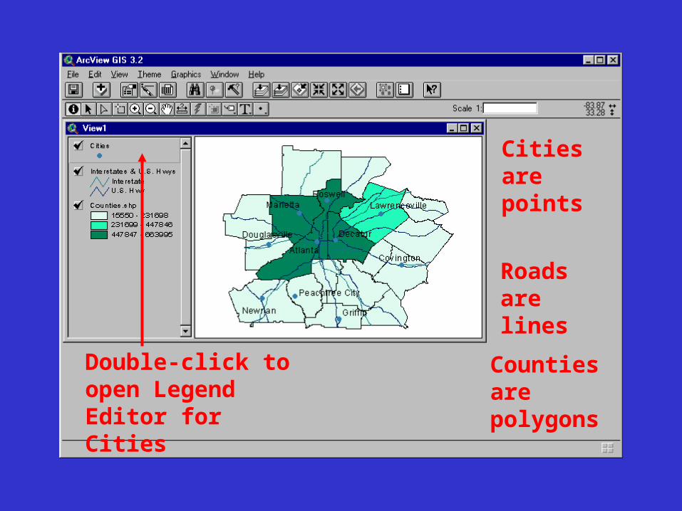
Cities are points
Roads are lines
Counties are polygons
Double-click to open Legend Editor for Cities
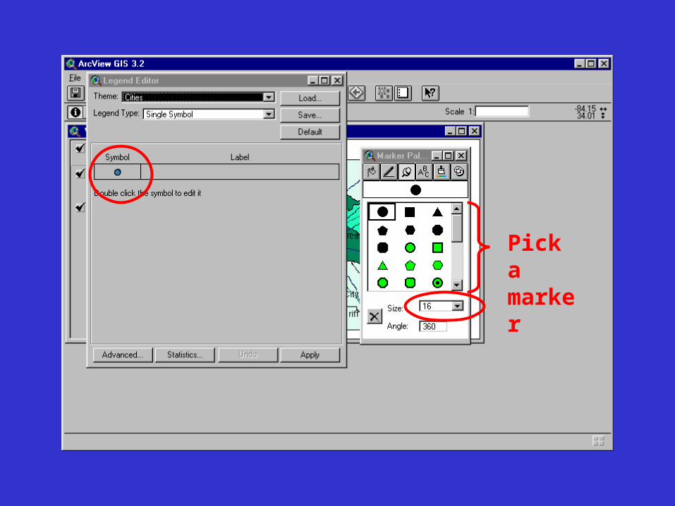
Pick a marker
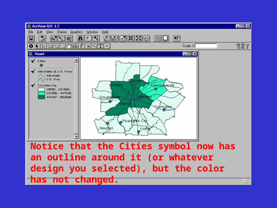
Notice that the Cities symbol now has an outline around it (or whatever design you selected), but the color has not changed.
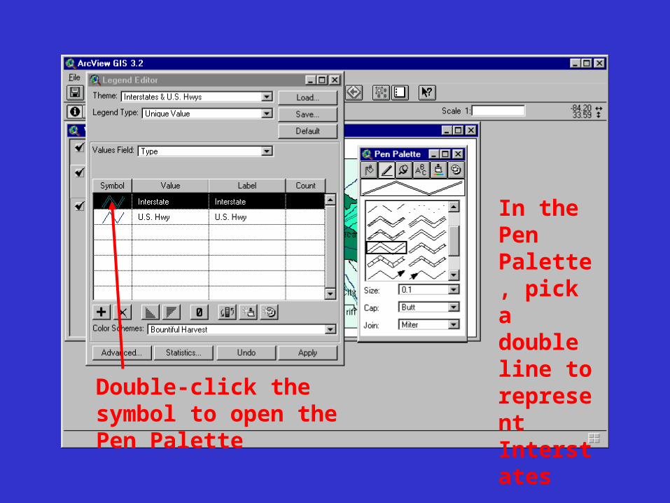
In the Pen Palette, pick a double line to represent Interstates
Double-click the symbol to open the Pen Palette
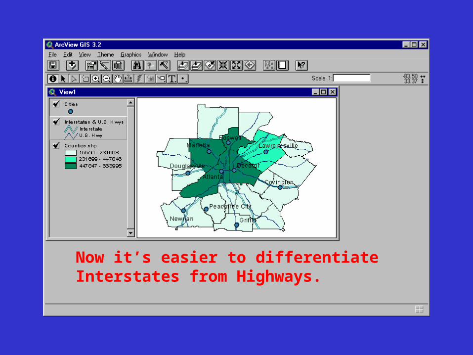
Now it’s easier to differentiate Interstates from Highways.
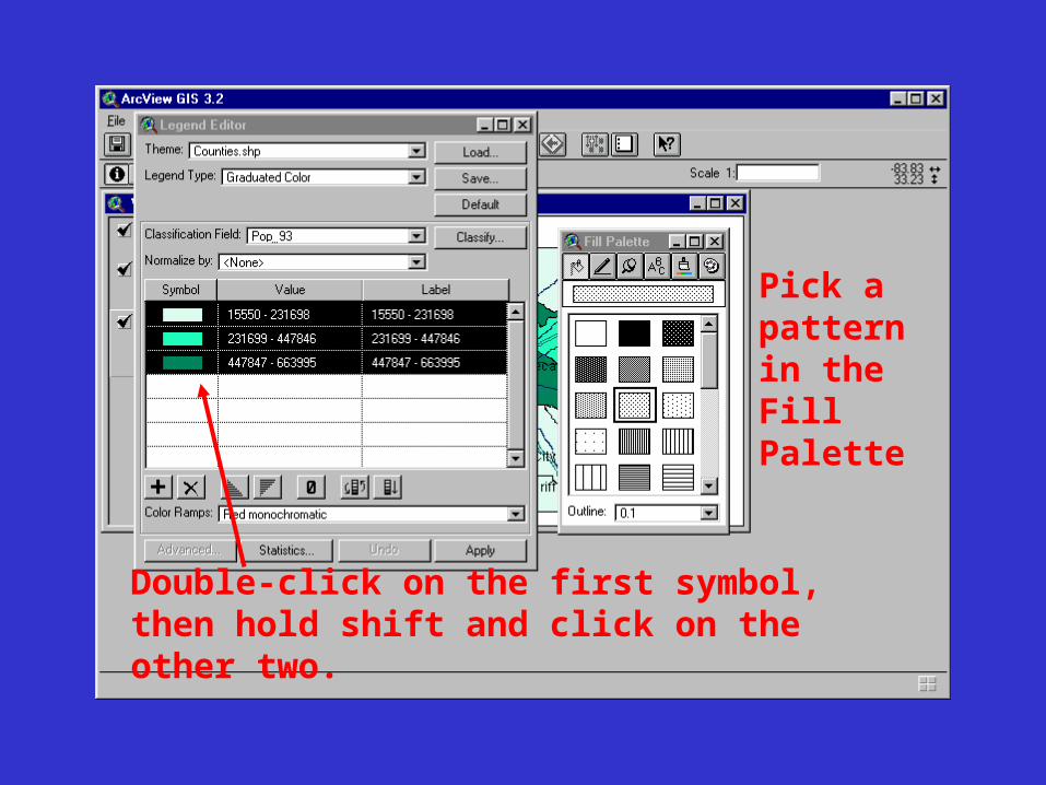
Double-click on the first symbol, then hold shift and click on the other two.
Pick a pattern in the Fill Palette
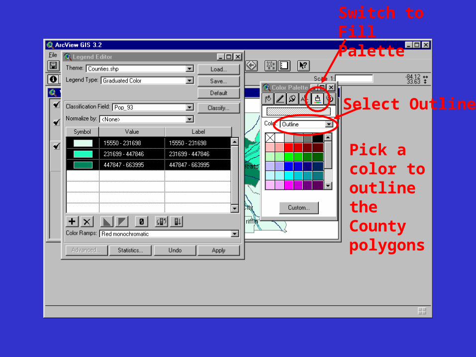
Switch to Fill Palette
Select Outline
Pick a color to outline the County polygons