Embed Size (px)
Citation preview
INTRODUCTION TO MICROSOFT EXCEL 2003 PIVOT TABLES
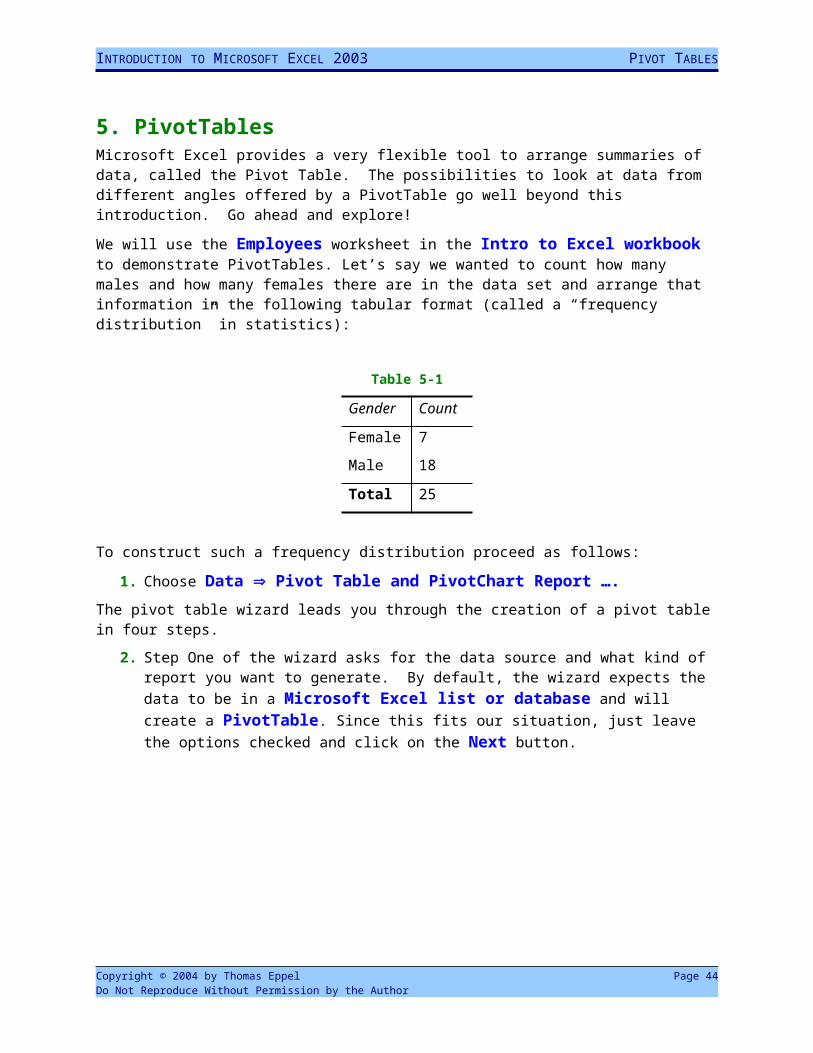
5. PivotTablesMicrosoft Excel provides a very flexible tool to arrange summaries of data, called the Pivot Table. The possibilities to look at data from different angles offered by a PivotTable go well beyond this introduction. Go ahead and explore!
We will use the Employees worksheet in the Intro to Excel workbook to demonstrate PivotTables. Let’s say we wanted to count how many males and how many females there are in the data set and arrange that information in the following tabular format (called a “frequency distribution” in statistics):
Table 5-1
Gender Count
Female 7
Male 18
Total 25
To construct such a frequency distribution proceed as follows:
1. Choose Data Pivot Table and PivotChart Report ….The pivot table wizard leads you through the creation of a pivot table in four steps.
2. Step One of the wizard asks for the data source and what kind of report you want to generate. By default, the wizard expects the data to be in a Microsoft Excel list or database and will create a PivotTable. Since this fits our situation, just leave the options checked and click on the Next button.
Copyright © 2004 by Thomas Eppel Page 44Do Not Reproduce Without Permission by the Author
INTRODUCTION TO MICROSOFT EXCEL 2003 PIVOT TABLES
Figure 5-1
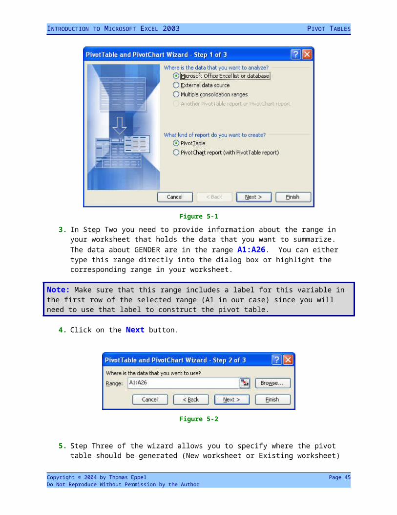
3. In Step Two you need to provide information about the range in your worksheet that holds the data that you want to summarize. The data about GENDER are in the range A1:A26. You can either type this range directly into the dialog box or highlight the corresponding range in your worksheet.
Note: Make sure that this range includes a label for this variable in the first row of the selected range (A1 in our case) since you will need to use that label to construct the pivot table.
4. Click on the Next button.
Figure 5-2
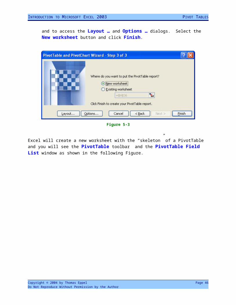
5. Step Three of the wizard allows you to specify where the pivot table should be generated (New worksheet or Existing worksheet) and to access the Layout … and Options … dialogs. Select the New worksheet button and click Finish.
Copyright © 2004 by Thomas Eppel Page 45Do Not Reproduce Without Permission by the Author
INTRODUCTION TO MICROSOFT EXCEL 2003 PIVOT TABLES
Figure 5-3
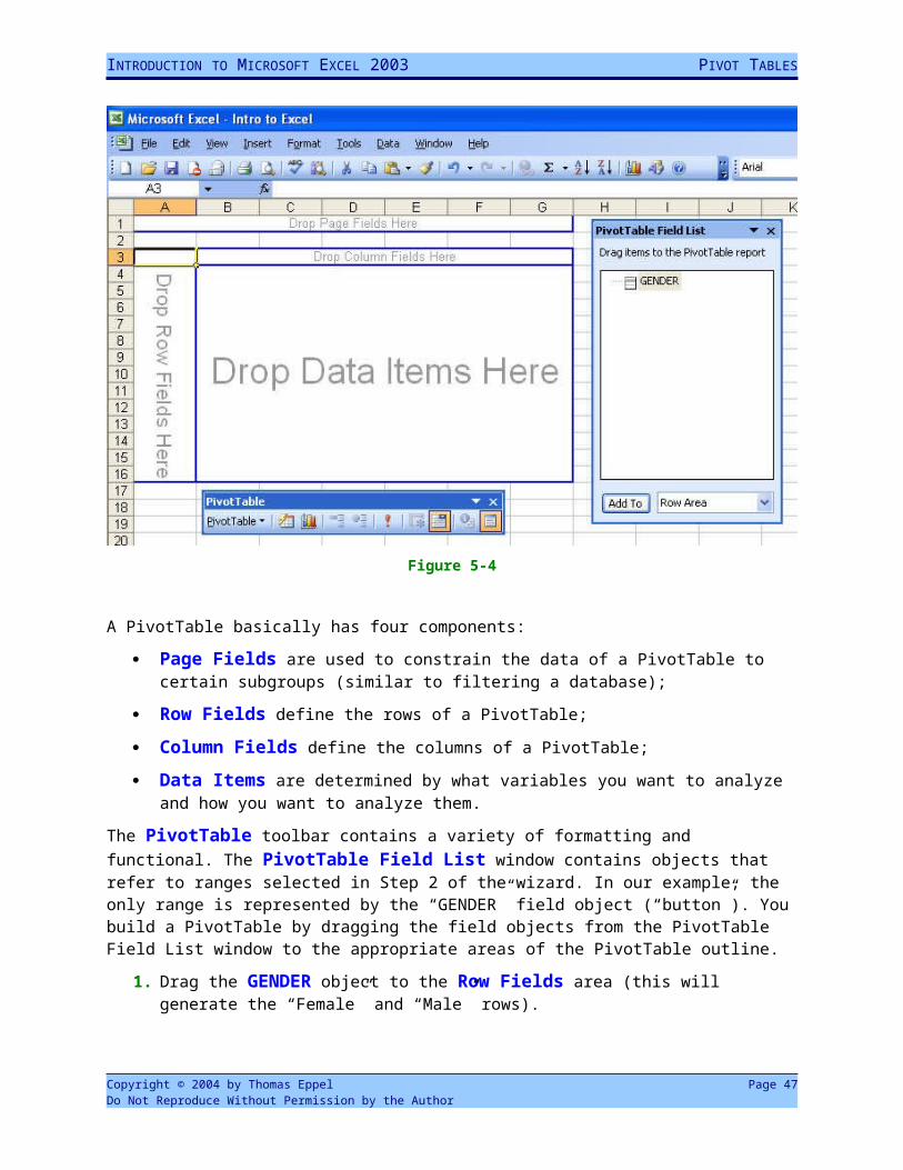
Excel will create a new worksheet with the “skeleton” of a PivotTable and you will see the PivotTable toolbar and the PivotTable Field List window as shown in the following Figure.
Figure 5-4
A PivotTable basically has four components:
Copyright © 2004 by Thomas Eppel Page 46Do Not Reproduce Without Permission by the Author
INTRODUCTION TO MICROSOFT EXCEL 2003 PIVOT TABLES
Page Fields are used to constrain the data of a PivotTable to certain subgroups (similar to filtering a database);
Row Fields define the rows of a PivotTable;
Column Fields define the columns of a PivotTable;
Data Items are determined by what variables you want to analyze and how you want to analyze them.
The PivotTable toolbar contains a variety of formatting and functional. The PivotTable Field List window contains objects that refer to ranges selected in Step 2 of the wizard. In our example, the only range is represented by the “GENDER” field object (“button”). You build a PivotTable by dragging the field objects from the PivotTable Field List window to the appropriate areas of the PivotTable outline.
1. Drag the GENDER object to the Row Fields area (this will generate the “Female” and “Male” rows).
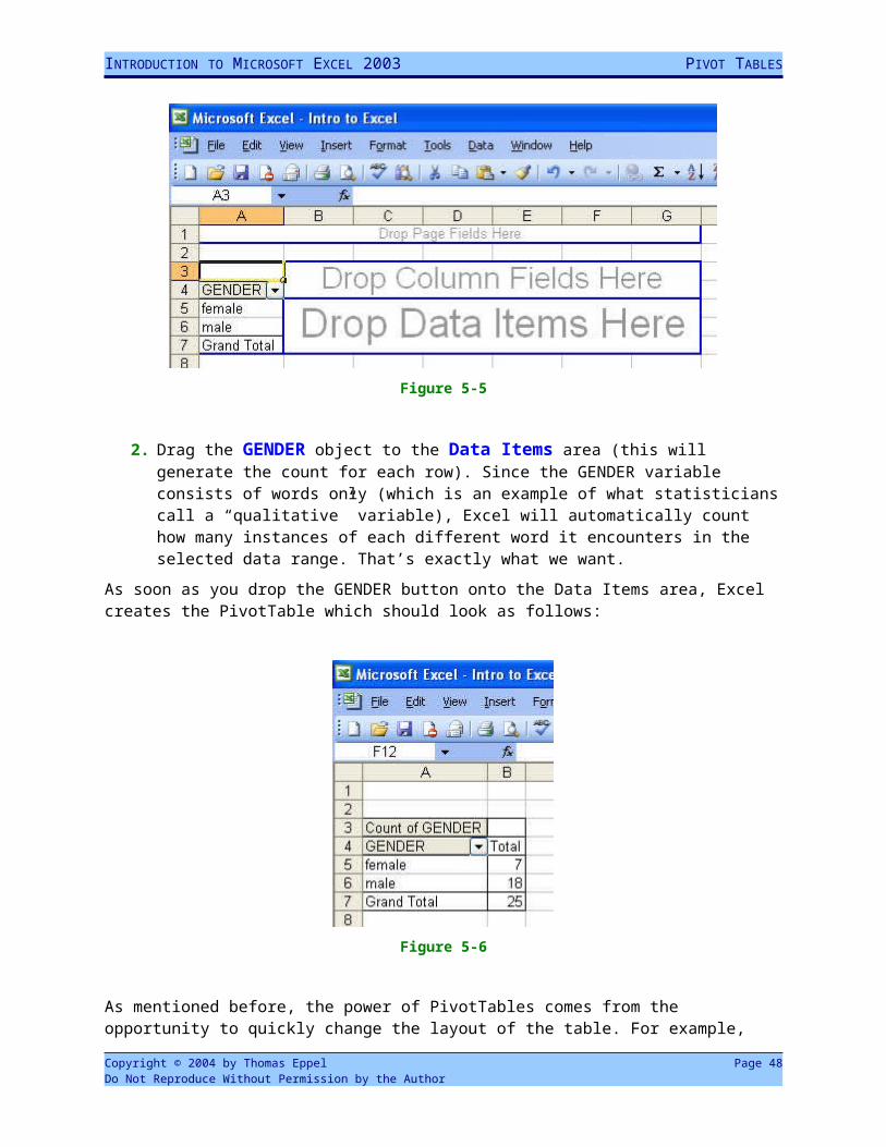
Figure 5-5
2. Drag the GENDER object to the Data Items area (this will generate the count for each row). Since the GENDER variable consists of words only (which is an example of what statisticians call a “qualitative” variable), Excel will automatically count how many instances of each different word it encounters in the selected data range. That’s exactly what we want.
As soon as you drop the GENDER button onto the Data Items area, Excel creates the PivotTable which should look as follows:
Copyright © 2004 by Thomas Eppel Page 47Do Not Reproduce Without Permission by the Author
INTRODUCTION TO MICROSOFT EXCEL 2003 PIVOT TABLES
Figure 5-6
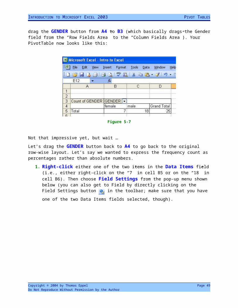
As mentioned before, the power of PivotTables comes from the opportunity to quickly change the layout of the table. For example, drag the GENDER button from A4 to B3 (which basically drags the Gender field from the “Row Fields Area” to the “Column Fields Area”). Your PivotTable now looks like this:
Figure 5-7
Not that impressive yet, but wait …
Let’s drag the GENDER button back to A4 to go back to the original row-wise layout. Let’s say we wanted to express the frequency count as percentages rather than absolute numbers.
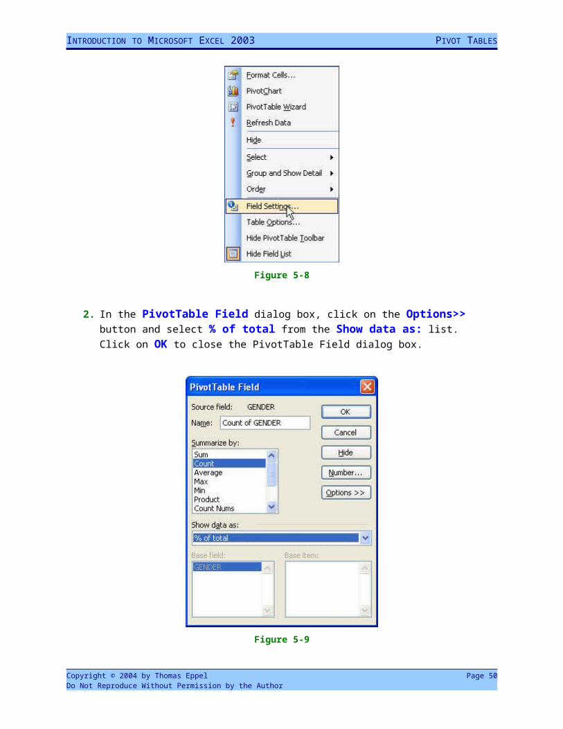
1. Right-click either one of the two items in the Data Items field (i.e., either right-click on the “7” in cell B5 or on the “18” in cell B6). Then choose Field Settings from the pop-up menu shown below (you can also get to Field by directly clicking on the Field Settings button in the toolbar; make sure that you have one of the two Data Items fields
selected, though).
Copyright © 2004 by Thomas Eppel Page 48Do Not Reproduce Without Permission by the Author
INTRODUCTION TO MICROSOFT EXCEL 2003 PIVOT TABLES
Figure 5-8
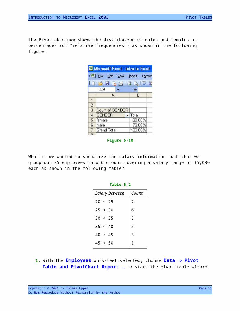
2. In the PivotTable Field dialog box, click on the Options>> button and select % of total from the Show data as: list. Click on OK to close the PivotTable Field dialog box.
Figure 5-9
Copyright © 2004 by Thomas Eppel Page 49Do Not Reproduce Without Permission by the Author
INTRODUCTION TO MICROSOFT EXCEL 2003 PIVOT TABLES
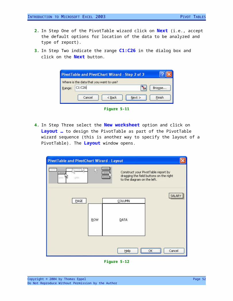
The PivotTable now shows the distribution of males and females as percentages (or “relative frequencies”) as shown in the following figure.
Figure 5-10
What if we wanted to summarize the salary information such that we group our 25 employees into 6 groups covering a salary range of $5,000 each as shown in the following table?
Table 5-2
Salary Between Count
20 < 25 2
25 < 30 6
30 < 35 8
35 < 40 5
40 < 45 3
45 < 50 1
1. With the Employees worksheet selected, choose Data Pivot Table and PivotChart Report … to start the pivot table wizard.
2. In Step One of the PivotTable wizard click on Next (i.e., accept the default options for location of the data to be analyzed and type of report).
3. In Step Two indicate the range C1:C26 in the dialog box and click on the Next button.
Copyright © 2004 by Thomas Eppel Page 50Do Not Reproduce Without Permission by the Author
INTRODUCTION TO MICROSOFT EXCEL 2003 PIVOT TABLES
Figure 5-11
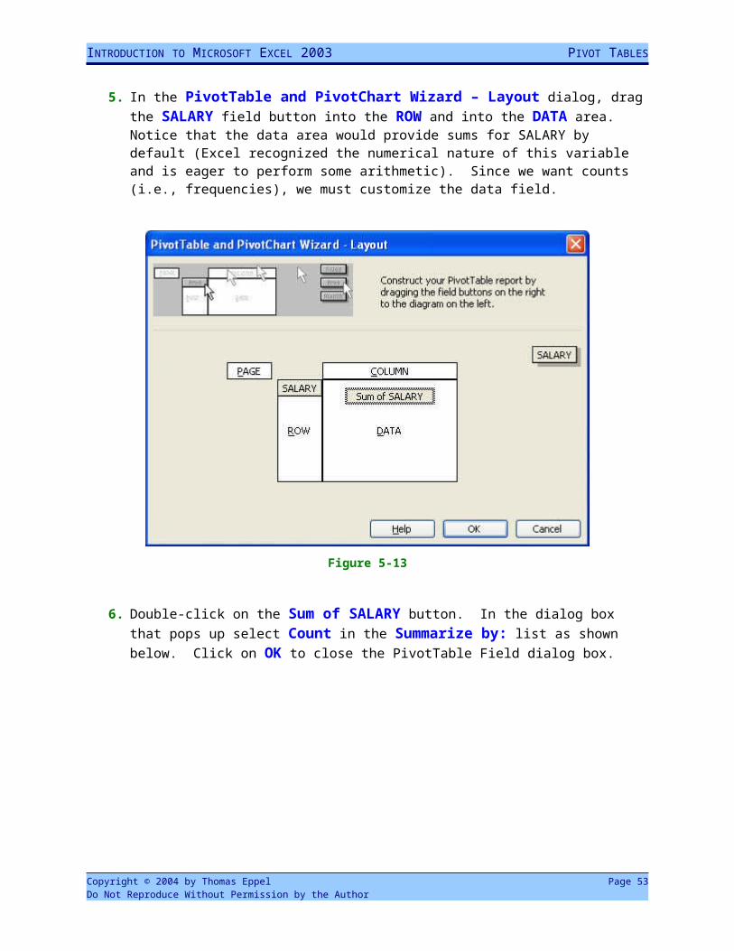
4. In Step Three select the New worksheet option and click on Layout … to design the PivotTable as part of the PivotTable wizard sequence (this is another way to specify the layout of a PivotTable). The Layout window opens.
Figure 5-12
5. In the PivotTable and PivotChart Wizard – Layout dialog, drag the SALARY field button into the ROW and into the DATA area. Notice that the data area would provide sums for SALARY by default (Excel recognized the numerical nature of this variable and is eager to perform some arithmetic). Since we want counts (i.e., frequencies), we must customize the data field.
Copyright © 2004 by Thomas Eppel Page 51Do Not Reproduce Without Permission by the Author
INTRODUCTION TO MICROSOFT EXCEL 2003 PIVOT TABLES
Figure 5-13
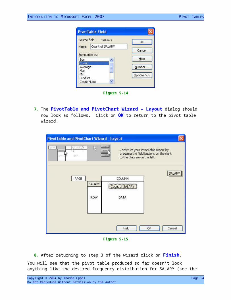
6. Double-click on the Sum of SALARY button. In the dialog box that pops up select Count in the Summarize by: list as shown below. Click on OK to close the PivotTable Field dialog box.
Figure 5-14
7. The PivotTable and PivotChart Wizard – Layout dialog should now look as follows. Click on OK to return to the pivot table wizard.
Copyright © 2004 by Thomas Eppel Page 52Do Not Reproduce Without Permission by the Author
INTRODUCTION TO MICROSOFT EXCEL 2003 PIVOT TABLES
Figure 5-15
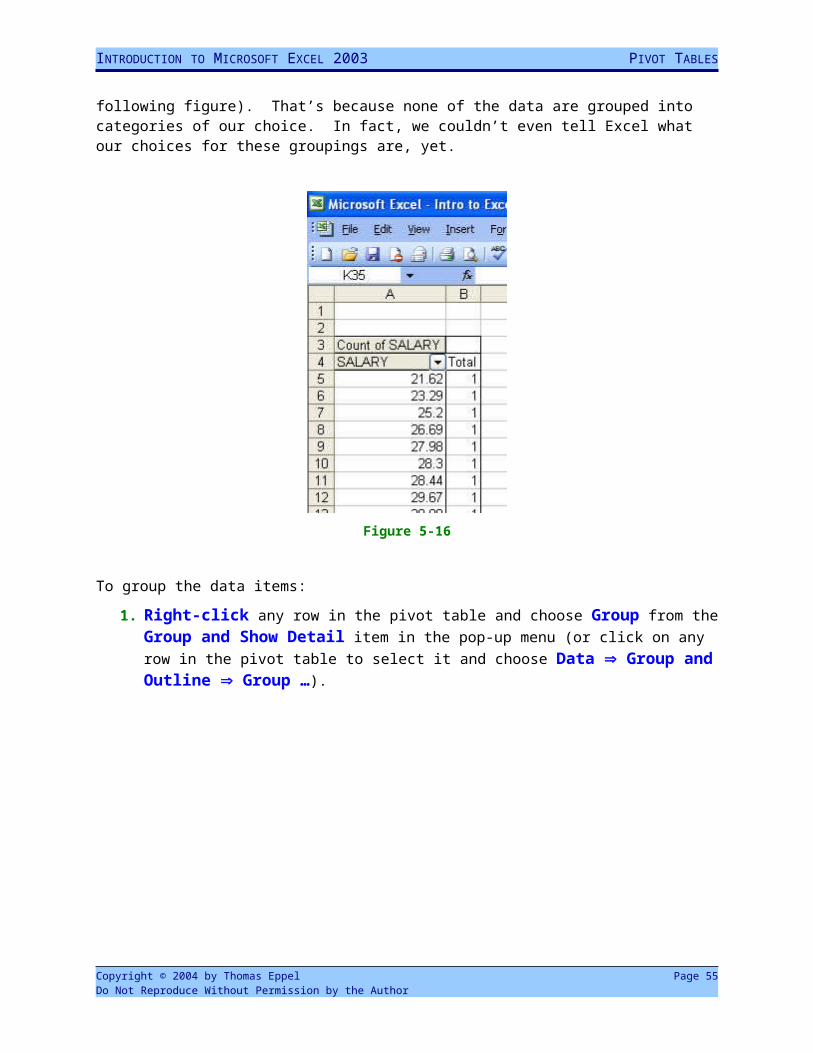
8. After returning to step 3 of the wizard click on Finish.
You will see that the pivot table produced so far doesn’t look anything like the desired frequency distribution for SALARY (see the following figure). That’s because none of the data are grouped into categories of our choice. In fact, we couldn’t even tell Excel what our choices for these groupings are, yet.
Copyright © 2004 by Thomas Eppel Page 53Do Not Reproduce Without Permission by the Author
INTRODUCTION TO MICROSOFT EXCEL 2003 PIVOT TABLES
Figure 5-16
To group the data items:
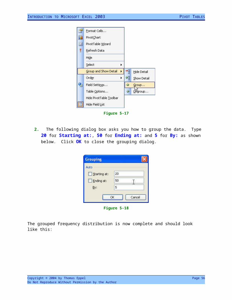
1. Right-click any row in the pivot table and choose Group from the Group and Show Detail item in the pop-up menu (or click on any row in the pivot table to select it and choose Data Group and Outline Group …).
Figure 5-17
Copyright © 2004 by Thomas Eppel Page 54Do Not Reproduce Without Permission by the Author
INTRODUCTION TO MICROSOFT EXCEL 2003 PIVOT TABLES
2. The following dialog box asks you how to group the data. Type 20 for Starting at:, 50 for Ending at: and 5 for By: as shown below. Click OK to close the grouping dialog.
Figure 5-18
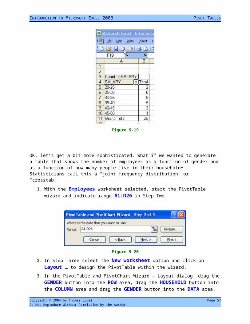
The grouped frequency distribution is now complete and should look like this:
Figure 5-19
OK, let’s get a bit more sophisticated. What if we wanted to generate a table that shows the number of employees as a function of gender and as a function of how many people live in their household. Statisticians call this a “joint frequency distribution” or “crosstab.”
1. With the Employees worksheet selected, start the PivotTable wizard and indicate range A1:D26 in Step Two.
Copyright © 2004 by Thomas Eppel Page 55Do Not Reproduce Without Permission by the Author
INTRODUCTION TO MICROSOFT EXCEL 2003 PIVOT TABLES
Figure 5-20
2. In Step Three select the New worksheet option and click on Layout … to design the PivotTable within the wizard.
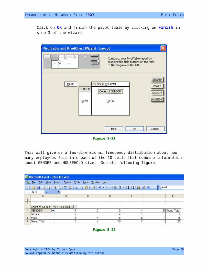
3. In the PivotTable and PivotChart Wizard – Layout dialog, drag the GENDER button into the ROW area, drag the HOUSEHOLD button into the COLUMN area and drag the GENDER button into the DATA area. Click on OK and finish the pivot table by clicking on Finish in step 3 of the wizard.
Figure 5-21
This will give us a two-dimensional frequency distribution about how many employees fall into each of the 10 cells that combine information about GENDER and HOUSEHOLD size. See the following figure.
Copyright © 2004 by Thomas Eppel Page 56Do Not Reproduce Without Permission by the Author
INTRODUCTION TO MICROSOFT EXCEL 2003 PIVOT TABLES
Figure 5-22
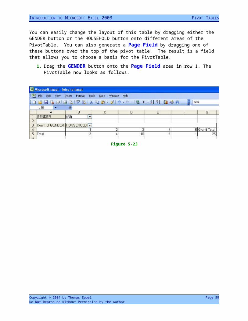
You can easily change the layout of this table by dragging either the GENDER button or the HOUSEHOLD button onto different areas of the PivotTable. You can also generate a Page Field by dragging one of these buttons over the top of the pivot table. The result is a field that allows you to choose a basis for the PivotTable.
1. Drag the GENDER button onto the Page Field area in row 1. The PivotTable now looks as follows.
Figure 5-23
Copyright © 2004 by Thomas Eppel Page 57Do Not Reproduce Without Permission by the Author
INTRODUCTION TO MICROSOFT EXCEL 2003 PIVOT TABLES
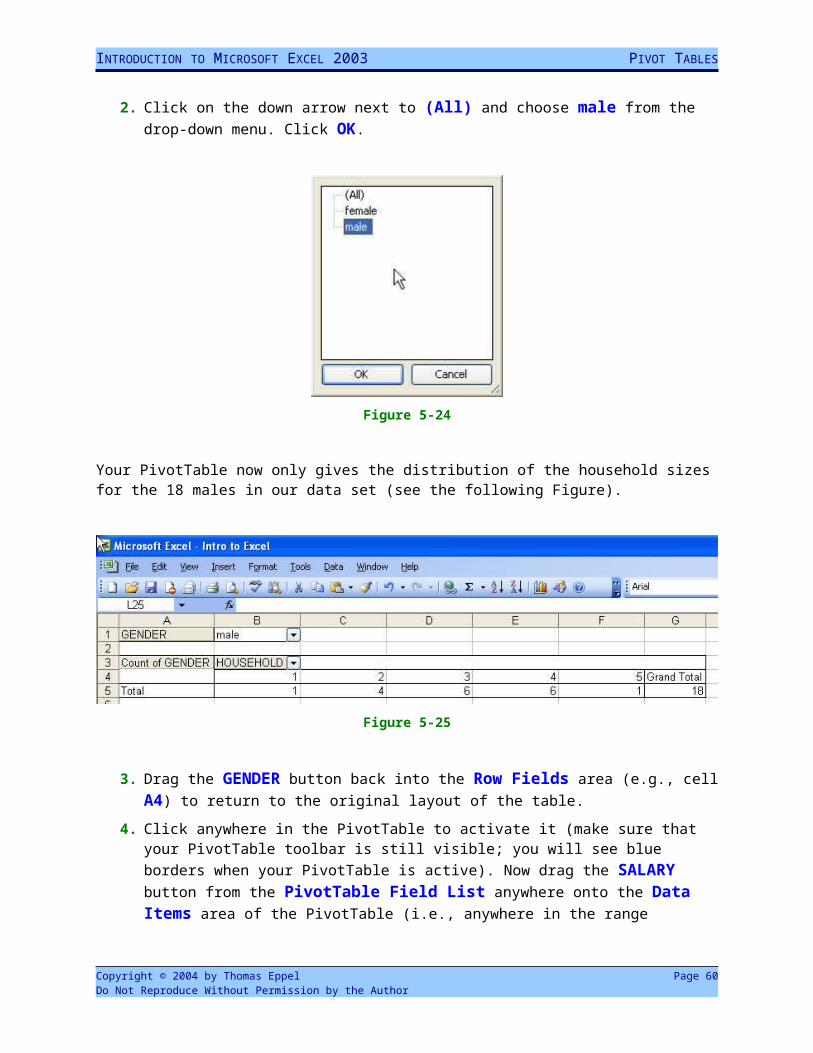
2. Click on the down arrow next to (All) and choose male from the drop-down menu. Click OK.
Figure 5-24
Your PivotTable now only gives the distribution of the household sizes for the 18 males in our data set (see the following Figure).
Figure 5-25
3. Drag the GENDER button back into the Row Fields area (e.g., cell A4) to return to the original layout of the table.
4. Click anywhere in the PivotTable to activate it (make sure that your PivotTable toolbar is still visible; you will see blue borders when your PivotTable is active). Now drag the SALARY button from the PivotTable Field List anywhere onto the Data Items area of the PivotTable (i.e., anywhere in the range B5:G7). Excel adds the Sum of Salary as a data item and your pivot table should look like this.
Copyright © 2004 by Thomas Eppel Page 58Do Not Reproduce Without Permission by the Author
INTRODUCTION TO MICROSOFT EXCEL 2003 PIVOT TABLES
Figure 5-26
5. To show the average salaries rather than the sum of salaries, click on Sum of Salary either in cell B6 or in B8. Click the Field Settings button ( ) in the PivotTable toolbar and choose Average from the Summarize by: listbox in the PivotTable Field dialog box.
Figure 5-27
Your PivotTable now shows average salaries in addition to the count of employees for each cell (see the following figure).
Copyright © 2004 by Thomas Eppel Page 59Do Not Reproduce Without Permission by the Author
INTRODUCTION TO MICROSOFT EXCEL 2003 PIVOT TABLES
Figure 5-28
Exercise:Use the Top Web Sites worksheet in your Intro to Excel workbook.
1) Use a PivotTable to find the average number of users for each web site category.
2) Use a page field to show the average number of users for web sites from the Finance category only.
Copyright © 2004 by Thomas Eppel Page 60Do Not Reproduce Without Permission by the Author