Embed Size (px)
Citation preview
SURVIVAL GUIDE: FANTASIZING
The copy provided assumed an unusually diverse audience: if you found yourself anywhere on Earth, practically anytime between the Italian Renaissance and the near future , you’d find something in the Cryosoldier Edition of the United States Armed Forces Survival Guide of great interest and immediate utility to you. To protect this precious manual against unforseen calamity, it is bound with piano hinges between sheets of embossed aluminum that contain the hard copy, which is itself printed on metallic paper. Department of Cryowarfare, United States Armed Forces. USA. Oct. 2013.
MACRO MAGAZINE: VISUALIZING
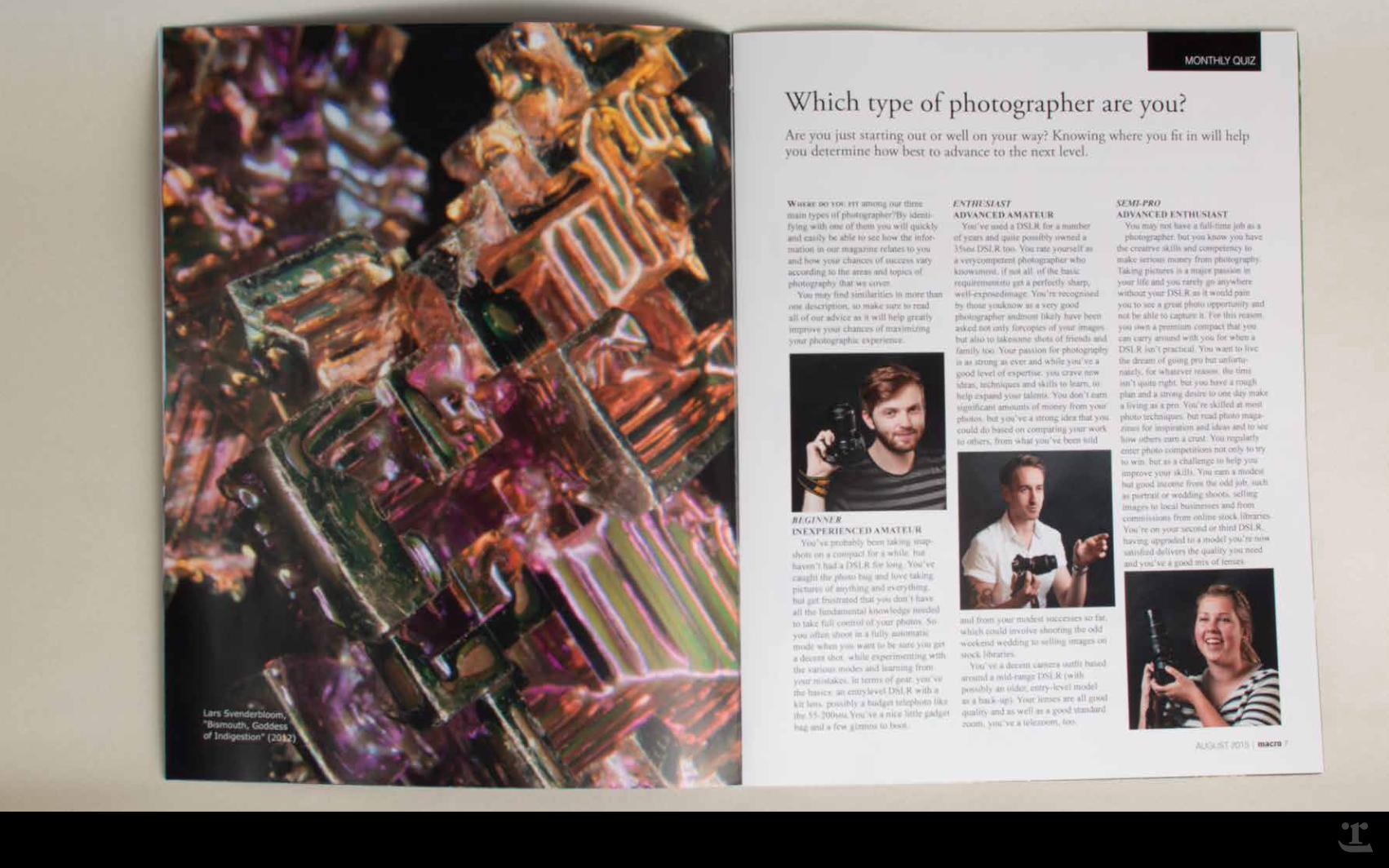
MACRO says “yes you can!” The target audience of MACRO is the up-and-coming amateur photographer who, demographically, is likely between the ages of 18 and 28 and earns less than thirty-five thousand dollars per year. The function of the magazine, as imagined by BigPhoto Inc. (the magazine’s parent company) is to attract an audience of hobbyists and interest them in the lifestyle, services and premium merchandise described in more sophisticated members of the BigPhoto family. As such, much of the copy and imagery treats subject of interest to the aspiring but timid photographer. BigPhoto Inc., Nov. 2014.
WASN’T THE FUTURE WONDERFUL: ADVERTISING
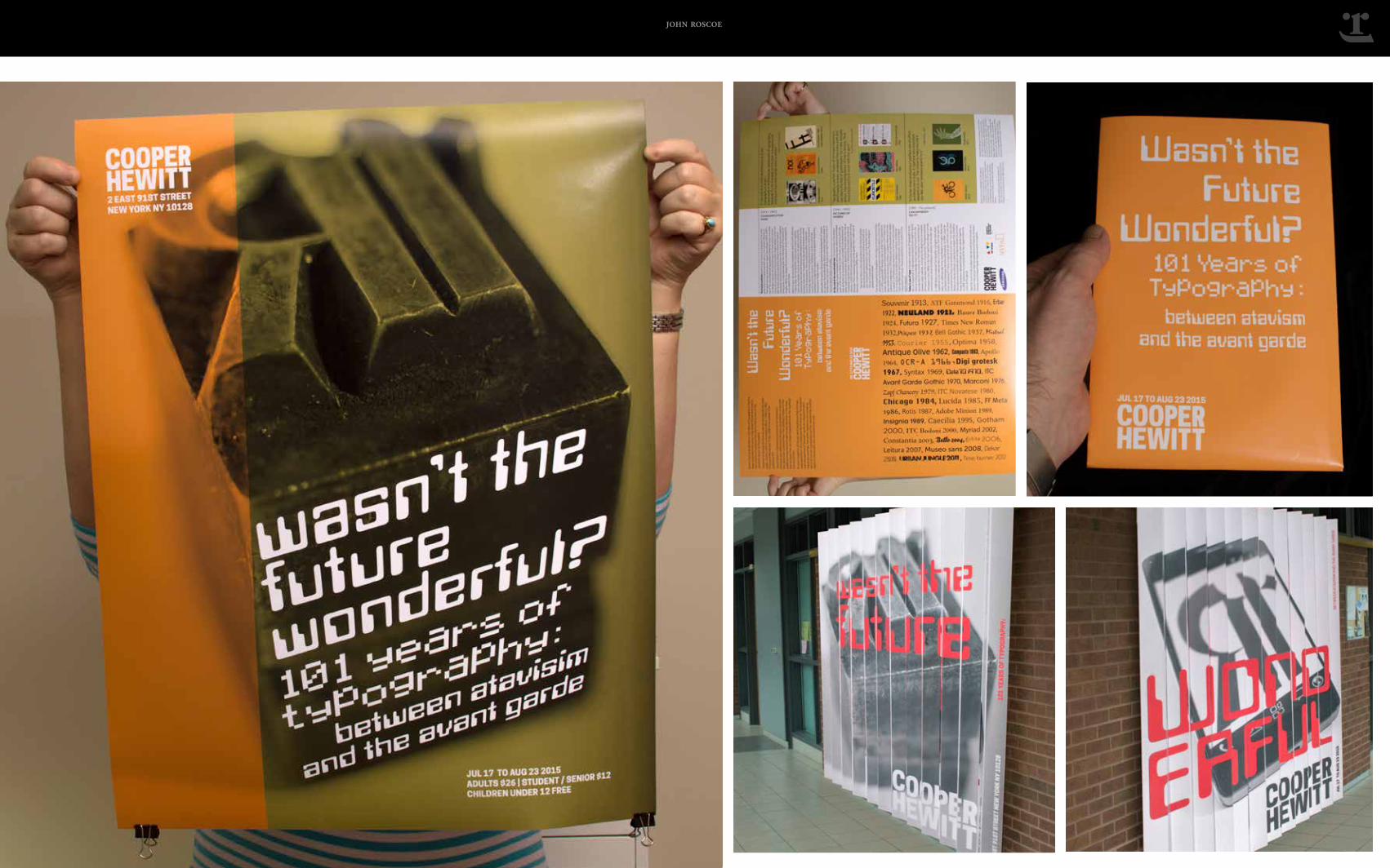
When the Cooper Hewlitt Design Museum decided to put on an exhibition showcasing the history and evolution of typography from Edwardia to the present, they wanted to show the matter not as a dry and obscure subject of interest only to typophiles, but rather as a window on the shifting perceptions of North American readers and writers of the period. Dynamism was called for, so a giant, lenticular poster engaging passersby to study it’s juxtapositions was created, as well as a large-scale yet mail-freindly, foldable poster with an informative program on the reverse. Cooper Hewlitt, Nov. 2014.
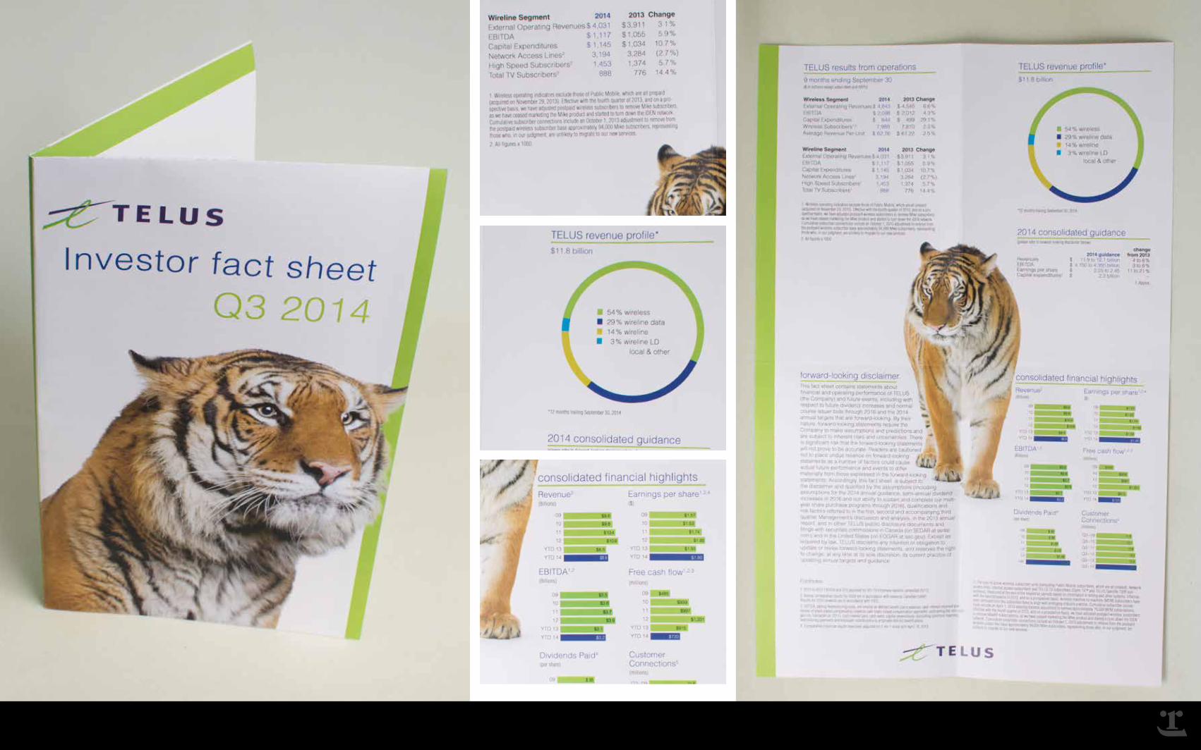
TELUS INVESTOR FACT SHEET: ACCOUNTING
Investors have certain expectations about quarterly reports. They should be truthful above all else, of course, but they should also be consistent. One needs to be able to compare apples to apples with these documents, and the only way to achieve that is to follow the existing aesthetic as laid out in previous reports. But being faithful to an existing aesthetic does not mean repeating the previous design. Like the companies they represent, there is always some room for improvement in a quarterly report, and the solution here makes it with minimalist attention to fine detail. Telus, Nov. 2014.
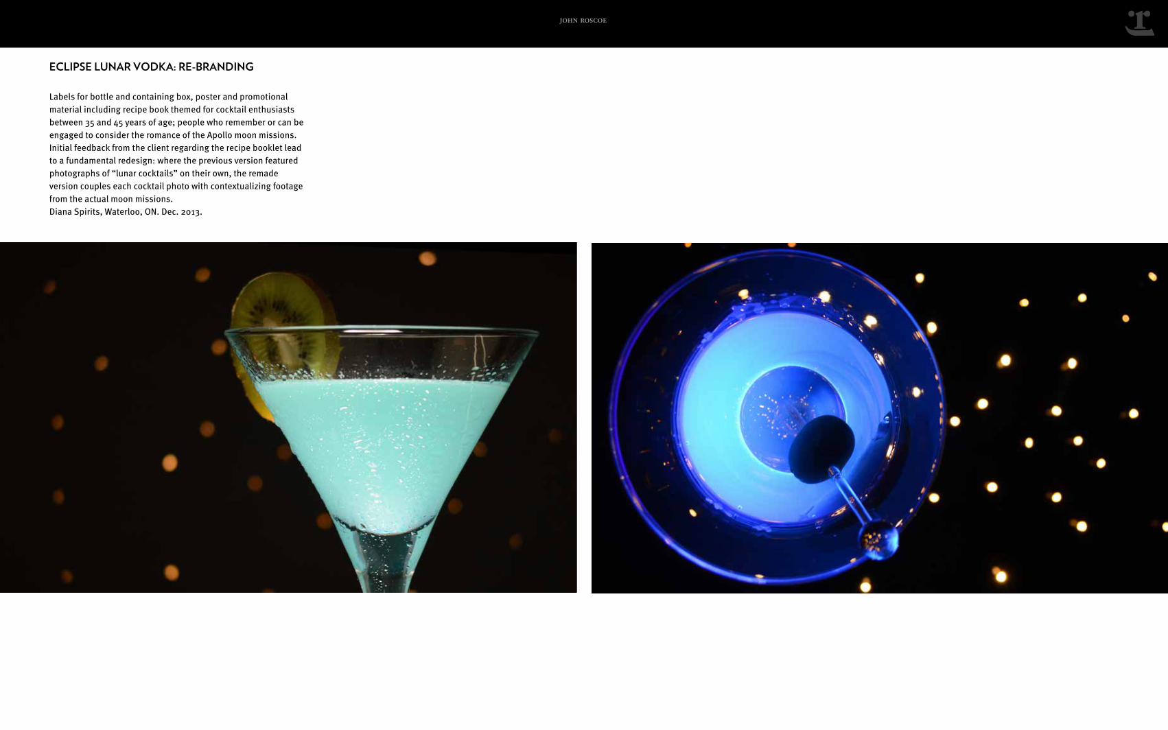
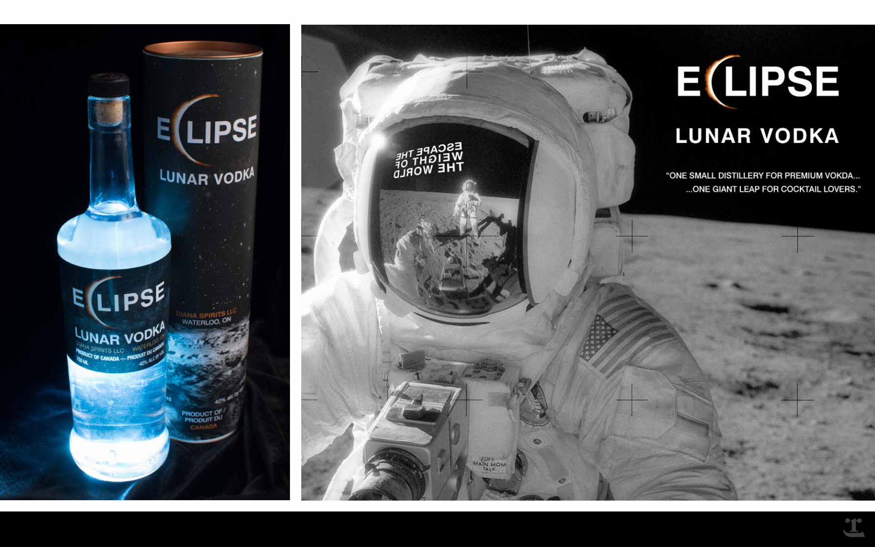
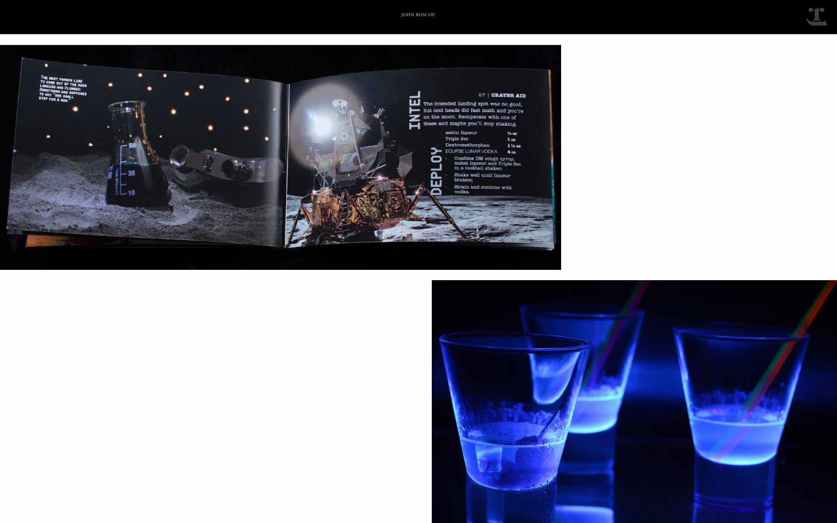
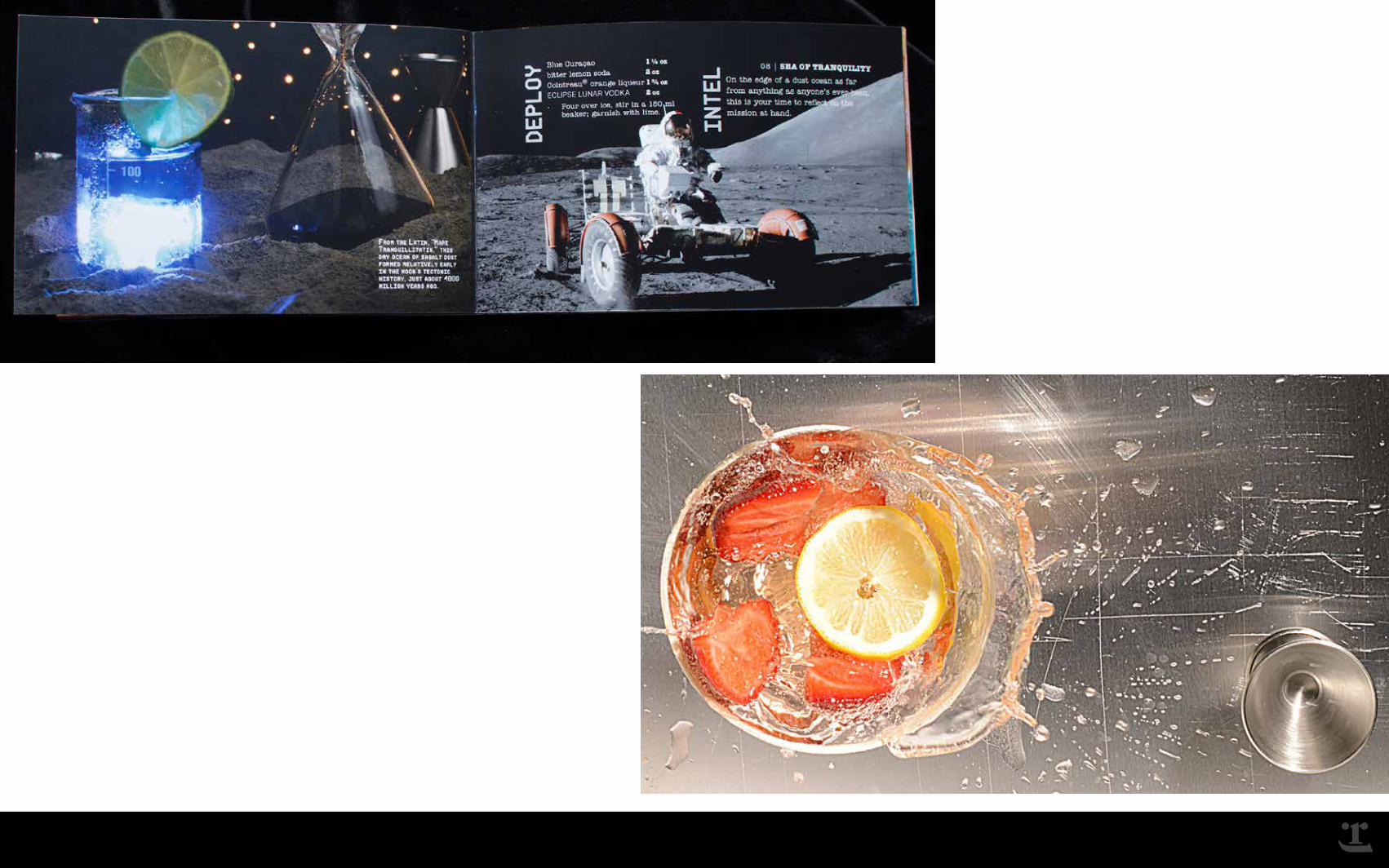
ECLIPSE LUNAR VODKA: RE-BRANDING
Labels for bottle and containing box, poster and promotional material including recipe book themed for cocktail enthusiasts between 35 and 45 years of age who remember or can be engaged to consider the romance of the Apollo moon missions. Initial feedback from the client regarding the recipe booklet lead to a fundamental redesign: where the previous version featured photographs of “lunar cocktails” on their own, the remade version couples each cocktail photo with contextualizing footage from the actual missions. Diana Spirits, Waterloo, ON. Dec. 2013.
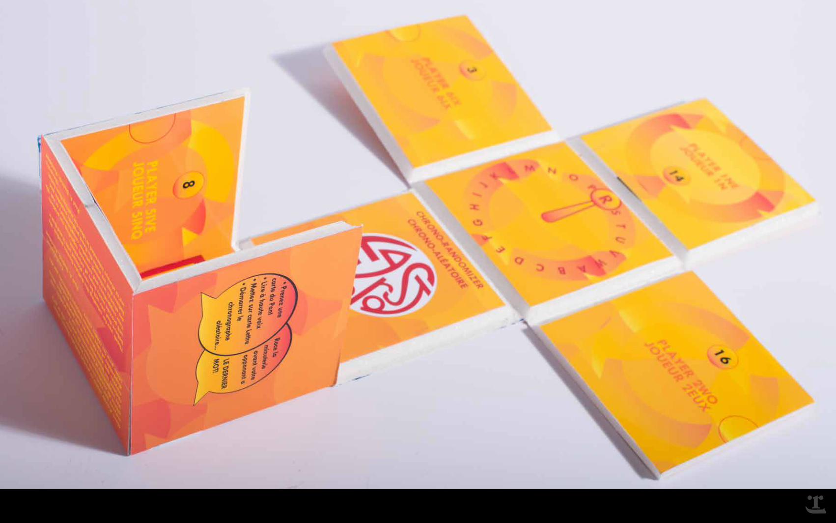
LAST WORD BOARD GAME: RE-IMAGINING
Buffalo Games acquired the rights to this game in the mid 2000s, but only realized the full potential of the it with this design, which uses magnets to secure the complex, six-person game board into a single, take-anywhere cube. The elimination of many of the smaller, easily-lost pieces and incorporation of the games electronics into it’s consolidated case / playing surface make it an ideal traveling pass-time. Also, the new game’s magnetic components make it adhere to any vertical metallic surface, and thus suit it well for play on buses, ferries, school lockers, etc. Buffalo Games, USA. Oct. 2014.
OXO BULLION CUBES: REPACKAGING
OXO has been a familiar brand in the UK and Commonwealth Nations almost as long as there have been such things, so it was with great care for the persistence of the brand that the new package was engineered. Beyond appealing to its existing users, the package needed also to penetrate a new market: moderately affluent consumers of fancy foodstuffs between 25 and 35 years of age. The new package uses a pattern of bowls & crossed spoons to signify across shelf space when viewed at a distance in the store, and in a clear white block font evocative of the original logo up close. Knorr Foods, ON Oct 2014
BROWN RICE CRISPS: ECOLOGIZING
The challenge was to create a packaging solution for the twenty-first century: find a way to protect the contents from ischemic damage that results from exposure to air, from kinetic damage that occurs when the goods are jostled in shipping or shelving, and do so with the minimum ecological footprint. The solution was a single sheet of food-grade polyethylene rendered stress-bearing and food-preserving through the application of pneumatic contrast. The food is packed in a compartment in a vacuum which is surrounded by compartments holding thin columns of air. Want-Want Foods, ON Oct 2014
ECLIPSE LUNAR VODKA: RE-BRANDING
Labels for bottle and containing box, poster and promotional material including recipe book themed for cocktail enthusiasts between 35 and 45 years of age; people who remember or can be engaged to consider the romance of the Apollo moon missions. Initial feedback from the client regarding the recipe booklet lead to a fundamental redesign: where the previous version featured photographs of “lunar cocktails” on their own, the remade version couples each cocktail photo with contextualizing footage from the actual moon missions. Diana Spirits, Waterloo, ON. Dec. 2013.
john roscoe
john roscoe
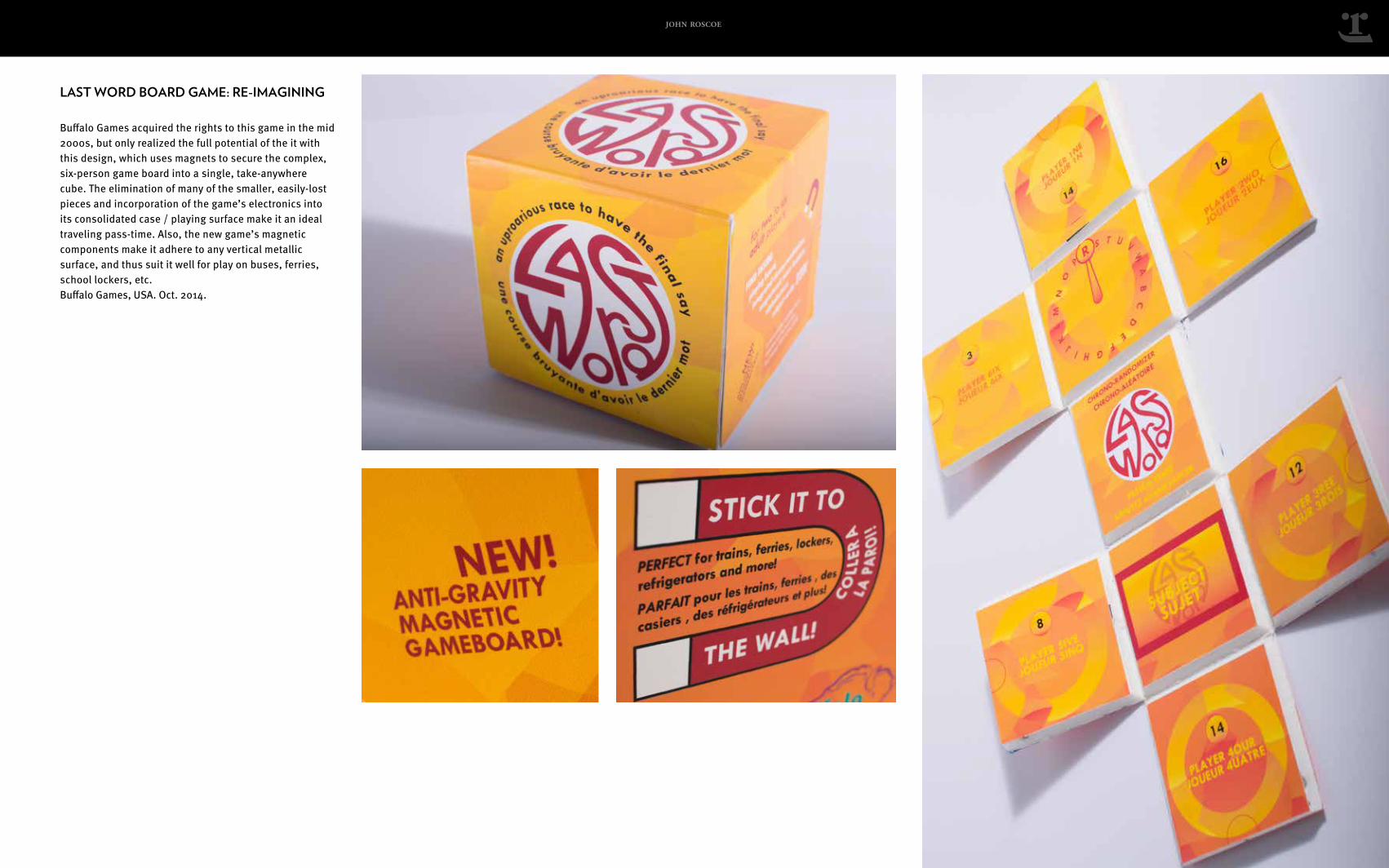
LAST WORD BOARD GAME: RE-IMAGINING
Buffalo Games acquired the rights to this game in the mid 2000s, but only realized the full potential of the it with this design, which uses magnets to secure the complex, six-person game board into a single, take-anywhere cube. The elimination of many of the smaller, easily-lost pieces and incorporation of the game’s electronics into its consolidated case / playing surface make it an ideal traveling pass-time. Also, the new game’s magnetic components make it adhere to any vertical metallic surface, and thus suit it well for play on buses, ferries, school lockers, etc. Buffalo Games, USA. Oct. 2014.
john roscoe
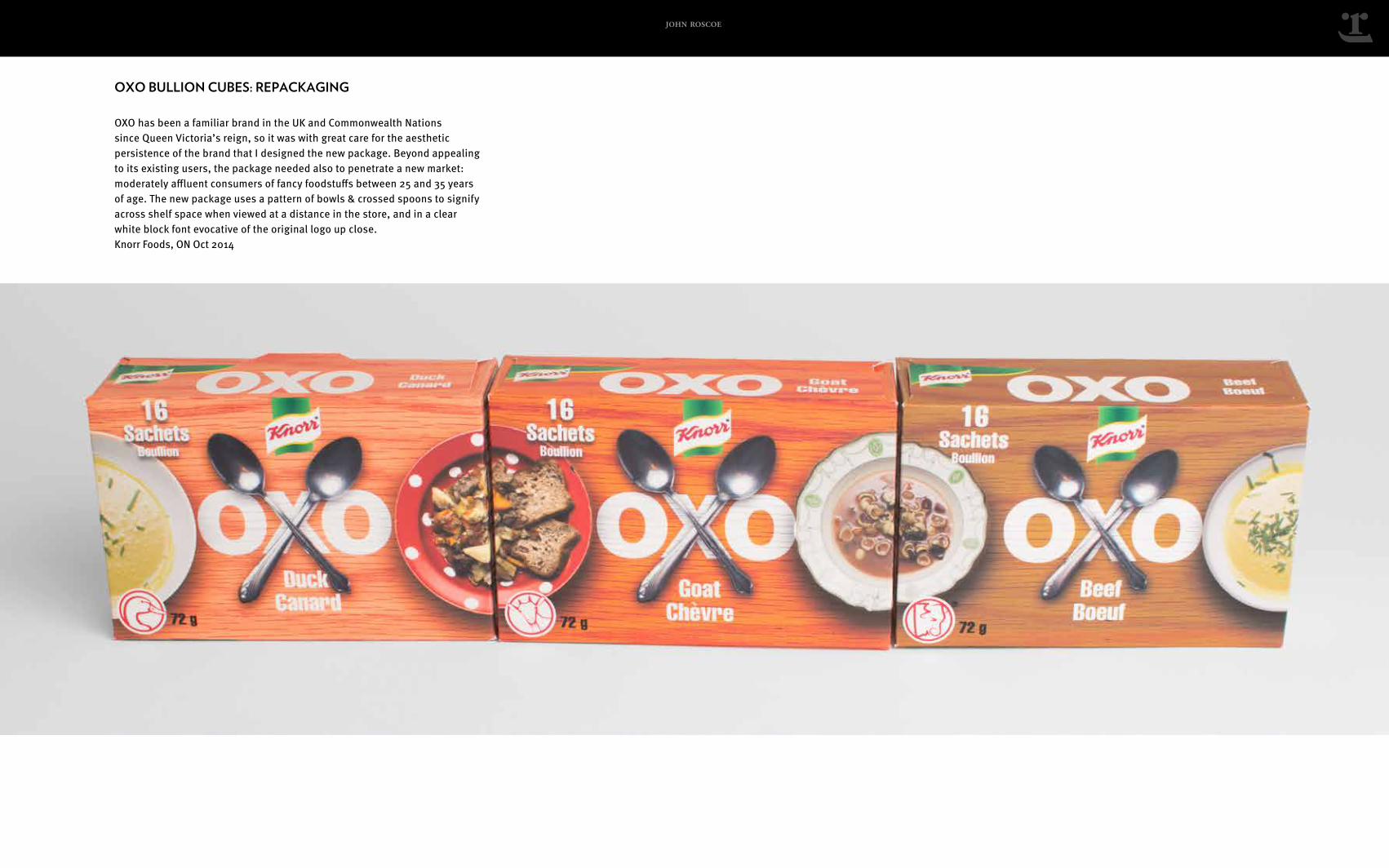
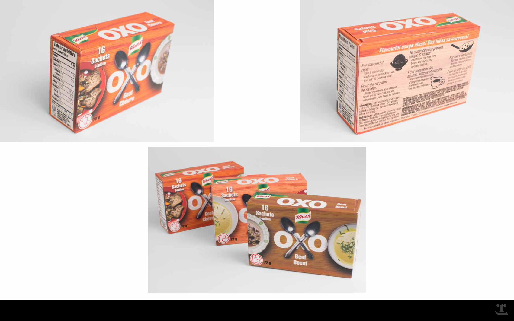
OXO BULLION CUBES: REPACKAGING
OXO has been a familiar brand in the UK and Commonwealth Nations since Queen Victoria’s reign, so it was with great care for the aesthetic persistence of the brand that I designed the new package. Beyond appealing to its existing users, the package needed also to penetrate a new market: moderately affluent consumers of fancy foodstuffs between 25 and 35 years of age. The new package uses a pattern of bowls & crossed spoons to signify across shelf space when viewed at a distance in the store, and in a clear white block font evocative of the original logo up close. Knorr Foods, ON Oct 2014
john roscoe
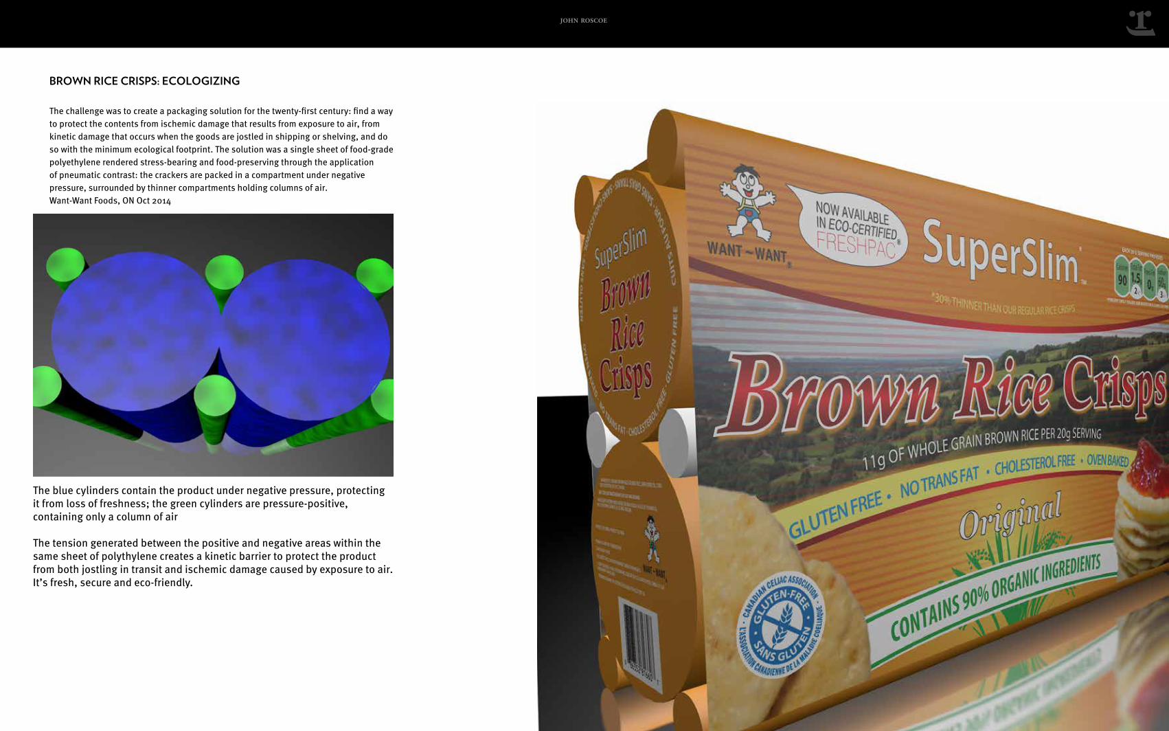
BROWN RICE CRISPS: ECOLOGIZING
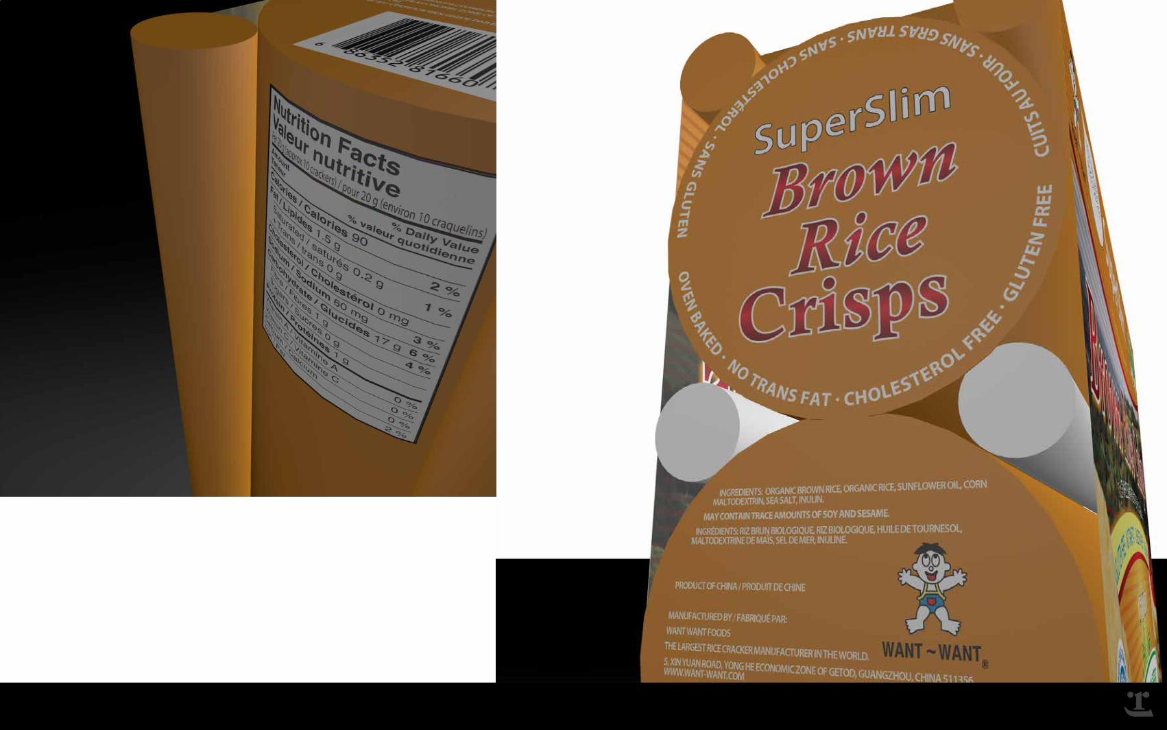
The challenge was to create a packaging solution for the twenty-first century: find a way to protect the contents from ischemic damage that results from exposure to air, from kinetic damage that occurs when the goods are jostled in shipping or shelving, and do so with the minimum ecological footprint. The solution was a single sheet of food-grade polyethylene rendered stress-bearing and food-preserving through the application of pneumatic contrast: the crackers are packed in a compartment under negative pressure, surrounded by thinner compartments holding columns of air. Want-Want Foods, ON Oct 2014
The blue cylinders contain the product under negative pressure, protecting it from loss of freshness; the green cylinders are pressure-positive, containing only a column of air
The tension generated between the positive and negative areas within the same sheet of polythylene creates a kinetic barrier to protect the product from both jostling in transit and ischemic damage caused by exposure to air. It’s fresh, secure and eco-friendly.
john roscoe
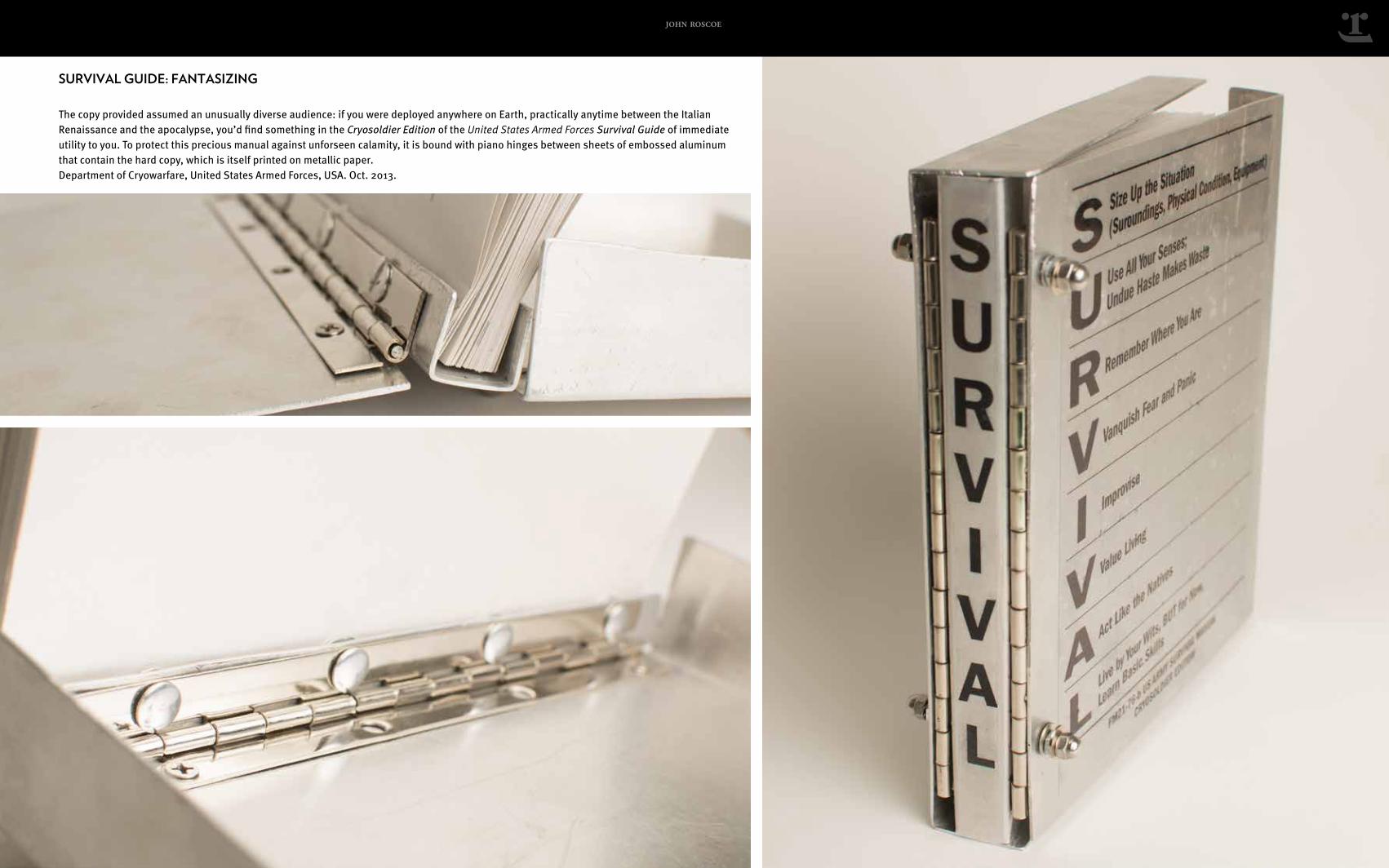
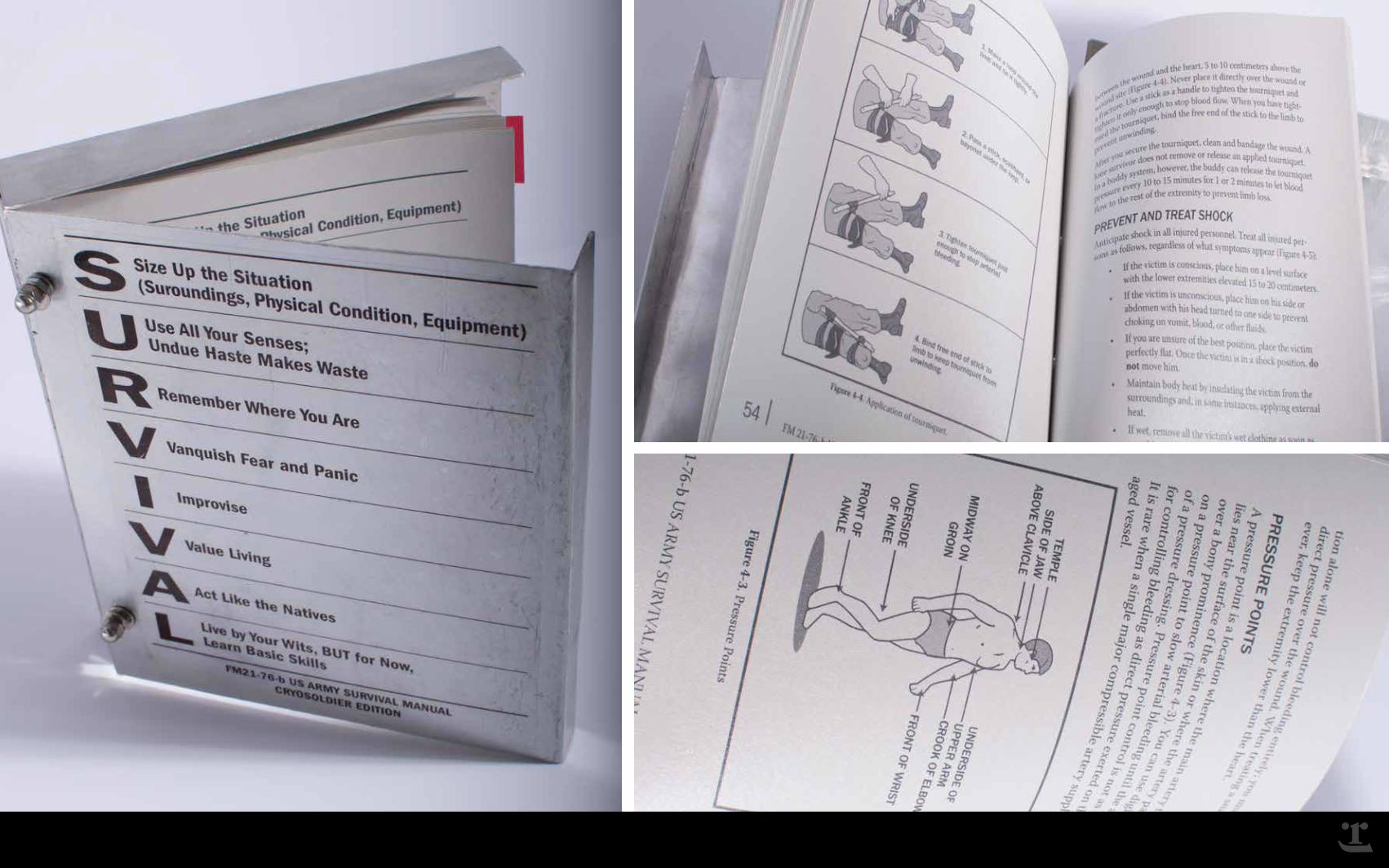
SURVIVAL GUIDE: FANTASIZING
The copy provided assumed an unusually diverse audience: if you were deployed anywhere on Earth, practically anytime between the Italian Renaissance and the apocalypse, you’d find something in the Cryosoldier Edition of the United States Armed Forces Survival Guide of immediate utility to you. To protect this precious manual against unforseen calamity, it is bound with piano hinges between sheets of embossed aluminum that contain the hard copy, which is itself printed on metallic paper. Department of Cryowarfare, United States Armed Forces, USA. Oct. 2013.
john roscoe
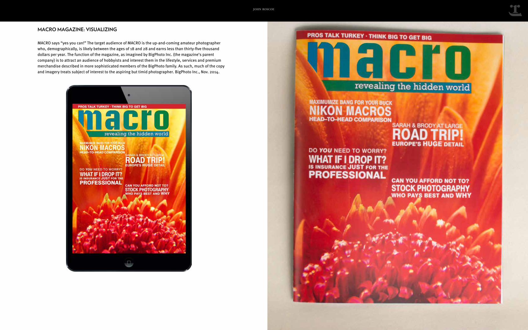
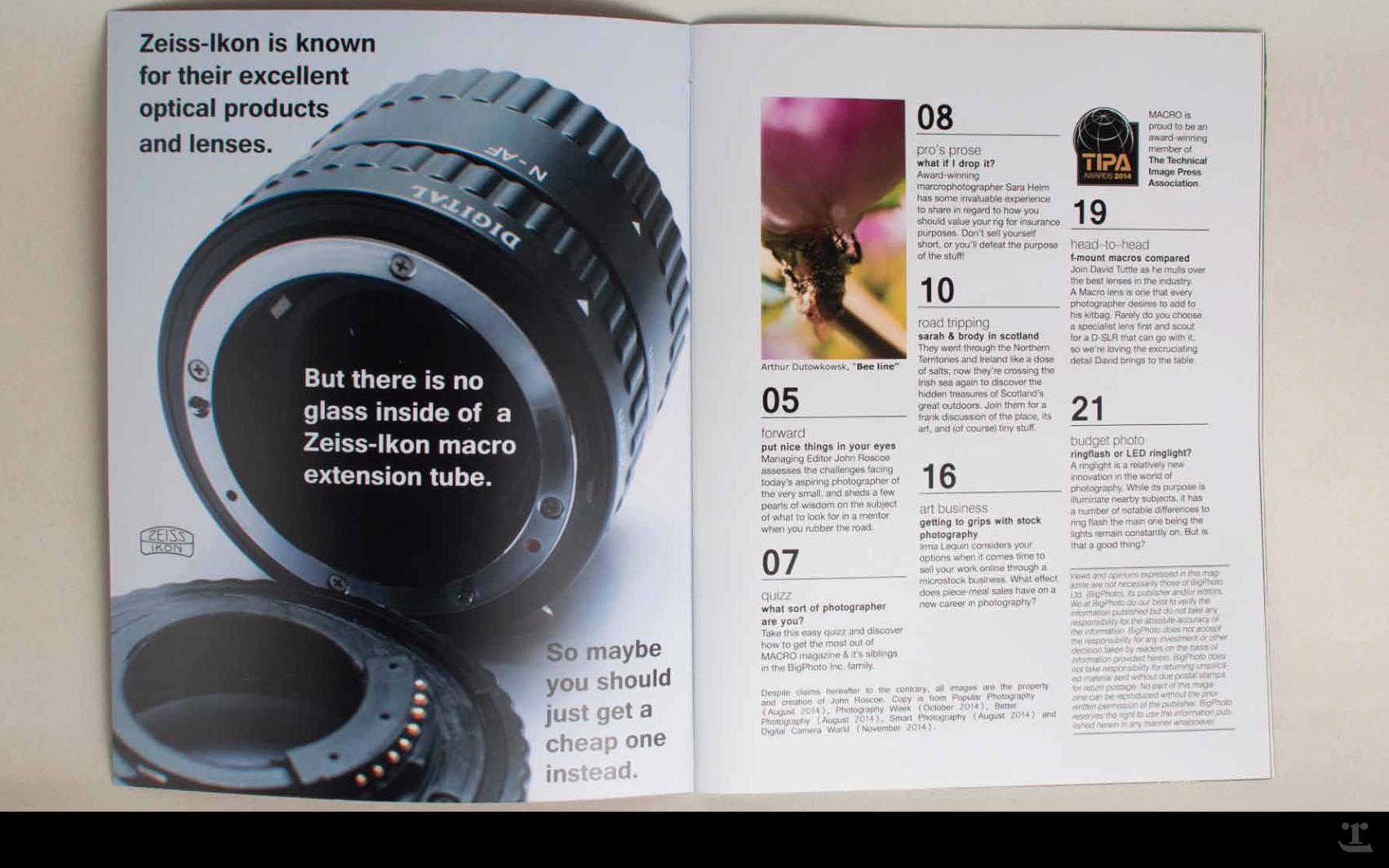
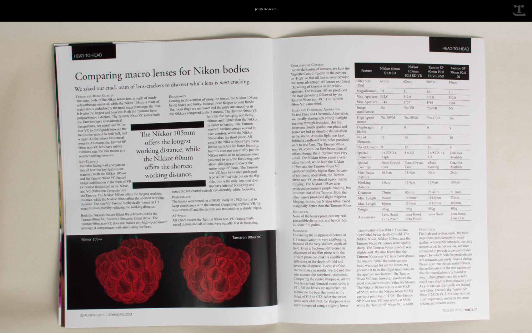
MACRO MAGAZINE: VISUALIZING
MACRO says “yes you can!” The target audience of MACRO is the up-and-coming amateur photographer who, demographically, is likely between the ages of 18 and 28 and earns less than thirty-five thousand dollars per year. The function of the magazine, as imagined by BigPhoto Inc. (the magazine’s parent company) is to attract an audience of hobbyists and interest them in the lifestyle, services and premium merchandise described in more sophisticated members of the BigPhoto family. As such, much of the copy and imagery treats subject of interest to the aspiring but timid photographer. BigPhoto Inc., Nov. 2014.
john roscoe
john roscoe
john roscoe