Embed Size (px)
Citation preview
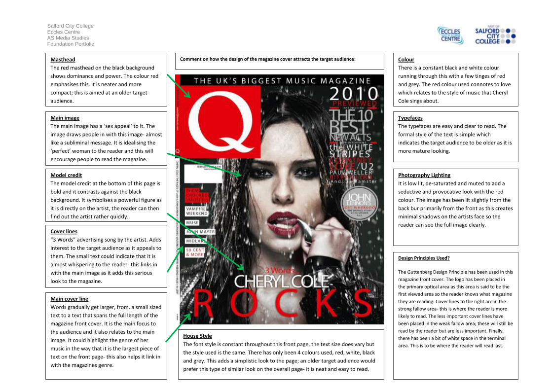
Salford City College Eccles Centre AS Media Studies Foundation Portfolio
Masthead
The red masthead on the black background
shows dominance and power. The colour red
emphasises this. It is neater and more
compact; this is aimed at an older target
audience.
Main image
The main image has a ‘sex appeal’ to it. The
image draws people in with this image- almost
like a subliminal message. It is idealising the
‘perfect’ woman to the reader and this will
encourage people to read the magazine.
Model credit
The model credit at the bottom of this page is
bold and it contrasts against the black
background. It symbolises a powerful figure as
it is directly on the artist, the reader can then
find out the artist rather quickly.
Cover lines
“3 Words” advertising song by the artist. Adds
interest to the target audience as it appeals to
them. The small text could indicate that it is
almost whispering to the reader- this links in
with the main image as it adds this serious
look to the magazine.
Main cover line
Words gradually get larger, from, a small sized
text to a text that spans the full length of the
magazine front cover. It is the main focus to
the audience and it also relates to the main
image. It could highlight the genre of her
music in the way that it is the largest piece of
text on the front page- this also helps it link in
with the magazines genre.
Colour
There is a constant black and white colour
running through this with a few tinges of red
and grey. The red colour used connotes to love
which relates to the style of music that Cheryl
Cole sings about.
Typefaces
The typefaces are easy and clear to read. The
formal style of the text is simple which
indicates the target audience to be older as it is
more mature looking.
Photography Lighting
It is low lit, de-saturated and muted to add a
seductive and provocative look with the red
colour. The image has been lit slightly from the
back bur primarily from the front as this creates
minimal shadows on the artists face so the
reader can see the full image clearly.
Design Principles Used?
The Guttenberg Design Principle has been used in this
magazine front cover. The logo has been placed in
the primary optical area as this area is said to be the
first viewed area so the reader knows what magazine
they are reading. Cover lines to the right are in the
strong fallow area- this is where the reader is more
likely to read. The less important cover lines have
been placed in the weak fallow area; these will still be
read by the reader but are less important. Finally,
there has been a bit of white space in the terminal
area. This is to be where the reader will read last.
House Style
The font style is constant throughout this front page, the text size does vary but
the style used is the same. There has only been 4 colours used, red, white, black
and grey. This adds a simplistic look to the page; an older target audience would
prefer this type of similar look on the overall page- it is neat and easy to read.
Comment on how the design of the magazine cover attracts the target audience: