Embed Size (px)
Citation preview

Excel: Charts and Comments
October 15, 2012
1
Microsoft Excel 2010
Lesson 7: Charts and Comments
Open Example.xlsx if it is not
already open.
Click on the Example 3 tab to see
the worksheet for this lesson. This
is essentially the same worksheet
as that under the Example 1 tab. I
have added a column of dates.
In Lesson 7 we will plot some of
the information on this worksheet.
Creating a Column Chart
We want to create a column chart that plots the daily totals for the two weeks on the spreadsheet.
We want the data for the two weeks to be displayed by different columns. The totals will be
plotted according to day.
Excel: Charts and Comments
October 15, 2012
2
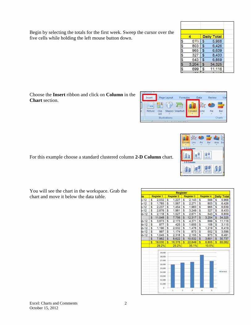
Begin by selecting the totals for the first week. Sweep the cursor over the
five cells while holding the left mouse button down.
Choose the Insert ribbon and click on Column in the
Chart section.
For this example choose a standard clustered column 2-D Column chart.
You will see the chart in the workspace. Grab the
chart and move it below the data table.
Excel: Charts and Comments
October 15, 2012
3
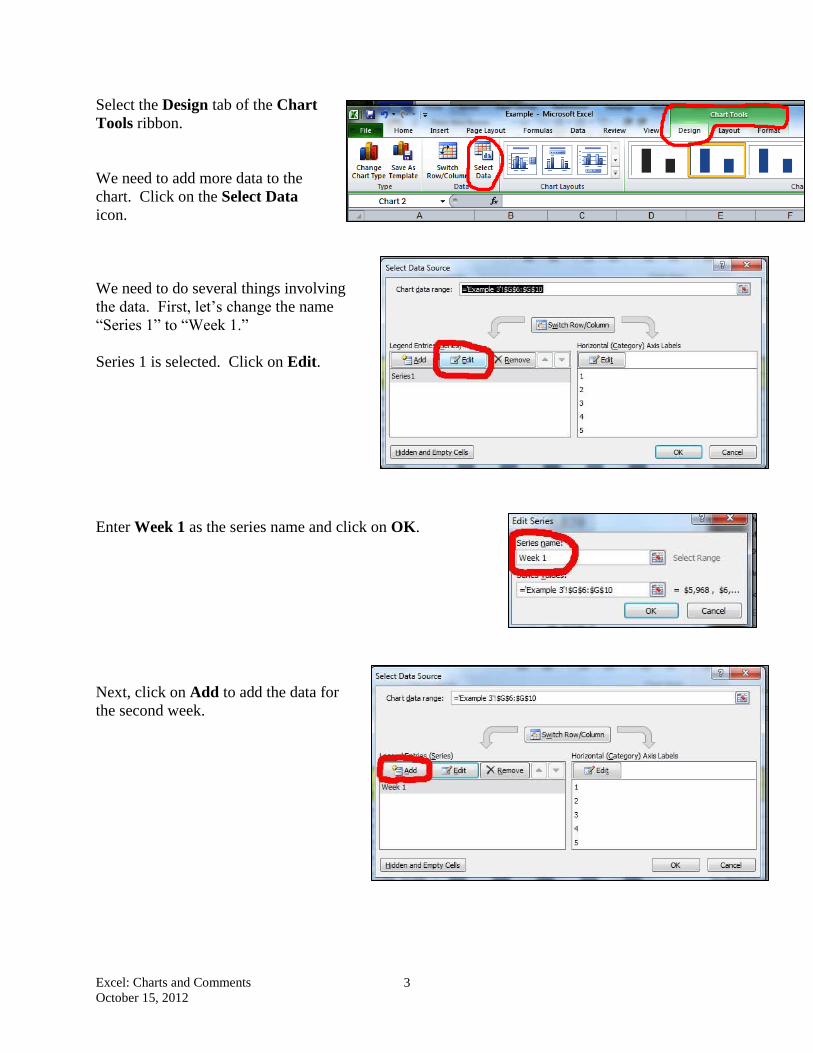
Select the Design tab of the Chart
Tools ribbon.
We need to add more data to the
chart. Click on the Select Data
icon.
We need to do several things involving
the data. First, let’s change the name
“Series 1” to “Week 1.”
Series 1 is selected. Click on Edit.
Enter Week 1 as the series name and click on OK.
Next, click on Add to add the data for
the second week.
Excel: Charts and Comments
October 15, 2012
4
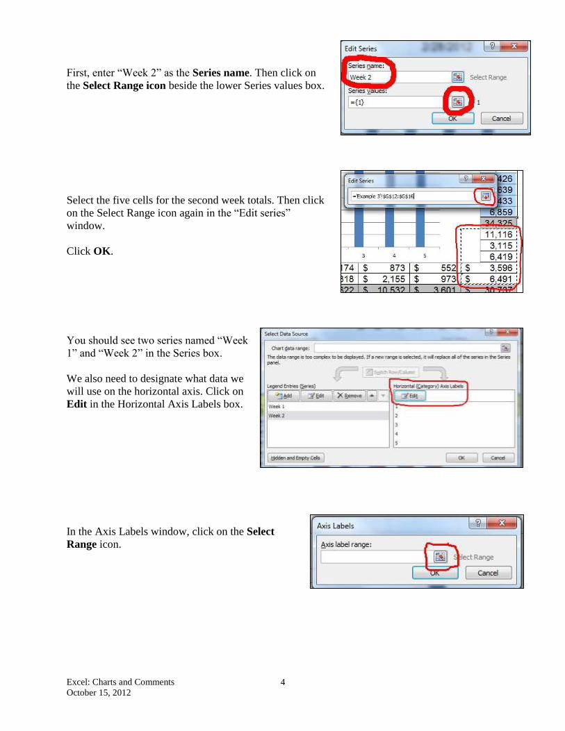
First, enter “Week 2” as the Series name. Then click on
the Select Range icon beside the lower Series values box.
Select the five cells for the second week totals. Then click
on the Select Range icon again in the “Edit series”
window.
Click OK.
You should see two series named “Week
1” and “Week 2” in the Series box.
We also need to designate what data we
will use on the horizontal axis. Click on
Edit in the Horizontal Axis Labels box.
In the Axis Labels window, click on the Select
Range icon.
Excel: Charts and Comments
October 15, 2012
5
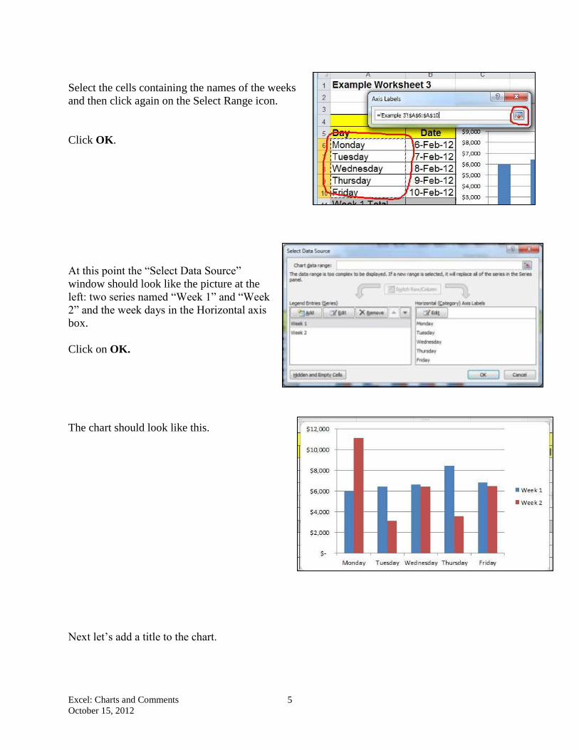
Select the cells containing the names of the weeks
and then click again on the Select Range icon.
Click OK.
At this point the “Select Data Source”
window should look like the picture at the
left: two series named “Week 1” and “Week
2” and the week days in the Horizontal axis
box.
Click on OK.
The chart should look like this.
Next let’s add a title to the chart.
Excel: Charts and Comments
October 15, 2012
6
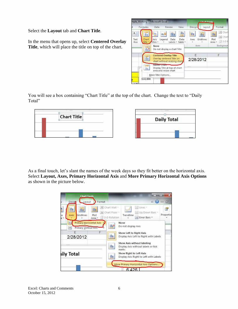
Select the Layout tab and Chart Title.
In the menu that opens up, select Centered Overlay
Title, which will place the title on top of the chart.
You will see a box containing “Chart Title” at the top of the chart. Change the text to “Daily
Total”
As a final touch, let’s slant the names of the week days so they fit better on the horizontal axis.
Select Layout, Axes, Primary Horizontal Axis and More Primary Horizontal Axis Options
as shown in the picture below.

Excel: Charts and Comments
October 15, 2012
7
In the Format Axis window, select Alignment and a
Custom angle of 50.
Click OK.
Your chart should look like the one shown below.
Excel: Charts and Comments
October 15, 2012
8
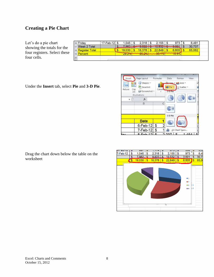
Creating a Pie Chart
Let’s do a pie chart
showing the totals for the
four registers. Select these
four cells.
Under the Insert tab, select Pie and 3-D Pie.
Drag the chart down below the table on the
worksheet
Excel: Charts and Comments
October 15, 2012
9
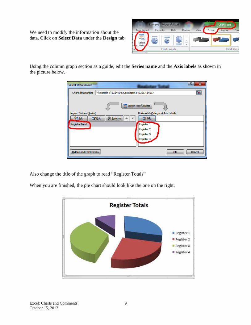
We need to modify the information about the
data. Click on Select Data under the Design tab.
Using the column graph section as a guide, edit the Series name and the Axis labels as shown in
the picture below.
Also change the title of the graph to read “Register Totals”
When you are finished, the pie chart should look like the one on the right.
Excel: Charts and Comments
October 15, 2012
10
Putting a Chart on a Separate Sheet
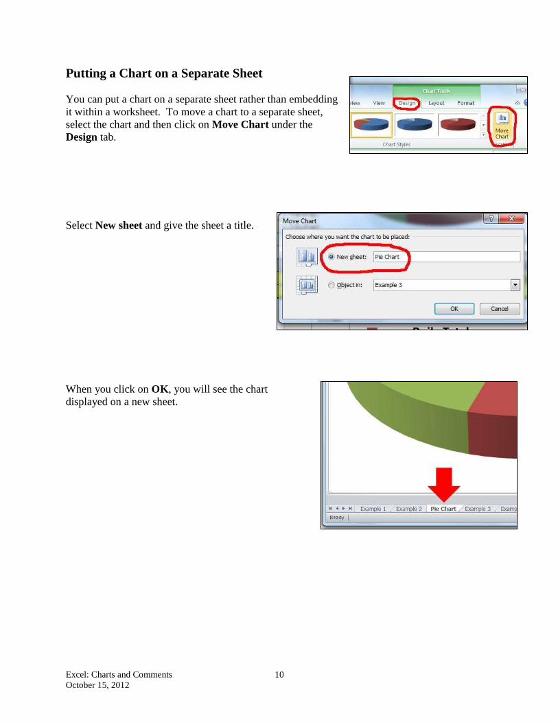
You can put a chart on a separate sheet rather than embedding
it within a worksheet. To move a chart to a separate sheet,
select the chart and then click on Move Chart under the
Design tab.
Select New sheet and give the sheet a title.
When you click on OK, you will see the chart
displayed on a new sheet.
Excel: Charts and Comments
October 15, 2012
11
Adding Comments to a Worksheet
Frequently it is useful to attach comments to cells, either to help
you remember something later or to help explain something to
another person using the spreadsheet.
Suppose that we would like to attach a comment to the number
representing each register explaining where the register is located.
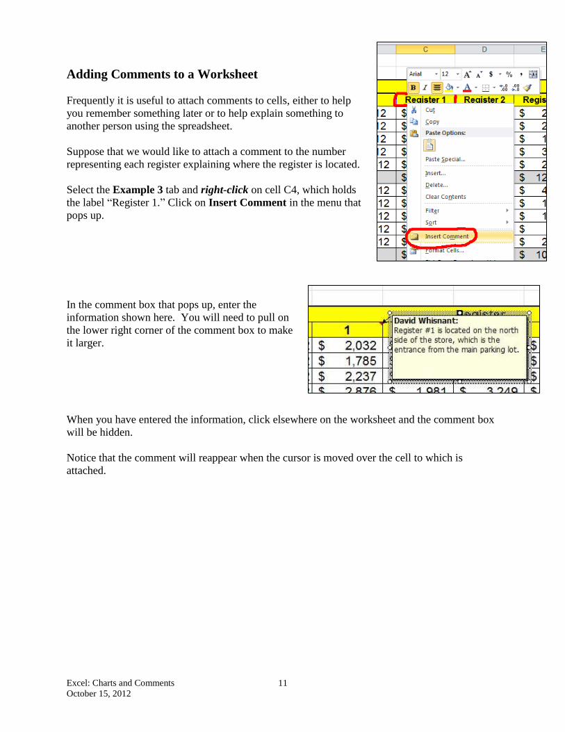
Select the Example 3 tab and right-click on cell C4, which holds
the label “Register 1.” Click on Insert Comment in the menu that
pops up.
In the comment box that pops up, enter the
information shown here. You will need to pull on
the lower right corner of the comment box to make
it larger.
When you have entered the information, click elsewhere on the worksheet and the comment box
will be hidden.
Notice that the comment will reappear when the cursor is moved over the cell to which is
attached.
Excel: Charts and Comments
October 15, 2012
12
Editing a Comment
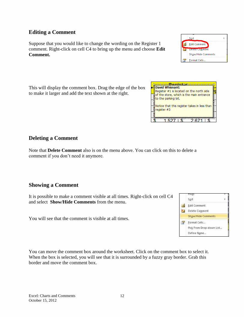
Suppose that you would like to change the wording on the Register 1
comment. Right-click on cell C4 to bring up the menu and choose Edit
Comment.
This will display the comment box. Drag the edge of the box
to make it larger and add the text shown at the right.
Deleting a Comment
Note that Delete Comment also is on the menu above. You can click on this to delete a
comment if you don’t need it anymore.
Showing a Comment
It is possible to make a comment visible at all times. Right-click on cell C4
and select Show/Hide Comments from the menu.
You will see that the comment is visible at all times.
You can move the comment box around the worksheet. Click on the comment box to select it.
When the box is selected, you will see that it is surrounded by a fuzzy gray border. Grab this
border and move the comment box.
Excel: Charts and Comments
October 15, 2012
13
Printing a Page with Comments Showing
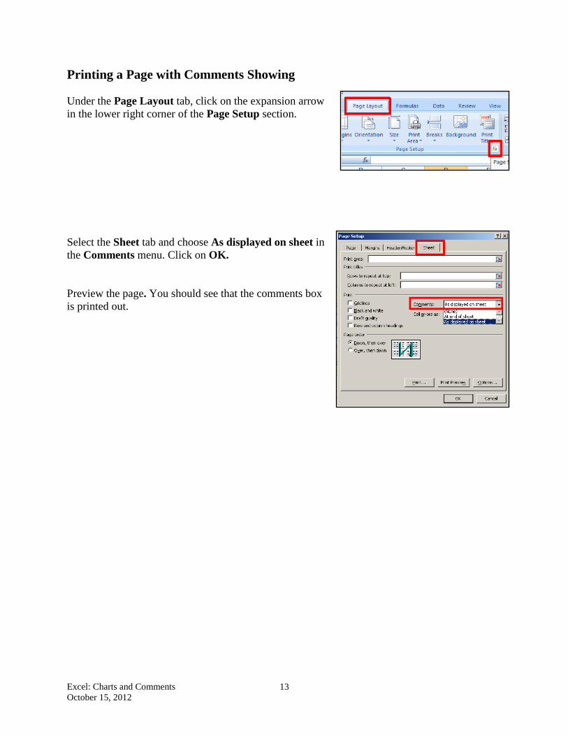
Under the Page Layout tab, click on the expansion arrow
in the lower right corner of the Page Setup section.
Select the Sheet tab and choose As displayed on sheet in
the Comments menu. Click on OK.
Preview the page. You should see that the comments box
is printed out.