Embed Size (px)
Citation preview
Barbara Brownie
1
Modular construction and anamorphosis in Channel 4 idents: past and present
(Published in The Journal of Media Practice Vol. 14, No. 2)
Abstract
In the 30 years since the first appearance of Martin Lambie Nairn‘s ident, Round and Back,
Channel 4 has established a reputation for screening idents that are both innovative and
pleasingly familiar. While many texts have acknowledged the significance of these artefacts,
there has, as yet, been no sufficient exploration into the precise behaviours that make these
idents so distinct. This article explores the construction of the Channel 4 logo from
independently moving parts, and the alignment of static parts prompted by tracked
navigation, showing how these behaviours are made possible by the modularity of the
Channel 4 logo. These behaviours are likened to anamorphosis, in which a privileged viewing
zone reveals to viewers an alignment of forms, and a fleeting moment in which separate
pictorial objects collaborate in the presentation of a more significant numerical configuration.
Keywords
Channel 4, ident, logo, Gestalt, anamorphosis, typography.
Introduction
From its launch in 1982 to the present, Channel 4 has identified its presence on screen
with a continually evolving set of idents. These idents signify Channel 4‘s core values of
innovation and diversity, through a number of converging blocks which align to construct the
Channel 4 logo. In 2011, 29 years after Martin Lambie Nairn‘s first ident was broadcast, the
appearance of these idents has changed dramatically, with the figure ‗4‘ being constructed
from objects that are rendered to blend seamlessly into photorealistic environments.
Nevertheless, the basic process by which this ‗4‘ emerges from the scene remains largely
unchanged. The viewer directly witnesses the construction of the ‗4‘ logo from separate, and
apparently unrelated objects, which either converge or align to collaborate in the presentation
of the Channel‘s identity.
Although numerous texts acknowledge the significance of Martin Lambie Nairn and
MPC‘s idents, none adequately explore the behaviour that makes them distinct (see, for
example, Aymer, 2006, and Woolman and Bellantoni 1999: 34). Many focus on what Yin
Yin Wong (1995: 11) describes as ‗structural characteristics‘ (the features of physical form),
rather than the ‗behavioural characteristics‘ which are so remarkable in these idents. Despite
Barbara Brownie
2
intending to provide a thorough exploration of Channel 4 branding, Christine Fanthome
(2007: 258) devotes very little of her text to describing kinetic features, instead focusing on
its structural attributes including its three-dimensionality and colours. Though perhaps
prompted by Fanthome (2007: 267), even Brett Foraker of 4Creative, who was directly
involved in the design of Channel 4‘s more recent Atlas idents, appears to focus on the use of
‗dimensional and solid‘ components rather than on the way in which these components align.
Paul Grainge (2009) describes, in detail, some of the architectural scenes and objects that
feature in recent idents, but does not describe their behaviours except through the observation
that they aim to imitate Lambie Nairn‘s originals. Though these structural features are an
essential part of Channel 4‘s idents, they also exist in the static version of the logo, intended
for print, and so do not sufficiently distinguish it from static artefacts.
When commentators discuss the temporal features of the Channel 4 idents, they
generally acknowledge that it involves construction, in that it presents ‗various parts [that]
converge in space‘ (Woolman and Bellantoni 1999: 34), ‗come together‘ (Heusser et al.
2007), or ‗unite‘ (Fanthome 2007: 255). These descriptions, however, are rarely thorough
enough to explain how that construction occurs. When they attempt more specific
description, the outcome is often vague or misleading. Fanthome‘s description of Round and
Back, for example, tells readers that the components of the ‗4‘ ‗simply rotated through three-
hundred and sixty degrees‘ (Fanthome 2007: 259). As is shown below, closer inspection of
this ident reveals that its components engage in more complex behaviour than rotation. It is
perhaps ironic that these texts so enthusiastically relate the success and originality of Lambie
Nairn‘s idents, and yet seem largely unable to accurately describe, explain and analyse them.
Without this knowledge, it is difficult for practice to move forward, as practitioners may only
consider their work in terms of what has come before. It is necessary for new practice to be
able to distinguish itself from its predecessors, and in order to do that it must find the
language to identify innovations.
This article will discuss the modular construction of the Channel 4 logo in its idents,
dividing them into two broad categories: those which exhibit construction through the motion
of parts, and those which exhibit alignment through the tracked navigation of the camera.
This discussion will thereby aim to provide a more explicit and detailed exploration of the
behaviours exhibited in Channel 4 idents than has been previously offered by existing texts. It
will be shown that these idents exploit similar conditions to those seen in anamorphosis,
whereby a privileged ‗viewing zone‘ (Kac 1997) grants access to apparent compression of
space, leading to a meaningful alignment of shapes. This article will further observe how the
Barbara Brownie
3
audience‘s increasing familiarity with this process has allowed Channel 4 idents to become
ever more complex, and for the moment of alignment of the ‗4‘ to become increasingly
fleeting.
Construction in Martin Lambie-Nairn’s early Channel 4 idents
Martin Lambie Nairn‘s first Channel 4 idents, produced from 1982 onwards, signified
the practice that set Channel 4 apart from other British television broadcasters at the time:
that of sourcing a variety of television shows from a range of production companies
(Woolman and Bellantoni 1999: 34). This practice is illustrated in the coming-together of
visibly different elements in the construction of the Channel 4 logo. In Lambie Nairn‘s first
series of idents, coloured polygons converge towards the centre of the screen, against an
empty black background, and align to form the figure ‗4‘. At this moment the polygons
appear to undergo a change in identity, becoming parts of a verbal sign, and achieving
particular purpose and verbal meaning. A single identifiable sign emerges, and the polygons
appear to shift from one paradigm to another: pictorial or abstract, to verbal.
In constructing a numerical character from separate pictorial forms, Lambie Nairn
intended to assert Channel 4‘s difference from existing broadcasters. In particular, he wished
to communicate the channel‘s aim to provide ‗diversity and innovation‘ in its programming
(Docherty et al. 1988: 6). The innovation, which set this ident apart from those used by ITV
and the BBC at the time, came in the form of the use of pictorial three-dimensional elements
in the construction of a numerical whole. This innovation was acknowledged by others in the
branding and graphic design industry, as Lambie Nairn‘s work was seen as heralding a new
era in television branding, and won numerous awards (Fanthome 2007: 258). Diversity was
also viewed as particularly important in establishing the character and methods of the new
channel. As opposed to the production role of other channels, Channel 4 saw itself as a
‗publisher‘, selecting and broadcasting programmes produced elsewhere (Docherty et al.
1988: 8). This role as a publisher was one way in which it aimed to promote diversity, as it
gave minority groups the opportunity ‗to express their views unmediated by television
bureaucrats‘ (Docherty et al. 1988: 36). By directly depicting the construction of the logo
from separate parts, Lambie Nairn‘s ident effectively conveys not only Channel 4‘s role as
publisher, but also the relationship between this role and the ambition for diversity. The
convergence of several differently coloured polygons acts as a metaphor for the sourcing of
programmes from different production companies, and for collaboration between culturally
diverse groups.
Barbara Brownie
4
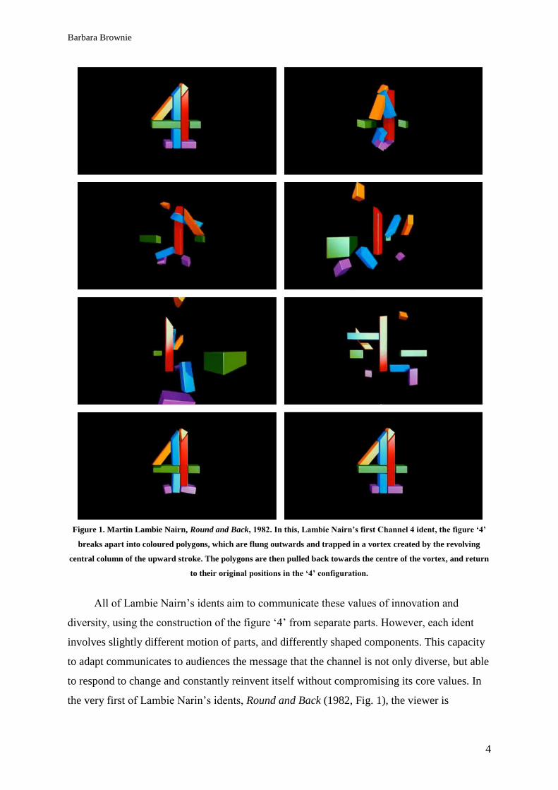
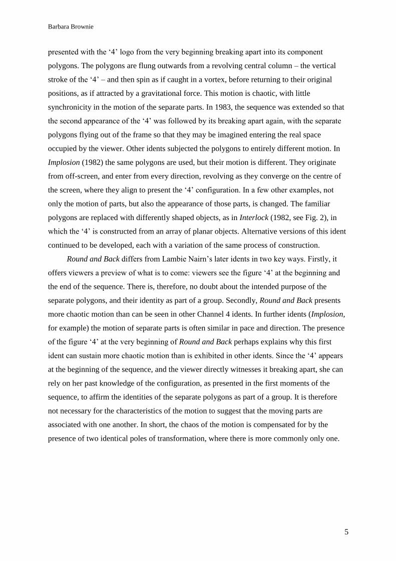
Figure 1. Martin Lambie Nairn, Round and Back, 1982. In this, Lambie Nairn’s first Channel 4 ident, the figure ‘4’
breaks apart into coloured polygons, which are flung outwards and trapped in a vortex created by the revolving
central column of the upward stroke. The polygons are then pulled back towards the centre of the vortex, and return
to their original positions in the ‘4’ configuration.
All of Lambie Nairn‘s idents aim to communicate these values of innovation and
diversity, using the construction of the figure ‗4‘ from separate parts. However, each ident
involves slightly different motion of parts, and differently shaped components. This capacity
to adapt communicates to audiences the message that the channel is not only diverse, but able
to respond to change and constantly reinvent itself without compromising its core values. In
the very first of Lambie Narin‘s idents, Round and Back (1982, Fig. 1), the viewer is
Barbara Brownie
5
presented with the ‗4‘ logo from the very beginning breaking apart into its component
polygons. The polygons are flung outwards from a revolving central column – the vertical
stroke of the ‗4‘ – and then spin as if caught in a vortex, before returning to their original
positions, as if attracted by a gravitational force. This motion is chaotic, with little
synchronicity in the motion of the separate parts. In 1983, the sequence was extended so that
the second appearance of the ‗4‘ was followed by its breaking apart again, with the separate
polygons flying out of the frame so that they may be imagined entering the real space
occupied by the viewer. Other idents subjected the polygons to entirely different motion. In
Implosion (1982) the same polygons are used, but their motion is different. They originate
from off-screen, and enter from every direction, revolving as they converge on the centre of
the screen, where they align to present the ‗4‘ configuration. In a few other examples, not
only the motion of parts, but also the appearance of those parts, is changed. The familiar
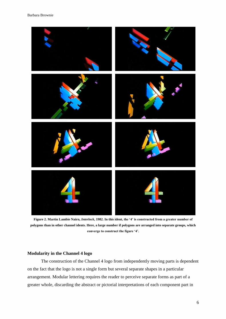
polygons are replaced with differently shaped objects, as in Interlock (1982, see Fig. 2), in
which the ‗4‘ is constructed from an array of planar objects. Alternative versions of this ident
continued to be developed, each with a variation of the same process of construction.
Round and Back differs from Lambie Nairn‘s later idents in two key ways. Firstly, it
offers viewers a preview of what is to come: viewers see the figure ‗4‘ at the beginning and
the end of the sequence. There is, therefore, no doubt about the intended purpose of the
separate polygons, and their identity as part of a group. Secondly, Round and Back presents
more chaotic motion than can be seen in other Channel 4 idents. In further idents (Implosion,
for example) the motion of separate parts is often similar in pace and direction. The presence
of the figure ‗4‘ at the very beginning of Round and Back perhaps explains why this first
ident can sustain more chaotic motion than is exhibited in other idents. Since the ‗4‘ appears
at the beginning of the sequence, and the viewer directly witnesses it breaking apart, she can
rely on her past knowledge of the configuration, as presented in the first moments of the
sequence, to affirm the identities of the separate polygons as part of a group. It is therefore
not necessary for the characteristics of the motion to suggest that the moving parts are
associated with one another. In short, the chaos of the motion is compensated for by the
presence of two identical poles of transformation, where there is more commonly only one.
Barbara Brownie
6
Figure 2. Martin Lambie Nairn, Interlock, 1982. In this ident, the ‘4’ is constructed from a greater number of
polygons than in other channel idents. Here, a large number if polygons are arranged into separate groups, which
converge to construct the figure ‘4’.
Modularity in the Channel 4 logo
The construction of the Channel 4 logo from independently moving parts is dependent
on the fact that the logo is not a single form but several separate shapes in a particular
arrangement. Modular lettering requires the reader to perceive separate forms as part of a
greater whole, discarding the abstract or pictorial interpretations of each component part in
Barbara Brownie
7
favour of a verbal interpretation that considers the entire arrangement. This tendency to
favour the perception of a whole group rather than separate parts can be described according
to Gestalt laws of perceptual organisation.
Gestalt theories can broadly be broken summarised as a ‗mosaic or ―bundle‖
hypothesis‘ (that ‗every ―complex‖ consists of elementary contents or pieces‘), or,
commonly, that the whole is more than the sum of its parts (Wertheimer, 1923: 12). Max
Wertheimer‘s 1923 paper, ‗Laws of Organisation in Perceptual Forms‘, identified the various
features which prompt perception of the whole rather than separate parts. In particular, he
observed factors of ‗similarity‘ and ‗proximity‘, that describe how objects that are similar in
appearance, and located in close proximity, are likely to be perceived as associated with one
another (Wertheimer 1923: 74-75). He further identified the ‗factor of closure‘, which
suggests that objects that are close together are perceived as being part of a whole to the
extent that gaps between them may be imagined to be ‗closed‘, forming complete contours
(Wertheimer, 1923: 83). These factors may be employed in the perception of modular
lettering such as that favoured in the modernist era, including Joseph Albers‘ Stencil (1925)
and Theo van Doesburg‘s typeface for De Stijl magazine (1917). In these and other modular
typefaces, letterforms are constructed from separate parts, described by Rosemberger and
MacNiel (1999: 252) as ‗primitives‘. Bart van der Leck, who used modular lettering in works
including Het Vlas (1941), referred to such typographic works as ‗compositions‘, describing
characters that are built, as opposed to moulded, with each character ‗systematically‘
constructed ‗as if it were a building‘ (Ryan 2001: 40 and 58). This reflected the modernist
enthusiasm for regular and interchangeable component parts, which emulated the machine
aesthetic through repetition (Jobling and Crowley 1996: 141). Construction, as opposed to
other methods of creation, leaves the component parts as whole forms or objects in their own
right: part of a verbal character but still independent. According to Wetheimer‘s laws of
perceptual organisation, if these separate parts are similar and in close proximity, they will be
assumed to be part of a group. According to the factor of closure, the gaps between these
separate parts will be ignored, so that each letter is perceived as a single form: an
alphanumeric character.
Barbara Brownie
8
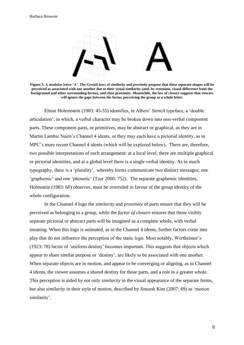
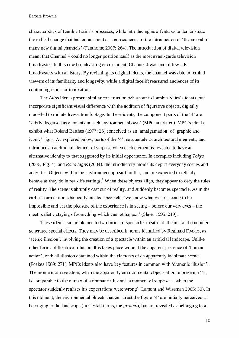
Figure 3. A modular letter ‘A’. The Gestalt laws of similarity and proximity propose that these separate shapes will be
perceived as associated with one another due to their visual similarity (and, by extension, visual difference from the
background and other surrounding forms), and close proximity. Meanwhile, the law of closure suggests that viewers
will ignore the gaps between the forms, perceiving the group as a whole letter.
Elmar Holemstein (1983: 45-55) identifies, in Albers‘ Stencil typeface, a ‗double
articulation‘, in which, a verbal character may be broken down into non-verbal component
parts. These component parts, or primitives, may be abstract or graphical, as they are in
Martin Lambie Nairn‘s Channel 4 idents, or they may each have a pictorial identity, as in
MPC‘s more recent Channel 4 idents (which will be explored below). There are, therefore,
two possible interpretations of each arrangement: at a local level, there are multiple graphical
or pictorial identities, and at a global level there is a single verbal identity. As in much
typography, there is a ‗plurality‘, whereby forms communicate two distinct messages; one
‗graphemic‘ and one ‗phonetic‘ (Tsur 2000: 752). The separate graphemic identities,
Holmstein (1983: 60) observes, must be overruled in favour of the group identity of the
whole configuration.
In the Channel 4 logo the similarity and proximity of parts ensure that they will be
perceived as belonging to a group, while the factor of closure ensures that those visibly
separate pictorial or abstract parts will be imagined as a complete whole, with verbal
meaning. When this logo is animated, as in the Channel 4 idents, further factors come into
play that do not influence the perception of the static logo. Most notably, Wertheimer‘s
(1923: 78) factor of ‗uniform destiny‘ becomes important. This suggests that objects which
appear to share similar purpose or ‗destiny‘, are likely to be associated with one another.
When separate objects are in motion, and appear to be converging or aligning, as in Channel
4 idents, the viewer assumes a shared destiny for those parts, and a role in a greater whole.
This perception is aided by not only similarity in the visual appearance of the separate forms,
but also similarity in their style of motion, described by Jinsook Kim (2007: 69) as ‗motion
similarity‘.
Barbara Brownie
9
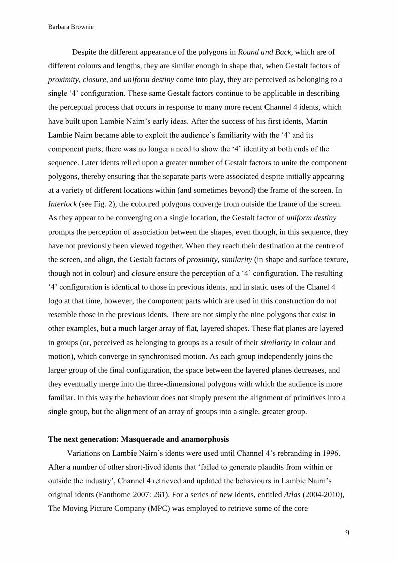
Despite the different appearance of the polygons in Round and Back, which are of
different colours and lengths, they are similar enough in shape that, when Gestalt factors of
proximity, closure, and uniform destiny come into play, they are perceived as belonging to a
single ‗4‘ configuration. These same Gestalt factors continue to be applicable in describing
the perceptual process that occurs in response to many more recent Channel 4 idents, which
have built upon Lambie Nairn‘s early ideas. After the success of his first idents, Martin
Lambie Nairn became able to exploit the audience‘s familiarity with the ‗4‘ and its
component parts; there was no longer a need to show the ‗4‘ identity at both ends of the
sequence. Later idents relied upon a greater number of Gestalt factors to unite the component
polygons, thereby ensuring that the separate parts were associated despite initially appearing
at a variety of different locations within (and sometimes beyond) the frame of the screen. In
Interlock (see Fig. 2), the coloured polygons converge from outside the frame of the screen.
As they appear to be converging on a single location, the Gestalt factor of uniform destiny
prompts the perception of association between the shapes, even though, in this sequence, they
have not previously been viewed together. When they reach their destination at the centre of
the screen, and align, the Gestalt factors of proximity, similarity (in shape and surface texture,
though not in colour) and closure ensure the perception of a ‗4‘ configuration. The resulting
‗4‘ configuration is identical to those in previous idents, and in static uses of the Chanel 4
logo at that time, however, the component parts which are used in this construction do not
resemble those in the previous idents. There are not simply the nine polygons that exist in
other examples, but a much larger array of flat, layered shapes. These flat planes are layered
in groups (or, perceived as belonging to groups as a result of their similarity in colour and
motion), which converge in synchronised motion. As each group independently joins the
larger group of the final configuration, the space between the layered planes decreases, and
they eventually merge into the three-dimensional polygons with which the audience is more
familiar. In this way the behaviour does not simply present the alignment of primitives into a
single group, but the alignment of an array of groups into a single, greater group.
The next generation: Masquerade and anamorphosis
Variations on Lambie Nairn‘s idents were used until Channel 4‘s rebranding in 1996.
After a number of other short-lived idents that ‗failed to generate plaudits from within or
outside the industry‘, Channel 4 retrieved and updated the behaviours in Lambie Nairn‘s
original idents (Fanthome 2007: 261). For a series of new idents, entitled Atlas (2004-2010),
The Moving Picture Company (MPC) was employed to retrieve some of the core
Barbara Brownie
10
characteristics of Lambie Nairn‘s processes, while introducing new features to demonstrate
the radical change that had come about as a consequence of the introduction of ‗the arrival of
many new digital channels‘ (Fanthome 2007: 264). The introduction of digital television
meant that Channel 4 could no longer position itself as the most avant-garde television
broadcaster. In this new broadcasting environment, Channel 4 was one of few UK
broadcasters with a history. By revisiting its original idents, the channel was able to remind
viewers of its familiarity and longevity, while a digital facelift reassured audiences of its
continuing remit for innovation.
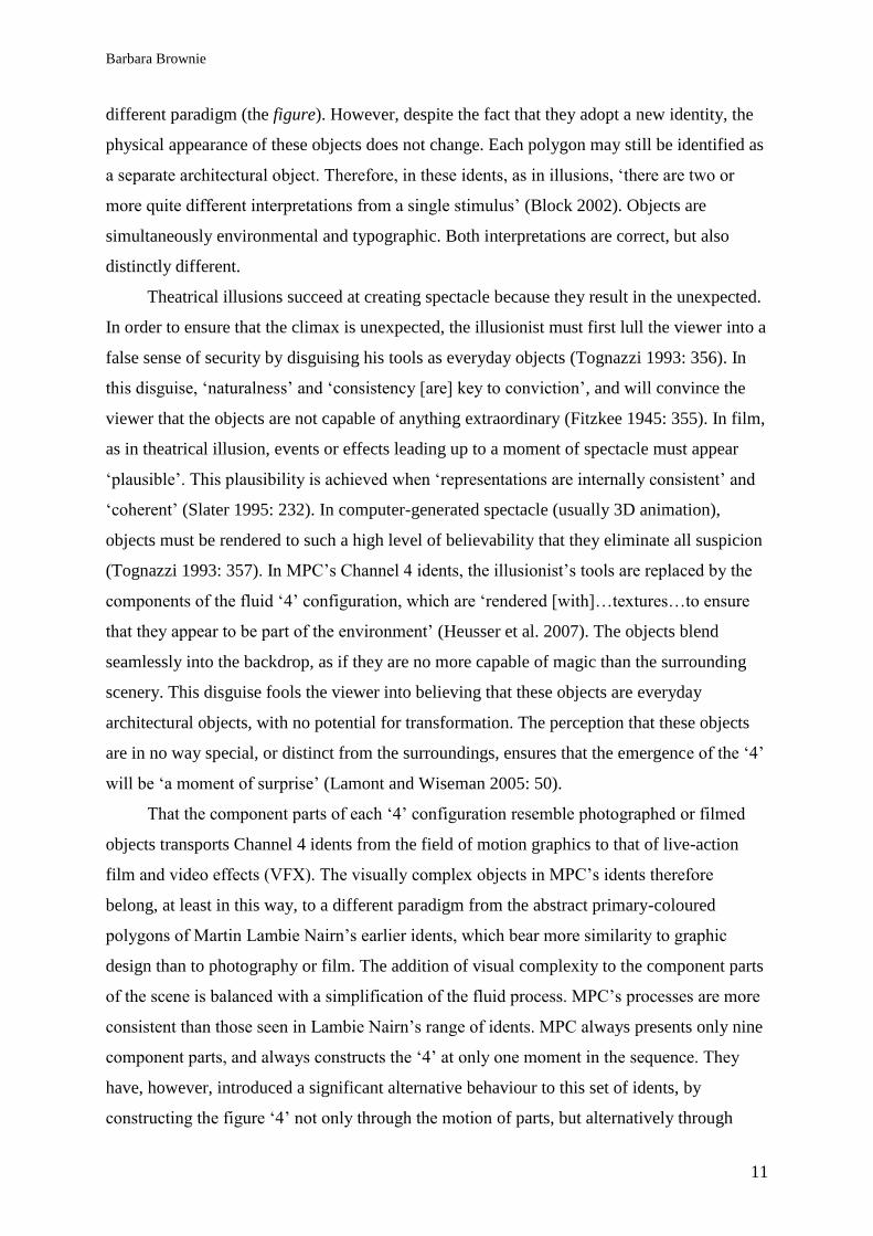
The Atlas idents present similar construction behaviour to Lambie Nairn‘s idents, but
incorporate significant visual difference with the addition of figurative objects, digitally
modelled to imitate live-action footage. In these idents, the component parts of the ‗4‘ are
‗subtly disguised as elements in each environment shown‘ (MPC not dated). MPC‘s idents
exhibit what Roland Barthes (1977: 26) conceived as an ‗amalgamation‘ of ‗graphic and
iconic‘ signs. As explored below, parts of the ‗4‘ masquerade as architectural elements, and
introduce an additional element of surprise when each element is revealed to have an
alternative identity to that suggested by its initial appearance. In examples including Tokyo
(2006, Fig. 4), and Road Signs (2004), the introductory moments depict everyday scenes and
activities. Objects within the environment appear familiar, and are expected to reliably
behave as they do in real-life settings.1 When these objects align, they appear to defy the rules
of reality. The scene is abruptly cast out of reality, and suddenly becomes spectacle. As in the
earliest forms of mechanically created spectacle, ‗we know what we are seeing to be
impossible and yet the pleasure of the experience is in seeing – before our very eyes – the
most realistic staging of something which cannot happen‘ (Slater 1995: 219).
These idents can be likened to two forms of spectacle: theatrical illusion, and computer-
generated special effects. They may be described in terms identified by Reginald Foakes, as
‗scenic illusion‘, involving the creation of a spectacle within an artificial landscape. Unlike
other forms of theatrical illusion, this takes place without the apparent presence of ‗human
action‘, with all illusion contained within the elements of an apparently inanimate scene
(Foakes 1989: 271). MPCs idents also have key features in common with ‗dramatic illusion‘.
The moment of revelation, when the apparently environmental objects align to present a ‗4‘,
is comparable to the climax of a dramatic illusion: ‗a moment of surprise… when the
spectator suddenly realises his expectations were wrong‘ (Lamont and Wiseman 2005: 50). In
this moment, the environmental objects that construct the figure ‗4‘ are initially perceived as
belonging to the landscape (in Gestalt terms, the ground), but are revealed as belonging to a
Barbara Brownie
11
different paradigm (the figure). However, despite the fact that they adopt a new identity, the
physical appearance of these objects does not change. Each polygon may still be identified as
a separate architectural object. Therefore, in these idents, as in illusions, ‗there are two or
more quite different interpretations from a single stimulus‘ (Block 2002). Objects are
simultaneously environmental and typographic. Both interpretations are correct, but also
distinctly different.
Theatrical illusions succeed at creating spectacle because they result in the unexpected.
In order to ensure that the climax is unexpected, the illusionist must first lull the viewer into a
false sense of security by disguising his tools as everyday objects (Tognazzi 1993: 356). In
this disguise, ‗naturalness‘ and ‗consistency [are] key to conviction‘, and will convince the
viewer that the objects are not capable of anything extraordinary (Fitzkee 1945: 355). In film,
as in theatrical illusion, events or effects leading up to a moment of spectacle must appear
‗plausible‘. This plausibility is achieved when ‗representations are internally consistent‘ and
‗coherent‘ (Slater 1995: 232). In computer-generated spectacle (usually 3D animation),
objects must be rendered to such a high level of believability that they eliminate all suspicion
(Tognazzi 1993: 357). In MPC‘s Channel 4 idents, the illusionist‘s tools are replaced by the
components of the fluid ‗4‘ configuration, which are ‗rendered [with]…textures…to ensure
that they appear to be part of the environment‘ (Heusser et al. 2007). The objects blend
seamlessly into the backdrop, as if they are no more capable of magic than the surrounding
scenery. This disguise fools the viewer into believing that these objects are everyday
architectural objects, with no potential for transformation. The perception that these objects
are in no way special, or distinct from the surroundings, ensures that the emergence of the ‗4‘
will be ‗a moment of surprise‘ (Lamont and Wiseman 2005: 50).
That the component parts of each ‗4‘ configuration resemble photographed or filmed
objects transports Channel 4 idents from the field of motion graphics to that of live-action
film and video effects (VFX). The visually complex objects in MPC‘s idents therefore
belong, at least in this way, to a different paradigm from the abstract primary-coloured
polygons of Martin Lambie Nairn‘s earlier idents, which bear more similarity to graphic
design than to photography or film. The addition of visual complexity to the component parts
of the scene is balanced with a simplification of the fluid process. MPC‘s processes are more
consistent than those seen in Lambie Nairn‘s range of idents. MPC always presents only nine
component parts, and always constructs the ‗4‘ at only one moment in the sequence. They
have, however, introduced a significant alternative behaviour to this set of idents, by
constructing the figure ‗4‘ not only through the motion of parts, but alternatively through
Barbara Brownie
12
navigation around static parts, arranged over virtual three-dimensional space. MPCs idents
can be divided into two categories: those which present construction through motion of parts,
in which ‗moving material‘ aligns into the ‗4‘ configuration; and those which exhibit
construction through navigation, in which a ‗first person perspective camera moves through
the sequence to reveal the Chanel 4 logo at the midpoint‘ (MPC not dated).
Figure 4. MPC, Tokyo, 2006. In MPC’s idents, the ‘4’ is constructed from apparently environmental objects. These
objects appear to be part of the landscape until they apparently align to construct the ‘4’.
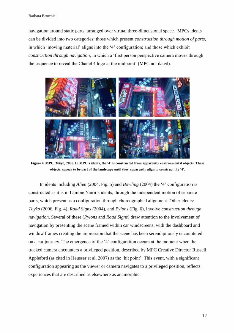
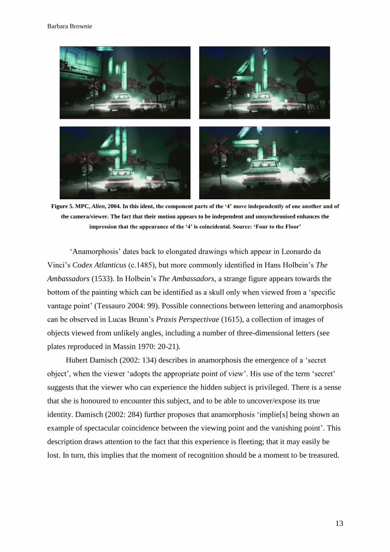
In idents including Alien (2004, Fig. 5) and Bowling (2004) the ‗4‘ configuration is
constructed as it is in Lambie Nairn‘s idents, through the independent motion of separate
parts, which present as a configuration through choreographed alignment. Other idents:
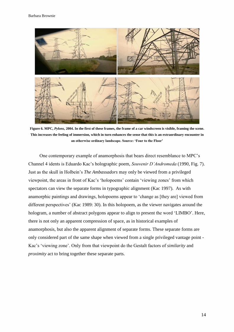
Toyko (2006, Fig. 4), Road Signs (2004), and Pylons (Fig. 6), involve construction through
navigation. Several of these (Pylons and Road Signs) draw attention to the involvement of
navigation by presenting the scene framed within car windscreens, with the dashboard and
window frames creating the impression that the scene has been serendipitously encountered
on a car journey. The emergence of the ‗4‘ configuration occurs at the moment when the
tracked camera encounters a privileged position, described by MPC Creative Director Russell
Appleford (as cited in Heusser et al. 2007) as the ‗hit point‘. This event, with a significant
configuration appearing as the viewer or camera navigates to a privileged position, reflects
experiences that are described as elsewhere as anamorphic.
Barbara Brownie
13
Figure 5. MPC, Alien, 2004. In this ident, the component parts of the ‘4’ move independently of one another and of
the camera/viewer. The fact that their motion appears to be independent and unsynchronised enhances the
impression that the appearance of the ‘4’ is coincidental. Source: ‘Four to the Floor’
‗Anamorphosis‘ dates back to elongated drawings which appear in Leonardo da
Vinci‘s Codex Atlanticus (c.1485), but more commonly identified in Hans Holbein‘s The
Ambassadors (1533). In Holbein‘s The Ambassadors, a strange figure appears towards the
bottom of the painting which can be identified as a skull only when viewed from a ‗specific
vantage point‘ (Tessauro 2004: 99). Possible connections between lettering and anamorphosis
can be observed in Lucas Brunn‘s Praxis Perspectivae (1615), a collection of images of
objects viewed from unlikely angles, including a number of three-dimensional letters (see
plates reproduced in Massin 1970: 20-21).
Hubert Damisch (2002: 134) describes in anamorphosis the emergence of a ‗secret
object‘, when the viewer ‗adopts the appropriate point of view‘. His use of the term ‗secret‘
suggests that the viewer who can experience the hidden subject is privileged. There is a sense
that she is honoured to encounter this subject, and to be able to uncover/expose its true
identity. Damisch (2002: 284) further proposes that anamorphosis ‗implie[s] being shown an
example of spectacular coincidence between the viewing point and the vanishing point‘. This
description draws attention to the fact that this experience is fleeting; that it may easily be
lost. In turn, this implies that the moment of recognition should be a moment to be treasured.
Barbara Brownie
14
Figure 6. MPC, Pylons, 2004. In the first of these frames, the frame of a car windscreen is visible, framing the scene.
This increases the feeling of immersion, which in turn enhances the sense that this is an extraordinary encounter in
an otherwise ordinary landscape. Source: ‘Four to the Floor’
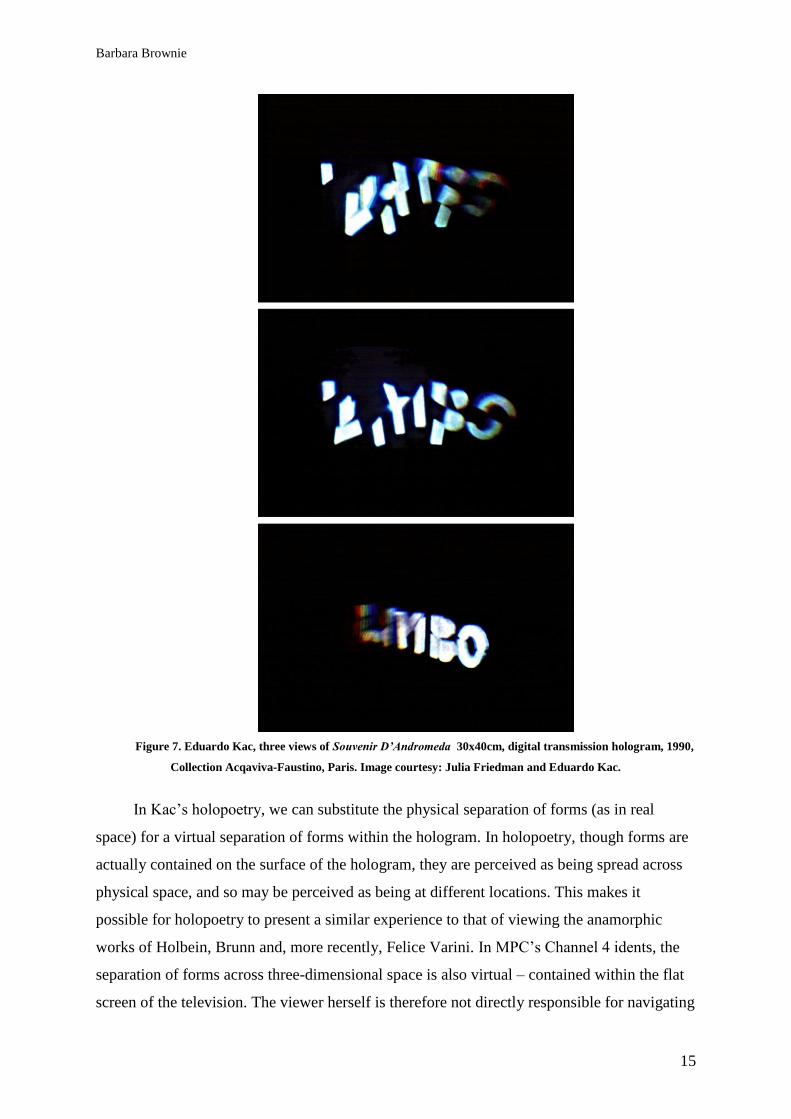
One contemporary example of anamorphosis that bears direct resemblance to MPC‘s
Channel 4 idents is Eduardo Kac‘s holographic poem, Souvenir D’Andromeda (1990, Fig. 7).
Just as the skull in Holbein‘s The Ambassadors may only be viewed from a privileged
viewpoint, the areas in front of Kac‘s ‗holopoems‘ contain ‗viewing zones‘ from which
spectators can view the separate forms in typographic alignment (Kac 1997). As with
anamorphic paintings and drawings, holopoems appear to ‗change as [they are] viewed from
different perspectives‘ (Kac 1989: 30). In this holopoem, as the viewer navigates around the
hologram, a number of abstract polygons appear to align to present the word ‗LIMBO‘. Here,
there is not only an apparent compression of space, as in historical examples of
anamorphosis, but also the apparent alignment of separate forms. These separate forms are
only considered part of the same shape when viewed from a single privileged vantage point -
Kac‘s ‗viewing zone‘. Only from that viewpoint do the Gestalt factors of similarity and
proximity act to bring together these separate parts.
Barbara Brownie
15
Figure 7. Eduardo Kac, three views of Souvenir D’Andromeda 30x40cm, digital transmission hologram, 1990,
Collection Acqaviva-Faustino, Paris. Image courtesy: Julia Friedman and Eduardo Kac.
In Kac‘s holopoetry, we can substitute the physical separation of forms (as in real
space) for a virtual separation of forms within the hologram. In holopoetry, though forms are
actually contained on the surface of the hologram, they are perceived as being spread across
physical space, and so may be perceived as being at different locations. This makes it
possible for holopoetry to present a similar experience to that of viewing the anamorphic
works of Holbein, Brunn and, more recently, Felice Varini. In MPC‘s Channel 4 idents, the
separation of forms across three-dimensional space is also virtual – contained within the flat
screen of the television. The viewer herself is therefore not directly responsible for navigating
Barbara Brownie
16
into the privileged position or ‗viewing zone‘. This navigation is the responsibility of the
camera, that tracks through the scene until it encounters an alignment of objects to reveal the
‗4‘. The fact that the whole audience at once encounters the privileged position
simultaneously does not diminish the feeling of spectacular coincidence. MPC designer
Russell Appleford (as cited in Heusser et al. 2007) describes his aim as inviting the
impression that the ‗4‘ has been ‗found‘ by the viewer, rather than deliberately presented to
her. The experience remains fleeting, as the camera continues to track through space, and the
verbal identities dissipate. This event ensures the impression that the appearance of the ‗4‘ is
fleeting, and that the exact location and exact moment of the appearance of the ‗4‘ may never
be recaptured. There is, in these idents, not only a privileged position, but also a privileged
moment that the viewer (with no power to stop the navigation) cannot preserve. By creating a
sense that they alone are privileged to witness the alignment of the '4' logo, audiences are
given the impression that Channel 4 provides opportunities to view content that cannot be
seen elsewhere. Their encounter with the '4' configuration, and so too the rest of their
viewing, seems exclusive.
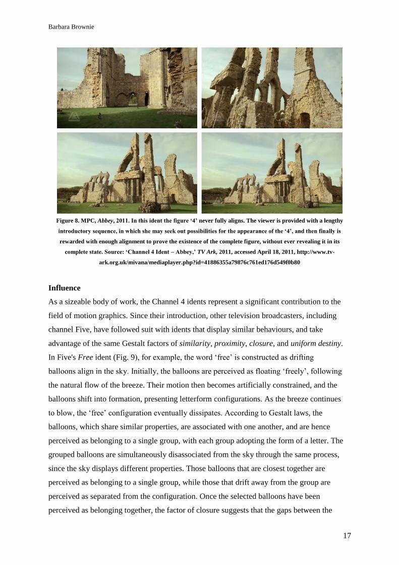
In this collection of idents there is a trend towards an ever more abbreviated alignment.
The time for which the ‗4‘ configuration is in alignment has decreased to the extent that
recent indents, such as Blackpool (2011) and Abbey (2011), reveal it so fleetingly that
viewers must be dedicated to seeking it out in order to notice its split-second appearance. In
some cases (as in Abbey, Fig. 8) the ‗4‘ never fully completes its alignment, providing
viewers with only enough alignment to demonstrate the potential for ‗4‘ rather than a fully
complete figure. This trend illustrates the extent of the success of this set of idents, and the
familiarity of their behaviour to the target audience. The audience has become so familiar
with the behaviours exhibited in this set of idents that they no longer cause surprise, but
instead present a challenge to the viewer, to anticipate the point of alignment by seeking out
the component parts of the ‗4‘ before they align. The idents are, therefore, no longer simply
spectacles, but rather games, involving participation from the audience. The apparent need
for the alignment to be abbreviated can be considered in light of the findings of Sarah
Kettley, who has observed that, when audiences are repeatedly faced with ambiguous but
similar artefacts, ‗the rates of visual output... had to be substantially speeded up in order to
hold the attention of viewers‘ (Ketley 2005). Kettley‘s research would suggest that the
increasing speed of the behaviour is required to fend off fatigue in an audience who has been
exposed to similar behaviours for almost three decades.
Barbara Brownie
17
Figure 8. MPC, Abbey, 2011. In this ident the figure ‘4’ never fully aligns. The viewer is provided with a lengthy
introductory sequence, in which she may seek out possibilities for the appearance of the ‘4’, and then finally is
rewarded with enough alignment to prove the existence of the complete figure, without ever revealing it in its
complete state. Source: ‘Channel 4 Ident – Abbey,’ TV Ark, 2011, accessed April 18, 2011, http://www.tv-
ark.org.uk/mivana/mediaplayer.php?id=41886355a79876c761ed176d549f0b80
Influence
As a sizeable body of work, the Channel 4 idents represent a significant contribution to the
field of motion graphics. Since their introduction, other television broadcasters, including
channel Five, have followed suit with idents that display similar behaviours, and take
advantage of the same Gestalt factors of similarity, proximity, closure, and uniform destiny.
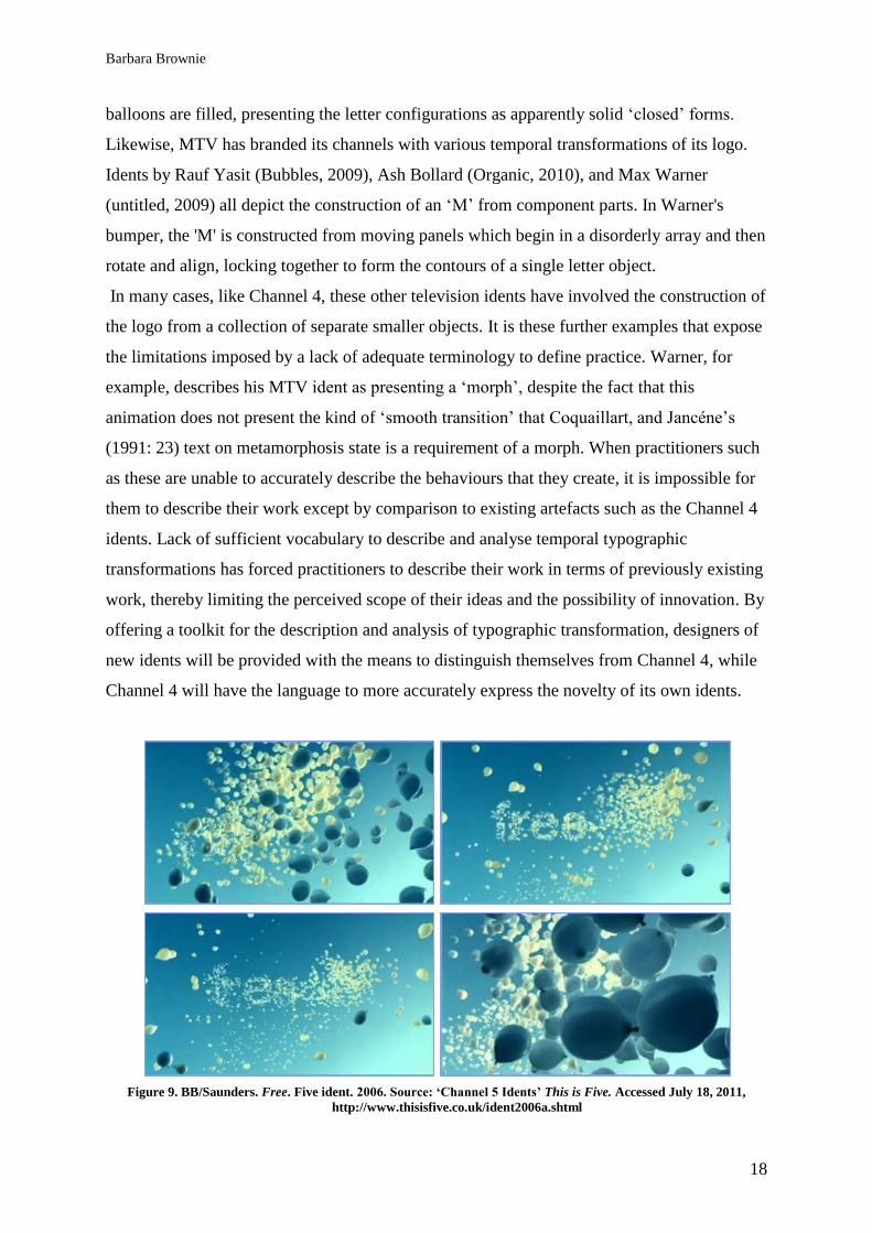
In Five's Free ident (Fig. 9), for example, the word ‗free‘ is constructed as drifting
balloons align in the sky. Initially, the balloons are perceived as floating ‗freely‘, following
the natural flow of the breeze. Their motion then becomes artificially constrained, and the
balloons shift into formation, presenting letterform configurations. As the breeze continues
to blow, the ‗free‘ configuration eventually dissipates. According to Gestalt laws, the
balloons, which share similar properties, are associated with one another, and are hence
perceived as belonging to a single group, with each group adopting the form of a letter. The
grouped balloons are simultaneously disassociated from the sky through the same process,
since the sky displays different properties. Those balloons that are closest together are
perceived as belonging to a single group, while those that drift away from the group are
perceived as separated from the configuration. Once the selected balloons have been
perceived as belonging together, the factor of closure suggests that the gaps between the
Barbara Brownie
18
balloons are filled, presenting the letter configurations as apparently solid ‗closed‘ forms.
Likewise, MTV has branded its channels with various temporal transformations of its logo.
Idents by Rauf Yasit (Bubbles, 2009), Ash Bollard (Organic, 2010), and Max Warner
(untitled, 2009) all depict the construction of an ‗M‘ from component parts. In Warner's
bumper, the 'M' is constructed from moving panels which begin in a disorderly array and then
rotate and align, locking together to form the contours of a single letter object.
In many cases, like Channel 4, these other television idents have involved the construction of
the logo from a collection of separate smaller objects. It is these further examples that expose
the limitations imposed by a lack of adequate terminology to define practice. Warner, for
example, describes his MTV ident as presenting a ‗morph‘, despite the fact that this
animation does not present the kind of ‗smooth transition‘ that Coquaillart, and Jancéne‘s
(1991: 23) text on metamorphosis state is a requirement of a morph. When practitioners such
as these are unable to accurately describe the behaviours that they create, it is impossible for
them to describe their work except by comparison to existing artefacts such as the Channel 4
idents. Lack of sufficient vocabulary to describe and analyse temporal typographic
transformations has forced practitioners to describe their work in terms of previously existing
work, thereby limiting the perceived scope of their ideas and the possibility of innovation. By
offering a toolkit for the description and analysis of typographic transformation, designers of
new idents will be provided with the means to distinguish themselves from Channel 4, while
Channel 4 will have the language to more accurately express the novelty of its own idents.
Figure 9. BB/Saunders. Free. Five ident. 2006. Source: ‘Channel 5 Idents’ This is Five. Accessed July 18, 2011,
http://www.thisisfive.co.uk/ident2006a.shtml
Barbara Brownie
19
Conclusion
MPC‘s recent explorations into anamorphosis have not only inspired other practitioners
to follow suit in temporal typography, but have also inspired Channel 4 to explore the
potential presentation of their logo in other settings. The virtual compression of space, as
prompted by camera navigation in MPC‘s idents, was replicated in reality in an installation
that appeared outside of the Channel 4 headquarters from 2008. In celebration of Channel 4‘s
25th
anniversary, a 48-foot tall steel model of the logo was constructed and installed at the
company‘s headquarters (Ozler 2007). The component parts of the giant logo were not
positioned on a single plane, but spaced apart, so that they could only be viewed in alignment
from a position directly in front of the building. This ‗4‘, as a real-life arrangement of objects
rather than computer generated models contained within a screen, highlights the fact that the
behaviours seen in the 4 idents are not merely a product of temporal media, but are
reproducible as a real-life parallax.
This installation reflects a shift in contemporary practice, away from the treatment of
the logo as a flat symbol, towards the perception of a logo as a physical object. This shift in
perception has prompted other brands to follow suit, with other typographic elements
constructed from photorealistic component parts. Recent experiments in fluid typography
have yielded numerous artefacts that owe much to the impact of Martin Lambie Nairn and
MPC, but despite this, there is still no agreed-upon understanding of the behaviours that are
exhibited in these artefacts. New terminology is required for practitioners and commentators
to accurately describe this flourishing contemporary practice. It is only with new terminology
that the innovation of Channel 4's idents may be accurately expressed and analysed.
Acknowledgements
I would like to extend thanks to my research supervisors, Grace Lees-Maffei and Alan
Peacock. I would also like to thank Channel 4 Broadcasting for granting permission to
include images of their idents, and Eduardo Kac for granting permission to include his
holopoem.
Barbara Brownie
20
References
Aymer, G. (2006), ‗Lambie Nairn‘, Computer Arts 120
http://www.computerarts.co.uk/in_depth/interviews/lambie-nairn#Scene_1 accessed July 17, 2011.
Barthes, R. (1977), Image Music Text, (trans. S. Heath) London: Fontana Press, London.
Block, J. R. (2002), ‗What is an Illusion?‘ Sandlot Science,
http://www.sandlotscience.com/EyeonIllusions/whatisanillusion.htm accessed July 19, 2011.
Coquaillart, Sabine, and Jancéne, Pierre (1991) ‗Animated Free-Form Deformation: An Interactive
Animation Technique.‘ Computer Graphics, 25: 4, pp. 23-26.
Damisch, H. (2002), A Theory of Cloud: Toward a History of Painting. Stanford, CA: Stanford
University Press.
Docherty, D, Morison D. E, and Tracey, M. (1988), Keeping the Faith? Channel Four and its
Audience, London: John Libbey.
Fanthome, C. (2007), ‗Creating an Iconic Brand – An Account of the History, Development Context
and Significance of Channel 4‘s Idents‘, Journal of Media Practice, 8:3, pp. 255-271.
Fitzkee, D. (1945), Magic By Misdirection, Ohio: Lee Jacobs, as cited in Tognazzini (1993).
Foakes, R. A. (1989), ‗Making and Breaking Dramatic Illusion‘, in F. Burwick and W. Pape (eds.)
Aesthetic Illusion: Theoretical and Historical Approaches, New York: Walter de Gruyter, pp. 217-
228.
Grainge, P. (2009), ‗Lost Logos: Channel 4 and the Branding of American Event Television‘,
http://web.mit.edu/uricchio/Public/television/grainge%20uk%20branding%20lost.pdf accessed July
17, 2011, originally published in R. E. Pearson (ed.), Reading Lost, London: IB Taurus, pp. 95-115.
Heusser, J., Montgomery, J. and Seymour, S. (2007), ‗MPC London‘s Award Winning Channel 4
Idents‘, FX Guide,
http://www.fxguide.com/featured/MPC_Londons_Award_Winning_Channel_4_Idents/ accessed July
19, 2011.
Hobson, D. (2008), Channel 4: the early years and the Jeremy Isaacs legacy, London: I.B. Taurus &
Co.
Holemstein, E. (1983), ‗Double Articulation in Writing‘, in F. Coulmas, and K. Ehlich (eds.), Writing
in Focus, New York: Walter de Gruyter, pp. 45-62.
Icon Group International (2008), Brandies: Webster’s Quotations, Facts and Phrases, San Diego:
ICON Group International.
Jobling, P. and Crowley, D. (1996), Graphic Design: Reproduction and Representation Since 1800,
Manchester: Manchester University Press.
Kac, E. (1989) ‗Holopetry: from ―Holo/Olho‖ (1983) to ―When?‖ (1988)‘, in Holopoetry: Essays,
Manifestos, Critical and Theoretical Writings, Lexington New Media Editions, pp. 29-36,
http://www.ekac.org/holopoetrybook.pdf accessed July 19, 2011, originally published in Leonardo
22: 3/4, pp. 397-402.
Kac, E. (1997), ‗Key Concepts of Holopoetry’, Electronic Book Review
http://www.electronicbookreview.com/thread/electropoetics/uncontrollable accessed April 10, 2006,
originally published in Jacksin, D., Vos, E. and Drucker, J. (eds.) (1996), Experimental-Visual-
Concrete: Avant-Garde Poetry Since the 1960s, Amsterdam—Atlanta: Rodopi, pp. 247-257.
Kettley, S. (2005), ‗Framing the Ambiguous Wearable‘, Convivio Journal 2,
http://www.sarahkettleydesign.co.uk/sarahkettley/friendship_Jewellery_01_sarah_kettley_files/Frami
ng%20the%20Ambiguous%20Wearable.pdf accessed April 15, 2011.
Barbara Brownie
21
Kim, J. (2007), ‗Motion Gestalt for Screen Design: Applied Theory of Grouping Principles for Visual
Motion Integrity‘, PhD thesis, Illinois Institute of Technology.
Lamont, P. and Wiseman, R. (2005), Magic in Theory: An Introduction to the Theoretical and
Psychological Elements of Conjuring, Hertfordshire: University of Hertfordshire Press.
Massin (1970), Letter and Image, London: Studio Vista.
Miller, J. A. (1996), Dimensional Typography, New York: Princeton Architectural Press.
Mollerup, P. (1999), Marks of Excellence, London: Phiadon.
MPC (not dated), ‗Channel 4 idents‘, http://www.moving-
picture.com/index.php?option=com_content&view=article&id=341&Itemid=873&contentview=singl
e§ion=1&pagenum=1 accessed July 19, 2011
Ozler, L. (2007), ‗Channel 4 Brings Its Logo to Life to Launch Big Art in 2008‘, Dexigner, 14
October, http://www.dexigner.com/news/12348 accessed July 19, 2011.
Rosenberger, T., and MacNiel, R.L. (1999), ‗Prosodic Font: Translating Speech into Graphics‘, CHI
99 Conference Proceedings, http://alumni.media.mit.edu/~tara/CHI1999.pdf accessed July 13, 2011.
Tsur, R. (2000), ‗Picture Poetry, Mannerism, and Sign Relationships‘, Poetics Today, 21: 4, pp. 751-
781, http://muse.jhu.edu/journals/poetics_today/v021/21.4tsur.html accessed July 19, 2011.
Ryan, D. (2001), Letter Perfect: The Art of Modernist Typography 1896-1953, California:
Pomegranate.
Slater, D. (1995), ‗Photography and Modern Vision: The Spectacle of Natural Magic‘, in C. Jenks
(ed.), Visual Culture, London: Routledge, pp. 218-237.
Tesauro, E. (2004), ‗Beyond Anamorphosis‘, in Varini, F. Müller, L. and López-Durán, F., Felice
Varini: points of view, Baden: Lars Müller Publishers.
Tognazzini, B. (1993), ‗Principles, Techniques, and Ethics of Stage Magic and Their Application to
Human Interface Design.‘ Proceedings of InterCHI '93, pp. 355-362, doi: 10.1145/169059.169284
accessed June 20, 2011.
Wertheimer, M. (1923), ‗General Problems, Section 1: Gestalt Theory‘, in W. D. Ellis (ed) (1938), A
Source Book of Gestalt Psychology, London: Routledge & Kegan Paul Ltd., originally published as
‗Untersuchungen zur Lehre von der Gestalt, II‘, Psychol. Forsch. 4, pp.301-530.
Wong, Y. Y. (1995), ‗Temporal Typography: Characterization of Time-varying Typographic Form‘,
MS thesis, MIT, http://hdl.handle.net/1721.1/29102 accessed July 19, 2011.
Woolman, M., and Bellantoni, J. (1999), Type in Motion. London: Thames & Hudson.
1 For viewers who have already encountered one of these idents, the revelation of the ‘4’ is expected.
The everyday introductory moments become a period of anticipation.