Embed Size (px)
DESCRIPTION
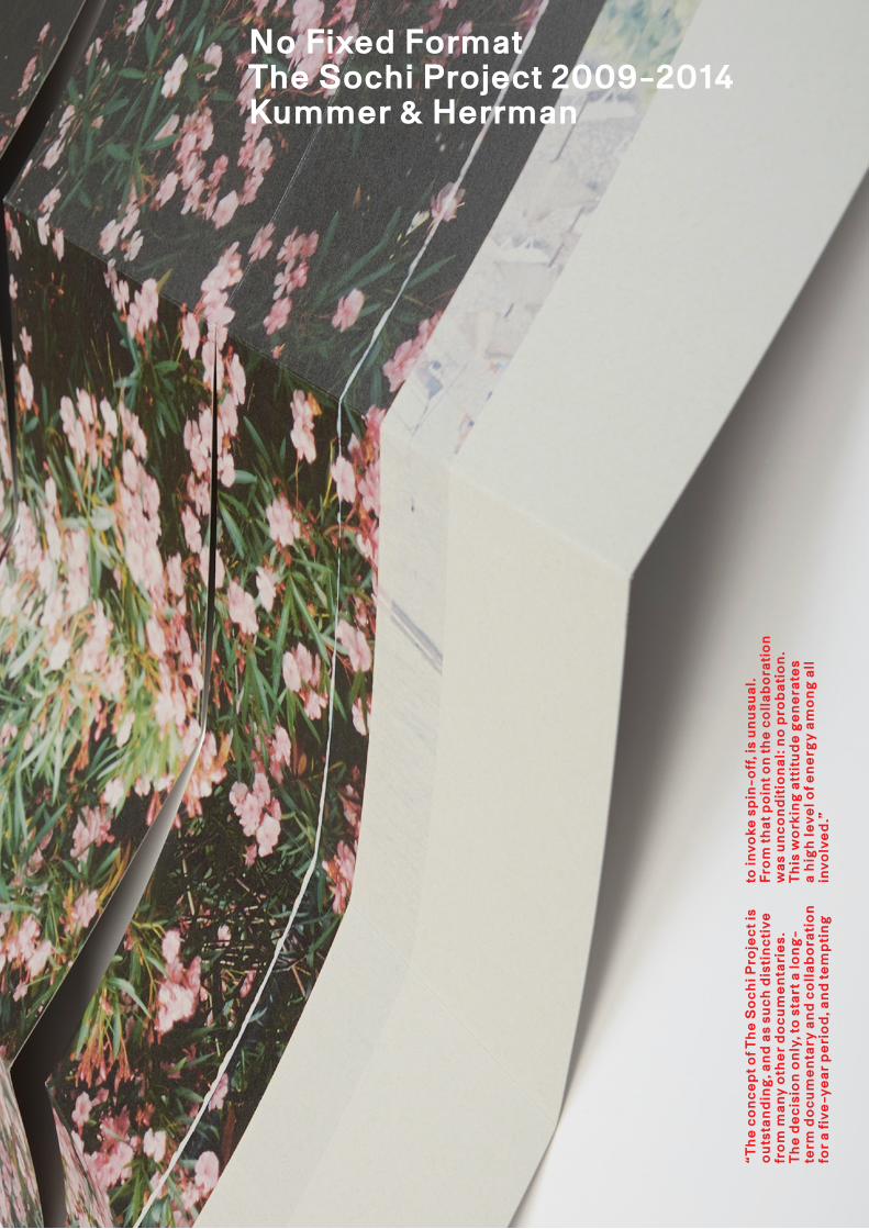
Rob Hornstra (photographer) and Arnold van Bruggen (journalist and film maker) have been working together since 2007 to tell the story of Sochi, Russia, site of the 2014 Winter Olympic Games. They have returned repeatedly to this region as committed practitioners of ‘slow journalism’, establishing a solid foundation of research on and engagement with this small yet incredibly complicated region before it finds itself in the glare of international media attention. The Sochi Project was cofounded by Rob Hornstra and Arnold van Bruggen, in association with long-standing collaborators Kummer & Herrman. ‘No Fixed Format’ gives an overview of the most striking expressions of this project. It presents the role Kummer & Herrman as design studio played within the projects. It showcases the large variety of ways to disseminate and present documentaries. It demonstrates what visual storytelling in a collaborative manner is about. You can order your copy by email.
Citation preview
“Th
e c
on
ce
pt o
f Th
e S
oc
hi P
roje
ct i
s o
uts
tan
din
g, a
nd
as
suc
h d
isti
nc
tive
fr
om
man
y o
the
r d
oc
um
en
tari
es.
T
he
de
cis
ion
on
ly, t
o s
tart
a lo
ng
-te
rm d
oc
um
en
tary
an
d c
oll
abo
rati
on
fo
r a
five
-ye
ar
pe
rio
d, a
nd
te
mp
tin
g
to in
voke
sp
in-o
ff, i
s u
nu
sua
l.F
rom
tha
t po
int o
n th
e c
oll
abo
rati
on
w
as
un
co
nd
itio
na
l: n
o p
rob
ati
on
. T
his
wo
rkin
g a
ttit
ud
e g
en
era
tes
a
hig
h le
vel o
f en
erg
y am
on
g a
ll
invo
lve
d.”
No Fixed FormatThe Sochi Project 2009-2014Kummer & Herrman
Give us your moneypage 2
Give us your money
Crowdfunding is an important part of the project from the start. The first items being produced focus on getting people involved and to persuade them to become bronze, silver or gold donors.
Besides we develop a strong typographical identity with the notion that images in the project will always be shown in combina-tion with text to provide context.
page 2:
Registration card
2009 148 x 210 mmoffset, one colour1.000 copies
Flyer for the Sochi Project launch at the Naarden Fotofestival
2009 148 x 210 mmoffset, full colour5.000 copies
page 3-4:
Introduction newspaper
Contains an introduction to the project and its authors as well as one photographic image which can be seen in total when the newspaper is taken apart and the four sheets are layed out next to each other.
2009 299 x 415 mm16 pages newsprint, full colour10.000 copies
Give us your moneypage 3
Give us your moneypage 4
Collectors box for gold donors
Five custom made individual portfolios for each year, per-fectly fitting in one matching collectors box. Each portfolio contains one selected C-Print by Rob Hornstra with an accompanying text by Arnold van Bruggen.
2009 419 x 488 mmhandmade, cloth covered cardboard, blind embossing, silk screened20 copies
Give us your moneypage 5
Year Publications
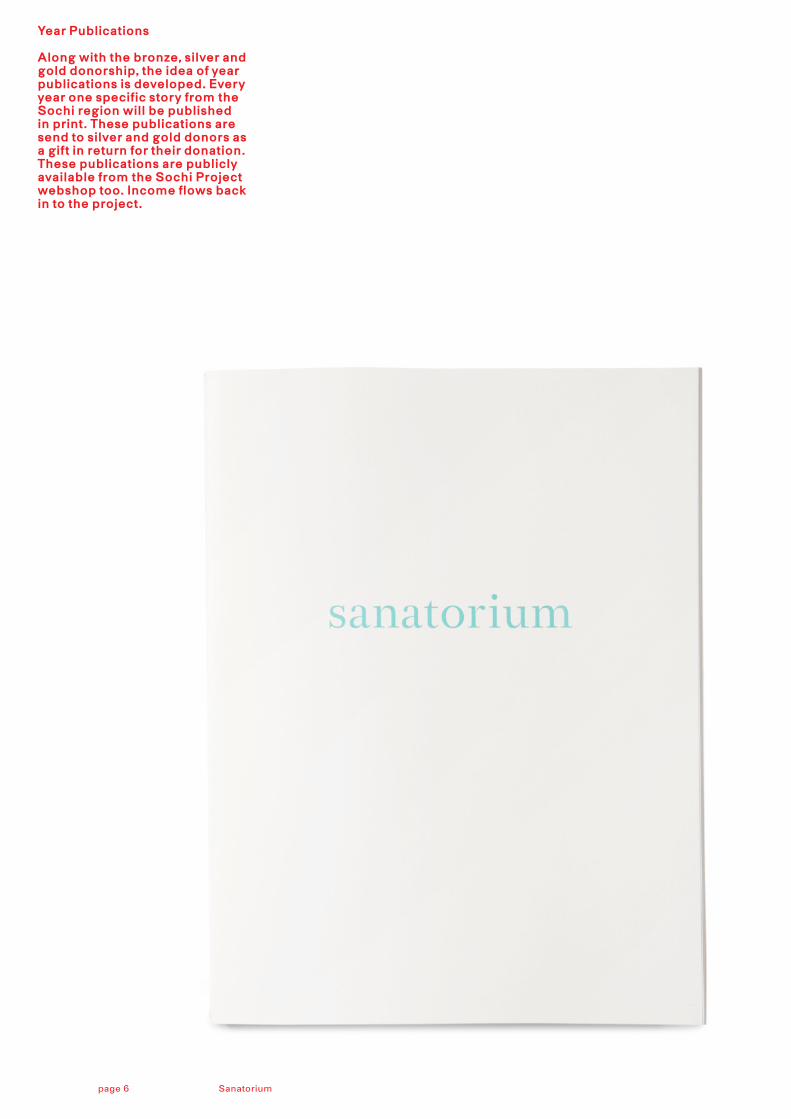
Along with the bronze, silver and gold donorship, the idea of year publications is developed. Every year one specific story from the Sochi region will be published in print. These publications are send to silver and gold donors as a gift in return for their donation. These publications are publicly available from the Sochi Project webshop too. Income flows back in to the project.
Sanatoriumpage 6
page 6-9:
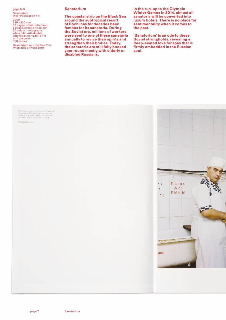
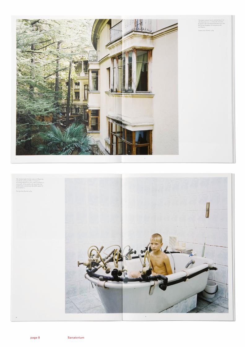
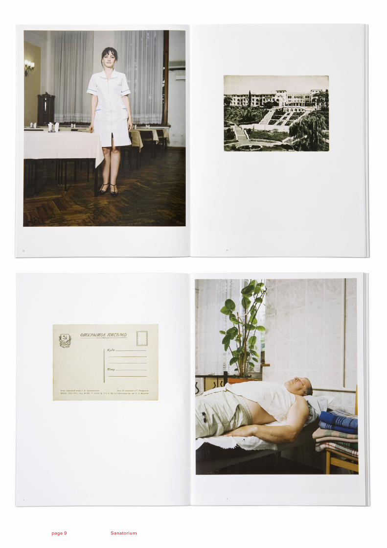
Sanatorium(Year Publication #1)
2009240 x 320 mm32 pages, offset, full colour 8 pages, offset, one colour 20 colour photographs white folio with double stitched binding, foil print on front cover350 copies
Sanatorium won the New York Photo Book Award 2010
Sanatorium
The coastal strip on the Black Sea around the subtropical resort of Sochi has for decades been famous for its sanatoria. During the Soviet era, millions of workers were sent to one of these sanatoria annually to revive their spirits and strengthen their bodies. Today, the sanatoria are still fully booked year round mostly with elderly or disabled Russians.
In the run-up to the Olympic Winter Games in 2014, almost all sanatoria will be converted into luxury hotels. There is no place for sentimentality when it comes to the past. ‘Sanatorium’ is an ode to these Soviet strongholds, revealing a deep-seated love for spas that is firmly embedded in the Russian soul.
Sanatoriumpage 7
Sanatoriumpage 8
Sanatoriumpage 9
page 10-11:
Set of 5 posters
2010700 x 1000 mmoffset, full colour 150 copies each
Cardboard box 2010810 x 155 x155 mmsilkcreen, one colour
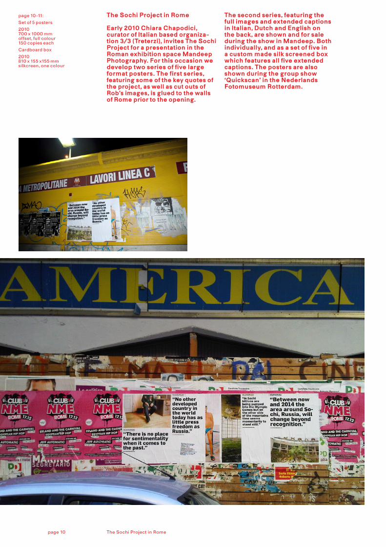
The Sochi Project in Rome
Early 2010 Chiara Chapodici, curator of Italian based organiza-tion 3/3 (Treterzi), invites The Sochi Project for a presentation in the Roman exhibition space Mandeep Photography. For this occasion we develop two series of five large format posters. The first series, featuring some of the key quotes of the project, as well as cut outs of Rob’s images, is glued to the walls of Rome prior to the opening.
The second series, featuring the full images and extended captions in Italian, Dutch and English on the back, are shown and for sale during the show in Mandeep. Both individually, and as a set of five in a custom made silk screened box which features all five extended captions. The posters are also shown during the group show ‘Quickscan’ in the Nederlands Fotomuseum Rotterdam.
The Sochi Project in Romepage 10
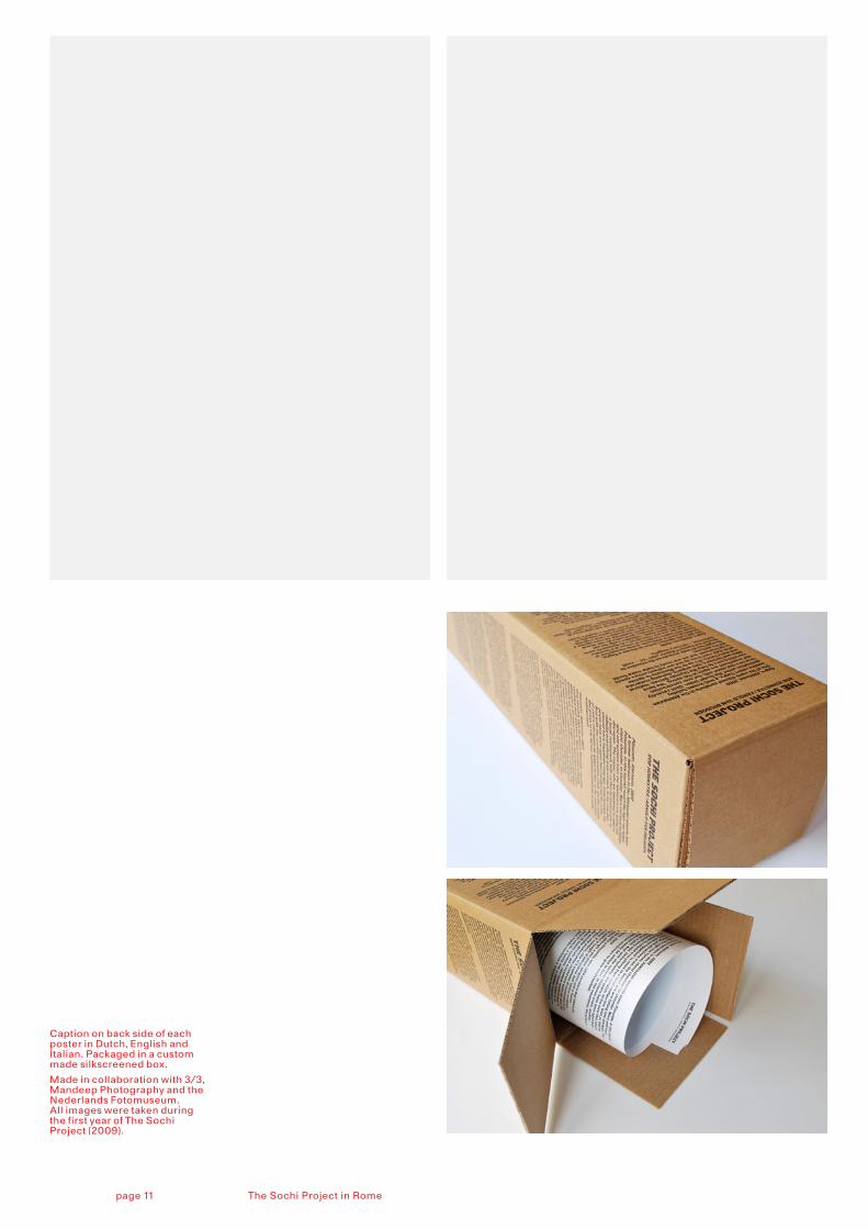
Caption on back side of each poster in Dutch, English and Italian. Packaged in a custom made silkscreened box.
Made in collaboration with 3/3, Mandeep Photography and the Nederlands Fotomuseum. All images were taken during the first year of The Sochi Project (2009).
The Sochi Project in Romepage 11
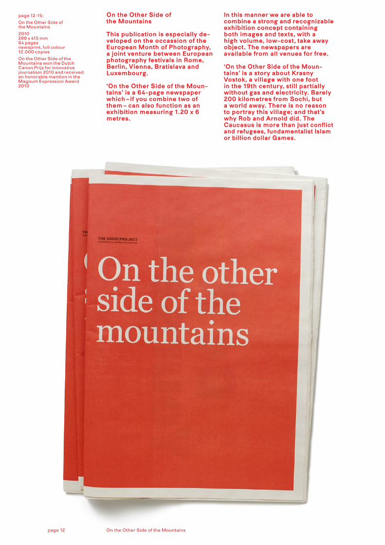
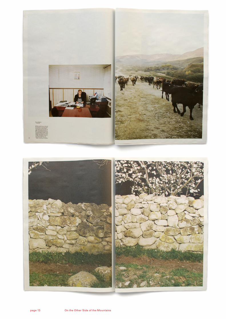
page 12-15:
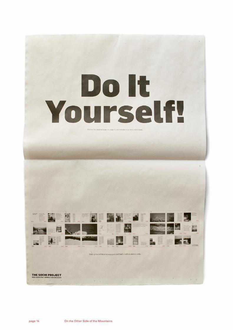
On the Other Side of the Mountains
2010 299 x 415 mm 64 pages newsprint, full colour12.000 copies
On the Other Side of the Mountains won the Dutch Canon Prijs for innovative journalism 2010 and received an honorable mention in the Magnum Expression Award 2010
On the Other Side of the Mountains
This publication is especially de-veloped on the occassion of the European Month of Photography, a joint venture between European photography festivals in Rome, Berlin, Vienna, Bratislava and Luxembourg.
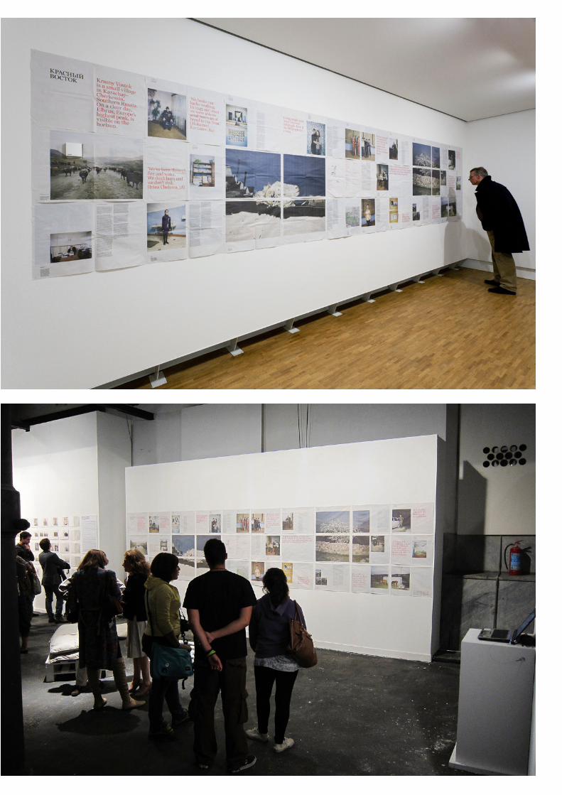
‘On the Other Side of the Moun-tains’ is a 64-page news paper which – if you combine two of them – can also function as an exhibition measuring 1.20 x 6 metres.
In this manner we are able to combine a strong and recognizable exhibition concept containing both images and texts, with a high volume, low-cost, take away object. The newspapers are available from all venues for free.
‘On the Other Side of the Moun-tains’ is a story about Krasny Vostok, a village with one foot in the 19th century, still partially without gas and electricity. Barely 200 kilometres from Sochi, but a world away. There is no reason to portray this village; and that’s why Rob and Arnold did. The Caucasus is more than just conflict and refugees, fundamentalist Islam or billion dollar Games.
On the Other Side of the Mountainspage 12
On the Other Side of the Mountainspage 13
On the Other Side of the Mountainspage 14
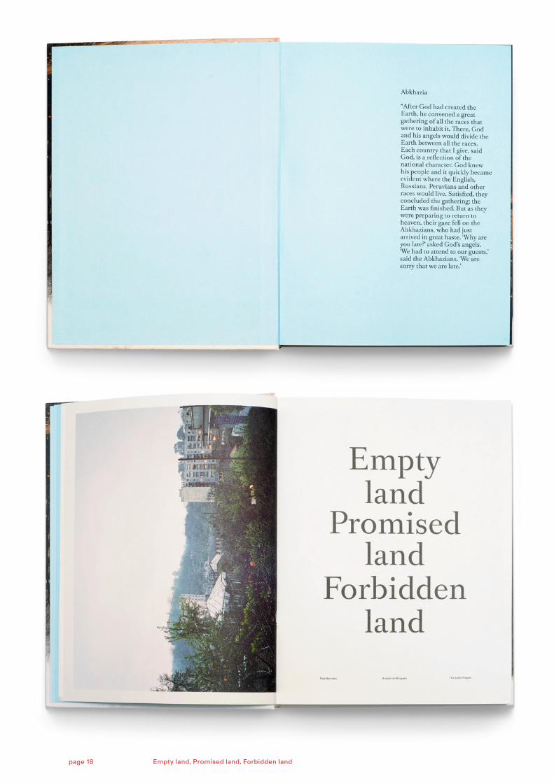
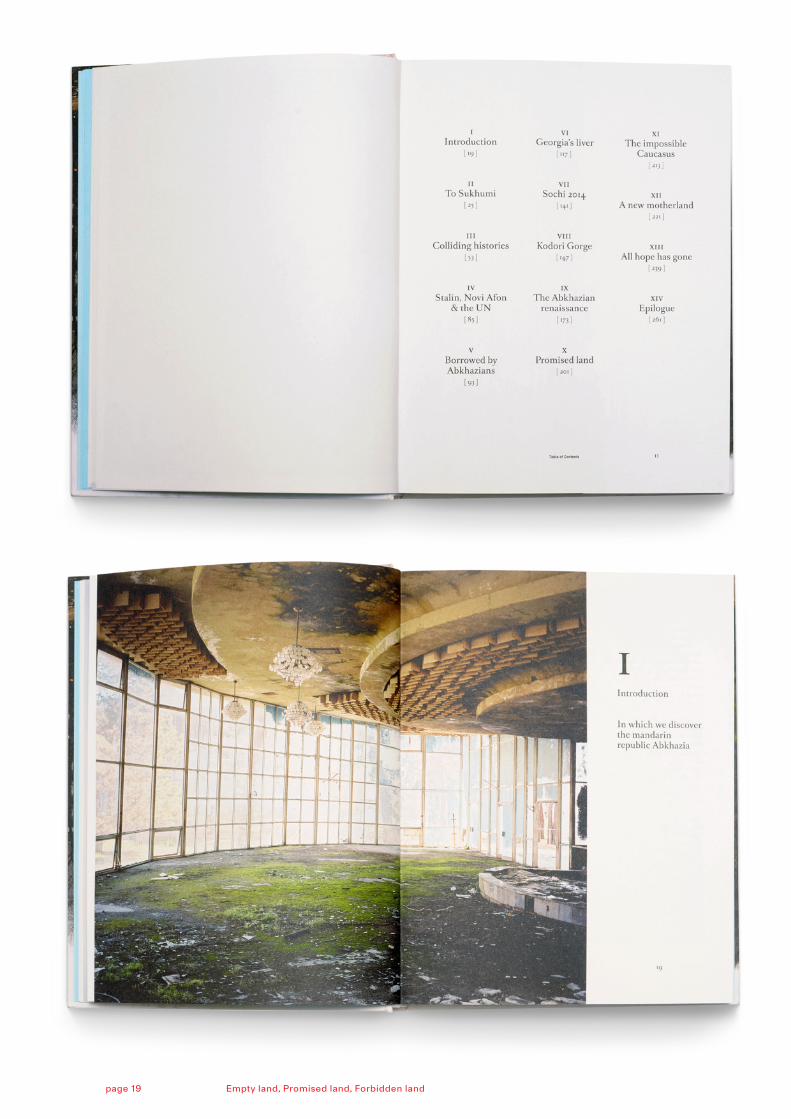
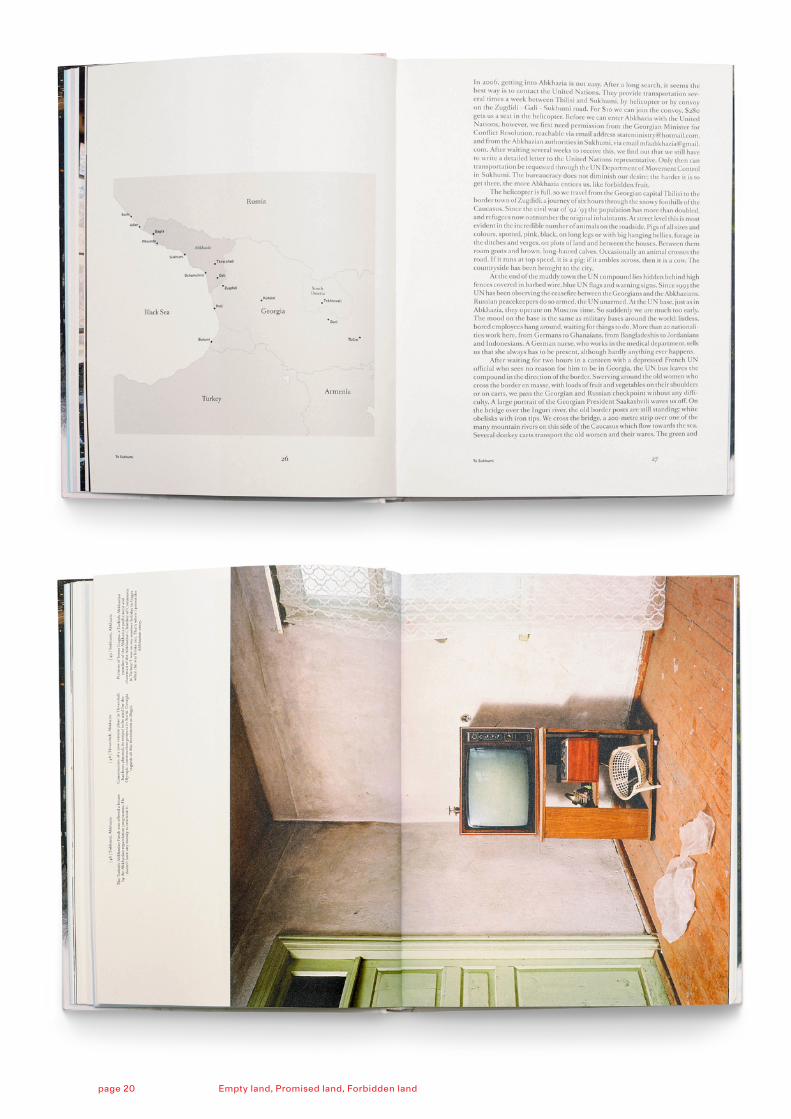
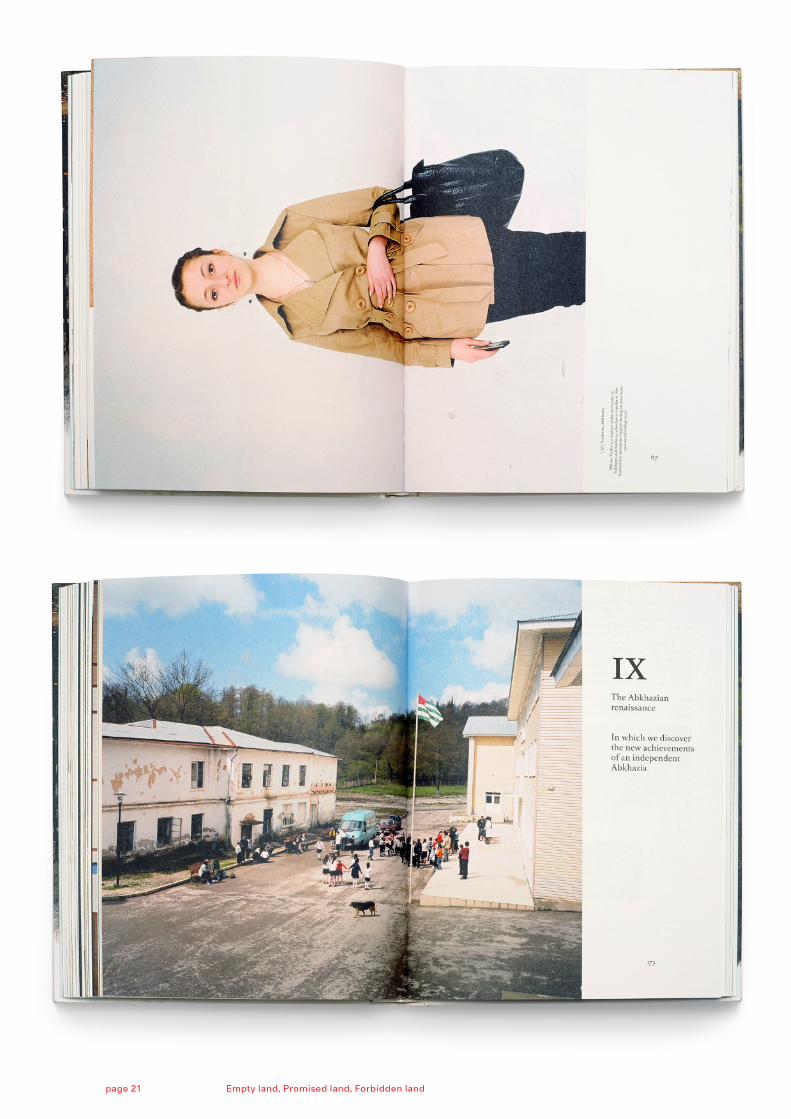
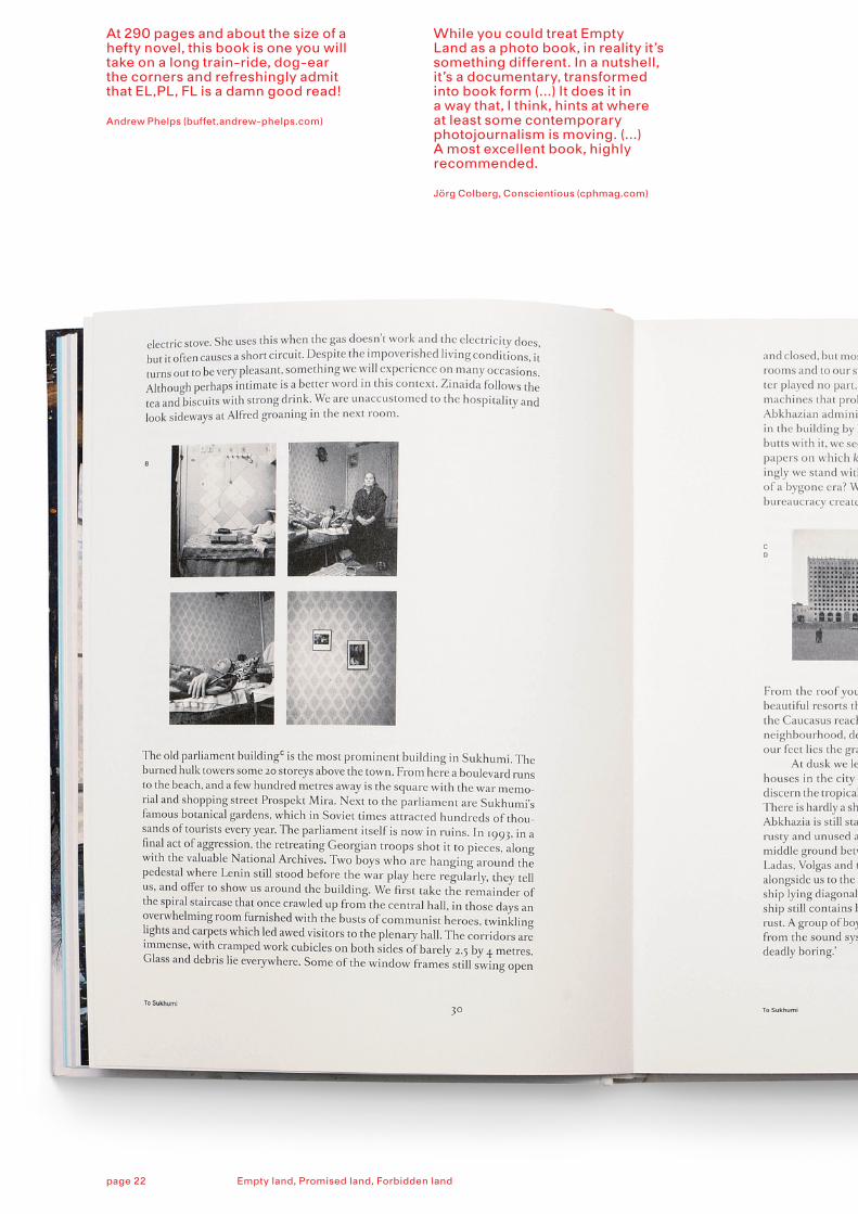
page 16-22:
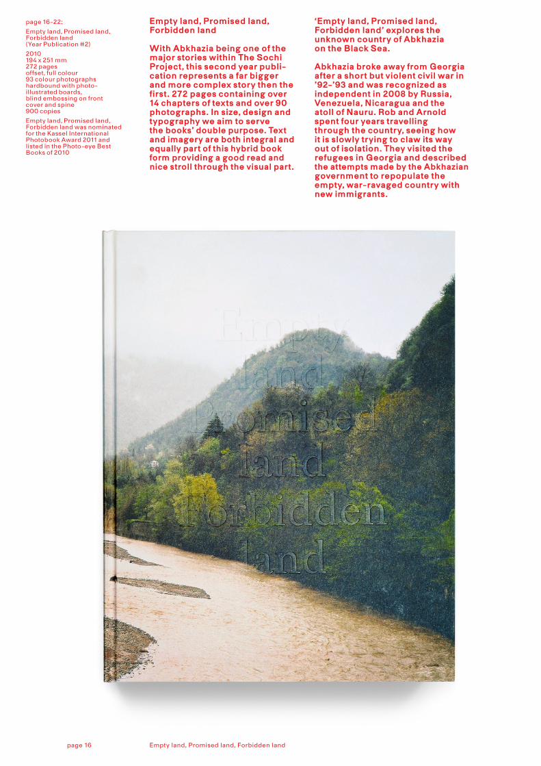
Empty land, Promised land, Forbidden land(Year Publication #2)
2010 194 x 251 mm272 pagesoffset, full colour 93 colour photographshardbound with photo-illustrated boards,blind embossing on front cover and spine900 copies
Empty land, Promised land, Forbidden land was nominated for the Kassel International Photobook Award 2011 and listed in the Photo-eye Best Books of 2010
Empty land, Promised land, Forbidden land
With Abkhazia being one of the major stories within The Sochi Project, this second year publi - ca tion represents a far bigger and more complex story then the first. 272 pages containing over 14 chapters of texts and over 90 photographs. In size, design and typography we aim to serve the books’ double purpose. Text and imagery are both integral and equally part of this hybrid book form providing a good read and nice stroll through the visual part.
‘Empty land, Promised land, Forbidden land’ explores the unknown country of Abkhazia on the Black Sea. Abkhazia broke away from Georgia after a short but violent civil war in ’92-’93 and was recognized as independent in 2008 by Russia, Venezuela, Nicaragua and the atoll of Nauru. Rob and Arnold spent four years travelling through the country, seeing how it is slowly trying to claw its way out of isolation. They visited the refugees in Georgia and described the attempts made by the Abkhazian government to repopulate the empty, war-ravaged country with new immigrants.
Empty land, Promised land, Forbidden landpage 16
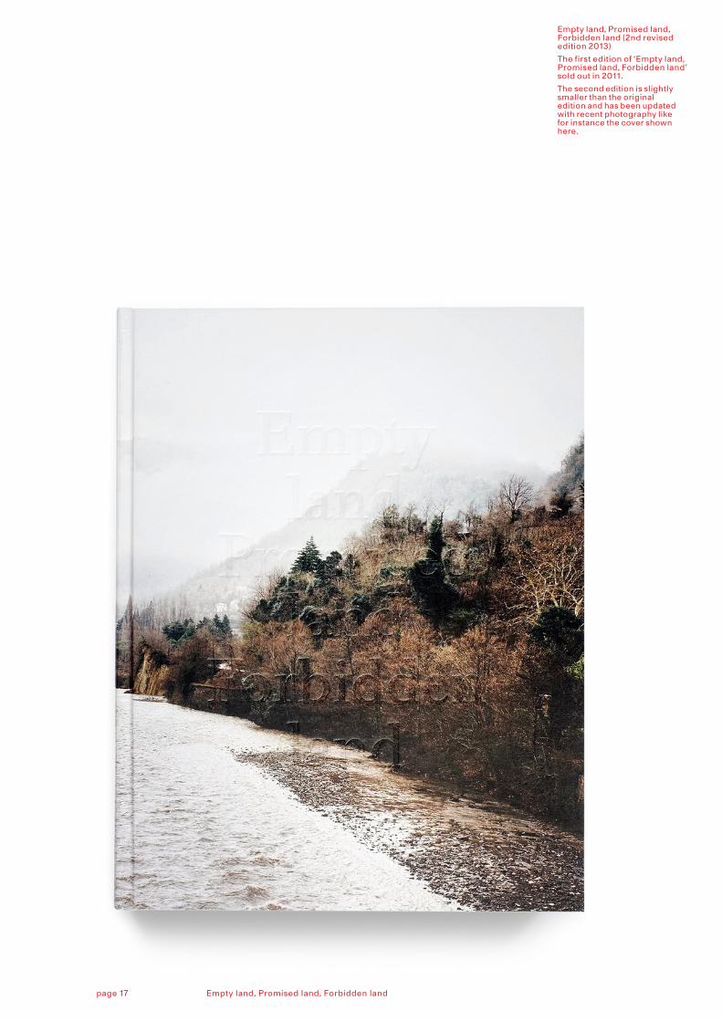
Empty land, Promised land, Forbidden land (2nd revised edition 2013)
The first edition of ‘Empty land, Promised land, Forbidden land’ sold out in 2011.
The second edition is slightly smaller than the original edition and has been updated with recent photography like for instance the cover shown here.
Empty land, Promised land, Forbidden landpage 17
Empty land, Promised land, Forbidden landpage 18
Empty land, Promised land, Forbidden landpage 19
Empty land, Promised land, Forbidden landpage 20
Empty land, Promised land, Forbidden landpage 21
At 290 pages and about the size of a hefty novel, this book is one you will take on a long train-ride, dog-ear the corners and refreshingly admit that EL,PL, FL is a damn good read!
Andrew Phelps (buffet.andrew-phelps.com)
While you could treat Empty Land as a photo book, in reality it’s something different. In a nutshell, it’s a documentary, transformed into book form (...) It does it in a way that, I think, hints at where at least some contemporary photojournalism is moving. (...) A most excellent book, highly recommended.
Jörg Colberg, Conscientious (cphmag.com)
Empty land, Promised land, Forbidden landpage 22
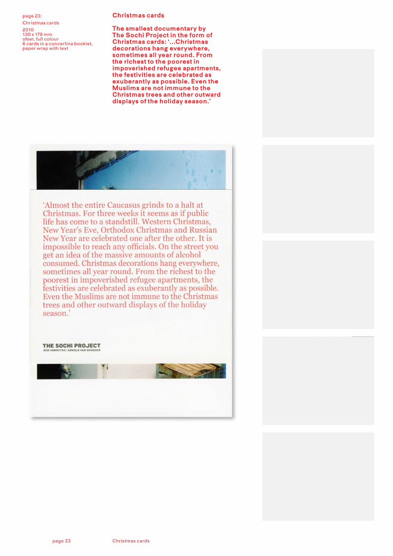
page 23:
Christmas cards
2010130 x 178 mmofset, full colour6 cards in a concertina booklet, paper wrap with text
Christmas cards
The smallest documentary by The Sochi Project in the form of Christmas cards: ‘...Christmas decorations hang everywhere, sometimes all year round. From the richest to the poorest in impoverished refugee apartments, the festivities are celebrated as exuberantly as possible. Even the Muslims are not immune to the Christmas trees and other outward displays of the holiday season.’
Christmas cardspage 23
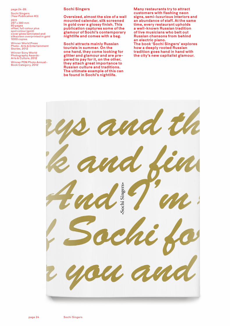
page 24-28:
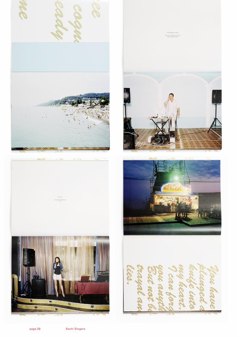
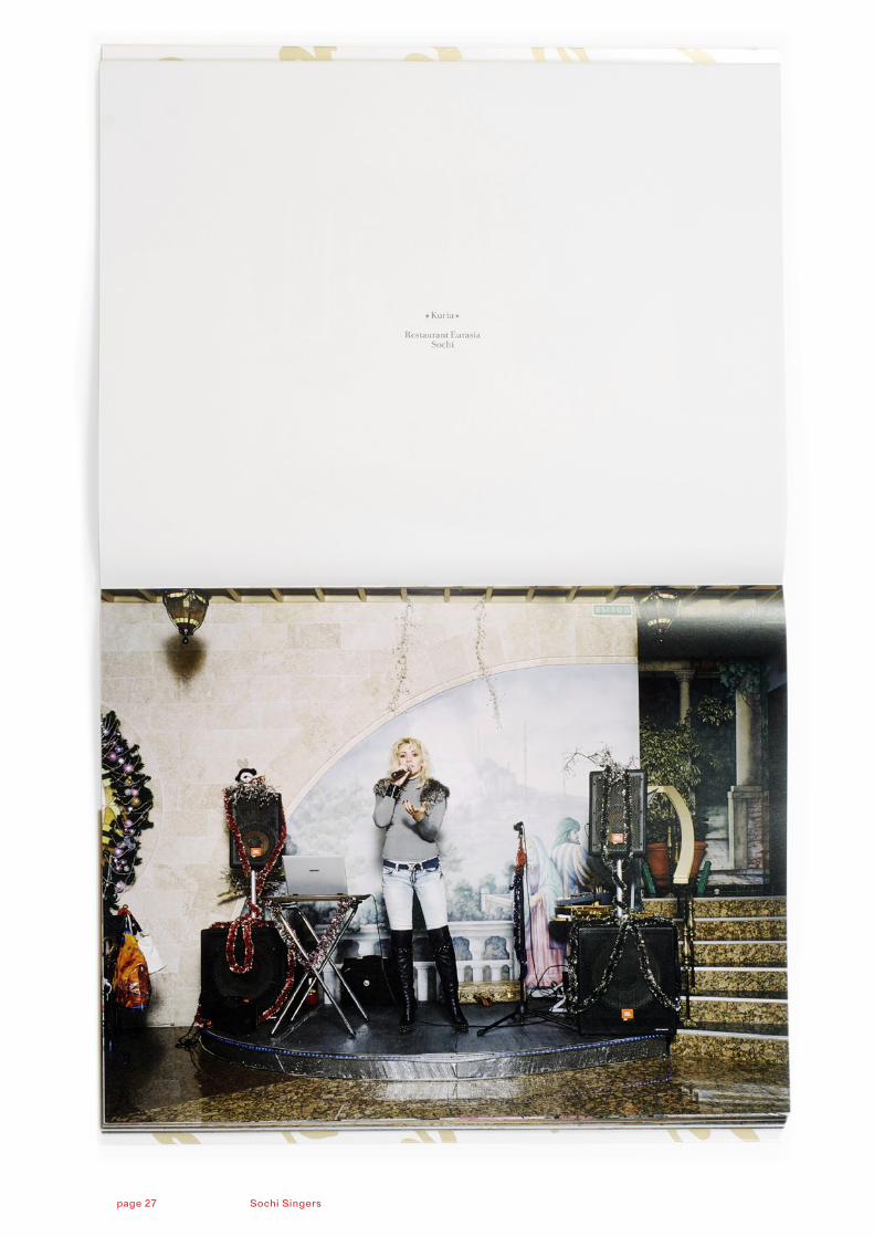
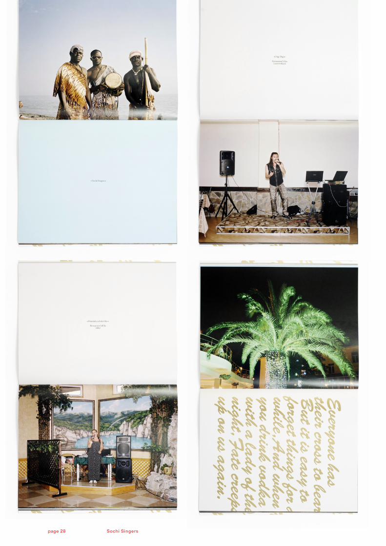
Sochi Singers(Year Publication #3)
2011 297 x 380 mm80 pagesoffset, full colour plusspot colour (gold)cover gloss laminated and silkscreen overprinted in gold1000 copies
Winner World Press Photo - Arts & Entertainment Stories, 2012
Winner Sony World Photography Awards - Arts & Culture, 2012
Winner PDN Photo Annual - Book Category, 2012
Sochi Singers
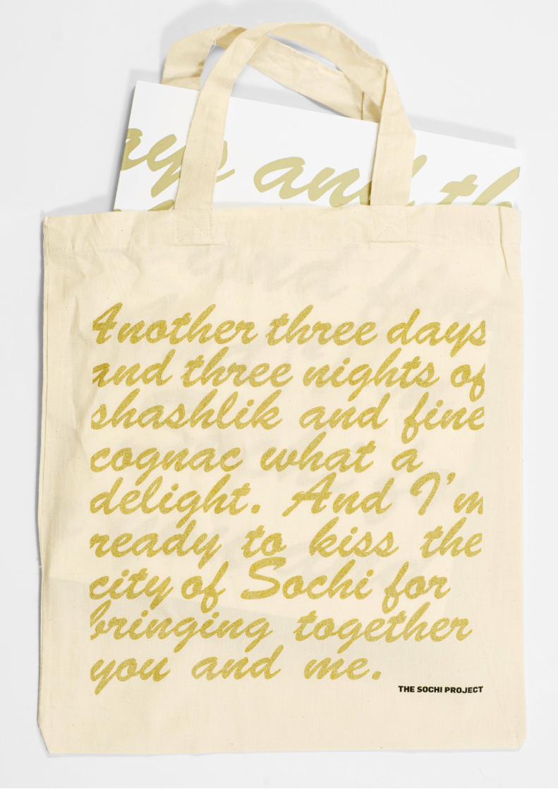
Oversized, almost the size of a wall mounted calendar, silk screened in gold over a glossy finish. This publication captures some of the glamour of Sochi’s contemporary nightlife and comes with a bag.
Sochi attracts mainly Russian tourists in summer. On the one hand, they come looking for glitter and glamour and are pre-pared to pay for it, on the other, they attach great importance to Russian culture and traditions. The ultimate example of this can be found in Sochi’s nightlife.
Many restaurants try to attract customers with flashing neon signs, semi-luxurious interiors and an abundance of staff. At the same time, every restaurant upholds a well-known Russian tradition of live musicians who belt out Russian chansons from behind an electric piano. The book ‘Sochi Singers’ explores how a deeply rooted Russian tradition goes hand in hand with the city’s new capitalist glamour.
Sochi Singerspage 24
Sochi Singerspage 26
Sochi Singerspage 27
Sochi Singerspage 28
page 29 The Sochi Project and its publicationspage 32 The Sochi Project and its publications
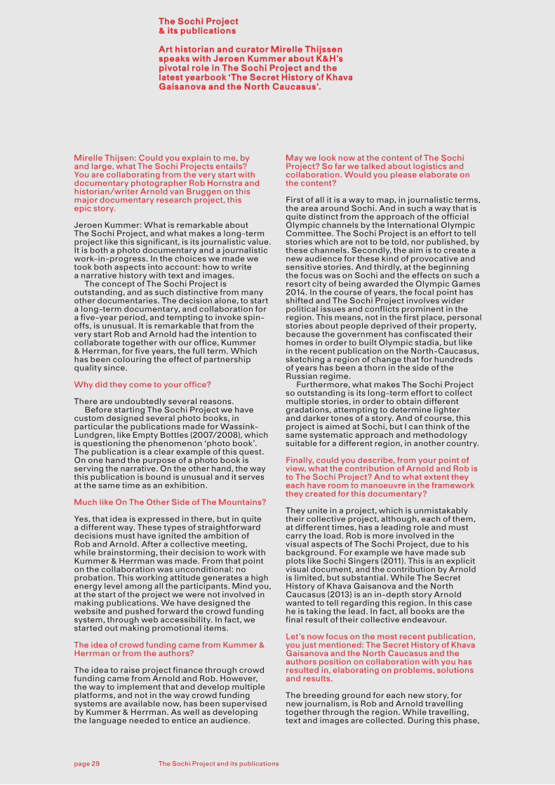
The Sochi Project & its publications
Art historian and curator Mirelle Thijssen speaks with Jeroen Kummer about K&H’s pivotal role in The Sochi Project and the latest yearbook ‘The Secret History of Khava Gaisanova and the North Caucasus’.
Each publication is an entity, and not only should we tell Rob’s story, but the story of The Sochi Project as a whole. None of The Sochi Project publications are to be considered classical photo books.
Mirelle Thijsen: Could you explain to me, by and large, what The Sochi Projects entails? You are collaborating from the very start with documentary photographer Rob Hornstra and historian/writer Arnold van Bruggen on this major documentary research project, this epic story.
Jeroen Kummer: What is remarkable about The Sochi Project, and what makes a long-term project like this significant, is its journalistic value. It is both a photo documentary and a journalistic work-in-progress. In the choices we made we took both aspects into account: how to write a narrative history with text and images. The concept of The Sochi Project is outstanding, and as such distinctive from many other documentaries. The decision alone, to start a long-term documentary, and collaboration for a five-year period, and tempting to invoke spin-offs, is unusual. It is remarkable that from the very start Rob and Arnold had the intention to collaborate together with our office, Kummer & Herrman, for five years, the full term. Which has been colouring the effect of partnership quality since.
Why did they come to your office?
There are undoubtedly several reasons. Before starting The Sochi Project we have custom designed several photo books, in particular the publications made for Wassink-Lundgren, like Empty Bottles (2007/2008), which is questioning the phenomenon ‘photo book’. The publication is a clear example of this quest. On one hand the purpose of a photo book is serving the narrative. On the other hand, the way this publication is bound is unusual and it serves at the same time as an exhibition.
Much like On The Other Side of The Mountains?
Yes, that idea is expressed in there, but in quite a different way. These types of straightforward decisions must have ignited the ambition of Rob and Arnold. After a collective meeting, while brainstorming, their decision to work with Kummer & Herrman was made. From that point on the collaboration was unconditional: no probation. This working attitude generates a high energy level among all the participants. Mind you, at the start of the project we were not involved in making publications. We have designed the website and pushed forward the crowd funding system, through web accessibility. In fact, we started out making promotional items.
The idea of crowd funding came from Kummer & Herrman or from the authors?
The idea to raise project finance through crowd funding came from Arnold and Rob. However, the way to implement that and develop multiple platforms, and not in the way crowd funding systems are available now, has been supervised by Kummer & Herrman. As well as developing the language needed to entice an audience.
Will you have carte blanche? In other words, how does Kummer & Herrman play a major role in the representation of the work by Rob Hornstra?
In principle, we are given carte blanche: no restrictions, no preconditions. Although Rob does have a clear image of the way in which his work is to be published. He has a leading role in the process of compiling a book. He pushes the boundaries of his photography, with a view to his work being merged in the integral project, serving the overall story. Publishing his work on newsprint was a logical choice made along the way in order to shape The Sochi Project. Rob has a strong opinion about the purpose and aim of his work. And sometimes it needs a poor reproduction quality to proclaim the message. Pegasus, the publisher, was not beyond any doubts, when it comes to the ideal way of printing a photo book.
But HOW do you tell Rob’s story? Is it different this time, compared to, let’s say, the Sochi Singers, or Empty Land, Promised Land, Forbidden Land. Does it at all relate to the way you work on a scenario per publication?
Each publication is an entity, and not only should we tell Rob’s story, but the story of The Sochi Project as a whole. None of The Sochi Project publications are to be considered classical photo books. They all consist of different components, and contain a variety of histories. In this respect they are comparable in nature. On the other hand, the making of is quite different in each case. There is no fixed format. Regarding the Sochi Singers, Rob was uncertain whether to publish them, because these pictures are of a typological kind. In editing that yearbook, I had an extensive role. Please realize a strong cooperation is required in how to outline a publication. Editing and design are not split tasks; Rob, Arnold, Arthur [Herrman] and / or me are involved. And yes, you could call it a ‘scenario’, in terms of choices that have to be made, but the way the process of book production develops is different each time.
Let’s take The Secret History as a case study: what choices have been made, how did the process unravel?
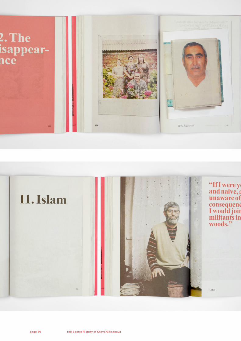
In The Secret History the text is directive: the narrative structure is carried by the text. At one point, a major decision was taken: incorporating the personal history of Khava. Then, the booklet inserted in the year publication was eventually planned as a quire, prior to binding. As the texts in the book consist of two different levels, these images, being reproductions of a small family photo album found in Khava’s home, represent a different level than the documentary photography by Rob. In this way the facsimile is both part of the integral publication, and a separate unit. As I explained earlier, the stratification in the text consists of two kinds of chapters: one written from a historical perspective on the Caucasus, the other focussing on the tragic family history of Khava Gaisanova. And chapter titles are
May we look now at the content of The Sochi Project? So far we talked about logistics and collaboration. Would you please elaborate on the content?
First of all it is a way to map, in journalistic terms, the area around Sochi. And in such a way that is quite distinct from the approach of the official Olympic channels by the International Olympic Committee. The Sochi Project is an effort to tell stories which are not to be told, nor published, by these channels. Secondly, the aim is to create a new audience for these kind of provocative and sensitive stories. And thirdly, at the beginning the focus was on Sochi and the effects on such a resort city of being awarded the Olympic Games 2014. In the course of years, the focal point has shifted and The Sochi Project involves wider political issues and conflicts prominent in the region. This means, not in the first place, personal stories about people deprived of their property, because the government has confiscated their homes in order to built Olympic stadia, but like in the recent publication on the North-Caucasus, sketching a region of change that for hundreds of years has been a thorn in the side of the Russian regime. Furthermore, what makes The Sochi Project so outstanding is its long-term effort to collect multiple stories, in order to obtain different gradations, attempting to determine lighter and darker tones of a story. And of course, this project is aimed at Sochi, but I can think of the same systematic approach and methodology suitable for a different region, in another country.
Finally, could you describe, from your point of view, what the contribution of Arnold and Rob is to The Sochi Project? And to what extent they each have room to manoeuvre in the framework they created for this documentary?
They unite in a project, which is unmistakably their collective project, although, each of them, at different times, has a leading role and must carry the load. Rob is more involved in the visual aspects of The Sochi Project, due to his background. For example we have made sub plots like Sochi Singers (2011). This is an explicit visual document, and the contribution by Arnold is limited, but substantial. While The Secret History of Khava Gaisanova and the North Caucasus (2013) is an in-depth story Arnold wanted to tell regarding this region. In this case he is taking the lead. In fact, all books are the final result of their collective endeavour.
Let’s now focus on the most recent publication, you just mentioned: The Secret History of Khava Gaisanova and the North Caucasus and the authors position on collaboration with you has resulted in, elaborating on problems, solutions and results.
The breeding ground for each new story, for new journalism, is Rob and Arnold travelling together through the region. While travelling, text and images are collected. During this phase,
respectively printed in black, and in red. In fact, the new journalistic epic story versus the family history is represented in the structure of the book. And of course, this is not a fixed format. Rob also took pictures of family members, personages in the street, but the booklet is definitely a jewel devoted to amateur and family photography. And this idea for the insert sprouted from the story development.
The photographs are not entirely full bleeding images.
Using newsprint full bleed on both vertical sides of the pages is not possible. What you see is the rough unfinished edges of the newsprint, literally, the edge of the print roll. I really like that aspect. So you have to check all possibilities taking into account the negative format Rob is using. Images are only full bleed on the upper and lower side of the page. The result is a kind of roughness that suits the project.
And sometimes there is the amount and use of white space on a page. Like page 201, the title for chapter 11: ‘The Islam’.
Chapter number and title in a header, is what you mean. I like that very much, the content of the book gains strength by this kind of ‘unfinished’ page. We had a discussion whether to number the different chapters or not, I was a proponent, because numbering supports the storyline, the sequencing of chapters. If you would open the book and just read ‘The Islam’, it is an odd cry.
I consider the numbered chapters suitable for a historical overview….
Yes, indeed.
The density in black ink is not always equal.
You have to realize the newspaper printer is an enormous machine, stamping away. The print runs of such a machine usually is 20.000 and more. The print run for this publication is peanuts: 1100 copies are printed in 20 minutes! And it delivers standard newsprint quality, with fluctuations inherent to the printing process, including spots. It is a hybrid product: newsprint bound at the bookbinder. And that requires guidance.
For commodity use.
Yes, indeed. That’s it!
Originally published March 28th 2013 on Mirelle Thijsen’s blog ‘–theloggingroad’ (iphorblog.wordpress.com), reprinted here with the kind permission of the author.
page 31 The Sochi Project and its publicationspage 30 The Sochi Project and its publications
Yes, indeed. Like the red cover, showing a portrait of the young and beautiful Khava, but with a haunting look in her eyes. A sign, you could say, indicating the horrifying experiences her family is dealing with. The colour red is representing that life full of misery on the cover and in the quotes. They have the same roughness. This story of Khava Gaisanova is the most terrifying of all the personal histories collected so far in The Sochi Project. People disappeared, others slaughtered. As a graphic designer you’re looking for a framework, a form, justifying these impressive quotes. Like this one on the back cover: “If someone is missing for more then three days, with no sign of life, that sign rarely comes.” P. 36 backside cover The Secret History of Khava Gaisanova and the North Caucasus (2013) These book-technical matters, for example choosing a printing mode, also have to do with financial considerations. Production wise, newsprint suits the nature of the story: it sustains its sobriety. Newsprint in a low-cost, non-archival paper used to print newspapers. And frankly, it makes it possible to print two editions. Now we have two editions for the price of one. Realising a project of this magnitude, you continuously face financial pressure. Just imagine, this book is printed on a huge newspaper press, as big as a gymnasium. A Dutch and English edition, printed side by side, on a gigantic press in the form of a print roll. The illustrations are identical for both editions. And regarding the text, the advantage of newsprint is, the text ink plate, in black, simultaneously substitutes a red ink plate for the quotes. So for many reasons, producing a book this way has been quite appropriate.
Who is choosing the quotes? And who edits the image sequences?
First of all, both Arnold and Rob choose the quotes. Both authors highlight them. While editing the book, I also make suggestions. And text wise, quotes are collected, selected and written down by Arnold.
Meanwhile, you must have a scenario for each calendar year regarding The Sochi Project.
Regarding the Sketchbook series, from the start of the project the intention has been to publish one book a year. In The Sochi Project terminology we speak of the ‘year publication’. The Secret History is in fact the one covering 2012. So this year publication has been launched a little later. The intention refers to the offer made to our silver and gold donators that receive each year a free copy by surface mail, as service on return for their financial contribution. On the contrary, the Sketchbooks have been released much later, in 2011. This idea came about during the years of economic crisis, when financing the yearbooks became more problematic, due to dramatic cuts to art budgets. Grants to art publications are no longer issued. Besides, The Sochi Project maintenance depends in part on crowd funding, not entirely. Donators finance the travels and the story collecting. The publications are subsidised
at Kummer & Herrman, we gain insight into a work-in-progress, the nature of text and image production for a book. In this case, the text, the stories, the chapters, are a guiding principle. Looking at The Sochi Project books published thus far, two publications are the most hybrid books, in terms of being both a reading book and a visual narrative: The Secret History of Khava Gaisanova and its pendant, the publication on Abkhazia: Empty Land, Promised Land, Forbidden Land. The latter also predetermined the outline for The Secret History of Khava Gaisanova; achieving a substantial historical component in the book. Along the way, the meeting with Khava has raised the entire scope of the story to another level. So, on one level you have the history of the North-Caucasus and the bilateral relations with Russia, throughout the centuries. Explaining large-scale historical change. But on another level, on a personal level, the cover story of Khava unravels, and that of her family and her husband who disappeared. The tragic life of the protagonist in this story is symbolic for that of many other families in the North-Caucasus. Meanwhile it is a beautiful parable in itself, finding close kinship with the larger history. We, the Kummer & Herrman team, don’t consider it our duty to guide that process, but we do communicate on the story gradually taking shape, the chance in structure, hence Khava becoming part of the narrative. The next step in the decision-making process is text production by Arnold. We don’t interfere in that. With Rob I discuss the photo editing. It was a challenge for him how to document the history of the Caucasus and how to fit that into the larger picture.
In addition, a narrative, being it a location-based production, by a documentary photographer is definitely contemporary. The protagonists in the pictures are the people living there right now. So the question is how to weave their stories with the historical chapters? For example, there is a chapter on the Islam. How do you depict a religion, generally equated with violence, in a broader social-historical context? Thus it became imperative, deciding in an early stage, which book technical aspects are suitable for the story to be told. In terms of size, binding, printing, colour, etc. In this case, because it is tagged as a reading-book, there are restrictions regarding the size. It has to be portable and handy; a book you read in the train, one that fits in your pocket. The length of the stories and the amount of photographs determents the size of the book. A particular feature of this book I like to mention is, that it is published in both a Dutch and an English edition simultaneously. Thus far, all publications covering The Sochi Project have been published in English, with an initial print run of a thousand to twelve hundred copies. Regarding The Secret History of Khava Gaisanova, the authors worked for the first time together with a publishing House (Pegasus), exclusively for the Dutch edition. This implies the print run has been doubled.
Why?
separately. When Sochi Singers was being produced, mid 2011, we realized we will have difficulty financing the publication. So we had to change course. There are many options. One is recruiting more donators. Finally we decided to launch a new series of booklets, covering smaller topics, intimate stories, which never fitted in the larger context of a yearbook. Initially these were posted on The Sochi Project website, but they deserve to be published. All these booklets of similar size, about A5, are sold for 35.00 EUR each, which is a considerable amount of money. By buying one, you support the project. Up to now we have made three Sketchbooks. The last one is KIEV. They are meant to be lightweight and happen to be very successful.
What is planned, regarding the Sketchbook series?
Probably one or two more Sketchbooks will be launched. One subject, for this series of booklets, we already have worked out, is a giant hotel in Sochi, with an inexpressible name. In an earlier stage of The Sochi Project, Rob has already made photographs of striptease dancers working in the hotel. It’s a building with nine hundred rooms or more, two nightclubs, three restaurants: a world of its own. Built in the Soviet era. Quit a fascinating complex. So one of the ideas is to make a booklet on this hotel, focussing on the architecture as well, mapping the different floors, in order to capture the megalomaniac scale. In regard to the yearbook, which will be published later this year by Aperture, and we’re honoured because of that….
Isn’t that against your principles? All photo books by Rob have been self-published. This is Rob Hornstra in a nutshell.
Yes, a bit of opportunism here! We did have our doubts, eventually, but on the other hand, a final publication certainly needs marking a turning point. It will still be a true The Sochi Project publication, produced by the same team. Meantime it is a retrospective as well, looking back on the past five years and incorporating the integral project. You may find pictures that have been published in The Sochi Project books at an earlier stage. That only counts for a small part. Most of it is new and unpublished material. The aim is to map the area; the title of the final yearbook is An Atlas of War and Tourism. Indeed, this publication is different in nature. Important stories and sub plots from the region will be included. Another intent is to reach a larger audience. Thanks to Aperture a wide distribution and a print run of five thousand copies is possible. With self-publishing I don’t think such high figure print run is feasible. Besides, I think self-publishing is and remains a strong power tool.
So Kummer & Herrman carry out the graphic design, am I right?
Yes, the same team.
One reason is the authors intend to broaden their audience. Secondly, a separate Dutch-language and English-language edition has emerged from a grant offered by the Fonds Bijzondere Journalistieke Projecten (Fund for Exceeding Journalistic Projects). To receive such a grant, is dependent on the condition to produce a Dutch-language publication in cooperation with a publishing house. All these issues are arising, and are influential in shaping a photo book. Everything considered this is the first time we make two editions in two languages. One of the challenges is to find a way to solve the bilingual aspect. Another is to reproduce Rob’s photographs on newsprint. We have had some experience with this printing procedure during The Sochi Project, trying out different possibilities. At the very start we made an introduction pamphlet on newsprint. A first major publication is the multiple use newspaper The Other Side of The Mountains. And last November, at Paris Photo, his photographs were presented at Flatland Gallery on newsprint as well. The technical aspects and aesthetical qualities of Rob Hornstra’s documentary photography are strikingly in contrast to the roughness of news-print. At the same time you might consider this technology-based solution a vehicle, a means for the pictures to transmit the storyline. And because he formalizes new photographic aesthetics, his pictures stand out. Which is a quality per se, but as soon as they are integrated in a publication, there certainly is a type of friction.
Would you please elaborate on the typography in The Secret History? Similar to the one used in On The Other Side of The Mountains. Titles and quotes are in both publications prominent, even monumental I would say. Like the header on the front page of a daily newspaper: bold and penetrating.
Newsprint was chosen for many reasons. This way we captured the journalistic gut feeling of the publication.
Oral history is of major importance throughout the entire Sochi Project, and very present in the form of quotes in the layout.
Yes, and in this case the personal quotes, titles and main text are printed using the serif typeface Times New Roman, a newspaper typeface by excellence. This is the first time we use that typeface for The Sochi Project. And because the text in this recent publication is substantial, we work with a compact framework for column width, and by using the Times it will remain readable. This layout enables the reader to consume the text. It serves its purpose. Still, this book does not have the format for a novel, a non-fiction book. Those are smaller in size.
Quotes are printed in bloody red? It makes them look rough, sober, straightforward and non-artificial. You’re not trying to polish the story.
… from the very start Rob and Arnold had the intention to collaborate together with our office for five years, the full term. Which has been colouring the effect of partnership quality since.
The technical aspects and aesthetical qualities of Rob Hornstra’s documentary photography are strikingly in contrast to the roughness of newsprint. At the same time you might consider this technology-based solution a vehicle, a means for the pictures to transmit the storyline.
page 29 The Sochi Project and its publicationspage 32 The Sochi Project and its publications
The Sochi Project & its publications
Art historian and curator Mirelle Thijssen speaks with Jeroen Kummer about K&H’s pivotal role in The Sochi Project and the latest yearbook ‘The Secret History of Khava Gaisanova and the North Caucasus’.
Each publication is an entity, and not only should we tell Rob’s story, but the story of The Sochi Project as a whole. None of The Sochi Project publications are to be considered classical photo books.
Mirelle Thijsen: Could you explain to me, by and large, what The Sochi Projects entails? You are collaborating from the very start with documentary photographer Rob Hornstra and historian/writer Arnold van Bruggen on this major documentary research project, this epic story.
Jeroen Kummer: What is remarkable about The Sochi Project, and what makes a long-term project like this significant, is its journalistic value. It is both a photo documentary and a journalistic work-in-progress. In the choices we made we took both aspects into account: how to write a narrative history with text and images. The concept of The Sochi Project is outstanding, and as such distinctive from many other documentaries. The decision alone, to start a long-term documentary, and collaboration for a five-year period, and tempting to invoke spin-offs, is unusual. It is remarkable that from the very start Rob and Arnold had the intention to collaborate together with our office, Kummer & Herrman, for five years, the full term. Which has been colouring the effect of partnership quality since.
Why did they come to your office?
There are undoubtedly several reasons. Before starting The Sochi Project we have custom designed several photo books, in particular the publications made for Wassink-Lundgren, like Empty Bottles (2007/2008), which is questioning the phenomenon ‘photo book’. The publication is a clear example of this quest. On one hand the purpose of a photo book is serving the narrative. On the other hand, the way this publication is bound is unusual and it serves at the same time as an exhibition.
Much like On The Other Side of The Mountains?
Yes, that idea is expressed in there, but in quite a different way. These types of straightforward decisions must have ignited the ambition of Rob and Arnold. After a collective meeting, while brainstorming, their decision to work with Kummer & Herrman was made. From that point on the collaboration was unconditional: no probation. This working attitude generates a high energy level among all the participants. Mind you, at the start of the project we were not involved in making publications. We have designed the website and pushed forward the crowd funding system, through web accessibility. In fact, we started out making promotional items.
The idea of crowd funding came from Kummer & Herrman or from the authors?
The idea to raise project finance through crowd funding came from Arnold and Rob. However, the way to implement that and develop multiple platforms, and not in the way crowd funding systems are available now, has been supervised by Kummer & Herrman. As well as developing the language needed to entice an audience.
Will you have carte blanche? In other words, how does Kummer & Herrman play a major role in the representation of the work by Rob Hornstra?
In principle, we are given carte blanche: no restrictions, no preconditions. Although Rob does have a clear image of the way in which his work is to be published. He has a leading role in the process of compiling a book. He pushes the boundaries of his photography, with a view to his work being merged in the integral project, serving the overall story. Publishing his work on newsprint was a logical choice made along the way in order to shape The Sochi Project. Rob has a strong opinion about the purpose and aim of his work. And sometimes it needs a poor reproduction quality to proclaim the message. Pegasus, the publisher, was not beyond any doubts, when it comes to the ideal way of printing a photo book.
But HOW do you tell Rob’s story? Is it different this time, compared to, let’s say, the Sochi Singers, or Empty Land, Promised Land, Forbidden Land. Does it at all relate to the way you work on a scenario per publication?
Each publication is an entity, and not only should we tell Rob’s story, but the story of The Sochi Project as a whole. None of The Sochi Project publications are to be considered classical photo books. They all consist of different components, and contain a variety of histories. In this respect they are comparable in nature. On the other hand, the making of is quite different in each case. There is no fixed format. Regarding the Sochi Singers, Rob was uncertain whether to publish them, because these pictures are of a typological kind. In editing that yearbook, I had an extensive role. Please realize a strong cooperation is required in how to outline a publication. Editing and design are not split tasks; Rob, Arnold, Arthur [Herrman] and / or me are involved. And yes, you could call it a ‘scenario’, in terms of choices that have to be made, but the way the process of book production develops is different each time.
Let’s take The Secret History as a case study: what choices have been made, how did the process unravel?
In The Secret History the text is directive: the narrative structure is carried by the text. At one point, a major decision was taken: incorporating the personal history of Khava. Then, the booklet inserted in the year publication was eventually planned as a quire, prior to binding. As the texts in the book consist of two different levels, these images, being reproductions of a small family photo album found in Khava’s home, represent a different level than the documentary photography by Rob. In this way the facsimile is both part of the integral publication, and a separate unit. As I explained earlier, the stratification in the text consists of two kinds of chapters: one written from a historical perspective on the Caucasus, the other focussing on the tragic family history of Khava Gaisanova. And chapter titles are
May we look now at the content of The Sochi Project? So far we talked about logistics and collaboration. Would you please elaborate on the content?
First of all it is a way to map, in journalistic terms, the area around Sochi. And in such a way that is quite distinct from the approach of the official Olympic channels by the International Olympic Committee. The Sochi Project is an effort to tell stories which are not to be told, nor published, by these channels. Secondly, the aim is to create a new audience for these kind of provocative and sensitive stories. And thirdly, at the beginning the focus was on Sochi and the effects on such a resort city of being awarded the Olympic Games 2014. In the course of years, the focal point has shifted and The Sochi Project involves wider political issues and conflicts prominent in the region. This means, not in the first place, personal stories about people deprived of their property, because the government has confiscated their homes in order to built Olympic stadia, but like in the recent publication on the North-Caucasus, sketching a region of change that for hundreds of years has been a thorn in the side of the Russian regime. Furthermore, what makes The Sochi Project so outstanding is its long-term effort to collect multiple stories, in order to obtain different gradations, attempting to determine lighter and darker tones of a story. And of course, this project is aimed at Sochi, but I can think of the same systematic approach and methodology suitable for a different region, in another country.
Finally, could you describe, from your point of view, what the contribution of Arnold and Rob is to The Sochi Project? And to what extent they each have room to manoeuvre in the framework they created for this documentary?
They unite in a project, which is unmistakably their collective project, although, each of them, at different times, has a leading role and must carry the load. Rob is more involved in the visual aspects of The Sochi Project, due to his background. For example we have made sub plots like Sochi Singers (2011). This is an explicit visual document, and the contribution by Arnold is limited, but substantial. While The Secret History of Khava Gaisanova and the North Caucasus (2013) is an in-depth story Arnold wanted to tell regarding this region. In this case he is taking the lead. In fact, all books are the final result of their collective endeavour.
Let’s now focus on the most recent publication, you just mentioned: The Secret History of Khava Gaisanova and the North Caucasus and the authors position on collaboration with you has resulted in, elaborating on problems, solutions and results.
The breeding ground for each new story, for new journalism, is Rob and Arnold travelling together through the region. While travelling, text and images are collected. During this phase,
respectively printed in black, and in red. In fact, the new journalistic epic story versus the family history is represented in the structure of the book. And of course, this is not a fixed format. Rob also took pictures of family members, personages in the street, but the booklet is definitely a jewel devoted to amateur and family photography. And this idea for the insert sprouted from the story development.
The photographs are not entirely full bleeding images.
Using newsprint full bleed on both vertical sides of the pages is not possible. What you see is the rough unfinished edges of the newsprint, literally, the edge of the print roll. I really like that aspect. So you have to check all possibilities taking into account the negative format Rob is using. Images are only full bleed on the upper and lower side of the page. The result is a kind of roughness that suits the project.
And sometimes there is the amount and use of white space on a page. Like page 201, the title for chapter 11: ‘The Islam’.
Chapter number and title in a header, is what you mean. I like that very much, the content of the book gains strength by this kind of ‘unfinished’ page. We had a discussion whether to number the different chapters or not, I was a proponent, because numbering supports the storyline, the sequencing of chapters. If you would open the book and just read ‘The Islam’, it is an odd cry.
I consider the numbered chapters suitable for a historical overview….
Yes, indeed.
The density in black ink is not always equal.
You have to realize the newspaper printer is an enormous machine, stamping away. The print runs of such a machine usually is 20.000 and more. The print run for this publication is peanuts: 1100 copies are printed in 20 minutes! And it delivers standard newsprint quality, with fluctuations inherent to the printing process, including spots. It is a hybrid product: newsprint bound at the bookbinder. And that requires guidance.
For commodity use.
Yes, indeed. That’s it!
Originally published March 28th 2013 on Mirelle Thijsen’s blog ‘–theloggingroad’ (iphorblog.wordpress.com), reprinted here with the kind permission of the author.
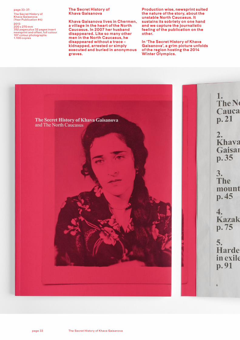
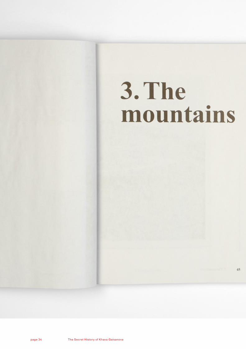
page 33-37:
The Secret History of Khava Gaisanova(Year Publication #4)
2013 200 x 270 mm352 pages plus 32 pages insert newsprint and offset, full colour107 colour photographs 1.100 copies
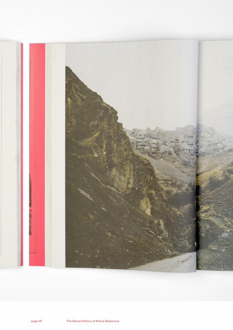
The Secret History of Khava Gaisanova
Khava Gaisanova lives in Chermen, a village in the heart of the North Caucasus. In 2007 her husband disappeared. Like so many other men in the North Caucasus, he disappeared without a trace – kidnapped, arrested or simply executed and buried in anonymous graves.
Production wise, newsprint suited the nature of the story, about the unstable North Caucasus. It sustains its sobriety on one hand and we capture the journalistic feeling of the publication on the other. In ‘The Secret History of Khava Gaisanova’, a grim picture unfolds of the region hosting the 2014 Winter Olympics.
The Secret History of Khava Gaisanovapage 33
The Secret History of Khava Gaisanovapage 34
The Secret History of Khava Gaisanovapage 35
The Secret History of Khava Gaisanovapage 36
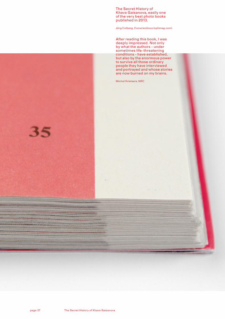
The Secret History of Khava Gaisanova, easily one of the very best photo books published in 2013.
Jörg Colberg, Conscientious (cphmag.com)
After reading this book, I was deeply impressed. Not only by what the authors - under sometimes life-threatening conditions - have established, but also by the enormous power to survive all those ordinary people they have interviewed and portrayed and whose stories are now burned on my brains.
Michel Krielaars, NRC
The Secret History of Khava Gaisanovapage 37
page 39:
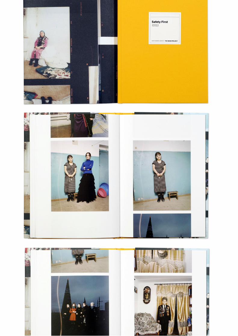
Safety First
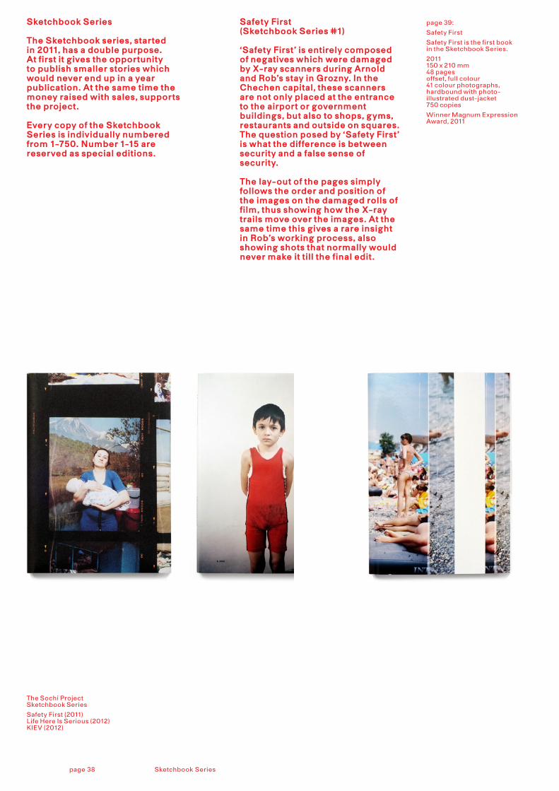
Safety First is the first book in the Sketchbook Series.
2011150 x 210 mm 48 pagesoffset, full colour 41 colour photographs, hardbound with photo-illustrated dust-jacket 750 copies
Winner Magnum Expression Award, 2011
Safety First (Sketchbook Series #1)
‘Safety First’ is entirely composed of negatives which were damaged by X-ray scanners during Arnold and Rob’s stay in Grozny. In the Chechen capital, these scanners are not only placed at the entrance to the airport or government buildings, but also to shops, gyms, restaurants and outside on squares. The question posed by ‘Safety First’ is what the difference is between security and a false sense of security.
The lay-out of the pages simply follows the order and position of the images on the damaged rolls of film, thus showing how the X-ray trails move over the images. At the same time this gives a rare insight in Rob’s working process, also showing shots that normally would never make it till the final edit.
Sketchbook Series
The Sketchbook series, started in 2011, has a double purpose. At first it gives the opportunity to publish smaller stories which would never end up in a year publication. At the same time the money raised with sales, supports the project.
Every copy of the Sketchbook Series is individually numbered from 1-750. Number 1-15 are reserved as special editions.
The Sochi Project Sketchbook Series
Safety First (2011)Life Here Is Serious (2012)KIEV (2012)
Sketchbook Seriespage 38
The Secret History of Khava Gaisanovapage 39
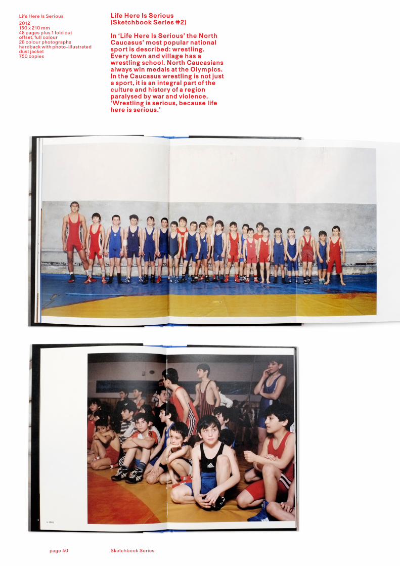
Life Here Is Serious
2012150 x 210 mm48 pages plus 1 fold out offset, full colour28 colour photographshardback with photo-illustrated dust jacket750 copies
Life Here Is Serious (Sketchbook Series #2)
In ‘Life Here Is Serious’ the North Caucasus’ most popular national sport is described: wrestling. Every town and village has a wrestling school. North Caucasians always win medals at the Olympics. In the Caucasus wrestling is not just a sport, it is an integral part of the culture and history of a region paralysed by war and violence. ‘Wrestling is serious, because life here is serious.’
Sketchbook Seriespage 40
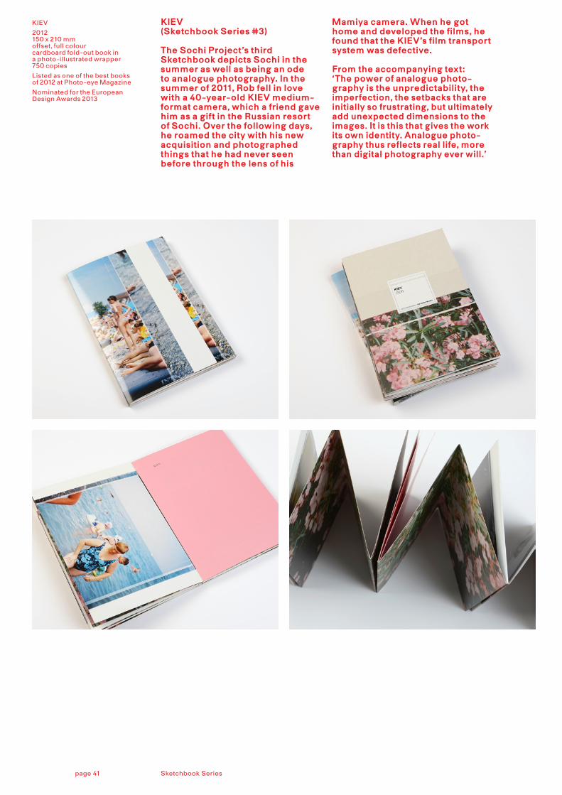
KIEV
2012150 x 210 mm offset, full colourcardboard fold-out book in a photo-illustrated wrapper 750 copies
Listed as one of the best books of 2012 at Photo-eye Magazine
Nominated for the European Design Awards 2013
KIEV (Sketchbook Series #3)
The Sochi Project’s third Sketchbook depicts Sochi in the summer as well as being an ode to analogue photography. In the summer of 2011, Rob fell in love with a 40-year-old KIEV medium-format camera, which a friend gave him as a gift in the Russian resort of Sochi. Over the following days, he roamed the city with his new acquisition and photographed things that he had never seen before through the lens of his
Mamiya camera. When he got home and developed the films, he found that the KIEV’s film transport system was defective.
From the accompanying text: ‘The power of analogue photo-graphy is the unpredictability, the imperfection, the setbacks that are initially so frustrating, but ultimately add unexpected dimensions to the images. It is this that gives the work its own identity. Analogue photo-graphy thus reflects real life, more than digital photography ever will.’
Sketchbook Seriespage 41
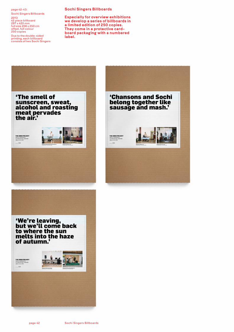
21page 42-43:
Sochi Singers Billboards
2013 42 piece billboard 297 x 420 mmfull size 208 x 250 cmoffset, full colour 250 copies
Due to the double-sided printing, each billboard consists of two Sochi Singers
Sochi Singers Billboards
Especially for overview exhibitions we develop a series of billboards in a limited edition of 250 copies. They come in a protective card-board packaging with a numbered label.
Sochi Singers Billboardspage 42
Sketchbooks Seriespage 43
21
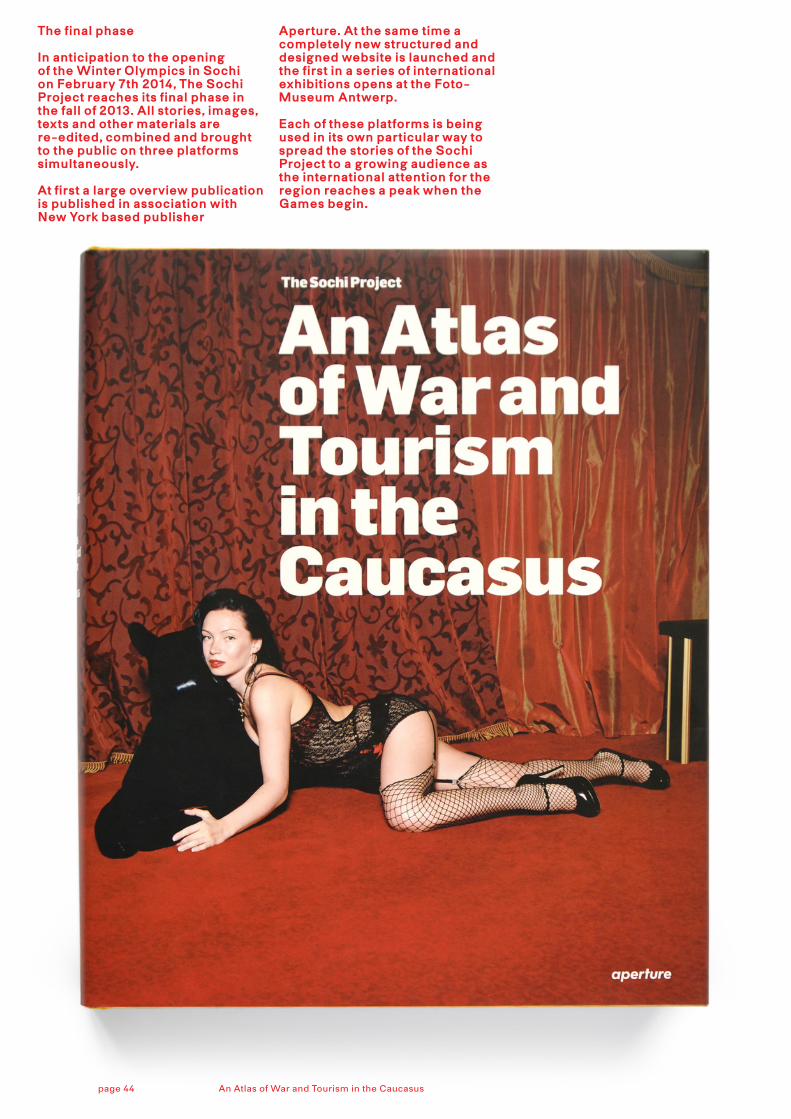
The final phase
In anticipation to the opening of the Winter Olympics in Sochi on February 7th 2014, The Sochi Project reaches its final phase in the fall of 2013. All stories, images, texts and other materials are re-edited, combined and brought to the public on three platforms simultaneously.
At first a large overview publication is published in association with New York based publisher
Aperture. At the same time a completely new structured and designed website is launched and the first in a series of international exhibitions opens at the Foto-Museum Antwerp. Each of these platforms is being used in its own particular way to spread the stories of the Sochi Project to a growing audience as the international attention for the region reaches a peak when the Games begin.
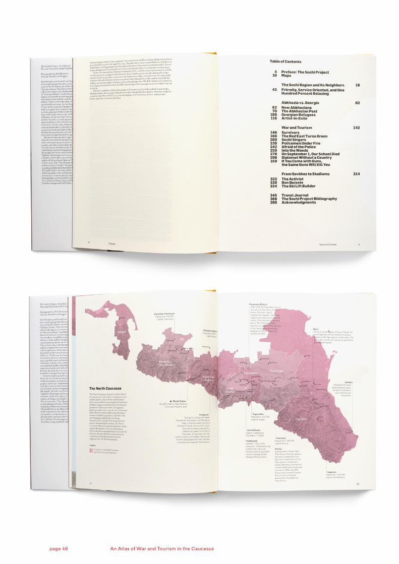
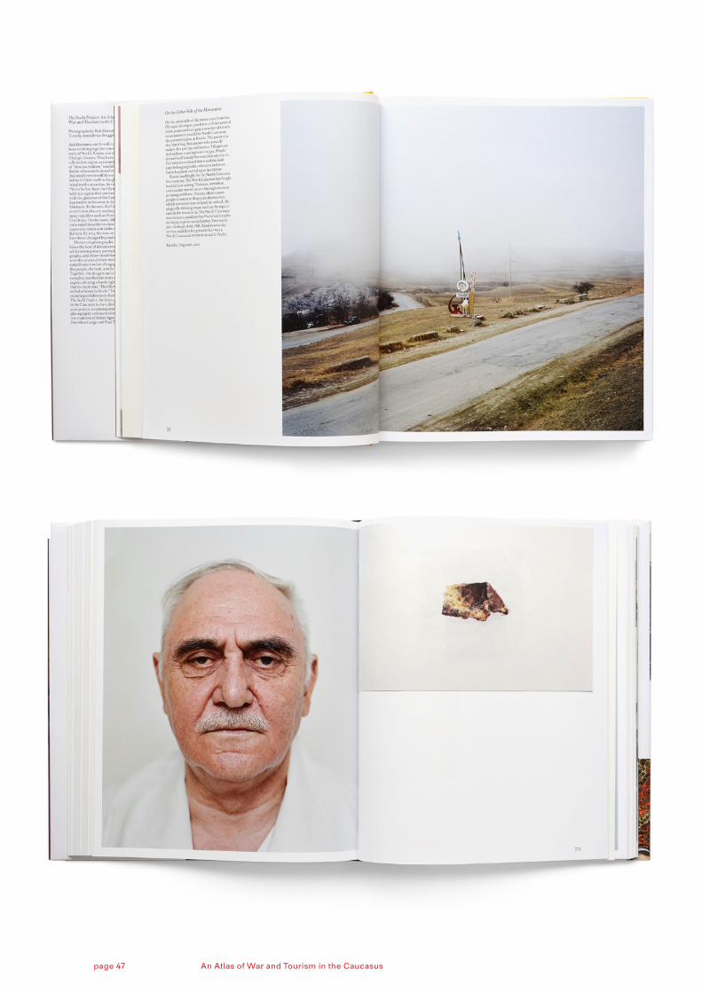
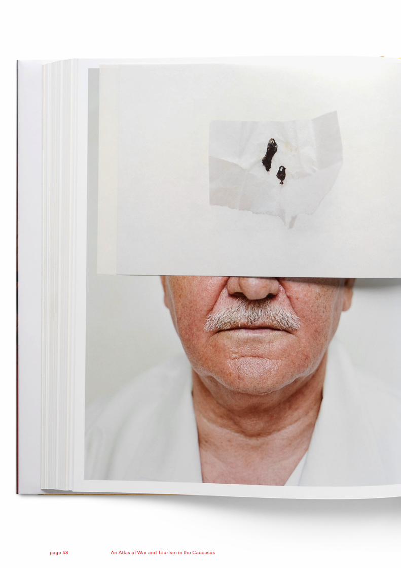
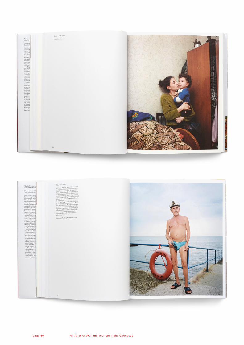
An Atlas of War and Tourism in the Caucasuspage 44
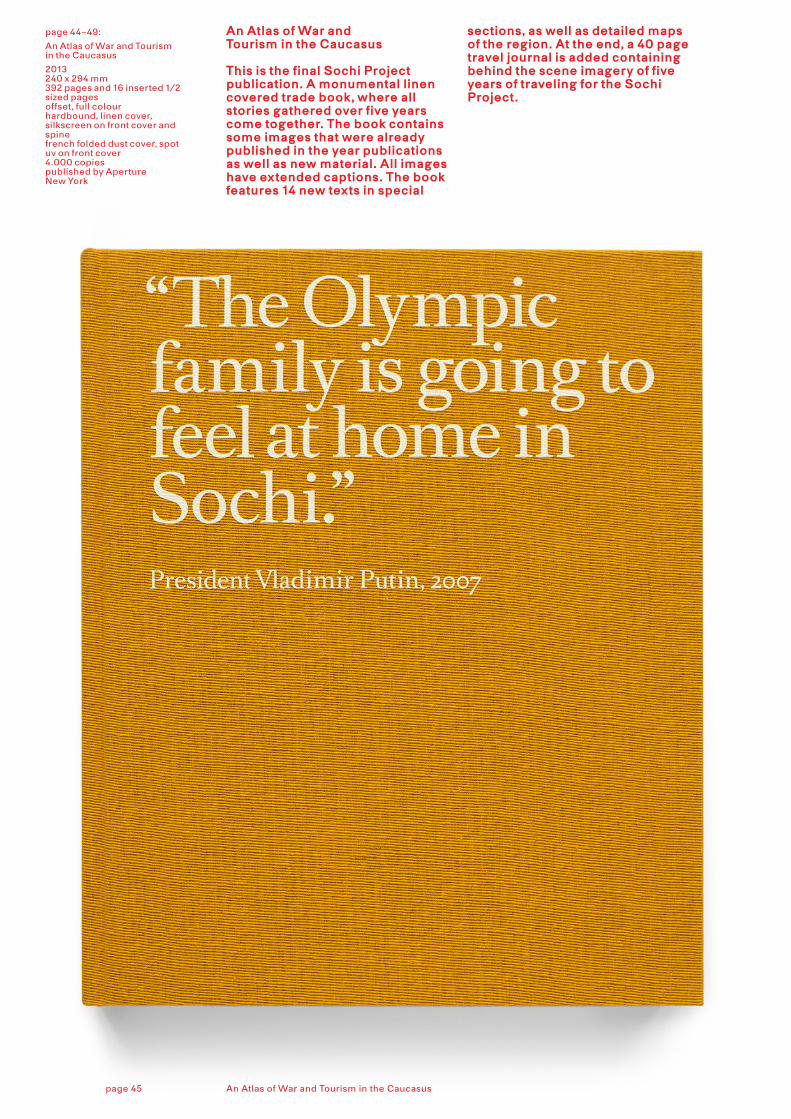
page 44–49:
An Atlas of War and Tourism in the Caucasus
2013240 x 294 mm392 pages and 16 inserted 1/2 sized pagesoffset, full colourhardbound, linen cover, silkscreen on front cover and spinefrench folded dust cover, spot uv on front cover4.000 copies published by Aperture New York
An Atlas of War and Tourism in the Caucasus
This is the final Sochi Project publication. A monumental linen covered trade book, where all stories gathered over five years come together. The book contains some images that were already published in the year publications as well as new material. All images have extended captions. The book features 14 new texts in special
sections, as well as detailed maps of the region. At the end, a 40 page travel journal is added containing behind the scene imagery of five years of traveling for the Sochi Project.
An Atlas of War and Tourism in the Caucasuspage 45
An Atlas of War and Tourism in the Caucasuspage 46
An Atlas of War and Tourism in the Caucasuspage 47
An Atlas of War and Tourism in the Caucasuspage 48
An Atlas of War and Tourism in the Caucasuspage 49
page 50–53:
Website
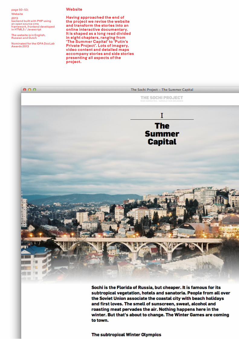
2013 backend built with PHP using an open source cms framework, frontend developed in HTML5 / Javascript The website is in English, Russian and Dutch Nominated for the IDFA DocLab Awards 2013
Website
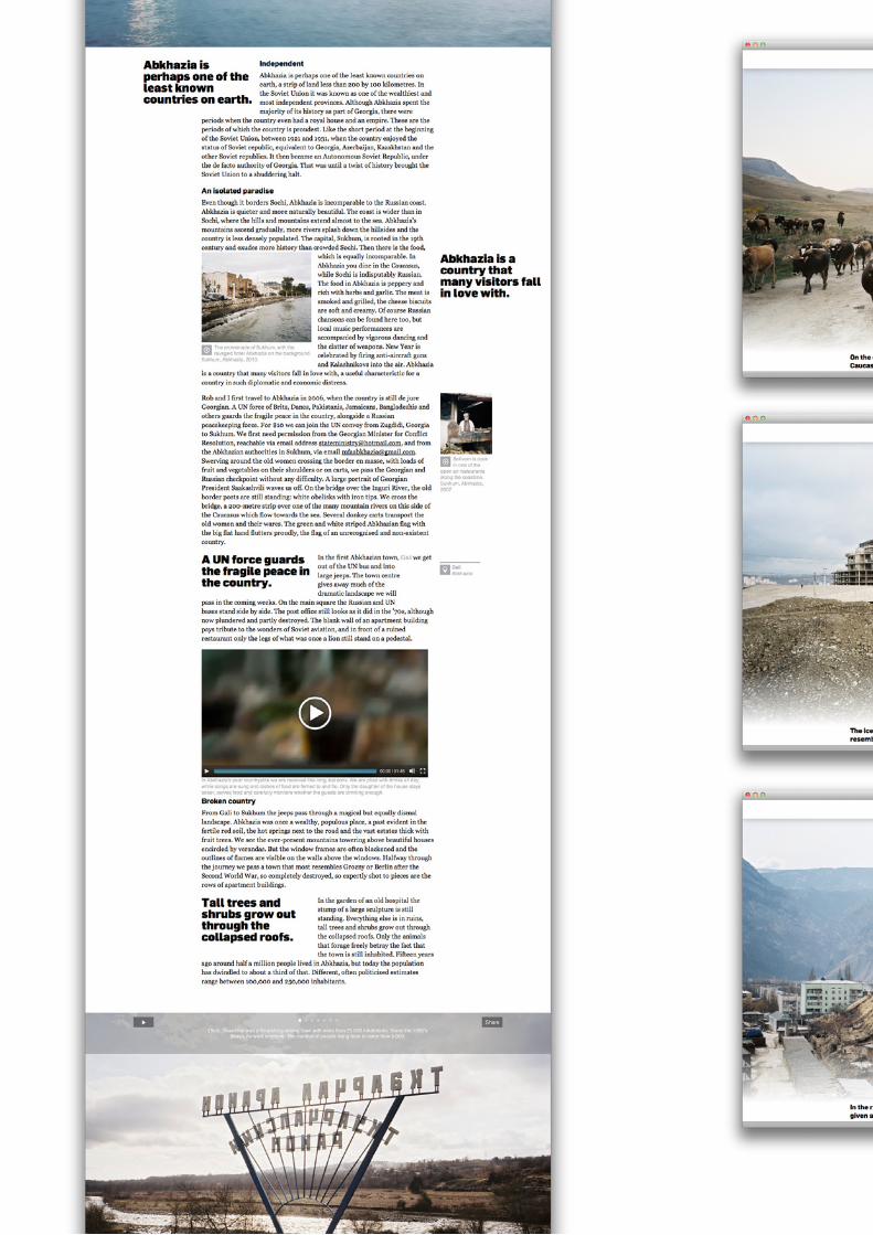
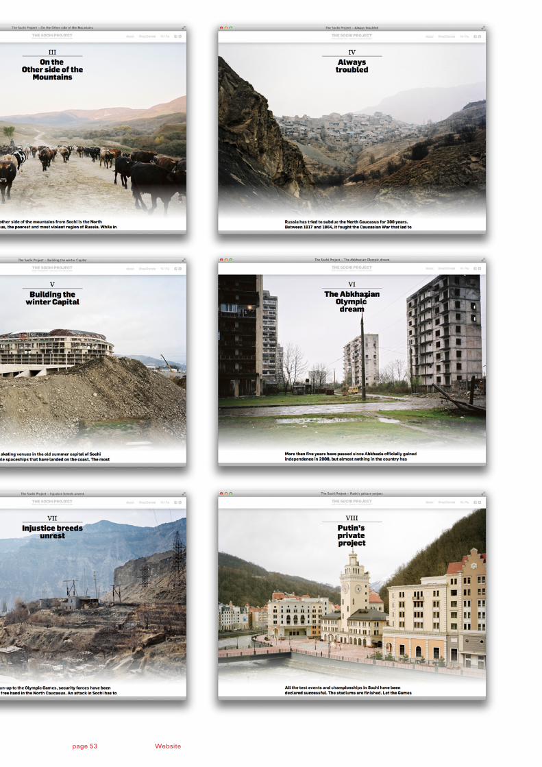
Having approached the end of the project we revise the website and transform the stories into an online interactive documentary. It is shaped as a long read divided in eight chapters, ranging from ‘The Summer Capital’ to ‘Putin’s Private Project’. Lots of imagery, video content and detailed maps accompany stories and side stories presenting all aspects of the project.
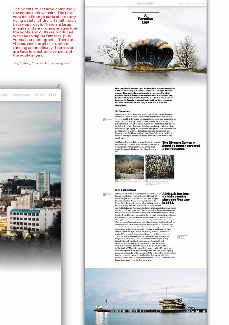
The Sochi Project have completely revamped their website. The new version tells large parts of the story, using a state-of-the-art multimedia heavy approach: There are large images and small ones, images from the books and outtakes produced with cheap digital cameras, plus vernacular photographs. There are videos, some to click on, others running automatically. There even are links to electronic versions of the publications.
Jörg Colberg, Conscientious (cphmag.com)
Websitepage 53
page 54–59:
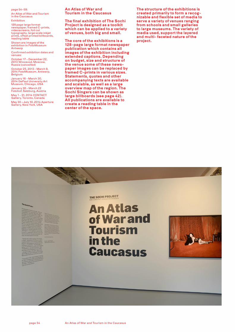
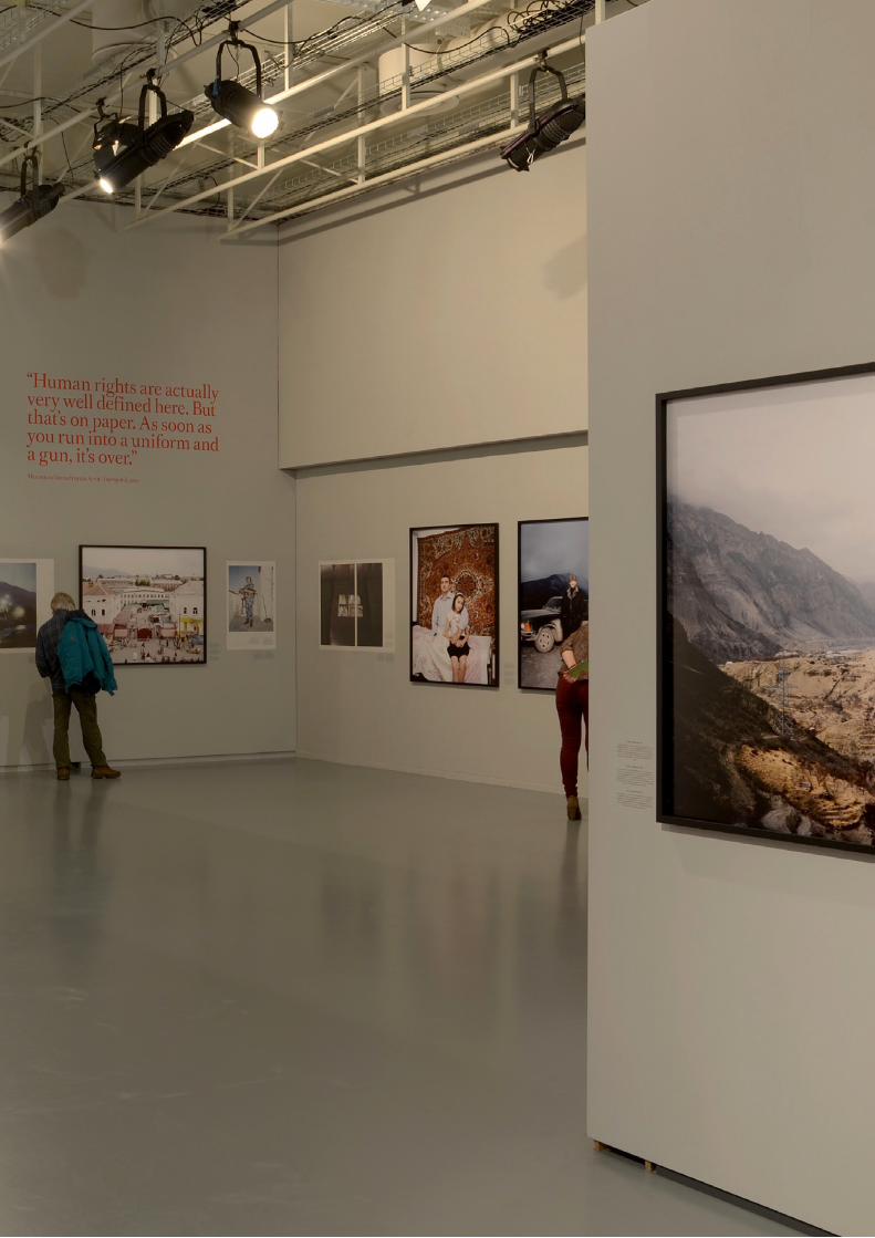
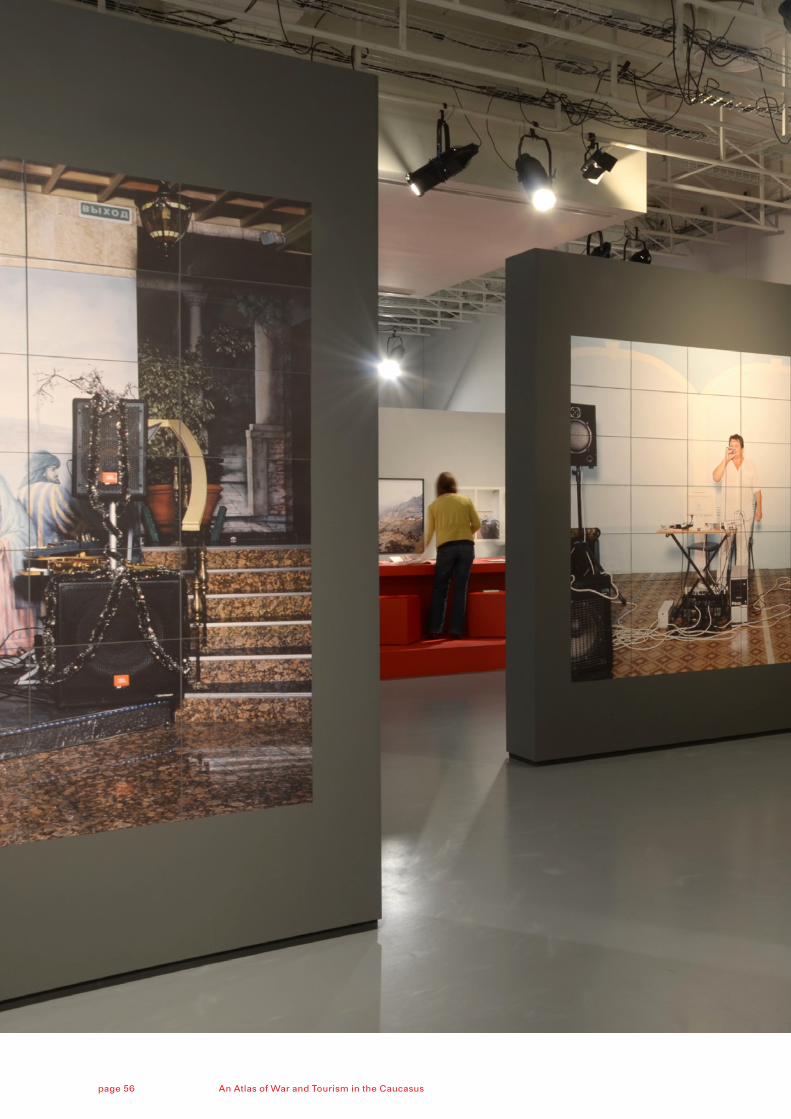
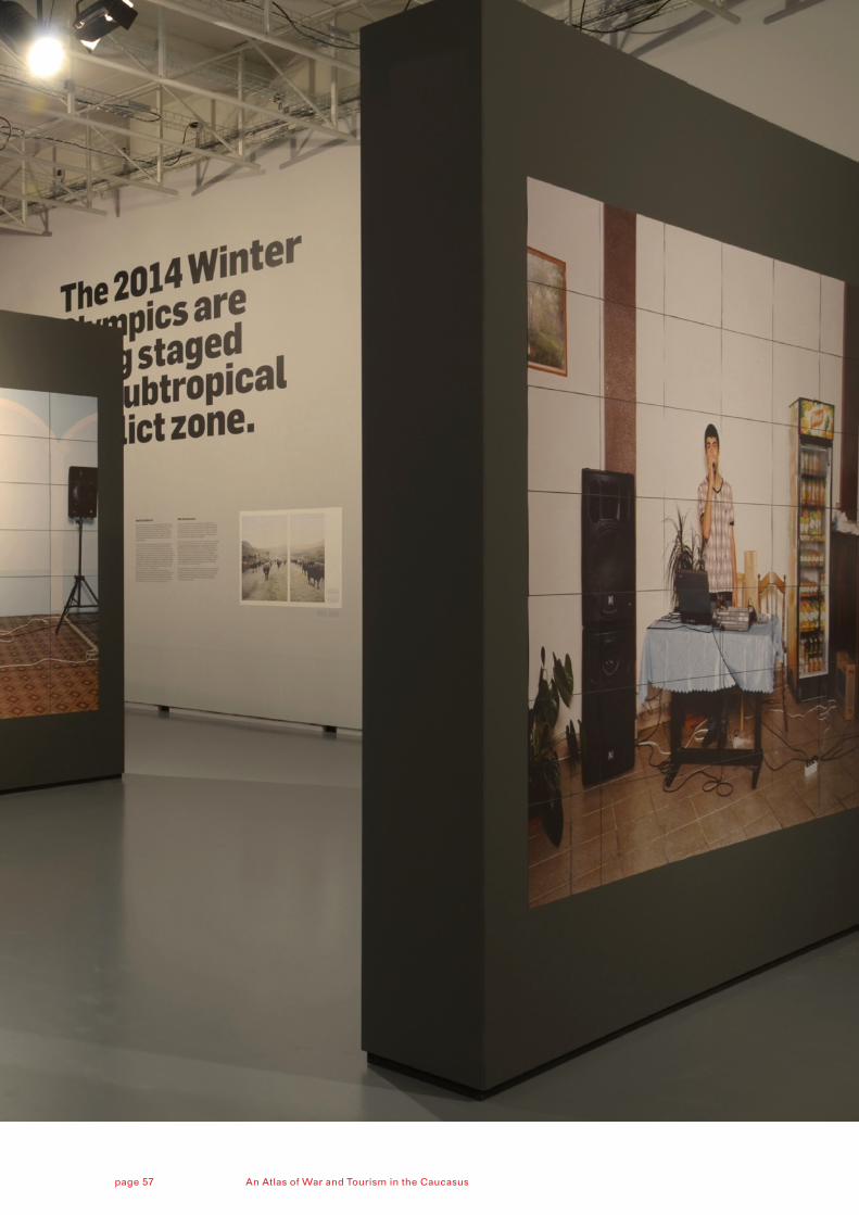
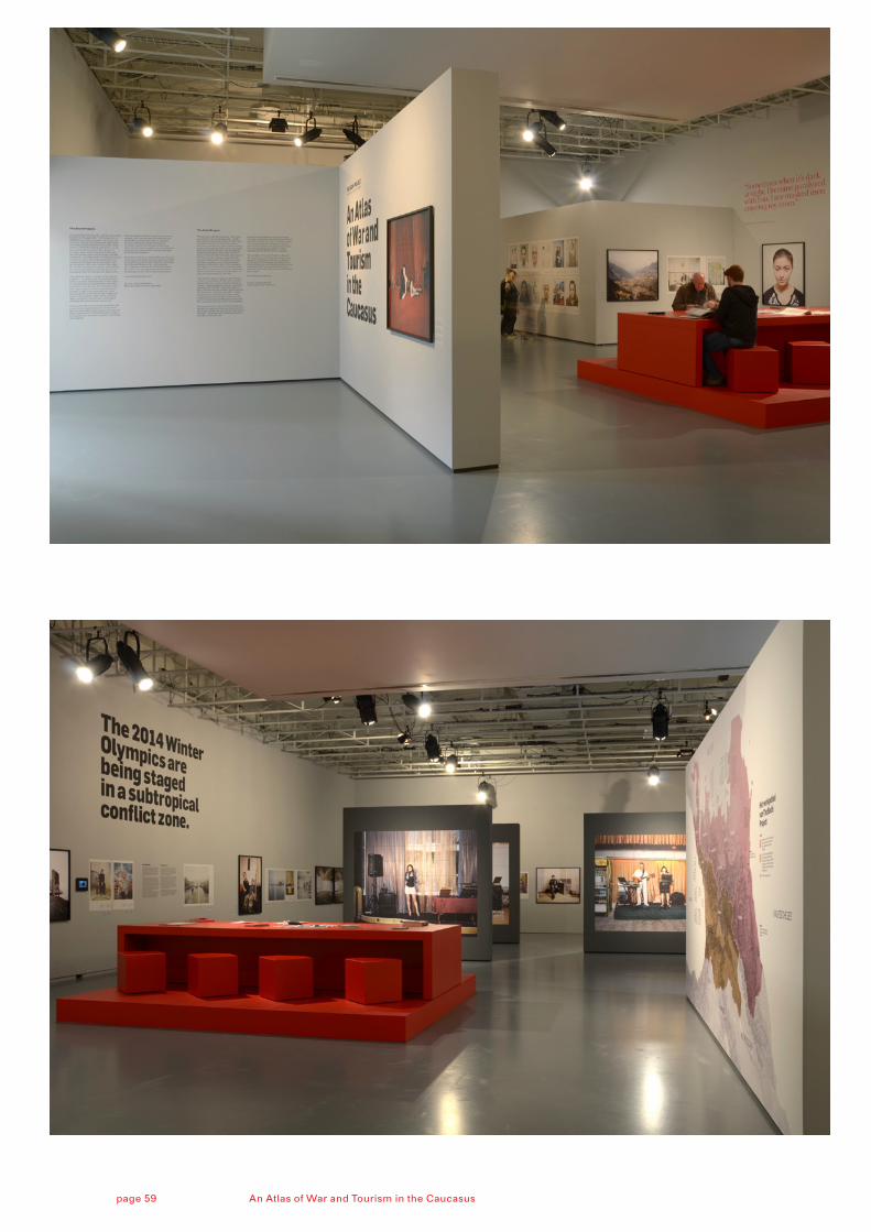
An Atlas of War and Tourism in the Caucasus
Exhibition
128 page large format newspaper, framed C-prints,videoscreens, foil cut typography, large scale inkjet prints, offset printed billboards,reading table
Shown are images of the exhibition in FotoMuseum Antwerp
Confirmed exhibition dates and venues:
October 17 – December 22, 2013 Winzavod, Moscow, Russia (cancelled)
October 25, 2013 – March 9, 2014 FotoMuseum, Antwerp, Belgium
January 16 – March 30, 2014 DePaul University Art Museum, Chicago, USA
January 30 – March 22 Fotohof, Salzburg, Austria
May 1 – 31, 2014 CONTACT Gallery, Toronto, Canada
May 30 – July 10, 2014 Aperture Gallery, New York, USA
An Atlas of War and Tourism in the Caucasus
The final exhibition of The Sochi Project is designed as a toolkit which can be applied to a variety of venues, both big and small.
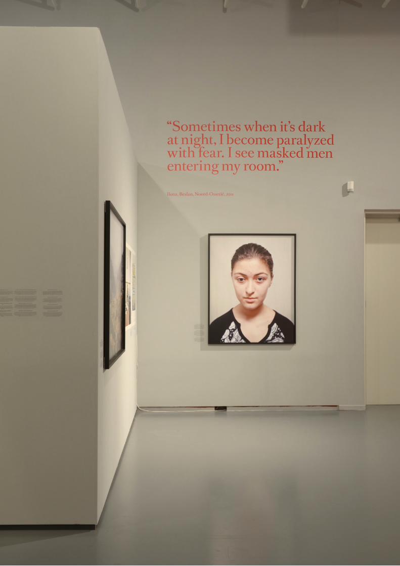
The core of the exhibitions is a 128-page large format newspaper publication which contains all images of the exhibition including extended captions. Depending on budget, size and structure of the venue some of these news-paper images can be replaced by framed C-prints in various sizes. Statements, quotes and other accompanying texts are available and scalable, as well as a large overview map of the region. The Sochi Singers can be shown as large billboards (see page 42). All publications are available to create a reading table in the center of the space.
The structure of the exhibitions is created primarily to form a recog-nizable and flexible set of media to serve a variety of venues ranging from schools and small galleries to large museums. The variety of media used, support the layered and multi- faceted nature of the project.
An Atlas of War and Tourism in the Caucasuspage 54
An Atlas of War and Tourism in the Caucasuspage 56
An Atlas of War and Tourism in the Caucasuspage 57
An Atlas of War and Tourism in the Caucasuspage 59
Rob Hornstra (photographer) and Arnold van Bruggen (journalist and film maker) have been working together since 2007 to tell the story of Sochi, Russia, site of the 2014 Winter Olympic Games. They have returned repeatedly to this region as committed practitioners of ‘slow journalism’, establishing a solid foundation of research on and engagement with this small yet incredibly complicated region before it finds itself in the glare of international media attention.
K&
HK
um
me
r &
He
rrm
an is
an
off
ice
fo
r d
esi
gn
fou
nd
ed
in 1
99
8 b
y Je
roe
n K
um
me
r an
d A
rth
ur
He
rrm
an. S
inc
e th
e s
tart
the
y g
ath
ere
d a
rou
nd
the
m a
sm
all
tea
m o
f cre
ati
ve p
rofe
ssio
nal
s w
ho
sh
are
the
ir lo
ve fo
r to
p-
no
tch
pro
jec
ts fo
r a
wid
e r
ang
e
of i
nte
rna
tio
nal
cli
en
ts.
K
&H
do
no
t lim
it th
eir
wo
rk to
a
spe
cifi
c m
ed
ium
. Th
ey
gre
w
up
wit
h p
rin
t, b
ut a
re li
vin
g in
a
rap
idly
ch
ang
ing
wo
rld
, an
d
pro
jec
ts o
fte
n a
sk fo
r a
co
mb
i-n
ati
on
of m
ed
ia. R
eg
ard
less
of
the
me
ans
or
me
dia
, th
ey
firm
ly
be
lie
ve th
at a
go
od
de
sig
n
sho
uld
be
ba
sed
on
a c
lear
an
d
stro
ng
ide
a, e
xecu
ted
in a
co
n-
sist
en
t man
ne
r. T
he
ae
sth
eti
cs
sho
uld
ne
ver
ge
t in
the
way
of
bri
ng
ing
acr
oss
this
ide
a.
R
ec
en
tly,
Ku
mm
er
& H
err
man
h
as
be
en
incr
ea
sin
gly
invo
lve
d
as
de
sig
ne
rs in
the
fie
ld o
f p
ho
tog
rap
hy.
Th
ey
are
co
l-la
bo
rati
ng
wit
h p
ho
tog
rap
he
rs,
pu
bli
she
rs a
nd
cu
rato
rs, a
nd
ar
e w
ork
ing
on
exh
ibit
ion
s,
visu
al id
en
titi
es,
ap
ps
and
w
eb
site
s.
Ove
r th
e y
ear
s, K
&H
ga
the
red
a
lot o
f in
tern
ati
on
al a
ccl
aim
fo
r th
eir
wo
rk. T
he
y w
ere
n
om
ina
ted
an
d a
war
de
d
nu
me
rou
sly.
At t
he
mo
me
nt,
th
ey
are
co
nsi
de
red
as
on
e o
f th
e le
ad
ing
ag
en
cie
s w
orl
d-
wid
e fo
r p
ho
to b
oo
k d
esi
gn
.
TE
AM
A
rth
ur
He
rrm
an
Jero
en
Ku
mm
er
Sim
on
Bu
rer
Ro
bin
Slu
ijs
Kim
Wa
terl
and
er
(in
tern
) S
ofi
e B
ern
ha
ge
n (i
nte
rn)
SE
LE
CT
ED
CL
IEN
TS
A
no
uk
Kru
ith
of;
A
pe
rtu
re F
ou
nd
ati
on
;A
sso
cia
tio
n o
f Du
tch
Inte
rio
r A
rch
ite
cts
; D
utc
h F
ou
nd
ati
on
for
Lit
era
ture
;E
dit
ion
s X
avie
r B
arra
l; F
oto
Mu
seu
m A
ntw
erp
en
; H
ans
van
de
r M
ee
r;
Ha
tje
Can
tz V
erl
ag
; K
LM
Ro
yal D
utc
h A
irli
ne
s;
Me
lin
da
Gib
son
;N
Ai P
ub
lish
ers
; N
TR
, Du
tch
Pu
bli
c Te
levi
sio
n
Par
ad
ox;
R
ap
ha
ël D
alla
po
rta;
R
oya
l TN
T P
ost
; S
tern
be
rg P
ress
;T
ha
me
s &
Hu
dso
n
Wa
ssin
kLu
nd
gre
n;
Wit
te d
e W
ith
;W
orl
d P
ress
Ph
oto
SE
LE
CT
ED
AW
AR
DS
/
20
13: S
ele
cte
d fo
r ID
FA
Do
cL
ab
wit
h o
nli
ne
do
cum
en
-ta
ry (
Th
e S
och
i Pro
jec
t);
Bro
nze
at E
uro
pe
an D
esi
gn
A
war
d fo
r ‘P
op
py
– Tr
ail
s o
f A
fgh
an H
ero
in’;
Can
on
Pri
ze
for
‘Po
pp
y –
Tra
ils
of A
fgh
an
He
roin
’; N
om
ina
tio
n E
uro
pe
an
De
sig
n A
war
ds
for
‘KIE
V’ (
TS
P).
/ 2
012
: Go
ld a
t De
uts
che
r F
oto
bu
chp
reis
for
‘Po
pp
y –
Tra
ils
of A
fgh
an H
ero
in’;
PD
N
Ph
oto
An
nu
al-B
oo
k C
ate
go
ry
for
‘So
chi S
ing
ers
’ (T
SP
) /
20
11: C
ano
n P
rize
for
‘On
the
O
the
r S
ide
of t
he
Mo
un
tain
s’
(TS
P);
Ph
oto
Eye
’s B
est
Bo
oks
: ‘T
ok
yo T
ok
yo’ (
Wa
ssin
k-L
un
dg
ren
), ‘E
mp
ty la
nd
, P
rom
ise
d la
nd
, Fo
rbid
de
n
lan
d’ (
TS
P) a
nd
‘Pla
yin
g
Bo
rde
rs’ (
An
ou
k K
ruit
ho
f).
NO
FIX
ED
FO
RM
AT
pu
bli
she
d b
y:K
um
me
r & H
err
man
K
rom
me
Nie
uw
eg
rach
t 88
3
512
HM
Utr
ech
t (N
L)
t +3
1 (0
)30
23
4 3
8 2
4
stu
dio
@ku
mm
er-
he
rrm
an.n
l w
ww
.ku
mm
er-
he
rrm
an.n
l
face
bo
ok.
com
/ku
mm
erh
err
man
b
eh
ance
.ne
t/ku
mm
erh
err
man
©2
013
, Ku
mm
er
& H
err
man
A
ll r
igh
ts r
ese
rve
d.
No
par
t of t
his
pu
bli
ca
tio
n m
ay
be
re
pro
du
ce
d in
an
y m
ann
er
wit
ho
ut w
ritt
en
pe
rmis
sio
n.
The Sochi Project was cofounded by Rob Hornstra and Arnold van Bruggen, in association with long-standing collaborators Kummer & Herrman,
‘No Fixed Format’ gives an overview of the most striking expressions of this project. It showcases the large variety of ways to disseminate and present documentaries. It demonstrates what visual storytelling in a collaborative manner is about.


![Your First Input and beyond · Fixed vs free format [2/2] Free format: Free format can be made locallyavailable issuing option FREE (without any parameter), until the option FIXED](https://img.pdfslide.net/doc/110x75/5e9a6daadc840a57bc1bab36/your-first-input-and-beyond-fixed-vs-free-format-22-free-format-free-format.jpg)