Embed Size (px)
Citation preview
september 2010 331
Noam rappaportWHIte COLUmNs
In the paintings of Noam Rappaport, the canvas assumes a character of its own, becoming an ingredient with weight equal to that of any other. In his first solo exhibition at White Columns, the artist gave stretcher bars—usually hidden completely—a similar identity, and did the same for a list of other structural bits and pieces, from nails and screws to wiring. The New York–based artist seems to aim for a kind
of material transparency, through a practice that also constantly directs our attention to the modest and the everyday.
Rappaport’s constructions, then, have a rawness that reveals a sensitivity to the potential of the just-found and the jerry-rigged. But more important, his works derive from the realm of intuition and experimen-tation, in which colors and lines, shapes and textures are juxtaposed and combined with a seeming casualness that can veil a fine-tuned subtlety. Rappaport’s sensibility might be aligned with those of Richard Tuttle, Mitzi Pederson, B. Wurtz (with whom he exhibited last year), and even Georg Herold. But there’s a personal touch to his anti-crafted gambits that prevents them from ever seeming too derivative.
The show opens with Untitled (Gray #2), 2010, a wall-mounted construction featur-ing a tall, rectangular frame with one curved side, to which a sheet of canvas has been attached in such a way that the underlying wooden shape remains clearly visible. The canvas does not fully cover the frame but stops short of its top and bottom, and the
lower third of the material is painted dark gray, the colored area partly outlined in sky blue pencil. Imagine an entry from Tablet: 1948–1973, Ellsworth Kelly’s volume of sketches and collages, writ large; Untitled (Gray #2) (should we call it a painting? A relief? A sculpture?) expresses a similarly effortless and irreducible grace. Just across the room, Light Blue Door Form, 2010, repeats the performance with a slight variation.
In the three paintings Washing Machine, Gibbous, and Borga, all 2010, the action is a little more contained, though all the works revolve around a gently expanded notion of the medium. Here, amor-phous white and dark shapes are brushed onto imperfectly stretched white canvas panels to cover arrangements of wood fragments, the final impression evoking Vincent Fecteau’s way with casually assem-bled forms. The Sleeper, 2009–10, and Three or So, 2009, also make use of a tweaked base—in both cases, a diagonal bisects the painting into darker and lighter regions—adding a variety of gestural dabs and swooshes of color. If these two works seem at points to tip over into genuine awkwardness, Rappaport’s enterprise as a whole remains valid for its acknowledgment that such categories are porous, and that there is still a value in occupying them.
Finally, Collection #5, 2010, relies on a conventional panel format but turns its surface into a repository for a hundred-odd tiny work-shop offcuts and pieces of studio litter. Most are scraps of wood and foil, rubber and cork; every now and then, a metal bolt or plastic bag-tie puts in an appearance. The work’s combination of order (its com-position is a neat grid) and chaos (there is a certain style to the artist’s
selections, but a feeling of randomness, too) mirrors Rappaport’s methodology as a whole. Toying with familiar materials to quietly undermine our expectations of what constitutes a “legitimate” subject or treatment, he arrives at some lively and likable suggestions.
—Michael Wilson
Josephine prydereeNa spaULINgs FINe art
For all the vigilance with which Josephine Pryde’s art guards meaning, it does reveal some of the ways in which its maker is alert to the com-plexities and mundanities of being a working artist. She has written for Texte Zur Kunst about stealing time on the job through day-dreaming. For her show at Richard Telles Fine Art last year, she pre-sented photographs of a toddler and delivered an opening-night performance of Léo Ferré’s “La Vie d’Artiste,” a song whose lyrics relay a biting narrative of an artist’s submission to economic reality. The juxtaposition suggested the complicationsboth in the spheres of finance and individual productionof intermingling la vie d’artiste with parenthood.
Pryde’s exhibitions engender colorful and tentative speculation; for a 2007 show at Berlin’s Galerie Neu, deadpan images of sheep flanked diagrams of yoga positions arranged on Plexiglas with chains. Yoga as enchainment and embodiment of herd mentality? At Reena Spaulings, Pryde showed closely cropped photos of fabric draped on a female mannequin. Again, the work gains resonance through juxtaposition; here the photos were joined by The Mystery of Artistic Work I, II, and III (all works 2010), vertical, hanging assemblages of woven baskets that rotated slowly from the ceiling on a mechanism left over from artist team Claire Fontaine’s recent exhibition. The gallery’s press release archly claimed that the show “turns on the possibility that there is potential for relations involving objects and subjects in art practice to be therapeutic.” The avatar of this possibility is a “creative lady,” though the camera focuses on her clothes “under the apprehen-sion that they could say more to a viewer about such a lady . . . than an image of her person ever could.”
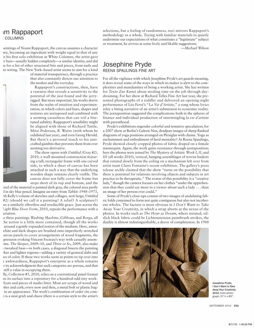
Some of Pryde’s close-ups consist of two images of undulating fab-ric folds conjoined to form not quite contiguous but also not incoher-ent wholes. The facture is most obvious in I Don’t Want to Take Away Your Creativity, in which a strap aborts at the nexus of the photos. In works such as The Hour as Dream, where striated, oil-slick black fabric could be Lichtensteinian paintbrush strokes, the duality is almost indistinguishable, a decoy of completeness. In 1988
Noam Rappaport, Untitled (Gray #2),
2010, color pencil, wax, and oil on canvas, wood,
923⁄4 x 381⁄4 x 1⁄2".
Josephine Pryde, I Don’t Want to Take Away Your Creativity, 2010, color photo-graph, 571⁄2 x 85".
SEPT.revs.indd 331 8/11/10 1:40:53 PM
reviews
332 ArTFOrUM
and 19 . . . , both single images, the creative lady’s skin peers through small perforations in her blouse that spell out the pieces’ respective titles; completing the show’s Gordian knot of logic, the press release trumpets her clothing as “technologically advanced.”
The effect of Pryde’s nonlinearand yet not incoherent juxtapositions here recalls Godard’s 1965 film Alphaville, in which a society of fragmentation and deletion (of vocabulary, of emotion, of joy in the social) creates for its subjects an effective decoy of emotional satiety. Yes, Pryde’s baskets were handmade by the artist and some students—and now they rotate dumbly from the ceiling like the tchotchkes being sold in dollar stores down the street on East Broadway. For all the agency the press text imbues her with, the woman cited as the “guardian” of the ideas, images, and objects has basically been imaged as a model, one who glamorizes another’s ideas, images, objects. What is purportedly therapeutic sure seems pathetic. The fixations of the gaze in these photographs cause the works to read as portraits of mental zone-outs: what the eyes fall and lock on when something else is on the brain. Maybe this is the defiant whisper against a deadening empirical and corporate notion of “productivity” embedded in these images. Or maybe the photos are more like illustrations of a twenty-first-century working condition that hovers somewhere between dismal and self-preservationist: the eye-mind divide of daydreaming.
—Nick Stillman
Molly smithKATe werble GAllery
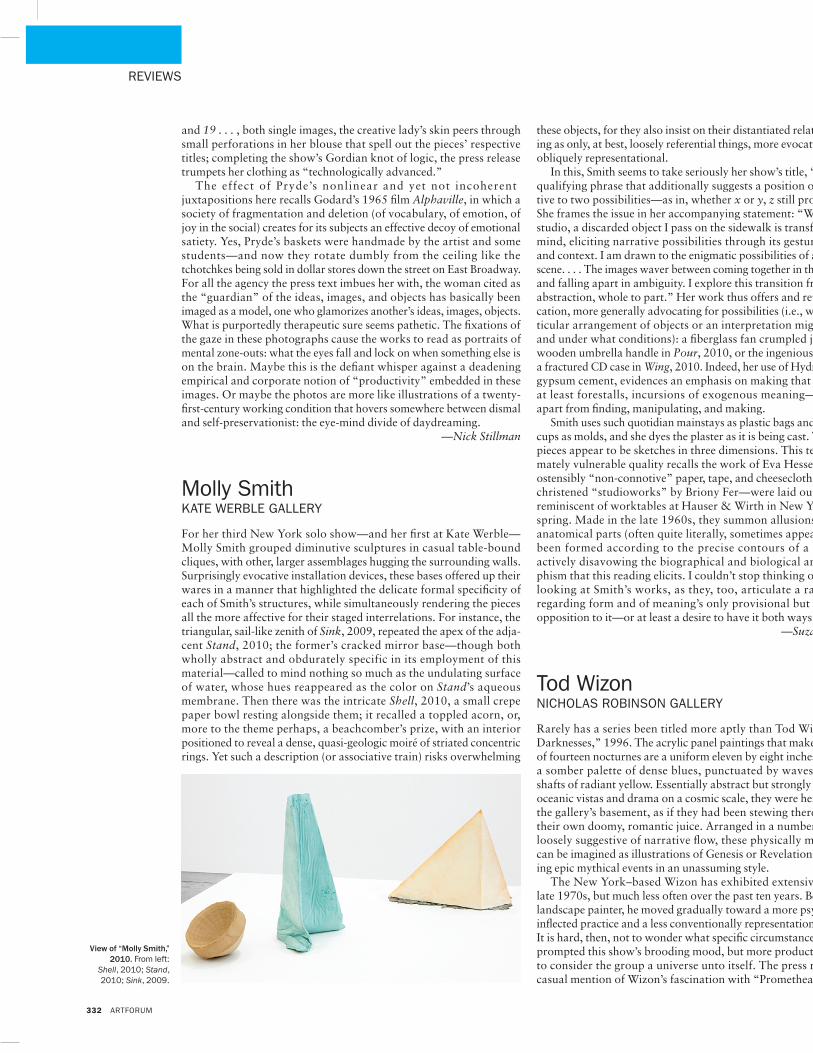
For her third New York solo show—and her first at Kate Werble—Molly Smith grouped diminutive sculptures in casual table-bound cliques, with other, larger assemblages hugging the surrounding walls. Surprisingly evocative installation devices, these bases offered up their wares in a manner that highlighted the delicate formal specificity of each of Smith’s structures, while simultaneously rendering the pieces all the more affective for their staged interrelations. For instance, the triangular, sail-like zenith of Sink, 2009, repeated the apex of the adja-cent Stand, 2010; the former’s cracked mirror base—though both wholly abstract and obdurately specific in its employment of this material—called to mind nothing so much as the undulating surface of water, whose hues reappeared as the color on Stand’s aqueous membrane. Then there was the intricate Shell, 2010, a small crepe paper bowl resting alongside them; it recalled a toppled acorn, or, more to the theme perhaps, a beachcomber’s prize, with an interior positioned to reveal a dense, quasi-geologic moiré of striated concentric rings. Yet such a description (or associative train) risks overwhelming
these objects, for they also insist on their distantiated relation to mean-ing as only, at best, loosely referential things, more evocative than even obliquely representational.
In this, Smith seems to take seriously her show’s title, “Whether,” a qualifying phrase that additionally suggests a position of doubt rela-tive to two possibilities—as in, whether x or y, z still proves unlikely. She frames the issue in her accompanying statement: “Walking to my studio, a discarded object I pass on the sidewalk is transformed in my mind, eliciting narrative possibilities through its gesture, condition and context. I am drawn to the enigmatic possibilities of an accidental scene. . . . The images waver between coming together in their specificity and falling apart in ambiguity. I explore this transition from image to abstraction, whole to part.” Her work thus offers and retracts signifi-cation, more generally advocating for possibilities (i.e., whether a par-ticular arrangement of objects or an interpretation might be viable, and under what conditions): a fiberglass fan crumpled just so over a wooden umbrella handle in Pour, 2010, or the ingenious curvature of a fractured CD case in Wing, 2010. Indeed, her use of Hydrocal, a white gypsum cement, evidences an emphasis on making that displaces, or at least forestalls, incursions of exogenous meaning—or meaning apart from finding, manipulating, and making.
Smith uses such quotidian mainstays as plastic bags and paper coffee cups as molds, and she dyes the plaster as it is being cast. The resulting pieces appear to be sketches in three dimensions. This tentative, ulti-mately vulnerable quality recalls the work of Eva Hesse, whose own ostensibly “non-connotive” paper, tape, and cheesecloth test pieces—christened “studioworks” by Briony Fer—were laid out on surfaces reminiscent of worktables at Hauser & Wirth in New York this past spring. Made in the late 1960s, they summon allusions to skin and anatomical parts (often quite literally, sometimes appearing to have been formed according to the precise contours of a body) while actively disavowing the biographical and biological anthropomor-phism that this reading elicits. I couldn’t stop thinking of them while looking at Smith’s works, as they, too, articulate a rare openness regarding form and of meaning’s only provisional but still possible opposition to it—or at least a desire to have it both ways.
—Suzanne Hudson
Tod wizonNiCHOlAs rObiNsON GAllery
Rarely has a series been titled more aptly than Tod Wizon’s “Little Darknesses,” 1996. The acrylic panel paintings that make up this suite of fourteen nocturnes are a uniform eleven by eight inches and lean on a somber palette of dense blues, punctuated by waves of gray and shafts of radiant yellow. Essentially abstract but strongly suggestive of oceanic vistas and drama on a cosmic scale, they were here secreted in the gallery’s basement, as if they had been stewing there for years in their own doomy, romantic juice. Arranged in a numbered sequence loosely suggestive of narrative flow, these physically modest works can be imagined as illustrations of Genesis or Revelations, document-ing epic mythical events in an unassuming style.
The New York–based Wizon has exhibited extensively since the late 1970s, but much less often over the past ten years. Beginning as a landscape painter, he moved gradually toward a more psychologically inflected practice and a less conventionally representational approach. It is hard, then, not to wonder what specific circumstances might have prompted this show’s brooding mood, but more productive, perhaps, to consider the group a universe unto itself. The press release drops casual mention of Wizon’s fascination with “Promethean creativity”
View of “Molly Smith,” 2010. From left:
Shell, 2010; Stand, 2010; Sink, 2009.
SEPT.revs.indd 332 8/4/10 3:30:36 PM