Embed Size (px)
Citation preview
CYOA: Returning to Retro
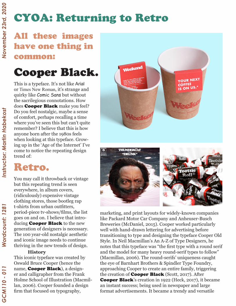
All these images have one thing in common:
Retro.
This is a typeface. It’s not like Arial or Times New Roman, it’s strange and quirky like Comic Sans but without the sacrilegious connotations. How does Cooper Black make you feel? Do you feel nostalgic, maybe a sense of comfort, perhaps recalling a time where you’ve seen this but can’t quite remember? I believe that this is how anyone born after the 1980s feels when looking at this typeface. Grow-ing up in the ‘Age of the Internet’ I’ve come to notice the repeating design trend of:
Cooper Black.
This iconic typeface was created by Oswald Bruce Cooper (hence the name, Cooper Black), a design-er and calligrapher from the Frank Holme School of Illustration (Macmil-lan, 2006). Cooper founded a design firm that focused on typography,
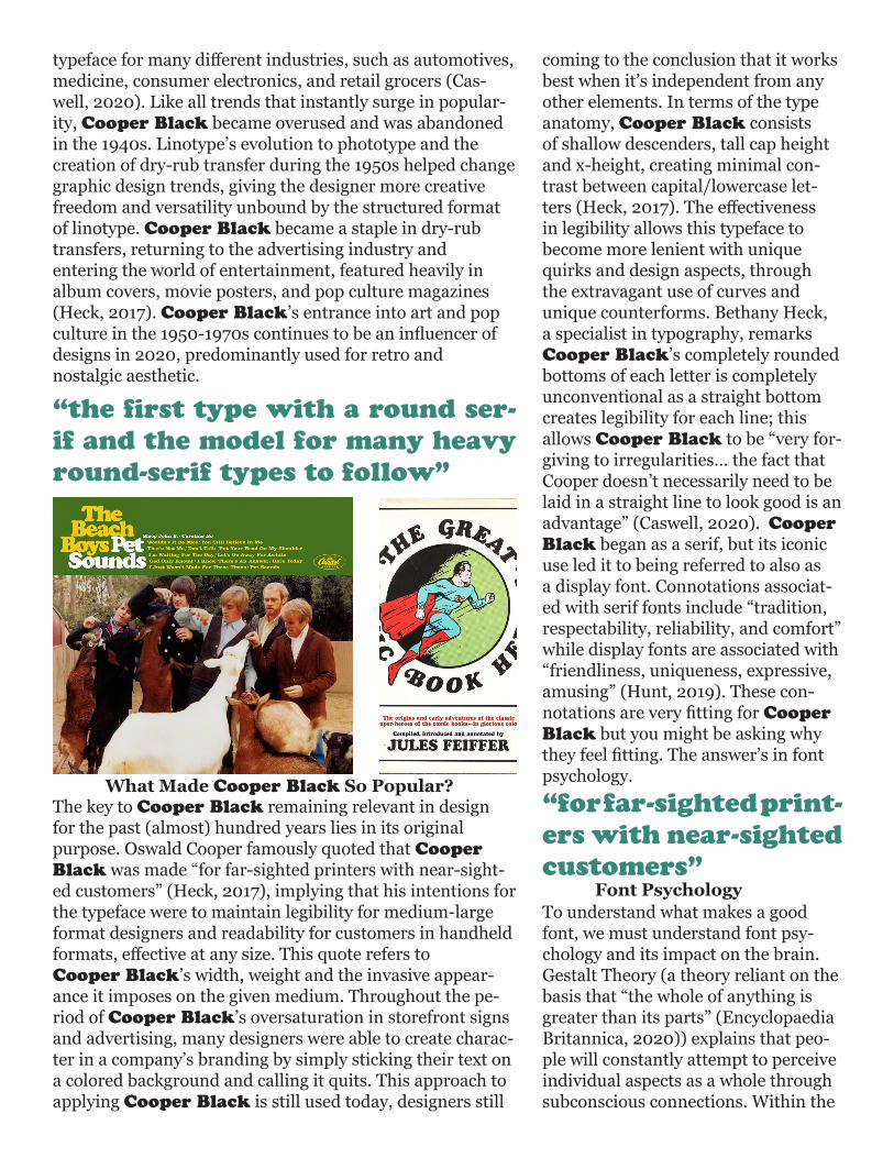
marketing, and print layouts for widely-known companies like Packard Motor Car Company and Anheuser-Busch Breweries (McDaniel, 2015). Cooper worked particularly well with hand-drawn lettering for advertising before transitioning to type and designing the typeface Cooper Old Style. In Neil Macmillan’s An A-Z of Type Designers, he notes that this typeface was “the first type with a round serif and the model for many heavy round-serif types to follow” (Macmillan, 2006). The round-serifs’ uniqueness caught the eye of Barnhart Brothers & Spindler Type Foundry, approaching Cooper to create an entire family, triggering the creation of Cooper Black (Scott, 2017). After Cooper Black’s creation in 1922 (Heck, 2017), it became an instant success; being used in newspaper and large format advertisements. It became a trendy and versatile
You may call it throwback or vintage but this repeating trend is seen everywhere, in album covers, (ridiculously) expensive vintage clothing stores, those bootleg rap t-shirts from urban outfitters, period-piece tv-shows/films, the list goes on and on. I believe that intro-ducing Cooper Black to the new generation of designers is necessary. The 100 year-old nostalgic aesthetic and iconic image needs to continue thriving in the new trends of design. History
GC
M11
0 - 0
11
W
ordc
ount
: 128
1
Inst
ruct
or: M
artin
Hab
ekos
tN
ovem
ber 2
3rd,
202
0
The key to Cooper Black remaining relevant in design for the past (almost) hundred years lies in its original purpose. Oswald Cooper famously quoted that Cooper Black was made “for far-sighted printers with near-sight-ed customers” (Heck, 2017), implying that his intentions for the typeface were to maintain legibility for medium-large format designers and readability for customers in handheld formats, effective at any size. This quote refers to Cooper Black’s width, weight and the invasive appear-ance it imposes on the given medium. Throughout the pe-riod of Cooper Black’s oversaturation in storefront signs and advertising, many designers were able to create charac-ter in a company’s branding by simply sticking their text on a colored background and calling it quits. This approach to applying Cooper Black is still used today, designers still
“the first type with a round ser-if and the model for many heavy round-serif types to follow”
typeface for many different industries, such as automotives, medicine, consumer electronics, and retail grocers (Cas-well, 2020). Like all trends that instantly surge in popular-ity, Cooper Black became overused and was abandoned in the 1940s. Linotype’s evolution to phototype and the creation of dry-rub transfer during the 1950s helped change graphic design trends, giving the designer more creative freedom and versatility unbound by the structured format of linotype. Cooper Black became a staple in dry-rub transfers, returning to the advertising industry and entering the world of entertainment, featured heavily in album covers, movie posters, and pop culture magazines (Heck, 2017). Cooper Black’s entrance into art and pop culture in the 1950-1970s continues to be an influencer of designs in 2020, predominantly used for retro and nostalgic aesthetic.
What Made Cooper Black So Popular?
Font Psychology
coming to the conclusion that it works best when it’s independent from any other elements. In terms of the type anatomy, Cooper Black consists of shallow descenders, tall cap height and x-height, creating minimal con-trast between capital/lowercase let-ters (Heck, 2017). The effectiveness in legibility allows this typeface to become more lenient with unique quirks and design aspects, through the extravagant use of curves and unique counterforms. Bethany Heck, a specialist in typography, remarks Cooper Black’s completely rounded bottoms of each letter is completely unconventional as a straight bottom creates legibility for each line; this allows Cooper Black to be “very for-giving to irregularities… the fact that Cooper doesn’t necessarily need to be laid in a straight line to look good is an advantage” (Caswell, 2020). Cooper Black began as a serif, but its iconic use led it to being referred to also as a display font. Connotations associat-ed with serif fonts include “tradition, respectability, reliability, and comfort” while display fonts are associated with “friendliness, uniqueness, expressive, amusing” (Hunt, 2019). These con-notations are very fitting for Cooper Black but you might be asking why they feel fitting. The answer’s in font psychology.
“for far-sighted print-ers with near-sighted customers”
To understand what makes a good font, we must understand font psy-chology and its impact on the brain. Gestalt Theory (a theory reliant on the basis that “the whole of anything is greater than its parts” (Encyclopaedia Britannica, 2020)) explains that peo-ple will constantly attempt to perceive individual aspects as a whole through subconscious connections. Within the
design industry, this has to be con-stantly considered when applying elements into designs and typefaces, in order to create a cohesive message within the design (Peate, 2018). Es-sentially meaning that every detail matters in a design. For example, a brand and logo design needs to have synergetic shapes, color scheme, fonts and layout to become successful and stand out.
all things, but in typography, this is how emotions towards certain typefaces or fonts are formed. With Cooper Black, I immediately recognized it but was clueless as to where I saw it, why I thought of it as retro and nostalgic, and why I was drawn to it. These questions are often inserted into the audience’s minds, combined with the connections made creates a ‘collective meaning’ that they can’t particularly describe. Through sensory experience of the font over time, the individual’s opinion on a font design becomes more rig-id, evaluating a font based on whether or not the presenta-tion caters to their own opinion. The audience’s judgement of the design can be based on evaluating the font first, then the context or vice versa (Kolenda, 2020). Understanding this is very important for designs as it will act as a guideline when choosing a specific font for designs, the control and influence it has on the design is fundamental if the designer wants to create an effective piece.
Nick Kolenda, an author and re-searcher of subconscious psychology, describes the series of stages that a viewer will experience when looking at a font. The physical features of a font are noticed first, the features mentioned earlier like height, thick-ness, and weight, and other general attributes of the font are needed in order to make subconscious connec-tions through context. When that font is seen in the future, their origi-nal impression of the font is shifted, becoming firmer if the future situation is similar, obscured if the situation is different, and creates new connections (Kolenda, 2020). This is obviously to
The physical attributes and psychology behind Cooper Black caused it to survive almost 100 years in the graphic design industry. Although there was a pe-riod where it was used for low-effort and unsophisticated applications, Cooper Black’s foundations and structure as a typeface reveals its effectiveness in design. Its large cultural impact and history will benefit designers that choose to use it as the connections and familiarity revolving around Cooper Black will draw larger audiences to the design. The use of Cooper Black should be taken advan-tage of during the recent trends of retro and vintage designs, implementing this subtly and correctly will benefit any confi-dent designer’s piece of work.
References ConclusionCaswell, E. (2020, June 18). Why this font is everywhere. Re-trieved November 23, 2020, from https://www.vox.com/vid-eos/21294395/cooper-black-pop-culture
Encyclopaedia Britannica (Ed.). (2020, May 26). Gestalt psychol-ogy. Retrieved November 23, 2020, from https://www.britannica.com/science/Gestalt-psychology
Heck, B. (2017, September 11). Cooper - Designed by Oswald Cooper. Retrieved November 23, 2020, from https://fontreview-journal.com/cooper/
Hunt, T. (2019, October 21). A Pro Designer Shares the Psychol-ogy of Font Choices [Infographic]. Retrieved November 23, 2020, from https://www.crazyegg.com/blog/psychology-of-fonts-info-graphic/
Kolenda, N. (2020). How to Choose the Right Font (According to Science). Retrieved November 23, 2020, from https://www.nick-kolenda.com/font-psychology/
Macmillan, N. (2006). An A-Z of type designers. New Haven: Yale University Press.
McDaniel, M. (2015, June 29). Bertsch & Cooper image col-lection. Retrieved November 23, 2020, from https://www.aaa.si.edu/collections/surveys/chicago/chicago-history-museum/bertsch-cooper-image-collection
Peate, S. (2018, February 09). Font Psychology And Typography Inspiration In Logo Design. Retrieved November 23, 2020, from https://fabrikbrands.com/font-psychology-and-typography-inspi-ration-in-logo-design/
Scott, M. (2017, October 17). Cooper Black - Oswald Bruce Coo-per (1921). Retrieved November 23, 2020, from https://medium.com/fgd1-the-archive/cooper-black-by-oswald-bruce-cooper-d5a3df7e5020vv
About the Author:
Jacob Chan is a GCM student at Ryerson University. He is a first year student with zero Adobe InDesign experience, finished the design of the maga-zine excerpt at roughly 8:37am. He’s learned many things about typography and is quite frankly, excited for Typography 230!


![Magical Girl CYOA Supplementary Combat System v1.8 Order ... · [v1.8] MG CYOA Supplementary Combat System OCFF Expansion P a g e | 2 Rapport The relationship with a Patron is an](https://img.pdfslide.net/doc/110x75/6056da4b71855309e7163aa8/magical-girl-cyoa-supplementary-combat-system-v18-order-v18-mg-cyoa-supplementary.jpg)