Embed Size (px)
Citation preview
PortfolioAshley Caine
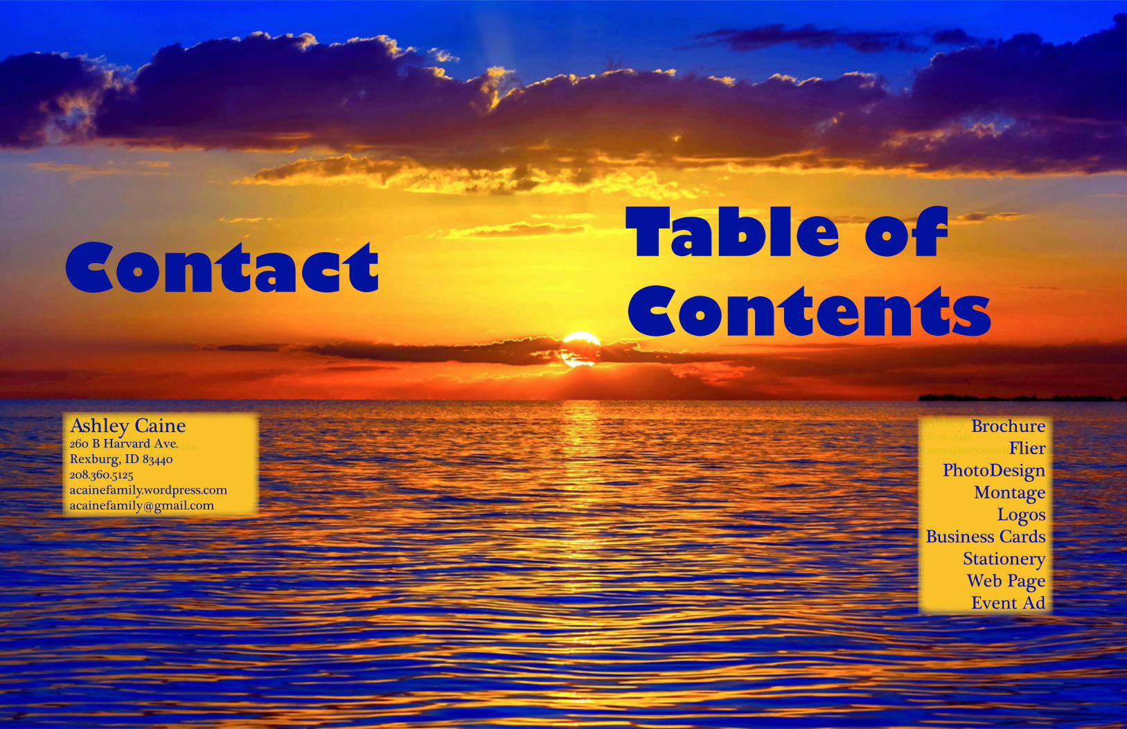
PortfolioAshley CaineContact Table of Contents
Ashley Caine208.360.5125acainefamily.wordpress.comacainefamily@gmail.com
Ashley Caine208.360.5125acainefamily.wordpress.comacainefamily@gmail.com
BrochureFlier
PhotoDesignMontage
LogosBusiness Cards
StationeryWeb PageEvent Ad
Ashley Caine260 B Harvard Ave.Rexburg, ID 83440208.360.5125acainefamily.wordpress.comacainefamily@gmail.com
Ashley [email protected]
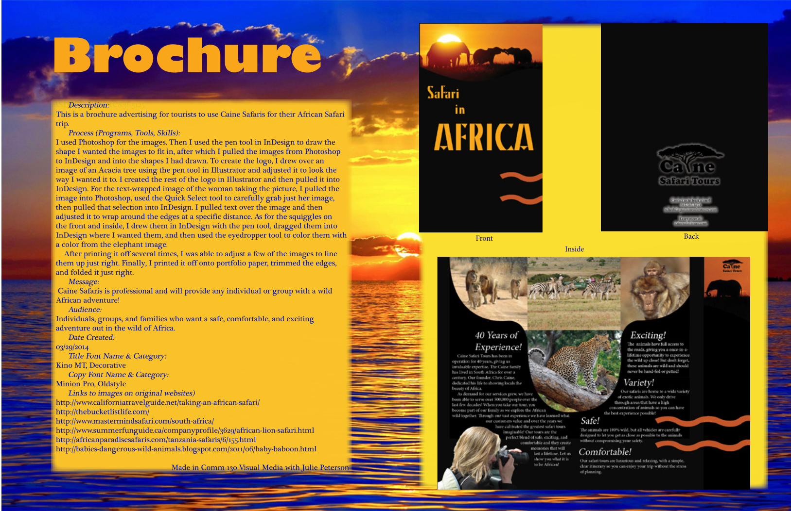
Brochure Description:This is a brochure advertising for tourists to use Caine Safaris for their African Safari trip. Process (Programs, Tools, Skills):I used Photoshop for the images. Then I used the pen tool in InDesign to draw the shape I wanted the images to fit in, after which I pulled the images from Photoshop to InDesign and into the shapes I had drawn. To create the logo, I drew over an image of an Acacia tree using the pen tool in Illustrator and adjusted it to look the way I wanted it to. I created the rest of the logo in Illustrator and then pulled it into InDesign. For the text-wrapped image of the woman taking the picture, I pulled the image into Photoshop, used the Quick Select tool to carefully grab just her image, then pulled that selection into InDesign. I pulled text over the image and then adjusted it to wrap around the edges at a specific distance. As for the squiggles on the front and inside, I drew them in InDesign with the pen tool, dragged them into InDesign where I wanted them, and then used the eyedropper tool to color them with a color from the elephant image. After printing it off several times, I was able to adjust a few of the images to line them up just right. Finally, I printed it off onto portfolio paper, trimmed the edges, and folded it just right. Message: Caine Safaris is professional and will provide any individual or group with a wild African adventure! Audience:Individuals, groups, and families who want a safe, comfortable, and exciting adventure out in the wild of Africa. Date Created:03/29/2014 Title Font Name & Category:Kino MT, Decorative Copy Font Name & Category:Minion Pro, Oldstyle Links to images on original websites)http://www.californiatravelguide.net/taking-an-african-safari/http://thebucketlistlife.com/http://www.mastermindsafari.com/south-africa/http://www.summerfunguide.ca/companyprofile/3629/african-lion-safari.htmlhttp://africanparadisesafaris.com/tanzania-safaris/6/155.htmlhttp://babies-dangerous-wild-animals.blogspot.com/2011/06/baby-baboon.html
Made in Comm 130 Visual Media with Julie Peterson
FrontInside
Back
Ashley [email protected]
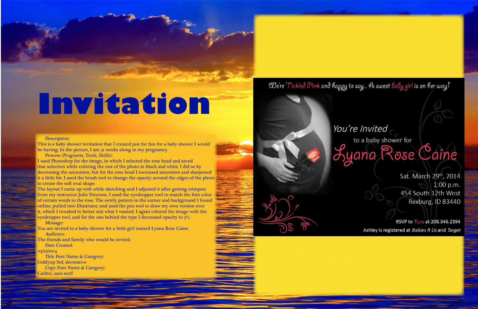
Description:This is a baby shower invitation that I created just for fun for a baby shower I would be having. In the picture, I am 31 weeks along in my pregnancy. Process (Programs, Tools, Skills):I used Photoshop for the image, in which I selected the rose head and saved that selection while coloring the rest of the photo in black and white. I did so by decreasing the saturation, but for the rose head I increased saturation and sharpened it a little bit. I used the brush tool to change the opacity around the edges of the photo to create the soft oval shape. The layout I came up with while sketching and I adjusted it after getting critiques from my instructor Julie Peterson. I used the eyedropper tool to match the font color of certain words to the rose. The swirly pattern in the corner and background I found online, pulled into Illustrator, and used the pen tool to draw my own version over it, which I tweaked to better suit what I wanted. I again colored the image with the eyedropper tool, and for the one behind the type I decreased opacity to 3%. Message:You are invited to a baby shower for a little girl named Lyana Rose Caine. Audience:The friends and family who would be invited. Date Created:03/22/2014 Title Font Name & Category:Giddyup Std, decorative Copy Font Name & Category:Calibri, sans serif
Invitation

Ashley [email protected]
Flier Description:A black-and-white promotional flier designed to raise awareness of a graduate leadership conference. Process:First, I walked around campus and town looking at fliers of all types to get ideas. I made rough sketches of layouts that I liked. That got my creative juices flowing and I drew and re-drew four different sketches that I considered using for the final product. After analyzing who I wanted my target audience to be and the message I was trying to send, I chose a format and spent several days creating and adjusting it in InDesign. I took into account peer critiques and made use of the lab helper before settling on my final product, which I am posting a copy of here. Message:This flier is designed to catch the attention of graduates and soon-to-be graduates who would like a competitive edge to help them succeed once they leave college. Audience:College graduates and soon-to-be college graduates, most likely between 22 and 26 years old. Date Made:01/25/2014 Title Font Name and Category:Arial Black, sans serif Copy Font Name and Category:Bell MT, oldstyle
Made in Comm 130 Visual Media with Julie Peterson
Ashley [email protected]
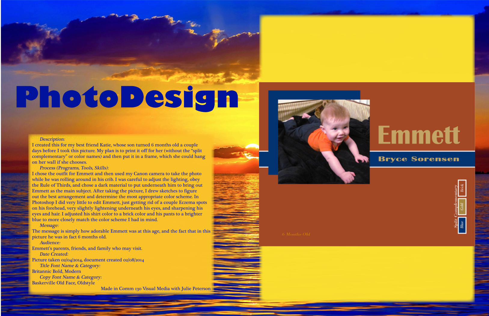
PhotoDesign Description: I created this for my best friend Katie, whose son turned 6 months old a couple days before I took this picture. My plan is to print it off for her (without the “split complementary” or color names) and then put it in a frame, which she could hang on her wall if she chooses. Process (Programs, Tools, Skills): I chose the outfit for Emmett and then used my Canon camera to take the photo while he was rolling around in his crib. I was careful to adjust the lighting, obey the Rule of Thirds, and chose a dark material to put underneath him to bring out Emmett as the main subject. After taking the picture, I drew sketches to figure out the best arrangement and determine the most appropriate color scheme. In Photoshop I did very little to edit Emmett, just getting rid of a couple Eczema spots on his forehead, very slightly lightening underneath his eyes, and sharpening his eyes and hair. I adjusted his shirt color to a brick color and his pants to a brighter blue to more closely match the color scheme I had in mind. Message: The message is simply how adorable Emmett was at this age, and the fact that in this picture he was in fact 6 months old. Audience: Emmett’s parents, friends, and family who may visit. Date Created: Picture taken 02/04/2014, document created 02/08/2014 Title Font Name & Category: Britannic Bold, Modern Copy Font Name & Category: Baskerville Old Face, Oldstyle
Made in Comm 130 Visual Media with Julie Peterson

Ashley [email protected]
Montage Description: This is an inspirational montage about Mandela and what he overcame before he became President of South Africa. The background is a black-and-white picture of the prison cell he was held in for 17 years, the quote is from him, and this headshot of him was taken while he was visiting this cell after he became President.Process (Programs, Tools, Skills): I used Photoshop to put this together. I first inserted the image of the cell, which I cropped to 11x8.5 inches. In another window, I took the head shot of Mandela and adjusted the background color so it wasn’t such a harsh green. I then pulled in the head shot, sharpened his eyes, and brushed the hard edges away with the brush at 100% opacity. I changed the opacity of the brush to 15-25% (depending on the area) to delicately blend his image with the background. Because the background was not merging very well with the head shot, I changed the background to be black-and-white. Finally, I added the text, making Mandela’s name smaller to add contrast and tilting it to align it with the cell bars. Message: That prisons of all kinds can be broken out of and that anything can be accomplished. Simply put, this is supposed to convey hope. Audience: Everyone, because all of us reach points where we don’t believe we can overcome something or we feel trapped in some way. Date Created: 02/15/2014 Filter / Colorization used and where it was applied: After bringing in Mandela’s headshot, I applied black-and-white colorization to just his hair. Copy Font Name & Category: TempusSansITC, script Sources: http://www.brainyquote.com/quotes/authors/n/nelson_mandela.html#QADTm1UesI3JWW7w.99 http://history8lrm.weebly.com/credits.html , http://www.northcountrypublicradio.org/news/npr/197674511/nelson-mandela-s-prison-adventures
Made in Comm 130 Visual Media with Julie Peterson
Ashley [email protected]
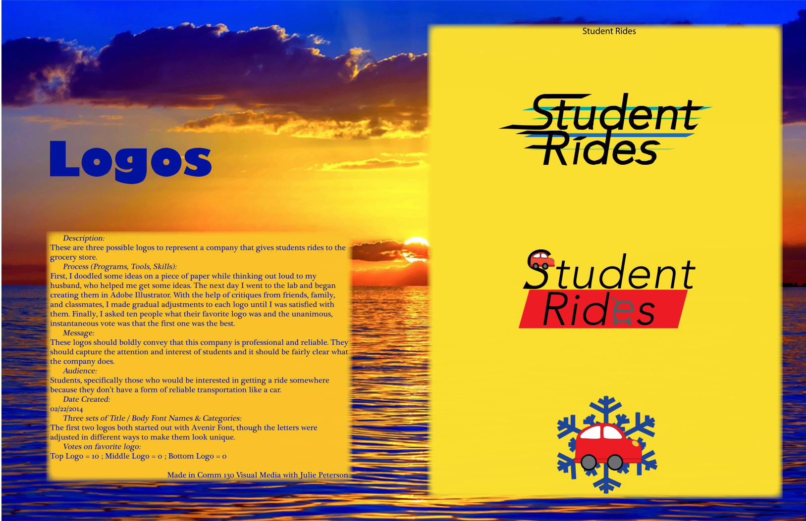
Logos Description: These are three possible logos to represent a company that gives students rides to the grocery store. Process (Programs, Tools, Skills): First, I doodled some ideas on a piece of paper while thinking out loud to my husband, who helped me get some ideas. The next day I went to the lab and began creating them in Adobe Illustrator. With the help of critiques from friends, family, and classmates, I made gradual adjustments to each logo until I was satisfied with them. Finally, I asked ten people what their favorite logo was and the unanimous, instantaneous vote was that the first one was the best. Message: These logos should boldly convey that this company is professional and reliable. They should capture the attention and interest of students and it should be fairly clear what the company does. Audience: Students, specifically those who would be interested in getting a ride somewhere because they don’t have a form of reliable transportation like a car. Date Created: 02/22/2014 Three sets of Title / Body Font Names & Categories: The first two logos both started out with Avenir Font, though the letters were adjusted in different ways to make them look unique. Votes on favorite logo:Top Logo = 10 ; Middle Logo = 0 ; Bottom Logo = 0
Made in Comm 130 Visual Media with Julie Peterson
Student Rides
Ashley [email protected]
Business Cards
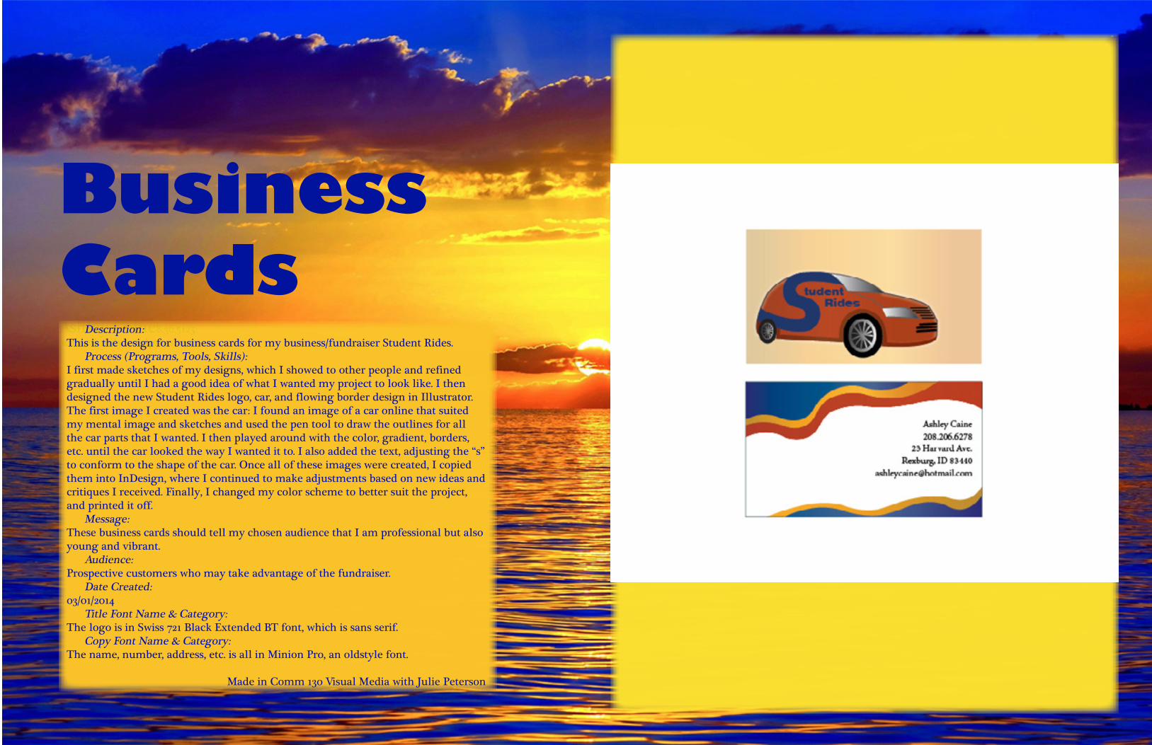
Description:This is the design for business cards for my business/fundraiser Student Rides. Process (Programs, Tools, Skills):I first made sketches of my designs, which I showed to other people and refined gradually until I had a good idea of what I wanted my project to look like. I then designed the new Student Rides logo, car, and flowing border design in Illustrator. The first image I created was the car: I found an image of a car online that suited my mental image and sketches and used the pen tool to draw the outlines for all the car parts that I wanted. I then played around with the color, gradient, borders, etc. until the car looked the way I wanted it to. I also added the text, adjusting the “s” to conform to the shape of the car. Once all of these images were created, I copied them into InDesign, where I continued to make adjustments based on new ideas and critiques I received. Finally, I changed my color scheme to better suit the project, and printed it off. Message:These business cards should tell my chosen audience that I am professional but also young and vibrant. Audience:Prospective customers who may take advantage of the fundraiser. Date Created:03/01/2014 Title Font Name & Category:The logo is in Swiss 721 Black Extended BT font, which is sans serif. Copy Font Name & Category:The name, number, address, etc. is all in Minion Pro, an oldstyle font.
Made in Comm 130 Visual Media with Julie Peterson
StationeryAshley [email protected]
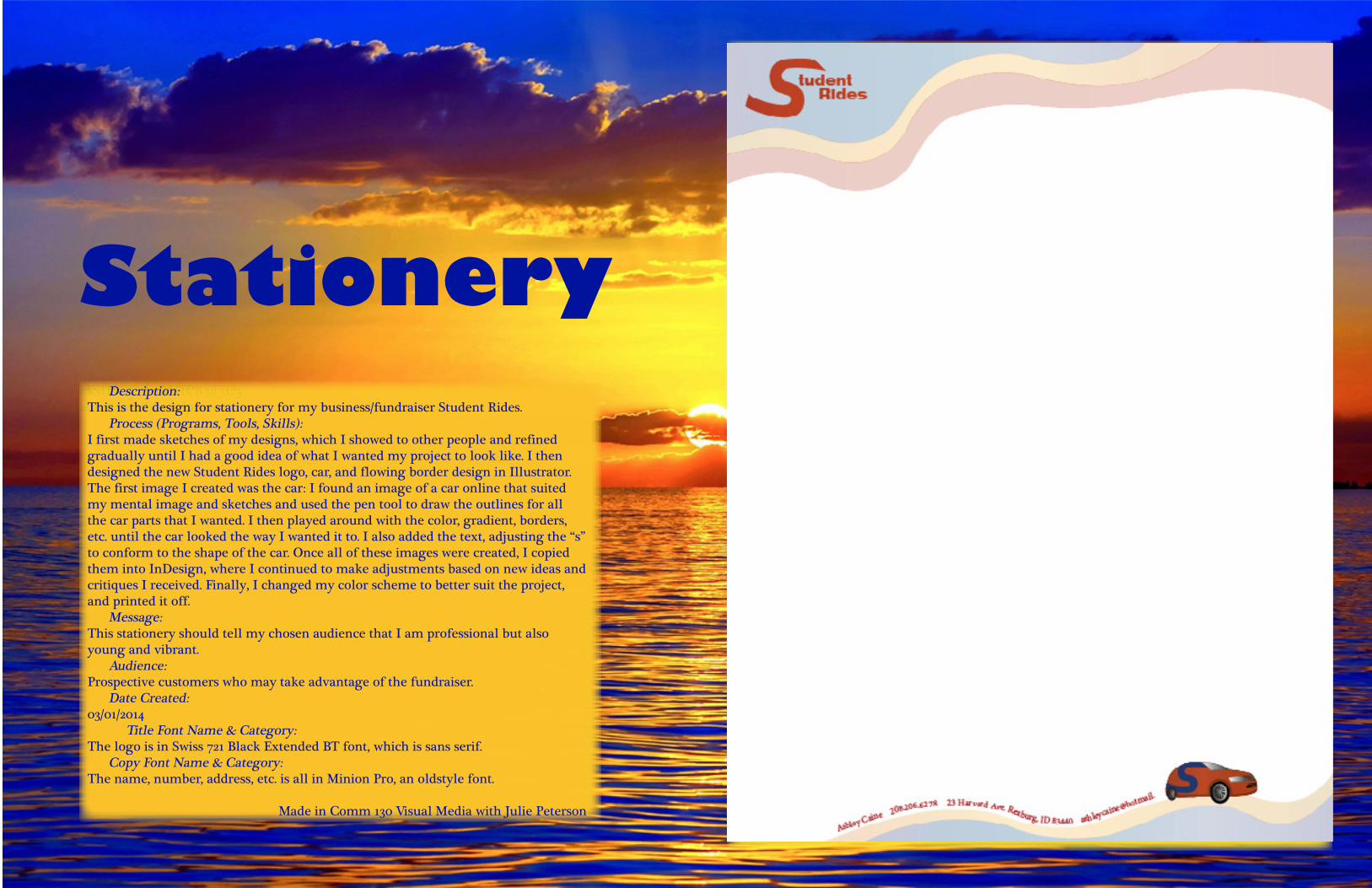
Description:This is the design for stationery for my business/fundraiser Student Rides. Process (Programs, Tools, Skills):I first made sketches of my designs, which I showed to other people and refined gradually until I had a good idea of what I wanted my project to look like. I then designed the new Student Rides logo, car, and flowing border design in Illustrator. The first image I created was the car: I found an image of a car online that suited my mental image and sketches and used the pen tool to draw the outlines for all the car parts that I wanted. I then played around with the color, gradient, borders, etc. until the car looked the way I wanted it to. I also added the text, adjusting the “s” to conform to the shape of the car. Once all of these images were created, I copied them into InDesign, where I continued to make adjustments based on new ideas and critiques I received. Finally, I changed my color scheme to better suit the project, and printed it off. Message:This stationery should tell my chosen audience that I am professional but also young and vibrant. Audience:Prospective customers who may take advantage of the fundraiser. Date Created:03/01/2014 Title Font Name & Category:The logo is in Swiss 721 Black Extended BT font, which is sans serif. Copy Font Name & Category:The name, number, address, etc. is all in Minion Pro, an oldstyle font.
Made in Comm 130 Visual Media with Julie Peterson
Ashley [email protected]
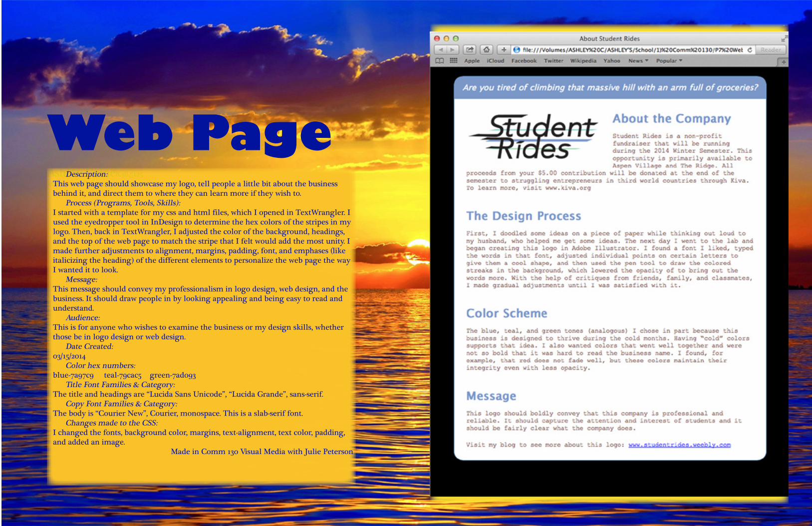
Web Page Description: This web page should showcase my logo, tell people a little bit about the business behind it, and direct them to where they can learn more if they wish to. Process (Programs, Tools, Skills): I started with a template for my css and html files, which I opened in TextWrangler. I used the eyedropper tool in InDesign to determine the hex colors of the stripes in my logo. Then, back in TextWrangler, I adjusted the color of the background, headings, and the top of the web page to match the stripe that I felt would add the most unity. I made further adjustments to alignment, margins, padding, font, and emphases (like italicizing the heading) of the different elements to personalize the web page the way I wanted it to look. Message: This message should convey my professionalism in logo design, web design, and the business. It should draw people in by looking appealing and being easy to read and understand. Audience: This is for anyone who wishes to examine the business or my design skills, whether those be in logo design or web design. Date Created: 03/15/2014 Color hex numbers: blue-7a97c9 teal-79cac5 green-7ad093 Title Font Families & Category: The title and headings are “Lucida Sans Unicode”, “Lucida Grande”, sans-serif. Copy Font Families & Category: The body is “Courier New”, Courier, monospace. This is a slab-serif font. Changes made to the CSS: I changed the fonts, background color, margins, text-alignment, text color, padding, and added an image.
Made in Comm 130 Visual Media with Julie Peterson
Ashley [email protected]
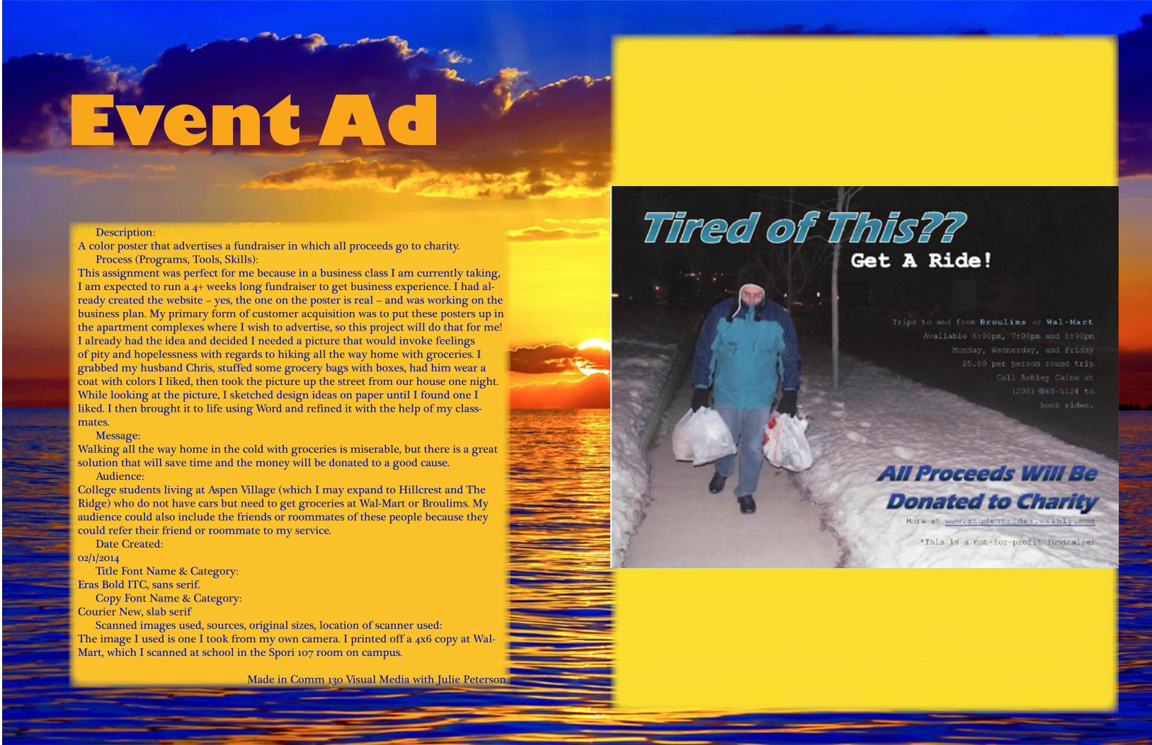
Event Ad Description:A color poster that advertises a fundraiser in which all proceeds go to charity. Process (Programs, Tools, Skills):This assignment was perfect for me because in a business class I am currently taking, I am expected to run a 4+ weeks long fundraiser to get business experience. I had al-ready created the website – yes, the one on the poster is real – and was working on the business plan. My primary form of customer acquisition was to put these posters up in the apartment complexes where I wish to advertise, so this project will do that for me!I already had the idea and decided I needed a picture that would invoke feelings of pity and hopelessness with regards to hiking all the way home with groceries. I grabbed my husband Chris, stuffed some grocery bags with boxes, had him wear a coat with colors I liked, then took the picture up the street from our house one night. While looking at the picture, I sketched design ideas on paper until I found one I liked. I then brought it to life using Word and refined it with the help of my class-mates. Message:Walking all the way home in the cold with groceries is miserable, but there is a great solution that will save time and the money will be donated to a good cause. Audience:College students living at Aspen Village (which I may expand to Hillcrest and The Ridge) who do not have cars but need to get groceries at Wal-Mart or Broulims. My audience could also include the friends or roommates of these people because they could refer their friend or roommate to my service. Date Created:02/1/2014 Title Font Name & Category:Eras Bold ITC, sans serif. Copy Font Name & Category:Courier New, slab serif Scanned images used, sources, original sizes, location of scanner used:The image I used is one I took from my own camera. I printed off a 4x6 copy at Wal-Mart, which I scanned at school in the Spori 107 room on campus.
Made in Comm 130 Visual Media with Julie Peterson