Embed Size (px)
Citation preview
1
Paper SAS734-2017
Designing for Performance – Best Practices for SAS® Visual Analytics Reports
Kerri L. Rivers, SAS Institute Inc., Cary, NC
ABSTRACT
As a SAS® Visual Analytics report designer, your goal is to create effective data visualizations that quickly communicate key information to report readers. But what makes a dashboard or report effective? How do you ensure that key points are understood quickly? One of the most common questions asked about SAS® Visual Analytics is, what are the best practices for designing a report?
Experts like Stephen Few and Edward Tufte have written extensively about successful visual design and data visualization. This paper focuses mainly on a different aspect of visual reports - the speed with which online reports render. In today’s world, instant results are almost always expected. And the faster your report renders, the sooner decisions can be made and actions taken.
Based on proven best practices and existing customer implementations, this paper focuses on server-side performance, client-side performance, and design performance. The end result is a set of design techniques that you can put in to practice immediately to optimize report performance.
INTRODUCTION SAS® Visual Analytics is an easy-to-use, web-based solution that empowers organizations to explore small to large volumes of data very quickly. Using this single application, you design dashboards and reports that present results in an insightful way, enabling everyone to answer critical business questions.
As organizations begin using SAS Visual Analytics, a common question is, what are the best practices for designing a report? As a report designer, you have two primary goals: effectively communicate information in a visual format and communicate information quickly. This paper focuses on the latter – the speed with which online reports render.
Performance in and of itself is a rather large topic. There are several types of performance that can affect how quickly a dashboard or report renders:
Server-side performance
Client-side performance
Design performance
Network performance
Server-side performance is affected by the structure of the data table (or data tables) in the SAS LASR Analytic Server. Client-side performance refers to the number and type of objects to render. Design performance includes things like the number of custom calculations and concatenation of strings. Finally, network performance involves network topics like the distance from the web browser to the server.
As a report designer, you have the most control over the objects that you include in the report and how you arrange them. You might also have some control over the source data table (or data tables). The bulk of this paper focuses on how you can assess and what you can do to optimize server-side, client-side, and design performance. On the other end of the spectrum, you likely have no control over the network performance, so that topic is not covered here.
ENVIRONMENT AND DATA DESCRIPTION
The content in this paper is based on a real world customer implementation of SAS software. SAS Visual Analytics 7.3 is installed in a virtual distributed environment with the following specifications:
2
SAS 9.4 M3
SAS Visual Analytics Server 7.3
SAS LASR Analytic Server (distributed, 16 cores total)
o Red Hat Enterprise Linux Server 6.7
o 4 Intel® Xeon® CPU E5530 @ 2.40GHz
o RAM: 64 GB
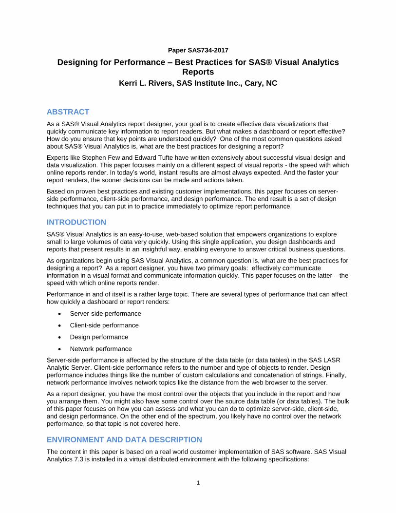
Four different source data tables are tested and discussed throughout the paper, as shown in Table 1. The first data table has 38 character fields and 18 numeric fields, two of which are SAS dates. The second table removes unnecessary columns, which brings the total number of columns down to 43: 27 character and 16 numeric. The third source table is based on a LASR star schema with the unnecessary columns removed. The addition of a fact key adds one column to the star schema view. Finally, the fourth source table is another flat table with additional fields for newly calculated data items. This table has 64 columns: 27 character and 37 numeric. Cardinality of the data is not particularly notable except for one field in all source tables: ZIP code has 42,943 distinct values.
Table Description Size Rows Columns
Total Character Numeric
Table 1: Original flat materialized table 7.93 GB 7,199,504 56 38 18
Table 2: Flat table with no unnecessary columns
6.38 GB 7,199,504 43 27 16
LASR star schema view of Table 2 6.49 GB 7,199,504 44 28 16
Table 4: Flat table with additional columns for calculated items
7.55 37GB
7,199,504 64 27 37
Table 1. Description of Source Tables for Reports in SAS Visual Analytics
All testing is done on a virtual Windows client with the following specifications:
Windows 7 with Service Pack 1
Intel® Xeon® CPU X5650 @ 2.67GHz
6.84 RAM
IE version 11.0.9600.18537IS
At any given point during test, 6% of memory is used in the SAS LASR Analytic Server.
OBTAINING PERFORMANCE METRICS
Analyzing performance can be extensive and there are many different metrics to explore. When report performance is deemed slow, one of the first places to look is at individual query time for objects in the report. This reveals if you have one query that runs really long or if there are multiple queries with long run times.
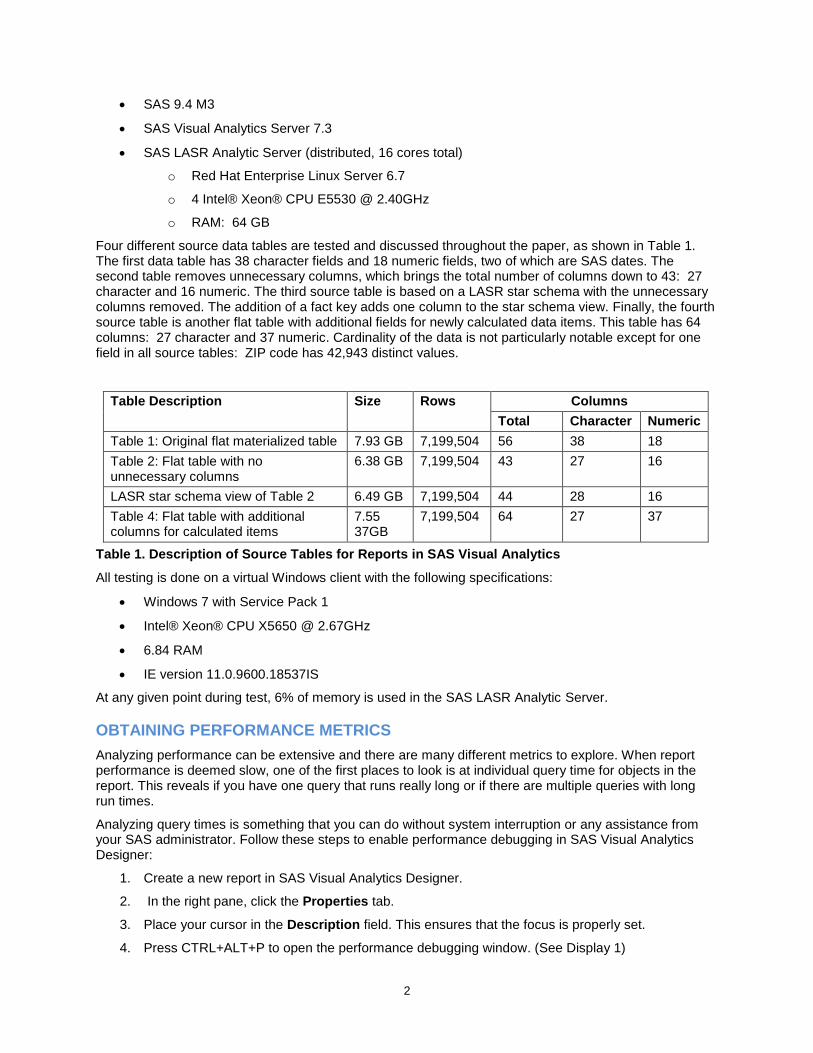
Analyzing query times is something that you can do without system interruption or any assistance from your SAS administrator. Follow these steps to enable performance debugging in SAS Visual Analytics Designer:
1. Create a new report in SAS Visual Analytics Designer.
2. In the right pane, click the Properties tab.
3. Place your cursor in the Description field. This ensures that the focus is properly set.
4. Press CTRL+ALT+P to open the performance debugging window. (See Display 1)
3
5. Keep the debugging window open and open the report that has the performance problem. The performance debugging window updates with information as the report section renders.
6. Once all objects in the section have rendered, you can copy the information and analyze the results.
Display 1. SAS Visual Analytics Performance Debugging Window
The performance debugging window provides several metrics of interest:
Processed BI report data or BIRD (which is the time to process the report XML)
Query time for the <Report Object> (which is the time to perform each SAS LASR Analytic Server action)
Render complete for the <Section Name> (which is the time to render a report section)
If you find you need more information than performance debugging provides, assessing performance through log files might be your next step. Logging is an optional feature in SAS Visual Analytics and is turned off by default in order to conserve disk space. A SAS administrator can enable logging for the LASR Analytic Server, when issues occur that need troubleshooting.
The methods described here are not meant to be an exhaustive list, but rather a place to start. Performance debugging is the method used throughout this paper.
4
REPORT DESCRIPTION
Performance results examined here are from a report created in SAS Visual Analytics. For purposes of this paper, assume the report shows workforce recruitment data for seven different geographical hierarchies that all drill down to a ZIP code. All screenshots are anonymized and fictitious data are displayed.
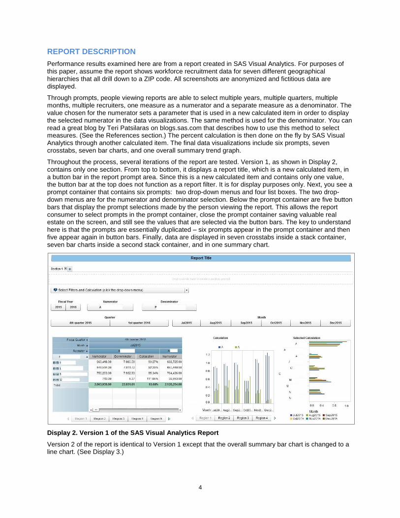
Through prompts, people viewing reports are able to select multiple years, multiple quarters, multiple months, multiple recruiters, one measure as a numerator and a separate measure as a denominator. The value chosen for the numerator sets a parameter that is used in a new calculated item in order to display the selected numerator in the data visualizations. The same method is used for the denominator. You can read a great blog by Teri Patsilaras on blogs.sas.com that describes how to use this method to select measures. (See the References section.) The percent calculation is then done on the fly by SAS Visual Analytics through another calculated item. The final data visualizations include six prompts, seven crosstabs, seven bar charts, and one overall summary trend graph.
Throughout the process, several iterations of the report are tested. Version 1, as shown in Display 2, contains only one section. From top to bottom, it displays a report title, which is a new calculated item, in a button bar in the report prompt area. Since this is a new calculated item and contains only one value, the button bar at the top does not function as a report filter. It is for display purposes only. Next, you see a prompt container that contains six prompts: two drop-down menus and four list boxes. The two drop-down menus are for the numerator and denominator selection. Below the prompt container are five button bars that display the prompt selections made by the person viewing the report. This allows the report consumer to select prompts in the prompt container, close the prompt container saving valuable real estate on the screen, and still see the values that are selected via the button bars. The key to understand here is that the prompts are essentially duplicated – six prompts appear in the prompt container and then five appear again in button bars. Finally, data are displayed in seven crosstabs inside a stack container, seven bar charts inside a second stack container, and in one summary chart.
Display 2. Version 1 of the SAS Visual Analytics Report
Version 2 of the report is identical to Version 1 except that the overall summary bar chart is changed to a line chart. (See Display 3.)

5
Display 3. Version 2 of the SAS Visual Analytics Report
Version 3 of the report, shown in Display 4 removes the button bar that served as the report title in prior versions and removes the button bars in the body of the report. None of those button bars are actually needed to filter the report since the prompts still exist in the prompt container.
Display 4. Version 3 of the SAS Visual Analytics Report
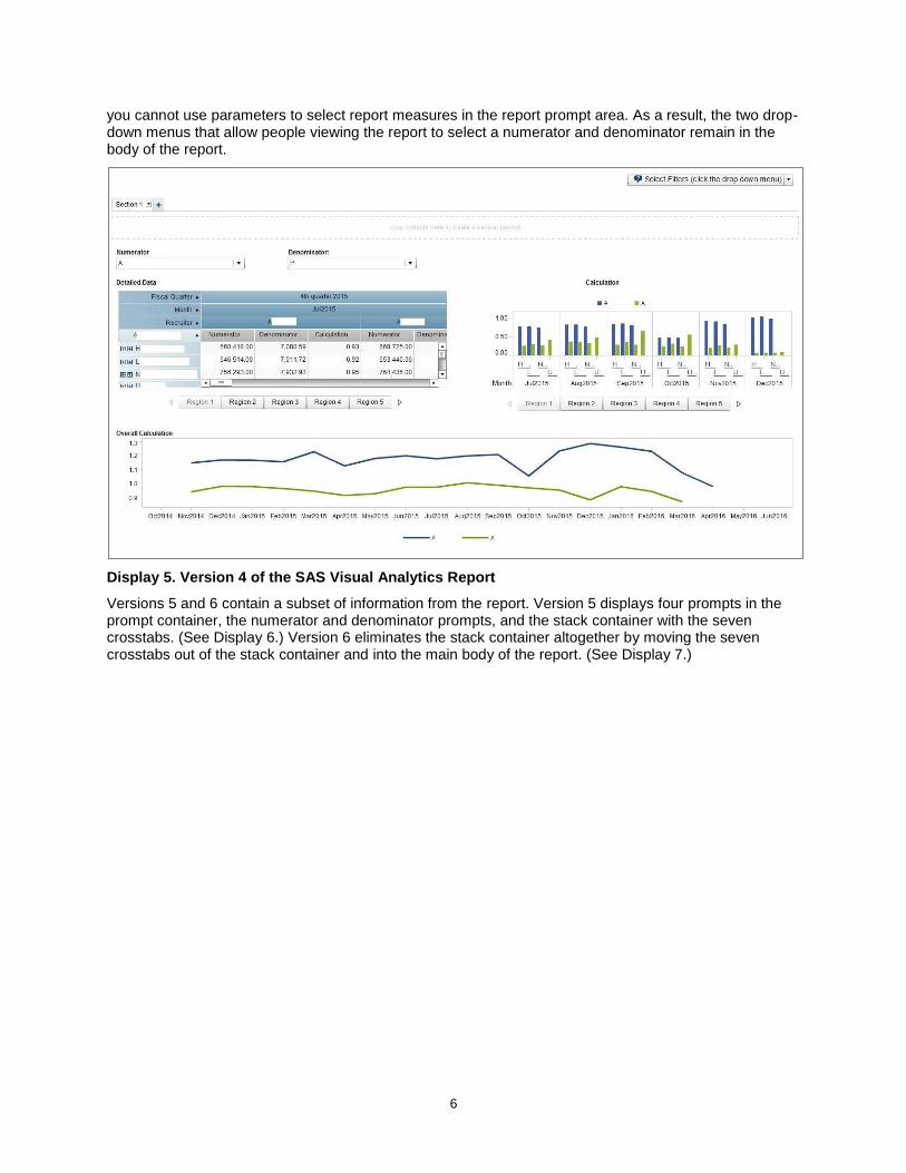
Version 4 of the report is identical to Version 3 in terms of content, but moves the prompt container from the body of the report up to the report prompt area. (See Display 5.) As noted in Teri Patsilaras’ blog post,
6
you cannot use parameters to select report measures in the report prompt area. As a result, the two drop-down menus that allow people viewing the report to select a numerator and denominator remain in the body of the report.
Display 5. Version 4 of the SAS Visual Analytics Report
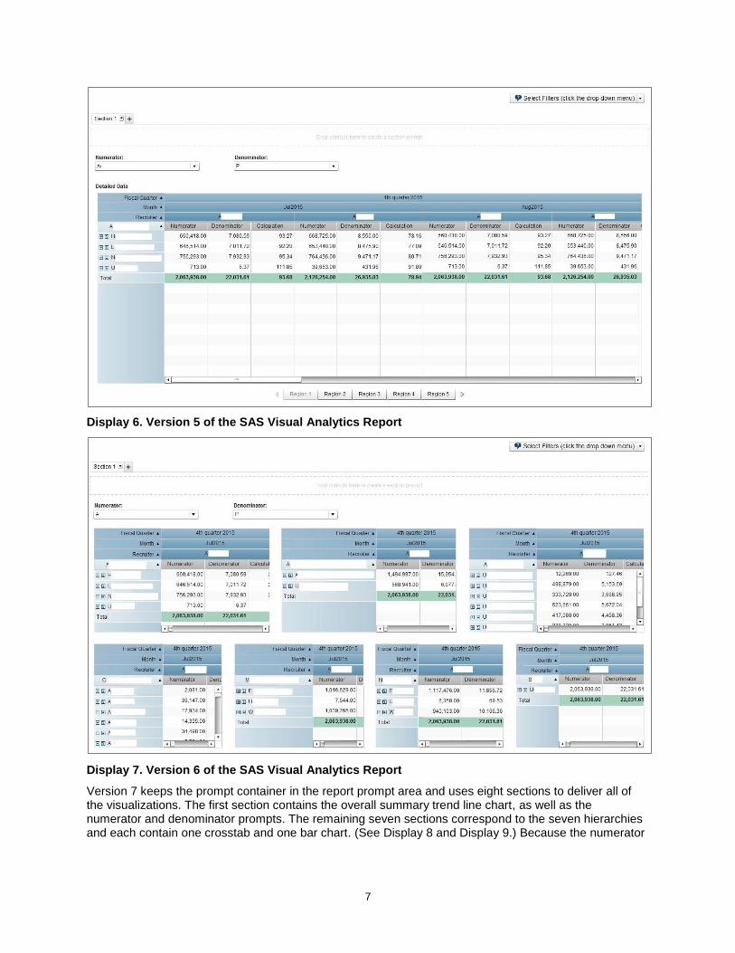
Versions 5 and 6 contain a subset of information from the report. Version 5 displays four prompts in the prompt container, the numerator and denominator prompts, and the stack container with the seven crosstabs. (See Display 6.) Version 6 eliminates the stack container altogether by moving the seven crosstabs out of the stack container and into the main body of the report. (See Display 7.)
7
Display 6. Version 5 of the SAS Visual Analytics Report
Display 7. Version 6 of the SAS Visual Analytics Report
Version 7 keeps the prompt container in the report prompt area and uses eight sections to deliver all of the visualizations. The first section contains the overall summary trend line chart, as well as the numerator and denominator prompts. The remaining seven sections correspond to the seven hierarchies and each contain one crosstab and one bar chart. (See Display 8 and Display 9.) Because the numerator

8
and denominator prompts set parameters, they only need to be set once. In other words, the prompts do not need to be duplicated in each report section.
Display 8. Section 1 of Version 7 of the SAS Visual Analytics Report
Display 9. Section 2 of Version 7 of the SAS Visual Analytics Report
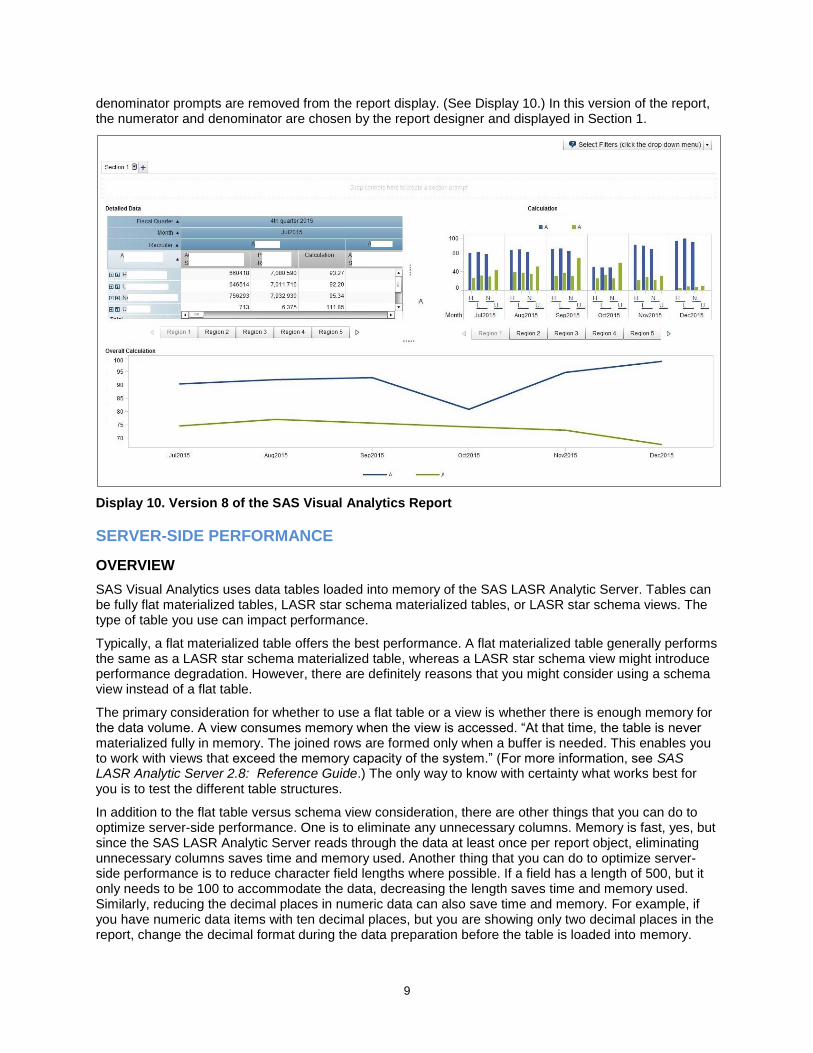
Version 8 of the report, which is an alteration of Version 4, eliminates all of the parameters, custom categories, calculated items, and aggregated items from the report. As a result, the numerator and
9
denominator prompts are removed from the report display. (See Display 10.) In this version of the report, the numerator and denominator are chosen by the report designer and displayed in Section 1.
Display 10. Version 8 of the SAS Visual Analytics Report
SERVER-SIDE PERFORMANCE
OVERVIEW
SAS Visual Analytics uses data tables loaded into memory of the SAS LASR Analytic Server. Tables can be fully flat materialized tables, LASR star schema materialized tables, or LASR star schema views. The type of table you use can impact performance.
Typically, a flat materialized table offers the best performance. A flat materialized table generally performs the same as a LASR star schema materialized table, whereas a LASR star schema view might introduce performance degradation. However, there are definitely reasons that you might consider using a schema view instead of a flat table.
The primary consideration for whether to use a flat table or a view is whether there is enough memory for the data volume. A view consumes memory when the view is accessed. “At that time, the table is never materialized fully in memory. The joined rows are formed only when a buffer is needed. This enables you to work with views that exceed the memory capacity of the system.” (For more information, see SAS LASR Analytic Server 2.8: Reference Guide.) The only way to know with certainty what works best for you is to test the different table structures.
In addition to the flat table versus schema view consideration, there are other things that you can do to optimize server-side performance. One is to eliminate any unnecessary columns. Memory is fast, yes, but since the SAS LASR Analytic Server reads through the data at least once per report object, eliminating unnecessary columns saves time and memory used. Another thing that you can do to optimize server-side performance is to reduce character field lengths where possible. If a field has a length of 500, but it only needs to be 100 to accommodate the data, decreasing the length saves time and memory used. Similarly, reducing the decimal places in numeric data can also save time and memory. For example, if you have numeric data items with ten decimal places, but you are showing only two decimal places in the report, change the decimal format during the data preparation before the table is loaded into memory.

10
That lowers the cardinality of the data item and means there is less data to process when rendering reports.
TABLE STRUCTURE ANALYSIS
Three different source tables are tested with Version 1 of the report. (See Figure 1.) The first is a flat materialized table with 56 columns, 7,199,504 rows, and 7.93 GB in size. Using this table, Version 1 took an average of 51.41 seconds to render. The table does not have character fields that are unusually or unnecessarily long, but it does have columns that are not being used in the report.
After removing unnecessary columns from the table, Table 2, which is also a flat materialized table, has 43 columns, the same number of rows as Table 1, and is 6.38 GB. When using Table 2 as the source table for the report, Version 1 takes an average of 34.39 seconds to render, which is a reduction of 33%, but is still rather long.
Finally, a LASR star schema view is tested, moving the hierarchy columns out of Table 2 and into DIM (dimension) tables, to see whether that makes any difference. By creating a LASR star schema view, a fact key column is added to the main FACT table. That yields a view with 44 columns, the same number of rows as Tables 1 and 2, and a size of 6.49 GB. When using the view as the source table for the report, Version 1 takes an average of 48.28 seconds to render.
51.41
34.39
48.28
0
10
20
30
40
50
60
Table 1 (Flat Materialized) Table 2 (Reduced Columns) Table 3 (Star Schema View)
Total Render Time (in Seconds) by Table Type
Figure 1. Comparison of Table Structure on Average Total Time to Render
In this case, the flat materialized Table 2 with the unnecessary columns removed clearly has the best performance.
CLIENT-SIDE PERFORMANCE
OVERVIEW
When designing a report, the goal is to communicate information quickly and effectively. Report design is all about balance. You want to display enough information to be informative, but not so much that readers do not know where to look. You also want graphics that are easy to understand, and do not cause the readers to think too much to comprehend the messages that you are trying to convey. And of course, if the report takes too long to render, you might lose your audience altogether.
11
Client-side performance is affected by the number and types of objects to render. Using the performance debugger, you can assess differences in report layouts and between object types. Looking at the individual query times for each object in a report is a good way to see if there are any long running queries. Once you have identified one or more long running queries, you might want to work with your SAS administrator to turn on logging for the SAS LASR Analytic Server. Analyzing the logs provides additional information that might help you determine what about the particular object is making the query slow.
REPORT ANALYSIS
To assess client-side performance, performance debugging metrics are captured three separate times for each report version and then averaged. Metrics are captured outside of regular working hours, during off-peak times so as to not introduce another level of complexity to the analysis. See Table 2 for a sample of performance debugging metrics.
Analysis of Version 1 of the report reveals that all of the queries for the bar charts and crosstabs are running fairly long – 25.17 to 42.94 seconds with the original data table and 15.83 to 28.23 seconds with Table 2. Reducing the number of columns in Table 2 has reduced query time across all the objects, so Table 2 is used in all additional iterations of the report.
Version 1 of the report (see Display 2) has a number of characteristics that can be altered to see what, if anything, results in performance improvements:
Change the overall summary bar chart to a line chart (Report Version 2)
Remove duplicative and unnecessary button bars (Report Version 3)
Move prompt container out of the report body to report filters (Report Version 4)
Move objects out of the stack container (Report Versions 5 and 6)
The report must contain seven detailed crosstabs, seven detailed bar charts, and one overall summary chart. The original report used a bar chart for the overall summary. Version 2 of the report changes the overall summary bar chart to a line chart. (See Display 3.)
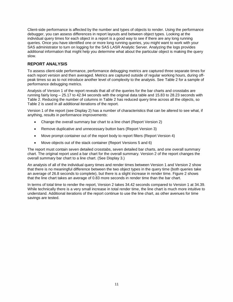
An analysis of all of the individual query times and render times between Version 1 and Version 2 show that there is no meaningful difference between the two object types in the query time (both queries take an average of 26.8 seconds to complete), but there is a slight increase in render time. Figure 2 shows that the line chart takes an average of 0.83 more seconds in render time than the bar chart.
In terms of total time to render the report, Version 2 takes 34.42 seconds compared to Version 1 at 34.39. While technically there is a very small increase in total render time, the line chart is much more intuitive to understand. Additional iterations of the report continue to use the line chart, as other avenues for time savings are tested.
12
0.54
1.36
0
1
2
3
4
5
Bar Graph (Version 1) Line Graph (Version 2)
Object Render Time (seconds)
Figure 2. Average Render Times for Bar Chart Compared to Line Chart
There are five extraneous button bars in Versions 1 and 2. They show the results of the filters that are selected in the prompt container by the person viewing the report and do not serve any real functional purpose. The extraneous queries each take anywhere from 5.83 to 11.53 seconds in Version 2, so removing them should improve the total render time for the report. Version 3 of the report (see Display 4) removes the button bars in the body of the report, as well as the button bar that serves as the report title.
As expected, removing those button bars decreases the total render time for the report. The average total render time for Version 3 is 31.03 seconds, which is 3.38 seconds faster than Version 2.
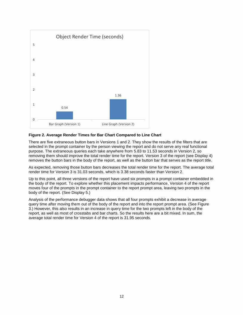
Up to this point, all three versions of the report have used six prompts in a prompt container embedded in the body of the report. To explore whether this placement impacts performance, Version 4 of the report moves four of the prompts in the prompt container to the report prompt area, leaving two prompts in the body of the report. (See Display 5.)
Analysis of the performance debugger data shows that all four prompts exhibit a decrease in average query time after moving them out of the body of the report and into the report prompt area. (See Figure 3.) However, this also results in an increase in query time for the two prompts left in the body of the report, as well as most of crosstabs and bar charts. So the results here are a bit mixed. In sum, the average total render time for Version 4 of the report is 31.95 seconds.
13
2.43
6.13
7.99
3.25
2.38
4.474.80
2.51
0.00
1.00
2.00
3.00
4.00
5.00
6.00
7.00
8.00
9.00
Fiscal Year Quarter Month Recruiter
Query Time (seconds)
Prompts in Report Body Prompts in Report Filter
Figure 3. Comparison of Prompt Location on Average Query Time
The next assessment looks at whether placing objects in a stack container takes longer to render than not placing objects in a stack container. To examine this, Version 5 and Version 6 are created displaying only the report prompts and bar charts. Version 5 contains the report prompts and one stack container with seven crosstabs. (See Display 6.) Version 6 contains the report prompts and seven crosstabs, but no stack container. (See Display 7.)
Analysis of the query times shows that moving the crosstabs out of the stack container yields small decreases in query times for five of seven crosstabs. Average query time for five of the crosstabs decreases anywhere from 0.27 to 1.38 seconds. Two crosstabs have an increase in average query time of 0.5 to 0.15 seconds. The total render time for the report with the stack container is 23.51 seconds, compared to 22.67 seconds for the report without the stack container. So overall, moving tables out of the stack container saves time.
Looking at Table 2, you can see the drop in average query time once there are fewer objects in the report altogether. Comparing the query time for the crosstabs in Version 4 to Version 5, the average query time for the crosstabs in Version 5 are anywhere from 6.10 to 7.44 seconds less (which is 24% to 29% better).
Object Version 1
Version 2
Version 3
Version 4
Version 5
Version 6
Version 7
Version 8
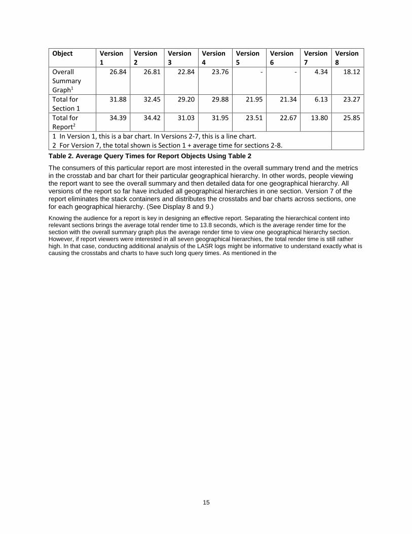
Report Title 1.88 1.67 - - - - - -
Fiscal Year 2.32 2.22 2.43 2.38 2.50 2.53 1.80 2.45
Selected Fiscal Year Button
5.36 5.83 - - - - - -
Selected Quarters
4.68 5.30 6.13 4.47 4.87 5.18 3.04 3.79
Selected Quarter Button
8.47 8.76 - - - - - -

14
Object Version 1
Version 2
Version 3
Version 4
Version 5
Version 6
Version 7
Version 8
Selected Months
6.39 7.26 7.99 4.80 5.32 5.80 3.17 4.23
Selected Months Button
10.46 11.53 - - - - - -
Selected Numerator
5.48 6.11 6.32 11.61 9.98 10.88 4.65 -
Selected Numerator Button
7.32 6.95 - - - - - -
Selected Denominator
4.04 4.35 4.62 10.55 9.69 10.75 4.39 -
Selected Denominator Button
6.83 6.23 - - - - - -
Recruiter 4.45 4.56 3.25 2.51 3.03 3.30 2.25 2.44
Detail Table 1
26.73 26.72 24.98 25.68 18.85 18.89 3.87 17.94
Detail Table 2
26.71 26.82 24.26 25.37 19.22 17.84 3.91 19.14
Detail Table 3
27.22 27.37 25.20 25.48 18.68 17.47 3.93 19.43
Detail Table 4
27.39 27.98 25.67 25.89 19.80 18.29 4.21 19.53
Detail Table 5
27.33 27.97 25.73 25.89 18.45 18.60 3.66 19.80
Detail Table 6
27.65 28.29 24.41 25.31 19.01 18.74 3.63 19.02
Detail Table 7
28.23 29.16 26.26 26.68 20.34 19.72 4.85 19.25
Detailed Graph 1
15.83 17.78 13.32 13.34 - - 2.23 10.48
Detailed Graph 2
16.27 16.87 16.09 13.37 - - 2.18 10.14
Detailed Graph 3
17.91 18.21 16.89 14.41 - - 2.29 11.25
Detailed Graph 4
18.75 18.43 15.45 19.08 - - 2.48 11.08
Detailed Graph 5
20.75 22.35 16.33 20.92 - - 2.57 12.11
Detailed Graph 6
25.40 25.96 22.38 22.89 - - 1.97 17.11
Detailed Graph 7
27.47 28.24 25.51 25.79 - - 3.26 17.63
15
Object Version 1
Version 2
Version 3
Version 4
Version 5
Version 6
Version 7
Version 8
Overall Summary Graph1
26.84 26.81 22.84 23.76 - - 4.34 18.12
Total for Section 1
31.88 32.45 29.20 29.88 21.95 21.34 6.13 23.27
Total for Report2
34.39 34.42 31.03 31.95 23.51 22.67 13.80 25.85
1 In Version 1, this is a bar chart. In Versions 2-7, this is a line chart. 2 For Version 7, the total shown is Section 1 + average time for sections 2-8.
Table 2. Average Query Times for Report Objects Using Table 2
The consumers of this particular report are most interested in the overall summary trend and the metrics in the crosstab and bar chart for their particular geographical hierarchy. In other words, people viewing the report want to see the overall summary and then detailed data for one geographical hierarchy. All versions of the report so far have included all geographical hierarchies in one section. Version 7 of the report eliminates the stack containers and distributes the crosstabs and bar charts across sections, one for each geographical hierarchy. (See Display 8 and 9.)
Knowing the audience for a report is key in designing an effective report. Separating the hierarchical content into relevant sections brings the average total render time to 13.8 seconds, which is the average render time for the section with the overall summary graph plus the average render time to view one geographical hierarchy section. However, if report viewers were interested in all seven geographical hierarchies, the total render time is still rather high. In that case, conducting additional analysis of the LASR logs might be informative to understand exactly what is causing the crosstabs and charts to have such long query times. As mentioned in the

16
Report Description section, this report uses parameters and calculated items. It is highly likely that some of those are adversely impacting performance. (See Design Performance.)
SUMMARY
With the various versions of the report, several aspects of client-side performance are tested. Here is a summary of the results:
There are minor differences in query times and render times between bar charts and line charts.
Removing unnecessary objects saves just over 3 seconds.
Placing prompts in the report prompt area, as opposed to in the body of the report, reduces query time for those prompts, but in this case has mixed results for the report overall.
Moving objects out of a stack container saves time.
DESIGN PERFORMANCE
Another aspect of report design in SAS Visual Analytics that can impact performance is the extent to which you use custom calculations and concatenated strings. As mentioned in the Report Description section, this report uses parameters and calculated items. Version 8 of the report, which is an alteration of Version 4, eliminates all of the parameters and calculated items from the report. In this case, calculations are moved to the data preparation layer. Table 4, as described in the Environment and Data Description section of this paper, serves as the source table for Version 8.
Analysis of the performance debugger data shows the average total render time for Version 8 is 25.85 seconds, which is a 19% reduction from Version 4. While this render time is still somewhat long, it reduces total render time by 6.10 seconds, which is clearly an improvement.
Minimizing the number of transformations that need to be done to the data at the row level is a good practice for better performance. In other words, to the extent possible, move complex calculations and row-level transformations to the data preparation layer.
OTHER CONSIDERATIONS
In addition to the items tested here, there are other decisions that you can make when designing a report that might impact performance:
Using dashed reference lines can adversely affect performance. SAS recommends you use solid reference lines, if you encounter this issue. (For more information, see SAS Note 56820.)
Adding spark lines to a list table might degrade performance, as they add extra SAS LASR Analytic Server actions. If showing a trend line is an important feature, consider using a line chart instead of spark lines in a list table object.
If you use comparison filters (for example, x > y), any objects that are impacted by those comparison filters might see performance degradation. The larger the data table, the more pronounced this issue can be. To resolve this issue, there is a setting the SAS administrator can make in SAS Management Console. (For more information, see SAS Note 53386.)
Using the PARSE function in calculated items, aggregated measures, or filters can adversely affect performance. SAS recommends adding the relevant data items to the data table before it is loaded into the SAS LASR Analytic Server. (For more information, see SAS Note 57025.)
Compressing data tables as they are loaded into the SAS LASR Analytic Server saves space, but users viewing reports might experience performance degradation as the table gets uncompressed to render the report. Stephen Foerster wrote an article for blogs.sas.com that outlines several strategies for minimizing SAS LASR table size. Steve Mellgren also wrote an article for blogs.sas.com about things to consider when preparing data for the SAS LASR Analytic Server.
17
CONCLUSION
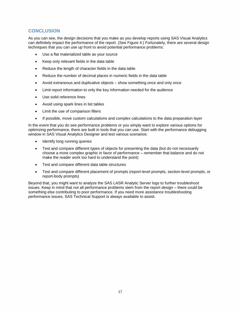
As you can see, the design decisions that you make as you develop reports using SAS Visual Analytics can definitely impact the performance of the report. (See Figure 4.) Fortunately, there are several design techniques that you can use up front to avoid potential performance problems:
Use a flat materialized table as your source
Keep only relevant fields in the data table
Reduce the length of character fields in the data table
Reduce the number of decimal places in numeric fields in the data table
Avoid extraneous and duplicative objects – show something once and only once
Limit report information to only the key information needed for the audience
Use solid reference lines
Avoid using spark lines in list tables
Limit the use of comparison filters
If possible, move custom calculations and complex calculations to the data preparation layer
In the event that you do see performance problems or you simply want to explore various options for optimizing performance, there are built in tools that you can use. Start with the performance debugging window in SAS Visual Analytics Designer and test various scenarios:
Identify long running queries
Test and compare different types of objects for presenting the data (but do not necessarily choose a more complex graphic in favor of performance – remember that balance and do not make the reader work too hard to understand the point)
Test and compare different data table structures
Test and compare different placement of prompts (report-level prompts, section-level prompts, or report-body prompts)
Beyond that, you might want to analyze the SAS LASR Analytic Server logs to further troubleshoot issues. Keep in mind that not all performance problems stem from the report design – there could be something else contributing to poor performance. If you need more assistance troubleshooting performance issues, SAS Technical Support is always available to assist.
18
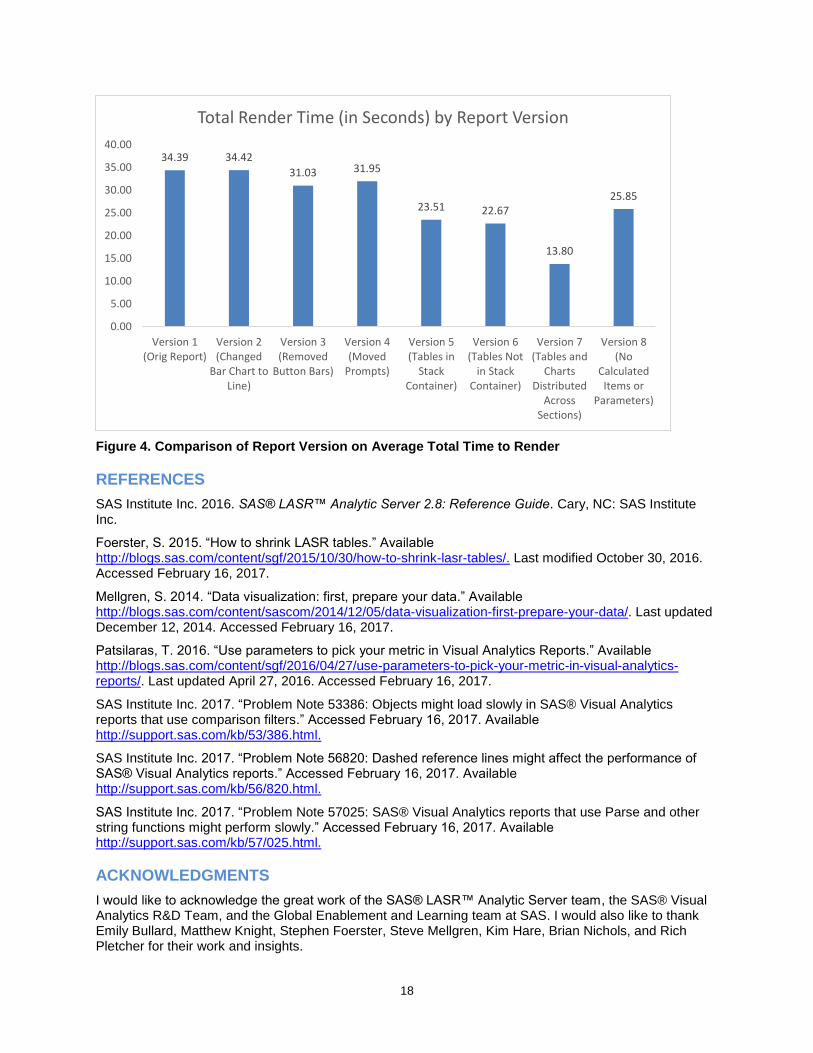
Figure 4. Comparison of Report Version on Average Total Time to Render
REFERENCES
SAS Institute Inc. 2016. SAS® LASR™ Analytic Server 2.8: Reference Guide. Cary, NC: SAS Institute Inc.
Foerster, S. 2015. “How to shrink LASR tables.” Available http://blogs.sas.com/content/sgf/2015/10/30/how-to-shrink-lasr-tables/. Last modified October 30, 2016. Accessed February 16, 2017.
Mellgren, S. 2014. “Data visualization: first, prepare your data.” Available http://blogs.sas.com/content/sascom/2014/12/05/data-visualization-first-prepare-your-data/. Last updated December 12, 2014. Accessed February 16, 2017.
Patsilaras, T. 2016. “Use parameters to pick your metric in Visual Analytics Reports.” Available http://blogs.sas.com/content/sgf/2016/04/27/use-parameters-to-pick-your-metric-in-visual-analytics-reports/. Last updated April 27, 2016. Accessed February 16, 2017.
SAS Institute Inc. 2017. “Problem Note 53386: Objects might load slowly in SAS® Visual Analytics reports that use comparison filters.” Accessed February 16, 2017. Available http://support.sas.com/kb/53/386.html.
SAS Institute Inc. 2017. “Problem Note 56820: Dashed reference lines might affect the performance of SAS® Visual Analytics reports.” Accessed February 16, 2017. Available http://support.sas.com/kb/56/820.html.
SAS Institute Inc. 2017. “Problem Note 57025: SAS® Visual Analytics reports that use Parse and other string functions might perform slowly.” Accessed February 16, 2017. Available http://support.sas.com/kb/57/025.html.
ACKNOWLEDGMENTS
I would like to acknowledge the great work of the SAS® LASR™ Analytic Server team, the SAS® Visual Analytics R&D Team, and the Global Enablement and Learning team at SAS. I would also like to thank Emily Bullard, Matthew Knight, Stephen Foerster, Steve Mellgren, Kim Hare, Brian Nichols, and Rich Pletcher for their work and insights.
34.39 34.42
31.03 31.95
23.51 22.67
13.80
25.85
0.00
5.00
10.00
15.00
20.00
25.00
30.00
35.00
40.00
Version 1(Orig Report)
Version 2(Changed
Bar Chart toLine)
Version 3(Removed
Button Bars)
Version 4(Moved
Prompts)
Version 5(Tables in
StackContainer)
Version 6(Tables Not
in StackContainer)
Version 7(Tables and
ChartsDistributed
AcrossSections)
Version 8(No
CalculatedItems or
Parameters)
Total Render Time (in Seconds) by Report Version

19
CONTACT INFORMATION
Your comments and questions are valued and encouraged. Contact the author at:
Kerri L. Rivers 100 SAS Campus Drive Cary, NC 27513 SAS Institute Inc. [email protected] http://www.sas.com
SAS and all other SAS Institute Inc. product or service names are registered trademarks or trademarks of SAS Institute Inc. in the USA and other countries. ® indicates USA registration.
Other brand and product names are trademarks of their respective companies.