Embed Size (px)
Citation preview
1 Pasewark & Pasewark
Excel Lesson 8Working with Charts
Microsoft Office 2007: Introductory
Ex
cel –
Les
so
n 8
Microsoft Office 2007: Introductory
2 Pasewark & Pasewark
Objectives
Identify the purpose of charting worksheet data.
Identify the types of charts. Create a chart embedded in a worksheet. Move a chart to a chart sheet. Choose a chart layout and style.
Ex
cel –
Les
so
n 8
Microsoft Office 2007: Introductory
3 Pasewark & Pasewark
Objectives (continued)
Display or hide chart elements. Format a chart. Edit a format chart text. Change the chart type.
Ex
cel –
Les
so
n 8
Microsoft Office 2007: Introductory
4 Pasewark & Pasewark
Vocabulary
Axis Chart Chart area Chart layout Chart sheet
Chart style Column chart Data label Data marker Data series
Ex
cel –
Les
so
n 8
Microsoft Office 2007: Introductory
5 Pasewark & Pasewark
Vocabulary (continued)
Data source Data table Embedded chart Exploded pie chart Legend Line chart
Pie chart Plot area Scatter chart Selection box Sizing handles
Ex
cel –
Les
so
n 8
Microsoft Office 2007: Introductory
6 Pasewark & Pasewark
What is a Worksheet Chart?
A chart is a graphical representation of data. Charts make the data in a worksheet easier to
understand by providing a visual picture of the data.
Ex
cel –
Les
so
n 8
Microsoft Office 2007: Introductory
7 Pasewark & Pasewark
Comparing Chart Types
You can create a variety of charts in Excel, each working with specific types of data.
Column chart: Uses bars to illustrate values in a worksheet, and shows relationships among categories.
Line chart: Shows points connected by a line, and is ideal for illustrating trends over time.
Pie chart: Shows the relationship of a part to a whole. Each part is shown as a “slice” of the pie.
Scatter chart (XY chart): Shows the relationship between two categories of data, one represented on the vertical axis, and the other on the horizontal axis. The points are not connected.
Ex
cel –
Les
so
n 8
Microsoft Office 2007: Introductory
8 Pasewark & Pasewark
Creating Charts
Selecting Chart Data: Chart data, called the data source, is stored in a range of cells in the worksheet. When you select the data source, include the text you want to use as labels. You can chart more than one series of data. A data series is a group of related information in a column or row of a worksheet that is plotted on the chart.
Selecting a Chart Type: The next step is to select the type of chart you want to create, such as a column chart, a pie chart, or a line chart. Each type of chart has a variety of subtypes you can choose from. The chart types are available on the Insert tab in the Charts group.
Ex
cel –
Les
so
n 8
Microsoft Office 2007: Introductory
9 Pasewark & Pasewark
Creating Charts (continued)
Choosing the Chart Location: After you select a chart type and style, the chart is inserted as an embedded chart in the center of the worksheet. You can also choose to move the chart to a chart sheet, which is a separate sheet in the workbook that stores a chart.
Ex
cel –
Les
so
n 8
Microsoft Office 2007: Introductory
10 Pasewark & Pasewark
Updating the Data Source
Charts are closely related to their underlying data stored in a worksheet.
If you need to change the data in the worksheet, the chart is automatically updated to reflect the new data.
You switch between a chart sheet and a worksheet by clicking the appropriate sheet tab.
Ex
cel –
Les
so
n 8
Microsoft Office 2007: Introductory
11 Pasewark & Pasewark
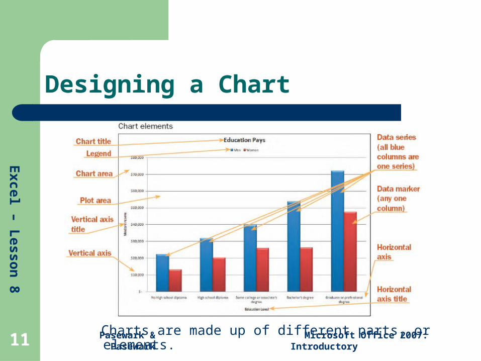
Designing a Chart
Charts are made up of different parts, or elements.
Ex
cel –
Les
so
n 8
Microsoft Office 2007: Introductory
12 Pasewark & Pasewark
Designing a Chart (continued)
Selecting Chart Elements: The quickest way to select a chart element is to click it with the pointer. If you point to an element, a ScreenTip displays with its name. A selected chart element is surrounded by a selection box. After you select a chart element, you can modify it.
Choosing a Chart Layout and Style: You can quickly change the look of any chart you created by applying a layout and style. A chart layout specifies which elements are included in a chart and where they are placed. A chart style formats the chart based on the colors, fonts, and effects associated with the workbook’s theme.

Ex
cel –
Les
so
n 8
Microsoft Office 2007: Introductory
13 Pasewark & Pasewark
Designing a Chart (continued)
Arranging Chart Elements: You can create a specific look for a chart by specifying which chart elements appear in the chart and where they are located.
For example, you can choose when and where to display the chart title, axis titles, legend, data labels, data table, axes, gridlines, and the plot area. Select the chart. Then, click the Layout tab under Chart Tools on the Ribbon. The Labels, Axes, and Background groups contain buttons for each element.
Ex
cel –
Les
so
n 8
Microsoft Office 2007: Introductory
14 Pasewark & Pasewark
Creating a 3-D Chart
A pie chart shows the relationship of a part to a whole. Each part is shown as a “slice” of the pie. The slices are different colors to distinguish each data marker.
Pie charts, as with many chart types, can be either 2-D or 3-D. When you select the chart style, click a 3-D chart subtype to create a 3-D chart.
Ex
cel –
Les
so
n 8
Microsoft Office 2007: Introductory
15 Pasewark & Pasewark
Formatting and Modifying a Chart
Formatting a Chart: To make changes to an element’s fill, border color, alignment, and so forth, access the Format dialog box by selecting the chart you want to edit. Then, on the Format tab under Chart Tools on the Ribbon, in the Current Selection group, click the Format Selection button.
Editing and Formatting Chart Text: Use the standard text formatting tools to make changes to the fonts used in the chart.
Changing the Chart Type: On the Design tab, under Chart Tools on the Ribbon, in the Type group, click the Change Chart Type button. The Change Chart Type dialog box appears.
Ex
cel –
Les
so
n 8
Microsoft Office 2007: Introductory
16 Pasewark & Pasewark
Summary
A chart is a graphical representation of data. You can create several types of worksheet charts, including column, line, pie, and scatter charts.
Charts can be embedded within a worksheet or created on a chart sheet.
The process for creating a chart is the same for all chart types. Select the data for the chart. Select a chart type. Move, resize, and format the chart as needed.
Any changes made to a data source automatically appear in the chart based on that data.
Ex
cel –
Les
so
n 8
Microsoft Office 2007: Introductory
17 Pasewark & Pasewark
Summary (continued)
Charts are made up of different parts, or elements. You can apply a chart layout and a chart style to determine which elements appear in the chart, where they appear, and how they look.
You can fine-tune a chart by clicking a chart element and then opening its Format dialog box. You can also edit and format the chart text, using the standard text formatting tools.
You can change the type of chart in the Change Chart Type dialog box.