Embed Size (px)
Citation preview
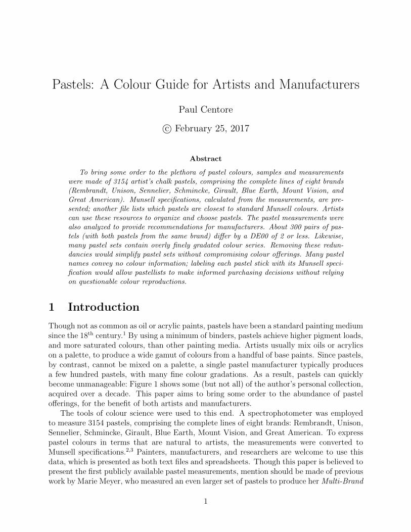
Pastels: A Colour Guide for Artists and Manufacturers
Paul Centore
c© February 25, 2017
Abstract
To bring some order to the plethora of pastel colours, samples and measurementswere made of 3154 artist’s chalk pastels, comprising the complete lines of eight brands(Rembrandt, Unison, Sennelier, Schmincke, Girault, Blue Earth, Mount Vision, andGreat American). Munsell specifications, calculated from the measurements, are pre-sented; another file lists which pastels are closest to standard Munsell colours. Artistscan use these resources to organize and choose pastels. The pastel measurements werealso analyzed to provide recommendations for manufacturers. About 300 pairs of pas-tels (with both pastels from the same brand) differ by a DE00 of 2 or less. Likewise,many pastel sets contain overly finely gradated colour series. Removing these redun-dancies would simplify pastel sets without compromising colour offerings. Many pastelnames convey no colour information; labeling each pastel stick with its Munsell speci-fication would allow pastellists to make informed purchasing decisions without relyingon questionable colour reproductions.
1 Introduction
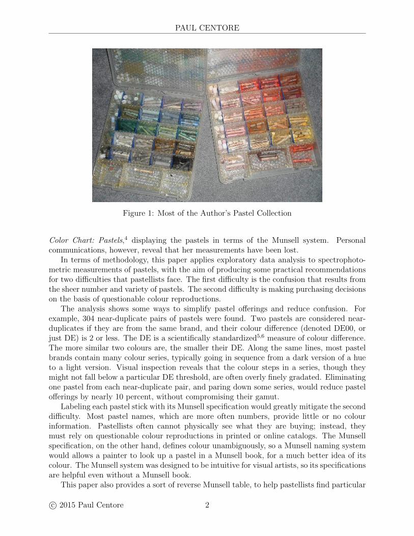
Though not as common as oil or acrylic paints, pastels have been a standard painting mediumsince the 18th century.1 By using a minimum of binders, pastels achieve higher pigment loads,and more saturated colours, than other painting media. Artists usually mix oils or acrylicson a palette, to produce a wide gamut of colours from a handful of base paints. Since pastels,by contrast, cannot be mixed on a palette, a single pastel manufacturer typically producesa few hundred pastels, with many fine colour gradations. As a result, pastels can quicklybecome unmanageable: Figure 1 shows some (but not all) of the author’s personal collection,acquired over a decade. This paper aims to bring some order to the abundance of pastelofferings, for the benefit of both artists and manufacturers.
The tools of colour science were used to this end. A spectrophotometer was employedto measure 3154 pastels, comprising the complete lines of eight brands: Rembrandt, Unison,Sennelier, Schmincke, Girault, Blue Earth, Mount Vision, and Great American. To expresspastel colours in terms that are natural to artists, the measurements were converted toMunsell specifications.2,3 Painters, manufacturers, and researchers are welcome to use thisdata, which is presented as both text files and spreadsheets. Though this paper is believed topresent the first publicly available pastel measurements, mention should be made of previouswork by Marie Meyer, who measured an even larger set of pastels to produce her Multi-Brand
1
PAUL CENTORE
Figure 1: Most of the Author’s Pastel Collection
Color Chart: Pastels,4 displaying the pastels in terms of the Munsell system. Personalcommunications, however, reveal that her measurements have been lost.
In terms of methodology, this paper applies exploratory data analysis to spectrophoto-metric measurements of pastels, with the aim of producing some practical recommendationsfor two difficulties that pastellists face. The first difficulty is the confusion that results fromthe sheer number and variety of pastels. The second difficulty is making purchasing decisionson the basis of questionable colour reproductions.
The analysis shows some ways to simplify pastel offerings and reduce confusion. Forexample, 304 near-duplicate pairs of pastels were found. Two pastels are considered near-duplicates if they are from the same brand, and their colour difference (denoted DE00, orjust DE) is 2 or less. The DE is a scientifically standardized5,6 measure of colour difference.The more similar two colours are, the smaller their DE. Along the same lines, most pastelbrands contain many colour series, typically going in sequence from a dark version of a hueto a light version. Visual inspection reveals that the colour steps in a series, though theymight not fall below a particular DE threshold, are often overly finely gradated. Eliminatingone pastel from each near-duplicate pair, and paring down some series, would reduce pastelofferings by nearly 10 percent, without compromising their gamut.
Labeling each pastel stick with its Munsell specification would greatly mitigate the seconddifficulty. Most pastel names, which are more often numbers, provide little or no colourinformation. Pastellists often cannot physically see what they are buying; instead, theymust rely on questionable colour reproductions in printed or online catalogs. The Munsellspecification, on the other hand, defines colour unambiguously, so a Munsell naming systemwould allows a painter to look up a pastel in a Munsell book, for a much better idea of itscolour. The Munsell system was designed to be intuitive for visual artists, so its specificationsare helpful even without a Munsell book.
This paper also provides a sort of reverse Munsell table, to help pastellists find particular
c© 2015 Paul Centore 2
PASTELS: A COLOUR GUIDE
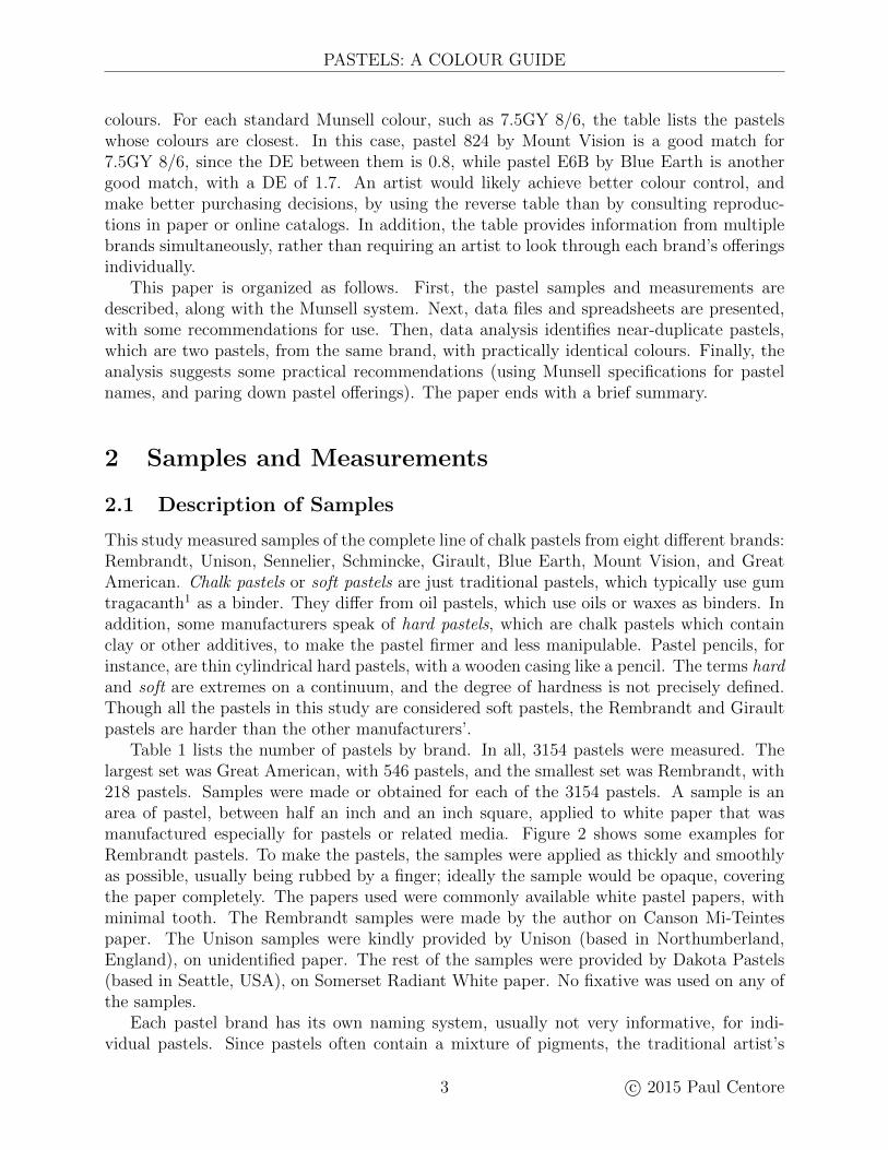
colours. For each standard Munsell colour, such as 7.5GY 8/6, the table lists the pastelswhose colours are closest. In this case, pastel 824 by Mount Vision is a good match for7.5GY 8/6, since the DE between them is 0.8, while pastel E6B by Blue Earth is anothergood match, with a DE of 1.7. An artist would likely achieve better colour control, andmake better purchasing decisions, by using the reverse table than by consulting reproduc-tions in paper or online catalogs. In addition, the table provides information from multiplebrands simultaneously, rather than requiring an artist to look through each brand’s offeringsindividually.
This paper is organized as follows. First, the pastel samples and measurements aredescribed, along with the Munsell system. Next, data files and spreadsheets are presented,with some recommendations for use. Then, data analysis identifies near-duplicate pastels,which are two pastels, from the same brand, with practically identical colours. Finally, theanalysis suggests some practical recommendations (using Munsell specifications for pastelnames, and paring down pastel offerings). The paper ends with a brief summary.
2 Samples and Measurements
2.1 Description of Samples
This study measured samples of the complete line of chalk pastels from eight different brands:Rembrandt, Unison, Sennelier, Schmincke, Girault, Blue Earth, Mount Vision, and GreatAmerican. Chalk pastels or soft pastels are just traditional pastels, which typically use gumtragacanth1 as a binder. They differ from oil pastels, which use oils or waxes as binders. Inaddition, some manufacturers speak of hard pastels, which are chalk pastels which containclay or other additives, to make the pastel firmer and less manipulable. Pastel pencils, forinstance, are thin cylindrical hard pastels, with a wooden casing like a pencil. The terms hardand soft are extremes on a continuum, and the degree of hardness is not precisely defined.Though all the pastels in this study are considered soft pastels, the Rembrandt and Giraultpastels are harder than the other manufacturers’.
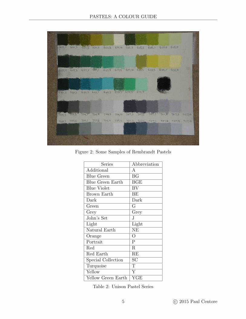
Table 1 lists the number of pastels by brand. In all, 3154 pastels were measured. Thelargest set was Great American, with 546 pastels, and the smallest set was Rembrandt, with218 pastels. Samples were made or obtained for each of the 3154 pastels. A sample is anarea of pastel, between half an inch and an inch square, applied to white paper that wasmanufactured especially for pastels or related media. Figure 2 shows some examples forRembrandt pastels. To make the pastels, the samples were applied as thickly and smoothlyas possible, usually being rubbed by a finger; ideally the sample would be opaque, coveringthe paper completely. The papers used were commonly available white pastel papers, withminimal tooth. The Rembrandt samples were made by the author on Canson Mi-Teintespaper. The Unison samples were kindly provided by Unison (based in Northumberland,England), on unidentified paper. The rest of the samples were provided by Dakota Pastels(based in Seattle, USA), on Somerset Radiant White paper. No fixative was used on any ofthe samples.
Each pastel brand has its own naming system, usually not very informative, for indi-vidual pastels. Since pastels often contain a mixture of pigments, the traditional artist’s
3 c© 2015 Paul Centore
PAUL CENTORE
Brand Number of PastelsGreat American 546Sennelier 525Unison 422Mount Vision 407Schmincke 400Blue Earth 336Girault 300Rembrandt 218
Total 3154
Table 1: Measured Pastel Samples
nomenclature of pigment names like cadmium yellow or viridian green cannot be used. Somemanufacturers, like Girault and Sennelier, simply assign numbers, not always consecutive,to their pastels. Rembrandt divides its set into hue series, assigning each pastel one numberfor its series, and a second number for its position in the series. The position numbers varyfrom 2 to 12, with numbers above 5 indicating tints and numbers below 5 indicating shades.For example, the Rembrandt pastel 626,10 is a light green. Other manufacturers use lettersas modifiers. Schmincke, for example, uses D and H to indicate dark and light versions of acolour (D and H stand for dunkel and hell, the German words for dark and light). Unisondivides its pastels into series such as Yellow Green Earth. Table 2 lists the series, along withabbreviations used in this paper. The pastels in each series are then numbered, so YellowGreen Earth 7 is the seventh pastel in that series. This paper will refer to a pastel by itsbrand name, plus the manufacturer’s identifier for that particular pastel. For example, thetwo pastels mentioned in this paragraph would be Rembrandt 626,10 and Unison YGE7.
While most pastels contain only pigment and binders, some manufacturers have intro-duced additives to give special effects, such as mica flakes for iridescence. Sennelier 800through 825 are examples. These additives affect a pastel’s appearance rather than its colourper se. Since the number of effect pastels is small, and since they have definite colours, theywere included in this analysis alongside the standard pastels.
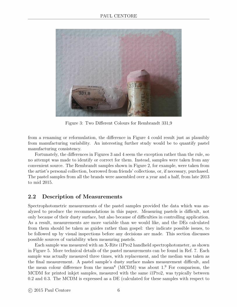
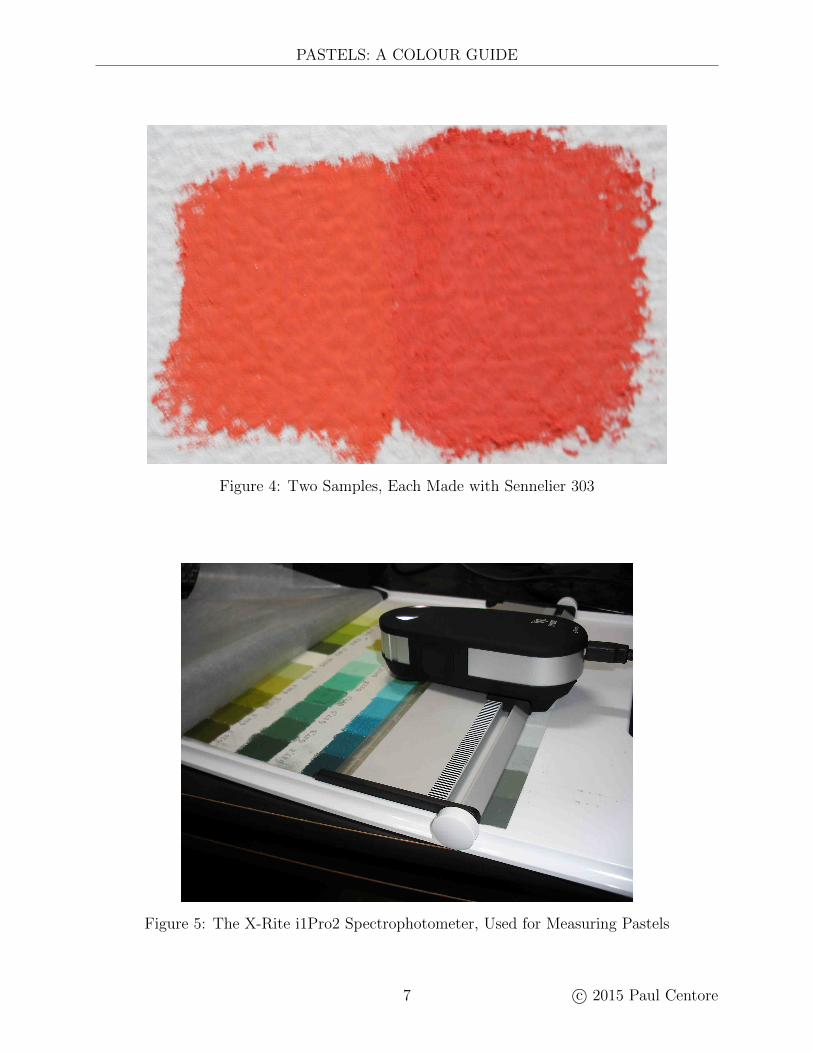
A pastel’s shelf life is effectively unlimited, and decades-old pastels are still usable. Al-though reputable manufacturers use lightfast pigments to prevent colour changes, there isalways the possibility of fading. Over a long enough time, furthermore, a manufacturermight change a pastel’s name or formulation. Because of such situations, two pastels withthe same name can differ. Figure 3 shows a particularly bad example, in which two pastels,both Rembrandt 331,9, produce very different colours. Another possible cause of colour vari-ation is manufacturing inconsistency. Slight pigment discrepancies from batch to batch, orfluctuations in the relative proportions of ingredients, can cause colour irregularities. Whilecolour consistency was not analyzed, Figure 4 shows that it could be significant when itoccurs. The figure reproduces two samples, each made with a pastel labeled Sennelier 303.Though close, the two samples’ colours are also slightly but definitely different. The sam-ple on the left tends toward orange when compared with the sample on the right, whichtends more toward red. While the extreme difference in Figure 3 almost certainly results
c© 2015 Paul Centore 4
PASTELS: A COLOUR GUIDE
Figure 2: Some Samples of Rembrandt Pastels
Series AbbreviationAdditional ABlue Green BGBlue Green Earth BGEBlue Violet BVBrown Earth BEDark DarkGreen GGrey GreyJohn’s Set JLight LightNatural Earth NEOrange OPortrait PRed RRed Earth RESpecial Collection SCTurquoise TYellow YYellow Green Earth YGE
Table 2: Unison Pastel Series
5 c© 2015 Paul Centore
PAUL CENTORE
Figure 3: Two Different Colours for Rembrandt 331,9
from a renaming or reformulation, the difference in Figure 4 could result just as plausiblyfrom manufacturing variability. An interesting further study would be to quantify pastelmanufacturing consistency.
Fortunately, the differences in Figures 3 and 4 seem the exception rather than the rule, sono attempt was made to identify or correct for them. Instead, samples were taken from anyconvenient source. The Rembrandt samples shown in Figure 2, for example, were taken fromthe artist’s personal collection, borrowed from friends’ collections, or, if necessary, purchased.The pastel samples from all the brands were assembled over a year and a half, from late 2013to mid 2015.
2.2 Description of Measurements
Spectrophotometric measurements of the pastel samples provided the data which was an-alyzed to produce the recommendations in this paper. Measuring pastels is difficult, notonly because of their dusty surface, but also because of difficulties in controlling application.As a result, measurements are more variable than we would like, and the DEs calculatedfrom them should be taken as guides rather than gospel: they indicate possible issues, tobe followed up by visual inspections before any decisions are made. This section discussespossible sources of variability when measuring pastels.
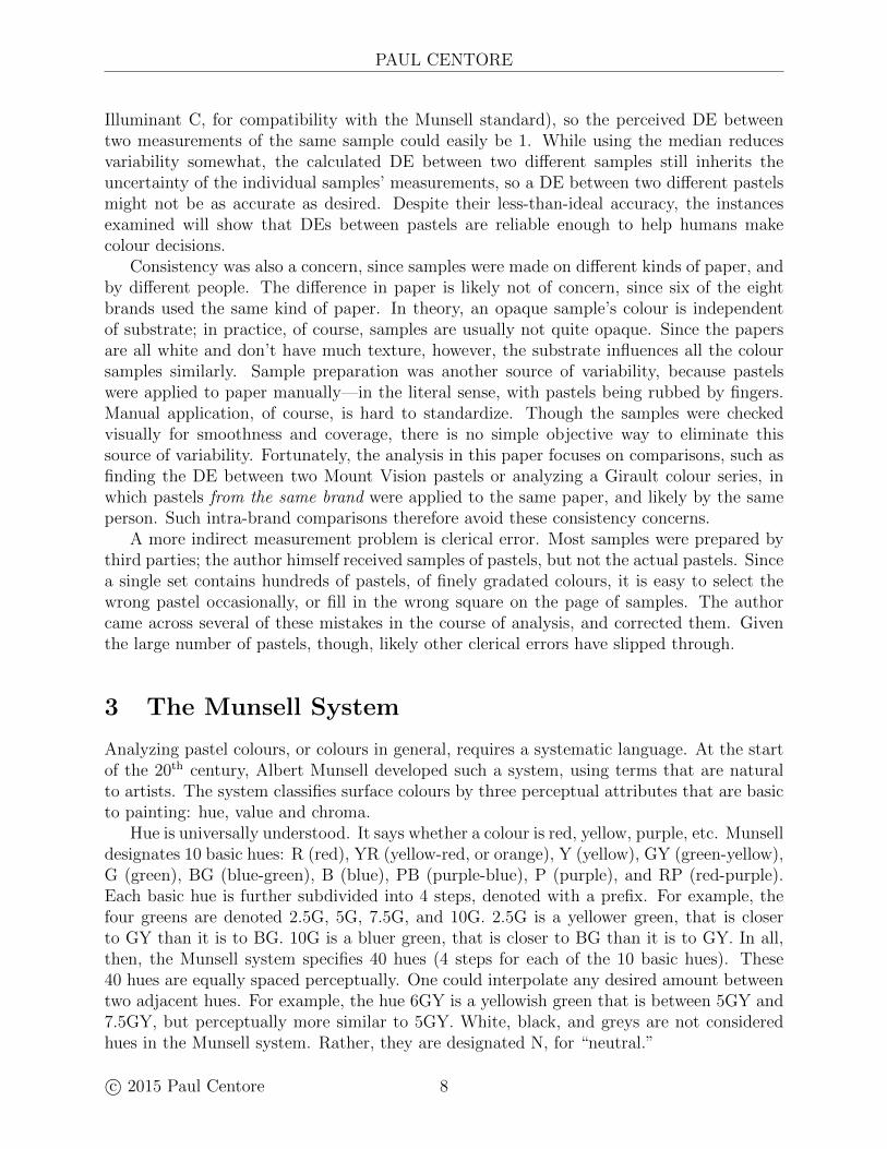
Each sample was measured with an X-Rite i1Pro2 handheld spectrophotometer, as shownin Figure 5. More technical details of the pastel measurements can be found in Ref. 7. Eachsample was actually measured three times, with replacement, and the median was taken asthe final measurement. A pastel sample’s dusty surface makes measurement difficult, andthe mean colour difference from the mean8 (MCDM) was about 1.9 For comparison, theMCDM for printed inkjet samples, measured with the same i1Pro2, was typically between0.2 and 0.3. The MCDM is expressed as a DE (calculated for these samples with respect to
c© 2015 Paul Centore 6
PASTELS: A COLOUR GUIDE
Figure 4: Two Samples, Each Made with Sennelier 303
Figure 5: The X-Rite i1Pro2 Spectrophotometer, Used for Measuring Pastels
7 c© 2015 Paul Centore
PAUL CENTORE
Illuminant C, for compatibility with the Munsell standard), so the perceived DE betweentwo measurements of the same sample could easily be 1. While using the median reducesvariability somewhat, the calculated DE between two different samples still inherits theuncertainty of the individual samples’ measurements, so a DE between two different pastelsmight not be as accurate as desired. Despite their less-than-ideal accuracy, the instancesexamined will show that DEs between pastels are reliable enough to help humans makecolour decisions.
Consistency was also a concern, since samples were made on different kinds of paper, andby different people. The difference in paper is likely not of concern, since six of the eightbrands used the same kind of paper. In theory, an opaque sample’s colour is independentof substrate; in practice, of course, samples are usually not quite opaque. Since the papersare all white and don’t have much texture, however, the substrate influences all the coloursamples similarly. Sample preparation was another source of variability, because pastelswere applied to paper manually—in the literal sense, with pastels being rubbed by fingers.Manual application, of course, is hard to standardize. Though the samples were checkedvisually for smoothness and coverage, there is no simple objective way to eliminate thissource of variability. Fortunately, the analysis in this paper focuses on comparisons, such asfinding the DE between two Mount Vision pastels or analyzing a Girault colour series, inwhich pastels from the same brand were applied to the same paper, and likely by the sameperson. Such intra-brand comparisons therefore avoid these consistency concerns.
A more indirect measurement problem is clerical error. Most samples were prepared bythird parties; the author himself received samples of pastels, but not the actual pastels. Sincea single set contains hundreds of pastels, of finely gradated colours, it is easy to select thewrong pastel occasionally, or fill in the wrong square on the page of samples. The authorcame across several of these mistakes in the course of analysis, and corrected them. Giventhe large number of pastels, though, likely other clerical errors have slipped through.
3 The Munsell System
Analyzing pastel colours, or colours in general, requires a systematic language. At the startof the 20th century, Albert Munsell developed such a system, using terms that are naturalto artists. The system classifies surface colours by three perceptual attributes that are basicto painting: hue, value and chroma.
Hue is universally understood. It says whether a colour is red, yellow, purple, etc. Munselldesignates 10 basic hues: R (red), YR (yellow-red, or orange), Y (yellow), GY (green-yellow),G (green), BG (blue-green), B (blue), PB (purple-blue), P (purple), and RP (red-purple).Each basic hue is further subdivided into 4 steps, denoted with a prefix. For example, thefour greens are denoted 2.5G, 5G, 7.5G, and 10G. 2.5G is a yellower green, that is closerto GY than it is to BG. 10G is a bluer green, that is closer to BG than it is to GY. In all,then, the Munsell system specifies 40 hues (4 steps for each of the 10 basic hues). These40 hues are equally spaced perceptually. One could interpolate any desired amount betweentwo adjacent hues. For example, the hue 6GY is a yellowish green that is between 5GY and7.5GY, but perceptually more similar to 5GY. White, black, and greys are not consideredhues in the Munsell system. Rather, they are designated N, for “neutral.”
c© 2015 Paul Centore 8
PASTELS: A COLOUR GUIDE
N2
N9
N8
N7
N6
N5
N4
N3
N1
2 4 6 8 10 12
Chroma
Hue: 6GY
Valu
e
Figure 6: The Hue Leaf for 6GY in the Munsell System
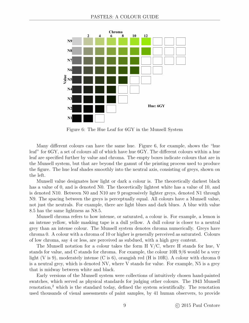
Many different colours can have the same hue. Figure 6, for example, shows the “hueleaf” for 6GY, a set of colours all of which have hue 6GY. The different colours within a hueleaf are specified further by value and chroma. The empty boxes indicate colours that are inthe Munsell system, but that are beyond the gamut of the printing process used to producethe figure. The hue leaf shades smoothly into the neutral axis, consisting of greys, shown onthe left.
Munsell value designates how light or dark a colour is. The theoretically darkest blackhas a value of 0, and is denoted N0. The theoretically lightest white has a value of 10, andis denoted N10. Between N0 and N10 are 9 progressively lighter greys, denoted N1 throughN9. The spacing between the greys is perceptually equal. All colours have a Munsell value,not just the neutrals. For example, there are light blues and dark blues. A blue with value8.5 has the same lightness as N8.5.
Munsell chroma refers to how intense, or saturated, a colour is. For example, a lemon isan intense yellow, while masking tape is a dull yellow. A dull colour is closer to a neutralgrey than an intense colour. The Munsell system denotes chroma numerically. Greys havechroma 0. A colour with a chroma of 10 or higher is generally perceived as saturated. Coloursof low chroma, say 4 or less, are perceived as subdued, with a high grey content.
The Munsell notation for a colour takes the form H V/C, where H stands for hue, Vstands for value, and C stands for chroma. For example, the colour 10R 9/6 would be a verylight (V is 9), moderately intense (C is 6), orangish red (H is 10R). A colour with chroma 0is a neutral grey, which is denoted NV, where V stands for value. For example, N5 is a greythat is midway between white and black.
Early versions of the Munsell system were collections of intuitively chosen hand-paintedswatches, which served as physical standards for judging other colours. The 1943 Munsellrenotation,2 which is the standard today, defined the system scientifically. The renotationused thousands of visual assessments of paint samples, by 41 human observers, to provide
9 c© 2015 Paul Centore
PAUL CENTORE
a firm empirical basis for the system. In addition, the renotation specified a set of 2745Munsell colours quantitatively, in terms of a scientific coordinate system developed by theCommission Internationale de l’Eclairage (CIE). By interpolating between the 2745 specifiedMunsell colours, CIE coordinates can be found for any other Munsell expressions. Whilethe renotation calculates CIE coordinates from Munsell coordinates, it is also possible toinvert3 the renotation, so that one can calculate a Munsell specification from a set of CIEcoordinates.
CIE coordinates can be calculated from measurements provided by the i1Pro2 spec-trophotometer, allowing us to find Munsell specifications for all 3154 pastels. As a result,we have an intuitive, yet still objective, description for each pastel’s colour.
4 Pastel Data Files and Spreadsheets
To allow painters easy access to the Munsell data for pastels, some downloadable text fileshave been posted online, at http://www.aic-color.org/journal/v15.htm. Each text file con-tains tab-delimited, human-readable text, in a matrix format. The first line is a header row,that describes the contents of the rows beneath. The files can be easily opened in spreadsheetprograms such as Microsoft Excel. For convenience, two workbooks, one in Microsoft Excel.xls format and one in NeoOffice .ods format, have also been provided. The text files appearas spreadsheets in these two workbooks.
The following files have been provided:
1. MunsellDataForPastels.txt. Each row of this text file gives the Munsell coordi-nates for one pastel. In addition to the complete Munsell specification, columns giveparticular parts of the Munsell specification. For example, there are columns for valueand chroma.
2. MunsellToPastel.txt. This file is a kind of inverse to MunsellDataForPastels.txt.Given a Munsell specification from the renotation, the file lists those pastels that arethe best match for it.
3. NearDuplicatesForPastels.txt. This file lists all pairs of pastels that are producedby the same manufacturer, and whose colours are very similar. Such near-duplicateswill be discussed in detail later.
4. PastelData.ods and PastelData.xls. Each of the preceding files appears as onespreadsheet in these two workbooks.
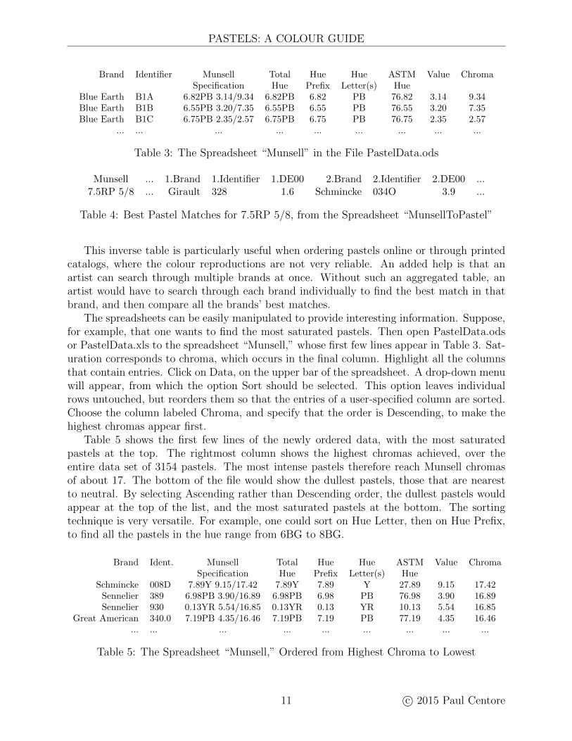
The spreadsheet “Munsell” presents the most basic data. Table 3 shows the first fewlines. Given a particular pastel, an artist can find its Munsell specification directly besideit.
The spreadsheet “MunsellToPastel” presents a sort of inverse table, which helps find apastel that is a good match for a desired colour. Suppose a pastellist wants a certain colour,such as 7.5RP 5/8. Then the row for 7.5RP 5/8 in “MunsellToPastel” gives the closestavailable pastel as Girault 328, whose DE from 7.5RP 5/8 is 1.6, a good match. The nextbest match is Schmincke 034O, with a DE of 3.9. Three other possible matches, with theirDEs, are also given.
c© 2015 Paul Centore 10
PASTELS: A COLOUR GUIDE
Brand Identifier Munsell Total Hue Hue ASTM Value ChromaSpecification Hue Prefix Letter(s) Hue
Blue Earth B1A 6.82PB 3.14/9.34 6.82PB 6.82 PB 76.82 3.14 9.34Blue Earth B1B 6.55PB 3.20/7.35 6.55PB 6.55 PB 76.55 3.20 7.35Blue Earth B1C 6.75PB 2.35/2.57 6.75PB 6.75 PB 76.75 2.35 2.57
... ... ... ... ... ... ... ... ...
Table 3: The Spreadsheet “Munsell” in the File PastelData.ods
Munsell ... 1.Brand 1.Identifier 1.DE00 2.Brand 2.Identifier 2.DE00 ...7.5RP 5/8 ... Girault 328 1.6 Schmincke 034O 3.9 ...
Table 4: Best Pastel Matches for 7.5RP 5/8, from the Spreadsheet “MunsellToPastel”
This inverse table is particularly useful when ordering pastels online or through printedcatalogs, where the colour reproductions are not very reliable. An added help is that anartist can search through multiple brands at once. Without such an aggregated table, anartist would have to search through each brand individually to find the best match in thatbrand, and then compare all the brands’ best matches.
The spreadsheets can be easily manipulated to provide interesting information. Suppose,for example, that one wants to find the most saturated pastels. Then open PastelData.odsor PastelData.xls to the spreadsheet “Munsell,” whose first few lines appear in Table 3. Sat-uration corresponds to chroma, which occurs in the final column. Highlight all the columnsthat contain entries. Click on Data, on the upper bar of the spreadsheet. A drop-down menuwill appear, from which the option Sort should be selected. This option leaves individualrows untouched, but reorders them so that the entries of a user-specified column are sorted.Choose the column labeled Chroma, and specify that the order is Descending, to make thehighest chromas appear first.
Table 5 shows the first few lines of the newly ordered data, with the most saturatedpastels at the top. The rightmost column shows the highest chromas achieved, over theentire data set of 3154 pastels. The most intense pastels therefore reach Munsell chromasof about 17. The bottom of the file would show the dullest pastels, those that are nearestto neutral. By selecting Ascending rather than Descending order, the dullest pastels wouldappear at the top of the list, and the most saturated pastels at the bottom. The sortingtechnique is very versatile. For example, one could sort on Hue Letter, then on Hue Prefix,to find all the pastels in the hue range from 6BG to 8BG.
Brand Ident. Munsell Total Hue Hue ASTM Value ChromaSpecification Hue Prefix Letter(s) Hue
Schmincke 008D 7.89Y 9.15/17.42 7.89Y 7.89 Y 27.89 9.15 17.42Sennelier 389 6.98PB 3.90/16.89 6.98PB 6.98 PB 76.98 3.90 16.89Sennelier 930 0.13YR 5.54/16.85 0.13YR 0.13 YR 10.13 5.54 16.85
Great American 340.0 7.19PB 4.35/16.46 7.19PB 7.19 PB 77.19 4.35 16.46... ... ... ... ... ... ... ... ...
Table 5: The Spreadsheet “Munsell,” Ordered from Highest Chroma to Lowest
11 c© 2015 Paul Centore
PAUL CENTORE
5 Analysis and Recommendations
A major difficulty with pastels is their sheer numbers: painters and manufacturers mustsomehow make sense of hundreds of pastel sticks. This section first presents some analysisof the spectrophotometric pastel measurements, showing that most manufacturers producenear-duplicates, in which two pastels have almost identical colours. This analysis, and theprevious Munsell analysis, lead to two practical suggestions for making pastels more under-standable. First, near-duplicate or unnecessary colours can be eliminated. Second, pastels’names could be their Munsell specifications. This section discusses each suggestion in turn.
5.1 Eliminating Near-Duplicates
When a manufacturer produces several hundred pastel colours, making them all distinct isa challenge. This section discusses the finding that all the brands offered some duplicatesor near-duplicates, that is, two pastels (from the same brand) whose colours were nearlyidentical. An exhaustive calculation determined near-duplicates, by evaluating the colourdifference (DE) for all pairs of pastels of the same brand. Two pastels were considerednear-duplicates if their DE was 2 or less. For example, the DE between the pair Blue EarthC1C and Blue Earth B2C was only 0.2; these colours would be considered identical in mostpractical settings. A few of the comparisons were not quite appropriate, for example whenone pastel was an iridescent version of another; in that case, the pastels could have thesame colour, but a significant difference in appearance. Sennelier, for instance, had five suchnear-duplicate pairs. Overall, however, the small number of effect pastels did not distort theresults significantly, so they were included in the near-duplicate analysis.
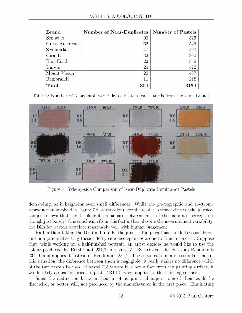
Table 6 lists the number of near-duplicates by brand. Sennelier has 90 near-duplicatepairs, the largest of any brand. Rembrandt has only 11 pairs, the smallest of any brand.Sennelier, however, offers more than twice as many pastels as Rembrandt. As a rule ofthumb, the table shows that larger sets have more near-duplicates. While not unexpected,this result does suggest that manufacturers are not systematically checking for repeatedcolours. This lack of checking is perhaps understandable because the sheer number of pastelsmakes identifying duplicates surprisingly time-consuming. A visual check requires settinga sample of each pastel directly against a sample of every other pastel. Even a small setlike Rembrandt would require nearly 50,000 comparisons. A spectrophotometric analysis, ofcourse, will readily identify pastels of similar colours, but it is unclear to what extent pastelmanufacturers use colour-measuring equipment. (Many pastel companies function more likecottage industries than instrumented factories. Unison, for example, consists of less than adozen employees, making pastels in an old rectory in Northumberland.)
Since spectrophotometric measurements have an MCDM of 1, causing some uncertaintyin the DEs when two pastels are compared, an ersatz duplication could occur solely becauseof measurement error. A colour shift due to manufacturing inconsistency, such as appearsin Figure 4, could also create an ersatz duplication. Given this general uncertainty, the DEsshould be used mainly as indicators of likely colour duplication, which must then be visuallyinspected.
As an example, Figure 7 shows the 11 near-duplicate Rembrandt pairs. Two samples havebeen made for each pair, and placed side-by-side. This method of comparison is the most
c© 2015 Paul Centore 12
PASTELS: A COLOUR GUIDE
Brand Number of Near-Duplicates Number of PastelsSennelier 90 525Great American 62 546Schmincke 47 400Girault 32 300Blue Earth 22 336Unison 20 422Mount Vision 20 407Rembrandt 11 218
Total 304 3154
Table 6: Number of Near-Duplicate Pairs of Pastels (each pair is from the same brand)
Figure 7: Side-by-side Comparison of Near-Duplicate Rembrandt Pastels
demanding, as it heightens even small differences. While the photographic and electronicreproduction involved in Figure 7 distorts colours for the reader, a visual check of the physicalsamples shows that slight colour discrepancies between most of the pairs are perceptible,though just barely. One conclusion from this fact is that, despite the measurement variability,the DEs for pastels correlate reasonably well with human judgement.
Rather than taking the DE too literally, the practical implications should be considered,and in a practical setting these side-by-side discrepancies are not of much concern. Supposethat, while working on a half-finished portrait, an artist decides he would like to use thecolour produced by Rembrandt 231,9 in Figure 7. By accident, he picks up Rembrandt234,10 and applies it instead of Rembrandt 231,9. These two colours are so similar that, inthis situation, the difference between them is negligible: it really makes no difference whichof the two pastels he uses. If pastel 231,9 were in a box a foot from the painting surface, itwould likely appear identical to pastel 234,10, when applied to the painting surface.
Since the distinction between them is of no practical import, one of them could bediscarded, or better still, not produced by the manufacturer in the first place. Eliminating
13 c© 2015 Paul Centore
PAUL CENTORE
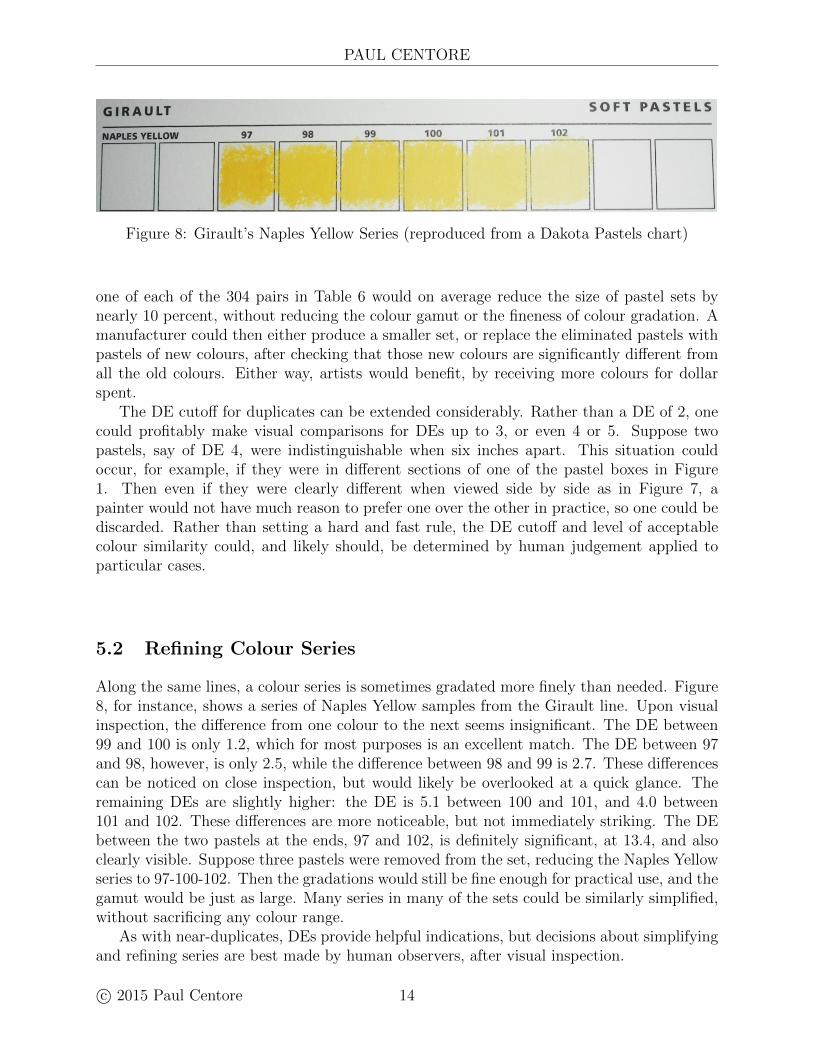
Figure 8: Girault’s Naples Yellow Series (reproduced from a Dakota Pastels chart)
one of each of the 304 pairs in Table 6 would on average reduce the size of pastel sets bynearly 10 percent, without reducing the colour gamut or the fineness of colour gradation. Amanufacturer could then either produce a smaller set, or replace the eliminated pastels withpastels of new colours, after checking that those new colours are significantly different fromall the old colours. Either way, artists would benefit, by receiving more colours for dollarspent.
The DE cutoff for duplicates can be extended considerably. Rather than a DE of 2, onecould profitably make visual comparisons for DEs up to 3, or even 4 or 5. Suppose twopastels, say of DE 4, were indistinguishable when six inches apart. This situation couldoccur, for example, if they were in different sections of one of the pastel boxes in Figure1. Then even if they were clearly different when viewed side by side as in Figure 7, apainter would not have much reason to prefer one over the other in practice, so one could bediscarded. Rather than setting a hard and fast rule, the DE cutoff and level of acceptablecolour similarity could, and likely should, be determined by human judgement applied toparticular cases.
5.2 Refining Colour Series
Along the same lines, a colour series is sometimes gradated more finely than needed. Figure8, for instance, shows a series of Naples Yellow samples from the Girault line. Upon visualinspection, the difference from one colour to the next seems insignificant. The DE between99 and 100 is only 1.2, which for most purposes is an excellent match. The DE between 97and 98, however, is only 2.5, while the difference between 98 and 99 is 2.7. These differencescan be noticed on close inspection, but would likely be overlooked at a quick glance. Theremaining DEs are slightly higher: the DE is 5.1 between 100 and 101, and 4.0 between101 and 102. These differences are more noticeable, but not immediately striking. The DEbetween the two pastels at the ends, 97 and 102, is definitely significant, at 13.4, and alsoclearly visible. Suppose three pastels were removed from the set, reducing the Naples Yellowseries to 97-100-102. Then the gradations would still be fine enough for practical use, and thegamut would be just as large. Many series in many of the sets could be similarly simplified,without sacrificing any colour range.
As with near-duplicates, DEs provide helpful indications, but decisions about simplifyingand refining series are best made by human observers, after visual inspection.
c© 2015 Paul Centore 14
PASTELS: A COLOUR GUIDE
5.3 Informative Pastel Names
As mentioned earlier, most pastel names (or more often, numbers) convey little informationto an artist. The name Girault 97, for instance, gives no indication that the pastel is ayellow, nor that it is light and fairly saturated. Two brands, Unison and Blue Earth, givesome indication of hue, and two others, Rembrandt and Schmincke, give at least a relativeindication of lightness. It is recommended instead that each pastel be labeled with itsMunsell specification. The name itself would then provide at least an approximate idea ofthe colour, and a painter could consult a Munsell book, interpolating visually if needed, fora more accurate idea.
In fact, the Munsell system can be helpful even without a book. For example, theMunsell value of Caucasian skin is about 7, so when painting a portrait, colours with Munsellvalue 7 would likely be used for skin in full light. Taking this idea further, shadows inportraits or figure work would be given a Munsell value of 4 if moderate light-dark contrastis desired, and a Munsell value of 2 for strong light-dark contrast. As another example, anartist who has some pastels of chroma 4, and recognizes them as being subdued but stillof easily distinguishable hue, knows that other pastels of about that chroma are similarlysaturated. Hue markings, of course, are self-explanatory, even without a printed reference.By considering the three Munsell attributes in this way, a painter could select pastels withoutconsulting a Munsell book.
Munsell identifiers would eliminate a difficulty that pastellists face: buying pastels withoutfirst seeing their colours. Since art supply stores that display open stock pastels for manybrands, or even one brand, are few and far between, purchasers must rely on printed orelectronic colour reproductions. Since these reproductions are usually inaccurate, manypurchases involve a fair bit of guesswork. Using Munsell specifications as names wouldmitigate this guesswork.
6 Summary
This paper has presented Munsell specifications for 3154 artist’s pastels, calculated fromoriginal spectrophotometric measurements. A sort of inverse table was also calculated, thatidentifies which pastels are closest to a standard Munsell colour. Artists can use this datawhen choosing, organizing, or purchasing pastels, to avoid relying on questionable colourreproductions. The pastels’ measurements have all been posted along with this paper, asboth text files and spreadsheets. Other researchers are free to use this data for furtheranalysis, and to combine it with data of their own.
Measurement analysis revealed many near-duplicates, in which two pastels from the samebrand have very similar colours. The analysis also suggested some practical improvements,such as using Munsell specifications as pastel names and eliminating duplicate or unnecessarypastels, to make pastel offerings more tractable for both artists and manufacturers.
This work aims to bring some order to the plethora of commercially available pastelcolours. Many painters, not to mention manufacturers, undoubtedly find the large numberof pastels unnecessarily confusing. It is hoped that the results presented here will lead tosimple, practical improvements that make pastel use easier and more effective.
15 c© 2015 Paul Centore
PAUL CENTORE
References
1. Ralph Mayer, The Artist’s Handbook of Materials and Techniques, 5th ed., Faber andFaber, 1991.
2. Sidney Newhall, Dorothy Nickerson, & Deane B. Judd. “Final Report of the O. S. A.Subcommittee on the Spacing of the Munsell Colors,” JOSA, Vol. 33, Issue 7, 1943, pp.385-418.
3. Paul Centore, “An Open-Source Inversion Algorithm for the Munsell Renotation,” ColorResearch & Application, Vol. 37, No. 6, December 2012, pp. 455-464.
4. Marie Meyer, Multi-Brand Color Chart: Pastels, Huechroval Corporation, 2007.
5. CIE. “Colorimetry.” Vienna: CIE Technical Report No. 15:2004, 3rd ed., Central Bureauof the CIE, 2004
6. Gaurav Sharma, Wencheng Wu, & Edul N. Dalal, “The CIEDE2000 Formula: Imple-mentation Notes, Supplementary Test Data, and Mathematical Observations,” COLORResearch and Application, Vol. 30, Number 1, February 2005, pp. 21-30.
7. Paul Centore, “A Colour Survey of Artist’s Pastels,” Journal of the International ColourAssociation, Vol. 15, May 2016, pp. 42-59.
8. Roy S. Berns, Billmeyer and Saltzman’s Principles of Color Technology, 3rd ed., JohnWiley & Sons, 2000.
9. Paul Centore, “The Coefficient of Variation as a Measure of Spectrophotometric Repeata-bility,” to appear in Color Research and Application, 2017.
c© 2015 Paul Centore 16