Embed Size (px)
Citation preview
Lean Six Sigma Training – The DMAIC Story
UNIT 3: STEP 3: Analyze Page 3-1
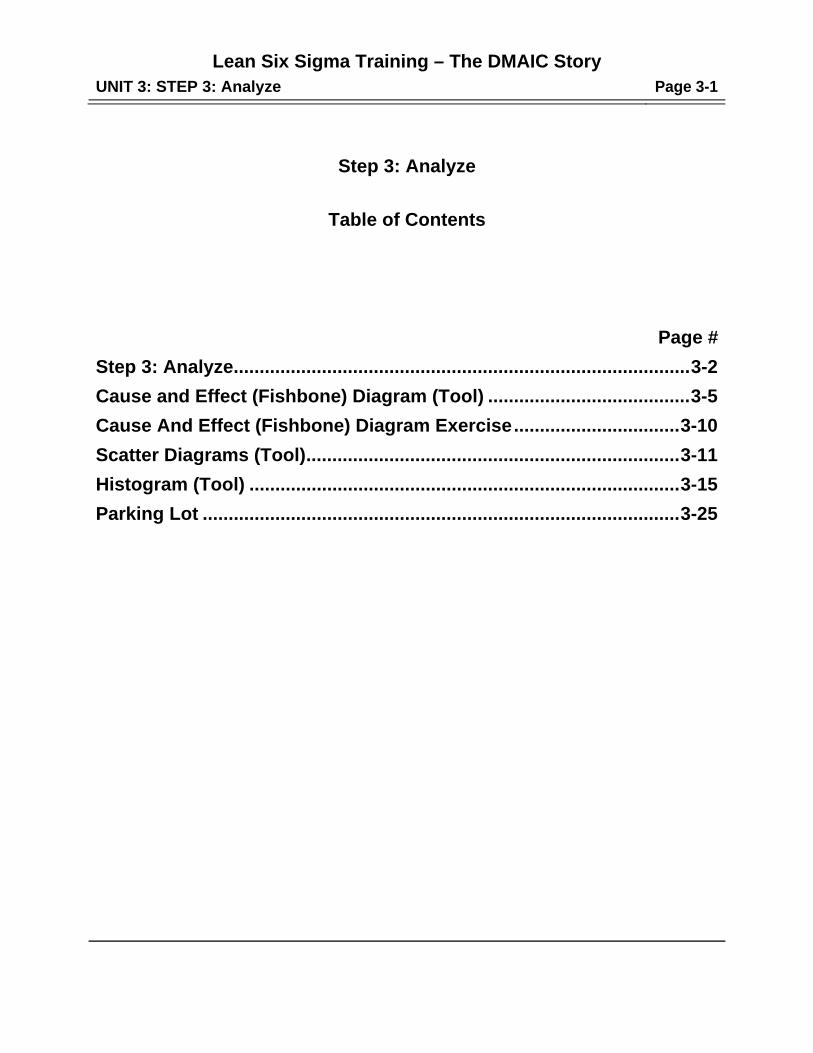
Step 3: Analyze
Table of Contents
Page #
Step 3: Analyze ........................................................................................ 3-2
Cause and Effect (Fishbone) Diagram (Tool) ....................................... 3-5
Cause And Effect (Fishbone) Diagram Exercise ................................ 3-10
Scatter Diagrams (Tool) ........................................................................ 3-11
Histogram (Tool) ................................................................................... 3-15
Parking Lot ............................................................................................ 3-25
Lean Six Sigma Training – The DMAIC Story
UNIT 3: STEP 3: Analyze Page 3-2
9
Step 3: Analyze
Objective:
Analyze the problem to identify and verify its primary root causes.
Description:
STEP 3 identifies the problem's primary causes and verifies them with data to ensure
they are the root causes. To accomplish this task:
(1) Collect as much information as possible concerning the data contained in the
“Problem Statement” and identify potential causes from “standards, policies or
procedures that failed” or “training concerns”. Take each potential cause to the root
level and check reverse logic. (2) Select the most likely primary causes - those that
potentially have the greatest impact on the problem. (3) Verify a cause and effect
relationship between the most likely causes and the problem.
It is important to conduct sufficient Analysis so that each primary root cause's impact
on the gap identified in STEP 2 can be approximated. Analysis should be sufficient to
satisfy the reasonable person. Avoid “paralysis by Analysis”.
Checkpoints:
Cause and effect Analysis was taken to the root level.
Cause and effect Analysis requires that sufficient knowledge concerning the
data in the problem statement is collected. This may require subject matter
experts or people from other departments. Through close examination of the
problematic data within the “Problem Statement” the team can identify the
potential root causes.
Lean Six Sigma Training – The DMAIC Story
UNIT 3: STEP 3: Analyze Page 3-3
12
11
10
Step 3: Analyze (Continued)
Potential causes most likely to have the greatest impact on the problem
were selected.
The team needs to identify causes that appear or are proven to occur more
frequently than other causes found in the “Problem Statement” data.
A relationship between the root causes and the problem was verified with
data.
Verification must be performed with data. Careful thought should be given as to
what relationship is to be proven so that an appropriate data collection form can
be designed. The team must determine if the data to be collected will be
attributes or variables and how long it will take to collect data. Verification of
root causes should be sufficient to satisfy a reasonable person that when
the root causes are present the problem exists and when root causes are
absent the problem does not exist or is reduced. There are many statistical
tools and techniques to verify cause and effect relationships. This manual only
provides the scatter diagram tool for review.
The impact of each root cause on the gap was determined.
Sufficiently collected and analyzed data will enable the team to approximate
with confidence the impact of root causes on the gap. This is a step critical to
cost-benefit Analysis, which will be done in STEP 4 when feasibility is
evaluated.
Lean Six Sigma Training – The DMAIC Story
UNIT 3: STEP 3: Analyze Page 3-4
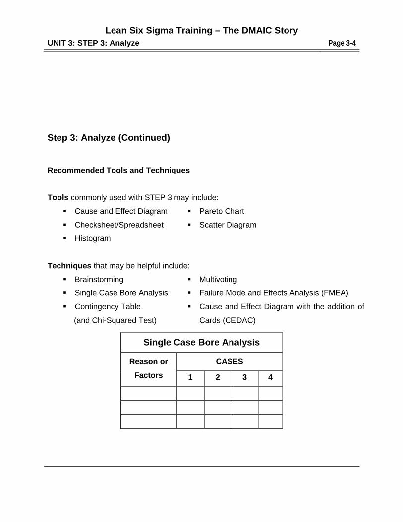
Step 3: Analyze (Continued)
Recommended Tools and Techniques
Tools commonly used with STEP 3 may include:
Cause and Effect Diagram Pareto Chart
Checksheet/Spreadsheet Scatter Diagram
Histogram
Techniques that may be helpful include:
Brainstorming Multivoting
Single Case Bore Analysis Failure Mode and Effects Analysis (FMEA)
Contingency Table
(and Chi-Squared Test)
Cause and Effect Diagram with the addition of
Cards (CEDAC)
Single Case Bore Analysis
Reason or
Factors
CASES
1 2 3 4
Lean Six Sigma Training – The DMAIC Story
UNIT 3: STEP 3: Analyze Page 3-5
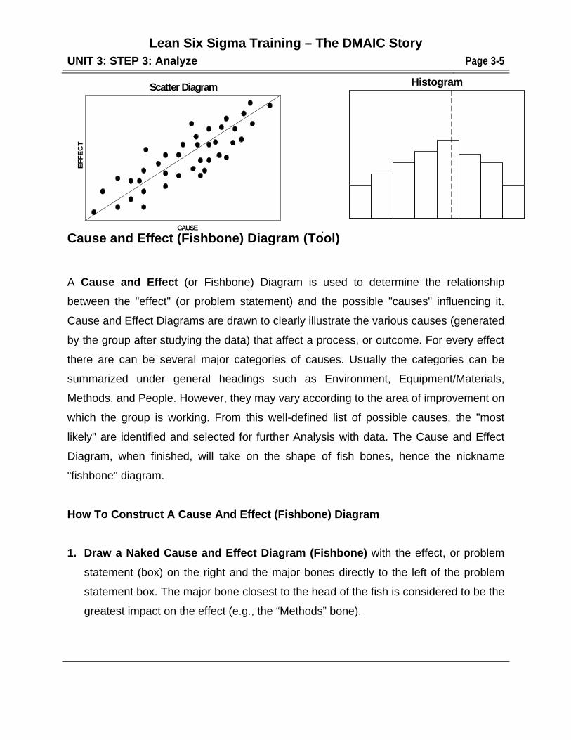
Cause and Effect (Fishbone) Diagram (Tool) A Cause and Effect (or Fishbone) Diagram is used to determine the relationship
between the "effect" (or problem statement) and the possible "causes" influencing it.
Cause and Effect Diagrams are drawn to clearly illustrate the various causes (generated
by the group after studying the data) that affect a process, or outcome. For every effect
there are can be several major categories of causes. Usually the categories can be
summarized under general headings such as Environment, Equipment/Materials,
Methods, and People. However, they may vary according to the area of improvement on
which the group is working. From this well-defined list of possible causes, the "most
likely" are identified and selected for further Analysis with data. The Cause and Effect
Diagram, when finished, will take on the shape of fish bones, hence the nickname
"fishbone" diagram.
How To Construct A Cause And Effect (Fishbone) Diagram
1. Draw a Naked Cause and Effect Diagram (Fishbone) with the effect, or problem
statement (box) on the right and the major bones directly to the left of the problem
statement box. The major bone closest to the head of the fish is considered to be the
greatest impact on the effect (e.g., the “Methods” bone).
HistogramScatter Diagram
CAUSE
EF
FE
CT
Lean Six Sigma Training – The DMAIC Story
UNIT 3: STEP 3: Analyze Page 3-6
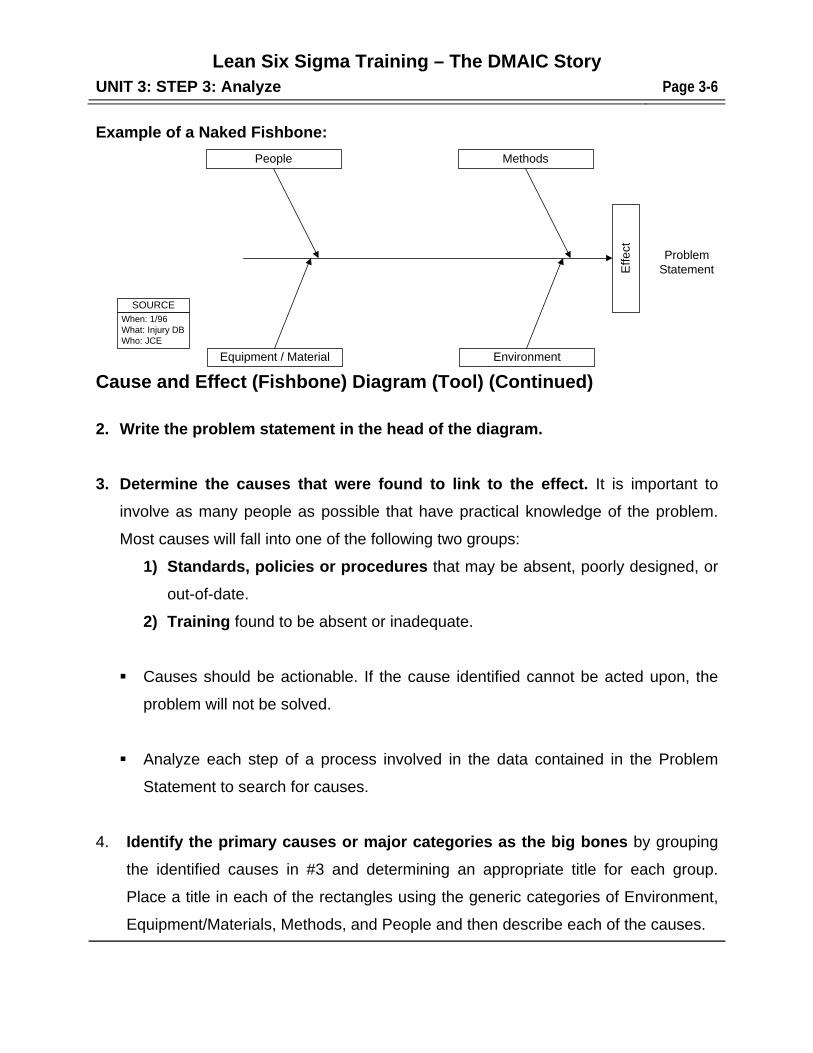
Example of a Naked Fishbone:
Cause and Effect (Fishbone) Diagram (Tool) (Continued)
2. Write the problem statement in the head of the diagram.
3. Determine the causes that were found to link to the effect. It is important to
involve as many people as possible that have practical knowledge of the problem.
Most causes will fall into one of the following two groups:
1) Standards, policies or procedures that may be absent, poorly designed, or
out-of-date.
2) Training found to be absent or inadequate.
Causes should be actionable. If the cause identified cannot be acted upon, the
problem will not be solved.
Analyze each step of a process involved in the data contained in the Problem
Statement to search for causes.
4. Identify the primary causes or major categories as the big bones by grouping
the identified causes in #3 and determining an appropriate title for each group.
Place a title in each of the rectangles using the generic categories of Environment,
Equipment/Materials, Methods, and People and then describe each of the causes.
MethodsPeople
Equipment / Material Environment
Effe
ct
When: 1/96What: Injury DBWho: JCE
SOURCE
ProblemStatement
Lean Six Sigma Training – The DMAIC Story
UNIT 3: STEP 3: Analyze Page 3-7
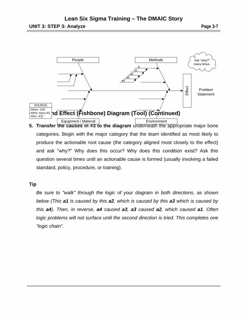
Cause and Effect (Fishbone) Diagram (Tool) (Continued) 5. Transfer the causes in #3 to the diagram underneath the appropriate major bone
categories. Begin with the major category that the team identified as most likely to
produce the actionable root cause (the category aligned most closely to the effect)
and ask "why?" Why does this occur? Why does this condition exist? Ask this
question several times until an actionable cause is formed (usually involving a failed
standard, policy, procedure, or training).
Tip
Be sure to "walk" through the logic of your diagram in both directions, as shown
below (This a1 is caused by this a2, which is caused by this a3 which is caused by
this a4). Then, in reverse, a4 caused a3, a3 caused a2, which caused a1. Often
logic problems will not surface until the second direction is tried. This completes one
“logic chain”.
MethodsPeople
Equipment / Material Environment
Effe
ct
Ask "why?"many times.
Aa1
a2a3
a4
When: 1/00What: Injury 6GWho: JCE
SOURCE
ProblemStatement
Lean Six Sigma Training – The DMAIC Story
UNIT 3: STEP 3: Analyze Page 3-8
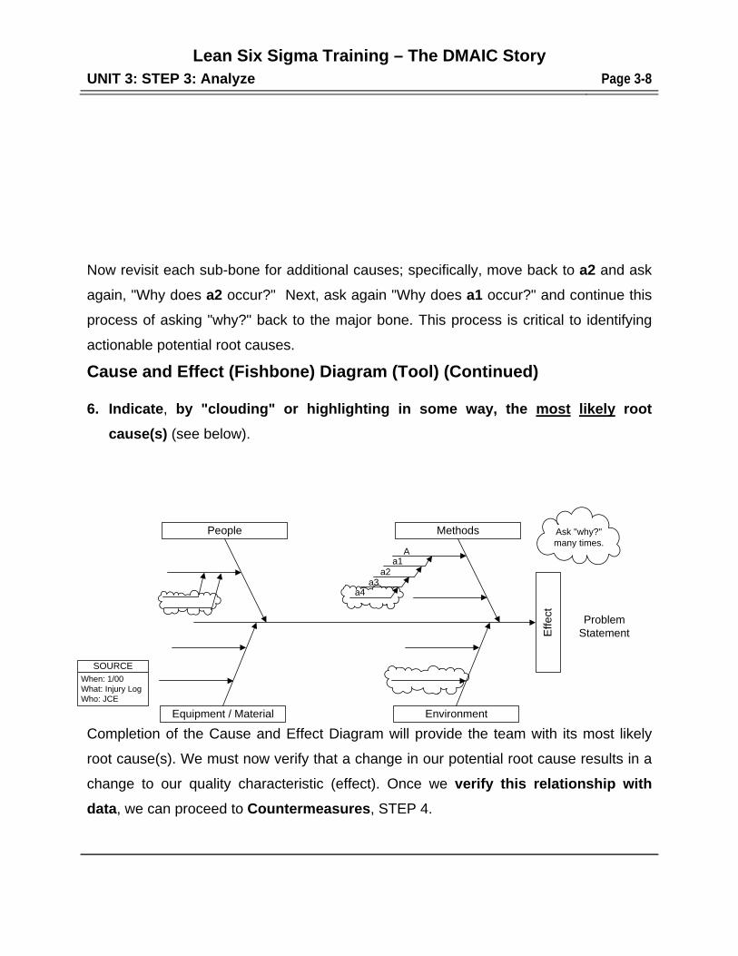
Now revisit each sub-bone for additional causes; specifically, move back to a2 and ask
again, "Why does a2 occur?" Next, ask again "Why does a1 occur?" and continue this
process of asking "why?" back to the major bone. This process is critical to identifying
actionable potential root causes.
Cause and Effect (Fishbone) Diagram (Tool) (Continued) 6. Indicate, by "clouding" or highlighting in some way, the most likely root
cause(s) (see below).
Completion of the Cause and Effect Diagram will provide the team with its most likely
root cause(s). We must now verify that a change in our potential root cause results in a
change to our quality characteristic (effect). Once we verify this relationship with
data, we can proceed to Countermeasures, STEP 4.
MethodsPeople
Equipment / Material Environment
Effe
ct
Ask "why?"many times.
Aa1
a2a3
a4
When: 1/00What: Injury LogWho: JCE
SOURCE
ProblemStatement
Lean Six Sigma Training – The DMAIC Story
UNIT 3: STEP 3: Analyze Page 3-9
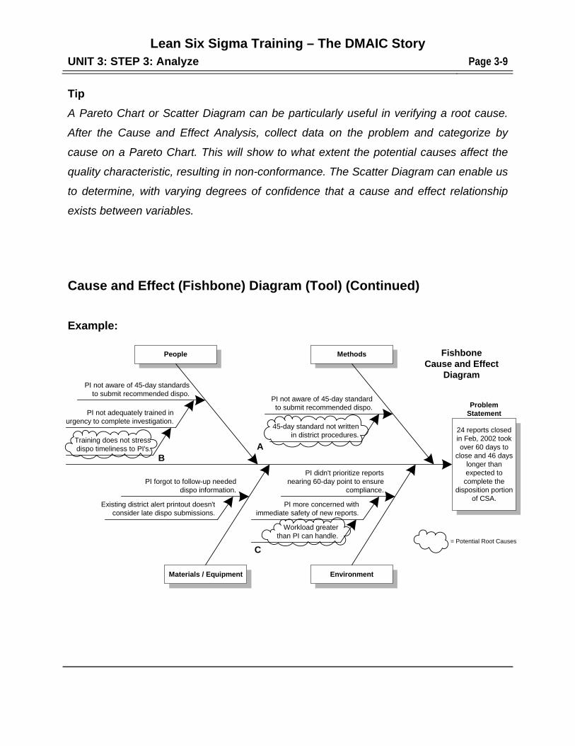
Tip
A Pareto Chart or Scatter Diagram can be particularly useful in verifying a root cause.
After the Cause and Effect Analysis, collect data on the problem and categorize by
cause on a Pareto Chart. This will show to what extent the potential causes affect the
quality characteristic, resulting in non-conformance. The Scatter Diagram can enable us
to determine, with varying degrees of confidence that a cause and effect relationship
exists between variables.
Cause and Effect (Fishbone) Diagram (Tool) (Continued) Example:
People
PI didn't prioritize reportsnearing 60-day point to ensure
compliance.
PI more concerned withimmediate safety of new reports.
Workload greaterthan PI can handle.
PI not aware of 45-day standardto submit recommended dispo.
PI not aware of 45-day standardsto submit recommended dispo.
45-day standard not writtenin district procedures.
PI not adequately trained inurgency to complete investigation.
Training does not stressdispo timeliness to PI's.
PI forgot to follow-up neededdispo information.
Existing district alert printout doesn'tconsider late dispo submissions.
Materials / Equipment Environment
Methods
24 reports closedin Feb, 2002 tookover 60 days to
close and 46 dayslonger thanexpected to
complete thedisposition portion
of CSA.
ProblemStatement
FishboneCause and Effect
Diagram
= Potential Root Causes
AB
C
Lean Six Sigma Training – The DMAIC Story
UNIT 3: STEP 3: Analyze Page 3-10
Cause and Effect (Fishbone) Diagram Exercise
To practice constructing a Cause and Effect (Fishbone) Diagram.
1. Instructor assigns topic
2. Instructor to divide class
3. Construct Cause and Effect (Fishbone) Diagram
4. Select spokesperson to present to full group
30 minutes in teams
15 minutes in full group presentations
PURPOSE
LIMITS
AGENDA
Lean Six Sigma Training – The DMAIC Story
UNIT 3: STEP 3: Analyze Page 3-11
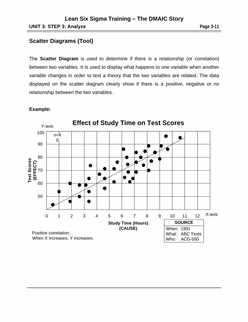
Scatter Diagrams (Tool)
The Scatter Diagram is used to determine if there is a relationship (or correlation)
between two variables. It is used to display what happens to one variable when another
variable changes in order to test a theory that the two variables are related. The data
displayed on the scatter diagram clearly show if there is a positive, negative or no
relationship between the two variables.
Example:
Effect of Study Time on Test Scores
90
1 2 3 4 5 6 7 8 9 10 11 12
Study Time (Hours)(CAUSE)
Tes
t S
co
res
(EF
FE
CT
)
80
70
60
50
n=40
0
Positive correlation:When X increases, Y increases.
100
Y-axis
X-axis
When: 1991What: ABC TestsWho: ACG-550
SOURCE
Lean Six Sigma Training – The DMAIC Story
UNIT 3: STEP 3: Analyze Page 3-12
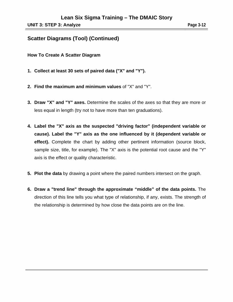
Scatter Diagrams (Tool) (Continued)
How To Create A Scatter Diagram
1. Collect at least 30 sets of paired data ("X" and "Y").
2. Find the maximum and minimum values of "X" and "Y".
3. Draw "X" and "Y" axes. Determine the scales of the axes so that they are more or
less equal in length (try not to have more than ten graduations).
4. Label the "X" axis as the suspected "driving factor" (independent variable or
cause). Label the "Y" axis as the one influenced by it (dependent variable or
effect). Complete the chart by adding other pertinent information (source block,
sample size, title, for example). The "X" axis is the potential root cause and the "Y"
axis is the effect or quality characteristic.
5. Plot the data by drawing a point where the paired numbers intersect on the graph.
6. Draw a "trend line" through the approximate “middle” of the data points. The
direction of this line tells you what type of relationship, if any, exists. The strength of
the relationship is determined by how close the data points are on the line.
Lean Six Sigma Training – The DMAIC Story
UNIT 3: STEP 3: Analyze Page 3-13
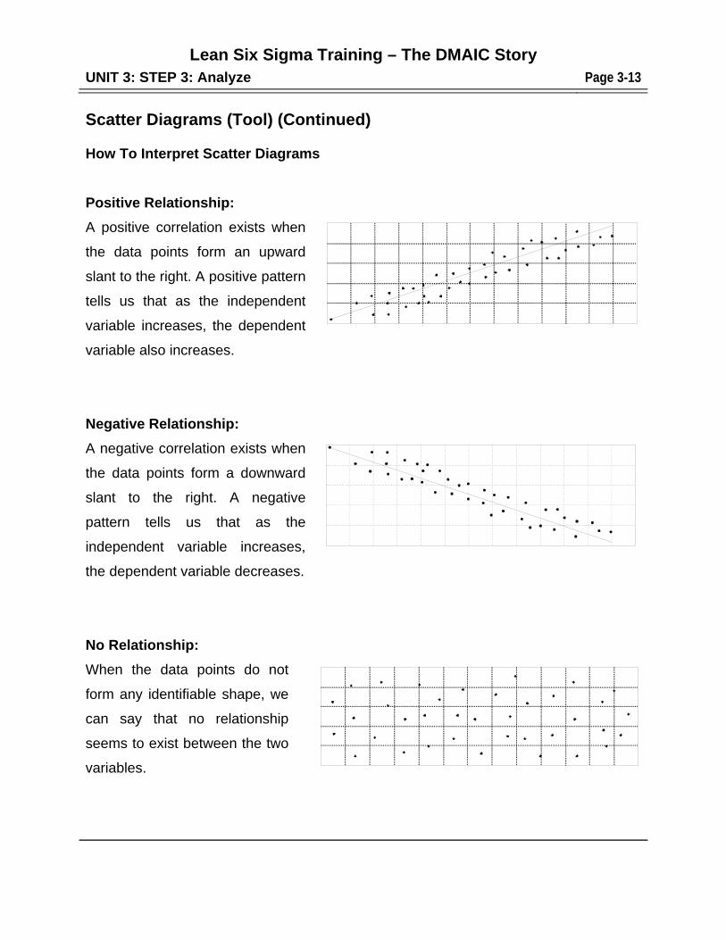
Scatter Diagrams (Tool) (Continued) How To Interpret Scatter Diagrams
Positive Relationship:
A positive correlation exists when
the data points form an upward
slant to the right. A positive pattern
tells us that as the independent
variable increases, the dependent
variable also increases.
Negative Relationship:
A negative correlation exists when
the data points form a downward
slant to the right. A negative
pattern tells us that as the
independent variable increases,
the dependent variable decreases.
No Relationship:
When the data points do not
form any identifiable shape, we
can say that no relationship
seems to exist between the two
variables.
Lean Six Sigma Training – The DMAIC Story
UNIT 3: STEP 3: Analyze Page 3-14
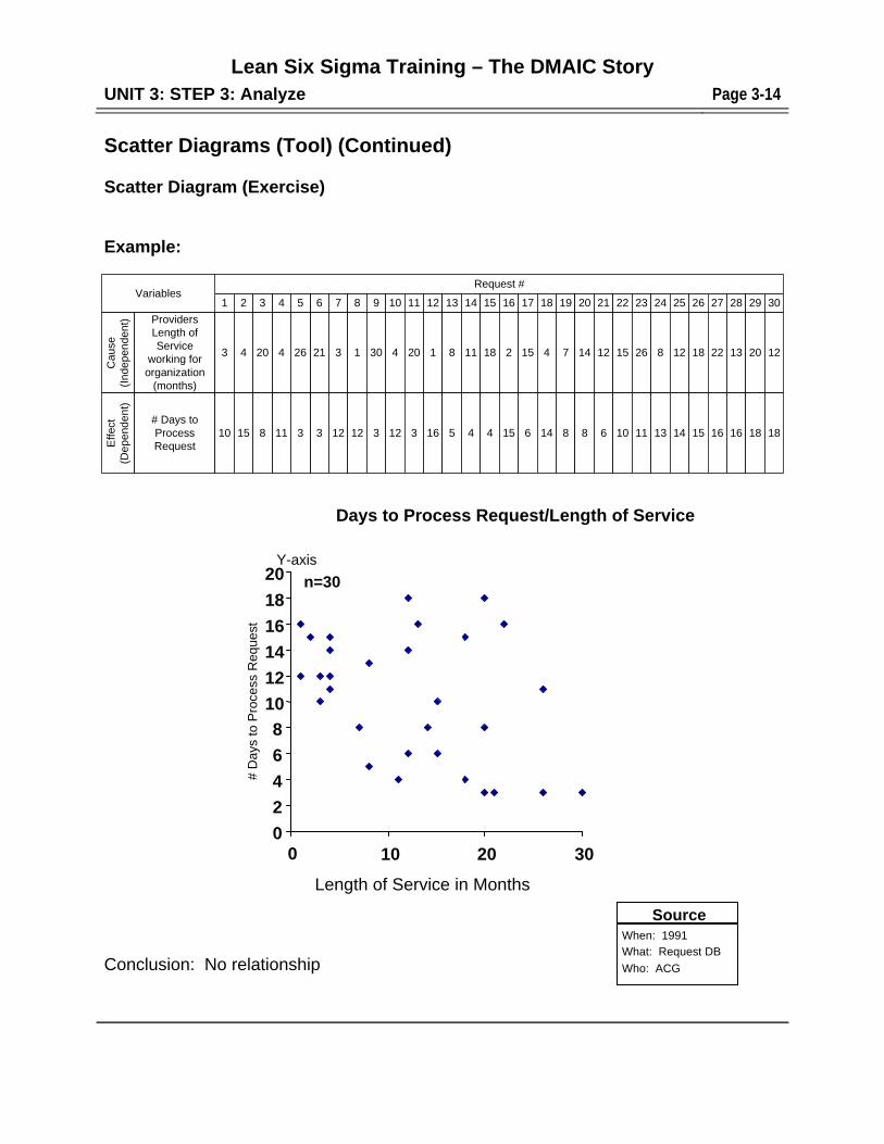
Scatter Diagrams (Tool) (Continued) Scatter Diagram (Exercise)
Example:
Conclusion: No relationship
Request #
211 2 6 7 8 9 10 11 12 13 14 15 16 17 18 19 20543Variables
Cau
se(I
ndep
ende
nt) Providers
Length ofService
working fororganization
(months)
Eff
ect
(Dep
ende
nt)
# Days toProcessRequest
123 4 21 3 1 30 4 20 1 8 11 18 2 15 4 7 1426420
610 15 3 12 12 3 12 3 16 5 4 4 15 6 14 8 83118
22
15
10
23
26
11
24
8
13
25
12
14
26
18
15
27
22
16
28
13
16
29
20
18
30
12
18
When: 1991
What: Request DB
Who: ACG
Source
0
2
4
6
8
10
12
14
16
18
20
0 10 20 30
Length of Service in
n=30
# D
ays
to P
roce
ss R
eque
st
Y-axis
Length of Service in Months
Days to Process Request/Length of Service
Lean Six Sigma Training – The DMAIC Story
UNIT 3: STEP 3: Analyze Page 3-15
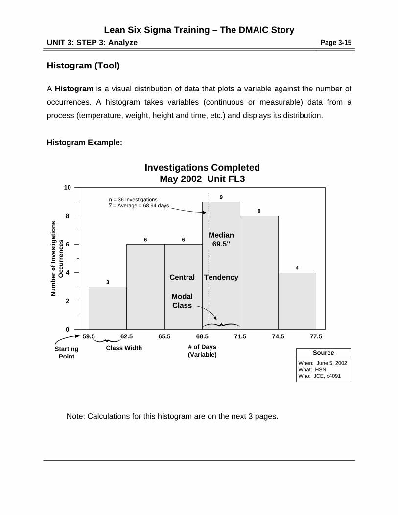
Histogram (Tool)
A Histogram is a visual distribution of data that plots a variable against the number of
occurrences. A histogram takes variables (continuous or measurable) data from a
process (temperature, weight, height and time, etc.) and displays its distribution.
Histogram Example:
Note: Calculations for this histogram are on the next 3 pages.
10
8
6
4
2
0
3
6 6
9
8
4
Central
Median69.5"
Tendency
ModalClass
n = 36 Investigationsx = Average = 68.94 days
Nu
mb
er o
f In
vest
igat
ion
sO
ccu
rren
ces
Investigations CompletedMay 2002 Unit FL3
59.5 62.5 65.5 68.5 71.5 74.5 77.5
# of Days(Variable) Source
When: June 5, 2002What: HSNWho: JCE, x4091
StartingPoint
Class Width
Lean Six Sigma Training – The DMAIC Story
UNIT 3: STEP 3: Analyze Page 3-16
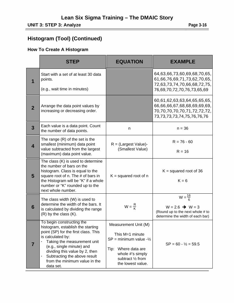
Histogram (Tool) (Continued) How To Create A Histogram
STEP EQUATION EXAMPLE
1
Start with a set of at least 30 datapoints.
(e.g., wait time in minutes)
Arrange the data point values byincreasing or decreasing order.
64,63,66,73,60,69,68,70,65,61,66,76,69,71,73,62,70,65,72,63,73,74,70,66,68,72,75,76,69,70,72,70,76,73,65,69
60,61,62,63,63,64,65,65,65,66,66,66,67,68,68,69,69,69,70,70,70,70,70,71,72,72,72,73,73,73,73,74,75,76,76,76
Each value is a data point. Countthe number of data points.
n n = 36
The range (R) of the set is thesmallest (minimum) data pointvalue subtracted from the largest(maximum) data point value.
R = (Largest Value)- (Smallest Value)
R = 76 - 60
R = 16
R
K
16
6
2
3
4
The class (K) is used to determinethe number of bars on thehistogram. Class is equal to thesquare root of n. The # of bars inthe Histogram will be “K” if a wholenumber or “K” rounded up to thenext whole number.
K = squared root of nK = squared root of 36
K = 65
7
To begin constructing thehistogram, establish the startingpoint (SP) for the first class. Thisis calculated by:· Taking the measurement unit
(e.g., single minute) anddividing this value by 2, then
· Subtracting the above resultfrom the minimum value in thedata set.
Measurement Unit (M)
This M=1 minuteSP = minimum value -½
Tip: Where data are whole #’s simply subtract ½ from the lowest value.
SP = 60 - ½ = 59.5
The class width (W) is used todetermine the width of the bars. Itis calculated by dividing the range(R) by the class (K).
W =
W =
W = 2.6 W = 3(Round up to the next whole # todetermine the width of each bar)
6
166_
RK_
Lean Six Sigma Training – The DMAIC Story
UNIT 3: STEP 3: Analyze Page 3-17
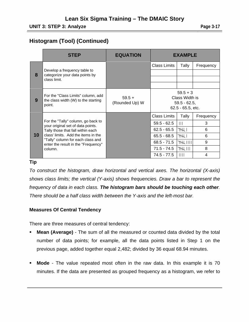
Histogram (Tool) (Continued)
Tip
To construct the histogram, draw horizontal and vertical axes. The horizontal (X-axis)
shows class limits; the vertical (Y-axis) shows frequencies. Draw a bar to represent the
frequency of data in each class. The histogram bars should be touching each other.
There should be a half class width between the Y-axis and the left-most bar.
Measures Of Central Tendency
There are three measures of central tendency:
Mean (Average) - The sum of all the measured or counted data divided by the total
number of data points; for example, all the data points listed in Step 1 on the
previous page, added together equal 2,482; divided by 36 equal 68.94 minutes.
Mode - The value repeated most often in the raw data. In this example it is 70
minutes. If the data are presented as grouped frequency as a histogram, we refer to
STEP EQUATION EXAMPLE
59.5 +(Rounded Up) W
For the "Tally" column, go back toyour original set of data points.Tally those that fall within eachclass' limits. Add the items in the"Tally" column for each class andenter the result in the "Frequency"column.
10
For the "Class Limits" column, addthe class width (W) to the startingpoint.
9
8Develop a frequency table tocategorize your data points byclass limit.
Class Limits Tally Frequency
Class Limits
59.5 - 62.5
62.5 - 65.5
Tally Frequency
3
6
65.5 - 68.5 6
68.5 - 71.5 9
71.5 - 74.5 8
74.5 - 77.5 4
59.5 + 3Class Width is
59.5 - 62.5,62.5 - 65.5, etc.
Lean Six Sigma Training – The DMAIC Story
UNIT 3: STEP 3: Analyze Page 3-18
the modal class instead of the mode. Modal class is the class interval with the
highest frequency. In this example, the modal class is 68.5 - 71.5 minutes.
Histogram (Tool) (Continued) Median – A Median is the middle value in a distribution arrayed by size, above and
below which lie an equal number of values. Unlike averages, medians are less
sensitive to extreme values and are therefore, preferred in Analysis pertaining to
compensation. For example, in our data of 36 samples the median value is the
average of the two middle values since there is not a single middle value
(69+70=139 divided by 2 = 69.5 minutes).
When Should You Use A Histogram?
1. To set goals or targets. Once the histogram is constructed, the team may choose a
target (or specification limit) near the tail(s) of histogram.
2. To show process capability. If specification limits or the customer's requirements
are available, they can be displayed on the histogram to show how much of the
histogram is outside of specification limits.
3. To stratify data. The tails of histograms generally provide the pertinent data desired
in stratifications.
4. To confirm results. By comparing histograms before and after countermeasures
have been implemented, a shift in the average and/or tightening up of the
distribution can indicate the effectiveness of countermeasures in attacking root
causes of the problem.
Variation
Understanding and controlling variation are the keys to successful quality control. This
is accomplished by taking samples from a process output, measuring the variations of
that output using a histogram, and then implementing countermeasures to reduce the
Lean Six Sigma Training – The DMAIC Story
UNIT 3: STEP 3: Analyze Page 3-19
variation displayed in the histogram. Histograms are used for variables (measurable)
data only. Attribute data are shown on a frequency chart.
Histogram (Tool) (Continued)
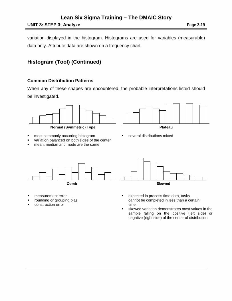
Common Distribution Patterns
When any of these shapes are encountered, the probable interpretations listed should
be investigated.
most commonly occurring histogram variation balanced on both sides of the center mean, median and mode are the same
several distributions mixed
measurement error rounding or grouping bias construction error
expected in process time data, tasks cannot be completed in less than a certain time
skewed variation demonstrates most values in the sample falling on the positive (left side) or negative (right side) of the center of distribution
PlateauNormal (Symmetric) Type
SkewedComb
Lean Six Sigma Training – The DMAIC Story
UNIT 3: STEP 3: Analyze Page 3-20
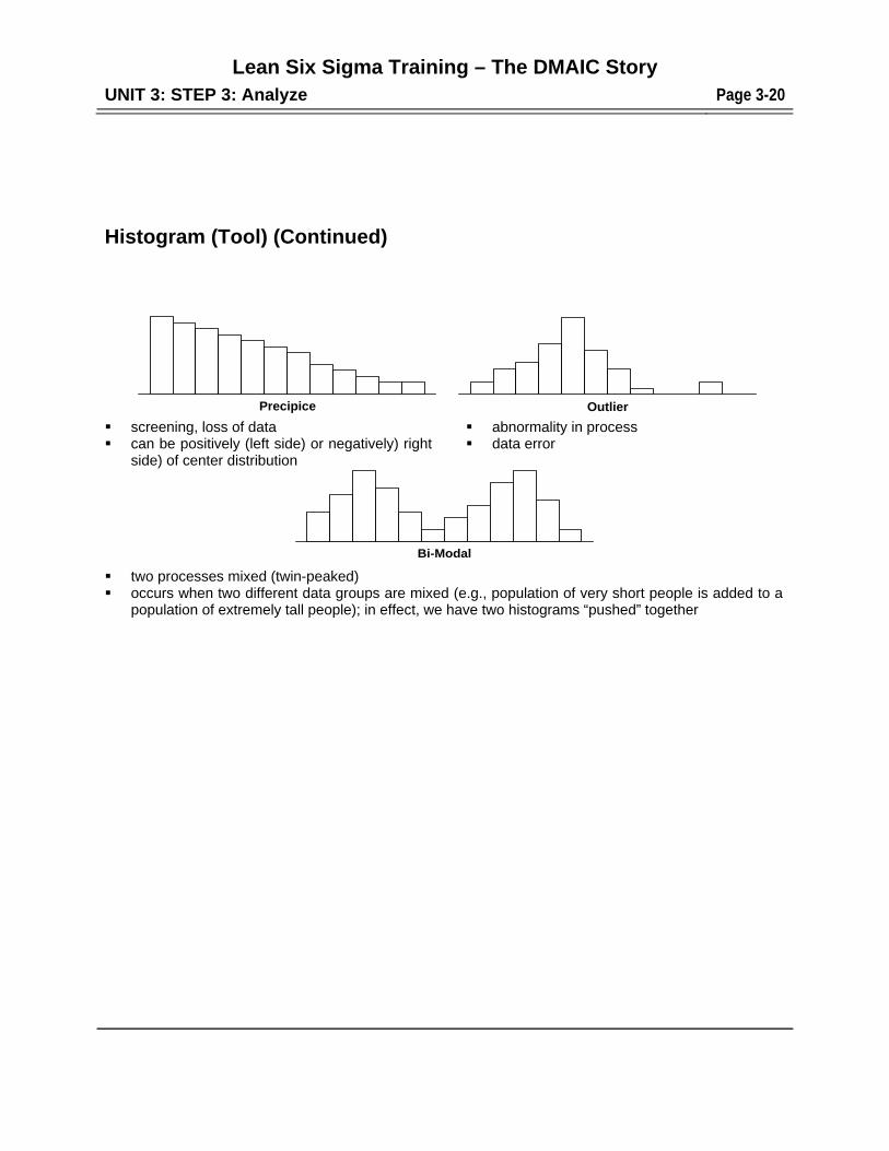
Histogram (Tool) (Continued)
screening, loss of data can be positively (left side) or negatively) right
side) of center distribution
abnormality in process data error
two processes mixed (twin-peaked) occurs when two different data groups are mixed (e.g., population of very short people is added to a
population of extremely tall people); in effect, we have two histograms “pushed” together
Precipice Outlier
Bi-Modal
Lean Six Sigma Training – The DMAIC Story
UNIT 3: STEP 3: Analyze Page 3-21
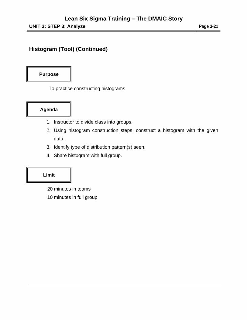
Histogram (Tool) (Continued)
To practice constructing histograms.
1. Instructor to divide class into groups.
2. Using histogram construction steps, construct a histogram with the given
data.
3. Identify type of distribution pattern(s) seen.
4. Share histogram with full group.
20 minutes in teams
10 minutes in full group
Purpose
Agenda
Limit

Lean Six Sigma Training – The DMAIC Story
UNIT 3: STEP 3: Analyze Page 3-22
P.A.L. (Purpose-Agenda-Limit) A. What Is An Effective Meeting?
An effective meeting is a meeting:
which is necessary.
which includes all individuals required to accomplish the intended PURPOSE.
which covers the AGENDA*.
where people know what is expected of them.
where the real issues are on the table and being dealt with and where most
hidden agendas are legitimized and surfaced for discussion.
where decisions and commitments are made, plans are developed, problems are
solved.
where people leave knowing what was accomplished and what they are to do.
which meets its intended PURPOSE*.
which respects people by starting and ending on time (LIMIT*).
B. Why Are Effective Meetings Important?
Because organizations spend 7.15% of their personnel budgets, 35% of middle
management's time, and 60% of top management's time in meetings.
C. When Are Meetings Needed?
Meetings are useful:
for group problem solving.
for sharing information or advice.
for building commitment to a common goal.
for addressing problems or issues that involve a number of people.
for planning.
for defining accountability and responsibility.
Lean Six Sigma Training – The DMAIC Story
UNIT 3: STEP 3: Analyze Page 3-23
for group decision-making.
P.A.L. (Purpose-Agenda-Limit) (Continued)
D. How Are They Created?
Send a draft of the agenda. The person calling the meeting should send out
information on the agenda so that the purpose, time frames and topics are clear
before people come to the meeting.
Start the meeting on time.
Revise and agree on an agenda. Add agenda items suggested by others
attending the meeting, as appropriate. Finalize and agree on the agenda.
Agree on ground rules.
Encourage active participation from all members.
Choose a process facilitator. To ensure an effective meeting, someone needs
to take responsibility for managing the process portion of the meeting.
Frequently, because of their involvement in the content of a meeting, Team
Leaders and other accountable people are unable to manage both the process
and the content of a meeting. At such times, it is helpful to assign the role of
facilitating the process to another team member or to bring in a facilitator. The
process of facilitation helps the group stay focused on the intended purpose and
agenda, manages the time limits and renegotiates them if necessary. Meeting
participants are expected to help the "process person" manage the meeting time
and content. There should be a clock visible to participants.
Focus the discussion. Clarify and summarize as necessary to facilitate mutual
understanding of perspectives and ideas. When people wander off the subject,
point out that the group has changed topics. Should this happen repeatedly,
encourage the group to choose to either return to the intended focus or, if
necessary, to deliberately re-direct the purpose of the meeting. Make the
decision to change the content of the meeting continuously and explicitly, don't
just let the conversation wander.
Lean Six Sigma Training – The DMAIC Story
UNIT 3: STEP 3: Analyze Page 3-24
P.A.L. (Purpose-Agenda-Limit) (Continued)
D. How Are They Created? (Continued)
Decide how to decide. Determine how decisions will be made in the meeting -
by consensus, by multivoting, by majority voting, or by the team leader.
Address all items raised. Insure that all items raised are addressed by the end
of the meeting and that the person who raised the item knows what the next
step will be, specifically:
- Decide whether or not the item will be addressed by this particular group.
- If yes, decide whether it will be addressed:
- in this meeting
- in another meeting
- by being assigned to a person or group.
Check with the person who raised the issue to ensure they know what needs to
happen next to get the issue addressed and that the proposed plan meets their
needs.
Lean Six Sigma Training – The DMAIC Story
UNIT 3: STEP 3: Analyze Page 3-25
Parking Lot
Parking Lot is a strategy for recording and postponing items raised during a meeting.
Create a side list of items to be addressed later. Before the meeting adjourns, review
ALL "parked" items and decide:
- whether this group will address the item or refer it elsewhere, and if the item
will be addressed by the group, decide when and how it will be addressed -
(e.g., agenda next meeting, assign).
- communicate decisions to the person who raised the item.
Summarize results, agreements, and next steps. Acknowledge agreements.
At the close of the meeting review the decisions and agreements and other
accomplishments that happened in the meeting, and review the next steps.
WRITE IT ALL DOWN! Acknowledging and celebrating what was accomplished
at a successful meeting gives people a sense of progress, and rewards them for
the time and effort the meeting required. It also encourages them to work to
make the next meeting productive.
End the meeting on time.