Embed Size (px)
Citation preview
Seeing and Perceiving 24 (2011) 1–17 brill.nl/sp
Perceiving Opponent Hues in Color Induction Displays
Gennady Livitz 1, Arash Yazdanbakhsh 1,2, Rhea T. Eskew, Jr. 3 and Ennio Mingolla 1,∗
1 Department of Cognitive and Neural Systems, Boston University, Boston, MA 02215, USA2 Neurobiology Department, Harvard Medical School, Boston, MA 02115, USA
3 Department of Psychology, 125-NI, Northeastern University, Boston, MA 02115, USA
Received 4 February 2010; accepted 9 November 2010
AbstractAccording to Hering’s color theory, certain hues (red vs green and blue vs yellow) are mutually exclusiveas components of a single color; consequently a color cannot be perceived as reddish-green or bluish-yellow. The goal of our study is to test this key postulate of the opponent color theory. Using the methodof adjustment, our observers determine the boundaries of chromatic zones in a red–green continuum. Wedemonstrate on two distinct stimulus sets, one formed using a chromatic grid and neon spreading and theother based on solid colored regions, that the chromatic contrast of a purple surround over a red figureresults in perception of ‘forbidden’ reddish-green colors. The observed phenomenon can be understood asresulting from the construction of a virtual filter, a process that bypasses photoreceptor summation andpermits forbidden color combinations. Showing that opponent hue combinations, previously reported onlyunder artificial image stabilization, can be present in normal viewing conditions offers new approaches forthe experimental study of the dimensionality and structure of perceptual color space.© Koninklijke Brill NV, Leiden, 2011
KeywordsColor induction, color opponency, neon color spreading
1. Introduction
Human color perception is normally compatible with the classic opponent colortheory of Hering (1872), which describes chromaticity in two dimensions formedby pairs of primary hues: red–green and blue–yellow. All other hues are perceivedas mixtures of two primary dimensions. Opponent mixtures do not create chromaticcombinations, as they fall inside the two-dimensional continuum of Newton’s colorcircle. In an opponent color space, transitioning from a green color to red resultsin seeing mixtures of green and yellow followed by seeing mixtures of yellow and
* To whom correspondence should be addressed. E-mail: [email protected]
© Koninklijke Brill NV, Leiden, 2011 DOI:10.1163/187847510X547021
2 G. Livitz et al. / Seeing and Perceiving 24 (2011) 1–17
red, with some color in between appearing as pure (unique) yellow. A great deal ofpsychophysical data fits within this framework (Kaiser and Boynton, 1996).
However, Crane and Piantanida (1983) and Billock et al. (2001) used retinallystabilized, equiluminant, bipartite images comprising opponent hues to produce for-bidden (non-Hering) color mixtures by making opponent hues from two differentspatial locations blend together into a single color via a filling-in process. Subjectsreported colors with simultaneous red/green and blue/yellow components. Billocket al. (2001) and Billock and Tsou (2010) argued that the opponency of red andgreen or blue and yellow hues is not hard-wired but rather an emergent propertyof color perception. However, the retinal stabilization technique used in these stud-ies necessitated a limited number of subjects, and the results were solely verbaldescriptions. Our study explores the perception of ‘forbidden’ colors using conven-tional displays and psychophysical methods.
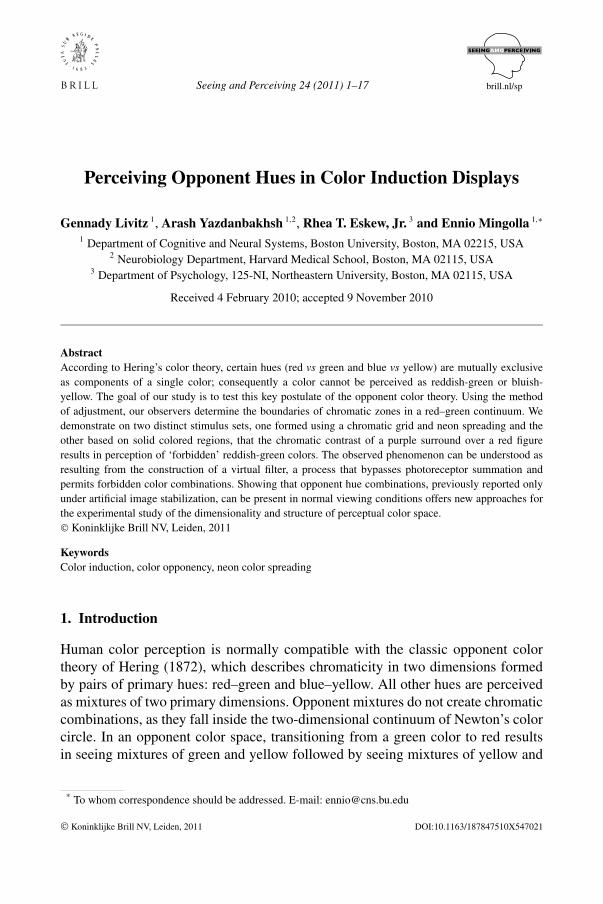
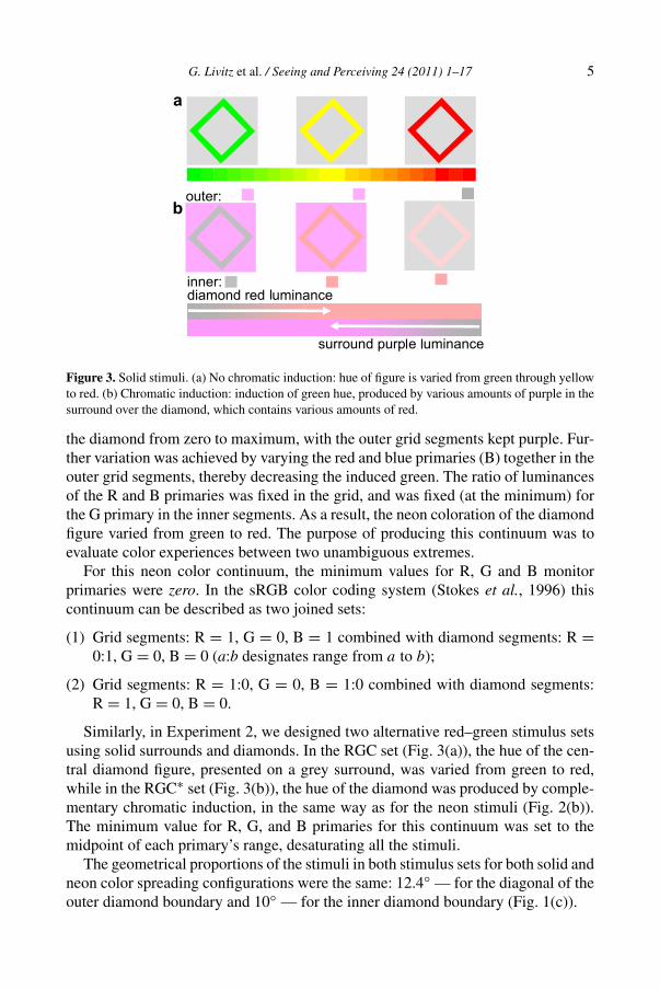
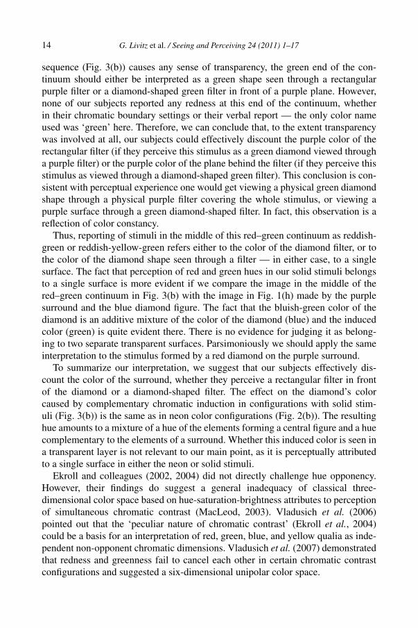
In Fig. 1(a) an illusory desaturated ‘neon’ red hue appears in the white areasbetween the red line segments that form the diamond figure (Da Pos and Bressan,2003; van Tuijl, 1975). A chromatic outer grid induces a hue complementary to itsown in the region of the central diamond figure (Bressan, 1995; van Tuijl, 1975),and thus the black diamond in Fig. 1(c) appears greenish when embedded withinthe purple outer grid. Combining the purple outer grid with red lines in the diamond(Fig. 1(b)) creates conditions for integration of the central figure’s red neon hue witha green hue induced by the purple surround.
Similar perceptual effects can be observed in displays where chromatic con-trast is made by solid colors (Fig. 1(g)–(i)). A chromatic surround induces a huecomplementary to its own in the region of a central diamond figure. For example,perception of a blue diamond against a purple surround (Fig. 1(h)) results in in-tegration of the green hue induced by the purple surround (Fig. 1(g)) and the bluecolor of the diamond (Fig. 1(i)), so the color of the diamond in Fig. 1(h) is perceivedas bluish-green.
The complementary chromatic induction demonstrated in Fig. 1 is a manifes-tation of the much-studied process of color constancy (Brenner and Cornelis-sen, 2002; Conway, 2001; D’Zmura and Lennie, 1986; Hurlbert and Wolf, 2004;Krauskopf et al., 1986; Land and McCann, 1971; Walraven et al., 1987), whichasserts spectral properties of a particular spatial region as either pertaining to anilluminant or to a surface. Chromatic induction constitutes a failure of this funda-mental process, since it leads the visual system to respond as if the color of theobject is different from what it would have appeared against a neutral background.Brenner and Cornelissen (2002) pointed out that in the case of complementary chro-matic induction, spectral properties of the surround are incorrectly inferred to beproperties of the illuminant.
Da Pos and Bressan (2003) provide evidence that a chromatic shift associatedwith complementary chromatic induction amounts to an additive mixture of theinduced color (complementary to the surround) and the color of the target; com-pare Fig. 1(a) with 1(b), 1(d) with 1(e). However, this additive mixing is different
G. Livitz et al. / Seeing and Perceiving 24 (2011) 1–17 3
from the additive mixing of lights stimulating the same retinal location, becauseit does not involve photoreceptor summation (absorption of quanta of differentwavelengths by the photoreceptors), and thus may produce a different perceptualoutcome if the induced hue and the hue of the target region are opponent. Usinga purple surround creates distinct conditions for integration of red and green huesthrough complementary chromatic induction, because in order to be integrated withthe red hue, the green hue can only be induced by a complementary surround (seeDiscussion).
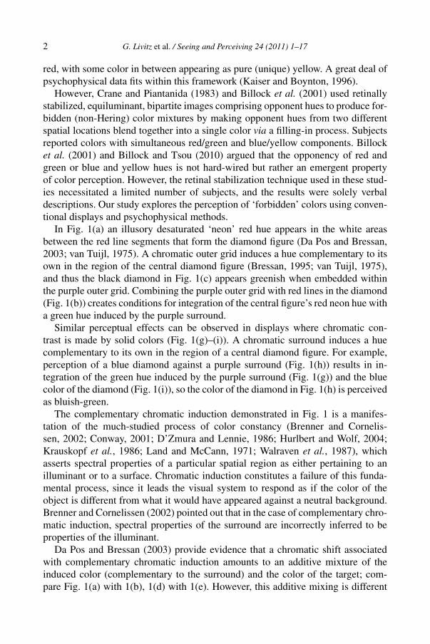
In the present study we parametrically varied the luminances of the color withinthe diamond (the red line segments in the neon stimulus, or the red of the solid di-amond) and in the outer purple inducer (the surround grid or solid region), therebycreating a continuum of colors between red and green. Any red–green continuumcontains red and green perceptual zones: a subset of colors where red hue is per-ceived and a subset of colors where green hue is perceived. In the geometrical modeladopted by the opponent color theory these zones do not overlap; they are insteadseparated by yellow colors. However, if the postulate of opponency between redand green hues is violated, then perception of both red and green as components ofa single color would be reflected as an overlap between red and green perceptualzones. We used a task aimed at detecting the presence or absence of red or green inthe color of the diamond (Fig. 2(b)).
We used these well-studied diamond-shaped stimuli (Da Pos and Bressan, 2003;Grossberg and Mingolla, 1985; van Tuijl, 1975) in order to place our results inthe context of the ongoing discussion related to the mechanisms and interpretationof the perceptual outcome of chromatic induction effects. We used both neon andsolid color stimuli in order to analyze the strong connection between simultane-ous chromatic contrast and perceptual transparency suggested by multiple studiesand widely discussed in the literature (Anderson, 1997; Da Pos and Bressan, 2003;Ekroll and Faul, 2002; Grossberg and Mingolla, 1985; Nakayama et al., 1990;Wollschläger and Anderson, 2009).
2. Methods
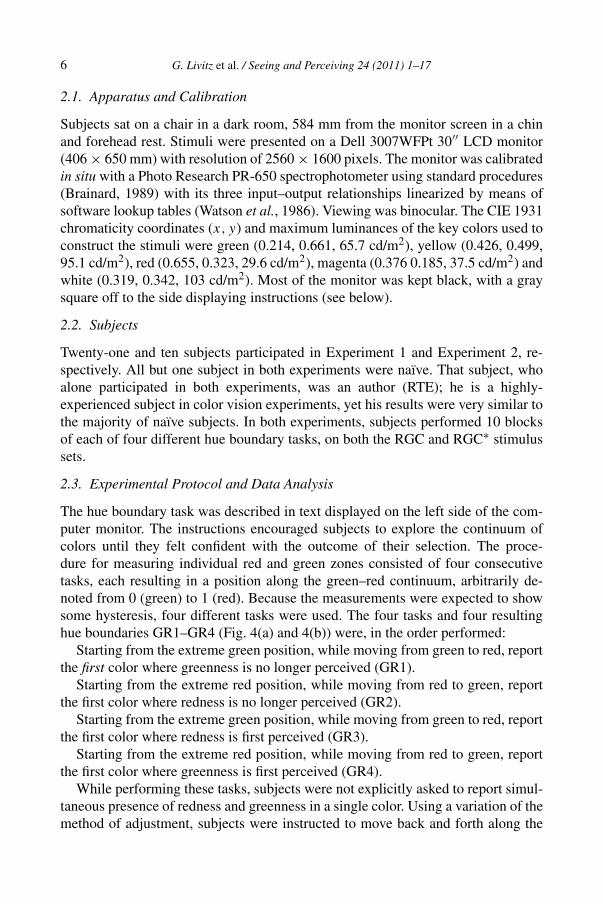
In Experiment 1 subjects were asked to vary colors, as described below, to findbounds on when they first (or no longer) saw ‘redness’ or ‘greenness’ in a dia-mond figure (Fig. 1(a)). Each subject was shown two stimulus sets, both using neoncolor displays. The RGC set (Fig. 2(a)) had an achromatic outer grid and inner linesegments with a hue that varied from green to red, with yellow near the middle.Subjects could adjust the intensity of the red monitor primary (R) from minimumto maximum while the intensity of the green primary (G) was kept at maximum, andthen adjust the intensity G from maximum to minimum while the intensity R waskept at maximum. In the second stimulus set, called RGC∗, the purple outer gridmade the inner diamond region look greenish by chromatic induction (Fig. 2(b),left). Subjects could adjust the intensity of the red primary for the line segments in
4 G. Livitz et al. / Seeing and Perceiving 24 (2011) 1–17
Figure 1. Neon color spreading: integration of colors in the diamond figure produced by varyingthe color of the inner line segments and the outer grid region. (a) Red inner segments in a blackgrid produce red neon color in the diamond; (d) blue inner segments in a black grid produce blueneon color; (c) purple grid segments induce a greenish color in the diamond composed of black innersegments; (b) red over green diamond, produced by superposing the red inner segments from (a) andthe purple grid from (c); (e) blue over green figure produced by superposing the blue inner segmentsfrom (d) and the purple grid from (c); (f) purple grid induces green over green inner segments.
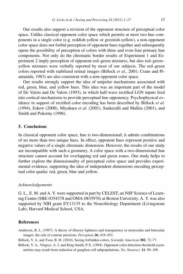
Figure 2. Neon color stimuli and color continua. (a) No chromatic induction: hue of inner segments isvaried from green through yellow to red. (b) Chromatic induction: induction of green hue, produced byvarious amounts of purple in the outer grid, over illusory diamond figure formed by various amountsof red in the inner line segments of the diamond figure.
G. Livitz et al. / Seeing and Perceiving 24 (2011) 1–17 5
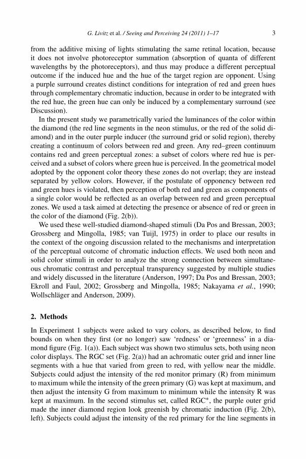
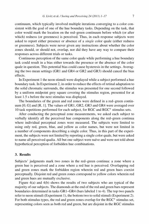
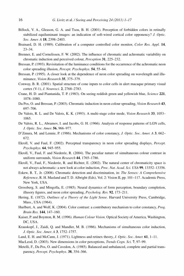
Figure 3. Solid stimuli. (a) No chromatic induction: hue of figure is varied from green through yellowto red. (b) Chromatic induction: induction of green hue, produced by various amounts of purple in thesurround over the diamond, which contains various amounts of red.
the diamond from zero to maximum, with the outer grid segments kept purple. Fur-ther variation was achieved by varying the red and blue primaries (B) together in theouter grid segments, thereby decreasing the induced green. The ratio of luminancesof the R and B primaries was fixed in the grid, and was fixed (at the minimum) forthe G primary in the inner segments. As a result, the neon coloration of the diamondfigure varied from green to red. The purpose of producing this continuum was toevaluate color experiences between two unambiguous extremes.
For this neon color continuum, the minimum values for R, G and B monitorprimaries were zero. In the sRGB color coding system (Stokes et al., 1996) thiscontinuum can be described as two joined sets:
(1) Grid segments: R = 1, G = 0, B = 1 combined with diamond segments: R =0:1, G = 0, B = 0 (a:b designates range from a to b);
(2) Grid segments: R = 1:0, G = 0, B = 1:0 combined with diamond segments:R = 1, G = 0, B = 0.
Similarly, in Experiment 2, we designed two alternative red–green stimulus setsusing solid surrounds and diamonds. In the RGC set (Fig. 3(a)), the hue of the cen-tral diamond figure, presented on a grey surround, was varied from green to red,while in the RGC∗ set (Fig. 3(b)), the hue of the diamond was produced by comple-mentary chromatic induction, in the same way as for the neon stimuli (Fig. 2(b)).The minimum value for R, G, and B primaries for this continuum was set to themidpoint of each primary’s range, desaturating all the stimuli.
The geometrical proportions of the stimuli in both stimulus sets for both solid andneon color spreading configurations were the same: 12.4◦ — for the diagonal of theouter diamond boundary and 10◦ — for the inner diamond boundary (Fig. 1(c)).
6 G. Livitz et al. / Seeing and Perceiving 24 (2011) 1–17
2.1. Apparatus and Calibration
Subjects sat on a chair in a dark room, 584 mm from the monitor screen in a chinand forehead rest. Stimuli were presented on a Dell 3007WFPt 30′′ LCD monitor(406 × 650 mm) with resolution of 2560 × 1600 pixels. The monitor was calibratedin situ with a Photo Research PR-650 spectrophotometer using standard procedures(Brainard, 1989) with its three input–output relationships linearized by means ofsoftware lookup tables (Watson et al., 1986). Viewing was binocular. The CIE 1931chromaticity coordinates (x, y) and maximum luminances of the key colors used toconstruct the stimuli were green (0.214, 0.661, 65.7 cd/m2), yellow (0.426, 0.499,95.1 cd/m2), red (0.655, 0.323, 29.6 cd/m2), magenta (0.376 0.185, 37.5 cd/m2) andwhite (0.319, 0.342, 103 cd/m2). Most of the monitor was kept black, with a graysquare off to the side displaying instructions (see below).
2.2. Subjects
Twenty-one and ten subjects participated in Experiment 1 and Experiment 2, re-spectively. All but one subject in both experiments were naïve. That subject, whoalone participated in both experiments, was an author (RTE); he is a highly-experienced subject in color vision experiments, yet his results were very similar tothe majority of naïve subjects. In both experiments, subjects performed 10 blocksof each of four different hue boundary tasks, on both the RGC and RGC∗ stimulussets.
2.3. Experimental Protocol and Data Analysis
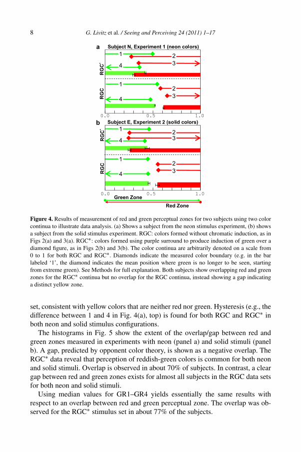
The hue boundary task was described in text displayed on the left side of the com-puter monitor. The instructions encouraged subjects to explore the continuum ofcolors until they felt confident with the outcome of their selection. The proce-dure for measuring individual red and green zones consisted of four consecutivetasks, each resulting in a position along the green–red continuum, arbitrarily de-noted from 0 (green) to 1 (red). Because the measurements were expected to showsome hysteresis, four different tasks were used. The four tasks and four resultinghue boundaries GR1–GR4 (Fig. 4(a) and 4(b)) were, in the order performed:
Starting from the extreme green position, while moving from green to red, reportthe first color where greenness is no longer perceived (GR1).
Starting from the extreme red position, while moving from red to green, reportthe first color where redness is no longer perceived (GR2).
Starting from the extreme green position, while moving from green to red, reportthe first color where redness is first perceived (GR3).
Starting from the extreme red position, while moving from red to green, reportthe first color where greenness is first perceived (GR4).
While performing these tasks, subjects were not explicitly asked to report simul-taneous presence of redness and greenness in a single color. Using a variation of themethod of adjustment, subjects were instructed to move back and forth along the
G. Livitz et al. / Seeing and Perceiving 24 (2011) 1–17 7
continuum, which typically involved multiple iterations converging to a color con-sistent with the goal of one of the hue boundary tasks. Depending on the task, thatcolor would mark the location on the red–green continuum before which (or afterwhich) redness (or greenness) is perceived. Thus, in each response subjects wereasked to report either presence or absence of a single color quale (either rednessor greenness). Subjects were never given any instructions about whether the colorzones should, or should not, overlap, nor did they have any way to compare theirresponses across different trials or tasks.
Continuous perception of the same color quale while performing a hue boundarytask could result in a bias either towards the presence or the absence of the colorquale in question. This potential bias could cause hysteresis in the settings. Averag-ing the two mean settings (GR1 and GR4 or GR2 and GR3) should cancel the biaseffects.
In Experiment 1 the neon stimuli were displayed while a subject performed a hueboundary task. In Experiment 2, in order to reduce the effects of retinal adaptation tothe solid chromatic surrounds, the stimulus was presented for one second followedby a uniform midpoint grey square covering the stimulus region, presented for atleast 1.5 s before the next stimulus was displayed.
The boundaries of the green and red zones were defined in a red–green contin-uum [0,G] and [R,1]. The values of GR1, GR2, GR3 and GR4 were averaged over10 task repetitions performed for each subject, for RGC and RGC∗ stimulus sets.
After conducting the perceptual zone measurements, we asked each subject toverbally identify all the perceived hue components along the red–green continuawhere individual perceptual zones were measured. The subjects were limited tousing only red, green, blue, and yellow as color names, but were not limited ina number of components describing a single color. Thus, in this part of the experi-ment, the subjects were not limited by reporting a single color quale, but were askedto name all perceived qualia. All but one subject were naïve and were not told abouthypothetical perception of forbidden hue combinations.
3. Results
Subjects’ judgments mark two zones in the red–green continua: a zone where agreen hue is perceived and a zone where a red hue is perceived. Overlapping redand green zones mark the forbidden region wherein red and green hues coexistperceptually. Disjoint red and green zones correspond to yellow colors wherein redand green hues are mutually exclusive.
Figure 4(a) and 4(b) shows the results of two subjects who are typical of themajority of our subjects. The diamonds at the end of the red and green bars representboundaries determined in tasks GR1–GR4 (bars labeled 1 to 4). The top two panelsrefer to neon stimuli (Experiment 1), the bottom two to solid stimuli (Experiment 2).For both stimulus types, the red and green zones overlap for the RGC∗ stimulus set,representing colors seen as both red and green, but are disjoint in the RGC stimulus
8 G. Livitz et al. / Seeing and Perceiving 24 (2011) 1–17
Figure 4. Results of measurement of red and green perceptual zones for two subjects using two colorcontinua to illustrate data analysis. (a) Shows a subject from the neon stimulus experiment, (b) showsa subject from the solid stimulus experiment. RGC: colors formed without chromatic induction, as inFigs 2(a) and 3(a). RGC∗: colors formed using purple surround to produce induction of green over adiamond figure, as in Figs 2(b) and 3(b). The color continua are arbitrarily denoted on a scale from0 to 1 for both RGC and RGC∗. Diamonds indicate the measured color boundary (e.g. in the barlabeled ‘1’, the diamond indicates the mean position where green is no longer to be seen, startingfrom extreme green). See Methods for full explanation. Both subjects show overlapping red and greenzones for the RGC∗ continua but no overlap for the RGC continua, instead showing a gap indicatinga distinct yellow zone.
set, consistent with yellow colors that are neither red nor green. Hysteresis (e.g., thedifference between 1 and 4 in Fig. 4(a), top) is found for both RGC and RGC∗ inboth neon and solid stimulus configurations.
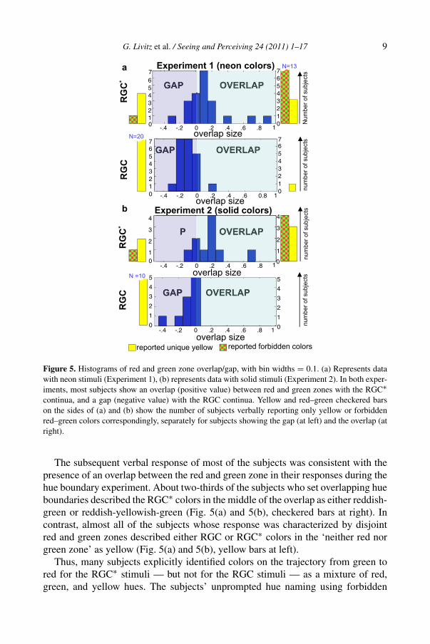
The histograms in Fig. 5 show the extent of the overlap/gap between red andgreen zones measured in experiments with neon (panel a) and solid stimuli (panelb). A gap, predicted by opponent color theory, is shown as a negative overlap. TheRGC∗ data reveal that perception of reddish-green colors is common for both neonand solid stimuli. Overlap is observed in about 70% of subjects. In contrast, a cleargap between red and green zones exists for almost all subjects in the RGC data setsfor both neon and solid stimuli.
Using median values for GR1–GR4 yields essentially the same results withrespect to an overlap between red and green perceptual zone. The overlap was ob-served for the RGC∗ stimulus set in about 77% of the subjects.
G. Livitz et al. / Seeing and Perceiving 24 (2011) 1–17 9
Figure 5. Histograms of red and green zone overlap/gap, with bin widths = 0.1. (a) Represents datawith neon stimuli (Experiment 1), (b) represents data with solid stimuli (Experiment 2). In both exper-iments, most subjects show an overlap (positive value) between red and green zones with the RGC∗continua, and a gap (negative value) with the RGC continua. Yellow and red–green checkered barson the sides of (a) and (b) show the number of subjects verbally reporting only yellow or forbiddenred–green colors correspondingly, separately for subjects showing the gap (at left) and the overlap (atright).
The subsequent verbal response of most of the subjects was consistent with thepresence of an overlap between the red and green zone in their responses during thehue boundary experiment. About two-thirds of the subjects who set overlapping hueboundaries described the RGC∗ colors in the middle of the overlap as either reddish-green or reddish-yellowish-green (Fig. 5(a) and 5(b), checkered bars at right). Incontrast, almost all of the subjects whose response was characterized by disjointred and green zones described either RGC or RGC∗ colors in the ‘neither red norgreen zone’ as yellow (Fig. 5(a) and 5(b), yellow bars at left).
Thus, many subjects explicitly identified colors on the trajectory from green tored for the RGC∗ stimuli — but not for the RGC stimuli — as a mixture of red,green, and yellow hues. The subjects’ unprompted hue naming using forbidden
10 G. Livitz et al. / Seeing and Perceiving 24 (2011) 1–17
color combinations is further evidence of the inadequacy of opponent color theoryto describe their perceptual experience.
4. Discussion
One question that arises is the degree to which our method of producing ‘forbid-den’ colors depends upon the particular color scheme we used — a purple surround,and the red–green dimension. Red and green are opponent but not complementary:their sum is not white, but yellow. Therefore, the green induced by the purple sur-round could combine with the red central color, without completely desaturatingit. Although a cyan surround could be used to induce red over a green target, inour experience this induction is not as perceptually salient as the induction of greenby a purple surround. Using the same principle of chromatic contrast for creatingblue-and-yellow integration conditions is not feasible, because blue and yellow areboth complementary and opponent, and therefore their combination lacks chromaticcontrast either between the inducing region and the target or between the inducedhue and the target. For example, a yellow surround inducing a blue hue over a bluetarget fails to create an opponent hue combination. Similarly, a blue surround induc-ing a yellow hue over a yellow target could not produce an opponent mixture. Thus,using opponent but not complementary colors is a critical element for creating con-ditions for integration of opponent hues as components of a single color throughadditive mixing. We see this as an intrinsic property of our method of constructingopponent mixtures that can be used to invoke perception of forbidden colors alongthe red–green dimension.
One explanation for our results is based on the evidence that chromatic inductionstimuli can generate a dual color percept (Ekroll and Faul, 2002). One percept re-sults from a transparent layer, the other from a background layer. Here, the red andgreen sensations we measured would be attributed to these two layers, rather than toa forbidden color combination. Such an interpretation is consistent with perceptualhue opponency. It is difficult to definitively rule this explanation out based upon ourdata: further experiments may be required. But in what follows, we argue that thisexplanation would require not one, but two transparent layers to account for ourdata, and that there is no evidence for that third layer. Central to our account is theperceived color of the background as discussed in the following paragraphs.
Neon color spreading is known to cause a sense of transparency (Anderson,1997; Ekroll and Faul, 2002; Grossberg and Mingolla, 1985; Nakayama et al.,1990), and red and green hues might be perceived as belonging to two separate sur-faces on two different planes. In neon configurations similar to ours, neon color hasbeen reported to appear on a transparent layer in front of a grid (Anderson, 1997; DaPos and Bressan, 2003; Grossberg and Mingolla, 1985). Alternative explanations ofchromatic effects in neon color spreading as phenomenal scission (Anderson, 1997;Ekroll and Faul, 2002) or assimilation of chromatically induced color (Da Pos andBressan, 2003) have important implication for interpretation of the results of ourexperiments as either dual chromatic impressions pertaining to two different layers
G. Livitz et al. / Seeing and Perceiving 24 (2011) 1–17 11
or opponent mixtures within a single layer. According to Anderson (1997), phe-nomenal scission amounts to a perceptual decomposition of a low contrast regionalong the aligned contours into a near transparent layer and a distant layer. Scissionis sufficient to explain perceptual effects in classical neon color spreading displayssimilar to the stimuli in Fig. 1(a) and 1(d), by which the chromaticity of the innersegments is assigned to the near transparent layer perceived in front of the achro-matic grid.
Thus, the scission idea implies that the distal layer must have a lightness (or, toexplain color scission, chromaticity) that is consistent with it being a continuationof the surround in which a target is embedded (Anderson, 1997; Ekroll and Faul,2002). As Anderson (Anderson, 1997, p. 429) notes, without this ‘critical aspectof the present theory’ the predictions of scission would be ambiguous. Strict ap-plication of the scission concept implies that subjects should perceive a transparentgreen layer — a green filter — in front of a purplish plane in Fig. 1(c), due to phe-nomenal scission of the achromatic layer (the diamond) into complementary colorsgreen and magenta. In informal observations using naive subjects, however, all ofthem report perceiving a black grid within the greenish diamond region of Fig. 1(c),not a continuation of the purple grid.
Applying the scission concept to chromatic contrast configurations brings up an-other problem pointed out by Da Pos and Bressan (2003). For example, havinggreen segments embedded in a purple outer grid leads to perception of a transpar-ent green layer in front of green segments within the diamond (Fig. 1(f)), which ishard to reconcile with the notion of green split into green and magenta — a logicalprediction of the chromatic extension of the scission theory to this neon configura-tion. It is easy to verify that a physical green filter held in front of the purple gridproduces a percept of a green region in front of a purplish grid, consistent with scis-sion, but not with the perception of Fig. 1(f). These inconsistencies were pointedout and discussed in detail in Da Pos and Bressan (2003).
Bressan (1993) offered an alternative explanation of neon color spreading basedon chromatic induction and subsequent assimilation of the induced color in the tar-get region. Bressan’s concept extended Grossberg and Mingolla’s (1985) originalexplanation of neon color spreading. Da Poss and Bressan (2003) demonstrated thatin configurations similar to the ones shown in Fig. 1, the neon color resides in a sin-gle transparent layer the hue of which can be described as an additive mixture of ahue of the line segments in the figure and a hue complementary to the hue of thesurround. For example, a blue diamond (Fig. 1(d)) on a purple surround (Fig. 1(c))looks blue–green (Fig. 1(e)) forming a single transparent blue–green neon colorlayer. Interpretation of this pattern as having two different transparent blue andgreen layers, both seen in front of a white background, seems exotic and unnec-essary. By the same line of reasoning, the neon color of the diamond in Fig. 1(b)can be parsimoniously interpreted as a single transparent layer, whose hue resultsfrom integration of the green hue induced by the surround and the red hue of thefigure, and not as two different transparent red and green layers in front of a purple
12 G. Livitz et al. / Seeing and Perceiving 24 (2011) 1–17
background. Thus, although neon displays may indeed generate transparency, forthat transparency to explain a violation of red–green opponency would require notone transparent layer but two, and there is no evidence for such.
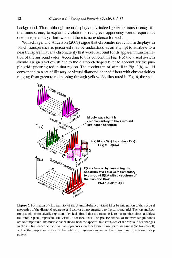
Wollschläger and Anderson (2009) argue that chromatic induction in displays inwhich transparency is perceived may be understood as an attempt to attribute to anear transparent layer a chromaticity that would account for its apparent transforma-tion of the surround color. According to this concept, in Fig. 1(b) the visual systemshould assign a yellowish hue to the diamond-shaped filter to account for the pur-ple grid appearing red in that region. The continuum of stimuli in Fig. 2(b) wouldcorrespond to a set of illusory or virtual diamond-shaped filters with chromaticitiesranging from green to red passing through yellow. As illustrated in Fig. 6, the spec-
Figure 6. Formation of chromaticity of the diamond-shaped virtual filter by integration of the spectralproperties of the diamond segments and a color complementary to the surround grid. The top and bot-tom panels schematically represent physical stimuli that are metameric to our monitor chromaticities;the middle panel represents the virtual filter (see text). The precise shapes of the wavelength bandsare not important. The middle panel shows how the spectral transmittance of the virtual filter changesas the red luminance of the diamond segments increases from minimum to maximum (bottom panel),and as the purple luminance of the outer grid segments increases from minimum to maximum (toppanel).
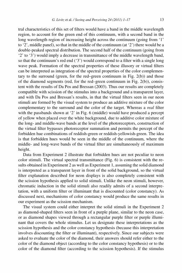
G. Livitz et al. / Seeing and Perceiving 24 (2011) 1–17 13
tral characteristics of this set of filters would have a band in the middle wavelengthregion, to account for the green end of this continuum, with a second band in thelong wavelength region of increasing height across the continuum (going from ‘1’to ‘2’, middle panel), so that in the middle of the continuum (at ‘2’) there would be adouble-peaked spectral distribution. The second half of the continuum (going from‘2’ to ‘3’) would imply a decrease in transmittance of the middle wavelength band,so that the continuum’s red end (‘3’) would correspond to a filter with a single longwave peak. Formation of the spectral properties of these illusory or virtual filterscan be interpreted as integration of the spectral properties of the color complemen-tary to the surround (green, for the red–green continuum in Fig. 2(b)) and thoseof the diamond segments (red, for the red–green continuum in Fig. 2(b)), consis-tent with the results of Da Pos and Bressan (2003). Thus our results are completelycompatible with scission of the stimulus into a background and a transparent layer,and with Da Pos and Bressan’s results, in that the virtual filters seen in our neonstimuli are formed by the visual system to produce an additive mixture of the colorcomplementary to the surround and the color of the target. Whereas a real filterwith the passbands shown at ‘2’ in Fig. 6 (middle) would have produced a perceptof yellow when placed over the white background, due to additive color mixture ofthe long- and middle-wave bands at the level of the photoreceptors, construction ofthe virtual filter bypasses photoreceptor summation and permits the percept of theforbidden hue combinations of reddish-green or reddish-yellowish-green. The ideais that forbidden hues would be seen in the middle of the continuum, where themiddle- and long-wave bands of the virtual filter are simultaneously of maximumheight.
Data from Experiment 2 illustrate that forbidden hues are not peculiar to neoncolor stimuli. The virtual spectral transmittance (Fig. 6) is consistent with the re-sults obtained in Experiment 2 as well as Experiment 1, assuming the solid diamondis interpreted as a transparent layer in front of the solid background, so the virtualfilter explanation described for neon displays is also completely consistent withthe scission hypothesis applied to solid stimuli. Unlike the neon stimuli, however,chromatic induction in the solid stimuli also readily admits of a second interpre-tation, with a uniform filter or illuminant that is discounted (color constancy). Asdiscussed next, mechanisms of color constancy would produce the same results inour experiment as the scission mechanism.
The visual system could either interpret the solid stimuli in the Experiment 2as diamond-shaped filters seen in front of a purple plane, similar to the neon case,or as diamond shapes viewed through a rectangular purple filter or purple illumi-nant that covers the whole stimulus. Let us designate these interpretations as thescission hypothesis and the color constancy hypothesis (because this interpretationinvolves discounting the filter or illuminant), respectively. Since our subjects wereasked to evaluate the color of the diamond, their answers should refer either to thecolor of the diamond object (according to the color constancy hypothesis) or to thecolor of the diamond filter (according to the scission hypothesis). If the stimulus
14 G. Livitz et al. / Seeing and Perceiving 24 (2011) 1–17
sequence (Fig. 3(b)) causes any sense of transparency, the green end of the con-tinuum should either be interpreted as a green shape seen through a rectangularpurple filter or a diamond-shaped green filter in front of a purple plane. However,none of our subjects reported any redness at this end of the continuum, whetherin their chromatic boundary settings or their verbal report — the only color nameused was ‘green’ here. Therefore, we can conclude that, to the extent transparencywas involved at all, our subjects could effectively discount the purple color of therectangular filter (if they perceive this stimulus as a green diamond viewed througha purple filter) or the purple color of the plane behind the filter (if they perceive thisstimulus as viewed through a diamond-shaped green filter). This conclusion is con-sistent with perceptual experience one would get viewing a physical green diamondshape through a physical purple filter covering the whole stimulus, or viewing apurple surface through a green diamond-shaped filter. In fact, this observation is areflection of color constancy.
Thus, reporting of stimuli in the middle of this red–green continuum as reddish-green or reddish-yellow-green refers either to the color of the diamond filter, or tothe color of the diamond shape seen through a filter — in either case, to a singlesurface. The fact that perception of red and green hues in our solid stimuli belongsto a single surface is more evident if we compare the image in the middle of thered–green continuum in Fig. 3(b) with the image in Fig. 1(h) made by the purplesurround and the blue diamond figure. The fact that the bluish-green color of thediamond is an additive mixture of the color of the diamond (blue) and the inducedcolor (green) is quite evident there. There is no evidence for judging it as belong-ing to two separate transparent surfaces. Parsimoniously we should apply the sameinterpretation to the stimulus formed by a red diamond on the purple surround.
To summarize our interpretation, we suggest that our subjects effectively dis-count the color of the surround, whether they perceive a rectangular filter in frontof the diamond or a diamond-shaped filter. The effect on the diamond’s colorcaused by complementary chromatic induction in configurations with solid stim-uli (Fig. 3(b)) is the same as in neon color configurations (Fig. 2(b)). The resultinghue amounts to a mixture of a hue of the elements forming a central figure and a huecomplementary to the elements of a surround. Whether this induced color is seen ina transparent layer is not relevant to our main point, as it is perceptually attributedto a single surface in either the neon or solid stimuli.
Ekroll and colleagues (2002, 2004) did not directly challenge hue opponency.However, their findings do suggest a general inadequacy of classical three-dimensional color space based on hue-saturation-brightness attributes to perceptionof simultaneous chromatic contrast (MacLeod, 2003). Vladusich et al. (2006)pointed out that the ‘peculiar nature of chromatic contrast’ (Ekroll et al., 2004)could be a basis for an interpretation of red, green, blue, and yellow qualia as inde-pendent non-opponent chromatic dimensions. Vladusich et al. (2007) demonstratedthat redness and greenness fail to cancel each other in certain chromatic contrastconfigurations and suggested a six-dimensional unipolar color space.
G. Livitz et al. / Seeing and Perceiving 24 (2011) 1–17 15
Our results also support a revision of the opponent structure of perceptual colorspace. Unlike classical opponent color space which permits at most two hue com-ponents in a single color (e.g. reddish-yellow or greenish-yellow), a non-opponentcolor space does not forbid perception of opponent hues together and subsequentlyopens the possibility of perception of colors with three and even four primary huecomponents. Not only do the chromatic border results of Experiment 1 and Ex-periment 2 imply perception of opponent red–green mixtures, but also red–green–yellow mixtures were verbally reported by most of our subjects. The red–greencolors reported with stabilized retinal images (Billock et al., 2001; Crane and Pi-antanida, 1983) are also consistent with a non-opponent color space.
Our results strongly support the idea of unipolar mechanisms associated withred, green, blue, and yellow hues. This idea was an important part of the modelof De Valois and De Valois (1993), in which half-wave rectified LGN inputs feedinto cortical mechanisms to provide perceptual hue opponency. Psychophysical ev-idence in support of rectified color encoding has been described by Billock et al.(1994), Eskew (2008), Miyahara et al. (2001), Sankeralli and Mullen (2001), andSmith and Pokorny (1996).
5. Conclusions
In classical opponent color space, hue is two-dimensional; it admits combinationsof no more than two unique hues. In effect, opponent hues represent positive andnegative values of a single chromatic dimension. However, the results of our studyare incompatible with such a geometry. A color space with a two-dimensional huestructure cannot account for overlapping red and green zones. Our study helps tofurther explore the dimensionality of perceptual color space and provides experi-mental evidence, supporting the idea of independent dimensions encoding percep-tual color qualia: red, green, blue and yellow.
Acknowledgements
G. L., E. M. and A. Y. were supported in part by CELEST, an NSF Science of Learn-ing Center (SBE-0354378 and OMA-0835976) at Boston University. A. Y. was alsosupported by NIH grant EY13135 to the Neurobiology Department (LivingstoneLab), Harvard Medical School, USA.
References
Anderson, B. L. (1997). A theory of illusory lightness and transparency in monocular and binocularimages: the role of contour junctions, Perception 26, 419–453.
Billock, V. A. and Tsou, B. H. (2010). Seeing forbidden colors, Scientific American 302, 72–77.Billock, V. A., Vingrys, A. J. and King-Smith, P. E. (1994). Opponent color detection threshold asym-
metries may result from reduction of ganglion cell subpopulations, Vis. Neurosci. 11, 99–109.
16 G. Livitz et al. / Seeing and Perceiving 24 (2011) 1–17
Billock, V. A., Gleason, G. A. and Tsou, B. H. (2001). Perception of forbidden colors in retinallystabilized equiluminant images: an indication of soft-wired cortical color opponency? J. Optic.Soc. Amer. A 18, 2398–2403.
Brainard, D. H. (1989). Calibration of a computer controlled color monitor, Color Res. Appl. 14,23–34.
Brenner, E. and Cornelissen, F. W. (2002). The influence of chromatic and achromatic variability onchromatic induction and perceived colour, Perception 31, 225–232.
Bressan, P. (1993). Revisitation of the luminance conditions for the occurrence of the achromatic neoncolor spreading illusion, Percept. Psychophys. 54, 55–64.
Bressan, P. (1995). A closer look at the dependence of neon color spreading on wavelength and illu-minance, Vision Research 35, 375–379.
Conway, B. R. (2001). Spatial structure of cone inputs to color cells in alert macaque primary visualcortex (V-1), J. Neurosci. 2, 2768–2783.
Crane, H. D. and Piantanida, T. P. (1983). On seeing reddish green and yellowish blue, Science 221,1078–1080.
Da Pos, O. and Bressan, P. (2003). Chromatic induction in neon colour spreading, Vision Research 43,697–706.
De Valois, R. L. and De Valois, K. K. (1993). A multi-stage color mode, Vision Research 33, 1053–1065.
De Valois, R. L., Abramov, I. and Jacobs, G. H. (1966). Analysis of response patterns of LGN cells,J. Optic. Soc. Amer. 56, 966–977.
D’Zmura, M. and Lennie, P. (1986). Mechanisms of color constancy, J. Optic. Soc. Amer. A 3, 662–672.
Ekroll, V. and Faul, F. (2002). Perceptual transparency in neon color spreading displays, Percept.Psychophys. 64, 945–955.
Ekroll, V., Faul, F. and Niederée, R. (2004). The peculiar nature of simultaneous colour contrast inuniform surrounds, Vision Research 44, 1765–1786.
Ekroll, V., Faul, F., Niederée, R. and Richter, E. (2002). The natural center of chromaticity space isnot always achromatic: a new look at color induction, Proc. Nat. Acad. Sci. USA 99, 13352–13356.
Eskew, R. T., Jr. (2008). Chromatic detection and discrimination, in: The Senses: A ComprehensiveReference, R. H. Masland and T. D. Albright (Eds), Vol. 2: Vision II, pp. 101–117. Academic Press,New York, USA.
Grossberg, S. and Mingolla, E. (1985). Neural dynamics of form perception, boundary completion,illusory figures, and neon color spreading, Psycholog. Rev. 92, 173–211.
Hering, E. (1872). Outlines of a Theory of the Light Sense. Harvard University Press, Cambridge,Mass., USA (1964).
Hurlbert, A. and Wolf, K. (2004). Color contrast: a contributory mechanism to color constancy, Prog.Brain Res. 144, 147–160.
Kaiser, P. and Boynton, R. M. (1996). Human Colour Vision. Optical Society of America, Washington,DC, USA.
Krauskopf, J., Zaidi, Q. and Mandler, M. B. (1986). Mechanisms of simultaneous color induction,J. Optic. Soc. Amer. A 3, 1752–1757.
Land, E. H. and McCann, J. (1971). Lightness and retinex theory, J. Optic. Soc. Amer. 61, 1–11.MacLeod, D. (2003). New dimensions in color perceptions, Trends Cogn. Sci. 7, 97–99.Metelli, F., Da Pos, O. and Cavedon, A. (1985). Balanced and unbalanced, complete and partial trans-
parency, Percept. Psychophys. 38, 354–366.

G. Livitz et al. / Seeing and Perceiving 24 (2011) 1–17 17
Miyahara, E., Smith, V. C. and Pokorny, J. (2001). The consequences of opponent rectification: theeffect of surround size and luminance on color appearance, Vision Research 41, 859–871.
Nakayama, K., Shimojo, S. and Ramachandran, V. S. (1990). Transparency: relation to depth, subjec-tive contours, and neon color spreading, Perception 19, 497–513.
Sankeralli, M. J. and Mullen, K. T. (2001). Bipolar or rectified chromatic detection mechanisms? Vis.Neurosci. 18, 127–135.
Smith, V. C. and Pokorny, J. (1996). Color contrast under controlled chromatic adaptation revealsopponent rectification, Vision Research 36, 3087–3105.
Stokes, M., Anderson, M., Chandrasekar, S. and Motta, R. (1996). A standard default color space forthe internet sRGB, http://www.color.org/contrib/sRGB.html, November 1996.
van Tuijl, H. F. J. M. (1975). A new visual illusion: neonlike color spreading and complementary colorinduction between subjective contours, Acta Psychologica 39, 441–445.
Vladusich, T., Lucassen, M. P. and Cornelissen, F. W. (2006). Edge integration and the perception ofbrightness and darkness, J. Vision 6, 1126–1147.
Vladusich, T., Lucassen, M. P. and Cornelissen, F. W. (2007). Brightness and darkness as perceptualdimensions, PLoS Comput. Biol. 3, e179.
Walraven, J., Benzschawel, T. L. and Rogowitz, B. E. (1987). Color-constancy interpretation of chro-matic induction, Die Farbe 34, 269–273.
Watson, A. B., Nielsen, K. R. K., Poirson, A., Fitzhugh, A., Bilson, A., Nguyen, K. and Ahumada,A. J., Jr. (1986). Use of a raster framebuffer in vision research, Behav. Res. Methods, InstrumentsComputers 8, 587–594.
Wollschläger, D. and Anderson, B. L. (2009). The role of layered scene representations in color ap-pearance, Curr. Biol. 19, 430–435.