Embed Size (px)
Citation preview
Tstthl
maapcpecdbsiAtethtihcw
pfsntWpohc
tH
5
practice applicationsTOPICS OF PROFESSIONAL INTEREST
Picture This: Visual Cues Enhance Health Education
Messages for People with Low Literacy SkillsvelgsgsmadacmaN
mHp“‘vmttismo
SWndstdwrpssn
tftett
pmMcapaamk
lchcrshptamvefiwactaCdgtbsiftctM
DWmhpth
he old adage, “A picture is wortha thousand words” refers to theidea that an image may be more
uccessful in communicating a storyhan several lines of text—but doeshis idea hold true for communicatingealth information to people with low
iteracy skills?While people at all literacy levelsay have problems comprehending
nd retaining health information forvariety of reasons, including com-
lex medical terminology and preoc-upation with their own symptoms,eople with limited literacy skills arespecially in need of assistance be-ause they require additional help un-erstanding written information and,ecause they place more reliance onpoken explanations, they need helpn remembering what they hear (1).ccording to a paper published in Pa-
ient Education and Counseling thatxamined several recent studies onhe role of pictures in improvingealth communication, “adding pic-ures to written and spoken languagencreases patient retention, compre-ension, recall, and adherence, andan be especially helpful to patientsith low literacy skills (1).”So, the old adage does seem to ap-
ly when communicating health in-ormation to people with low literacykills. The real question for food andutrition practitioners is related tohe practical application of this idea:
hat are the best practices for incor-orating pictures, illustrations, andther graphics when communicatingealth information to patients andlients with low literacy skills?
Joan Guthrie Medlen, RD, LD, au-hor of The Down Syndrome Nutritionandbook, specializes in designing
This article was written by TonyPeregrin, a freelance writer inChicago, IL, and a former editorof the Journal.
wdoi: 10.1016/j.jada.2010.02.019
00 Journal of the AMERICAN DIETETIC ASSOCIATIO
isual tools for communicating andducating people with disabilities,ow literacy skills, and for whom En-lish is a second language (ESL). “Vi-ual cues are very important for theseroups. When people truly under-tand your health message they feelore empowered when they walk
way from the meeting. They feel in-ependent. They know what to do,nd they feel positive about thehange because they know how toake that change,” observes Medlen,member of the Behavioral Healthutrition dietetic practice group (DPG).“There is a quote I like about com-unication from a book by Lindaodgdon titled Visual Tools for Im-roving Communication,” says Medlen.In the book, Hodgdon states thatcommunication is 55% visual, 37%ocal, and 7% verbal or the actualessage.’ When you consider the fact
hat communication is far more thanhe printed work or spoken word, ands so much what we see, then youtart to realize how you present infor-ation is hugely important in terms
f comprehension (2).”
TART WITH A CLEAR OBJECTIVEhen food and nutrition practitio-
ers are in the process of selecting oresigning visuals, it is important totart with a central educational objec-ive. After a main message has beenetermined, Medlen suggests askinghether the amount of text may be
educed by using visuals. “Patients,articularly those with low literacykills, require simple, easy-to-under-tand visuals that focus on what theyeed to do,” asserts Medlen.“Typically, food and nutrition prac-
itioners are only able to see patientsor a very short amount of time, [so]hey want their patients to rememberverything about the meeting,” con-inues Medlen. “To accomplish thishey give their patients handouts
ith visual cues to enhance the com- sN © 2010
rehension and retention of key infor-ation. For example, the Plateethod is a very visual tool. An RD
an draw a line down the center andcross the plate to help remind theatient which types of foods to eatnd in what amounts, proportion-tely. The patient can sit down to aeal, look at the illustration, and
now what to do—it’s that simple.”Medlen, a clinical advisor for health
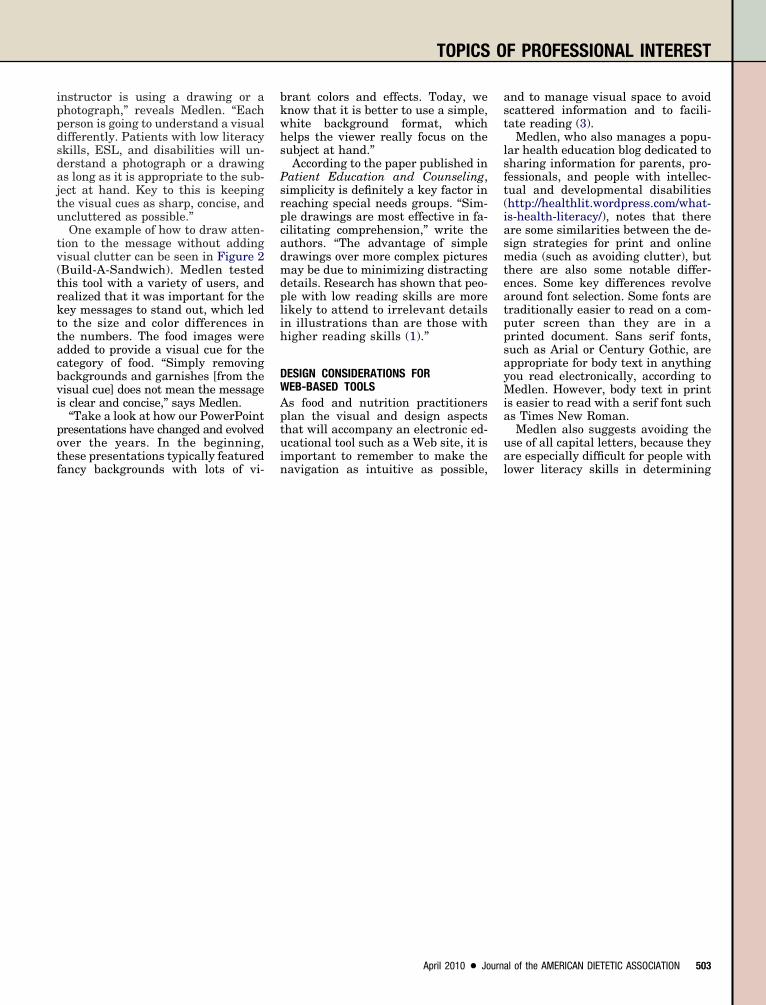
iteracy for the Special Olympics, hasodeveloped the “I Choose to Change!”ealth literacy tool which has a verylear main objective: to assist users inemembering key health information,uch as ways for achieving boneealth (Figure 1). The set of cardsrovides an opportunity for athleteso make a choice to improve specificreas of health using concise state-ents coupled with simple, yet rele-
ant graphics. There are five topics,ach with a postcard featuring fourrst steps to choose from. The toolas designed for athletes to choose anrea in which they want to makehanges as they leave health promo-ion screenings, but are adaptable tony health screening situation. The “Ihoose to Change!” tool is great forrawing athletes into the process ofoal setting and taking control ofheir health,” explains Medlen. Theack of each card includes screeningcores for bone density and body massndex, with recommendations forollow-up if needed. “Essentially, weook something as dry as a reportard and turned it into a tool for ac-ion for health promotion,” addsedlen.
RAWINGS VS PHOTOGRAPHShat types of visual cues are theost successful in communicating
ealth information, particularly foreople with low literacy skills? “Whathe studies in the areas of literacy,ealth literacy, and special education
how is that it doesn’t matter if theby the American Dietetic Association

FS
TOPICS OF PROFESSIONAL INTEREST
5
I choose to change!
Here are things I can choose to do:
I choose to have strong bones.
Drink a glass of milk instead of a soda.Keep working on my sport!Choose not to smoke.Eat foods that build my bones:
BroccoliYogurt
••••
••
Dark leafy lettuceAlmonds
••
Take a vitamin pill with Calcium and Vitamin D.
•
Food images © 2006 Silverlining Multimedia. Used with permission.
Personal Health CardToday we measured two things that tell about your health.
How strong your bones are (BMD). How much body fat you have (BMI)
1.2.
Your BMI is:
You are at a healthy weight for your height.
Your may want to lose some weight to feel healthy.
Your weight may be getting in the way of your sport. Show this card to your Doctor and ask for help losing weight.
�
�
�
Your BMD score is:
Your bones are healthy.
Your bones may not be as strong as you want.
Show your Doctor this card. Ask your Doctor how to help your bones be stronger.
�
�
�
igure 1. “I Choose to Change!” health literacy tool. Copyright © 2005, Special Olympics, Inc, Healthy Athletes Health Promotion. www.
pecialOlympics.org/Healthy_Athletes. Used with permission.02 April 2010 Volume 110 Number 4
ippdsdajtu
tv(trkttacbvi
potf
bkwhs
Psrpcadmdplih
DWAptui
ast
lsft(iasmteatppsayMia
ua
TOPICS OF PROFESSIONAL INTEREST
nstructor is using a drawing or ahotograph,” reveals Medlen. “Eacherson is going to understand a visualifferently. Patients with low literacykills, ESL, and disabilities will un-erstand a photograph or a drawings long as it is appropriate to the sub-ect at hand. Key to this is keepinghe visual cues as sharp, concise, andncluttered as possible.”One example of how to draw atten-
ion to the message without addingisual clutter can be seen in Figure 2Build-A-Sandwich). Medlen testedhis tool with a variety of users, andealized that it was important for theey messages to stand out, which ledo the size and color differences inhe numbers. The food images weredded to provide a visual cue for theategory of food. “Simply removingackgrounds and garnishes [from theisual cue] does not mean the messages clear and concise,” says Medlen.
“Take a look at how our PowerPointresentations have changed and evolvedver the years. In the beginning,hese presentations typically featured
ancy backgrounds with lots of vi- nrant colors and effects. Today, wenow that it is better to use a simple,hite background format, whichelps the viewer really focus on theubject at hand.”According to the paper published in
atient Education and Counseling,implicity is definitely a key factor ineaching special needs groups. “Sim-le drawings are most effective in fa-ilitating comprehension,” write theuthors. “The advantage of simplerawings over more complex picturesay be due to minimizing distracting
etails. Research has shown that peo-le with low reading skills are moreikely to attend to irrelevant detailsn illustrations than are those withigher reading skills (1).”
ESIGN CONSIDERATIONS FOREB-BASED TOOLSs food and nutrition practitionerslan the visual and design aspectshat will accompany an electronic ed-cational tool such as a Web site, it is
mportant to remember to make the
avigation as intuitive as possible, lApril 2010 ● Journa
nd to manage visual space to avoidcattered information and to facili-ate reading (3).
Medlen, who also manages a popu-ar health education blog dedicated toharing information for parents, pro-essionals, and people with intellec-ual and developmental disabilitieshttp://healthlit.wordpress.com/what-s-health-literacy/), notes that therere some similarities between the de-ign strategies for print and onlineedia (such as avoiding clutter), but
here are also some notable differ-nces. Some key differences revolveround font selection. Some fonts areraditionally easier to read on a com-uter screen than they are in arinted document. Sans serif fonts,uch as Arial or Century Gothic, areppropriate for body text in anythingou read electronically, according toedlen. However, body text in print
s easier to read with a serif font suchs Times New Roman.Medlen also suggests avoiding the
se of all capital letters, because theyre especially difficult for people with
ower literacy skills in determiningl of the AMERICAN DIETETIC ASSOCIATION 503
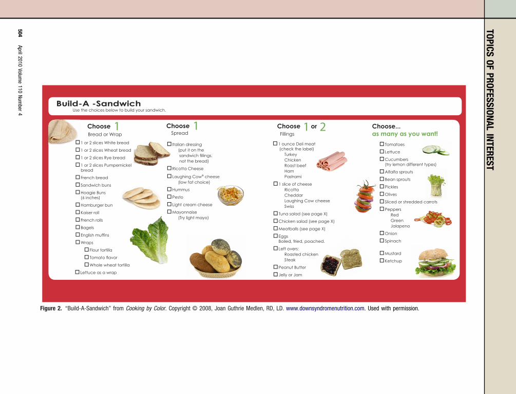
Italian dressing � (put it on the sandwich fillings, not the bread)
Ricotta Cheese �
Laughin � g Cow® cheese (low fat choice)
Hummus �Pesto �Light cream cheese �Mayonnaise � (Try light mayo)
Choose... as many as you want!
Build-A -Sandwich
1 or 2 slices White bread �1 or 2 slices Wheat bread �1 or 2 slices Rye bread �1 or 2 slices Pumpernickel �bread
French bread �Sandwich buns �Hoagie Buns �(6 inches)
Hamburger bun �Kaiser roll �French rolls �Bagels �English muffins �Wraps �
Flour tortilla �Tomato flavor �Whole wheat tortilla �
Lettuce as a wrap �
1Choose
Tomatoes �Lettuce �Cucumbers �(try lemon different types)
Alfalfa sprouts �Bean sprouts �Pickles �Olives �Sliced or shredded carrots �Peppers � Red Green Jalapeno
Onion �Spinach �
Mustard �Ketchup �
1 ounce Deli meat � (check the label) Turkey Chicken Roast beef Ham Pastrami
1 slice of cheese � Ricotta Cheddar Laughing Cow cheese Swiss
Tuna salad (see page X) �Chicken salad (see page X) �Meatballs (see page X) �Eggs �Boiled, fried, poached.
Left overs: � Roasted chicken Steak
Peanut Butter �Jelly or Jam �
Bread or Wrap1Choose
Spreador1Choose 2
Fillings
Use the choices below to build your sandwich.
Figure 2. “Build-A-Sandwich” from Cooking by Color. Copyright © 2008, Joan Guthrie Medlen, RD, LD. www.downsyndromenutrition.com. Used with permission.
TOPICSOF
PROFESSIONALINTEREST
504April2010
Volume
110Num
ber4
teeaeshb
wtiswpiWmcugmtaufItig
VAnah
ahasepovpwsTtasittai
pdtr
pcPhsatmrtai
cpstaac
F“pstuvptmAitieVspf
uichgtd
vdrmcmwu
tcn
ilitc
R1
2
3
TOPICS OF PROFESSIONAL INTEREST
he beginning and end of words. Lit-racy experts also suggest startingvery sentence with a capital letternd to place a period at the end ofach sentence and bullet point. Theseubtle visual cues help people whoave trouble reading to identify theeginning and end of a sentence.“When building a Web page tool, Iould advise food and nutrition prac-
itioners to look up general accessibil-ty standards for basic Web page de-ign, and to make sure they havehat is considered an accessible Webage,” notes Medlen. “At that point its then important to think of each
eb page as a [standalone] visualessage. You want each page to be
lear and easy to navigate so that theser knows where he or she needs too to access particular pieces of infor-ation. Remember not to assume
hat people visiting your Web site areccomplished readers and computersers. For example, make it very easyor users to adjust the size of the text.f they can do this easily and quickly,hen they will be able to focus on thenformation rather than how to navi-ate the site.”
ISUAL CUE CAVEATSre there situations where a food andutrition practitioner may want tovoid using a visual cue to enhanceis or her message?“I am a firm believer that you can
lways find a visual way to help en-ance communication and messages,”sserts Medlen. “A complicated mes-age, such as listing all of the sideffects, or the things that could hap-en in a particular scenario, wouldbviously not make a very productiveisual cue, and could take up a lot ofaper. However, informing peopleho to go to for information about
ide effects is absolutely possible.”he key to clear visual communica-ion is to select visual cues carefully,nd to consider what parts of the mes-age will translate well to a visualmage or tool. If you do a good job ofhis, the patient or client will grow torust you and may even feel comfort-ble reaching out to you for follow-upnformation.”
While a visual cue may enhanceractically any nutrition message, in-ustry experts are quick to point outhe importance of an image’s cultural
elevance, especially when engaging teople with low literacy skills. Ac-ording to the paper published inatient Education and Counseling,ealth care educators should “be sen-itive to the culture of the intendedudience in creating or selecting pic-ures for use in health educationaterials.” Based on their review of
elevant studies on this issue, the au-hors conclude “people from the targetudience should be involved in creat-ng the pictures (1).”
“It is essential to test your visualues,” adds Medlen. “Gather up a feweople from your target audience andee what message they receive fromhe tool. You might be very surprisedt the results! It is important not tossume that your message is 100%lear the first time around.”
UTURE OF VISUAL MESSAGINGI think we are headed towards bestractices that will incorporate visualtrategies,” predicts Medlen. “From aechnology standpoint, I am alreadysing [a smartphone] to communicateisual messages to patients—I loadhotographs, arranged in sequence,hat feature visual cues, such as re-inders or step-by-step instructions.nother great tool is [a handheld dig-
tal video camera], which you can useo film your message and, maybe, postt [online], send via e-mail to the cli-nt, or upload onto a [smartphone].”ideo self-modeling, which is an in-tructional film shot from the view-oint of the user, is particularly use-ul for people low literacy skills.
Text messaging can also provideseful, visual cues for users, accord-
ng to Medlen. “It’s interesting be-ause some of these users might notave a great understanding of the En-lish language, but we’ve found thathey are sometimes quite adept at un-erstanding texting shorthand!”Whatever the format, at their core,
isual cues should always enhance aocument or electronic education tool,ather than simply make it appearore attractive. It is important to be
lear regarding the main points of theessages and to determine early onhat key information you want theser to walk away with.“Developing a rapport with our pa-
ients is the most important thing wean do as food and nutrition practitio-ers,” says Medlen. “We might have
o take a little extra time when work-April 2010 ● Journa
ng with people with disabilities, lowiteracy skills, and for whom Englishs a second language, but it is impor-ant to first and foremost be person-entered and client-centered.”
eferences. Houts P, Doak C, Doak L, Loscalzo M. The
role of pictures in improving health commu-nication: A review of research on attention,comprehension, recall, and adherence. PatientEduc Couns. 2006;61:173-190.
. Hodgdon L. Visual Strategies for ImprovingCommunication: Practical Supports for Schooland Home. Troy, MI: QuirkRoberts Publishing;2001.
. Communication Canada. Successful Communi-cation: Literacy and You. Canadian NationalAdult Literacy Database. http://www.nald.ca/library/learning/successe/successe.pdf. Ac-cessed January 4, 2010.
l of the AMERICAN DIETETIC ASSOCIATION 505